Category: Photography

  • Two Useful Lightroom Print Module Custom Layouts

    On sale now at Snapndeals: August 11-25th get 20% OFF Andrew’s ebooks – Mastering Lightroom Complete Collection: Lightroom 6 & CC Update. 

    With a little imagination and know-how you can use the Lightroom Print module to create amazing layouts, which in turn you can use to create prints, postcards or even business cards. I’m going to give you a couple of examples, which you can copy or adapt to your own requirements. Let them inspire you to come up with your own creative designs!

    Custom Layout #1: Single Image / Contact Sheet

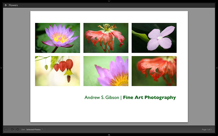
    This is the first custom layout we are going to create. It uses the Single Image / Contact Sheet Layout Style. With this Layout Style, each selected photo in the Collection is added to the layout just once, in the order that they appear.
    Lightroom Print module

    1. Maximize template

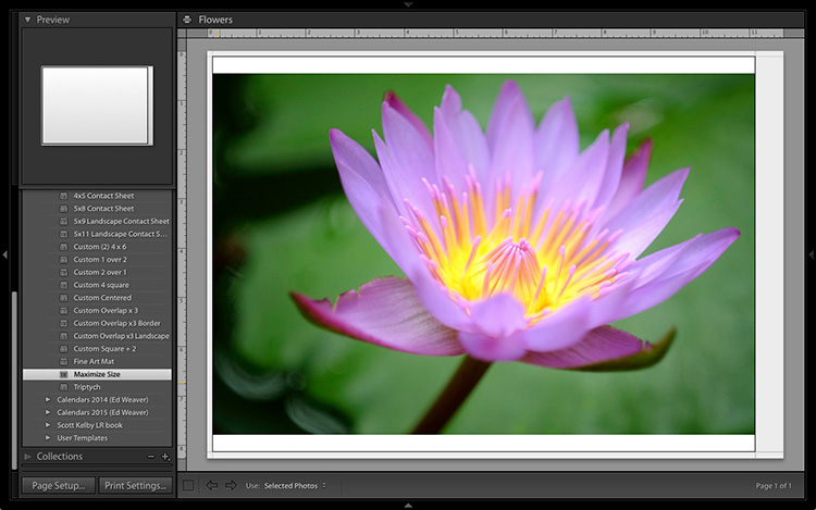
    Go to the Template Browser panel in the Lightroom Print module and select the Maximize Size template. This simple template is an ideal starting point for creating your own layouts.

    Note: I started with paper size set to A4 (click the Page Setup button to set paper size and orientation). If your paper size is different, you will require different measurements to those used here. The same applies if your page bleed area, which depends on the printer model, is different.
    Lightroom Print module

    2. Save Print

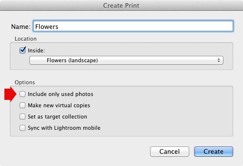
    Before you go any further, click the Create Saved Print button. The Create Print window appears. Give the print a name, and make sure the Include only used photos box is unticked. Click Create, and Lightroom creates a new Collection called a Print Collection (marked by a printer icon in the Collections panel) containing the photos in the original Collection. Now it’s impossible for you to lose your work – you can leave and come back to the Print Collection at any time.
    Lightroom Print module

    3. Set up the page layout

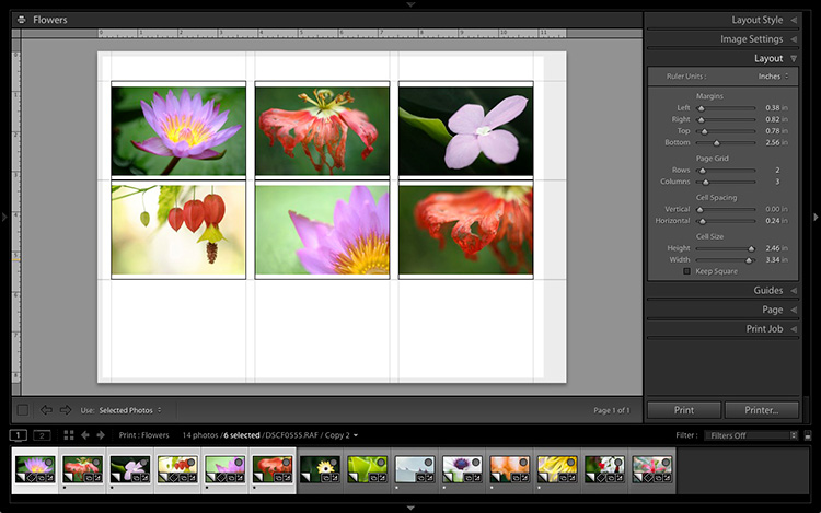
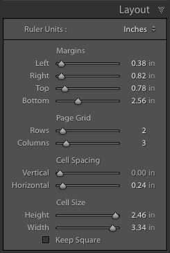
    Go to the Layout panel and under Page Grid; set Rows to 2 and Columns to 3. Only selected photos appear in the layout, so in the Filmstrip, select the photos that you want to appear, clicking and dragging to rearrange the order if necessary. Note: If you select more than six images, Lightroom creates a second page to automatically fit them onto.

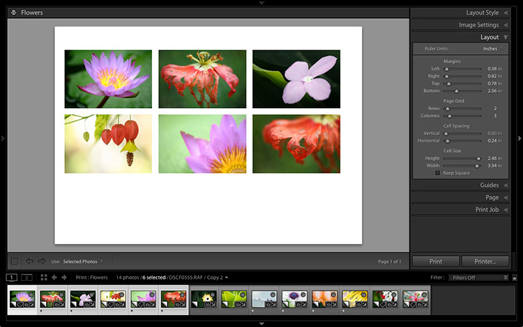
    Adjust the Margins, Cell Spacing and Cell Size settings to add space between the photos and create the style you see below. The layout is shown both with the guides on and off (tick/untick the Show Guides box in the Guides panel) for clarity. Remember to centre the photos between the grey border representing the page bleed area, not the page itself.
    Lightroom Print module

    This screenshot shows the layout with Guides enabled. Note the page bleed area around the edge (shown in grey) and the black lines showing the dimensions of the Photo Cells.
    Lightroom Print module

    The layout is much easier to see with the Guides turned off.

    The idea is to keep the spaces between the photos as even as possible (or as close as you can get according to the restrictions of your selected paper size). The settings I used are shown below, but yours may differ if you are using a different paper size, or if your photos have a different aspect ratio.
    Lightroom Print module

    4. Set up the Identity Plate

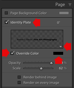
    Go to the Page panel and tick the Identity Plate box. Click the white arrow icon (down facing one) and choose a Styled Text Identity Plate to go at the bottom of the layout – if you don’t have a suitable one already, you can create a new one by selecting Edit from the menu. Tick the Override Color box and click the rectangle to the right of it to select a colour for the Identity Plate text.
    Lightroom Print module

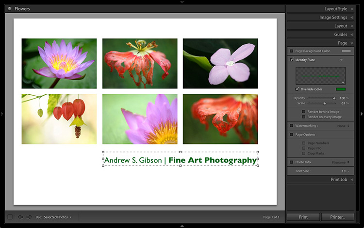
    5. Set size of identity plate to match two columns

    If possible, resize the Identity Plate so it is the same width as the last two columns. As long as the text doesn’t look too large or too small (you’ll have to exercise your own judgement), aligning it with the photos this way adds a professional touch to the design.
    Lightroom Print module

    Custom Layout #2: Custom Package

    The Print module contains nine templates that work with the Custom Package Layout Style. This Layout Style is like the Single Image / Contact Sheet Layout Style, except that it lets you add the same image to a page more than once, and also overlap photos.

    Another difference between the Custom Package Layout Style and the others, is that Lightroom doesn’t add photos automatically to the layout. Instead, you add them yourself by clicking and dragging them from the Filmstrip. This makes it easy to move photos around without having to rearrange them in the Filmstrip, and to add the same photo to a page more than once.

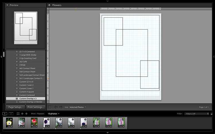
    1. Select the Custom Overlap x3 template

    Go to the Template Browser panel and select the Custom Overlap x 3 template. Don’t forget to click the Save Print button to create a new Print Collection.
    Lightroom Print module

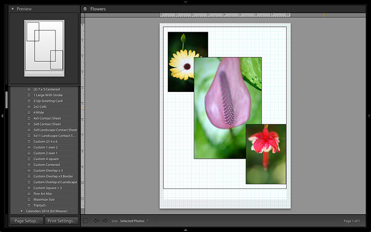
    2. Add the photos by dragging and dropping them

    Unlike the previous example the template doesn’t automatically populate with selected images. Instead, you have to click and drag photos from the Filmstrip. Here’s how it looks with photos added.
    Lightroom Print module

    3. Resize images to suit

    The overlapping images are less than ideal, but unlike the Single Image / Contact Sheet Layout Style used in the first example, you can drag and resize the Photo Cells to something that suits you. You can adjust the size of the Photo Cells precisely in the Cells panel (and add new ones), and keep them aligned by going to the Rulers, Grids & Guides panel and setting Grid Snap to Grid.

    Right-click on a Photo Cell and select Send to Front to bring it on top of the others.

    You can also add a Styled Text Identity Plate the same way as in the first example. A little tweaking enabled me to come up with the following design.
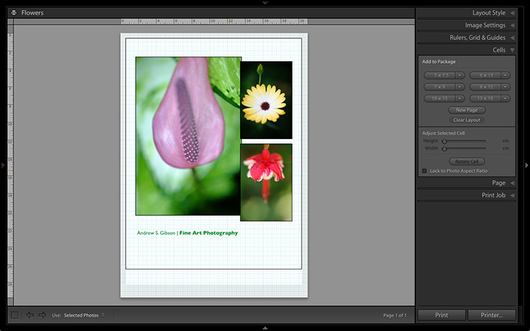
    Lightroom Print module

    Hopefully these examples will show you just how flexible the layouts in the Print module are when you take the time to explore the possibilities. But did you know that you can also create triptychs and calendars quite easily in the Print module? The following articles show you how to do it.

    • How to Create a 2015 Calendar in the Lightroom Print Module
    • How to Make a Triptych in Lightroom

    The Mastering Lightroom CollectionMastering Lightroom ebooks
    On sale now at Snapndeals: August 11-25th get 20% OFF Andrew’s ebooks – Mastering Lightroom Complete Collection: Lightroom 6 & CC Update. 

    googletag.cmd.push(function() {
    tablet_slots.push( googletag.defineSlot( “/1005424/_dPSv4_tab-all-article-bottom_(300×250)”, [300, 250], “pb-ad-78623” ).addService( googletag.pubads() ) ); } );

    googletag.cmd.push(function() {
    mobile_slots.push( googletag.defineSlot( “/1005424/_dPSv4_mob-all-article-bottom_(300×250)”, [300, 250], “pb-ad-78158” ).addService( googletag.pubads() ) ); } );

    The post Two Useful Lightroom Print Module Custom Layouts by Andrew S. Gibson appeared first on Digital Photography School.
    Digital Photography School

  • 7 Tips for Black and White Portrait Photography

    Why would you choose to create black and white photographs in the era of digital cameras that are capable of accurately capturing millions upon millions of colors? Black and white photography seems to be a constant in the history of the medium, with color technology only propagating itself into wide use around halfway between Nicéphore Niépce’s first heliograph and today.

    Black and white portrait tips 3201

    There’s a lot of debate on both sides of the argument, but for me and many others it’s a simple matter of aesthetics. A good black and white treatment has a way of stripping unneeded information from an image, helping you to emphasize specific elements to your viewer without the distractions color can provide.

    Portrait photography is a genre where black and white images can really shine. Like any technique, there are considerations that you should regard that can help to make sure your images have the most impact.

    1 – Start with black and white in mind

    For many photographers, black and white is more than a creative choice at the post-production stage; it’s a mindset. If you can start the creation of an image knowing that you intend it to be black and white, you can take steps to ensure that all of the elements of a good monochrome image are in place before you press the shutter. Things like contrast in tonality, contrast in lighting, and appropriate expressions from your subjects are all elements that are difficult, if not impossible, to fix after an image is taken.

    If you have trouble imagining how an image may look in black and white, try setting your camera to a monochrome setting. While it isn’t recommended to do this for a final image, as long as you shoot in RAW file format, then all of your image’s color data will still be present in the file, and Lightroom and Adobe Camera Raw will reset the photo back to color once it’s imported. Doing this will allow you to have an idea of how an image will work in black and white, while still providing the highest amount of versatility in post-production.

    2 – The eyes are more important than ever

    Black and white portrait tips 3088

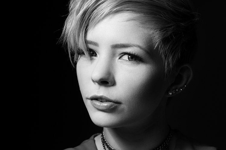
    The most important part of the majority of portraits are the eyes. They are usually the focal point that the rest of your image is built around. This is especially true with black and white. With the omission of color, a black and white image often breaks down into graphic forms and shapes. Eyes are shapes that everyone recognizes and they draw immediate focus from your viewers. Make sure that your subject’s eyes are well lit, and focus is critical.

    3 – Expressions are emphasized

    Black and white portrait tips 3191

    Like the eyes, other facial features become more prominent in a black and white portrait. You can use this to your advantage by conveying emotion in your images. Even tiny changes in your subject’s expression can make a difference. Things like a raised eyebrow, a twitch at the corner of a mouth, and smile lines under the eyes can all be used to great effect.

    Here is an exercise you can do with your portrait subjects to get a mixture of great expressions. Prepare a list of words or phrases and ask them to react to how they feel to each one. The words you choose can be simple descriptors of emotion like: love, sad, joy, angry and melancholy. For more diverse expressions try more abstract words, or funny ones like: cheeseburger, politics, Teletubbies or Hulk smash. As a bonus, this sometimes works extremely well to lighten the mood when you have a subject who’s tense or nervous during a sitting.

    4 – Lighting considerations

    Black and white portrait tips 3335

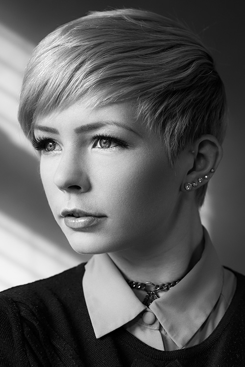
    When it comes to lighting a black and white portrait image, there are no hard and fast rules. If you like high contrast images with hard gradations in tone, then choose a harder source of light. If you like soft tones and subtler images, then you want a softer light source.

    It’s all about personal preference here. If you’re not sure what yours is, try finding the first ten black and white portraits that stand out to you the most and see if you can deconstruct them in terms of lighting.

    5 – Add contrast with light

    Black and white portrait tips 3107

    If you’re going to create high contrast black and white photos, the best advice is to add it with light, not in Photoshop. Small global adjustments are okay and won’t hurt your images, but definitely do not crank the contrast slider to 100. Try to limit it between +15/-15. For local adjustments, use a dodging and burning technique of your choice. The key point in this, and all post-production, is subtlety.

    6 – You can’t save a bad image with black and white

    If you’re working on an image that you feel isn’t up to scratch and you ask yourself if it will work in black and white, the answer is probably no. A black and white treatment will often emphasize the flaws that made you question the image in the first place, and a bad photo is a bad photo regardless of its color scheme or lack thereof.

    7 – Choose black and white in spite of color

    Certain subjects scream out to be shot in black and white. Other subjects may not be so obvious. Bright, punchy colors obviously make for vivid color photos, but by removing the color element you can completely change how a subject or scene is perceived. When you want to ensure your viewer is focused on a particular element, color as a graphic element, can become a distraction. Try removing it.

    This can be a difficult concept to understand without seeing it, so I have included an example of a color version of one the images above. Ask yourself: How did your perception of the photos change? What did you notice first in each of the images? Do you feel differently or think differently of it when you view it in color than in black and white?

    Black and white portrait tips 3088 colour

    Hopefully, you can see that even though bold colors can make for vivid imagery, their absence can as well.

    If you’re new to black and white photography, do remember that these are guides and not rules. If you need to stray from them to get the result you’re after, do so without hesitation.

    Finally, if you try black and white and you like it: welcome to the addiction!

    Editor’s Note: This is one of a series of articles this week featuring black and white photography tips. Look for earlier ones below and more daily over the next week.

    • 5 Simple Ways to Create Expressive Photos in Black and White
    • Tips for Black and White Wildlife Photography

    googletag.cmd.push(function() {
    tablet_slots.push( googletag.defineSlot( “/1005424/_dPSv4_tab-all-article-bottom_(300×250)”, [300, 250], “pb-ad-78623” ).addService( googletag.pubads() ) ); } );

    googletag.cmd.push(function() {
    mobile_slots.push( googletag.defineSlot( “/1005424/_dPSv4_mob-all-article-bottom_(300×250)”, [300, 250], “pb-ad-78158” ).addService( googletag.pubads() ) ); } );

    The post 7 Tips for Black and White Portrait Photography by John McIntire appeared first on Digital Photography School.


    Digital Photography School

  • Understanding Black and White Filters in Lightroom

    Shooting in black and white can be an amazingly creative way to explore new areas of photography, and help you see not only your pictures, but the world around you in a whole new light. However, unless you are shooting with black and white film or with a dedicated black and white camera like the Leica M Monochrom, all your pictures will initially be shot in color and later transformed into black and white through software tricks or filters.

    Lightroom has an impressive array of presets that allow you to apply black and white effects to your color pictures, but in order to select the right filter for your particular pictures it’s important to understand how these presets work behind the scenes, and what they are really doing to your photos.

    black-and-white-filters-hispanic-student-association

    Back in the days of film photography, black and white film was composed of a single layer of silver crystals that were sensitive to light and affected the film in different ways depending on the wavelength, or color, of the incoming light. Green light (like reflected off of plants and trees) had a different effect on the film than red light (reflected off apples) or blue light (reflected off the sky).

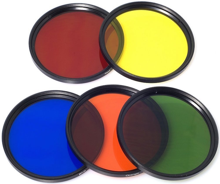
    When color film was invented it contained not one, but three layers of silver halide crystals, each of which produced different colors when exposed to light–similar to how the photosensitive pixels work on modern digital cameras. The problem with this method was that sometimes a photographer would need his or her film to be extra sensitive to different wavelengths of light, depending on the particular scene being photographed. One popular solution was to use colored filters that screwed onto the front of the camera lens, which still left the resulting image monochrome but changed its properties in significant ways.

    A collection of color filters that can be quite useful in black and white photography.

    A collection of color filters from Amazon that can be quite useful in black and white photography.

    These filters operate by absorbing light on different parts of the spectrum while letting other colors pass through much more easily: green filters absorb more of most colors except green, blue blocks most colors except blue, and so on. This means that portions of the spectrum similar to the color of the filter will be lighter since more of that color of light makes it through the filter and essentially over-exposing those portions of the film. Conversely, portions on the opposite side of the color wheel from a given filter color will be darker since less of that light is allowed to pass through. For example, this diagram illustrates the basic principle behind a red color filter:

    black-and-white-color-filters-diagram

    The fact that more red is allowed to enter through the camera lens means the camera’s light meter would then adjust itself accordingly: you’re essentially exposing for the reds, which means that a properly exposed black and white image with a red filter would have pleasing reds with very dark cyans, blues, and greens.

    black-and-white-color-filters-diagram-stars

    By taking this basic idea and applying it to modern digital photography you can start to see how different black and white post-processing solutions work. In Lightroom you can mimic the effects of a color filter when converting an image to black and white. It’s not quite the same as actually using a physical filter on your lens and shooting using black and white film, but it’s a decent approximation that gets the job done for most circumstances. The trick is knowing which filter to use in a given situation.

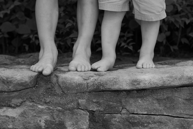
    This shot of kids’ feet would be nice in black and white, but in order to choose the right style it’s important to know how each type of color filter will affect the results. A green filter will make the leaves lighter while darkening the skin colors, since they are somewhat opposite on the color wheel. A blue filter will lighten the bluish hue of the rocks and the darker areas in the leaves but darken the skin colors, though perhaps a bit too much.

    black-and-white-filters-feet-original

    Here’s what the same image looks like with five different Lightroom black and white filter presets applied:

    black-and-white-filters-all

    In the end I chose a yellow filter to create the final image because it exposes the legs and feet a bit more while underexposing the blue and purple hues in the rocks:

    black-and-white-filters-feet-yellow-filter

    Of course Lightroom is not actually putting a color filter over your picture, but using digital tricks to approximate the same effect. It does this by altering the values of various parameters in the Develop module when a given preset is applied. After selecting a Black and White Filter preset you can see how various color values change by choosing the B&W panel in the Develop module. Note how the sliders change for various selected Presets, such as the Yellow and Blue in the example below.

    black-and-white-lightroom-presets

    Lightroom is not applying different colors to a black and white image, but deciding how much of each color value to over or under-saturate in order to mimic the effect of putting the same type of physical filter on your camera. While it’s not quite the same as shooting in pure black and white, one of the nice advantages is how Lightroom allows you to essentially create custom black and white filters by adjusting the slider values yourself. You can tweak any of the existing Presets, not just the Black and White ones, by increasing or decreasing various sliders, and even save your adjustments as new Presets that you can apply instantly to any image.

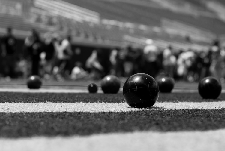
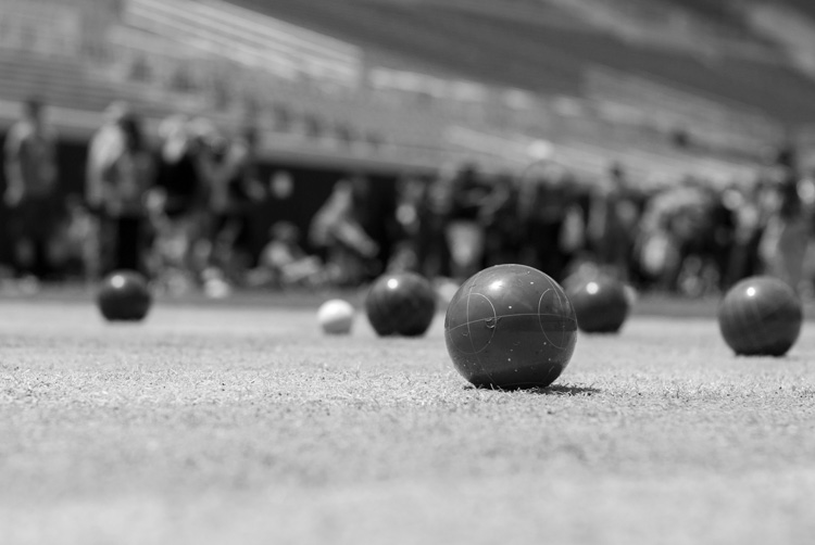
    As one more extreme example, here’s an image of some bocce balls with different filters applied.

    black-and-white-lightroom-balls-original

    The original color image, properly exposed.

    Applying a red filter preset in Lightroom produces an image where the reds are properly exposed and a bit lighter, but the blue shirts are dramatically darker since red and blue are rather opposite on the color spectrum.

    black-and-white-lightroom-balls-red-filter

    The same image with a Red black and white filter preset applied.

    Now look what happens when a blue filter preset is applied. Just like a real physical filter on the front of the camera lens, the blues are lighter while all opposing colors are incredibly dark because very little of that light was allowed to pass through–or at least that’s the effect that Lightroom attempts to mimic.

    black-and-white-lightroom-balls-blue-filter

    A Blue filter preset now changes the image dramatically.

    So how do you get a properly exposed image, with a well balanced amount of black and white across the frame? In real life you would use a green filter since this would block roughly equal amounts of both reds and blues, and the effect works quite well in Lightroom as well.

    black-and-white-lightroom-balls-green-filter

    Using a green filter preset results in a well balanced image.

    As you can see, getting a proper black and white conversion in Lightroom is not always as simple as just clicking a button. It helps to know not only what options are available, but why they function the way they do.

    What about you? What are your favorite black and white tips and tricks in Lightroom? There is much more I have not covered in this article, and if you have anything you’d like to share leave your thoughts in the comments below.

    Editor’s Note: This is the second article in a week full of features on black and white photography. Look for 5 Simple Ways to Create Expressive Photos in Black and White earlier today and more daily over the next week.

    googletag.cmd.push(function() {
    tablet_slots.push( googletag.defineSlot( “/1005424/_dPSv4_tab-all-article-bottom_(300×250)”, [300, 250], “pb-ad-78623” ).addService( googletag.pubads() ) ); } );

    googletag.cmd.push(function() {
    mobile_slots.push( googletag.defineSlot( “/1005424/_dPSv4_mob-all-article-bottom_(300×250)”, [300, 250], “pb-ad-78158” ).addService( googletag.pubads() ) ); } );

    The post Understanding Black and White Filters in Lightroom by Simon Ringsmuth appeared first on Digital Photography School.


    Digital Photography School

  • Early Morning Light: What’s so Great about It?

    Let’s face it, getting up super early in the moring is horrid, any way you look at it. I hate it, the clients hate it, my assistants really hate it, and yet, more often than not, here I am, setting my alarm at 3 in the morning. Why? It’s the Light. Morning light is so gentle and beautiful. It just Continue Reading

    The post Early Morning Light: What’s so Great about It? appeared first on Photodoto.


    Photodoto

  • Blog View

    Formerly a traditional blog, Strobist is now organized as a knowledge bank with occasional content updates. For those who prefer the traditional, last-in first-out blog format, this is the place to see the most recent entries. (Or, switch back to the Knowledge Bank view.)

    Please note that some housekeeping posts are omitted from this view. As always, you can search by month and year on the Monthly Archives drop-down on the sidebar at right.

    __________

    QA | Shooting Events Without TTL Flash

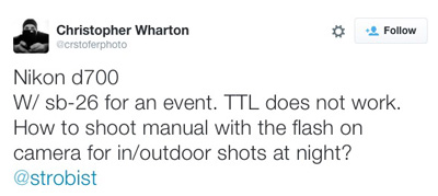
    Reader Christopher Wharton has a flash-camera combo that will not work in TTL mode, so how he can shoot run-and-gun events?

    Long forgotten in the age of TTL, this post explains hot to use your flash’s “automatic” mode.

    Read full post

    Kinda Genius: The LP742 LightSwitch

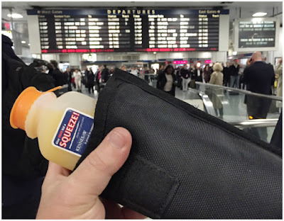
    See that? That’s the high water mark to date for my dual-purpose creativity with a speedlight case. Being padded, I use it as a thermos for my station-purchased beverage when home-bound from New York City on the train.

    (Works totally ace, BTW.)

    But that bar just got seriously upped today by the LumoPro LP742 “LightSwitch” speedlight case.

    Read full post

    On Assignment: The Light You Don’t See

    This photo is 100% flash, 0% ambient. But it almost looks like the reverse. And for this portrait of soprano Robin Steitz, a timeless available-light look was what we were going for.

    But when you are working with flash (a single speedlight) and controlling your light (a scrounged “fill blanket” from the couch) you can keep the best of both worlds of strobe and ambient.

    Read full post

    GPP PopUP Seattle: What to Expect

    Several folks have asked for more specifics on the Seattle GPP Pop-Up. So here’s the long version.

    Read full post

    On the Road? Backup Without the Bulk-Up

    I seldom review gadgets these days, but sometimes something is so useful that it’s worth telling people about. Such is the case with the SD card-enabled Western Digital My Passport Wireless hard drive.

    Read full post

    Your Basic Lighting Kit: A Spin Around the Block

    So the UPS guy just dropped your very first lighting kit at your front door. WHAT DO YOU DO NOW?

    Read full post

    On Assignment: I Got Rhythm

    A cool little trick that forever changed the way I photograph dancers.

    Read full post

    On Assignment: Lighting Like Leo

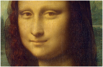
    In which we travel to London to serve as a lighting tech for a documentary. Our goal? Lighting for a photographic reproduction of the Mona Lisa.

    Read full post

    Inspiration: Atbin Eslami’s Video Bio

    Such a simple idea, and not so difficult to do—unless you count all of the self-inspection it will require. Iranian-born (now in Dubai) photographer Atbin Eslami’s video-bio of herself first made me think, “that’s really cool.”

    And second, “Why haven’t I done that?”

    Read full post

    On Assignment: Ben Lurye

    Who needs a studio when you have a bridge abutment? Today, we’ll explore a few of its facades while making an actor’s portrait.

    Read full post

    On Assignment: Choosing a Tripod

    Little? Big? Aluminum? Carbon fiber? New? Used?

    Three legs, many choices.

    Read full post

    __________

    For older posts, please see the Monthly Archives dropdown menu on the right sidebar.


    Strobist

  • Think Tank Shape Shifter Backpack Review

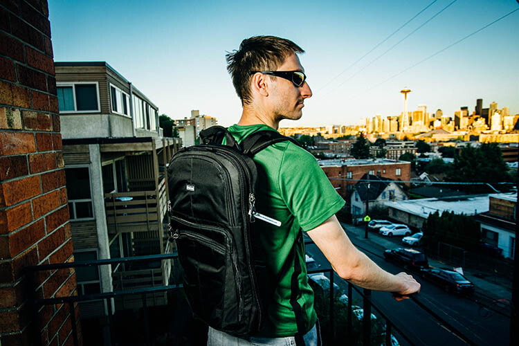
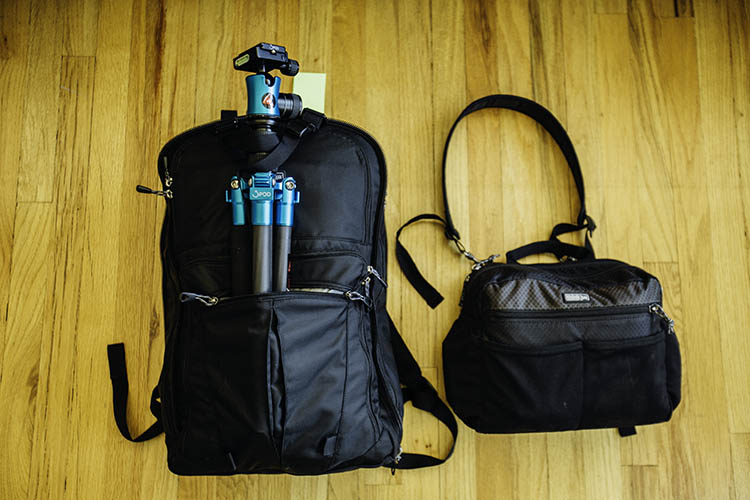
    Finding the perfect camera bag is a challenge in today’s world where every bag style is possible. From messenger bags to belt packs to purses, there are many different camera bags out there to tickle your fancy. While the trend recently may be minimalist and compact, I’d like you to consider for a moment the exact opposite – a large, yet highly versatile, camera backpack known as the Think Tank Shape Shifter.

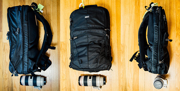
    In general, many bags suffer from giving off the feeling and appearance of too much bulk, while at the same time not having nearly enough space for all of one’s camera gear. The Think Tank Shape Shifter is ingenious in that it is designed specifically to go from thin and skinny, to large and expansive, whenever you need it to. Top that flexibility off with fantastic padding and back support, as well as lots of pockets to hold all sorts of gear, and you have what I deem to be the perfect camera bag.

    Think Tank Shapeshifter Backpack 2

    Flexible sizing

    The Shape Shifter’s key feature is its flexibility in sizing, thanks to its rather simple zipper system. Similar to how luggage works, you simply unzip a section of the bag when you need it to expand, or zip it up to minimize the size. At its most compressed, the Shape Shifter measures 3 inches in diameter, and 7 inches at its maximum expansion.

    Think Tank Shapeshifter Backpack

    Sturdy build

    As you can expect from all Think Tank bags, the Shape Shifter is built tough, despite having a minimalist profile. Featuring a black water-resistant exterior fabric, it also comes with a seam-sealed removable rain cover, just in case of a sudden downpour. The straps and back padding are made of 3D air mesh with a breathable air flow system, making the bag extremely comfortable to wear for long periods of time. There are also strong waist and chest straps to help equally distribute the bag’s weight across your upper body. The ergonomic value here is especially high, since backpacks already do a better job of equalizing the weight of heavy gear, as opposed to a one-sided messenger bag.

    Think Tank Shapeshifter Backpack 4

    Pockets galore

    There are several main pockets in the Shape Shifter including a compartment for a laptop, up to 17″, and a huge compartment full of stretchable neoprene pouches for holding lenses and camera bodies. Alternatively, you could also stuff about four size small t-shirts in the pouches if you wanted to use the bag as a makeshift suitcase. There are also smaller zippered pockets on the bag’s exterior, where smaller items such as batteries and memory cards can be stored. Larger items such as tripods and lighting stands can also be strapped to the backpack if needed, using two sturdy straps that come with the bag.

    Think Tank Shapeshifter Backpack 6

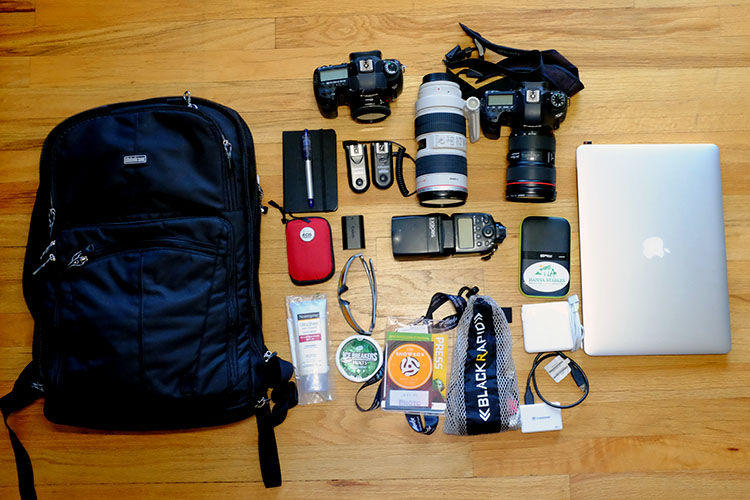
    I took the Shape Shifter on a trial run while photographing the USGA U.S. Open at Chambers Bay recently. Needing to take along a majority of my photography equipment, I managed to fit all of the following into the backpack:

    • (2) Camera bodies (Canon 6D and 5D Mark III)
    • (3) Lenses (Canon 40mm f/2.8, 70-200mm f/2.8, 24-70mm f/2.8)
    • (1) Flash (Canon 580 EXII)
    • (2) Flash Triggers (Yongnuo)
    • (1) Laptop (Apple 15″ MacBook Pro Retina Display)
    • Camera accessories (memory card wallet, spare batteries)
    • Laptop accessories (card reader, external hard drive, charger)
    • Other goodies (sunscreen, sunglasses, mints, credentials holder, notebook)

    The resulting bag was admittedly pretty heavy, but the comfortable back padding and straps made the bag much easier to carry despite the added weight.

    Think Tank Shapeshifter Backpack 5

    Versatile, despite shortcomings

    One of the biggest challenges that the Shape Shifter has is in its ability to carry your whole photo studio. You can indeed do just that, but the bag gets extremely heavy, and some gear is difficult to reach without stopping to unzip and lay out the entire bag. Additionally, the structure of the bag makes it hard to carry preassembled cameras (lens attached) in it, meaning it is meant to have the lens and bodies in separate pouches rather than attached as one unit. The best way around this is to simply wear your cameras while shooting, and keep items you don’t need regular access to in the Shape Shifter.

    Alternatively, you could also convert the Shape Shifter into a more functional daypack or suitcase, since its pockets and design don’t restrict it from being used as solely a camera bag. Say you’re travelling by air and trying to meet the two bag carry-on limit. You could put the majority of your camera gear that you need to be readily accessible in a smaller bag such as the Think Tank ChangeUp, and use the Shape Shifter to carry your overnight travel items and excess gear. Again, the big benefit of the Shape Shifter is its ability to shrink or enlarge depending on your needs.

    Have you tried out the Think Tank Shape Shifter? Did it meet your expectations? Let me know in the comments below!

    googletag.cmd.push(function() {
    tablet_slots.push( googletag.defineSlot( “/1005424/_dPSv4_tab-all-article-bottom_(300×250)”, [300, 250], “pb-ad-78623” ).addService( googletag.pubads() ) ); } );

    googletag.cmd.push(function() {
    mobile_slots.push( googletag.defineSlot( “/1005424/_dPSv4_mob-all-article-bottom_(300×250)”, [300, 250], “pb-ad-78158” ).addService( googletag.pubads() ) ); } );

    The post Think Tank Shape Shifter Backpack Review by Suzi Pratt appeared first on Digital Photography School.

    Digital Photography School

  • QA: How to Shoot Events Without TTL Flash

    Technology is great. But it can also make us its slave.

    For instance, TTL flash is pretty good at solving lighting problems on the run. (See, McNally? I'm open-minded…) But those problems existed long before we had TTL flash—or TTL exposure metering, for that matter.

    And yet, we solved them on a regular basis. Even without feedback on the backs of our cameras. Or autofocus. While walking five miles to school barefoot in the snow. Uphill. Both ways.

    Read more »
    Strobist

  • 7 Reasons Why You’d be Crazy Not to use Lightroom Presets

    Today, in this digital age, your job isn’t done once you’ve taken the photos, you’re really only halfway there. You need to edit your photos. Luckily, using Adobe Lightroom, combined with some really high-quality presets, you can instantly start getting amazing results, rather than spin your wheels being frustrated trying to edit your photos.

    But first – what is a Lightroom preset?

    DPS Presets Article Cover Photo

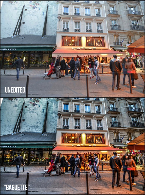
    A Lightroom preset is simply a collection of photo edit settings inside of Lightroom that are bundled into a single click allowing you to edit photos far more efficiently than you would otherwise by repeating those same settings and editing steps one by one.

    Here are 7 reasons why you’d be crazy not to use Lightroom presets:

    Save Time

    When using Lightroom presets, with only one click you’ll be able to instantly get your photos to an 85-90% edited state, and sometimes you’ll even be completely done with one click! Rather than edit each photo from start to finish, you can spend your time on the fine-tuning part of the editing process.

    Simple to Use

    Learning any new software can be intimidating, and take time to master. While it’s certainly important to always take strides at truly learning the program, using presets will let you instantly get started in Lightroom, and edit your photos simpler than ever before.

    LR Preset Screenshot what and why presets

    Variety

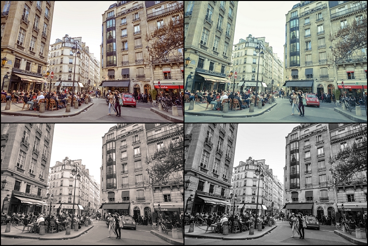
    Does the photo look best in black and white or a sepia edit? Or maybe a vibrant color edit or a subdued vintage look? Using Lightroom presets will give you a ton of creative variety right at your fingertips so you can effectively try different edits and see which style is most fitting for a particular photo, or even full photo session. Quick tip – when you hover over a different preset, Lightroom will show you a preview of how that photo will look with that preset applied (in the Navigator box, at the top of the left panel in the Develop Module, see screenshot above).

    Digital Photography School Lightroom Presets 0001 Variety

    Consistency

    When you are editing an entire photo session, using the same presets across the whole photo shoot will give your images a more uniform and consistent look, as opposed to editing each and every photo one-by-one, which can yield varying settings and a disjointed look to your image set.

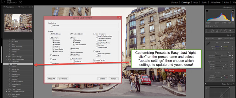
    Completely Customizable

    Have a preset you love, but you always have to slightly adjust the color or contrast? Or maybe your very own style has changed over time? No problem at all. Any develop preset you use inside Lightroom is completely customizable and it’s as easy as a couple mouse clicks.

    DPS Customize Presets 750

    Lightroom versus Photoshop

    Presets work inside Lightroom and actions work inside Photoshop. Both programs have their place in a professional photographer’s editing workflow. However, Lightroom is the primary editing software of choice for both professionals and hobbyists alike. Not only is it far easier to use and learn compared to Photoshop, but within Lightroom all of your edits are non-destructive. That means that your original unedited photo is always stored in Lightroom so you can experiment as much or as little as you want, without ever degrading the quality of your original image.

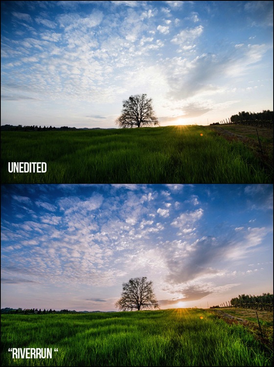
    Presets + Batch Editing = The Winning Combo

    Final Landscape 750

    Example from the dPS 101 Lightroom Presets Pack

    One of the greatest benefits of using Lightroom is its ability to edit a lot of photos very quickly by batch editing, or syncing, your settings from one photo to many at once. When you combine high-quality presets with batch editing in Lightroom you will be able to drastically cut down your complete photo editing time per session.

    Now that you have a better understanding of how using Lightroom presets can dramatically reduce the amount of time you spend editing your photos, while getting you better results and increasing your creativity – it’s time to grab some presets for you to use inside of Lightroom.

    Introducing the dPS 101 Lightroom Presets Pack

    You can scour the web to research and find different Lightroom presets, you can choose to create your own, or you can make your life really easy and purchase the official Digital Photography School – 101 Lightroom Presets Pack that I’ve created.

    Final Portraits 750

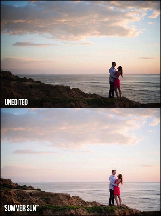
    Example using the Summer Sun preset from the dPS 101 Lightroom Presets Pack

    This ultimate preset bundle includes seven different themes, so you can easily find and use a preset that is the most fitting for your specific photo, without having to waste any time. You’ll find presets dedicated for portraits, stunning black and white & sepia presets, presets for landscape photography, street photography, vintage presets and much more.

    It doesn’t matter if you are a beginner or professional, you’ll love these presets and the amazing results you’ll get from them. Click here to learn more and save big by getting them during this limited time introductory special promotion price.

    Final Street 750

    Example from the dPS 101 Lightroom Presets Pack


    presets_coverdPS 101 Lightroom Presets Pack

    Cole’s handcrafted a brand new set of presets, exclusive to dPS.

    • Instant Digital Download
    • Guaranteed for 2 full months
    • Pay by PayPal or Credit Card

    For a limited time only get them at the introductory price of $ 20.


    googletag.cmd.push(function() {
    tablet_slots.push( googletag.defineSlot( “/1005424/_dPSv4_tab-all-article-bottom_(300×250)”, [300, 250], “pb-ad-78623” ).addService( googletag.pubads() ) ); } );

    googletag.cmd.push(function() {
    mobile_slots.push( googletag.defineSlot( “/1005424/_dPSv4_mob-all-article-bottom_(300×250)”, [300, 250], “pb-ad-78158” ).addService( googletag.pubads() ) ); } );

    The post 7 Reasons Why You’d be Crazy Not to use Lightroom Presets by Cole Joseph appeared first on Digital Photography School.


    Digital Photography School

  • How to Create a Spectacular Background Using an El Bokeh Wall

    Bokeh is the aesthetic quality of the blur, in the out-of-focus areas of an image. You can easily get this spectacular background blur in your photos using a fast prime or macro lens (basically ones with an aperture of f/2.8 or greater), and a technique involving what many call the El Bokeh Wall.

    Photo A  Uddhav Gupta  uddhav98 gmail com

    In my opinion, the El Bokeh wall is very effective at creating eye-popping bokeh, which can help make your picture more interesting and unique in its own right. However, keeping in mind the potential it has, it doesn’t seem to be used often enough. It is very simple though, you can do it without any special equipment, using things you will probably be able to find lying around at home.

    (NOTE: Several demonstrations of this technique use a speed-light. For those without such equipment, don’t worry, there IS a very good alternative which this tutorial will tell you about!)

    THINGS YOU’LL NEED:

    • A camera
    • A macro or prime lens with a large aperture for nice bokeh (you can still try to do it even if you don’t have one of these, but your attempt may or may not be successful)
    • A tripod
    • Aluminium foil (You’ll probably have some in the kitchen. If not, it’s very cheap to buy)
    • A speedlight, or as in this tutorial, use an alternative light source instead. You can use a flashlight or download an app onto your smartphone which allows you to use its flash as a light)
    • A subject
    • A background (you can use a piece of cardboard)

    STEPS FOR SETTING UP THE EL BOKEH WALL

    You’ll be surprised at how simple it really is:

    Step one: Get as much aluminium foil as you think you will need to sufficiently cover your background

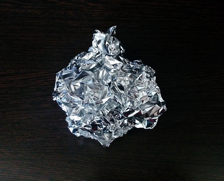
    Step two: Crumple the aluminium foil into a loose ball (as shown here)

    Step 2

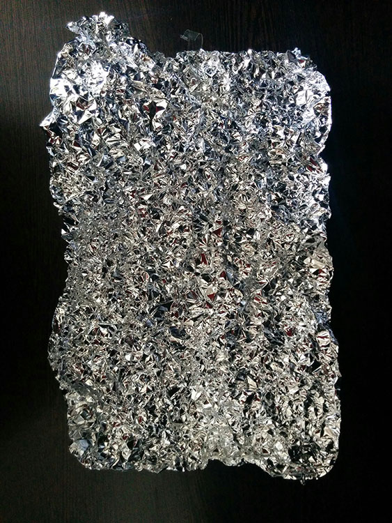
    Step three: Open up the ball, without smoothing out the crinkles (these will reflect the light, which will create the magnificent bokeh you need) – be careful not to tear the foil in this step.

    Step 3

    Step four: Stick the foil to the background (you may use some transparent tape to do so).

    Step 4

    HOW TO CREAT A PICTURE WITH AMAZING BOKEH

    Without the use of a speedlight!

    • Place your camera and tripod some distance away from the El Bokeh Wall. The desired part of the subject (or the whole subject) is typically included along with some of the bokeh from the foil.
    • Place the subject a suitable distance away from the El Bokeh Wall. You will need to judge what this suitable distance is on your own, as that will vary depending on your chosen subject, and the camera and lens combination you’re using. While constantly checking your camera’s LCD monitor (it’s just easier this way – remember to switch to Live View), place the subject in a the position that makes the bokeh pops the most.
    • Get your camera to focus on the subject (with the background properly out of focus to obtain good bokeh) and then switch to manual focus.
    • Experiment with your lighting (since you’re not using any fixed lighting). Hold up your flashlight or smartphone and experiment with various angles until you get the best result.
    • Set the two second self-timer on your camera to count down.
    • Keep holding the light source at the angle which yield the best results until the picture is taken.

    THAT’S IT!

    You should now have a great picture with marvellous bokeh like this:

    Photo B  Uddhav Gupta  uddhav98 gmail com

    Photo C  Uddhav Gupta  uddhav98 gmail com

    Give it a try and please leave your comments below.

    googletag.cmd.push(function() {
    tablet_slots.push( googletag.defineSlot( “/1005424/_dPSv4_tab-all-article-bottom_(300×250)”, [300, 250], “pb-ad-78623” ).addService( googletag.pubads() ) ); } );

    googletag.cmd.push(function() {
    mobile_slots.push( googletag.defineSlot( “/1005424/_dPSv4_mob-all-article-bottom_(300×250)”, [300, 250], “pb-ad-78158” ).addService( googletag.pubads() ) ); } );

    The post How to Create a Spectacular Background Using an El Bokeh Wall by Uddhav Gupta appeared first on Digital Photography School.

    Digital Photography School

  • Freelance Photography Tips from the Experts

    We’ve all become a world obsessed with imagery, and this couldn’t be more obvious than the simple fact that the photo heavy social network Instagram currently has 300 million monthly active users. We all see ourselves as amateur photographers, but some of us want our love for a good picture to become far more than a pipe dream. If you’ve Continue Reading

    The post Freelance Photography Tips from the Experts appeared first on Photodoto.


    Photodoto