Category: Photography

  • 25 Spacious Images that use Simplicity Effectively

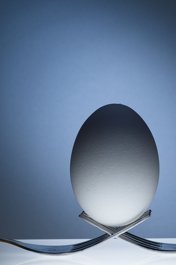
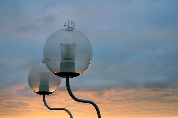
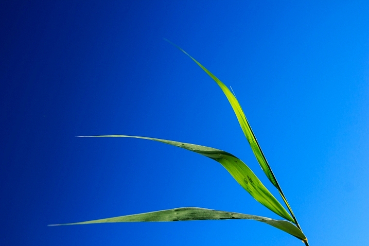
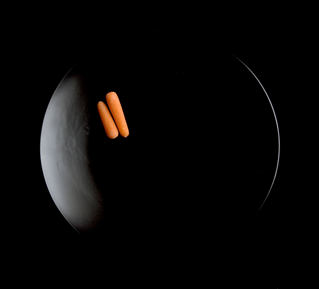
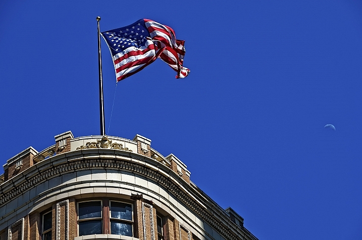
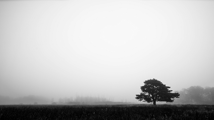
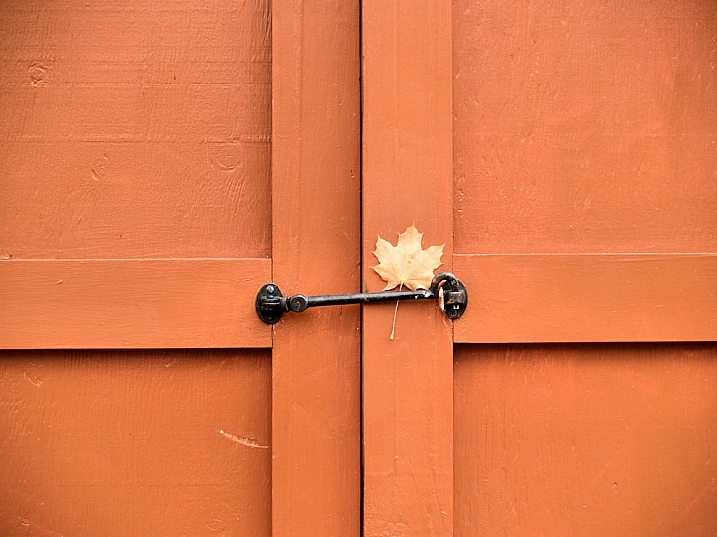
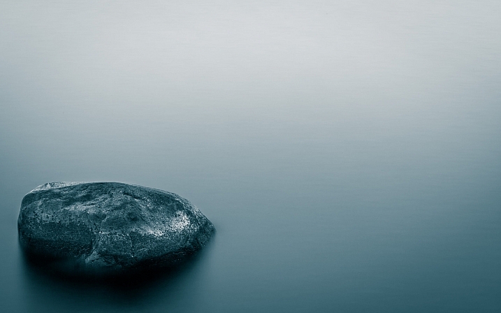
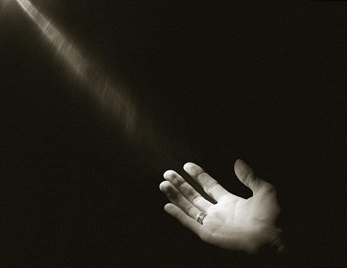
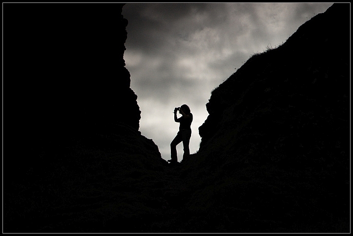
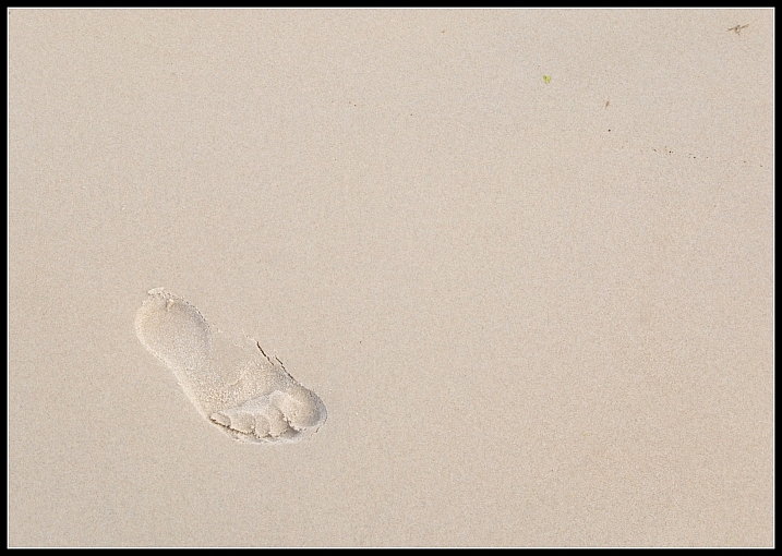
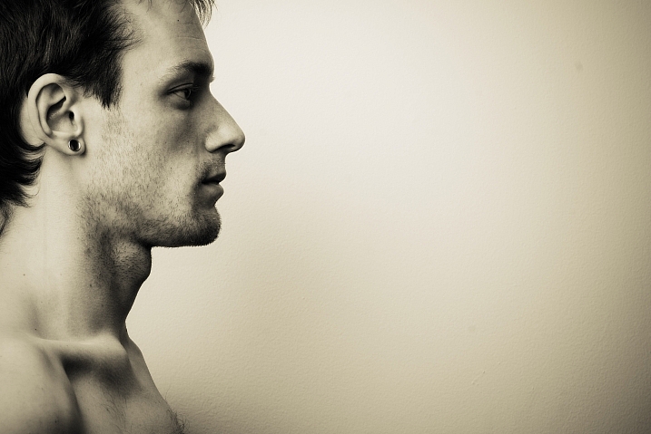
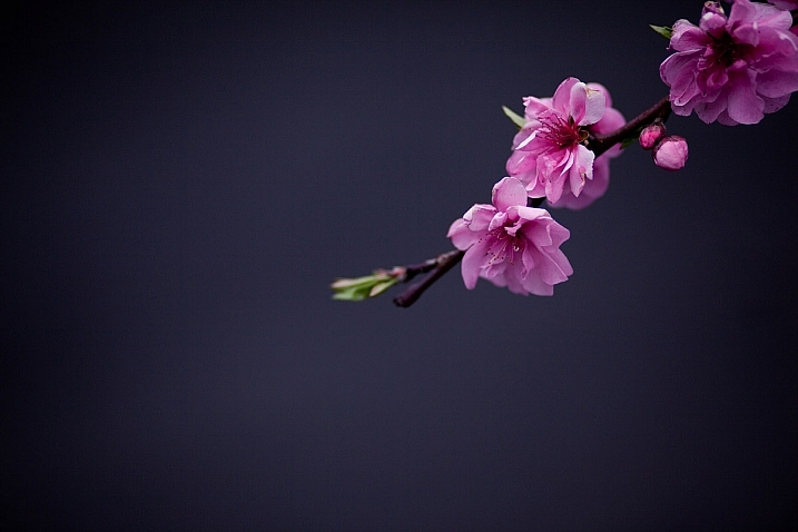
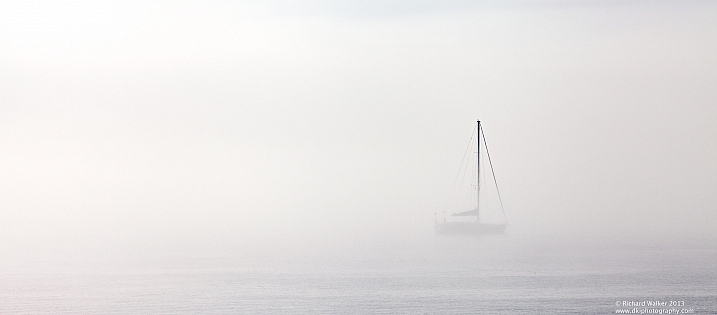
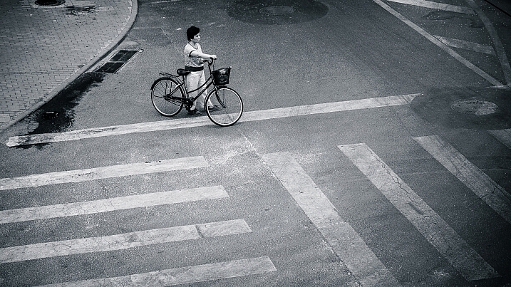
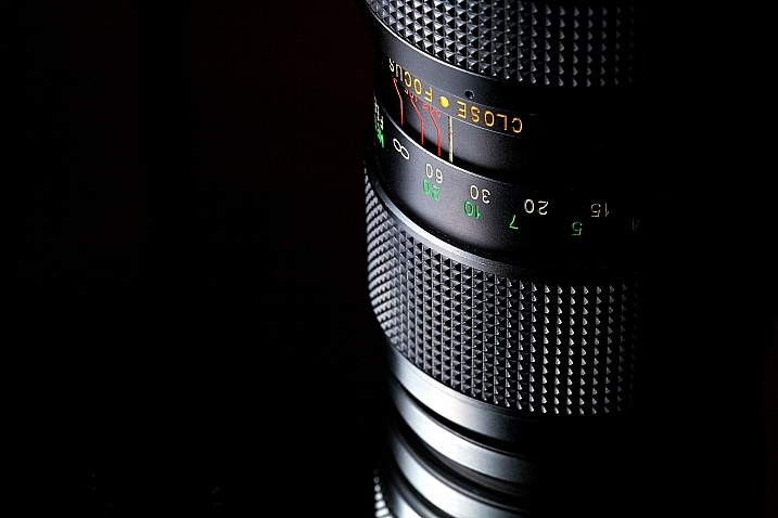
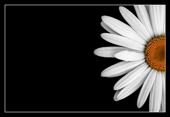
    One element of composition that is often overlooked is the use of negative space – basically including a whole lot of nothing in your image.

    Let’s look at a few images that use negative space, and simplicity, to create a dynamic and interesting composition.

    Daniel Go

    By Daniel Go

    Joseph Boss

    By Joseph Boss

    Flavio~

    By Flavio~

    Tom Szymanski

    By Tom Szymanski

    David.Asch

    By David.Asch

    Daniel Sjöström

    By Daniel Sjöström

    M K

    By m k

    DarrelBirkett

    By DarrelBirkett

    Sea Turtle

    By sea turtle

    David Ingram

    By David Ingram

    Toni Verdú Carbó

    By Toni Verdú Carbó

    Hansen De Sade

    By Hansen de Sade

    Grant MacDonald

    By Grant MacDonald

    Richard Walker

    By Richard Walker

    Ram Yoga

    By Ram Yoga

    Tamaar

    By Tamaar

    Spodzone

    By spodzone

    Spodzone

    By spodzone

    Luke Stearns

    By Luke Stearns

    Jeff Laitila

    By Jeff Laitila

    Richard Walker

    By Richard Walker

    Bryon Lippincott

    By Bryon Lippincott

    Darwin Bell

    By darwin Bell

    Jonathan Cohen

    By Jonathan Cohen

    Ram Reddy

    By ram reddy

    googletag.cmd.push(function() {
    tablet_slots.push( googletag.defineSlot( “/1005424/_dPSv4_tab-all-article-bottom_(300×250)”, [300, 250], “pb-ad-78623” ).addService( googletag.pubads() ) ); } );

    googletag.cmd.push(function() {
    mobile_slots.push( googletag.defineSlot( “/1005424/_dPSv4_mob-all-article-bottom_(300×250)”, [300, 250], “pb-ad-78158” ).addService( googletag.pubads() ) ); } );

    The post 25 Spacious Images that use Simplicity Effectively by Darlene Hildebrandt appeared first on Digital Photography School.


    Digital Photography School

  • Weekly Photography Challenge – Negative Space

    Composition is one of the keys to creating a strong and effective image. One compositional element you can use is negative space. Basically simplification to the highest level, and making the subject isolated with lots of empty space around it. Here are a few examples.

    I tell my students all the time – get closer, simplify!

    David

    By David

    ELKayPics / Lutz Koch

    By eLKayPics / Lutz Koch

    Weekly photography challenge – negative space

    Often I see new photographers trying to cram too much stuff into their images, and they just end up being confusing, and ineffective. By simplifying and removing everything except the subject the viewer has no choice but to see it. Taking it a step farther and composing so as to have space around the subject, room for it to move or breathe, allows the image to take on a feeling.

    Negative space can add a feeling of loneliness, solitude, quiet, peace, serenity, or even movement. What do these say:

    Fran Parra Carrión

    By Fran Parra Carrión

    Pedro Fernandes

    By Pedro Fernandes

    John Mcsporran

    By john mcsporran

    FUMIGRAPHIK-Photographist

    By FUMIGRAPHIK-Photographist

    Carlos Galeano

    By Carlos Galeano

    Israel Gutiérrez

    By Israel Gutiérrez

    Ivan Malkin

    By Ivan Malkin

    Share your images below:

    Simply upload your shot into the comment field (look for the little camera icon in the Disqus comments section) and they’ll get embedded for us all to see or if you’d prefer upload them to your favourite photo sharing site and leave the link to them. Show me your best images in this week’s challenge. Sometimes it takes a while for an image to appear so be patient and try not to post the same image twice.

    googletag.cmd.push(function() {
    tablet_slots.push( googletag.defineSlot( “/1005424/_dPSv4_tab-all-article-bottom_(300×250)”, [300, 250], “pb-ad-78623” ).addService( googletag.pubads() ) ); } );

    googletag.cmd.push(function() {
    mobile_slots.push( googletag.defineSlot( “/1005424/_dPSv4_mob-all-article-bottom_(300×250)”, [300, 250], “pb-ad-78158” ).addService( googletag.pubads() ) ); } );

    The post Weekly Photography Challenge – Negative Space by Darlene Hildebrandt appeared first on Digital Photography School.


    Digital Photography School

  • Tips for Doing Fall Portraits

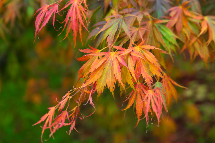
    Autumn provides photographers with an abundance of colours and amazing light. When captured right, autumn can create images which are the envy of everyone.

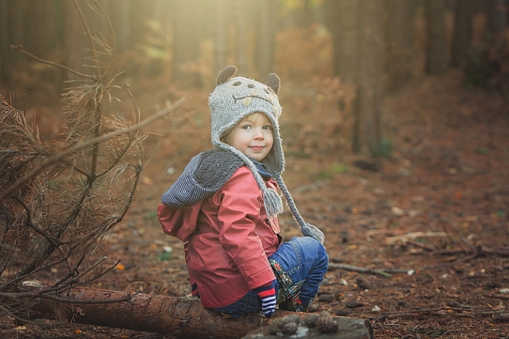
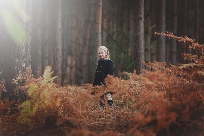
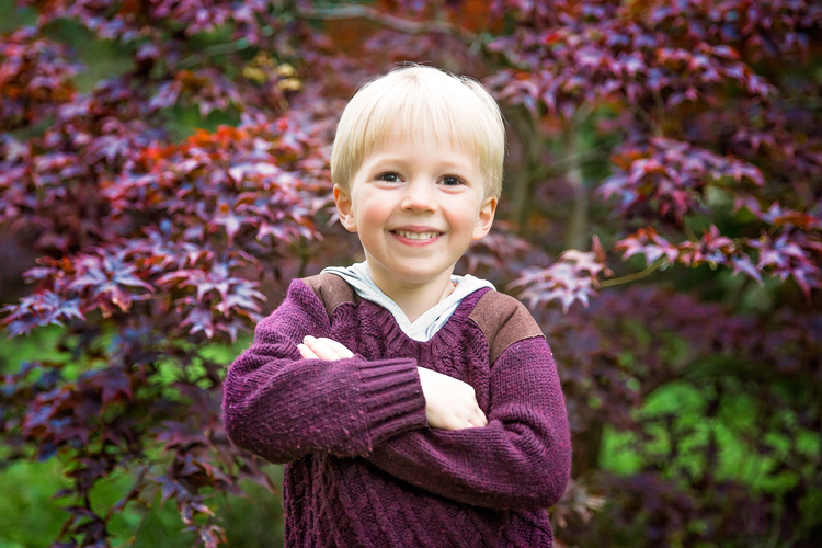
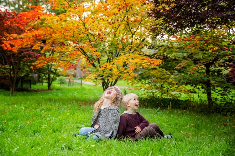
    For family photos, autumn can provide you with amazing backdrops, and a variety that can be matched by no other season. For this article, I took my own two children for a walk in the woods to do some fall portraits. Photographing other people’s children is always easier than your own, so I thought it would be a great exercise, and we may also even get some nice pictures of our own children for once. So here are some fall portrait tips to get you started.

    Gannon-Studios-2

    Autumn Portraits 4

    Preparation

    Preparation is the key to any successful shoot. Of course ensuring your camera equipment is charged, you have clear cards, and your gear is clean seems like a no brainer, but it’s often the fundamentals that we overlook. Clearing cards can be daunting for those starting out, but just double check that you have downloaded everything, then use the Format function (in the camera) that will give you a completely clear card. There are rumors that deleting single images in-camera can lead to corrupting the card, so it’s best to use the Format function.

    Make sure you check the weather. Here in the UK, as well as many other parts of the world, it can change quickly at this time of year. Check with a few sources about local weather. It’s such a pain to get everyone together, get in the car and travel for some time, only to be rained out. Although, even rain in autumn can provide some great image opportunities, if you are dressed correctly.

    Gannon-Studios-1

    Sunrise and sunset can give us the best light. However, dragging your family out of bed for a photo shoot is always going to be tough. Aim to start your shoot about an hour before sunset. This Golden Hour is favored by many professional portrait photographers, as the light is more flattering and you may even get a great sunset. You can look up sunset times for your local area. It can be surprising how early it gets dark, and you want at least a good hour of shooting before the sun goes down.

    Make sure everyone dresses appropriately. It’s getting colder, and it’s one less thing to worry about if everyone is warm during the walk back to the car. While we still think it’s lovely and warm outside, believe me, it gets cold pretty quick when the sun starts to go down. Also have a change of clothing available for everyone. It can be wet and muddy and some of us are prone to falling over!

    Make sure you bring snacks and drinks. Especially if you are photographing children. They will get bored and hungry way before you do, so anything to help keep them going while you master that perfect shot the better.

    Editor’s note: if you are photographing other people’s kids have the parents bring snacks that the kids like. Never give food to other people’s kids without asking the parents, there may be allergies or special diets.

    Clothing advice for portrait photographers:

    Clothing choices are always important for portraits, but in fall it can really make a difference to your image. Try and have everyone wear natural tones that will either compliment the colours of the leaves and trees, or blend in. My son wore a dark red sweater, as we knew the area had very vivid reds in the trees. My daughter wore black and white which is a timeless combination that blends in well. My son also wore a grey hood that coordinated with his sister.

    Autumn Portraits

    Try and avoid clashing patterns or colours amongst your subjects by discussing it in advance, and maybe come up with a colour theme that everyone can include. Also avoid t-shirts or sweatshirts that have dominant logos. If he could, our son would have Star Wars logos on everything. This can of course date an image, and is also very distracting.

    Try and have a few changes of clothes available. This will not only provide variety in your images, but in the wet and possibly muddy conditions, you may well need them, especially for any children.

    Location

    Location is essential for any shoot, but for autumn you want to find the best colours and textures you can. Things can change really quickly. The leaves can change over a couple of days, but it often doesn’t happen until later than you think. For this article, we actually struggled to find autumn colours despite it being early October. You also need to check that the leaves are still there. A heavy wind can take them down overnight, so don’t wait too long after you have scouted your spot to shoot.

    We searched online for arboretums, these are great places that have collections of interesting trees. Of course, your local forest would be great too.

    Autumn Portraits 2

    Use social media for location tags to see what other people have photographed over the last few days, at or near the same location. Instagram, Twitter and even Trip Advisor are fantastic for this. You may also get to see a great place that you may not have found otherwise.

    The technical bits

    For my shoot, I was using a Canon 5D Mark 3 and took the 24-70mm f/2.8 Mark 2, and the 70-200mm f/2.8 Mark 2. These of course are professional cameras and lenses, but any modern camera whether a DSLR, point and shoot, or even a smart phone should provide great images. In fact, I find the iPhone 6 has great range of colours and light.

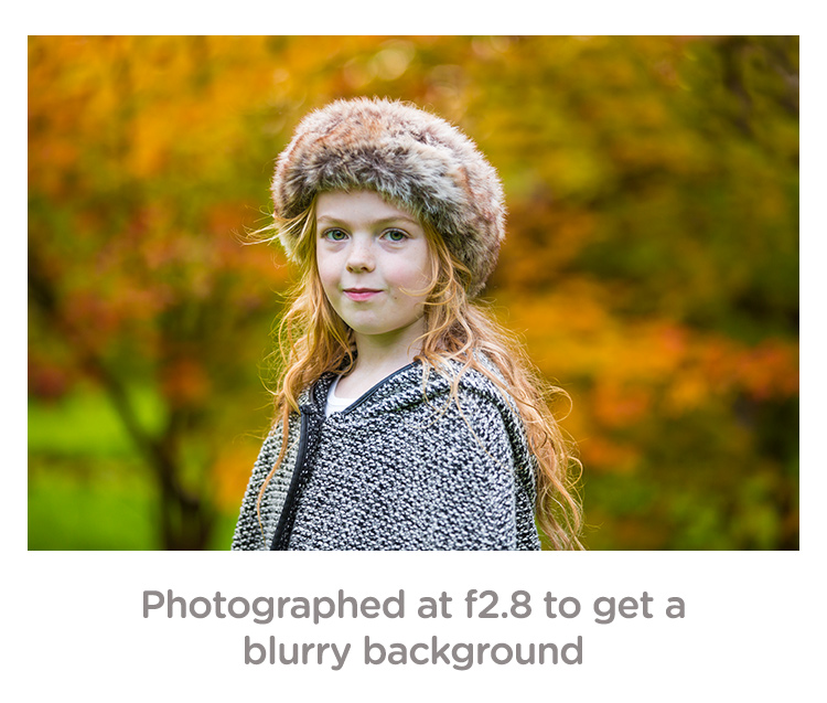
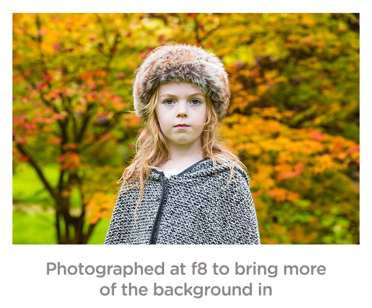
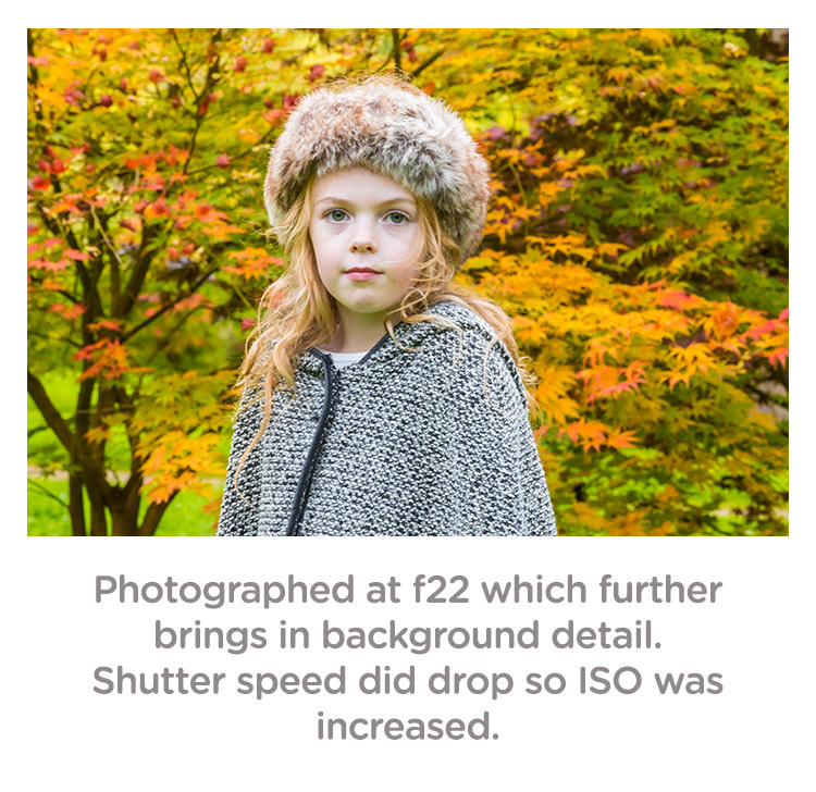
    If you are using a DSLR, you can really play with the aperture (f-stops) to get a range of looks without moving location. To get a super blurry background, set your aperture to the lowest number. On my lens, this is f/2.8. Some lenses can go lower and some are limited to higher setting. Even with a kit lens that comes with your camera, you should be able to get to around f/5. If you want the leaves and your family in focus, try increasing the aperture to f/8 or even f/22. Do be careful though because at f/22 your shutter speed will be significantly slower, and you may well need to increase your ISO to compensate.

    Depth of field guide f2 8

    Depth of field guide f8

    Depth of field guide f22

    I photographed the images above in Aperture Priority (AV on a Canon, and A on a Nikon). This is when you decide the aperture and the camera sets the shutter speed. Keep an eye that the shutter speed doesn’t geet too slow (1/60 as a minimum). If it does, increase your ISO.

    Personally, I always shoot in RAW. For me it just allows me that flexibility afterwards. However, with modern cameras, JPEGs are very versatile, and don’t break up as much as they used to. Some cameras allow you to capture a RAW and JPEG at the same time. This is great so you have the RAW to go to if need be.

    White Balance: for these images, I shot in cloudy White Balance. It warmed up the colours, although I did alter these in Camera RAW processing later, it did give me a great starting point. If you are using your manufacturer’s own software, you should be able to change the white balance quite easily.

    Getting natural smiles and reactions from children

    You know your own children very well. You know the songs they like and what gets them interested. However, they are also very comfortable around you, and may decide to walk off just as you get your camera settings right. Here are a few tips to get a natural reaction.

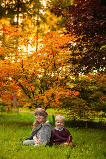
    As in the images in this article. I asked my children to laugh hysterically for no reason at all. This got a huge overreaction which although is a great animated image, is not what we were after. What did happen is that as they calmed down from that, they had natural smiles. They thought it was funny and continued smiling naturally.

    Posing Idea 1

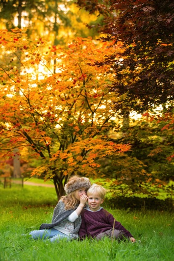
    If you have more than one child, ask one to tell the other a secret. This will always get them giggling.

    Posing Idea 2 Posing Idea 3

    With just one child, ask them to tell you or the camera anything that they are interested in. Our son will talk for hours about anything Star Wars or Marvel. With our daughter we can ask her math questions, which gets a range of reactions.

    Sing them a song but get it wrong. For some reason, this is the funniest thing ever to kids. Basically, do anything to distract them or get a reaction, but not by saying CHEESE!

    Editing your images

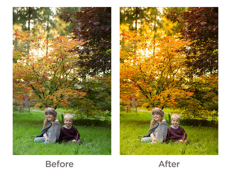
    For editing, I used Camera RAW processor which is part of Photoshop. However, most cameras come with editing software, or you can use something like Lightroom which is quite affordable. I actually kept the editing quite simple. The main thing I did was to go to the saturation panel and increased my Reds, Greens and Yellows. This really brought some punch to the image.

    Before and After Editing

    And finally…

    Please print your images in some way. As parents, we are great at taking images, but not doing anything with them. Don’t worry about capturing the most amazing image, just get something that captures your family and print it some way.

    googletag.cmd.push(function() {
    tablet_slots.push( googletag.defineSlot( “/1005424/_dPSv4_tab-all-article-bottom_(300×250)”, [300, 250], “pb-ad-78623” ).addService( googletag.pubads() ) ); } );

    googletag.cmd.push(function() {
    mobile_slots.push( googletag.defineSlot( “/1005424/_dPSv4_mob-all-article-bottom_(300×250)”, [300, 250], “pb-ad-78158” ).addService( googletag.pubads() ) ); } );

    The post Tips for Doing Fall Portraits by Sean Gannon appeared first on Digital Photography School.


    Digital Photography School

  • 3 Tips for Taking Photos of Flowers

    Flowers are everywhere, and sometimes just the thought of going out to take pictures of their pretty petals can seem downright cliché, because so many people do it. However, one reason flower photography is so popular is because these kinds of pictures can capture incredible beauty, without a great deal of effort. It’s fun to go outside and document the incredible array of colors that can be found in flowers, but it’s just as common to look at your photos later and discover that they might not be as good as you had hoped.

    Fortunately there are a few easy steps you can take to not only improve your own flower photography, but help you get out and enjoy the beauty of nature while you’re at it.

    3-tips-flower-photos-coneflower

    50mm f/1.8, 1/640 second, ISO 200

    Everyone has their own unique style when it comes to photography, and taking pictures of flowers is no exception. Some people like flowers in isolation, whereas some like to see a whole field of blossoms in one shot. Some like to use techniques such as over-saturation or selective coloring, while others find these approaches distasteful. Therefore the following tips are not to be considered universal, or the be-all-end-all when it comes to taking pictures of flowers. They are a few lessons I have learned over the years that work for me, and hopefully they will give you something to think about the next time you step out to capture the beauty of nature.

    Give your image a clear focal point

    All good photos have a subject, or something on which the viewer’s attention is to be fixed. Some pictures can have multiple subjects, but rarely will you find a good image (flower or otherwise) with no subject at all. Where flowers are concerned, you might want to focus on just one flower, or have your viewers see many of them at once, but at the end of the day it should be readily apparent to anyone who sees your photo just what they are supposed to be looking at.

    For example, the following image is decent, but as a viewer it’s difficult to notice the flower in the center amidst all the other blooms in the background. In essence, there is no one clear focal point even though there is a flower in the center of the frame.

    3-tips-flower-photos-dof-wide

    50mm f/4.8, 1/60 second, ISO 100

    There are several things that can be done to fix the problem, but one of my favorite techniques is to simply use a wider aperture on my lens. I re-shot the same image using a much bigger aperture, which resulted in a shallow depth of field, rendering the flower in focus while the rest of the background shows up as a silky smooth blur. Looking at the second image, there is no doubt at all as to what the subject of the photo is, and what viewers are supposed to focus their attention on.

    f/1.8, 1/350 second, ISO 100

    50mm f/1.8, 1/350 second, ISO 100

    Another way to make sure your image has a clear focal point is to utilize colors that complement or contrast with one another. The purple flowers in the image below stand out because they contrast quite nicely with the green background, which draws the viewer’s attention immediately and creates a nice focal point for the picture as a whole.

    NEED EXIF

    50mm f/1.8, 1/200 second, ISO 100

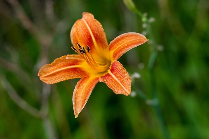
    You can use multiple techniques to achieve the desired effect, such as the picture below of an orange lily that stands out clearly from the background thanks to contrasting colors, while also using a wide aperture to make the background appear blurrier. Be careful not to use an aperture that is too wide, though: depth of field can be a fickle mistress, and shooting at f/1.8 or f/1.4 might seem like a good idea, until you realize that only half of your flower is in focus and the rest is a fuzzy mess.

    NEED EXIF

    50mm f/2.8, 1/400 second, ISO 200

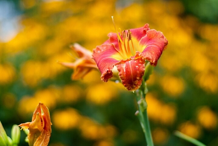
    This last picture (below) is similar to the one above, but ultimately fails because there is no obvious focal point. Notice how the flower itself almost blends in with the background, and the inclusion of two additional blossoms just behind the red one and in the bottom corner of the frame. These problems cripple the image and keep it firmly in my “Rejected” category in Lightroom, but I’m using it here as an example of what not to do.

    NEED EXIF

    50mm f/1.8, 1/1000 second, ISO 200

    I could have easily fixed this picture by looking at the flower from a different perspective, but alas, I did not and am left with an image that is almost unusable because the subject, what should be the focal point, blends in so much with the rest of the image that it’s difficult for the viewer to know what to see. Finding a clear focal point for your images might take a bit of practice, but the results will be well worth your efforts.

    Find the right camera angle

    It’s not uncommon to see people taking pictures of flowers with their cameras pointed down from eye level. While doing so may produce decent results from time to time, you will often find that selecting a different angle will yield much more interesting results. The red blossom in the picture below was a few feet off the ground so I did what most people would do: I pointed my camera down and pressed the shutter button.

    f/1.8, 1/320 second, ISO 100

    f/1.8, 1/320 second, ISO 100

    There’s a couple of things wrong with this picture, but to me the most critical problem is that it’s just not very interesting. Looking at flowers from your normal eye level can sometimes produce pleasing photos, but often you will get better results if you move around a bit, and seek out a more interesting angle. After taking the initial picture I crouched down and shuffled among the plants for a bit until I found a better perspective from which to shoot the photo.

    3-tips-flower-photos-angle-comparison-side

    While not perfect, this is certainly a much better composition than the original shot, and it shows the flower in a whole new light. You can not only see more detail on the petals, but it stands out more from the background, and even utilizes a bit of foreground elements to add depth. The drop of water on the left side which is an afterthought in the original, is now featured quite prominently, and adds a nice accent to the rich red tones of the flower petals. All this was made possible because of a quick and simple change in my perspective. While this doesn’t always guarantee better photos it is a fun way to try something new, and even explore a bit more of your surroundings than you otherwise might.

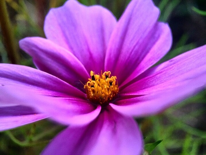
    Shooting macro-style pictures is another fun way to get creative with choosing the angles on your shots, provided you are willing to look for some unusual perspectives. My cousin Beth took the following picture of a cosmo flower with nothing more than her iPhone 5s, and a $ 50 Olloclip lens attachment, that lets her get extraordinarily close-up photos of just about anything. By shooting from a creative perspective instead of straight down, and using complementary colors of yellow and purple, she was able to take a gorgeous picture that might otherwise have looked quite mundane and ordinary. Her Instagram account is filled with images just like these that she took with her phone, which also illustrates that you don’t need to spend a great deal of money to get incredible photos of flowers.

    3-tips-flower-photos-iphone

    Compose with the whole scene in mind

    Taking good flower pictures is about more than just a few pretty petals, but everything in front of and behind them as well. Finding creative ways to avoid conflicting colors between your subject and the background or foreground is nice, but you can step things up a notch by actively using these elements to enhance your shots.

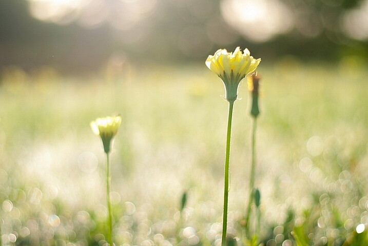
    For example, I had many options available when I took the following shot of some yellow kosmeyas. I could have just focused on the flower in the foreground, but by taking all the other elements of the scene into account, I was able to create a much richer and more interesting picture. I shot into the early morning sun, before the dew had evaporated, so I could make creative use of backlighting, and was so pleased with the result that a large print of this is now hanging in my living room.

    3-tips-flower-photos-morning-sun

    50mm f/2.8, 1/750 second, ISO 100

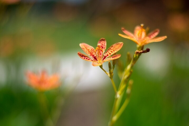
    Even the background elements themselves can add interesting colors and patterns that you might not otherwise consider, as long as you pay attention when shooting, and use a careful eye with regard to composition. As I took the photo below, I saw a sidewalk running through the background, so I spent several minutes not just adjusting my camera settings, but also looking at the sidewalk and using that as an intentional compositional element. I like the way it cuts horizontally through the image and serves to accentuate the oranges in the flower at the center.

    3-tips-flower-photos-bokeh-dark-orange

    50mm f/1.8, 1/8000 second, ISO 100

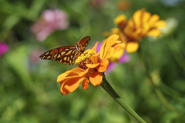
    I want to leave you with one final example when I did not use this technique, and was quite disappointed with the photo that I almost got. Several months ago I spent a while following a butterfly around on a sunny day. When it finally landed on a flower and let me get close enough to take a photo, I eagerly snapped away without taking the rest of the scene into account.

    3-tips-flower-photos-insects-butterfly

    50mm f/2.8, 1/3000 second, ISO 200

    If only I had scooted mere inches to the right I would have isolated the flower and the butterfly against a nice green background, but instead I did not take the whole scene into account, and got an image with no clear focal point and a big splotch of blurry orange right behind my subjects. I could have used the background elements to my advantage, but instead I was careless and overeager. This was actually a good learning experience for me though, as it helped me take much better photos in the time since.

    As I mentioned at the outset, these are just a few examples and tips that you could employ to get better flower pictures but I’m curious to find out what has worked for you. What are your favorite tips and tricks to get better images of flowers? Leave your thoughts in the comments below.

    googletag.cmd.push(function() {
    tablet_slots.push( googletag.defineSlot( “/1005424/_dPSv4_tab-all-article-bottom_(300×250)”, [300, 250], “pb-ad-78623” ).addService( googletag.pubads() ) ); } );

    googletag.cmd.push(function() {
    mobile_slots.push( googletag.defineSlot( “/1005424/_dPSv4_mob-all-article-bottom_(300×250)”, [300, 250], “pb-ad-78158” ).addService( googletag.pubads() ) ); } );

    The post 3 Tips for Taking Photos of Flowers by Simon Ringsmuth appeared first on Digital Photography School.


    Digital Photography School

  • The Fine Line Between Travel Photography and Having a family Vacation

    A simple Google search for travel inspiration yields thousands of beautiful images and motivational quotes. Words like, “The Best University is to travel”, “We must take adventures in order to know where we truly belong” and “To travel is to live a full life” flash across your computer screen amidst jaw-dropping travel photography imagery. It brings forth such great feelings of wanderlust and longing to hit the road.

    However, for those of us who travel with families and/or young kids there is a nagging voice somewhere in the back of our heads that speaks up and says, “Be practical, can you really make this journey with the kids?”. Then if you add to this mix, a parent who is very emotionally attached to his or her camera, you have just stirred up a pot full of trouble for yourself.

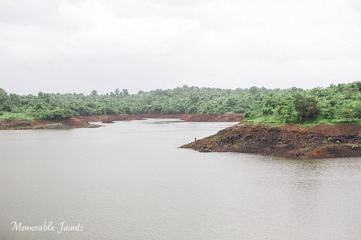
    Landscape Image Near Bombay Memorable Jaunts for DPS

    Being my family’s designated photographer, and having spent the past two months traveling across my home country of India, I experienced much of these same emotions on a day to day basis. India is a country like no other, where every part of the country has such a strong impact to the senses. It is big, busy, loud, and colorful – and is a photographer’s delight. The parent in me wanted to experience this magical journey with my family, and see my beautiful country through their eyes. Whereas the photographer in me was on a creative high and I wanted to document each and every thing I was seeing through my mind’s eye, and my camera’s viewfinder. I constantly struggled to find the right balance between being a mom, and being a professional photographer. 4000+ pictures later, I feel like I finally figured out what worked for me!

    Memorable Jaunts Finding Balance as a photographer Article for DPS-1-2

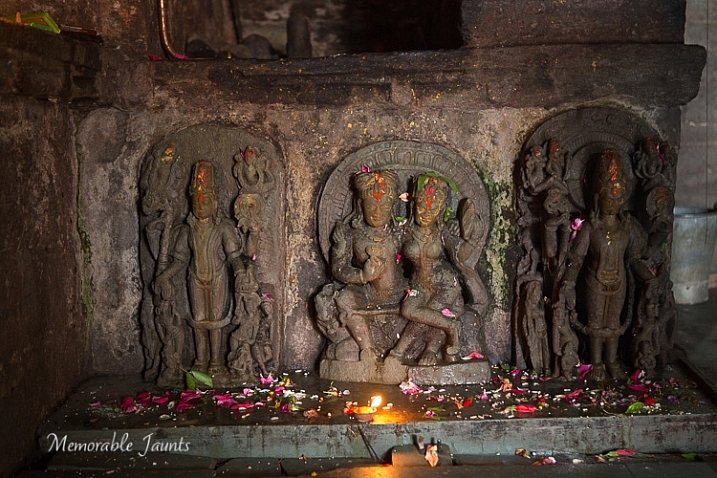
    A quick detour on our road trip led to an ancient temple where I was able to take some amazing and interesting pictures inside the inner sanctum.

    Research locations for photo opportunities ahead of time

    Just like kids, we adults too crave structure and routine, especially when it comes to photography assignments. Just like you would carry a shot list for a wedding photography gig or a commercial assignment, knowing what to expect with every place you visit gives you a certain peace of mind. This is particularly true if you are visiting famous locations and monuments. I found that often in such places photography was not allowed, or you needed special permission, or had to pay a fee.

    Research your travel destination as much as you can. Look for information online, or even ask in photography forums specific to your needs. I learned early on in my trip, that most religious monuments and places of worship don’t allow any type of photography. Even cell phones are not permitted. So I would often leave my gear at home, or in the car, and just enjoy the location with my family.

    Minimum gear for maximum effect

    Packing for months on the road is never easy, especially when you have a ton of equipment, and suffer from an acute case of separation anxiety with your gear. Once you have researched your travel destination and know what types of imagery to expect, only pack the appropriate gear. Maybe even challenge yourself to only use certain types of lenses and cameras. The more practical you are about your gear, the less frustrated you will be for taking stuff you don’t end up using. My goto setup was my Canon EOS 5D MK III and Canon 24-70mmL lens. I used that combination 75% of the time when I was traveling. I found that I could switch easily from photographing wide angle landscape shots, to narrowing in on my kids playing effortlessly with my zoom lens. I also carried my Canon 70-200mmL lens, but found it was very impractical in terms of its weight. Additionally, professional DSLRs and multitude of lenses tend to get heavy and uncomfortable to lug around for a 20 day road trip, and several flight journeys. If you are going off the grid, or visiting remote places, err on the side of caution, and perhaps travel with minimal gear like a small point and shoot camera.

    Set aside some “me” time with just with your camera

    Memorable Jaunts Finding Balance as a photographer Article for DPS-1

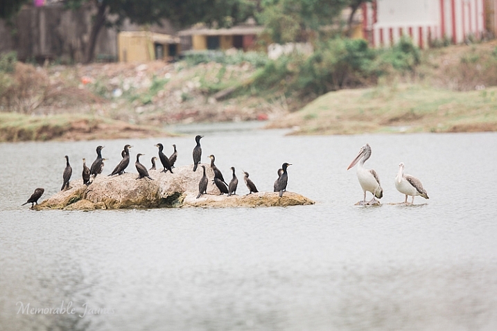
    During a ‘me’ time photowalk close to my home in Chennai, I spent 30 minutes photographing these birds without any interruptions or disruptions!

    The deal I stuck with my family is that at every new place we visited, I would get one hour just to be with my camera. Any photography assignment specific pictures would be taken at that time. The rest of the day was time spent with my family, and capturing those moments on camera sparingly. There were times when the camera was completely banned because I really wanted to treasure the moments, and not just focus on documenting the experience. And guess what, I found I was a much happier, and nicer person, at the end of the day!

    Engage your family in your photo trips

    Do you have old outdated gear sitting in your gear cabinet? You know those old first generation DSLRs that you will probably have to pay someone to take off your hands? Use them to get your family engaged in photography. My kids share my old DSLR with a kit lens, and they love it. They love playing photographer, and some of the images they capture are so adorable. I always make it a big deal to praise their budding photography skills, and in turn, they are generally more tolerant when mom wants to spend an extra 10 minutes photographing the waves crashing against the rocks at sunset (because it is the most magical sunset ever!)

    Memorable Jaunts Finding Balance as a photographer Article for DPS-1-3

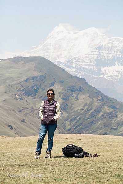
    A rare image of me as taken by my daughter! – this was during a four day hike in the mountains, and it’s the only picture I have to prove that I was there too!

    Memorable Jaunts Finding Balance as a photographer Article for DPS-2

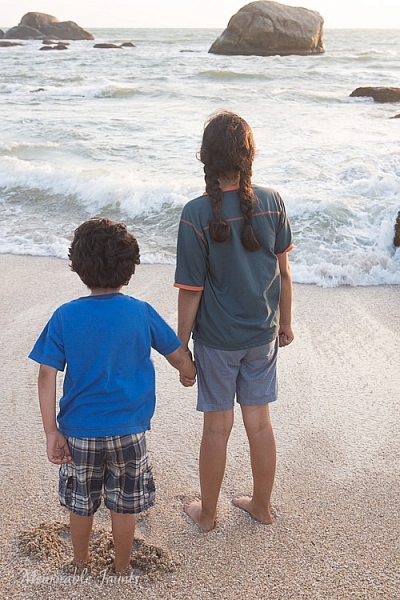
    But 10 days later, this was the best I could get of them! – No amount of negotiation could get them to turn around and face me.

    Make memories and not pictures

    Give yourself permission to not take any pictures occasionally. Put the camera away and just enjoy the experience of being on vacation. After all, you have probably spent a lot of money, and precious time, to get to your destination. Soak in the essence of the space and place, and make memories that will last a lifetime.

    After my long summer break, I still felt that I never really had any time off. To me, every minute was a working one, whether was I being a full-time mom, or a travel photographer. While I did walk away with some amazing imagery, a part of me regretted not spending more time with my family. What are some of your strategies for finding a good balance?

    googletag.cmd.push(function() {
    tablet_slots.push( googletag.defineSlot( “/1005424/_dPSv4_tab-all-article-bottom_(300×250)”, [300, 250], “pb-ad-78623” ).addService( googletag.pubads() ) ); } );

    googletag.cmd.push(function() {
    mobile_slots.push( googletag.defineSlot( “/1005424/_dPSv4_mob-all-article-bottom_(300×250)”, [300, 250], “pb-ad-78158” ).addService( googletag.pubads() ) ); } );

    The post The Fine Line Between Travel Photography and Having a family Vacation by Karthika Gupta appeared first on Digital Photography School.


    Digital Photography School

  • Understanding Natural Light Part 1: Quality of Light

    Light has different qualities, and by understanding those differences and using them in your favor, you can become a better image maker. From my point of view, the best place to start improving your ability to work with light is by learning its most basic form, which is natural light.

    quality of light - soft light portrait

    Therefore, this article is the first of a series that will focus on understanding how to work with natural light. We will:

    • Explore the difference between harsh (hard) and soft lighting and each of their pros and cons.
    • Understand how to use color to serve the visual story we want to portray.
    • Learn how the direction and intensity of light affects the final image.

    Even if you are a studio photographer, who wishes to work exclusively with strobes and flash, this article is crucial for you. If you manage to understand how to work with natural light, this knowledge can be later applied to any genre or style of photography. As a portrait photographer, in my explanation and examples, I will focus on working with natural light in portraits. However, as mentioned, once you understand the concept, this can be applied to any genre or subject.

    George Eastman, the American entrepreneur that founded Kodak (and who probably knew a thing or two about photography), said, “Embrace light. Admire it. Love it. However, above all, know light. Know it for all you are worth, and you will know the key to photography.”

    What do you think that Mr. Eastman meant by “know light. Know it for all you are worth.”? From my point of view, he meant that as photographers, light is our raw material. It is like letters to the writer and notes to the musician, and as photographers, we must understand how this raw material works and behaves under different conditions.

    quality of light - soft light

    Quality of light – Understanding hard and soft light

    In this first chapter we will:

    • Understand the differences between soft and hard (or harsh) light.
    • Explore the concept of “Good Light” versus “Bad Light.”
    • Learn about common challenges faced when working with natural light, and how to overcome them.
    • Suggest exercises that you can use to practice the explained concepts and techniques.

    Soft lighting

    Soft light is characterized by low levels of light, lack of shadows, a small and gentle difference between dark and bright areas.

    soft lighting

    Soft lighting situation is characterized by the lack of shadows and (as you can see in this image), cold hues during cloudy weather, which fit the greens and blues in this situation.

    When does it happen? Depends on the weather and your location on the globe (it won’t happen at the North Pole, during winter), but you will usually encounter a soft lighting situation, at the edges of the day (also referred to the Golden Hours), just after sunrise and just before sunset (how much time before and after, is again dependent on your location). Besides the edges of the day, you can find soft lighting conditions under a cloudy or overcast sky.

    Challenges: Soft light is not suitable for every portrait, it all depends on what you wish to evoke (in terms of emotion and mood) in your image, as I will describe later. Another issue is the level of light, which may be too low. So, it is very important that you pay attention to your shutter speed and increase it manually, to avoid blurriness.

    Hard/harsh lighting

    Hard light is characterized by strong levels of light, long and deep shadows, a big difference between dark and bright areas (high dynamic range). Because of contrast, harsh light will strengthen the current situation in the field, in terms of color. Saturated and rich colors will seem even more intense, and dull colors will seem even more so.

    hard or harsh lighting

    In harsh light, there is a huge contrast between the dark and bright areas in the image and details might get too bright or too dark – but this is perfectly fine!

    When do you have hard light? It also depends on the weather and location, but usually, you can encounter harsh lighting situations during the day, about two hours after sunrise, until one hour before sunset (middle of the day).

    Challenges: the main problem with the harsh lighting is the huge difference between the dark and bright areas (also known as contrast). Contrary to our sophisticated eyes, the camera is (still) not able to cope with this difference. So, the result will be the loss of details in your image, as they become too bright or too dark. For example, you might get a great exposure on your subject while losing detail in the background or vice versa.

    Some photographers mistakenly think that this condition (the loss of details) is due to an error they made in operating their camera. So, the first step to the solution is to understand the problem. If you are shooting under harsh light, that lost of details is something that you cannot change (unless you use flash or post-process the image), because it is due to the contrast between the dark and the bright areas. So, changing the aperture, shutter or ISO, won’t help correct it.

    “The artist vocation is to send light into the human heart.” – Robert Schumann

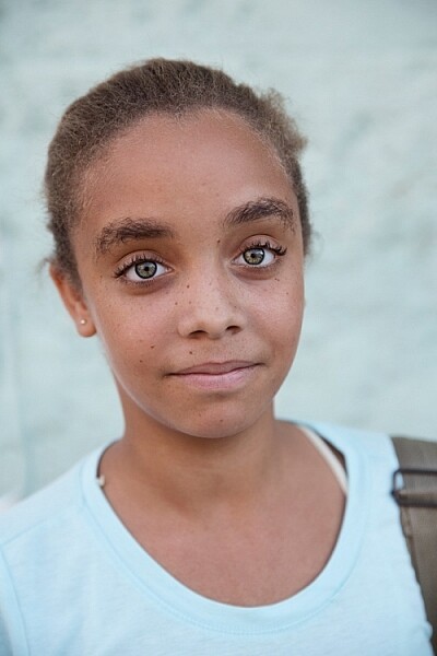
    Forget about “good” lighting

    Due to the challenges I have mentioned, most photographers avoid shooting under harsh lighting condition. They prefer to work under soft lighting, which is usually referred to as more pleasing to the eyes. However, it is not always the right choice for your portrait.

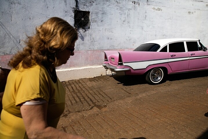
    hard lighting

    That day in the streets of Havana was extremely hot. So, I used the harsh light to evoke that sense.

    The thing to remember is that you want to match the light to the visual story you want the portrait to tell. As we just learned, each lighting condition has its own qualities and characteristics. While the soft light from a setting sun might be best for a romantic couple’s photoshoot, it may be less suitable for a portrait of a hardworking man outdoors. Let’s stop using the concepts of good and bad lighting, and start thinking in terms of more suitable, or less suitable lighting.

    Planning

    To work under the most suitable lighting conditions, you should plan for it instead of just wishing for it. Check the weather forecast, as well as the sunrise and sunset times. For example, if you need soft lighting for your project, you should know exactly where to be, and what to do around sunrise and sunset every day. Do not waste even a minute on sleeping when there is suitable light out there.

    1. Matching the time of day to desired mood – You should choose the most suitable time to go out and work, according to your desired results.

    2. Matching the visual story to the given lighting conditions – I often choose the visual story, according to the available light given to me on location.

    soft light

    Flexibility

    Sometimes even with careful planning, the weather changes and therefore, so does the natural lighting condition. That’s what happened to me when I was working on an assignment in southern Thailand. In a place known for pristine beaches and postcard-like islands, the mighty monsoon decided to make an appearance and show everyone who’s boss. At first I was afraid that I wouldn’t be able to provide the images that I had in mind to my editor.

    However, I know one thing for sure: you cannot fight the light. So I changed my plans and headed to the small village of the Chao Leh (Sea Gypsies) community. This visit (which ultimately became a seven-year project), allowed me to discover a different, much less touristy side, of that area. I discovered a story about a struggling community of sea drifters, that never fully recovered from the tsunami of 2004.

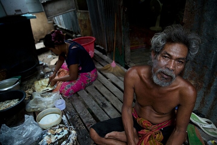
    soft light be flexible

    The Chao Leh (Sea Gypsies) community in southern Thailand. The stormy weather, with its soft, low, blue-colored light gave the images a sense of “cold winter,” which was a perfect match to the feeling I wanted to evoke in that story.

    A few days later, the clouds gave way to the sun and I was back to my original shooting list. When I sent the images back to my editor, she was thrilled with the new direction and decided to run a full story about this community.

    “What makes photography a strange invention is that its primary raw materials are light and time.” – John Berger

    In conclusion, do not limit yourself to working exclusively under soft light, as both harsh and soft light summon great challenges and opportunities. As a visual storyteller, aim to always try and match the story you are trying to tell, to the light you are using, to bring that visual story to your viewers. The key element is planning, with a bit of flexibility, and some room for serendipity.

    Practice working with quality of light

    Exercise #1 – using over exposure compensation while working with a harsh light condition.
    • Time: A sunny afternoon.
    • Location: Any outdoor location – from your backyard to the local park.
    • Step one: Place your favorite model (it can be a friend, a family member, your partner, or a beloved dog) under the midday sun.
    • Step two: Take a moment to understand how the light illuminates your subject’s face. Do you notice the high contrast between dark and bright areas (lit forehead versus dark eyes)?
    • Step three: Work in Aperture Priority mode (A in Nikon and AV in Canon), and use exposure compensation (overexpose), until you manage to bring more light to your subject’s eyes. Don’t panic, as you will probably burn out (lose details) the background, and parts of the subject’s face. It is okay. This exercise is about being able to stop reviewing your images through the histogram tool and highlight alerts, and start thinking in terms of story, and if that story is working or not.
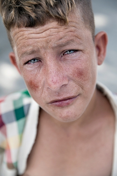
    hard light portrait

    Harsh light helped me to create a sense of “roughness” in this portrait, which I felt that support the visual story I wanted to tell.

    Exercise #2 – switch to black and white while working under soft light conditions.
    • Time: A cloudy day or the edges of the day.
    • Location: Any outdoor location – from your backyard to the local park.
    • Step one: Approach a stranger and ask his or her permission for a portrait. Perhaps you can send the final image by email as a token of appreciation.
    • Step two: Switch to Monochrome mode, which is black and white photography (under Picture Style in Canon and Picture Control in Nikon).
    • Step three: Take a close-up portrait (torso and face only). Note how the light gradually illuminates the subject’s face, creating soft pockets of shadows that evoke a sense of depth.

    black and white in soft light

    The author would like to thank Nicholas Orloff for his assistance in writing this article.

    googletag.cmd.push(function() {
    tablet_slots.push( googletag.defineSlot( “/1005424/_dPSv4_tab-all-article-bottom_(300×250)”, [300, 250], “pb-ad-78623” ).addService( googletag.pubads() ) ); } );

    googletag.cmd.push(function() {
    mobile_slots.push( googletag.defineSlot( “/1005424/_dPSv4_mob-all-article-bottom_(300×250)”, [300, 250], “pb-ad-78158” ).addService( googletag.pubads() ) ); } );

    The post Understanding Natural Light Part 1: Quality of Light by Oded Wagenstein appeared first on Digital Photography School.


    Digital Photography School

  • A Quick Guide to Email Marketing for Photographers

    Photographers are turning to social media these days to try and get their names out there and reach their target audiences. Being active on social media is critically important for small businesses these days, but more traditional online marketing tactics, like email marketing, are still very useful. Ignoring email as a part of your marketing campaign could cost your photography Continue Reading

    The post A Quick Guide to Email Marketing for Photographers appeared first on Photodoto.


    Photodoto

  • Steps for Getting Started in the Lightroom Develop Module

    Lightroom Develop module

    If you have read my earlier articles about Lightroom you will already understand how it differs from Photoshop and how it uses a database to organize your photos as well as process them.

    Lightroom has evolved into a powerful raw processor, and it is now possible to process most of your images in it. You only need to use other software (such as Photoshop or a plug-in) when you reach the limits of what Lightroom can do.

    Raw processing takes place in the Lightroom Develop module. If you haven’t used Lightroom before you may find the Develop module layout confusing, especially if you are used to pixel editing software like Photoshop. Lightroom has no layers or blending modes, and there is no real set order in which to do things. But don’t worry if it makes little sense at first – this article will help you come to grips with the basics, and make a start on processing your raw images.

    Note that you can also use Lightroom to process JPEG and TIFF files, although some of the options Lightroom gives you differ slightly. I have used raw files in this article.

    The Lightroom Develop Module

    To start, go to the Library module and select the photo you want to process. Click on Develop in the Module Picker, or press D on the keyboard, to open the image in the Develop module.

    The Develop module is split into sections. There are panels on the left, some more on the right, and the Content Window in the middle, where the photo you are currently working on is displayed. Just like the Library module, you also have the Module Picker at the top and the Filmstrip at the bottom.

    Lightroom Develop module

    You may have noticed that there is no Folders panel (left side) in the Develop module. This is Adobe’s way of encouraging you to use Collections. So if you are not doing so already, now is time to get in the habit.

    We don’t need the Module Picker, left-hand panels, or Filmstrip for this article, so when you’re ready click on the white arrows at the edges of the screen to hide them.

    Your screen should look something like this, with the right-hand panels and the histogram available on the right, and the photo you are working on occupying the rest of the screen.

    Lightroom Develop module

    If you do not see the toolbar below your image hit T on your keyboard to show/hide it.

    The right-hand panels contain most of the tools that Lightroom has for processing raw files. Today we are going to look at three of these:

    Lightroom Develop module
    • Camera Calibration panel
    • Lens Corrections panel
    • Basic panel

    These panels are important because they are the foundation of the processing work you do on an image.

    The Camera Calibration panel

    The Camera Calibration panel is the ideal starting point for processing an image. When you come here you are looking for two important settings.

    Process: Should be set to 2012 (Current), which is set by default.

    Lightroom Develop moduleProfile: Should be set for the most appropriate setting for your photo. The options you see here depend on the camera used to take the photo. All cameras have profiles that you set to determine the treatment of the image. Each manufacturer has different names for this setting (for example, Canon calls it Picture Style, Nikon Picture Control and Fujifilm Film Simulation).

    Lightroom should show you most of the settings you have available on your camera plus another one called Adobe Standard. Your job is to pick the profile that is most suited to your photo.

    I’ll assume you know your own camera settings well enough to do so. If there’s any doubt, just move through the available options and pick the one that has the most suitable effect. In this case I selected Camera Velvia/Vivid to bring out the strong colours in the photo.

    Ignore the colour sliders in the Camera Calibration panel for now, they are for advanced users.

    The Lens Correction panel

    There are a lot of things you can do in the Lens Correction panel, but to get started you only need two:

    #1 – Enable Profile

    Lightroom Develop module

    Note that this screen shot is from a photo taken with a Canon camera.

    Click Profile and tick the Enable Profile Corrections box. Select your lens using the menus underneath. Lightroom contains profiles for most commonly used lenses (the full list is available here).

    Set the Distortion slider to 100 (the default). Lightroom uses the selected profile to remove any barrel or pincushion distortion caused by the lens.

    The default for the Vignetting slider is 100. This lightens the edges of the photo to compensate for the vignetting effect caused by using your lens at wide apertures. You may wish to include the vignetting for aesthetic reasons – in which case move the slider left until you get the effect you want.

    Some Raw files, such as those created by most Fujifilm cameras, have an embedded profile that Lightroom uses to correct barrel and pincushion distortion. If this is the case, and you are using Lightroom 6 or Lightroom CC, then the message Built-in Lens Profile applied is displayed at the bottom of the panel. If you see this message, don’t tick the Enable Profile Corrections box. Lightroom doesn’t have a profile for your lens and you won’t be able to find it.

    Lightroom Develop module

    In earlier versions of Lightroom the Built-in Lens Profile applied message isn’t displayed, even if your Raw file has a built-in profile. If you can’t find your lens in the list, it’s probably because:

    a. The lens is so old Adobe hasn’t got around to profiling it yet.

    b. The lens is so new that Adobe hasn’t had chance to profile it yet (updates with new lens profiles are released periodically).

    c. The camera used embeds the lens profile into the Raw file, and Lightroom uses it automatically. This is most common with mirrorless cameras.

    #2 Remove Chromatic Aberration

    Click on Color and tick the Remove Chromatic Aberration box. This tells Lightroom to remove any chromatic aberrations caused by the lens.

    Lightroom Develop module

    The sliders underneath are for removing purple and green fringing. They are zeroed by default, and for the moment we will leave them there, as they are a topic for another article.

    The Basic panel

    The Basic panel is where you adjust the color and tonal values of your image. These sliders can make a dramatic difference to the appearance of your photo, and there are times when you won’t need to touch any of the other panels in the Develop module.

    The White Balance sliders

    If you’re not sure what White Balance is then read our article Demystifying White Balance, but really all you need to know here is that you move the Temp slider left to make the image cooler (add a blue cast or remove an orange cast) or move it right to make the image warmer (add an orange cast or remove a blue cast).

    Lightroom Develop moduleAlternatively, you can use the WB presets: As Shot, Daylight, and so on (note: those options only appear when you are processing a Raw file). I selected Daylight for this image for a fairly neutral colour balance.

    The Tint slider is for removing green and magenta colour casts. These are usually caused by artificial lighting such as fluorescent lights.

    If none of the above options seem to work then activate the eyedropper tool by clicking on the eyedropper icon and click a neutral grey or white area in the photo. Lightroom analyzes the pixels underneath the cursor and adjusts the White Balance accordingly to remove any color cast and make it neutral.

    What is the purpose of White Balance? The answer depends on what you want to do with the image. There are three basic options.

    1. Create an image with neutral colour: In this case you are trying to eliminate any colour casts present in the image.
    2. Create an image with a warm colour cast: This is something you might do with a landscape photo taken during the golden hour or a portrait (where warm tones are more flattering) to the subject.
    3. Create an image with a cool colour cast: This is something you might do if you want to impart a cold feel to the image. This would suit a landscape taken in winter, for example.

    Think about your intent when you adjust White Balance. Once you know what you want to do, you can adjust the sliders to suit.

    Lightroom Develop moduleWhite Balance is all about color and there are two more sliders at the bottom of the Basic panel that assist with controlling colour, they are called Vibrance and Saturation. Move these sliders left to reduce the color intensity, or right to increase it.

    The Saturation slider affects all hues equally, whereas the Vibrance slider has a greater effect on weaker colours than it does on stronger ones. Play around with them on a few different images to get the hang of how they work.

    Be careful with both sliders – they are usually used to desaturate colour rather than increase it (which can look false). For this photo I have left them both at zero.

    The Tonal Sliders

    Lightroom Develop moduleThe following sliders affect tones, and are used for adjusting brightness and contrast. Feel free to press the Auto button to see what Lightroom thinks you should do with your photo.

    The Exposure slider

    This slider is very simple – move it right to make the photo brighter or left to make it darker.

    The Contrast slider

    Again, a simple slider to use. Move it right to increase contrast, or left to decrease it.

    The Highlights and Shadows sliders

    Whereas the Exposure and Contrast sliders affect every tone in the photo, the Highlights sliders affects only the lightest tones and the Shadows slider affects only the darkest tones.

    Move the Highlights slider right to make light tones lighter, or left to make them darker. Move the Shadows slider right to make the dark tones lighter, or left to make them darker.

    Note: you may have notice sliders left makes your image lighter, sliders right makes it darker.

    Again, the best way to learn how these sliders work is to play with them. Move them around and observe the effect they have on the histogram (displayed at the top of the right-hand panels), and the appearance of the image itself.

    Don’t worry if you’re not sure how to read the histogram. It deserves an article to itself and I will write one shortly.

    The Whites and Black sliders

    You don’t have to worry too much about these sliders when you are just starting out. You can either leave them at the default setting of zero or let Lightroom work out what the settings should be.

    To set the Whites slider automatically, hold the Shift key down and double-click on the word Whites. Do the same to set the Black slider automatically, hold the Shift key down and double-click the word Blacks.

    If the slider settings don’t change when you do so, that means that zero is the ideal setting.

    The Clarity slider

    The Clarity slider affects something called mid-tone contrast. In simple terms, moving the Clarity slider right emphasizes texture, and moving it left removes texture by softening the image. Many photos benefit from a subtle increase in Clarity (between +10 and +20). Black and white photos, of which texture is often an important part, can benefit from greater adjustments.

    Play around with the Clarity slider on different photos to see what effect it has. Resist the temptation to make your photos pop by moving it too far to the right – it may seem like a good idea at the time but the result will simply hurt your eyes.

    My article Four Ways to Improve Your Photos with the Clarity Slider in Lightroom explores the topic in more detail.

    These are the Basic panel settings I settled on for this photo. Every image is different, but at least it gives you an idea.

    Lightroom Develop module

    This is how the photo looks so far. Not very exciting, I admit, but that’s because so far we’ve been doing mainly preparation work. The real excitement comes when you add local adjustments or convert the photo to black and white. Lightroom Develop module

    I’ll show you what the other right-hand panels do in my next article. In the meantime, if you have any questions about processes explored in this one, please let me know in the comments.


    The Mastering Lightroom CollectionMastering Lightroom ebooks
    My Mastering Lightroom ebooks will help you get the most out of Lightroom. They cover every aspect of the software from the Library module through to creating beautiful images in the Develop module. Click the link to learn more or buy.

    googletag.cmd.push(function() {
    tablet_slots.push( googletag.defineSlot( “/1005424/_dPSv4_tab-all-article-bottom_(300×250)”, [300, 250], “pb-ad-78623” ).addService( googletag.pubads() ) ); } );

    googletag.cmd.push(function() {
    mobile_slots.push( googletag.defineSlot( “/1005424/_dPSv4_mob-all-article-bottom_(300×250)”, [300, 250], “pb-ad-78158” ).addService( googletag.pubads() ) ); } );

    The post Steps for Getting Started in the Lightroom Develop Module by Andrew S. Gibson appeared first on Digital Photography School.


    Digital Photography School
  • How to Get the Most Out of Your Camera Bag

    Boulder-Beach-Maine, landscape photography, camera bags, backpack, travel, photography, bags, gear

    One of my biggest quests as a photographer who travels is not the search for the perfect shot, but for the perfect camera bag. No doubt you have come across this problem as well. With every bag or backpack I’ve ever owned, the dividers that come with the bags never seem to fit the gear perfectly. They leave compartments that are either too small to hold the lenses I need them to, or so large that the lens I am keeping in that compartment has too much room to move. The result tends to be a lot of wasted space in the bag, and gut-wrenching decisions over which lens to leave behind.

    The gear I’m trying to fit includes all of the following: Nikon D810, a flash, 14-24mm lens, 16-35mm lens, 24-120mm lens, 80-400mm lens, 105mm macro lens, and a 24mm f/1.4 lens along with my set of 4×5 glass filters, just to give you an idea. Yes I know there are redundancies, but I have my reasons. So what’s the solution?

    ThinkTank Airport Takeoff, backpack, roller bag, camera bag, photography, travel,

    I started working with this. You can see that there’s plenty of wasted space and two compartments that I can’t fit a lens in. My 80-400 doesn’t even fit!

    For me, the solution was to get rid of the dividers. I’m using a LowePro ProTactic 450AW and a ThinkTank Airport Takeoff. Which bag I use depends on the type of trip I’m taking. Obviously, you still need to pad your equipment. Bags get swung around, put down, picked up, and banged into. The gear moves inside it and without that padding, one way or another it will eventually suffer damage. One option to pad your precious cameras and lenses is to use wraps. There are several brands that make wraps, and they come in varying sizes, to fit different pieces of equipment.  The thing I didn’t like about this option is that when you go to re-wrap the lenses or camera, it takes some time (at least for me) and I didn’t really like the wraps I tried.

    Completely removing the dividers from the ThinkTank Airport takeoff allowed me to fit everything I wanted, with plenty of room to spare.

    Completely removing the dividers from the ThinkTank Airport takeoff allowed me to fit everything I wanted, with plenty of room to spare.

    I went back to dividers after the fiasco with wraps, and gave up on the idea for a few years. But recently, I’ve gone on a few trips where I had to choose something to leave behind, because I just couldn’t get the dividers configured properly. Usually, it meant leaving behind a lens I doubted I’d have a need for, but I always end up wishing I’d brought later.

    So I revisited the idea when I was in a camera store and found myself staring at neoprene lens pouches. Neoprene pouches provide padding, and come in various sizes that fit each lens in my kit, without being too snug, or being overly large. The pouches allow me to position lenses and cameras in the bag against each other, without having to worry about how the dividers fit. The neoprene is generally 4-5mm thick, so two pouches side by side have about as much thickness as the velcro dividers do.

    camera bag, getting the most from your bag, travel, photography, lenspouch, lowepro protactic 450 aw

    This is the LowePro ProTactic 450 AW. I used two dividers to support the lenses and keep them from shifting in transit, but eliminating the middle dividers allow me to fit gear more snugly.

    After ripping all of the velcro dividers out of my backpack, I found I could fit everything I listed above pretty nicely. However, I did notice that after wearing the backpack while hiking, the items had a tendency to settle to the bottom, which made it difficult to find things when I opened it. I finally settled on a hybrid solution that has been working extremely well.

    I have two full-width dividers running across the LowePro ProTactic backpack. At the bottom of the backpack I placed my 80-400mm lens, with no pouch. It is the only item in this compartment. In the next compartment is room for three lenses, in neoprene pouches.  Next, I used one of the velcro dividers to house my camera, on the side. What I’m then left with is a space that can take one or two more lenses in pouches, or my filters, or one lens and my filters, with some smaller accessories like lens cloths or a flashlight tucked in the middle.

    So here’s how to do it:

    1. Measure each lens you plan to store in a pouch.  The interior dimensions should be about a half-inch larger than the lens. I used the LensCoat Lens Pouches.  The beauty of using the pouches is that if I decide to remove a lens from the bag, it is still protected from bumps and drops.
    2. Depending on how you arrange things, you may want a neoprene camera pouch as well. I’m using the LensCoat Body Bag pouches. Choose the one that best fits your camera.
    3. I purchased a Sharpie silver marker, and some stencils from a craft store, to label the outside of each pouch, for easy identification.

    I find that if needed, I can fit more into the camera bag, because I’m not limited to what the dividers will allow me to do. It’s still not the ever-elusive “perfect camera bag” that every photographer I know is searching for, but for me it is just a bit closer. What is your ideal camera bag?

    lenspouch, pouch, sharpie, stencil, lens, padding, travel

    Using a silver Sharpie and a stencil, I marked each pouch to identify which lens was inside.

    IMG_0892

    Lens pouches marked for easy identification

    Have you come up with any other invention solutions to this issue? Do share in the comments below.

    googletag.cmd.push(function() {
    tablet_slots.push( googletag.defineSlot( “/1005424/_dPSv4_tab-all-article-bottom_(300×250)”, [300, 250], “pb-ad-78623” ).addService( googletag.pubads() ) ); } );

    googletag.cmd.push(function() {
    mobile_slots.push( googletag.defineSlot( “/1005424/_dPSv4_mob-all-article-bottom_(300×250)”, [300, 250], “pb-ad-78158” ).addService( googletag.pubads() ) ); } );

    The post How to Get the Most Out of Your Camera Bag by Rick Berk appeared first on Digital Photography School.


    Digital Photography School
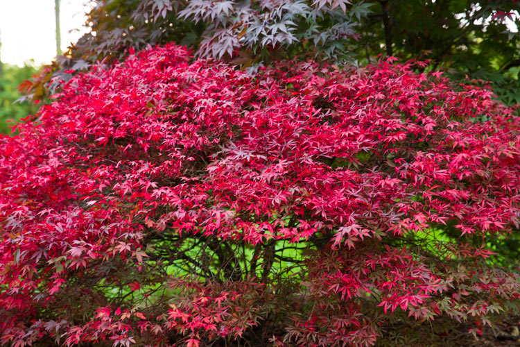
  • 5 Effective Methods of Creative Composition

    It seems everyone has a camera these days, so you may be wondering, “How can I separate myself from the pack?” The answer does not involve a better camera, or a more expensive lens. In fact, the most important part of your equipment actually can’t be purchased in a store. It’s your own unique vision, and perspective on the world, that makes all the difference. The following five elements of creative composition are starting points to help you better express your point of view.
    1) Leading Lines

    While using leading lines in composition sounds simple, it’s actually one of the harder styles to pre-visualize. The idea is to find a line that will lead the viewer’s eye through the frame, and direct them to the subject. Train tracks are an obvious example, but it’s dangerous to shoot there, and therefore not recommended. There’s no shortage of safe alternatives however. The key is learning to see these opportunities, and apply them accordingly. How do you do this? Slowing down is certainly a good place to start. If you’re chasing the light at sunset, chances are your composition will be rushed and sloppy. If you take the time to really scout a location, it’s possible to craft an image that far exceeds a routine snapshot.

    2) Shutter Speed

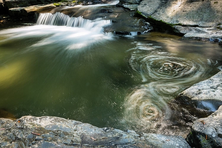
    2_waterfall_slow-shutter

    Yes, even your camera settings can be used as a compositional element. In this instance, a fast shutter speed would have frozen the water, leaving it rather listless. By slowing the exposure down to several seconds, the circular motion of the stream becomes evident, and works to anchor the scene. This is a different way of thinking about composition. It’s not only about where you put your focus point, but how you apply your settings to create the scene.

    3) Depth of Field and Selective Focus

    The aperture you choose can also play a major role in your composition. At f/1.8 for example, you have such a shallow depth of field that only a small portion of the picture is in focus. From a strategic angle, this can be quite an effective way to bring attention to your subject. While the face of the monument is sharp, both the foreground and background are completely out of focus. Seeing like this in advance, takes practice and imagination. When you look at an object, try to visualize how the camera can render it at various settings.

    4) Going the Extra Mile

    Lazy Composition

    When traveling, it’s easy to get swept up in the excitement of a location. Often, you have to balance shooting time with making time to eat, sleep, and well, be human. Still, you want to get the shot that will be good enough for your portfolio. This doesn’t necessarily mean you need to sleep in the field, with the camera as your pillow. Sometimes, the difference between an average shot and a great one is a little extra effort. I’ve seen this time and again in my own work, and therefore wanted to stress it here.

    In the first shot (above), I got off the ship, turned around and made a quick mindless record shot. The light was pretty but the overall image is uninspiring at best. Taking my own advice, I asked the waiting cab to let it idle for a minute, and walked down the pier a few hundred feet. From this new perspective, an entire different view presented itself with the sun kissing the ship’s bow. To emphasize the shape and color I purposely underexposed the scene (to make a silhouette). The small aperture of f/16 turned the sun into a starburst. These two shots are vastly different but were taken merely 100 feet apart, separated by five minutes.

    Second ship shot

    5) Framing

    There are of course times when you scout and plan well, but the light is just not flattering when you arrive. You can go home empty handed, or work with what’s been presented, to make something special. Framing is one of the most effective ways to eliminate bad light. By essentially hiding it behind foliage you can emphasize your subject in a clever way. For the viewer, this provides a sense of three dimensionality, almost like they’re peering through a window. A small aperture works best for this technique, as it will keep everything sharp from near to far.

    So try to incorporate some of these creative composition techniques into your images as you shoot. Work intentionally and think about your image before you press the button. Share any additional tips you have in the comments below.

    googletag.cmd.push(function() {
    tablet_slots.push( googletag.defineSlot( “/1005424/_dPSv4_tab-all-article-bottom_(300×250)”, [300, 250], “pb-ad-78623” ).addService( googletag.pubads() ) ); } );

    googletag.cmd.push(function() {
    mobile_slots.push( googletag.defineSlot( “/1005424/_dPSv4_mob-all-article-bottom_(300×250)”, [300, 250], “pb-ad-78158” ).addService( googletag.pubads() ) ); } );

    The post 5 Effective Methods of Creative Composition by Chris Corradino appeared first on Digital Photography School.


    Digital Photography School