Category: Photography

  • 9 Tips for Adding a Warm Sun Flare to Your Image

    Photography, as an art form, is simply the capture of light on either a sensitive physical medium or, in more recent times, an electronic sensor.

    What makes a photograph unique and attractive to the eyes is the distribution of that light. Shadows, highlights, and varying levels of warmth and tone evoke emotion when viewing them, emotionally investing you to the picture you’re viewing.

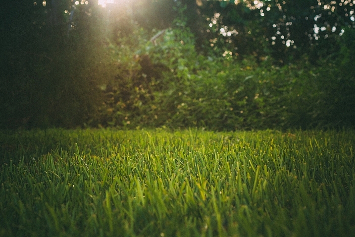
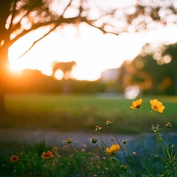
    One of the most dramatic instances of light that can occur in a photo is flare, and more specifically, a sun flare. You’ve no doubt seen spectacular images with beams of light radiating through the photo, giving you a wonderful sense of warmth and brilliance.

    21474625629_1dd03156ae_k

    I remember about three years back, a friend asked me to how to produce the warm flares that were visible in many of my photographs. I tried to explain, but realized I really didn’t know the exact combination of properties that worked. I just knew the sunlight coming through a camera lens at the right angle created a beautiful artifact, and that I was able to achieve it pretty consistently in my beach, landscape, and nature shots taken at sunset.

    Over time, I learned the details of what it takes to incorporate this effect, and how to use it to my advantage to get a warm, dreamy feel that amps up the viewer’s connection with the photo. This is what I’d like to share with you, as it’s one of the easiest ways to inject emotion into your photography.

    In this article, we’ll cover what flare is, what artistic and aesthetic benefits you can derive from it, and finally, how to produce and use it effectively in your photography.

    What is sun flare?

    Lens flare, as described in its most basic form, is the result of a bright light source entering the lens and producing artifacts, shapes, and effects in the resulting image.

    Technically, lens flare and sun flare are different entities, but for the purpose of this article, we’ll treat them the same. We will be talking about the effect created in-camera by having bright sun as a light source in, or near, the edge of the frame.

    21629871846_47b2c9c4fa_b

    On many occasions this is an unwanted effect. For this reason a lens hood is often used to prevent flare, when bright light shines on the lens opening from outside the frame. Flare often reduces cleanliness and clarity in a scene that requires it, such as with architectural or commercial photography.

    But flaring has a beautiful side as well, as you know. Some of us strive for the warmth and haziness that flared light from the sun can provide. Environmental portraiture is an example of an area that utilizes this effect. So how can we create and use flare to our advantage?

    21036819798_41e380f648_h

    Creating the flare

    1. Don’t try this on a cloudy day

    The main requirement to create flare is of course, the sun. If you’re shooting on an overcast day and there isn’t any sun poking through, you won’t be able to create a flare.

    2. A low angle is best

    Although you can create flare at any time during the day, it’s much easier, and much more dramatic, to shoot the sun when its low on the horizon – in other words, at sunrise or sunset, during the golden hours.

    This is because you’ll need the sun in the frame, or just outside the frame, and this will usually coincide with your subject positioning.

    21469116409_265a1699e2_k

    3. Drop the lens hood and pick your lens

    If you’re using a lens hood, remove it. Lens hoods are intended to reduce glare and flare from light sources outside the frame, which is exactly opposite of what you’re looking for in this case..

    To amplify the chances of getting a good flare, try using a zoom lens, as opposed to a prime. The additional spaces and mechanical parts inside the zoom give the sunlight more room to bounce around and do its thing.

    4. Shoot in Manual Mode

    This particular discipline is based on the principle that the slightest change in orientation, composition, or aperture can make a pretty big difference in the end result. Shooting manually will allow you to have finer control over these factors and make things much easier for you.

    Shooting with Live View can help even more, as you’ll be able to monitor changes in your scene in real time.

    5. Settings: Aperture and more

    You can use any aperture you wish when creating flare effects, but the look will differ depending on what setting you choose. At smaller apertures (f/11 and smaller), any visible part of the light source will create more of a starburst effect, while a larger aperture (f/8 and larger) will diffuse and disperse the effect, and you’ll end up with a much smoother distribution of the light.

    Shutter speed also affects the final result, as more light streams into the lens when using slower speeds; therefore, you’ll have more of a flaring effect.

    20950860109_026cca9525_o

    6. Focus first

    The large amount of light coming into your sensor will affect the autofocus on your camera if you’re using it. So, focus on your subject first by blocking the sun somehow, whether it be your hand, a reflector or a piece of cardboard. Then, once you’ve focused (and lock it or use back button focus), you can shoot normally knowing you are focused correctly for the given distance.

    7. Don’t forget to light your subject

    If you’re photographing a portrait, don’t forget the negative effect the flare can have on the proper lighting of the face and body. If you find the subject’s face, or other important areas, are washed out too much from the high light levels, use a reflector or other methods of fill light to compensate, and ensure your subject is well illuminated.

    Alright, let’s get to shooting!

    8. Method one:  In the frame

    There are two primary methods of creating the flare effect. The first is by having the sun actually within the frame of the image. Naturally, just having it centered and completely uncovered will result in a washed out photo. You’ll want to have something to partially block the light, so that a flare can be achieved without washing out the subject of your photo. Trees, a distant treeline or building, and your subject can all provide enough cover to produce the desired effect.

    16777527017_5540bf7379_b

    Take care not to capture too much light. Sometimes the resulting flare can be so pronounced that your image is completely washed out. Shoot several frames, and check the amount of flare you’re getting. If it’s too much, compose the sun a little more out of frame (or more hidden) to reduce the effect.

    9. Method two: out of the frame

    For an even more pronounced and diffused flare, you can compose your image with the sun partially, or completely out of frame. Usually the best results come from having the sun just outside the camera’s view. Experiment with position to find the correct angle and amount of flare necessary for the shot you’re after.

    This method produces more a diffused and smooth flare, especially in the early morning and late evening hours, when the sun is very low on the horizon.

    16642785747_fd851ca392_k

    That’s it! 

    Adding a nice looking sun flare to your image really isn’t tough at all. Following a few rules is all you have to do, and like everything else in our wonderful world of photography, the result is always subjective. Add a little, add a lot, all that matters is that you’re happy with the final image! There’s no wrong way to do it.

    So get out there and get your flare on! Of course, we’d love to see some examples of what you can do with this effect, let’s see your best shots!

    googletag.cmd.push(function() {
    tablet_slots.push( googletag.defineSlot( “/1005424/_dPSv4_tab-all-article-bottom_(300×250)”, [300, 250], “pb-ad-78623” ).addService( googletag.pubads() ) ); } );

    googletag.cmd.push(function() {
    mobile_slots.push( googletag.defineSlot( “/1005424/_dPSv4_mob-all-article-bottom_(300×250)”, [300, 250], “pb-ad-78158” ).addService( googletag.pubads() ) ); } );

    The post 9 Tips for Adding a Warm Sun Flare to Your Image by Tim Gilbreath appeared first on Digital Photography School.


    Digital Photography School

  • Moms and Daughters and Fathers and Sons

    The other day, I put my hair up in a messy bun, threw on a blue sweater and jeans with tan Uggs and went into the kitchen, where Zoe, my 16 year old and Tenley, my 11 year old were standing, both sporting messy buns and wearing the exact same thing as me.  I offered to change, and they protested, Continue Reading

    The post Moms and Daughters and Fathers and Sons appeared first on Photodoto.


    Photodoto

  • Next Steps to Getting Started in the Lightroom Develop Module

    Lightroom Develop module

    A previous article showed you how to get started in Lightroom’s Develop module by using the Camera Calibration, Lens Corrections and the Basic panels.

    In this article you’ll learn how to use the remaining right-hand panels in the Lightroom Develop module:

    • Tone Curve panel
    • HSL / Color / B&W panel
    • Split Toning panel
    • Detail panel
    • Effects panel

    This guide is aimed at photographers who are new to Lightroom, so it doesn’t cover every aspect – just the important things you need to know if you’re just getting started with it.

    It is quite possible that you won’t have to touch any of the panels listed above when processing a photo. Many photos can be developed in Lightroom just by using the Camera Calibration, Lens Correction and Basic panels, plus local adjustments. But the panels mentioned above will help you be more creative with your processing, especially when it comes to working with colour and tone.

    The Tone Curve panel

    One purpose of the Tone Curve panel is to give you another way of applying the same tonal adjustments that you can make with the Basic panel sliders. If you’re accustomed to using curves in Photoshop, the Tone Curve panel gives you the option of doing the same in Lightroom in addition to, or instead of, using the Basic panel sliders.

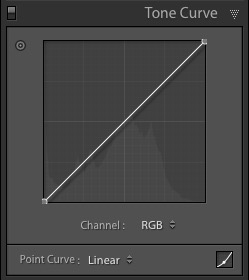
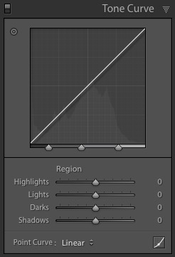
    This is what you will see when you open the Tone Curve panel for the first time.

    Lightroom Develop module

    This is the RGB curve. Adjusting this curve affects the brightness values, but not the colours, of the photo.

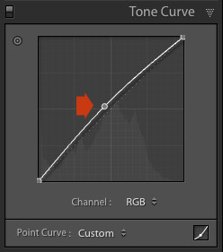
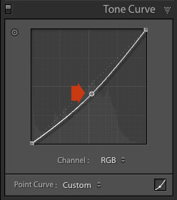
    You can move the curve upwards (as shown below) to make the image lighter. To do so, left-click once on the midpoint of the curve to add an adjustment point. Then click and drag the adjustment point to move it up, and change the shape of the curve.

    Lightroom Develop module

    You can also move it downwards to make the image darker.

    Lightroom Develop module

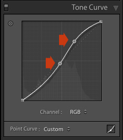
    You can create an S-curve like this to increase contrast (add a second adjustment point first).

    Lightroom Develop module

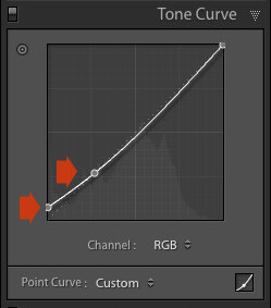
    You can create the matte look with a curve like this. Add an adjustment point near the bottom of the curve then lift the left-side up. This makes the darkest tones in the photo dark grey rather than black, imitating the look of a print made on matte paper.

    Lightroom Develop module

    Notice the lower left point is not touching the bottom, this creates a matte look.

    You can return to the original straight tone curve at any time by going to the Point Curve menu and selecting Linear.

    Colour curves

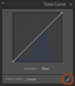
    Underneath the Tone Curve is a menu that lets you select the Red, Green, or Blue tone curves individually. These curves affect each of the color channels in the photo respectively. The blue curve is shown below.

    Lightroom Develop module

    More options

    If you click the icon in the bottom right-hand corner of the Tone Curve panel (circled above) the panel opens up to reveal four sliders, called Highlights, Lights, Darks and Shadows (see below).

    Lightroom Develop module

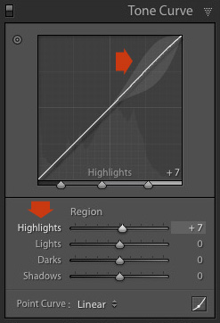
    These sliders give you another way to make adjustments to the tone curve. When you move one of the sliders, the corresponding region of the tone curve is highlighted, so you can see which tones are affected.

    The illustration below shows what happens when you move the Highlights slider. The top right of the tone curve is marked in grey. This part of the curve changes when you move the Highlights slider.

    Lightroom Develop module

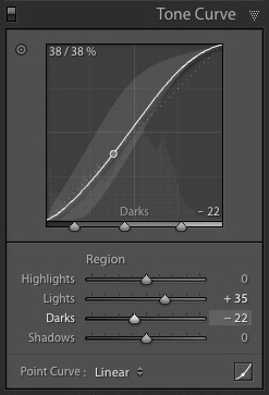
    You can click and drag on a single adjustment point (but not multiple points) to change the shape of the curve. The sliders change value as you adjust the curve. The diagram below shows the effect a simple S-curve has on the sliders.

    Lightroom Develop module

    Double click on any slider heading to reset that slider to zero. That covers the basics of curves. You can learn more advanced techniques by reading our article Lightroom’s Tone Curve Explained.

    HSL / Color / B&W

    The HSL / Color / B&W panel is for adjusting colour values. It is also for converting photos to black and white. This is beyond the scope of this article, but you can learn more by reading my article How to Convert Photos to Black and White in Lightroom.

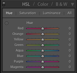
    The HSL / Color / B&W panel is divided into three tabs. The HSL and Color tabs are the ones you need for making adjustments to colour. They contain the same sliders, just arranged in a different order. The screen shots below are taken from the HSL panel.

    The Saturation and Vibrance sliders in the Basic panel affect all the colours in the photo. The HSL and Color tabs allow you to target individual hues without affecting others. You can target a specific colour and change the following:

    • Hue
    • Saturation
    • Luminance

    Adjusting Hue replaces the selected colour with an adjacent colour on the colour wheel. For example, you can target red tones and make them more magenta (pink tone) or orange. Or you could target blue tones and make them aqua or purple.

    You don’t need a colour wheel to see how colours are affected by the Hue sliders. You can just look at the eight Hue sliders. For example, the Red slider (top in the diagram below) is coloured magenta to the left and orange to the right. Moving the slider in those directions changes red colours in the photo to either magenta or orange.

    Lightroom Develop module

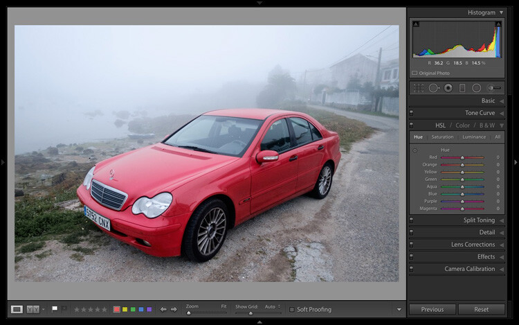
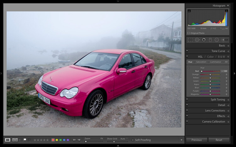
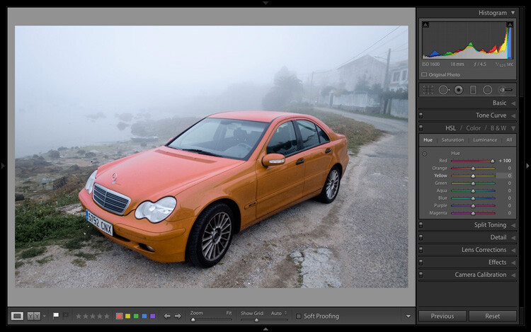
    The easiest way to see how this works is to try it. The examples below show the effect that moving the Red slider to -100 and +100 (the strongest available settings) have on the image.

    Lightroom Develop module

    No adjustment.

    Lightroom Develop module

    Red -100.

    Lightroom Develop module

    Red +100

    The Saturation and Luminance sliders work in a similar way. Saturation adjusts the saturation (intensity) of specific colours, and Luminance adjusts the brightness.

    Targeted Adjustment Tool

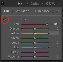
    The Targeted Adjustment Tool gives you an even more precise way of adjusting colour values. To use it, click on the Targeted Adjustment Tool icon in the HSL / Color / B&W panel (circled below).

    Lightroom Develop module

    Then move the cursor over the colour (area) in the photo you want to adjust. Click and hold the left mouse button, while you drag the mouse downwards to reduce the Saturation or Luminance of the colours underneath the cursor, or adjust the hue.

    Move the mouse upwards to increase the saturation or luminance, or adjust the hue in the opposite direction. Lightroom analyzes the colours underneath the cursor and moves the sliders in the HSL / Color / B&W panel accordingly. All similar colors in the image will be affected.

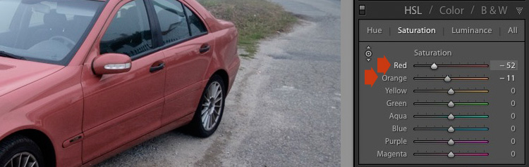
    For example, in the following photo I activated the Targeted Adjustment Tool, then clicked on the car’s paintwork and dragged the mouse downwards to reduce the Saturation. Lightroom adjusted both the Red and Orange sliders, showing that the red paintwork is comprised of those two colours. This is more accurate result than only moving the Red slider.

    Lightroom Develop module

    The Targeted Adjustment Tool is a useful tool that appears in other Develop module panels.

    Read my article Mastering Color in Lightroom using the HSL tab to learn more about the HSL / Color / B&W panel.

    The Split Toning panel

    The Split Toning panel is for toning photos. While this is a technique traditionally associated with black and white photography, you can also use it with colour. If you’re a beginner, split toning is a little advanced for you at this stage, so I’ll direct those of you who are interested to articles that cover it in detail.

    How to Split Tone Black and White Photos in Lightroom shows you how it’s done with black and white photography.

    How to Create a Vintage Look using Lightroom shows you how to split tone colour photos (it also covers tone curves and Lightroom Develop Presets)

    The Detail panel

    The Detail panel is for adjusting the default image sharpness and noise reduction settings. For beginners it is simplest not to touch these. You won’t need to do so until you are a more advanced user.

    Those of your curious to learn more can read our articles Learn How to Use the Sharpening Tools in Lightroom and How to Do Noise Reduction in Lightroom.

    The Effects module

    Use the Effects module to apply a creative vignette, add grain or (new in Lightroom CC only) add or remove atmospheric haze.

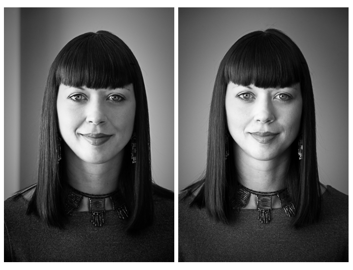
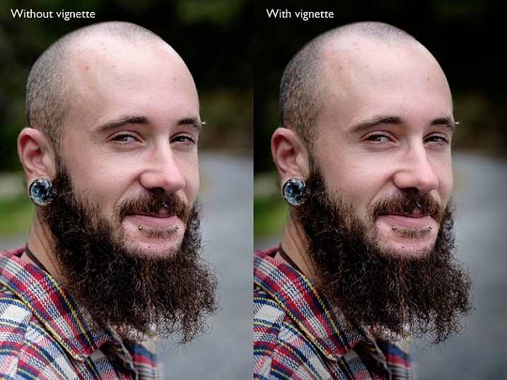
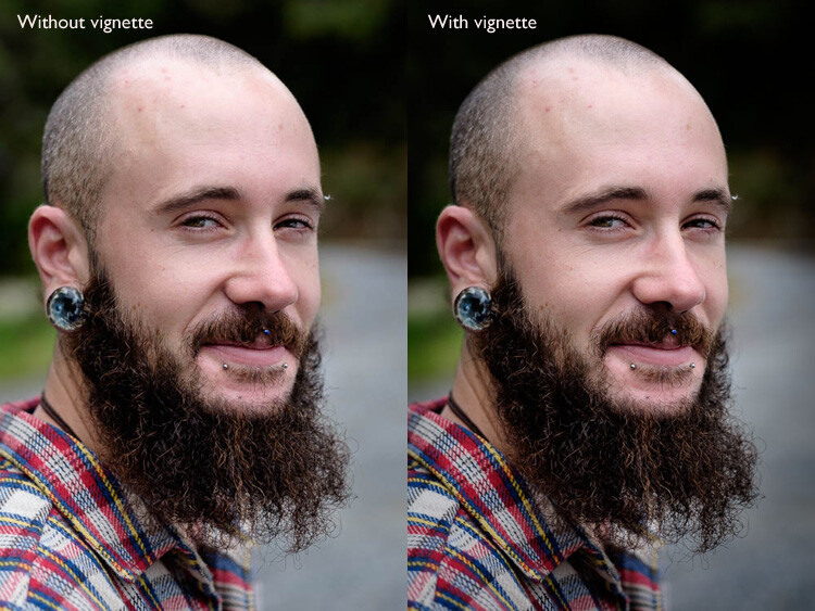
    Vignetting lets you darken (or lighten) the edges of your photo, gently guiding the viewer’s eye towards the centre. Many images, especially portraits, can be improved by adding a subtle dark vignette. Here’s an example:

    Lightroom Develop module

    You may have to look closely to see it as the effect is subtle, but the portrait on the right has a vignette. It is most obvious in the bottom right corner.

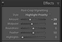
    These are the settings used to create this vignette:

    Lightroom Develop module

    • Move the Amount slider left to darken the edges of the image, or to the right to lighten them.
    • Move the Midpoint slider left to make the area covered by the vignette larger, or right to make it smaller.
    • Move the Roundness slider left to make the vignette squarer, or right to make it more circular.
    • Move the Feather slider left to make the edge of the vignette harder (a more defined end and beginning of it), or right to make the edge softer (graduates slower from dark to light).
    • Move the Highlights slider right to preserve any highlights present in the area covered by the vignette.

    Tip: The easiest way to see what these sliders do is to set Amount to -100. Then move the other sliders to see what effect they have.

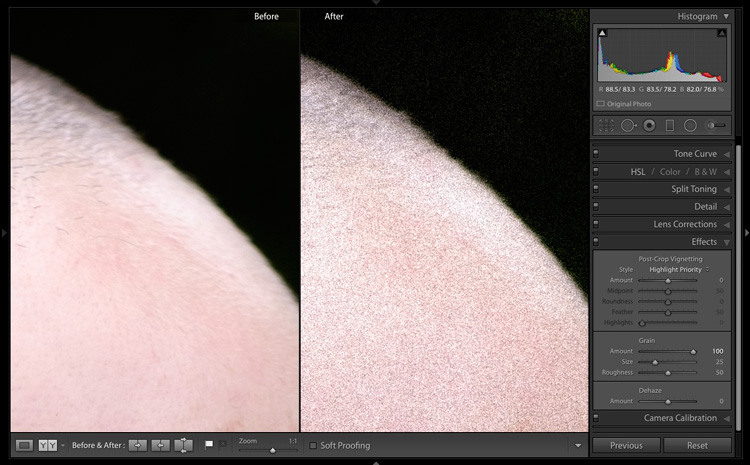
    Use the Grain sliders to add grain to your photos. This is only useful if you would like to emulate the look of photos taken with film. Move the Amount slider right to add grain (there is no grain at the zero setting) and then use the Size and Roughness sliders to adjust the size and appearance of the grain. This before and after image shows the effect of increasing Grain to 100, the maximum setting:

    Lightroom Develop module

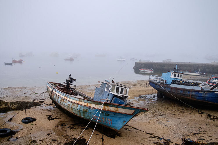
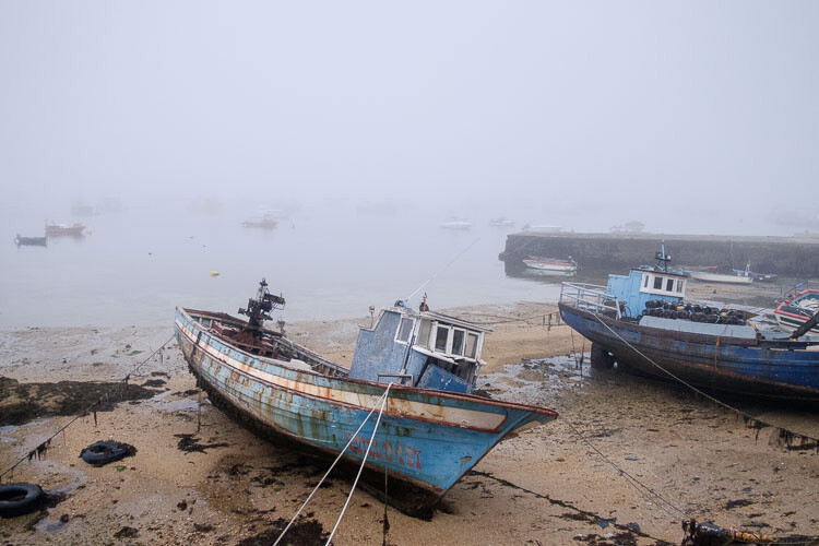
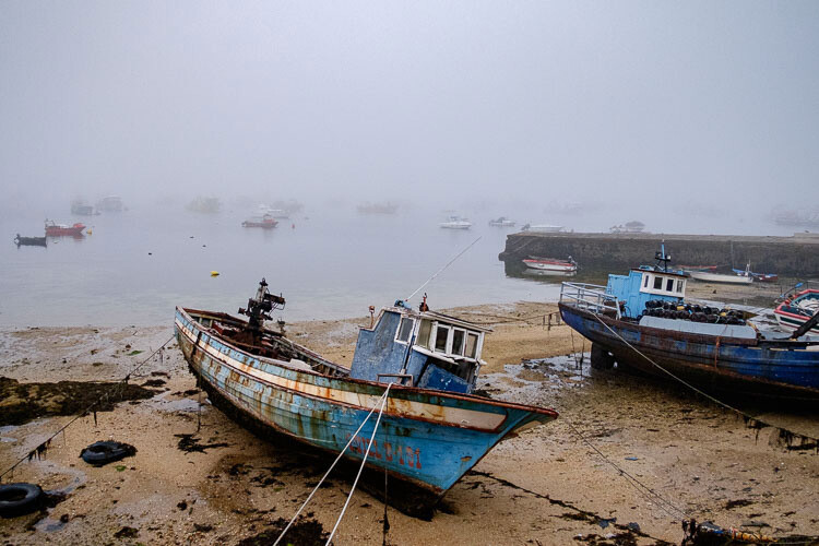
    Dehaze is a new slider that is only available in Lightroom CC. Use it to reduce atmospheric haze caused by flare, mist, or pollution. You can also use it to increase haze – a good example of this is with photos taken in foggy conditions.

    Lightroom Develop module

    Photo taken in foggy conditions. Dehaze set to zero (the default).

    Lightroom Develop module

    Dehaze set to -10 to increase effect of fog.

    Lightroom Develop module

    Dehaze set to +30 to decrease effect of fog.

    I’ll show you how to build on the work done in the right-hand panels by making local adjustments in my next article. In the meantime, if you have any questions about the techniques in this article, please let me know in the comments.


    The Mastering Lightroom CollectionMastering Lightroom ebooks

    My Mastering Lightroom ebooks will help you get the most out of Lightroom. They cover every aspect of the software from the Library module through to creating beautiful images in the Develop module. Click the link to learn more or buy.

    googletag.cmd.push(function() {
    tablet_slots.push( googletag.defineSlot( “/1005424/_dPSv4_tab-all-article-bottom_(300×250)”, [300, 250], “pb-ad-78623” ).addService( googletag.pubads() ) ); } );

    googletag.cmd.push(function() {
    mobile_slots.push( googletag.defineSlot( “/1005424/_dPSv4_mob-all-article-bottom_(300×250)”, [300, 250], “pb-ad-78158” ).addService( googletag.pubads() ) ); } );

    The post Next Steps to Getting Started in the Lightroom Develop Module by Andrew S. Gibson appeared first on Digital Photography School.


    Digital Photography School

  • 10 Crucial Things You Need to Think About for Portrait Photography

    Darlene’s Portrait Fundamentals course is on sale for $ 75 (50% off) now until November 3rd only. Find out more or grab the deal over at Snapndeals.com.


    There are many pieces to doing a portrait – it’s not easy. You have to think about the technical stuff like exposure and focus, as well as the non-technical stuff like composition and working with a live subject. It can be daunting if you’re just starting out doing portrait photography so let’s break it down into all the pieces so you can work on one at a time, then put it all together.
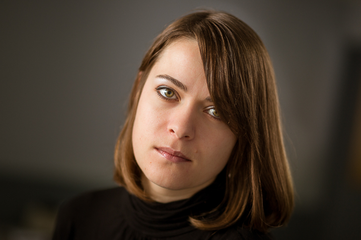
    Portrait tips dps717px 04

    Here are the 10 crucial elements you need to think about when doing portrait photography:

    1. Lighting Pattern
    2. Lighting Ratio
    3. Quality of light
    4. Lens selection
    5. Background
    6. Exposure/metering
    7. Sharpness – getting it in focus
    8. How to position the subject (posing)
    9. Facial view and camera position
    10. Expression

    THE TECHNICAL STUFF

    #1 Lighting pattern

    This is how the light falls on the subject’s face. How you set up the light will determine the mood of the final portrait and whether or not the subject is flattered. Lighting partner is a critical piece to get right. There are four main type of patterns and two styles, they are:

    • Split lighting
    • Loop lighting
    • Rembrandt lighting
    • Butterfly lighting
    • Short lighting
    • Broad lighting
    Portrait tips 02

    Left – Split lighting. Right – Loop lighting.
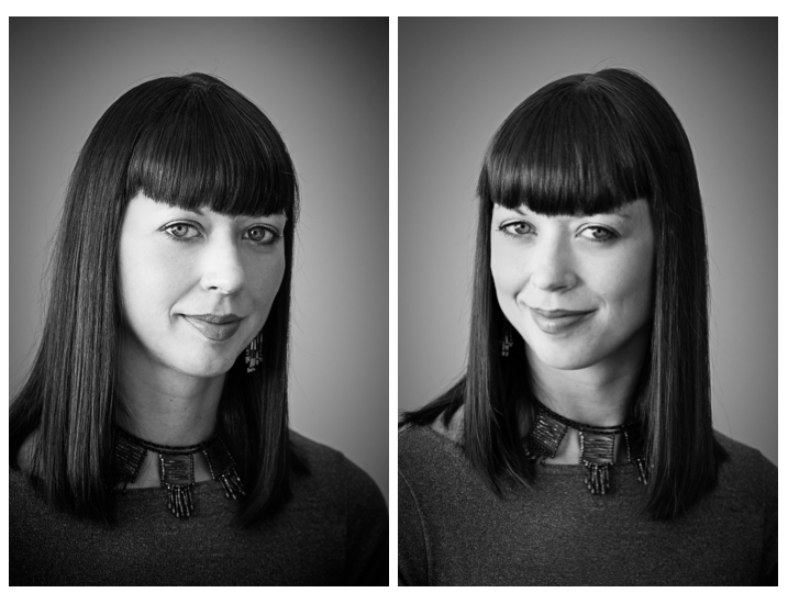
    Portrait tips 01

    Left: Broad lighting. Right: Short lighting. Notice how different she looks in each image, particularly her nose!

    Knowing what each looks like and when to use them is very important. Read more here: 6 Portrait Lighting Patterns Every Photographer Should Know.

    #2 Lighting ratio

    A ratio is a comparison of one thing to another and in terms of lighting it is comparing the dark and light sides of the face. How much difference is there is from the shadow, to the highlight side? The greater the ratio, the more contrast the image will have, and the more moody the portrait will become. The lower the ratio, the less contrast, and the portrait will have a lighter, fresher feeling.

    Look at the following examples:
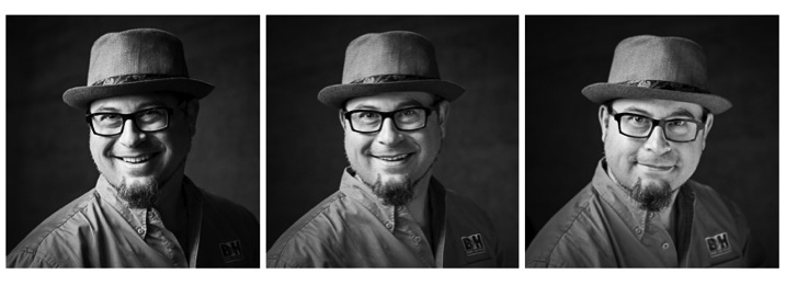
    Portrait tips 03

    In the images above the ratio on the left is very strong, about 16:1 or four stops. The missing is about 4:1 or two stops, and the right is almost 1:1 or even. The only difference from one to the next is use of a reflector. Notice how the mood and feel of the portrait changes, as the contrast is adjusted.

    For more detail on ratios read: Lighting Ratios to Make or Break your Portrait

    #3 Quality of light

    Another aspect of lighting you need to decide is whether you will use hard or soft light.

    Hard light is produced by a small light source and is characterized by high contrast, enhanced texture of the subject, added drama, and harsh well edge-defined shadows. Examples of hard light sources are:

    • The sun (even though it is large, it is far away so its relative size is small)
    • A bare light bulb
    • The small built-in flash on your camera (including your speedlight without modifiers)

    Here are two portraits done using hard light. Which is more appropriate use of this type of lighting for the subject?
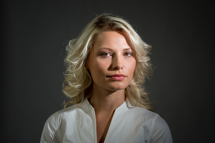

    Portrait tips dps717px 08

    Portrait tips dps717px 05

    Soft light is produced by a very large light source. It is low contrast (or can even be quite flat), less textureenhancing, and is more forgiving and flattering for people photography. Examples of soft light sources are:

    • The sky on an overcast day
    • Large studio softboxes
    • A large reflector like 42” or 52”
    • An on-camera flash that has been bounced off a ceiling or wall

    Here are two portraits done using soft light. Which is more appropriate use of this type of lighting for the subject?
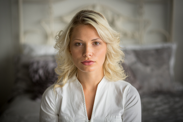
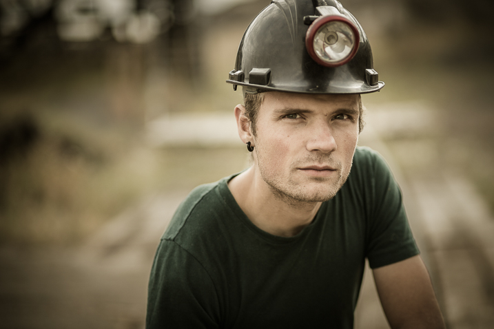
    Portrait tips dps717px 09

    Portrait tips dps717px 07

    So along with the ratio, the quality of light will have a great affect on the mood and feeling of your portrait. Choose soft light for portraits that flatter the subject, and choose hard light for an edgier look with more grit and drama.

    #4 Lens selection

    The lens you select will change the appearance not only of the subject, but the background as well.

    Using a wide angle lens will introduce distortion and cause the subject’s face to look abnormal, sort of stretched. It will also allow you to see a large sweeping view of the background behind them.
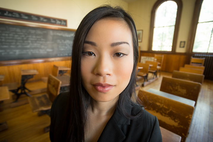
    Portrait tips dps717px 13

    Notice how the shape of her face and her features are distorted? This is not something most people will desire.

    However, there may be instances where you want this look such as a humorous portrait, kids, or an editorial style portrait of a street vendor at a market where you want to see his environment.
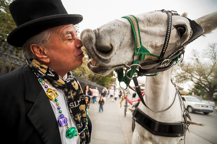
    Portrait tips dps717px 12

    The wide angle view adds to the comical nature of this portrait.

    Telephoto lenses compress perspective – this does two things. First it is usually more flattering to the subject, their facial features look less distorted. Second, it simplifies the background by seeing less of it, and often it’s less in focus as well (dependant on distance to the background) putting more emphasis on the subject, which is what you want. Read more at: How to Achieve Blurred Backgrounds in Portraits.
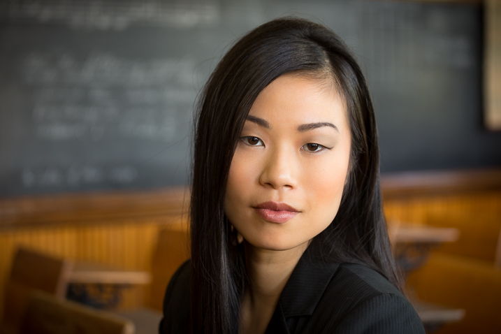
    Portrait tips dps717px 14
    Same girl as the portrait above. Compare her face in the two images, and take note of the background as well. See how much less of the room, and how it is more out of focus than the wide image above?
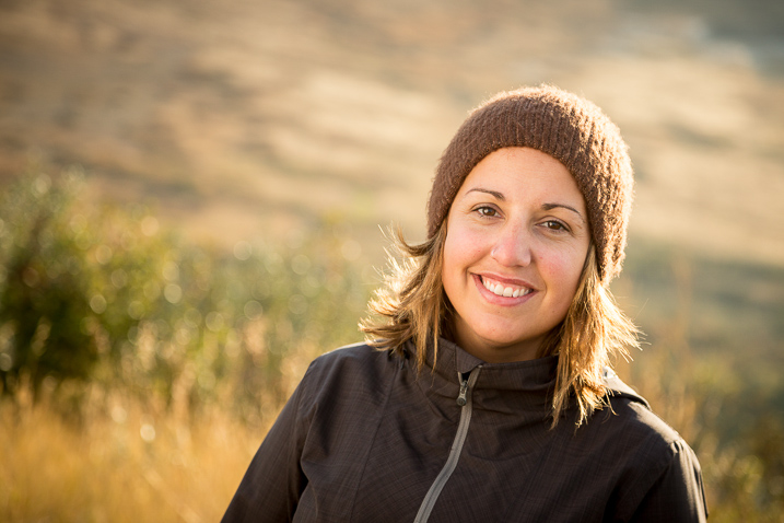
    Portrait tips dps717px 11
    The long lens used for this image has compressed the background and because it is so far away (across the river on the other side) it is really out of focus and provides a soft background to enhance the portrait, not take away from the girl.

    #5 Background

    One thing many of my students forget to control and think about is the background. It’s so easy to be focused on all the other stuff and working with your subject that you forget to even look at the background.

    Two things you want to make sure about for the background are: it makes sense with the portrait, and doesn’t distract the viewer from the subject. There are four things that can do that, watch for them in your background and adjust your camera position or composition accordingly if they show up:

    • Contrast
    • Bright colours (warm tones are the worse for distraction like red and yellow)
    • Sharpness
    • Bright areas
    Portrait tips dps717px 15

    See how the bright areas, which are also high contrast, in the background draw your attention away from the wedding couple?

    Any or all of those can draw the eye away from the subject if they are in your background. The eye is attracted to the brightest area of an image, as well as the sharpest. So get your portrait subject away from the background far enough to get it out of focus, and watch for hot spots that grab the eye. Sometimes simply moving your camera a foot or two to the left or right can eliminate trouble areas and give you a cleaner background – allowing the subject to be the star.
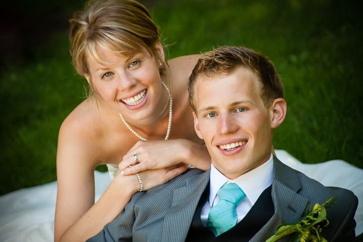
    Portrait tips dps717px 16
    Use of multiple techniques here have drastically improved this portrait over the one above. The background is now solid, out of focus, and it does not take your eye away from the couple but rather compliments the overall portrait.

    #6 Exposure and metering

    For a portrait where the subject is not moving, I almost always use the following camera settings:

    • Manual shooting mode
    • Single shot drive mode (when I press the button it takes one image only)
    • Single point focus (not multi or zone)
    • One-shot or AF-S focus mode to focus and lock (not continuous)
    • Shade White Balance preset (as I am usually working in the shade, if you’re in the bright sun choose that – but pick one that matches your lighting condition and leave it, anything but AWB!)
    • Shoot in RAW

    That gives me the most control over doing one very important thing – having a consistent exposure from one frame to the next. That may not seem like a bit deal but if you ever decide to do portraits for a friend or have real paying clients – you want to be able to show them the images on the back of the camera and not worry about the one in the middle that was black cause you forgot to adjust the exposure.
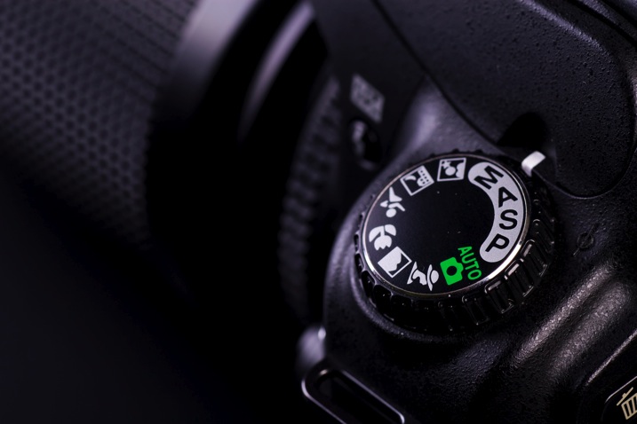
    Photodune 1733468 camera controls m

    The other thing it does is makes editing in the post-production stage much faster.

    So basically set your exposure, do a test shot (review it for exposure using the histogram), then don’t touch it unless you either move to a new location, or the light changes.

    #7 Sharpness – getting it in focus

    I already mentioned the settings I use for focus above. Back button focus is something I highly recommend as well. It allows me to lock focus on the subject, precisely on their eye if I’m in close enough, and then recompose my portrait and shoot away. Unless the subject or I move, changing the distance between us, there is no need to refocus.

    Here are a few more focus tips from a past article I did: 5 Tips for Getting Sharper Images. Obviously if you’re shooting a moving target, like kids in action, you’ll want to choose different focus settings. Try Continuous focus (Servo or AF-C) and burst mode (continuous shooting mode or drive).

    THE AESTHETIC STUFF

    #8 Posing the subject

    Getting your subject or model into a comfortable, yet flattering pose can be tricky. People are generally nervous when being photographed and will look to you for guidance on how to stand, hold their body, turn their head, and adjust their hands. So you need to have a few ideas ready for them, making sure they can hold it comfortably and they look good at the same time.

    Here are a few tips:

    • You’ve likely heard this before, but if it bends – bend it. Meaning get them out of a stiff body position bending one leg slightly, and bending elbows and wrists.
    • Get them to shift their weight away from the camera (hip away) it will be more flattering that way.
    • Add a slight head tilt for ladies to add a touch of femininity.
    • To get people to turn their body when standing – tell them to turn and point their feet, the body will follow naturally.
    • Turn shoulders slightly to narrow the body width, which is more flattering for most people.
    • Let them pose naturally and just make slight tweaks or adjustments. Watch how they move on their own so it still looks like them.
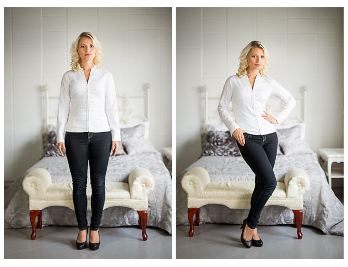
    Portrait tips dps717px 17

    Left – stiff and boring. Right – bend the parts that bend and make a more dynamic pose, it’s also more flattering, and in this case feminine.

    For more tips on posing read these dPS articles:

    • Portrait Posing Tips- How to Help People to Relax and Take Better Photos
    • Tips for Posing Men
    • Posing Guide for Photographing Women: 7 Poses to Get You 21 Different Photos
    • Or grab the dPS ebook Portraits: Strike the Pose

    #9 Facial view and camera position

    How you position the subject’s face is another factor that determines how flattering the portrait will be, and the mood. Some people look really great in full face view (facing the camera directly) while most benefit from turning slightly to one side, thus narrowing the face a little.

    Profile view is something people cannot see in the mirror, so many have never seen theirs, and have no idea what they look like from the side. Only by trying it out will you see and know if it’s flattering for them.

    The key to choosing the right angle for their face is to observe them. Do they tend to turn slightly when talking to you? Take note – that is probably the side the subconsciously prefer.
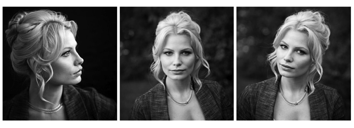
    Portrait tips dps717px 18
    Three different views of the same girl’s face (above). She has a really gorgeous profile and a square jaw. I think the profile and last image (¾ face view) are the most flattering for her but she looks great in any image. Not all your portrait subjects will have that, so you have to help them look their best by making choices like this. If in doubt, shoot all three and choose later, or let them pick. You’ll learn from the subject what they like and what they think looks flattering.

    Tip: for people who have a bump on their nose that do not want it to show – try photographing them facing both ways. One way will show the bump, the other it will be hidden. How you do that is shoot one way with the light say off to camera right. Then trade places with them so the light is coming from the other way and do a second shot. See which shows, and which hides the bump – then you’re ready to go.

    What camera position you choose will decide what you’re emphasizing on the subject. A low camera angle can show height (especially if shooting full body) and make someone look taller, but it also emphasizes the body more. Not a good choice if someone wants to appear slimmer. Getting low down near kids level puts you closer to the action and makes them appear less small.

    A slightly above eye level camera angle will emphasize the face and minimize the body, a good choice for most people. It also makes kids look smaller and can be effective if that’s the look you want. A really high angle will make the forehead prominentant (perhaps not the best choice for a receding hairline).

    Just be conscious that where you place your camera will affect the final look of the portrait.

    #10 Expression

    Portrait tips dps717px 20

    Even though my Spanish is limited I was able to talk to this little girl and got this reaction and expression. She is holding a photo of her auntie’s ultrasound and her new baby cousin to be that she was really excited about. I just asked her to show me her baby primo (cousin) and she did this.

    Okay, this is the ultimate thing you need to get right for great portraits. You can nail all nine points above, but if the subject has a bad expression, they will not like the image. There is one big tip I have for getting the best expressions in your portraits – talk to the subject and interact with them. There is one huge barrier to doing that which I see happen all the time.

    There is a big black thing in between you and the real person sitting in front of you!

    Yes, I mean the camera. Try this exercise if you dare:

    Get a friend, or one of your kids or grandkids, to pose for you. Now put the camera up to your eye and take a few shots. How did it feel to you? Did you feel connected to your subject? Ask them how they felt?

    Now put the camera on a tripod – yes the dreaded beast we all hate but it a necessary evil – and take a few shots using a remote trigger to fire the camera. How did you feel then? What about your subject? Were you able to make them laugh or smile? I’m going to go out on a limb and guess that you both had a better experience the second time and you got better expressions in the photos.

    The key to expression is eye contact and you cannot do that with a camera between you.

    Portrait tips dps717px 21
    I’ve photographed Bob many times. He is a volunteer at an old coal mine where I do a workshop twice a year. He was a miner way back in the day and is as spry in his 70s as many people who are 40! He loves telling stories about the mine and ghosts so I just get him talking and let him go. We have fun, he loves being a “model” for a day, and it shows in the images.

    Try it and see if it doesn’t make a difference. The tripod will also make you slow down and think about your camera, settings, and everything. Your tripod is not evil, it is your friend. Make friends with your tripod and use it.

    Putting it all together

    Whew! See I told you doing portraits is a lot to think about. But you can do this, you got this. Just take it one step at a time. If you aren’t at the stage of getting all 10 of these things yet, just pick one at a time and work on that. Choose patient models that will help you and practice. The only way to get better is by doing.

    My students often ask me, “How do you make it look so easy?” – then answer – I’ve been doing this a really long time and it becomes instinct and subconscious after so many hours. Put in your 10,000 hours and we’ll talk!

    If you have any questions or want to share your images – please do so in the comments below.


    snapdeal-330-x-220Darlene’s Portrait Fundamentals course is on sale for $ 75 (50% off) now until November 3rd only. Find out more or grab the deal over at Snapndeals.com. Take more professional looking portraits in 30 days! The Portrait Fundamentals course covers everything you need to know, from camera basics to using a multi-flash set-ups. Over 6.5 hours of video lessons with two experiences instructors.

    googletag.cmd.push(function() {
    tablet_slots.push( googletag.defineSlot( “/1005424/_dPSv4_tab-all-article-bottom_(300×250)”, [300, 250], “pb-ad-78623” ).addService( googletag.pubads() ) ); } );

    googletag.cmd.push(function() {
    mobile_slots.push( googletag.defineSlot( “/1005424/_dPSv4_mob-all-article-bottom_(300×250)”, [300, 250], “pb-ad-78158” ).addService( googletag.pubads() ) ); } );

    The post 10 Crucial Things You Need to Think About for Portrait Photography by Darlene Hildebrandt appeared first on Digital Photography School.


    Digital Photography School
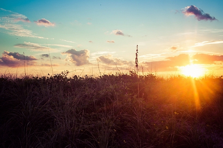
  • Top 10 Things to do When Your New Camera Arrives

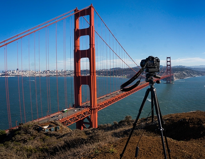
    TripodAtGoldenGate

    I recently found myself in the position of having to buy a new camera. It is an exciting time, but the new camera will take some getting used to.

    Once you have put the battery in, the lens on, and inserted the memory card, it’s time to make your camera your own. Here are some steps to do so:

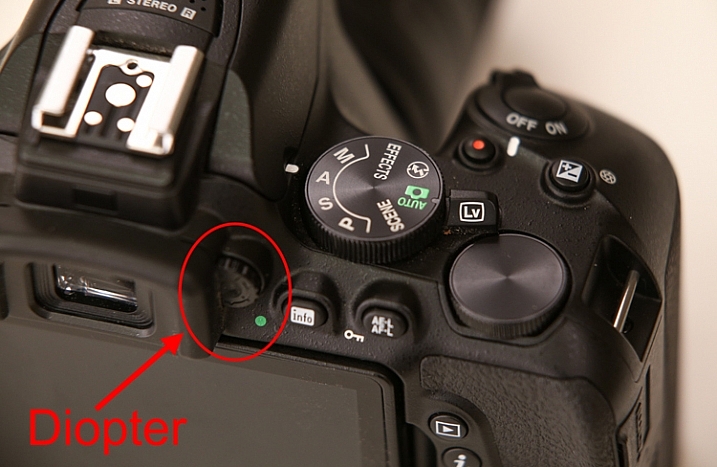
    #1 Set your diopter

    If your camera has a viewfinder, there will be a tiny dial near the eye piece. This is called the diopter and it affects how you see through the lens. Be sure to set it for your eyes, or things might not appear sharp when you look through the viewfinder.

    Diopter

    Actually, if you’ve been shooting for a while and have never set your diopter, go ahead and do it now. You might be amazed at how much clearer things appear.

    #2 Set your Modes

    You already know to set your mode dial (get it out of Automatic), but there are some other modes to worry about.

    First, set the Drive Mode to what you want. I suggest Continuous because it will allow you to bracket your photos, or just shoot rapidly. If you do it now, you won’t be in the field wondering why your camera is only taking one photo at a time.

    Next, you will need to set your Metering Mode. This is the way the camera determines the proper exposure level. The camera can either use a large portion of the scene to measure the brightness level, or just one specific point. The choices you have are:

    • Automatic Mode: which is called Evaluative by Canon, Matrix by Nikon, and Multi-Segment by Sony
    • Partial Metering: where the camera uses the center portion of the scene to measure light
    • Spot Metering: where the camera meters using only one specific point (small area)

    Any one of these modes is fine, just be sure to set the one you like best (Spot metering is more advanced so use with caution until you are up to speed with it).

    Finally, set your Autofocus Mode, and by that I mean setting the focus points. You can either have the camera automatically select the focus points, or you can do it. If you do it yourself, set it so that the camera uses the center point to focus, it is the fastest and most accurate.

    #3 Add your externals

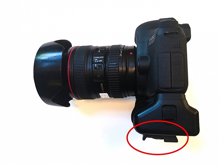
    Most of the time you will be adding a few things to your camera. Obvious items are the strap and the battery grip, if you have one. But another item you should add right away is the quick release plate for your tripod. That way, you won’t forget it, and you will also be able to put the camera on the tripod quickly when you are in the field.

    Tripod-Plate

    While we are on the subject of external items, this is probably a good time to make sure you have an intervalometer, or remote shutter release, that is compatible with your new camera. These things are very cheap these days, so go ahead and get one.

    #4 Arrange Image Review

    All cameras will show your picture on the LCD after you take it. The camera will not necessarily do it the way you want though. Here are the settings to check to make sure it is set up according to your preferences:

    • Length of time: In the camera’s menu, there will be an option to set the length of time your image appears. You might as well set this on its longest setting, as you can always click it away.
    • Orientation: If you shoot with your camera turned to a vertical orientation, sometimes the camera will turn the image on your LCD so it fits horizontally on the screen. The result is a tiny image, so you may want to turn this off (Note: this may be called “Auto Rotate” in some cameras).
    • Show Histogram: Definitely set your review so that it shows the histogram with the image review. That is the best way to make sure you have a proper exposure.
    • LCD brightness: Set your LCD brightness level to the highest level. Otherwise, when you are out in the sun you will have a very difficult time seeing the LCD at all.

    While I am on the subject of the LCD, I want to mention one tricky little item for Canon shooters. On many Canon cameras, to use the Live View function, you have to go into the menu and enable it. I recently rented a Canon camera and actually thought it was broken because the Live View didn’t work. Turns out, I just needed to enable it!

    #5 Set the Image Quality

    The next setting to check is image quality. This is where you tell the camera what type of file to create.

    Do I have to tell you that this setting should be Raw? No? Good. You might as well have the camera also create a JPEG while you are at it though. It won’t cost you anything but a small amount of memory.

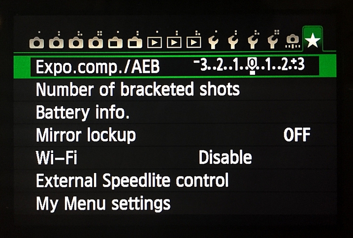
    #6 Create a Custom Menu

    There are certain things you will only want to access sometimes, but you will want to get to them fast. Mirror Lock-up and Auto Bracketing come to mind for me. Fortunately, most cameras allow you to create a custom menu. That way you can add the features and settings you use the most, to one menu screen. That will save you a lot of time digging around in your camera’s menu.

    Custom-Menu

    My custom menu settings

    #7 Set up Back Button Focus

    Normally your camera will focus when you press the shutter button halfway down. That works okay, but the better way is to set your camera to instead focus when you press a button on the back of the camera. This way the focus will not automatically reset with each picture. The setting will be in your camera’s menu.

    #8 Protect your gear

    I suggest using a label maker to put a label with your name and phone number on each camera, lens, or other piece of equipment you own. We are all careful with our gear, but sometimes things move fast, and I know people that have inadvertently left lenses or other items behind. What are the odds that someone who finds something you left behind will actually call the number on the label to return the item? I don’t know. Maybe they are not high. But I do know that the odds of someone returning something with no ability to identify where it came from to be precisely zero percent.

    You can also add some protection for your gear by registering it with Lenstag. It is a free service where you register your camera and/or lenses with them, then if your item is stolen they put the word out to help you recover it. Does it actually work? Mercifully I’ve never had anything stolen, so I don’t know. But it is free so you might as well try it.

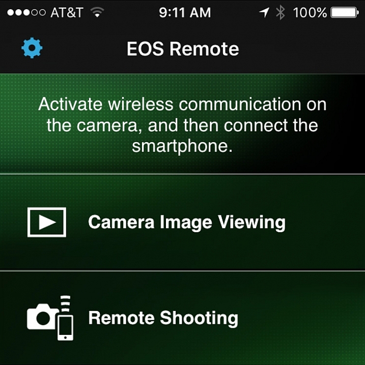
    #9 Set up the Wifi

    Almost all new cameras have a Wifi feature these days. To take advantage of it, you will have to download an app to your phone and go through a set-up process. It’s best to sit down and do that right away so that when you are out and about you are ready to take advantage of the Wifi feature.

    Wifi

    Set up the connection between your camera and your phone to enable remote shooting and camera image viewing.

    #10 Read the Manual

    You knew this was coming, didn’t you? Yes, you need to read your camera manual. Yes, it can be tedious, but you’ll be glad you did.

    Do you have any other tips to add for new camera owners? Please share in the comments below.

    googletag.cmd.push(function() {
    tablet_slots.push( googletag.defineSlot( “/1005424/_dPSv4_tab-all-article-bottom_(300×250)”, [300, 250], “pb-ad-78623” ).addService( googletag.pubads() ) ); } );

    googletag.cmd.push(function() {
    mobile_slots.push( googletag.defineSlot( “/1005424/_dPSv4_mob-all-article-bottom_(300×250)”, [300, 250], “pb-ad-78158” ).addService( googletag.pubads() ) ); } );

    The post Top 10 Things to do When Your New Camera Arrives by Jim Hamel appeared first on Digital Photography School.


    Digital Photography School
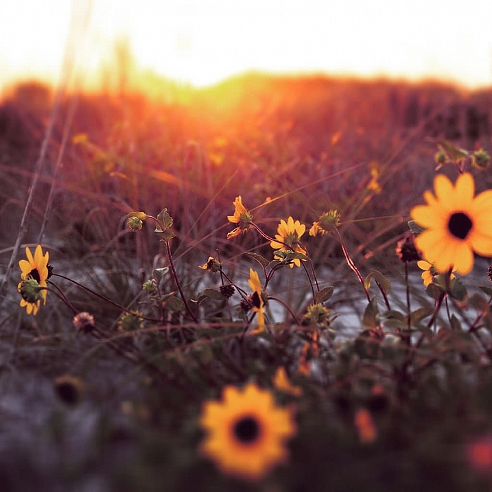
  • 20 Tips to Improve Your Travel Stock Photos

    Here are 20 tips to help you take the best stock photos while traveling or around your hometown. Even if you don’t do stock photography, you can use these tips to help you get better images.

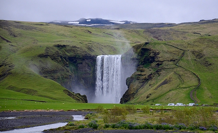
    NEAR SKOGAR, ICELAND - JUN 19:  Skogafoss waterfall on June 19, 2015, was in the film The Secret Life of Walter Mitty in 2013.

    NEAR SKOGAR, ICELAND – JUN 19: Skogafoss waterfall on June 19, 2015, was in the film The Secret Life of Walter Mitty in 2013.

    1. Check stock photo websites to see popular locations

    In addition to doing some web searches for areas of interest, a great way to know which locations are popular is to check popular stock photo websites, such as Shutterstock or iStockphoto. You’re not looking to recreate any existing shots, but it helps to know what’s been done well already and, more importantly, what is missing.

    2. Check the itinerary of sightseeing buses

    A great way to see what popular locations are is by reviewing any websites for sightseeing buses. Make a note of their stops and add them to your shot list.

    3. For international travel, learn the basic words of the language

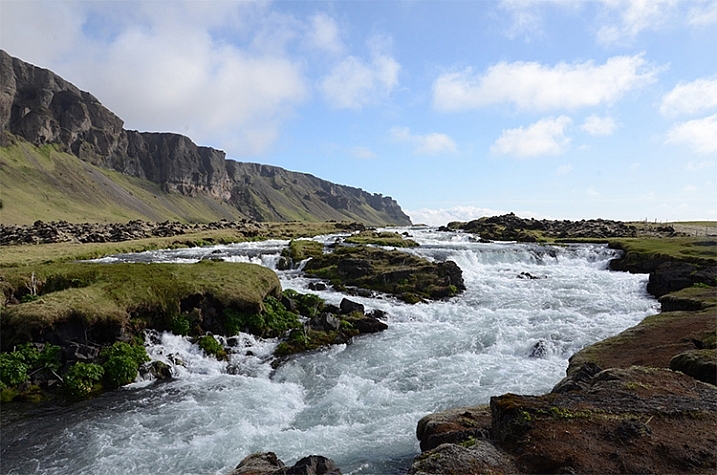
    Iceland rushing water 750 px

    Learning some key words like, “please”, “thank you”, and “Okay?” can make communication much easier abroad, and help spur friendships. uTalk is a terrific app to learn a new language, and Duolingo is great to refresh a language you are already familiar with.

    4. Check out popular postcards

    Taking a peek at postcards in tourist shops will give you an idea of the popular sites. Again, you are not looking to recreate shots, but you might be able to add a few locations to your shot list.

    5. Get recommendations from locals

    Check with the clerk at the grocery store, or gift shop, at your current stop for nearby locations that would be worth photographing. You may learn about some lovely hidden gems that will enrich your experience.

    6. Consider renting a car to have greater control of your travel plans

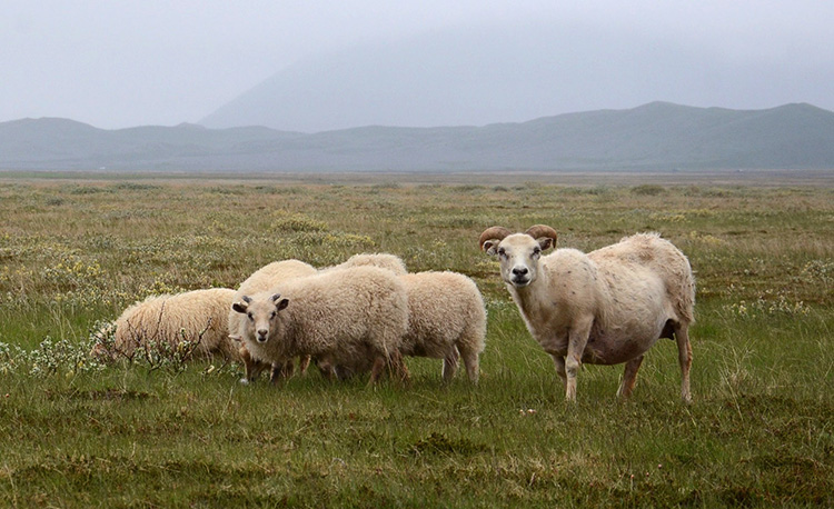
    Iceland goats 750 px

    You never know what you’ll encounter on the road

    Public transportation is fine within many cities, but if you’re going between towns renting a car allows you to pull off by the side of the road, and take those random shots that were not on your itinerary.

    7. Take photos when you have a chance, you might not go back the way you came

    Don’t figure you’ll catch something on your way back, you never know when serendipity will take you in a different direction than you intended. Get the shot now.

    8. Take the sightseeing bus (or boat)

    A sightseeing bus is a great way to get to the popular destinations, and if it’s a double decker bus, or a boat, you get views you couldn’t get otherwise.

    9. If shooting for editorial stock always note the location of the photo

    An editorial stock photo is going to require a location in the caption, so always note the name of the town. Take a quick shot of the welcome sign as you enter the town, or take a photo of a store with the town’s name. Of course having the location saved on your photo itself helps a lot too, but having it embedded within your photos makes it easier to quickly remember where you were. As another reminder, save all handouts from tourist spots, maps, and travel guides you pick up along the way to refer to later when processing your photos.

    Iceland car GPS 750 px

    10. Check your photo settings frequently

    You don’t want to look back on your photos for the day and realize you had set your ISO to very high for an indoor shot, and forgot to reset it when you went out into a sunny location so your outdoor photos are grainy. Or you set your photo size to small when you need a big file to get photos large enough to be accepted by the stock photo sites. If this sounds like the voice of experience, it is. We all make these mistakes – don’t be too tough on yourself if you make them too, just live and learn.

    11. Ask the experts

    You’ll sometimes find professional photographers taking shots. If they seem approachable, ask them, politely, what they are photographing. Some will be very eager to discuss what they are doing, others not so much, but it’s worth a shot. You might get some great insights.

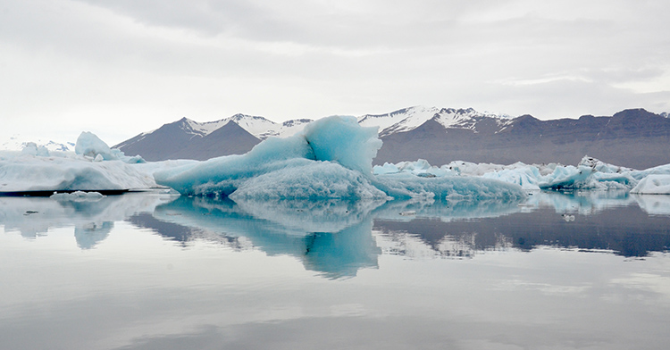
    12. Give yourself time to get the shot right

    You’ve traveled thousands of miles to get there, you won’t be able to go back and reshoot, so give yourself the time to get the shot right. Work the photograph to clean up the background, to remove distractions so the focus is on the area of interest. Sometimes just taking a few steps to the side, or turning a bit can make a dramatic difference by removing distracting elements in your background, or focusing the eye on the area of interest.

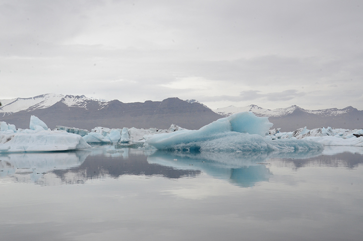
    Iceland Glacier Lagoon big blue side 750 px

    Glacier on the side, not noticeable

    Iceland Glacier Lagoon big blue 750 px

    Glacier is the main focus of the shot

    Hanging around also allows you to absorb the atmosphere of the place, and keeps you from rushing from photo to photo.

    13. Think layers

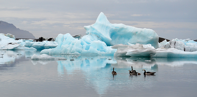
    While you’re waiting for that right shot, think in terms of three layers: The area of interest as the middle layer, with a clean background layer to set it off. Wait for an interesting foreground to present itself, maybe people, or animals in this case, going past your area of interest. This makes the photograph come alive, gives it some depth, adds to the interest.

    Iceland Glacier Lagoon geese 750 px

    Geese add a sense of proportion to the glacier and bring the scene to life

    14. Think like a guidebook author or a nature artist, or…

    Pretend you are writing for a tourist guidebook – what kind of shots do you want in your guidebook? What would your potential readers like to see? How about if you were an artist preparing for a nature exhibit – what photographs would you want as part of your exhibit? Look at each location from different perspectives to get new ideas.

    15. Take a variety of shots

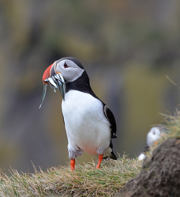
    Give your clients as many options as possible. Take 15-20 shots at any one location, walk around and check different positions, try different angles, think close-ups, wide shots, vertical as well as horizontal shots. You’ll then have plenty of options to choose from for your final photographs.

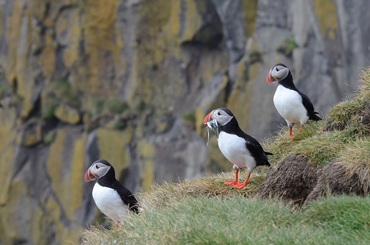
    Iceland puffin with fish left 750 px

    Iceland puffin with fish and buddies 750 px

    Close-up and wide shots gives you and your clients options

    16. Look behind you as you leave your location

    Don’t leave the best shots behind your back. As you leave a location turn around and see what shot you might be missing.

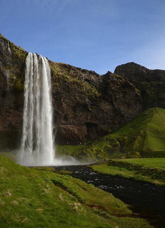
    Iceland Seljalandfoss exit side 750 px

    Don’t miss the great shot behind you

    17. Offer to take photographs for others

    Share your skills – if you see a group of people taking a group photograph, offer to take the shot for them. It makes for another chance to interact with people, and if you learned a bit of the language, all the better.

    18. Be mindful of other people’s desire for privacy

    People will make it pretty clear whether they are okay with being included in your photographs. Stay away from editorial photos of little children, and if you accidentally take a photo of someone who clearly doesn’t want to be in your photo, let them know you have erased the shot. On the other hand, many people will be eager to have you take their picture, and oblige happily.

    19. Back up your photographs every night and cull as you go

    Upload your photographs to your laptop and/or to the cloud, you’d hate to have your camera stolen or lost mid-travel, and lose all those shots. While you’re at it, delete the photos you know are not going to work out, those with people blocking the view, or out of focus, etc. Don’t wait until you get home to the daunting task of sifting through thousands of photographs.

    20. Process your photos right away upon your return

    The longer you wait to process your photos the harder it will be to get to it. Unprocessed photos tend to get heavier with time and sink to the bottom of your to-do list. It’s best to process them while you remember what the sights really looked like, so you remember to uncover that rainbow you know was there but might not be so visible before Photoshop.

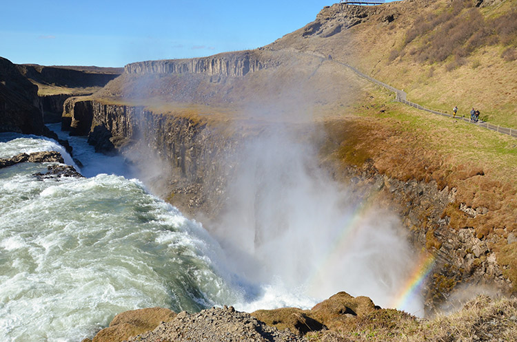
    Iceland Gulfoss rainbows 750 px

    Don’t forget to uncover the rainbow.

    Best wishes on your photography adventures. Please share in the comments below if you have any questions or additional tips.

    googletag.cmd.push(function() {
    tablet_slots.push( googletag.defineSlot( “/1005424/_dPSv4_tab-all-article-bottom_(300×250)”, [300, 250], “pb-ad-78623” ).addService( googletag.pubads() ) ); } );

    googletag.cmd.push(function() {
    mobile_slots.push( googletag.defineSlot( “/1005424/_dPSv4_mob-all-article-bottom_(300×250)”, [300, 250], “pb-ad-78158” ).addService( googletag.pubads() ) ); } );

    The post 20 Tips to Improve Your Travel Stock Photos by Susan Montgomery appeared first on Digital Photography School.


    Digital Photography School

  • 10 Photography Website Mistakes That Might be Repelling Your Potential Clients

    If you are serious about your photography business, then you most likely have your own photography website already (if not, you should set one up right away). You are probably really proud of it and consider it the best website under the sun. However, numerous mistakes can be found on almost every photographer’s site. These mistakes could be fatal for your business, since they can easily repel your potential clients. We are talking big agencies, companies and even government organizations, not just regular consumers who want you to be their wedding photographer.

    Here’s some good news: these mistakes can be fixed easily once you know what they are based on.

    We have recently researched thousands of photographers’ websites when looking for professional vacation photographers for our new project. We were quite surprised by the number of mistakes we had encountered on them. On top of that, several particular mistakes kept constantly repeating!

    Some seem obvious, some of them not, but almost every photographer’s website is guilty of at least one or two of these mistakes. So, here comes the checklist of some of the most common photography website mistakes that might save some of your serious assignments:

    1) Your name is missing

    This is probably the most obvious mistake. However, you would be really surprised how many websites are anonymous. A nickname may be great, it might help you look like a mysterious artist, but it definitely won’t help you to get new inquiries.

    Your name is your only brand. You should be proud of it and present it to the public as much as you can. So put your name out there! Visibly! And buy yourself a domain with your name if possible.

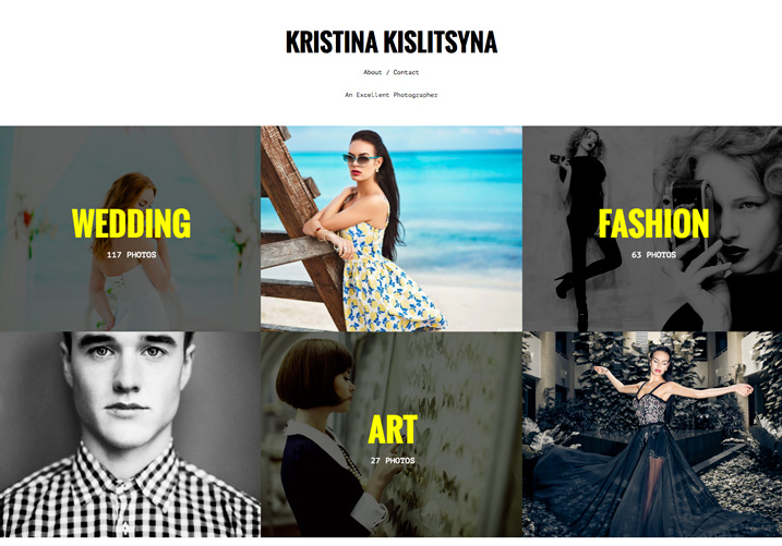
    1 example of good website be proud of your name

    Example of good website, be proud of your name: Kristina Kislitsyna

    2) You’re using cheap web templates

    Do you want to run a successful photography business? Then you have to invest in it, at least a little. Start with investing in a decent website. A few hundred bucks and a skilled friend will have the work done in a blink of an eye, you’ll have a nice, basic, yet original website.

    However, I implore you, do avoid those cheap template websites with the provider‘s logo all over the place.

    3) Your contact information is missing

    Email address is the key. Your client needs to find it quickly and easily. Contact forms might not seem like a bad choice at first, however, they most certainly are. Lots of big clients prefer to contact you via email, because they want to have a copy of the email that they send to you.

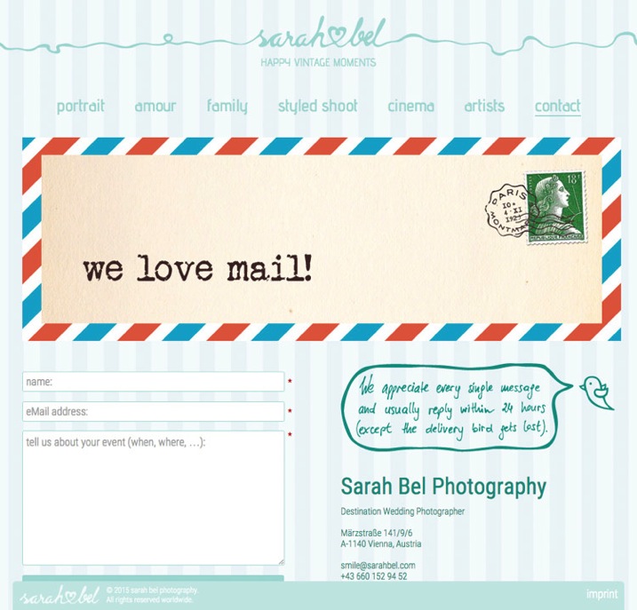
    If you insist on having a contact form, put your email address next to it and let your client decide. Here’s a secret tip – insert your email address as an image with your email on it so bots cannot find it and you save yourself from getting tons of spam.


    2 example of good website put your email address next to the contact form and let your client decide www sarahbel com

    Put your email address next to the contact form and let your client decide: Sarah Bel Photography

    4) Check your spam box

    This one is closely connected to the previous point. Inquiries from agencies, companies, and other projects often end up in the spam box or junk folder. It doesn’t matter which email service you use to communicate with your client, but it is essential to check your spam box every few days. This is the only way to avoid those embarrassing moments when you respond to an important inquiry after several months, and indeed, it is usually too late at that point.

    5) There’s music playing on your website

    Do I have to add anything else? Hello, it’s 2015! Everyone is listening to Spotify or YouTube while browsing the internet. The last thing people want is to be interrupted by the blasting of your favourite music.

    6) Your pricing is hidden

    It’s okay if you don’t want to share the pricing on your website, it’s also okay if you want to share it, but you definitely need to decide which way you want to go! If you want to show your prices, do so visibly, clearly, and in a special menu category. If you don’t want to share them, then say so clearly (and add your email address at that point, so that the client can contact you regarding the pricing details right away).

    There’s nothing weirder and more suspicious than a small hidden grey link to a PDF pricing guide that cringes at the bottom right corner of an About Me page.

    3 example of good website clear statement about where to find pricing www verapavlovaphotography com

    Example of what to do – clear statement about where to find pricing: Vera Pavlova Photography

    7) Your website is too slow

    On photography websites, this is most often caused by high-resolution and uncompressed photos. I know, we are photographers and we are proud of our latest cameras with great dynamic range and stuff. Still, these things are usually not that important for our potential clients. You need your website to be fast! And because of that, you need to compress photos for your website – compress them big time (150-200kb is a good maximum file size for website images, any bigger will slow your site down). Speed is the king in the realm of photography websites.

    8) There’s no English version

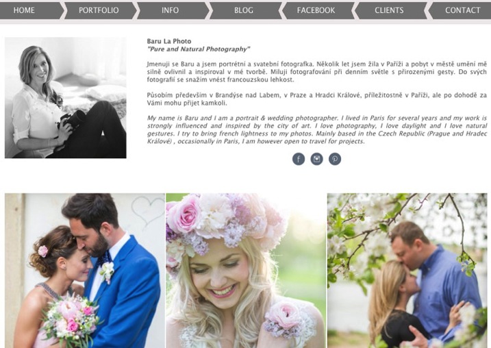
    This one is for photographers from non-English speaking countries. Yes, English is the most important language in the business world nowadays, so you need to have an English version of your website if you want to target the worldwide market. If you don’t have the time, or the resources, to prepare two language versions, then go for an English only site.

    4 example of good website two language versions including English www barulaphoto com

    Example of a website with two language versions including English: Baru la Photo

    9) Your location is missing

    Lots of (semi)professional photographers try to target the whole world, thus the only location info that you can find on their website is “available worldwide”. Okay, it’s great to know that you’re willing to travel, but clients are sometimes looking for local know-how. Always specify your location (at least by the city).

    10) There are no links to social media

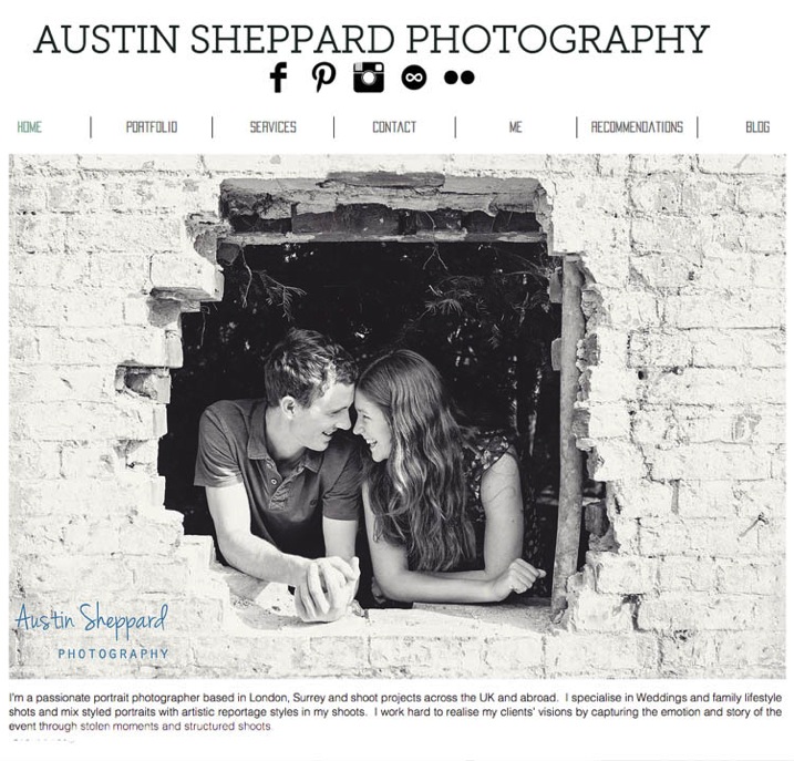
    Social media is the new place to check testimonials and references to your work. It is crucial for your potential clients to be able to quickly find their way to your profiles on social media. The rule “the more, the better” applies here 100% – Facebook, Twitter, Pinterest and Instagram are necessary. You name the others…

    5 example of good website clearly visible links to social media www austinsheppardphotography com

    Example of clearly visible links to social media: Austin Sheppard Photography

    Summary

    You put a great amount of energy and time to build up your website. It would be pity to reduce the possibility of attracting potential clients just by making some small mistakes that you can get rid of quite easily. I hope that this article will show some practical examples of such possible changes.

    We would also love to hear from you! Are there any other mistakes that you suggest avoiding on photography websites?

    googletag.cmd.push(function() {
    tablet_slots.push( googletag.defineSlot( “/1005424/_dPSv4_tab-all-article-bottom_(300×250)”, [300, 250], “pb-ad-78623” ).addService( googletag.pubads() ) ); } );

    googletag.cmd.push(function() {
    mobile_slots.push( googletag.defineSlot( “/1005424/_dPSv4_mob-all-article-bottom_(300×250)”, [300, 250], “pb-ad-78158” ).addService( googletag.pubads() ) ); } );

    The post 10 Photography Website Mistakes That Might be Repelling Your Potential Clients by Matej Slezak appeared first on Digital Photography School.


    Digital Photography School

  • 5 Tips for Using the Blend If Feature in Photoshop

    In this video Blake Rudis, from EverydayHDR, shows five really useful tips for using the Blend If feature, which is available in Photoshop when working with layers.

    The five methods for using Blend If:

    1. Adding sharpness to your image
    2. Removing noise
    3. Adding saturation
    4. Vignetting
    5. Adding a texture to your photo

    Get the downloads he mentions in the video here:

    Using the Blend If sliders allow you to really control where you want the affects to apply, without complicated masking and brushing in and out details. Give it a try, it may save you a ton of time editing!

    googletag.cmd.push(function() {
    tablet_slots.push( googletag.defineSlot( “/1005424/_dPSv4_tab-all-article-bottom_(300×250)”, [300, 250], “pb-ad-78623” ).addService( googletag.pubads() ) ); } );

    googletag.cmd.push(function() {
    mobile_slots.push( googletag.defineSlot( “/1005424/_dPSv4_mob-all-article-bottom_(300×250)”, [300, 250], “pb-ad-78158” ).addService( googletag.pubads() ) ); } );

    The post 5 Tips for Using the Blend If Feature in Photoshop by Darlene Hildebrandt appeared first on Digital Photography School.


    Digital Photography School
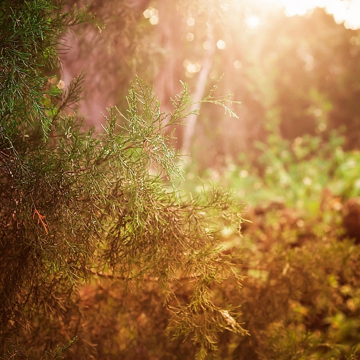
  • Planning Your Photoshoot – Review of the App: LightTrac

    Getting to know when is the best time of the day, or the best lighting conditions in specific locations, is key for the outdoor photographer. Whether you are shooting landscapes or portraits outside, it is always good to know in advance what to expect in terms of lighting at your desired location. Of course, as the old saying goes, there’s an app for that.

    LightTrap-App-Review-3

    While there is no shortage of similar applications, I find LightTrac easy to use and understand. It basically helps to plan outdoor photo sessions in advance, by finding the right lighting conditions and time, depending on the specific location you want to photograph.

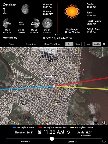
    The application calculates the angle of the sun, the moon, and plots the results on top of a map for any location in the world. While using LightTrac you can pick any date and time, at any place, then visualize the position and elevation of the sun and moon. It’s quite handy to be able to know not only what time sunset or sunrise will be, but more importantly, the relative position of the sun.

    Here is the list of features for the iPad and iPhone version:

    • Find angle and elevation of sun for any location and time
    • Find angle and elevation of moon for any location and time
    • Find sunrise, sunset and twilight times for any day
    • Find moonrise, moonset and moon phase for any day
    • View when full moon, new moon, first and last quarters occur
    • View elevation chart and azimuth chart for sun and moon
    • Integrated compass view on the iPad
    • Search locations by address, city or zip code
    • Save multiple locations and switch between them easily
    • Use address book to pick locations from your contacts’ addresses
    • Share your saved locations easily with fellow photographers via email
    • Easily export your locations to KML file to view on other apps
    • Does automatic timezone detection
    • Available in English, German and French languages

    There is also an Android version with a more limited list of features.

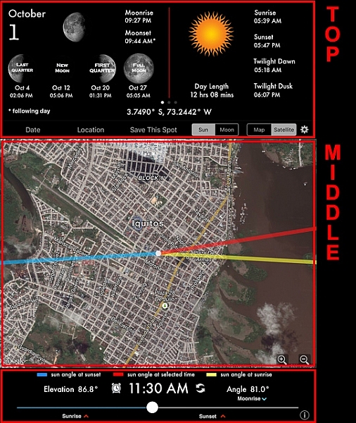
    The application is very easy to read and understand. The screen is mainly divided into three sections: top, middle and bottom.

    LightTrap-App-Review-2

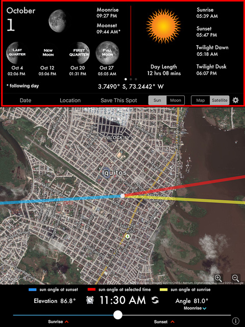
    The upper section of the application’s screen shows the date and all information pertaining to moonrise and sunrise with times, including twilight for dawn and dusk. It also display the lunar phases for the month, and GPS coordinates. If you are looking to search information for a specific place, you can tap in “Location” and either enter your own GPS coordinates, or make a search by city name. The same can be done with “Date”; just tap to enter a date in the future.

    LightTrap-App-Review-1

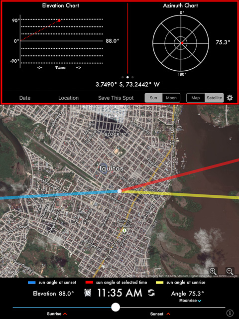
    But the upper section provides much more information. Just by sweeping to the left, there are two more screens. The first one will show you an elevation chart and an azimuth chart; these sets of tools basically help you to determine the position of the sun in the sky related to your location at a certain time of the day.

    LightTrap-App-Review-5
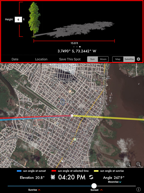
    That’s practical information for sure, but it seems a bit geeky to me. I’d rather use the second screen. If you sweep one more time, the following illustration will show you the shadows projections from an object; it’s more practical and easier to understand than the previous screen.

    LightTrap-App-Review-4

    As you can see in the screen captures above, the middle section shows a map with super-imposed information of the sun’s angle. The sun’s angle at sunrise is marked in yellow, at sunset in blue, and the red line will show the sun’s angle at any time you select. The selection can be easily done by moving the slider of the bottom section, and as you do, the time changes and the red line that represents the sun angle moves accordingly, emulating the position and movement.

    There is also a very useful tool in the bottom section. If you tap in the clock besides the time, a window will pop up offering you to set a reminder, an alarm, or even add to your calendar that specific event.

    In conclusion, LightTrac is a simple but practical tool that is very useful for the outdoor photographer, because one the best ways to create beautiful photos is to properly plan the best time of the day to shoot. This application allows you to do that very precisely and in advance.

    googletag.cmd.push(function() {
    tablet_slots.push( googletag.defineSlot( “/1005424/_dPSv4_tab-all-article-bottom_(300×250)”, [300, 250], “pb-ad-78623” ).addService( googletag.pubads() ) ); } );

    googletag.cmd.push(function() {
    mobile_slots.push( googletag.defineSlot( “/1005424/_dPSv4_mob-all-article-bottom_(300×250)”, [300, 250], “pb-ad-78158” ).addService( googletag.pubads() ) ); } );

    The post Planning Your Photoshoot – Review of the App: LightTrac by Daniel Korzeniewski appeared first on Digital Photography School.


    Digital Photography School
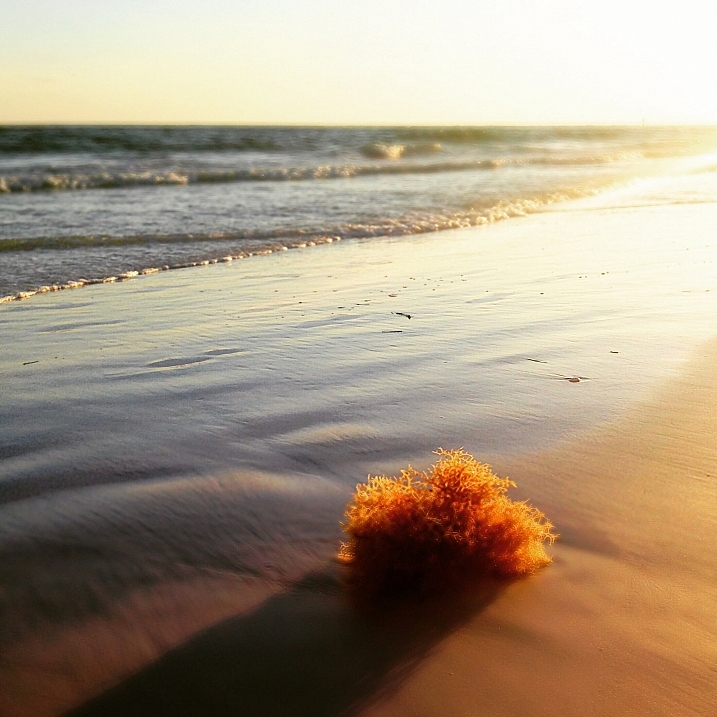
  • Writer’s Favorite Lens – Nikon 16-35mm f/4

    favorite, lens, nikkor, 16-35mm, ultrawide, wide angle, landscape

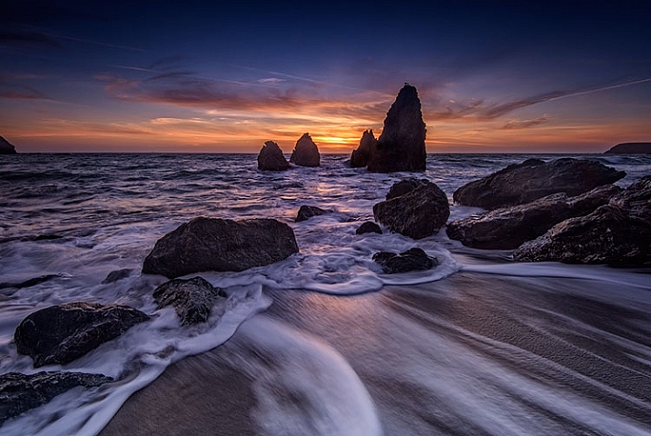
    Rodeo Beach, Marin County, California

    Asking me which lens is my favorite is somewhat akin to asking me which one of my two children I love the most. The simple answer is, “the one that will get me the shot I want!” I will also tell you, it depends on the subject I’m shooting. If I’m photographing a portrait, I’m more likely to choose my 85mm f/1.4. But primarily, I am a landscape photographer, so as I look back at some of my favorite images, I will say that most have been made using my AF Nikkor 16-35mm f/4G ED.
    As I have grown as a photographer, I must admit I have become more and more enamored with the ultra-wide angle point of view. I enjoy seeing things in that perspective, and using the wide angle to emphasize foreground objects. I do also own the 14-24mm f/2.8 lens, but one thing sets the 16-35mm apart for me – that is the ease with which filters can be used. More on that in a bit.

    First, some technical specs:

    • Focal Length:  16-35mm
    • Maximum Aperture: f/4
    • Minimum Aperture: f/22
    • Format: FX
    • Vibration Reduction: Yes
    • Dimensions: 3.2 in.(82.5 mm)
    • Weight: 24 oz. (680g)
    • Price: $ 1259 USD

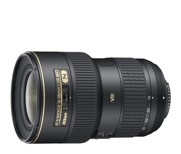
      AF Nikkor 16-35mm f/4G ED VR II, my favorite lens

      Courtesy of Nikon

    Ultra-Wide Angle Coverage

    As a landscape photographer, I love using the perspective of an ultra-wide angle lens to be able to distort perspective and emphasize foreground objects. I often find that 24mm just isn’t wide enough to do what I’d like. Also, the 2x zoom to 35mm adds some nice versatility on the wide angle end of things. I can go from ultra-wide at 16mm to moderately wide at 35mm, without needing to change lenses to my mid-range zoom.  This provides me with a little more flexibility than the 14-24mm.

    While that lens can go just a bit wider, there are several trade-offs that make the 16-35mm more appealing. In addition, I find the lens to be tack sharp throughout the range, with very little if any chromatic aberration (color fringing that can happen in high contrast areas). While the maximum aperture of f/4 may give some photographers pause (believing that f/2.8 is a necessity) I find that more often than not, I am shooting this lens while mounted on a tripod, and stopped down for maximum depth of field.  Being able to shoot at f/2.8 just isn’t a requirement for me. Keep in mind, I am using this lens on a Nikon D810. If you are using a DX body, the lens’ coverage won’t be as wide.

    my favorite lens, photography, landscape, wide angle, ultrawide angle, landscape,

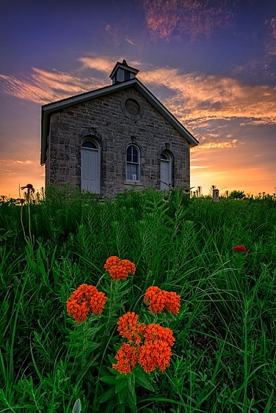
    Lower Fox Creek Schoolhouse

    Using Filters

    As a landscape photographer, the ability to use filters is no small consideration. While I have filters for my 14-24mm lens, they are quite large. If I’m trying to travel light, I can’t always fit them in the bag, and those filters only fit the 14-24mm. My 100mm filter kit fits all of my lenses except for the 14-24mm, so it’s more economical in terms of space if I only carry that one kit and use my 16-35mm as my ultra-wide option when a filter is needed. The 16-35mm takes a 77mm sized filter for screw ins, or 77mm mounting ring if I’m using my drop-in filters. That matches most of my other lenses, making it convenient in terms of compatibility with accessories.

    my favorite lens, photography, landscape, wide angle, ultrawide angle, landscape,

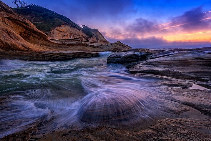
    Cape Kiwanda, Oregon

    Image Stabilization

    While it’s not typically deemed necessary in an ultra-wide angle lens, the inclusion of VR, or vibration reduction (sometimes also called image stabilization) is a nice plus for this lens. Other lens makers have also begun including it in their competitors in this range. As I said, I am generally on a tripod when shooting with this lens, but there are times when hand-holding is necessary. Having the option of turning on the VR to give me some extra help in steadying the camera, gives me a great sense of reassurance that my images will be sharp. This is of particular importance when standing on a bridge, which can vibrate due to cars on the roadway, or when photographing in a place where tripods aren’t allowed.

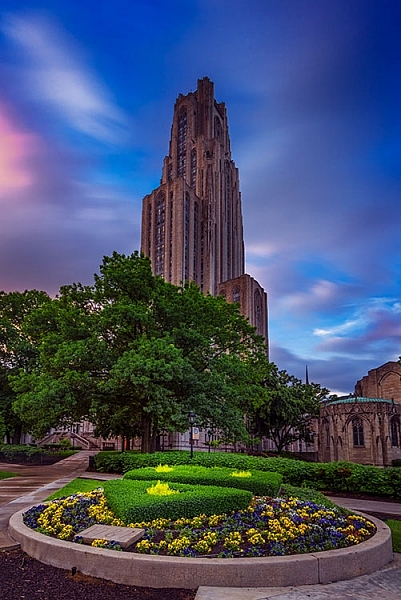
    my favorite lens, photography, landscape, wide angle, ultrawide angle, landscape, cityscape, architecture

    Cathedral of Learning, University of Pittsburgh

    The Bottom Line

    For me, it’s all about the image. Size and weight are a distant second. Is the lens sharp? Yes. Is the field of view what I want? Yes. Can I use it with my filters to achieve my final image? Yes. It is the positive answers to those three questions that make this lens my favorite for photographing landscapes. Come back and talk to me about my favorite portrait lens another time.

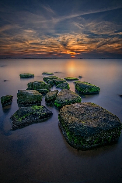
    my favorite lens, photography, landscape, wide angle, ultrawide angle, landscape, sunset

    Great South Bay, NY

    googletag.cmd.push(function() {
    tablet_slots.push( googletag.defineSlot( “/1005424/_dPSv4_tab-all-article-bottom_(300×250)”, [300, 250], “pb-ad-78623” ).addService( googletag.pubads() ) ); } );

    googletag.cmd.push(function() {
    mobile_slots.push( googletag.defineSlot( “/1005424/_dPSv4_mob-all-article-bottom_(300×250)”, [300, 250], “pb-ad-78158” ).addService( googletag.pubads() ) ); } );

    The post Writer’s Favorite Lens – Nikon 16-35mm f/4 by Rick Berk appeared first on Digital Photography School.


    Digital Photography School