Category: Photography

  • 3 Quick Photoshop Edits You Need to Know

    For many photographers, spending time behind a computer editing images, can be annoying. I personally enjoy the editing process, but I often hear photographers saying that they wish they didn’t have to spend time editing images. Of course, the image editing process has become the photographer’s responsibility since the advent of digital photography. In the past, the editing process was the domain of the lab that developed and printed your roll of film.

    If you are one of the photographers that does not like the idea of spending hours editing your images, then this article might help you get out of the editing blues.
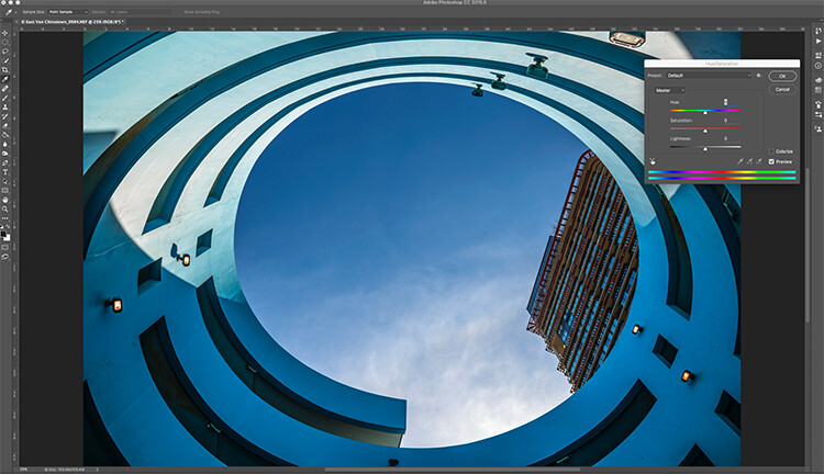
    Image open in Photoshop with the Hue and Saturation tool open

    Image open in Photoshop with the Hue and Saturation tool open

    Of course, you will always need to spend some time editing, but you don’t want to be spend hours trying to make an image  look good. There is a quick way to get some good results from your images in Photoshop. But, before we talk about that, first there are some things that you need to do in-camera, which will save you time in post-production.

    1. Make sure your lenses are clean, you don’t want to spend time cleaning up dust spots on your images.
    2. Make sure your sensor is clean, get your sensor cleaned when you start to notice sensor spots on your images.
    3. Use a tripod, straightening images in Photoshop or Lightroom wastes your time.
    4. Make sure your image is in focus and sharp. Zoom in on your LCD screen to be sure, if not, retake the shot.

    From there, you can be sure that your images are coming out of your camera in an edit-ready state. You don’t want to spend your time fixing photography mistakes made in-camera. The main goal with image editing is to take your good images, and make them look spectacular. So, here are some very quick edits you can do to your images (assuming the image is in good shape) in Photoshop, and in turn, spend more time behind the camera.

    Quick Edit #1 – Levels or Curves?

    This is something of an ongoing debate among photographers. Some have a preference for one or the other, the reality is that they are very different tools, and you can (and should) use both.
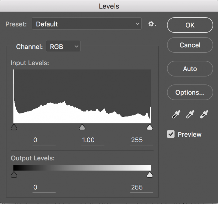
    Screen Shot 2016-06-30 at 3.52.50 PMLevels is a great tool to quickly make exposure adjustments to your image. Curves gives you the same ability, but in much more detail. It also has some very powerful abilities in terms of specific adjustments. For a quick edit though, Levels is your tool of choice: IMAGE > ADJUSTMENTS > LEVELS, the keyboard shortcut is CMD>L on a Mac and CTRL>L on a PC, OR add it as an adjustment layer for non-destructive editing.

    Levels can really make a difference to your image. Take a look at this article to help you with levels: 5 Photoshop Tools to Take Your Images from Good to Great, as well as some of the other tools available. The levels tool looks deceptively simple, but it has some really powerful functionality. It is best to adjust your image using Levels first, as this tool affects exposure on three areas of your image: the highlights, shadows and midtones.

    All images are made up of a combination of these three areas. The Levels tool adjusts the exposure in each of them separately. The reason why this is important, is because exposure affects colour. For example, if you make your exposure in a scene darker, your colours will become more saturated, if you brighten the exposure, your colours will desaturate. So, making levels adjustments first, will also help your image’s colour.
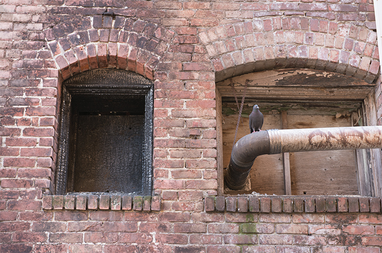
    Image straight out of camera, no adjustments

    Image straight out of camera, no adjustments.
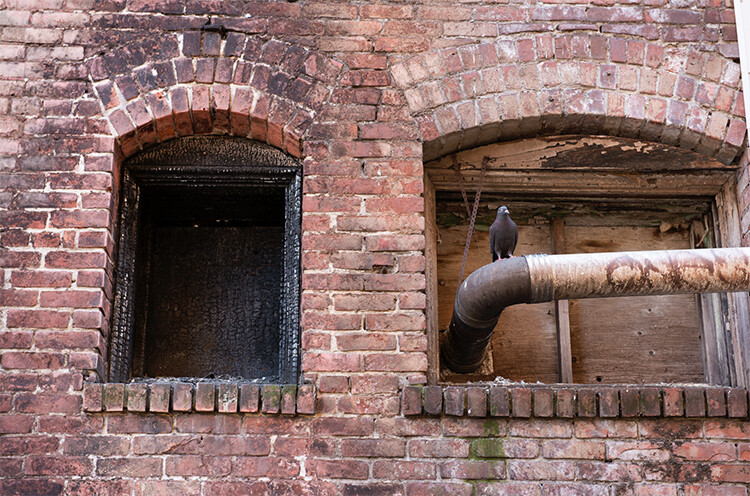
    The same image after adjustments in Levels

    The same image after Levels adjustments

    Quick Edit #2 – Hue and Saturation
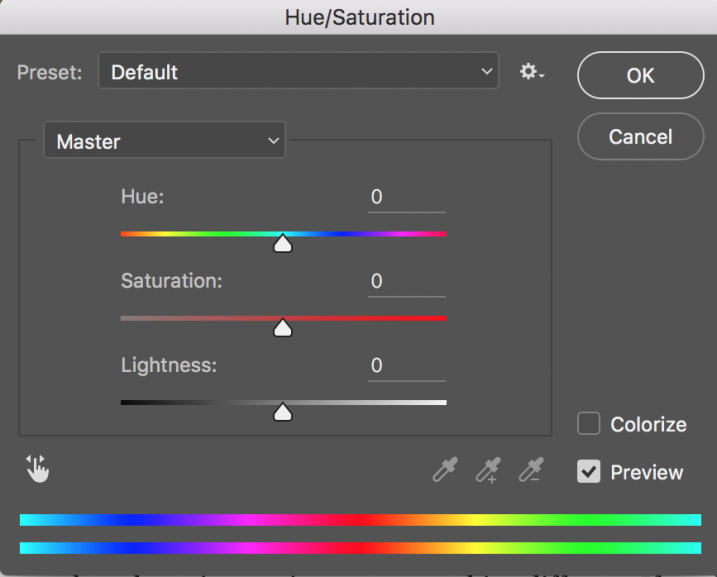
    Screen Shot 2016-06-30 at 3.54.30 PMThis tool is the next one in order. Start off with Levels and then move onto Hue and Saturation  (IMAGE > ADJUSTMENTS > HUE AND SATURATION or the keyboard shortcut is CMD>U on a Mac or CTRL>U ON A pc). This also looks like a simple tool on the surface, but there is a lot more depth to it.

    First of all, you will see three sliders, the top one is Hue, the middle one is Saturation, and the bottom one Lightness. You will also notice a pull-down box above the three sliders, it is set to Master as the default.
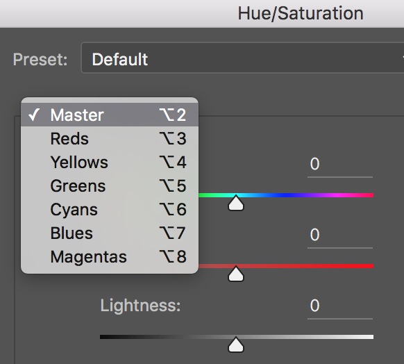
    Screen Shot 2016-06-30 at 4.02.56 PMThe Hue slider is used if you want to change the colours in your image to something different. If you leave the box at the top on Master and adjust the Hue slider, all the colours in the image will change, making your image look a little funky and weird, but this could be fun too! The real power of the Hue slide comes into play when you select a colour channel from the drop down box. If you click on the arrow next to Master, all the colour channels will drop down (see screenshot left). This is really useful if you want all the reds to look a little more orange in your scene. Bear in mind, this is a universal adjustment, it will select all the reds in your image and make an adjustment to them all.
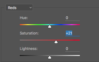
    Screen Shot 2016-06-30 at 4.06.31 PMThe second slider is Saturation which affects how rich your colours are in your image. If the reds in your image seem to be light or weak, you can select Reds from the list, and simply move the Saturation slider up (see screenshot right). Also, if some of your colours seem too bold, you can select the appropriate colour channel and move the Saturation slider to the left. You can select each colour individually and make the necessary adjustments.

    The last slider is Lightness. I have almost never used this one. If you have done a good job on your levels adjustment, there is really no reason to use the Lightness slider, so I would recommend not using it.
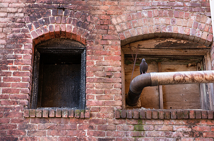
    Image after Hue and Saturation adjustments have been made

    Image after Hue and Saturation adjustments have been made

    Quick Edit #3 – Brightness and Contrast

    Once you have made your colour adjustments using Hue and Saturation, you might need to boost the brightness a little. The Brightness and Contrast tool (IMAGE > ADJUSTMENTS > BRIGHTNESS AND CONTRAST, there is no keyboard shortcut to this one) should be used sparingly, do not make big adjustments using it.

    You can simply nudge the Brightness slider to the right and give some pop to the image, then do the same for the Contrast slider. If you don’t feel that you need to use this tool, then don’t, it is only necessary if your image looks a little dark after your colour adjustments.

    Note: if you’ve done each of these as an adjustment layer you can go back and tweak your levels again, after doing the others.
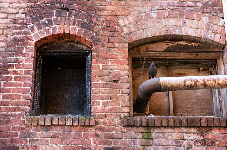
    Final quick edits made in Brightness and Contrast

    Final quick edits made in Brightness and Contrast

    That’s it, you are done, in a manner of speaking. These quick edits may be good enough for you to get your image to a satisfactory point. If you are happy with your image, then great – you have not spent too much time editing it.

    You can do these three quick Photoshop edits on images that you think might be printed. Then if you see that the edits give them the boost you want, you can then spend more time on each image. This cannot replace a good workflow and a good understanding of what is possible in Photoshop, but these three tools will give you the ability to quickly edit your images and get them into a print-ready state really quickly.

    If you need to do some further edits, then take a look at this article about more detailed post production techniques or check out all the articles dPS has on image editing in Photoshop. 

    googletag.cmd.push(function() {
    tablet_slots.push( googletag.defineSlot( “/1005424/_dPSv4_tab-all-article-bottom_(300×250)”, [300, 250], “pb-ad-78623” ).addService( googletag.pubads() ) ); } );

    googletag.cmd.push(function() {
    mobile_slots.push( googletag.defineSlot( “/1005424/_dPSv4_mob-all-article-bottom_(300×250)”, [300, 250], “pb-ad-78158” ).addService( googletag.pubads() ) ); } );

    The post 3 Quick Photoshop Edits You Need to Know by Barry J Brady appeared first on Digital Photography School.
    Digital Photography School

  • Tips for How to Make the Most of Rainy Days

    It isn’t always possible to get great weather when are out photographing. If you’re on a once in a lifetime vacation and you encounter rainy weather, then you have a couple of choices. You can pack away your camera and forget about shooting until the weather improves, or you can find a creative approach to make the most of the inclement weather. I suggest you attempt the latter, and when you encounter wet weather, look for opportunities to create great photos notwithstanding the rain.

    In fact, if you compare a day with dull gray skies to one where there is plenty of rain, you might actually find that the rainy day is preferable, as there are more things of interest happening.

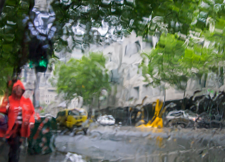
    Melbourne Australia in the rain

    There are, however, some things to consider when shooting in the rain. You will want to protect your gear from getting too wet, and you will want to know a bit about using your camera so that you can take great shots. Here are some tips for shooting on rainy days.

    Preparing for rain

    Invariably, at some time you will encounter rainy weather when you are out photographing. If you have a set of “go to” creative options that you have practiced, and you are familiar with, you can swing immediately into the mindset of taking advantage of the wet weather and capture some great shots. I’ll give you some ideas about what you can shoot.

    You’ll also need to prepare yourself and your camera so you can stay as dry as possible. Wet weather shooting should still be fun, and staying dry is an important part of that.

    What to shoot

    When you encounter rainy weather you can try to minimize the appearance of the rain or capture it. If you try to avoid the rain you’ll often capture dull and uninteresting images. Whereas if you capture the rain in your photographs, you’ll likely achieve more creative and interesting images.

    Shoot through windows

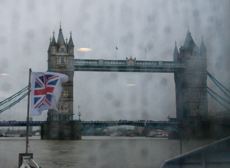
    Here are two shots of Tower Bridge in London shot from a ferry on the Thames. For the first image I shot through a rain-splattered window and focused on the Tower Bridge. The result is, quite frankly, embarrassingly awful.

    Tower Bridge London in the rain

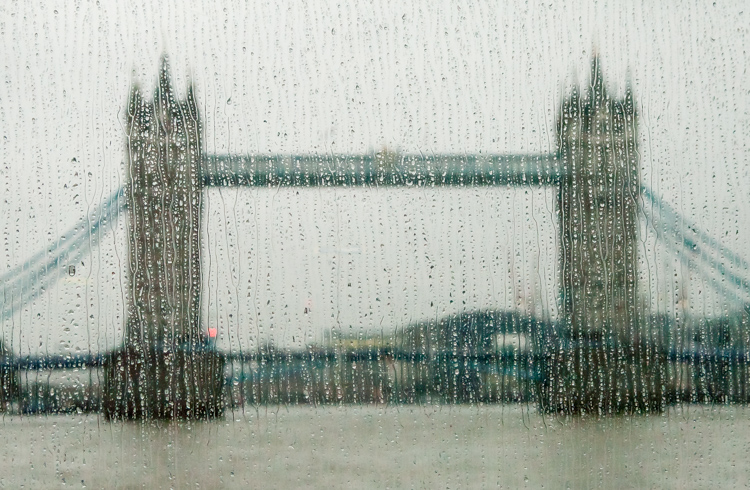
    This second image is shot from the same ferry, through the same window, but this time I focused on the raindrops instead of the bridge. The Tower Bridge is still recognizable, and the overall image is much more creative and pleasing. When you next get a chance, try focusing on the raindrops on a window, and not what you see through it.

    Tower Bridge London in the rain

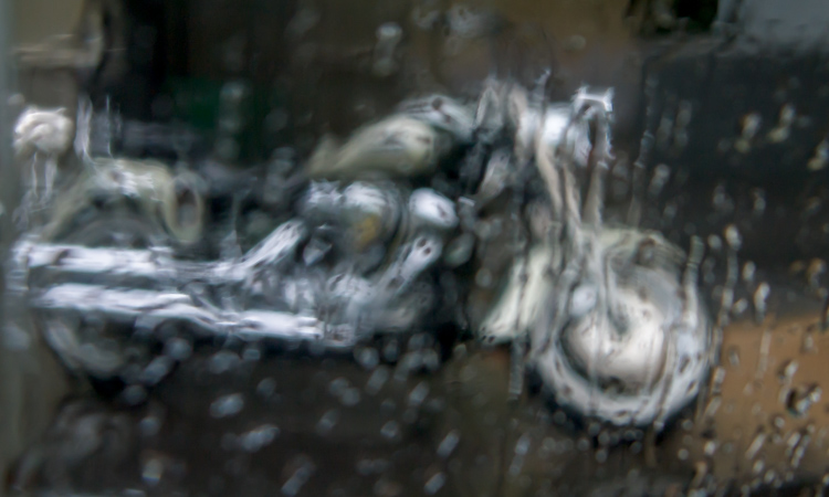
    In this shot below , captured through a taxi window as it sped through Melbourne in a sudden downpour, the focus has landed somewhere between the window and the bike, and the result is a painterly image.

    Tower Bridge London in the rain

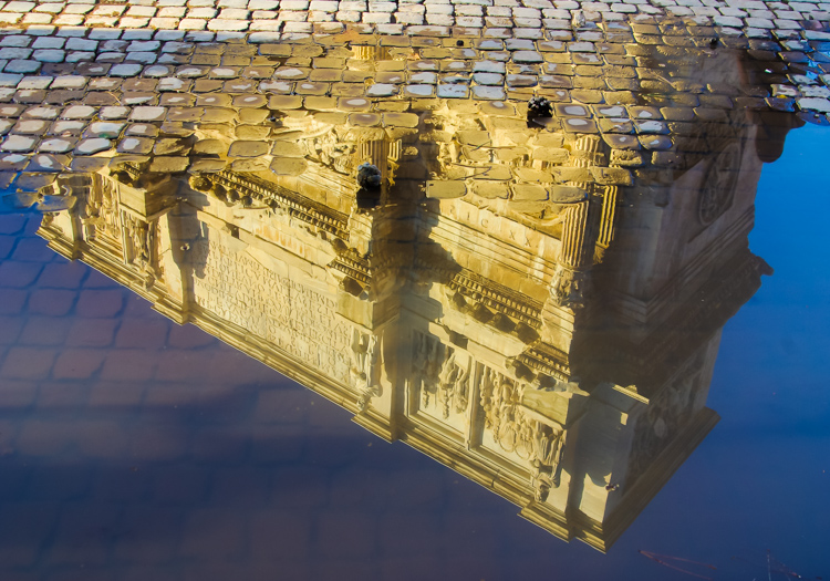
    Shoot puddles

    Where there is rain, there are generally puddles. These puddles will reflect anything (and everything) from car taillights to buildings, and from people to trees. Look out for interesting objects reflected in puddles.

    Rome - reflection of building in a puddle

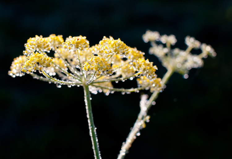
    Shoot water droplets

    For a time after it has rained, raindrops will still cling to plants and other surfaces. Look for interesting objects dotted with raindrops.

    raindrops on yellow flowers

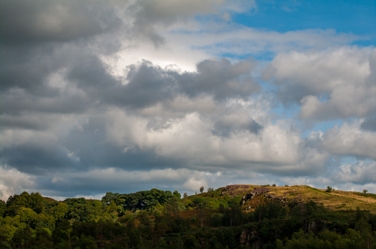
    Shoot the clouds

    Before it rains you will typically see interesting formations of rain clouds. Sometimes they will enhance an otherwise spectacular landscape, and sometimes they are the subject a photo in and of themselves.

    thunderous clouds

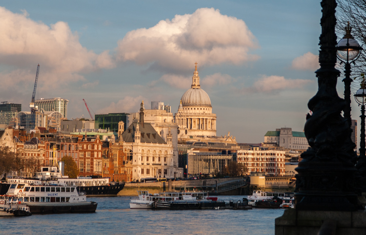
    When there are gaps between rain clouds, you will often see shafts of sunlight piercing the clouds and highlighting small areas of a landscape or cityscape. This light is truly magical and it will give a sense of drama a scene. Keep an eye out for this light and shoot it quickly when you see it – because the clouds are moving, light that is there one minute, will be gone the next.

    St Paul’s lit by shard of light

    Camera settings

    Some creative photography will require skills beyond using the automatic settings on your camera. For example when you opt to capture the raindrops on a window rather than what you see through the window you will need to experiment to find the best distance to stand from the window. Moving one or two steps closer or further from the window can totally change the image.

    You will also probably need to manually focus your camera so you need to know how to set it to Manual focus mode. The reason for this is that most cameras in autofocus mode will try to focus on the distant building, and won’t focus on the raindrops on the window. Using manual focus will allow you to determine exactly what is in focus in your shot.

    To capture raindrops on plants and other surfaces, you can use Aperture Priority mode and vary the aperture to achieve different results. A very large aperture (f/ 2.0 – f/5.6) will give you a shallow depth of field with only a small part of the scene in focus. A small aperture (f/8- f/13) will result in a much deeper depth of field, where more of the scene is in focus. It is up to you to decide how much of the image you want to be in focus – just be sure you know how to set your camera in Aperture Priority mode, what range of apertures are available for the lens you are using, and how to change the aperture setting.

    Caring for you and your camera

    When shooting in the rain you’ll want to keep your camera and yourself as dry as possible. I find it preferable to wear a raincoat with a hood because I find it impossible to juggle an umbrella and a camera at the same time. Whatever you choose, carry only what you need to have with you, so you have a better chance of keeping everything dry. It’s best to avoid changing lenses in wet weather, so stick with just one lens. Take care when moving from a cold, rainy situation into a warmer building. The heat combined with the damp will increase the humidity and you run the risk of condensation forming inside your camera lens.

    Even if your camera has good weather seals, take care to protect it as best you can. There are plenty of good rain covers that you can purchase for your camera, or in a pinch, cover the camera and lens with a plastic bag, and cut a small opening for the lens. Duct tape or elastic bands will hold the bag securely on the camera.

    Make sure to pack some clean, dry towels that you can use to wipe off your camera, but don’t use them on your lens – only use a lens cleaning cloth on the lens glass.

    If your camera gets wet, dry it off as carefully as you can, and leave the lens open at full zoom until it’s thoroughly dry. A camera will dry best in a cool dry place, and you can use silica gel (an absorbent material sold in packets) in your camera bag to help avoid condensation forming.

    Conclusion

    Giving some thought as to creative options for capturing great photos in the rain, with some advanced preparation so that you and your camera stay dry, may turn the prospect of shooting on a rainy day from a sorry disappointment, into an exciting challenge.

    googletag.cmd.push(function() {
    tablet_slots.push( googletag.defineSlot( “/1005424/_dPSv4_tab-all-article-bottom_(300×250)”, [300, 250], “pb-ad-78623” ).addService( googletag.pubads() ) ); } );

    googletag.cmd.push(function() {
    mobile_slots.push( googletag.defineSlot( “/1005424/_dPSv4_mob-all-article-bottom_(300×250)”, [300, 250], “pb-ad-78158” ).addService( googletag.pubads() ) ); } );

    The post Tips for How to Make the Most of Rainy Days by Helen Bradley appeared first on Digital Photography School.

    Digital Photography School

  • 5 Life-Saving Tips on How to Back Up Photos

    Everyone’s heard the horror stories about people who’ve lost their photos, and everyone knows that – no matter what they’re of or what they’re for – losing your pictures can be devastating. Whether it’s a folder of precious family photos, a portfolio, or a project for a client, replacing what was lost can be time consuming, expensive, and even impossible Continue Reading

    The post 5 Life-Saving Tips on How to Back Up Photos appeared first on Photodoto.


    Photodoto

  • Tips for HDR Night Photography to Retain Maximum Image Detail

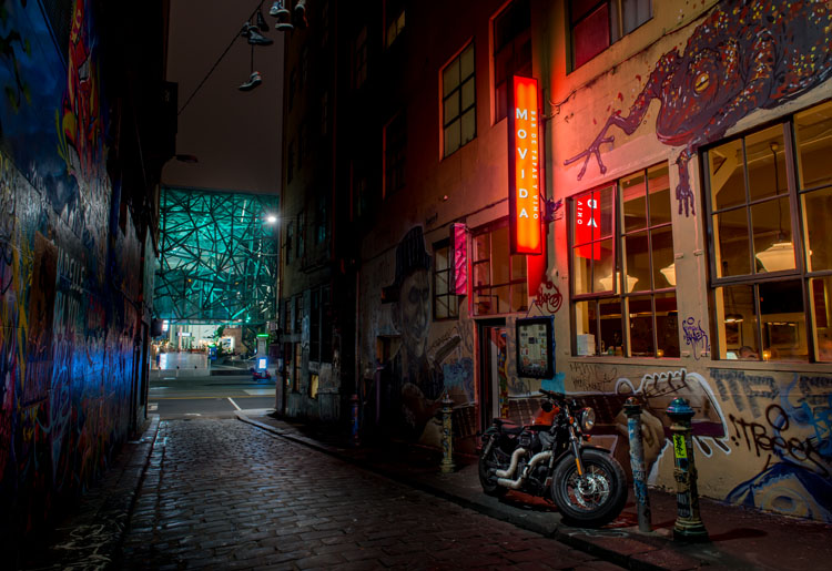
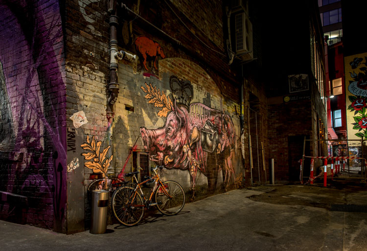
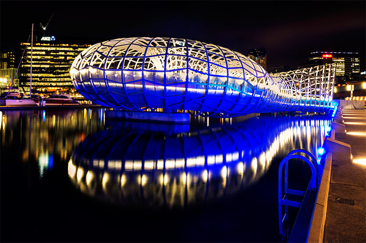
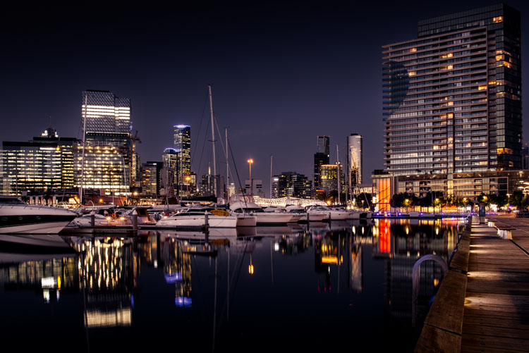
    Night photography is very popular, and if you go out to take photos on on any given night here in my hometown of Melbourne, you will find other photographers doing the same thing. Night photography can create magical images and you are able to see things with the camera, that you can not see with your eyes alone. Your camera can do a better job at taking in the lights than you can.

    leannecole-night-photography-nightHDR-start

    HDR image of Docklands, Melbourne.

    Taking photos with your phone, or on a compact camera, is never going to give you those amazing results you see of night photos. You really need to do long exposures; set your camera up on a tripod and do exposures from a couple of seconds, to several minutes.

    One major problem with taking photos at night is the sharp contrast between the highlights and shadows. If you try and get detail in the shadows, you will often blow out your highlights. If you do expose for the bright parts, then you won’t get any detail in the rest. Most people don’t mind this. However, if you want your night images to really sing, you should start looking at what you can do to make them stand out.

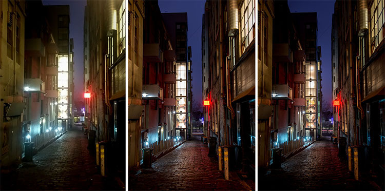
    Comparing shots with different exposures

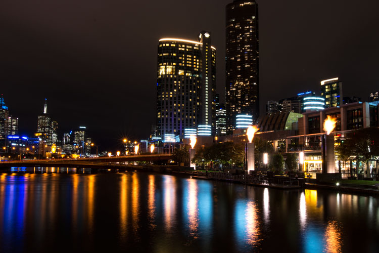
    Here is a side by side comparison of images all taken at the same time, but with different methods. The first was taken with a phone, the second is a single exposure, the one the camera says is correct. Lastly, the third image is an HDR using four out of five bracketed shots.

    leannecole-nightphotography-comparison

    Three images of the same scene, (left) phone, (middle) camera correct exposure, and (right) HDR.

    Hopefully you can recognize the difference and appreciate just how unique each approach is.

    Photos with your phone

    You see a lot of people in the city taking photos with their phones. If it is all you have, then you have to be content with what you get. However, you are never going to get amazing night photos simply with a phone or most compact cameras. Often the photos are too grainy, you will only get a few of the highlights, and none of the depth that a longer exposure will give you.

    To get great night photos you need to have a camera on which you can control the ISO, aperture and shutter speed.

    The first image (below) was taken with the Samsung Galaxy Note 4. It is not a bad image for a phone, but it is noisy and not as sharp.

    leannecole-night-photography-phone

    Image taken with phone of Melbourne at the Casino.

    Using a DSLR or Mirrorless Camera

    When you can control what your camera is doing, then you can use a low ISO, the aperture you want, and get a shutter speed of a couple of seconds to several minutes. You will get a lot more detail doing this, however, you do need more equipment.

    A tripod or somewhere solid to set your camera is important to prevent camera shake. If you want to do exposures longer than 30 seconds you will need a remote shutter release, that will allow you to lock your shutter open for however long you choose to expose. Both are pieces of equipment that you will use a lot so they are worth getting.

    This image was taken with a DSLR at the correct exposure, according to the camera.

    leannecole-night-photography-3

    Single image of Melbourne at the Casino.

    Bracketing

    Bracketing your photos is thought to be a process that people only do for HDR. However, photographers have been using this technique for a very long time. In the days of film, you would have had to work it out for yourself, but most digital cameras have the ability to take bracketed exposures, and do the calculating for you.

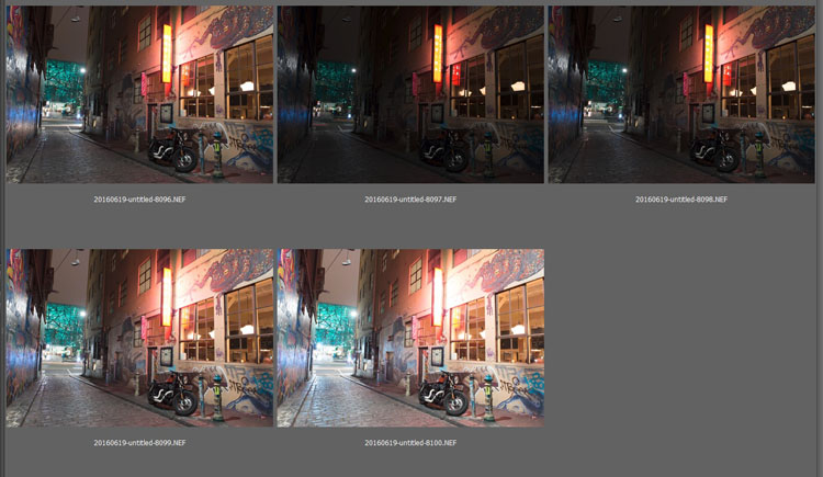
    The process involves taking a series of photos, usually three or five. When you do this, you are taking one image that is the correct exposure, and additional images that are under and overexposed. The amount of time for each image changes, while aperture and ISO remain the same, and the shutter speed is altered by the camera.

    There are good reasons for bracketing, one being that it gives you more options. Sometimes the exposure the camera says is the right one, is in fact not. The overexposed image or the one that is under can be the better choice.

    leannecole-nightphotography-bracketed

    Five bracketed photos ready to use.

    There are, of course, disadvantages to bracketing. You end up with many more images, especially if you are doing five each time. If you are shooting in RAW you may encounter storage problems. However, I find that the positives far outweigh the negatives.

    High Dynamic Range (HDR)

    HDR has been popular for a few years and we have all seen those hyper real images that some people create. They have given the process a bad name, but if it is used in the situations it is meant for, it can be very effective.

    High Dynamic Range is used to correct the problem of having very bright and overly dark areas. Cameras do not work the same way as our eyes, and they cannot make the necessary adjustments that your brain and eyes do. Your camera will either expose for the highlights and make the shadows too dark, or it will do the opposite.

    HDR software takes the well exposed highlights and shadows, and puts them together in one finished image so that nothing is lost in either area. You can do it manually (using luminosity masking or layer blending), but there is good software out there which can do it for you.

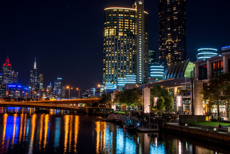
    Here is an HDR image of the same scene above, using four of five bracketed shots. Notice how much more detail is retained in the highlights.

    leannecole-night-photography-hdr-example

    HDR night image of Melbourne at the Casino.

    HDR Software

    There are many different types of software that can process your HDR images for you. The most popular has been Photomatix Pro, though Lightroom and Photoshop can also be used, and they have improved significantly over the years.

    Lightroom does a fairly decent HDR image and I often use it. However, you do have to be careful that the image is processed properly. Sometimes it misses spots, but most of the time it is effective.

    Lightroom HDR

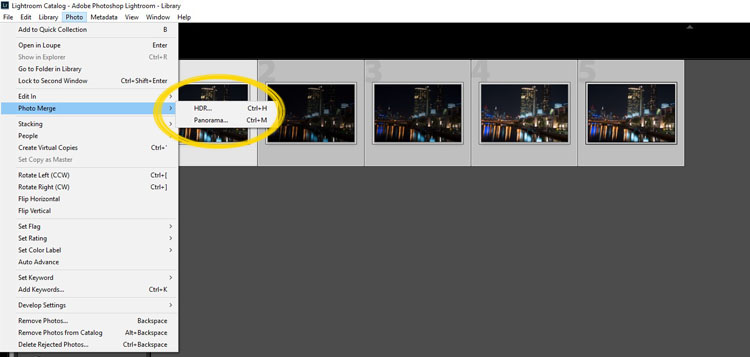
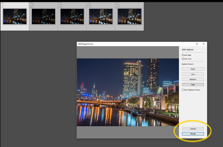
    It is easy to use Lightroom’s Merge to HDR. Select the images you want to process and highlight them. Go to Photo > Photo Merge > and click on HDR (you can also find it by right clicking with the images selected).

    leannecole-night-photography-101

    Selecting photos and merging for a HDR in Lightroom.

    A separate window will come up. You can select whether you need deghosting or not (use it if something has moved between shots like trees or people). If you have used a tripod to take the image then you shouldn’t need deghosting, although it doesn’t hurt to use it regardless.

    leannecole-night-photography-102

    Lightroom loading the photos ready for you to click Merge

    Watch for the Merge icon to come up and then press it.

    Often the image will appear at the end of the folder, sometimes just after the images. You may have to search for it (sort by file name and it should appear next to your originals).

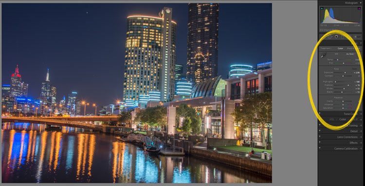
    Once it is done you will see that it does not look great.

    leannecole-night-photography-103

    What the image looks like when Lightroom has processed it using Auto Tone.

    Lightroom shows you the adjustments that it has made using Auto Tone, but there is no reason why you can not change them.

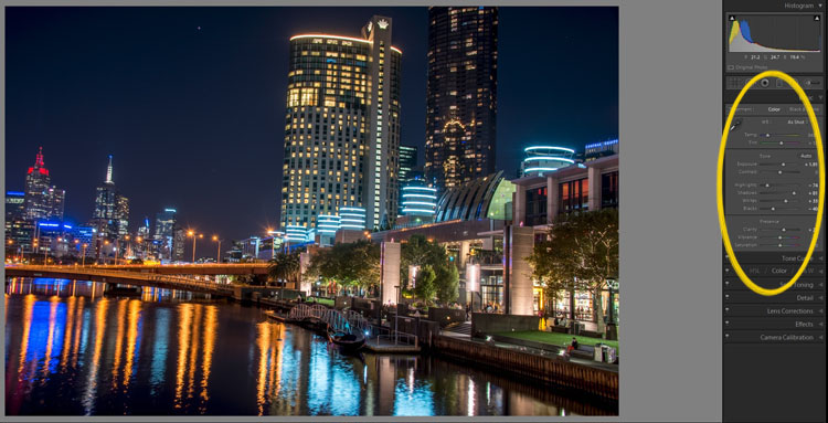
    I have found that it will often have the exposure up too far, but you are able to turn that down slightly. You can turn the shadows down a little, and you usually need to add more black to the image. Compare the image above and below and you can see what changes have been made.

    leannecole-night-photography-104

    What it looks like after you have made changes to the adjustments.

    Once you have the image as you want it, you can do further adjustments in Lightroom or press Ctrl+E and continue editing it in Photoshop.

    Long Exposure Night Photography

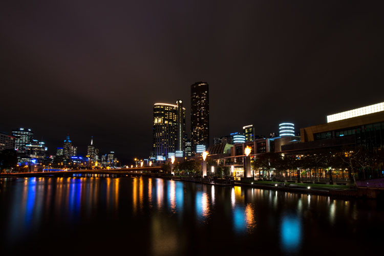
    There is nothing wrong with doing long exposures as well. You do not need filters, but you can do images that are more than 30 seconds. Using a tripod and a remote shutter release, you can put your shutter speed on Bulb, and try taking some exposures for a minute or longer.

    leannecole-night-photography-longexposure

    A one minute exposure of Melbourne at the Casino.

    You do have to be careful that you don’t blow out the highlights too much. Try different times and see what you can get.

    Examples

    Night photos taken with any of these techniques can give you great results. You should try them all and see which ones you like, and what works best for your style.

    Following are some more night shots with descriptions of how they were done.  Good luck and be safe out there.

    leannecole-night-photography-example3

    Hosier Lane in Melbourne, HDR image with 4 images.

    leannecole-night-photography-hdr-example2

    HDR image of laneway in Melbourne.

    leannecole-night-photography-example4

    Single image at docklands with a one minute exposure.

    googletag.cmd.push(function() {
    tablet_slots.push( googletag.defineSlot( “/1005424/_dPSv4_tab-all-article-bottom_(300×250)”, [300, 250], “pb-ad-78623” ).addService( googletag.pubads() ) ); } );

    googletag.cmd.push(function() {
    mobile_slots.push( googletag.defineSlot( “/1005424/_dPSv4_mob-all-article-bottom_(300×250)”, [300, 250], “pb-ad-78158” ).addService( googletag.pubads() ) ); } );

    The post Tips for HDR Night Photography to Retain Maximum Image Detail by Leanne Cole appeared first on Digital Photography School.

    Digital Photography School

  • How to Use Lightroom to Learn Composition in Photography

    If you want more Lightroom help from Viktor, get 50% OFF his Four Seasons Lightroom Preset Collection, on now at Snapdeals (only until July 19th, 2016)

    When you start learning about photography, the whole process can be overwhelming with its complexity. But, when you break it down into smaller pieces that you can tackle one at a time, you quickly realize that photography isn’t rocket science at all. By then, it’s only a matter of time before you understand the whole picture, and are comfortable with the different aspects and techniques.

    Images Composition in Lightroom 01

    I still find one aspect of photography is more challenging than the rest, however. That is composition, which is difficult to learn and even more difficult to teach.

    Why? The main reason is because of its subjective nature. It is not easy to quantify composition. In other words, there is no right or wrong; everything is open to interpretation. As a result, learning and mastering composition is usually a long and gradual process.

    I want to share with you an exercise that you can perform using Lightroom, in the comfort of your home, that can accelerate the composition learning cycle. This approach was incredibly helpful in building my comfort with, and understanding of composition, in my photography. I hope you find it useful too.

    Images Composition in Lightroom 02

    The way I approach composition today is different, compared to my approach five years ago. The reason for that is because of new publishing channels.

    As a photographer who runs a popular blog dedicated to travel photography, I have multiple channels where I publish my photographs. It all begins on the blog, then moves to social media networks like Facebook, Instagram, G+, and Pinterest. Plus, I often prepare an extra version for printing purposes as well.

    Typically, different publishing channels require different versions of the same photograph. For example, if the original photograph has a landscape orientation with the aspect ratio of 3 x 2, Instagram requires a square 1 x 1 version, and Pinterest requires a vertically oriented image. I might need a panoramic version for print.

    Even though creating multiple versions of the same photo with meaningful composition takes more time and effort, I find this exercise is extremely valuable in learning and mastering composition in photography.

    Exercise in a Real Life Scenario

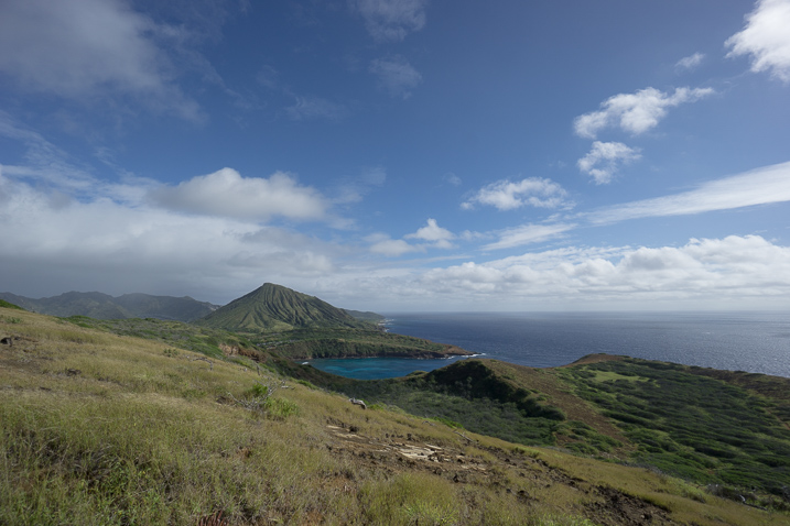
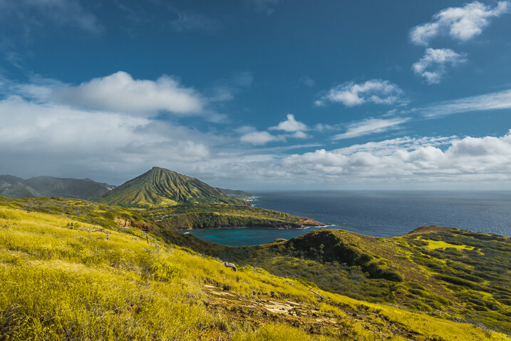
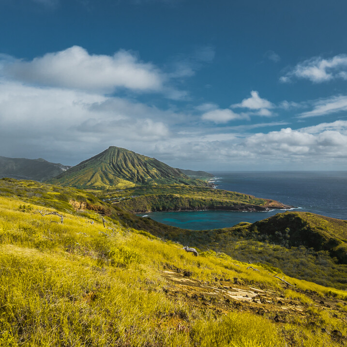
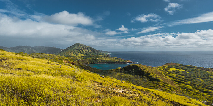
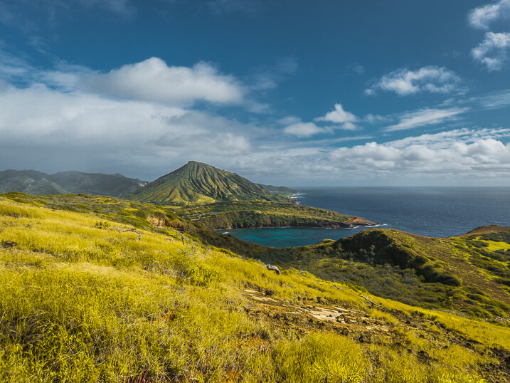
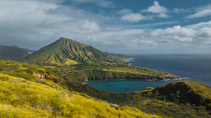
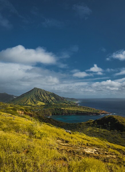
    I took this photo just after the sunrise on O’ahu Island in Hawaii.

    Images Composition in Lightroom 03

    From the very beginning, I could see the potential of the scene and was confident that I would use it on my blog, and maybe even in my portfolio.

    I intentionally took the shot of the scene wider than I would want for a regular 3 x 2 landscape composition. I left some room to have more freedom when creating different versions for publishing. I have no problem with cropping and trimming my photographs in post-processing, because 24 Mpx sensor on my Sony a6000 gives me enough pixels even for very aggressive cropping.

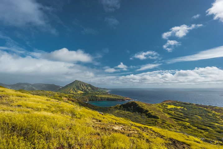
    I started the editing process by applying few of my favorite presets from my Landscape collection, and when I was happy with the result I started working on composition.

    Images Composition in Lightroom 4

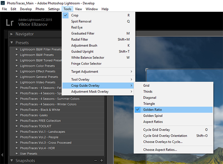
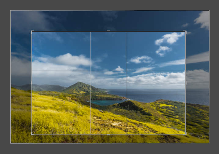
    First, I set up the Crop tool Overlay options, setting it to Golden Ratio. I know that Thirds is the most popular option among visual guides, but I find that Golden Ratio helps me to create more balanced compositions.

    Images Composition in Lightroom 05

    You can also scroll through the various overlay options by repeatedly hitting the O key on your keyboard, until you find the one you want.

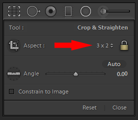
    I set the aspect ratio to 2×3 and lock it.

    Images Composition in Lightroom 06

    I create my first version by simply making the composition tighter.

    Images Composition in Lightroom 07

    Images Composition in Lightroom 09

    Version 1 – Aspect Ratio 3 x 2

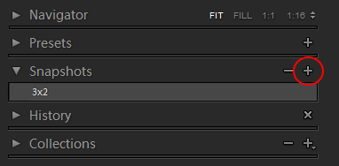
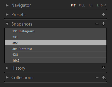
    When I am happy with the result I use the Snapshot functionality of Lightroom to save my version as a new Snapshot, and name it 3 x 2.

    Images Composition in Lightroom 08

    Then, I move on to the next version.

    Images Composition in Lightroom 10

    Version 2 – Aspect Ratio 1 x 1 (Instagram)

    Images Composition in Lightroom 11

    Version 3 – Aspect Ratio 2 x 1

    Images Composition in Lightroom 12

    Version 4 – Aspect Ratio 4 x 3

    Images Composition in Lightroom 13

    Version 5 – Aspect Ratio 16 x 9

    Images Composition in Lightroom 14

    Version 5 – Aspect Ratio 3 x 4 (Pinterest)

    When I am done I have the Snapshot Panel filled with six newly saved versions (snapshots).

    Images Composition in Lightroom 15

    Another alternative is to use the Virtual Copy functionality for each version I create. bu I prefer the Snapshot panel, which makes Lightroom less cluttered.

    Now, I can review each version by clicking on an individual Snapshot version, and if I am happy with the results, I am ready to start publishing.

    Conclusion

    The only way to learn composition in photography is to practice on a regular basis. I highly recommend the exercise I outlined above. Make a habit of creating at least two extra versions for each photograph you edit, one for Instagram and another for Pinterest. I can guarantee you it will help you to accelerate the process of learning.

    If you want more Lightroom help from Viktor, get 50% OFF his Four Seasons Lightroom Preset Collection, on now at Snapdeals (only until July 19th, 2016)

    googletag.cmd.push(function() {
    tablet_slots.push( googletag.defineSlot( “/1005424/_dPSv4_tab-all-article-bottom_(300×250)”, [300, 250], “pb-ad-78623” ).addService( googletag.pubads() ) ); } );

    googletag.cmd.push(function() {
    mobile_slots.push( googletag.defineSlot( “/1005424/_dPSv4_mob-all-article-bottom_(300×250)”, [300, 250], “pb-ad-78158” ).addService( googletag.pubads() ) ); } );

    The post How to Use Lightroom to Learn Composition in Photography by Viktor Elizarov appeared first on Digital Photography School.

    Digital Photography School

  • Tips for Successful Star Trails Photography

    Star trail photography – not so difficult with the correct planning and appropriate gear

    In this short article I will show you, the night sky enthusiastic, that by using the right gear and proper planning, you too can make beautiful star trail photo.

    Actually, shooting the stars is not that much different from any other kind of photography, and a decent composition is the key to an outstanding photo. Here are some star trail photography tips to help you.

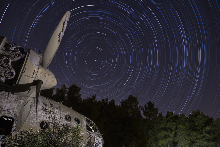
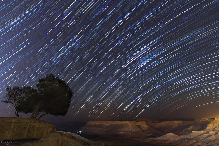
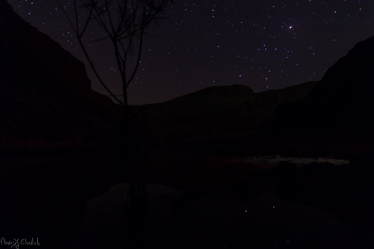
    Camera pointed to NorthNorth West

    Camera pointed to North/North-West with an artificially lit foreground.

    Prepare your gear

    • A DSLR camera (or one that has Manual shooting mode) with fully charged battery.
    • Plenty of room on your memory card. I suggest shooting all in RAW as you’ll get better results later in post-processing.
    • A wide angle lens. Anything between 10-20mm will give you good results. You can shoot also with a longer focal length but the results will be less impressive. Using a wide aperture is also essential to allow lower ISO.
    • A strong, steady, tripod. When placing it, make sure nothing will cause it to shiver from a passing wind.
    • A remote control (preferably not wireless). If you have a way to program intervals in your camera, the remote is not necessary.
    • Stuff to help you pass the time – coffee set, snacks, a comfortable chair, etc.
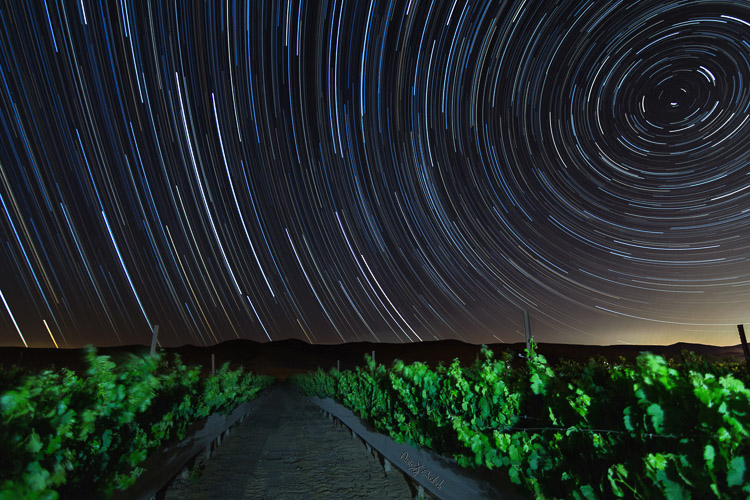
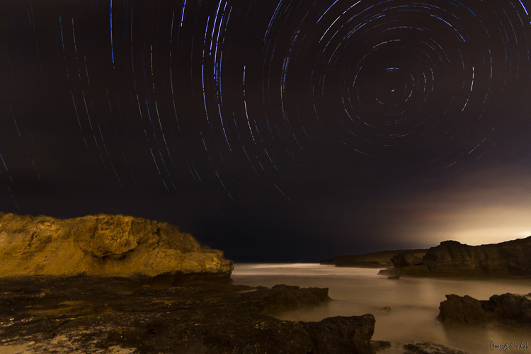
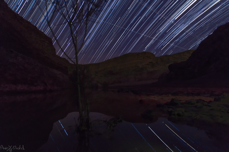
    Camera pointed to North with an artificially lit foreground .

    Camera pointed to North with an artificially lit foreground .

    Planning ahead

    Before going out there, you must consider there is some planning needed to be done.

    1. Choose your location carefully (there is no place for spontaneity). There are several things to consider, but most importantly you need a dark location, as far as possible from light polluted areas. Consider that city halos are visible at night for a very long distance, so get as far as possible from light sources. The darker the area you’re, the more stars you’ll see.
    2. Consider an interesting foreground item to be used as your anchor in the photo. It is not enough to shoot the stars, you want to have a nice foreground to make your photo interesting and unique. Find yourself a big tree, an interesting rock formation, a pier on a lake, or any other item to be used as your anchor.
    3. Learn about the weather and the moon phases – to get a good, clean shot you need a good, clear, dark sky. Choose that period of the month when the moon is not visible in the night sky (or is smaller like crescent moon), and make sure the forecast does not predict too many clouds. High humidity is also not good, as it may accumulate on your lens and result in blurry frames.
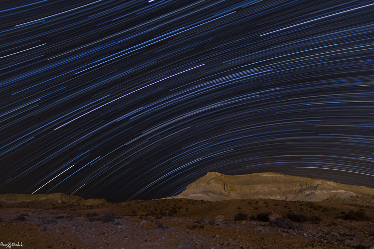
    4. Consider the rotation of the stars and the Earth, as this will determine the appearance of the final result. The best results (in my opinion) will be achieved by shooting to the North (photo above) or to the South-East (photo below). Since Earth and the North Star are moving in the same direction, at the same pace, it appears as if all stars are rotating around the North Star, so having it in your frame will result in getting circles of stars. Shooting to the South-East will grant you with an almost horizontal line, that is concave in one corner and convex in the opposite corner. The stars rotation speed is 15 degrees per hour around the North Star. That means that stars closer to the North Star will make a shorter distance in comparison to those further away (also, the longer you’ll shoot, the longer the lines will be).
    Camera pointed to South East

    Camera pointed to South-East with foreground lit by surrounding light pollution.

    Getting started

    #1 Pick a foreground anchor

    Although you may want to show as much of the night sky as possible, it cannot stand alone. Your photo must rely on a “strong” anchor / foreground if you want your viewers to be really impressed.

    #2 Get there before dark

    In most cases, it will be quite difficult, to the verge of impossible, to build your composition at night, in total darkness. It is better to arrive before night falls and it gets too dark to see. The last minutes of the day are your best time to plan and build your composition.

    #3 Compose your shot

    This is now the moment you place your camera and composing your frame. Remember to consider not only the appearance of your foreground in the frame, but also the direction that the camera is facing (as explained above).

    Camera pointed to North/North-West lit by surrounding light pollution. Trails looks fragrant due to passing clouds.

    Camera pointed to North/North-West lit by surrounding light pollution. Trails looks fragmented due to passing clouds.

    #4 Shoot for the foreground

    Take the first shot which will be used as the foreground of the frame. If you want your foreground to be a silhouette then all is good. But, if you want details to be shown, you will need to have at least one frame lit up. This can be achieved if few ways

    • Shooting one frame during twilight
    • Use a high ISO and longer exposure
    • Using an outside light source such as flash (it is good to use a CTO gel for the right color temperature). Your goal here is to get one frame that has good detail of your chosen foreground. It is better to take few options using different ISO level / exposure time / lightning options to be able to choose the best result afterward. When satisfied, you can move on to do a test frame of the sky.

    #5 Setup and test camera settings for the night sky

    Change the settings of the camera to get the best result for the night sky, without interference of light pollution. You need to see as many stars as possible, and to make sure they are in focus. The camera needs to be in Manual mode (or Bulb if using intervals). White Balance needs to be decided by you, and not on Auto mode (preferably in Tungsten mode, it will give you more blue in your image). Aperture set as wide as possible and an exposure time of around 30 seconds (with intervals you can set it to longer, but not more than a minute, for the sake of your sensor – it gets too hot).

    You can change the ISO to get lighter or darker sky as needed, but not too high to keep a smooth, clean frame. Once satisfied with the result, keep the settings and erase these test frames (just make sure to keep the foreground frames you did in step #4 above).

    #6 Take a couple dark frames

    Camera pointed to South-East with foreground lit by surrounding light pollution coming from behind.

    Camera pointed to South-East with foreground lit by surrounding light pollution coming from behind.

    Take one or two dark frames. This is done by putting on the lens cap, and shooting with the settings you chose in step #5 above. These frames will be used later in post-processing. Make sure you remove the cap once you’re done this part!

    #7 Take your interval shots

    Lock the shutter release controller or press start if doing intervals. Wait to see that it works properly, and a new exposure starts immediately after one ends. Now it’s time to let the camera work for as long as you decided, while you rest or go do something else, but make sure you keep a distance and are not adding light into your camera or composition. For a good result, it is advised to shoot for at least two hours, especially when shooting to the North.

    #8 Take two more dark frames

    Once your intervals are finished, before moving the camera, repeat on step 6 and take a couple more dark frames.

    This is it, YOU made it! All is finished and you can go back home for the post-processing part.

    Post-processing star trails

    First, from the foreground frames, choose the one that looks the best and process it to your liking. In this frame you can ignore the look of the sky, and if possible, it’s even better to darken it. When you’re happy with it, convert to JPEG or TIFF.

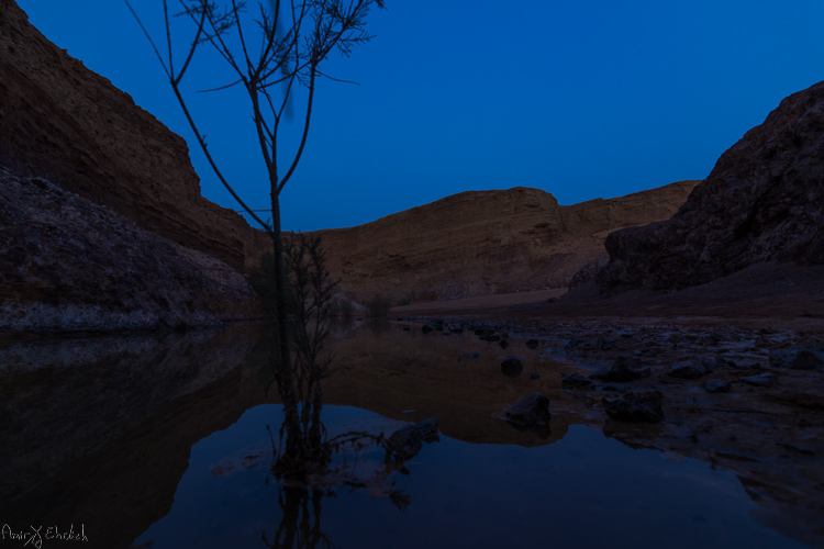
    Foreground frame

    A frame taken during blue hour to be used as foreground.

    Next, move on to the sky frames. Process the first one to improve the appearance and visibility of the stars. In this frame you can ignore the look of the foreground, and if possible, it’s better to darken it. Synchronize your settings to the rest of the sky frames. Export or convert the files to JPEG or TIFF.

    Sky frame

    One of the frames taken for the stars.

    If you did any lens corrections, apply them also to the dark frames, then convert them to the same format as the sky frames.

    Move on to the software you use for combining the frames – you can choose StarStax (Mac and Windows) or Startrails (Windows only) which are both free, very easy, and efficient. Upload the frames to their dedicated location (dark frames goes separately – the software is using them to subtract burned pixels from the final result).

    Stacked frame

    The result of merging all the sky frames in Starstax.

    The foreground frame can be handled in one of two ways – (a) placed together with all other sky frames or (b) left aside for merging it later to the final result, in Photoshop.

    If you are working with StarStax, I recommend marking the Gap Filling option (in Startrails it is called: Lighten-screen-blend). It will make the processing time a bit longer, but the final result will be smoother.

    If you chose to add the foreground image in when stacking the sky image, the result you’ll get is the final one and you may need only some fine-tuning to be done in Photoshop. Due to the time passed from the shooting of the foreground frame to the sky frames, you will notice a dot in front of every trail. These are the stars captured in the foreground frame. I see them as an interference in the overall look and erase them one by one.

    If adding the foreground image in Photoshop later was your choice, then now is the time to put it all together. Load the foreground frame and the star trail frame as layers in Photoshop, and merge them into one using a layer mask. This option is better when the sky in the foreground frame is too bright.

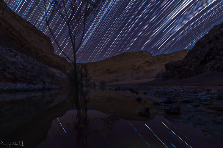
    Final after merging and cleaning

    The final frame after cleaning up any disturbing lights in the sky, and merging with the foreground.

    googletag.cmd.push(function() {
    tablet_slots.push( googletag.defineSlot( “/1005424/_dPSv4_tab-all-article-bottom_(300×250)”, [300, 250], “pb-ad-78623” ).addService( googletag.pubads() ) ); } );

    googletag.cmd.push(function() {
    mobile_slots.push( googletag.defineSlot( “/1005424/_dPSv4_mob-all-article-bottom_(300×250)”, [300, 250], “pb-ad-78158” ).addService( googletag.pubads() ) ); } );

    The post Tips for Successful Star Trails Photography by Amir Ehrlich appeared first on Digital Photography School.

    Digital Photography School

  • 3 Rookie Mistakes to Avoid When Shooting on a White Background

    Because the ubiquitous white background portrait is so commonplace, many people think it’s easy to achieve. Simply put your subject in front of the camera against a white background, preferably with a flash or strobe, and take the picture.

    how-to-shoot-white-seamless-tutorial

    Unfortunately it’s not as simple as that. Doing just that would result in a photo with either a gray, dull, muddy toned background. The best possible result would be an off-white background after you have done some edits. That’s not the only issue though, you’d be dismayed to see unwanted shadows everywhere too.

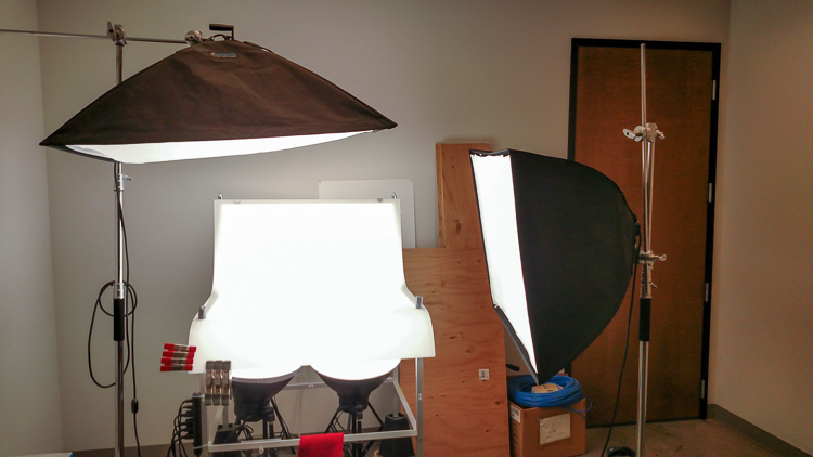
    I have replicated the setup with my little model Sven – Kristoff’s beloved reindeer in the movie Frozen. It is easier doing this on small scale subject as the lights are oversized in comparison. With people, to do this to scale, you need to have massive size octoboxes and flags. But this tutorial will show you the process clearly.

    Here are 3 rookie mistakes to avoid when trying to achieve a 100% pure white background:

    Mistake #1 The background is not lit properly

    The background must be lit with approximately two stops more light, than the amount of falling on the subject. For example, if you want to photograph your subject at f/8, set your background lights to two stops brighter, so the meter would read f/16 on the background.

    Note: You need to meter both background lights separately, so that when metering for the main light (on the subject) you would turn the background lights off, and vice versa. When both the background and main lights are on, your meter should still give you f/8 on the subject, because you are metering the light that falls on your subject and not on the background.

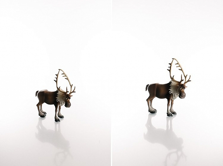
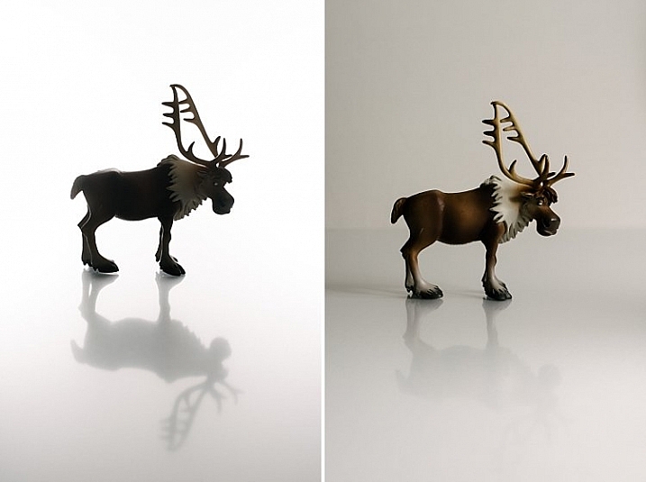
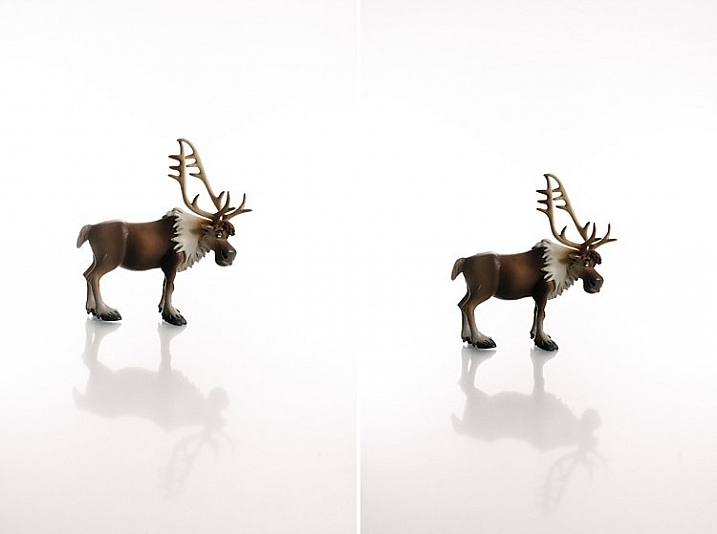
    The photo below (right) shows what it looks like when you don’t light the background at all. You get a tone and color other than the intended white. In the photo on the left the background was lit, but there was no main light illuminating the subject; thus the resulting image is almost a silhouette of the subject.

    how-to-shoot-white-seamless-tutorial

    My camera settings for all the shots in this setup were: ISO 250, 1/160th of a second, shot at f/8 for Sven, (the background read f/16). The speedlights were set to 1/16th power. I rarely use them at full power because the batteries run out very quickly that way. If you are using the SB900 Nikon, firing at 1/1 power, not only does it drain the batteries very quickly, but also makes the flash overheat. Nikon has solved this problem with the SB910. These are some reasons why I did not shoot this at ISO 100. The camera used was a Nikon D750, which handles noise superbly, so that ISO is not an issue. Two SB910s and one SB900 were used for this setup.

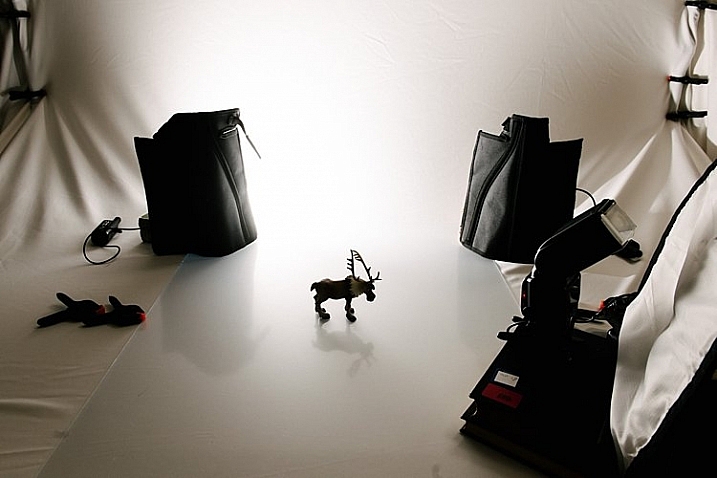
    The photo below shows a pull back of the setup with only the left background light firing.

    how-to-shoot-white-seamless-tutorial

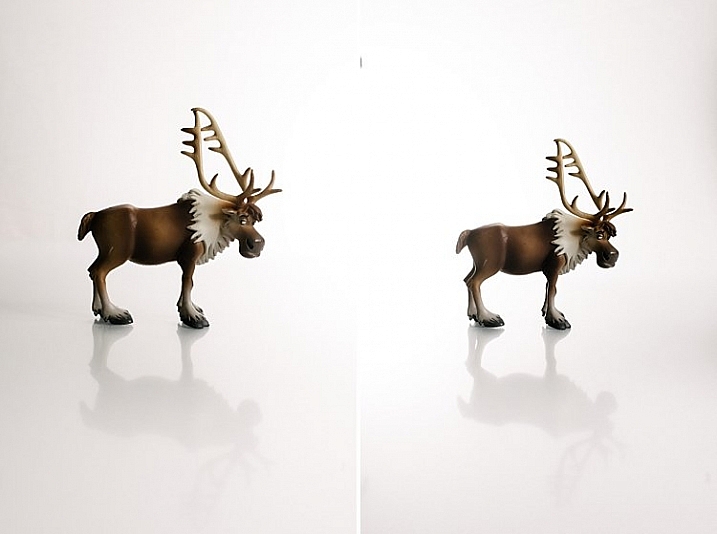
    You will notice in the two images below that only the right background light fired on the left photo, and only the left background light fired on the right photo. This lighting is acceptable of course if that were your intention. The main light was positioned at a 45 degree angle on camera right. I wanted to bounce my flash onto the white rogue bender to modify it.

    how-to-shoot-white-seamless-tutorial

    You may also notice that on the left photo (above) there is a pleasing shadow of Sven behind him on the background – because the left background light didn’t fire. Where the background light did fire on the left, this shadow was eliminated (right photo above).

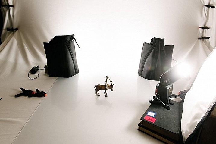
    Below is the setup with all three lights firing correctly.

    how-to-shoot-white-seamless-tutorial

    Now that you have your background and main lights set up, you need to make sure these lights only hit the intended subject. This leads us to the next rookie mistake… separation.

    Mistake #2 Not enough subject background separation

    Because the background lights are so much brighter, you need to separate them from the main subject. There are two key ways of doing this:

    1. Flagging
    2. Distance

    Flagging

    You can use anything block to flag your lights; the black side of a reflector, black cardboard sheets, black foam core. Black does not let light in, instead it absorbs light rather than bounces it. It also blocks light from seeping through to places where you do not want it. If you don’t flag (block) your background lights, your subject will get a halo effect and look very backlit.

    Distance

    Once you have flagged your lights, you need to distance your subject far enough away the background (and background light) so that any spills won’t touch your subject. This depends on your personal preference and intention of course – you may want some spill on your subject for a certain look or effect, or you may not.

    If you do want some spill on your subject, make sure to run a few tests with various lenses, as chromatic aberration tends to occur around the edges due to the abundance of light. Some lenses are prone to chromatic aberration irrespective of aperture, while others can handle it very well even at wide apertures, where it is most commonly observed. Also, be careful with the amount of spill you allow so as not to chop off parts of your subject from the spill overexposure.

    how-to-shoot-white-seamless-tutorial

    The photos above show a properly lit Sven. The two background lights firing at f/16 and the main light firing at f/8. There are no unwanted shadows on the background, as was my intention. However, I wanted to have a reflection and shadow in the foreground. This leads nicely to the third rookie mistake to avoid…a floating subject.

    Mistake #3 The subject is floating

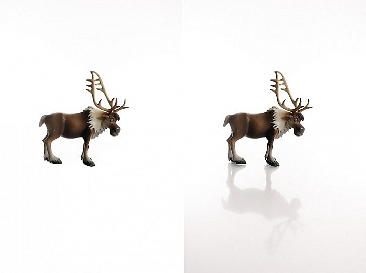
    If you do not include some floor shadows, your subjects will look like they are floating on white air, or cut out and pasted on a white sheet of paper.

    The best tip for avoiding floating subjects is to use a reflective surface like translucent white plexiglass, or white tile sheet, as a base for your subject to stand on. You can adjust the opacity of this reflection in Photoshop during post-processing, but having the reflection shows that your subject is planted firmly on solid ground.

    how-to-shoot-white-seamless-tutorial

    The left image shows Sven floating, and on the right you see the reflection showing Sven standing on solid ground. The latter looks more pleasing and natural, and not like a cut-and-paste job.

    Bonus Mistake #4 Overexposed background

    Be careful not to add too much light to the background. If you go past pure white and really overexpose it, the white will start almost glowing around the subject just like if you had sun flare outdoors. It lowers contrast and your subject looks like that have a bit of a halo, as you can see in the images below.

    white-seamless-overexposed-background_0000

    For more tips on a white or high key background see: 4 Tips for a Perfect White Background in High Key Photography

    Conclusion

    I hope this little tutorial has shed some light on basic techniques for shooting a white background, where you want the background to be 100% white, and that it has dispelled any mystery over how to achieve this look. If you have other more advanced techniques, do share them here!

    googletag.cmd.push(function() {
    tablet_slots.push( googletag.defineSlot( “/1005424/_dPSv4_tab-all-article-bottom_(300×250)”, [300, 250], “pb-ad-78623” ).addService( googletag.pubads() ) ); } );

    googletag.cmd.push(function() {
    mobile_slots.push( googletag.defineSlot( “/1005424/_dPSv4_mob-all-article-bottom_(300×250)”, [300, 250], “pb-ad-78158” ).addService( googletag.pubads() ) ); } );

    The post 3 Rookie Mistakes to Avoid When Shooting on a White Background by Lily Sawyer appeared first on Digital Photography School.

    Digital Photography School

  • Equipment Tips for Quick and Efficient Studio Product Photography

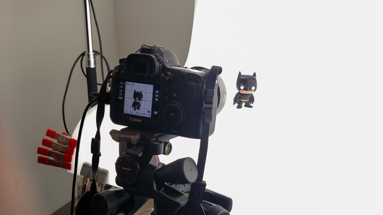
    In this article I’m going to discuss the equipment you will need to create great product photography. I built my setup to provide great versatile lighting, speed, and the ability to cut out the product in post production very quickly and accurately. This setup can be used for still life, food, fine art and even some macro work.

    Article Example_03

    When I first started doing product photography I was hired by a company to reshoot their entire 3200 piece inventory. Needless to say that was a HUGE job, and speed and efficiency was paramount. I had previously not done more than a few dozen parts at one time for a client, so I really was not set up to undertake a job of this scale. I was going to have to rethink a lot of things, and I knew I was going to need additional studio equipment. The words, “Not going to happen” were not going to come out of my mouth, as I wanted the challenge and the learning experience. Many of the things I implemented for that specific job are still in use for my product photography today. This tips in this article are a good base to start if you are an aspiring product photographer.

    Requirements of a product setup

    Article Example_04

    Here is what I felt were the most important things to plan for to make this job happen.

    1. Speed – to be able to quickly move through multiple angles of a single product, and to adapt quickly to the next product.
    2. Versatile light – lighting that can stay constant for similar groups of products, but remain flexible enough to quickly shift to get proper exposure.
    3. Cut-out ease – the ability to knock out a product from the background quickly in post-production, and place a product on pure white without having to open the image in Photoshop.

    With this list in mind you find yourself smack dab in the crosshairs of a shooting table. There really is no other way around it. This is why a shooting table works so well for this type of setup.

    1. Speed

    Article-Example_01b

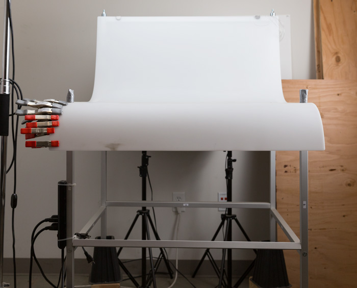
    A platform is needed when you want to quickly move products in front of your camera and then off the set. Why not make it a platform that is specifically made for photography? The seamless background of a shooting table means less fussing around with intersecting lines that is typical with most background setups, and you won’t have to spend much time with product placement within the scene. That alone will speed up your shoots.

    2. Versatile light

    You can bounce light off the white shooting table, or better yet light the table from below, causing it to glow. Another great thing about a shooting table is that it’s white. White is a great way to control the shadows of a product. If I had it my way I would have the product completely enshrouded in white light or reflectors, then introduce shadows that add shape and dimension via black cards for the ultimate control. That unfortunately isn’t going to happen, but a white table is a great start.

    ShootList4

    Table with light coming from below.

    ShootList5

    Table with light from above.

    3. Remove background quickly in post-production

    Article Example_05

    Article-Example_02b

    Nice clean light, easy to cut-out product shot.

    No one wants to sit around using the Quick Selection tool in Photoshop, refining the edge, seeing the horrible job that tool does, and then finally having to use the much more labor intensive Pen tool to mask out the background. It’s far easier to get this done in camera, or at least give yourself a huge head start. The time you will save with this method will add up very quickly, and will give you a more natural look.

    A shooting table

    A shooting table is the first place to spend your money. There are many different tables out there but after all my research I found the Foba DIMIU shooting table to be the perfect solution for me.

    ShootList3

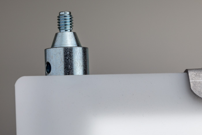
    It is a large shooting area, a long sweeping seamless Plexiglas surface that allows you to light from above or below it, the table frame features 4 – æ inch studs at each corner that can be used for various attachments such as arms and brackets to hold cards, product or lights.

    ShootList1

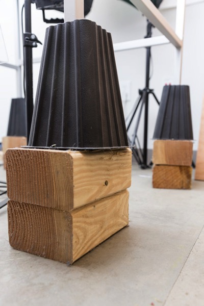
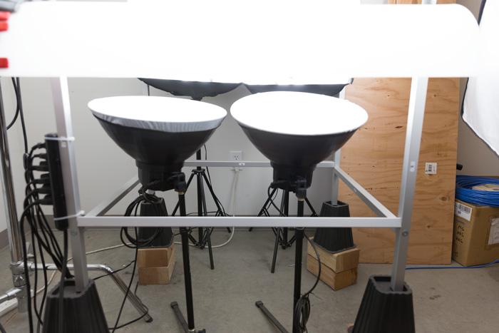
    The table is lightweight, can be moved around the studio with ease, and is easy to assemble. I raised the height of my table by using 6×4 lumber cut into blocks, and some bed risers.

    ShootList2

    At $ 1,544 I realize that the price might keep it out of a lot of hands. But, don’t fret, a more affordable option can be found, like the Manfrotto large still life table for $ 811. If you’re planning on shooting only small products, the Manfrotto mini table at $ 480 is an option as well. Keep in mind, if you think you might have large products in the future, spend the money now and get the largest table you can afford.

    Lighting

    Lighting is the next thing to consider. The type of system you choose is going to make a pretty big difference when it comes to shooting your actual products. You will ultimately be choosing between two main types of light; a constant (continuous) light system or a studio strobe (flash) system.

    A constant light setup is going to be much easier if you’re just starting out with product photography. With a constant light system the learning curve is exponentially smaller. The benefits of What You See Is What You Get (WYSIWYG) light cannot be overstated. I am going to go out on a limb to make a broad statement and say that if you are reading this article for help with your product photography, then you likely do not have the experience needed to employ studio strobes as your light source.

    Article Example_03

    Even if you have some experience with strobes, unless you have two to three years or more of shooting strobes in a product environment, do yourself a huge favor and get continuous lights. You will be amazed at how much, and how quickly you will learn when you use constant light. Plus there are some added benefits of using a constant light:

    • No tether equipment. You do not have to control the lights with a radio transmitter, by placing the light in optical slave mode, or by a cable like you do with studio strobes. They will always be on, ready to make pictures.
    • You can use them as video lights if you want to get into motion for product shots.
    • They are a far superior light learning tool, even for more advanced photographers. In my opinion this reason alone is why you want go with constant light.

    ShootList9

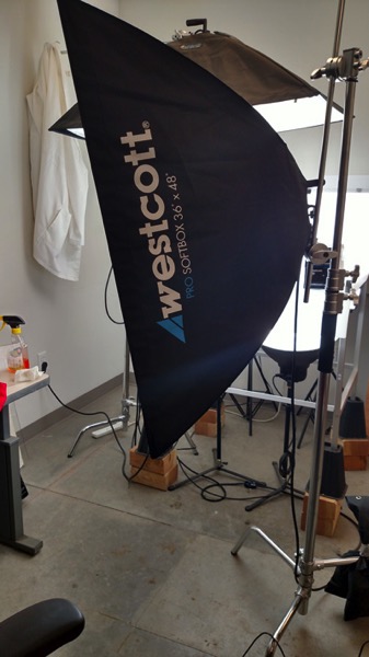
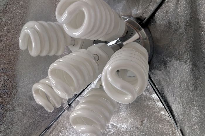
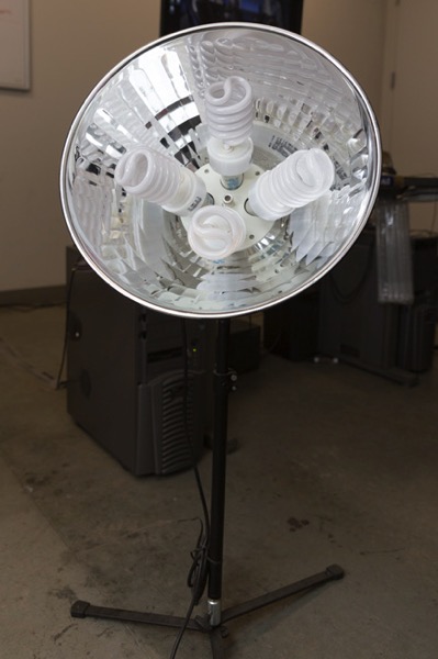
    Okay great, you are going to take my advice and get some constant light. My recommendation would be the Westcott Spiderlite TD6 system for the following reasons:

    • They are bright.
    • The fluorescent bulbs stay cool. A huge deal when you are stuffed in a studio with no windows.
    • The included bulbs are daylight balanced and can be mixed with light from a window.
    • Option to use tungsten halogens (not sure why you would because those bulbs run so hot).
    • Westcott has plenty of light modifiers for shaping your light.
    • Light output is controllable in 33% increments with three switches.
    • Solid build, with all metal heads and quality light modifiers.

    When I bought the kit from Westcott it came with the Spiderlite TD6 head, six 50w fluorescent bulbs, a tilter bracket, and the 36×48 softbox. I paid $ 700 per light, and bought two of those kits for a grand total of $ 1400.

    ShootList10

    There is some good news though. At the time of writing this article, there is a Westcott promo kit that comes with two of everything, two heads, two brackets, two sets of bulbs, and two softboxes, one is the 36×48 the other is a strip 12×36. The kit is going for $ 799. A fantastic buy for this lighting system.

    If that is still a little more than you want to spend, then there are some other options for lighting. Impact has a kit that has light heads, stands, bulbs, and modifiers for about $ 265. But as my grandfather always said, you can’t afford to buy something twice. If product photography is something you are going to do, pay for the quality of Westcott. It will last, day in and day out.

    My TD6 lights are used primarily as my key (main) and fill lights. I still need to be able to light my shooting table. For that I turned to some reflectors.

    ShootList6

    I went with two 16″ reflectors from Flashpoint, for $ 70 a piece. These sit under my raised shooting table and shine straight up through the bottom to blow out my table top.

    ShootList7

    Light stands

    Now is a good time to talk about support. Supporting your lights should be carefully considered, and you need to ensure you don’t skimp here. I have a story to help illustrate this point. While doing a product shot for a client I was moving about the studio, and I brushed past my lights on my way back to my camera. Before I could turn around and look at the scene I heard a crash. My light had toppled over, hit the table, knocked the product off balance, and it hit the floor and broke. It was a bottle of wine. I was left with a huge mess to clean up, a broken bottle that needed to be replaced, and a bill from the client for the unreturned product. It could have been worse, but not by much. Invest in your light stands. Get good ones and weigh them down properly with sandbags.

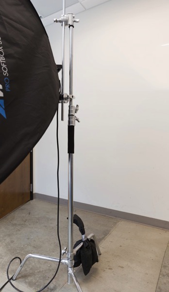
    You are going to want to use some sort of a C-Stand. Whether it be a turtle base (removable legs from the center column) a rocky mountain C-stand (a stand with one leg that can go up and down the center column) or a super C-stand (extra heavy duty) invest in a C stand for your large lights. Also, always have sandbags handy to weigh the C-stands down once you bring them onto your set.

    ShootList8

    For the price of $ 129 per stand from Adorama, for their Flashpoint C-stand with turtle base is pretty great, I couldn’t be more pleased. It has been a fantastic solid stand for my large TD6 lights.

    The other stand that I bought was a lot less mission critical, it was for my reflectors. I bought a few Manfrotto Nanopole stands which bottom out at 20″, and can go as high as six feet. They are not meant for anything too heavy, but they do the small stand job perfectly.

    So, we touched on all the main equipment needed to make a successful product photography set. Do you have any other tips to add? What do you use for product photography? If you have any questions please ask in the comments below.

    googletag.cmd.push(function() {
    tablet_slots.push( googletag.defineSlot( “/1005424/_dPSv4_tab-all-article-bottom_(300×250)”, [300, 250], “pb-ad-78623” ).addService( googletag.pubads() ) ); } );

    googletag.cmd.push(function() {
    mobile_slots.push( googletag.defineSlot( “/1005424/_dPSv4_mob-all-article-bottom_(300×250)”, [300, 250], “pb-ad-78158” ).addService( googletag.pubads() ) ); } );

    The post Equipment Tips for Quick and Efficient Studio Product Photography by Jacob Macias appeared first on Digital Photography School.

    Digital Photography School

  • 4 Key Lightroom Sliders That Will Supercharge Your Photos

    Lightroom is kind of like a Swiss Army Knife or, better yet, a Leatherman Wave, in that it does so many things and is an invaluable program for many photographers–amateur, professional, or anywhere in between. Regardless of whether you’re the kind of person who prefers presets, or someone who likes scooting sliders, there are four options hidden in plain sight, right on the Basic panel of the Develop module, that can dramatically enhance almost any picture.

    It took me a few years to learn to use these sliders properly, and even now I am still figuring out new ways to work with them, in combination with other options in the Develop module to get my pictures looking just the way I want. But, now I am at a point where adjusting these four options is the very first thing I do on almost every single photo. They’re that useful for me, and could be for you too.

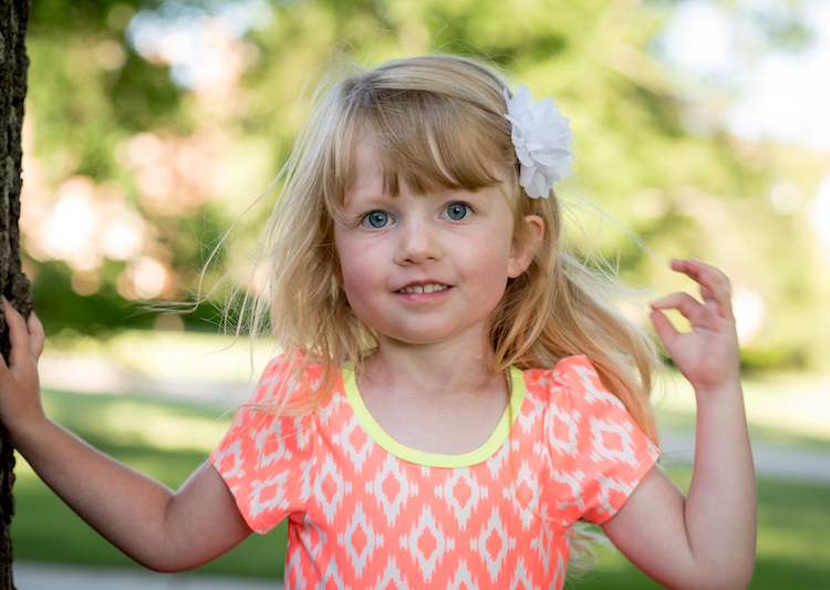
    four-lightroom-sliders-girl

    The four key Lightroom sliders are:

    1. Highlights
    2. Shadows
    3. Whites
    4. Blacks

    Learning how to work with these four key sliders can have an amazing impact on your photography.

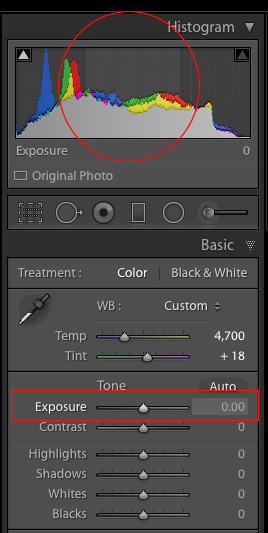
    Exposure-sliderTo demonstrate the effect of each slider I’m going to show you a picture in various states of editing, as I adjust values for each option one by one. If you are used to using the Exposure (note in the screenshot on the right what areas of your image are affected by moving the Exposure slider) and Contrast sliders to adjust your images, you may want to put those aside for now and focus on these other four instead, as they can give you significantly better results.

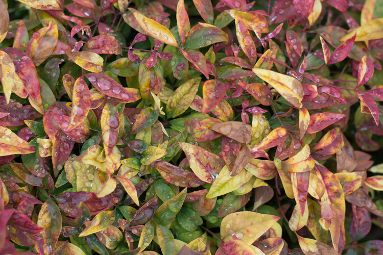
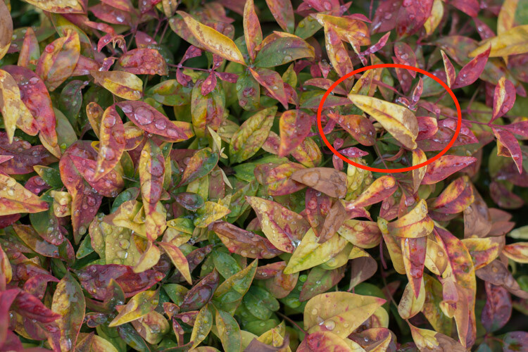
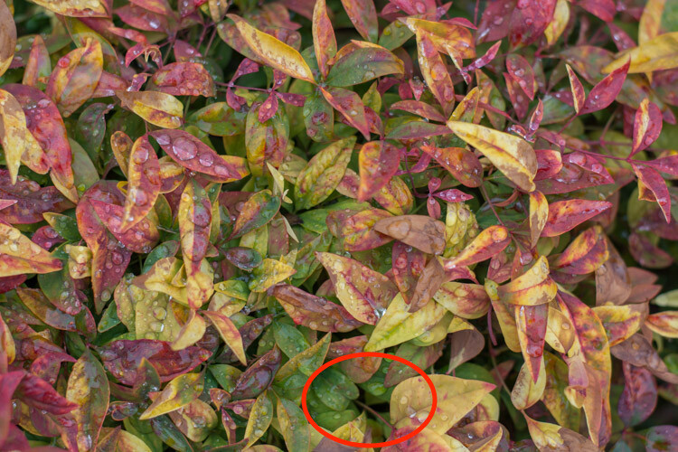
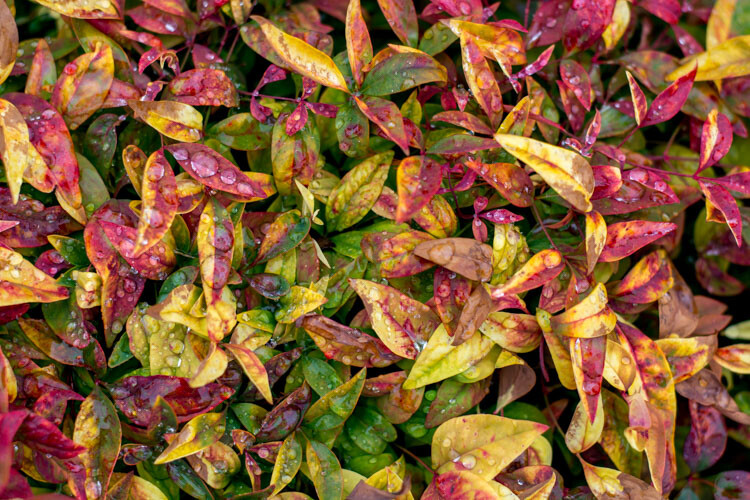
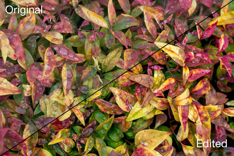
    I should also note that, as with virtually all Lightroom tips and tricks, your results will be best if you shoot in RAW instead of JPG. The picture I’m going to start with is a shot of some colorful leaves on a rainy day, that seems fairly decent to begin with, but is made much more vibrant and richer just by adjusting these four key Lightroom sliders: Highlights, Shadows, Whites, and Blacks.

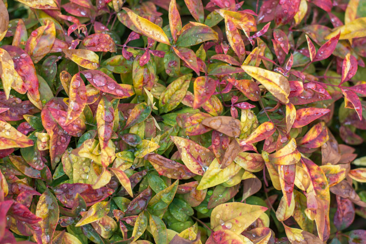
    The original photo straight out of my camera with no adjustments applied whatsoever.

    The original photo straight out of the camera with no adjustments applied whatsoever.

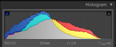
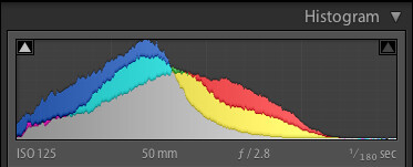
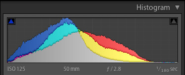
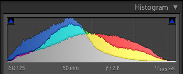
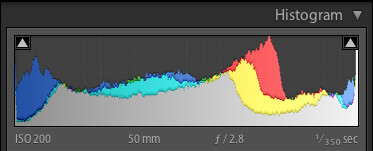
    Histogram of original unedited image.

    Histogram of original unedited image.

    #1 – Highlights slider

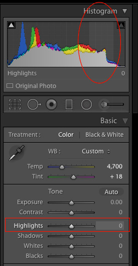
    Highlights-sliderI mentioned the Exposure slider in the previous paragraph, which is a tool that adjusts the overall brightness or darkness of an entire image (based on the midtones). The Highlights slider allows you to perform a similar type of adjustment, but only with the brightest parts of an image (tones not quite pure white). Moving it to the left will make the brightest parts darker, and moving it to the right will make the same parts brighter. Hover over the Highlights slider with your mouse to see on the histogram which parts of the image will be affected (see screenshot at the right).

    I use this as a starting point when making adjustments to a picture, because it can help recover some of the details in the lighter parts of an image that might seem a bit too bright or washed out, and can give the picture a more evenly-lit appearance overall.

    Highlights adjusted to a value of -80. Notice how the yellow leaves, particularly the large one on the right-hand side, now display a much richer shade of yellow and are not as washed-out as in the initial photo.

    Highlights adjusted to a value of -80. Notice how the yellow leaves, particularly the large one on the right-hand side, now display a much richer shade of yellow and are not as washed-out as in the initial photo.

    Histogram with highlights adjusted.

    Histogram with highlights adjusted.

    As you adjust the Highlights, or any of the other three sliders mentioned in this article, you can use the built-in clipping guide to help get the right amount of adjustments to your image. Hold down the alt key (option on Mac) as you move the slider from left to right and you will see your image go all dark except for a few spots. These spots indicate areas of your image that are clipped, which means image data is being lost in those parts. You generally want to avoid clipping, so it’s a good idea to not adjust the Highlights or any other slider so much that you start seeing lots of clipped areas.

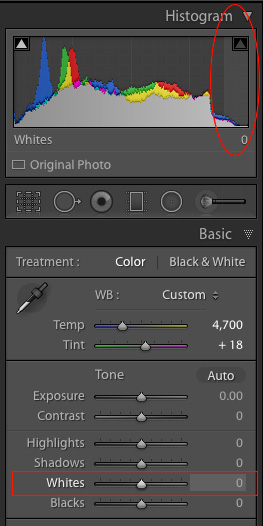
    A peek at the histogram on top of the Basic module will show you similar information, as the more you adjust the Highlights slider to the right the more you will see the colors move to the right-hand side as well. If they move so far that they are off that side of the grid, areas of your image are being clipped, and there are going to be spots of pure white that you may not want.

    #2 – Shadows slider

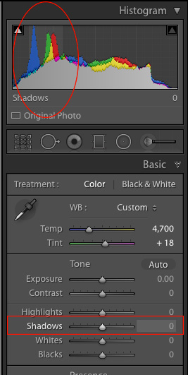
    Shadows-sliderIn a similar vein as the Highlights slider, the Shadows option makes the dark parts of your image a little brighter (see image right for which areas are affected). It’s kind of like using the Exposure slider to make your image brighter, but restricting it only to the sections of an image that are very dark, while ignoring the rest. This works wonders on pictures that are underexposed, as modern cameras have image sensors that capture an amazing amount of detail in the shadows, particularly at lower ISO values. It’s rare that you will need to (or even want to) boost the shadow level clear up to 100, but it’s nice knowing Lightroom at least gives you the option of doing so.

    I should also note that you could use the same slider to make the shadow areas of an image even darker, and depending on the type of photography you do, that may very well be a useful option but most photographers will want to just lighten the shadows instead.

    Adjusting the shadows by +50 helped to bring back some of the detail that was lost in the darker areas, as you can see in the area of green leaves inside the circle.

    Adjusting the shadows by +50 helped to bring back some of the detail that was lost in the darker areas, as you can see in the area of green leaves inside the circle.

    Highlights and shadows adjusted.

    Highlights and shadows adjusted.

    #3 – Whites slider

    Whites-sliderThis is related to the highlights, but has a slightly different impact on your image, that is subtle but quite impactful. Adjusting this to the right essentially makes the white tones in your image, more pure white. It affects all the white tones in the photo (see image on the right) as opposed to the highlights slider which only deals with a narrow range of very bright colors.

    What you’re doing here is setting the white point, or telling Lightroom what you want the brightest point of your photo to actually be. This can give a flat image much more depth and tonality, and take an otherwise boring picture and really start to make it shine. I almost always drag this slider a little bit to the right, though you must be careful not to let anything get clipped, which you can do by holding down the alt or option key while you drag it.

    Bringing the white slider to a value of +45 now makes all the white areas more pure white. The effect is most noticeable on the various water drops which now appear much more vibrant and well defined.

    Bringing the white slider to a value of +45 now makes all the white areas more pure white. The effect is most noticeable on the various water drops which now appear much more vibrant and well defined.

    Highlights, shadows and whites adjusted.

    Highlights, shadows and whites adjusted.

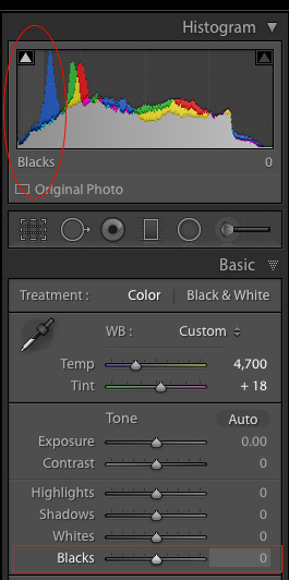
    #4 – Blacks slider

    Blacks-sliderSimilar to the Whites slider, this one adjusts the black point of your image, or how dark the darkest portions really render. I almost always slide this to the left to give my photos a little more punch. It helps pictures have a little more contrast, while bringing out a lot more color in any image as a whole.

    One difference to note when adjusting this slider, as opposed to some of the others, is that you actually do want the black level to be clipped slightly. So, when you hold the alt or option key down as you adjust this one, you want to see a few highlighted areas show up. The reason for this is to make the very darkest parts of your images truly black, which adds depth and a nice pleasing look to your pictures, that is far more effective than simply moving the contrast slider.

    Note: the contrast slider pushes out from the middle of the histogram, whereas pulling the Whites and Blacks sliders pulls out from the edge – thus giving you more control over how contrast is applied to your image.

    Bringing the shadows down to -70 makes the black areas pure black, and gives a much richer sense of contrast to the image overall than simply adjusting the contrast slider.

    Bringing the Blacks down to -70 makes the black areas pure black, and gives a much richer sense of contrast to the image overall than simply adjusting the contrast slider.

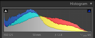
    All four adjustments made.

    All four adjustments made.

    Before and after

    To give you a clear sense of just how much these four sliders can affect an image, here’s a before and after comparison of the same photo. The original seems so dull and lifeless, compared to the vibrant dynamic edited version. Remember, the only things that were adjusted were the Highlights, Shadows, Whites, and Blacks sliders.

    four-lightroom-sliders-leaves-comparison

    There are dozens of other edits that can be done in Lightroom to improve photos. Simple things like increasing the clarity, adjusting the tone curve, fine-tuning the sharpening, or selectively editing each color, can improve your original images (especially if you shoot in RAW) leaps and bounds beyond what you might have thought. But if all that seems like a bit too much to take in all at once, just know that you can get a huge amount of improvements just by using these four simple sliders in the Basic panel.

    When I said that these four key Lightroom sliders can supercharge your editing, I really meant it. Learning to use them only takes a few minutes, and can make a huge difference in your images.

    To recap, here’s what each slider does in a nutshell:

    • Highlights: Adjusts the brighter portions of an image to bring back some color that might be too washed out.
    • Shadows: Adjusts the darker portions of an image to bring out some color and detail where it may appear to be too dark.
    • Whites: Makes the whitest portions of an image more pure white.
    • Blacks: Makes the blackest portions of an image more pure black.
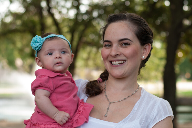
    Original image, straight out of camera, with no edits applied.

    Original image, straight out of camera, with no edits applied.

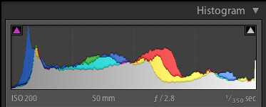
    Original image histogram.

    Original image histogram.

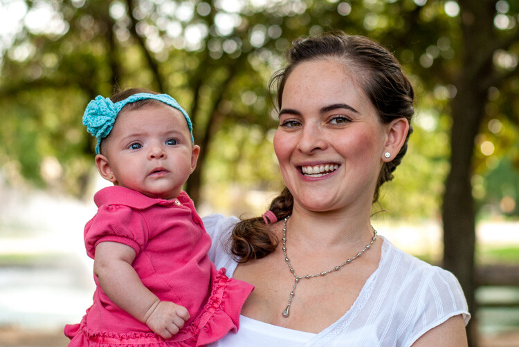
    Highlights -47, Shadows +83, Whites +79, Blacks -56, and no other edits at all.

    Highlights -47, Shadows +83, Whites +79, Blacks -56, and no other edits at all.

    Adjusted histogram.

    Adjusted histogram.

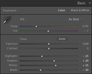
    I have found myself using these four sliders so much that I actually created a custom preset in Lightroom that sets them all to specific values. I often apply this preset to every picture upon import, as it gives me a good starting point to work from, when doing my other edits. The values I use are:four-lightroom-sliders

    • Highlights -25
    • Shadows +20
    • Whites +25
    • Blacks -30

    Your mileage will vary, and again this is just a starting point, but hopefully all of this illustrates just how useful these four sliders are. When I first started working with Lightroom I was so overwhelmed with all the options at my disposal, that not only did I think I would never be able to learn it, but I didn’t even know where to start. If that sounds like you, I would recommend giving these four sliders a try and use this as the springboard for the rest of your edits.

    What about you? What are some of your favorite editing tips and tricks in Lightroom? Do you have a particular key to an effective workflow that you’d like to share? Leave your thoughts in the comments below.

    googletag.cmd.push(function() {
    tablet_slots.push( googletag.defineSlot( “/1005424/_dPSv4_tab-all-article-bottom_(300×250)”, [300, 250], “pb-ad-78623” ).addService( googletag.pubads() ) ); } );

    googletag.cmd.push(function() {
    mobile_slots.push( googletag.defineSlot( “/1005424/_dPSv4_mob-all-article-bottom_(300×250)”, [300, 250], “pb-ad-78158” ).addService( googletag.pubads() ) ); } );

    The post 4 Key Lightroom Sliders That Will Supercharge Your Photos by Simon Ringsmuth appeared first on Digital Photography School.

    Digital Photography School

  • How to Use Light to Create Moody Images

    It isn’t difficult to take sharp, well-exposed photos with modern cameras. But how do you take it a step further and create moody images that capture the spirit of a place?

    What is mood?

    I define mood as a feeling or emotion you get while experiencing something. For example, while travelling through Xi’an, a city in China, last year I spent some time in the city’s Muslim Quarter. I felt a mixture of things – overwhelmed by the crowds and the sticky heat, fascinated by the sights and smells coming from stalls selling home-made street food, and claustrophobic while wandering down hutongs (alleyways) connecting the main streets. Then there was the paradox of the city’s ancient open air mosque – a peaceful paradise amongst the noise and dirt of the old city.

    Mood and light

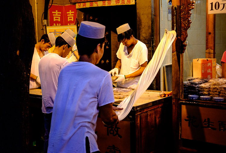
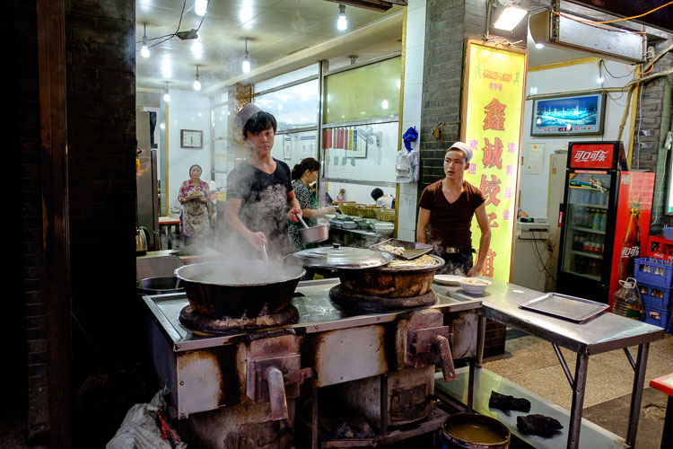
    The mood in this photo was created by the mix of artificial and natural light. The lights in the market stall bathe the scene in an orange glow, while the blue light of early evening creeps in at the edges.

    Once you have the sense of the mood of a place, you can start thinking about how to capture that in a still frame. Part of the answer lies in composition and the subject. In this example it is obvious that well composed images taken amongst the hubbub of the Muslim Quarter in Xi’an will help capture the atmosphere. But the one thing you really have to pay attention to, the thing that will elevate your photos above the ordinary, is light.

    How light and time of day affect your images

    Most photographers are familiar with the idea that the moodiest, most evocative lighting comes at either end of the day, close to sunrise and sunset. Golden hour is the name for the time when the sun is close to the horizon, casting golden light that creates long, raking shadows. The blue hour is the time at dusk, or just before sunrise, when there is light in the sky and the natural color of the ambient light is deep blue.

    The light at both these times is incredibly moody. Once you have found an interesting place to photograph, and identified with the spirit of the place, then you really can’t go wrong by venturing out at these times to take photos. Yes, you can take interesting photos at other times of the day, but the light won’t be as evocative.

    One of the challenges of working in moody light, especially during dusk, is that light levels are low. This is less of a problem than it used to be because high ISO performance on modern cameras is so good you can easily raise the ISO to work with a hand-held camera in low light. It also helps if you have a prime lens, as this lets you use wider apertures which let more light in, enabling you to use lower ISOs or faster shutter speeds (or both). Image Stabilization in its various forms may also be useful.

    Mood and light

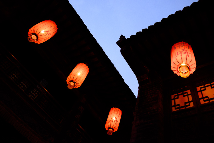
    This photo balances the orange glow from the lanterns against the fading blue light of the evening sky. I used an ISO of 6400 to work in low light shooting without a tripod.

    If you are a landscape photographer, these points aren’t so important, as you would simply use a tripod to support the camera, allowing you to use small apertures, low ISO settings, and long shutter speeds (another tool for creating mood in the landscape) without camera shake.

    Returning to my example of taking photos in Xi’an, I didn’t bother going out with my camera in the middle of the day (when the light was too harsh). Instead, I visited it in the late afternoon, when the fading light and encroaching artificial lights added to the mood, and helped me create a sense of place. This was as interesting time to work, as the low light and the crowds created various challenges to be overcome.

    Mood and light

    Look carefully at this image and you’ll see that the ground is glistening after a rain shower. Together with the out of focus orange lights in the background, this helps to add mood to the photo.

    Mood and light

    The green fluorescent lights in this image create a different type of mood. The fluorescent light is ugly, rather than beautiful.

    Using color contrasts for more drama

    One of the key aspects of light at the end of the day is that it often utilizes the contrast between orange and blue. It is something you see a lot in the landscape, with the orange light from the setting sun contrasting with the blue of the sea. Or you may have a photo taken during the blue hour, with a corresponding contrast created by an artificial light source. Sadly, the practise of using fluorescent or white LED lighting is making this less common, but it is something to look out for.

    Mood and light

    This photo, taken during the golden hour, shows the contrast between the orange light casty by the setting sun on the tower and flag, and the blue sky.

    I recently came across an example of this color contrast in a blacksmith’s forge in Lincolnshire, UK. The forge is a historical building, and the people who work there use techniques that were used in the forge over a hundred years ago. The interior has changed little in that time – one of the blacksmiths told me that they are visited by people who remember the forge from childhood over 50 years ago, and say it still looks exactly as they remember it.

    There were two types of moody lighting in the forge. One was daylight coming through the small windows, the other was orange light coming from the fire in the forge, and sparks cast by the blacksmith as he worked. I chose to emphasize these even more in post-processing, by using a split tone to give the background a cold blue color.

    Mood and light

    What examples of moody lighting can you think of? Please let me know in the comments.


    Mastering Photography

    If you’d like to learn more about creating beautiful photos with light then please take a look at my ebook Mastering Photography: A Beginner’s Guide to Using Digital Cameras.

    googletag.cmd.push(function() {
    tablet_slots.push( googletag.defineSlot( “/1005424/_dPSv4_tab-all-article-bottom_(300×250)”, [300, 250], “pb-ad-78623” ).addService( googletag.pubads() ) ); } );

    googletag.cmd.push(function() {
    mobile_slots.push( googletag.defineSlot( “/1005424/_dPSv4_mob-all-article-bottom_(300×250)”, [300, 250], “pb-ad-78158” ).addService( googletag.pubads() ) ); } );

    The post How to Use Light to Create Moody Images by Andrew S. Gibson appeared first on Digital Photography School.
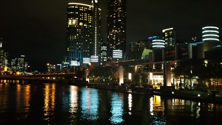

    Digital Photography School