Category: Photography

  • 4 Ways to Get Inspiration from the Streets to do Better Wedding Photography

    Be inspired by decisive moments on the streets to create better wedding photography.

    If you are reading this article you must have some interest in street photography, or maybe you are starting as a professional wedding photographer, but most likely you are interested in both fields. This will give you some ideas on how to draw inspiration from street photography that you can use in your wedding work.
    A street photographer can be anyone going out to wander the streets of a city with their camera, in order to make photographs that tell the human story of daily life as it occurs on the streets. A wedding photographer on the other hand, is one that is hired to capture memories, tell the love story, and the unfolding special day in a family’s life. The wedding photographer is a professional with enormous responsibility to find, and deliver the right frames, that will recreate trusted memories, decades after the big day is over.

    A clear personal artistic voice is what separates one photographer from another. That voice is who you are, but that voice of yours needs constant care and development, in order for it to be a dominant factor in your photographic style as a professional photographer. Competition, changing trends, and the release of new gear also have their own voices that can influence your photography. Maintaining a balance between your inner world and the outer influences is key to success as a street-wedding photographer.
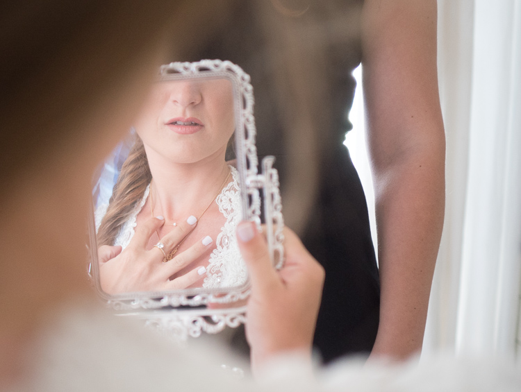
    The following tips came from the world of street photography and are perfectly suited for the wedding photographer. If you master them on the street, you can go to a wedding with confidence, and sing your own song with your camera.

    1 – Planning versus reacting
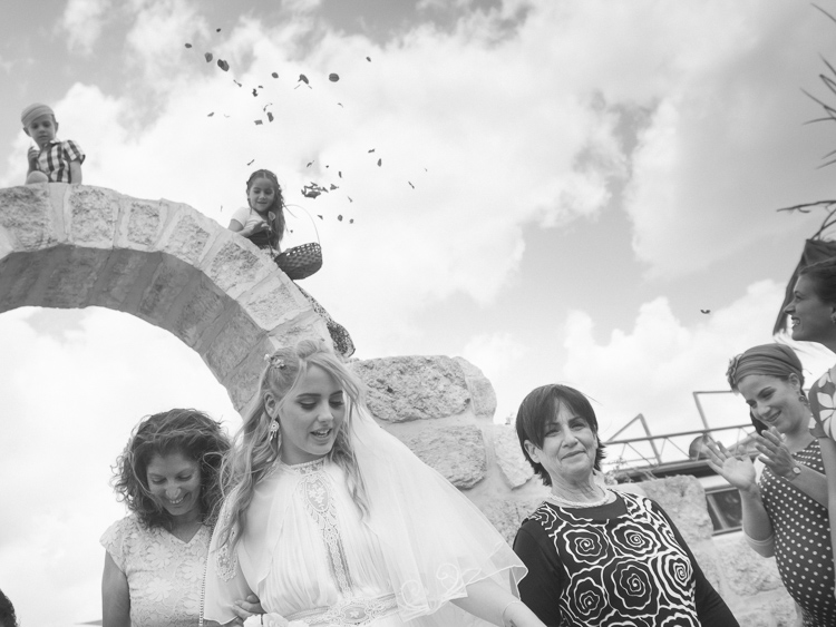
    Wedding photography tips
    What it takes to make great decisive moment photographs is, that first of all you need to see them before they occur. The longer before the better, it will give you the time to plan your composition, and work towards a frame that will be exciting and tell a story. In order to see things before the happen it takes looking around your subject, and constantly look at the surroundings of the bride, rather than focusing your attention only on her. This way you will be able to notice other elements and people that make your frame more interesting and communicative. Even as short as two or three seconds can be long enough for a street photographer to plan a good frame.

    If you look around and plan your next shot you have a greater chance of catching the decisive moment, rather the one that follows.
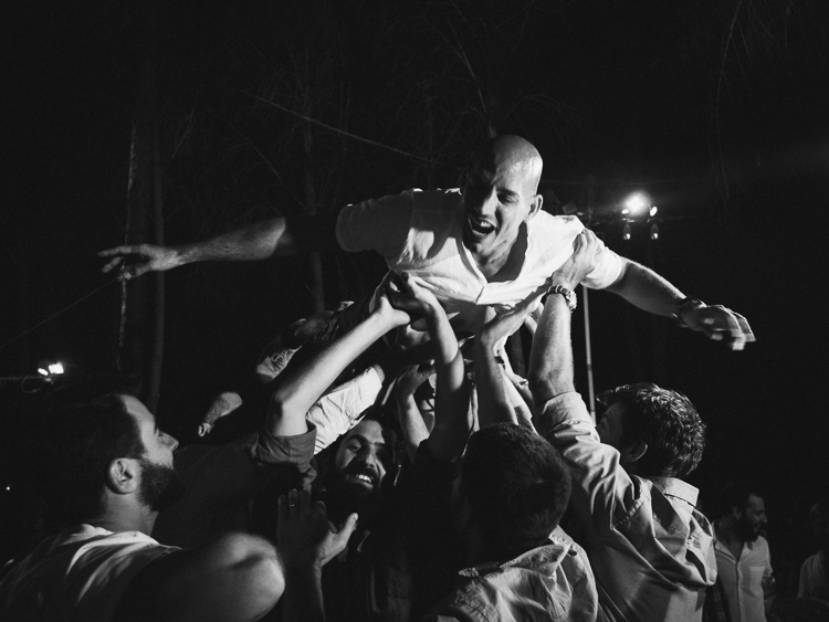
    2 – Create emotion
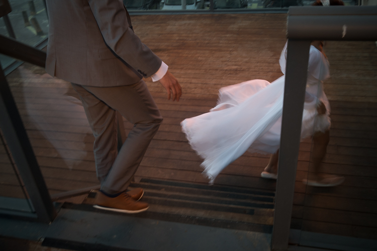
    wedding photography tips motion
    Freezing and blurring the movement of objects and people are two ways to communicate emotion in a photograph. It is a property that is unique to still photography, and is a big part of the photographic language. But often many photographers think that a wedding photograph has to be sharp and in focus, and the end result is often a precise documentation of reality, rather a poetic description of the moment. Give yourself the time it takes on the street to fully understand how the blurring and freezing of motion is being read and perceived by the viewers.

    Master motion techniques then bring them into the weddings you photograph.

    3 – Understand the way light can work for you
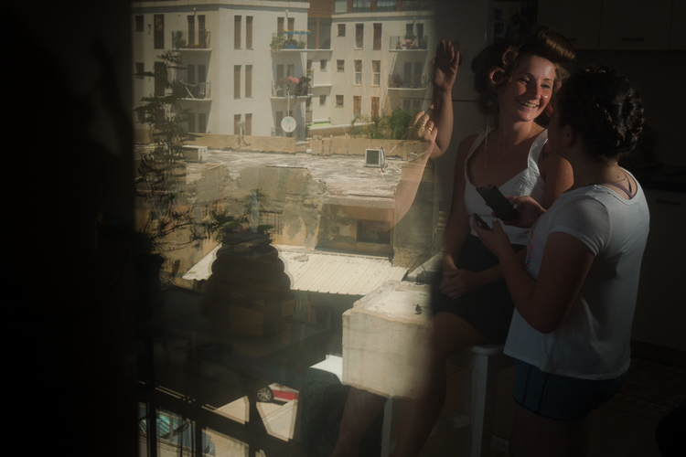
    wedding photography tips light
    Explore the way light falls on things, and the way it looks in your street photographs. When your are under the stress and responsibility of a wedding day the thinking side of your brain often takes over, and shuts down the creative side. You may see the wedding as a checklist of photographs to be taken, images of subjects, rather than decisive moments to tell a story.

    One way to keep the creative brain in charge of things is to remind yourself constantly to work with the light, see light, change it if necessary, and let go of the subjects. If you are photographing the bride getting ready, she is the subject whether you think about it or not, now it’s time to think about light.
    4 – Responsibility and integrity
    wedding photography tips

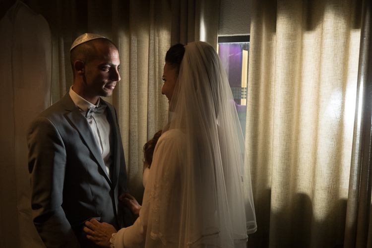
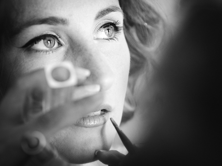
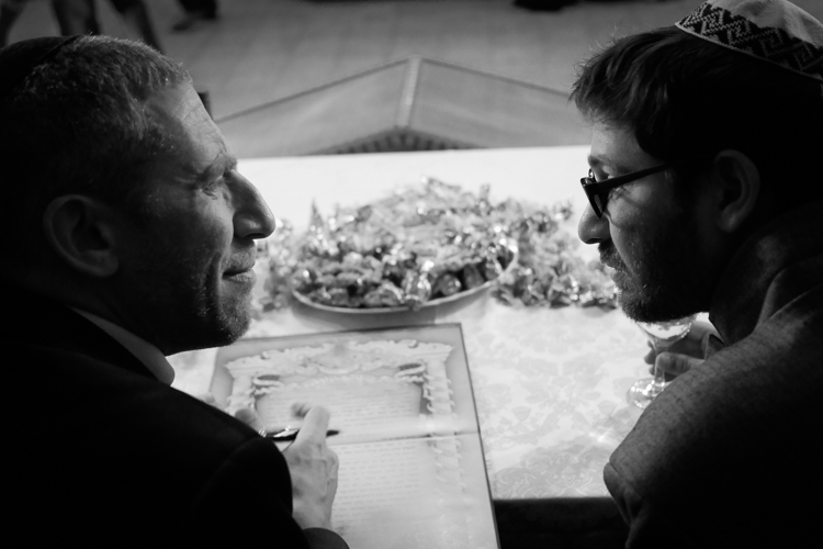
    Whether you work for yourself as a street photographer, or as a professional wedding shooter, you should be able to sleep well at night. You should never publish street photographs that might hurt someone’s feelings or cause them damage. However, that being said, you should also remember that the act of photographing people on the streets doesn’t harm them in any way, and have no fear to do your art.

    There is another side to the coin of responsibility, that is integrity. when you are hired to photograph a wedding be sure to have shown only photographs that were made by you, that are a good representation of your style and voice. Be sure to let your clients know that they are going to get artistic street-wedding photographs if that is what you want to give them!
    googletag.cmd.push(function() {
    tablet_slots.push( googletag.defineSlot( “/1005424/_dPSv4_tab-all-article-bottom_(300×250)”, [300, 250], “pb-ad-78623” ).addService( googletag.pubads() ) ); } );

    googletag.cmd.push(function() {
    mobile_slots.push( googletag.defineSlot( “/1005424/_dPSv4_mob-all-article-bottom_(300×250)”, [300, 250], “pb-ad-78158” ).addService( googletag.pubads() ) ); } );

    The post 4 Ways to Get Inspiration from the Streets to do Better Wedding Photography by Ouria Tadmor appeared first on Digital Photography School.
    Digital Photography School

  • How to Use the Text Tool in Photoshop

    As photographers, we often swear by the mantra that a picture speaks a thousand words. Yet there are some instances when we just wish we could add a word or two to help facilitate the understanding of the image, or carry the thought process forward even beyond viewing the image. The good news is that this is fairly easy to do using most editing software on the market today.

    In this article we’ll go over the basics of how to add text to an image using Photoshop.

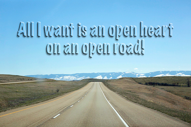
    transparent-text

    The Type Tool

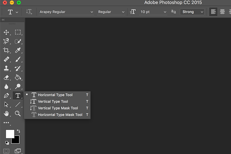
    Photoshop’s Type Tool is an easy to use yet powerful mechanism with which you can add text to an image. The Type Tool is found in the Tools panel, normally located along the left side of the screen. It’s the icon that is the capital letter T. You can also select the Type Tool by pressing the letter T on your keyboard. The default chosen is the Horizontal type tool, but you also have the option of selecting the Vertical type tool (where text entered is displayed in vertical orientation, going down instead of to the right – just click and hold your mouse on the Type tool on the panel to access the other options).

    Memorable Jaunts Article for DPS Text tool in Photoshop basics 02

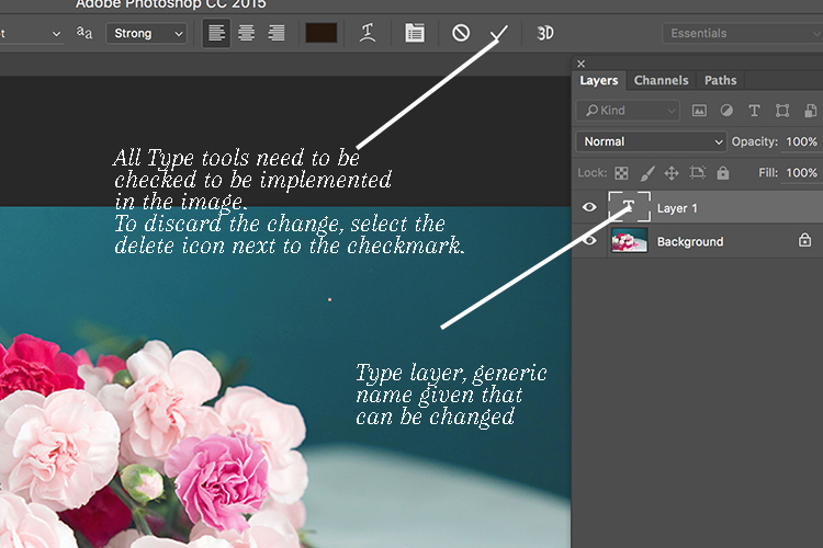
    When you choose the Type Tool, Photoshop automatically creates a new layer (called Type Layer) over the original background image. This is very helpful should you make a mistake and want to delete the layer to start over, or if you want to make edits after the fact. Initially the layer has a generic name “Layer 1” but once you start entering the text, the layer name changes to the text you have entered. However, this can be confusing, especially if you are entering in a lot of text in the type layer. I recommend changing the name of the Layer to something more appropriate and meaningful like Title Text or Quote Text, etc.

    Memorable Jaunts Article for DPS Text tool in Photoshop basics 04

    Choosing a Font

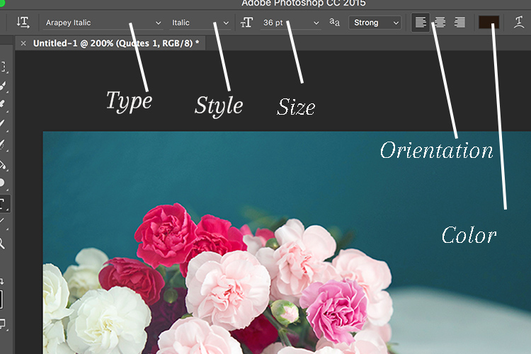
    As soon as you select the Type Tool, the Options Bar along the top of the screen updates to show the options related to it, including options for choosing a font, a font style and the size among others. Front left to right (as shown in the image below) you can choose font type, font style, font size, alignment, and color. The type indicates the font you want to use. Clicking on the dropdown arrow shows a list of all the possible fonts available for use. The exact fonts you’ll see in your list will depend on which fonts are currently installed on your computer. Next up is the style. In this example, I have used italic style for the image below. Following that is the size, alignment, and color. Selecting the color opens up the color picker tool where you can either choose the color from the pallet, or enter in the HEX value of the color you want for the text.

    Memorable Jaunts Article for DPS Text tool in Photoshop basics 03

    Adding Type to the Image

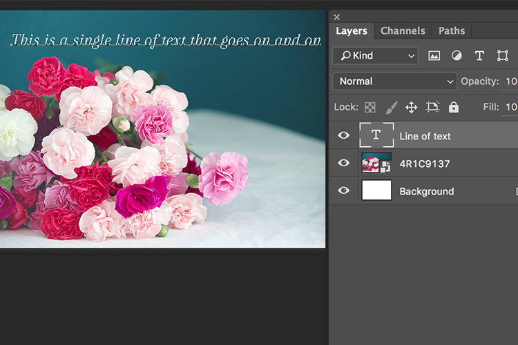
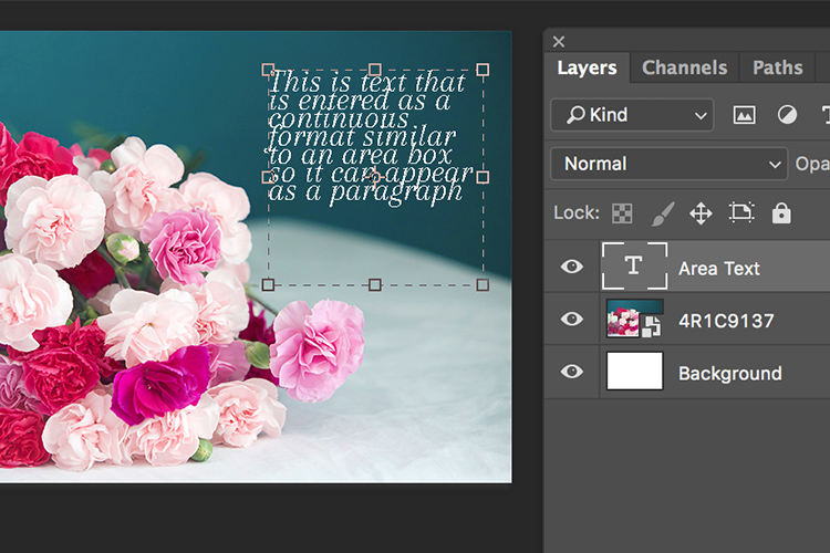
    The power of the type tool in Photoshop lies in the ability to add different types of text to a document. The first option is Point type (also known as character type), and the second is Area type (also known as paragraph type). The difference is that point type is mainly used for adding small amounts of text to a document (a few words, a title, etc.) while area type is used for adding larger amounts of text (think a quote or paragraph) inside a selected area. The Point type is the basic type tool. When the type tool is selected the default is a line of text that will keep extending as long as you keep writing text in the type box (that is Point type).

    Memorable Jaunts Article for DPS Text tool in Photoshop basics 07

    To add text using the Point type, simply click on your image with the Type Tool, in the spot where you want your text to begin. A blinking insertion marker will appear letting you know that Photoshop is ready for you to start typing.

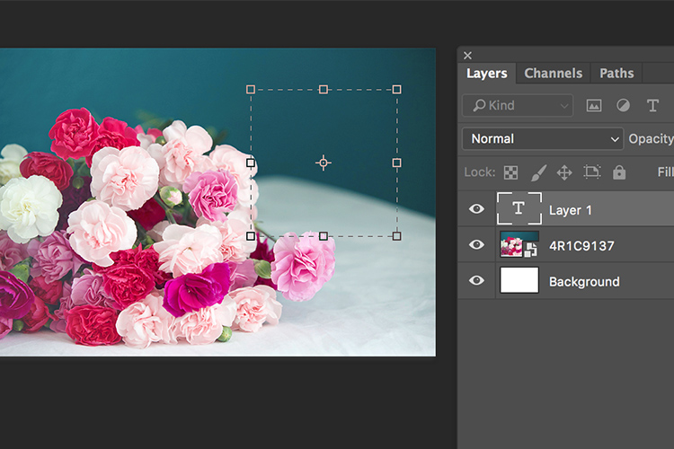
    By holding down the Shift key, and dragging the ends of the type box (the blinking insertion marker), and an Area type will be created. This is the area where larger blocks of text, like paragraphs, can be entered. You can also simply click and drag to make a rectangle (similar to make a marquee selection) which will be the Area type.

    Memorable Jaunts Article for DPS Text tool in Photoshop basics 05

    Memorable Jaunts Article for DPS Text tool in Photoshop basics 06

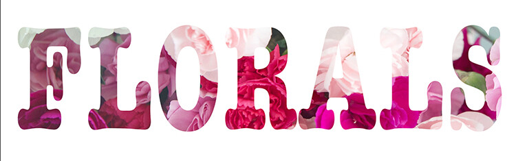
    As you can see, the Type tool is a simple yet powerful tool to add text to your images in a creative way. It can be used to enhance the messaging on an image, as well as for other uses like creating announcements, marketing materials, etc., based on your needs. Once you have the basics of the text tool mastered, you can take it up a notch to add effects like drop shadow and an image see-through the text effect as shown in the images below. It is not complicated but you need to follow the steps carefully.

    Special text effects

    Memorable-Jaunts-Text-Tool-Text-See-through-effect-for-DPS-article-01b

    Text tool effect with image see through

    Memorable-Jaunts-Text-Tool-Text-See-through-effect-for-DPS-article-02b

    Text tool with image see-through effect and a drop shadow for added impact.

    To add a drop-shadow to text, follow the steps listed below:

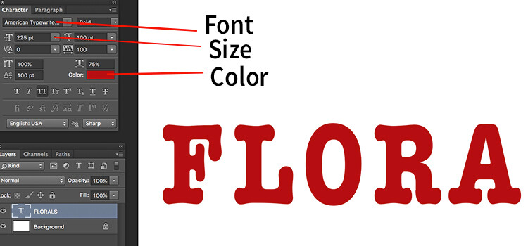
    1. Create a new text layer and select the font, size and color you want. To see the true effect of image through text, make sure you select an appropriate font and size (something bold and wide).
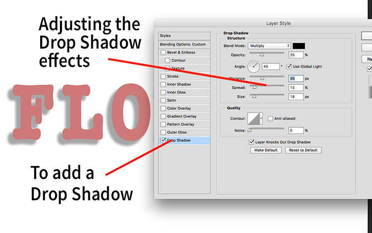
    2. Double clicking on the text layer will open up the layer style panel. To add a drop shadow effect, select the drop shadow option (last option) and adjust the size, position and color of the drop shadow.
    text-tool-01

    Create a new text layer on a new image and adjust the font, size and color of the text layer to taste. For text see-through effect, a bold large font is preferred.

    text-tool-02

    Using the layer style option, you can add a drop shadow effect and adjust the size, distance and orientation/angle of the drop shadow.

    Creating see-through text

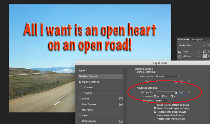
    To create an effect of transparent text (you can see through it) open up the Layer Style panel and click on Blending Options from the left-hand side. Look for Advanced Blending (circled below).

    text-unfaded

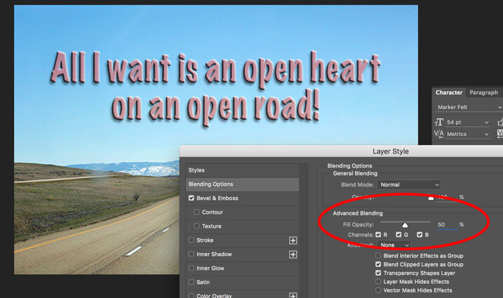
    Lower the Fill Opacity by moving the slider to the left. This is what 50% faded looks like:

    text-50-faded

    Text layer with the opacity lowered.

    Notice that is does not lower the opacity of any of the other layer styles you have applied such as the Drop Shadow. It only fades out the inside of the text. This is a handy trick for making watermarks of your name or logo over your images so it is subtle.

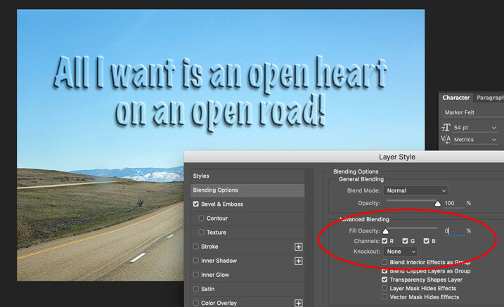
    Faded out to 0%

    Faded out to 0%

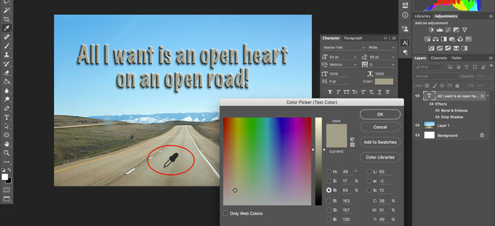
    Note: if you want to make a custom color for your text, one that complements well with the tones of your image – you can use the color picker to select a shade right from your image. Just click on the color in the top menu panel or the Character panel if you have it opened – that will bring up the Color Picker popup box. Just hover over your image and you will see a small eyedropper (I have enlarged it below so you can see it easier). Whatever color you click on will be selected and pulled right from your image.

    text-tool-custom-color

    Use the color picker to select a tone from your image to use for your text.

    Creating and image inside text

    To add an image see-through effect to the text you created, follow the steps listed below:

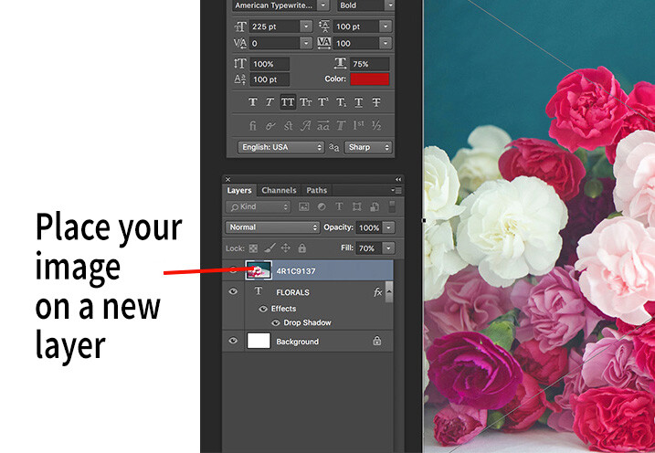
    1. Once you have the text you want, place an image (Select File, Place image). A new layer will be created and the image will be placed on top of the text layer. You will notice that the text layer you just created will be hidden behind the image.
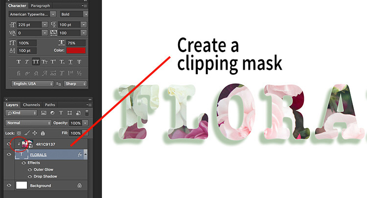
    2. To create the see through effect, you need to add a clipping mask to the image layer. This causes the image to be clipped to the text.
    3. To add a clipping mask, select Layer -> Create clipping mask from the menu options.
    4. You can move the image using the transform tool, to change the position of certain elements in the image to line up to the text if needed. For example I moved the image up to show more of the red and pink flowers through the text.
    text-tool-03

    Select the image you want to use for the text see-through effect and use the Place function to put it on the text layer. It is automatically selected in the transform mode. Adjust the size of the image to taste.

    Add a clipping mask to the image layer (Menu option - layer -> create clipping mask). The image will automatically appear behind the text and the effect will be seen through the text.

    Add a clipping mask to the image layer (Menu option – layer -> create clipping mask). The image will automatically appear behind the text and the effect will be seen through the text. When you see the little down arrow (circled) you know the clipping mask is applied between those two layers.

    Memorable-Jaunts-Text-Tool-Text-See-through-effect-for-DPS-article-02b

    Text with see-through image effect and pink drop shadow.

    Be sure to play around with various images to see what images work for you. What are some way you use the Type tool for your images? Feel free to share in the comments below.

    googletag.cmd.push(function() {
    tablet_slots.push( googletag.defineSlot( “/1005424/_dPSv4_tab-all-article-bottom_(300×250)”, [300, 250], “pb-ad-78623” ).addService( googletag.pubads() ) ); } );

    googletag.cmd.push(function() {
    mobile_slots.push( googletag.defineSlot( “/1005424/_dPSv4_mob-all-article-bottom_(300×250)”, [300, 250], “pb-ad-78158” ).addService( googletag.pubads() ) ); } );

    The post How to Use the Text Tool in Photoshop by Karthika Gupta appeared first on Digital Photography School.

    Digital Photography School

  • DEAL: $5000 worth of Post Production Tools for Just $79

    It’s the 7th and final day of our 2016 Summer Sale… and we’ve saved the biggest deal until last!

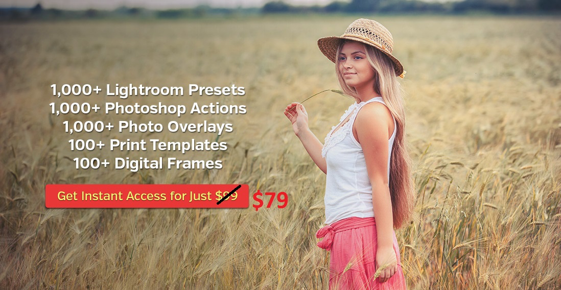
    The good people over at Photographypla have made their Ultimate Photography Bundle, worth a whopping US$ 5,000+, available to dPS subscribers for just US$ 79.

    NewImage

    Yes, $ 5,000+, worth of resources for Lightroom and Photoshop for $ 79.

    In it you’ll get:

    • 1,000+ Lightroom presets
    • 1,000+ Photoshop actions
    • 500+ actions for Photoshop Elements to apply a huge variety of different effects to your photos in no time.
    • 1,000+ photo overlays for weddings, engagements, graduations and more
    • 130+ print templates with announcements for births, graduation, weddings and more
    • 120+ digital frames
    • Collection of business and marketing resources (including contract templates)

    Why buy presets or actions in small packs when you can get this MASSIVE bundle at an amazing price? Get it while it lasts!

    googletag.cmd.push(function() {
    tablet_slots.push( googletag.defineSlot( “/1005424/_dPSv4_tab-all-article-bottom_(300×250)”, [300, 250], “pb-ad-78623” ).addService( googletag.pubads() ) ); } );

    googletag.cmd.push(function() {
    mobile_slots.push( googletag.defineSlot( “/1005424/_dPSv4_mob-all-article-bottom_(300×250)”, [300, 250], “pb-ad-78158” ).addService( googletag.pubads() ) ); } );

    The post DEAL: $ 5000 worth of Post Production Tools for Just $ 79 by Darren Rowse appeared first on Digital Photography School.

    Digital Photography School

  • DIY: $10 Custom Wooden Backdrop Mount

    Do you have painted canvas backdrop, or other textile, that you use for portraits?

    Why clamp it up to a crossbar (and crop the top) every time you use it, when for about $ 10 you can build a permanent wooden mounting bar that begs to be included in the frame?

    Such was this morning's project.Read more »
    Strobist

  • 6 Reasons to Love Ultra-Wide Lenses

    Get 50% off Tom’s ebook Ang’s World – A Life in Photography eBook, now only until July 26 at Snapndeals.

    Right now is the best time in the history of photography to get into ultra wide-angle lenses. In the last few years, lens designers have given us quality that is far better than ever – in fact, far better than we ever thought possible. Yet you may have been warned against using ultra wide-angles. Tutors tell you they’re really tricky to use, that you’ll produce ugly effects. Even that these lenses teach you bad habits.

    Well, I’ve used ultra-wides for well over 30 years and they haven’t harmed my career. In fact, my last two exhibitions were shot entirely with them.

    01 DSC0565

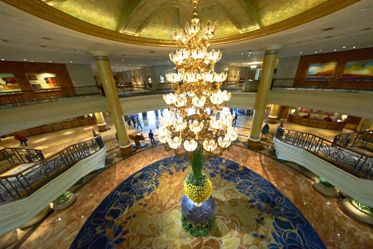
    When you need to get everything into a single image – as in this hotel in Manila, Philippines – and you have no room to manoeuvre, an ultra wide-angle focal length of 11mm is your best friend.

    If wide-angle lenses take in more of the view than normal, ultra wide-angles take in a huge amount more. The field of view of these lenses is enormous. Compared to around 47º of normal lenses, they can be nearly two-and-a-half times wider, about 130º. There’s one proviso: straight lines in the view remain fairly straight. This contrasts with fish-eye lenses that freely bend straight lines.

    Going by 35mm equivalent focal length (comparing focal length to a standard 35mm film or full frame format), focal lengths shorter than the normal 50mm are called wide-angle. The range from 24-35mm can be said to be wide-angle. Shorter than that, to around 18mm is very wide. Any focal length shorter than 18mm we call ultra or extreme wide-angle. Best-known of these lenses is the Sigma 12mm-24mm zoom, challenged by the mighty, and costly, Canon 11mm-24mm f/4. This dwarfs the neat, new Voigtländer 10mm.

    02 DSC1518 28mm

    This image covers about 28mm – the widest angle that you’ll commonly see because it’s the widest often found in zoom lenses on compact cameras.

    03 DSC1518 11mm

    Compare the same view shot at 11mm: almost the widest straight-line shot you can obtain on any format. When you get used to ultra wide-angles, normal focal lengths look telephoto.

    Let me share the reasons why I love using ultra wide-angle lenses.

    #1 – THEY IMMERSE YOU

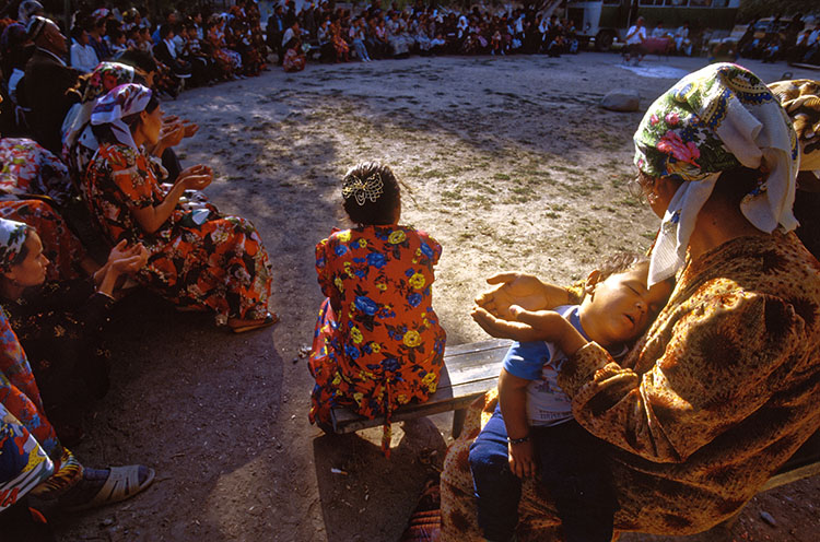
    The first one, above all, is that they immerse you in the scene. They take you into the situation. They draw you in. The reason is simple; you, as the photographer, must get close to your subject to capture it effectively. The lens draws you into the action, often well into personal space, and it draws you into the undergrowth.

    04 asleep at prayers

    With my wide-angle zoom set to 16mm I had to get within touching distance of this mother and her sleeping child. Watching from the outer perimeter just wasn’t an option.

    05 DSC2794

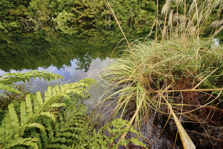
    You can reach close into nature, the nearest leaves almost touching the lens, yet still capture the wider vista of the trees beyond as well as their reflections in the lake.

    #2 – THEY HELP YOU SEE STRAIGHT

    You know what it’s like; you’re close to some elegant building like a cathedral and you want to get it all into the shot. But when you point the camera up, the building leans backwards in a thoroughly inelegant way. If you use an ultra wide-angle lens, there’s a good chance you can get the whole building into shot without having to point upwards. Keep the camera pointed at the horizon, and all the verticals stay vertical, so the cathedral won’t look like it’s leaning back.
    You’ll get lots of foreground, but that’s easily cropped off.

    Here’s a bonus benefit: with ultra wides, you usually don’t have to back that far away from the building to get it all in.

    06 DSC0587A

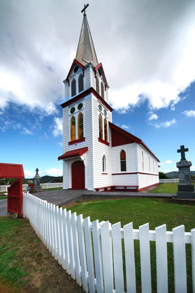
    The soaring steeple of this church in New Zealand is not improved by being exaggerated – which would have happened if the camera had been pointing upwards more.

    6A DSC0587A crop

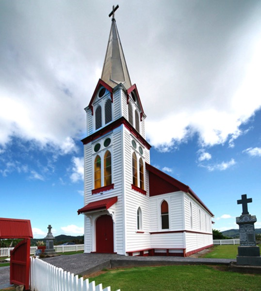
    The ultra wide-angle view of 12mm took in too much of the foreground fence, so cropping it off benefits the whole image.

    #3 – THEY REVERSE SCALE

    This effect is perhaps the best-known of ultra-wide lenses: they make things close to the lens look enormous, while objects further away look tiny. You may see this called perspective distortion or extreme perspective. In practical terms, what you can exploit is that small things can be made to look huge, and big things made to look very small. The wider the lens, the greater the effect.

    07 MG 8638A

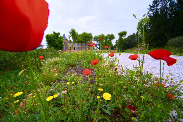
    With the poppy nearly touching my ultra wide-angle zoom lens set to 12mm, the chateau becomes a tiny, model-like building.

    07B DSC8791 1 A

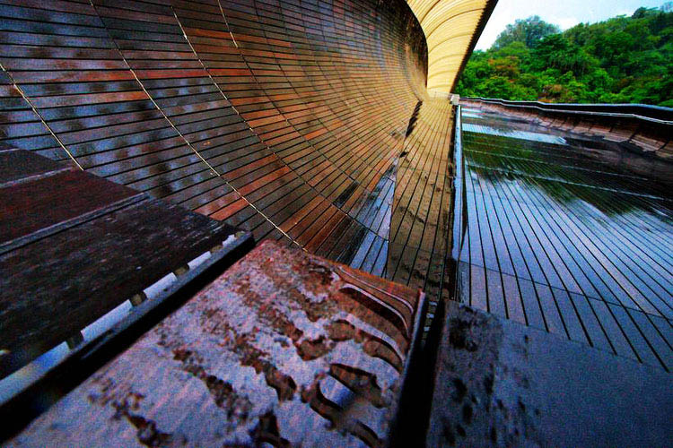
    It follows from their strong effect on foreground-background difference that converging lines are very strongly rendered, making for dramatic receding effects as in this wooden walkway in Singapore.

    #4 – THEY HAVE BUILT-IN PANORAMA FUNCTIONALITY

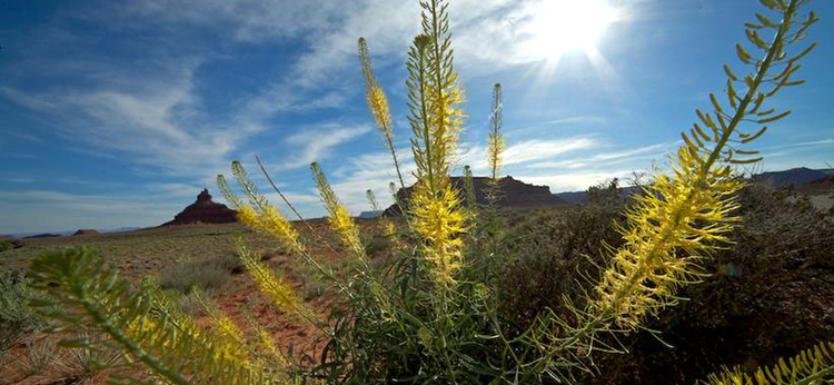
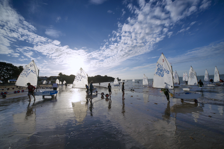
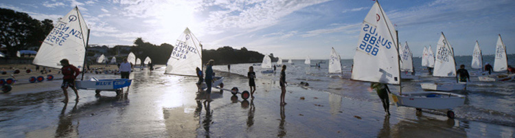
    Thanks to their ability to capture a huge amount of scenic real estate, ultra-wides are perfect for creating pseudo-panoramas. You simply slice chunks from the top and bottom, and you can create an image that would otherwise need the stitching together of two or more shots. To make the most of this, it helps to ensure the camera is aimed horizontally, as a crop tends to emphasize any leaning of objects.

    08 valley of gods ANG2981A

    A view of the Valley of the Gods in USA at 12mm can lose the sky and the foreground, so taking your attention to the relation between the flowers in the foreground and the distant landmarks.

    09 DSC0940A

    A 12mm focal length shot of sailing in Auckland, New Zealand, was attractive with the sky and sand in view.

    09B DSC0940A cropped

    But it’s much stronger cropped to panorama, as the emphasis is clearly on the repeated triangles of the sails and busy activity.

    #5 – THEY GIVE GLORIOUS REFLECTIONS

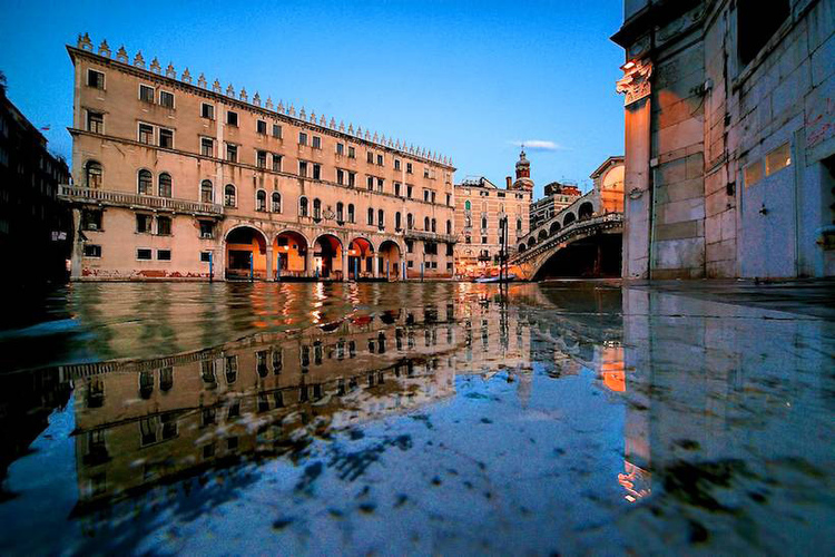
    If you love working with reflections (who doesn’t?) the wider your field of view, the more reflection you can dig out, and you can’t have too much of that magic. The secret to making the most of reflections is to get as close to the reflecting surface as possible. I’ve been known to dip the camera nearly in the water in my attempt to get to the mirror surface.

    10 Travel 154A
    This image, at 12mm setting, was the easiest possible capture, if not best for looking after equipment. After a heavy downpour in Venice, I placed the camera on the ground and pressed the shutter button. The camera got wet, but the ground steadied it for the long exposure needed.

    #6 – THEY ARE SIMPLY MAGIC!

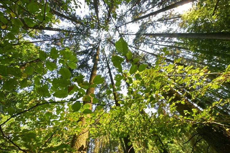
    To be sure, many views such as landscape vistas may look like you should capture as much as possible, when selective views often work more effectively. But here’s the thing – where you absolutely need the widest view, an ultra wide-angle can’t be beaten. Where views and treatments simply call for the widest possible view, then the wider you can get it, the better. This is particularly true of ceilings, (e.g., painted ceilings of great houses), and also natural ceilings such as a leafy canopy.

    11 DSC2282
    If this view were shot at 16mm or 18mm it might look pretty similar. But a wide-angle freak wants more! Made at 11mm focal length, the extra field coverage draws in nearby detail such as criss-crossing branches and sun-lit leaves that smaller views miss out.

    In the end, the best reason for using any lens is that it makes magic. Ultra wide-angles do that for me, which is why it’s my most used lens. Do you have any wide-angle images or thoughts you’d like to share? Please do so in the comments below.


    Get 50% off Tom’s ebook Ang’s World – A Life in Photography eBook, now only until July 26 at Snapndeals.

    googletag.cmd.push(function() {
    tablet_slots.push( googletag.defineSlot( “/1005424/_dPSv4_tab-all-article-bottom_(300×250)”, [300, 250], “pb-ad-78623” ).addService( googletag.pubads() ) ); } );

    googletag.cmd.push(function() {
    mobile_slots.push( googletag.defineSlot( “/1005424/_dPSv4_mob-all-article-bottom_(300×250)”, [300, 250], “pb-ad-78158” ).addService( googletag.pubads() ) ); } );

    The post 6 Reasons to Love Ultra-Wide Lenses by Tom Ang appeared first on Digital Photography School.

    Digital Photography School

  • DEAL: How to Take Your Landscape Photography to the Next Level

    It’s Day 6 of our 7 Day Mid Year Sale, and for the next 24 hours you can grab a copy of The Complete Photography Tutorial Ebook by Richard Schneider at 61% off.

    NewImage

    Richard’s guide normally sells for US$ 99. But he’s made it available to the dPS community for just US$ 39, today only.

    At over 250 pages, this may be the most in-depth ebook on how to capture amazing photography anywhere whether it be countryside landscapes or cityscapes!

    It also comes with bonus Lightroom Presets to help you make your photos pop.

    Richard has worked as a photography educator for over 10 years, as well as a pro landscape photographer.

    He wrote The Complete Photography Tutorial Ebook to help people learn the core concepts of photography quickly and avoid the same mistakes he made.

    Now you can learn everything you need to get started and capture your own stunning photos.

    Grab your copy today for just US$ 39 – 61% off.

    But remember this offer only lasts for 24 hours.

    googletag.cmd.push(function() {
    tablet_slots.push( googletag.defineSlot( “/1005424/_dPSv4_tab-all-article-bottom_(300×250)”, [300, 250], “pb-ad-78623” ).addService( googletag.pubads() ) ); } );

    googletag.cmd.push(function() {
    mobile_slots.push( googletag.defineSlot( “/1005424/_dPSv4_mob-all-article-bottom_(300×250)”, [300, 250], “pb-ad-78158” ).addService( googletag.pubads() ) ); } );

    The post DEAL: How to Take Your Landscape Photography to the Next Level by Darren Rowse appeared first on Digital Photography School.

    Digital Photography School

  • A Beginner’s Guide to Minimalist Photography

    Minimalism is splitting the world in two. Love it or hate it, it’s a style with a very defined outline, one that has its roots in in the painted arts of the 20th century and that continued to branch out in other domains. These days, minimalism is especially present in design, fashion, and photography. A simple scout around websites such Continue Reading

    The post A Beginner’s Guide to Minimalist Photography appeared first on Photodoto.


    Photodoto

  • How to Create Beautiful Light Painting Images With an Illuminated Hoop

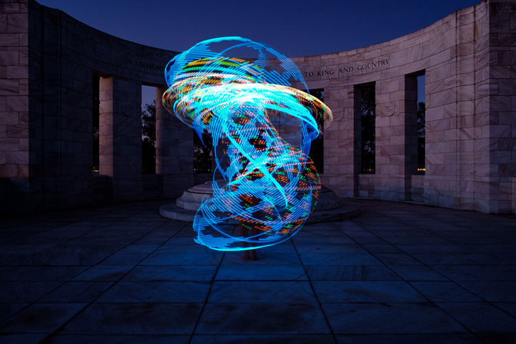
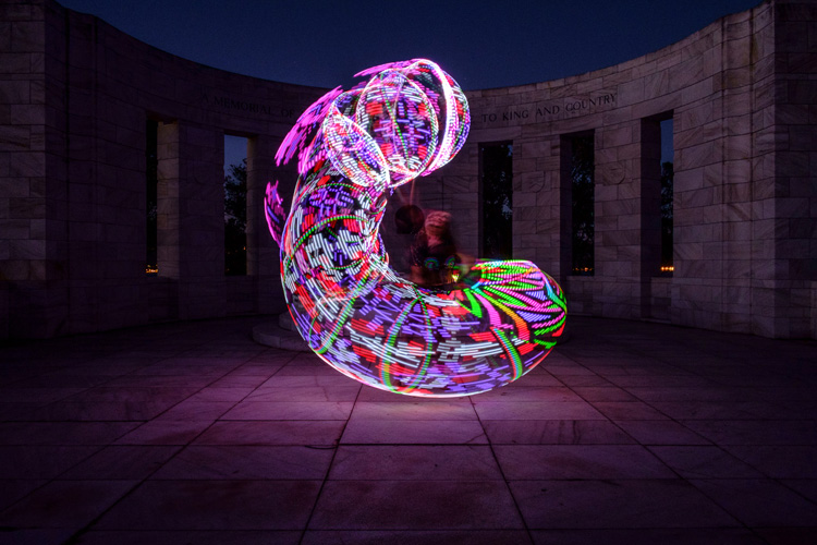
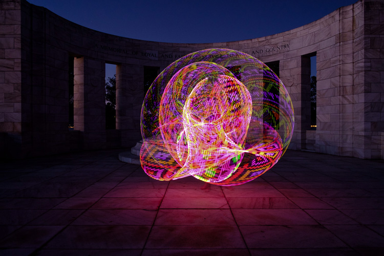
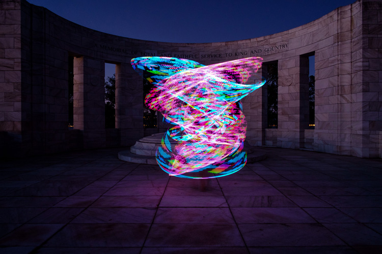
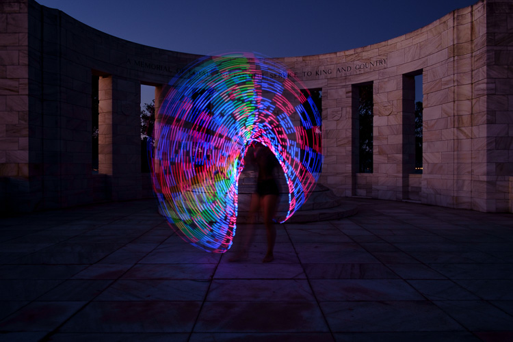
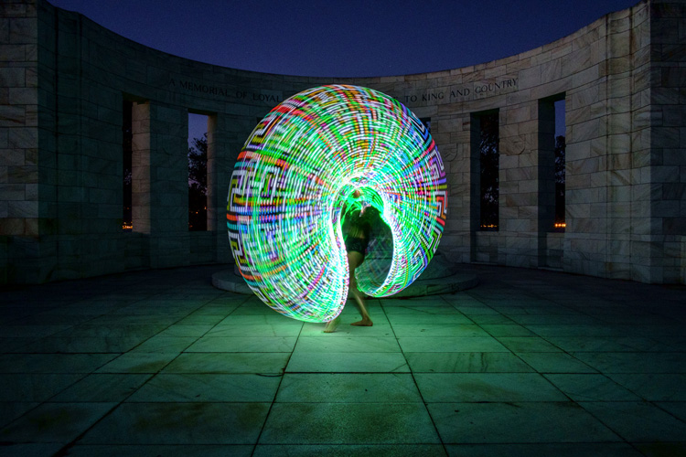
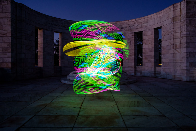
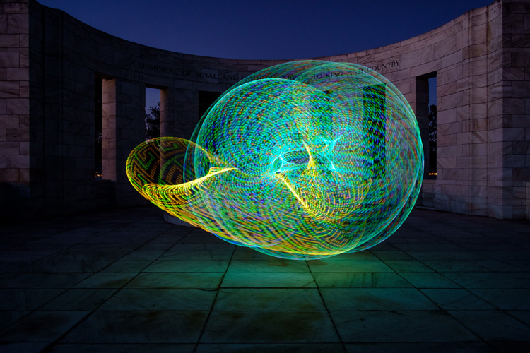
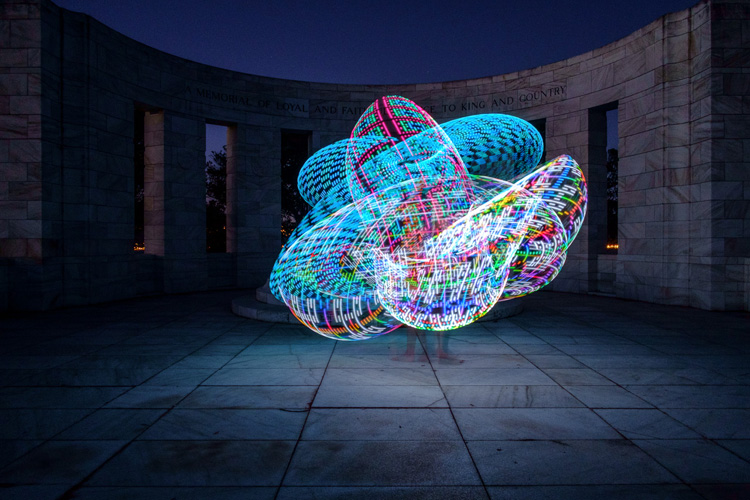
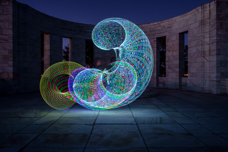
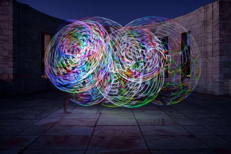
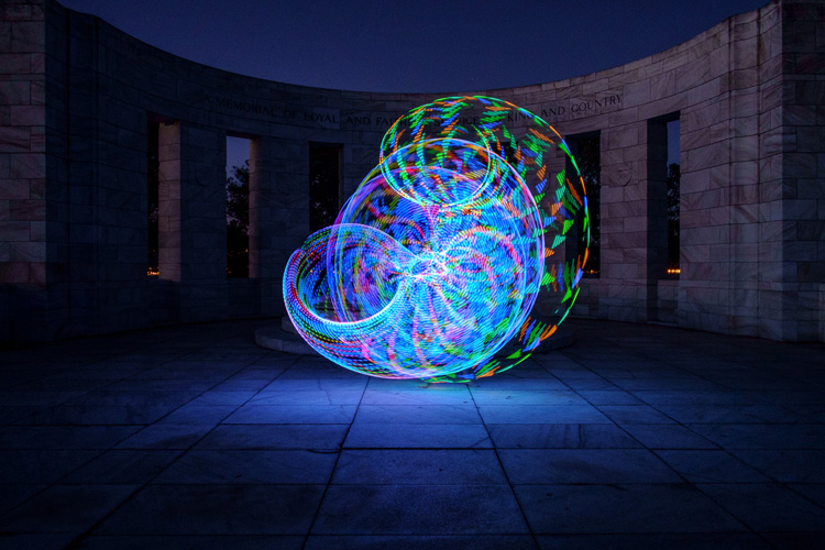
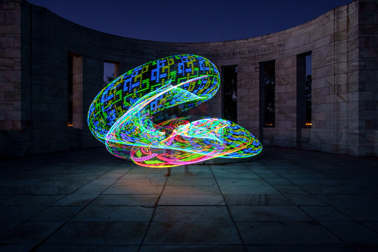
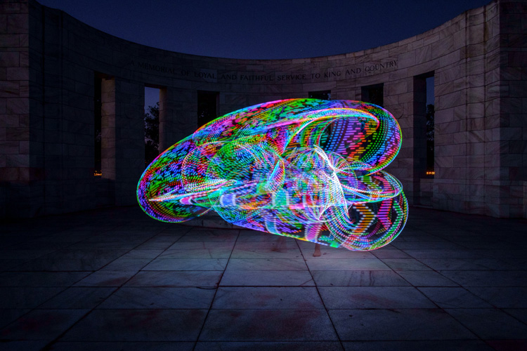
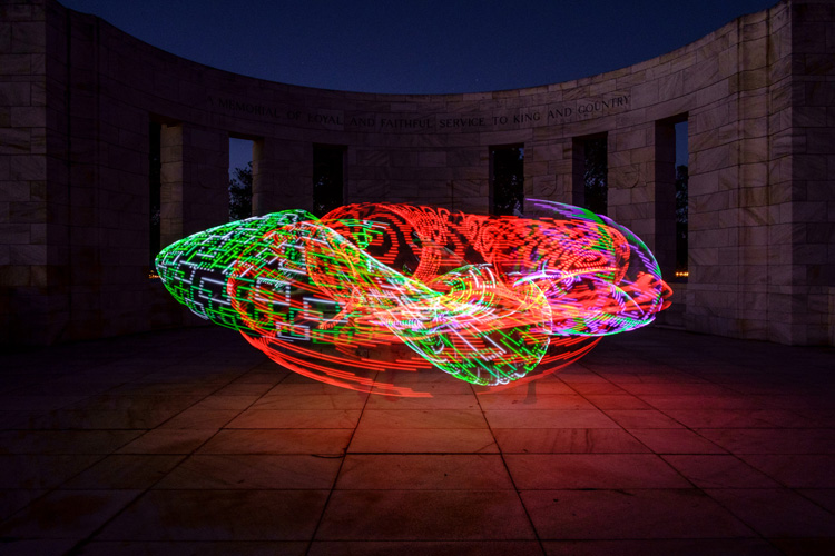
    Early last year I collaborated with a friend who is a professional circus performer and hula hooper to create the unique images that you see in this article.

    There are lots of good light painting photos around, but the factor that sets these ones apart is that my friend Tess used something called a FutureHoop – a transparent hula hoop that has built-in lights that can be programmed to flash in different colors and patterns. It helps that Tess is a trained dancer and hooper, so she was able to create some beautiful patterns with the FutureHoop.

    painting with light

    You can try this technique yourself – if not with a FutureHoop then with any number of colored light tubes or similar devices that are available (or make your own). Do a search on Amazon to see what you can find, and use your imagination to reveal their potential.

    Whatever you end up using for your painting with light experiments, there are a number of things you need to consider to get the best results. Take care of these and you should be able to create some strong images.

    Choose a Location

    painting-with-light-7

    Pick a good location. You need a dramatic background that complements the painting with light technique you choose to use. For these photos we went to Massey Memorial, built in remembrance of a past New Zealand Prime Minister on a hill in Wellington. I knew it would be a great place to take the photos because the marble pillars form a dramatic background. There was also plenty of room for Tess to move and dance with the FutureHoop.

    Take the practicalities into consideration when choosing a background. For example, beaches often make good locations for painting with light photos, but you need to make sure your model can walk around safely in the near dark without tripping over rocks (or falling into the sea). Incidentally, isolated beaches are also a great place to try steel wool spinning, another form of painting with light.

    painting with light

    Pick a model

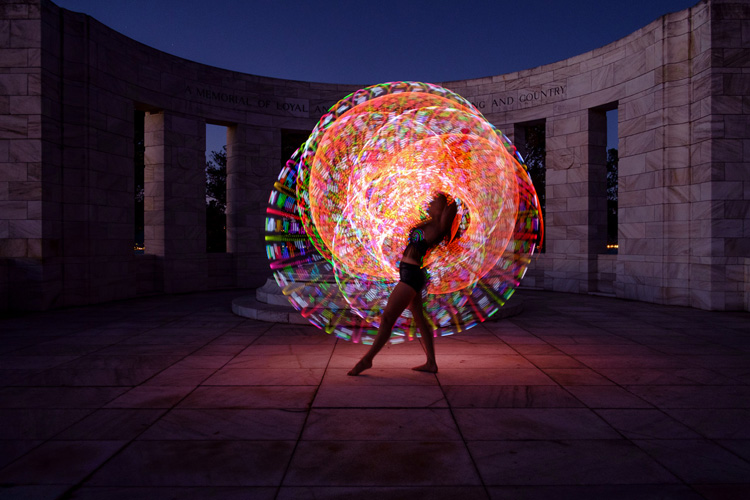
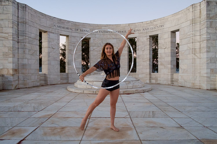
    Pick the right model. Tess is a professional performer and I couldn’t have created these photos without her. She had the appropriate costume, including an illuminated bra that can also be programmed to give different color displays.

    Her training also meant that she could strike professional poses. The following photo demonstrates this perfectly. Look at the arch of her back, the way her feet are positioned, and how the toes on her left foot are pointed. You can even see the flashing bra.

    painting with light

    The other thing that helped is that Tess thought about the patterns she would use on FutureHoop, and how she would move the hoop before the shoot. That helped us nail the shoot the first time.

    Ask your model to practice, and be prepared to reshoot if necessary. It is possible that you won’t create your best images during the first attempt. During the shoot, look at the photos on the camera’s LCD screen and see what works and what doesn’t. Then you can suggest things that your model can try, or ask her to do something again if you didn’t quite time the photo correctly. Use feedback to refine the images and work towards something beautiful.

    painting-with-light-15

    Time of Day

    Choose the right time of day. The best time for painting with light is twilight, as it is dark enough for the lights to show, but there is still enough ambient light to subtly illuminate the background, and maintain some color in the sky.

    The only difficulty with twilight is that the light fades rapidly, so you have to keep up by changing the exposure settings as you go along. The photos you take earlier on in the shoot, will be different from the ones you take later, as the light is fading. The ratio between the light from the FutureHoop (or whatever devices you are using), which stays constant, and the ambient light, which is fading, changes.

    painting with light

    painting with light

    The two photos above show the difference. The first was taken early in the evening, the second one when it was nearly dark. The pillars in the background in the first are lit by the light of the setting sun. The FutureHoop seems much brighter in the second because the ambient light levels are lower. Note that I darkened the background of the first image in Lightroom to match that of the second one.

    This photo shows Tess warming up at the start of the shoot. It was still too bright as this stage for the painting with light photos – you can barely see the light of the FutureHoop.

    painting with light

    If you shoot at night the exposure should remain constant, but the sky will lack color. On the other hand, the light from the device your model is using could light up the background beautifully if it is close enough. So there may be advantages to working at night, rather than twilight, but in most cases the light during twilight will be better.

    Technique and Camera Settings

    Get your technique right. You need slow shutter speeds to take this type of photo, so a good tripod to support the camera and a cable release are necessities. I used shutter speeds between two and four seconds for these photos – you may need longer exposures depending on how long it takes your model to move the device you are using through the air. Tess moved quite fast, so the shorter shutter speeds we used worked better.

    painting-with-light-16

    Set your camera to Manual mode so that the exposure remains constant throughout the series (the moving lights will confuse your camera’s light meter in an automatic exposure mode). It is easy enough to open the aperture, or raise the ISO, if you need to as the light fades.

    Use the Raw format to give you maximum leeway in post-processing. Shooting Raw simplifies the shoot greatly as you don’t have to worry about settings such as color profile until you sit down to process the photos.

    In this shoot, once the camera was set up, I kept the aperture at f/8 or f/11 and raised the ISO as the light faded. I set the White Balance to Daylight so I could see the natural colors of the FutureHoop and the ambient light. Using auto White Balance may result in some strange color casts as the camera tries to compensate for the colored lights.

    painting-with-light-14

    Above all, have fun. If you both enjoy the process you create better images. If your model enjoys it she will want to collaborate with you on future ideas. Below are a few more images from our shoot – enjoy and hopefully they give you some ideas.

    painting-with-light-6

    painting-with-light-13

    painting-with-light-12

    painting-with-light-11

    painting-with-light-10

    painting-with-light-9

    painting-with-light-8

    Any questions? Let us know in the comments and I’ll do my best to answer.

    And if you’d like to learn more about the basics of photography, then please check out my ebook Mastering Photography: A Beginner’s Guide to Using Digital Cameras.

    googletag.cmd.push(function() {
    tablet_slots.push( googletag.defineSlot( “/1005424/_dPSv4_tab-all-article-bottom_(300×250)”, [300, 250], “pb-ad-78623” ).addService( googletag.pubads() ) ); } );

    googletag.cmd.push(function() {
    mobile_slots.push( googletag.defineSlot( “/1005424/_dPSv4_mob-all-article-bottom_(300×250)”, [300, 250], “pb-ad-78158” ).addService( googletag.pubads() ) ); } );

    The post How to Create Beautiful Light Painting Images With an Illuminated Hoop by Andrew S. Gibson appeared first on Digital Photography School.

    Digital Photography School

  • Software Review: AfterShot Pro 3 by Corel

    ASP3-box_front.jpgI remember seeing a poster on the wall of my fourth grade elementary school class that said, “What’s right isn’t always popular, and what’s popular isn’t always right.” The quote is attributed to Albert Einstein, and while he was most likely speaking with regard to issues of ethics, justice, and social equality, he might as well have been referencing the current state of image editing software.

    The king of the hill when it comes to photo editing programs is Adobe, with their extensive suite of applications designed for creative professionals and hobbyists. But just because their software is widely used, does not mean it is the best. Corel, a software company based in Canada, has been making its own image and video editing programs for years, and is a stalwart in the ever-changing software industry with roots that go back to the early days of the personal computer revolution in the mid-1980’s.

    The most recent version of their photo-editing software, AfterShot Pro 3 by Corel, may not have the sheer quantity of features offered by Lightroom or Photoshop, but it has a few tricks up its sleeve that make it a very attractive alternative to those looking for a solid solution outside of Adobe’s offerings.

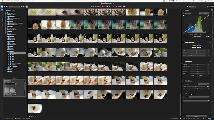
    The user interface is instantly familiar to anyone who has used Lightroom or other image editing programs.

    The user interface is instantly familiar to anyone who has used Lightroom or other image editing programs.

    Overview

    At its core, AfterShot Pro 3 is an end-to-end workflow solution that is designed to suit the needs of demanding photographers as well as casual hobbyists. It allows you to sort your images, edit them, and export them for print, sharing, or use in other programs. Its core features are centered on a robust set of tools that allow you to have a great deal of control over several parameters of your images, and adjust fairly basic elements like white balance, exposure, saturation, and contrast, while also giving you fine-grained control over settings like individual RGB color balance, hue/saturation/luminance, and tone curves.

    Pixel peepers and image tweakers will find little to complain about here, though some of the tools are a bit lacking compared to those offered by Lightroom. Sharpening and noise removal work quite well, but don’t allow the same degree of control as in Adobe’s software, but there are some automatic “Perfectly Clear” options for noise removal and color adjustments that I have found to be quite useful.

    You can of course edit metadata, use presets, and even insert watermarks or access a growing library of plugins, but a proper evaluation of this program isn’t necessarily about comparing features tit-for-tat to see how it stacks up to the competition. Anyone who is looking at sheer numbers of options and adjustment sliders, will likely find everything here that they could ask for. Rather, deciding if this is the right program for you will likely come down to whether it is suited to your own particular way of actually using the features it has.

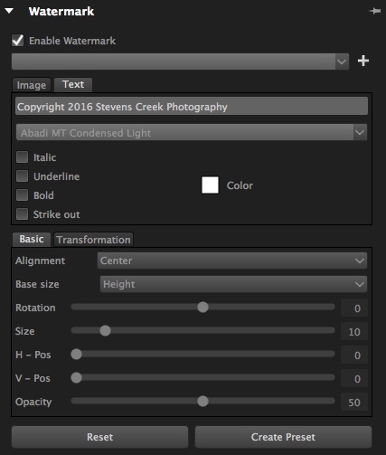
    The built-in watermarking tool can accommodate text or allow you to insert a logo or other graphic.

    The built-in watermarking tool can accommodate text or allow you to insert a logo or other graphic.

    Workflow

    AfterShot Pro 3 has its own unique workflow, which does bear some resemblance to how Lightroom and other programs function. But, in order to make full use of the program’s capabilities you might need to learn how to do things in a way that seems strange at first, but will feel like second nature over time.

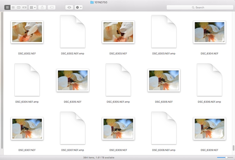
    One of the most notable differences is that AfterShot Pro 3 does not import your pictures into a database, and does not store changes to files in one single master catalog like Lightroom. Instead, it works by leaving your pictures exactly where they are and does not copy them, even from a camera memory card. You must first save your images where you want them, and then as you make edits, a record of all the changes you have made to your image get stored in a unique XMP file.

    Instead of keeping a master catalog file with all your edits, a single data file is created for every photo that you have changed. To let someone else edit a photo you have already started, give them the original and the XMP file.

    Instead of keeping a master catalog file with all your edits, a single data file is created for every photo that you have changed. To let someone else edit a photo you have already started, give them the original and the XMP file.

    This approach may seem counterproductive at first, because you end up with thousands of XMP files instead of one single all-encompassing catalog. However, it makes your editing much more portable and flexible, since you can transfer your photos and their editing instructions across devices, and share them with other users in a way that Lightroom simply does not offer. If I edit an image on my computer and want to hand it off to another team member to tweak even further, all I have to do is send her the original RAW or JPG file, along with the very small related XMP file. She can now open the image on her machine, make changes to any of my edits, and add alterations of her own. I can even edit an image right on my camera’s memory card without ever copying it to a hard drive, and then physically hand that card to someone else who can make further edits or go back and revise any changes I have made.

    From this standpoint, AfterShot Pro 3 could be a boon to those who work in a collaborative or fast-paced environment, as well as casual or hobbyist photographers who want a little more flexibility.

    Work space

    AfterShot Pro 3 also operates in a single combined environment, as opposed to the discrete modular-based approach taken by Lightroom, where you use the Library module to organize and sort your images, the Develop module to make edits, the Print module when making prints, etc. In AfterShot Pro 3 everything happens from within a single module, from organizing your images, to editing them, to adding watermarks, and finally printing or sharing. Neither one is necessarily good or bad, and neither approach can be said to be objectively better than the other, but personally I have found the interface in AfterShot Pro 3 to be a refreshing change from Lightroom, where I am forced to switch between Library and Develop to do simple things, and even the function of quick keys changes depending on which module I am in at the time. Your mileage may vary, but it’s an important distinction to know if you are considering changing over to Corel’s program, or even just trying it out.

    Use of Layers and Flexibility

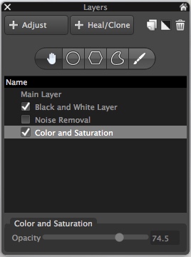
    Layers contain a set of edits and can be made more or less opaque, and enabled or disabled at will.

    Layers contain a set of edits and can be made more or less opaque, and enabled or disabled at will.

    One hugely useful aspect in AfterShot Pro 3, that really stands out from much of the competition, is its intuitive use of layers. You can apply any number of edits in terms of tint, hue, curves, etc., then stash them all into a single layer, which can then be set to anywhere between 100% and 0% opacity. This is an incredibly helpful way of stacking various types of edits on top of one another, and I’m surprised it is not available in Lightroom. For instance, you could easily create a layer wherein you convert your image to black and white, but then set that overall layer opacity to 25%, which would lend a subtle desaturated look to the actual image. You can use multiple layers of edits on a single picture, and even use layers specifically for cloning and healing adjustments as well. It’s a clever, and highly useful way of editing your images, and once you get used to it, you may not ever want to be without it again.

    Is the software right for your needs

    New in version 3 of the program, is a highlight recovery tool that allows you to coax a bit more out of your RAW files than before, along with other tweaks and improvements compared to earlier iterations. However, as I mentioned in the opening paragraph it’s not really a productive exercise to simply compare a list of features when deciding if an image editor is right for you, since nearly all of them have extensive options that will likely suit your needs.

    What matters is whether the program suits your needs and your workflow, and in the case of AfterShot Pro 3 it is certainly worth considering if you are a casual user who wants something with much more power and flexibility, or are simply seeking a worthy (and far cheaper) alternative to one of the more popular editors like Lightroom.

    One of my favorite parts of AfterShot Pro 3 is its speed, which honestly could be a make-or-break decision if you are comparing programs. Photos load almost instantly and switching between RAW files is as smooth as butter, which is a far cry from some other programs where you might as well go make some coffee while you wait for a picture to load.

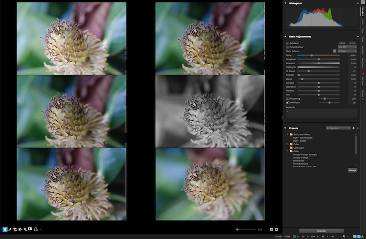
    You can view up to six images at once and apply edits to individual photos while in multi-image view.

    You can view up to six images at once and apply edits to individual photos while in multi-image view.

    In the end, I found Corel’s latest entry into the image-editing fray a worthy competitor that can certainly hold its own against the competition. I especially like that it’s priced well under $ 100, which is a one-time purchase, as opposed to a monthly subscription.

    I did find a few things to quibble over, like like its lack of a clarity slider (which can be mitigated by using a combination of other sliders) and a black and white conversion function, that is in my opinion, far behind Lightroom’s use of color filters to take fine-tune control over monochrome conversions. However it is a speedy and full-featured image editing program that is certainly worth checking out.

    ASP3-Logo.png

    Editor’s note: if you want to check it out Corel has a free trial and you can enter to win a copy right here on dPS. 

    googletag.cmd.push(function() {
    tablet_slots.push( googletag.defineSlot( “/1005424/_dPSv4_tab-all-article-bottom_(300×250)”, [300, 250], “pb-ad-78623” ).addService( googletag.pubads() ) ); } );

    googletag.cmd.push(function() {
    mobile_slots.push( googletag.defineSlot( “/1005424/_dPSv4_mob-all-article-bottom_(300×250)”, [300, 250], “pb-ad-78158” ).addService( googletag.pubads() ) ); } );

    The post Software Review: AfterShot Pro 3 by Corel by Simon Ringsmuth appeared first on Digital Photography School.


    Digital Photography School

  • DEAL: How to Get Your Camera Out of Auto Mode

    It is Day 5 of our 7 day Summer Sale.

    Today only, you can buy our two popular Photo Nuts courses together for just $ 35.

    Pnbvideo

    Normally you’d pay $ 118 to get them both. But today you’ll save 70% when you purchase them in a bundle.

    Grab them here.

    In these two courses, Neil Creek goes through all the basics of photography and explains tech concepts in a way anyone can understand.

    This 2 course bundle includes:

    1. Photo Nuts and Bolts – Over 2 hours of practical online video lessons that teaches you all about your camera and gets you out of “auto” mode.
    2. Photo Nuts and Shots – 2.5 hours of online video lessons, that teach you the craft of photography – so you can take photos that truly connect with people and reflect your creative vision.

    Only want the one course? Then pick up either for just $ 19 for today only. Usually $ 59, you’ll save 68%.

    Remember, these deals only last for 24hrs so grab this offer while you can.

    Note: As with all dPS products these come with a 60 day money back guarantee so there’s no risk. If you don’t find them useful simply let our team know and we’ll arrange a refund.

    googletag.cmd.push(function() {
    tablet_slots.push( googletag.defineSlot( “/1005424/_dPSv4_tab-all-article-bottom_(300×250)”, [300, 250], “pb-ad-78623” ).addService( googletag.pubads() ) ); } );

    googletag.cmd.push(function() {
    mobile_slots.push( googletag.defineSlot( “/1005424/_dPSv4_mob-all-article-bottom_(300×250)”, [300, 250], “pb-ad-78158” ).addService( googletag.pubads() ) ); } );

    The post DEAL: How to Get Your Camera Out of Auto Mode by Darren Rowse appeared first on Digital Photography School.

    Digital Photography School