RSS
 

Archive for the ‘Photography’ Category

8 Reasons to Revisit the Same Photography Location Again and Again

31 Mar

It’s good to keep moving forward and trying new things all the time. There are times when going back to an old photography location can be a great idea, though. Even if you have a stellar photo from that location it doesn’t mean you can’t get an equally good image that has different characteristics.

The easiest places to make return visits to are of course those local to you, but heading back to that far-off exotic destination is also rewarding. Let’s take a look at those eight reasons to revisit a photography location, and why this will improve your work.

8 Good Reasons to Revisit the Same Photography Location Again and Again

This is a great vantage point in Busan. I returned to this location to take this photo.

1 – Conditions are never the same!

The earth is a constantly changing and dynamic entity, that means you’ll almost certainly get a different image if you go to the exact same spot and photograph it again. There are even projects that show the same location photographed every day, with the intent of showing subtle changes. You don’t need to go every day, of course, but you might take a shot of the location in the snow, and one in the sun.

The following is a list of variables that should ensure you can return to a photography location, and get something different from it each time.

8 Good Reasons to Revisit the Same Photography Location Again and Again

A different angle of the bridge in Busan. This time photographed from the coast.

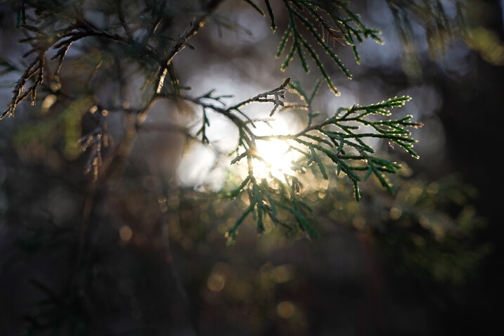
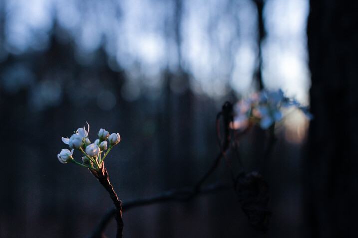
  • Season –  Provided you live in a temperate area that sees a change of the seasons, you can make the most of this with your photography. Taking shots of the same location in spring, summer, fall and winter is a classic photography idea.
  • The tide  If you’re in a coastal location the change in the tides can alter the scene you photograph dramatically. You can check the state of the tide at this website, and remember to stay safe in coastal areas.
  • The sun position – This is similar to the seasonal change, though the position of the sun could make or break the photo more than if there is snow or not. The position of the sun can be planned before you go back using the suncalc website.
  • Astro-photography – You may have photographed a place by day, but how about photographing it at night? You could try photographing star trails, or even the Milky Way. As with the sun, the position of the Milky Way shifts in the sky throughout the year, so prior planning is needed when shooting the night sky.
8 Good Reasons to Revisit the Same Photography Location Again and Again

Everything looks great with snow! Snow is one of the best weather conditions in which to shoot.

2 – Revisit a photography location with brand new gear!

New photography equipment can really open up other creative angles that you’d never thought of before. One of the best pieces of equipment any new photographer can purchase is a tripod, which will then open up the door to lots of long exposure photography.

The addition of a new lens to your camera equipment will open up yet further possibilities, especially if you’re trying a wide-angle or fisheye lens for the first time. Those who like light painting should look at the pixelstick, a great tool for this type of photography.

8 Good Reasons to Revisit the Same Photography Location Again and Again

New gear is a great reason to revisit a photo location. In this photo I used a glass ball, it’s one of the first photos I took with it.

3 – New photography techniques

New gear often means learning a new technique. There are plenty of techniques you can learn with your existing gear.

As a landscape photographer, you may have photographed a location before using a technique like digital blending. Of course, once you know this new technique you’ll want to revisit a photography location and see if you can improve on your old shots. Equally, if you’re a portrait photographer learning to use

Equally, if you’re a portrait photographer learning to use off-camera flash will really enhance your work. This would give you a good reason to go back and shoot a place again.

8 Good Reasons to Revisit the Same Photography Location Again and Again

A new technique such as steel wool spinning can lead you to revisit a photography location.

4 – A special event is happening

There really is no better reason to revisit a photography location than some kind of event happening there. A big cultural event can give a location much more context and story, enriching your photo. The potential for unique photos that other photographers won’t be able to replicate also exists at these kinds of events.

Photographing an event also presents a good test of your skill, there are no second chances with these type of photos. Lastly, it’s great to experience a place at its vibrant best, which will be the case during a festival or event. It’s always worth running a google search on a particular location to see what yearly festivals they have, this way you can plan to be there during that time.

8 Good Reasons to Revisit the Same Photography Location Again and Again

A fireworks festival will often show a location in a different way.

5 – Improvement as a photographer

The longer the gap between revisiting a photo location, the more your photography will have changed. This can be a great way to gauge your improvement as well.

Lay out your best five photographs from the first trip you made, and then your best five when you return this time. Are there differences? How have you improved as a photographer? Is there something you wanted to improve that you still need to work on? It is typical for a photographer to first improve by making their photos more minimal. After a period of learning the next step is to add story and context to a more minimal scene, this is a step-by-step process.

8 Good Reasons to Revisit the Same Photography Location Again and Again

As you develop as a photographer the angles you use will change. You should be able to look back and see your improvement.

6 – Revisit a photo location until you get the best weather

If you know a good landscape photographer they’ll likely tell you they revisit the same spot until they get the photograph they want. The truth is you never know whether you will get the perfect sky. This can be especially frustrating if you need to travel several hours to reach the location. Weather can change fast, and these days pollution can also be a factor.

The need to make repeat journeys then is important if you wish your photo to be striking. Even once you have that perfect shot going back can be fun. Can you take this scene with different weather conditions and make another striking image?

8 Good Reasons to Revisit the Same Photography Location Again and Again

This is what happened the first time I visited this spot. The day was nice, then dust and smog rolled in.

7 – Previous experience of a location

As a photographer, it’s always a good idea to have some stock locations you know about. These are places you’ve been before, and you will know very well. The big advantage here is you will automatically know the best location and shooting angles.

That means no losing the shot because you’re scrambling around looking for the best perspective. Landscape locations very often work well for portraits as well, and prior knowledge of a place will help you choose a good spot for this. It’s always good to have a killer location in your back pocket.

8 Good Reasons to Revisit the Same Photography Location Again and Again

I’d shot this bridge several times before. I used my prior knowledge of this location to choose a new angle.

8 – Visit with friends

When friends come and visit, and especially if they’re photographers, it’s great to show them a nice place. They’ll appreciate the local knowledge passed on to them. The chances are one day you’ll benefit when someone takes you to a great location that they know about, so sharing is always a good idea.

The other benefit of going with another photographer is they’ll have fresh eyes. They may spot something you missed, and give you further ideas about how you can photograph that location.

8 Good Reasons to Revisit the Same Photography Location Again and Again

Infrared is another photography technique that opens new creative possibilities.

Get out there and play it again!

Do you really need any of the above reasons to revisit a photography location? Those areas of natural beauty or the cool festival you went to the year before are always great to see again.

Let’s see your favorite photography location in the comments below. What draws you back to this place, and do you have more than one favorite photo from there? Is there anywhere you’ve been to that you’d like to visit again? We’re all looking forward to hearing your stories in the comments below!

This was one of the first photos I took at this location. Return visits have meant better photos.

8 Good Reasons to Revisit the Same Photography Location Again and Again

This bridge in Busan is photogenic. It’s fair to say one of my first photos of it isn’t that dynamic.

8 Good Reasons to Revisit the Same Photography Location Again and Again

This bridge at Seonamsa in South Korea was a favorite photo when I took it. I have since photographed this place several more times.

The post 8 Reasons to Revisit the Same Photography Location Again and Again by Simon Bond appeared first on Digital Photography School.


Digital Photography School

 
Comments Off on 8 Reasons to Revisit the Same Photography Location Again and Again

Posted in Photography


Review of the Sigma 24mm F1.4 DG HSM Art Lens

31 Mar

As I begin this review I find myself searching for appropriate adjectives. A few that come to mind are sharp, crisp, beautiful, sleek, and sexy. Easily, any one of these could be used with confidence when describing a sports car or an extra tasty hot dog. But here, I feel the need to apply such words to what very well may be the most impressively performing lens I’ve encountered in some time, perhaps ever. Before I get too ahead of myself, the one in question is the Sigma 24mm F1.4 DG HSM | Art Lens.

Review of the Sigma 24mm F1.4 DG HSM Art Lens

The folks at Sigma have long been in the game of photography and lately their newly engineered “Art” line of lenses have been aimed to impress the discerning shooter. Let’s take a look at the 24mm F1.4 Art Lens to see why it’s worthy of all those impressive adjectives.

Build Quality

Aesthetically, this lens is beautiful. It arrived pristinely packaged and once I removed it from the box the high quality of the build is readily apparent. All markings and indicators are well executed and easily readable. The focus ring turns smoothly with very pleasing travel with the autofocus/manual switch being acceptably well placed and crisp.

Review of the Sigma 24mm F1.4 DG HSM Art Lens

With Sigma’s Art line came a newly introduced method of manufacture and construction material. This lens is made from Thermally Stable Composite or TSC. The lens barrel is constructed using this material rather than opting for a metal housing such as aluminum. According to Sigma, the benefits of using TSC is its resistance to shrinking and swelling when placed in temperature extremes (not as aluminum would) while maintaining its relatively low size to weight ratio.

It feels remarkably like metal and in the hand, it’s quite difficult to discern the difference. To date, all Sigma lenses I have evaluated which have been made with TSC have performed quite well. The 24mm F1.4 also comes fully weather sealed.

Review of the Sigma 24mm F1.4 DG HSM Art Lens

Specs – Size and Weight

The size and weight of the lens feel very manageable especially once it is mounted on the camera. Balance is something that can be difficult to maintain when sporting this wide of an aperture but the weight is very well managed on the Sigma 24mm F1.4. Even with a substantial number of elements (15), it is by no means outlandishly bulky at 23.5oz (665g). It’s close cousin, the Canon EF 24mm f/1.4L II USM weighs in at approximately 22.8oz (646g)

Review of the Sigma 24mm F1.4 DG HSM Art Lens

Review of the Sigma 24mm F1.4 DG HSM Art Lens

The Sigma 24mm F1.4 Art is both beautiful and manageable.

Review of the Sigma 24mm F1.4 DG HSM Art Lens

Here’s a full specification list from Sigma:

Review of the Sigma 24mm F1.4 DG HSM Art Lens

Image Quality

The overall image quality is, as I mentioned earlier, completely impressive. Short focal length lenses tend to suffer from distortion at the corners as well as loss of sharpness towards the edges of the frame. This softening becomes more apparent as the shooter uses wider apertures. Even at f/1.4, there is no considerable reduction in sharpness nor is there any apparent barrel distortion.

Another bane of large aperture lenses is the increased incidence of chromatic aberration as the aperture widens. Not the case with this 24mm. The only occurrence of chromatic aberration that I encountered was during imaging with highly backlit objects. There was a minute amount of purple fringing in those cases, which was only visible at 3:1 magnification. Vignetting was also minimal but nonetheless evident at apertures wider than f/2.8.

Review of the Sigma 24mm F1.4 DG HSM Art Lens

Chromatic Aberration in corner at f/1.6 is barely noticeable. Note the 3:1 magnification in the preview window.

Sharpness

Sharpness has been second to none, quite literally. Ultimately, maximum sharpness is one of the great goals of photo makers. The Sigma 24mm F1.4 Art lens delivers the best sharpness I have ever encountered with a lens of this focal length. I place it high in the running for the sharpest lens I have used in my career. I don’t make that claim lightly!

From corner to corner the sharpness is superb. At wide apertures there was virtually no diminishment of clarity toward the edges of the frame. Sigma claims this is due to the inclusion of FLD and SLD glass elements. The FLD is marketed as being arguably comparable to fluorite glass found in many telescope lenses. Whether these claims from Sigma are practically applicable or not, the proof is most certainly in the pudding.

Review of the Sigma 24mm F1.4 DG HSM Art Lens

Review of the Sigma 24mm F1.4 DG HSM Art Lens

Bokeh at f/2.8 and wider is absolutely dreamy. Pure cream, and as the aperture widens the results were even more impressive. Again, for a lens of this focal length, the bokeh is quite brilliant. The unnervingly close minimum focus distance of 9.8 inches (25cm) does a lot to help the lens in this area, as do the nine rounded aperture blades.

Review of the Sigma 24mm F1.4 DG HSM Art Lens

Review of the Sigma 24mm F1.4 DG HSM Art Lens

Even the lens flare was pleasing to the eye.

Autofocus

The autofocus capabilities of the 24mm F1.4 Art follow form with the other impressive attributes of this lens. The HSM motor is astonishingly quiet and swiftly focuses on the subject. The autofocus is, of course, overridable so the photographer can manually adjust focus without switching the lens to full manual focus. There is no image stabilization on this lens which, is not uncommon for lenses of such short focal length.

Some Final Thoughts

The Sigma 24mm F1.4 Art has excelled in every aspect of testing. It is dumbfoundingly sharp across all apertures, presents low chromatic aberrations, and is virtually distortion free. I don’t mind adding that the lens itself has a beauty that rivals even similar lenses in Sigma’s Art line. Its aesthetic appeal is possibly due to some yet to be discovered cosmic ratio that we haven’t been able to name. In any case…this lens looks downright sexy. There…I said it.

If there’s a cumulative notion I can lend to describe my attitude towards this fine piece of glass it’s this: this lens will likely be finding a home in my bag in the very near future. Here are a couple more sample shots taken with the Sigma 24mm F1.4 DG HSM Art lens.

Review of the Sigma 24mm F1.4 DG HSM Art Lens

Review of the Sigma 24mm F1.4 DG HSM Art Lens

The post Review of the Sigma 24mm F1.4 DG HSM Art Lens by Adam Welch appeared first on Digital Photography School.


Digital Photography School

 
Comments Off on Review of the Sigma 24mm F1.4 DG HSM Art Lens

Posted in Photography


Six Ways to Capture Character in Portraits

31 Mar

Broadly speaking there are two types of portraits. The first is where you try to make the model look as beautiful as possible. You may need a make-up artist or stylist to do it properly. Most commercial photographers are paid to make their models look beautiful, and there are many links with the world of fashion photography.

Six Ways to Create Character Portraits

The other is where you try and capture somebody’s essence, create character portraits. One interesting thing about this style of portraiture is that it opens up your range of models beyond people that are considered conventionally beautiful. It’s less complex because you don’t necessarily need make-up artists, stylists, or complex lighting.

Capturing character is a more simplistic, honest approach to making portraits. The techniques and principles behind it are simple but may take a lifetime to master.

1. Focus on the eyes

This applies to all types of portraiture but even more so when trying to capture their character. This idea goes beyond focusing your lens on your model’s eyes and making sure they are well lit and have a catchlight.

Six Ways to Capture Character Portraits

I made this character portrait of an elderly lady in Bolivia. Her eyes and the wrinkles around them convey so much about her life.

Eyes should be a focus conceptually as well as literally. They tell you a lot about a person. Eyes convey emotion, vitality, and life. The saying, “The eyes are the windows of the soul” has a lot of truth to it. Older people have wrinkles around their eyes that speak of experiences lived and wisdom gained.

2. Ask the model to wear their own clothes

Choice of clothing can say a lot about an individual, particularly if they have a quirky fashion sense. This is the opposite approach to fashion, where the model often wears clothes that don’t belong to them. When capturing character ask the model to bring along clothes that are meaningful to them.

Character portraits

The model in these portraits is a circus performer, she wore the costume she uses while performing. The close-up portrait draws more attention to her dreadlocks and tattoo, the other to her costume.

3. Shoot the model in their environment

A common component of the type of portrait photography where you try to make somebody look beautiful is to place the model in an unusual or striking environment.

When capturing character you should try and do the opposite. Look for links between your model and the environment. If your model is the outdoorsy type, look for a place to take the portrait that reflects that. Or maybe their home or garden are decorated in a way that reflects their character. Or perhaps they have an interesting hobby or profession.

Think about how you can use these elements to create a portrait that tells a story about the model’s character.

Character portraits

The man in these portraits makes wooden flutes, so I photographed him in his workshop. Hands often reveal character so I took a close-up photo of his hands at work.

4. Use prime lenses

Prime lenses are the secret weapon of the portrait photographer. Part of that is because of the practical advantages. We all know you can select a wide aperture to blur the background and create compositions with bokeh. But you can also set the aperture to f/2.8 or f/4 knowing the results will be sharp (compared to the softer performance expected from zoom lenses at those apertures).

Being restricted to a single focal length means you have to get creative with your compositions. You can create variety by changing the distance between you and your model, and by utilizing different points of view.

But most of all, the minimal approach to gear enforced by prime lenses lends itself to a more honest approach to portraiture. I often take just one camera, one short telephoto lens, and no lights to a portrait shoot. I prefer to rely on natural light (and reflectors). Eliminating distractions helps me concentrate on the next step – making a genuine and meaningful connection with the model.

Character portraits

I used an 85mm prime lens set to f/2.5 to create this portrait. The wide aperture blurred the background, making the model the center of attention.

5. Build rapport

The success of the shoot depends on the relationship you create with your model. You might only have a short time to do this. I’ve turned up for shoots with people who I’ve never met before, having communicated only by email or text message. It helps that I’m a naturally curious person and enjoy learning about other people and their lives.

Part of building rapport is getting the model genuinely interested in the photo shoot. If it is part of an ongoing project (and it should be, because projects are the best way to help you develop creatively as a photographer) let the model know about it so they can take pride in being part of your project.

Use conversation during the shoot to provoke animated expressions. Read the story about Yousuf Karsh photographing Winston Churchill for an extreme example of this!

Character portraits

I made this portrait as part of a project photographing musicians. The violinist enjoyed being part of the project.

6. Post-process appropriately

Think about your style of post-processing. For example, a portrait that expresses character probably needs far less retouching than a portrait that is trying to make the model look as physically beautiful as possible. A light touch is often best, when working in color.

You should also consider converting your best portraits to black and white. There is something timeless and special about a good black and white portrait. It’s ideal for expressing character and emotion.

Character portraits

The strong eye contact and black and white conversion turn this portrait into one that expresses the character of the model.

Conclusion

Capturing character, rather than (but not necessarily instead of) beauty poses a challenge to the creative photographer, but the results are often more satisfying.

I find that an interest in capturing character rather than beauty marks an evolution in a photographer’s thinking, a shift from photographing the superficial to looking for deeper themes and human connections. But what do you think? What techniques do you use to capture character? Let us know in the comments below.


If you enjoyed this article and would like to learn more about portrait photography then please check out my ebook The Candid Portrait.

The post Six Ways to Capture Character in Portraits by Andrew S. Gibson appeared first on Digital Photography School.


Digital Photography School

 
Comments Off on Six Ways to Capture Character in Portraits

Posted in Photography


How to Customize Your Images With In-Camera Picture Styles

31 Mar

I’ve written before about how your images are being processed. This is true regardless of whether you shoot RAW and process in software such as Lightroom or Photoshop, or JPEG and allow the camera to make color and contrast decisions for you. Personally, I’ve never been a fan of the canned in-camera picture styles the camera manufacturers prepackage in their cameras. Some are too contrasty, while others don’t offer enough color saturation for my taste.

Customizing Your Images With In-Camera Picture Styles

A landscape image using a picture style I created in Canon Picture Style Editor.


While all of today’s digital cameras have some ability to adjust the processing decisions being made by selecting and adjusting Picture Styles (in Canon-speak) or Picture Controls (in Nikonian terms), many people aren’t aware that you can be even more creative and create your own styles using desktop software provided by Canon and Nikon.

There are two reasons why you would do this. First, if you do not like processing RAW files, or just prefer “getting it right in camera”, but would still like to be able to create your own look to your images, creating a custom picture style is an easy way to do so. Second, if you’re undertaking a project which would require processing large numbers of files, having the camera use a custom look for these images takes away a lot of processing grunt work.

Canon’s Picture Style Editor is available on the Canon EOS Solutions disc which is packaged with the camera and is also available for download via the various Canon websites, under Drivers and Downloads for your specific camera. Nikon’s Picture Control Utility 2 is available via Nikon’s Download Center.

Canon’s Picture Style Editor

Customizing Your Images With In-Camera Picture Styles

Canon Picture Style Editor

Canon Picture Style Editor offers a tremendous amount of control over the final look of an image. Once inside the application, you’ll be prompted to open a Canon CR2 file you’ve taken. A popup will appear advising of the best way to adjust the picture style. First, make the basic adjustments. Next, you should make adjustments to the six color axis. Finally, make adjustments to specific colors.

Make the adjustments you want

In the Basic Adjustments, you select the Base Picture Style to start with, and then you can adjust Sharpness, Contrast, Color Saturation, and Color Tone using the labeled sliders. You can also create a custom tone curve here.

The three adjustment panels found in Canon Picture Style Editor - Customizing Your Images With In-Camera Picture Styles

The three adjustment panels found in Canon Picture Style Editor

Once the Basic adjustments are done, you can move to the six color axis. Here you can adjust Red, Green, Blue, Cyan, Magenta, and Yellow values including Hue, Saturation, and Luminosity. For further color adjustments, you then click on the Specific Colors tab and again make adjustments there including Hue, Saturation, and Luminosity, as well as Tone Curve.

The number of adjustments available within the Canon software allows for a wide variety of styles for your images. Canon has several downloadable picture styles available so you can see what’s possible, but the ability to create your own really make this utility a great addition to your workflow, especially if you dislike post-processing. Effects such as selective color, muted color, highly saturated color, and more, can be created in-camera.

Selective Color Picture Style

On the left is an image using Canon’s Portrait picture style. On the right, is a selective color picture style I created in Canon’s Picture Style Editor. You have to know which color you want to show through before the shot is taken, but conceivably, you could create several selective color styles and upload them to the camera.

Adding the styles to your camera

Custom Picture Styles - Canon

To upload your new custom picture style to your Canon EOS camera, you need to connect the camera to your computer with a USB cable. You also need Canon’s EOS Utility Software, which is provided on your EOS Solutions CD, or is available on Canon’s website.

Once inside EOS Utility, select Control Camera, then Camera Settings/Remote Shooting. You’ll see a window open up that displays the camera settings. Beneath that will be a shooting menu, where you’ll see the heading for Picture Styles. Click on Register User Defined style. A window will open up where you can select from three slots to register a user-defined style. Select one and then click on the Open Folder button to select the picture style file you created and upload it to your camera. Once it’s in the camera, you can select it the same way you would with the pre-loaded picture styles.

Nikon Picture Control Utility

Nikon Picture Control Utility - Customizing Your Images With In-Camera Picture Styles

Nikon Picture Control Utility

Nikon Picture Control Utility Adjustments - Customizing Your Images With In-Camera Picture Styles

The adjustment panel for Nikon Picture Control Utility

Nikon’s Picture Control Utility is a bit more limited in its adjustments than is the Canon application, but you still have a fair amount of control to create new image styles. When you open the application, you’ll see a listing of the Nikon Picture Controls on the left. These are the same as you see in-camera when you select the Picture Control menu on your Nikon. On the right hand side, you’ll see the adjustments you can make, which include Sharpening, Clarity, Contrast, Brightness, Saturation, and Hue. You also have the ability to create a custom tone curve if you prefer, rather than using the Brightness and Contrast sliders.

While I prefer the greater control over color that Canon provides, Nikon’s Picture Control Editor allows you good options to create your own look for your images.

Uploading to the camera

Uploading them into your camera is even easier than Canon’s method. Simply connect a Nikon formatted memory card to your computer, and at the bottom of the application window, click Use In Camera. You’ll want to use a descriptive name for your picture control so that you’ll know what you’re choosing when selecting it in camera. This will automatically save the picture style to your memory card.  Insert the memory card into your Nikon camera and in the Camera menu, select Manage Picture Control. Select Load/Save and you’ll see any Picture Control files you’ve saved to the card and be prompted to add them to the camera.

That’s all there is to it. In addition to saving the picture control to a memory card, you can save it to a file on your computer, and also use it in Nikon’s Capture NX or View NX software.

Gritty Portrait Picture Control - Customizing Your Images With In-Camera Picture Styles

The image on the left is shown using Nikon’s Portrait Picture Control. On the right, is a custom Portrait Picture Control created in Nikon Picture Control Editor.

Summary

In the digital age, it’s sometimes difficult to differentiate your images from the millions of others out there. One way to do so is in post-processing. But that’s not something every photographer, be they professional or enthusiast, wants to deal with.

Creating custom picture styles takes a few minutes on the computer, but allows you to create a look that is distinctly yours. By uploading it to your camera you can then apply it to images you make from that point on. Have you created any custom picture styles for your work? Share samples in the comments below!

Custom Landscape Picture Control - Customizing Your Images With In-Camera Picture Styles

On the top is the image using Nikon’s Landscape picture control. On the bottom is the same image with a custom picture control I created. I adjusted to tone curve to reduce contrast and increased color saturation to provide better color in my landscape images.

Customizing Your Images With In-Camera Picture Styles

On the left is Nikon’s Standard picture control, while on the right is a custom picture control I created.

Canon Muted Color Picture Style - Customizing Your Images With In-Camera Picture Styles

The left image was shot using Canon’s Portrait Picture Style. On the right is the same image where I created a more muted look.

Canon Picture Style - Customizing Your Images With In-Camera Picture Styles

On the left is Canon’s Landscape picture style, on the right is a custom picture style I created for landscape images.

The post How to Customize Your Images With In-Camera Picture Styles by Rick Berk appeared first on Digital Photography School.


Digital Photography School

 
Comments Off on How to Customize Your Images With In-Camera Picture Styles

Posted in Photography


How to Understand the Curves Tool in Photoshop

31 Mar

After you’ve mastered Levels, it’s time to take a step up to the tool that is probably the most useful for color and contrast control in Photoshop: Curves. As with levels, you should play around with the basic Curves command to get a feel for it. For safety’s sake, begin by duplicating your background layer, either from the Layer>New Layer from Copy menu, or use the shortcut Control/Command + J. You should make a habit of learning shortcuts because it speeds up your workflow.

The Curves Dialog

Here’s our starting image for this tutorial, shot on a hazy day at Formentor in Mallorca.

How to Understand Curves in Photoshop

Formentor, the northern tip of Mallorca

Use Control/Command + M to invoke the Curves dialog. Taking a look, you’ll see the main part of the dialog is the Curve itself. By default it’s a straight line from bottom left to top right – this is the baseline. There’s faded histogram in the background that corresponds to the tones in the image. There are two other tools to help you work in Curves.

There are two other tools to help you work in Curves. The first is the Channel Overlays, which show you the changes you make when applying curves to the individual red, green, and blue channel curves. The second is Intersection Lines, which appear when you drag a point on the curve. They let you see where the point is relative to the grid. The Channels Overlays, the Histogram, the Baseline, and the Intersection lines can all be turned off in the “Show” section of the dialog box. They’re all on by default.

How to Understand Curves in Photoshop

Another default is that the darker tones are on the left, and the lighter tones are on the right. It can be swapped by clicking the “Show Amount of:” option from Light (0-255) to Pigment/Ink %. Unless you have a specific reason to change it, leave it on the default option Light. The final option is for the Grid. You can change from quarters to tenths by alternating the grid size icon. Alternatively, you can Alt or Option click directly on the Grid to toggle between them.

Starting with Curves

To change the Curve, you click on the baseline to create a control point (we’ll just call them points from here). By dragging the point up, you will lighten the image at those tones and surrounding tone. Drag down, and you’ll see the image darken at the tones around your point.

The most basic change you can make is to click on the center of the curve and drag up. This lightens the mid-tones and acts in a similar way to the Brightness slider, but with more control over the center-point of the effect. By the way, you don’t even need to drag the point. Instead, you can click to create a point and then use the Up/Down/Left/Right arrow keys to move it. A single arrow click moves 1 point (in the range 0-255), while holding the Shift key down as well, moves it 10 points. For utter precision, you can enter the number directly into the Input (that’s the point you click) and Output (that’s the place it moves to).

How to Understand Curves in Photoshop

While it will work as a brightness tool, Curves is really about contrast. Contrast defines the relationship between the tones in your photo. A high contrast image will generally have strong shadows and highlights, with a lot of saturation. Low contrast photos will look flat and almost gray. That’s not to say low contrast is bad, it can be ethereal like the woods in fog, or a flared backlit portrait at sunset. A lot of photos can benefit from an increase in contrast.

So how can you do this? Well, you’ll need to make the shadows darker and the highlights lighter.

Creating Contrast

First of all, click on the line about a quarter of the way in from the left. Next, drag the point you’ve created down. This will darken your entire image. You don’t need to drag it down much to see a difference. After this, you should create a second point, this time about three-quarters of the way along and drag it up a little. Again, only a small amount is needed for this to work.

If you look at your curve, you’ll notice it resembles an S-shape. This S-Curve is probably one of the most common ways for you to create contrast with Curves. Our sample photo has better contrast now, but it is still a little dark, we’ll come to that shortly.

How to Understand Curves in Photoshop

Notice how the line now resembles the shape of the letter S.

As another way of working, start by placing a point in the center. This will be your anchor point. You’re not going to move this one. Now create the point for your shadows and drag it down. You’ll notice that as you drag the shadows down, the highlights will move up automatically across from the anchor point. By clicking and dragging the center up, you both brighten the image and increase contrast. If you want to control the image more, just add more points.

How to Understand Curves in Photoshop

Endpoints and Input

You’re not restricted to making just curves. You can also move the endpoints of the line in. This results in a look that’s similar to when you move the black and white points using Levels. This adjustment makes a huge difference with this image, where most of the tonal information is in the center of the histogram. Notice that as you move the endpoints in the black and white points on the Input Slider move to a corresponding position – so you could also just move these sliders.

How to Understand Curves in Photoshop

Moving the endpoints in curves.

To finish up this look, you can add a little S-Curve after moving the end points. You’ll notice that the increased contrast has also led to increased color saturation.

How to Understand Curves in Photoshop

Erase and Rewind

At any point that you want to start again without closing the dialog and reopening it, you can hold down the Alt or Option key, and click the Reset button that appears instead of the Cancel button.

How to Understand Curves in Photoshop - reset

If you only want to remove a single point, you’ve got a few options. Drag the point right off the grid. Or, you can click on a point and press the Delete key. The last option is to Control/Command+click on a point to remove it.

Presets

Just by way of mention, you should try the Curves presets in the menu to get a feel for what particular points can do to a curve. You can also save any curve you create yourself by clicking on the tiny cog beside the menu and choose “Save Preset”. Your Curves preset will then get added to the menu.

How to Understand Curves in Photoshop

Auto and Options

Just like Levels, there’s an Auto function for Curves. It too depends on the Options section. Rather than repeat it verbatim, go check out the Auto section in the Levels article.

Auto Curves - How to Understand Curves in Photoshop

Using Curves as an Adjustment Layer

Up to now, what you’ve done has been destructive editing. You’re completely changing the layer to which you apply the Curve. Instead, it’s best to use Curves as an Adjustment layer. From the bottom of the Layers panel, click the split circle icon and choose Curves.

How to Understand Curves in Photoshop

The Curve will appear in the Properties panel. Using the information you’ve got so far it should be no problem editing a file like this. I’ve started by pressing the Auto button, then added a curve to both increase contrast and brightness.

How to Understand Curves in Photoshop

Sectioning your photo with Curves Adjustment layers

So far you’ve been using Curves on the entire image. Not all areas in a photo may need the same work, but it’s easy for you to select different areas to work on.

Press L to bring up the Lasso tool, or select it in the toolbar. If it’s not the main lasso, use Shift+L to cycle through the options. At the top, enter 15px in the Feather option. You’re going to select the sky first. In order to draw outside the photo edge, hold down the Alt/Option key. You need to do this so the Feather, which softens the edge of the selection, doesn’t soften the edge of the photo. Join the two ends of the lasso to make a selection.

selection - How to Understand Curves in Photoshop

Now, create a new Curves Adjustment Layer. Notice that the mask beside the curve is white on top, and black on the bottom? That means your curve will only affect the top of the image. White means the effect is revealed, whereas black means it’s concealed. You can use the brush tool to add to a mask or remove from it using a black brush. Shades of gray will work too but act like an opacity control.

You can now go and edit the curve for the sky, separately to the main curve. Another advantage to using Curves as an adjustment layer is you can overdo the look of the curve, and then bring it back using the layer’s opacity slider.

How to Understand Curves in Photoshop

Before Curves adjustments.

How to Understand Curves in Photoshop

Here’s the version after curves have been applied.

The Tip of the Iceberg

Curves is a pretty useful tool and more versatile than Levels for advanced contrast control. You’ve seen a lot of what can be done here, but there’s also the color changes that can be done using the individual color channel curves, but that’s a topic for another article.

The post How to Understand the Curves Tool in Photoshop by Sean McCormack appeared first on Digital Photography School.


Digital Photography School

 
Comments Off on How to Understand the Curves Tool in Photoshop

Posted in Photography


Eight Ways to Get Rid of GAS – Gear Acquisition Syndrome

30 Mar

All photographers find themselves suffering from Gear Acquisition Syndrome (or GAS, if you don’t mind) at one time or another. Whether you are eager to try something new or just stuck in a creative rut, falling into the trap of thinking that buying a new lens will instantly revamp your photography skills is something we have all been guilty of doing.

You can spend hours daydreaming of the amazing shots you would be taking if only you could afford that lovely lens you have your eye on. But what if you just can’t justify the purchase? If, like most of us, you don’t have inexhaustible funds, here are eight easy tips to keep your GAS (Gear Acquisition Syndrome) at bay.

Eight Ways to Get Rid of GAS - Gear Acquisition Syndrome

#1 – Keep your kit lens

One of the first things many photographers do after they’ve learned how to use their DSLR is to upgrade their kit lens. Kit lenses are lightweight, versatile, and can achieve most of the results you desire, despite their limitations. They are incredibly handy to keep around. As you start expanding your lens collection, you may suddenly find that there is a type of photography you want to explore that your current lenses aren’t very good for. Your kit lens can almost certainly help you.

Typically ranging from 17-55mm, kit lenses offer a good wide-angle combined with a short telephoto capability (especially when used on an APS-C sensor camera). This means that they can shoot the gamut from landscape to portraiture easily. When you suddenly find yourself dreaming of that incredibly pricey wide-angle and wishing it was yours, having your kit lens on hand is a way of finding out if you actually want or need a wide-angle lens before you hand over your hard-earned money.

Gear Acquisition Syndrome

Shot using a kit lens.

#2 – Change your environment, not your gear

The easiest way to shake up the way you shoot with the equipment you already have is to change what you are shooting. Hop in your car and go on a road trip. Visit the sea. Climb a hill and take in the view. Go to a new neighborhood and explore.

Of course, it doesn’t all have to be about travel. If you always shoot landscapes or take some time out to see how your skills translate to portraiture. If you love still life photos, go to your local hardware store and buy a few wooden planks and marble tiles to use as backdrops in your images.

It’s easy to get bored, but shaking up your surroundings and seeking out new subjects is an instant form of inspiration.

Gear Acquisition Syndrome

A new place opens your eyes.

#3 – Set your alarm clock

It’s a piece of advice given to photographers so often that it is almost a cliché, but there’s no denying that it’s true. Setting your alarm clock to wake up early and take advantage of the golden hour light is the easiest way to improve your photography without spending a penny.

The quality of light found at sunrise – that crisp, misty, lemony light – and sunset – that rich red and gold glow – completely transforms any scene. Buying a different lens isn’t going to change your world unless you have very specific needs for it, but having a limitless spectrum of shifting light to play with certainly will.

Gear Acquisition Syndrome

Light can make even the most mundane subject seem magical.

#4 – Join an on-going photography challenge

Whether it’s a 365 photo-a-day challenge or a 30-day photo sprint, whether it’s a once-a-week challenge or just something you dip into now and again like a photography tutorial book, starting a challenge can refresh your eye for photography. On-going challenges can also help you to avoid blank spots in your creativity and build up a body of work over time. As well as helping you get rid of any creative blocks, these challenges can introduce you to new techniques and ideas.

Sometimes changing the way you shoot is far easier than changing what you are shooting with. Why not try HDR? How about trying a new post-production technique? Or maybe try creating a photo series where you can only use a symmetrical perspective. These challenges help you try lots of new things without needing to buy any new gear.

Gear Acquisition Syndrome

New perspectives can shake up your photography.

#5 – Limit yourself

They say that the best camera is the one you have with you. Sometimes we get so fixated on gear we think we need, that we forget that the photographer is the main component in making a great picture. Digital Rev’s Cheap Camera Challenge has proven time and again that great photography starts with the creative eye behind the camera and not the actual camera they are using.

Instead of investing in a new piece of gear, put your gear on the shelf and limit yourself for a while to the camera on your phone. It might sound like madness, but limitation can be the mother of creativity. Working with a more basic tool forces you to focus on the fundamentals of the form – composition, color, texture, symmetry, subject, style, and more. This minimalist approach will hone your eye, and when you finally go back to using your gear, it will be like dipping into a treasure trove of possibilities.

Gear Acquisition Syndrome

Shot with an iPhone.

#6 – Macro without a macro lens

There are some types of photography you may think are impossible without first investing in specialist equipment. Macro photography is one of those genres. Without a dedicated macro lens, how can you possibly achieve close enough focus? But there are a few ways to try shooting macro before you buy.

Firstly, free lensing is the technique of shooting with your lens unattached to your camera’s lens mount. By holding the lens freely and moving it backward and forward in front of the sensor, you can achieve a dreamy, light-leaked aesthetic. But this freedom of movement also changes the lens’s ability to focus at far closer distances. This is an easy and completely free way to test out shooting macro. The downside, however, is that it’s hard to control the light leaks and almost impossible to shoot steadily.

Gear Acquisition Syndrome

Shot using a Canon extension tube.

To resolve this you can try extension tubes. These cheap tubes mimic the effect of free lensing, but minimize light leaks and shake. If you have a little more to spend, you can buy AF-equipped versions. These cheap solutions can let you try shooting macro without putting quite the dent in your bank balance that a dedicated macro lens would.

#7 – Collaborate with models

If you find yourself stuck in a creative rut and you’re fixated on a new piece of gear in the hopes of shaking yourself out of it, why not try working with new subjects instead?

Platforms like Model Mayhem or Purple Port can help you to connect and collaborate with models. By finding subjects who also bring their own ideas to the table, you can test out new techniques and styles. Don’t forget that working with models can mean more than just portraiture. Food photographers sometimes need models to be the hands in their images and lifestyle photographers may need someone building the campfire in a landscape scene. Let your imagination run wild.

Eight Ways to Get Rid of GAS - Gear Acquisition Syndrome A model interacting with a scene tells a story.

#8 – Shop for bargains

If all else fails and you succumb to GAS, try and find some cheap alternatives before you splash the cash. By shopping around on platforms like eBay and Etsy, you can stumble across some great vintage lenses for reasonable prices. As long as you have an adapter for your lens mount, these manual lenses offer fantastic optics at less than a quarter of the price of a modern alternative.

You can also find secondhand cameras, lenses, tripods, and lighting gear from reputable sellers like Wex Photographic and the London Camera Exchange (in the UK) or B&H Photo Video and Adorama (in the USA). These sellers test the equipment they sell to ensure it is in working order and sometimes offer warranties, giving you peace of mind and shaving potentially hundreds off your purchase.

Eight Ways to Get Rid of GAS - Gear Acquisition Syndrome

Get out and shoot. (Shot with an iPhone.)

Conclusion

There will always be a time when you need a new tripod, lens, flashgun – or whatever it may be – in order to bring your creative vision to life. But I’d argue that nine times out of ten you don’t actually need more gear – you need more ingenuity.

So when you feel like you are succumbing to GAS and are hasty to spend money, just remember that a great photograph starts and ends with a great photographer. You don’t give credit for the exquisite work of a master carpenter to the chisel he chose to use, so you certainly shouldn’t give so much credit to your gear! Instead, focus on your ingenuity in using what you already own.

The post Eight Ways to Get Rid of GAS – Gear Acquisition Syndrome by Laura Hexton appeared first on Digital Photography School.


Digital Photography School

 
Comments Off on Eight Ways to Get Rid of GAS – Gear Acquisition Syndrome

Posted in Photography


Visual Flow – How to Get the Most out of Composition

30 Mar

In photography terms, composition can make the difference between a good image and a fantastic one. Yes, you need all the other components; the light has to be dramatic, the subject compelling, and the colours vibrant. All of these will add to the final result. If you have all that, but your composition is not great, the image will fall flat.

Jay Maisel has a quote that goes like this, “As the photographer, you are responsible for every inch of the frame”. This is true, and one of Jay’s other mantras is that he prefers to speak about framing and not cropping. His view is that framing is done at the time of making the image. Cropping is done afterward in post-production. He maintains that cropping changes the original intent of the image. If you frame an image in a particular way and then crop it afterward, it really is a different image.


Visual Flow - How to Get the Most out of Composition

Frame your scene correctly in camera

I don’t think Jay is saying that you shouldn’t crop, but rather that you need to compose with intent and purpose, not simply hope for the best and try and “fix” the image later by cropping. Good composition can really be impactful on your image. Changing your composition is free. You don’t need any special equipment or lenses. There’s no need to wait for a specific type of light. You can shoot at any time of day. Composition is the one thing in photography that is easiest to fix, yet it is most often overlooked.

There are many articles on DPS and other sites about composition and the best techniques for improving composition, so I won’t try to reinvent the wheel. What I want to talk about here is visual flow. This is more about the visual journey you are taking your viewer on than the destination. In this article, we aren’t going to discuss the rule of thirds and powerpoints, but we will discuss how framing, removing distractions, and how light, shape, and texture will all contribute to your composition.

We will look at how someone’s eye will travel through your image. You want the viewers of our images to look at them longer, to find them interesting and to be captivated and inspired by what they see.

Framing not cropping

As the photographer, you need to take responsibility for everything in the frame. That means, you decide what will be in the shot and sometimes more importantly, what will NOT be in the shot. Your subject needs to be in the frame obviously, but what else absolutely needs to be included? Ask yourself if all the elements in the frame are adding to the narrative or story you are trying to tell. If not, get rid of what is not working.

In this case, less is definitely more (and usually better). Be aware of visual clutter in the frame, objects that are distracting or drawing the viewer’s full attention away from the subject. This is really tough to get right and it takes time and practice. But once you become aware of this and work hard on fixing it, it will become much easier.

Visual Flow - How to Get the Most out of Composition

Focus on your subject

Remove distractions

This sounds obvious but is not always easy. There are many things that can cause your viewer to be distracted when they look at your image. Any words in your photograph will automatically draw they eye. Signposts, graffiti, street signs…anything with words or letters will cause the viewer to look at that part of the image. If the wording is not the reason for the image, then try and remove that item from the frame as it may be distracting.

Color can cause the eye to wander. If your scene is full of color, that’s great, but if it is largely monochromatic and there is only one color in the frame, that color will become the focal point. Warm colors like yellow or red will very quickly pull the eye across to them, so be aware of the colors in your image.

The human form will also draw the eye. Again, if the person in the frame is a key part of the image, that’s great, leave them in the shot. But if not, then wait until they leave the scene or reframe the scene without them. As humans, we tend to find the human form in an image very quickly and this will become the main focus of the image.

Visual Flow - How to Get the Most out of Composition

Be aware of distractions, words, powerlines etc

Using light, shape and texture

These three elements (there are more) will greatly help you in your visual flow.

Light is key to making any image. Without light, we cannot do photography. Light also informs so much in your image. You can use side light to emphasize texture in your image. You can use front light to create a silhouette, which will emphasise shape. These three elements are important tools in making sure your image compels people to look at it.

Shapes in your image add a dynamic feel. Get in close and emphasize the shape of an object. If it has a curve, make that curve fill the frame. Shapes can make a great subject too. They are all around you too, you just have to start looking.

Texture is a great way to emphasize your subject. To get great texture images, your light needs to come from the side. Side light enhances texture and each granular detail can be seen if the light is right. Texture will make your images seem three dimensional. Using texture is a great way to communicate more information about your subject.

Visual Flow - How to Get the Most out of Composition

Use side light to emphasize texture.

Get in close

To make sure that you get the most out of the scene, you can do a few things. First, move in closer and fill the frame with your subject. This is especially useful if you are doing abstract or creative images. If you are not going to fill the frame, then decide where to put your subject. Yes, you can use the rule of thirds for this (this would be my last choice), but you can also use the Fibonacci Spiral (Golden Ratio) or any number of other compositional techniques.

The most important part of an effective composition is to make sure that your viewer knows what they are supposed to look at in your image. If your subject (the reason for the image) is unclear, your image will have little impact. You have likely seen this happen. You show someone photos from your last trip and they simply glance at them in passing. Then suddenly, something catches their attention in a particular image and they stop and look intently at the scene. That’s when you know your image has hit the mark.

As I said earlier, all the elements need to come together to make a great image, but if you have good light, great exposure and bad composition, chances are, people will just flip past the image.

Visual Flow - How to Get the Most out of Composition

Fill the viewfinder with your subject.

Conclusion

So, how else can you improve your composition? It is deceptively simple but easily overlooked. Some of the things I do is get inspiration from the top photographers in the genre I want to shoot. If it is street photography, then I am looking at Henri Cartier-Bresson, Jay Maisel, Ernst Haas, and others. If it is landscape photography, then I will be looking at Ansel Adams, Charlie Waite, and Koos van der Lende. I look at photographers who inspire me. I also make a point of visiting art galleries whenever I can.

Photography is not even 200 years old as an art form. Much of the techniques we use as photographers have been learned from the painters and artists of old. Spend time looking at the composition of master painters. Look at how they placed subjects in their scene. See how the light works in their paintings, is it hard light or soft light? Spend time taking note of how they used color and shapes in their images. Then, go out and apply that to your photographs. Over time you will begin to see your eye and your images improve.

Visual Flow - How to Get the Most out of Composition

Work hard at improving your compositional eye.

The post Visual Flow – How to Get the Most out of Composition by Barry J Brady appeared first on Digital Photography School.


Digital Photography School

 
Comments Off on Visual Flow – How to Get the Most out of Composition

Posted in Photography


Using Juxtaposition for More Compelling Landscape Photography

30 Mar

Juxtaposition – it’s one of my favorite words, and also one of the most important aspects of successful photography. It’s used in portraiture, outdoor adventure, and frequently in travel photography. In images of the landscape, however, juxtaposition is often overlooked.

I say overlooked because many photographers integrate juxtaposed elements in their landscapes without even being aware of them. You see, juxtaposition, or the way different elements conflict and contrast, is a key feature in most good landscape photographs.

Though there are a dozen or more different ways juxtaposition can occur in an image, in this article I’m going to concentrate on three; color, texture, and subject matter.

Using Juxtaposition for More Compelling Landscapes

Juxtaposition – Color

You are probably familiar with the color wheel. Likely you were introduced to the concept in grade school when you learned the difference between primary and secondary colors. More recently, if you have selected a new font color on your word processing program you’ve likely seen some form of the color wheel.

Simply, a color wheel shows the three primary colors (red, blue, and yellow) occupying three slices of the circle with all the mixing iterations of color blending together between them. The result is a continuous blur of colors, encompassing just about everything on the visible spectrum.

Using Juxtaposition for More Compelling Landscapes

Many landscape images will have multiple juxtapositions. In this case, color is foremost with the warm tones on the salt mounds against the deeper blues of the water and sky. But the shape and texture also stand out. (Salar de Uyuni, Bolivia).

Colors that are opposite from one another (complementary) on the wheel like; blue and yellow, red and green, or orange and purple, for example, will juxtapose. That is, they will stand out from one another; some in a pleasing way, some in a conflicting way. Both can work in photography, depending on your goal, but you need to be aware of the way colors communicate in an image to assure your final result is what you intend.

Using Juxtaposition for More Compelling Landscapes

In this aerial image of the Baird Mountains in northwest Alaska, the turquoise tarn in the foreground stands out as the brightest patch of color in the frame, juxtaposed from the muted grays and browns of the mountains.

Reds and blues, for example, are very commonly blended in landscape photography; blue water with sunset sky, red flowers on a bluebird day, autumn colors against a dark backdrop, etc. Color plays an important role in landscape photography, and we recognize pleasing color combinations as soon as we see them. But recognizing WHY they are pleasing, is different from seeing that they are. Look for those relationships in your compositions, and concentrate on their placement. Some colors, red for example, are extremely effective at drawing the eye. But to be most effective, red needs to be counteracted by cooler tones, balancing the image. Mind how the colors are distributed in your image. It matters.

Juxtaposition – Texture

Using Juxtaposition for More Compelling Landscapes

A long exposure softened the water which creates a juxtaposition with the rough stones of the cliff. (Grand Canyon National Park, Arizona.)

Using Juxtaposition for More Compelling Landscapes

In this image, both the color and the rounded texture of the autumn Bearberry in the foreground creates a juxtaposition with the blue sky and the sharp, upright trees in the background.

Juxtaposed textures are abundant in any landscape; spiky bushes against a smooth landscape, water flowing over rough rock, or just a jagged boulder in the middle of an otherwise soft, grassy meadow, etc. Textures, as like color, are easy to observe in the field. Like bright colors, aggressive textures too need to be used in moderation. Like reds and oranges, sharp, rough, textures will dominate an image if used too liberally.

Using Juxtaposition for More Compelling Landscapes

The antlers of this caribou skull and the bright white against the dark tundra make the subject leap out from the image.

Overwhelming textures, just like overwhelming colors, might be exactly what you want. Just be aware of that decision when you make the image. Make the harsh textures the point of your image, because the wrong balance, or aggressive textures placed too dominantly by accident, can ruin the balance of an image. Consider how they relate, the story you want to tell with their use, and place them in the frame accordingly.

This is a tough one to put to use because there are no clear rules about texture. You may not always realize when you’ve gotten this balance right, but you’ll definitely know when it’s wrong.

Using Juxtaposition for More Compelling Landscapes

In this image of Denali, in Denali National Park, Alaska, the two rounded forms, one green and spiky, one blue-white and more smooth echo one another, while providing wildly different textures, colors, and implications for the image.

Juxtaposition – Subject

Using Juxtaposition for More Compelling Landscapes

Bright flowers on a gray day on a barren dune. Few things can create more juxtaposition in this image.

Using Juxtaposition for More Compelling Landscapes

Without context, this image would not have an obvious juxtaposition, it’s just an image of a lightning strike. But, when I tell you this photo was made on the arctic coastal plain of northern Alaska where thunderstorms are as rare as unicorns, then the juxtaposition of location and lightning are more clear.

The first two examples, color and texture, are more nebulous and tougher to apply in the field than the subject of the image. In landscapes, juxtapositions within the subject matter are easier to apply, and will almost always add interest to your images.

Using Juxtaposition for More Compelling Landscapes

A rare rain storm in the Altiplano of Bolivia catches the last rays of sunlight. Both color and subject juxtapose here.

As I sat down to write this article, the first thing that came to mind was the weather. Storm light, that rare sunlight that appears despite the dark clouds, is a perfect example of subject juxtaposition. Few things contrast as much as a stormy day, and sunlight.

Using Juxtaposition for More Compelling Landscapes

Rainbow in the dry desert, another clear example of the way juxtaposed subject matter can add interest to an image.

Tying weather to elements of the landscape is another way to create juxtapositions. A few years ago, I was hiking in the Chisos Mountains of Big Bend National Park, Texas when I was treated to a rare thunderstorm. As the very brief storm cleared the mountains, a rainbow appeared. The desert landscape, topped by a rainbow against a blue sky, leads to an undeniable juxtaposition.

Similarly, last summer I was leading a wilderness photo tour in the Brooks Range of northern Alaska. On the summer solstice, it snowed four inches overnight, and the following morning the blooming flowers were covered in snow. Summer flowers and fresh snow juxtapose nicely.

Using Juxtaposition for More Compelling Landscapes

Summer flowers the day after a snow storm.

Summary

Juxtaposition, the way elements compare and contrast each other, is as important in landscape photography as it is in any other discipline of the art, even if it is more difficult to use. Pay attention to the way color, texture, and your subject interrelate within your image and you’ll find greater success with your landscapes.

Have you explored juxtapositions in your landscape photographs? Tell me about it in the comments, and share some of your successes.

The post Using Juxtaposition for More Compelling Landscape Photography by David Shaw appeared first on Digital Photography School.


Digital Photography School

 
Comments Off on Using Juxtaposition for More Compelling Landscape Photography

Posted in Photography


How To Use Lightroom To Save An Underexposed Photo

30 Mar

Sometimes you  come home with what you thought was a great shot, just to find out that it is way underexposed and without any better exposures of that composition. But, how can you save the underexposed photo in Lightroom? Of course, first of all, it would be better to get the exposure right on location, lesson learned, right. But if Continue Reading

The post How To Use Lightroom To Save An Underexposed Photo appeared first on Photodoto.


Photodoto

 
Comments Off on How To Use Lightroom To Save An Underexposed Photo

Posted in Photography


Movavi Photo Editor 4

28 Mar

  Let’s take a closer look at  the new  Movavi Photo Editor. The completely redesigned interface is the first thing that catches your eye when you launch the program. Now you’ve got all the tool tabs at the top, and their settings on the right. Quick access to all functions, including “Undo”, “Redo”, “Revert Changes”, and “View Original” buttons in Continue Reading

The post Movavi Photo Editor 4 appeared first on Photodoto.


Photodoto

 
Comments Off on Movavi Photo Editor 4

Posted in Photography