Category: Photography

  • 7 Ways to Stay Organized While You’re Traveling

    Travel has the capacity to take you to any number of amazing destinations to photograph. It also means you are often on the move, setting up in your new location of choice, only then to pack up and move to the next, often soon after. Staying organized while traveling can have some major benefits to the enjoyment of your trip as well as your photography.

    7 Reasons to Stay Organized While You're Traveling

    Ultimately, the more organized you are, the less time you need to spend on the logistics of travel, and the more you can dedicate your time to taking photos when opportunity knocks and enjoying the journey. The list below covers both travel and photographic logistics to help in the process.

    While reading this article, keep in mind that all points suggested for staying organized can be implemented into your workflow before you go traveling. Getting organized and developing an efficient workflow is best established before you hit the road where time can be of the essence and photo opportunities plentiful.

    The points raised below could definitely be considered common sense. But, there are also very real practical benefits to each of them that may result in the difference between coming home with a special, image or missing out.

    7 Reasons to Stay Organized While You're Traveling

    1. Download and backup when you have the time

    There’s nothing worse than realizing you are about to visit an amazing location and you do not enough memory to photograph it comprehensively.

    If you are traveling with your own computer and hard drives, then you will have greater flexibility to download and backup your precious files. Assume for a moment, you are relying on other people’s computers. This is where it is important to take advantage and download and backup when you can.

    7 Reasons to Stay Organized While You're Traveling

    I have seen many memory cards corrupt or simply stop working during expeditions for many different reasons. If you only have a couple of free cards left and one of them stops working, you will definitely be limited until you are able to download and make room for more content. This is especially true if a situation presents itself and you have a once in a lifetime opportunity to capture something special.

    While working in Antarctica, I had several days where I shot over 1000 images before lunchtime because the subject matter was so good. It is this type of situation it is imperative to efficiently download when possible.

    2. When you have time to charge batteries, do it

    For much the same reason as downloading your content, when there is the opportunity to charge your batteries, be sure to do it. It is often the most obvious, day to day tasks that we forget about, yet they can be responsible for the worst possible situations to present themselves.

    7 Reasons to Stay Organized While You're Traveling

    While it is imperative to have multiple batteries (as well as multiple memory cards), it is also critical to be sure to recharge them when there is time. It is all too easy to think the pile of batteries in your bag are mostly fully charged, when in fact they may be mostly empty. Keeping empty ones separate can help keep yourself organized, however, your best practice should include charging when there is time.

    3. If you can do it today, don’t do leave it until tomorrow

    This is an old saying that I have heard many times. If there is time to get organized today, then do it. I have been reminded of this many times when having an early start to photograph sunrise, only to arrive five minutes after the light was at its best.

    If there is the opportunity to make sure your bag is packed and ready to go, then take it. Be sure to have memory cards and charged batteries in your cameras before you leave for a shoot. If time is of the essence, you will only regret not being more organized.

    7 Reasons to Stay Organized While You're Traveling

    If you need specific gear for the next day’s location, be sure your bag is packed with the gear you need all in the one place. It will lessen the pressure to get everything ready when you’re running out of time.

    4. Put your gear in the same place

    Once you have figured out the best places to keep all your gear within your bag, always put each item back in the same spot.

    I learned this photographing weddings when I was always working quickly and needed quick access to accessories like flash triggers, camera remotes, batteries, memory, etc. There is nothing better when you are under pressure for time than knowing exactly where the item you need is within your bag. It also means that if you send a friend to get something for you when time is not plentiful, you can not only describe the item clearly, but also tell them exactly where to find it.

    Learning the best way to pack your gear is something that comes from time and experience. Before you travel, be sure to head out on day trips taking photos as much as possible. This will help cement the best way to pack your bag to allow for efficient packing and quick access to your gear.

    7 Reasons to Stay Organized While You're Traveling

    5. Keep your gear clean

    Keeping your gear clean and well-maintained will also help to keep it functioning properly. If you are working near the ocean or in a dusty environment, be sure to wipe down your cameras and lenses on a regular basis so nothing foreign finds its way into the internal parts of your cameras. Be sure to also clean where possible, the inside of your camera bag. I have always found it to be a place where dust can build up over time, especially when working in challenging environments.

    If you are confident to do so, also consider cleaning your sensor. Avoiding dust spots on your images can help reduce the amount of editing time your images need at a later time.

    6. Keep all other non-photographic related items organized and separate in your bag

    Often while travelling, we have more personal items on us than normal. Be sure to keep these safe and packed well within your camera bag, preferably separate to your gear so it does not interfere with daily activities. This is particularly important when working in challenging environments.

    7 Reasons to Stay Organized While You're Traveling

    It’s also important to be sure to have them organized and easily accessible, especially if you have flights or other forms of transport that require paperwork and/or tickets that need to be accessed regularly.

    7. Be sure to keep your data organized

    This more organized your content is while travelling, the quicker you can begin choosing images, begin keywording and captioning them, as well as editing once you are home or even while still on the road. This is an important factor whether you are shooting for a client or just for your own enjoyment.

    7 Reasons to Stay Organized While You're Traveling

    The enormity of starting the editing process can sometimes turn you off making a start, as the task can seem too big to comprehend. This feeling changes the more experienced you become, however, breaking your editing process down into steps will always help. Speed in handling your files and the editing process comes with time, and is usually achieved by increasing efficiency across the many steps in the process.

    Staying organized across all the stages of editing will only help to reduce the amount of time it takes to organize, and choose and edit your images. This in turn gives you a completed portfolio sooner to enjoy and share.

    7 Reasons to Stay Organized While You're Traveling

    Conclusion

    The bottom line for staying organized while you’re traveling is it will help reduce your stress level. Travel can be hard at the best of times, make it easier for yourself by planning and staying organized. You’ll be ready for anything.

    Do you have any other tips to add? Please do so in the comments section below.

    The post 7 Ways to Stay Organized While You’re Traveling by Damian Caniglia appeared first on Digital Photography School.


    Digital Photography School

  • A Quick Exercise to Help You Take Better Self-Portraits

    This article will give you some tips on how to take better self-portraits. That is different than doing a selfie – let’s have a closer look at the issue.

    A Quick Exercise to Help Improve Your Self-Portraits

    Thank you to dPS writer Hannele Luhtasela-el Showk for contributing her self-portrait to the article.

    The selfie – what not to do

    The selfie has become such an important part of our culture. The invention of the selfie-stick shows just how important this phenomenon has become. Everyone is snapping pics and posting them online. Phones make it convenient to share images and show people the events of your day. But I would argue these images barely scratch the surface. They don’t do much more than give people a brief glimpse into how happy you were while visiting the zoo with your children.

    Look back at your Facebook profile. Look at the pictures you’ve uploaded. If you are like the rest of us, I’m willing to bet you’ve filled your profile with images. Superficial images where you are smiling while hiking or maybe you’re shopping with friends. They don’t show much, do they? Sure you’re out having a great time, but there’s more to you than fun isn’t there? These smiling images don’t get at who you truly are. There’s a difference between a selfie and a self-portrait that shows something about you; an image that gets at who you are and tells your story in an intimate way.

    A Quick Exercise to Help Improve Your Self-Portraits

    We’ve all taken one of these images. You know the ones with terrible quality in low lit areas. This is a typical facebook selfie.

    I think this is a pretty typical selfie. We’ve all posted images like this. Even I am guilty. Two happy friends together somewhere.

    Self-portraits – take it up a notch

    So if you’re like me if you’re tired of the superficial smile, then it’s time to think about how you can step up the selfie game and graduate to full-fledged self-portraits. I’ve said it before, and I’ll say it again – good photography needs some forethought. There’s more to quality pictures than using the correct settings. Let’s take a look at a quick exercise you can use to help you create more meaningful, telling and compelling self-portraits.

    A Quick Exercise to Help Improve Your Self-Portraits

    This was shot after 12 hours working outdoors for a photo shoot. I was exhausted and wanted to show the toll my work took on me. Hopefully, I look exhausted.

    Exercise – Discover Treasured Objects

    I’m going to ask you to get out a pen and paper. Sorry, but it’s necessary, and I promise it won’t be too onerous. It’s time to do some brainstorming and soul searching.

    Let’s pinpoint the things that are really important to you. Think about all the physical objects you hold dear. Start by writing without restraint. Jot down the items that quickly come to mind. Try not to evaluate them too harshly. This is about fleshing out ideas. You can use your judgment later to question whether an object should stay on the list.

    If you want to create a list no problem. Or if you’re like me and none of your thoughts are ever linear then maybe an idea web (or word cloud, or a mind map) works better for you, just go for it. Write down your thoughts in the way you are most comfortable. Maybe one of the items you list is a treasured photograph of your grandmother or a plastic beaded necklace a friend gave you. It doesn’t matter just get it down on paper. Try to list at least 10 objects.

    A Quick Exercise to Help Improve Your Self-Portraits

    Thanks to dPS writer and team member Simon Pollock for contributing his self-portrait to the article.

    Here’s my mind map. I struggled to get 10 objects as I’m not someone who has a lot of physical possessions but I will bare my soul to you all.

    Here are my brainstorming efforts.

    Plan photos around your objects

    Now that you’ve got your mind map all worked out it’s time to consider the items you’ve jotted down. How could you incorporate one of these items into a photograph? How will you portray yourself to the world? Use these treasured objects to help you to craft meaningful self-portraits.

    Here’s the image I created after completing this exercise. I hate being in front of the camera so this was a big challenge for me. I spent an afternoon twirling around in my aunt’s deerskin dress. She often used this dress during sunrise ceremonies before she gifted it to me. The dress is an important part of my heritage. I wanted to show the world something about that part of my culture.

    A Quick Exercise to Help Improve Your Self-Portraits

    You don’t have to show your face to create self-portraits. Other details can tell a story.

    This is in contrast to the following image. I created this one with my cell phone. I shot it while sitting on my couch watching TV. Is there a story here? Or is this just a nice picture?

    A Quick Exercise to Help Improve Your Self-Portraits

    Ask yourself this question

    It might help to consider the following question when crafting your self-portrait.

    “How is this portrait I am creating a story, rather than just a visually interesting image?”

    I’m not sure who first asked me that question. It was probably some wise old grizzled photographer with years of knowledge. I wish I could remember. Use this question along with the exercise above to create a meaningful self-portrait.

    You can also make idea maps that show important relationships or meaningful thoughts. Be creative, but try to push your self-portraits past the mundane. You don’t have to shoot portraits with a DSLR you can use your cell phone, but take a few minutes to consider the shot before you push the button. Look at the story you’re telling and leave your mark. Show the world exactly who you are.

    dPS writer Sean McCormack took this self-portrait using a remote trigger.

    A Quick Exercise to Help Improve Your Self-Portraits

    Thanks to Hannele for contributing another image to the collection.

    A Quick Exercise to Help Improve Your Self-Portraits

    A self-portrait can be a silhouette. We don’t always have to see your face. Thanks, Simon for contributing this shot.

    The post A Quick Exercise to Help You Take Better Self-Portraits by Erin Fitzgibbon appeared first on Digital Photography School.


    Digital Photography School

  • Photoshop Versus Lightroom: Which is Best for Beginners?

    If you’re new to photography, you’re likely wondering how to post-process or edit your photos. There is a wide selection of photo editing software to choose from, but the two that you probably hear debated the most are Adobe Photoshop versus Lightroom. So what are the main differences and which program is best for beginners and for you? Read on for a basic overview!

    Photoshop v Lightroom

    A Quick Note

    While going through this article, please keep three points in mind:

    1. This is not meant to be a thorough comparison review of the two programs. There are endless features to compare between Photoshop and Lightroom, but this article is meant to give beginning photographers a point of reference as to which program to start with first.
    2. Ever since the Creative Cloud rolled out, Photoshop and Lightroom are constantly being updated with new tools and features. So depending on which version of the programs you are using, some of the tools and features mentioned below may or may not be present in your version of Photoshop or Lightroom.
    3. There are many other comparisons written several years ago that aren’t up to date don’t reflect the new features and changes in Photoshop and Lightroom. So if you read other comparison articles (including this one), be sure to double check when they were published and if they have been updated. For reference, I have Lightroom CC 2015.10 and Photoshop CC 2017.0.1

    Get both Photoshop and Lightroom here and receive 20% off the Creative Cloud Photography membership now for dPS readers. 

    What is Adobe Photoshop?


    Photoshop Versus Lightroom: Which is Best for Beginners?

    What the photo editing layout typically looks like in Photoshop.

    Photoshop is a name that has become synonymous with photo editing. Today, thanks to its extensive functionality, Photoshop is used by not only photographers, but also by graphic designers, web designers, architects, and publishers.

    Photoshop is also a pixel-based image editor, giving you ultimate control of every single pixel that makes up your digital photograph. This means you have limitless options when it comes to manipulating your photos. Want to stitch your friend’s head to a frog’s body or swap out gray skies for sunny skies? These are instances when you would turn to Photoshop.

    What is Adobe Lightroom?

    If you take a look at the main Photoshop interface for the first time, you’re likely to feel overwhelmed. There is a seemingly endless array of tools and options to choose from, and it’s hard to know where to start. This is because Photoshop contains features not only for photographers but also for designers and those of other creative skillsets. So when it comes to easily finding the photo editing tools you need, this is where Lightroom typically excels, especially for those new to photo editing.

    Lightroom takes many of Photoshop’s features that are specific to photographers and puts them in an easy-to-find panel. Previous versions of Lightroom lacked extensive editing tools, but today, Lightroom contains many of the main image manipulation tools you need to process your photos.

    Another benefit to using Lightroom is that it is also a fantastic image management software. You can use it to import, organize, manage, and edit your photos. In essence, Lightroom is your all-in-one photo management and editing tool. On the other hand, if you want to manage and organize your images with Photoshop, you must use the accompanying software called Adobe Bridge (which automatically comes with Photoshop).

    Photoshop Versus Lightroom: Which is Best for Beginners?

    What you’ll typically see in Lightroom after you import some photos.

    Lightroom versus Photoshop?

    Not long ago, you had to purchase Photoshop or Lightroom individually, and it was truly a challenge to figure out which was a more worthwhile investment. Today, you now get access to both programs if you purchase a subscription to Adobe Creative Cloud. For around $ 10 a month, you can purchase the Photography Creative Cloud package, which gives you access to both Lightroom and Photoshop (with Bridge). If you need other Adobe software such as Illustrator, InDesign or Premiere Pro, you can upgrade to the $ 50 per month Creative Cloud subscription.

    However, the average photographer will be just fine with the simple plan that includes Lightroom and Photoshop. So from a financial perspective, it’s a no-brainer to get both photo editing programs. But in practice, here are some rules of thumb when deciding whether to use Lightroom or Photoshop.

    Use Lightroom if…

    You are brand new to photo editing

    Most beginning photographers will probably prefer the layout of Lightroom. It presents all of your main editing tools in an easy-to-find column, and it is pretty intuitive to figure out. In Photoshop, you have to do a little more customization to set up your workstation exactly how you want; this leads to more flexibility, meaning you can further customize what tools you choose to appear. However, this can be confusing for beginning photographers.

    Photoshop Versus Lightroom: Which is Best for Beginners?

    For comparison: Lightroom automatically presents your basic photo editing tools in a column.

    Photoshop Versus Lightroom: Which is Best for Beginners?

    On the other hand, you have to customize which photo editing tools appear in your Photoshop work area.

    You want to batch process multiple images

    If you have a bunch of photos that you want to batch process, it is much easier to do in Lightroom using presets and its smooth workflow. Batch processing can still be done in Photoshop using Actions, but Lightroom is arguably more straightforward.

     You value a smooth, straightforward workflow

    When it comes to workflow, Lightroom is arguably much better than Photoshop. Using Lightroom, you can easily create image collections, keyword images, share images directly to social media, batch process, and more.

    Photoshop Versus Lightroom: Which is Best for Beginners?

    In Lightroom, you can both organize your photo library and edit photos.

    Adobe Bridge - Photoshop Versus Lightroom: Which is Best for Beginners?

    If you want to organize or manage your photo library with Photoshop, you must use another program called Adobe Bridge.

    Use Photoshop if…

    You can’t do it in Lightroom

    This is the easy answer since Lightroom will truly meet the photo editing needs of most beginning photographers. With that said, there are a few instances in particular when Photoshop will outperform Lightroom.

    Advanced Retouching

    While the latest versions of Lightroom do include some basic retouching tools for patching and removing blemishes, you can do much more in Photoshop. Want to make a person look thinner, whiten teeth, and remove small objects? While you can do this in Lightroom, Photoshop’s retouching tools are much more powerful. It might take some extra time to figure out where these tools are within Photoshop and how to use them, but you’ll be able to enhance your photos much more than in Lightroom.

    Compositing

    Do you want to combine the elements of multiple images into a single one? This is termed as compositing, and you will want to use Photoshop to combine and further manipulate images.

    In Conclusion

    If you are a beginning photographer looking for a relatively intuitive photo editing software, Lightroom is generally best, to begin with. You can always add Photoshop to the mix later, if and when you’re in need of advanced photo manipulation techniques.

    What do you think? In the Photoshop Versus Lightroom debate, which is best for beginners? Why? Let us know in the comments below.

    The post Photoshop Versus Lightroom: Which is Best for Beginners? by Suzi Pratt appeared first on Digital Photography School.


    Digital Photography School

  • Think Tank Signature 13 Camera Shoulder Bag Review

    There are certain features most people would expect to find in any camera bag, such as spacious areas for holding gear, a shoulder strap, and pockets in and around the bag for carrying smaller items like memory cards, a flash, or even car keys. Judged by those standards, the Think Tank Signature 13 Shoulder Bag excels admirably. But handing out that kind of compliment for a camera bag is like giving kudos to a car company for including seats and a steering wheel on one of their latest sedans.

    Pick nearly any camera bag on the market and you’ll find options and features similar to what you might see in Think Tank’s latest creation. But evaluating a bag like this by talking about a bulleted list of features kind of misses the point. This is one case in which the whole truly is much more than the sum of its parts, and the result is a capable and refined camera bag that will suit the needs of most photographers quite well.

    Think Tank Signature 13 Camera Shoulder Bag Review

    The Think Tank Signature 13 Camera Shoulder Bag

    I have owned and used many camera bags over the years, from freebies that were included with a camera to expensive models uniquely suited to specific purposes. In my closet right now I’ve got backpack-style bags, messenger-style bags, over-the-shoulder bags, sling-style bags, and even one small little oddity whose purpose I can’t even articulate clearly. The Think Tank Signature 13 easily rests at or near the top of this relatively crowded consortium. Not necessarily because it has one single standout feature, but because it does many things so well and with a level of craftsmanship and refinement that I don’t often see especially on less expensive bags.

    Design and appearance of the Think Tank Signature 13

    The first thing I noticed when I got this bag, which held true for everyone to whom I showed it, is that the Signature 13 looks fantastic. Not that a nice-looking bag will help you take better photos or protect your gear, but if you value style then the Signature series is definitely worth a look. I have the Slate Gray version. It also comes in a greenish color called Dusty Olive, which I didn’t see in person although online it seemed a little too dull for my taste.

    Bold leather accents and thick metal clasps made some heads turn when I brought the bag to my office. But these flourishes could also send a message to would-be camera pilferers that inside the bag is a lot of gear worth stealing. It’s not a drawback of the Signature 13 per se but is a reality of using a nice-looking camera bag. It’s also one of the reasons my father continues to keep his camera gear in what’s basically an old padded lunch sack. I do think even he would be tempted by the Signature 13 though, and it’s certainly a cut above some of the black and gray monochromatic nylon bags in my closet.

    Details

    Small, but significant, design touches abound, and you’re not likely to find a zipper, clasp, or velcro that isn’t a cut above what you’re used to seeing. The material from which the bag is made feels quite soft and yet surprisingly durable. My wife remarked that it felt a little bit like wool even though it’s actually a blend of nylon and polyester. In terms of overall appearance I like the way the fabric is accented with thick leather trim, hefty and durable clasps, and a generously-padded shoulder strap that distributes weight quite nicely. One of my coworkers stated that this bag would easily be suited to a professional environment such as business travel or public presentations, even though its primary function is to hold camera gear.

    Think Tank Signature 13 Camera Shoulder Bag Review

    Detail of the Think Tank Signature 13

    Size

    The Signature series comes in two sizes. A smaller Signature 10 is designed for mirrorless systems or those without a lot of camera gear, and the larger Signature 13 which can accommodate more equipment and even a 13″ laptop. I have the latter version which I found more than adequate for my camera kit on any given day of shooting. Although if I wanted to put all my gear inside it probably wouldn’t fit.

    A bag like this is not really comparable to something like my Everyday Backpack 30L whose cavernous compartments can swallow up cameras, lenses, laptops, batteries, and a myriad of other accessories all at the same time. The Signature series takes a more measured and thoughtful approach to gear transportation. Instead of lugging everything you own, it’s ideally suited for the times when you want a bag that is small enough to hold the essentials, yet large enough that you can take what you need without having to worry about trade-offs.

    Think Tank Signature 13 Camera Shoulder Bag Review

    Practicalities of the Signature 13

    In terms of regular daily usage there are lots of little details that make the Signature 13 bag pleasant to carry, with a couple of small nagging items that cast a shadow on an otherwise outstanding product.

    Shoulder strap is a cut above

    The main shoulder strap is, and I hope I don’t come across as overly effusive, exceedingly comfortable and ideally suited to carry a bag of this size with whatever gear you choose to put in it. Plenty of the bags in my collection seem to treat the shoulder strap as an afterthought, with basic nylon construction and perhaps a small sliding pad to keep your shoulder from hurting too much. The shoulder strap on the Signature 13 bag is almost worth the price alone, with thick luxurious (I’m serious, it’s really nice) padding running a full 20 inches throughout the length of the strap and a classy leather accent to boot. It’s a huge improvement over most other shoulder straps and makes carrying the bag an easy and pleasant experience.

    There’s also a traditional handle for times when you want to grab the bag with one hand. While that isn’t generally how I use my camera bags I did find it to be sturdy and comfortable.

    Think Tank Signature 13 Camera Shoulder Bag Review

    These clasps fasten securely but I did sometimes have trouble opening them quickly.

    Bag flaps

    Inside the bag are other equally thoughtful considerations that are quite well suited to the needs of photographers. The main protective flap closes securely with two metal clasps on the front of the bag. They work just fine but did leave me frustrated a few times when I needed to open the bag quickly or close it without looking down.

    The flap opens to reveal a front pouch with a dual-position strap to hold it shut, and an additional zipper pouch behind it for thin items like a cell phone, memory cards, shot list, etc. I did find myself fishing around in both of these front pouches a bit more than I thought I would, but it’s not really a design flaw so much as it’s a result of the pockets being so deep. There’s also a zippered top for the main storage compartment that acts as a second layer of protection if you’re a bit nervous at the thought of only using the main flap to keep your gear from tumbling out. But fortunately, this flap can be either buttoned to the top flap or tucked away altogether so it stays out of your way unless you really need it.

    Signature 13 interior

    The main cavity of the Signature 13 bag is, in many respects, standard fare for this type of storage device. Look inside and you will see a deep and well-padded chamber with plenty of velcro-style dividers that you can customize and reposition to your heart’s content. Some people like this style of bag and others don’t, so I can’t say whether this will specifically work for every photographer. But if you are the kind of person who likes to use velcro dividers to separate your gear then the Signature 13 will certainly work very well for you.

    It’s not so much the functionality of this bag that differentiates it from others on the market, but the thoughtful construction and design choices made when creating it. One example is the quilted nature of the inner pocket and dividers which help them feel strong, sturdy, and quite durable. I found the dividers just as easy to use and reposition as any bag of this type, but they did have a more solid, confident feel than most others.

    Detail inside the Signature 13

    Detail inside the Signature 13

    Bottom of the Signature 13

    Rounding out the design of the Signature 13 is a massive leather base that extends the length of the bag and wraps about an inch up on either side as well. I don’t know if it’s because of this leather base or the sidewall construction, but I never had issues with the bag tipping over when I set it down regardless of whether it was empty or stuffed with cameras and lenses. Combine this with the nicely padded exterior and I would feel quite comfortable taking this bag on an extended trip, knowing my gear would be safe whether tossed in an overhead luggage bin or sitting among suitcases in the trunk of my car.

    The Verdict

    It probably sounds like I’m heaping compliments on this bag and to some extent that’s true. But I feel like praise is best given when it is well earned and that is certainly the case here. Still, I do have a few issues with the Signature 13 and would be remiss in not pointing them out for other buyers.

    Con – the bag is not waterproof

    For one, the bag is not entirely waterproof which could be a major drawback for some photographers who carry their gear in all kinds of weather. I do believe it would keep things dry well enough (though I must admit I am loathed to take it out in a rainstorm to test this out) but even so, the copious amounts of leather accents would likely get damaged or at least discolored in heavy amounts of rainfall. According to Think Tank the polyester/nylon shell is water resistant, so in theory, it should keep your gear safe and dry. It also comes with a collapsible nylon shell if you do find yourself caught in a downpour.

    Think Tank Signature 13 Camera Shoulder Bag Review

    The Signature 13 easily accommodates a DSLR body, 70-200 f/2.8 lens, external speedlight, and an iPad with some room to spare.

    Con – clasps can be a bit clunky to use

    I also think the dual front clasps are a bit impractical, and at times I found myself getting a little frustrated when trying to release or secure them in a hurry. They work just fine for what they are, but I tend to prefer magnetic or snap-based closure mechanisms that are easier to use with one hand or without looking.

    Con  – large price tag

    One other potential drawback is the price which, at $ 249 for the Signature 10 and $ 279 for the Signature 13, is not exactly cheap. For that price, you are certainly getting a high level of quality, but you are also paying for some of the appearance and design elements that just might not matter to some photographers. If the price is your primary consideration you might want to look elsewhere as there are certainly less expensive bags which perform most of the same functions as the Signature series. But you are also not likely to get a bag with such pleasantly pervasive flourishes and design touches.

    Think Tank Signature 13 Camera Shoulder Bag Review

    A sturdy leather base helps the bag sit upright whether empty or stuffed with gear.

    Overall I have found the Think Tank Signature 13 Shoulder Bag to be outstanding and a fine addition to my carrying collection. It’s not revolutionary in any one single way, but it takes the concept of a shoulder-style bag with velcro dividers and enhances it to a level of refinement and craftsmanship that I don’t see in a lot of other bags. If you’re the kind of photographer who likes this type of bag, I heartily recommend the Think Tank Signature 13.

    Rating (out of five stars)

    • Design: 5
    • Ease of Use: 4.5
    • Comfort: 5
    • Durability: 4.5
    • Functionality: 5
    • Overall: 4.5/5

    The post Think Tank Signature 13 Camera Shoulder Bag Review by Simon Ringsmuth appeared first on Digital Photography School.


    Digital Photography School

  • Flickr’s Redesigned Profile Page

    Following on the successful redesign of the Flickr homepage last Fall, today Flickr is announcing the redesign of the photographer profile page. As far back as I can remember the Flickr profile page has remained the same — probably at least over the past decade or so — complete with the odd request for your airport code, even though that information never seemed to actually appear anywhere on your profile.

    The new redesign is much more photocentric and offers a beautiful showcase of your most popular photos published to Flickr. Tiny little square thumbnails on the profile page have been replaced by much bigger, bolder versions of your own most popular images in an attractive mosaic format.

    The new profile page will start rolling out to users over the next few days so if you don’t already have it, don’t fret, it’s on the way.

    The redesign makes several changes in terms of what and how the information on your profile page is presented. Some information has been added, some removed and some streamlined.

    Your Most Favorited, Interesting, Commented, and Viewed Photos on the New Flickr Profile Page
    Flickr’s new profile page shows your most favorited photos on Flickr.

    1. Most dramatically, by default the new Flickr profile page has a beautiful mosaic of large sized photos showcasing your 25 most favorited photos on Flickr. Additionally your profile visitors can use a pull down menu to look at your 25 most interesting (as rated by Flickr’s algorithm) photos, along with your most viewed and commented photos. This is a super helpful way to get a quick impression of the type of photographer you are looking at when you find someone new that you might want to follow on Flickr. Personally this is my favorite feature of the new profile page.

    Your Custom Photo Showcase on the New Flickr Profile Page
    Flickr’s new profile page lets you customize 25 photos on your page.

    2. Because some people would rather show off other photos than their most favorited, popular, commented or viewed, Flickr now also allows you to add a custom collection of 25 photos as chosen by you manually from your stream. So you can showcase up to 50 total photos now on the profile page between your own chosen photos and Flickr’s selections. The organizer used to build your custom mosaic is super intuitive and allows you to review your albums or search for specific photos you want to add. You can change what photos appear here whenever you want. I’m looking forward to the creative ways that users come up with using this mosaic.

    Links to Your Other Social Networks on the New Flickr Profile Page
    Flickr now makes user view counts public.

    3. With the new profile page Flickr now shows you how many views a user has racked up on Flickr. If there is anything even mildly controversial about the new page design it would probably be this. In the past your total view count was available to you and you only through the stats page if you were a paid Pro account. Now your view count is posted publicly on your profile page for the entire world to see. So for the first time we can see that the Obama White House page has racked up an impressive 303 million views on Flickr, while alas, the current Trump White House has only racked up only a mere 2.1 million views on Flickr thus far.

    Not that anyone’s keeping track or cares about these type of things though, am I right? ?

    4. On the old profile page Flickr allowed you a single website link. On the new profile you can include a link to your website and also additional links to your pages on Facebook, Twitter, Instagram, Pinterest and Tumblr.

    Testimonials Make the Cut in the New Flickr Profile Page
    Testimonials make the cut for the new Flickr profile page.

    5. Testimonials are still included in the new Flickr profile page. I think it’s been several years since I’ve actually written someone a testimonial, but they were a lot of fun to get and give back in the old school days of Flickr. I’m glad they made the cut on the new page.

    6. The old profile page prominently featured a link to everyone you were following on Flickr and featured the avatars of the last 16 people you had followed. This section has now been reduced to a small link at the top of the page linking to everyone you follow listed alphabetically.

    7. The old profile page had a link to your favorites from other Flickr members including thumbnails of the last 12 photos that you’d favorited. The new page has a smaller link that just takes people directly to your favorites page.

    8. Hometown and current location information has been retained and is still shown on the new profile page, but gender and relationship status has been removed.

    9. Additional links on the new profile page include links to a photographer’s tags (listed alphabetically), geotagged photos (shown on a cool interactive map), links to your favorites and your groups.

    Large Photos You are Tagged in on the New Flickr Profile Page
    Photos you are tagged in are larger.

    10. Photos of a user are featured in much larger format with a link to all of the photos you are tagged in on Flickr.

    Overall I think the new Flickr profile page is a terrific refresh to the site. It is good to see that Flickr continues to innovate finding fresh new ways to share photos. Although not the largest photo sharing site on the web today, Flickr is still my personal favorite and where I keep my primary archive of images. As a paid pro account (old skool) I am provided an unlimited amount storage for full high res photos at $ 49.99/year — a huge bargain. New Pro users get 1TB instead of unlimited storage so if you are old skool Pro *don’t* let that subscription expire. I also get detailed stats and an ad free browsing experience both for myself and for people who view my photo pages. If you are not Pro on Flickr already you should definitely consider it. It’s a wonderful community of photographers on the web where I personally interact on a daily basis.

    Anyways, nice job to team Flickr on another big improvement to the site. Keep up the good work! More details in the help forum on the new page here.

    You can follow my own photography on Flickr here. ?


    Thomas Hawk Digital Connection

  • Dismal River in Nebraska Sand Hills from Above

    The Dismal River in Nebraska Sand Hills is one of my favorite paddling destination. I started paddling the Dismal in 2001 when training for Texas Water Safari. The river felt quite similar to the San Marcos River in Texas. Since […]
    paddling with a camera

  • Lighting 103: Greg’s Assignment

    Abstract: The best way to get a better understanding of light and color is to just do it.

    In the last part of our conversation with Greg Heisler, he gave what I think is a very good piece of advice about light and color:

    "I think what you have to do to be able to see it, is to shoot it. And then shoot it.

    Like, shoot it the clean way, with white light. Then the next way is to shoot it with a warm and a cool. And so you see that. And then muddy up the light a little bit, and then see it that way."

    So that's exactly what we're gonna do. Read more »
    Strobist

  • How to Use White Balance as a Creative Tool

    White Balance is almost always used to match what colors our cameras detect to the colors we see with our eyes. Our brains are very good at managing how we see color. A sunny day looks warm and bright, but the actual color of the light is skewed heavily blue. Indoors, incandescent lights are notoriously warm (yellow/orange) and though our eyes may detect little of this warmth, you can bet our cameras will. White Balance is how we correct for that difference in light color, and how we can make images appear “natural” which is to say, how our brains detect it.

    White Balance as a Creative Tool

    Auto White Balance

    It’s useful, certainly, but most of us leave it up to the camera to make the decision about White Balance. I know I do. My cameras are almost always set to Auto White Balance. Since I shoot in RAW, any errors that the camera makes can quickly be corrected in post-processing. At this point, I rarely even think about White Balance. But, perhaps I should…

    White Balance can be more than a mindless setting of camera functions or a digital slider in Lightroom. Instead, it can be used as a creative tool. Slight changes in White Balance can change the tone and impact of your images. From dramatic color shifts to subtle changes in tonality, it’s time to elevate White Balance into the realm of creative options in photography.

    The methods I’ll discuss here can be done either in camera or in post-processing, but it’s easier using the latter since you can see the impact of your choices real time. Although I use Adobe Lightroom, any program that allows you to adjust White Balance will work.

    Dramatic Shifts in White Balance

    Big shifts in White Balance can completely change the nature of your image. Shifts from cool to warm tones can take the image from looking as though it was made during the blue hour to post-dawn, or even make the weather appear to change.

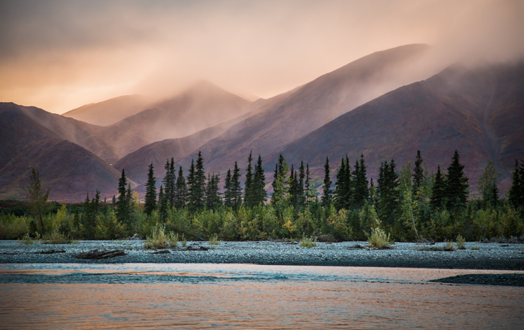
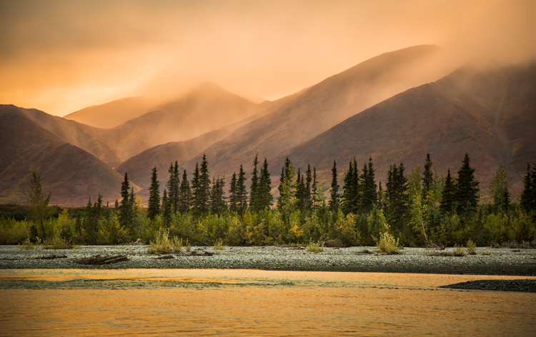
    A few years ago I was leading a wilderness/photo tour in the Noatak National Preserve in northwestern Alaska. One evening, an afternoon storm was clearing off the mountains and I went down to the river to make a few images. The light was pink, the rolling clouds and falling rain lit by the low sun.

    Below are three versions of the same image with only the White Balance changed. You can see the huge difference made by the shift from warm to cool tones. The bluest image is set 3600K, the warmest to 14750K, and the one somewhere in between is 7000K. In the end, you’ll probably choose an image that is neither overly cool, nor overly warm, but how the White Balance setting changes the feel of the image is worth noting.

    White Balance as a Creative Tool

    White Balance set to 3600K.

    White Balance as a Creative Tool

    7000K

    White Balance as a Creative Tool

    14,750K

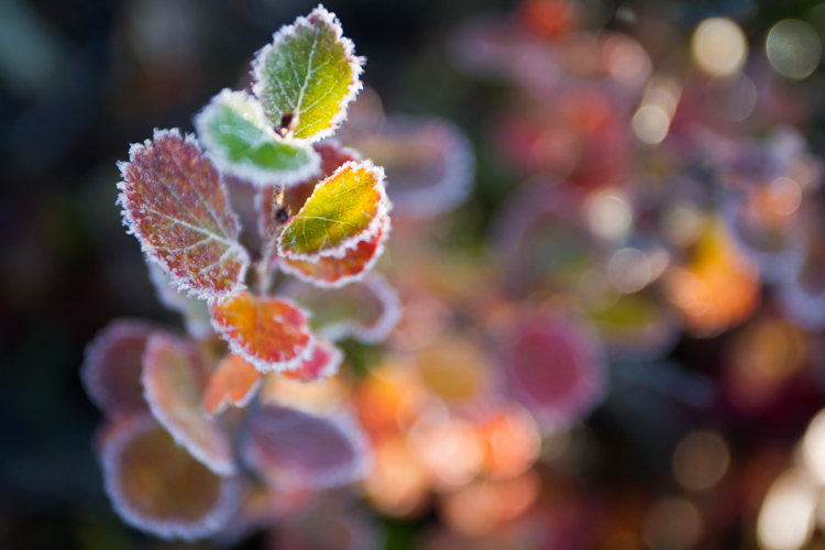
    Here is another example using autumn foliage, in this case, a Dwarf Birch in Alaska. The top image is 5050K, very close to what the Auto function on my camera selected, in the second I’ve warmed the image to 9000K. Although I prefer the cooler tones, I could see the second version appealing to editors looking for an autumn spread in a magazine or catalog.

    White Balance as a Creative Tool

    White Balance set to 5050K.

    White Balance as a Creative Tool

    White Balance set to 9000K.

    Subtle Shifts in White Balance

    White Balance as a Creative Tool

    White Balance set to 4350K.

    White Balance as a Creative Tool

    White Balance set to 8700K.

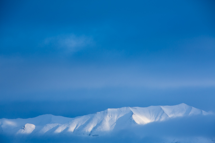
    Subtle shifts in White Balance can also be effective, even though differences between images may be less obvious. A change of a few hundred to a couple thousand Kelvin (the K measurement used in White Balance) can make a surprising difference to the impact of an image. In the top photo, I chose a cool setting (4350K) which brings out the cool winter tones. The second is much warmer, set to 8700k, which to me, (aside from being a bit too warm) feels like an evening storm is approaching. Neither is exactly “accurate” to the scene as I saw it, but neither are they necessarily unnatural. I’ll return to this image shortly.

    Water

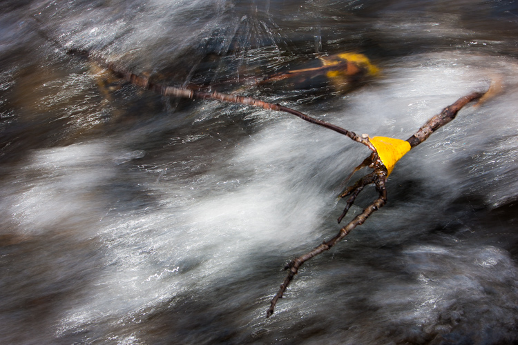
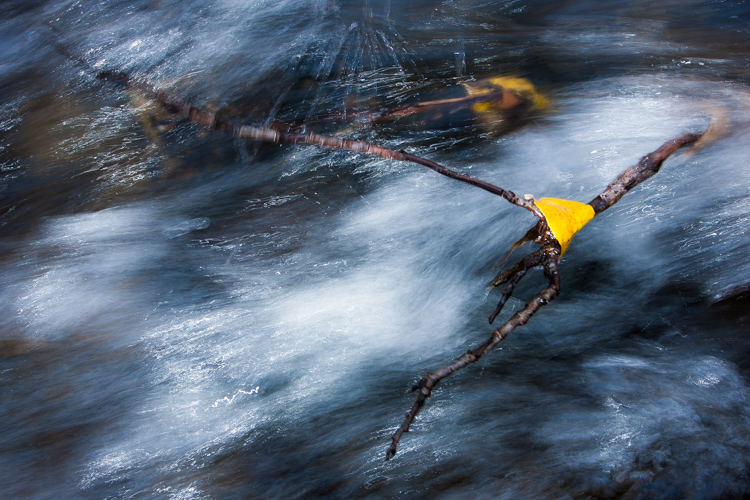
    Water strikes most people as a cool substance, and often it looks better when a White Balance with more blue-tone is selected. I made this image on a day with broken clouds, in autumn, in a small mountain range north of my home in Alaska. Tiny patches of the sun were penetrating the yellow, shrubby willows which surrounded this small creek. The yellow leaves and the partially overcast sky gave the scene a notably warm tone which you can see in the top image, set to 4600K (as selected by my camera’s Auto White Balance setting). I think it’s too warm, so just a subtle push to the blue range (4100K) was enough to retain the warm tone in the single yellow leaf but sufficient enough to cool the water.

    White Balance as a Creative Tool

    White Balance 4600K as chosen by the camera using AWB.

    White Balance as a Creative Tool

    White Balance adjusted to 4600K in post-processing makes the water feel much cooler.

    Sunsets

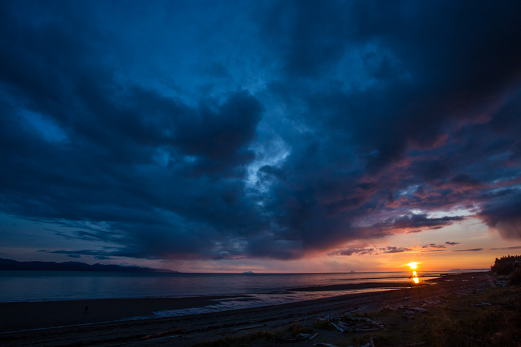
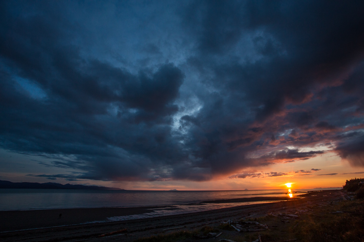
    Sunsets too can benefit from a little creative tweaking of the White Balance. From the bluff above a beach in Homer, Alaska, I made the image below. The cooler-toned toned image was shot using Auto White Balance (4600K), while the second I warmed up to 6000K in processing. I like both versions. So you can see that selecting a White Balance is very much a matter of taste, and how you want your image to come across to your audience. Which version do you prefer?

    White Balance 4600K as shot using AWB.

    White Balance adjusted to 6000K in post-processing.

    Selective Changes to White Balance

    The great part about digital post-processing is that you don’t have to choose one White Balance or another, you can mix and match. My choice of software, Adobe Lightroom, allows you to use the Adjustment Brush to grab certain parts of your frame, and independently adjust them from the rest of the image.

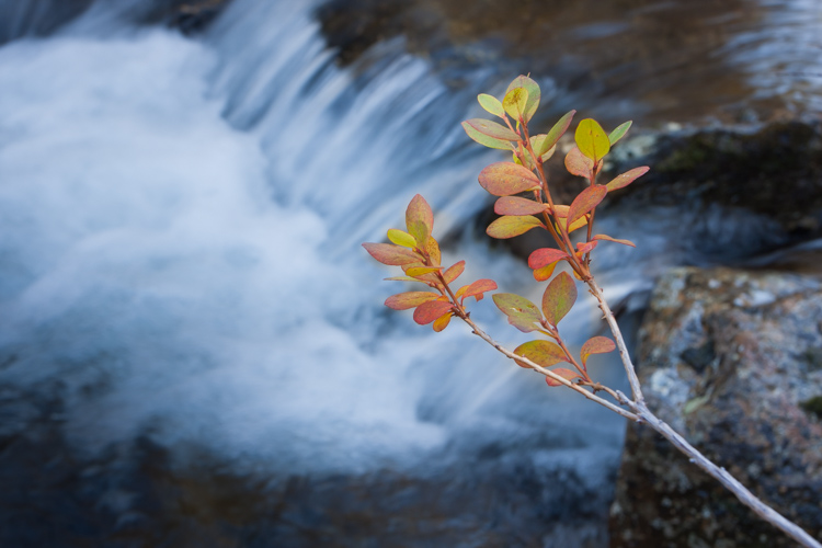
    The photo below was made around the same time as the leaf in the stream I discussed earlier. In this case, a global (over the entire image) adjustment made the sprig of autumn colors look too cool and weird, even though the water was about right. So I cooled the whole image off to 3700K, then selected the sprig and bumped the Temperature setting to +35 using the Adjustment Brush.

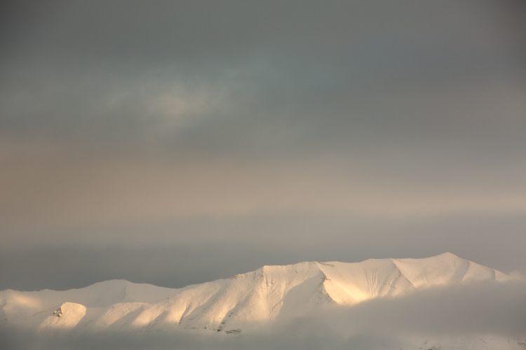
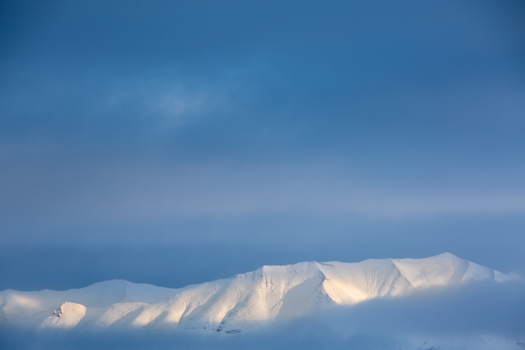
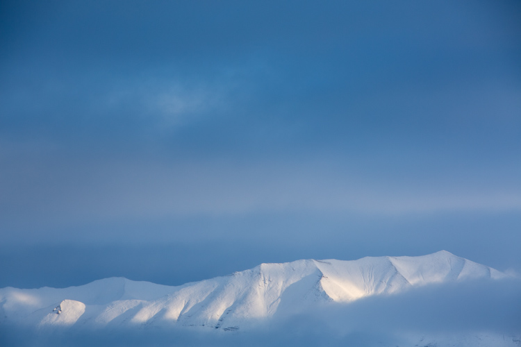
    As I was playing with the snowy mountain image I discussed early, I realized I liked neither the blue nor the overly warm version. I thought some combination might work well. So I set the overall tone slightly blue to 5100K and selected just the mountain, where the hint of sunlight was shedding some warmer light and gave that a boost to +23. The result works.

    White Balance set to 5100K overall with warmth added to the top of the mountains using the Adjustment Brush.

    Compare this version which is at 5000K with no extra adjustments on the mountains. See how subtle the difference is? But the version above feels little warmer in the sunlit areas.

    White Balance in Black and White

    We think of White Balance as strictly related to color, but in fact, it can play an important role in black and white as well. The White Balance used in your final image can impact cont st, and the way different shades of gray are presented in the final image.

    To get the full impact, you need to use that White Balance slider in a big way. That means doing big pushes from warm to cool, not little subtle shifts of a few hundred or thousand Kelvin.

    Examples

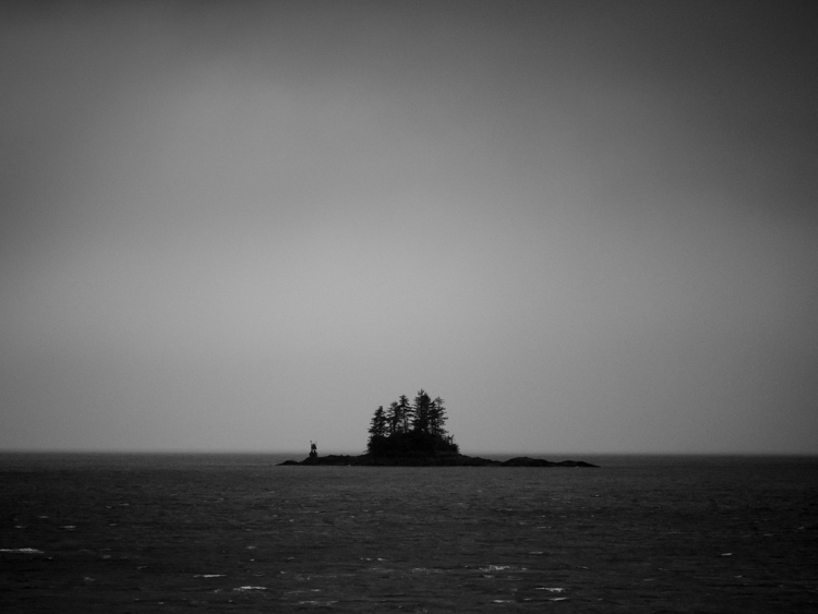
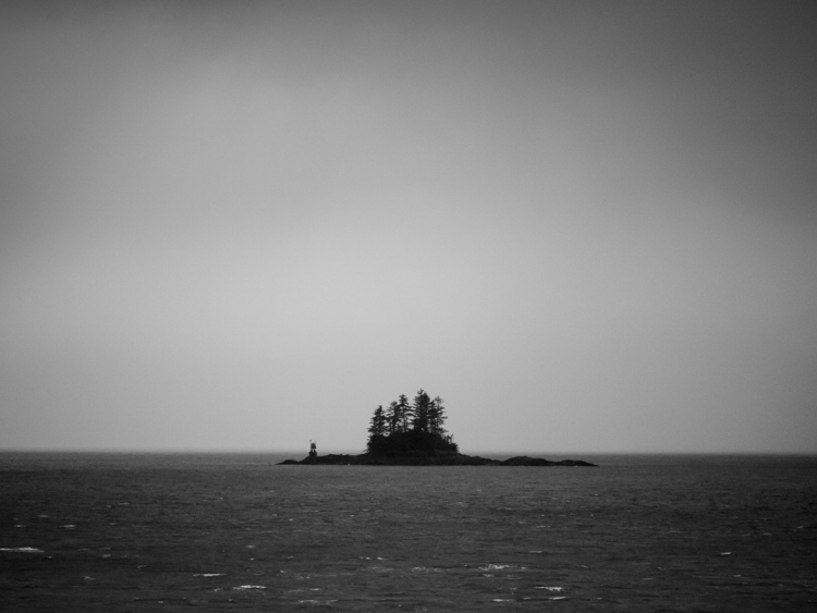
    I was on the Alaska Ferry making images on a very gray and rainy winter day when we passed this small speck of an island with a few wind-blown spruce trees growing on it. I knew it was a black and white kind of scene, so I quickly removed the color using Lightroom. When I moved the White Balance to one side or the other it created a big change in the contrast and overall brightness of the photo. The top image is set well to the blue range (3700K) while the second is way over in the warm range (32,700K). You can see how the warm setting removed some contrast and brightened the photo.

    3700K

    32,700K

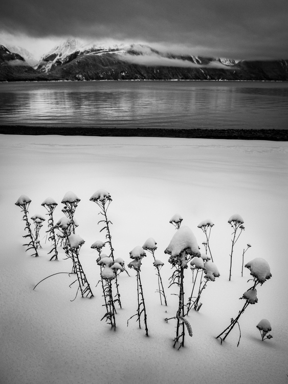
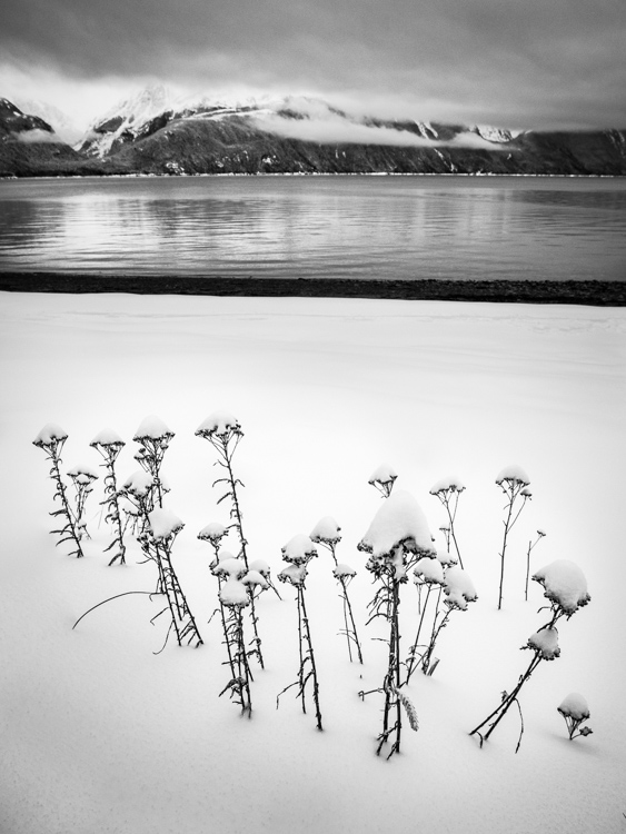
    A snowy landscape image on a beach near Haines, Alaska provided another chance to explore how White Balance impacts a black and white scene. The left image is set to 3700K, the right to 35,000K.

    3700K

    35,000K

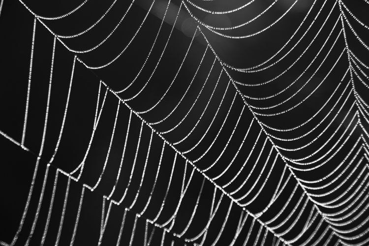
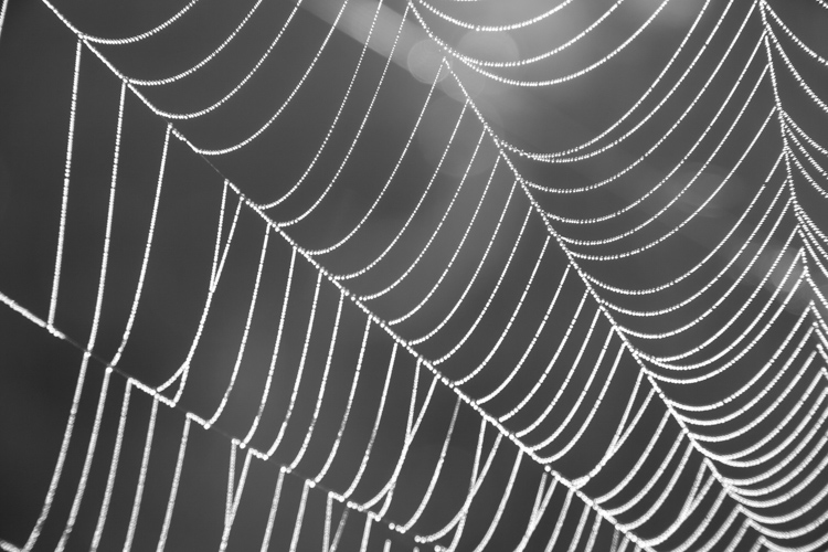
    Lastly, is this simple composition of a dew-covered spider web. The top image has high contrast, is dark overall, with clean white dew drops and is set 2000K, (as cool as Lightroom will allow). The second is much grayer, with substantially less contrast, and is as high as Lightroom will allow at 50,000K. There is no question, I prefer the first version. But many images, such as the two examples above depend more on personal taste.

    2000K

    50,000K

    Conclusion

    It is time to stop thinking of White Balance as strictly a way to accurately present color, and instead, embrace it as a creative tool. Whether it is for dramatic impact, subtle changes, selective adjustments, or even (counter-intuitively) using it in black and white photography – White Balance can play an important part in the outcome of your images. Consider it, use it. Embrace White Balance as more than just a setting.

    The post How to Use White Balance as a Creative Tool by David Shaw appeared first on Digital Photography School.


    Digital Photography School

  • 5 Surprising Habits That Will Make You a Better Photographer

    When you’re learning photography, it seems natural to pay the most attention to the gear and techniques you use to create images. You’ve probably received advice about developing great habits like photographing every day, carrying your camera everywhere you go, trying different compositions, learning processing skills, and backing up your photos. These things are important, no doubt! But there is more to becoming a better photographer than that.

    Getting the shot often comes down to being there at the right time, so these tips have to do with getting out in the field and staying out in the field. If you cultivate these surprising habits, you’ll surely become a better photographer.

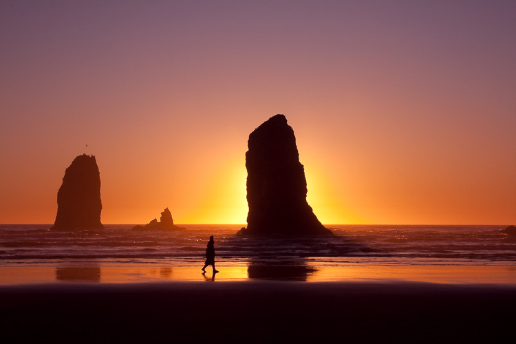
    Canon Beach, Oregon, by Anne McKinnell - better photographer

    #1 – Research Locations

    Before you set off on your photo shoot, doing a little research can go a long way to making better images. First, think about what potential subjects are available. I like to create a Pinterest board and start collecting images I like from the location. Once you get an idea of what is there, how can you create images that are different from what you have seen? Is there a different perspective you want to check out? Or maybe a night shot? Don’t forget to take note of the direction of light in the images you see. Imagine what it would look like at a different time of day.

    Once you get an idea of what is there, how can you create images that are different from what you have seen? Is there a different perspective you want to check out? Or maybe a night shot? Don’t forget to take note of the direction of light in the images you’ve seen. Imagine what it would look like at a different time of day.

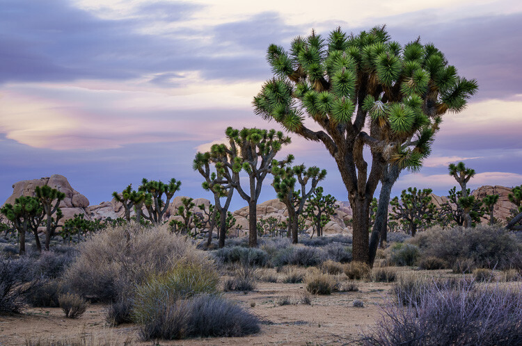
    Joshua Tree National Park, California, by Anne McKinnell - habits better photographer

    This is the location where the Joshua Trees are the densest in Joshua Tree National Park, California.

    The second part of your research should be looking at maps and figuring out where exactly the best subjects are located and how to get there. Is the location close to the road or will you have to hike there? How long will it take?

    #2 – Watch the Weather

    Keeping a close eye on the weather forecast will dramatically affect your photos. Remember, bad weather is usually a good thing for photography! Storms bring the potential for seeing dramatic clouds, wet leaves, and even rainbows. You’ll get photos with fewer people in them too.

    Red Rock State Park, Sedona, Arizona by Anne McKinnell - habits better photographer

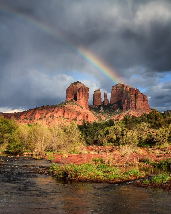
    Waiting for a break in the weather resulted in this rainbow at Cathedral Rock, Arizona.

    When I was visiting Cathedral Rock in Sedona, Arizona, I noticed that there were a lot of people around and it was difficult to get a photo without a lot of tourists in it. Then it started to rain and everyone left. I waited in my truck for 45 minutes during the downpour. Mine was the only vehicle in the parking lot, and when the rain began to die down, I headed out and was rewarded with a beautiful rainbow. I had the location all to myself.

    If a clear sky is in your forecast, instead of photographing your scene with a plain blue sky, you might have the potential for a great night shot.

    While you’re at it, don’t forget to check when the sun rises and sets and when the moon rises and sets. If you’re going to be on the beach, tides are also important.

    #3 – Carry Less Stuff

    Whether you choose to go out with your camera and only one or two lenses or switch your whole system to a lightweight mirrorless system, you’ll undoubtedly find that you can hike farther and get to more remote locations with less weight on your shoulders. The potential for finding unique subjects and unique compositions increases the farther away you get from the beaten track.

    Big Bend Ranch State Park, Texas, by Anne McKinnell - habits better photographer

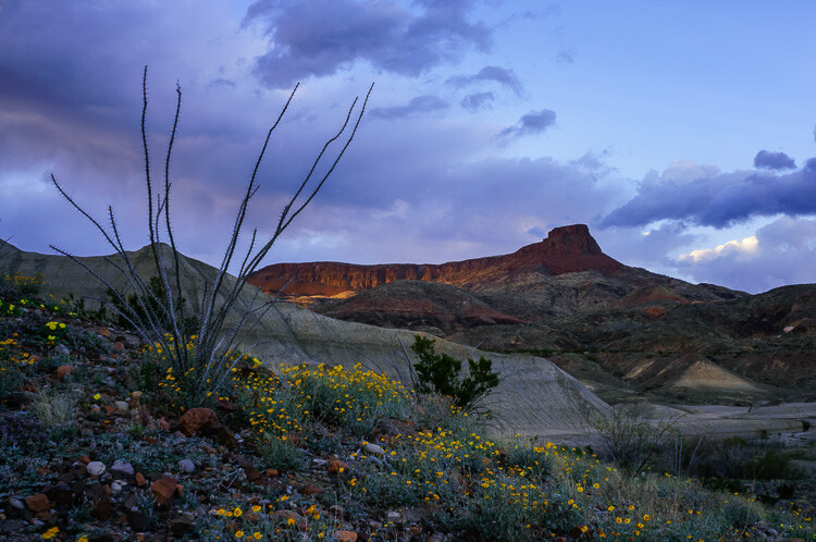
    I don’t think I would have made it this far up the hill if I had carried all of my heavy gear.

    #4 – Don’t Forget the Comfort Essentials

    Despite the last tip about carrying less stuff, it’s equally essential that you carry the right stuff to allow you to stay out there longer. Anything that makes you uncomfortable in the field will probably cause you to leave earlier than otherwise.

    Thirst, hunger, being cold or wet, getting bitten by bugs and looming darkness are just a few things that can make you leave a location too soon. A few things on my “always carry” list are food, water, rain jacket, sweater, bug spray, and a headlamp. These items will get you more potential shots than that extra lens.

    Organ Pipe Cactus National Monument, Arizona, by Anne McKinnell habit better photographer

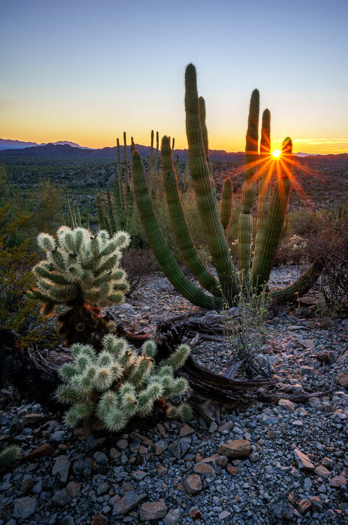
    I probably wouldn’t have this photo if it were not for my trusty headlamp that I used to make my way back through the cacti in the dark.

    #5 – Hike With a GPS

    Getting lost is one of my fears when I’m out exploring, so I have started hiking with a handheld GPS. It took me awhile to get used to it because it’s not the fancy kind with built-in maps. All I do is mark a waypoint where I park my truck and then it tracks me as I walk. No cell signal or internet required. I can always figure out the direction to get back to my waypoint, or even follow my tracks to go back using the exact route I took to go out. It’s worth it to carry a couple of extra batteries for it too.

    Now that I have the GPS, I am more willing to go off the trail and explore new things. It’s a whole new level of freedom!

    Bisti Badlands, New Mexico, by Anne McKinnell - habits better photographer

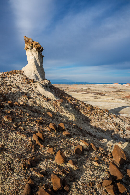
    At Bisti Badlands, New Mexico, it is very easy to get lost with no trails and strange rock formations in every direction. My GPS was a lifesaver.

    Conclusion

    These tips should help you figure out where to go when to get there and make sure you are comfortable in the field so you can stay as long as you like to get that special shot. Sometimes photography is a waiting game, but if you are comfortable you can be patient and wait for the magic moment to happen.

    The post 5 Surprising Habits That Will Make You a Better Photographer by Anne McKinnell appeared first on Digital Photography School.


    Digital Photography School

  • Manual Mode or Exposure Compensation – Which is Best?

    As you may know, cameras often get exposure wrong. The question is, what do you do when you realize that the exposure settings suggested by your camera are not right?

    You have two options. One is to switch to Manual mode and set the ISO, aperture, and shutter speed yourself. The other is to use exposure compensation (and Aperture or Shutter Priority mode).

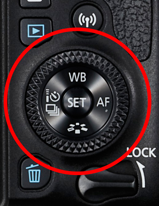
    The best solution depends on the situation in which you find yourself, plus the configuration of your camera’s dials. For example, with a Canon EOS digital SLR it’s easy to apply exposure compensation by moving the Quick control dial on the back of the camera. It’s so simple you don’t need to take your eye away from the viewfinder.

    Exposure compensation versus manual mode

    The Quick control dial on the EOS 77D.

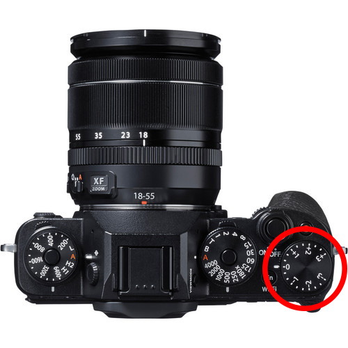
    On my Fujifilm X-T1, the exposure compensation dial is on top of the camera. It’s harder to get at and nearly impossible to adjust without taking your eye away from the viewfinder. But the aperture ring on the lens makes it easy to go to Manual mode and adjust exposure by changing the aperture. An optional live histogram in the viewfinder helps you see if exposure is accurate before pressing the shutter (an advantage of some mirrorless cameras).

    Exposure compensation versus manual mode

    The exposure compensation dial on the Fujifilm X-T1 is much harder to reach.

    These are good examples of how hardware can push you in one direction or another. My Canon SLRs pushed me towards exposure compensation, and my Fujifilm X-T1 pushes me towards using Manual mode.

    Using Manual mode

    Let’s look at Manual mode first. In Manual, you set the ISO, aperture, and shutter speed yourself. There are certain situations when using Manual mode (as opposed to Programmed Auto, Aperture Priority or Shutter Priority with exposure compensation) is beneficial. Let’s look at a few.

    1. Shoot in Manual when the light level is constant

    If the ambient light level is steady, you don’t need to change the exposure settings once you have decided which ones to use. Automatic exposure modes are influenced by the reflectivity of the subject and the exposure reading can change even if the light levels don’t.

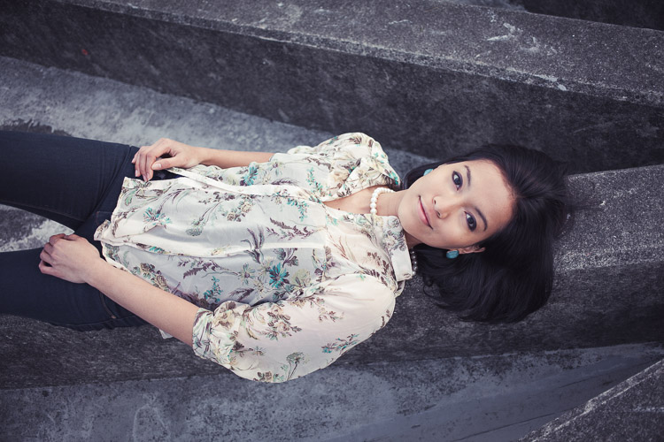
    That makes Manual mode ideal for this kind of situation. Once you’ve set the exposure you don’t need to change it. I like to use Manual mode when making portraits in natural light. Once I’ve set the exposure I’m free to concentrate on directing the model.

    Exposure compensation versus manual mode

    2. Shoot in Manual when you’re photographing landscapes and using a tripod

    In this situation, you have plenty of time to assess exposure. Manual mode is ideal because you can set a low ISO (for image quality), a small aperture (for depth of field) and change the shutter speed to suit the light levels. It’s also easy to make adjustments to allow for any polarizing, neutral density or graduated neutral density filters you may be using.

    If you’re shooting landscapes at dusk, while the light is fading, Manual mode also works well. After you take a photo, just check the histogram. As it moves to the left, which it will as the light fades, dial in a slower shutter speed to compensate.

    Exposure compensation vs. manual mode

    3. Use Manual Mode when you’re using manual flash

    If you’re using a flash set to manual the output from the flash is the same every time. In that situation, it’s best to adjust the camera settings manually so the exposure is consistent from frame to frame.

    To create the portrait below, I worked with both the camera and flash set to manual. Setting your flash to manual only works when the flash to subject distance doesn’t change.

    Exposure compensation vs. manual mode

    4. Use Manual mode for long exposure photography

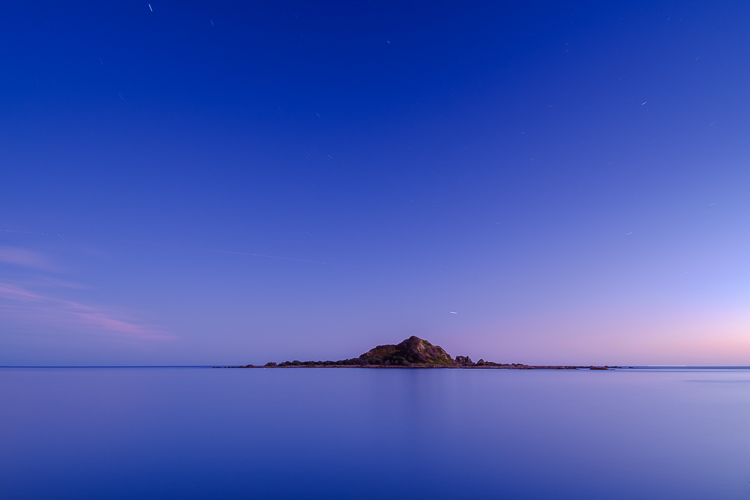
    If you’re doing long exposure landscape photography and your shutter speed (exposure time) is longer than 30 seconds then you need to use Bulb mode. This is another form of Manual mode. Except that rather than telling the camera what shutter speed you want it to use, you do so by using the camera’s bulb setting and a remote release.

    I used Bulb mode to make this landscape photo with a shutter speed (exposure time) of 82 seconds.

    Exposure compensation vs. manual mode

    Using Exposure Compensation

    The alternative to Manual mode is to set your camera to an automatic exposure mode and use exposure compensation to override the camera’s settings.

    The three best automatic exposure modes to use are Aperture Priority, Shutter Priority or Programmed auto. Other exposure modes, such as Landscape and Portrait, don’t give you enough control. On some cameras (such as Canon EOS) you can’t adjust exposure compensation when using one of these modes.

    These are some of the situations where exposure compensation may be better than Manual mode.

    1. Use Exposure Compensation for street and travel photography

    If you are taking photos of people in the street the required exposures can vary wildly. One moment you may take a photo of something in the sun, the next you may photograph something in the shade. The sun may also be going in and out between the clouds.

    In this situation, you want to concentrate on finding interesting things to photograph and creating a good composition. If you have to stop and think about exposure, then you may miss the shot. Automatic exposure modes help greatly.

    Exposure compensation vs. manual mode

    2. Use Exposure Compensation when you are using on-camera flash in an automatic mode (TTL)

    If you have the on-camera flash set to an automatic mode, then the camera needs to be set to evaluative or matrix metering, the camera’s most advanced metering mode, to take full advantage of that. The camera and flash work together to calculate the correct exposure.

    Setting your flash to automatic (TTL or E-TTL) works best when the subject to flash distance is constantly changing. Using automatic means your camera can adjust the output of the flash as it needs to.

    3. Use Exposure Compensation when shooting sports or wildlife

    This is another situation where the light level is likely to change frequently and you need to concentrate on tracking the action and capturing important moments. You don’t want to be thinking about exposure when trying to capture the peak of the action in sports or photographing fast-moving wildlife. Let your camera do the work, and use exposure compensation if you have to.

    Conclusion

    Everybody works differently, so the points in this article should be taken as suggestions only. The more experienced you become as a photographer the more you will learn to judge whether you should use Manual mode or Exposure Compensation to take control of your exposure.

    It may make it easier to think of it in terms of time. If you have more time to think about your camera settings, then use Manual mode. If you have less thinking time and need to be ready to react quickly to capture the action, then use an automatic exposure mode and Exposure Compensation.

    Do you prefer to use Manual mode or an automatic exposure mode with exposure compensation? Please let me know in the comments below,


    Want to learn how to get perfect exposure on your digital camera? Then check out my new ebook Mastering Exposure and say goodbye to all your exposure problems!

    The post Manual Mode or Exposure Compensation – Which is Best? by Andrew S. Gibson appeared first on Digital Photography School.


    Digital Photography School