Category: Photography

  • Review: Photolemur 3 Photo Enhancer Software

    The post Review: Photolemur 3 Photo Enhancer Software appeared first on Digital Photography School. It was authored by Sandra Roussy.

    There are many options out there when it comes to photo editing apps and software. From the simple one-click filter apps for smartphones to the elaborate software programs like Photoshop and Lightroom.

    Technology is making it easier to do photo editing quicker and expertly without learning the complete nuts and bolts of complex and expensive software. Depending on your particular needs, some software on the market today can do a very professional job in a few easy clicks.

    Let’s take a look at one of these programs that have emerged on the market that boasts advanced technology using algorithms and artificial intelligence to enhance photos automatically and effortlessly.

    Photolemur 3 Photo Enhancer

    Photolemur is relatively new on the market and prides itself on being a completely automatic photo enhancer. It uses algorithms and artificial intelligence to analyze photos and applies corrections and enhancements as necessary. The software is only available for computer use at the moment and is Mac and PC compatible. You can purchase a single license for US$ 35.00 or a family licenses of up to five users for US$ 55.00.

    How it works – instant and quick results

    It really is as easy as they say! You drop your photos or import them into the app, and the software gets to work immediately. It analyzes skies, colors, exposure, and faces to enhance your images and fix any problems it encounters.

    You can batch import and apply the editing to all your photos at once, or edit them one by one. The software supports a variety of file formats – even RAW files.
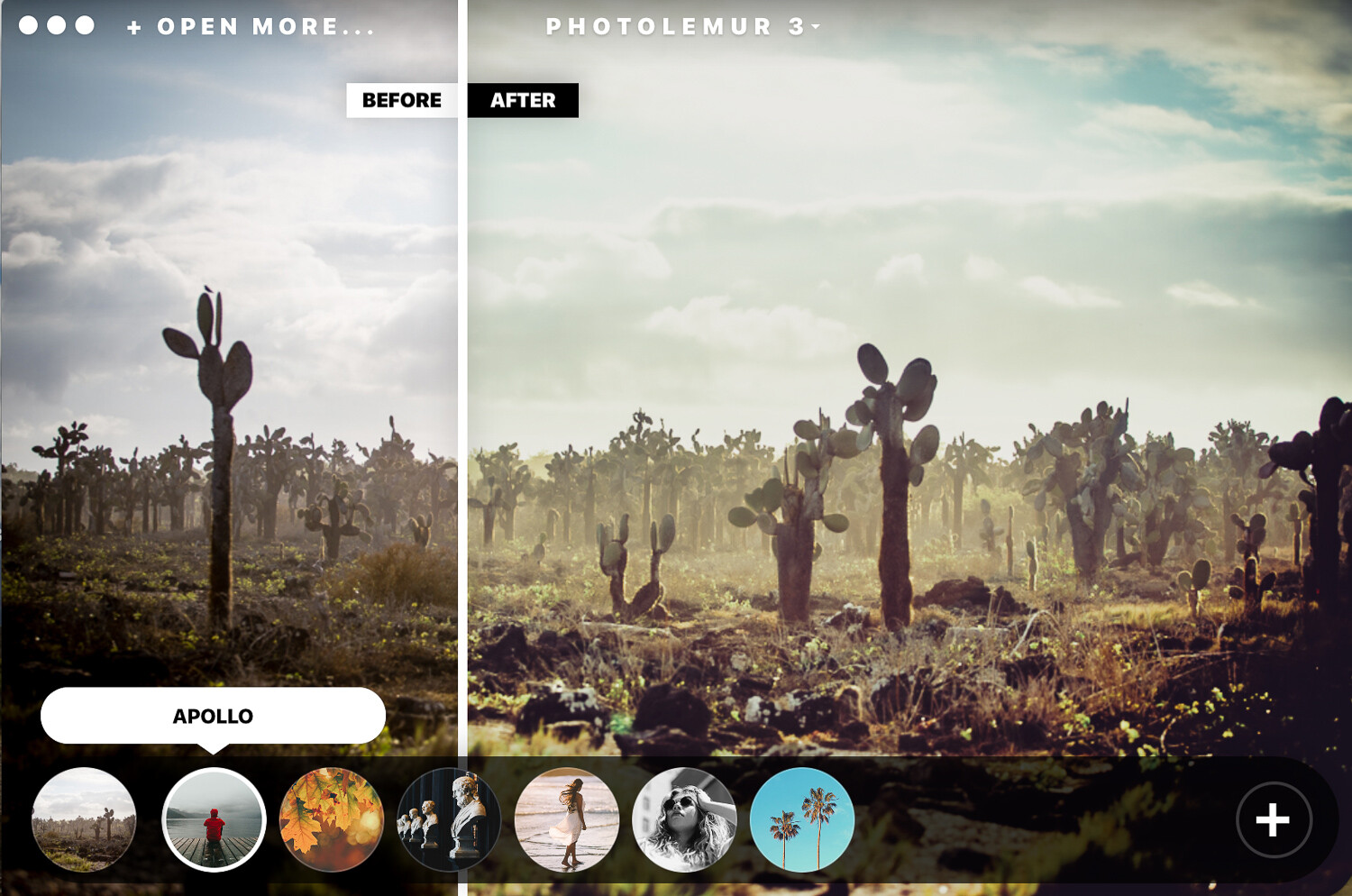
    After Photlemur finishes analyzing your images, it gives you a before and after view with a fun slider. You can see and compare the enhancements applied to your photos.

    At the bottom, you can click on the paintbrush and gain access to a slider that lets you adjust the amount of enhancement that you want to apply. The software won’t let you adjust the changes individually. For example, you can’t edit the exposure only. It does a pretty decent job at making the skies pop and fixing any exposure issues automatically.

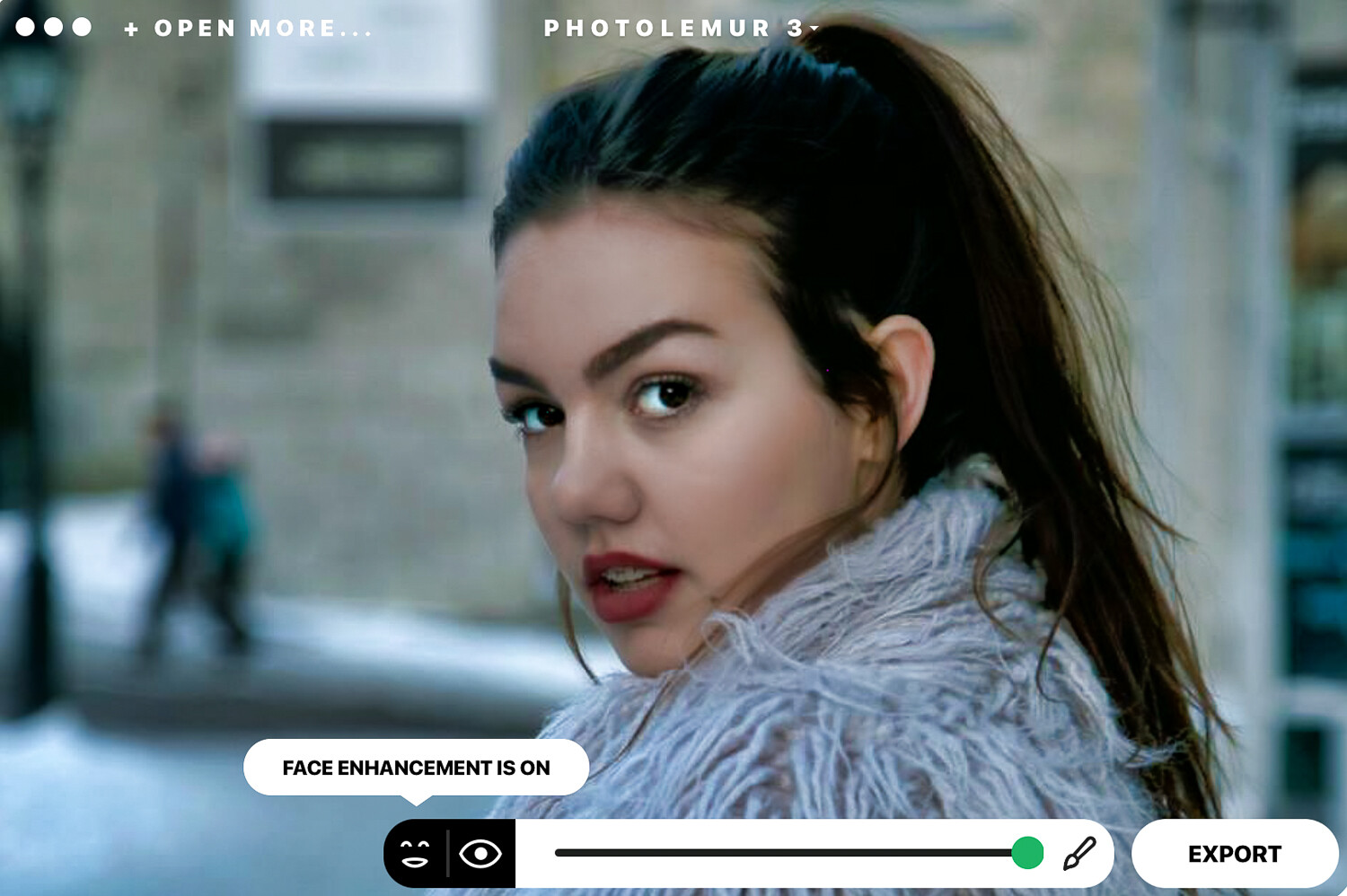
    Photolemur 3 also features a face and skin enhancer that fix your portrait photos instantly by smoothing skin and imperfections, enhancing eyes, and whitening teeth.

    On the left-hand side of the bottom slider, you will notice icons that let you turn on or off the “EYES ENLARGEMENT” and the “FACE ENHANCEMENT”.

    I didn’t particularly like what happened to the hair of my model in this image. I would probably glide the slider a little to the left for portrait photos.

    Applying filters

    The software has integrated filters you can apply to your images. The filters are very similar to the ones you find on apps like Instagram. Click on the circle at the bottom and get access to all the filter options. If you’re a fan of filters, these do the trick pretty well. The mono filter transforms your photos to black and white with commendable results.
    Exporting options

    Once you’ve finished editing your photos, you can export them to your computer, upload them on various social media sites, or attach them directly to an email.

    Standalone and Plug-in

    You can use Photolemur 3 as a standalone app on your computer, and you can also add it as a plugin for Photoshop and Lightroom. Upon initial installation, you are prompted to add the plugin if you wish to do so.

    Who it’s for

    Photolemur 3 is a great tool for beginner or amateur photographers who want to easily and quickly enhance their photos. It does what it claims and has made photo enhancing stress-free. However, I don’t think that professional photographers will use this software on a regular basis because of its limitations.

    It’s ideal for landscape photographers because of the sky enhancer and also for portrait photography. It’s super easy to set-up and get going. You can get your photos edited in a few minutes with a few simple clicks.

    What it doesn’t do

    If you have Photoshop or Lightroom knowledge and are accustomed to editing your photos manually, you will find Photolemur 3 restrictive. If you don’t like the way the software adjusted your exposure and colors, there is no way to go in deeper to adjust these results individually.

    That said, it does a pretty good job automatically.

    The program makes some sounds when it does certain actions that I’m not a fan of. Thankfully you can go to the settings drop-down menu and disable this feature.

    Conclusion

    I particularly like the way Photolemur 3 processes the skies to look better and how it corrects any exposure issues. However, I would go a little easy on the face enhancement features so that portraits don’t look over-edited.

    You can give Photolemur 3 an unlimited free trial before you purchase it. Download the free limited version from their website and test it out for yourself. The free version adds a watermark and has other restrictions like no batch processing and limited export size.

    This type of technology is the future of photo editing, and we will be seeing more algorithms and artificial intelligence applied to photography software and apps. I’m all for professional results done in a less time-consuming way. More time to have fun shooting!

    Have you used Photolemur 3? What are your thoughts?

    The post Review: Photolemur 3 Photo Enhancer Software appeared first on Digital Photography School. It was authored by Sandra Roussy.


    Digital Photography School

  • 6 Methods to Create Dynamic in Your Photography [video]

    The post 6 Methods to Create Dynamic in Your Photography appeared first on Digital Photography School. It was authored by Caz Nowaczyk.

    In this video from our friends over at Cooph, you’ll learn 6 methods to create dynamic in your photography.

    ?


    The video covers these 6 tips:

    1. Power of Color

    Scout a vibrant location, and find your angle.

    Look for color blocking opportunities. Look for vivid backgrounds that are perfect for graphic needs.

    2. Black and White

    Look for things like parking ramps as they provide great contrast and depth. Shoot roofs that cast interesting shadows.

    3. Motion Blur

    Create dynamic by panning. Pan subjects passing on the street. Rig your tripod up in the back of your vehicle and photograph long exposures for light trails and movement. (Be sure you and your gear are safe and secure here.)

    Or frame the cockpit instead!

    4. Zoom Blur

    Zoom out and expose long for interesting effects.

    Define a focal point of interest, shoot and zoom!

    Shoot at night using long exposures and zooming effects. Shooting buildings with all their lights can make for great effects!

    5. Rectangles

    Use places like stairways that have long vanishing points. Here straight lines become dynamic! Coupled with light and shadow, you can get some really interesting shots! Also, look for sharp corners and lines that draw the viewer’s eye throughout your frame.

    6. Perspective

    Seek high buildings, get down low and angle your camera from a low angle, pointing upward for epic perspective!

    Crawl under a grid (if you really want to, and can find one!) and shoot your subject standing on the grid above for a cool urban look.

    Find a low, infrequently used tunnel. Get low and create lines in your images.


    You may also find the following article helpful:

    Get Low and Aim High – How to Use Low-Angle Photography to Great Effect

    9 Creative Architecture Photography Techniques for Amazing Photos!

    How to do Light Painting Photography Art with Endless Possibilities

    5 Photography Hacks to Improve Your Creative Photography

    The dPS Top Street Photography Tips of 2018

    The post 6 Methods to Create Dynamic in Your Photography appeared first on Digital Photography School. It was authored by Caz Nowaczyk.


    Digital Photography School

  • Weekly Photography Challenge – Bicycles

    The post Weekly Photography Challenge – Bicycles appeared first on Digital Photography School. It was authored by Caz Nowaczyk.

    This week’s photography challenge topic is BICYCLES!

    Flo Karr

    Your photos can include anything that has bicycles. It can be motion-blurred, cropped, minimalist, color-based, use nature, objects or anything really! They can be color, black and white, moody or bright. You get the picture! Have fun, and I look forward to seeing what you come up with!

    Emily Levine


    Some Inst-piration from some Instagrammers:


    View this post on Instagram


    A post shared by RITIHK SANTHALIA | ?? (@the.speaking.lenses) on


    View this post on Instagram


    A post shared by Locke Cheng (@lockelei) on


    View this post on Instagram


    A post shared by Ventsislav K Valev (@ventsislavvalev) on


    View this post on Instagram


    A post shared by Andy | 16 (@andyvisualz) on


    View this post on Instagram


    A post shared by ?? MD ?? (@daversa_marco) on

    Check out some of the articles below that give you tips on this week’s challenge.

    Tips for Shooting BICYCLES

    6 Tips to Master Panning Photography

    The dPS Top Street Photography Tips of 2018

    How to Avoid Distracting Backgrounds in Street Photography

    Which Street Photography Lens is Right for You?

    How to Tell a Story With Your Street Photography


    Weekly Photography Challenge – BICYCLES

    Simply upload your shot into the comment field (look for the little camera icon in the Disqus comments section) and they’ll get embedded for us all to see or if you’d prefer, upload them to your favorite photo-sharing site and leave the link to them. Show me your best images in this week’s challenge.

    Share in the dPS Facebook Group

    You can also share your images in the dPS Facebook group as the challenge is posted there each week as well.

    If you tag your photos on Flickr, Instagram, Twitter or other sites – tag them as #DPSbicycles to help others find them. Linking back to this page might also help others know what you’re doing so that they can share in the fun.

    The post Weekly Photography Challenge – Bicycles appeared first on Digital Photography School. It was authored by Caz Nowaczyk.


    Digital Photography School

  • Thoughts and Field Test: DJI Osmo Pocket

    The post Thoughts and Field Test: DJI Osmo Pocket appeared first on Digital Photography School. It was authored by Suzi Pratt.

    In December 2018, DJI released a revolutionary product: the Osmo Pocket.

    DJI basically took the same camera sensor found in their popular Mavic Pro and Mavic Air drones and put it in the Osmo Pocket. The result is a tiny, pocket-sized camera that can capture high-quality 4K video and 12-megapixel still photos. Given the presence of the 3-axis gimbal, this camera is widely marketed as an ideal compact video camera. But how is it for still photography? Read on to learn more!

    DJI Osmo Pocket

    Video features

    Standing at just about 4.8 inches (12.19 cm) tall and weighing 4 oz (113.4 g), the Osmo Pocket looks more like a toy than a camera. This makes it ultra stealthy. Despite its size, this camera comes packed with pro features. The tiny camera sits on a full 3-axis gimbal to give you stable video. You can shoot at up to 4K 60fps, remarkable for its 1/2.3-inch sensor. There are dual built-in microphones with noise canceling to capture high-quality audio.

    The Osmo Pocket has many more video features including ActiveTrack to follow subjects, FaceTrack to automatically recognize faces, Slow Motion shooting, Timelapse and Motionlapse.

    Photography features

    Based on features alone, this is clearly a camera for those interested in shooting video. But there are notable features for still photography as well. The camera has a fixed lens of about 26mm (35mm format equivalent) and a fast f/2.0 aperture.

    It also has panorama photo mode, which is brilliant on a camera with a built-in gimbal. When shooting a panorama, the camera automatically pans and shoots 4 images in sequence. This is much more accurate than precariously handholding your camera while panning or having to lug a tripod around. The only downside is that the camera won’t stitch the pan together automatically unless you shoot with a cell phone attached (more on this below).

    DJI Osmo Pocket

    Osmo Pocket LCD screen

    A camera this tiny has its challenges, especially when it comes to seeing what you’re shooting. The built-in LCD screen is tiny and can be quite hard to see if you don’t have the best eyesight. I found it a challenge to not only compose my images but also to see if my shots were in focus. Luckily, DJI has a solution.

    There’s a port next to the LCD to connect a smartphone via USB-C (or Lightning connector for iPhones). When using the free DJI Mimo app, a connected smartphone becomes an extension of the LCD screen.

    This makes shooting with the Osmo Pocket an entirely different experience. It is much easier to compose your images and even unlock more photo and video features, such as stitching panoramas together automatically.

    However, this makes the camera rig significantly bigger. It’s also much harder to shoot one-handed with a cell phone precariously attached to the Osmo Pocket via a USB-C connection.

    Shooting with the Osmo Pocket

    Using a camera this small is fun, but challenging. Its design is very different than cell phones or traditional cameras, so that can take some getting used to. When using the Osmo Pocket by itself, it is a one-handed device. There are just two buttons and a tiny touchscreen LCD that you swipe up and down to control the gimbal, and left and right to activate various features. Attaching the phone turns the Osmo Pocket into a two-handed camera, which can feel more ergonomic and natural.

    When shooting with the smartphone, my instincts were to use the device as I would a smartphone camera. Instead, I had to use the DJI Mimo app, which has a very different interface than most smartphone apps. It also doesn’t let you zoom, and you instead have to physically move forward to zoom in.

    Also, it was difficult to remember where my camera was. I usually shoot with my smartphone cameras on the left, and in this case, the Osmo Pocket camera is on the right since it is plugged into the phone’s USB-C port. This made composing images a challenge as I struggled to remember my main camera location.

    DJI Osmo Pocket

    Osmo Pocket photo quality

    If you’ve shot photo or video with DJI drones, the photo quality that comes out of the Osmo Pocket is very similar. Colors are pretty natural, and the images are sharp (almost too sharp, depending on your taste). While the fixed lens is definitely not a macro, you can get reasonably close to your subject and capture photos with pretty good bokeh. Osmo Pocket is slow to focus (tap on the LCD to focus), which can be frustrating if you’re trying to shoot action.

    Who’s this camera for?

    Osmo Pocket isn’t aimed at a professional crowd, although it certainly could be used by a pro to capture B roll (supplemental footage). However, the size of this camera plus some of its limitations suggests that this is for casual camera users.

    If you’re wanting to dabble in videography without investing in large and expensive camera stabilizers, the Osmo Pocket is a great option to consider. Keep in mind that it isn’t waterproof and definitely not a tough action camera like the GoPro; in fact, this camera is somewhat fragile given the loose nature of the gimbal.

    DJI is slowly releasing accessories to add on to the Osmo Pocket such as 3.5mm external microphone adapter, mount, extension rod, and WiFi module. There are also polarizers and ND filters that you can get to mount to the front of the camera. These little accessories add to the cost of the already pricey camera and also point out some of the seemingly basic features that are missing from this camera.

    Bottom line

    If you want an ultra compact and stealthy camera for capturing smooth, high-quality video footage, the Osmo Pocket is a great option to consider. However, in most cases, this isn’t a do-all camera and is instead a supplemental device for capturing very specific footage.

    Sample Photos

    DJI Osmo Pocket

    DJI Osmo Pocket

    DJI Osmo Pocket

    DJI Osmo Pocket

    DJI Osmo Pocket

    DJI Osmo Pocket

    DJI Osmo Pocket

    DJI Osmo Pocket

    DJI Osmo Pocket

    Video

    The post Thoughts and Field Test: DJI Osmo Pocket appeared first on Digital Photography School. It was authored by Suzi Pratt.


    Digital Photography School

  • Real Estate Photography: Artificial Light versus Natural Light

    The post Real Estate Photography: Artificial Light versus Natural Light appeared first on Digital Photography School. It was authored by Nisha Ramroop.

    Architecture: Michael Vail Design. Photo: © Sallie Moffatt.

    This article is written by Nisha Ramroop and Ron Pepper.

    Real estate interior photography can seem simple, but that impression can change when trying to capture a space that has big bright window views, and many areas of light and shadow inside. Often, it’s important to achieve balance amongst the bright and dark areas, whilst also capturing the view outside the window.

    In this article, we’ll discuss shooting interiors using various lighting methods. These methods include using single and multiple Speedlight flashes, larger strobe lights, and using bracketed exposures for HDR.

    Artificial lighting

    Speedlight flash

    The term ‘Speedlight’ refers to the kind of flash that can be connected to the camera’s hot shoe. These battery-powered flash units are very versatile and relatively inexpensive (often available used) because they can also be used off-camera. Nikon uses this term for this kind of flash, Canon uses the very similar ‘Speedlite’ and others might say ‘on-camera flash’ or other terms.

    Architecture: Michael Vail Design. Photo: © Sallie Moffatt.

    Using only a single Speedlight flash with your camera to light a room can be a good way to capture interiors quickly with minimal equipment. This does require some practice and a powerful Speedlight.

    Usually, you want to retain detail in the brightest part of your room (either the view through the window or in a light fixture) and build your flash lighting around that.

    To achieve this, you need to establish a base shot which exposes for the window view. If the window is the brightest area in the room, the rest of the room gets underexposed. Thus you need to light the underexposed areas of your room with your flash. Experiment with your flash at different power levels to equalize the light in the room. You can also use a light meter to measure the light being thrown in a particular area. This helps you adjust the flash output deliberately.

    Lighting equipment enables you to fill areas of shadow to capture details in those dark areas. A powerful technique is to “Bounce” your Speedlight flash off a wall or ceiling to fill your areas of shadow more evenly.

    Note: While bouncing flash softens the light before it hits your subject and gives you non-directional light, you can use it to supplement any directional light, so that the shadows from your natural light source make sense.

    Keep in mind the following technical details, when finding the perfect balance using flash:

    • Your shutter speed does not affect the flash settings – it only affects the ambient light in your room (ambient light refers to any continuous light sources in the room. For example, sun or lamps). If you slow your shutter speed, it raises all the ambient light levels, which means it also affects the view out of your window.
    • The aperture affects both the flash and ambient light because a smaller aperture reduces the amount of all light that passes through the lens.
    • ISO also affects both flash and ambient light. It does this by altering the camera’s sensitivity to light.

    Pros

    • Image almost finished in-camera, very little post-processing
    • Enables you to have creative control over the final image
    • Allows you to choose your best angle/composition early in the process and light for that specifically
    • You don’t need a tripod
    • Less camera equipment needed

    Cons

    • Depending on the room, you may need more than one flash/light
    • These smaller flashes produce more “hard” light when fired directly into the scene
    • Some expertise is required. If done incorrectly, you may end up with inconsistent shadows to your natural light source or appear unnatural/fake
    • Your exterior needs to be correctly metered to your camera’s flash sync speed
    • Cost and management of batteries

    Note: Using only one speed light can be tricky to achieve balanced light when window sources are large with bright sunlight.

    Using multiple Speedlights with a remote trigger

    Using multiple Speedlights on stands with a remote trigger can be handy when shooting larger spaces with overbearing natural light sources coming through the window. In some cases, you may need between two and four Speedlights to allow for enough internal light to equalize strong external window light – especially if shooting with direct sun outside the window. Shooting with multiple flashes allows you to get the right shot with a single image, rather than having to use bracketed exposures.

    Architecture: Michael Vail Design. Photo: © Sallie Moffatt.

    Pros

    • Allows fine control over the interior lighting
    • It allows you to light more dark areas
    • You can set each individual flash unit’s exposure to your needs
    • No need for a tripod

    Cons

    • Relatively complex set-up normally requiring an experienced photographer
    • Carrying needed equipment can be challenging
    • Multiple points of (battery) failure
    • Need to set flashes so they are not in the shot
    • While no tripod is needed, multiple light stands are needed

    Strobe lights

    Here a ‘strobe’ refers to larger, more powerful lights. Modern strobes are powered by batteries. In the past (and lower-end current strobes), strobes needed to be plugged into electrical power or large battery packs.

    Architecture: Michael Vail Design. Photo: © Sallie Moffatt.

    Strobe Lights can be great to use for interior real estate photography, particularly if there is a large window light source. The greater power brings flexibility. For instance, adding a light modifier makes the light softer, avoiding harsh shadows that happen with smaller flashes.

    Set your strobe light/s for the darker areas of the room. Depending on your shooting angle, you could set the strobe behind your camera line and bounce flash off the wall or ceiling above or behind you to fill any shadows in front of you.

    Pros

    • A larger light source means softer, more attractive light
    • Full control over lighting
    • Tripod optional
    • Light is white and clean
    • Can solve color cast

    Cons

    • Equipment is heavy to carry
    • Expensive compared to Speedlights
    • Can be hard to set up in small spaces
    • May need to be plugged in if not a higher-end battery-powered strobe

    Natural or available light

    There is an alternative to using artificial lighting to capture a room with bright and dark areas. Perhaps using Speedlights or strobes isn’t possible because the photographer doesn’t have this equipment, doesn’t know how to use it, or simply prefers the technique below.

    Architecture: Michael Vail Design. Photo: © Sallie Moffatt.

    We face the same challenge that the camera can see either the bright area, or the dark area, but not both. This can be solved, not by adding light, but by adding more exposures from the camera.

    High Dynamic Range (HDR)

    When using natural light for real estate interiors, there is some level of post-processing involved. One of the most common processing techniques used is High Dynamic Range (HDR) processing. The HDR technique means that you’ll take bracketed exposures using the camera, then they are combined using HDR software.

    Architecture: Michael Vail Design. Photo: © Sallie Moffatt.

    1. Bracketing exposures

    So where do you start to capture the dynamic range of your interior (what your eyes see)? Since you may be working with a scene of high contrast, start with a process called “Exposure Bracketing.”

    Exposure Bracketing is where you take (a minimum) of three identically composed images at different exposures. The first image uses the settings recommended by the camera. Then one or more images are intentionally overexposed, and one or more get deliberately underexposed.

    One of the challenges with getting that first image (where the camera recommends settings for as properly exposed) is that the camera can choose the shutter speed based on the bright window light. This selection can leave the rest of the image too underexposed. A good solution for this underexposure is to lock your exposure on an area that is neither too bright nor too dark and use that as your baseline shot. When taking bracketed images indoors, use a tripod. Keep your aperture constant, ISO low, and vary your shutter speeds to achieve your different exposures.

    Most DSLR cameras now have built-in bracketing called “Automatic Exposure Bracketing” (AEB), making it an easy, one-click process. If you are unfamiliar with this term, your camera manual is an excellent source for learning about this cool feature, and videos showing how to set AEB on many popular cameras are here.

    If you are familiar with AEB, go ahead and set the exposure compensation values to plus and minus 2 EV (+/-2EV) or the maximum exposure increment (EV spacing) your camera allows. Your camera display should now show three exposure markers: one underexposed by 2-stops (-2EV), one correctly exposed (0), and one overexposed by 2-stops (+2EV). These represent the three shots that the camera takes.

    Important note: The example above is for a three-shot HDR image. If your camera is capable of taking more pictures for HDR merging (some take 5 or 7), you can use the maximum number of shots available to you.

    Put your camera into its Continuous Shooting Mode, compose your image and take your shots. Minimizing shake is highly recommended, so use a remote shutter release or timer where possible. Your bracketed images are now ready for the next step.

    2. HDR software

    As expressed previously, combining these bracketed images ensures you get a properly exposed image. This method is especially useful when you have challenging lighting situations and is a popular processing method for real estate photographers. Photomatix Pro is one of the top software used by professionals for the merging process.

    One of the unspoken rules of real estate photography is that the vertical lines must, well, be vertical. Also, the horizon must be level. This is easy to achieve by leveling the camera. However, if you find that the image isn’t quite level, The Finishing Touch Panel in Photomatix Pro allows you to correct perspective issues with ease.

    Benefits of using this method:

    • Easy to learn shooting technique
    • Fast shooting with a little practice
    • Minimal equipment needed (camera/lens and tripod,)
    • Natural shadows
    • No heavy equipment to lug around/set up
    • Some flexibility with composition
    • Great for shooting virtually any space
    • Compact gear — photographer can pick up tripod/camera and put it down for next shot

    Challenges

    • Shooting angles may be limited, to avoid flare, etc.
    • Color cast happens more compared to using artificial light
    • Post-processing required
    • Memory needed to save the bracketed photos
    • A tripod is required

    Architecture: Michael Vail Design. Photo: © Sallie Moffatt.

    Conclusion

    As noted, there are pros and cons to each lighting method when photographing real estate interiors. When deciding which method is best for you, consider the needs of the shoot you are undertaking.

    If you are a beginner, it is also good practice to experiment first with natural light. Doing so helps you understand how light works before you move on to adding artificial light to your room.

    If you are comfortable adding light, remember to keep it soft and be aware of your light direction at all times. If you are shooting with available light, master your processing techniques. Use HDR software such as Photomatix Pro to combine your Exposure Bracketed photos and achieve a nice exposure balance.

    No matter what technique you use, some key things to remember are: show details, balance your well-lit areas against those in the shadows and show the space in the most flattering way – just as you see it as you walk in the room.

    Disclaimer: HDR Soft is a paid partner of DPS.

    The post Real Estate Photography: Artificial Light versus Natural Light appeared first on Digital Photography School. It was authored by Nisha Ramroop.


    Digital Photography School

  • Lessons from the Masters: Imogen Cunningham

    The post Lessons from the Masters: Imogen Cunningham appeared first on Digital Photography School. It was authored by Adam Welch.

    It’s easy enough to develop the illusion that the legendary names venerated throughout the history of photography were somehow so different from ourselves. While’s it’s certainly true that the photographic climate has changed, we still share the same passion for the art as those who clicked shutters fifty years or even a century ago. Many of them faced the same challenges, inspirations, successes and failures as we do. Perhaps that’s why I love learning more about the giants of photography and applying lessons from their work to my photos.

    In this installment of “Lessons from the Masters,” we’re going to take a closer look at the work of the estimable Imogen Cunningham. Her determination and herculean achievements placed her working alongside other formative photographers of the 20th century. The contributions she made to photography as an art helped shape the photographic landscape we know today.

    Imogen Cunningham

    imogen-cunningham-masters-series-digital-photography-school-adam-welch

    Self Portrait with Korona View, 1933 ©2019 Imogen Cunningham Trust

    Named after the heroine of the Shakespearean play Cymbeline, Imogen Cunningham entered this world on April 12th, 1883. Born to rather paradoxical parents (her father a spiritualist and her mother Methodist) in Portland, Oregon she was a self-described “ill-tempered” child.

    When she was 18 years old, she saved enough money to purchase (via mail order) her first camera in 1903, a 4×5 type, along with a box of glass plate negatives. She then began teaching herself how to make photographs. Cunningham knew photography would be her life’s work although her path would not be a direct one.

    Following her graduation from the University of Washington with a degree in Chemistry in 1907, Imogen worked with Edward Curtis at his Seattle studio. There, she honed her skills in the darkroom while printing his iconic images of Native Americans and the American West.

    Two years later, Cunningham received a $ 500 grant which enabled her to continue her studies abroad in Germany. During this time she developed theories on photographic chemistry still practiced today.

    On her return to the west coast from Europe, Imogen made a familiar pilgrimage which other notable artists of the time often made and ventured to New York City for a meeting with the legendary Alfred Stieglitz at his “291” gallery. Stieglitz introduced her to Gertrude Käsebier who was the first professional female commercial photographer at that time.

    After this influential meeting, Imogen committed her energy to photography. She opened a studio in Seattle, Washington and soon made a name for herself through portraits.

    It was this studio where Imogen made her living while finding time to delve into more personal work before relocating to California in 1917. Unfortunately for us, she left the majority of her photographs and negatives behind, so there isn’t a large wealth of examples from that period of her career. In 1929, the Film und Foto Exhibition in Stuttgart, Germany, included a ten-piece selection of Cunningham’s work. The fabled Group f/64 would form a few years later to which Imogen was a founding member. Other founding members included her friend Edward Weston as well as Henry Swift, John Paul Edwards, Sonja Noskowiak, Ansel Adams and Willard Van Dyke. Over the years, Imogen Cunningham’s body of work would be as eclectic as it was groundbreaking.

    imogen-cunningham-masters-series-digital-photography-school-adam-welch-1-3

    Imogen photographing Ansel Adams…photographing Half Dome in 1953. ©2019 Imogen Cunningham Trust

    After living an extraordinary life of photography, Imogen Cunningham passed away on June 23rd, 1976 in San Francisco, California at the age of 93.

    Now that you know a little bit about the person, let’s dig a little deeper. We’ll look at a few of the many the lessons you can learn from the life, work, and attitude of Imogen Cunningham which can help to improve your photography.

    Extend your range

    Imogen Cunningham’s choice in subject matter was ‘diverse’ to say the least. From her earliest pictorial work to her self portraits and nudes, it’s safe to say that the idea of sticking to one subject or even one genre for that matter was not something that held back the creative spirit of Imogen Cunningham. She believed that photographs presented themselves to her organically.

    She seldom went “looking for things to shoot,” instead preferring to allow the subject matter to appeal to her aesthetic awareness. I mean, come on, she was even one of the early practitioners of street photography before there was street photography!

    imogen-cunningham-masters-series-digital-photography-school-adam-welch-2

    Hashbury, 1967. ©2019 Imogen Cunningham Trust

    Many of Imogen’s most iconic photographs gravitated towards the use of light and shadow to present common scenes in an extraordinary way by accentuating texture and shapes. She could look past what a subject was to see what it could be. This beautifully simplistic aesthetic is one of the reasons so many Cunningham prints carry a timeless appeal.

    imogen-cunningham-masters-series-digital-photography-school-adam-welch-1-4

    The Unmade Bed, 1957. ©2019 Imogen Cunningham Trust

    Sometimes we find ourselves concentrating so vigorously on obtaining a particular photograph that we overlook other opportunities to produce great work. While it’s true that we can and should visualize how we want the final image to appear, the process is often helped along if we remain flexible.

    imogen-cunningham-masters-series-digital-photography-school-adam-welch-3

    One of my favorite photographs by Imogen Cunningham, “Callas” from around 1925. ©2019 Imogen Cunningham Trust

    Don’t allow yourself to be mired down by one particular subject or location. This is especially true for us today while bombarded by social media accounts producing visually similar photos according to a theme rather than personal expression. This leads to an almost unconscious dulling down of creativity.

    imogen-cunningham-calla-lillies-digital-photography-school-adam-welch-1

    My own still life photo of lilies making use of light and texture to bring out the subtle elegance of a simple subject.

    Photograph anything and everything that you please – even if might not fit with what you generally shoot.

    Feel the fear…then do it anyway

    One of my favorite quotes from Imogen Cunningham goes like this:

    “…you can’t expect things to be smooth and easy and beautiful. You just have to work, find your way out, and do anything you can yourself.”

    Without a doubt, Imogen was a strongly independent, capable and witty woman who pursued her work with an intensity of purpose. At the same time, she was human. She faced challenges, hardships, and fear just as we all do.

    mogen-cunningham-masters-series-digital-photography-school-adam-welch-1-2

    The key to overcoming your self-doubt is to keep moving forward. I think that’s what Cunningham was getting at here. It’s not that we should strive to be fearless but instead work to be tireless in the face of fear or our lack of confidence.

    When it comes to photography, there will always be areas where we don’t feel as knowledgeable or proficient as we would like. However, that shouldn’t reduce you to thinking you will always feel that way. Take it from Imogen. Work hard and accept that you won’t always find yourself in easy situations. But never, never, never give up.

    Interface with other photographers

    Surrounded by other photographers, like many other defining artists of her time, Imogen loved discussing all aspects of photo work. As a founding member of Group f/64, she understood the value of sharing ideas and concepts with other photographers who approached the medium with the same zeal as she did. They learned from one another and worked to further the craft.

    One of the most enlightening and enjoyable things I have ever done in this regard was to start the ongoing ITOW (In Their Own Words) Project. This project consists of interviewing other photographers that I either know personally or interact with on social media. The insights gained through these discussions continue to help deepen my own appreciation for the way other people see photography.

    imogen-cunningham-digital-photography-school-adam-welch-1

    By Seth Doyle via Unsplash

    Whenever possible, take the time to get to know other photographers and discuss photography openly and honestly. This doesn’t mean you have to strike up a conversation with anyone you see is carrying a camera, but it’s always interesting to examine how other people go about making their images and why.

    Worldwide communication has never been more extensive or readily available. We have the capability of connecting with people whom we would have never known existed otherwise. One of the greatest assets we have for growth in our work is by interacting with other people who appreciate the value of photography.

    Parting thoughts on Imogen Cunningham

    Having been fortunate enough to view some of Imogen’s original prints, it’s easy for me to understand why she was, and still is, one of the most influential and accomplished photographers of all time. Along with other pioneering photographers, we owe a debt of gratitude to Imogen for helping advance photography to the incredible medium we know today.

    The lessons we can learn from her work extend well beyond the photographic. She helped show that beauty is found in places and objects we see every day and that we can accomplish almost any goal – no matter how distant it may seem.

    I urge you to learn more about Imogen Cunningham, her photographs and her wonderful example of living a full life.

    Author’s Note: I would like to extend my immense appreciation to The Imogen Cunningham Trust for permitting the use of many of the photographs presented in this article. 


    The post Lessons from the Masters: Imogen Cunningham appeared first on Digital Photography School. It was authored by Adam Welch.


    Digital Photography School

  • 7 Tips and Tricks to Learn From Commercial Photographers

    The world of photography is an exciting one, and it is only getting more and more accessible as technology improves. Technically, anyone with a smartphone can be a photographer; whether or not you choose to be a “good” photographer is up to you. Commercial photographers are some of the most sought after image-takers in the world as they have to Continue Reading

    The post 7 Tips and Tricks to Learn From Commercial Photographers appeared first on Photodoto.


    Photodoto

  • Mastering Color Series – The Psychology and Evolution of the Color YELLOW and its use in Photography

    The post Mastering Color Series – The Psychology and Evolution of the Color YELLOW and its use in Photography appeared first on Digital Photography School. It was authored by Megan Kennedy.

    In her diary, Frida Kahlo once wrote, “Yellow: madness, sickness, fear (part of the sun and of joy).” As one of the oldest pigments used by humans, the spectrum of attributes associated with yellow makes it an enduring presence in art and design. In this article, we’ll look at the evolution and artistic impact of yellow from prehistoric to contemporary visual arts.

    The psychology of yellow

    As one of yellow’s oldest embodiments, the sun and yellow are inextricably linked, the qualities of the sun (warmth, energy, and radiance) reflected in human perceptions of the color yellow. Throughout history, the sun came to be viewed by many cultures as a figure of heavenly might. As a result, yellow has also inherited connotations of power, knowledge, imperishability, and status.

    Many associations attributed to yellow originate in nature. For example, sunlight shifting the darkness of night has forged a relationship between yellow and joy. Spring-blooming flowers like daffodils, dandelions, wattle, and forsythia draw connections between yellow, rebirth and renewal. The yellowing of Autumnal leaves cultivates associations of change, balance, and age. Vibrant hues of lemons, bananas, and corn characterize yellow as a color of nourishment.

    And in some cases, dangerous plants, insects and animals, exhibit yellow as a sign of warning.

    Yellow has strong historical and cultural significance in China, where it is the color of glory, royalty, happiness, and wisdom. However, in many Latin American cultures, yellow is associated with death, sorrow, and mourning. Similarly, yellow is seen as a color of mourning in some parts of the Middle East.

    In Japanese culture, yellow signifies courage, refinement and wealth. In Africa, yellow is worn to signify high-ranking members of a community. Saffron, a bright orange-yellow is considered sacred in India, representing selflessness and courage.

    Yellow’s high visibility sees extensive use in safety equipment and signage. Due to its reflective properties, however, yellow can also lead to visual fatigue. Yellow’s associations with energy can be related to impulsivity and egotism. A close relative of gold, yellow is associated with money, wealth and sometimes greed. To be called yellow-bellied is to be called a coward.

    The evolution of the color yellow

    Yellow ochre

    A natural clay earth pigment, yellow ocher’s availability and versatility saw wide-spread use from the prehistoric period. Gavin Evans, writer of The Story of Colour: an Exploration of the Hidden Messages of the Spectrum, states that “in the Bomvu Ridge area of Swaziland, archaeologists have found 40,000-year-old mines used to dig out red and yellow ochre, thought to be used for body paint.”

    Ancient cave paintings made with yellow ochre pigments have been found at Pech Merle in France, Lascaux cave and at the cave of Altamira in Spain. The Aboriginals of Australia have painted with yellow ochres for over 40,000 years.

    Today, artists continue to use yellow ochre in traditional forms and in modern paints.

    Orpiment

    Borrowing its name from the Latin word auripigmentum (aurum meaning gold and pigmentum meaning pigment), orpiment is found in volcanic fumaroles and hydro-thermal veins and hot springs. A richly colored orange-yellow arsenic sulfide, orpiment’s striking color captured the interest of both Chinese and Western alchemists looking for ways to create gold. Although highly toxic, orpiment saw use in Egypt, Persia, Asia, and Rome.

    Indian yellow

    Indian yellow was widely used in Indian watercolor and tempera-like paints. Noted for its use in Rajput-Mughal paintings from the 16th to the 19th century, Indian yellow was also used throughout Europe from the 17th to the 19th century.

    Indian yellow pigments were said to have been produced in rural India from the urine of cattle fed solely on water and mango leaves. Today, a synthetic Indian yellow hue is manufactured using a mixture of nickel aso, arylide yellow, and quinacridone burnt orange.

    Lead-tin yellow

    Lead-tin yellow takes on two different forms. According to ColourLex, “the first and more frequently used is called Lead-tin-yellow type I and is a mixed oxide of both elements tin and lead… Lead-tin-yellow type II possibly contains traces of silica and also pure tin oxide.” The earliest occurrence of lead-tin yellow dates back to the 1300s. It was most frequently used in the 15th, 16th and 17th centuries. Johannes Vermeer, Titian and Anthony van Dyck all made use of lead-tin yellow in their paintings.

    Chrome yellow

    When chromium was discovered in 1797 by French chemist Louis Vauquelin, lead chromate was synthesized and used as a pigment. In use by the second decade of the nineteenth century, chrome yellow’s toxicity and it’s inherent tendency to oxidize over time and darken on exposure to oxygen meant it was largely replaced by cadmium yellow.

    Joseph Mallord William Turner made use of chrome yellow for highlights in his dramatic Romantic paintings. In aviation, the well-loved Piper J-3 Cub adopted chrome yellow as its standard color. Because of this, chrome yellow and similar equivalents are known as Cub yellow in aviation circles.

    Cadmium yellow

    Much of the cadmium produced worldwide is used in rechargeable nickel-cadmium batteries. However, a portion of cadmium goes to the manufacture of cadmium pigments, a family of vibrant reds, yellows, and oranges. First discovered in 1817, good permanence and tinting properties mean cadmium yellow has remained in use since it began production in 1840. Claude Monet’s Wheatstacks (Sunset Snow Effect) and Still Life with Apples and Grapes are two examples of cadmium yellow’s application in art.

    Arylide yellow

    Arylide yellow (also known as Hansa yellow and Monoazo yellow) are a family of organic compounds used as industrial colorants for plastics, building paints, inks, oil paints, acrylics, and watercolors. Discovered in 1909 by Hermann Wagner in Germany, arylide yellow became commercially available around 1925 and has been used predominantly as a replacement for cadmium yellow since 1950. Alexander Calder and Jackson Pollock employed arylide yellow in their artworks.

    Yellow in visual arts

    Yellow’s propensity to capture attention makes it a commanding presence in visual art. Ancient Egyptians used yellow ocher to paint women’s skin tones and depict deities. Yellow ochre was also a staple on the palettes of Roman artists, who used it to lay down backgrounds and paint flesh-tones.

    During the Medieval period, Judas Iscariot came to be depicted in yellow. The exact reasons for this are unclear. Nevertheless, Judas’ portrayal quickly garnered associations between yellow and jealousy, unease, tension, and betrayal. Despite its negative associations, however, artists continued to draw on yellow as a color of life and abundance. As one of the first artists to use commercially manufactured paints, Vincent van Gogh’s famous fascination with yellow culminated in numerous artworks including A Field Of Yellow Flowers, Dunes and his study of Sunflowers.

    Painted during his Golden Period, Gustav Klimt’s, The Kiss is structured around luxuriant yellows and gold leaf. Pier Mondrian included yellow within his bold compositions of color and line. Artists like Mark Rothko and Willem de Kooning also used yellow to foster lightness and movement within their paintings and Andy Warhol used vibrant shades of yellow to add a blocky, surrealistic tone to his images of pop culture icons and everyday objects.

    With the arrival of the 21st century came the rise of new artistic materials and technologies. Olafur Eliasson’s The Weather Project generates an atmosphere suffused with the breathtaking light of an artificial yellow sun. Yayoi Kusama’s infinity rooms, seemingly endless fields of yellow pumpkins dotted with black polka dots, play with the nature and psychology of seeing. And James Turrell harnesses the changeable quality of light through his Skyspaces, which hem the yellow light of the morning and evening each day.

    Yellow in Photography

    The evocative nature of yellow and its associations with treachery, betrayal, joy, warning, and nature remain just as poignant within the frame of the photograph. Street photographer Saul Leiter incorporated swaths of yellow into his street scenes, adding a palpable rhythm to his work. Mark Cohens’ image of a blond boy brashly smoking into the camera lens is punctuated by the boy’s bright yellow skivvy. Gregory Crewdson often incorporates yellow light emanating from lamps or house windows, juxtaposing homeliness with palpable unrest. Frans Lanting’s depiction of a leopard stalking in grass explores yellow in the natural environment. Kyle Jeffers uses yellow to accent architectural landscapes and Annette Horn’s yellow images trace the energetic properties of yellow on the 2-dimensional photographic plane.

    Yellow can also be applied as a creative tool in photography. Golden hour, the period of daylight that occurs just after sunrise and just before sunset, has a distinctively yellow hue. During this window, daylight is at its softest and warmest, creating opportunities for dynamic portraiture and landscape photography. Generally the most subtle of colored filters, yellow filters are used in black and white photography to darken skies slightly, and boost the contrast of green foliage. In portraiture, yellow filters also deliver warmer skin tones.

    Conclusion

    Yellow’s vibrancy has resonated with artists and viewers for thousands of years. As the most vivid color on the visible spectrum, yellow reflects the dynamics of life. Charged with associations of joy, rebirth, renewal, change and energy, yellow’s use in art has also communicated portrayals of jealousy, betrayal, and greed. Yellow’s vibrancy, versatility, and accessibility connects to audiences through associations drawn from both visual arts and the world around us.

    Do you use the color yellow in your photography? Feel free to share your images and thoughts in the comments below.

    You may also like:

    Mastering Color Series – The Psychology and Evolution of the Color RED and its use in Photography


    The post Mastering Color Series – The Psychology and Evolution of the Color YELLOW and its use in Photography appeared first on Digital Photography School. It was authored by Megan Kennedy.


    Digital Photography School

  • How to Make Well Exposed Photos Every Time. Part 1 – Seeing the Light

    The post How to Make Well Exposed Photos Every Time. Part 1 – Seeing the Light appeared first on Digital Photography School. It was authored by Kevin Landwer-Johan.

    Part One – Seeing the Light

    Opinions about what a correctly exposed photograph is must be about as numerous as what people choose to take pictures of. Some opinions are more common than others.

    ‘Every photograph must contain an even range of tone with no details lost in the highlight or shadow areas.’ This is the one I encounter most frequently. It’s probably been learned from technical books and academics.

    Durian How to Make Well Exposed Photos Every Time

    © Kevin Landwer-Johan

    Performing a quick Google search on this topic brings up the Canon Australia website with this:

    “The act of having ‘correct’ exposure means your combination of settings between aperture, shutter speed, and ISO speed have produced a perfectly exposed image. When nothing is blown out (highlights) or lost in shadow in an image, it has achieved correct exposure.”

    I’m not including this quote to get at Canon users or Aussies, (even though I am a Nikon user and a Kiwi,) but because it represents a purely technical approach to exposure choice.

    How to Make Well Exposed Photos Every Time Flower and Moss

    © Kevin Landwer-Johan

    How can creative expression be judged as correct?

    Photography, at its best, is a creative expression of how we perceive what we see. Our world view is unique. Each of us has the ability to interpret and convey our experience through the photographs we capture.

    Freedom to expose our photos so some parts of our compositions have no recorded detail is a natural part of this art form. If our minds are boxed in by technical restraints such as are expressed on the Canon Australia website, our expression is inhibited.

    I’m not suggesting we disregard technical quality – this would be like throwing the baby out with the bathwater. I am recommending you reach beyond purely technical restraints to expose your photos so that they are more expressive of what they are about, not just what they are of.

    Conforming to the opinion that photographs are best when no details get lost due to exposure choice can provide documentation of what you are photographing. This approach to taking pictures will not often infuse your photographs with much life, emotion, or energy, apart from what your subject may naturally provide.

    Histogram bells taste like Vanilla ice cream

    Vanilla ice cream – enjoyable sometimes – but plain nonetheless. You are likely to get bored with it if that’s all you eat. It’s not the most exciting flavor at the ice cream parlor.

    A bell-shaped histogram indicates your camera has recorded a lot of mid-range tones and little or no extreme dark or light ones.

    Striving for a bell-shaped histogram is not going to produce the most flavorsome photographs. At times you’ll make a great image that’s got a bell-shaped histogram, but not often.

    I believe it’s a common myth that the ideal histogram is bell-shaped.


    Even Exposure Buddha Statue How to Make Well Exposed Photos Every Time

    You can see that the histogram for this image is reasonably balanced. There are no spikes to the left or right. This indicates we will see detail in the darkest and brightest parts of the composition.

    I took the photo mid-afternoon on an overcast day. Because the light was soft and even, and the tones in my composition are all fairly neutral, I have obtained a ‘correct’ exposure.

    How to Make Well Exposed Photos Every Time Contrast-Buddha-Statue

    Subscribing to the ideal of the bell shape, you might look at this histogram and think the photo is extremely underexposed. You might even consider deleting such an image based on this information alone.

    It is the same statue photographed on a sunny day in the mid-afternoon. It’s a much more appealing photograph than the one made on the overcast afternoon.

    It was my intention to lose shadow detail. I wanted to isolate the statue from the dull background and add some drama.

    Exposure choices are as personal as ice cream preferences

    How to Make Well Exposed Photos Every Time Chocolate Ice Cream

    © Kevin Landwer-Johan

    Seeking to only create photos with an even exposure throughout the tone range is like choosing to eat just vanilla ice cream and always ignoring all the other flavors.

    Great photographs express what the photographer sees and experiences. Sometimes they are technically correct, many times they aren’t. It all comes back to the intent of the photographer.

    Choosing to let most of your composition fall into darkness is your choice. If you want to use the shadow areas to enhance your subject, then do it. If light streaming into your lens from behind your subject creates softness and depth of feeling, let it happen.

    Don’t just focus on the technical details. You will usually end up with photos containing little or no feeling.

    Before you bring your camera up to your eye, you need to see the light. Consider the brightest parts of a scene. Are they important? Do you need to show detail in them to convey what you want to with your photo?

    Likewise for the dark areas of your photo – if there are a lot of distracting elements in the shadow areas – let them be buried in the darkness.

    How to Make Well Exposed Photos Every Time Woman Tourist with an Elephant

    © Kevin Landwer-Johan

    Behind the woman and elephant was a large, open building casting a helpful shadow over its messy interior. By positioning myself so I could only see the shaded area behind my subjects, I knew I could isolate them. I set my exposure for the woman’s face, as it’s the most important part of my composition.

    The fact that the background is dark and contains no detail helps make my photo stronger.

    Understanding light and tone will help you make more interesting exposures. Knowing how your camera evaluates and records light and tone is equally as important. How to manage your exposure is the topic of the next article in this series.

    What’s the most important element in your composition?

    Recognizing your key subject is an important early decision in taking a photo. Most often it will be your first.

    This will be what you focus on and what you want to expose well, (usually). If your subject has a wide tonal range – say a bride in a white dress and a groom in a black suit – be careful. Your camera will not be able to render detail both in the dress and the suit because the tones are extremely different.

    Likewise, if part of your subject is in bright sun and part is in the shade, you will need to choose your exposure carefully. The contrast created by sunlight and shade is also extreme.

    Discerning your primary subject helps you compose everything in your frame around it. Exposing it well helps make it the center of attention in your photograph.

    How to Make Well Exposed Photos Every Time Fancy Kaftan

    © Kevin Landwer-Johan

    What mood do you want to capture or create?

    To me, the answer to this question is more important to focus on than trying to obtain a full tonal range in my photographs.

    The type of light you’re photographing in will influence the feeling in your photographs. So will your exposure choice. Is the light bright and hard, or soft and gentle? Should you set your exposure so you can see all the detail in the shadows or chose to let them become very dark and contain little or no detail?

    Letting your camera make these choices for you, by not controlling your exposure, your photos may become flat and somewhat lifeless. By taking control and exposing your main subject well you can infuse story, drama, and imagination.

    How to Make Well Exposed Photos Every Time Karen Grandpa

    © Kevin Landwer-Johan

    I have a mantra of sorts. Look. Think. Click.

    Look at what you want to photograph. See what is before you. Your subject, it’s surroundings and the background. The light.

    Think about how you want to portray your subject. What is your intention?

    How much or how little do you want to include? What will fill your frame?

    What quality is the light and how will it affect your photo?

    Where will you stand or position yourself?

    When will be the best time to take your photo?

    Which exposure settings will you choose to best suit your intention?

    Click. This should only happen once you have thought these things through.

    How to Make Well Exposed Photos Every Time Chedi

    © Kevin Landwer-Johan

    It may seem a whole lot to do before taking a photograph, but this is what makes the difference between a snapshot and an image you may want to have framed and hang on your wall.

    In the next article in this series, I will cover how to manage your camera settings to match your intent.

    The post How to Make Well Exposed Photos Every Time. Part 1 – Seeing the Light appeared first on Digital Photography School. It was authored by Kevin Landwer-Johan.


    Digital Photography School

  • Tamron SP 24-70mm f/2.8 Di VC USD G2 Lens Review

    The post Tamron SP 24-70mm f/2.8 Di VC USD G2 Lens Review appeared first on Digital Photography School. It was authored by Kunal Malhotra.

    The 24-70mm is undoubtedly one of the most desired lenses because of obvious reasons. The focal length range in a single lens enables you to capture multiple genres of photography such as street, landscape, portraits, and travel.

    Recently, I got my hands on the Tamron SP 24-70mm f/2.8 Di VC USD G2 Lens, and I have been using it for more than a month now. I also made a comparison with the Canon variant, which I talk about at the end along with sample images.

    This lens is available in both Canon and Nikon mounts designed for FX and EF format cameras. It can also be mounted on DX/EF-S bodies.

    Build quality and ergonomics

    Talking about the construction of the Tamron 24-70mm f/2.8 G2, it consists of 17 elements in 12 groups and 9 rounded diaphragm blades. This lens has moisture-resistant construction, and the front element has fluorine coating which protects against dust, dirt, and smearing.

    The moment I held the Tamron 24-70mm f/2.8 G2, my first impression was that this lens feels premium. With the new SP series, Tamron has revised the design of their professional lenses and made them more sturdy. The AF/MF and VC ON/OFF switches are of superior quality, and the rubber grips for focus and focal length adjustment feel comfortable.

    One thing that impresses me on this Tamron lens is the placement of the focal length ring. I have been used to the Canon 24-70mm f/2.8 lens which features the focal length ring placed near to the camera. Whereas, the Tamron 24-70mm f/2.8 G2 lens has it placed near to the front element. After using both the lenses, I feel that the focal length ring placement is much more user-friendly on the Tamron lens.

    In regards to technology advancements, the Tamron 24-70mm f/2.8 G2 lens is compatible with TAP-in Console (to be purchased separately) for fine-tuning focus adjustments and also to update the lens firmware.

    Focus speed and accuracy

    The lens features an Ultrasonic Silent Drive auto-focus motor which is designed to provide quick and accurate focusing performance. After using the lens for a month, I feel the focus is precise and swift, even with fast moving subjects. As a street and travel photographer, my priority is to nail the focus, and this lens compliments my camera very well.

    I also took the Tamron 24-70mm f/2.8 lens for a spin in low light conditions, and I was happy to see how fast it locked the focus. Even in continuous focus mode, it hardly hunted for focus. Overall, this lens is a charmer in the focus speed and accuracy department.

    After using the Canon 24-70mm f/2.8 lens for almost 3 years, the Tamron lens did not make me feel that I was using a slower lens. It was almost the same experience for me. With the closest focusing distance of 1.25ft or 15inches (same as the Canon variant), I was also able to shoot some close up shots.

    Sharpness and Image Quality

    There is one highlighting feature in this Tamron zoom lens which the Canon variant is missing, and that is VC (Vibration Compensation) or Image Stabilization. VC helps in minimizing the camera shake by up to 5 stops, which can be effective in low light conditions.

    The VC on this lens helped me shoot at slower shutter speeds such as 1/10th -1/15th sec and lower ISO values without introducing shake in the images. Practically, I was able to achieve 3.5-4 stops of Image Stabilization performance with this lens, which I could not from my Canon variant.

    Canon vs Tamron 24-70mm f/2.8

    From f/2.8 to f/4 the Canon is slightly sharper at the center and has better contrast performance. But as I tested, these lenses at f/4 and narrower, both started generating similar results in terms of sharpness and contrast.

    Overall, the Canon 24-70mm f/2.8 lens scores better in terms of image quality. Whereas, for me, the Tamron is a winner considering its price-to-quality ratio and the build quality.

    LEFT: Shot at 1/15th sec with VC OFF. RIGHT: Shot at 1/15th sec with VC ON

    Conclusion

    At a good price point, the Tamron SP 24-70mm f/2.8 Di VC USD G2 Lens seems like a great choice for travel, street, wedding, and even landscape photography. The image quality is superior, and the focus speed and accuracy is spot on. If you are looking for a 24-70mm f/2.8 lens which is slightly cheaper than the Canon//Nikon variant but still performs very well, this could be an ideal choice.

    The post Tamron SP 24-70mm f/2.8 Di VC USD G2 Lens Review appeared first on Digital Photography School. It was authored by Kunal Malhotra.


    Digital Photography School