Category: Photography

  • How Using Movies Can Inspire Your Photography

    The post How Using Movies Can Inspire Your Photography appeared first on Digital Photography School. It was authored by Glenn Harper.

    One of the best ways to “improve” at photography is to look at a lot of pictures. Ask yourself why some photos work and others don’t. This is easy to do with the endless photo books and magazines available. You can also learn a lot from the world of cinema. Use movies to inspire your photography!

    bleach bypass filter effect

    The bleach bypass effect originated from movies.

    Many of the tricks and techniques used in movies are transferable to stills photography. It might be the lighting, the color contrast, the depth of field or the camera angle that gets your attention. Watch your favorite movies and see what you can learn, but also consider watching films you wouldn’t normally watch. Note the names of directors and observe their style.

    Lighting

    Lighting is obviously an important part of cinematography, but it’s not always discussed in the same terms that photographers are used to. For instance, there is “motivated” and “unmotivated” lighting. The former uses a light source within the frame, whereas the source of unmotivated lighting is unknown to the viewer.

    Photographers often leave artificial light sources out of frame. So not doing so and improvising with various lights (e.g., headlamps) makes your pictures instantly more movie-like.

    A classic movie lighting technique is three-point lighting. By lighting the subject from the front, back, and side, cinematographers create modeling and separate their subjects from the background. The strongest light is the key light, while the other light sources are fill lights.

    Stills photographers are familiar with the hardness and softness of light. Soft light generally comes from a large light source and hard light from a small one. Soft light is often more desirable, but the harsh shadows caused by hard lighting are useful in horror or film noir-style movies.

    Inspiring your photography with movies - film noir

    A small light source (e.g. table lamp) placed near the subject creates big, bold shadows – film noir-style.

    Film Noir

    Popular during the 1940s and 50s, and still a reference for today’s movie-makers, film noir uses low-key lighting and often a small light source to create long or bold shadows. You’ll see other tricks, too, like low camera angles to emphasize power in lead actors and instill fear in the viewer. Modern interpretations of film noir are “neo-noir” movies.

    Inspiring your photography with movies - film noir

    Almost film noir with the banister shadow cast onto the wall via an artificial light.

    Color

    Cinematographers, like photographers, use various tricks to separate elements in the frame. One way to do this is by using complementary colors to create color contrast. A common example is the orange and teal grading seen in many movie and TV scenes.

    orange and teal grading, movie effects, toning

    Orange and teal grading, which can be achieved in numerous ways with varying degrees of subtlety. This is still very common in movies and on TV.

    Orange and teal are opposite each other on a color wheel, like all complementary colors. These hues are useful for emphasizing skin tones against a dark background, but they also work well in beach scenes, sunsets and sometimes street views.

    Color Contrast in Photoshop CC

    The latest version of Photoshop CC includes the Adobe Color Themes extension, which can be used to find perfect complementary colors and paint them into photos. This technique works best in unfussy pictures, where you may want to create eye-catching color contrast between two main elements. You might paint a wall green, for instance, to complement a red subject in the foreground.

    Inspiring your photography with movies - Adobe Color Themes extension

    The Adobe Color Themes extension showing the complementary color for this Harley Davidson paintwork.

    You can also create these color contrast effects at the raw stage using split toning or calibration sliders in Lightroom or ACR. The channels sliders in Photoshop are another possibility, as are gradient maps. Try creating a gradient map by dialing in your own choice of complementary colors!

    Camera Angles

    Even as beginners, photographers soon realize that camera angles are important. In tall buildings, a sloping camera angle emphasizes height and has a disorienting effect on the viewer. Look at stills from Spiderman movies to see this! Buildings are very often diagonal in the frame. Or there’ll be several converging buildings to create a dizzying effect.

    The Dutch angle (or Dutch tilt)

    In movie terms, slanting the camera to create a diagonal perspective is called a “Dutch tilt”. You’d use it for the reasons described above, although not only with buildings. It wrong-foots the viewer and creates a feeling of tension, uneasiness or instability. Sometimes it conveys a psychological malaise in the subject. The Dutch tilt is a feature of film noir movies, too, as another means of unsettling viewers.

    Inspiring your photography with movies - the Dutch tilt, the Dutch angle

    The Dutch tilt.

    Soft focus effect

    In old movies, and not-so-old TV series, leading ladies were often shrouded with a soft-focus effect. Then we’d cut to the rugged leading man in sharp relief. Aside from its romantic quality, this effect has a smoothing effect that conceals skin blemishes and flatters the subject. The idea of routinely beautifying women for “the silver screen” is a little controversial today, but use of soft focus isn’t limited to portraits.

    soft focus photo effect - Gaussian blur

    Marcel Proust can be my soft-focus model. Note how his bronze skin is smoother in the upper part of the photo. This is a simple Gaussian blur edit.

    A subtle soft-focus effect can work quite well with scenery and it’s a useful way of remedying over-sharpening in web photos. Ideally, that shouldn’t happen, but sometimes resizing introduces a slight crunchiness in pictures (as does sharpening without your glasses on).

    One easy Photoshop method for a soft-focus effect is to create a duplicate layer, apply Gaussian blur to that layer with a value of about 10 and then reduce opacity. For a dreamy look, you can use an opacity of about 30-50%, but a much lower value will take the edge off sharpening in a web image.

    Evoke a film genre

    Even if you’re not directly copying a movie technique, you can still try to capture the feel of a movie genre. For instance, a war movie might have somber colors and a grainy look, while you could use a strong vignette and cool or dark tones to suggest a horror movie. Vignettes force the viewer’s eye along a specific path, so they can evoke a nightmarish loss of control if the subject matter lends itself to that treatment.

    horror movies, macabre photos

    Heavy vignetting and a somber tone get somewhere near a horror movie feel.

    Choosing lenses

    Cinematographers choose lenses for similar reasons to stills photographers: image quality, lens speed, practicality. They might use a fast telephoto zoom in less controllable situations (e.g. documentary shooting), but often they use prime lenses.

    You can buy into the cinematic look with what used to be called a standard lens – the 50mm prime. These are relatively cheap, though the faster, more expensive models (e.g. f/1.4) sometimes have more pleasing bokeh. And you can close them down a stop or two for sharper results than cheaper lenses at the same aperture. Still, the affordable 50mm f/1.8 is always a great buy. It’s also less prone to focusing problems than ultra-fast lenses.

    Shame the modern cars ruin the vintage feel of this photo. I took it with a Sigma 50mm f/1.4 lens, which was well known for its creamy background “bokeh”. Any 50mm lens is useful.

    Other prime lenses to consider include a wide-angle 28 or 35mm (or equivalent) and a fast “portrait” lens of between 80 and 105mm. The ability to use a wide aperture gives you more creative choice and helps isolate subjects, though clearly this is not always a cinematic aim.

    Studying movies

    You can learn a lot about photography just by closely studying movies. If you watch DVDs or Blu-ray discs, you might have the director’s commentary as an extra feature. This gives fascinating insight into the reasons scenes are shot the way they are. A director has the last say in framing and how a movie looks, although the cinematographer also has creative input (e.g. in lighting a scene).

    10 Well-Shot Movies

    Here are 10 movies from many that I admire for their photography:

    • Casablanca (1942)
    • Lawrence of Arabia (1962)
    • Chinatown (1974)
    • Apocalypse Now (1979)
    • The Shining (1980)
    • Amélie (2001)
    • Children of Men (2006)
    • No Country for Old Men (2007)
    • The Tree of Life (2011)
    • Mr. Turner (2014)

    A more extensive list is here. It helps if the subject matter appeals to you, but dedication can overcome this.

    Inspiring your photography with movies - DVDs

    An unforgettable movie still and a brilliantly shot horror film: The Shining. I don’t tend to watch horror films, but I’ve seen this many times.

    Closing shot

    The aim of this article is just to get you thinking about movies and how you can use them to inspire your own photography. Look at the style of different directors, the way they frame pictures and the colors they use. Look for their patterns across several movies. Check out the lighting.

    I was taking photos for years before I made a connection between stills photography and movies. I spent my formative years gazing at photo magazines without often reading the accompanying text. Since then, movies and their media have evolved. They’re more accessible.

    Everything in life may influence our photography on some tangential level, but if you make a conscious effort to understand and repeat cinematic techniques, those that you admire will ingrain themselves in your pictures.

    Has your photography been influenced by movies? Feel free to share some of your shots in the comments below.

    The post How Using Movies Can Inspire Your Photography appeared first on Digital Photography School. It was authored by Glenn Harper.


    Digital Photography School

  • Creating Spectacular Photo Displays with Digital Projectors

    If you are reading this, it is likely that you take copious amounts of photographs. A few years ago, families would gather around their Kodak carousel slide projector and look at 35 mm slides of family vacations. There was something that was almost magical about seeing images on the big screen in living color. Really, back then, a homemade slideshow Continue Reading

    The post Creating Spectacular Photo Displays with Digital Projectors appeared first on Photodoto.


    Photodoto

  • 5 Tips for Shooting Fine Art Photography

    The post 5 Tips for Shooting Fine Art Photography appeared first on Digital Photography School. It was authored by Jeremy Flint.

    Fine-art photography is a term given to describe ‘photography created according to the vision of the artist as a photographer.’

    In this context, photography is utilized as a way of bringing to life an image that only exists in the artist’s mind.

    Rickshaw rider, Kathmandu, Nepal © Jeremy Flint

    In essence, the goal of fine art is to express an idea, a message or an emotion rather than representational photography as found in photojournalism, documentary or commercial photography. Generally, it is more subjective than objective in nature.

    With the concept of fine-art photography in mind, here are 5 tips to help you shoot fine art photography:

    1. Check the weather

    As simple as it may seem, one thing to do when shooting fine-art photography is to check the weather. You will find having good light can help to transform mundane scenes into remarkable images.

    On occasion, you may turn up at a location and get lucky with the weather. However, particularly for fine-art landscape photography, weather forecasts help you to decide when the light is right to shoot on a certain day and when to avoid getting caught in heavy downpours.

    2. Be creative

    Being creative is one of the best ways to develop fine art photography. Putting your unique vision into your work helps you create fine art photos you can be proud of. For example, trying to show the landscapes you witness with the best impact and emotion is a proven method of developing fine art.

    I recommend asking yourself what fine art do I want to capture and what do I want to convey in my images?

    This is purely a personal choice where you can create an image that connects with how you are feeling at that moment in time or a unique and interesting way of embracing and documenting your chosen subject and showing this as an art form through your photos.

    3. Choose a subject to stimulate the viewer

    This brings me on to my next tip, choose a subject to enthuse the viewer. Finding a subject that connects with the audience can lift an image from ordinary to great. This could be anything from abstract details such as those found on rustic doors, textures of flowers or water droplets to interesting patterns.

    It could also be something that can be challenging to recognize or is easily identifiable. Whatever you choose, select a topic that interests you.

    4. Use colors or moods for fine art

    The paintings you often see in exhibitions and galleries are considered to be forms of fine art and often demonstrate different themes and moods. Therefore, my next tip is to shoot photographs with a painterly approach using color or moods.

    Color can be utilized to evoke emotion and is an excellent way of putting life into your fine art photography. Using colors such as blues and oranges can help evoke cooler or warmer tones, respectively. Bright and warm colors can add energy and an overall positive feeling, whilst cooler tones can be calming and relaxing.

    You can achieve different feelings in fine art photography by capturing something dark and moody or bright and uplifting. Reducing your exposure compensation is a great way of making your images darker and more dramatic. Increasing exposure can evoke vitality. Using contrast is also a good way to create mood as it provides variety in tones.

    Namibia

    5. Use motion blur

    Being experimental with fine-art photography is a wonderful way to achieve great pictures, and one way to do this is through motion blur. You can practice this technique in several different ways; you can photograph moving subjects, or you can move your camera when you release your shutter.

    Zebras, Tanzania

    Capturing moving subject’s over a period of time can create motion in the image. This technique tends to work well where either the subject or background is still, and the other is moving, giving contrast.

    You can also develop continuity in an image by physically moving your camera, either up, down or sideways as you press the shutter. You will find that even by zooming your lens in while you take a photograph can create movement in your images.

    Hyena Pan, Tanzania

    Conclusion

    In conclusion, fine-art photography is a great way to express your own ideas and vision in an interesting and subjective way. It offers the opportunity to be creative and stimulate the viewer using themes, moods and motion blur.

    With these tips, go out and take some pictures of what you perceive to be fine art and share your images with us below.

    The post 5 Tips for Shooting Fine Art Photography appeared first on Digital Photography School. It was authored by Jeremy Flint.


    Digital Photography School

  • ThinkTank Vision 15 Camera Bag Review

    The post ThinkTank Vision 15 Camera Bag Review appeared first on Digital Photography School. It was authored by Peter West Carey.

    ThinkTank’s Vision 15 camera bag is one in a line of stylish camera and computer shoulder bags built for photographers who want a functional bag that looks good walking down the street. It’s designed for someone who wants easy access to their gear and isn’t looking for a backpack.

    Key features

    The Vision 15 has a host of features that I enjoyed while testing. These include:

    Fits a DSLR mounted on a long lens

    I love my 28-300mm L lens (the same size as a 70-200mm f/2.8 or 100-400mm L lens) and this bag does a grand job of storing it while attached. ThinkTank, in their literature, mentions leaving the camera unattached, but I found the combination just barely fits, with easy, quick access.

    Canon 6D mounted with 28-300mm L lens alongside Canon 10-22mm lens

    Side view with padding removed

    Great organization for extras

    Inside the spacious main compartment is space enough for a few lenses and speedlights. There are both vertical and horizontal padded dividers to protect your shorter lens stacked one on the other.

    All the dividers have velcro on each side, so they can be attached to either long side of the bag or to other dividers. I usually travel with a long lens attached and a wide angle lens stored. This means I have room for: smaller Sony RX-100 V, waterproof cover (included with bag), battery pack for phone and tablet, glasses case, power brick for laptop and DJI Osmo Pocket. And there is still more room in there.

    It can handle a portable office

    If your bag is not just for your camera, but for all the other items you want with you on a shoot or day out of the office, this bag can carry most of it.

    The Vision 15 can manage a 15″ laptop and a 10″ tablet. The laptop sleeve is padded on the back and bottom while the tablet slot is found on the zippered front pocket.

    That front pocket has a host of other slots to hold pens, business cards, large phones, cables, and keys (with a tether and clip so that don’t get lost). And it still has ample pocket space for books, batteries, chargers and all the other little things that join you on the road.

    An added bit of security to the main compartment

    While the generous top flap of the bag keeps the elements at bay, a secondary zippered flap will help keep prying hands away. The flap has velcro to help hold it in place, meaning it will open when the main flap opens and close when it closes. Or zip up the inner flap for an added sense of security. It can also be tucked under the main flap to keep it out of the way for quicker access.

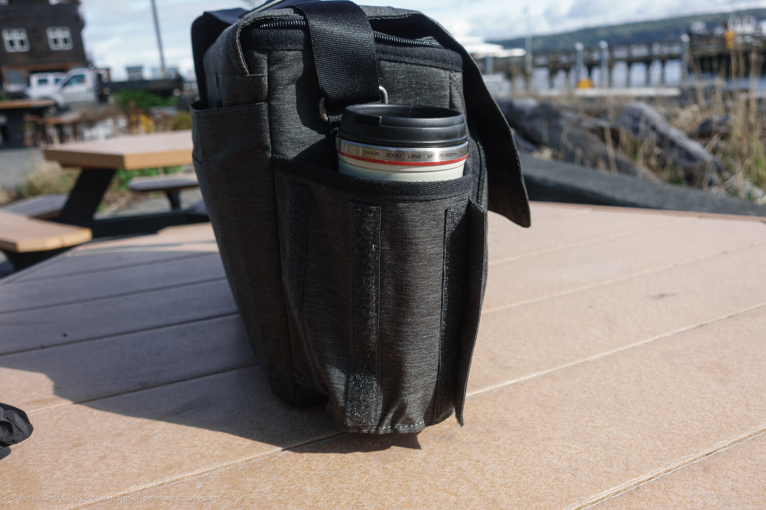
    Expandable bottle holder

    This little design aesthetic impressed me when I wasn’t expecting it to. Velcro keeps the bottle holder closed when not in use, reducing the chance that it will get caught on something. Plus it looks more stylish this way.

    But when you need to hold your coffee or water bottle, just expand the pocket to one of two sizes for a (nearly) custom fit.

    Tough, coated bottom

    While the bag’s fabric is stylish and does a good job of resisting stains and water, the bottom is made of beefed-up waterproof tarpaulin. This tough option makes for easy clean up when the bag is placed in anything but the most pristine locations. A quick wipe with a damp cloth keeps it clean and your contents dry.

    Front and back book/papers pockets

    On the back of the bag is a large pocket for books or notebooks. This is a great spot to place quick-at-hand items, and I use it for my calendar and main notebook.

    On the front of the bag is a smaller pocket. While you could fit a book in there, it presses against the organizer pocket behind it. While is looks good in photos, it’s not useful for thick items.

    Generously padded shoulder strap and carry handle

    The bag comes with two main modes of transport: a padded shoulder strap and a carry handle on top. The padding on the shoulder strap is generous and the strap itself has a wide range of adjustment for a variety of torsos. However, the top carry handle only works when you remember to clip the top flap shut. Still, it is a secure way to get the bag in and out of your car for a quick grab.

    It fits easily under a seat on a plane

    I’ve tested the bag under economy coach seats on 737s and smaller planes with ease. There is ample room and the bag doesn’t scratch along the underside of the seat.

    Not so artful tripod holder

    On a bag like this, the tripod attachment goes in the only location it can; on the bottom. ThinkTank uses their attachment straps (which can be removed when not in use, as shown above) to allow for a variety of tripod sizes. There’s really no other place for a tripod to go and the clips do an adequate job.

    Roller Bag Passthrough

    For those who love their roller bags for airports, the back of the Vision 15 has a slot for your roller bag handle to pass through.

    Limits

    While this bag has a lot going for it, I find the pockets get full fast. Even just throwing a Mindshift card wallet into the front pocket will expand it enough to press on the other pockets. Toss in a charger and Miops cable release as pictured above and you quickly start puffing the bag up, unlike a backpack-style bag.

    Vision 15 with rain cover attached

    Don’t expect to comfortably carry a full-size tripod on the bottom of this bag. The length would make things unwieldy. Also, with the tripod attached, you suddenly don’t have an easy way to set down the bag.

    In use

    I tested the bag in use on my job for a month, which included travel on four different flights up an down the West Coast. Its smaller form factor (compared to my normal backpack) is welcome as it packs into my car trunk easily and was effortless to remove, thanks to its clean lines and lack of straps like a backpack.

    Opening and accessing contents is straightforward and I left the velcro attachment connected on the inside lid most of the time. Yet, when I had to set the bag down a couple of times in less than ideal situations, that inner zipper was nice to employ. I never did use the rain cover but I am glad they shipped the bag with a black cover to keep it stylish.

    Conclusion

    The ThinkTank Vision 15 is a very useful shoulder bag. While it can’t quite hold all I like to carry (no space for a drone), it holds all you need on a day-to-day basis when away from the office all day. It easily holds a long lens as well as battery packs, chargers, cards, tablet and laptop. It can easily handle four lenses and a flash, while the padded shoulder strap makes carrying that load bearable.

    While the Vision 15 is sized for a 15″ laptop, they have two other, smaller sizes (which cut out the space for a tablet) that might fit your particular setup better.


    The post ThinkTank Vision 15 Camera Bag Review appeared first on Digital Photography School. It was authored by Peter West Carey.


    Digital Photography School

  • A Short Introduction to Basic Photo Editing for Beginners

    The post A Short Introduction to Basic Photo Editing for Beginners appeared first on Digital Photography School. It was authored by Lily Sawyer.

    If you’re a beginner, using editing software can be a daunting prospect. What if you can’t get a handle on the technology? What if it’s too complicated a process? What if it’s just too time-consuming? What if the images turn out horrible? So many what ifs! I get it; I’ve been there. In this article, I’m offering a very simple way of delving into editing if you’re a novice. These are basic principles that I hope will set you in good stead for more fancy editing in the future!

    dps-basic-editing-tutorial-final-image

    First things first.

    You need to be able to see what is a good image and a bad image. The key is in your perception.

    If you think heavily edited images are the perfect image, then your editing will lean that way and vice versa. If you think an overly-tinted image is perfect, then that would be your bar for perfection. We all have a bias towards something. However, for editing, I think we need to try and be as neutral as possible and leave our personal preferences for the moment.

    To be able to see things objectively, we need to:

    1. See the differences between over-exposed and under-exposed images and decide as to what is the correct exposure
    2. Understand white balance where white looks white, as it should, and not yellow or blue or orange
    3. See the contrast between dark and light
    4. Decide on the noise

    Once we have a basic grip of the above, then editing will be a breeze, and we can get more creative from a solid image base or what I’d like to call a clean edit.

    But first, a word on shooting format. Shoot in RAW.

    The images below are the original RAW images opened in Bridge without any edits applied.

    You can see there is a choice of Adobe color profiles. See the difference between the standard profile below left and the color profile used on the image on the right.

    You can choose which profile you prefer.

    dps-basic-editing-tutorial-profile

    To successfully understand the above, and make the edits towards them, it is important that you shoot in RAW format. If you shoot in JPEG, you are allowing the camera to process the image, discard pixels the camera deems unnecessary, and accept the color adjustments the camera has made. With a JPEG image, you have less control, are working on a great loss and compression of pixels at the very start and an already compromised image color.

    You can read more about RAW processing in Bridge here.

    Having said that, someone who is a really good, seasoned, experienced photographer may well shoot JPEGS and achieve the desired image they want. I am not there yet!

    Secondly, the type of camera you use affects the original images you get.

    A full-frame camera gives you the 35mm sensor – wider, more space, more light hitting the camera sensor and more pixels. What you see through the lens is pretty much what you get. A crop-sensor, on the other hand, works in the opposite way. The lens only allows you to use a portion of the sensor so that a 35mm lens mounted on a crop-sensor camera will only give you the point of view of a 52mm lens equivalent – a more zoomed-in longer focal length. You are losing some width, some light and some pixels.

    Let’s dive in!

    1. Correct exposure

    Correct exposure means getting the balance right between the 3 components of the exposure triangle. Namely: aperture, shutter speed, and ISO. Balancing all three correctly will give you a perfectly exposed image. That means no blown highlights or details are lost entirely in the shadow or darker areas of the image that should still be visible.

    A most useful tool in determining whether your exposure is perfect is to look at the histogram when you are editing. Alternatively, you can view the histogram when you have just taken the photo as there is also a histogram on the LCD of many cameras these days. Simply put, a histogram is a representation of the tonal value distribution across your image in the form of a visual graph. Just by looking at a histogram (that graph on the top right corner of the image below), you can immediately tell whether there is an even spread of tonal values on the image judging from the troughs and crests on the graph or a stark contrast.

    If the image you shot has incorrect exposure, then editing is your solution. You can move the sliders on your editing software to increase exposure if the photo is too dark or decrease your exposure if the photo’s too bright. You can usually recover some blown highlights in the case of overexposure.

    dps-basic-editing-tutorial-color-raw

    Take a look at the image above. This is the RAW image opened in Bridge. You can see it’s a little bright with the histogram showing a tall mountain almost touching the right edge. When the histogram touches both left and right edges, this would indicate the dark and light parts of your images are clipped and therefore there is overexposure and underexposure in the image. This is an okay image as nothing touches the edges, but it is too bright for me.

    The image on the left below shows an overexposed image with the exposure turned up and the image on the right shows an underexposed image with the exposure turned down. See what the histogram is doing in these images.

    dps-basic-editing-tutorial-color-raw

    2. White balance

    Simply put, white balance is the adjustment on your camera that reads the color temperature of the light you are shooting in in relation to neutral white. A perfect white balance should show white to be white as perceived in reality and there are no color casts that distorts the whiteness of white. You can, however, go for a warm white or a cool white by adjusting the white balance sliders. Generally speaking, what you don’t want is for white to look too yellow or orange or too cold like with a strong blue cast. Compare both photos below: too cool on the left and too warm on the right.

    dps-basic-editing-tutorial-color-raw

    3. Contrast

    There is nothing rocket science about contrast in my opinion. It is simply to do with the strength of the blacks on the photo. After the adjustments above, our photo is still looking very flat. All that’s needed is a fiddle on the blacks, shadows, highlights and light areas. Just remember not to clip your blacks or whites or if you want a bit more contrast, not too much clipping. You can also use the curves tab (the one that shows a grid with a curvy line) for contrast adjustments.

    dps-basic-editing-tutorial-finish

    I also played with the other sliders to get the result I wanted on the images above. Just do so gently – a touch here and there rather than extreme adjustments.

    Remember, you are only after a clean edit at this stage. The images above show the same edits on the standard and color profiles. The results are different so deciding on your color profile matters.

    4. Noise and Sharpening

    If you click on to the third tab which shows two black triangles, you get to the panel where you can adjust noise and sharpening. Again, gentle adjustments are needed here.

    It is vital to view your photo at 100% so you can see what the adjustments are doing to the image.

    Luminance has to do with the smoothness of the pixels. You don’t want to go too much, or you lose definition.

    Color has to do with how much the RGB pixels show up and extreme adjustments will either strip your image of color or make the pixels appear too saturated.

    dps-basic-editing-tutorial-sharpening-noise

    Conclusion

    Now I have a clean edit, there is still so much I can do to this photo. The eyes are a tad soft so I will need to adjust that. I could add vignettes or change the appearance of the background. I could add sunflares or textures. The possibilities are endless. But most of that has to happen in Photoshop.

    I hope this has helped you understand the basics of editing.

    Please share your comments below or if you have any questions!

    The post A Short Introduction to Basic Photo Editing for Beginners appeared first on Digital Photography School. It was authored by Lily Sawyer.


    Digital Photography School

  • Guidelines for Creating Your Photography Contract

    The post Guidelines for Creating Your Photography Contract appeared first on Digital Photography School. It was authored by Darina Kopcok.

    Guidelines for Creating Your Photography Contract

    If you’re any level of a photographer working with clients, you need to have a contract.

    When photo jobs go awry, it’s often due to a lack of communication.

    A contract protects not only you but also your client in the event of any unmet expectations.

    Here are some inclusions you may want to consider.

    Who is the agreement between?

    First of all, you need to state clearly who the contract is between and identify each party. You can identify yourself as “the Company”, and your client as “the Client.” The photo shoot itself can be referred to as “the Event.”

    Note that the agreement supersedes any prior agreements between the parties, and that the only way to add to the agreement is to do so in writing, and that this amendment must be signed by both parties.

    In short, if anything changes between the signing of the agreement and shoot day, you’ll need another contract.

    What are the reservations?

    You should have a section on your contract about the Reservations.

    This means you note the date the shoot is scheduled for, and your policies about rescheduling, postponement and cancellation.

    Make sure the client is very clear on the consequences of any of these changes.

    For example, many photographers require a 50% non-refundable deposit in case of cancellation, so they don’t miss out on potential work that could have been booked that day.

    Photography Contract - Darina Kopcok-DPS

    Safety

    I recommend having a section that notes that you as the photographer/company have the right to terminate coverage and leave the location if you experience inappropriate, threatening, hostile or offensive behaviour from a person at the event that calls your safety into question. This may be a rare occurrence, but it’s worth putting into your contract so you can assert your rights in case you’re a victim in an unsafe situation.

    This could be relevant to a female wedding photographer being harassed by drunken guests, for example.

    Shooting time and additions

    Note that shooting time commences at the scheduled start time and ends at the scheduled time, regardless of when the client shows up. If a client is very late, then the shoot goes to the agreed upon time and no later.

    I also highly recommend that if you’re a commercial photographer, that you state clearly that the client or a representative from their company must attend the shoot to provide creative direction and approve the final images.

    You’re not responsible for the final aesthetic if they are not there to provide feedback and approval.

    Furthermore, reserve the right to cancel the shoot and retain the deposit if the client or their representative does not attend.

    Seriously. This happens.

    Photography Contract -Darina Kopcok-DPS

    Expenses incurred

    This is where you might note that there could be additional expenses incurred that may not be part of the original quote, such as parking, props on a fashion or product shoot, or groceries on a food shoot.

    These kinds of expenses are usually TBD (to be determined) and not part of the initial estimate. This should be made clear up-front so you don’t end up taking a cut from your earnings to cover these things.

    Responsibilities

    You are responsible for a lot on a shoot, but certain things are unforeseen and out of your control. Things such as obtrusive staff, lateness of the client and staff, the weather, schedule complications, incorrect addresses provided by the client, or restrictions of the chosen location.

    Venue and Location Limits

    Unless you’re shooting at your studio or a rental, the client is usually responsible for providing an appropriate place for the photographic work to take place.

    If the venue is found to be limited in space or otherwise hinders you from carrying out your work in a safe manner (or one that doesn’t allow you to produce the desired result), reserve the right to request moving to another location or cancel the shoot without penalty.

    Permits

    Who is responsible for securing permits?

    The second you put a tripod down in a public place, you can very likely get asked to move along by a police officer or other type of city official. This can be disastrous on a commercial shoot where the location has been scouted and is essential to the storyboard or narrative of the final images.

    Permits can take some time to secure, so keep this in mind if this job falls on you.

    Photography Contract -Darina Kopcok-DPS

    Film & copyright

    The photography you produce for a client still belongs to you, as the creator of those images. A lot of clients think the images belong to them because they are paying you money to produce them. They need to be educated on copyright.

    In the commercial world, clients commission you to produce photos that align with their brand. They then pay you a separate fee to license those images for a specific use and time frame.

    You should have a separate Usage Agreement in addition to your contract that outlines usage parameters.

    Limit of liability

    In the unlikely event that you are not able to perform to the guidelines laid out in the contract due to injury, illness, an “act of God,” or another event outside of your control, you should not be held responsible.

    You should, however, make every effort to reschedule the shoot. If this isn’t possible, then ordinarily all payment received for the event should be returned.

    If digital files are lost, stolen, or destroyed beyond your control, including but not limited to hard drive or equipment malfunction, your liability is to return all payments.

    The limit liability for a partial loss of originals should be a prorated amount of exposures lost based on the percentages of the total number of originals.

    Capture and delivery

    You are not liable to deliver every image taken at an event or shoot.

    The number of final files to be delivered is up to the photographers discretion or is based on an agreement made between the photographer and client before the signing of the contract.

    In this section, you can make a note of when you’ll be delivering the files by and how they will be delivered, such as JPG or TIFF files.

    Photography Contract -Darina Kopcok-DPS

    Post-production and editing

    The final post-production and editing styles, effects, and overall aesthetic of the image are at your discretion unless you’re working on a specific type of job where the editing will be done in-house, say by a magazine or ad agency.

    Nothing is worse than working hard on editing and then having clients put crazy Instagram filters on your images. Prohibit any alteration to your photographs unless there is an agreement with the client as to what those alterations will be, like putting text on a photo.

    Payment schedule

    If you’re asking for a deposit (and I hope you are), make sure to put that in your contract.

    How you manage payment for the remainder is up to you. Many photographers allow thirty days for receipt, however, any late payment after that is subject to interest – usually 15-18%.

    Also, note a policy around any NSF charges and if there are any consequences the client needs to be aware of in terms of not paying on time.

    For example, you can state in your contract that non-payment after three months is subject to legal action.

    Pricing

    At the end of the agreement, I suggest that you lay out the agreed upon pricing.

    If you don’t have a separate usage agreement, you can include the usage terms here.

    For my commercial work, I typically don’t give my clients a usage agreement until the images have been paid for in full and prohibit the use of my images until then.

    I find this works well for me. Clients should not be using your images publicly unless they have paid for them, or it is a violation of your copyright.

    I even state this term on my invoices and draw their attention to this in my email communication upon sending it.

    Some clients can take a long time to pay you unless you draw specific boundaries around payment and the use of your images.

    Photography Contract -Darina Kopcok-DPS

    Signature field

    There should be an area where both you and the client can sign and date the contract.

    It’s best if you use electronic signature software such as Hello Sign so that clients don’t have to spend their time physically downloading and scanning a signed contract back to you. Everyone is busy, right?

    If you use a CRM software, it may already offer such a feature. For example, I use Dubsado, which is a CRM system for creatives. I can send clients emails and contracts directly from within the user interface.

    I have all the other features of a client management system for around the same price I would have to pay for signature software alone.

    In Conclusion

    Hopefully, this has given you some idea of what you can put in your contract.

    Be sure that your contracts are dated and signed before you consider a job booked.

    Go over them with the client and make sure the terms and conditions are understood. A lot of people don’t bother to read stuff before they sign it and you don’t want to deal with any surprises.

    Please note that this post is for educational purposes only and doesn’t constitute legal advice, as I am not a lawyer and cannot advise in that capacity.

    To make sure that any or your contract or written agreements are legally binding, and will cover you in an event of a discrepancy, please contact an attorney.

    The post Guidelines for Creating Your Photography Contract appeared first on Digital Photography School. It was authored by Darina Kopcok.


    Digital Photography School

  • 7 Steps to Perfect White Portrait Backgrounds in the Studio

    The post 7 Steps to Perfect White Portrait Backgrounds in the Studio appeared first on Digital Photography School. It was authored by John McIntire.

    Photographing subjects on a white background is one of those things that looks easy from the outside. However, once you start digging into the details, it turns out it’s not quite as simple as it seemed at first glance.

    Unfortunately, being able to shoot on a white background is one of the most useful skills for you to have in all sorts of photography including portraits and still life. Even if you hate it stylistically, you will eventually have plenty of people ask you for a pure white background.

    When you get the technique right, there are a whole host of things you can easily do with your photos, such as cutting your subjects out for composites. Even when your technique isn’t perfect, there are a host of post-processing options to get you, and your images, there in the end.

    However, this article outlines a process to help you get perfect results straight out of the camera every time. If you’re handling a high volume of images – whether that be portraits or products – this may save you countless hours in post-production.

    What you need

    You will need a few lights for this technique. In this example, there are three lights and a reflector.

    To get started with shooting on a white backdrop in a studio, you will need a few things.

    • At least two studio strobes with modifiers or flashguns (three or four would be preferable and will make your life easier). Softboxes are the easiest option for your background lights.
    • A light-colored backdrop. White is preferable, but this technique will work easily with anything up to mid-grey. It is more than possible to do it with darker backdrops but to avoid complications, stay light when you can.
    • Space. You will need space to get the best results. As described below, you will need to keep enough room between your subject and the background to help prevent spill from the background lights falling on your subject. For portraits, this could easily take ten to fifteen feet of space in addition to the distance you are from the subject. For smaller subjects, space is much less of an issue.
    • (Optional) A light meter. Because we’re dealing with moderately precise ratios, a light meter will help you here. You can get by without one, but it does make it easier.

    Step One – Choose your aperture

    Before you do anything with your lights or your subject, the first step in this process is to choose the aperture you want to shoot at. This choice is going to be the basis for everything else you do in this process. Anything from f/8 to f/4 is a good bet for studio portraits, but you can choose anything you like. Your only real limitation here is the power output of your lights.

    If you choose f/11, then your backgrounds lights will need to be set at least two stops brighter, which would be f/22. You may struggle to achieve that with low-powered strobes. If that’s the case, then you will have to choose a larger aperture for your final image.

    For the remainder of this article, the chosen aperture will be f/5.6.

    Step Two – Light your background

    When lighting your background, take the time to ensure that it is evenly lit. This will ensure that all of your background is white with no darker tones creeping into the sides and corners.

    Once you know your aperture, the next step is to set up your background light(s). If you can, use large, directional modifiers like softboxes. This will help prevent excess light spilling where you don’t want it. It will also help to ensure that the background is evenly lit from top to bottom, preventing any inconsistencies in exposure in your final images.

    Place your lights on either side of your backdrop and pointed towards it at a forty-five-degree angle. Try to position them so that you get even coverage.

    Step three – Set the exposure for your background lights

    The easiest way to find the exposure for you background is to use a light meter. Don’t worry if you don’t have one, you can still chimp the histogram to make sure it’s overexposed.

    With your lights positioned, all you have to do is set the power so that the camera will record your background as pure white. Your background needs to be at least two or three stops brighter than your subject. Because the hypothetical aperture we’re using is f/5.6, that means the backgrounds lights should be at f/16 for three stops of exposure difference.

    If you’re using a meter, be sure to check the exposure at the top and bottom of the background and not just the middle.

    Step four – Place your subject for a test

    On the left, the subject is too close to the background and the light is wrapping around her and lighting her front. Placed a few feet further away, the subject is rendered as a silhouette. (The detail in the darker image is from the overhead fluorescent that I hadn’t turned off yet.)

    To figure out where your subject needs to stand, or be placed, put them in front of the background and take a test shot with only the background lights on. If they are far enough away from the background, your subject should be in perfect silhouette, and there should be no light falling on them or wrapping around them in any way.

    Where there is light falling on your subject, just move them further away from the backdrop until you achieve that perfect silhouette.

    If your exposure is right, you should have no details in your background and no details in your subject.

    Because you are lighting a white (therefore reflective) surface, your background is effectively a light source and acts like one. The light from your backgrounds will fall off at a rate governed by the inverse square law. What you are trying to do is to place your subject in a place where the light level drops enough that it has no effect on your subject at your desired aperture.

    Step four (part 2) – Flag your background lights

    To ensure light isn’t going where you don’t want it, flag your background lights. Here, I’ve used black fabric and covered all but the section of background that will be in the photos.

    It may be that you can’t achieve a perfect silhouette of your subject for some reason. This issue can arise from not having enough space to work in, or it could be that your modifiers are producing too much spill. One way to combat this is to flag your lights.

    Flagging simply means to block light from where you don’t want it. You can do this in any way that you want. V-flats and black curtains (as in the example images) are both cheap and effective ways to flag your light.

    Simply place your preferred flags in a manner that blocks excess light from coming back towards the camera, but doesn’t interfere with the part of the background that will wind up in your composition.

    Step 5 – Place your key light

    Once the background lights are done, you can light your subject in any way you want.

    Now that your background is lit and you know where your subject needs to be, you just need to light your subject. All you have to do is place your light any way that you desire (any lighting pattern will work), and set the power to your desired aperture (f/5.6 in the examples).

    Unlike the background lights, you don’t have to worry about what any excess light from your key light is doing. Because you are so far away from the background with a light set to a much lower power, it will have little to no effect on the final exposure of the background. However, do pay attention to what the light is doing off to the sides. If it’s firing into a nearby white wall or another light-colored surface, then that surface will act as a reflector in your images.

    Step 6 – Add fill (optional)

    Use fill lighting to reduce the impact of heavy shadows in your images. You can use another light if you wish, or a reflector as shown here.

    If you want to add a fill light to your set-up, you can now do that as normal. You can fill with another strobe, or you can use a reflector as shown in the example images. The main thing to remember about fill light is that it should be at least one stop lower in power than your key light.

    Step 7 – Check your final exposure

    With everything set-up, you should have a perfect white background straight out of the camera.

    With everything in place, take a test shot at your desired aperture. If your key and fill lights are in your desired position, everything should be spot on and you should now have an image with a perfectly white background straight out of the camera.

    That’s it

    This isn’t a hard technique, but it does require a fair few steps and a lot of attention to detail. Don’t be put off by any of that. Once you’ve set it up a few times, it will become second nature very quickly. You will also be able to learn how to set it up in a few minutes, potentially saving you a ridiculous amount of time post-processing backgrounds that aren’t perfectly white.

    The post 7 Steps to Perfect White Portrait Backgrounds in the Studio appeared first on Digital Photography School. It was authored by John McIntire.


    Digital Photography School

  • How to Stay Inspired with your Photography

    The post How to Stay Inspired with your Photography appeared first on Digital Photography School. It was authored by Nisha Ramroop.

    How do you keep creating when you feel uninspired? This is one of those questions that plagues photographers at all levels, at some point in their lives. Here are a few tried and true tips that have prevented some from giving up.

    1. Start a project

    At some stage in your shooting life, a photography project is highly recommended. When stuck in a creative rut, setting yourself a clear and defined focus or theme helps. Projects require a commitment out of you and are a great way to push yourself.

    Depending on the magnitude of your project you can either set a timeline or forego it. Some timelines are built into a project, for example: a 365 project with a common theme or a 52-week portrait challenge. Other projects can be life long, such as shooting long exposure beaches in different countries or a specific location over a number of years.

    The best part is that your project can be as small or big as you want – ranging from strange and faraway places to the comforts of your back yard. There are endless possibilities.

    During the course of your project, do not forget to challenge yourself often. If you find your project is getting routine or mundane, this is an indication that your progress/learning has stopped or is slowing down. If this happens you could very well end up back in your previous uninspired state. Make your project challenge you, while keeping it fun and celebrate your skill and knowledge progression.

    2. Do something outside your comfort zone/genre

    One of the greatest things about photography is that there are so many genres, with different skills to explore. Landscape photographers and studio portrait photographers have distinctive skill sets. Street photography versus macro photography, each comes with their unique challenges.

    When you love capturing moments in time, traversing an area outside of your norm can help you see things anew. Even within the same genre, each photo experience can be diverse. In landscape photography, for example, you have sub-categories such as long exposure, astrophotography, nightscapes and seascapes to name a few.

    If you have hit a creative wall in your genre, try learning something new to you. Creating new work encompasses shooting outside of your comfort zone or even editing differently.

    As a creative, you can even try another artistic avenue other photography! It may sound unrelated, but doing something else like painting or drawing can give you a whole new appreciation for light (or maybe it will just remind you why you shoot and not draw or paint).

    3. Consume less, do more

    Inspiration is everywhere. Looking at other people’s work in person (exhibitions) or online (photography websites, social media) is a great way to probe yourself. Asking questions like, “how can I do a version of that?” or “what will it take to recreate that lighting?” Save anything that inspires you with purpose. Images that get you excited about creating or planning a future shoot. Browsing other people’s work can be a double-edge sword though.

    On the plus side, you can use it to gauge either how far you have come or what is left for you to learn. It can inspire you to try something new and challenge your skill level. The recommendation is to do this in spurts and not too often for too long, as you can start comparing yourself to the point of getting discouraged. Consume enough so that you are inspired, move to the planning stage and execute. More doing/creating is what will actually move you to a better place mentally.

    Once inspiration starts to overwhelm you, take a step back. Reference the images that you want to learn from and actually attempt it. In this case, failure is an option as it shows you that you need to read, research and try again until you get the final output that you desire.

    Important note: while you can learn from your attempts, do not set yourself up for failure. Too often trying to recreate the entire image can be senseless. A better approach may be to determine what about the image inspires you (lighting, subject, processing). Choose one or two elements you want to experiment with and make it your own.

    4. Get constructive feedback

    Posting your images on social media might seem like the best place to get feedback – it is not. While it may be a great way to share your image (and boost your ego), it is not the place where you will learn what you can do to improve. If you are feeling uninspired, constructive/positive feedback will do you good. Keep in mind that in order to improve, you have to also be willing to deal with critique.

    On most photography forums known for good feedback, you will find that the other members here know how to give feedback in a non-offensive, positive way since they also seek feedback for themselves. Additionally, you can also streamline what you ask for. Is it the lighting? The composition? Exposure techniques? These questions will help your viewers hone in on the area you are having the challenge with.

    Conclusion

    If you find yourself at a plateau with your creative work, there is no right time to try to come out of it. Make the effort to break out of that uninspired space by committing to do something different. Challenge yourself outside your comfort zone or start a project.

    Looking at your peer’s work can definitely be inspirational, but more than that, do something today and get feedback on it. These are great ways to push through the mental blocks.

    Share with us something that has worked for you on your photography journey in the comments below.

    The post How to Stay Inspired with your Photography appeared first on Digital Photography School. It was authored by Nisha Ramroop.


    Digital Photography School

  • Review: Sigma 40mm f/1.4 DG HSM Art Lens

    The post Review: Sigma 40mm f/1.4 DG HSM Art Lens appeared first on Digital Photography School. It was authored by Simon Ringsmuth.

    Sigma occupies an interesting and somewhat unique space in the photography industry. They are most widely known for their lineup of third-party lenses for Nikon, Canon, and Sony cameras. Sigma also manufactures other gear such as flashes, filters, and even their own digital camera bodies using their home-grown Foveon image sensor.

    While Sigma lenses have always been quite well regarded by amateur and professional photographers, their recent series of Art lenses have really given first-party manufacturers a run for their money. With optical performance that meets, and in many cases, exceeds lenses made by most mainstream camera companies, Sigma has really started to make significant inroads in professional imaging products.

    The latest example of this is their outstanding 40mm f/1.4 Art lens.

    Sigma 40mm f/1.4: 1/180th second, f/1.4, ISO 720.

    The story of this particular lens actually begins a few years ago with Sigma’s 18-35mm f/1.8 Art lens for APS-C cameras. That was the first iteration of what what has become a very successful strategy for Sigma: producing lenses with superior optical performance, even if it means selling them at a higher price than consumers are used to for a third-party company.

    Sigma have since fleshed out their Art series of lenses with a variety of focal lengths, in both primes and zooms. Many photographers and videographers have started to take notice, and Sigma has since branched off into a line of Cine lenses specifically designed to meet the demands and challenges of video.

    This lens is so big several people thought I was using a zoom.

    Enter the Sigma 40mm f/1.4 DG HSM Art Lens (Nikon, Canon, Sony) – designed with features photographers want and videographers demand.

    Its optical path and lens elements fit the mold of what their other Art lenses offer, while its all-metal construction and gear-based focusing make it well suited for video. While I’m no videographer and can’t speak to how this lens functions in that regard, I can say for sure that it is one of the most astonishing photography lenses I have ever used.

    The price tag is a bit high, but the tradeoff is a lens with supreme sharpness – even at its widest aperture – and virtually none of the problems that plague so many other lenses.

    Nikon D750, 40mm, 1/500th second, f/1.4, ISO 100.

    As I was using this lens I thought back to my first lens, the humble Nikon 50mm f/1.8. When I got that diminutive piece of glass I remember shooting almost everything at f/1.8 because it looked so cool to have my subject in focus with the rest of the shot was filled with beautiful blurry bokeh. However, I soon realized that these types of shots were a bit problematic, mostly due to all sorts of optical issues like lack of overall sharpness, vignetting, and really bad chromatic aberration.

    I soon got used to shooting my 50mm lens stopped down a bit. It’s the same with other lenses that I’ve acquired over the years. While they most definitely work while wide open, there’s usually some tradeoff.

    The Sigma 40mm f/1.4 is a whole different beast entirely. Using it is an absolute joy because you can basically shoot whatever you want, any way you want, with total impunity.

    100% crop of the image above. The sharpness of this lens at f/1.4 is incredible.

    I should point out, before getting too far into this review, that the performance of this lens does not come cheap. At nearly $ 1400 this lens is almost ten times as expensive as an entry-level 50mm f/1.8.

    However, this lens isn’t exactly aimed at entry-level photographers. It’s designed for people who want (as near as I can tell from using it extensively) no compromises in terms of optical performance. As a result, the lens is big, heavy, expensive, and not exactly the sort that you would take out as a casual go-anywhere addition to your camera kit. Although, if you prioritize outstanding image quality above all else, then this may be the lens you are looking for.

    Sharpness

    I don’t want the substance of this review to get lost in hyperbole or vain platitudes, but in some way, this Sigma 40mm f/1.4 lens really does operate at a whole other level in terms of sharpness. I’ve used sharp lenses before, but nothing quite like this – especially when shooting wide open.

    I took this to an equestrian show with my family and just for fun. Then I shot almost exclusively at f/1.4 just to see what this lens could do.

    I was consistently impressed by the results.

    Nikon D750, 40mm, f/1.4, 1/2000th second, ISO 100.

    In the image above, I focused on the horse’s eye, which was a little tricky since it was constantly moving its head up and down. The resulting images were much sharper than I imagined they would be. The f/1.4 aperture also gives a pleasing foreground and background blur, especially on the man’s plaid shirt. The 40mm focal length offers a field of view that’s wide enough to get plenty of elements in the frame.

    To further illustrate the sharpness, the following is a 100% crop from the original. You can clearly distinguish individual hairs and eyelashes.

    100% crop of original image.

    Of course, this type of result really isn’t all that special. Plenty of lenses are quite sharp in the center, but what about the rest of the frame? I was curious to see how the Sigma 40mm f/1.4 performed in a variety of conditions, so I shot scenes like the one below to see how this lens would handle trickier situations.

    Normally in a shot like this, the trees in the center would be sharp while the outer edges would be significantly less so. They would also have significant chromatic aberration issues on the branches around the perimeter.

    Nikon D750, 40mm, f/1.4, 1/250th second, ISO 100.

    Investigating a 100% crop shows that image quality is tightly controlled even around the edges. Individual branches are tack-sharp and clearly distinguishable, with no green or purple fringing whatsoever.

    Granted this wasn’t shot in broad daylight, but I found results like this to be consistent in a variety of shooting conditions.

    100% crop of above image.

    Overall, I was highly impressed with the sharpness of this lens, especially at f/1.4. But then again, this is a $ 1400 lens. When you spend this much on a lens like this, you might naturally expect these results. If you want to save over a thousand dollars on a wide-aperture 40mm lens you could always opt for the Canon 40mm f/2.8 Pancake, which is a great lens and certainly worth looking at. However, in terms of sheer optical performance, the Sigma 40mm f/1.4 is a whole other ballgame entirely. It is well worth considering if you prioritize features like sharpness and overall performance above all else.

    Foreground/background blur

    Some qualities of camera gear can be measured objectively, while others are difficult to fully explain or describe without delving into a more qualitative realm.

    You could put the Sigma 40mm f/1.4 lens up against similar lenses in a lab and come away with charts and diagrams that illustrate various optical properties of each one.

    However, at the end of the day, there’s something about some particular lenses that either grabs me or pushes me away. I don’t know exactly what it is about this particular lens, but the out-of-focus foreground and backgrounds just look, as the saying goes, smooth as butter.

    Nikon D750, 40mm, f/1.4, 1/180th second, ISO 1000

    The way the bricks in the background slowly fade away while the clean mortar lines remain visible, and the smooth transition across the frame from in-focus to blurry, is far beyond what I’m used to on my usual gear. I don’t know if I quite know how to describe this and I don’t want to sound like a shill for Sigma (they did not pay me for doing this review, and I have no relationship with them whatsoever) but I really, really like the photos I was getting out of this lens.

    Throw in some lights in the background, and you start to see even more to like with the Sigma 40mm f/1.4 DG HSM.

    Nikon D750, 40mm, f/1.4, 1/400th second, ISO 1250

    The clean, clear spots of light behind this bronze statue are nice and blurry without any of the onion-ring artifacts that are so common on a lot of other lenses. It’s part of what makes this lens so fun to use – especially knowing that when you take shots wide open, you aren’t losing anything (at least, nothing that I could notice) in the way of sharpness or overall handling of chromatic aberration.

    Of course, there is some vignetting at f/1.4 but nothing that I would consider out of the ordinary, and well worth the tradeoff compared with shooting at smaller apertures. For example, here’s another picture of a purple magnolia flower that I shot at f/2.8.

    Nikon D750, 40mm, f/2.8, 1/180th second, ISO 1800

    This isn’t a bad photo, and the flower in the center is bright and sharp, which I always like to see on any lens. The 40mm focal length let me fill the frame with branches, buds, and other elements that add a sense of context. However, the scene is transformed into something almost otherworldly when shot at f/1.4.

    Nikon D750, 40mm, f/1.4, 1/180th second, ISO 400

    The corners are darker due to vignetting at such a wide aperture, but the rest of the image is almost entirely obscured in beautiful bokeh. The out-of-focus areas are blurry without being muddy. While the flower in the center is now a beacon of color amidst brown and yellow. I don’t quite know how to describe just what it is about the rendition of foreground and background elements that I find so pleasing on this lens. But it’s certainly something to behold and a lot of fun to have available at your fingertips.

    Autofocus

    If there is one area where this lens didn’t impress me all that much it was autofocus. It’s not that it’s bad, but it’s not exactly superlative either. I suppose I could best describe it by saying it simply gets the job done most of the time. I found that it couldn’t quite keep up with my own two kids when they were running around outside, but for most normal shooting conditions it works pretty well. Autofocus is quick and silent – so quiet that I had to hold my ear up to the lens to hear the gears turning – but if you’re used to the speed of a sports-oriented lens like the 70-200 f/2.8, you might find this is lacking too much for your taste.

    Nikon D750, 40mm, f/1.4, 1/180th second, ISO 360.

    I shot several dozen images similar to the one above, and the Sigma 40mm f/1.4 lens performed just fine. Most shots were nice and sharp, however, the movements of the horse were a trot – not a gallop – and in a mostly predictable straight line. My go-to gear for most daily shooting is a Fuji X100F and this Sigma lens is certainly faster and more reliable than that camera.

    Nikon D750, 40mm, f/1.4, 1/180th second, ISO 800. Autofocus kept up fairly well with this remote-control helicopter.

    Perhaps the best thing I can say about the autofocus on this lens is that it works about how you would expect. It’s not going to break any records for speed, but it’s reliable, predictable, and effective.

    Handling

    Similar to autofocus, the overall handling of this lens is something that I can describe in terms of how it feels, but I don’t know if I can accurately quantify it with numbers and hard data. Simply put, this lens is a beast. It’s big, thick, heavy, and feels like it could withstand a beating. Sigma claims it is dust and splash-proof. While I didn’t test this personally, given the overall build quality, I would certainly expect this lens to be able to withstand being out in the elements.

    Manual focusing happens with gears, not electronics, so you always have a smooth tactile experience when turning the focus ring. There are no hard stops as you turn the focus ring, but after about 160° of travel, there is a soft click indicating you have reached the nearest or farthest focusing limit. There’s a single switch on the side that alternates between Autofocus and Manual focus, which I found to be simple and effective in regular use.

    Image stabilization is nonexistent. However, I didn’t miss it much. With such good image quality at f/1.4, I could use fast shutter speeds without the need for stabilization. Video shooters may have this lens mounted firmly on a tripod, so the lack of image stabilization may not be a mark against it.

    Nikon D750, 40mm, f/1.4, 1/2000 second, ISO 100.

    Despite being such a heavy lens, I didn’t find it difficult to carry around for general shooting. At 1300 grams, it’s almost as heavy as my 70-200 f/2.8 which clocks in at 1540 grams. The Sigma 40mm f/1.4 packs all that heft in a much smaller package. Because of this, I didn’t feel the weight as much as I thought I would, but it’s the type of lens that will certainly strain your arm over time. I really liked shooting with a battery grip on my camera to help balance things out a bit.

    Conclusion

    My thoughts on this lens can perhaps be best summed up with this photo:

    Nikon D750, 40mm, f/1.4, 1/1500 second, ISO 100.

    I don’t think I could have gotten this shot with any other lens, and it’s a testament to the quality and engineering that went into this Sigma 40mm f/1.4.

    I focused on the flower just to the left of the sun as it peeked over the horizon and it’s sharp as a tack. Zooming in to 100% reveals a level of sharpness and detail, as well as an almost complete absence of chromatic aberration.

    That was highly impressive.

    100% crop of above image.

    This is one of the best lenses I have ever used, and well worth the price if you value image quality above all else. It’s big, heavy, and not exactly easy on the wallet. But what you get for the price is a lens that is sturdy, reliable, and exquisitely sharp at all apertures – especially wide open.

    If you’re looking for a lens that offers outstanding optical performance first and foremost and is designed to meet the needs of demanding photographers and videographers, then I don’t think I can recommend the Sigma 40mm f/1.4 Art highly enough.

    The post Review: Sigma 40mm f/1.4 DG HSM Art Lens appeared first on Digital Photography School. It was authored by Simon Ringsmuth.


    Digital Photography School

  • How to Prepare Images For Publication – Part Two

    The post How to Prepare Images For Publication – Part Two appeared first on Digital Photography School. It was authored by Herb Paynter.

    In part one of this series, I presented the reasons why images printed in magazines and publications can appear lackluster, dark, and dull rather than detailed and vibrant as when printed on an inkjet printer. In this follow-up article, I address the unique requirements and limitations of printing presses and some ways to produce rich and detailed images in print.

    Fine Tuning the Process for Print

    Paper surfaces

    The depth and detail that a press can reproduce in the darkest (shadow) portions of an image are limited by several print-related factors, with the paper grade (quality) being the biggest factor. Printing papers come in various grades, textures, and shades of white.

    White is a relative term, and newspapers are a prime example. Newsprint isn’t actually pure white and the ink printed on it never appears black.

    Printing inks

    Newspaper inks are nearly in a liquid state as opposed to other forms of print. The tack level (stickiness) of these inks must remain very low since the newsprint paper composition is quite soft. Full-bodied inks printed at high speed would tear the paper apart. Instead of appearing as black ink on white paper, newspapers appear more like charcoal colored ink on light gray paper. This factor alone dismisses the visual contrast in pictures. Newsprint absorbs ink like a paper towel, which is why pictures in the newspaper lack contrast, punch and depth.

    Magazine paper surfaces

    Publication (magazine) presses fair much better. However, they still have limitations. Paper grades for publications are still lower quality than those of brochures and coffee table books because of the economy of the project. Most publication stocks are made from recycled papers in which many of the whitening agents and glossy coatings used in higher grade papers are absent. This results in less reflective surfaces and varying shades of off-white colors. While the recycled paper is good news for the environment, it’s bad news for print quality.

    The challenge

    High-speed presses must also reduce the tack level of their inks to keep these papers flowing through the presses. When the tack level goes down, so does the opacity of the inks, and when the tack level of translucent inks is reduced, the contrast in the images (and image detail) is also reduced. You can see where this is headed…

    The creative solution

    Thus the challenge is to maintain as much apparent contrast in each image as possible under less than ideal circumstances. Here is where the creative magic of contrast “compensation” enters the picture. Prior to the era of digital editing, this creative level of tonal manipulation was simply out of reach. While adjusting the overall contrast (white, middle, and black points) of printed images has always been possible, serious contour shaping was not. But within current digital image editing software, the entire internal range of tones can be tuned and cajoled with great precision. Success simply takes a clear understanding of the limitations and a good knowledge of the tools in the digital tool chest.

    The Sun backlit the subjects in this photo causing the darker areas to hide significant detail. If sent to press without compensating adjustments, the printed results would have looked even darker and important detail would have been lost.

    Pictured here are the settings that produced the civil war reenactment photo above. Information contained in the middle tones and shadow tones was recovered by powerful tonal adjustments available in each of the four software applications. Very similar settings produced very similar results. The panels (from left to right) include Adobe Camera Raw, Adobe Lightroom, On1 Photo RAW, and Alien Skin X4.5. Camera Raw and Lightroom produced identical results from identical settings for obvious reasons, while the development engineers from On1 and Alien Skin used unique routines and algorithms in their software to affect very similar results.


    The secret to success in adjusting the internal contrast of an image is in developing a distinct visual difference between the whites and highlights and the shadows and black tones. This is best addressed within the six major tonal sliders provided by most RAW editing software (Lightroom, Camera Raw, On1 Photo RAW and Alien Skin’s Xposure X4.5) best address this.

    Don’t let the term RAW scare you away. These editors can open and process just about all image file types (RAW, JPEG, TIFF, etc.). Each of these packages provides very similar tonal area adjustments (Exposure, Contrast, Highlights, Shadows, Whites, and Blacks) though each maintains a slightly different range for each. Additional controls to fine tune the tonal values include the Tone Curve adjustments of Highlights, Lights, Darks, and Shadows.

    The beauty of all these controls is the fact that they are nonlinear, meaning they can be adjusted in any order and at any time during (and during follow-up) editing sessions. Using these editing packages, truly non-non-destructive image editing can be made to RAW, TIFF and JPEG image files.

    Backlighting and a black cat provided a serious challenge in this image. These adjustments were needed even if the picture was not going to press.

    Three aspects of tonal controls

    Familiarize yourself with these three general aspects of tonal controls to prepare your photos specifically for the printing press.

    One

    Since camera image sensors capture very little shadow detail, digital images require significant internal contrast adjustments to the lower portion of the tonal scale.

    Shadow tones of each image are the most challenging areas to print cleanly on press. Therefore, you must create a sharp distinction between the darkest darks (Black slider) and the three-quarter tones (Shadow slider).

    Use the Exposure slider in conjunction with the Blacks slider to bring out all the detail in the darkest portion of the image. Reference the histogram to gauge the actual pixels that will print darkest.

    Two

    Lighten the middle tones and accent the difference between the quarter tones and the highlights.

    Use the Curves tool to affect the middle tones while adjusting the Shadows slider and Highlight Slider to define the middle tones further.

    Three

    Reference the histogram again to monitor the lightest tones (White slider). White is a misnomer in the labeling of this slider as its influence is on the extreme highlight tones. Draw a distinction between the light tones and absolute white by using the Highlights slider and the White slider.

    The Exposure slider and the Contrast slider play an important part in this tonal ballet. Choreograph these controls to achieve the best balance of internal tones and check your progress by occasionally tapping the “P” key to preview the composite effects of all your adjustments against the original image.

    Seemingly lost detail in the darker areas was completely recovered by some severe adjustments to individual tonal areas throughout the tonal range. The image was recovered with only the use of the sliders shown. No further editing (dodging, burning, etc.) was required.

    This article is hardly an exhaustive explanation of how to prepare images for publication inasmuch as it does not address the critical issues of color, sharpening, resolution, etc. But it will get you started on the most critical issues of tone sculpturing images for reproduction. In every example shown, ONLY global adjustments to the seven sliders was required to bring full life back into lackluster photos. The most critical aspect of post-production involves an image’s internal tonality.

    Shape each image’s internal contrast specifically for the press and paper being printed. If you don’t, the printed image will probably hide shadow detail, lose their “snap” in the highlights, and produce muddy middle tones. Slight but deliberate accenting of the tone curve will produce significantly better images in print.

    Working on images in these RAW Interpreter software applications provides amazing latitude in recovering both shadow and highlight detail. This example shows how On1 Photo RAW found significant detail in what appeared to be blown out highlights of a JPEG image.

    Chasing light

    At the core of the issue is light.

    Everything about photography concerns light, and that includes viewing photos in print.

    The reason images appear more vibrant and colorful on a monitor is because the background “white” is projected light, not paper. Images printed on paper will ALWAYS appear less vibrant. Paper is only as white as the light reflecting from it. The darker the paper and the dimmer the reflecting light, the less bright the picture appears. Images in print will never look as good as images on your monitor simply because reflected light cannot compete with projected light.

    Conclusion

    Preparing images to print correctly is a serious challenge, but one that delivers an amazing result. If you want to test your image editing skills, it doesn’t get more challenging than this. The reward for all your print-editing efforts will last a whole lot longer than a post on the Internet and will be seen by thousands (if not millions) more than a print hanging in a gallery. People collect well-produced publications and display them for others to see.

    Virtually all images deserve thoughtful preparation before presentation. The camera can’t evaluate tonality balance by human standards. Learning the reproduction habits and limitations of different devices and understanding how to best compensate for each will pay serious visual dividends.

    Of course, the final challenge in preparing images for publication is converting the color mode from RGB to CMYK. Check with your publication about this matter before you arbitrarily choose CMYK from the Image/Mode menu. There are a number of workflows that publications use to produce their final files for the printer. I suggest you leave the color conversion decision up to the magazine’s production staff. The conversion process is a complex issue that deserves much more attention than I’m addressing in this series.

    Please feel free to comment and question what you’ve just read. Life is a collaborative effort, and we’re all learning.

    The post How to Prepare Images For Publication – Part Two appeared first on Digital Photography School. It was authored by Herb Paynter.


    Digital Photography School