Blog

  • Phottix announces next generation of Odin TTL flash controllers

    $ (document).ready(function() { SampleGalleryV2({“containerId”:”embeddedSampleGallery_1596139815″,”galleryId”:”1596139815″,”isEmbeddedWidget”:true,”selectedImageIndex”:0,”startInCommentsView”:false,”isMobile”:false}) });

    Flash and accessory manufacturer Phottix has released details of the second generation of Odin flash controllers that will go on sale mid-February. The Odin II units, which allow wireless TTL control of hotshoe and portable studio flash units, will add two extra control groups and 28 additional channels to the radio trigger’s reach, and will make the user interface easier to handle. 

    The Odin system, which is compatible with Nikon, Canon and Sony cameras can be used with the company’s battery-powered Indra 500 and 300 portable studio flash heads, as well as the company’s Mitros hotshoe flash units. The new models also add an AF assist lamp, 10 new custom functions and digital ID for channels 5 to 32 to ensure the correct units are communicating. 

    The Odin system is divided into transmitters and receivers, and Phottix’s own flash units have the receivers built-in. Photographers using Canon, Nikon or Sony branded flash units can use their hotshoe flash units with an Odin receiver to take advantage of the better range and connection of radio transmission over the line-of-sight systems camera brands tend to produce. Radio also works better when shooting outside in bright conditions.

    The company says that new firmware will be released for the Mitros and Indra flash units to make them compatible with the new features. 

    The Canon and Nikon models will be available first, with those for Sony cameras arriving in late April. The transmitters will cost £160, while receivers will be £125.

    For more information visit the Phottix website.

    Press release: 

    Introducing the Phottix Odin II TTL Flash Trigger

    Phottix adds cutting edge functionality and features to its flagship trigger

    Eagerly anticipated by thousands of Odin customers, the Odin II is the result of requests from Professional Photographers demanding more from their TTL flash systems.  Phottix is delivering on its promises to provide the very best system available today. 

    Unrivalled Control and Streamlined User Interface

    The Odin II allows more control than ever before.  The controls are logical, simple to use, and allow extremely fast adjustments.

    With five groups, A, B, C, D and E, the dedicated quick access buttons allow changes to be made by simply turning the new thumb wheel which is perfectly placed below the improved large LCD screen to adjust the compensation.  The backlit LCD panel shows the settings at a glance.  Now you can control five channels or groups of lights at the touch of a button, in TTL Mode or in a combination of full manual mode and TTL – the choice is yours.  When switching a group off, its display line disappears from the screen, showing just the groups remaining active.

    Backward Compatibility

    The Odin II system is compatible with the original Odin system, Phottix Mitros+ Speedlights, the award-winning Indra360 and Indra500 TTL Studio lights, Strato and Strato II receivers, and Atlas II in receiver mode.  Using channels 1 to 4 you can work with the kit you already own with the Phottix Odin II.

    More Channels and Digital ID

    To take advantage of the Phottix Odin II, a total of 32 channels can be used, channels 5 to 32 use the full functionality of the Odin II receiver, including a user-set digital ID for the ultimate in secure triggering.  Users can remotely control Speedlight zoom settings, providing the perfect coverage from a wide angle to a spot light.  When shooting with the Phottix Indra360/500 series, the Odin II transmitter also offers remote modelling light control and full light ratio controls.

    High Speed Sync and Overdrive Sync

    High Speed Sync with TTL flashes and Overdrive Sync with manual enable flash photography at up to 1/8000 second for creative photographers.  The newly added AF assist light makes autofocus a breeze in dimly lit locations.  An additional ten custom functions allow users to customise the Odin II, including switching on/off the audible beep, screen brightness, an AF Illuminator function and the ODS system control functionality, as well as a full factory reset should you need it.

    Firmware Updates

    Firmware upgrades for the Phottix Mitros+ and Phottix Indra360/500 will soon be available to take advantage of the new features of the Odin II – these will be announced shortly via the Phottix Journal and on the Phottix.com website.

    Major Features 

    • 5 groups A, B, C, D and E
    • 32 channels with user-set Digital ID on channels 5 to 32
    • Group buttons and thumbwheel control for fast operation
    • TTL Power Control +/- 3EV
    • Manual Power Control 1/1 to 1/128th
    • High Speed Sync – up to 1/8000s on compatible cameras
    • Second Curtain Sync (Nikon and Sony only)
    • AF Assist Light
    • Flash zoom control
    • Modelling Light Control with Indra500/360
    • 2.4 GHz, Range up to 100 metres
    • Compatible with Indra500/360 TTL, Mitros+, Odin, Strato, Strato II and Atlas II
    • Always up to date via the latest Firmware.

    Odin II for Nikon and Canon will be available from all Platinum Dealers week commencing 15th of February 2016, the Sony Odin II is expected to arrive in late April.
    Articles: Digital Photography Review (dpreview.com)

  • 10 Ways That Understanding Your Camera Leads to Better Images

    Perhaps you’ve heard this one before, or said even it yourself: I could take great pictures too, if I had your camera. But saying pictures are great because of the camera is like saying Michael Jordan was great because of his shoes. Sure, the camera determines an image’s resolution, but give a $ 7,000 camera to a toddler and you’ll have Continue Reading

    The post 10 Ways That Understanding Your Camera Leads to Better Images appeared first on Photodoto.


    Photodoto

  • Photo Mate R3 brings improved Raw editing on Android

    Photo Mate, arguably the most comprehensive Raw image editing app for Android, has received a substantial update. Version R3 comes with an all-new rendering engine for both Raw & JPEG editing. This includes improvements to all the important adjustments, such as contrast, shadows, highlights and exposure. Read more

    Articles: Digital Photography Review (dpreview.com)

  • How to Create Dynamic Images with an LED as Your Only Light Source

    With a limited budget it’s easy to feel limited by your gear (or lack of gear I should say) but with time, and experimentation, you can discover ways to use the gear you have now, to make compelling images. In this tutorial you will be given a few pointers on how you can use just one LED light to make beautiful and dynamic images.

    Equipment

    For this tutorial you will need:

    Intro image 1

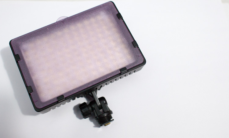
    • An LED light. The light used here is a Neewer CN-126 LED Video Light which was bought on Amazon for under $ 35.
    • A DLSR – Canon, Sony, or any other brand is suitable. I used a Canon 5D Mark II.
    • A tripod or stable surface.

    Direct light

    Let’s start with the easiest setup: Placing your LED light directly on top of your camera, or on a light stand directly in front of your subject, may seem fairly basic. On its own, it can create a standard, flatly, lit image, which may not seem very exciting to your viewer. However, placing an item that has an interesting pattern or shape directly between your light and your subject can give a unique and creative result.

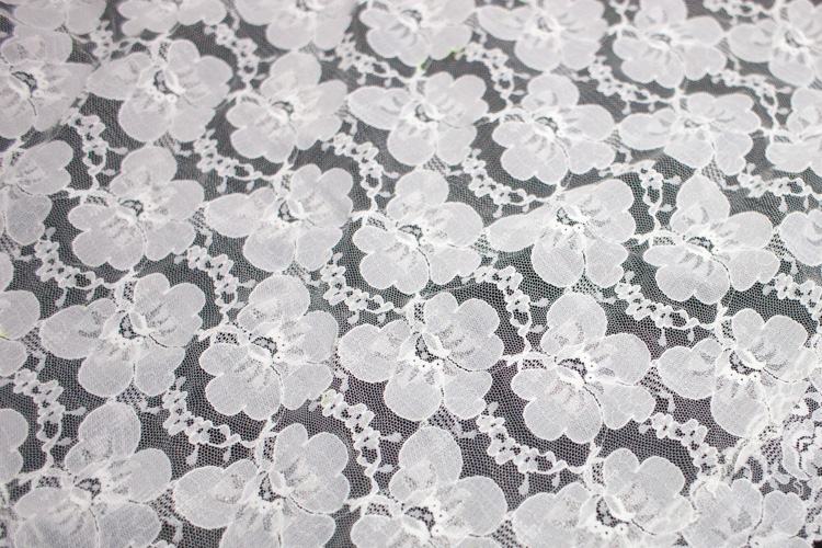
    You can, for example, place a lace tablecloth between your LED light and your model/subject. Playing around with the fabric’s distance from the light, causes the pattern’s shadow to change size, and sometimes even shape. Adjust the distance and placement of your fabric (or other item) until you find a combination that works for you.

    DL image 1

    DL image 2

    DL image 3

    For the image above, I used my 50mm lens with an ISO of 2000, and my exposure set manually with shutter speed at 1/50th and aperture at f/1.4. My LED light was adjusted to medium brightness.

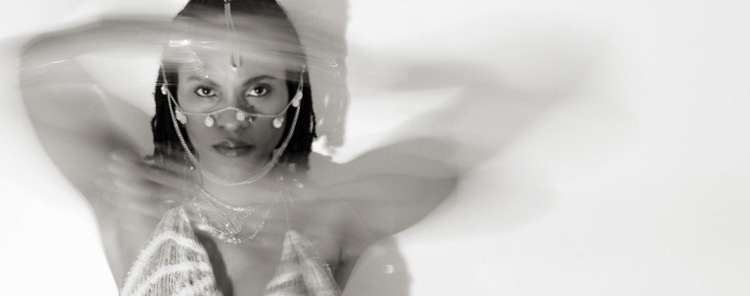
    You can also use movement to add interest to your image as shown below. A slow shutter speed along with quick movements can make your images a real conversation piece. Try experimenting with moving your body, or an object like a colourful scarf or umbrella in your image.

    DL image 4

    Side light

    Taking your LED off-camera, and placing it at an angle to your subject is another easy way to create a beautiful image with this simple setup. Keep your LED light setting between low and medium, and angle it at roughly 45 degrees from your subject, can give a nice soft light cascade across your image.

    SL image 1

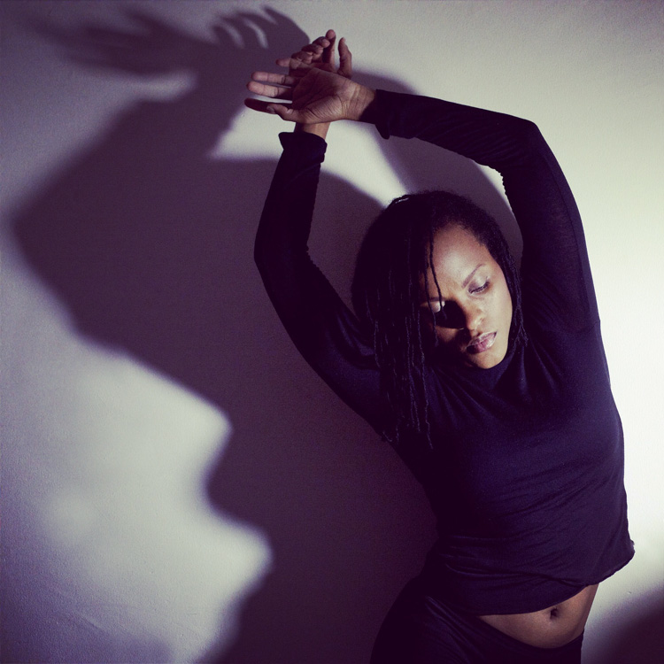
    If you try placing your LED light directly to the right, or left, of your subject, you will get a pretty cool effect as well. This placement creates an interesting shape in the natural shadow your subject makes. In the image below, the LED is propped up at eye level, on a bookshelf to my left. The angle of the light, coupled with a delicate pose, created an image that was both compelling, and visually interesting. Camera settings for this image were ISO 1600, f/3.2 and 1/160th of a second with a 50mm lens.

    SL image 2

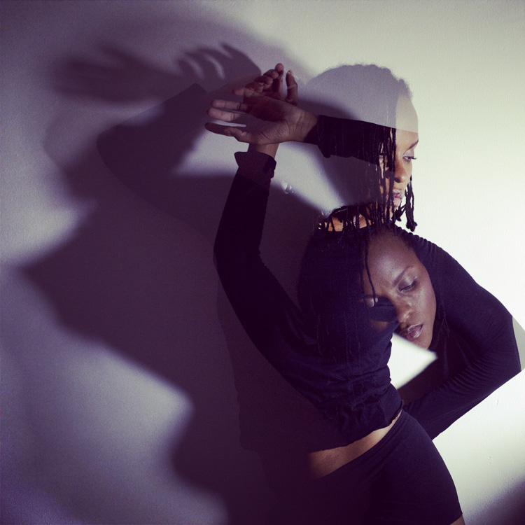
    Playing around with overlays and textures in Photoshop can further enhance your photo.

    SL image 3

    Backlight and overhead light

    For small objects you can do a simple backlight setup, using your LED light. If you place a sheet of white letter sized printing paper directly over your LED light, and place your subject directly on top of it, the result is pretty interesting. When using this method try to choose a subject that you think would have an interesting silhouette. You can also try items that are slightly translucent and may possibly glow when back lit. Try capturing your final image by shooting from an overhead angle, but don’t be afraid to experiment with other camera positions as well.

    BL image 1

    BL image 2

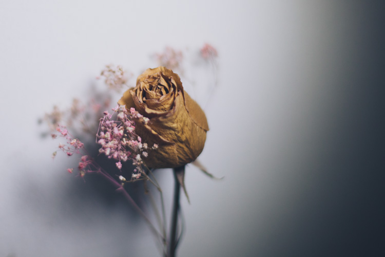
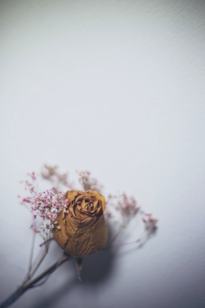
    Interesting images can also be created by putting your LED light directly above your subject. In the first image below, the light was angled slightly above the rose. This created a nice, softly angled, light effect that gave the rose a different dimension.

    OL image 1

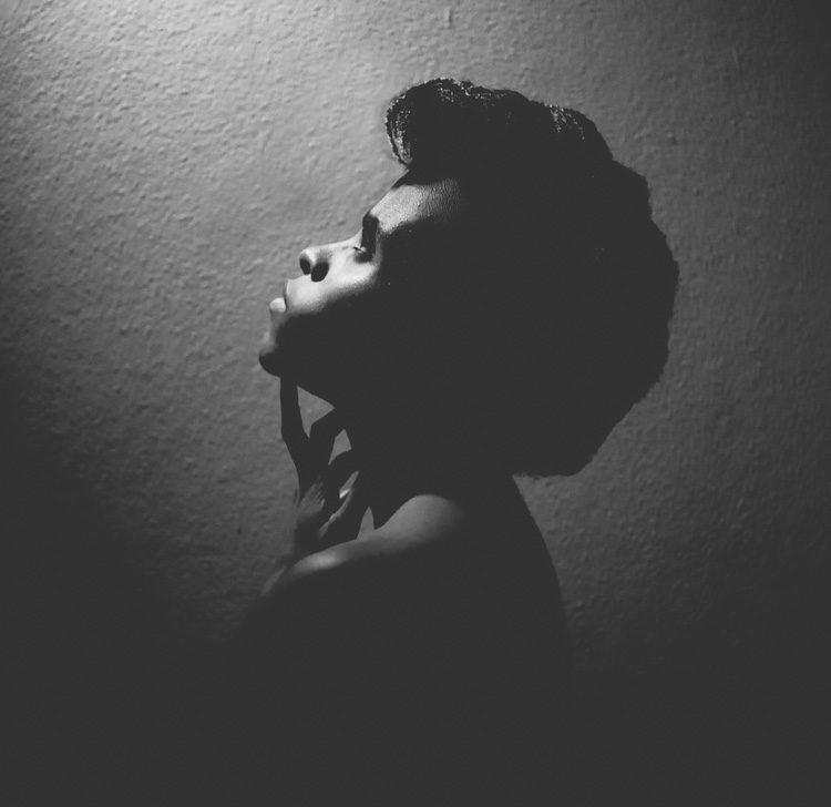
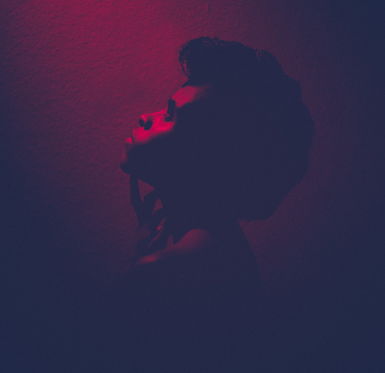
    Coupling the overhead LED placement with interesting poses gives really striking results. Posing your subject with their face turned upward, in the direction of the light, for example, creates some really nice shadows along the contours of the face. Some creative editing in Photoshop resulted in these final images.

    OL image 2

    OL image 3

    With this simple tool and a little imagination, you can create dynamic, visually appealing images for your portfolio. The key here is to experiment, play and have fun.

    Let me know other creative ways you have used an LED light to add interest to your photography in the comments below.

    googletag.cmd.push(function() {
    tablet_slots.push( googletag.defineSlot( “/1005424/_dPSv4_tab-all-article-bottom_(300×250)”, [300, 250], “pb-ad-78623” ).addService( googletag.pubads() ) ); } );

    googletag.cmd.push(function() {
    mobile_slots.push( googletag.defineSlot( “/1005424/_dPSv4_mob-all-article-bottom_(300×250)”, [300, 250], “pb-ad-78158” ).addService( googletag.pubads() ) ); } );

    The post How to Create Dynamic Images with an LED as Your Only Light Source by Tricia Bent appeared first on Digital Photography School.


    Digital Photography School

  • Valentine Gifts Your Sweetie (or Self) Will Love

    Express your love of photography and of that special someone in your life!

    Even if that someone is yourself, we’ve got you covered.

    From phoneography gizmos for that special someone who loves their phone almost as much as they love you, to lens shaped shot glasses for all those “just friends” out there.

    Find your relationship status below and the perfect gifts to accompany it.

    (…)
    Read the rest of Valentine Gifts Your Sweetie (or Self) Will Love (0 words)


    © laurel for Photojojo, 2016. |
    Permalink |
    No comment |
    Add to
    del.icio.us

    Post tags:


    Photojojo

  • Time Capsule Apartments: 10 Perfectly Preserved Interiors

    [ By Steph in Culture & History & Travel. ]

    time capsule chicago

    Never-updated interiors may be considered ‘dated’ within a decade or two of being in style, but give them some more time and they become vintage time capsules capturing the essence of their particular era, from swinging ’70s penthouses and pristine ’60s kitchens to luxurious Parisian apartments abandoned during World War II. Frozen in time, some of these interiors lay abandoned for decades before being rediscovered, while others have finally been sold after never being updated by their elderly original owners.

    Chicago Condo Untouched Since the ‘70s
    time capsule chicago 2

    time capsule chicago 3

    time capsule chicago 4

    time capsule chicago 5

    time capsule chicago 6

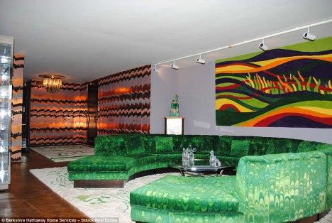
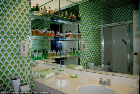
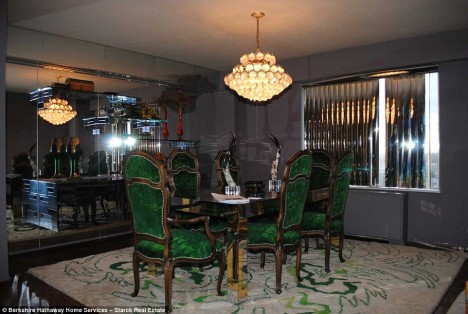
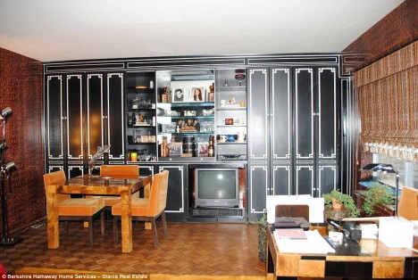
    Untouched for decades, a swingin’ 70s penthouse in Chicago’s Winston Towers condo recently went up for sale for just $ 158,000, with the original furniture, decor and even bottles of perfume on the bathroom shelves still intact. The 1,877-square-foot three-bedroom condo would have been considered garishly dated in the ‘80s, but over forty years after it was furnished and decorated, it’s like a living snapshot of the tastes that were popular at the time and has big appeal for vintage enthusiasts.

    Paris Apartment Untouched for 70 Years
    time capsule apartment paris

    time capsule paris 2

    time capsule paris 3

    time capsule paris 4

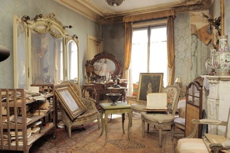
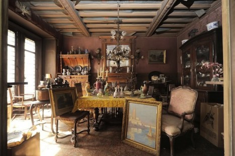
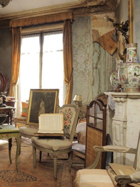
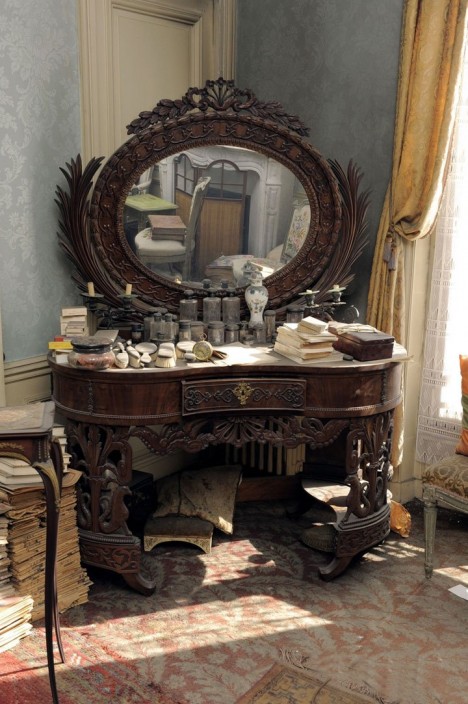
    Thanks to a wealthy estate that paid its bills without checking on anything too carefully, an apartment in Paris was left isolated for 70 years after its owner fled the city during World War II. The interiors are exactly as she left them, full of vintage Parisian treasures, including a 19th century painting by celebrated Italian artist Giovanni Boldini of the owner’s grandmother, actress Marthe de Florian. The time capsule was discovered after the woman’s heirs decided to take an inventory of her possessions.

    Scott’s Hut & Shackleton’s Hut, Antarctica
    time capsule scotts hut

    time capsule scotts hut 2

    time capsule scotts hut 3

    time capsule shackleton's hut

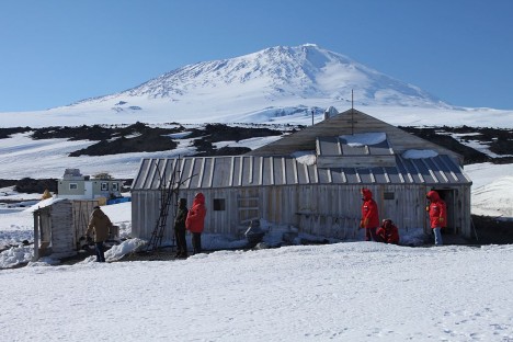
    100 years after explorers built their own wooden shacks on the freezing, windy, desolate continent of Antarctica, the structures are exactly as they left them. British adventurers Ernest Shackleton and Robert Falcon Scott and their crews created the dwellings and stocked them with whiskey and brandy, which can still be seen on the shelves and tables today. It’s a wonder that the shacks – made to be temporary at the time – are still standing, but conservators have restored the landmarks to eliminate damage from decades of water seepage, age and abandonment. The extreme cold preserved artifacts like newspapers, scientific equipment and cans of food.

    Garage Full of ‘Brand-New’ ‘60s Cars
    time capsule car warehouse

    time capsule car warehouse 2

    time capsule car warehouse 3

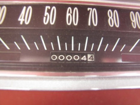
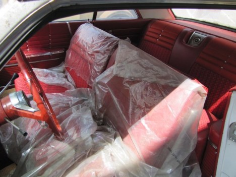
    Imagine opening an old, seemingly forgotten garage to discover a treasure trove of ‘50s and 60’s cars in near-perfect condition, some of them driven less than 10 miles. Long time owners of a dealership in Pierce, Nebraska, a couple who are now in their nineties had been storing the vehicles for decades, and finally decided to liquidate their inventory in 2013. The collection includes Impalas, Chevelles and a 1956 Chevrolet Cameo Pickup. All were ultimately auctioned off to the tune of $ 2.8 million.

    Next Page – Click Below to Read More:
    Time Capsule Apartments 10 Perfectly Preserved Interiors

    Share on Facebook


    [ By Steph in Culture & History & Travel. ]

    [ WebUrbanist | Archives | Galleries | Privacy | TOS ]


    WebUrbanist

  • Design, looks and desire: Olympus does it again

    You really can’t tell whether a camera is any good just by looking at it. Some people do indeed think that they can, but they will be people who admit quite openly that they know nothing about cameras. To those unfamiliar with the market, and the reasons we need different body shapes, some cameras will simply look more ‘professional’ than others. And bigger cameras will inevitably be considered much more serious than those whose designers have gone to great lengths to make compact.

    Colorful cameras are obviously less credible than ones that have silver bits on them, and infinitely less credible again than ones that come cloaked entirely in matte black. Chrome and silver can make some believe the subject of their gaze is antique, and those that have no fancy knobs or shiny bits may be considered simply old-fashioned. 

    Our use of Leica rangefinders when I worked as a cruise ship photographer prompted more than one jolly passenger to remark that there seemed to be no relationship between the extortionate prices the company charged for pictures and the state of the old-fashioned equipment we were forced to use. The passengers believed that our featureless, sparkle-less, prism-less, block-shaped cameras, that we had to focus ourselves, were relics of a former era. That indeed we were using M4s in 1991 instead of the M6s of the day is neither here nor there, as they essentially both look as ancient as each other. When we explained that these cameras cost of lot of money the response was generally that perhaps we should take our mother shopping with us to avoid being ripped-off. 

    It’s expected that the uninitiated will make quick decisions about a camera just by the way it looks, and in many cases to base a buying decision on its visual credentials. Serious enthusiasts and professional photographers would never do that of course. That’s why all camera brands design their cameras to look plain and unexciting. 

    I’m just looking, dear

    As much as the more sensible of us declare that all their camera equipment purchases are grounded in logic, there are very few of us that cannot be influenced by the way a camera looks. That doesn’t mean we have to buy the best looking model, but I think that most of us will at least admire the style of the new Olympus PEN-F.

    Those milled dials on the top plate and the neat flared appendage on the port-side forward facing are undeniably attractive. They may even create a twitching credit card in the pockets of those who had no prior idea they were in the market for a new camera. The clunky metallic dials may not represent the practicality of some other ways of working, but they certainly make for a more appetizing visual than a collection of black finger wheels ever could.

    Olympus’ repurposing of the film rewind post, with its gnarled head, to become the on/off switch, is a clever piece of work that lends the whole design a convincing impression of both heritage and originality, rather than looking like just another retro reproduction. 

    Creative license

    It is ironic perhaps that the design of 2016’s PEN-F has very little in common with the original model. That it has a lens and is available with a chrome or black top are about the only similarities. In my opinion, the PEN-F of 1963 was actually less than absolutely gorgeous unless decorated with ‘Hollywood’ lighting, used in a classy portrait or featured in a period drama.

    ‘the new PEN-F is left looking more like the love-child of the Leica lll than it does anything from the Olympus archive of the early 1960s’

    The rather-too-long top plate of the original makes the lens appear off-balanced compared to the central mount and active top plate of the 2016 model. The original also had no dials on the top plate and the action required to rewind a film was achieved with a crank handle rather than a gnarl-headed post. Olympus generally didn’t use big top-plate shutter speed dials until the OM series of 35mm SLRs, and it ran out of the gnarl-headed rewind posts after cameras like the 1948 35 1 – the first 35mm camera to be sold in Japan. 

    So in the new PEN-F what we are looking at is some historical fiction rather than a recreation. But that’s OK, history often looks much better with a heavy dose of make-believe – just ask Asterix and Obelix. 

    While the link between the new and old PEN-F models might not be as strong as it is between the original Leica MP and the ‘modern’ MP, I don’t think anyone is going to lose any sleep over it. The point is that the new model is very good looking, and good looking gets attention from photographers and ultimately helps to sell cameras. 

    Looks versus logic

    The Fujifilm X100 – massively popular even before it had been tested, and fortunately just as popular afterwards!

    Fujifilm might have a fantastic X-Trans sensor in its X-series cameras, but I expect a good many of those X-T1 and X-Pro1 bodies sold because they look so cool. I know there were enormous back orders for the X100 even before it had been tested by anyone, which demonstrates that plenty of people were prepared to put their money down even before they knew if the camera was any good.

    The strength of the X series design has even outweighed the widely acknowledged sluggish AF performance of some of the models, and we hear proud owners making excuses as though for a fondly looked on three-legged dog. ‘Yeah, I know the AF isn’t that great, but it’s such a beautiful camera. I love using it.’ Like the Sirens of Greek mythology, the intoxicating curves of a well-toned camera body can prove a powerful draw to a normally logical person. 

    I suppose a company’s heritage can reduce the risk of a good looking camera performing badly when you buy before you try, and it’s reasonable enough to expect that the PEN-F will operate as well as the OM-D bodies and the top-tier of the current PENs (and our initial impressions have been positive). More importantly perhaps there is no reason for us to think that it will NOT perform at least just as well. 

    A wolf in wolf’s clothing

    It will be interesting to see how sales of the PEN-F compare with those of Panasonic’s Lumix DMC-GX8. It is after all very similar in terms of key specification – probably the same sensor, enhanced touch functions including touch-pad AF, the same viewfinder position (minus the articulation) and the same lens range to choose from. In fact, the bodies are so astonishingly similar that the PEN-F looks more like a stylish adaptation, or a flattering imitator, than a competitor – but to my eye at least the PEN, with its contours, layers and more rounded feel takes the beauty pageant rosette. The designers have done a great job. 

    A camera has to perform, of course, and it won’t sell well otherwise, but an eye-catching design that appeals to the right audience is an important differentiator and often what gets the product noticed, mentioned in the press, remembered by the public and purchased in a crowded market. 

    With all things being mostly equal – except that Olympus has more heritage in the camera market, and Panasonic has 4K and a head-start – I suspect that it will be on looks that most people make the choice at the camera counter between the GX8 and PEN-F.

    Not for the first time

    The O-Product, from 1988

    Olympus has had quite a history of designing original and cool-looking cameras, and I suspect its success over the years has been as much down to the person wielding the drafting pencils as it has the people with the spanners and screw-drivers. Outstanding creations from the archive include the O-Product, the Ecru, the delightful XA and the Mju and Mju-mini digital cameras. My teenage son bought a Trip 35 from an online store that restores and re-covers them, and he thinks it is one of the coolest cameras ever made – to the best of his knowledge, of course. The model he has was likely created 20 years before he was – a better example of enduring design would be hard to find. 

    The Olympus Trip 35 was in production for twenty years, and sold 10 million units from its introduction in 1968 The XA series was popular for its looks and bolt-on flash unit as well as for its sophisticated controls. Launched in 1979 the XA4 was the last model, going on sale from 1985

    Is it OK to buy and love a camera because of the way it looks? Yes and no. If you buy only because of the way it looks you are about to risk your money, but if style and grace sway you from one good product to another that’s probably alright. I guess it is a question of why we take pictures and why we are into photography. Some people like their cameras more than they like taking pictures or looking at the pictures they take, while for some the end result is the be-all and end-all of the process and anything beyond pure functionality is extraneous.

    Most people can find a balance between the two – we buy the best we can, and can give ourselves permission to enjoy the way our equipment looks. Photographers are supposed to be creative people, and creative people like looking at and using nice things. We can choose to remember that there are many reasons for getting into photography and many for continuing to take pictures, but for most of us it is supposed to be enjoyable. We don’t all have to be seduced, but we can allow ourselves to admire some beautiful design, whether for you that’s the PEN-F or a Canon Rebel. Either way, Olympus is certainly going to cause a stir with this new design, just as it has done so many times before. 

    Articles: Digital Photography Review (dpreview.com)

  • How Auto White Balance Can Hinder Your Photography

    You’ve likely heard that auto settings like auto exposure and autofocus aren’t fail-proof. They’re strong features, no doubt, and most photographers take advantage of them at least some, if not all, of the time. But the key to success with auto-anything is to make it work for you; that is, to understand its limitations, and know when it’s not going to give you the best results.

    If you’ve been a photographer for very long, you’ve likely run into the situation in which a very bright scene, a snowy landscape, for example, caused your camera’s auto exposure to significantly underexpose the shot, giving you murky gray snow instead of brilliant white. Likewise, a shot that was naturally dark, like a portrait of a black dog, might have been recorded too light, also resulting in unwanted gray or brown.

    In both of these cases, the auto exposure was tricked by the scene’s overall light or dark tone, and attempted to compensate for this problem by doing exactly what it’s designed to do: choose an exposure that will average out the tones in the scene. For many photographs, auto exposure does a fine job of selecting a correct exposure, for scenes when average is correct. The trouble is when a situation is not average. In those cases, it’s up to you, the photographer, to make the necessary adjustments.

    DJ ATM7 40 2

    DJ ATM7 40

    The exact same thing happens with your camera’s Auto White Balance, only in this case, the issue is not with light intensity, but with color.

    The Color of Light

    Not all light is the same; different types of light have different colors built-in to them. Daylight is basically white, while light from a sunrise or sunset has a red, orange, or pink cast to it (caused by the light being bent through deeper layers of atmosphere). Shade is usually a bit blue, as is snow, as both of these situations are receiving reflected blue light from the sky. Standard incandescent (tungsten) lightbulbs give off a strong yellow cast, while fluorescent lights, long the bane of photographers, can be anywhere from blue, to purple, to green.

    Your camera needs to know the color of the light so that it can accurately record the rest of the colors in the scene. With film, this White Balance” is built into the product (i.e., Daylight film and Tungsten film), but with digital cameras, we have the ability to change the White Balance on the fly. If you shoot a room illuminated only by tungsten light with your camera’s Daylight White Balance setting, the resulting photo will show incorrect colors that are skewed towards yellow (try it and see for yourself). You could also shoot an outdoor natural-light photo with the tungsten setting and get some simply awful blue images. But when these situations are shot with the correct White Balance selected, the colors in the photos should be spot-on accurate.

    The Auto White Balance Blues

    Your camera likely offers a handful of White Balance choices, settings like: Daylight, Cloudy, Shade, Flash, Tungsten, and Fluorescent. There is also, surprise, an Auto choice.

    Many beginning photographers tend to set their White Balance selection to Auto and leave it there. This mistake can be the cause of quite a few photographic problems. Like your auto exposure, Auto White Balance is pretty good. Especially when dealing with artificial light sources, the results of Auto can be very satisfactory. The trouble arises when a color cast is desirable, or when shooting a subject that is mostly one color.

    DJ CWG 3 11 E 2

    DJ CWG 3 11 E

    A great example is a classic sunrise or sunset scene. In this case, there can be quite a lot of red or orange light illuminating the scene. If you choose Auto White Balance for this shot, the camera will evaluate the scene and think, “Hey, something’s wrong! There’s a lot of red here! Better back off on the reds.” The problem is, you do NOT want your camera to correct for those colors. In this case, having a lot of red in the scene is correct according to the subject and your intention. Auto White Balance will probably deliver a sunset that has a much more bluish feel, not as dramatic, and not what the scene actually looked like.

    Another way Auto White Balance can be fooled is with objects that are mostly one color. A good example is flower photography. Suppose you’re photographing a large pink flower that fills the frame almost entirely. Auto White Balance will look at this shot and think, “Whoa, too much pink! Gotta back off on that.” Auto White Balance has no way of knowing if subject is truly that color, or if it’s the lighting. The only thing it can do is try to deliver what it perceives to be an average color balance for the image. In this case, the flower in the photo won’t appear the correct, vibrant pink that it was.

    DJ 776 9 2

    DJ 776 9

    Auto White Balance can even cause slight inaccuracies to everyday outdoor photos, often resulting in shots with just a bit too much purple than they should have (the result of Auto trying to over-compensate for green vegetation).

    Use Presets!

    So what’s the solution? Use those White Balance presets! Many photographers, including me, use the Daylight setting a great deal of the time, to help ensure accurate colors during all times of the day and in many weather conditions. The Shade and Flash presets can also be quite useful. If you’re shooting JPEG files, selecting the correct White Balance at the time of shooting is critical. But even if you shoot RAW files and have the (very useful) ability to adjust your White Balance in post-production, choosing the correct White Balance preset at the time of shooting can start your images off right, and save you plenty of time, and who doesn’t like that?

    Do you have any other stories or examples where Auto White Balance did you wrong? Please share in the comment below.

    googletag.cmd.push(function() {
    tablet_slots.push( googletag.defineSlot( “/1005424/_dPSv4_tab-all-article-bottom_(300×250)”, [300, 250], “pb-ad-78623” ).addService( googletag.pubads() ) ); } );

    googletag.cmd.push(function() {
    mobile_slots.push( googletag.defineSlot( “/1005424/_dPSv4_mob-all-article-bottom_(300×250)”, [300, 250], “pb-ad-78158” ).addService( googletag.pubads() ) ); } );

    The post How Auto White Balance Can Hinder Your Photography by Daniel Johnson appeared first on Digital Photography School.


    Digital Photography School

  • Art of Photography: NYC Blizzard Photo Looks Like a Painting

    [ By WebUrbanist in Art & Photography & Video. ]

    blizzard photo painting art

    As roads closed and kids turned staircases into sledding hills and snowboarding slopes across East Coast cities during Jonas, one photographer stopped to shoot a few pictures that turned out looking like modern-day impressionist paintings.

    winter storm photo nyc

    Photographer Michele Palazzo managed to capture not only the swirling snow around the structure, but an installation of snowflakes inside mirroring the exterior weather. Despite Sprint and Apple logos, hallmarks of the present age, there is something timeless about the composition.

    winter storm photos

    According to Colossal, “the snowflakes you see in the window of the Flatiron are part of a paper origami installation by Chelsea Hrynick Browne in the Prow Artspace. The cloudy atmosphere and gusty winds creates patterns that appear uncannily like brush strokes. You can see more of Palazzo’s shots from the morning of January 23rd on EyeEm.” (See more storm photos, thumbnails above, over at the EyeEm Blog).

    Share on Facebook


    [ By WebUrbanist in Art & Photography & Video. ]

    [ WebUrbanist | Archives | Galleries | Privacy | TOS ]


    WebUrbanist

  • How to Photograph Reflective Surfaces

    Photographing reflective surfaces and objects is usually quite challenging, and can easily turn the work of the photographer into a frustrating task.

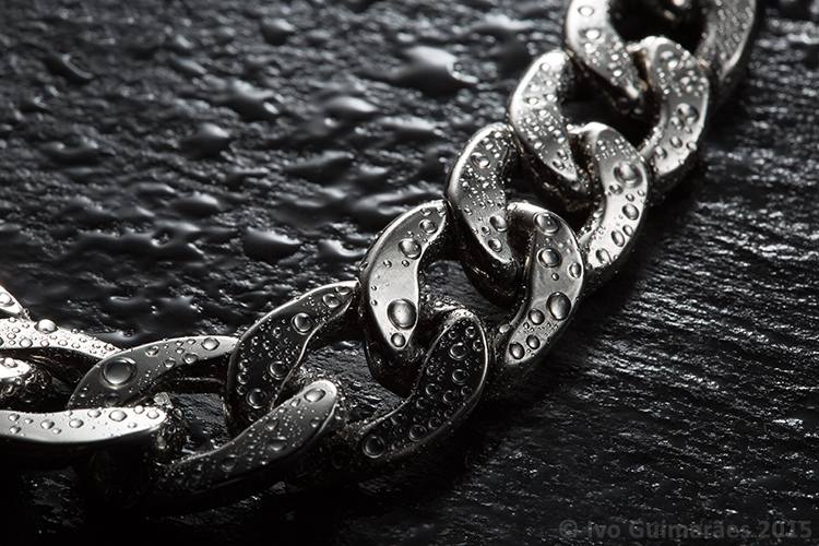
    Reflections are a hard to tame beast, but it gets easier to control if you know the rules. So, in this article I will show you how to create a high impact image with controlled reflections, like the one below, with a really simple, but highly effective, technique and using equipment you most certainly already own.

    01

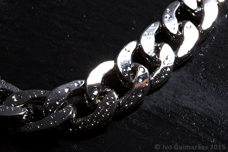
    A reflective surface acts like a mirror reflecting light, so if the light source of your image comes from the same direction as the camera, it causes specular highlights resulting in blown out spots without texture, and an overall poor looking image like the following one photographed with the flash mounted on camera.

    02

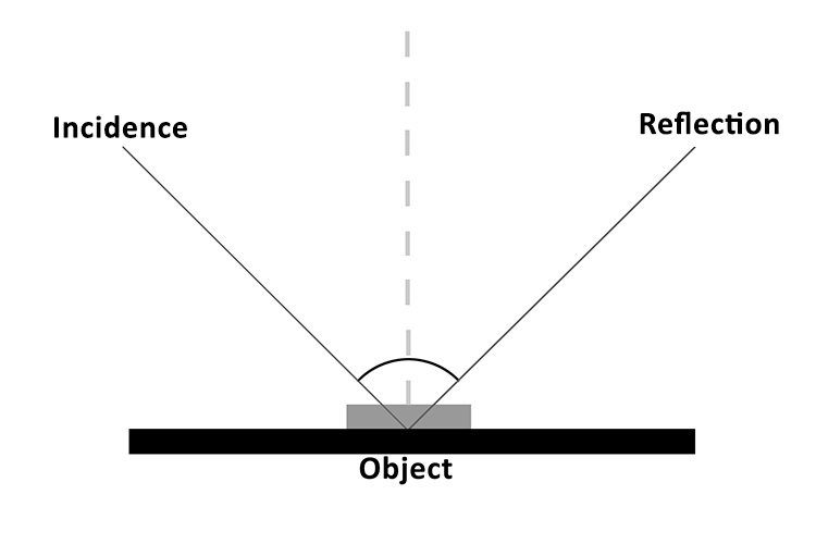
    It all comes down to the basic principles of light and the way it behaves, which is in fact very predictable. The law of reflection explains this phenomenon. If you project a ray of light on a flat reflective surface like a mirror, then the angle of incidence equals de angle of reflection, like the following diagram illustrates:

    03

    So, physics apart, what this really means is that if you are trying to photograph a reflective surface you should never light it from the same angle as the camera, otherwise you will only get light bouncing straight back at you (depending on the angle of the object).

    The trick here is to use a big light source, and position it in the same opposite angle of your camera, in relation to the photographed object (behind it).

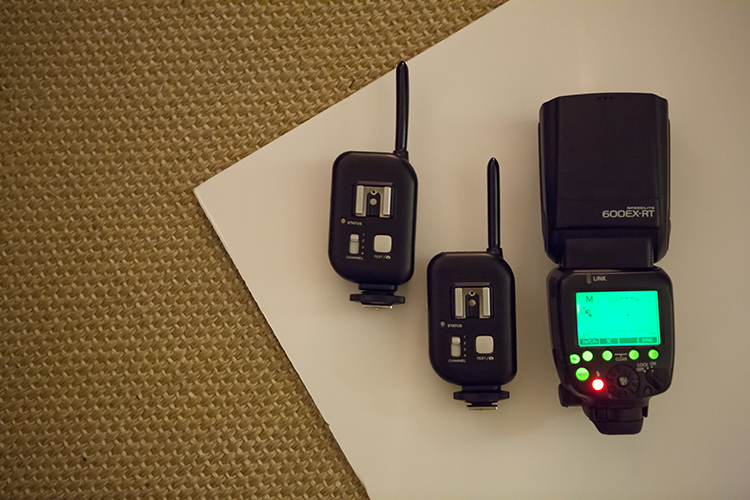
    You can do this with a studio flash head and a big softbox, but there is a much simpler and cheaper way of doing it. You just need some white cardboard, a flash, and trigger system to fire it off-camera.

    04

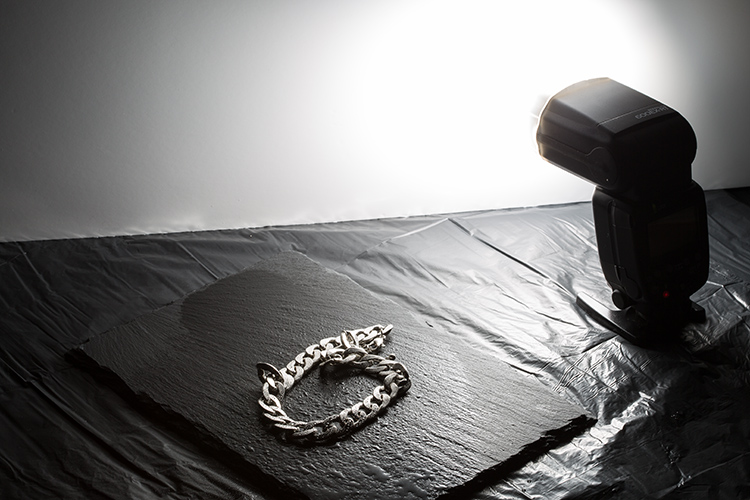
    Here is how you can use this lighting setup:

    05

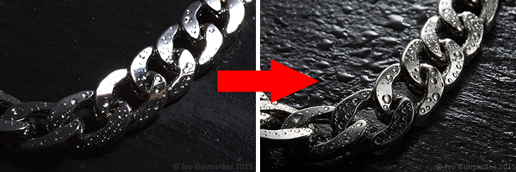
    The light from the flash bounced off the cardboard is a much bigger light source, allowing you to control the reflections on your image, creating gradients that shape the object, and avoiding specular highlights. Notice it also creates texture on the rock background.

    06

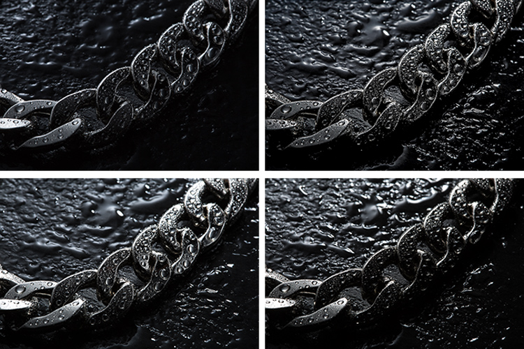
    This simple technique allows you to create a lot of different lighting effects in your image, depending how you position your flash, and angle the cardboard in relation to the photographed object, which also creates texture on the background stone and water drops.

    Here are some examples of light variations on this imag,e with just some small adjustments to the cardboard positioning.

    07

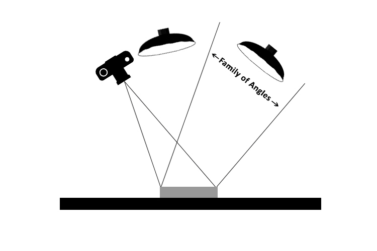
    Knowing that light rays will always bounce from a reflective surface, at the same angle at that at which they strike it, makes it possible to determine the best positioning for the camera and the light source, taking into consideration the family of angles as you can see in the next diagram.

    08

    The light positioned within the family of angles will produce a direct reflection and the light outside of the family of angles will not light a mirror-like subject at all, from the camera’s point of view.

    Even though the reflections on these images are not direct, but rather diffused reflections (which makes difficult to calculate the light angle as it is being bounced and dispersed in different directions) the family of angles can give you a good estimate of how to position your light in relation to the camera angle, in order to control the reflections in your image.

    All this technical information about light physics may seem overwhelming at first, but it will all make sense when you start playing around with it. So, give it at try, I’m sure you will get great images. Please share any questions and your images of reflective objects in the comments section below.

    googletag.cmd.push(function() {
    tablet_slots.push( googletag.defineSlot( “/1005424/_dPSv4_tab-all-article-bottom_(300×250)”, [300, 250], “pb-ad-78623” ).addService( googletag.pubads() ) ); } );

    googletag.cmd.push(function() {
    mobile_slots.push( googletag.defineSlot( “/1005424/_dPSv4_mob-all-article-bottom_(300×250)”, [300, 250], “pb-ad-78158” ).addService( googletag.pubads() ) ); } );

    The post How to Photograph Reflective Surfaces by Ivo Guimaraes appeared first on Digital Photography School.


    Digital Photography School