Blog

  • Pier Park: Undulating Landscape to Hover Over Hudson River in NYC

    nyc floating park

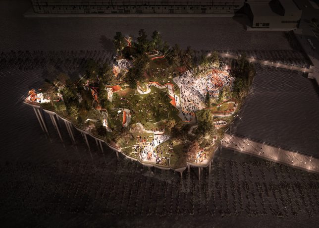
    Following the success of the hovering High Line, an elevated park set on re-purposed rail tracks, New York City aims to pull off another park space in an unused space, this time at Pier 55 floating along the waterfront near the Chelsea endpoint of the High Line.

    pier park

    pier gardens

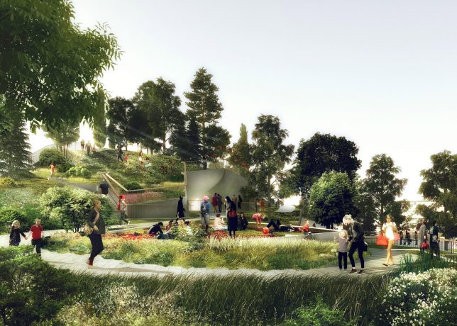
    Designed by British architect Thomas Heatherwick, also behind a garden bridge project for London, the park will be supported on pier-like columns that branch out to hold up the green space above. This new park is as spread out and open as the High Line is linear and streamline, also offering experiences at different elevations compared to its relatively flat cousin.

    pier wandering

    pier pressure

    “The pier will be a place of discovery, where visitors can wander and wonder, finding something new around every corner: places to lounge, eat lunch, or just lie in the grass,” said Heatherwick Studio. With its open spaces and various levels, the park is well-suited to hosting events and performances in the open air.

    pier deck

    pier space

    pier side

    The project is being funded by Barry Diller and Diane Von Furstenberg, who have pledged personal money and set up a non-profit to fund it. After a series of lawsuits and delays, the architects have now been given the go-ahead by the US Army Corps of Engineers and Hudson River Park Trust.


    WebUrbanist

  • 5 Tips to Improve Your Background and Make the Subject Stand Out More

    If you are looking for a quick, simple, hassle-free way to make your images pop more and stand out, this is the article for you!

    You don’t have to be a Photoshop genius – in fact, this may help you spend less time in Photoshop. These simple tips can elevate the photos you take. If there was one element in many images I see that could greatly improve it, it would have to be this: backgrounds. An ugly or distracting background can easily reduce the impact of even the best subjects. A clean, un-distracting background will help improve your images and make your subjects stand out even more. The best past is, you wont even have to spend a cent to do this.

    Even though the background here works quite well with the subjects, using a wider aperture has ensured that the subjects do not get lost, but stand out. © Daniel Smith / Getty Images.

    Even though the background here works quite well with the subjects, using a wider aperture has ensured that the subjects do not get lost, but stand out. © Daniel Smith / Getty Images.

    All too often we overlook the background and what is in it. You swear that those power lines weren’t in the viewfinder when you took that picture, and that post, where did that post come from?! That surely wasn’t protruding from your partner’s head when you clicked the shutter button. This occurs for a number of reasons:

    • You’re too focussed on the subject alone that it’s almost like you have blinders on and the subject is all you can see.
    • You may get too obsessed with the camera settings and making sure you nail the photo that you miss all those little annoying things that pop in to the frame.
    • Or you are simply unaware of the importance that a good background can make.

    So how can you improve your backgrounds, or at the very least, reduce the negative impact they can have on your images? By following these simple strategies, you’ll be well on your way to a better background and improving your images.

    #1 – Location, Location, Location

    If you have the option, do try and choose a location that has a nice background – that will make it as easy as it can get. What defines a nice background will depend on your subject, but as a very general guide, look for a spot that has a uniform look to it. Brick walls, corrugated iron roller doors, metal cladding on walls, or even something as simple as a painted white wall, can all make for a nice clean background. Ultimately, what you are not looking for is something that has a lot of other elements in the frame, that do not add to your subject.

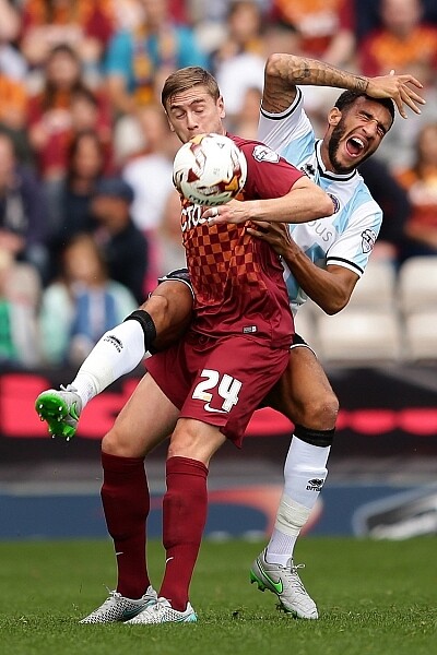
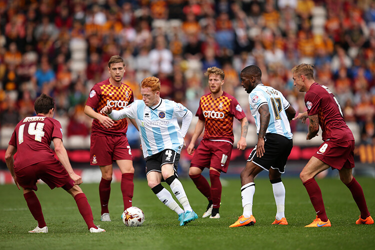
    If you cannot find a location that has a clean background, looking for somewhere where the background complements – or works with – your subject will also work, too. An example of this would be with sport photography. You simply cannot decide where the game will be played, so you have to work with what you have. In this situation, think about what would look good as a background. Would a stand full of supporters look better than a car park full of cars or a building site? I think it would. The stand full of supports, while not clean, works with your subjects and in fact, has more impact as the supporters add a nice element of atmosphere to the image.

    Cluttered BG 1

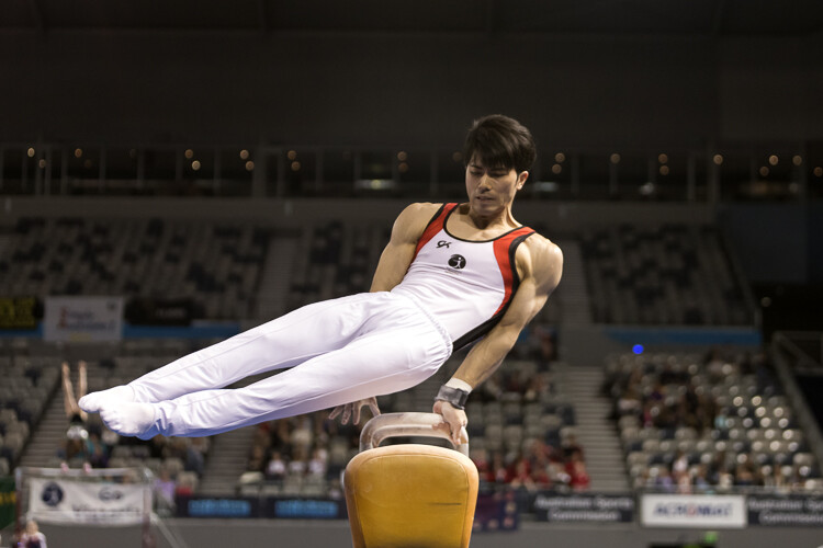
    Even though this image has the stadium in the background, it is a little cluttered. The seats are mostly empty, so it’s not really portraying any sense of atmosphere in the sport.

    Clean BG 5

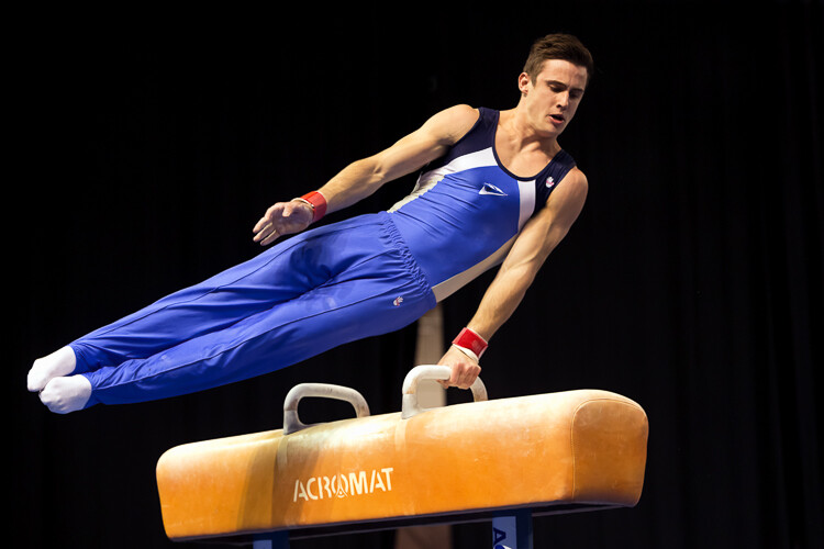
    By changing my position, I was able to use a the large black cloth in the background to make the athlete stand out much more. Nothing more than moving was required; much easier.

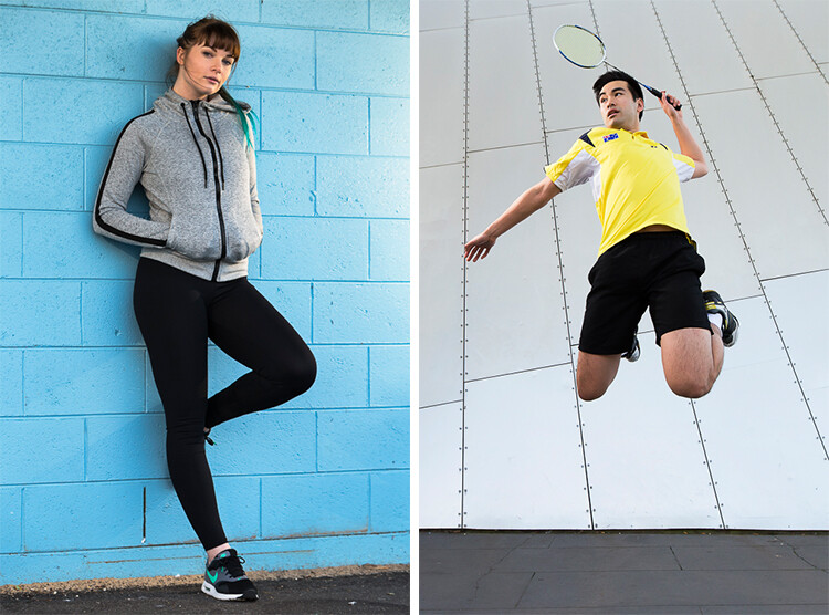
    Here, the backgrounds in these two images are quite plane. They help make the subjects the heroes of the images, as there is nothing else to compete with them.

    With this image, the stands in the background have much more people in them. This works nicely to complement the subjects which, in this case, are the players. © Daniel Smith / Getty Images.

    While this is a nice action frame, the background is not that fantastic. It’s in between areas of the different stands at this venue. It would look much better if it were against the full stadium, as in the previous image. © Daniel Smith / Getty Images.

    You’ve found your location, but a clean background just cannot be had. What do you do?

    #2 – It’s All About Perspective

    A good backgrounds can be anywhere, and it can change quite a lot depending on the angle at which you photograph your subject. You may be in a very busy space, but within that space will exist areas of calm and peace. By this I mean that your backgrounds can be clean; even when it just looks cluttered in all directions.

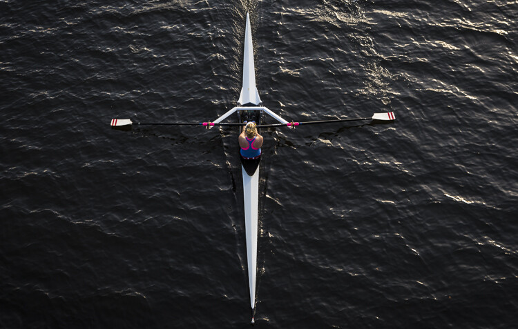
    When this happens, consider photographing from a different perspective. Photographing your subject from down low will make the sky your background. Conversely, if you’re looking down on your subject, whatever is below them will be the background. So if you cannot find an ideal background, don’t forget to look up and down – that’s where the best one may be hiding.

    Relevant BG 1

    This rower was photographed from a bridge, making the water the background. in this case, the background works quite well with the subject.

    Clean BG 7

    This time, I was photographing this plane landing. This meant that I would be looking up, and the sky became the background here. The complementary colour set of the blue sky and yellow light on the plane also help to make the subject stand out more.

    You may have the best background sorted. But it’s not always possible to be lucky enough to have that perfect background all the time. So what else can you do to help your subject?

    #3 – Camera Craft

    There will be times – more often than not – where you simply cannot win with your background. No matter which way you stand, you just can’t seem to find a nice clean backdrop. What now? Here’s where a little camera craft comes in to play and you have a couple of tricks up your sleeve with this.

    First point of call is aperture. You know that you can simply open your aperture up a little more, and give that background some nice bokeh (or blur) to reduce its impact. Even when you do have a nice complementary background, it’s still a good idea to use a wider aperture to blur it out a bit and make your subject stand out against it more.

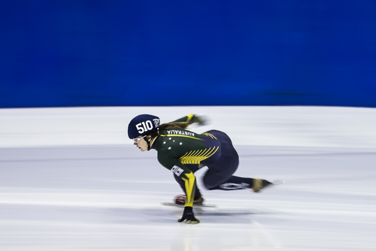
    What if you can’t open your aperture any further, though? There’s still hope. Our next strategy is to play with shutter speed and use a panning technique. This can help greatly in rendering a busy background into a nice blurry mess. It also helps to add a great sense of movement and action, as well as give a sense of excitement to an image. If you’re unsure about how to do panning, have a read of this article – it will help greatly. But in a nutshell, panning is the technique of using a slower shutter speed (usually around 1/60th or slower) while tracking a moving subject. The combination of a slow shutter speed, coupled with the panning action, will result in a nice motion blur affecting the background, and if done correctly, the subject will remain sharp.

    Cluttered BG 2

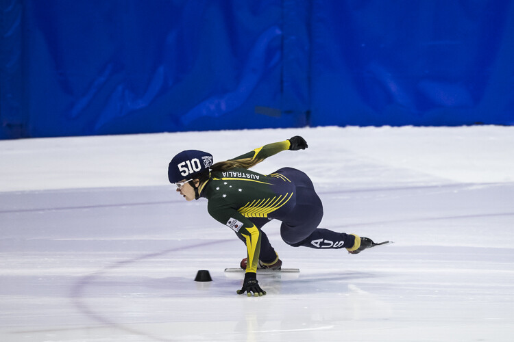
    This background is clean; there are no real distractions in it, but it could be improved upon.

    Clean BG 6

    Here’s a different frame but this time, a panning technique has been used to remove all the creases in the blue backdrop. This has made the background cleaner again, and the added motion blur gives a sense of speed which works well with the subject.

    Clean BG 8

    The use of a wide aperture here has dramatically blurred out the background making it much cleaner. The result is that the subject stands out much more. © Daniel Smith / Getty Images.

    #4 – Can You See the Light?

    Something that seems to always be overlooked in photography is light. This seems to me like quite a remarkable thing since without light, we don’t have much of a photo. But using light, and the contrast it can provide, is another way to reduce the appearance of a distracting background. With this strategy you need to look for a higher amount of contrast between your subject and the background; that is, you’re subject is (ideally) brighter than the background. By exposing for your subject (the brightest area) you effectively make shadowed areas in the frame darker, thereby affecting your background. This can be achieved with both natural light and flash.

    Contrast1

    In this image, the flower was in the daylight; whereas the background was in the shade. I exposed for the flower and this made the background darker.

    Again, the background here is much darker than the subject; helping to isolate the subject more. © Daniel Smith / Getty Images.

    Again, the background here is much darker than the subject; helping to isolate the subject more. © Daniel Smith / Getty Images.

    Clean BG 2 Clean BG 1

    These photographs were taken in an undercover car park. I used two flashes (both off-camera) as my only light source. This removed any ambient light affecting the image.

    #5 – The Final Stop

    You’ve done what you can with the background. You’ve tried everything, but your background still doesn’t want to play ball. There will be times when you simply cannot control any of the aspects that have been mentioned. Don’t worry – it isn’t uncommon. Now all you can do is hope that there is something that can be done later, and there is!

    If you’ve done everything you can to help improve your background and you’re still not winning, the last port of call is post-processing. You may be thinking, “Hold on, I’m not that great with selecting and masking in Photoshop yet.” but you needn’t worry. There is no selecting or masking with this one. (As a side note, if you intend on making a selection around your subject and replacing the background, you will need to photograph your subject accordingly to make this much easier and more natural).

    All you need do is crop your image. That’s it. Cropping is about all you can do now. By cropping, you are effectively removing as much of the background as possible without cropping into your subject. Don’t worry about how much you are cropping out – unless of course you intend on doing a large print. You’d be surprised at how much many photographers are willing to crop.

    Do you have any other tips for making the subject stand out, or improving the background? Please share your thoughts and images in the comments below.

    googletag.cmd.push(function() {
    tablet_slots.push( googletag.defineSlot( “/1005424/_dPSv4_tab-all-article-bottom_(300×250)”, [300, 250], “pb-ad-78623” ).addService( googletag.pubads() ) ); } );

    googletag.cmd.push(function() {
    mobile_slots.push( googletag.defineSlot( “/1005424/_dPSv4_mob-all-article-bottom_(300×250)”, [300, 250], “pb-ad-78158” ).addService( googletag.pubads() ) ); } );

    The post 5 Tips to Improve Your Background and Make the Subject Stand Out More by Daniel Smith appeared first on Digital Photography School.


    Digital Photography School

  • Fast Glass: Tips for Working With Wide Aperture Lenses

    As photographers, many of us become infatuated with new gear, such as a new flash, tripod, or lens. We scrimp and save our money, and go off to the camera store to purchase that new lens we’ve had our eye on, most times satisfied with whatever new piece of kit has found its way into our bag. Sometimes, though, it happens that for some reason that new gear we’ve spent our hard-earned money on doesn’t live up to our expectations.

    Shallow depth of field

    Fast lenses enable the photographer to use shallow depth of field creatively. A 24mm f/1.4 lens, shot at f/1.4 was used for this image.

    It may be that it was overhyped, or it doesn’t suit your workflow. There are occasions, however, when a piece of gear has a learning curve attached to it that needs to be solved before you can fully enjoy it. One such item that seems to have that learning curve attached, is a fast lens (one with large maximum aperture).

    At some point, we all begin dreaming of fast (large aperture) lenses. For the purpose of this article, I’m going to define fast lenses as ones with maximum apertures wider than f/4.

    Fast lenses are great for a lot of things, shooting in low light being one of the major advantages, because the wider aperture allows more light into the imaging sensor, which in turn allows you to use a faster shutter speed. This is why lenses like the 70-200mm f/2.8 are such a workhorse in a photojournalist’s camera bag. Another advantage to the wider aperture is the ability to create shallow depth of field in your image, which can make your subject really stand out from the background. The 85mm f/1.4 is one of my go-to lenses for almost any portrait situation for just that ability.

    Focus on the eye

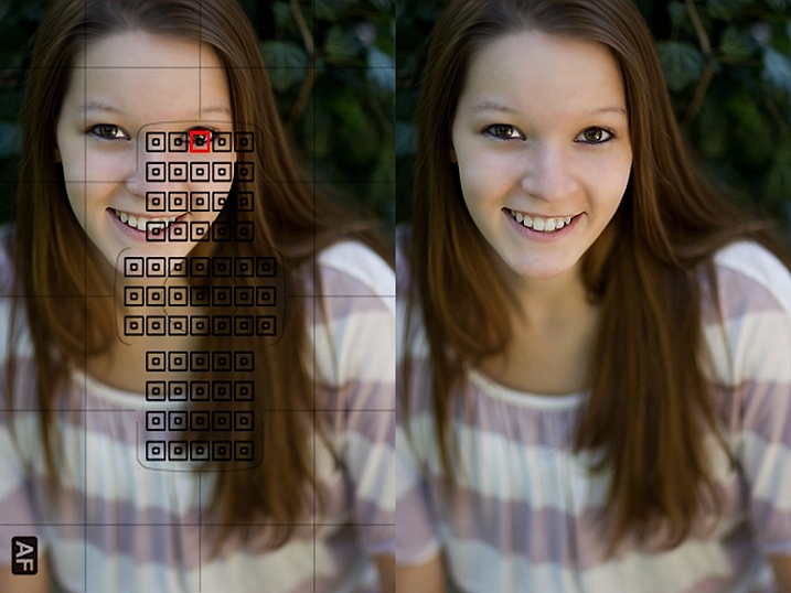
    When photographing portraits, focusing on the closest eye is ideal when using shallow depth of field.

    That all sounds great, right? But it’s that last point regarding shallow depth of field which seems to create the biggest problems for most photographers, who are new to using a fast lens. I often hear of photographers complaining about a lack of sharpness in their lenses, and more often than not, the issue crops up when the photographer is using a fast lens.

    It may be a portrait photographer trying to use an 85mm f/1.8 wide open, or someone doing street photography with a 35mm f/1.4, and for some reason there’s a lack of sharpness to the image that will invariably be blamed on the lens. In my 20 years in photography, I’ve owned and worked with a lot of gear – 0ver a dozen different camera bodies, and several dozen lenses I’ve used at one point or another. I can honestly say that I have never once had one come straight out of the box brand new, and not be in perfect working order, so treat that option (that the lens is faulty) as a last resort for now.

    Understanding Depth of Field

    In addition to their low light capabilities, many photographers purchase fast lenses simply because of the ability to shoot with a shallow depth of field. When used creatively, a lens with a large aperture used wide open, allows you to be very selective in what you show the viewer, and what you hide in soft out of focus areas, known as bokeh.

    However, it’s very important to understand that depth of field works differently dependent on the lens you are using. For instance, a lens such as the Nikon 85mm f/1.4 will have paper thin depth of field when used at f/1.4, at close distances to the subject. As the subject moves further away from the camera, that depth of field becomes a little greater. But at the minimum focusing distance, you could focus on an eyelash on your subject, and still have the eyeball be out of focus, despite the fact it’s only half an inch behind the eyelash. Assuming you don’t want to back up and change the framing on your subject, the best way to ensure sharp focus on the eye, is to choose a focus point on the eye and be careful it does not accidentally focus on an eyelash.

    If you are willing to sacrifice a bit of that shallow depth of field, simply stop down a bit to give yourself some leeway on where you focus. While at f/1.4 or f/1.8 you may not be able to get both the eyelash and the eye in focus, but at f/2.2 or f/2.8, you’ll likely have enough depth of field to achieve sharp focus on both.

    hyperfocal distance

    Using a 24mm f/1.4 lens wide open, setting the focus distance to the hyperfocal distance, allows you to get greater depth of field even when photographing wide open.

    Even on wide angle lenses, such as a 24mm f/1.4 or 35mm f/1.4, which have inherently (seemingly) greater depth of field due to the nature of wide angle lenses, you’ll still notice some issues arising due to the use of a wide open aperture. If you can step back from the subject, you can increase the perceived depth of field since you’ll be focusing further away. You can calculate how far away you need to be by using a hyperfocal distance calculator.

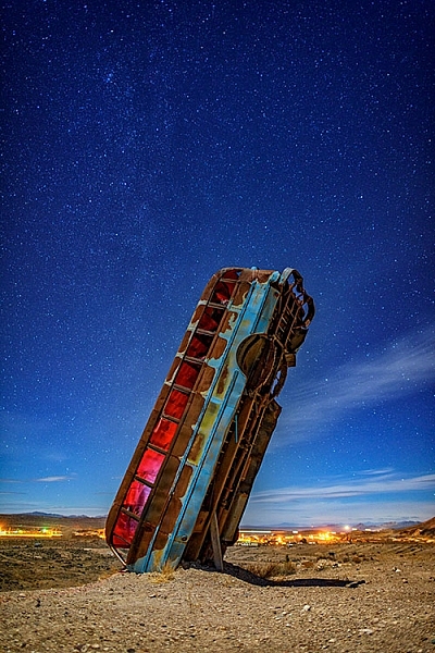
    The hyperfocal distance is the closest distance at which a lens can be focused, while still keeping objects at infinity acceptably sharp. In the shot of the upended bus at night, knowing the bus was about 30 feet away, I calculated the near limit of focus for the lens I was using at about 18 feet and the far limit was 91 feet, meaning anything past that distance would still be out of focus at f/1.4. By focusing at the hyperfocal distance of 44 feet, I knew the bus would fall into the area of sharp focus, while still keeping the stars in sharp focus. This is true because the hyperfocal distance is where everything from that distance to infinity falls within your depth of field, and everything from the hyperfocal distance to the point halfway between the camera and that distance, also falls within your depth of field.

    Unfortunately, it’s not always possible to focus at the hyperfocal distance. For instance, photographing at a party in a dimly lit room, you may notice some areas out of focus due to the shallow depth of field. The fix here is to  stop down a bit if you can. If you need more light, consider using a flash if appropriate, and stopping down the lens to give greater depth of field. Another option is to raise the ISO a bit to allow you to stop down the aperture more.

    You may find yourself saying, “I didn’t purchase a fast lens to use it at a smaller aperture!” While that may be true, if you find yourself unable to capture sharp images due to the shallow depth of field, stopping down is the best solution. Please keep in mind, I’m not talking about a lens that just isn’t sharp. I’m talking about a lens that, due to its fast aperture, isn’t capable of capturing the depth of field needed to keep everything that you want sharp in focus.

    Choosing Your Focus Point

    choose a focus point

    When it is critical to focus on a specific area in the image, choosing the correct focus point will ensure sharp focus where you want it, even when using a wide aperture with shallow depth of field.

    One of the best things you can do when using a fast lens, is to ensure you’re focusing precisely where you think you are focusing. You want to be sure your camera is set to allow you to manually choose a focus point. By manually selecting a focus point, you can ensure the camera focuses on what you think it should. Most cameras default focus point selection method is automatic. In this mode, the camera will generally try to focus on the nearest object with detail that is covered by one of the focus points. Allowing the camera to choose can be a recipe for disaster, since quite often, the nearest object with detail is not what you want to focus on.

    One of the best things you can do as a photographer is take control of where your camera is focusing by selecting the focus point that you want, and ensuring that the focus point you choose is on the subject you want to be sharp. Cameras today have multiple focus points, with some having as many as 61 AF points. While it’s true that generally speaking the center point will be the most accurate of those points, technological advances have made the points along the outer edge much more accurate than in the past. This means that you can choose those outer focus points with confidence when composing your image.

    Focus on the eyes

    Using shallow depth of field on a portrait allows the photographer to focus on the eyes, and lets the rest of the body fall out of focus. An 85mm f/1.2 lens was used here.

    Another related problem to the camera choosing the wrong AF point, is photographers employing a technique known as focus and recompose. This technique came about back when cameras only had a few AF points bunched around the center of the viewfinder. In many situations, it’s not a problem, as long as you are using an aperture that will provide adequate depth of field to maintain focus on the object or person you’ve focused on.

    However, when using a fast lens, at a wide open aperture, focusing and then recomposing your shot becomes a real problem. This is because when using a fast lens at a wide aperture, the depth of field is so thin, that recomposing the shot will actually shift the plane of sharp focus away from the subject you initially focused on. So while you may have focused on the correct subject, using the center AF point, in adjusting your composition you knocked your subject right out of focus again. The solution for this issue is the same as above: manually select an AF point that you can place right on top of your subject, without recomposing your shot.

    Embrace the Bokeh

    shallow depth of field

    Shallow depth of field can be used to create interesting effects and force your viewers to look where you want them. This image was made with a 70-200mm lens at f/2.8.

    Lastly, in answer to those who bought fast glass to shoot it wide open, I say – embrace the bokeh! Bokeh is defined as the visual quality of the out of focus areas of an image, and each lens renders these areas a bit differently. Fast lenses typically have beautifully smooth bokeh.

    Compose your shots so that the shallow depth of field is used creatively. To do this, you’ll need to understand what you can and can’t do when shooting wide open. Knowing that you will have a shallow depth of field, you’ll want to avoid stacking subjects at different distances. Create compositions that contrast sharp areas, with out of focus areas. Use that contrast to highlight certain objects within your frame, and by the same token, hide other objects by causing them to be drastically out of focus.

    Highlight an object using shallow depth of field

    Using shallow depth of field allows you to highlight one object in sharp focus against a blurry background. This image was made with an 85mm f/1.2 lens.

    Images created using shallow depth of field force your viewers to look where you want them to, because the eye is naturally drawn to areas of sharp focus. By using proper focusing techniques, you can ensure the image you see in your mind is the one you capture, and by understanding how the lens will handle depth of field, you can ensure that you’ll know to stop down when you need to for added depth of field, avoiding the mistake of having an important part of your image out of focus.

    What’s your favorite fast lens to work with and why?

    googletag.cmd.push(function() {
    tablet_slots.push( googletag.defineSlot( “/1005424/_dPSv4_tab-all-article-bottom_(300×250)”, [300, 250], “pb-ad-78623” ).addService( googletag.pubads() ) ); } );

    googletag.cmd.push(function() {
    mobile_slots.push( googletag.defineSlot( “/1005424/_dPSv4_mob-all-article-bottom_(300×250)”, [300, 250], “pb-ad-78158” ).addService( googletag.pubads() ) ); } );

    The post Fast Glass: Tips for Working With Wide Aperture Lenses by Rick Berk appeared first on Digital Photography School.


    Digital Photography School

  • Looking Sharp: A focus stacking tutorial

    This was taken in the deserts of Southern Utah at Snow Canyon State Park near St. George, Utah. 

     Photo: Chris Williams Exploration Photography

    Background: Understanding the Process

    One of the questions that I receive quite often from beginner photographers is “How do I produce tack sharp images from front to back in challenging shooting conditions or in cases where the foreground fills up nearly half the frame?” The answer in short is to utilize a process known as focus stacking. The answer is simple but the process can be very labor intensive from a shooting and processing standpoint.

    Even when working with a large depth of field there may be occasions where you still have to take more than one image due to low light, wind and or large foreground subjects. Most technique books will tell you that this is easily accomplished by stopping down to a very small aperture such as F22, focusing on a set focal point at about 1/3 of the way into the frame or determining the spot from your hyperfocal distance (the distance between a camera lens and the closest object that is in focus when the lens is focused at infinity), focus at that spot and take your image.

    Here’s one of the images that I used during focus stacking.  This was shot at 35mm and at f/2.8 due to conditions at the time of shooting.  As you can see it was impossible to achieve sharp focus throughout the image.

    In principle this sounds like a very quick and easy fix to a somewhat complex problem that plagues most landscape photographers. In practice, however, it comes with a couple of big issues. Not only can using an aperture this small decrease image quality due to diffraction, it doesn’t actually deliver the maximum possible depth of field. That’s where stacking comes in. In the digital age we can now improve upon this technique and produce higher quality, tack sharp images from the front to the very back of the frame.

    Before diving into this process I should mention that you may not always need to use this technique and this process is really up for interpretation in regard to what you define as a ‘sharp image’. The lens quality and aperture play a huge role in whether or not you wish to go through the work of focus stacking an image. In general, I always use this process now as I want my images to look tack sharp even when printed at very large sizes.

    Selecting the Aperture

    Choosing the aperture is an important first step to this process. I always try to choose an aperture in the ‘sweet spot’ of the lens. This is a bit of a loaded term; you have to decide whether you are after maximum resolving power or greater overall focus in your image. These differences may be subtle in some cases, but regardless I always try to choose optimal sharpness over depth of field in an individual image, bearing in mind that I’m going to be stacking multiple images. I would rather take a few extra shots to ensure that the RAW files are of the highest quality I can achieve given the conditions.

    Generally speaking, the sweet spot of a lens is about 2.5 to 3-stops from the maximum aperture. This does vary from lens to lens however; for example, I normally shoot between f/8 and f/11 when possible on my Canon 16-35mm f/2.8L ii to achieve the sharpest results possible (which I know is a few stops greater). The bottom line is to get to know your lens! You can even run it through an aperture progression and compare the images to find that coveted lens ‘sweet spot’.

    Behind the Lens

    Focus stacking can be very tricky when you’re out in the field. I use the following steps to ensure that I don’t miss a focus point and to make adjustments on the fly in changing conditions such as light, wind and rain.

    • Find your desired composition and make sure that your tripod is in safe position that won’t allow for any movement or shifting while you’re performing the in camera focus stacking.
    • Place your camera on your tripod, turn on live view, switch your lens to manual mode, make sure that your camera is set to manual and dial in your composition.
    •  Once you have the composition dialed in lock your camera down on your tripod and make sure that your ball-head or camera mount is completely locked down so no movement can occur during this process (if some movement does occur you can try to correct this using Auto-Align in Photoshop, but I always try to avoid this to the best of my ability).
    • Use either your camera’s in camera timer (set for 2-10 seconds) or use a remote shutter trigger to avoid any camera movement issues.
    • Once you are 100% sure that you’re happy with the composition it’s time to adjust your settings; I always fire a few test shots to ensure that I can freeze the foreground subject (flowers etc.) and to see what I can get away with in regard to ISO/Aperture/Shutter-speed while still yielding an acceptable result with respect to proper exposure and the signal to noise ratio.
    • This may sound trivial but play with your settings a bit to find the right exposure/sharpness balance; aim to keep the ISO at base and the aperture as close to the ‘sweet spot’ as possible (f/8-f/11 in most cases) this may not be possible depending upon conditions, so make adjustments as you see fit.
    • Adjust your CPL or lens filter (ND etc.), if you’re using one, to give the foreground more pop etc.

    The Progression

    Now comes the fun part: how do you make sure that you have everything in focus and that you don’t miss a focus point? There’s definitely more than one way to go about doing this, but I generally focus on the foreground elements that are closest to the lens; normally near the bottom 1/3 of the frame in live-view.

    I normally zoom in to my area of interest in Live-View and dial in my focus point using manual focus.  After taking the image I repeat the process for my next focus point.
    • While in live-view, zoom in to the bottom most portion of your foreground subject and manually adjust the focus until everything is sharp and adjust your settings depending upon conditions (wind etc.)
    • To find your next focus point stay in live-view, zoom in to the same area you just photographed and move up in the frame to find your next focus point
    • Repeat this process until you reach the background elements in your image and take your final exposure.
    • You may want to bracket your last exposure to keep the highlights and shadows from clipping or to catch a sunstar; if you’re shooting on a camera that has a great deal of dynamic range (like a Sony a7r/ii or Nikon D810) then you may be able to do this with one exposure; it’s completely up to you

    The toughest thing about focus stacking in the field is dealing with changing conditions such as wind, rain and light. When wind is an issue I always run through at least two or three focus stacking progressions to ensure that I have a sharp frame at each focus point. Even in perfect conditions I still run through a focus point progression at least twice to ensure that I haven’t missed a point. There’s nothing worse then getting home after a long day of shooting only to find that you completely missed a focus point.

    Once you take your camera off of your tripod or move your tripod, it will be a huge pain to get everything lined up again and you may not even be able to in most cases. Double and triple check your exposures to ensure that you’ve got all of your focus points nailed down before moving your camera and packing up your gear.

    Articles: Digital Photography Review (dpreview.com)

  • 6 Tips on How to Create Abstract Photos

    It’s time to have some fun with your camera, and pop you out of the realistic rut you may not even know you’re in. It’s time to create some images based on color, light, emotion, and a lack of concern for sharpness or details.

    It’s time to play around with abstract photography!

    PWC-Travel2015-1229-0212

    Abstract | ab-stract | adjective | of art : Expressing ideas and emotions by using elements such as colors and lines without attempting to create a realistic picture.

    You already have all the tools you need (a camera or even a smartphone),  so let’s take a look at some methods of creating emotive and abstracted images.

    Techniques

    1 – Move Your Camera

    The simplest method for creating images filled with color and lines, is to blur the snot out of everything. This is a liberating concept for most of us. “I get to move my camera and not worry about staying super steady? Heaven!” I can hear you shout.

    All of these techniques are paths of self discovery, but I can give some tips on where to start.

    PWC-Travel2016-0323-3539

    First, slow your shutter speed down to 1/10th of a second or slower. As with panning blur, this is where things get interesting. You can do this in Shutter Priority mode, or if you know how to adjust your camera in Aperture or Program modes, you can use those to get the same shutter speed. You’ll also be helped with a low ISO, such as 100 or lower.

    Second, look for things in the shade. That slow shutter speed needs a lack of light to work well, otherwise your shots will be blown out (overexposed).

    Third, take some sample shots moving your camera in one direction, then another. I know, this sounds like lame advice, and is simplistic, but it starts out that way. You have to start seeing what the scene in front of you does when you move one way or the other. Then start moving in circles or random wiggles.

    PWC-Abstract2016-0420-4743

    Sometimes straight lined objects look best when you go with their grain and direction. Sometimes circular items (flowers being an easy target) look best with some random wiggle. This is your official “Get out of photography-jail free card” to experiment and make some ugly images. But you may also make some that pique your interest.

    PWC-Abstract2016-0419-4286

    2 – Move the Subject

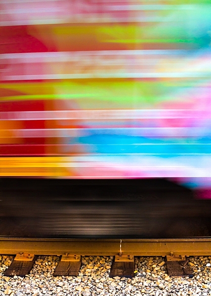
    I used to hate see tags on train cars, until I realized the magic of all those random colors screaming by at 40 miles per hour (65 km/h).

    Now I often look for all kinds of colorful items, just for their color alone. The shape, subject, or intent may not be what I want, but if I can use that color and get it to move just the way I want…I can capture the colorful essence.

    PWC-Oregon2012-0630-8954

    This can be a lot like light painting, but without the subject emitting the light. Think of other things that can be moved around, and go for bold colors.

    WARNING: Watch out for white, yellow and other super bright colors. Their properties mean they will fill your sensor with too much data too fast, and they will washout/cover over any other colors you may have in your shot.

    3 – Remove Reference

    A zoom lens will be your best friend here. Wide angle shots, even with ample blur, often allow us to ground ourselves in the scene, not the colors or emotion. It’s breaking out of what we can recognize, and can relate to, that helps the abstract images.

    Let me show you an example. What do you see here (below)?

    PWC-Abstract2016-0419-4328

    Now let me show you the larger context.

    PWC-Abstract2016-0419-4309

    The more you zoom in and pick apart details, the more you can play with abstraction.

    4 – Shoot Through Things

    I have yet to experiment heavily with shooting through objects, but there is much fun to be had here too. Having a way to hold the object helps, and a clamp on a light stand would be handy. Otherwise, start with everyday objects and work your way through colored glass, a glass block, or even smear various gels and liquids (Vaseline, olive oil, etc.) on a clear sheet of glass or plexiglass.

    PWC-Abstract2016-0428-4858

    5 – Multiple Exposure

    Using in-camera multiple exposure techniques can sometimes leave too much of the original, recognizable subject, for some photographers’ tastes. I have found the Average setting on my Canon to work well in combining shots. If you want to get funky, go for the Dark setting, and prepare to shoot a lot of tests.

    My method is to take one shot, mostly in focus. Then I shoot two more in varying degrees of out of focus. This sometimes ends up with more of a soft focus look, and that’s where the argument can be made that these images are not abstract enough. That’s why I’ll choose to zoom way in, to hopefully make the subject a little more out of context.

    PWC-Travel2016-0323-3621

    6 – Post-Processing as a Playground

    You know how people tend to complain about too much post-processing of some artists’ work? Now’s the time to cast off those bonds and have some fun. You can soften scenes to make them even more ethereal.

    PWC-Abstract2016-0419-4585

    Or you can try on different versions of the same image, but with vastly different color renditions (in this case, I simple moved the White Balance Temperature and Tint sliders in Lightroom).

    PWC-Travel2016-0323-3463-3

    PWC-Travel2016-0323-3463

    PWC-Travel2016-0323-3463-2

    Once your images are in the computer, let your impulses go wild!

    Conclusion

    PWC-Abstract2016-0419-4467

    The thing I like most about abstract photography is that it plays on the “This is something I really like, but I’m not sure why” nerve inside all of us. I can possibly breakdown each of these images and tell you why I picked them, but in the end, it doesn’t really matter. It’s about creating art for art’s sake. It’s about getting back to the basics of attraction to art. It’s about being surprised by what you see on your LCD while breaking a few of the rules you used to hold so dear.

    Now go experiment and show me what you can create!

    googletag.cmd.push(function() {
    tablet_slots.push( googletag.defineSlot( “/1005424/_dPSv4_tab-all-article-bottom_(300×250)”, [300, 250], “pb-ad-78623” ).addService( googletag.pubads() ) ); } );

    googletag.cmd.push(function() {
    mobile_slots.push( googletag.defineSlot( “/1005424/_dPSv4_mob-all-article-bottom_(300×250)”, [300, 250], “pb-ad-78158” ).addService( googletag.pubads() ) ); } );

    The post 6 Tips on How to Create Abstract Photos by Peter West Carey appeared first on Digital Photography School.


    Digital Photography School

  • Lane-Spanning Airbus to Drive Right Over Car Traffic in China

    land airbus solution china

    A Chinese transportation company behind a lane-straddling bus design (which passes over lanes rather than occupying them) is moving from scale to full-sized test models this summer. The plan is to introduced fully-functional models of these “land airbuses” to (or: above) the streets of Beijing over the next few years.

    straddlingbus

    retro landliner design

    The inspiration for this seemingly-novel design dates back to a 1960s “Landliner” proposed for New York City that would likewise ride on side rails adjacent to roadways. Cars would simply pass beneath the buses uninterrupted, moving faster than the bus in high traffic and allowing the bus to move over traffic jams. Such a system would be a fraction of the cost and effort compared to subway systems or even raised railways.

    landairbus

    In China, these new buses would hold up to 1,400 passengers each and cruise at up to 40 miles per hour, which sounds slow until you consider they do not have to stop for traffic. Running on electricity, these designs would reduce the need for conventional buses and cut polluting emissions. As a cyberpunk bonus: cars passing beneath these vehicles will see digital simulations of the sky above.

    landair transit stations

    For now, Transit Explore Bus is constructing a life-size model in Changzhou. This will allow real-time testing with actual cars, intersections and infrastructure, facilitating further refinements and eventual street deployments. For a country with serious pollution and traffic problems, this kind of solution could be just what is needed – for each new super-bus, 40 ordinary buses can be taken off the roads.


    WebUrbanist

  • An Overview of Google’s Nik Collection Filters for Post-Processing

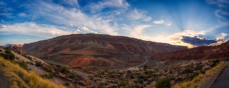
    ArchesPanorama

    By now, if you have not downloaded Google’s Nik Collection, at the very least you have heard that this once $ 500 software, was made free for download in March 2016. The Nik Collection, as it has been known for over a decade, is a set of photographic filter plug-ins, and image enhancement tools, that delivers another look and feel to your photo.

    The Nik Collection is comprised of Analog Efex Pro, Color Efex Pro, Dfine, HDR Efex Pro, Sharpener Pro, Silver Efex Pro and Viveza. As you see, the suite is quite extensive, thus this overview will just touch on its potential uses, and hopefully encourage you to further explore the collection more in-depth.

    The layout in each set is very similar, which translates to ease of use once you get the hang of it. Preset filters are listed down the left side panel of the dashboard. If you click any of them, the chosen filter is immediately applied to your preview, and you then have sub-options for that filter listed on the right panel, which gives you further control over its application.
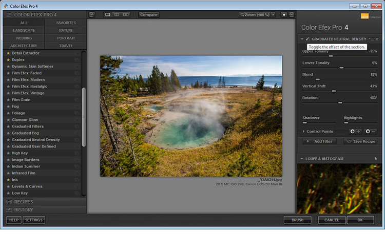
    GlacierPrintScreen_NikCollection

    An awesome feature that the Nik Collection utilizes is called Control Points, which is available in each plug-in. A control point, as the name implies, is a way to control the application of a filter to selected areas of your choice. Take note of this, as it will be referenced and elaborated on below, as the various plug-ins are discussed.

    Analog Efex Pro

    If you love the images produced by older cameras, or want to add a vintage look to your photo, Analog Efex Pro may be the set that appeals to you. It strives to pay homage to techniques used by photographers many years ago, and will help transport your image back in time.
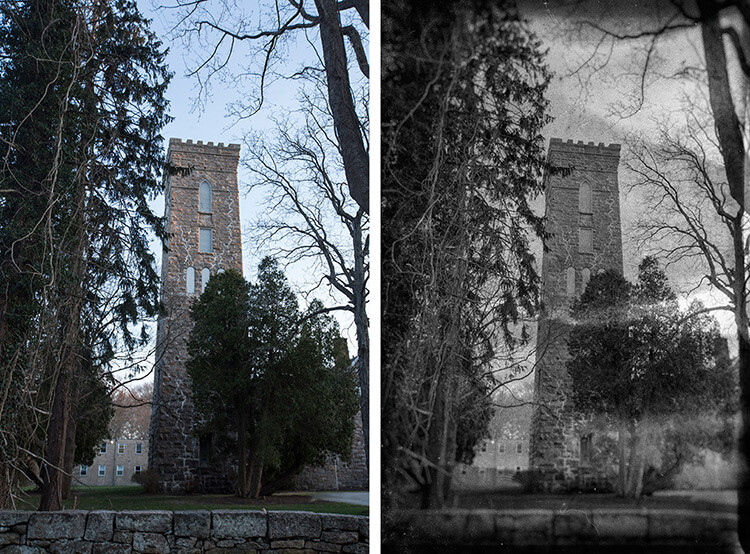
    AnalogEfexProCastle_BeforeAfter

    Original Image                                                                                                 Analog Efex Pro: Wet Plate preset applied

    In the sample image above, the finish is one of the “Wet Plate” preset options available in Analog Efex Pro 2, inspired by an alternative processing technique of yesteryear. Along with Wet Plate, some of the preset filters in the left panel include Classic Camera, Vintage Camera, Toy Camera and the popular Double-Exposure – all of which require little effort to give your image a unique style.
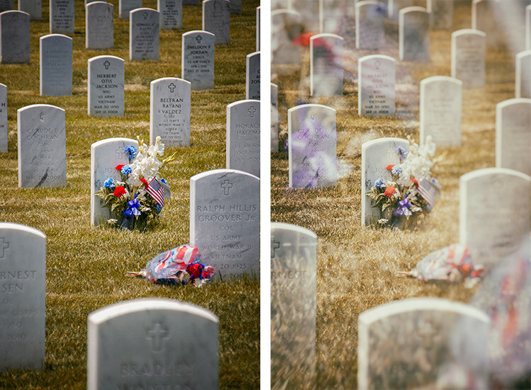
    AnalogDoubleExposureHeadstone_BeforeAfter

    Original Image edit                                                                              Analog Efex Pro: Double-Exposure preset applied

    With a few clicks, the application of this technique attempts to mimic processing techniques established in the darkroom, or in-camera double exposures. Each filter can further be fine-tuned to your desire, using the sliders and curve-adjustments included in the right panel; you can even add Dirt and Scratches to create a sense of age and give your digital photo a film-like feel.

    Color Efex Pro

    Color Efex Pro is a collection of visual presets that allows you to enhance, or get more creative with your photo. There are 55 filters in this set, but with the ability to stack filters, the possibilities are endless. Customized combinations can also be saved as a preset, so you can easily apply the same processing to other images with a single click.
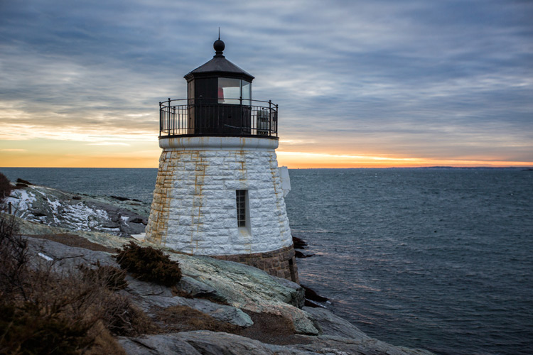
    ColorEfexProLH_BeforeSkylightFilter

    Original Image

    Color Efex Pro: Skylight Preset Filter applied

    Color Efex Pro 4: Skylight preset applied

    In the Lighthouse example shown above, the Skylight preset filter was used, which simulates a glass warming filter. It removes some of the blue color casts, and intelligently warms the colors in the photo for a more pleasing effect. You can use your right sub-options to make this as intense as you want, but in some cases less is more.
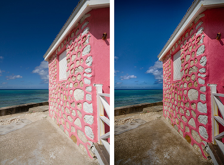
    ColorEfexProHut_BeforeAfterTonalContrast

    Original Image                                                                                            Color Efex Pro 4: Tonal Contrast preset applied

    In the photo above, the Tonal Contrast preset was applied. This preset adjusts contrast and light levels on a small scale, as well as brings out some texture in the image. The sliders enable you to affect how dynamic the final result turns out.
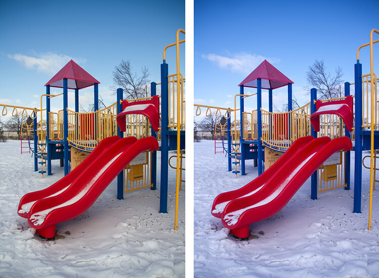
    Original Image Color Efex Pro: Wgite Neutralizer Preset Filter applied

    Original Image                                                                                            Color Efex Pro 4: White Neutralizer preset applied

    Sometimes you need your whites to pop, for example the snow in the photo above. The White Neutralizer filter removes color casts from light objects and can be used to create bright, crisp whites without affecting the other colors of the photo. It is very useful for brides’ dresses and large expanses of white, such as snow or walls.

    A very cool feature of Color Efex Pro is the ability to layer multiple filters on an image.
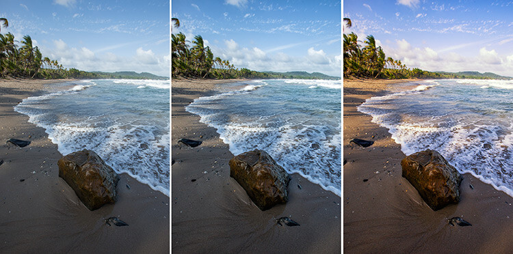
    RockBeach_ColorEfex

    Original Image                                         Color Efex Pro 4: Tonal Contrast               Color Efex Pro 4: Sunlight filter

    In the example shown, the Tonal Contrast preset was applied to the original image, then layered with the Sunlight filter. Layering equates to endless possibilities for your final edit.

    Dfine

    Dfine is Nik’s answer to noise reduction. Image noise characteristics deviate with exposure length, ISO settings and even temperature based on your camera. Dfine selects areas of your image and generates a “noise profile”. This allows the quick reduction of noise in your photos while retaining the edges, and in one click applies the calculated noise reduction to the image.
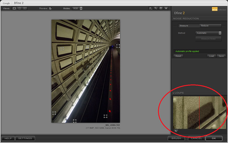
    Dfine Dashboard

    In the image above, the little squares denote what the software determined were areas requiring noise measurement. The loupe view (circled in red), shows the applied noise reduction on the right side – this view is at 100%.

    On the right panel, the “Reduce” sub-option gives you two main methods to take away noise – either via the contrast or color. Both these adjustments affect the image differently, so play around with them and see which one works for your image.
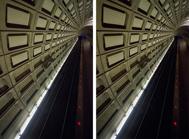
    Subway_DfineProEdit

    Original Image                                                                                                 Dfine 2: Auto Noise Reduction applied

    Also included are some useful global adjustments for further refinement, such as the removal of JPEG compression artefacts and debanding.

    Control Points in Dfine allows you to selectively apply noise reduction, which gives you the power to increase or decrease the noise reduction intensity in different areas of your image. So, even though Define auto-calculates the noise reduction needed, you can still maintain control over your noise processing.

    HDR Efex Pro

    High Dynamic Range (HDR) Imaging is a processing technique that has had mixed responses over the years. It was a trendy technique a few years ago, but has since matured into being used as a tool that extracts all the details of a scene available to the naked eye. HDR can be either overdone, or used subtlety, by exploring the differences between the darkest shadows and the brightest parts of the photo.

    HDR Efex Pro is Nik’s contribution to this type of processing; where several images captured at different exposures, are translated into a single image that reflects a more dynamic range than your camera output is capable of creating (although camera advancement is starting to address this).
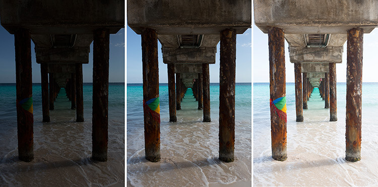
    HDR_original

    Original Images for HDR edit


    HDR_HDREfexPro

    Images combined using HDR Efex Pro 2

    In the example above, three exposures are combined to bring back the lost highlights and shadows with tonality adjustments. This image can be pushed to look more realistic or even in the opposite direction.

    Above its predecessors (such as Photomatix), HDR Efex Pro 2 has promised a simpler process and increased control and fine-tuning over the final image, along with an improved tone-mapping engine that claims to render color better. All tools are subjective, but no harm in trying this HDR tool out, even if just to verify some of Nik’s claims that they have improved Ghosting and Chromatic Aberration reductions.

    Silver Efex Pro

    Silver Efex Pro focuses on black and white processing. There are many programs quite capable of creating great black and white images, but various built-in tools like Dynamic Brightness, Soft Contrast, Amplify Whites, Amplify Blacks, and the advanced Grain Engine creates excellent diversity.
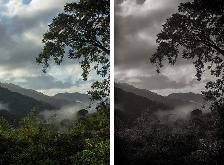
    SilverEfexTree_BeforeAfter

    Original Image                                                                                      Silver Efex Pro 2: Dark Sepia preset applied

    Silver Efex Pro comes with quite a variety of presets, and of course you can also create your own. The easiest way to do this is use an existing preset, customize it by making your adjustments, then save it so you can apply it to other images later on. Saving a preset is especially useful if you are doing an image set, and want the photos to have the same look and finish.
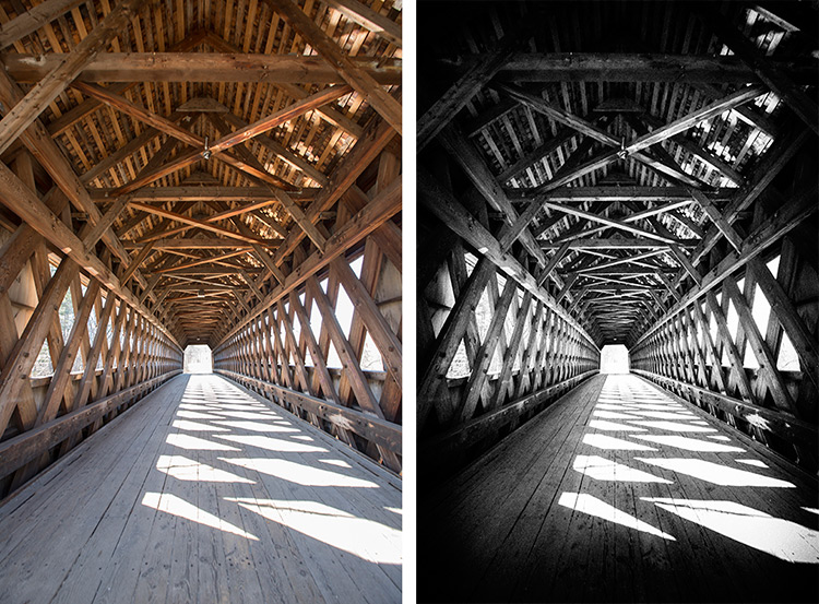
    SilverEfexBridge_BeforeAfter

    Original Image                                                                                      Silver Efex Pro 2: High Structure preset applied

    The structure in this software adds depth to the photo by adding some sharpening. If you are into black and white photography, this is definitely a set you want to play around with.

    Viveza

    Viveza is an easy way to apply enhancements selectively without creating masks. Yes, you can still do global or image-wide adjustments, but it is very useful to be able to later refine only selected areas. Imagine the possibilities of applying structure, color, exposure changes, or doing shadow recovery to only areas you choose, knowing that the software is going to blend in your changes seamlessly.

    You can use Control Points on any part of the image you want to change. As with the other software in the Nik Collection, the top control (on your control point) allows you to change the radius/size of your adjustment area.
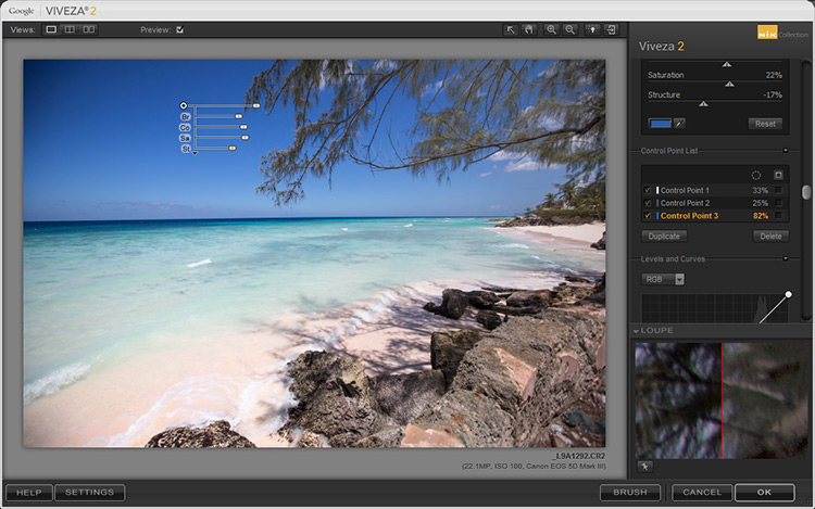
    VivezaControlPointBlue

    The Control Point shown in this image is on the blue sky. Based on the look you want, the radius of this area can be increased or decreased in size.

    If you check the box next to the Control Point on the right (sub-options), all the affected areas will be shown in white, so you can decide if you want to adjust your work area.
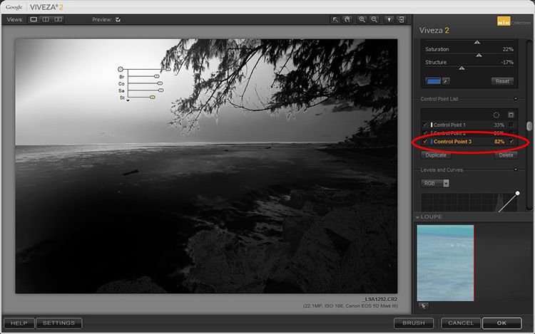
    VivezaDashboardHighlight

    In this example, the Control Point affects the blue in both the sky and sea, so any adjustments will apply to everything blue in the selected radius (highlighted in white on the image).

    Selections, masks or adjustment layers may be your tool of choice to get precisely defined areas, but Viveza’s localized adjustments blend in with the surrounding areas quite well, and in some cases look more natural.

    Sharpener Pro

    While not everything in your image needs to be razor sharp, the best way to end up with a crisp finish and distinct edges, would be to start out with a properly focused image. Post-capture sharpening increases the contrast between adjacent pixels and significant edges within an image, which attracts your eye. Sharpening is thus used to enhance a focused image, as opposed to rescue elements of photograph that was captured out of focus.
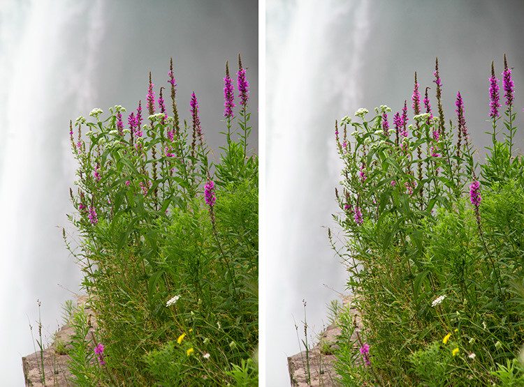
    NiagaraFlower_SharpenerProBeforeAfter

    Original Image                                                                                     Sharpener Pro 3: applied to show edges

    In the sample image above, the sharpening is exaggerated to show the contrast effect that the software applies.

    Sharpener Pro takes away some of the guesswork and gives you control over your sharpening, which is typically the last step in image processing. Control Points gives you the ability to selectively sharpen aspects of your image and allows the changes to blend in easily.

    Conclusion

    A great feature of each set in the Nik Collection is that it applies the effect on a duplicate layer. This is especially helpful if you want to dial back the effect and blend it with your original image, by simply changing the opacity of the layer.

    Each plug-in has great potential, so do not be fearful to explore, test your creativity with preset combinations, and experiment with Control Points. It is a user-friendly collection and while this is a plus, it can also make it easy to overdo it.

    Do share your thoughts and some of your images processed with Google’s Nik Collection of filters. How have they worked for you? Which is your favorite?

    googletag.cmd.push(function() {
    tablet_slots.push( googletag.defineSlot( “/1005424/_dPSv4_tab-all-article-bottom_(300×250)”, [300, 250], “pb-ad-78623” ).addService( googletag.pubads() ) ); } );

    googletag.cmd.push(function() {
    mobile_slots.push( googletag.defineSlot( “/1005424/_dPSv4_mob-all-article-bottom_(300×250)”, [300, 250], “pb-ad-78158” ).addService( googletag.pubads() ) ); } );

    The post An Overview of Google’s Nik Collection Filters for Post-Processing by Nisha Ramroop appeared first on Digital Photography School.


    Digital Photography School

  • Huawei P9 camera is nice, but it’s still a smartphone camera

    To dismiss the Huawei P9’s imager as ‘just another smartphone camera’ would be unfair. Its dual 12MP cameras aren’t your average dual cameras – Huawei claims that by using one monochrome and one RGB sensor, the camera is 100% more sensitive to light than your standard smartphone camera. It offers Raw capture, full manual exposure control and laser-assisted autofocus. Oh, and Leica had a hand in designing the module. All-in-all, there’s plenty going for it camera-wise. 

    We approached the P9 eager to give it a try, but with a healthy dose of skepticism. And keeping our expectations measured, we were pleased by the Huawei P9’s results. For one thing, shooting with is a nice experience. There are multiple grid overlay options, a level gauge (praise hands emoji!) and you can easily toggle between full manual and full auto shooting. It’s also possible to shoot exclusively with the monochrome camera, which opens up other creative possibilities.

    The P9 offers many of the comforts of an advanced point-and-shoot. So how’s the image quality? It’s pretty much as we expected. Good light JPEGs look just peachy on phone-sized screens, but at 100% they don’t look exactly ‘100 emoji’ 100. Grass turns mushy and halos start appearing around high contrast edges. Things obviously get quite noisy by the time you get to ISO 3200.

    $ (document).ready(function() { ImageComparisonWidget({“containerId”:”reviewImageComparisonWidget-42824869″,”widgetId”:365,”initialStateId”:null}) })

    But wait, there’s Raw! You can see some of the benefits in terms of detail retention in the studio scene widget$ (document).ready(function() { $ (“#imageComparisonLink2550”).click(function() { ImageComparisonWidgetLink(2550); }); }), but definitely check out the difference it makes in some of our real-world samples. It should be noted that Raw capture is only available in Pro mode, and can’t be used when shooting with the monochrome camera.

    TL;DR, I’d be pretty happy if the Huawei P9 camera was the camera I had with me all the time. But the dual camera system hasn’t solved the low light troubles inherent to small sensors.

    Articles: Digital Photography Review (dpreview.com)

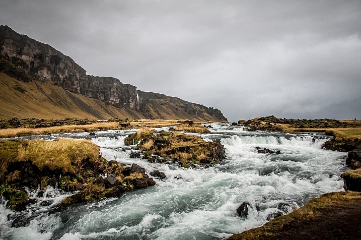
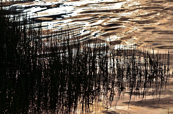
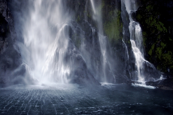
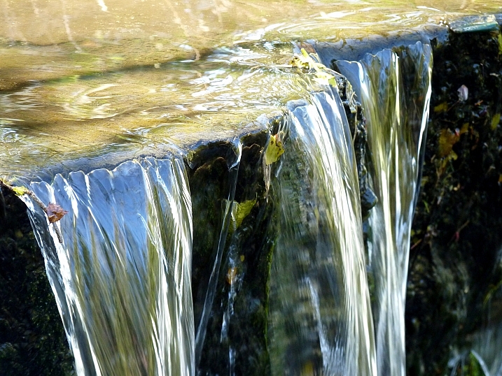
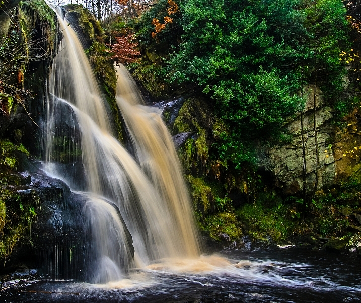
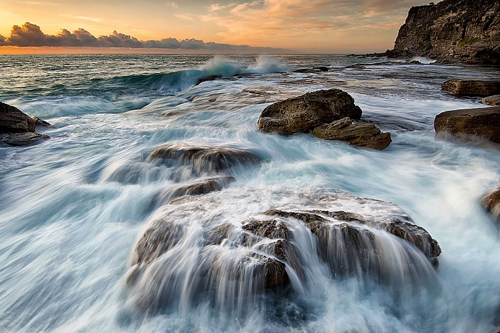
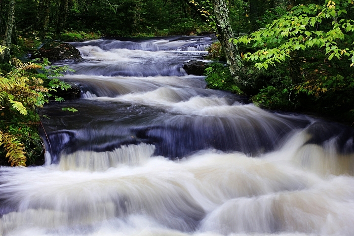
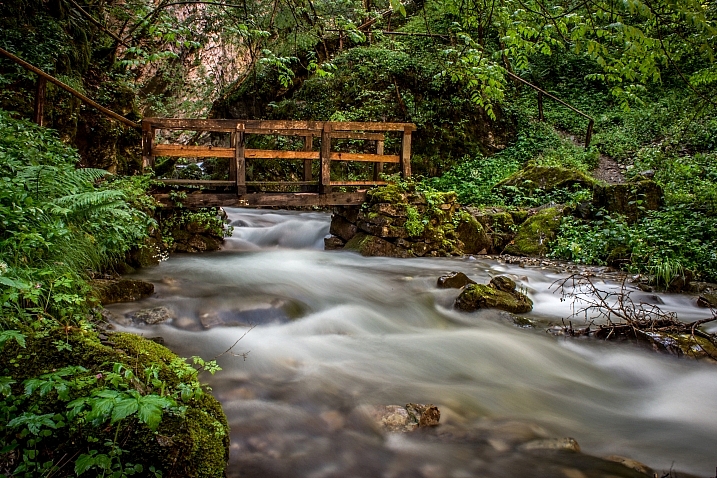
  • 23 Moving Images of Flowing Water

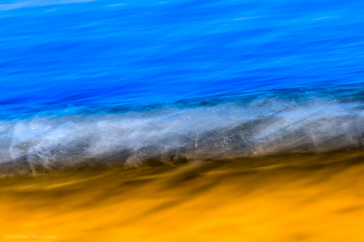
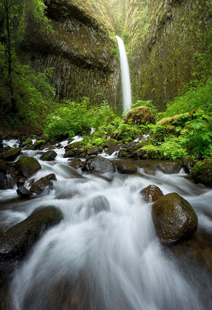
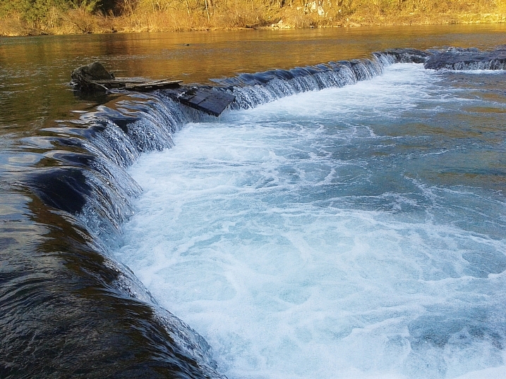
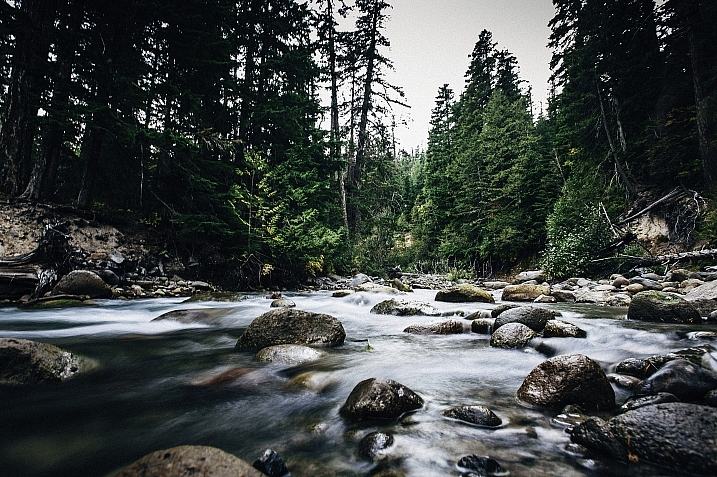
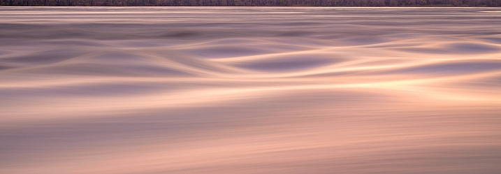
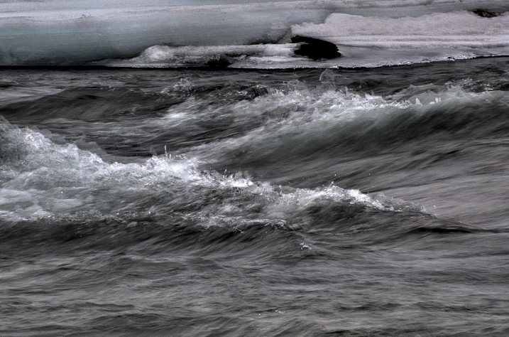
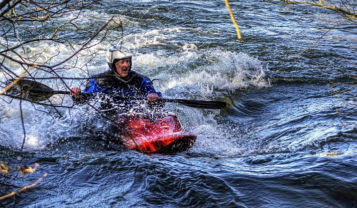
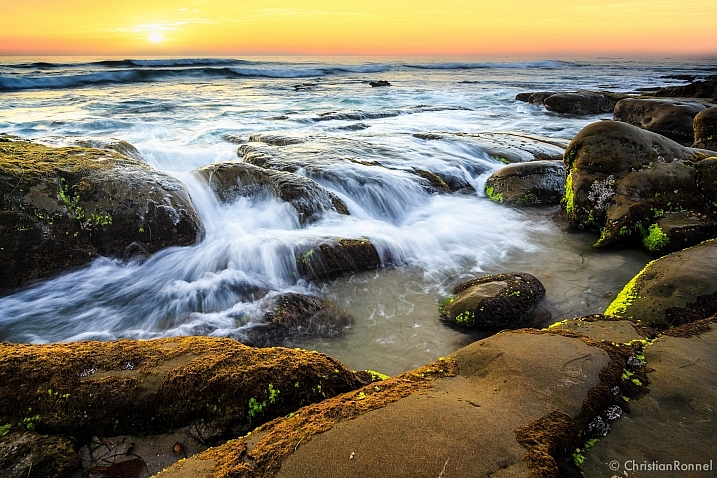
    Water, especially that which is flowing, is a popular subject for photographers. You get to make artistic choices about whether to freeze or blur the water, and to what degree. That will affect how the final image looks.

    Take a look at these images of flowing water and see how the photographers chose to capture the scene.

    David Kingham

    By David Kingham

    Darlene Hildebrandt

    By Darlene Hildebrandt

    Little Shiva

    By little shiva

    Christopher

    By Christopher

    Kamil Porembi?ski

    By Kamil Porembi?ski

    ~ Lzee. . . Mostly Out

    By ~ lzee. . . mostly out

    James Bremner

    By James Bremner

    Nick Kenrick

    By Nick Kenrick

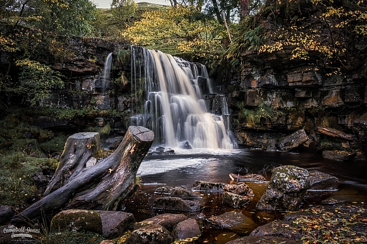
    Andi Campbell-Jones

    By Andi Campbell-Jones

    Andy Rothwell

    By Andy Rothwell

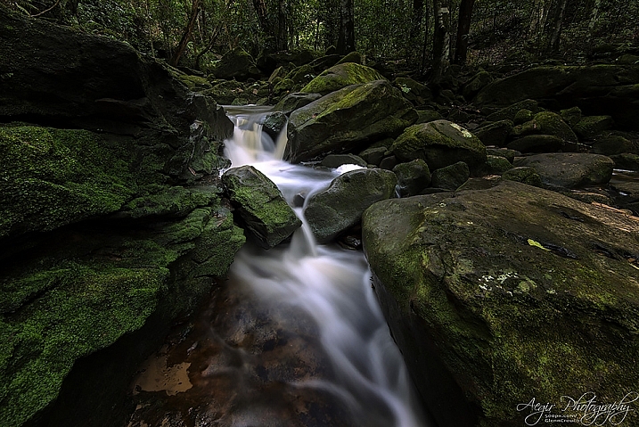
    Crouchy69

    By Crouchy69

    Crouchy69

    By Crouchy69

    Christian Barrette

    By Christian Barrette

    Billy Wilson

    By Billy Wilson

    Neil Howard

    By Neil Howard

    Christian Ronnel

    By Christian Ronnel

    Dirk Dittmar

    By Dirk Dittmar

    Nicole Quevillon

    By Nicole Quevillon

    Jonathan

    By Jonathan

    Marjan Lazarevski

    By Marjan Lazarevski

    John Fowler

    By John Fowler

    Susanne Nilsson

    By Susanne Nilsson

    Louis Du Mont

    By Louis du Mont

    googletag.cmd.push(function() {
    tablet_slots.push( googletag.defineSlot( “/1005424/_dPSv4_tab-all-article-bottom_(300×250)”, [300, 250], “pb-ad-78623” ).addService( googletag.pubads() ) ); } );

    googletag.cmd.push(function() {
    mobile_slots.push( googletag.defineSlot( “/1005424/_dPSv4_mob-all-article-bottom_(300×250)”, [300, 250], “pb-ad-78158” ).addService( googletag.pubads() ) ); } );

    The post 23 Moving Images of Flowing Water by Darlene Hildebrandt appeared first on Digital Photography School.


    Digital Photography School

  • Critical eye: Picturesqe aims to highlight your best frames and throw out the worst

    Picturesqe is a software application that’s designed to speed up the process of selecting the best image from a sequence of frames and the most successful pictures from a day’s shooting or a project. Load your images into the program and it applies artificial intelligence and machine learning to pick the best shots based on its own criteria and common preferences in photography.

    The idea is that the program analyzes the pictures as you import them, highlighting some and rejecting others, in an automated process that takes the strain out of determining which are the frames to use. All you have to do is review those Picturesqe selects and chose the best of three, for example, instead of the best of the 26 you shot in that sequence.

    I have to say at this very early stage that I’m not very keen on a machine making artistic decisions for me. It’s enough to battle the wants and tastes of a pushy modern camera without then allowing a canned algorithm to replace the subtle process of appreciating line, form, focus, light, composition and atmospheric exposure. That is quite a lot to expect a computer program to do, no matter how ‘intelligent’ it is. Nevertheless, I endeavored to give Picturesque a shot.

    What it does

    The beginning of the process involves importing your images into Picturesqe, which sends thumbnails to its servers to create groups and then determine which pictures are the best of each group.

    Picturesqe is a desktop application that runs on PC and Mac platforms, using support from the cloud to run its more power-intensive tasks. Once installed the program invites the user to import images either from an external source, such as a memory card, or from files already stored on the hard drive. As images are imported they are analyzed so that they can be formed into groups of similar-looking images and then arranged in order so that the best frames of each group are positioned at the top left of the screen.

    The process of grouping and ordering is done via an algorithm that exists in the cloud – or Picturesqe’s servers – so thumbnail images are sent from your machine for inspection and the information gleaned returns to Earth to inform the arrangement of images in the Picturesqe user window.

    The import process doesn’t actually copy files from the memory card onto your main desk drive but acts as a filtering system in between the two – a sort of staging post – so that you’ll eventually only have to save the best of your images. This way you’ll stop clogging your machine with pictures that will never be used and never seem to get deleted.

    Does it work?

    I imported the contents of a memory card into the software and it sorted the 460 image into groups according to content and what it determined would be the pictures I would want to choose the best of. Pictures it couldn’t find groups for, and lone images, are left floating freely. While most grouping exercises go well there are exceptions, such as this group in which the images clearly do not belong together.

    I found the results of an import and a dose of analysis to be a little mixed. At first I was impressed that Picturesqe was able to divide the contents of a memory card that contained street images, portraits and product shots into a number of mostly sensible groups. Images that feature the same color in about the same place get grouped easily, and those that contain the same objects in approximately the same composition are also bundled together with a decent degree of accuracy. Pictures that fall between stools are left ungrouped for us to leave floating on their own, to manually delete or to add to the group we think most appropriate.

    Opening a group reveals what the program thinks of your pictures, as it orders them according to its perception of their merits and labels those it doesn’t think much of with a waste paper basket. Those with a sensitive nature should avoid this stage, as the program’s mathematical opinion will not necessarily reflect everyone’s perceptions of their artistic brilliance.

    I had to remind myself that it was a machine I was dealing with so I didn’t have to take things personally

    In some instances I was glad of Picturesqe’s help in selecting the best frames from each group, but in others I was left slightly mystified by the way my images had been treated – like entering a camera club competition. Pictures that I thought were the better of the group were often not placed ahead of others I thought less pleasing. On more than a few occasions pictures I had previously selected for printing were marked out for shredding by the algorithm in the cloud. I had to remind myself that it was a machine I was dealing with so I didn’t have to take things personally. I hope Picturesqe has good insurance to pay for user’s trauma therapy. 

    I wouldn’t have grouped all of these images together as, while they are all from the same shoot, they represent the pool from which I’d hope to pull three quite different pictures. It doesn’t make sense, to me at least, to group uprights and landscape format images together.
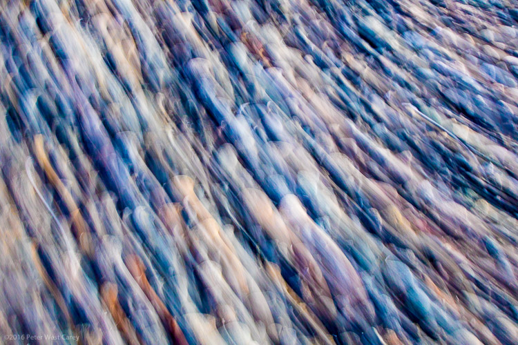
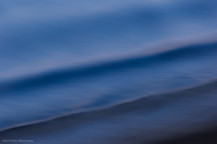
    The criteria for the grouping process is a little more open than I’d like as, for instance, it doesn’t seem to take into account the orientation of the image. When shooting a portrait, for example, I’ll shoot poses and locations in upright and landscape formats, and generally edit to offer the sitter one of each. To me then it doesn’t make sense to group uprights and landscape format images together as though you’d pick one or the other instead of one of each. On the whole though the grouping process does a pretty decent job of working out which pictures belong together, and will only rarely drop an odd frame into a group in which it clearly doesn’t belong.

    Groups can be edited, of course, once the program has made them, and we can reject individual images from the group so that they float free in the main browser window. A process of drag-and-drop then allows us to manually create our own groups by bunching images together.

    This is how the images look when they are first imported into the program – as they should. Picturesqe though then drops the camera-dictated color, contrast and styles for a much more ‘Raw’ looking image. Removing image characteristics doesn’t make picking a winner easier.

    The application works with Raw and JPEG files, and I was impressed it is able to display the latest Raw files from the Panasonic Lumix DMC-GX80/85 even before Adobe can. It does it though at the expense of any in-camera processing settings so we see the Raw ‘Raw’ data with distortions that are usually corrected before we get to view the picture. Anything you’ve shot in black and white using Raw will also be displayed in color, though for a short few seconds images are shown as we intended before Picturesqe renders them flat and with native colors. Thus we have to make our judgements without a good deal of the qualities we might often weigh-up when selecting the best of our images – such as color.

    I found this quite irritating. JPEGs are rendered just as they should be though, but when fed simultaneously-shot Raw and JPEG files we only get to see the Raws but with the rendering of the JPEGs – though I found the relationship between what I’d shot and what was displayed a little inconsistent across camera brands. If you only shoot Raw though you get to look at slightly flat and unsharp images.

    Judgement Day

    It seems that the ‘best’ picture (top left) has been selected by the software because the subject is quite central in the frame. The picture the software likes least (bottom right) shows the subject against a distracting background.

    It’s not completely clear on what grounds the program and analysis makes its judgements as it orders our images from good to bad. I spotted that it seems to like a subject that’s in the middle of the frame, and one that sits on a third, and that it can tell within a group when the subject is against a clear background and when it’s against one that’s a bit distracting.

    Magnifying the eye of the sitter from this group of portraits makes it clear that the software doesn’t place sharpness at the top of its list of priorities. The sharpest picture (bottom center) is actually marked with a waste paper basket, indicating that that Picturesqe thinks I should dump it. The shot it recommends is a good deal less focused.

    Things that humans might take into account though the software doesn’t seem to – such as exposure, over-powering flash, focus and whether there are distractions in the background. It can work out when eyes are closed though, and it knows the difference between someone facing the camera straight on and someone at an angle – but it always prefers face-on as though that’s the safe formula for a ‘good’ picture. It can’t tell an unflattering angle from a complementary one though, and doesn’t distinguish between a well-lit subject and lighting that makes a nose look big.

    The zoom feature identifies the part of the subject that you want to inspect and just magnifies that bit. The clever bit is that it doesn’t just magnify the same area of the frame of each picture, but actually identifies the part of the subject – wherever that subject is in the frame.

    A very nice feature is the synchronized zoom that is great for checking focus across a number of images at the same time. With a collection of portraits, for example, you can zoom into the eye of one frame and the eye area of all the other frames get magnified along with it. What is particularly clever is that the eyes don’t have to be at the same coordinates in the picture for the program to magnify them, as it can identify similar objects in the images across the series.

    This feature worked brilliantly for portraits, allowing closed eyes and missed focus to be spotted easily and early on, and on occasions it worked even when the images weren’t all in the same orientation. The success rate is reduced for landscapes and more general scenes where the element you want to inspect isn’t as distinct or as obvious as an eye, but the application can concentrate on rocks, trees and buildings so long as the object you are checking has reasonably powerful edges and outlines.

    When the images are less regular, such as in these street pictures, the software finds it more difficult to identify the subject. Using the zoom feature didn’t allow me to compare the sharpness of the subjects in the street pictures, even though they have similar outlines and contrast in each frame.

    Export

    Once you have whittled your selections down to the best images in each group, or to the better groups in the collection, you are ready to export the pictures to their final destination. The editing process involves deleting the images that aren’t wanted – not from the card or from their home on your hard drive, but from the imported collection. No files are actually deleted.

    To do this you’ll have to click on the trash can icon on the image. And that will have to be done on every unwanted image. So, if you have shot a sequence of 100 images and only need one you have to delete 99. You can attend to each frame individually and delete each one in turn, or you can select them all and use the delete key on the keyboard.

    I’m a little unhappy about the solely subtractive nature of the process and feel I’d rather just select the best frame and export that without having to deal with the wreckage of the frames that didn’t work, but the truth is it’s more of a big deal in my head that in reality. Clearing away the duds doesn’t take that long.

    Images can then be exported to a chosen folder on your hard drive or directly into Adobe Lightroom for editing. 

    The research program

    At the export stage the first option in the navigation is to send the images to Picturesqe’s research program. The company wants users to send images that have been rated by humans so that it can compare the ‘right’ ranking and grouping with the way the software performed. The idea is that the company can study the differences and similarities and develop algorithms that select and grade more like the user does.

    The uploaded images, we are assured, will never be used for anything other than research, and the company takes only a 1500×1500 pixel thumbnail that is studied by a computer and not by a human. The idea is to build a database of how images are selected to allow the software to learn and get better at its job.

    In this example the software has compared a Raw file with a JPEG I processed from that same file, and has concluded that the Raw file isn’t just weaker than the JPEG, but that it should be deleted. Had I used the software to select which Raw files I would save for processing in the first place, this one wouldn’t have ever got to the black and white JPEG stage.

    Conclusion

    So, Picturesqe isn’t perfect. Not by a long shot, in fact, but it gets enough right that shooters who work with long sequences of the same subject will find it useful. In more general work it is not much of a chore to compare three or four frames to select which is the better, but if your photography involves long bursts of action or multiple frames of the same thing, then what it does will be enough to make it useful and to save you time. As the engineers seem to have prioritized portraiture it makes sense that this is the area in which it works best, and for which I’d most recommend it, but motor sports and general action would suit it too.

    The company doesn’t claim that Picturesqe can make judgements of taste

    As the selection process tends to judge on more formulaic principals you’ll have more success with images that are more about content than artistic ideals. The company doesn’t claim that Picturesqe can make judgements of taste, but that it uses math and obvious standards to rank images, and that is exactly what you get.

    There is a good deal of potential to make this a very powerful program for factual photographic subjects and the learning element of Picturesqe promises great things. Right now it needs a bit more work to make it of a standard that the majority of photographers will find it useful, but it is an interesting idea and even as it is will be useful for a good many.

    Fortunately we don’t have to take its advice completely, and when you work together with the program, combining its literal mind with your own taste and style, it can work very well if you shoot the right sort of subject.

    What we like:

    • A great concept
    • Easy to use
    • Very good for comparing magnified views 
    • It does have some success
    • Good for factual images

    What we don’t like:

    • Success rate just isn’t high enough yet
    • It doesn’t sort by orientation
    • Doesn’t seem to take focus into consideration


    Interview Q&A with Picturesqe CEO Daniel Szollosi

    We got some time with Daniel Szollosi, the CEO and founder of Picturesqe, and questioned him about the way the application works and some of the issues we picked up during the review process.

    DPReview: The process to get to the pictures photographers want to save and work on means they have to delete those that they don’t. So, in a collection of 100 pictures to get to one you want to keep you need to delete 99. Is there a way to just export the one you want instead of going through the process of deleting the 99?

    Daniel Szollosi: We realize it is not a perfect workflow concept, you are totally right. Originally our primary goal was to get rid of the digital trash – so image deletion was the main focus. Since then we have come up with a new workflow, which directly helps the selection of top quality photos. The new workflow is going to be released in the next version of Picturesqe.


    DPR: Raw files don’t always look the way they were shot – when they are supposed to be black and white, for example. Does that only happen when there is no simultaneously shot JPEG imported with it?

    DS: We know about this bug. It’s related to white balance, we have problems with setting the right value yet. 


    DPR: Your program displays Raw files from cameras that are new and which Adobe can’t display yet. How does that happen?

    DS: We’re using a 3rd party library for decoding Raw camera images. Another advantage of this library is that the user doesn’t need to install any kind of camera drivers. 


    DPR: The program doesn’t always detect when images are out of focus – is it supposed to or is that something you are working on?

    DS: We are definitely working on it! In the next version we expect a really big improvement regarding focus detection. We have developed a technology which seems to be better than the current state-of-the-art regarding local sharpness/blur evaluation. 


    DPR: Picturesqe seems to prioritize images where the subject is in the centre of the frame, or on a third. Is that part of the analysis? What other factors are taken into account?

    DS: We do take into account composition factors, like rule of thirds. The quality factors we take into account are:

    • Location of visually attended area
    • Exposure (globally and in the visually attended area)
    • Focus (global blur, wrong focus localization)
    • Lighting distribution
    • Color harmony
    • Composition
    • Optical distortions
    • Visual noise

    DPR: In some cases the program recommends deleting a Raw file but promotes a JPEG processed from that file to the top of the stack. Why does that happen?

    DS: Thanks for mentioning this, we have not thought about it. We resize the images to a smaller size when evaluating the quality and aesthetics and on this scale Raw information does not exist anymore. We can easily implement a filter which prioritize Raw images when compared to its JPEG descendant.


    DPR: Does Picturesqe assess exposure and the content of the background?

    DS: Semantically we do not interpret the content of the background, but visually we assess the background and the foreground separately. The quality attributes calculated from the foreground have more weights.

    Articles: Digital Photography Review (dpreview.com)