Blog

  • Concept To Creation: Editorial Versus Campaign

    Editorial vs. Campaign


    Hey FashionPhotographyBlog.com readers.


    Thanks for joining us on our “Concept to Creation” series where we walk you through the process of taking an idea into an image. If you were here with us last time, we investigated examples of how working fashion photographers in the industry turn their inspirations into a concepts.


    Concept – crucial to binding your images together. You’ll find that any high end magazine only published editorials that has a concept holding the story together so today we are going discuss the difference between editorial and campaign images and how these can affect the concept for your shoots.


    There’s a bit of a formula to it all. A set of rules that can, and are, broken.. But for the most part hold true to all editorials and campaigns you see.


    Campaigns


    Typical, successful campaigns do a few things. Obviously, they showcase the clothing. If you can’t see the clothing, you’re not getting paid. In fashion, clothing is king. It comes before all else.


    You’ll notice that campaigns shot on location tend to stick to one area. If you’re on a sofa in a house- you’re on that sofa, in that house, for all of the images. A lot of campaign images tend to look the same. That’s a job well done! It’s this repetition that makes you remember “Oh, the girl on the blue couch with a million men is that Brian Atwood campaign.” So every time you see a girl on a blue couch with a million men, what do you think? That’s right! Subconsciously you recall Brian Atwood’s name!


    Brian Atwood’s Fall 2012 Campaign by Mert & Marcus:


    Notice all the images have the same general perspective, are in the same place, and are essentially the same image (with variations).

    brian-atwood-fall-2012-campaign-by-mert-and-marcusbrian-atwood-fall-2012-campaign-by-mert-and-marcusbrian-atwood-fall-2012-campaign-by-mert-and-marcus


    Louis Vuitton Spring 2012 by Steven Meisel

    Notice a pattern?louis-vuitton-2012-by-steven-meisellouis-vuitton-2012-by-steven-meisel

    EDITORIALS


    With an editorial, you have more freedom! You’re not glued to one location, you can play with lighting (it should be relatively consistent but doesn’t necessarily have to be exactly the same in every shot), you can play with angles, etc.


    As long as all the images are tied together via concept, have some fun with it. Editorials do showcase clothing however you can be a bit more liberal and artistic with how it’s shown. And one day, if you have enough power in the fashion world like Steven Meisel or Steven Klein, you can sometimes get away with having the dress you’re supposed to feature laying on the floor or hardly showing. (This only applies to the big players in the fashion photography industry.. don’t get any ideas!)


    Steven Klein for Interview Magazine


    Observe that there is a definite concept. However, unlike a campaign, there is more variation between the shots.

    steven-klein-for-interview-magazinesteven-klein-for-interview-magazinesteven-klein-for-interview-magazinesteven-klein-for-interview-magazine 

    Tim Walker (& Tim Burton!) for Harper’s Bazaar


    tim-walker-and-tim-burton-for-harpers-bazaartim-walker-and-tim-burton-for-harpers-bazaartim-walker-and-tim-burton-for-harpers-bazaartim-walker-and-tim-burton-for-harpers-bazaar

    I hope you all enjoyed discovering the difference between editorial and campaign images. It’s definitely something you want to keep in mind when you’re translating your inspirations into concepts. With a better understanding of the concept to creation process, you’ll be able to turn your shoot ideas into reality.

    As always, if you have any questions, feel free to shoot over an email!


    Alana


    IMAGE SOURCE:

    Feature image & images 1-3: Mert & Marcus for Brian Atwood’s Fall 2012 Campaign

    Images 4 & 5: Steven Meisel for Louis Vuitton Spring 2012 by Steven Meisel

    Images 6-9: Steven Klein for Interview Magazine

    Images 10-13: Tim Walker (& Tim Burton!) for Harper’s Bazaar


    Fashion Photography Blog

  • 10 Ideas for Photographing Nature in your Backyard

    Have you noticed how many photographers are fascinated with the natural world? Even if we specialise in another genre, few of us can resist a gorgeous flower, or a branch of autumn leaves.

    One of the best things about photographing nature is that it is so accessible. You needn’t travel far to find it, because it’s all around you. You may take it for granted because you see it every day, but your own backyard is treasure trove. Every hour of every day and every season, bring something new.
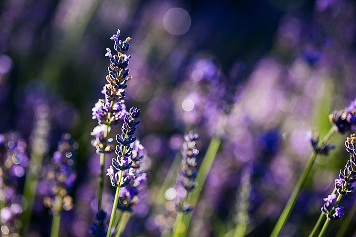
    image showing photographing nature in your backyard

    Summer lavender: ISO 100, f/3.5, 1/200th

    Backyard needn’t be taken literally here. If you don’t have a backyard, you’ll find plenty of nature to photograph just by wandering the streets or public parks and gardens.

    Tech details: All of the photographs in this article were shot on my Canon 5D Mark III. Unless otherwise stated, I have used my Canon macro 100mm f/2.8 lens. I have included details of ISO, aperture and shutter speed settings.

    #1 – Flowers and leaves

    Flowers and leaves are often the first things that come to mind when we look for subjects in our own backyards. They offer an endless variety of colours, shapes and textures for you to photograph. You could create a collection based on a single colour scheme, or try to find as many different leaf or flower shapes as possible.
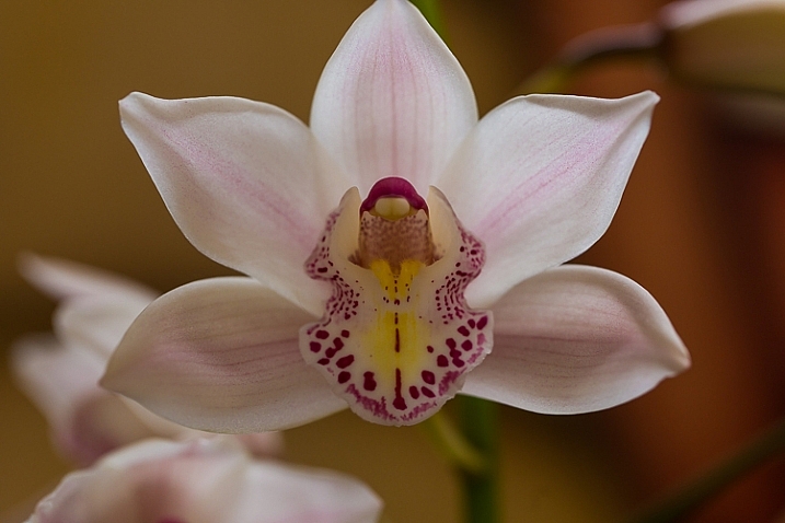
    iso 640, f4, 1/100 sec

    Cymbidium orchid: ISO 640, f/4, 1/100th
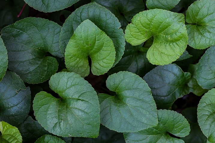
    image showing photographing nature in your backyard

    Violet leaves: ISO 800, f/8, 1/30th

    image showing photographing nature in your backyard

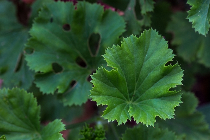
    Geranium leaves: ISO 320, f/8, 1/40th

    Experiment with different lighting and conditions. I love backlighting for leaves and flowers, as it creates a luminous, almost three-dimensional effect, and you can see details such as veins. Some shapes look better with strong, directional light, and I love how colours are enhanced in the wet.
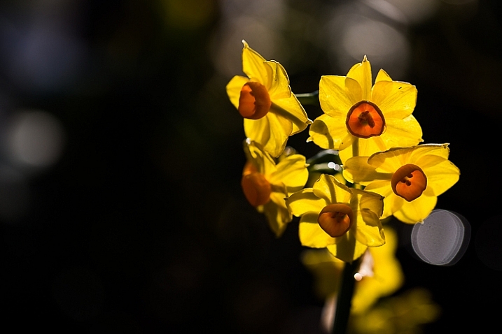
    image showing photographing nature in your backyard

    Erlicheer daffodils BACKLIT: ISO 100, f/4, 1/640th
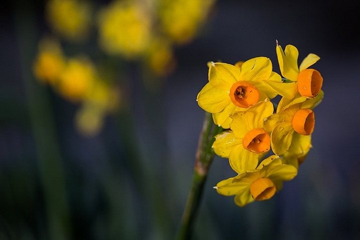
    image showing photographing nature in your backyard

    The same flower shot with the sun on my back: ISO 100, f/4, 1/800th
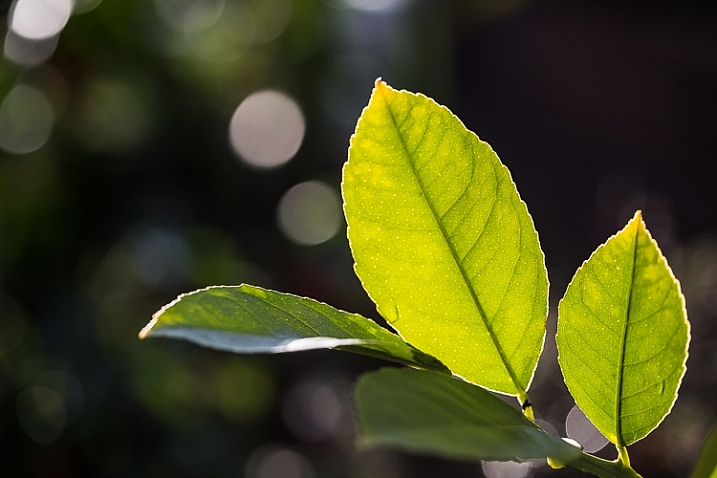
    image showing photographing nature in your backyard

    Backlighting a leaf reveals details you wouldn’t see if you lit it directly : ISO 100 f/4, 1/250th

    Flowers are seasonal, and in temperate zones, spring and summer offer the widest variety. There are still flowers to be found in winter, although you may need to look harder. Don’t forget that weeds, such as dandelions ,are also beautiful! Autumn (fall) provides the greatest colour spectrum in leaves.
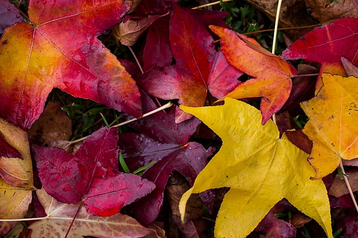
    image showing photographing nature in your backyard

    Liquidamber leaves photographed en masse: ISO 640, f/4, 1/80th
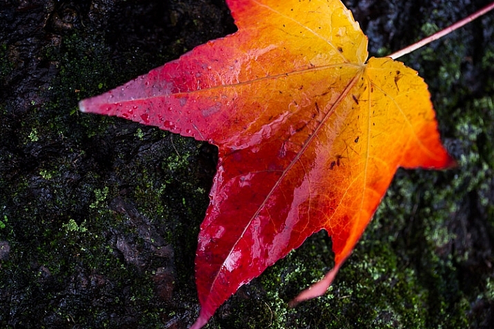
    image showing photographing nature in your backyard

    A single leaf isolated against a dark background: ISO 640, f/4, 1/30sec

    #2 – Fruit, berries and seed pods

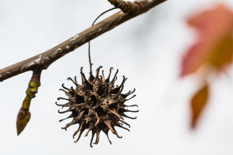
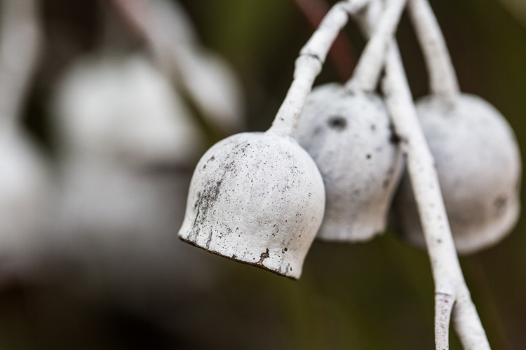
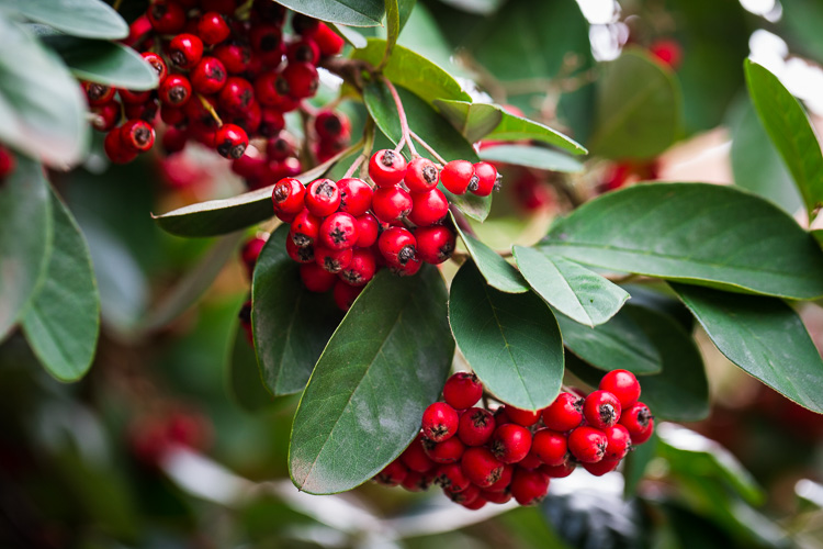
    When the summer flowers disappear, fruits and berries are nature’s way of providing for birds and animals throughout the colder months. Many berries and seed pods ripen towards the end of autumn, bringing colour to the winter garden. Citrus trees bear fruit in winter, and persimmon trees lose their leaves to reveal branches of shiny orange fruits. Think also of acorns, pine cones, and nuts.
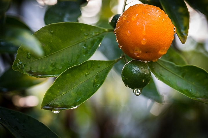
    image showing photographing nature in your backyard

    Kumquat: ISO 2500, f/4.5, 1/50 sec

    photgraphing nature in your backyard

    ISO 800, f/8.0, 1/500th.

    photgraphing nature in your backyard-4

    ISO 500, f/5.0, 1/1250th.

    photgraphing nature in your backyard-3

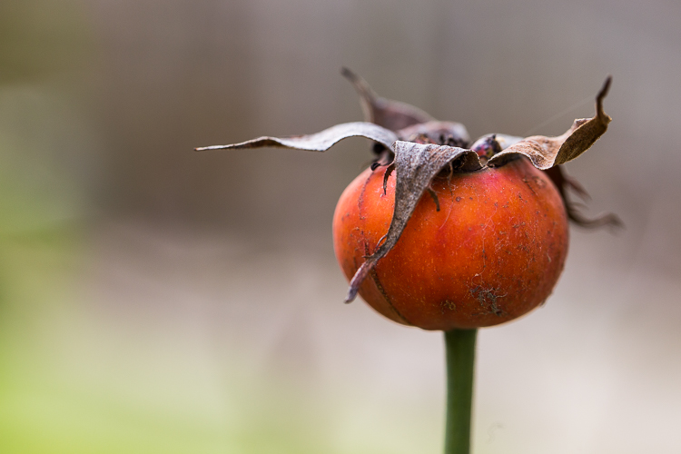
    Orange rosehip: ISO 500, f/5.0, 1/160th
    photgraphing nature in your backyard-2

    Bunches of red berries: ISO 500, f/5.0, 1/100th.

    #3 – After the rain

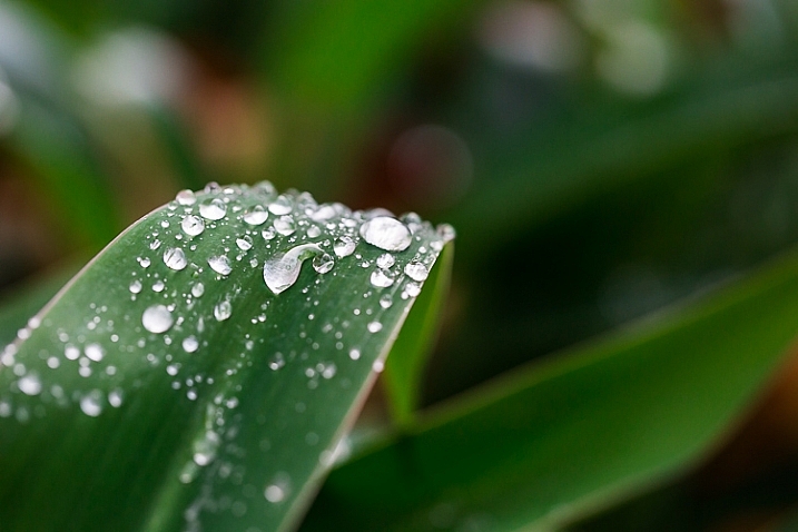
    Raindrops are fascinating through the lens. Try photographing them from various angles, and in different lighting. When photographing a single droplet, or a string of them, isolate them by keeping the background uncluttered. You can do this by creating distance between the droplets and the background, and using a wide aperture to ensure it is blurred. Notice also how water sits in nice round droplets on some types of leaves, but on others it disperses.
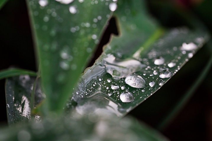
    image showing photographing nature in your backyard

    Arthrododium leaves after rain: ISO 800, f/4.5, 1/80 sec
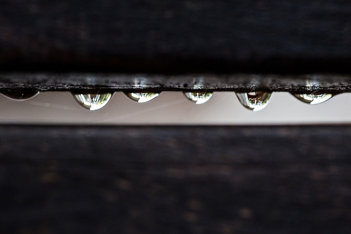
    image showing photographing nature in your backyard

    Raindrops hang from the slats on the back of a garden chair: ISO 1000, f/4, 1/125 sec
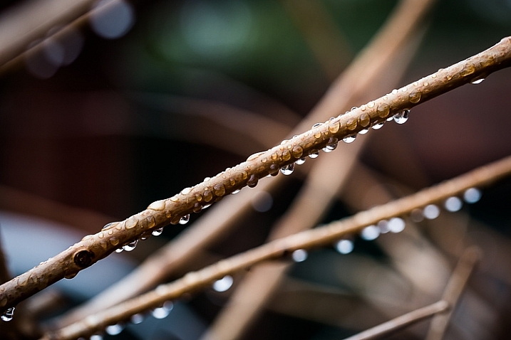
    image showing photographing nature in your backyard

    ISO 640, f/4, 1/125 sec

    image showing photographing nature in your backyard

    ISO 1000, f/4, 1/125 sec

    #4 – Mushrooms, toadstools and fungi

    These are abundant in autumn and winter, but some species pop up throughout the year after rain. Look in damp, mossy places, on the sides of trees and log piles for them.

    My personal favourites are the red toadstools with white speckles. They are evocative of fairy tales and magic, and their colours are a nature photographer’s dream!
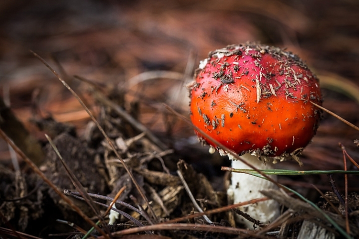
    image showing photographing nature in your backyard

    Toadstool: ISO 1000, f/6.3, 1/250 sec
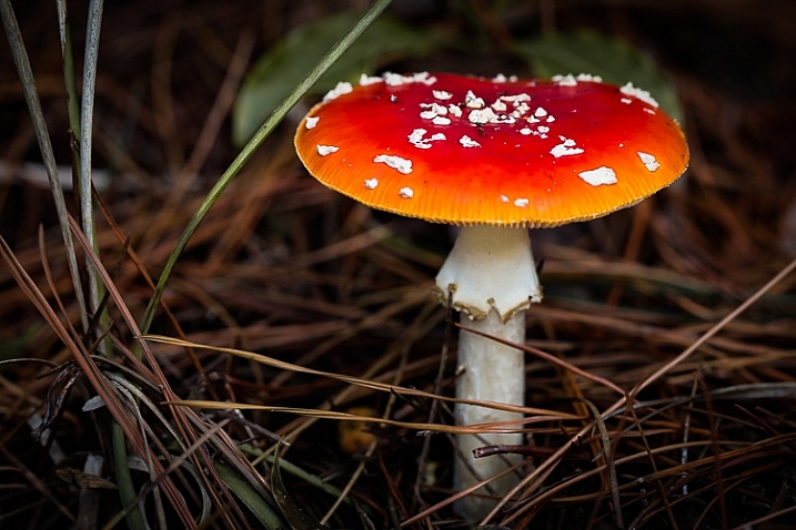
    image showing photographing nature in your backyard

    ISO 1000, f/6.3, 1/160 sec

    Don’t ignore the tiny, dull-coloured mushrooms and fungi. The ones in the photo below were growing in a crevice in the side of my herb garden. You can see by the scale of the woodgrain how tiny they were. From above, they were nondescript, but when I lay on the ground beneath them and shot into the backlight, they became translucent and I could see their delicate structure.
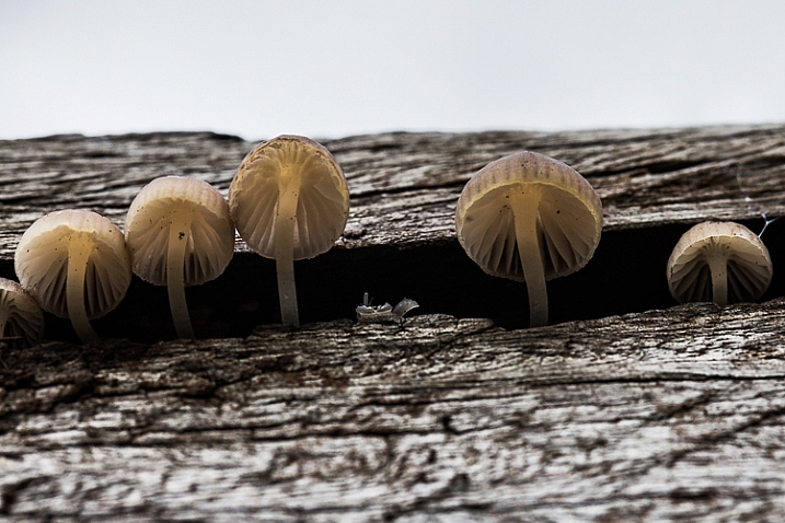
    image showing photographing nature in your backyard

    These tiny mushrooms were no bigger than the fingernail on my pinky finger! ISO 800, f/8, 1/160 sec

    #5 – Look up . . . look down

    We have a ginormous tree in our backyard. It was probably planted when our house was first built in the 1920s, and its canopy is as big as the footprint of the house. One of my favourite things to do in the warmer months is to put a picnic rug on the lawn, and lie on my back gazing up into its branches. It is free therapy!

    Watching the leaves change from bright spring green through to darker green in summer, the first blush of colour in autumn, through to rich claret just before they drop, never ceases to delight me. I have photographed it time and time again through the seasons. Even lying on the ground with my 35mm lens, I can only capture a small portion of the canopy.
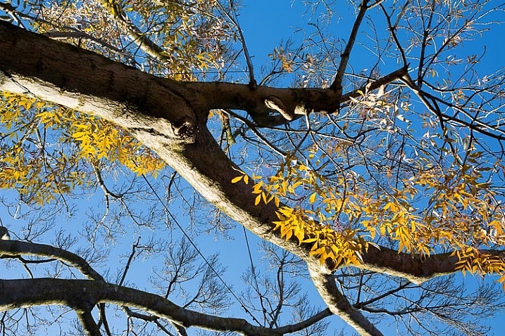
    image showing photographing nature in your backyard

    Sigma 35mm Art lens, ISO 160 f/11, 1/60 sec
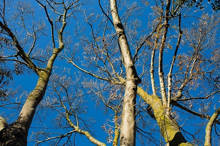
    image showing photographing nature in your backyard

    Sigma Art lens 35mm, ISO 160, f/11, 1/100 sec

    If you are lucky enough to have trees in your garden, try standing or lying directly underneath them and shooting up into the branches. Notice how the light changes from early morning, throughout the day into late afternoon and evening. Branches, whether they are naked or covered with leaves, contrast beautifully against a blue sky. They are equally stunning at sunrise and sunset, and on a moonlit night.
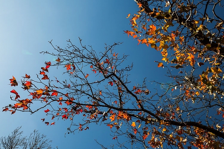
    image showing photographing nature in your backyard

    Sigma Art lens 35mm: ISO 200, f/11, 1/200

    If you haven’t any trees, look for interesting cloud formations to photograph. You can create a collection of skies to use as Photoshop overlays, to add interest to other outdoor photos such as portraits. Look for vertical cloud formations, fat white fluffy ones, and those lovely soft colours around the edge of the clouds at dusk and dawn.

    Down on the ground are a million microcosms in the moss, the lawn, between the paving stones, and the fallen bark and leaves. You won’t see them until you get down to ground level, so lie flat on your tummy and peer into another world.

    image showing photographing nature in your backyard

    Macro world: the moss on a tree trunk. ISO 640, f/4, 1/40 sec

    #6 – Black and white beauty

    We tend to think of colour photography when we think of nature, but don’t dismiss the idea of black and white. Nature provides sculptural shapes and contrasting textures that make great black and white subjects. If you have succulents or cacti in your garden, they are often more interesting in black and white than they are in colour (except on those rare occasions when they flower). Ditto with white flowers against a dark background. Smooth pebbles, rough bark, snail shells, acorns and pine cones all look fabulous in black and white. Try strong, directional lighting, and a high contrast edit.
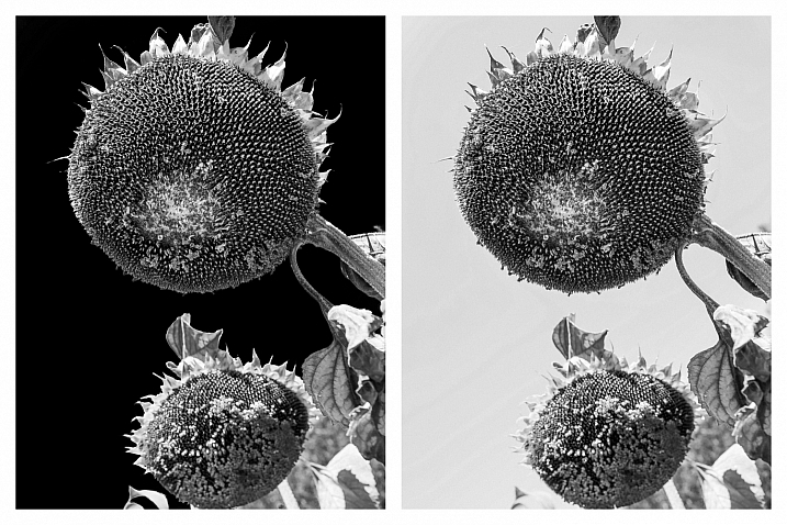
    image showing photographing nature in your backyard

    When I converted this file to B&W in Lightroom, I played with the sliders in the HSL panel. The photo on the left has the blue slider pulled all the way down to -100 to darken the blue sky. On the right, the blue slider is set to zero.
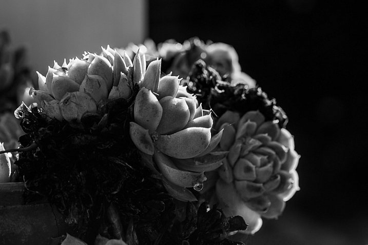
    image showing photographing nature in your backyard

    ISO 100, f/8, 1/100th. Converted to B&W in Lightroom.

    #7 – Experiment with sun flare and haze

    Your backyard is one of the best places to experiment with effects and new techniques. Firstly, you become familiar with how things look at various times of the day, and throughout the seasons. Secondly, you don’t need to travel far, so you can respond to anything on a whim. If you spot something amazing while you’re sipping on your morning coffee, you needn’t even get out of your pyjamas to capture it!

    The subjects in the two photographs below are both visible from my desk. Every morning last summer, I noticed how this shaft of hazy sunlight would hit the planting of succulents on the pedestal, so I knew exactly what time to capture it at its best. Also sitting at my desk, I saw how the sun caught this spray of orchids just after the rain, and I rushed outside with my camera.
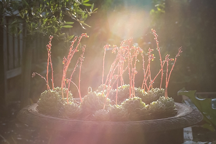
    image showing photographing nature in your backyard

    Canon 85mm lens, ISO 100, f/4, 1/800th.
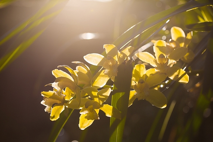
    image showing photographing nature in your backyard

    Shot with sun flare and no lens hood: ISO 100, f/4, 1/1000 sec
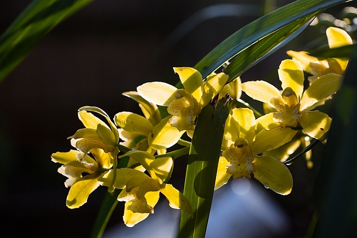
    image showing photographing nature in your backyard

    For comparison, this is the same scene shot with a lens hood to cut flare: ISO 100, f/4, 1/320sec

    #8 – Snails, bugs and spiders

    For nine months of the year, there are a million creepy-crawlies in my backyard. Butterflies, cicadas, crickets, praying mantis, caterpillars, moths, bees, wasps and spiders (I could happily do without the latter two). At the time of writing this article, it is winter in Melbourne, so most bugs are hiding or dormant.

    #9 – Birds and other wildlife

    I’m going to preface this paragraph with honesty. Confession #1: photographing wildlife of any kind requires more patience and a longer telephoto lens than I possess. Confession #2: I have the greatest admiration for those who do it. I have a Pinterest board just for animal photos (you’ll notice a clear bias towards squirrels) and on 500px I follow a number of photographers, one of whom only photographs squirrels!

    Editor’s note: our own Will Nichols specializes in photographing squirrels.

    The kinds of animals and birds you’re likely to find in your backyard obviously depends on which part of the world you live in, and how built-up your neighbourhood is. You will know which kinds of critters visit your backyard, and what their habits are. With that in mind, find a spot where you won’t be too conspicuous, and be prepared to wait. If you’re using a long lens, you might consider using a tripod or monopod to avoid camera shake. Have your ISO and aperture all set to go, with a fast shutter speed to freeze motion. If you have been watching the animal or bird’s behaviour over several days or weeks, it may be possible to focus roughly on the area you expect them to appear – for example, the birdbath.

    Also read: Guide to Attracting Critters to Your Garden for Backyard Wildlife Photography

    #10 – Portraits in nature

    Nature provides us with the perfect canvas for portraiture. Look for a bank of flowers, a bed of autumn leaves, or just a green hedge – the colours in nature never seem to clash.

    When photographing children and pets in particular, I almost always prefer an outdoor location over a studio. My eldest daughter usually runs a mile when she sees the camera, but the chance to roll around with the dog in these glorious leaves was clearly too much for her to resist.

    I love how the soft hues flatter her skin tone. If you are shooting outdoors with lots of colours, such as flowers or autumn leaves, take care with your subject’s outfit. These portraits might been too busy if my daughter had been wearing a patterned outfit.
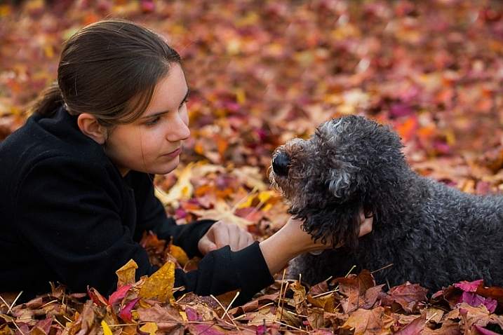
    image showing photograph nature in your backyard

    Not even teenage daughters can resist these leaves! ISO 320, f/4, 1/400 sec
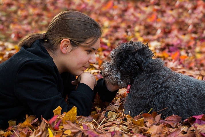
    image showing photographing nature in your backyard

    ISO 320, f/4, 1/320 sec

    Let’s hear from you!

    So there you have it – plenty of inspiration to get outdoors and photograph nature in your own backyard. It’s time to stop reading and get out there with your camera. Please share your backyard nature photographs in the comments below … especially if they involve squirrels!

    This week we are doing a series of articles to help you do better nature photography. See previous articles here:

    • 3 Habits Every Outdoor Photographer Should Develop to Avoid Missing Shots
    • 5 Tips for Better Nature Photography
    • 27 Serene Images of the Natural World
    • Weekly Photography Challenge – Nature

    googletag.cmd.push(function() {
    tablet_slots.push( googletag.defineSlot( “/1005424/_dPSv4_tab-all-article-bottom_(300×250)”, [300, 250], “pb-ad-78623” ).addService( googletag.pubads() ) ); } );

    googletag.cmd.push(function() {
    mobile_slots.push( googletag.defineSlot( “/1005424/_dPSv4_mob-all-article-bottom_(300×250)”, [300, 250], “pb-ad-78158” ).addService( googletag.pubads() ) ); } );

    The post 10 Ideas for Photographing Nature in your Backyard by Karen Quist appeared first on Digital Photography School.


    Digital Photography School

  • Do You Love What You Do?

    Craftsmanship Taking Pride

    Utsushi_The-Search-for-Katsuhiras-Tiger_01

    There are moments when you get jolted back to what really matters. This short documentation of the process in which classical Japanese metal artist Ford Hallam recreates a lost masterpiece by the 19th century Mito tsuba artist, Hagia Katsuhira is one of them. My jaw was literally on the floor in awe of the commitment and precision – and most of all the beauty of the process itself. The sword-guard that the artist re-created is incredibly beautiful in itself and the journey that Ford Hallam undertook is even more beautiful.


    Do you love what you do ?


    Is it possible to even remotely approach this level of dedication and precision in your own work? This film made me stop and reflect on all this and I encourage you to invest 30 mins of your time to watch this.


    The project and filming was funded by Mr Bob Morrison and took place from June to October 2009.


    IMAGE SOURCE:

    Feature image & images 1-2: courtesy of Per Zennstrom


    Utsushi_The-Search-for-Katsuhiras-Tiger_01


    Fashion Photography Blog

  • Concept To Creation: Finding Inspiration

    Hey FashionPhotographyBlog.com readers.


    This time around, we’re going to look at something a bit more conceptual. I can give advice and guide you, but ultimately it’s your job to really dig in and put it all together. That being said.. This post we’re going to briefly explore “Concept to Creation.” How to take an idea and turn it into an editorial or, if you’re lucky enough, an advertising campaign. Granted this post (hell- this whole blog) is geared more toward fashion photography, but the same principles apply for all walks of photography.


    One of the biggest things I didn’t understand when first starting out was what an editorial really is. Sure, it’s a “story.” It’s a group of images that go together. Easy enough. So what was I doing wrong that I couldn’t get any of my “stories” published? They were good pictures but I lacked concept and intrigue.


    When planning a shoot, there is no precise way to tell you how to get from initial inspiration to final image. However, we can look at developing an idea and the unwritten rules behind the images we see.


    Inspiration


    Let’s start at the beginning. First off, find some inspiration.


    Many people ask where to find inspiration. There’s no right or wrong answer. For some people it’s reading a book, watching a movie or going to a museum. For others it’s found walking around town or listening to new music. Everyone gets inspired differently. The hardest part is finding out how you’re inspired and taking it from there. Are you stimulated visually? Auditorily?


    The best piece of advice I could give you is to NOT look at fashion photographers work when trying to get inspired. Sounds silly, I know. Look at fashion photographers work all the time! Knock yourself out. But when it comes to initially conceiving an idea and you’re looking at the work of other fashion photographers, you’ll run into a few problems.


    1) You’re most likely going to steal a bit of their idea/image subconsciously

    2) If you’re looking at the work of masters such as Guy Bourdin or Steven Meisel, you’ll drive yourself mad! There is no way your work can stack up against these guys.


    Let your ideas come organically. Bounce ideas off friends. Watch a movie. Go to the Met. (Can’t get to NYC? No sweat! The Met has their collections catalogued online, so does the MoMA


    Browsing online and see something you like? Create an inspiration folder on your desktop to keep images for later reference.


    francis-bacon-pope

    Francis Bacon’s work often focuses on how the face distorts as one screams. I used this as inspiration for some personal images I shot.


    alana-tyler-slutsky-personal-work-lighting

    Image I shot studying how the face can be manipulated through distortion and lighting. As you can see, Bacon’s work was a big inspiration for this set of images.


    Stayed tuned because we will be diving a little further into turning inspiration into concept next time.

    Until then –


    Alana


    IMAGE SOURCE:


    Image 1: Francis Bacon

    Image 2: Alana Tyler Slutsky


    Fashion Photography Blog

  • Concept To Creation: Turn Inspiration Into Concept


    Turning Inspiration Into A Concept

    miles-aldridge-vogue-italia-cat-story

    Hey FashionPhotographyBlog.com readers.


    Thanks for joining us on our Concept to Creation series where we walk you through the process of taking an idea into an image. If you were with us last time, we talked about talked about how to find inspiration for your shoots. On today’s we’re going to jump into discussing how to turn your inspiration into a concept.


    Now, this right here is the most important step. You have an idea, great. How do you turn that idea into a set of images? Can it be turned into a picture narrative/story? Now that you have your base idea, it’s time to do some research! Doing an editorial based on the color red? What does the color red evoke? How have people pulled off red editorials in the past? While researching, plan your shoot. Is it in studio? Is it on location? One model or two? Blonde, brunette or redhead? Take this laundry list of ideas and findings and start turning it into a picture in your head.


    For some people, it helps to sketch things out. For others, it helps to collage. I tend to collect images while I sit on an idea and then go straight into creating a moodboard.


    Look at an editorial or a campaign, you’ll see that there is one main thing that binds all the images together – a concept. When flipping through the pages of a magazine, you can determine when one story ends and another beings purely based on the concept behind the images. You won’t find an editorial that consists of different girls wearing different types of clothing in locations that aren’t relevant to each other. That’s just not how it works.


    A concept is what will bind your story together. And the way in which you handle it shows a bit of your voice. A concept goes further than “my model is wearing red in all the images”. That’s purely a way of styling the model. Put some imagination into it.


    Hope you all enjoyed this dive into the thought process behind translating an inspiration into a concept. To help explain the points raised in this post further, the next article I’m posting, we’ll dive a little further by showing you some examples of how working fashion editorial photographers pull their inspiration and translating them into concepts.


    Until then –

    Alana


    IMAGE SOURCE:

    Feature image & image 1: Miles Aldridge for Vogue Italia


    Fashion Photography Blog

  • Tag, You’re It! Banksy Shows Softer Side, Makes Mural for Kids

    [ By WebUrbanist in Art & Street Art & Graffiti. ]

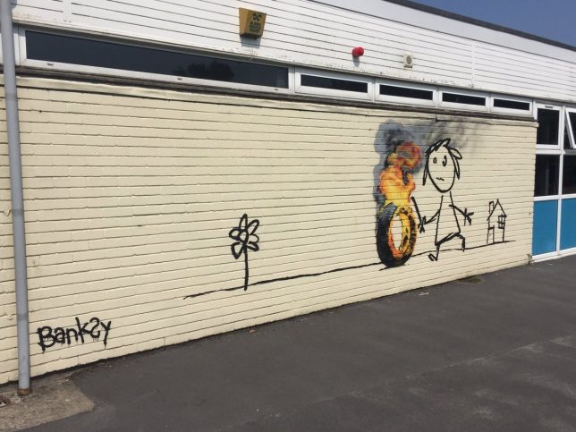
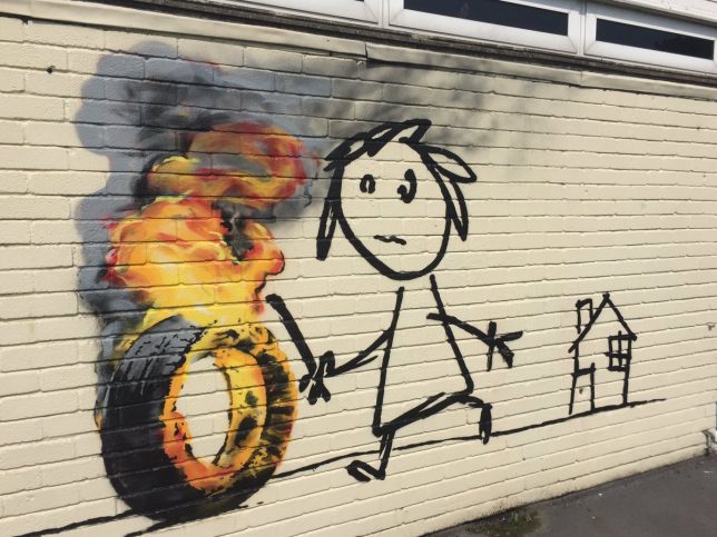
    banksy stick figure art

    Best known for biting political commentary and poignant artistic critiques, mysterious artist Banksy showed a somewhat friendlier side of his personality in gifting a mural to elementary students who named a building after him.

    banksy in bristol

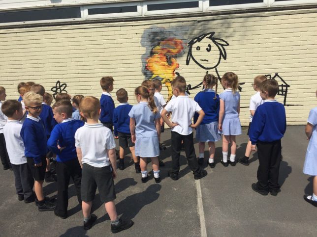
    Students at the Bridge Farm Primary School in Bristol, thought to be the anonymous street artist’s hometown, renamed several campus structures in a contest. Among the winners were Blackbeard, Cabot and Banksy.

    banksy rolling tire

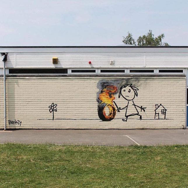
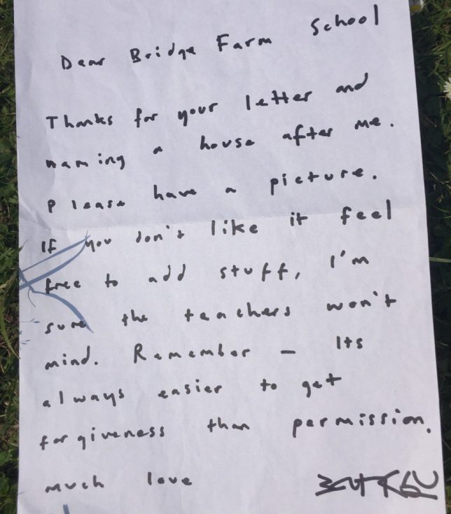
    The work itself features a child playing with a hoop, but because it’s Banksy … the hoop was turned into a tire, and the tire was set on fire. Banksy stopping by to make a mural was surprise, but he also left a note, which is even more out of character (though the work has been confirmed authentic):

    banksy hand written note

    “Dear Bridge Farm School,” the letter reads. “Thanks for your letter and naming a house after me. Please have a picture, and if you don’t like it, feel free to add stuff. I’m sure the teachers won’t mind. Remember, it’s always easier to get forgiveness than permission. Much love, Banksy.”

    banksy school mural stick

    In a somewhat ironic twist, the school is forbidding children from painting over or around the mural, perhaps out of respect or because if its doubtless high monetary value – either way, one can be sure Banksy would approve should one of those students break the rules (images by Jon Kay via Colossal).

    Share on Facebook


    [ By WebUrbanist in Art & Street Art & Graffiti. ]

    [ WebUrbanist | Archives | Galleries | Privacy | TOS ]


    WebUrbanist

  • Concept To Creation: How Professional Photographers Do It

    Examples of Concept to Creation from Working Fashion Photographers


    Hey FashionPhotographyBlog.com readers.


    Thanks for joining us on our “Concept to Creation” series where we walk you through the process of taking an idea into an image. If you were with us last time, we discussed how to turn your inspiration into a concept. Today, we’re going to dive a little further. I’ll help you out with some examples of how working fashion editorial photographers pull their inspiration and translating them into concepts.


    Miles Aldridge for Vogue Italia:

    Sure, there is a concept in the styling: spring time flowy dresses. There’s continuity between the images because of the bold use of color. But anyone that knows Miles Aldridge’s work knows that’s his style. What ties all these images together? Cats! Without the cats, none of the images would appear to be from the same editorial.

    miles-aldridge-vogue-italia-cat-story

    miles-aldridge-vogue-italia-cat-story

    miles-aldridge-vogue-italia-cat-story

    Mert & Marcus for W Magazine:

    All the images are shot in the same room. A room that has been flooded. Bingo! There’s your concept.

    Mert-&-Marcus-for-W-Magazine

    Mert-&-Marcus-for-W-Magazine

    Knowing that these guys often pull inspiration from artwork, I wouldn’t be surprised if they were inspired by Pre-Raphaeliate “Ophelia” paintings. I especially wouldn’t be surprised if a big piece of their inspiration came from photographer Gregory Crewdson’s interpretation of these Ophelia images.

    ophelia-by-john-everett-millais

    Ophelia by John Everett Millais

    Ophelia-by-Gregory-Crewdson

    Ophelia by Gregory Crewdson


    Granted, these examples are more on the extreme end of the spectrum. However, I think it drives the idea across. These images aren’t united because of what the model is wearing. They’re not united because of a dominant color (although, it helps). They’re united because of an idea which brings them together. It takes them out of the real world and brings them into a fantasy land.


    This is extremely hard to do on a limited budget. That’s okay! No one is expecting someone with no budget to pull off a shoot like the ones pictured above. Just because you don’t have funds doesn’t mean you cant create a concept on a low/no budget that ties everything together.


    Melissa Rodwell for Kurv Magazine:


    Not something that would require an extravagant budget like the images pictured above. However, they’re all united in their lighting, clothing, hair, makeup, location and way in which they’re shot. Melissa brings you into this whimsical, etherial world with a simple concept. White.


    I know, I know, I’ve said it shouldn’t just be a color that holds your images together. But In these images, it works! Melissa brings you beyond the color white and creates a fantasy world out of it.


    melissa-rodwell-kurv-magazinemelissa-rodwell-kurv-magazine

    Concept – crucial to binding your images together. You’ll find that any high end magazine only published editorials that has a concept holding the story together.


    Hope you all enjoyed the examples of working fashion photographers and their thought processes behind turning inspiration into concepts. Stay tuned because next time, we’ll be discussing the difference between editorial and campaign shoots and how these relate to your shoot concepts.

    Until then –


    Alana


    IMAGE SOURCE:


    Feature image: Mert & Marcus for W Magazine

    Images 1-3: Miles Aldridge for Vogue Italia

    Images 4 & 5: Mert & Marcus for W Magazine

    Image 6: John Everett Millais

    Image 7: Gregory Crewdson

    Images 8-10: Melissa Rodwell for Kurv Magazine


    Fashion Photography Blog

  • 15 Photographs from Ed Ruscha and the Great American West

    I had a wonderful opportunity to attend the press preview on Thursday for the new exhibition “Ed Ruscha and the Great American West,” which opens today and runs through October 9th at the de Young Museum in San Francisco.

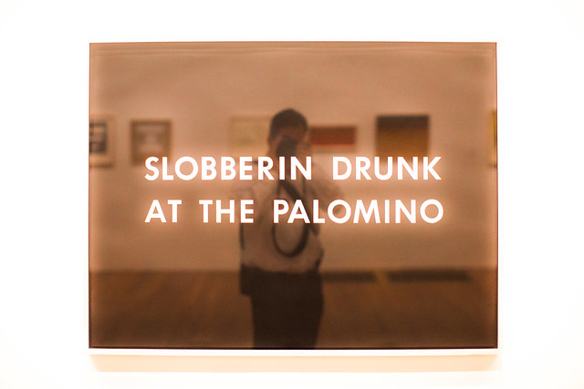
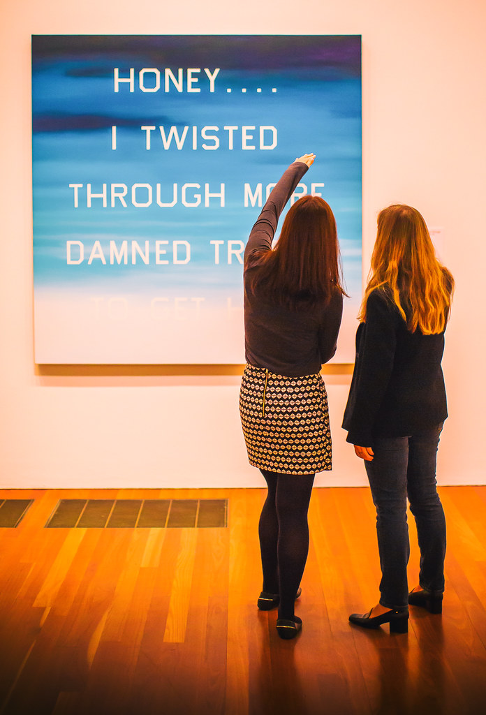
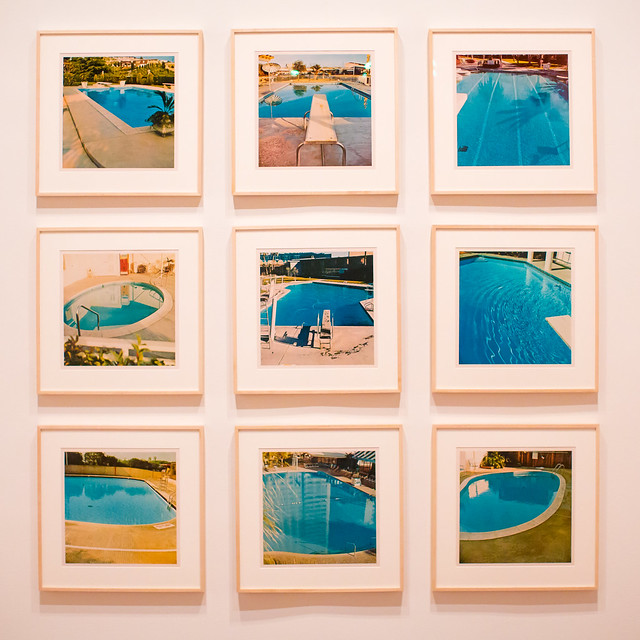
    Ed Ruscha has long been a hero of mine. With my own photography focusing on the American Road and my background growing up in Los Angeles, so much of Ruscha’s work has always rung true to me personally and I’ve felt a certain sort of affinity with it. Gas stations, neon signs, old swimming pools, and the images of a uniquely American experience, fill the current Ruscha exhibition. Mixed in with these beautiful, nostalgic and iconic images are the words that further explain this modern life: “Honey . . . . I Twisted Through More Damned Traffic to Get Here,” “God Knows Where,” “Slobberin Drunk at the Palomino” I remember back in high school or was it college once watching X, or maybe the Blasters or the Knitters perform back at North Hollywood’s Palomino, my memory is hazy and alcohol likely was involved.

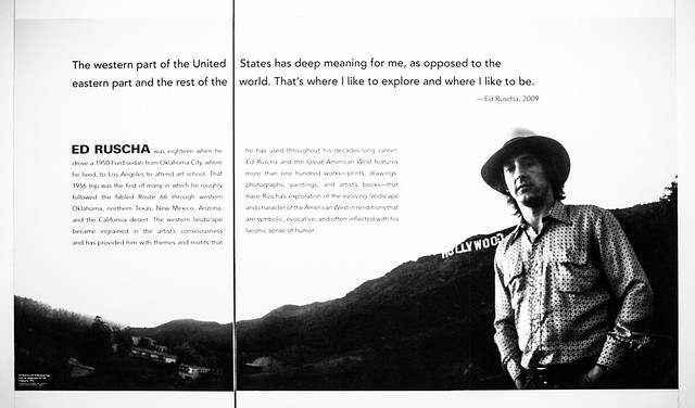
    “In 1956, at the age of 18, Ed Ruscha left his home in Oklahoma and drove a 1950 Ford sedan to Los Angeles, where he hoped to attend art school. His trip roughly followed the fabled Route 66 through the Southwest, which featured many of the sights—auto repair shops, billboards, and long stretches of roadway punctuated by telephone poles—that would provide him with artistic subjects for decades to come.” This may be all the inducement you need to read to get you to this show.

    Here are 15 photographs that I took on Thursday at the new exhibit representing my own interpretation.

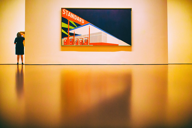
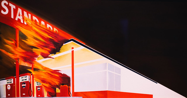
    Standard

    Every Building on the Sunset Strip

    A Particular Kind of Heaven

    Slobberin Drunk at the Palomino

    Honey . . . . I Twisted Through More Damn Traffic to Get Here

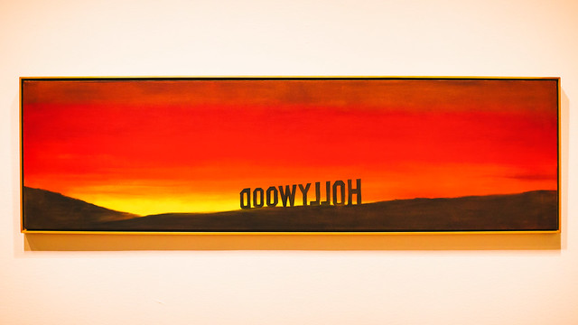
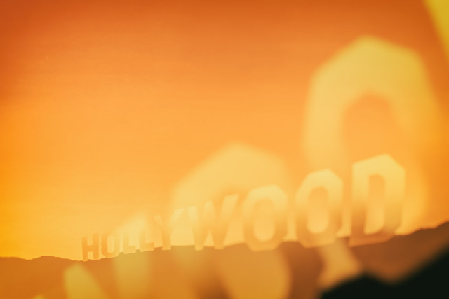
    Hollywood

    Poolside, Series of Nine Photographs

    God Knows Where

    Burning Gas Station

    Hollywood, 19698

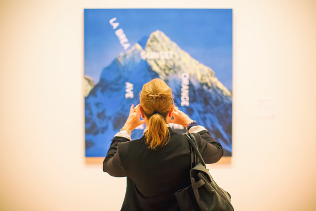
    La Brea, Sunset, Orange, De Longpre

    Texas

    Ed Ruscha

    15 Photos from Ed Ruscha and the Great American West-9

    Ed Ruscha and the Great American West Exhibition Store

    Complete 15 photo set here, but everything usually looks better on Ello. ?

    More Ruscha here.

    More de Young Museum here.


    Thomas Hawk Digital Connection

  • Behind the shot: Praia da Adraga at blue hour

    If you recognize Nicolas Alexander Otto’s name, it may be because we featured some of his work a while ago. The Germany-based landscape shooter has graciously agreed to share the story behind one of his images, titled ‘The Living Infinite’, a shot he captured on a trip to Portugal’s Praia da Adraga beach. He walks us through everything that went into making the image – from planning the trip to his post-processing technique. 

    By Nicolas Alexander Otto

    To explain my process, I should start with a little bit of background information. When I have a timeframe set and know that I will be on the road during that period I dive into the planning phase first, trying to make the most of the time I have available. I then try to organize my shooting itinerary accordingly, checking for all the different options available for good light: sunrise and sundown times, same goes for the moon, the tidal schedule and the position of the milky way.

    In this particular case I knew I was going to be at the ocean and the moon would set in the western skies during blue hour for three successive days. Hence, I knew I had to be at the Portuguese coastline by then, originally starting from Germany and driving all the way through France and Spain to get there.

    My main focus on the trip was a beach called Praia da Adraga, located near Sintra. I planned to get my shot in the early morning hours, knowing the blue hour would provide me with the gentle light necessary and the moon would add that little something to the sky, keeping it from falling flat, although much would depend on cloud coverage.
    Knowing my goal I looked up the tidal schedule next and noticed that the waves should be splashing around the famous sea stacks on the beach right around the time the moon would enter my frame. It’s important to note that I had been at that location two times prior to planning this, but tools like Google Earth and the Photographer’s Ephemeris make pre-visualizing shots fairly manageable without prior visits – I highly recommend using them. I checked the weather upon arrival and had to sit out a night of drizzle, already fearing I might not get the shot I had imagined. Luckily, it stopped once I woke up and grabbed my gear.

    On Location

    The evening before I had already scouted the location and taken some test shots looking for the right composition so I knew I didn’t need much time, just a short break in between showers to reel in my desired shots.

    During my third trip to the beach I noticed huge differences compared to my previous visit. A fellow photographer whom I met while walking towards the sea stacks told me that severe winter storms had altered the appearance of the beach, washing away quite a bit of sand rendering the sea stacks much higher than I remembered them, and revealing more rocks in the foreground as well. However, when I looked at where the moon would enter the frame on Photographers Ephemeris I saw that almost none of them would be in my composition.

    I knew I had to battle against the rising tide and might face issues with camera shake, especially with my 36MP Nikon D800, so I utilized my heaviest tripod: a 3.4kg Slik 780 DX Pro. If burrowed in the sand a little, it’s almost completely resistant against the incoming surge as long as it’s not much more than knee high.

    Composition-wise I went for a classic, dynamic two thirds setup with the waves’ receding flow drawing the viewer’s gaze into the image, right past the sea stacks out onto the ocean and the moon looming overhead in the left third of the frame. I tried to leave at least a little bit of separation between the rocks as their dark surfaces can be heavy and distracting if clumped up, drawing too much of the viewer’s attention to a single area.

    It took me some time to get an incoming wave to create those leading lines I had imagined. Sadly, the image ended up being a bit too dark, so I would need to brighten the exposure a little in post processing and work on the contrast. To blame was the fact that dawn had already kicked in and I had to readjust my camera settings each minute, and at that moment I tried adding a ND filter. When an especially promising wave came in, rather than adjusting my settings, I pressed the remote shutter and got exactly the wave patterns I was imagining. No other subsequent exposure came even close to it, unfortunately, thus I had to choose this one despite its technical shortcomings.

    It can be quite difficult to capture waves because the shutter speed has to match the their force to shape beautiful streaks of spume, without them stopping or clumping up at a rock, breaking the rhythm of the lines. Oftentimes a shorter exposure doesn’t create any dynamic addition to the image and a longer one would render most of the wave motion invisible.

    Here are the settings used for my shot:

    Camera: Nikon D800
    Lens: Nikkor AF-S 18-35mm F3.5-4.5 G ED
    Focal length: 18mm Shutter speed: 3,5 sec
    Aperture: F5.0
    ISO: 100
    Filter: Haida ND64

    Post-processing

    Exposure adjustments made to brighten the image.

    I knew I needed to brighten the image overall, however I did not not want to alter the colors in any way to preserve the natural hues that the magical blur hour light supplied. Also, I knew I had to make local adjustments to the micro contrast, which is why I did not use clarity just yet because I wanted to keep the clouds nice and smooth.

    At this point some adjustments to sharpening are made, along with correction for vignetting but none for distortion.

    I rarely ever sharpen my whole image which is why I used a mid-range mask here to cover only the stronger contrasted edges of the rocks and sky. Even though I do use lens corrections I almost always dial down the distortion; on the one hand because the Nikon 18-35mm G ED has almost no distortion to begin with and on the other because a little distortion, in my opinion, adds to the dynamism of the image, especially in landscape photography. And for the most part I keep the standard noise reductions settings as is.

    Next I imported the image into Photoshop and here you already can see all the different adjustments I made to the image on the right (first switched off so you can see the difference). Before I start working on anything else, I usually get rid of dust spots – thus the base layer is renamed to “clean”, indicating I’ve already cleaned up the image.

    As a second step I used Nik Color Efex Pro 4 here for some more global adjustments, and afterwards I used luminosity masks to target specific tonalities of the image, adding more contrast selectively to the sand and sky. Due to the very even overall exposure (not taking into account the rocks), most of the masks are not altered after the tonality selection.

    In Color Efex Pro 4 I first used the Pro Contrast and Detail Extractor with these settings:

    At this point I wanted to add a bit more contrast to the sky and the foreground without darkening the rocks to prevent having to brighten them up again later in the processing, since that is never a good idea to begin with. The rest of the image benefited from a little more punch overall, though. I also balanced out a little bit of the cyan toning with the ‘Correct Color Cast’ setting, because at this stage I felt like it might be deviating a bit too much from what the scene looked like in my recollection.

    The detail extractor is an incredibly powerful filter, which is why I seldom use it at more than 5%. I would also recommend painting the effect in rather than using control points for masking in more complex situations. But in this case, the selections that the program generated suited my needs and I went with it. I tried to prevent the detail extractor from brightening the waves and sky, as it tends to brighten darker parts of the image recovering information in the dark tones. Furthermore, longer exposed skies and waves looking too crisp, for me at least, often kind of defeat the purpose of taking long exposures in the first place. However, the dark rocks were already brightened up a little bit which was a desirable result in this case.

    After these adjustments the image already had more punch, but still lacked some differentiation in the narrow tonalities of the sand and the incoming surf – something common with blue hour shots. Additionally, I wanted the sky to be just a bit more dramatic. For this I added different curves layers with various luminosity masks generated with Tony Kuypers famous TK Panel.

    First, with a ‘Lights 3’ and a ‘Lights 1’ mask, I emphasized the waves in between the rocks, both grouped together and masked with a gradient in order not to affect the sky (you can see the gradient masks in the first screenshot).

    The same procedure was then used to get more detail out of the immediate foreground waves by using a ‘Midtones 3’, and again for the rocks, and foreground using a ‘Darks 2’ mask (this was actually applied later in the workflow and is called ‘contr5’ in the image above).

    Next I wanted to introduce a bit more drama to the sky, so I used a ‘Midtones 3’ mask in order to select a wide tonal range in the sky, and darkened them only a small amount to make the undersides of the clouds stand out more.

    In the end I darkened the rocks a little – just a tiny amount because I love images with prevalent darker tones – using a ‘Darks 3’ mask (this would’ve also simply been achieved by painting out the detail extractor added earlier).

    As a last step I added a minor dodge and burn alteration to call attention to the small water splashes on the right sea stack: a very subtle, almost unnoticeable effect.

    My final actions, as per usual, included resizing and converting into RGB color space. Usually I choose 900px for the web, but in this case I chose 1200px for this DPR article, so you can see more of the details.

    I hope you enjoyed this behind-the-scenes look at my process!

    Articles: Digital Photography Review (dpreview.com)

  • How to Accelerate the Development of Your Personal Photographic Style with Lightroom

    If you want more Lightroom help from Viktor, get 50% OFF his Four Seasons Lightroom Preset Collection, on now at Snapdeals (only until July 19th, 2016)

    Over the years, Lightroom has become the most important tool for my photography. I use it for organizing and editing my photos, as well as publishing them to various channels. But, this hasn’t always been the case.

    Images Personal Artistic Style in Lightroom 01

    When Adobe introduced Lightroom years ago, 100% of my editing was done in Photoshop. But, gradually over the years with every new version or update of Lightroom, it became a one-stop destination for all of my post-processing activities. Today, Lightroom meets 90% of my photography needs with Photoshop meeting only 10%.

    Compared to Photoshop, I love Lightroom because of its nondestructive RAW editing and speed. But, if I had to choose my favorite Lightroom feature, it would be the ability to create presets.

    Images Personal Artistic Style in Lightroom 02

    Notice patterns and make them into presets

    Preset functionality drastically changed the way I approach photo editing and helped me accelerate the development of my personal style. Yet, when presets were first introduced in Lightroom 3, I initially overlooked the feature until I decided to put an extra effort toward increasing the efficiency of my editing.

    When I started analyzing the way I take and edit photos, I noticed certain patterns. I recognized that the way I take pictures directly affects the way I process photos in Lightroom.

    For example, when shooting landscapes and cityscapes, I always set the exposure for the highlights (sky) that results in underexposed foreground shadow areas. Then, as I begin editing, I start by opening up the shadows, recovering details in the highlights and adding a graduated filter to the sky area. I boost contrast and clarity, increase the saturation and vibrance. This usually results in an oversaturated sky so I only desaturate the blue hues. I also ensure that the vegetation in my photos is not electric green by shifting the green hues toward the yellow spectrum. In the final steps, I add vignetting, increase sharpening and reduce noise.

    Images Personal Artistic Style in Lightroom 03

    Though these steps soon became second nature, it also meant that I performed anywhere from 20 to 30 identical adjustments to every edited photo. When I realized this, it quickly became obvious that if I recorded the common edits and adjustments as a Lightroom preset, then I could reuse them again and again more efficiently.

    When I finally saved the edits listed above, my first preset was born. I named it “Natural” because it fully reflected my photography style in achieving a natural and well-balanced look, with rich colors.

    Images Personal Artistic Style in Lightroom 04

    Create variations

    I then created two more presets, based on the first Natural preset. I shifted the color balance toward warm colors (yellow, orange) to emulate the warm hues of the early morning. I called this one “Sunrise.” Another preset I created was “Overcast” in which I decreased saturation and boosted contrast to imitate cloudy and darker days.

    These three presets – Natural, Sunrise and Overcast — were the foundation of my Landscape collection.

    Images Personal Artistic Style in Lightroom 05

    Over the years, I gradually created new presets while making sure each of them reflected my taste and photography style. At some point, I looked back and realized that I was actually defining and perfecting my own artistic style while also exploring different artistic directions and the future of my work.

    Today, I have three main preset collections that cover the different aspects of travel photography: Landscape Collection, Cityscape Collection and People Collection.

    Experiment and save

    I use the preset-based editing approach on a daily basis because it not only saves me an enormous amount of time editing, it also keeps my artistic style consistent. But, at the same time, I am also able to continue experimenting with new approaches that can be saved as new presets that reflect my evolving style.

    I highly recommend that you try a similar approach with your photography.

    Images Personal Artistic Style in Lightroom 06

    Making your own presets

    Here are some actionable steps that can help you jumpstart the process of creating your own presets:

    If you’ve been using Lightroom and have a decent sized photo collection, select your favorite photos from the archives and create your own presets based on the edits and adjustments of the selected photos. Continue refining your presets over time to make sure that they are generic enough to work with a variety of photos. Also, keep growing your preset collection, and be sure to organize them by topic and/or style.

    For photographers who are just starting out and don’t yet have a sizeable archive, I recommend using someone else’s presets as a starting point. It is fairly common that well-established photographers are willing to sell or give away their Lightroom presets to help budding photographers. Simply find a photographer whose style you like, and use his or her Lightroom presets as the foundation for your future collections.

    You can even try to reverse engineer them to figure out how certain effects were achieved. Also, don’t be afraid to modify the presets until you come up with something exciting and unique to you.

    Images Personal Artistic Style in Lightroom 07

    Conclusion

    Developing your personal artistic style in photography is a long, and sometimes chaotic and uncontrollable process. By recording your artistic tastes and versions as Lightroom presets, and by using them as the foundation for your preset-based editing routine, you can accelerate, simplify, and streamline an otherwise extremely complex process.

    If you want more Lightroom help from Viktor, get 50% OFF his Four Seasons Lightroom Preset Collection, on now at Snapdeals (only until July 19th, 2016)

    googletag.cmd.push(function() {
    tablet_slots.push( googletag.defineSlot( “/1005424/_dPSv4_tab-all-article-bottom_(300×250)”, [300, 250], “pb-ad-78623” ).addService( googletag.pubads() ) ); } );

    googletag.cmd.push(function() {
    mobile_slots.push( googletag.defineSlot( “/1005424/_dPSv4_mob-all-article-bottom_(300×250)”, [300, 250], “pb-ad-78158” ).addService( googletag.pubads() ) ); } );

    The post How to Accelerate the Development of Your Personal Photographic Style with Lightroom by Viktor Elizarov appeared first on Digital Photography School.


    Digital Photography School