US-based startup Light has officially introduced its L16, a portable device packed with 16 individual cameras, ten of which capture an image at the same time at different fixed focal lengths. The resulting photograph is a composite of all the individual images combined, with a final resolution of up to 52 megapixels. An earlier prototype of this camera was shown off this past April. Read more
Month: October 2015
-
Banksy’s Dismaland to be Reused as Refugee Housing in France
[ By WebUrbanist in Abandoned Places & Architecture. ]

The dystopian bemusement pop-up theme park known Dismaland, a project of UK artist Banksy, is now closed but its dismantled pieces and parts will find second lives as architecture and infrastructure for refugees across the English Channel in the French port city of Calais.


Known collectively as “The Jungle,” a series of mostly-informal refugee camps around the Port of Calais temporarily house asylum seekers from troubled countries including Darfur, Afghanistan, Syria and Iraq. Most of The Jungle’s occupants are looking for ways into the United Kingdom, legally or otherwise.


Working fixtures, furniture and furnishings will be appropriated more directly, while more complex structures are being disassembled to be reused as raw materials for shelters and services. While camps have existed in the area for years, they are in constant conflict with authorities and generally lack even basic day-to-day amenities.


Lasting just over a month, Dismaland attracted over 150,000 visitors, featuring works by Banksy and 58 other artists. Dismaland was a surprise installation to the residents of seaside Somerset, England, who were told the construction efforts were building toward a film set for an upcoming movie (images via Wikipedia and Colossal).
Want More? Click for Great Related Content on WebUrbanist:

Welcome to Dismaland: Banksy’s Dystopian Bemusement Park
Excited ticket holders rush past sullen-faced guards in mouse ears to gain access to Banksy’s Dismaland, a dilapidated, depressing ‘bemusement park’ …
Click Here to Read More »»
Details & Diagrams: $ 1,000 IKEA Flat-Pack Refugee Shelter
Emergency shelters are designed to be short-term solutions, and many cannot withstand rain, wind and sun for more than six months. Yet the average stay in …
Click Here to Read More »»

Casa Futebol: Design to Deploy Housing in World Cup Stadiums
Imagine converting the circumferential spaces of sports stadiums into a plug-and-play system of modular residential units, leaving their open centers for use …
Click Here to Read More »»


[ By WebUrbanist in Abandoned Places & Architecture. ]
[ WebUrbanist | Archives | Galleries | Privacy | TOS ]
-
8. Oktober 2015
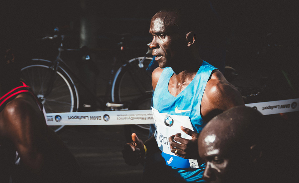
Das Bild des Tages von: Doktor Waumiau
Im Ausblick: Wolfskinder, die beliebtesten Instagramfotos und Alec Soth.
kwerfeldein – Fotografie Magazin | Fotocommunity -
Tips on Choosing a Free Photo Editor for Post-Processing
A question I get asked a lot is, “What software for post processing would you recommend if you were starting out in photography today?”
Don’t know which photo editor to choose, here are some free options worth considering.
My go-to software for editing photos is Adobe Photoshop. This doesn’t mean I am advocating that Photoshop is the only photo editor worth considering – far from it. I will be using Photoshop as a frame of reference only, and not as a direct comparison to other software products mentioned in this article.

Deciding which Photo Editor can be daunting for a beginner, especially as there are so many to choose from!
However, it is the industry’s number one software for professionals. Prior to the new subscription model, Photoshop was a standalone piece of software and was expensive. But even with the subscription model, it’s a recurrent expense, which over time will amount considerably for your buck.
After doing some research, I was quite amazed at the plethora of photo editing software applications, on the market that are relatively inexpensive to purchase. Most of which equip the beginner with more than enough features and tools to get your images looking great.
Also, most of the applications can be downloaded free, for a limited trial period. This gives you a better idea what it’s like, and you’re able to test the software and its capabilities.
Other products can be downloaded for entirely free and some are even web based, so you don’t have to download any software onto your computer. The disadvantage is that you do need a reliable internet connection. Also, I did find the annoying ads that pop up alongside the interface distracting. An alternative to get rid of these ads is to pay for an upgrade.
Let’s take a look at some of the free options:
Pixlr
Pixlr is a web based, online editing tool. You can create a new image, upload an image, or grab one directly from a URL location. I found this product very intuitive and easy to use. The images load up fast in the web browser. The interface is quite similar to Photoshop. It has all the tools like: layers, lasso tool, brush controls, cloning, and filters.

The Launch screen as it appears when you load Pixlr in your web browser.
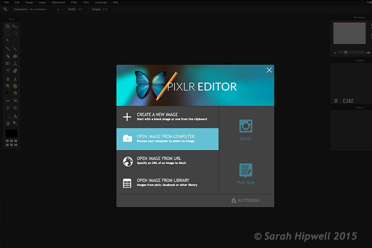
You have four options to choose from when you go to open your file. It’s that easy.
Ok, so where do you start with your post-processing?
When you have your image open, duplicate it so that you keep the original intact. That way, if you completely mess up, don’t worry, you still have the original to begin again.
Post editing is a skill. It does take patience and time to master.
Color correction
I would consider color correction an important area to begin your post-processing.
The Levels setting exists in many image editors. It is a powerful tool for adjusting the tones (contrast) in your image, and for making color adjustments. In Photoshop, you select Layer> New Adjustment Layer > Levels. In Photoshop Elements choose Enhance > Adjust Lighting > Levels. Other image editors place it differently, but essentially it does the same job. The Levels setting is a bit daunting and complex to begin with, but I do feel it is worth the time to get to know.
The Levels dialog box has an image histogram which is similar to the display on the back of your camera. A simple explanation of the histogram is: the shadows (blacks) are on the far left, mid-tones (grays) are in the middle and the highlights (whites) are on the far right. So by adjusting any of the sliders on the bottom, you will affect the contrast of your image.
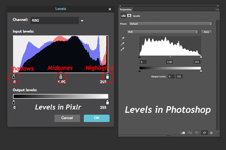
The Levels setting on the left belongs to Pixlr, and on the right is the Levels adjustment as it appears in Photoshop CS6.
Okay, but what about the color of the image?
An easy way to adjust color correction is by changing the color channels which are found in the Levels dialog box. The default setting is RGB in Pixlr.
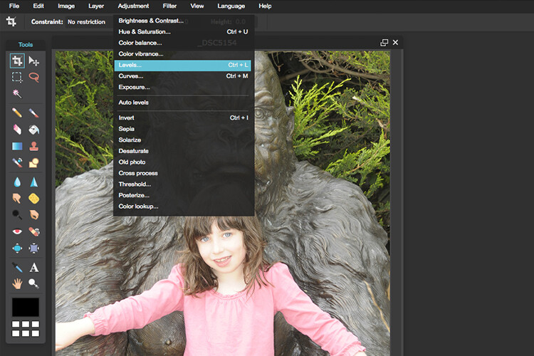
Where you find the Levels setting in Pixlr.
Go to Adjustment Tab and select Levels. Click on the downward arrow next to RGB in Channel, this brings up a drop-down menu for the red, green and blue channels. Choose the first one, which is red. Look at the histogram graph and check for gaps in it.
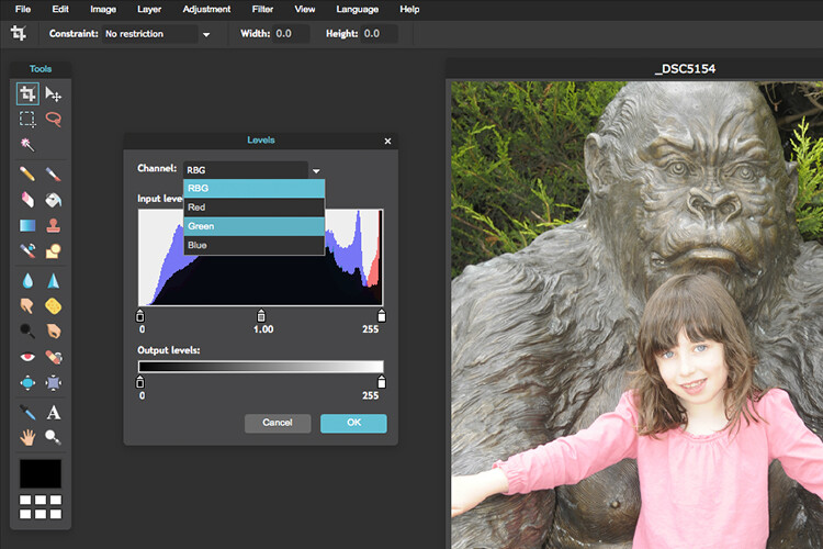
The colour channels appear in a drop down menu by clicking on the small arrow to the right of RGB.
For this image, as it is quite over-exposed a lot of the shadow detail is lost (overly gray and no black in the image), see left of the graph. Move the shadow slider to the right, in towards the middle, where the graph starts to go up.
You want your graph to represent a nice mountain shape starting from the shadows rising high in the midtones and back down to the highlights. See photo. Repeat this process for the other two channels. Click back to RGB.
To add some contrast, just move the middle slider (mid-tones) to the right, see photo below. There is a lot more to learn about the Levels adjustment, but this is just an easy way for beginners to start.
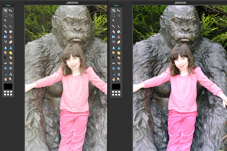
Before and after colour correction on the RGB channels using Pixlr.
Some other alternative web based solutions are SumoPaint, which has a similar interface to Photoshop, and another called PicMonkey.
SumoPaint
Similar to Pixlr, SumoPaint was very easy to use. I was able to adjust the color correction on this image using the Levels adjustment and modifying the color channels, as I did using Pixlr.


If you prefer to download software onto your computer. Again there is a wide choice of free products available.
- Paint.net, which is Windows based.
- Picasa is Google’s photo manager and editor. It plugs into Google+.
Photoscape
Here’s another one that you may or may not have come across, called Photoscape. This software is packed with excellent features for free. It has a built-in image viewer, which lets you see all your images quickly at a glance using thumbnails. It also has a Batch Editor, so if you apply an edit to one photo or resize it – using the Batch Editor will apply the same edit to multiple images. It even has a RAW Converter. For beginners, it offers image cropping, brightness and colour adjustment, red eye removal, and some great effects too. It does appear to more intuitive and offer a less steep learning curve for beginners.
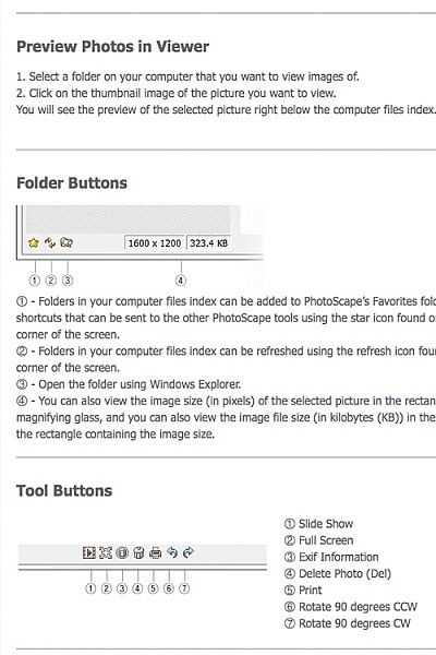
Photoscape
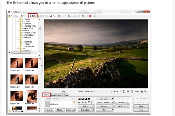
Main editor tools in Photoscape
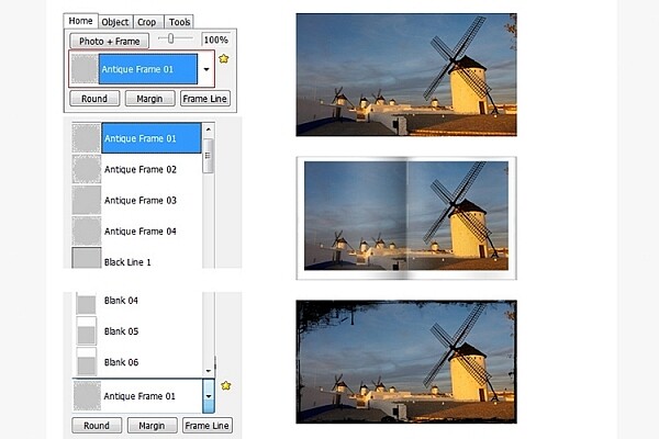
Adding frames in Photoscape
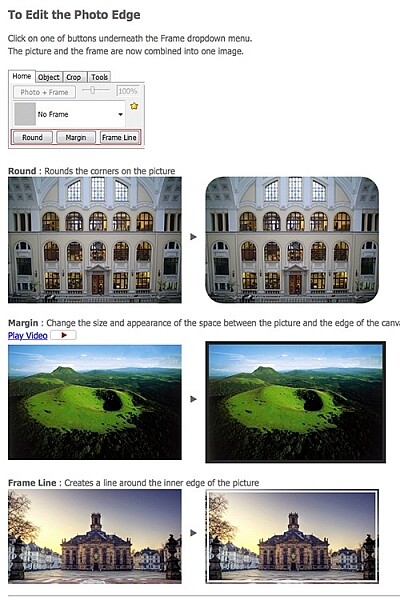
Edit photo edge in Photoscape
Preview, which is Apple’s built-in image and document viewer for OS X, surprised me. It has the capability to crop, resize, and do color adjustment which was quite impressive.
Conclusion
In summing up, there is a vast range of post-processing image editors to choose from. In this article, I only hinted at a mere few. The list is endless!
As a guide for beginners, I would experiment with the free options and test them out for yourself. There is no financial investment only your time. The time invested will give you a better idea which application suits you best in the long run.
Post-processing does require time, no matter how skillful you become at it. Once you have established a certain level of skill at post editing, you can then graduate to purchasing a reasonable priced standalone image editor, if you prefer.
Example products are:
- ACDsee19 for $ 59.99
- Photoshop Elements 14 for $ 99.00
- Adobe Lightroom 6 for $ 149.00
- Affinity Photo for the Mac is only for $ 49.99
- PhotoPlusx8 for $ 99.99
Or you could simply download GIMP, (some equate this software as being powerful to Photoshop) which is an open source image editor with versions available for Windows, OS X, and Linux. There are lots of tutorials and resources already on the web to help you further with this software.
In fact, if I was new to photography and I had to decide which photo editor to pick, I would feel spoilt for choice!
Disclaimer: I was not contacted or sponsored to test any of the above software applications. Opinions are purely by the author only.
googletag.cmd.push(function() {
tablet_slots.push( googletag.defineSlot( “/1005424/_dPSv4_tab-all-article-bottom_(300×250)”, [300, 250], “pb-ad-78623” ).addService( googletag.pubads() ) ); } );googletag.cmd.push(function() {
mobile_slots.push( googletag.defineSlot( “/1005424/_dPSv4_mob-all-article-bottom_(300×250)”, [300, 250], “pb-ad-78158” ).addService( googletag.pubads() ) ); } );The post Tips on Choosing a Free Photo Editor for Post-Processing by Sarah Hipwell appeared first on Digital Photography School.
-
And the winners are: DPReview Awards 2015
PIX 2015 has given us the opportunity to do something we’ve wanted to do for a long time: present awards recognizing the significant bits of photographic gear that have been announced in the last year. We handed them out last night, see which products were winners. Read more
-
Rezistenta Goldbach
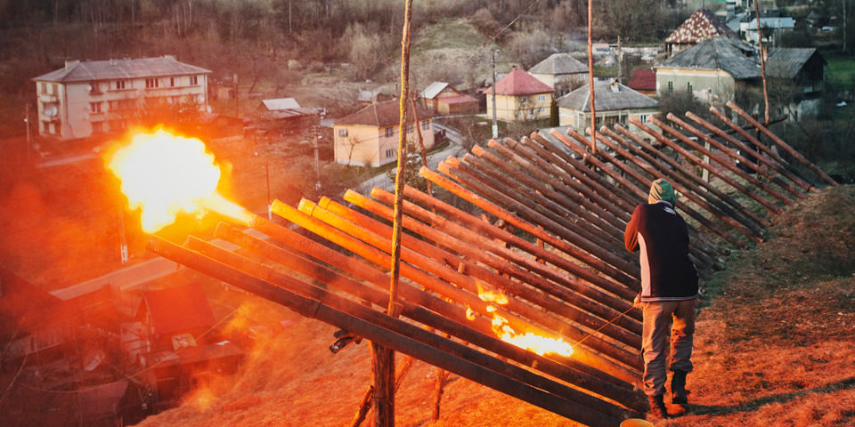
Ein Beitrag von: René Zieger
Im Sommer 2009 werde ich bei einer Freundin in Bukarest auf einen Artikel über Rosia Montana aufmerksam. Ein kleiner Ort im Apuseni-Gebirge, Teil der rumänischen Westkarpaten, im Widerstand gegen die Pläne eines kanadischen Konzerns, dort im großen Stil Gold zu fördern. Umsiedlung, Zerstörung von Naturräumen, soziale Konflikte in einer dörflichen Gemeinschaft – ganz ähnliche Prozesse, die auch meine damals aktuelle Arbeit „Retired Soil“ über ostdeutsche Braunkohlereviere begleiten.
kwerfeldein – Fotografie Magazin | Fotocommunity -
Manfrotto launches Pixi Evo mini tripods for DSLRs
Manfrotto has launched the Pixi Evo, a miniature lightweight tripod with two-section legs and five adjustable steps. The Pixi Evo represents a design update over the original Pixi mini tripod, and is designed, in part, to support entry-level DSLRs with large lenses. Read more
-
8 Common Landscape Photography Mistakes
As photographers, we know that there are literally hundreds of small things that need to be done in each scene, that add up to the final magnificent shot. Sometimes when we get behind the camera, and the light becomes amazing, it’s very easy to forget one or two things, and the result is that the shot is not as good as it could have been. There are lots of details to remember, but there often some obvious things that have been forgotten. These are the common mistakes I see in many landscape images. If they were corrected at the time, the image would have been much more dramatic and powerful.
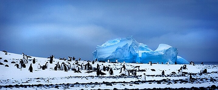
Penguins and iceberg in Antarctica.
So here are the eight top landscape photography mistakes make so you can avoid them and improve your images:
1. Stability – use a tripod
In creative images, blurriness can be very interesting. In landscape images however, you usually want your image to be sharp all the way through. The best way to be sure that your image is sharp is to use a tripod. If you are shooting in low light (you mostly will be if you are shooting landscapes) then you absolutely need to be using a tripod.
Now, there are tripods and there are tripods. For landscape photography, you might want to invest in a more heavy-duty one. The small light-weight tripods might do the trick for a while, but if you are shooting on a location and it’s windy, your tripod may get blown over, or might move because of the strength of the wind. A good tripod will also last a long time and take a beating, so buy the best tripod you can afford, and make sure you keep your camera as still as possible when shooting.
Another good piece of equipment to buy is a cable release. You don’t need to buy one of the expensive ones with the intervalometer built-in, no, just a simple cable release. Once you are set up and ready to take your shot, step back from the camera and press the button. There will be no vibration from you pressing the shutter release and your image will be nice and sharp. If you don’t have a cable release, you could use the built-in self timer to release the shutter too.
2. Get the horizon straight
This almost goes hand-in-hand with using a tripod. Many a good landscape image has been damaged by a skewed horizon. Fortunately, this can be easily fixed in Photoshop or Lightroom, so it’s not a very big worry, but you might have to crop out some details to get that right. The idea however, is to get the shot right in camera first, then edit.
You can use a few different tools to make sure your horizon is straight. Firstly, switch on the grid in your camera viewfinder, line up the horizon with the horizontal line, and you should be good. Some tripod heads have a built-in spirit level, make sure this is level and your horizon should be fine. Lastly, use the live view function on your camera, and if you have it, bring up the false horizon dial on the back of your screen, level your camera, and you are done.
I prefer levelling my horizon in camera, as it helps to save time in post production. If you need to straighten the horizon afterwards, you will need to crop the image as I noted earlier, which means your composition may change slightly. I prefer not to crop as far as possible, so getting it level in the camera is a good goal.
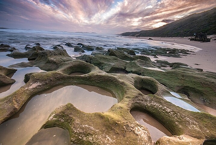
A crooked horizon is distracting.
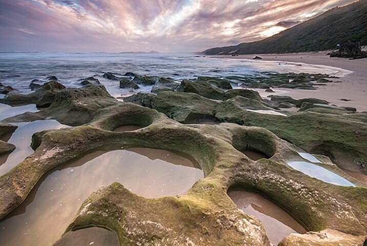
Looks better now that the horizon is straight.
3. Shooting only in landscape format
Many photographers assume that they should shoot a landscape scene in landscape (horizontal) format. This is normally not a bad idea, but in some cases, a portrait orientation (vertical) can work really well. Think of a forest or mountain scene. If the subject shape is more vertical than horizontal, try it in the portrait format, it can add a dynamic feel to the scene.
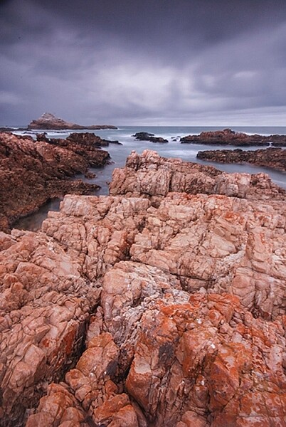
Shoot in portrait format too!
4. Not thinking about the aperture
I truly believe that aperture is a composition tool. When you are setting up a scene, you should be thinking about your depth of field. Do you want everything from the foreground to the background to be in focus? Generally, in landscape photography, this will be the case.
If that is what you want, make sure your aperture is f/8, f/11 or higher. That way, you will ensure that everything is in sharp focus. If you are at f/2.8, and you focus on the foreground, the background will be out of focus, and the middle of your scene will be soft. This should be one of your key checkpoints when you set up the shot. If you are using a wide aperture and the mountains in the distance are out of focus, this cannot be fixed afterwards in Photoshop…not yet anyway!
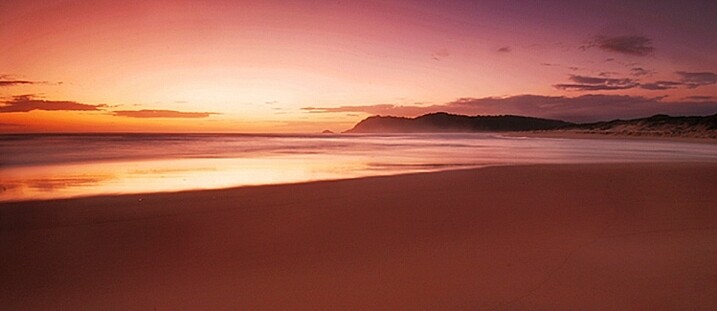
In a landscape image, you will likely want everything in focus.
5. Shooting using the camera’s landscape mode
Yes, you may have a landscape setting in the scene modes on your camera. As much as possible, try not to use it. Why? Well, it’s not great at making the exposure look good for your scene. What it will do is set your aperture to f/8 or even f/11, but it may not render the scene as effectively as you could do using manual settings. The scene settings are designed to work within certain parameters and in low-light conditions, they are not always the best choice. Try and shoot your landscapes on manual settings as far as possible, that means that you control ISO, shutter speed and aperture.
6. Standing next to other photographers
If you see a group of photographers standing on the top of a hill, it might be a good idea to shoot from somewhere else. This is not to say that other photographers have got it wrong, rather what I mean is, you want to go home with a different image to the others. Sometimes, the best composition or vantage point is at one particular spot, that’s fine, take a shot from there, but look for other places to get a great shot too.
It’s a good idea to scout a scene before you shoot it. Go and take a walk around the day before, look at where the sun will be setting, and decide on your position. Don’t simply follow the crowd, then your images will look like the rest of the images taken there.
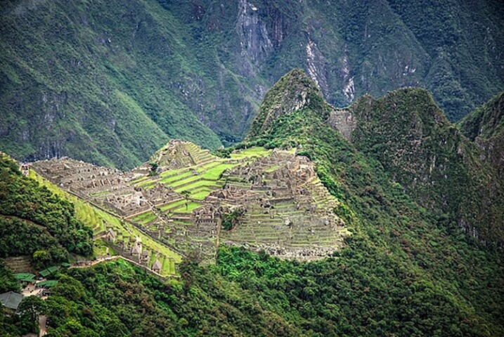
A different vista of Machu Picchu.
7. Uninteresting negative space
Negative space is the space that surrounds your subject. This space can truly make, or break, your image. In most cases, the sky is the negative space in a landscape scene. A clear blue sky looks great, but some wispy soft clouds can really make the scene dramatic. If the sky has no clouds and is clear, this can make the scene seem uninteresting.
If you find that in your scene, make the sky a smaller portion of your image, if there are some great looking clouds, give it more space in your scene. Sometimes, you don’t have a choice, you may only be able to get some shots on a particular day. In that case you need to get what you can. If you don’t have this constraint, try to go back on another evening, when there are some clouds in the sky. Clouds give the sky detail, they reflect the sunlight, and can look yellow orange against a blue sky. This makes for a much more interesting scene.
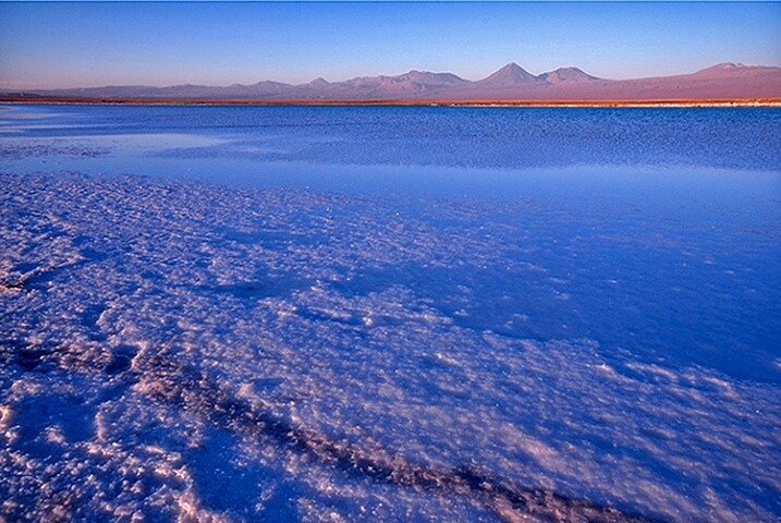
The sky had no clouds, so I made it a small part of the image.
8. No clear subject
It sounds crazy, but it is very easy to have an unclear subject in landscape photography. Most often, landscape photography is of a natural scene, mountains, forest, river, seascape, deserts, etc. Whichever one it is, make sure that it is clear to your viewer.
If you are photographing a mountainous scene, make sure you use a lens that works for that scene. Landscape photographers are tempted to think that every image needs to be taken with the wide angle lens. Sometimes, this can cause the mountain range in the background to seem small and insignificant. The same can be true in any of the other types of landscape photography. Be sure that your viewer knows what they are supposed to be looking at, and show them that, and the beauty that surrounds the subject. Get close to your subject, as close as possible, and if it’s not close enough, maybe you need to use a different lens to get closer. A 50mm lens can be used in landscape photography, so can a 200mm lens, it all depends on what you want the viewer to see.
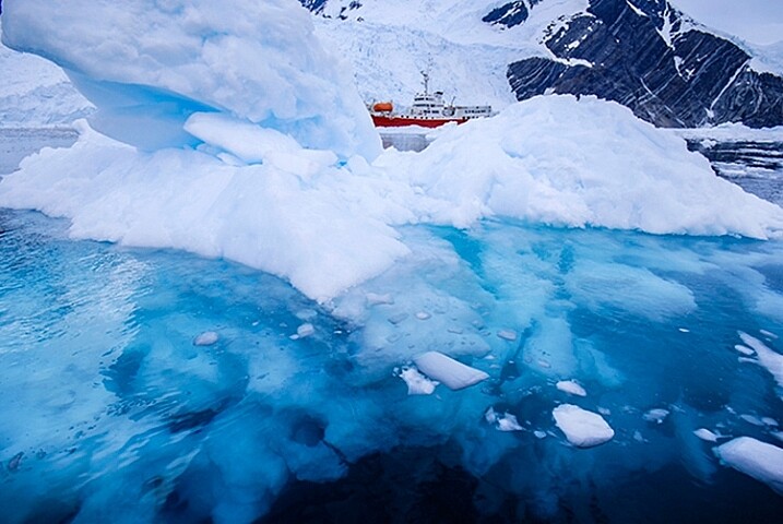
The iceberg in front of the ship is clearly the subject here.
Next time you are planning a landscape photo shoot, run through these points quickly and see how it works out for you. If anything, you will be more mindful and deliberate about what you are shooting, and that will immediately improve your images. Enjoy.
googletag.cmd.push(function() {
tablet_slots.push( googletag.defineSlot( “/1005424/_dPSv4_tab-all-article-bottom_(300×250)”, [300, 250], “pb-ad-78623” ).addService( googletag.pubads() ) ); } );googletag.cmd.push(function() {
mobile_slots.push( googletag.defineSlot( “/1005424/_dPSv4_mob-all-article-bottom_(300×250)”, [300, 250], “pb-ad-78158” ).addService( googletag.pubads() ) ); } );The post 8 Common Landscape Photography Mistakes by Barry J Brady appeared first on Digital Photography School.
-
Fist-Bump This Crosswalk Signal to Get a Green Light
[ By Steph in Design & Guerilla Ads & Marketing. ]

Pedestrians approaching a crosswalk button that has been modified with a silicone fist knew exactly what to do in order to get across the street. Anthropomorphizing a common urban fixture, designer duo Alfredo and Alberto make a walk through Los Angeles a lot more fun with nothing more than some silicone, glue and a #walkbump sticker printed with the simple instructions “fist bump to cross.”


The designers captured video of pedestrians as they encountered the guerrilla installation. Nearly everybody seems game to play along, some snapping selfies. While the Spanish-born designers don’t explain exactly how they made it, all it likely took to create was taking a quick clay mold of the button for a seamless fit, and a separate one of a fist, casting them into one piece in an eye-catching yellow hue.


This ‘quick and dirty’ urban intervention calls to mind the Rotten Apple Project, a series of cheap projects that anyone can replicate in their own cities, from turning a bike rack into a folding seat to screwing coat hooks onto bus stop signs. This kind of active participation in how cities look and function – often without the permission of officials – can enliven public spaces, whether the installations are just for fun or create new uses for existing structures. Check out 12 more creative DIY urban interventions.
Want More? Click for Great Related Content on WebUrbanist:

The Rotten Apple Project: Quick and Dirty Urban Hacks
Sometimes, a reclaimed piece of junk is all it takes to make a bus stop, bike rack, subway station or virtually any other urban setting more comfortable and …
Click Here to Read More »»

Art Brake: OZ’s Awesome Traffic Light Signal Boxes
Traffic light signal boxes are found near traffic lights but unlike the latter, the former aren’t designed to attract the eye… unless they’re in Australia.
Click Here to Read More »»

Bizarre Bicycle! Fliz Fits Like a Harness to Help You Run
This highly unusual bicycle has no pedals or seat; it straps over you like a harness to help you run faster than you ever could on your own.
Click Here to Read More »»
[ By Steph in Design & Guerilla Ads & Marketing. ]
[ WebUrbanist | Archives | Galleries | Privacy | TOS ]
-
8 Tips for Fall Landscape Photography
Fall is a fantastic time of year for you to photograph the landscape and really push your creativity. The colors, textures, and soft light provide an amazing palette to create compelling photographs. It’s really easy though to just point your camera at the color and hope the image comes together without thinking about the composition. Here are just a few tips to take with you into the field to make the most of the colorful season in your fall landscape photography:
1. Use a longer focal length lens

It’s tempting to photograph grand scenes with a wide angle lens, but using a longer focal length lens, 200mm or longer, can really help simplify the scene and make the subject about more than just color. You can also use the longer focal length lens to photograph the intimate details of a forest interior. Look for elements in the scene where there is a break in the pattern or use negative space to help isolate the subject.
2. Use a wide aperture to isolate the subject

Pick a wider aperture, around f/2.8 or f/5.6, to isolate your subject from its surroundings. This will help create visual contrast between the sharp subject and the background, which will be softer and more abstract. This also adds tension between the real and the unreal, providing you with an image that’s more dynamic and expressive. Experiment with different subjects and backgrounds and get creative with your choices. Pay close attention to your subject and make sure that you have the desired amount of the subject in focus when using a wide aperture.
3. Make fall color the secondary subject
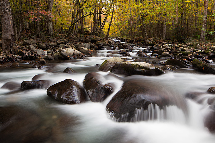
The temptation is for you to make the primary subject all about the fall colors. Find other primary subjects such as streams and waterfalls that are accented by the fall colors, to make images that have more depth and complexity. Although the color may attract your eye to the scene, ask yourself what the subject might be other than color.
4. Look for patterns and textures
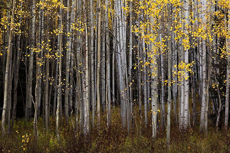
Color is an obvious design element that you’ll be working with in your images but look, for others like pattern and texture, to create satisfying compositions. Learning to see the world around you as elements of 2-D design (line, pattern, texture, etc.) will help you move forward in your composition skills.
5. Be patient and wait for interesting or dramatic light

Patience may be the best tool in your camera bag. Fall colors are wonderful, but can be even more stunning when combined with the right light for your subject. Patience usually is a big factor between a good image and a great image. Many times the best light can be short lived, so think through your composition in advance, and be ready for the light to work some magic.
6. Experiment with intentional camera movement

Definitely experiment with moving your camera vertically as you release the shutter to blur the scene and create an abstract image of lines, textures, and colors. Experiment with different shutter speeds, and the pace of moving your camera, until you find the right amount of blur. This is a great opportunity for you to take your camera off the tripod and just play with camera movement. Darker elements that work well include a rock face, canyon walls, or deep shaded areas in the forest.
7. Look for elements that contrast the fall color
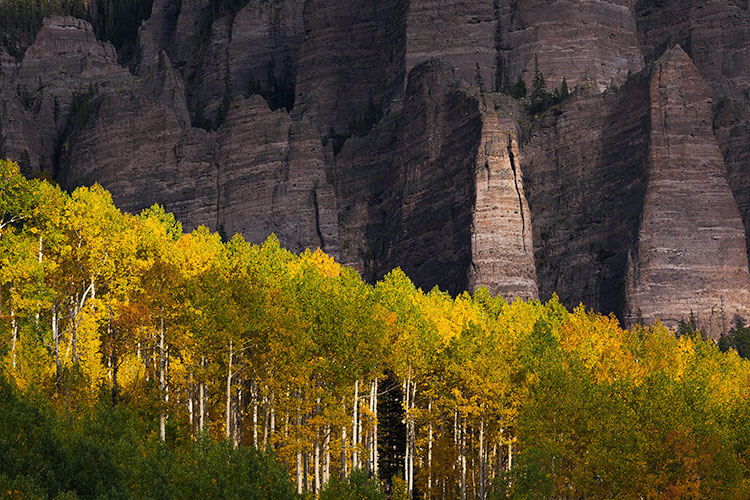
Fall colors are usually bright and have texture and pattern. Look for opportunities to place the fall colors against darker elements so you can create an image with some dramatic tension.
8. Don’t forget to look up

The interior of a forest can be an amazing and colorful place to photograph, but it’s often difficult to isolate a subject. If you’re having trouble, look up and explore the canopy. Images that contrast the fall colors with the deep blue sky can be really pleasing and make interesting wide angle photographs. Don’t forget to use smaller apertures like f/22, to create a starburst effect as you shoot through the forest toward the sun.
Summary
Hopefully these tips will help you make the most of your time photographing the amazing colors of the fall season. Take the list with you into the field so you can slow down, think through your compositions, and return home with some compelling photographs.
googletag.cmd.push(function() {
tablet_slots.push( googletag.defineSlot( “/1005424/_dPSv4_tab-all-article-bottom_(300×250)”, [300, 250], “pb-ad-78623” ).addService( googletag.pubads() ) ); } );googletag.cmd.push(function() {
mobile_slots.push( googletag.defineSlot( “/1005424/_dPSv4_mob-all-article-bottom_(300×250)”, [300, 250], “pb-ad-78158” ).addService( googletag.pubads() ) ); } );The post 8 Tips for Fall Landscape Photography by Dusty Doddridge appeared first on Digital Photography School.