Das Bild des Tages von: Alessio Albi
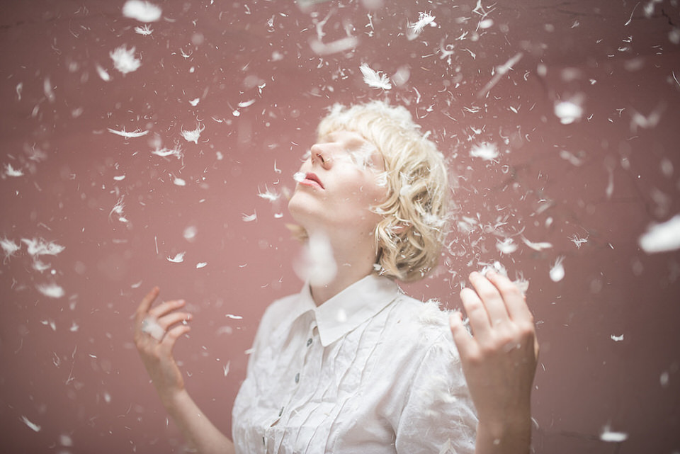
Im Ausblick regnet es heute Federn.
kwerfeldein – Fotografie Magazin | Fotocommunity
Das Bild des Tages von: Alessio Albi
Im Ausblick regnet es heute Federn.
kwerfeldein – Fotografie Magazin | Fotocommunity
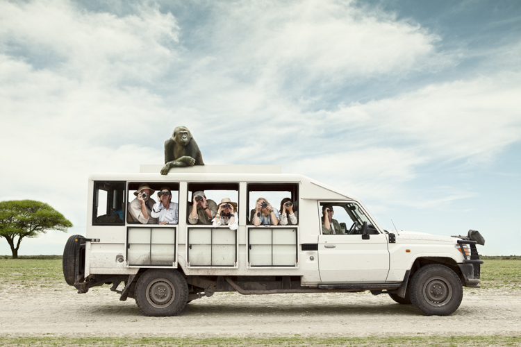
When dPS first heard about Zack Seckler’s unique style and perspective on photography, we thought you might like to hear about his though process and see some of his work here. So I did an email interview with Zack to ask him a few questions:
Whether it be written, drawn, spoken, or televised I have a deep appreciation for humor. I like to laugh, sure, I mean stating the obvious here. But what I love is that humor can push me to see, or think, differently. Like a camera lens, humor can refocus the way we see the world.
I enjoy showing an amusing version of the ordinary. I try not to take life too seriously, to always see the positives in things, and I want my work to reflect these sentiments.

I shoot humor-based work for clients and I also shoot for myself. When beginning a new personal project it can be a bit overwhelming because it’s not about finding inspiration, but about sifting through the zillion ideas, pictures, thoughts and ideas I’ve had; and trying to select just one. I have a Word doc dozens of pages long, with single line ideas in it. I have folders with hundreds of screenshots, and iPhone snaps that inspired a funny thought. I do this not as a job, but as a passion. When I have time to shoot a new personal piece it’s like trying to pick between my babies.
Eventually, I settle on something that I love, which is unique to what I’ve done so far. I like trying to push my body of work in new directions and to not repeat myself.

Once an idea is in play, I think “Okay, now how am I actually going to shoot this.” I think like a producer – where will I shoot this? Where will I cast the talent? How large a crew will be necessary? What type of gear will I need? What props will I use? Are there permitting and logistical issues I need to consider?
If I’m doing a personal project I’m always on a budget, and that forces me to be creative with my production. I frequently rely on compositing if the locations are exotic in anyway (and by exotic I mean anywhere outside my front door). Oftentimes I’ll shoot the background separately and then shoot the talent in a studio, or in a location that I don’t have to pay for.
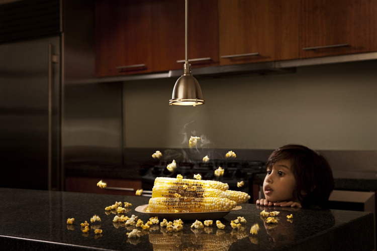
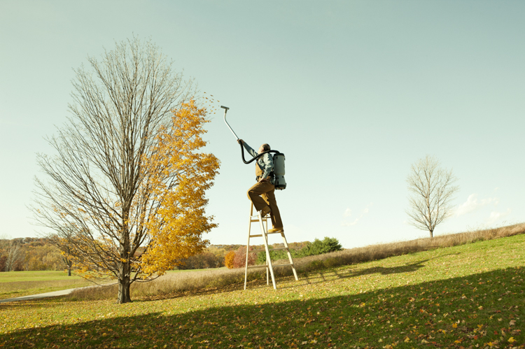
I’ve been fortunate to have multiple bodies of work go viral, including my humor and aerial fine art work. I’ve been seriously humbled by the response. It’s a bit surreal to see all these people discussing my work; and it sets the bar high for future projects. That said, having my work out there is fulfilling, but the best part is when I get emails from people saying that my work inspired them in some way. It means so much to me to hear from people who’ve been influenced in some way, great or small, by my imagery.
Doors have opened for me partly because of my style but more importantly doors have opened for me because of hard work. I spend a tremendous amount of time shooting, marketing, working on personal projects and networking. I love what I do so much, and so it doesn’t seem like work. But it’s a helluva a lot of work. The secret to success as a photographer is to work your butt off.


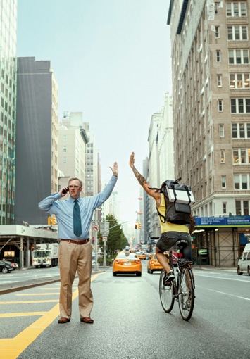
Being a professional photographer is one of those super competitive businesses. I think to be successful you absolutely must have a unique style. This is something that a lot of photographers starting out can have trouble grasping. I didn’t fully understand this at first either. When you pickup a camera and have a certain way of arranging the frame, the composition, the lighting, the mood – all without thinking – then you’re on your way to finding your own personal style. Then, when you combine these aesthetic aspects of photography with the actual content you like to photograph; you most likely already have a style. Ultimately, it’s all about practice.
Shoot, shoot, shoot! It’s common advice, but there’s a good reason for it. Practicing your craft is, bar none, the best way to get better; and to allow your own style to shine through. It’s common sense, sure, but just get out there and do it. That’s the most difficult thing about starting a journey: taking that first step. Then taking the next one and the next, and always looking forward.
I also recommend immersing yourself in the visual arts a much as possible. Go to museums and gallery shows – even if they’re not photography related. If you find yourself drawn to a particular painter, or period, ask yourself what it is that compels you. Look for similarities in your own work.
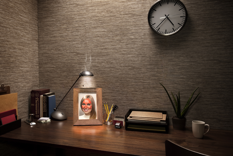
Be sure to keep up on all the current photography out there in magazines, advertising and the arts. Collect a visual library of things that inspire you. I still do this all the time! Then look back through the library and look for trends. You’ll find that you gravitate towards certain aesthetics. Identify those and see if you find parallels in your own work. If not, try using those as points of inspiration on your next shoot.
I love geeking out over gear as much as the next photographer. “Ooh checkout the pixel pitch on that sensor!” However, I must say that my one indispensable piece of gear is – drumroll please – Photoshop. On any shoot, we photographers are limited by the scene in front of us. But once we take that image into Photoshop, the only limitation is our imagination.
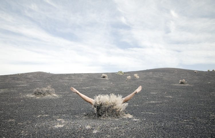
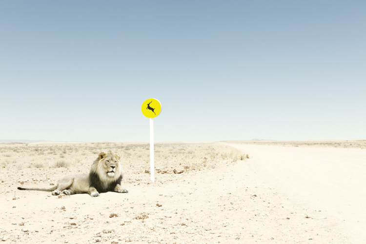
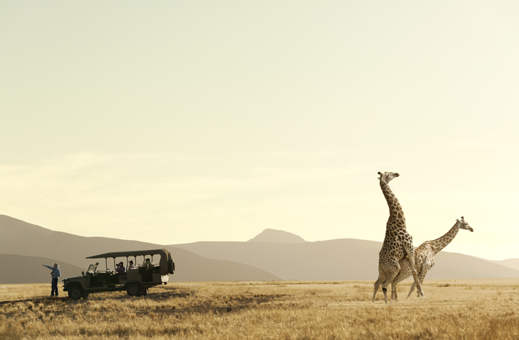


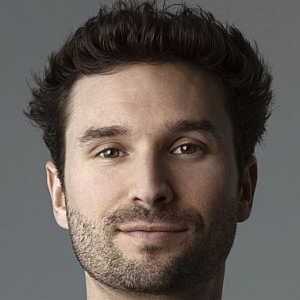 Boston born photographer Zack Seckler took to his craft after graduating from Syracuse University in 2003. He began his career as a photojournalist but in 2008, Seckler found his true passion to be creating imagery from scratch. This transition has been rewarding, resulting in over a dozen major industry awards, a distinguished client list and a budding fine art career. He lives with his wife and two young sons in the suburbs of New York City.
I hope you’ve enjoyed Zack’s images and words of wisdom. You can see more of his work on his website and his Instagram profile.
If you have any questions or comments for him, please leave them below and I’ll make sure that he gets them.
googletag.cmd.push(function() {
tablet_slots.push( googletag.defineSlot( “/1005424/_dPSv4_tab-all-article-bottom_(300×250)”, [300, 250], “pb-ad-78623” ).addService( googletag.pubads() ) ); } );
googletag.cmd.push(function() {
mobile_slots.push( googletag.defineSlot( “/1005424/_dPSv4_mob-all-article-bottom_(300×250)”, [300, 250], “pb-ad-78158” ).addService( googletag.pubads() ) ); } );
The post How Zack Seckler Uses Humor and Style in Photography by Darlene Hildebrandt appeared first on Digital Photography School.
Australia-based conceptual artist Colin Anderson is re-defining what it means to be a modern photographer. An early adopter of Photoshop, Anderson creates complex allegorical images from a number of visual elements, including stills captured with a medium format camera and 3D elements created from scratch. Find out what he’s learned from a long career in editorial and commercial photography. Read more
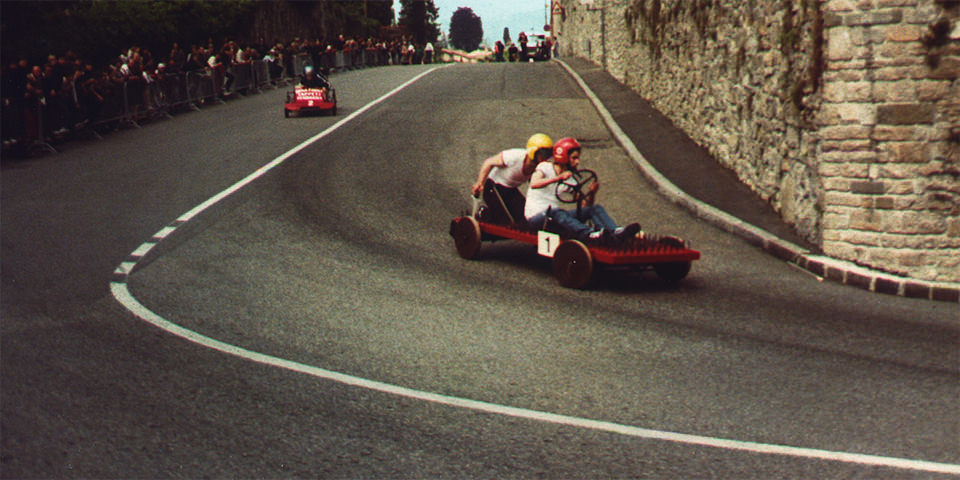
Auch in diesem Monat haben wir uns durch die Vielzahl aktueller Fotowettbewerbe und Awards gearbeitet und die größten fünf herausgepickt, die wir Euch nachfolgend vorstellen. Insgesamt lässt sich zusammenfassen: Die Geldpreise schießen in unglaubliche Höhen, gleichzeitig werden aber auch die Teilnahmegebühren immer mehr. Ob sich einige teure Wettbewerbe lohnen, kann wohl nur jeder für sich selbst entscheiden.
kwerfeldein – Fotografie Magazin | Fotocommunity
When setting up your lights for studio photography, you first need to consider what lighting setup will create the look you are going for. Is your light going to fall into the category of hard light – or will it be soft? What’s the difference?
Let’s first look at the basic characteristics of hard and soft light sources, and the different feel each creates when shooting the same subject.
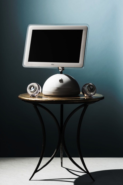
In general, a single-point light source, aimed from a distance is referred to as hard light, much like our sun on a clear day or a streetlight at night.

This hard light source creates a high contrast look, where the transition between highlights and shadows is sharp and well-defined.
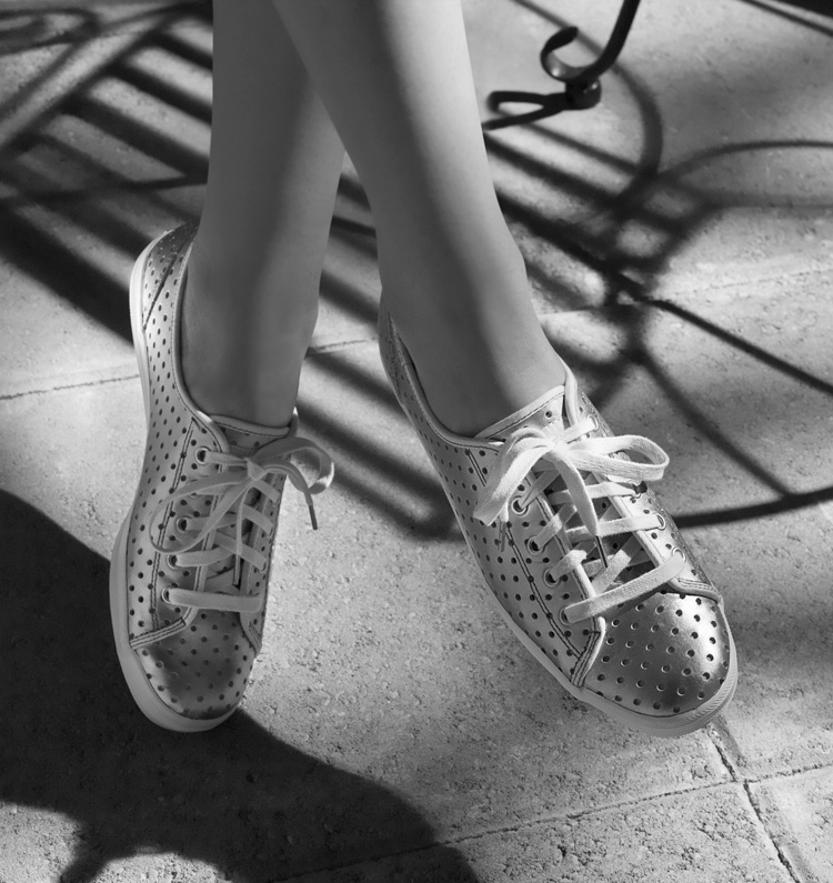
In some cases, this contrast can look harsh (and unwanted).

On the other hand, a soft light source is a larger, broader, light placed relatively close to the subject. A cloud-covered or overcast day, where diffused sunlight reflects off a large concrete wall would be one example of a soft light source.

The light tends to be flatter in contrast, and the highlights hold more detail, with the shadow’s edges being soft and open.

Generally this is a more pleasing light, but not necessarily the only light-source.
Many factors go into choosing light quality and the type of light source on set. One may be the direction given from an art director or client where you may be asked to match images from an existing campaign. They may want you to recreate a natural lighting condition (such as hot harsh desert sun on a pair of boots, or cool early morning light falling on a table setting).
The subject matter itself can also have a strong influence on your choice of light source. A highly reflective (like glass or chrome), or high-contrast product can be quite the challenge if you try lighting it with a hard light source. Fighting spectral highlights, or holding detail in the shadows and highlights, can be a pain if you have to use hard lighting alone.
If you’re lucky enough to be given creative freedom by the client, or working on a personal project, you might be illustrating a mood or an emotion and will use appropriate lighting needed to create it. Careful choice of lighting, and mixing your hard and soft light sources, will allow you to achieve that.
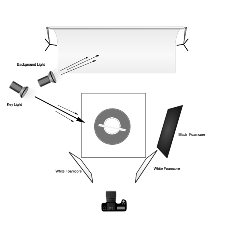
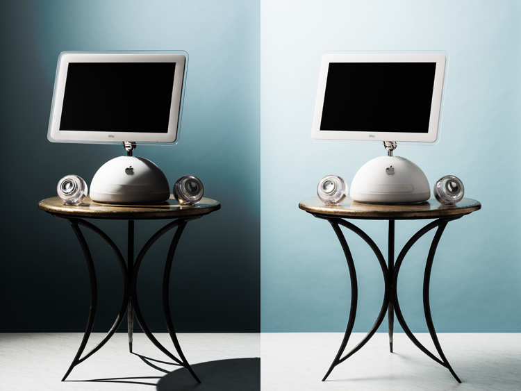
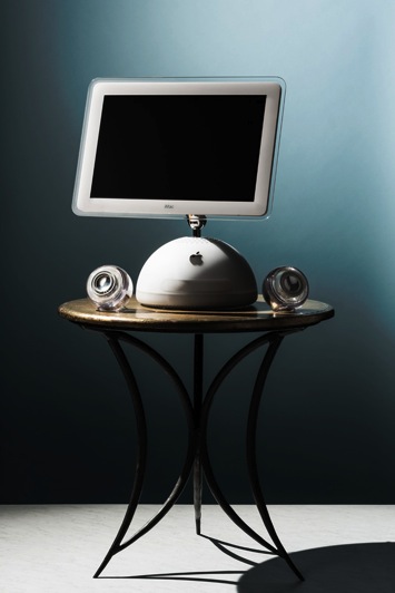 For the studio hard-light set, place the key (main) light (a strobe head with a 12” modifier) to the left and slightly behind the subject. The initial beam may be too broad, so to concentrate the light you can add a 35-degree grid to the modifier.
For this setup, final adjustments to the height and position of the key light were made, in order to modify the angle and length of the shadows on the table and floor, as well as to illuminate the edges of the computer screen in a pleasing manner. A 4’x8′ sheet of black foamcore was placed to the right of the set to deepen the shadows and remove unwanted reflections. Two smaller sheets of white foamcore were set low, in front and to either side, to control the amount of detail in the front edge of the table and legs.
A second strobe head with a 7” grid modifier was set high, and to the back of the set. Its angle was adjusted to illuminate the upper right corner of the background, which you can see in the photo (right).
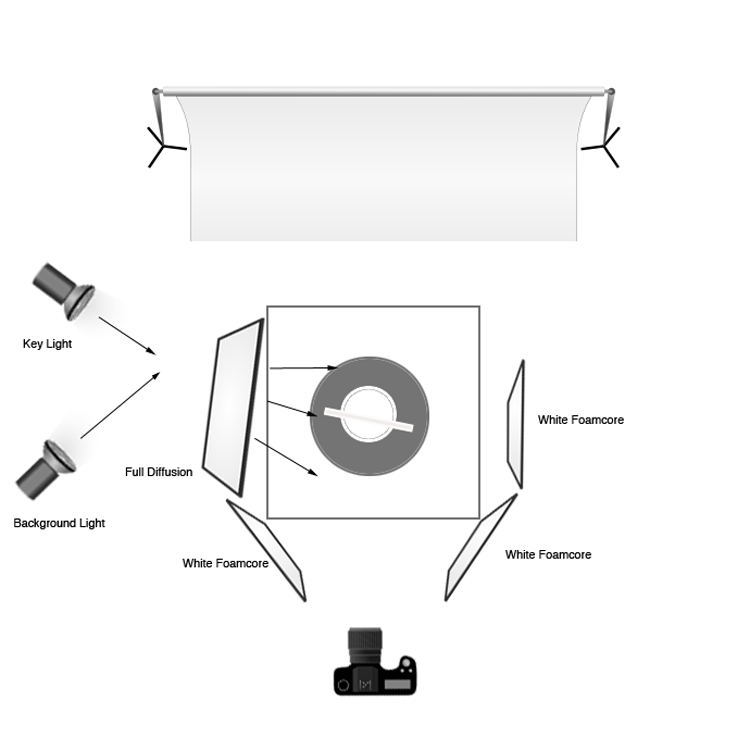
 To create the soft-light look, the key light is set in the same place, but a 4’x4′ full diffusion panel is placed between the light and the subject, just out of the frame. Remove the grid from the key light to broaden the light. The black foamcore is replaced by a sheet of white to fill or open the shadows (but the two sheets out front remain). The background light is pulled back, the grid removed, and a diffusion disk added to soften the beam and cover the entire background. In this way the whole set appears bright and soft and with a lot of ambient light filling the image (left).
You may get into a situation where you’ve set up your light source and find you actually want to go the other direction with it. In this case, it is quite easy to change one type of light source into the other. You can diffuse a hard source into being soft, by placing diffusion material between the lighting and the subject, which allows you to control the angle and light gradient. You can also just attach a softbox to the light to soften the light and make it into a broader, even source. You can also take a soft source that you’ve set up and change its distance from the subject in order to make it a harder, more focused light. You can also bounce the light around more using reflectors, umbrellas, or a handy wall in order to soften it and make it less directional.
The ultimate tip for studio photography is to be flexible with your lighting setup regardless of your years of know-how. You may have an idea in mind for the final look you want for the photograph, but you may find that on set the product looks quite different under various lighting conditions. Be prepared to play around and try things – because often a mixture of both hard and soft light can show the product to its full advantage.
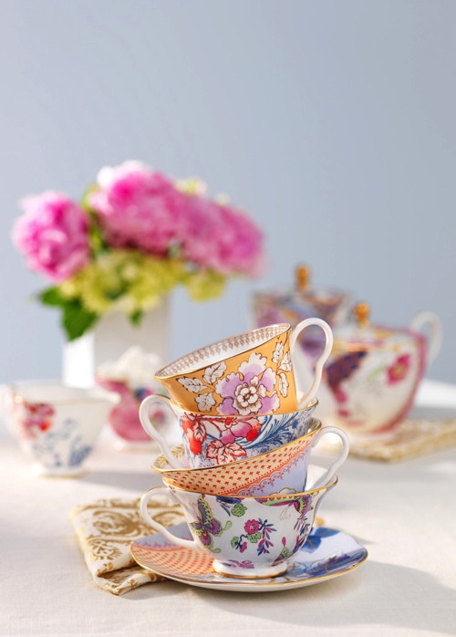
Soft light example with a hard light rim (kicker or accent) light from behind. Notice the hard shadow on the table in front of the cups – that is created by the hard rim light.
Once you have a full understanding of hard and soft light sources, you can combine the two lighting techniques. For example, the set might have a general, overall softness to its light, but you might use a rim (or accent) light to give the shot more mood or dimension, or to accent certain elements of items in frame. Mastering both types of light allows you to have the ultimate control over your lighting, and the final image that comes out of the camera.
googletag.cmd.push(function() {
tablet_slots.push( googletag.defineSlot( “/1005424/_dPSv4_tab-all-article-bottom_(300×250)”, [300, 250], “pb-ad-78623” ).addService( googletag.pubads() ) ); } );
googletag.cmd.push(function() {
mobile_slots.push( googletag.defineSlot( “/1005424/_dPSv4_mob-all-article-bottom_(300×250)”, [300, 250], “pb-ad-78158” ).addService( googletag.pubads() ) ); } );
The post How to Create and Use Hard and Soft Light in a Studio Setting by Craig Wagner appeared first on Digital Photography School.
Das Bild des Tages von: Mette1977
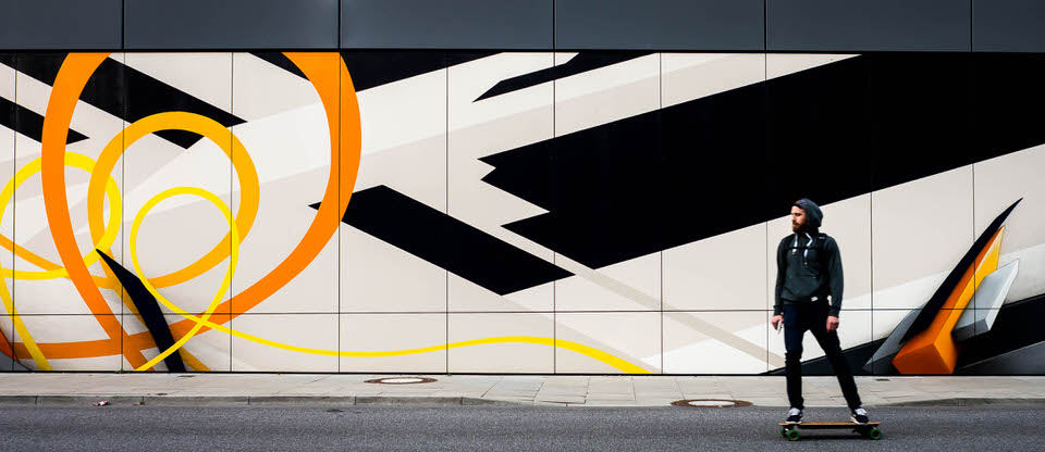
Entschuldigung, wir müssen mal kurz durch. Das Bild des Tages:
kwerfeldein – Fotografie Magazin | Fotocommunity
[ By WebUrbanist in Conceptual & Futuristic & Technology. ]

Reinventing one of the world’s most ubiquitous building materials, this concrete alternative developed at MIT can be 3D-printed then disassembled without wasting unnecessary energy or creating useless debris. Imagine the possibilities temporary concrete architecture that is easy to deconstruct with zero material loss.

Rock Print effectively shoves rocks into position, binding them with computer-controlled string. The result in this demonstration at the Chicago Architecture Biennial is a rigid 13-foot column that can be cleanly unraveled into its constituent parts.

A product of the Self-Assembly Lab at the Massachusetts Institute of Technology, this approach suggests a new way to think about concrete, a material that is typically cheap and easy to use in construction but expensive and wasteful when it comes to demolition.

As Skylar Tibbits explains, “We are using a similar technique to powder-based printing. There is a container, material is deposited layer by layer and a ‘binder (in this case the string) is applied to each layer in the specific pattern of the slice.”

Effectively any shape is possible thanks to the 3D printing process, while the results are strong and durable, relying on the physics of jamming and collective strength of composited stones. Even more importantly, the reversibility of the process makes this a far more eco-friendly way to build rigid structures from durable materials that still dismantle on demand.
An interdisciplinary team of architects and material specialists is developing a commercially-viable 3D-printing machine capable of creating complex objects …
Click Here to Read More »»
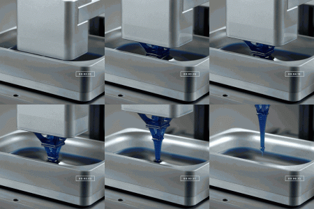
Generating objects 25 to 100 times faster than traditional layer-based 3D printers, this new continuous-liquid approach to high-speed fabrication can create …
Click Here to Read More »»

One of the biggest challenges of settlements in space is the cost of transporting materials and technologies for construction – hence: 3D printing from local …
Click Here to Read More »»


[ By WebUrbanist in Conceptual & Futuristic & Technology. ]
[ WebUrbanist | Archives | Galleries | Privacy | TOS ]
They say photography is an art form, and I couldn’t agree more. There are so many elements that go into making a great piece of art. Not only do you need to know your gear and the environment you work in, but you also need to know how to put the finishing touches to your art, that takes it from good to great.
This can be quite challenging especially to a beginner. But like any great artist would say, all of this can be done with a lot of practice and patience. Great photos tend to have universal appeal. They are technically sound, and also have an editing style that appeals to the mass majority. While most photographers, including myself, advocate getting it right in camera, there are some basic steps that you may need to follow just to add the right amount of oomph to your images in the post-processing stage.
The type of editing you apply to your images does depend on the type of software you use. There are many different options for editing software on the market. Adobe Photoshop and Lightroom are two of the most popular ones for serious amateurs, and professional photographers. But if you are an absolute beginner they might be cost prohibitive for your needs. There are some good free editing software, like PicMonkey and Picasa, that work great at a basic level. If you are a cell phone photographer, then most smartphones have built-in editing software that does the job fairly well too. Apart from the basic editing steps they also have a ton of filters for adding some really cool effects to your images. But just be careful of the audience and the purpose for these cell phone images before applying funky filters.
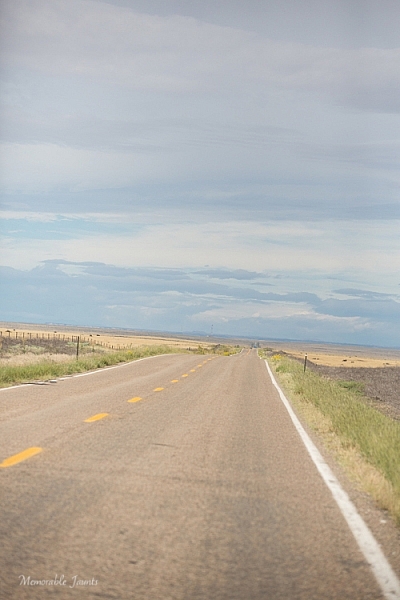
This was taken from the passenger side of the car – I really loved the leading lines but knew the horizon was way off.
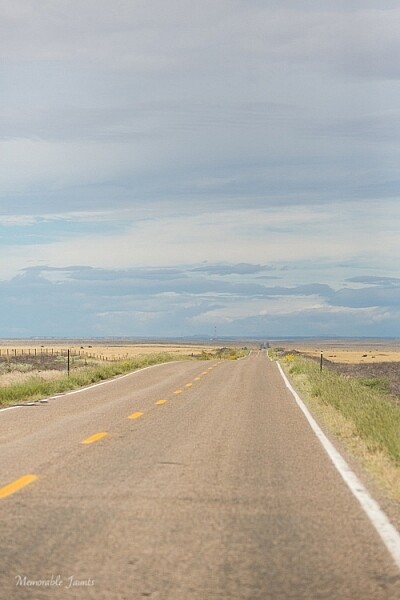
In Lightroom, I adjusted the horizon, increased the contrast gently, and warmed up the image by adjusting the temperature slightly.
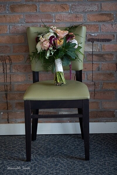
I loved the texture of the brick wall but hated the stains on the wall right near the chair.
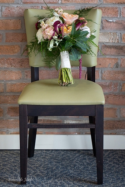
I chose a closer crop for the chair, and cloned out the stains using the spot removal tool in Lightroom. I also brightened the image a tad.
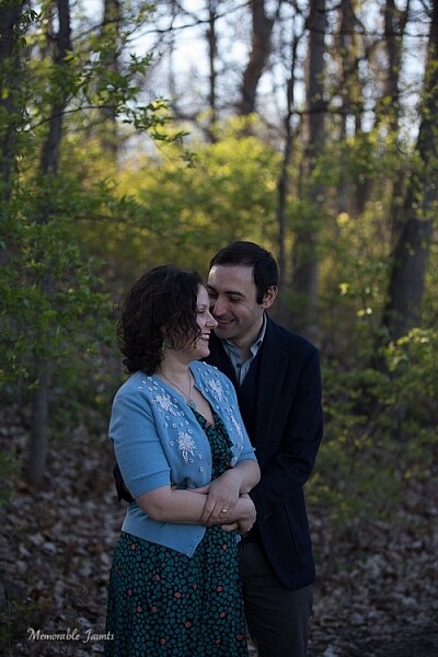
While I adore this pose of my clients, the image is a little too dark (underexposed) as the light was changing very fast.
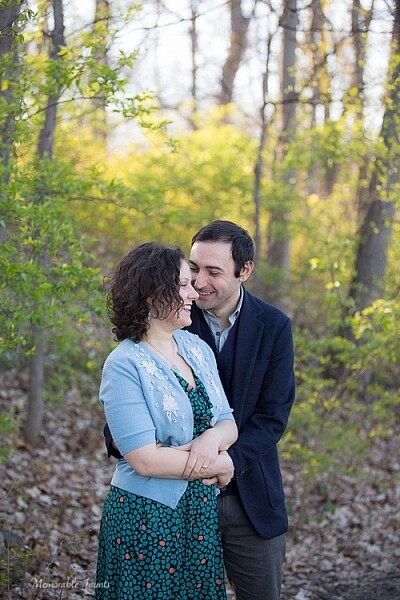
As part of my edits to this image, I increased the exposure, warmed up the image by increasing the temperature and also adjusted the contrast a bit to add a little more umph (punch) to the image.

I love this image of fresh snow on the blades of tall grass near my home. But, because everything was so dark and gloomy due to the snow, the image appears a bit flat and dull.
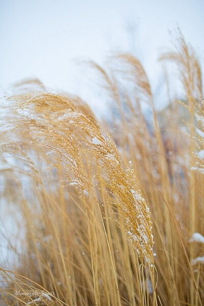
I wanted to exaggerate the colors of the blades of grass to show that they were extremely dry and also pop-out the white snow on the grass. So I adjusted the saturation and vibrance sliders in Lightroom, and also warmed up the image by adjusting the temperature.
Depending on what is the final treatment for your images, you can either save them as low resolution JPEGS or high resolution JPEGS. There are many other formats as well like TIFF, BMP, and GIF. JPEG are more universally accepted, and is the format that I use for all my images – the ones for print as well as for the web. Typically an image approximately 72PPI (pixels per inch) is considered as a low resolution image, ideal for the web. An image of 150DPI or 300DPI is considered a high resolution image ideal for print. DPI stands for Dots per inch. Per wikipedia, it is used to describe the resolution number of dots per inch in a digital print.
Ultimately how you process your images is an extremely personal decision. Choose the style and the tools that best describe your photography style. It is okay to experiment with the latest fads, filters, and looks but keep in mind that you may want your images to have a timeless look and feel so that years from now when you look at them, they still evoke an emotion.
googletag.cmd.push(function() {
tablet_slots.push( googletag.defineSlot( “/1005424/_dPSv4_tab-all-article-bottom_(300×250)”, [300, 250], “pb-ad-78623” ).addService( googletag.pubads() ) ); } );
googletag.cmd.push(function() {
mobile_slots.push( googletag.defineSlot( “/1005424/_dPSv4_mob-all-article-bottom_(300×250)”, [300, 250], “pb-ad-78158” ).addService( googletag.pubads() ) ); } );
The post Post-Processing Tips for Beginners by Karthika Gupta appeared first on Digital Photography School.
Last couple of weeks we’ve been looking at images of red and yellow, warm colors. So let’s switch it up and go with a cool color – blue!
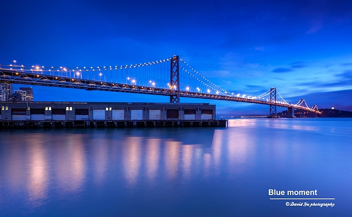
By David Yu

By Luis Ascenso

By Jeff S. PhotoArt at HDCanvas.ca
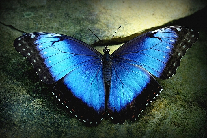
By TexasEagle

By Sonny Abesamis

By Adrien Sifre
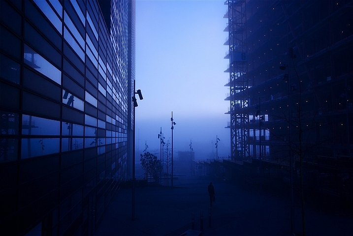
By geir tønnessen

By Alias 0591

By Eric Bégin

By Neal Fowler

By Thomas Hawk
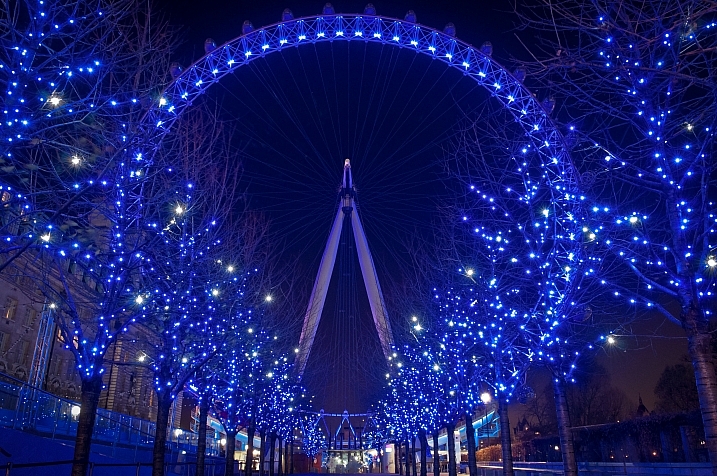
By Simon Ingram

By Julie Falk

By Pen Waggener

By Paul Nelson

By Jeff Huffman

By Mark Robinson

By Ernie R

By Huds?n

By Tambako The Jaguar

By Chris Combe

By Ronelle

By Ritchard Ton

By Lorna Carlson

By Roy Cheung

By StylishLensT

By Chris Ford
googletag.cmd.push(function() {
tablet_slots.push( googletag.defineSlot( “/1005424/_dPSv4_tab-all-article-bottom_(300×250)”, [300, 250], “pb-ad-78623” ).addService( googletag.pubads() ) ); } );
googletag.cmd.push(function() {
mobile_slots.push( googletag.defineSlot( “/1005424/_dPSv4_mob-all-article-bottom_(300×250)”, [300, 250], “pb-ad-78158” ).addService( googletag.pubads() ) ); } );
The post 26 Cool Images Utilizing the Color Blue by Darlene Hildebrandt appeared first on Digital Photography School.
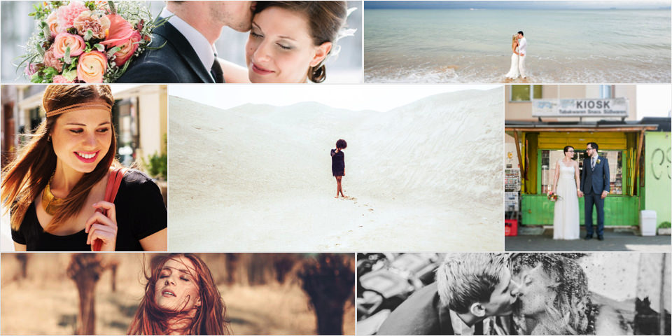
Ein „Kreatief“ kann man sich als Berufsfotograf eigentlich nicht leisten. Was macht man, wenn es doch einmal schwer fällt, die Kamera in die Hand zu nehmen? Diese Frage haben wir dieses Mal verschiedenen Fotografen gestellt und den Eindruck gewonnen: Am liebsten gehen Fotografen auf Reisen.
kwerfeldein – Fotografie Magazin | Fotocommunity