Month: October 2015

  • Freaky Florida: 12 of a Weird State’s Weirdest Attractions

    [ By Steph in Destinations & Sights & Travel. ]

    freaky florida coral castle 2

    There’s a lot more to America’s southernmost state than the headline-worthy misadventures of Florida Man and Florida Woman. Culturally distinct from the rest of the South, Florida has been heavily influenced by its Spanish and Caribbean roots, not to mention whatever mysterious set of circumstances a la the Bermuda Triangle make the state such a unique incubator for strange shenanigans. Beyond the obvious attractions like Disney World and South Beach that pull in millions of tourists every year, there are many more sights offering a little slice of the state’s unusual history. These 12 offbeat destinations are each very Florida in their own way.

    An Abandoned Island Fort You Can Visit, Dry Tortugas

    freaky florida fort jefferson 1

    freaky florida fort jefferson 2

    Take a relaxing three-hour boat ride or a 45-minute plane ride from Key West to the remains of Fort Jefferson, a massive 19th century fortress that was abandoned for nearly a century before becoming a wildlife sanctuary and national park. Once hosting Spanish explorer Ponce de Leon and the real-life Pirates of the Caribbean, the island chain known as the Dry Tortugas was crowned by a hexagonal all-masonry fort in the 1840s and briefly used as a prison for Union deserters in the Civil War before hurricane damage and all of its obsolete cannons led to its abandonment.

    Coral Castle, Homestead
    freaky florida coral castle 1

    freaky florida coral castle 2
    (images via: psyberartist)

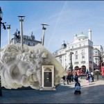
    A single 100-pound man worked tirelessly for three decades to build Homestead’s Coral Castle, a complex of strange shapes made from over 1,000 tons of sedimentary rock. Touted as an engineering marvel rivaling Stonehenge and the Great Pyramids of Egypt, the ‘castle’ was created as a tribute to Edward Leedskalnin’s sixteen-year-old lost love, who abandoned him on her wedding day. (In fact, Billy Idol wrote a song about it – ‘Sweet Sixteen.’) While some people like to imagine that the used mystical powers to move the huge stones, the truth is, medieval techniques like winches, ropes and pulleys helped him position each porous slab of stone. Still, it’s a remarkable feat and a beautiful sight.

    JFK’s Secret Island Bunker, Riviera Beach
    freaky florida kennedy bunker 1


    freaky florida kennedy bunker 2
    (images via: visit florida/Peter W. Cross)

    President John F. Kennedy’s personal nuclear fallout shelter was located in a seemingly unlikely place – a small island in the Intracoastal Waterway off Riviera Beach. Built in just two weeks in the lead-up to the Cuban Missile Crisis, the shelter is little more than a corrugated metal hole in the ground on Peanut Island, which is conveniently located a few hundred yards from a Coast Guard station and about a five-minute helicopter ride from the Kennedy estate in Palm Beach. This humble little place is the headquarters from which the president would have run the remains of the free world had any missiles actually been launched. Tours are available via the Palm Beach Maritime Museum, and the island is accessible by ferry and water taxi if you don’t have your own boat.

    Flagler’s Folly: Failed Overseas Railroad, Pigeon Key

    freaky florida flagler folly


    freaky florida flagler folly 2
    (images via: jack says relax, key lime pie yumyum)

    The industrialist and oil magnate responsible for founding the Florida East Coast Railway and nearly single-handedly developing much of Florida’s Atlantic coast was never afraid to dream big, even if it meant spectacular failure. After all of his successes elsewhere in the state, Henry Flagler envisioned a railroad extension that would take visitors from the town of Homestead all the way to the tip of Key West, an island that’s technically closer to Cuba than it is to the mainland U.S. Dubbed the ‘Overseas Railroad,’ this extension would enable Flagler to corner the trade market adjacent to the new Panama Canal and would have to span 60 miles of unobstructed water and many more miles of inhospitable islands. Through arduous effort, the workers made it happen, and upon its completion in 1912 it was called the Eighth Wonder of the World. Flagler died a year later, never to learn that his precious railroad would be partially destroyed in a hurricane in 1935, and that an astonishing 432 workers still toiling on the extension’s bridges would perish. The island where they were housed and died, Pigeon Key, was abandoned twice in the decades since, but its historical buildings have now been restored as a museum and a remaining 2.2-mile section is open to pedestrians and cyclists. A more modern roadway, the Overseas Highway, was built upon many of the other railway sections in the 1950s.

    Next Page – Click Below to Read More:
    Freaky Florida 12 Of A Weird States Weirdest Attractions

    Share on Facebook


    [ By Steph in Destinations & Sights & Travel. ]

    [ WebUrbanist | Archives | Galleries | Privacy | TOS ]


    WebUrbanist

  • ZEISS announces Otus 1.4/28, third lens for Otus series

    German optical manufacturer Zeiss has announced it is to introduce a wide angle to its Otus family of lenses designed for full frame SLR cameras. The Zeiss Otus 1.4/28 is a 28mm lens with a maximum aperture of f/1.4, and will be available with ZE and ZF.2 mounts for Canon EOS and Nikon F cameras. Read more

    Articles: Digital Photography Review (dpreview.com)

  • Understanding Natural Light Part 1: Quality of Light

    Light has different qualities, and by understanding those differences and using them in your favor, you can become a better image maker. From my point of view, the best place to start improving your ability to work with light is by learning its most basic form, which is natural light.

    quality of light - soft light portrait

    Therefore, this article is the first of a series that will focus on understanding how to work with natural light. We will:

    • Explore the difference between harsh (hard) and soft lighting and each of their pros and cons.
    • Understand how to use color to serve the visual story we want to portray.
    • Learn how the direction and intensity of light affects the final image.

    Even if you are a studio photographer, who wishes to work exclusively with strobes and flash, this article is crucial for you. If you manage to understand how to work with natural light, this knowledge can be later applied to any genre or style of photography. As a portrait photographer, in my explanation and examples, I will focus on working with natural light in portraits. However, as mentioned, once you understand the concept, this can be applied to any genre or subject.

    George Eastman, the American entrepreneur that founded Kodak (and who probably knew a thing or two about photography), said, “Embrace light. Admire it. Love it. However, above all, know light. Know it for all you are worth, and you will know the key to photography.”

    What do you think that Mr. Eastman meant by “know light. Know it for all you are worth.”? From my point of view, he meant that as photographers, light is our raw material. It is like letters to the writer and notes to the musician, and as photographers, we must understand how this raw material works and behaves under different conditions.

    quality of light - soft light

    Quality of light – Understanding hard and soft light

    In this first chapter we will:

    • Understand the differences between soft and hard (or harsh) light.
    • Explore the concept of “Good Light” versus “Bad Light.”
    • Learn about common challenges faced when working with natural light, and how to overcome them.
    • Suggest exercises that you can use to practice the explained concepts and techniques.

    Soft lighting

    Soft light is characterized by low levels of light, lack of shadows, a small and gentle difference between dark and bright areas.

    soft lighting

    Soft lighting situation is characterized by the lack of shadows and (as you can see in this image), cold hues during cloudy weather, which fit the greens and blues in this situation.

    When does it happen? Depends on the weather and your location on the globe (it won’t happen at the North Pole, during winter), but you will usually encounter a soft lighting situation, at the edges of the day (also referred to the Golden Hours), just after sunrise and just before sunset (how much time before and after, is again dependent on your location). Besides the edges of the day, you can find soft lighting conditions under a cloudy or overcast sky.

    Challenges: Soft light is not suitable for every portrait, it all depends on what you wish to evoke (in terms of emotion and mood) in your image, as I will describe later. Another issue is the level of light, which may be too low. So, it is very important that you pay attention to your shutter speed and increase it manually, to avoid blurriness.

    Hard/harsh lighting

    Hard light is characterized by strong levels of light, long and deep shadows, a big difference between dark and bright areas (high dynamic range). Because of contrast, harsh light will strengthen the current situation in the field, in terms of color. Saturated and rich colors will seem even more intense, and dull colors will seem even more so.

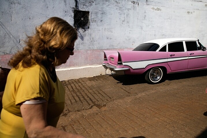
    hard or harsh lighting

    In harsh light, there is a huge contrast between the dark and bright areas in the image and details might get too bright or too dark – but this is perfectly fine!

    When do you have hard light? It also depends on the weather and location, but usually, you can encounter harsh lighting situations during the day, about two hours after sunrise, until one hour before sunset (middle of the day).

    Challenges: the main problem with the harsh lighting is the huge difference between the dark and bright areas (also known as contrast). Contrary to our sophisticated eyes, the camera is (still) not able to cope with this difference. So, the result will be the loss of details in your image, as they become too bright or too dark. For example, you might get a great exposure on your subject while losing detail in the background or vice versa.

    Some photographers mistakenly think that this condition (the loss of details) is due to an error they made in operating their camera. So, the first step to the solution is to understand the problem. If you are shooting under harsh light, that lost of details is something that you cannot change (unless you use flash or post-process the image), because it is due to the contrast between the dark and the bright areas. So, changing the aperture, shutter or ISO, won’t help correct it.

    “The artist vocation is to send light into the human heart.” – Robert Schumann

    Forget about “good” lighting

    Due to the challenges I have mentioned, most photographers avoid shooting under harsh lighting condition. They prefer to work under soft lighting, which is usually referred to as more pleasing to the eyes. However, it is not always the right choice for your portrait.

    hard lighting

    That day in the streets of Havana was extremely hot. So, I used the harsh light to evoke that sense.

    The thing to remember is that you want to match the light to the visual story you want the portrait to tell. As we just learned, each lighting condition has its own qualities and characteristics. While the soft light from a setting sun might be best for a romantic couple’s photoshoot, it may be less suitable for a portrait of a hardworking man outdoors. Let’s stop using the concepts of good and bad lighting, and start thinking in terms of more suitable, or less suitable lighting.

    Planning

    To work under the most suitable lighting conditions, you should plan for it instead of just wishing for it. Check the weather forecast, as well as the sunrise and sunset times. For example, if you need soft lighting for your project, you should know exactly where to be, and what to do around sunrise and sunset every day. Do not waste even a minute on sleeping when there is suitable light out there.

    1. Matching the time of day to desired mood – You should choose the most suitable time to go out and work, according to your desired results.

    2. Matching the visual story to the given lighting conditions – I often choose the visual story, according to the available light given to me on location.

    soft light

    Flexibility

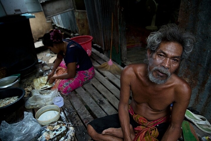
    Sometimes even with careful planning, the weather changes and therefore, so does the natural lighting condition. That’s what happened to me when I was working on an assignment in southern Thailand. In a place known for pristine beaches and postcard-like islands, the mighty monsoon decided to make an appearance and show everyone who’s boss. At first I was afraid that I wouldn’t be able to provide the images that I had in mind to my editor.

    However, I know one thing for sure: you cannot fight the light. So I changed my plans and headed to the small village of the Chao Leh (Sea Gypsies) community. This visit (which ultimately became a seven-year project), allowed me to discover a different, much less touristy side, of that area. I discovered a story about a struggling community of sea drifters, that never fully recovered from the tsunami of 2004.

    soft light be flexible

    The Chao Leh (Sea Gypsies) community in southern Thailand. The stormy weather, with its soft, low, blue-colored light gave the images a sense of “cold winter,” which was a perfect match to the feeling I wanted to evoke in that story.

    A few days later, the clouds gave way to the sun and I was back to my original shooting list. When I sent the images back to my editor, she was thrilled with the new direction and decided to run a full story about this community.

    “What makes photography a strange invention is that its primary raw materials are light and time.” – John Berger

    In conclusion, do not limit yourself to working exclusively under soft light, as both harsh and soft light summon great challenges and opportunities. As a visual storyteller, aim to always try and match the story you are trying to tell, to the light you are using, to bring that visual story to your viewers. The key element is planning, with a bit of flexibility, and some room for serendipity.

    Practice working with quality of light

    Exercise #1 – using over exposure compensation while working with a harsh light condition.
    • Time: A sunny afternoon.
    • Location: Any outdoor location – from your backyard to the local park.
    • Step one: Place your favorite model (it can be a friend, a family member, your partner, or a beloved dog) under the midday sun.
    • Step two: Take a moment to understand how the light illuminates your subject’s face. Do you notice the high contrast between dark and bright areas (lit forehead versus dark eyes)?
    • Step three: Work in Aperture Priority mode (A in Nikon and AV in Canon), and use exposure compensation (overexpose), until you manage to bring more light to your subject’s eyes. Don’t panic, as you will probably burn out (lose details) the background, and parts of the subject’s face. It is okay. This exercise is about being able to stop reviewing your images through the histogram tool and highlight alerts, and start thinking in terms of story, and if that story is working or not.
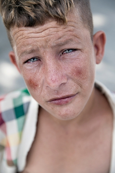
    hard light portrait

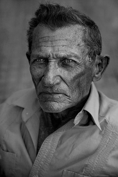
    Harsh light helped me to create a sense of “roughness” in this portrait, which I felt that support the visual story I wanted to tell.

    Exercise #2 – switch to black and white while working under soft light conditions.
    • Time: A cloudy day or the edges of the day.
    • Location: Any outdoor location – from your backyard to the local park.
    • Step one: Approach a stranger and ask his or her permission for a portrait. Perhaps you can send the final image by email as a token of appreciation.
    • Step two: Switch to Monochrome mode, which is black and white photography (under Picture Style in Canon and Picture Control in Nikon).
    • Step three: Take a close-up portrait (torso and face only). Note how the light gradually illuminates the subject’s face, creating soft pockets of shadows that evoke a sense of depth.

    black and white in soft light

    The author would like to thank Nicholas Orloff for his assistance in writing this article.

    googletag.cmd.push(function() {
    tablet_slots.push( googletag.defineSlot( “/1005424/_dPSv4_tab-all-article-bottom_(300×250)”, [300, 250], “pb-ad-78623” ).addService( googletag.pubads() ) ); } );

    googletag.cmd.push(function() {
    mobile_slots.push( googletag.defineSlot( “/1005424/_dPSv4_mob-all-article-bottom_(300×250)”, [300, 250], “pb-ad-78158” ).addService( googletag.pubads() ) ); } );

    The post Understanding Natural Light Part 1: Quality of Light by Oded Wagenstein appeared first on Digital Photography School.


    Digital Photography School

  • A Quick Guide to Email Marketing for Photographers

    Photographers are turning to social media these days to try and get their names out there and reach their target audiences. Being active on social media is critically important for small businesses these days, but more traditional online marketing tactics, like email marketing, are still very useful. Ignoring email as a part of your marketing campaign could cost your photography Continue Reading

    The post A Quick Guide to Email Marketing for Photographers appeared first on Photodoto.


    Photodoto

  • Schätze vom Flohmarkt

    © Ursula Schulz

    Flohmärkte sind spannende Orte mit unverwechselbarem Charakter. Jeder Flohmarkt ist anders, wird von anderen Leuten besucht und auch die angebotenen Waren unterscheiden sich teilweise deutlich. Seit einigen Jahren hat auch mich das Flohmarkt-Fieber gepackt.
    kwerfeldein – Fotografie Magazin | Fotocommunity

  • Steps for Getting Started in the Lightroom Develop Module

    Lightroom Develop module

    If you have read my earlier articles about Lightroom you will already understand how it differs from Photoshop and how it uses a database to organize your photos as well as process them.

    Lightroom has evolved into a powerful raw processor, and it is now possible to process most of your images in it. You only need to use other software (such as Photoshop or a plug-in) when you reach the limits of what Lightroom can do.

    Raw processing takes place in the Lightroom Develop module. If you haven’t used Lightroom before you may find the Develop module layout confusing, especially if you are used to pixel editing software like Photoshop. Lightroom has no layers or blending modes, and there is no real set order in which to do things. But don’t worry if it makes little sense at first – this article will help you come to grips with the basics, and make a start on processing your raw images.

    Note that you can also use Lightroom to process JPEG and TIFF files, although some of the options Lightroom gives you differ slightly. I have used raw files in this article.

    The Lightroom Develop Module

    To start, go to the Library module and select the photo you want to process. Click on Develop in the Module Picker, or press D on the keyboard, to open the image in the Develop module.

    The Develop module is split into sections. There are panels on the left, some more on the right, and the Content Window in the middle, where the photo you are currently working on is displayed. Just like the Library module, you also have the Module Picker at the top and the Filmstrip at the bottom.

    Lightroom Develop module

    You may have noticed that there is no Folders panel (left side) in the Develop module. This is Adobe’s way of encouraging you to use Collections. So if you are not doing so already, now is time to get in the habit.

    We don’t need the Module Picker, left-hand panels, or Filmstrip for this article, so when you’re ready click on the white arrows at the edges of the screen to hide them.

    Your screen should look something like this, with the right-hand panels and the histogram available on the right, and the photo you are working on occupying the rest of the screen.

    Lightroom Develop module

    If you do not see the toolbar below your image hit T on your keyboard to show/hide it.

    The right-hand panels contain most of the tools that Lightroom has for processing raw files. Today we are going to look at three of these:

    Lightroom Develop module
    • Camera Calibration panel
    • Lens Corrections panel
    • Basic panel

    These panels are important because they are the foundation of the processing work you do on an image.

    The Camera Calibration panel

    The Camera Calibration panel is the ideal starting point for processing an image. When you come here you are looking for two important settings.

    Process: Should be set to 2012 (Current), which is set by default.

    Lightroom Develop moduleProfile: Should be set for the most appropriate setting for your photo. The options you see here depend on the camera used to take the photo. All cameras have profiles that you set to determine the treatment of the image. Each manufacturer has different names for this setting (for example, Canon calls it Picture Style, Nikon Picture Control and Fujifilm Film Simulation).

    Lightroom should show you most of the settings you have available on your camera plus another one called Adobe Standard. Your job is to pick the profile that is most suited to your photo.

    I’ll assume you know your own camera settings well enough to do so. If there’s any doubt, just move through the available options and pick the one that has the most suitable effect. In this case I selected Camera Velvia/Vivid to bring out the strong colours in the photo.

    Ignore the colour sliders in the Camera Calibration panel for now, they are for advanced users.

    The Lens Correction panel

    There are a lot of things you can do in the Lens Correction panel, but to get started you only need two:

    #1 – Enable Profile

    Lightroom Develop module

    Note that this screen shot is from a photo taken with a Canon camera.

    Click Profile and tick the Enable Profile Corrections box. Select your lens using the menus underneath. Lightroom contains profiles for most commonly used lenses (the full list is available here).

    Set the Distortion slider to 100 (the default). Lightroom uses the selected profile to remove any barrel or pincushion distortion caused by the lens.

    The default for the Vignetting slider is 100. This lightens the edges of the photo to compensate for the vignetting effect caused by using your lens at wide apertures. You may wish to include the vignetting for aesthetic reasons – in which case move the slider left until you get the effect you want.

    Some Raw files, such as those created by most Fujifilm cameras, have an embedded profile that Lightroom uses to correct barrel and pincushion distortion. If this is the case, and you are using Lightroom 6 or Lightroom CC, then the message Built-in Lens Profile applied is displayed at the bottom of the panel. If you see this message, don’t tick the Enable Profile Corrections box. Lightroom doesn’t have a profile for your lens and you won’t be able to find it.

    Lightroom Develop module

    In earlier versions of Lightroom the Built-in Lens Profile applied message isn’t displayed, even if your Raw file has a built-in profile. If you can’t find your lens in the list, it’s probably because:

    a. The lens is so old Adobe hasn’t got around to profiling it yet.

    b. The lens is so new that Adobe hasn’t had chance to profile it yet (updates with new lens profiles are released periodically).

    c. The camera used embeds the lens profile into the Raw file, and Lightroom uses it automatically. This is most common with mirrorless cameras.

    #2 Remove Chromatic Aberration

    Click on Color and tick the Remove Chromatic Aberration box. This tells Lightroom to remove any chromatic aberrations caused by the lens.

    Lightroom Develop module

    The sliders underneath are for removing purple and green fringing. They are zeroed by default, and for the moment we will leave them there, as they are a topic for another article.

    The Basic panel

    The Basic panel is where you adjust the color and tonal values of your image. These sliders can make a dramatic difference to the appearance of your photo, and there are times when you won’t need to touch any of the other panels in the Develop module.

    The White Balance sliders

    If you’re not sure what White Balance is then read our article Demystifying White Balance, but really all you need to know here is that you move the Temp slider left to make the image cooler (add a blue cast or remove an orange cast) or move it right to make the image warmer (add an orange cast or remove a blue cast).

    Lightroom Develop moduleAlternatively, you can use the WB presets: As Shot, Daylight, and so on (note: those options only appear when you are processing a Raw file). I selected Daylight for this image for a fairly neutral colour balance.

    The Tint slider is for removing green and magenta colour casts. These are usually caused by artificial lighting such as fluorescent lights.

    If none of the above options seem to work then activate the eyedropper tool by clicking on the eyedropper icon and click a neutral grey or white area in the photo. Lightroom analyzes the pixels underneath the cursor and adjusts the White Balance accordingly to remove any color cast and make it neutral.

    What is the purpose of White Balance? The answer depends on what you want to do with the image. There are three basic options.

    1. Create an image with neutral colour: In this case you are trying to eliminate any colour casts present in the image.
    2. Create an image with a warm colour cast: This is something you might do with a landscape photo taken during the golden hour or a portrait (where warm tones are more flattering) to the subject.
    3. Create an image with a cool colour cast: This is something you might do if you want to impart a cold feel to the image. This would suit a landscape taken in winter, for example.

    Think about your intent when you adjust White Balance. Once you know what you want to do, you can adjust the sliders to suit.

    Lightroom Develop moduleWhite Balance is all about color and there are two more sliders at the bottom of the Basic panel that assist with controlling colour, they are called Vibrance and Saturation. Move these sliders left to reduce the color intensity, or right to increase it.

    The Saturation slider affects all hues equally, whereas the Vibrance slider has a greater effect on weaker colours than it does on stronger ones. Play around with them on a few different images to get the hang of how they work.

    Be careful with both sliders – they are usually used to desaturate colour rather than increase it (which can look false). For this photo I have left them both at zero.

    The Tonal Sliders

    Lightroom Develop moduleThe following sliders affect tones, and are used for adjusting brightness and contrast. Feel free to press the Auto button to see what Lightroom thinks you should do with your photo.

    The Exposure slider

    This slider is very simple – move it right to make the photo brighter or left to make it darker.

    The Contrast slider

    Again, a simple slider to use. Move it right to increase contrast, or left to decrease it.

    The Highlights and Shadows sliders

    Whereas the Exposure and Contrast sliders affect every tone in the photo, the Highlights sliders affects only the lightest tones and the Shadows slider affects only the darkest tones.

    Move the Highlights slider right to make light tones lighter, or left to make them darker. Move the Shadows slider right to make the dark tones lighter, or left to make them darker.

    Note: you may have notice sliders left makes your image lighter, sliders right makes it darker.

    Again, the best way to learn how these sliders work is to play with them. Move them around and observe the effect they have on the histogram (displayed at the top of the right-hand panels), and the appearance of the image itself.

    Don’t worry if you’re not sure how to read the histogram. It deserves an article to itself and I will write one shortly.

    The Whites and Black sliders

    You don’t have to worry too much about these sliders when you are just starting out. You can either leave them at the default setting of zero or let Lightroom work out what the settings should be.

    To set the Whites slider automatically, hold the Shift key down and double-click on the word Whites. Do the same to set the Black slider automatically, hold the Shift key down and double-click the word Blacks.

    If the slider settings don’t change when you do so, that means that zero is the ideal setting.

    The Clarity slider

    The Clarity slider affects something called mid-tone contrast. In simple terms, moving the Clarity slider right emphasizes texture, and moving it left removes texture by softening the image. Many photos benefit from a subtle increase in Clarity (between +10 and +20). Black and white photos, of which texture is often an important part, can benefit from greater adjustments.

    Play around with the Clarity slider on different photos to see what effect it has. Resist the temptation to make your photos pop by moving it too far to the right – it may seem like a good idea at the time but the result will simply hurt your eyes.

    My article Four Ways to Improve Your Photos with the Clarity Slider in Lightroom explores the topic in more detail.

    These are the Basic panel settings I settled on for this photo. Every image is different, but at least it gives you an idea.

    Lightroom Develop module

    This is how the photo looks so far. Not very exciting, I admit, but that’s because so far we’ve been doing mainly preparation work. The real excitement comes when you add local adjustments or convert the photo to black and white. Lightroom Develop module

    I’ll show you what the other right-hand panels do in my next article. In the meantime, if you have any questions about processes explored in this one, please let me know in the comments.


    The Mastering Lightroom CollectionMastering Lightroom ebooks
    My Mastering Lightroom ebooks will help you get the most out of Lightroom. They cover every aspect of the software from the Library module through to creating beautiful images in the Develop module. Click the link to learn more or buy.

    googletag.cmd.push(function() {
    tablet_slots.push( googletag.defineSlot( “/1005424/_dPSv4_tab-all-article-bottom_(300×250)”, [300, 250], “pb-ad-78623” ).addService( googletag.pubads() ) ); } );

    googletag.cmd.push(function() {
    mobile_slots.push( googletag.defineSlot( “/1005424/_dPSv4_mob-all-article-bottom_(300×250)”, [300, 250], “pb-ad-78158” ).addService( googletag.pubads() ) ); } );

    The post Steps for Getting Started in the Lightroom Develop Module by Andrew S. Gibson appeared first on Digital Photography School.


    Digital Photography School

  • DxOMark Mobile report: Apple iPhone 6s

    The camera in the new Apple iPhone 6s comes with an increased pixel count, better responsiveness and an updated panorama mode. Our friends at DxO have just released their full report on the iPhone 6s camera, and you can read the whole thing at our sister site, Connect. Read more

    Articles: Digital Photography Review (dpreview.com)

  • Tasty Toilet: Cake-Shaped Bathroom for Public Restroom Festival

    [ By Steph in Architecture & Public & Institutional. ]

    toilennale melting dream 1

    Maybe it’s a little weird to stare at oversized images of whipped cream and cherries plastered onto the wall while you’re relieving yourself, but hey, at least it’s not the other way around. The Toilennale festival in Oita, Japan attempted to elevate public restroom facilities into cultural experiences by transforming them into art installations or holding events like poetry readings inside.

    toilennale melting dream 2

    toilennale melting dream 4

    This particular installation, entitled ‘Melting Dream,’ looks like a gigantic cake – or perhaps an ice cream sundae – from outside (perhaps inspired by actual urinal cakes). Step inside and you’ll be confronted with murals of various sweet treats alongside cherry-red floors. Set adjacent to urinals mounted a wall, suddenly a sugary glaze dripping down fruit takes on a more ambiguous meaning.

    toilennale melting dream 3

    If you’re feeling a little disconcerted by this combination of human biological urges, that’s the point. Artist Minako Nishiyama notes that the people of Japan are going about their daily lives as if nothing changed after the Fukushima nuclear disaster. “The concept of the piece is that Japan, the sweet country of ambiguity, is beginning to crumble.”

    toilennale 5

    toilennale 6

    toilennale 7

    15 other public restroom transformations included ‘gonzo performance,’ private poetry readings inside stalls, a celebration of toilet graffiti and “an odd recital given by the ‘Zombie,’ an automatic performance machine that plays the recorder.” The facilities remained open for their usual purpose throughout the festival, which opened in July and ran through September 23rd. The next Toilennale is scheduled for 2017.

    Share on Facebook


    [ By Steph in Architecture & Public & Institutional. ]

    [ WebUrbanist | Archives | Galleries | Privacy | TOS ]


    WebUrbanist

  • How to Get the Most Out of Your Camera Bag

    Boulder-Beach-Maine, landscape photography, camera bags, backpack, travel, photography, bags, gear

    One of my biggest quests as a photographer who travels is not the search for the perfect shot, but for the perfect camera bag. No doubt you have come across this problem as well. With every bag or backpack I’ve ever owned, the dividers that come with the bags never seem to fit the gear perfectly. They leave compartments that are either too small to hold the lenses I need them to, or so large that the lens I am keeping in that compartment has too much room to move. The result tends to be a lot of wasted space in the bag, and gut-wrenching decisions over which lens to leave behind.

    The gear I’m trying to fit includes all of the following: Nikon D810, a flash, 14-24mm lens, 16-35mm lens, 24-120mm lens, 80-400mm lens, 105mm macro lens, and a 24mm f/1.4 lens along with my set of 4×5 glass filters, just to give you an idea. Yes I know there are redundancies, but I have my reasons. So what’s the solution?

    ThinkTank Airport Takeoff, backpack, roller bag, camera bag, photography, travel,

    I started working with this. You can see that there’s plenty of wasted space and two compartments that I can’t fit a lens in. My 80-400 doesn’t even fit!

    For me, the solution was to get rid of the dividers. I’m using a LowePro ProTactic 450AW and a ThinkTank Airport Takeoff. Which bag I use depends on the type of trip I’m taking. Obviously, you still need to pad your equipment. Bags get swung around, put down, picked up, and banged into. The gear moves inside it and without that padding, one way or another it will eventually suffer damage. One option to pad your precious cameras and lenses is to use wraps. There are several brands that make wraps, and they come in varying sizes, to fit different pieces of equipment.  The thing I didn’t like about this option is that when you go to re-wrap the lenses or camera, it takes some time (at least for me) and I didn’t really like the wraps I tried.

    Completely removing the dividers from the ThinkTank Airport takeoff allowed me to fit everything I wanted, with plenty of room to spare.

    Completely removing the dividers from the ThinkTank Airport takeoff allowed me to fit everything I wanted, with plenty of room to spare.

    I went back to dividers after the fiasco with wraps, and gave up on the idea for a few years. But recently, I’ve gone on a few trips where I had to choose something to leave behind, because I just couldn’t get the dividers configured properly. Usually, it meant leaving behind a lens I doubted I’d have a need for, but I always end up wishing I’d brought later.

    So I revisited the idea when I was in a camera store and found myself staring at neoprene lens pouches. Neoprene pouches provide padding, and come in various sizes that fit each lens in my kit, without being too snug, or being overly large. The pouches allow me to position lenses and cameras in the bag against each other, without having to worry about how the dividers fit. The neoprene is generally 4-5mm thick, so two pouches side by side have about as much thickness as the velcro dividers do.

    camera bag, getting the most from your bag, travel, photography, lenspouch, lowepro protactic 450 aw

    This is the LowePro ProTactic 450 AW. I used two dividers to support the lenses and keep them from shifting in transit, but eliminating the middle dividers allow me to fit gear more snugly.

    After ripping all of the velcro dividers out of my backpack, I found I could fit everything I listed above pretty nicely. However, I did notice that after wearing the backpack while hiking, the items had a tendency to settle to the bottom, which made it difficult to find things when I opened it. I finally settled on a hybrid solution that has been working extremely well.

    I have two full-width dividers running across the LowePro ProTactic backpack. At the bottom of the backpack I placed my 80-400mm lens, with no pouch. It is the only item in this compartment. In the next compartment is room for three lenses, in neoprene pouches.  Next, I used one of the velcro dividers to house my camera, on the side. What I’m then left with is a space that can take one or two more lenses in pouches, or my filters, or one lens and my filters, with some smaller accessories like lens cloths or a flashlight tucked in the middle.

    So here’s how to do it:

    1. Measure each lens you plan to store in a pouch.  The interior dimensions should be about a half-inch larger than the lens. I used the LensCoat Lens Pouches.  The beauty of using the pouches is that if I decide to remove a lens from the bag, it is still protected from bumps and drops.
    2. Depending on how you arrange things, you may want a neoprene camera pouch as well. I’m using the LensCoat Body Bag pouches. Choose the one that best fits your camera.
    3. I purchased a Sharpie silver marker, and some stencils from a craft store, to label the outside of each pouch, for easy identification.

    I find that if needed, I can fit more into the camera bag, because I’m not limited to what the dividers will allow me to do. It’s still not the ever-elusive “perfect camera bag” that every photographer I know is searching for, but for me it is just a bit closer. What is your ideal camera bag?

    lenspouch, pouch, sharpie, stencil, lens, padding, travel

    Using a silver Sharpie and a stencil, I marked each pouch to identify which lens was inside.

    IMG_0892

    Lens pouches marked for easy identification

    Have you come up with any other invention solutions to this issue? Do share in the comments below.

    googletag.cmd.push(function() {
    tablet_slots.push( googletag.defineSlot( “/1005424/_dPSv4_tab-all-article-bottom_(300×250)”, [300, 250], “pb-ad-78623” ).addService( googletag.pubads() ) ); } );

    googletag.cmd.push(function() {
    mobile_slots.push( googletag.defineSlot( “/1005424/_dPSv4_mob-all-article-bottom_(300×250)”, [300, 250], “pb-ad-78158” ).addService( googletag.pubads() ) ); } );

    The post How to Get the Most Out of Your Camera Bag by Rick Berk appeared first on Digital Photography School.


    Digital Photography School

  • Digging Deeper:Camera Comparison ofEvery iPhone Ever

    Fall Leaves

    We’re all stoked about the new 6s camera, but have you taken a minute to appreciate just how far the iPhone has come, camera-wise?

    Well Lisa Bettany has taken her appreciation to a visual level with an actual side-by-side comparison. Check out her full article here.

    We love seeing the evolution of clarity and contrast across the generations. What really blew us away though, was the significantly improved white-balance. For instance, clarity took a huge step forward on the 3Gs, but white-balance went haywire. Things cooled down with the iPhone 4, and everything improved, step-by-step, up to the impeccable iPhone 6s.

    Thanks to Lisa, we now have a real appreciation for how lucky we are to live in the future.

    Photo by Lisa Bettany


    © Erin for Photojojo, 2015. |
    Permalink |
    No comment |
    Add to
    Camera Comparison of
    Every iPhone Ever”>del.icio.us

    Post tags:


    Photojojo