Category: Photography

  • The Reality Of Shooting In National Parks

    You’ve seen them.

    The beautiful pictures, often repeats of other beautiful pictures. Here, let me give you an example.

    PeterWestCarey-Utah2012-1022-7461

    This is Mesa Arch in Canyonlands National Park, Utah. You may have seen this type of shot before or one much like it. Some people wait until the sun is blocked by the arch and the underside of the arch is glowing red, as in this picture.

    Calm. Serene. You can almost hear the light breeze and the whisper of time held still.

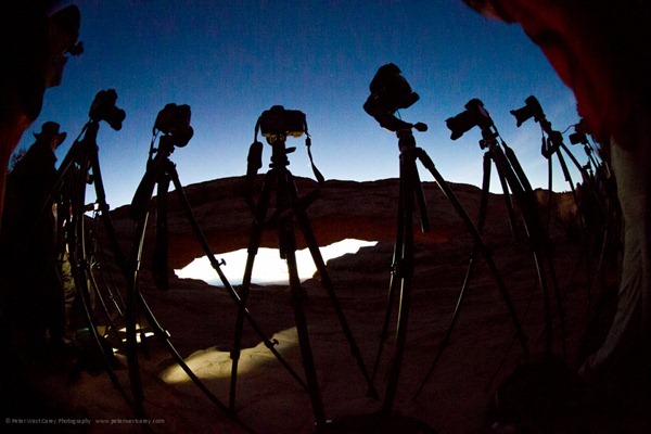
    Now let me show you what is missing in this frame on that day.

    PeterWestCarey-Utah2012-1022-6857

    And

    PeterWestCarey-Utah2012-1022-7347

    This is the reality behind the lens and something not often mentioned.

    For this shoot, I was meeting up with fellow photographer Michael Riffle who has been to this location before. He said we needed to meet early….real early. “How early?” I asked. With a sunrise at 7:30, he guessed about 5:30am. That should get us to the park and in position around 6:30am.

    Evidently that was not early enough.

    We were bested by two workshop groups who had arrived even earlier. I took up a position to the far right while Michael managed to use his charm to gain front row access, but not as close as he had planned. In all, there were over 17 people shooting the arch that day, the crowd getting ruckus when one gentleman decided to walk on top and pose for his workshop group. This brought yells to get off and threats that his act was illegal (for reference sake, we asked a park ranger at the trailhead and were told it is not illegal to walk the arch. “It’s not a very smart thing to do, though.” Were his words).

    The atmosphere is not what the illusion of the first image portrays, but that’s ok, because that’s photography. An illusion of what really was, malleable any way we, as artists, please.

    Now, let’s contrast that experience with our shoot the next morning in neighboring Arches National Park. It was my idea to head to Delicate Arch for sunrise. This icon is so popular, it even adorns most license plates in Utah.

    First, a shot of the classic arch.

    PeterWestCarey-Utah2012-1023-7847

    You may notice this is not the normal shot people take. That shot is near sunset when the face is lit up. We decided to go early for a different view of the classic and it paid off as this is the crowd we faced:

    PeterWestCarey-Utah2012-1023-7852

    No one. For an hour and a half we set up, tested, shot and waited. After an hour and a half, one person showed up for about 20 minutes and then left.

    In my book, it doesn’t get any better than that. I’ve been to this location at sunset and so had Michael. We exchanged horror stories of tourists being tourists and exploring the arch, much to the consternation of the multiple photographers lined up (to the right in the image above) to get their copy of a classic. I didn’t want to spend half a day trying to edit out tourists (yes, I am one of them too) who, “got in my shot!”

    This is a shot of such crowds by Matt Leher on Flickr.

    1805543877_305a65baf9_z

    The valley view just off the road in Yosemite Valley. Old Faithful. Mt. Rushmore.

    The list goes on and on. Classic shots that leave behind the reality of a crowded scene to get a classic shot.

    Crowds are not bad nor evil. I’m not saying you shouldn’t get those classic shots. They are beautiful and help people gain interest in our National Parks.

    I want you to be aware; when you plan that ultimate shoot to capture a well worn icon for your own portfolio, realize you may have company.

    On the other hand, we spoke with a local Utah photographer who visits Mesa Arch often and he pointed out winter is a great time to shoot and crowds are usually less. But he also said it can’t be predicted as he has been there in bad weather, expecting to have the place to himself, only to find a crowd. The flipside also being true.

    What can you do?

    • Scout first, during the day or day before. Look for a spot when the light is harsh and there are less visitors to contend with. You can do some of this online before leaving to see what others have shot and figure out angles you might want to try.
    • Arrive super early. Not early; super early.
    • Be patient. All the others are wanting what you want and it’s not because they hate you. It’s because you all likely appreciate the same beauty.
    • Be friendly. With the crowd at Mesa Arch, I joked around with a couple of people near me who were lighthearted enough to enjoy the morning even with the crowd.
    • Bring a second camera. This will allow you to stake a claim to a spot and still take other images.
    • Enjoy what you came to enjoy.

    Despite the crowds I have found at popular shooting locations, I have always enjoyed the experience. Sure, my expectations of a deserted vista were dashed, but once I dropped that expectation and the disappointment that came with it, my mood and shooting improved.

    Good luck! And good shooting!

    Post originally from: Digital Photography Tips.

    Check out our more Photography Tips at Photography Tips for Beginners, Portrait Photography Tips and Wedding Photography Tips.

    The Reality Of Shooting In National Parks


    Digital Photography School

  • Last Day of October – Paddling SUP and Overheating in Hydroskin


    beaver-pond-103112-1-1

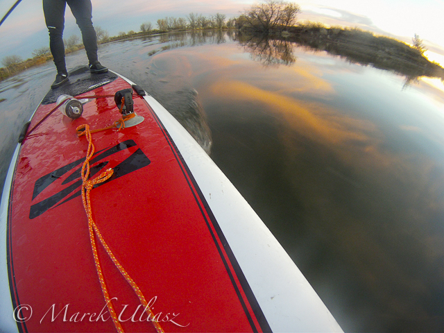
    October 31 2012. Last day of October on Beaver Pond in Arapaho Bend Natural Area. Camera: GoPro Hero.

    The new GoPro Hero 3 is supposed to have less wide angle lens distortion.

    I keep paddling my Bark Expedition paddleboard on Beaver Pond covering about 5 miles in each workout. Recently, I am wearing hydroskin top and bottom. On a warm day (~70F) I am really overheating, but water is getting chilly.

    Related posts:
    SUP Gallery in Fitness Paddling blog
    Daily Paddling Picture Gallery
    SUP (Stand Up Paddleboard) in Riverbend Ponds Natural Area
    Bark Expedition Stand Up Paddleboard in Fall Scenery


    paddling with a camera

  • Are Your Photos “Good Enough” For You To Be A Professional Photographer?

    There are a lot of photographers out there selling photos, which are well … rubbish. And there are many people out there who regard photography as an unpaid hobby, and yet produce shots which could be sold. How do you know if your photography is suitable for the commercial world? It’s not an easy question to answer, and I don’t Continue Reading
    Photodoto

  • Pulling Dreamscapes via Orton Effect

    Not far from my home is the residence of one of the best teachers of photography in Canada, if not the planet. Freeman Patterson has that incredible ability to not only implant a contagious passion within his student he does so in a way that demands they push their limits. Thankfully for us he has penned no less than 12 books, including four of the absolute best instructional volumes available. His sense of design and use of space have influenced many, many photographers that stand behind a camera today, myself included.

    On the opposite Canadian coast, in British Columbia, Michael Orton is one of a very few photographers who has created an effect that has endured both the film and digital ages. Some photographers have re-named the technique for their own purposes, but the fact remains it was Orton who mastered the technique.

    In the early 1980’s Orton started experimenting with sandwiching two slides to create a final image. This in and of itself is not unique; many photographers had been doing this for years. What Orton did, however, through his experimentation was to purposefully over-expose the two slides – one by two f/stops and the other by one f/stop. To add his own personal touch he would throw the two f/stop over-exposed image out of focus and thus came the “Orton Effect.”

    For the last 30 years this “Dreamscape” style of image has been appearing in camera club competitions, on greeting cards and calendars. We can call the technique what we will, but I am a firm believer in providing credit where due – Michael Orton.

    Once digital capture became the norm and film was relegated to disposal at yard sales, many photographers were left trying to discover ways to replicate in Photoshop those techniques that had previously taken considerable practice to master. It took some time for me to develop the recipe that “worked” and closely mimicked what I was able to capture on film. I have tweaked this many times and have yet to acquire that same “feel” as film, but will attribute this to the fact that digital capture simply is different than film.

    Please feel free to adjust and season to taste, but this technique should be included in every recipe book. I will not use shortcut keystrokes or use the command or control key function of Mac versus PC platforms. I will assume the reader can understand where, when and how to substitute these keystrokes.

    1. Open image
    2. Duplicate background layer and call this new layer “Base Layer”
    3. Create a duplicate layer of the Base Layer and call this new layer “Screen Layer”
    4. With the screen layer active, change blend mode to Screen
    5. With the screen layer active, select Merge Down
    6. Create a duplicate layer of the “Base Layer” and call this new layer “Blur Layer”
    7. With the “Blur Layer” active, go to Filter > Gaussian Blur. Adjust the blur to a point where there are no identifiable features; 20 is a good starting point.
    8. With the “Blur Layer” active, change the blend mode to Multiply, and adjust the opacity and / or fill slider bars to achieve the desired effect.
    9. Flatten the layers.

    Depending on your own taste you might find the blacks have become blocked-up. To adjust for this there are several usual techniques, most often it is easiest to create a curves adjustment layer and simply open those shadows until you begin to see a hint of detail.

    Like all cookbooks you adjust the recipe and season to taste.

    While there are many photographers utilizing variations of this technique today, it is always refreshing to review the works of the original craftsmen. Study Patterson for his approach to design and how to utilize space, in so doing it his style of image that loans itself best to the Orton Effect; and, review Orton’s work to see how it is possible to move an image from the documentary “I was there” type of picture to a well crafted and intended piece of art that captures the flavour of the place.

    Post originally from: Digital Photography Tips.

    Check out our more Photography Tips at Photography Tips for Beginners, Portrait Photography Tips and Wedding Photography Tips.

    Pulling Dreamscapes via Orton Effect


    Digital Photography School

  • Pro Photographer Editing Workflow (TIPS)

    Creating images is a process and, for me, pressing the shutter is only a small part of the journey to an image of sufficient quality to publish. In this article, part 2 to Architecture Photographers on Holiday, I will go through my image workflow.
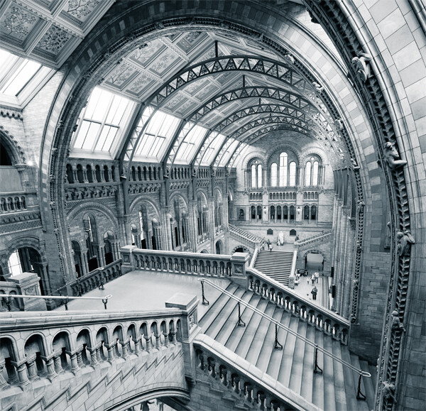
    All photography faces the challenge of scenes with a significant dynamic range. Landscape and architecture is really no different. I will capture as many frames as required to cover the entire scene’s dynamic range. For architecture and indoor 3 frames are enough for most scenes. The image above required 9 images; exposures bracketed at -2, 0 and +2 and 1 set for the lower half of the room and another for the ceiling. The additional set is to help me eliminate people from the shot.

    You really should …

    • Shoot RAW too to retain maximum flexibility in images; we aren’t sports shooters firing a constant stream of images to a desk, where JPEG is pretty much mandatory
    • Keep ISO Low
    • Use a single white balance setting for the same set of images
    • Use the heaviest tripod you have and a remote shutter release, wired or otherwise


    This image above, of Canary Wharf underground station, comprises 3 frames. The challenge for this scene was getting a good exposure of the dark surrounding areas, the bright metallic escalator and the ridiculously bright canopy. Each layer contains the properly exposed parts of the composition.

    Principal Camera

    Architecture and landscape images are pretty much covered with my 5D Mark II and 17mm TS-E Tilt-Shift lens. I shoot multiple exposures mostly due to the front element being convex and resisting any attempts to use filters. My bag will also always have an EF24 f/1.4 and EF50mm f/1.2. My tripod is a little ropey now; Gitzo legs and a Manfrotto ball head.

    Computer & Monitor

    All image editing is undertaken on a dual CPU Mac Pro with 24gb RAM. I frequently work with images in excess of 1GB, so a large amount of memory is a must. I have a Dell 27″ Ultrasharp monitor, which is calibrated using a Spyder 3 Elite.

    Before any significant editing session I calibrate my monitor.

    Importing Images

    I realise many of you will use different mechanisms, like Lightroom, iPhoto, Picassa, etc. Call me a luddite, but I hate to relinquish control and so my import routine is entirely manual.

    On location I will be filling 2 hard drives and, on my return, will be copying across 100GB of images in a single operation, to a location I have prepared. The folder structure on the left has served me very well for the past 10 years.

    You’ll notice my prepared JPEG files are prefixed with pixel sizes for various web sites; 500px is 900 pixels wide, however 1x.com is 950 pixels. I will also add ‘bw’ to the file name for monochrome images. These naming conventions make it easy to search your hard drive for correct sized images.

    Selection

    Of all the numerous photo applications I have installed, day to day, I use Adobe CS5. It is a very reliable work horse for image processing.

    Image preview and selection is accomplished quickly in Bridge. I select the images I am interested in – on the right. Once happy with this, I use the filter pane – on the left – to show only my final selection.

    Camera Raw

    If you are like me, everything on your camera is set to off or zero. Here in Adobe’s Camera Raw application, I will perform a few tweaks to all the images that will go towards a single composite image.

    • Ensure you are importing your images in the same color space as your camera. Mine is Adobe RGB, a wider color gamut than the internet’s sRGB. Work on the best quality image and then convert down for your target medium, like the internet
    • Edit images in 16 bit
    • Select the best and most evenly exposed frame and set your white balance
    • If there are hot spots, use the Recovery slider to compenstate. TIP: Press [alt][cmd] together whilst moving the Recovery slider and you will see where the hot spots are very clearly on the black background!
    • If you’re using the recovery slider too much, compensate with the exposure slider. Again, press [alt][cmd] together
    • You can use the [alt][cmd] again with the black levels – bring the black levels up to just before you start blowing the blacks
    • Select all the images, and Synchronize – top left – white balance to the other images in the set
    • Open All images into Photoshop


    Photoshop Tutorial

    My Photoshop workspace is quite austere and my editing process is also quite simple.

    I have a number of actions set up for menial tasks, like image resize, colorspace conversion, etc. The discrete tasks I perform can be broken down as follows:

    • Layer blend multiple image exposures
    • Stitch these composite images if panoramic
    • Save the single composite image as a Photoshop PSD file
    • Use masking to select targeted regions of the image for color, contrast and exposure control. A simple example might be to process the sky separately from the building in the foreground
    • Resave this image with all the layers that have been created
    • Flatten the image and straighten. If necessary, crop.
    • sharpen
    • save a new version of this prepared image as a Photoshop PSD
    • resize for your target medium, example, 900 pixels across for 500px.com
    • Convert to sRGB and to 8bit
    • Save as a JPEG. Remember to prefix the file name with ’900px’ for easy finding later on

    Manual Layer Blend

    First, get your separate exposures into one image as layers. You can use the menu to automate this: File > Scripts > Load Files Into A Stack [Add Open Files]
    Most Photoshop users are a little wary of masks and selections, etc, but they’re really quite simple. I shall demonstrate!

    Choose your Selection Tool of choice. I have used the Quick Selection tool, highlighted on the very left. Press [Shift] to add to your selection and [alt] to remove from your selection. You can see I have selected the correctly exposed canopy in Canary Wharf Station.

    This selection is very jagged and will be most visible if we don’t make it more smooth and elegant. So click on the [Refine Edge…] button, again highlighted at the top of the above image.

    The red mask area is very useful for viewing selected vs unselected, but you need to set this option. Click on the View drop down at the top of the Refine dialogue and select Overlay.

    We will use the Refine Radius Tool brush, highlighted on the left. It will allow us to paint the edge of the selection and Photoshop will take an educated guess on what should and should not be selected.


    Increase the size of the brush with the [Size] option and ‘paint’ lavishly around the edge of the selection. Go over all the edges!

    The selection edge is far more gradated now! Press [OK] to save this selection.


    We now to need to create a mask layer. A mask will will make some of the layer image visible and other parts invisible.

    Press the [Add Vector Mask] button, which is highlighted.

    You can see the black and white thumbnail that has appeared next to my layer thumbnail (below). Black is invisible. Simple as that. Anything not black will show through that same area in the corresponding layer. In my image, the canopy mask is all white and so only the canopy will show through. This is good, as it will leave the layer underneath visible, apart from the canopy.

    I have gone ahead and repeated the exposure layer mask for the escalator and canopy surround, which you can see below. The layers, at 100% are too harsh, so I have reduced the opacity of the canopy layer to 80% and the canopy surround/escalator to 70%. A little bit of work, but a very flexible method to be able to represent wide dynamic range scenes.

    A great observation to take away from this section is the power and flexibility of layers and masking. It’s precisely how I will process color and contrast in the next section.

    Flatten your exposure layers [Layer > Flatten Image] and Save as a Photoshop document. You now have a properly exposed version of your scene. A base you can come back to. Very useful if you want to convert to black and white later on.

    Image Edit: Color and Contrast

    I shall demonstrate this edit with this single capture from Kolmanskop, Namibia. I have overlayed the processed image to illustrate the differences from RAW to processed.

    If I attempted to enhance this image as a whole, it would probably be a mess and manipulating color and contrast for one area would most definitely degrade another portion of the image. Working on separate parts of the image makes most sense to me and this is achieved, once again, with masking and layers.

    Create layers of image sections to process using masking

    • Select portion of base layer
    • Refine Selection
    • Copy selection
    • Paste to a new layer; name it something sensible
    • Repeat for all sections that require separate attention

    I will go through my process to apply color and contrast adjustments to the sand.

    Saturation

    Select the layer you are going to edit – I will select the ‘Sand’ layer.

    Tick ‘Use Previous Layer to Create Clipping Mask’ to ensure your edit is only applied to the ‘Sand’ layer. You’ll see the new layer has a little arrow pointing down to reflect this.

    I have selected a predefined level of ‘Increased Saturation More’.

    Sand should be a nice warm orange, so I’ll add another adjustment layer of a Photo Filter – Layer > New Adjustment Layer > Photo Filter…. Select the ‘Sand’ layer first and remember to tick the ‘Use Previous Layer to Create Clipping Mask’ option.
    I have selected the ‘Warming Filter (85) and increased the density to 50 for a fuller effect.

    Lastly, I have added a curves layer for contrast. Select the ‘Sand’ layer and, from the same menu location – Layer > New Adjustment Layer > Curves… – select ‘Strong Contrast (RGB)‘.

    Since we have multiple layers corresponding to ‘Sand’, I will select them all, group and them – Layer > Group Layers – and apply a label.

    Now I can make the toggle the Group ‘Sand’ on and off to see the effect of my layer adjustments.


    TIP: To adjust exposure by a stop, add a curve layer and set it’s opacity to 38%. For +1 stop, set the Blending Mode to ‘Screen’ and for -1 stop, ‘Multiply’.

    All Edits done now and, by editing section by section, I have been able to control the image quite comprehensively.

    At this point save the image with all layers as a Photoshop Document.

    Straighten. Crop. Sharpen. Save. Resize. Save.

    Straighten

    I have 2 methods. Use the Ruler, illustrated left which is very quick once you identify the strongest line in the image, or select all layers, then select the entire image > Edit > Transform > Rotate.

    Crop

    Simple task, but difficult to undo once your image is saved. I suggest saving your image before proceeding.

    Sharpen

    There are numerous discussions on the subject of sharpening and I personally have tried them all, but the most elegant sharpening method is the High Pass filter method. The results are sharp, but without artefacts and ‘jaggies’. Sharpening after resize is a definite no no.

    • Duplicate the layer – Image > Duplicate…
    • Perform a High Pass Filter, 1.0 is a good radius for a well focused image around 10-20mp – Filter > Other > High Pass…
    • Set the Blending Layer Mode to ‘Overlay’ in the Layers Palette

    Save

    Flatten the image – Layer > Flatten Image – and save as a new Photoshop File and name accordingly.

    You now have a full resolution properly edited image. When you are preparing images for publication or competition, this is the version you will come back to to resize, save as JPEG and distribute.

    Resize

    I prepare JPEG image versions for various Blogs, Flickr, 500px, 1x and competition. They are all different sizes.

    Save

    The final save as a JPEG needs to be converted to sRGB and to 8 bit. These attributes are standard for the internet. If you don’t do either, your image on the internet will simply not look, to others, the same as you processed on your computer.

    • Image > Mode > 8 Bits/Channel
    • Edit > Convert to Profile…


    Well here you are, this is basically my image editing workflow.

    I suspect a Part 3, Pro Photographer Monochrome Conversion (TIPS), will be forthcoming, so stay tuned!

    Post originally from: Digital Photography Tips.

    Check out our more Photography Tips at Photography Tips for Beginners, Portrait Photography Tips and Wedding Photography Tips.

    Pro Photographer Editing Workflow (TIPS)


    Digital Photography School

  • Winter Reads: Painting with Light

    Batting second in our lineup of fireside books is Eric Curry's wonderfully comprehensive Painting with Light.

    If you have ever wanted to get into light painting but did not know where to start, Curry will take you gently by the hand and lead you into the world of creating beautifully complex pictures like the ones below…
    Read more »


    Strobist

  • Halloween Today, Super-Cheap Fog Machines Tomorrow

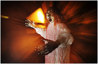
    Just a quick reminder that tomorrow that your local pop-up Halloween stores will be deep-discounting seasonal fog machines and bottles o’ fog juice. Which are, of course, lots of fun for all kinds of photos…

    -30-


    Strobist

  • What Is Alpenglow?

    Alpenglow is often misunderstood. More accurately, certain lighting conditions are labeled as alpenglow when they are not, in fact.

    Alpenglow is simply redirected light. Think of the clouds and atmosphere as a giant strobe reflector. Think of the sun as a giant strobe (for which, there is no PocketWizard controls). In the image art right, the entire scene is lit from light bouncing off the atmosphere and hitting Seattle and Mt. Rainier. If we had no atmosphere, the light would just pass on by as the sun is not yet over the horizon. (If you don’t believe me, go to the dark side of the moon and see if alpenglow exists.)

    Alpenglow often has a characteristic red to orange hue to it. This is because the light of the nearly rising or recently setting sun is passing through more of the atmosphere than when it is high overhead. The atmosphere strips out the blues first and leaves us with warm, red/orange light.

    Some people call direct light hitting a distant peak alpenglow, while they stand in the shadows of a valley (i.e. image at right). While this isn’t technically correct, it’s important not to start an internet flame war about it (hint: that means not in the comments section of this post, either, although legitimate debate is always welcome). If you find yourself getting in a tizzy about someone mislabeling Alps glowing from direct sunlight, instead of indirect sunlight, it might be time to step away from the computer and go shoot some photos. It’s just not worth the headache, both situations make for excellent photos.

    Shooting alpenglow presents no particular challenge to the photographer. Metering is done in the same fashion but post processing is where some magic can happen. Because of the intense colors, photos often have more saturation and are more vibrant than once the sun peeks over the horizon and lights the scene directly.

    The Blue Hour, an hour before sunrise and after sunset, intermingles with alpenglow depending on location, atmospheric conditions and topography. Think of it as a continuum from sunset, to alpenglow (if there is enough atmosphere/clouds to reflect off of) into the Blue Hour when the red leaches from the scene.

    Again, don’t get too caught up in terminology. Just remember that there is excellent light early and that’s why you should drag yourself out of bed when it is still dark in order to capture the blue turning to red turning to orange to direct sunlight as the sun races over the horizon. Then go back and catch a nap.


    Post originally from: Digital Photography Tips.

    Check out our more Photography Tips at Photography Tips for Beginners, Portrait Photography Tips and Wedding Photography Tips.

    What Is Alpenglow?


    Digital Photography School
  • Aspect Ratios in Landscape Photography

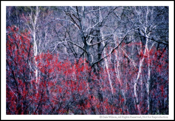
    Composition is often the key to the difference between a good landscape photograph and a great landscape photograph.  There are oft quoted rules that we all try to adhere to and break in equal measure (rule of thirds, leading lines, golden spiral etc.) yet when considering what we are trying to capture within the frame, we don’t always consider the frame itself.

    The aspect ratio of the photograph can make or break the composition by both emphasising the subject and removing distractions, or by putting the whole scene off-balance.  When looking through the viewfinder, about to press the shutter, it’s a good idea to try and envisage the final shot, including the aspect ratio, in order to optimise your composition (too often the aspect ratio is an after-thought, being edited and applied during post-processing to correct for poor compositional choice).

    But how does each aspect ratio impact our composition?  Hopefully, that’s where this article comes in.  I’m going to discuss a few common aspect ratios, with examples, and show the benefits and draw backs for each, considering where each one may be applied.

    (Note, there is an argument for cropping your photo without sticking to a defined ratio to give an image a custom ratio based on your subject matter.  I believe that can make printing/framing awkward so will therefore be sticking to well-defined ratios that most should be familiar with).

    1:1 –Square format

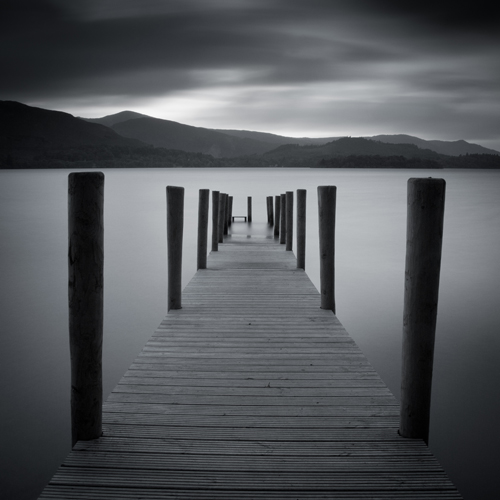
    The square format can often be used to simplify an image and give a subject a striking presence at the centre of the frame.  By keeping the width equal to the height, the way in which we read the photograph changes, as there is less of a need to move left-to-right through the frame.  The square format lends a good opportunity to break the rules we so often follow – place the horizon along the centre of the image or place a subject in centre of the frame, and the composition may only get stronger.  You’ll often see a 1:1 aspect ratio used to emphasise minimalism (again, along the theme of simplification).

    Derwent Water, Lake District, UK presented in a 1:1 aspect ratio

    A 1:1 aspect ratio used to add to the simplicity of this image

    4:3 – Four-thirds format

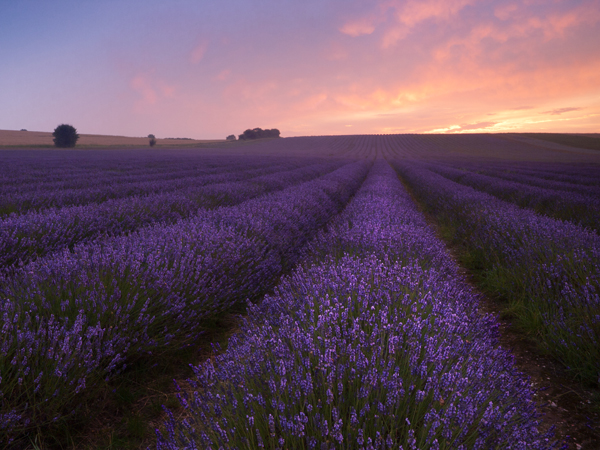
    This format is the default aspect ratio of cameras that use four-thirds sensors.  The image is wider than it is tall, meaning that the eye naturally wants to move left-to-right through the image.  However, given that the image is still fairly tall, in relation to the width, this ratio is perfect for leading the eye into the scene through leading lines from foreground interest.  The relative height of the image encourages the use of wide-angle focal lengths to capture the depth of a scene within an image, without capturing excess details at the edge of each frame.

    Lavender field at sunrise presented in a 4:3 format

    A 4:3 format allows for capturing close foreground detail and leading lines to draw the eye into the image

    6:4 – 35 mm format (also called 3:2)

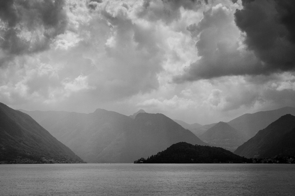
    This is the default aspect ratio for 35 mm film, and therefore for full frame and APS-C sensors used in most Nikon/Canon cameras.  The width of the image is significantly wider than the height that, again, encourages reading through the image from left-to-right, meaning diagonal leading lines can work a treat.  A limitation of this aspect ratio is that the height is that much shorter in relation to the width, meaning that capturing foreground detail using a wide-angle lens becomes more difficult due to the limited vertical space with which to work.  It can cause the subjects within the frame to become too disparate and therefore lose impact.  The 6:4 ratio can however be a format that is suited to capturing scenes where there is little to no foreground interest, with mid-range focal lengths (e.g. 35 mm).

    Rain over Lake Como presented in a 6:4 aspect ratio

    A 6:4 aspect ratio is used here as no close foreground detail is being captured, yet the scene still benefits from a wide aspect

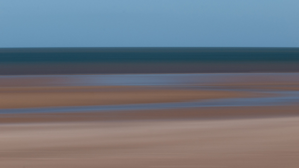
    16:9 – widescreen panoramic

    This format was supported in film by the advanced photo system (APS) on its introduction and has recently become more popular due to the prevalence of 16:9 aspect ratio displays in the home – tvs, computer monitors, mobile devices.  With this format, the width of the image is dominant, meaning leading the viewer in from the foreground is difficult, but the format is ideally suited to presenting portions of landscape scenes captured with longer focal lengths (i.e. zoom lenses) from a distance.

    Beach abstraction presented in a 16:9 format

    A wide and narrow 16:9 format was used here to emphasise the horizontal bands of colour

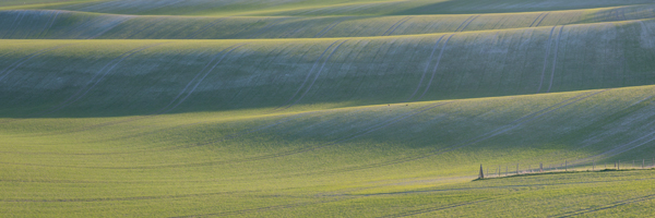
    12:6 or 18:6 – panoramic (also called 2:1 or 3:1)

    I’ve chosen to adopt 12:6 or 18:6 as the panoramic format here for a few reasons.  Both 2:1 and 3:1 seem to be fairly well supported in that panoramic picture frame options are typically either 2:1 or 3:1.  2:1 is a panoramic format supported by a number of medium format film cameras and 3:1 was supported by the APS.  Typically, panoramic ratios will be used to present the result of stitching 2 or more images together – it’s quite challenging to capture a 3:1 aspect ratio image from one frame and it sill be large enough to print at any meaningful size – and often frames to be stitched will have been captured using a longer focal length in order to pick out details distant in the landscape.  There is no real option of including foreground detail here.

    Chalkfields at sunrise presented in a 3:1 aspect ratio

    An ultra-wide 18:6 (3:1) aspect ratio was used to present this panorama of 7 stitched images, captured using a focal length of approx. 140 mm

    ‘Portrait’ mode

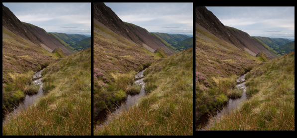
    I’m aware that I’ve discussed a number of different aspect ratios in the ‘landscape’ format and not in ‘portrait’ format.  That is because I believe the options for successful presentation of landscapes in ‘portrait’ format to be much fewer in number.  For a landscape to work, you need to balance the composition throughout a frame and aspect ratios such as 6;4 make that very difficult due to the image being too tall, relative to its width.  For ‘portrait’ landscapes to work, fatter rectangles such as 4:3, 7:6 or 5:4 are ideal, 5:4 being heavily used by professional landscape photographers using medium and large format cameras.  These formats allow the eye to be taken through an image, still from-left-to-right, without having an excess amount of sky putting the frame off-balance.

    Bwlch Y Groes, Wales, UK presented in three different portrait formats

    From left to right: 6:4, 4:3, 5:4. Which one looks best?

    Conclusion

    Whilst I have tried to describe specific uses to certain aspect ratios, I am aware that not all scenes will follow the suggestions I’ve made, and some images may well work in one ratio, not another, contrary to what I’ve suggested.

    However, I’m hoping this introduction to aspect ratios will encourage you to think about them when composing your shot, before pressing the shutter.  It isn’t always ideal to fill the frame of your camera with the landscape in front of you, and knowing that the aspect ratio you choose is not dictated by which camera you use means you may be able to use them effectively to boost the impact of your landscape photographs.

    Post originally from: Digital Photography Tips.

    Check out our more Photography Tips at Photography Tips for Beginners, Portrait Photography Tips and Wedding Photography Tips.

    Aspect Ratios in Landscape Photography


    Digital Photography School
  • Marketing Ideas for Photographers on How to Grow Your Business

    Do you know how to grow your photography business? If you take good shots it doesn’t mean you’ll gain success and popularity among customers. You need to know how to sell yourself well! But until you are not a star of the photography world you don’t need any professional and high paying marketers to teach you. Everything is quite simple Continue Reading
    Photodoto