Category: Photography

  • Directing your Viewer’s Eyes with Lightroom to Make a More Powerful Image

    One key to a successful photograph is that it directs the viewer’s attention towards the subject in question. There are many ways that this can be achieved through composition and lightning in the field, but did you know, you can also direct the attention of your viewer’s eyes through post-production?
    truck edit-2

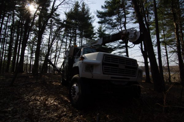
    You still need an interesting subject for this to work, as directing your viewer’s eyes to a boring location within a frame is still going to result in a boring photograph. For the sake of this tutorial I’ll be using this photograph of an abandoned utility truck, but you could use anything from an interesting tree, to a model, to your pet, and achieve similar results.

    First a few basic edits to bring the photo to life

    Before we can work on drawing the attention of the viewer this photograph needs a bit of life pumped back into it. Having shot this photograph into the sun, the foreground and front of the truck are going to require some basic recovery techniques. I’ll be using the Basic Tab in Lightroom 5 to recover the detail and add some interest to the shot.

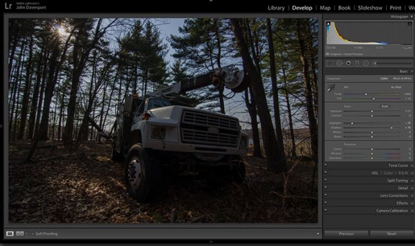
    Step One: Highlights and Shadows
    direct-viewers-attention-11

    Shooting into the sun can be tricky as it often will cause your sky to turn white. Reducing the highlights slider will help to counteract this. It does so by targeting the brightest areas of your photograph without effecting the overall white point of the image. The shadows slider has a similar effect on the darker areas of the image, allowing detail to be brought out in the grill of the truck and along some of the trees.

    Step Two: Add contrast with the Blacks and Whites sliders
    direct-viewers-attention-10

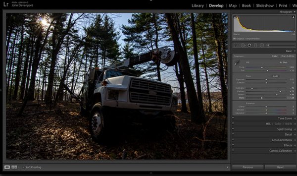
    One of the problems with the highlights and shadow recovery technique above is that it often will reduce the contrast of the image and create a sort of muddled and dull look. To counteract this you can use the whites and blacks sliders to effectively set your white and black points, as well as bring a bit of contrast back into the image. This allows you to have a bit more control over the contrast of your image as opposed to the more global Contrast slider adjustment.

    Do this by dragging your White slider to the right until your histogram touches the right edge of the graph. Make sure not to go too far and clip any highlights. Holding down the Alt (Option) key while you drag the slider will show any areas that are clipped – so drag to the right until you see some, then bring it back to the left just until they are no longer visible. Do the same with the Blacks slider by pulling it to the left. The Alt (Option) key works with this one too, but in the case of Blacks you actually do want a little clipping. Having a good black in your image will add that contrast you’re looking for.

    Step Three: Even out the exposure
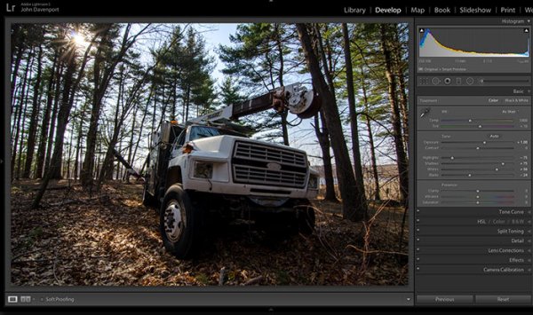
    direct-viewers-attention-9

    Now that the highlights, shadows, whites and blacks are set –  a quick bump up on the exposure slider will even out the rest of the scene and get us close to something we’re ready to work on.

    Step 4 (optional): Saturation and Vibrance
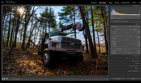
    direct-viewers-attention-8

    For this particular shot I wanted to add a bit more saturation to the trees and the floor of the forest. It’s going to depend on the shot that you’re working on, and the look that you are trying to achieve, as to whether this step is necessary. But it doesn’t hurt to play around with it before you move on to the next steps.

    For more on Lightroom’s Basic Tab read: Master These Five Lightroom Sliders and Your Photos Will Pop

    Now to draw the attention of the viewer

    While the truck itself is a strong subject, and one that does capture the viewer’s attention on its own, there are a few tools that Lightroom has to offer which will allow for even more attention grabbing goodness.

    Cropping for better positioning
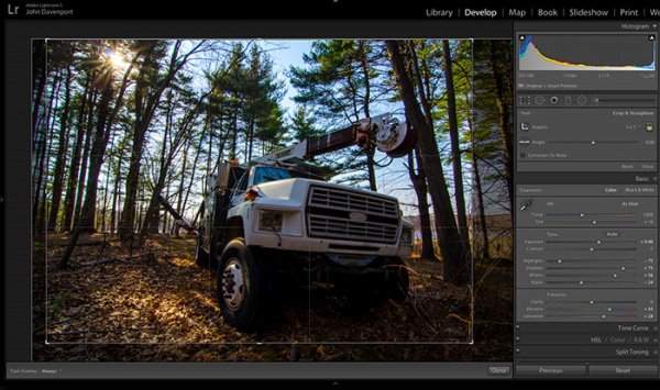
    direct-viewers-attention-7

    The crop tool allows you to have more control over the positioning of your subjects within the frame. In this shot the truck was a bit too centred and there was a little too much dead space in the forest so by cropping in a bit closer the shot becomes a bit more balanced, allowing the viewer’s eyes to stay focused on the truck.

    The Graduated Filter tool
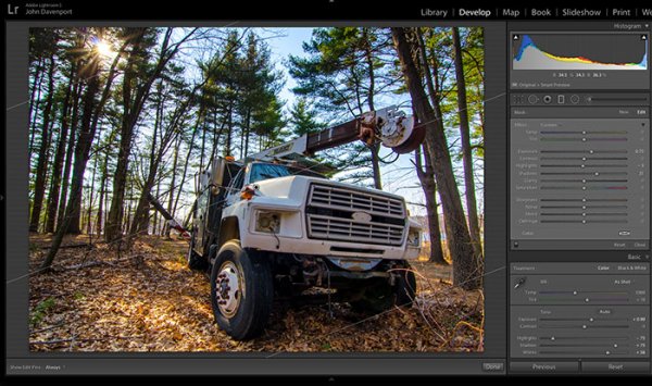
    direct-viewers-attention-6

    By adding a graduated filter to the bottom right of the image more detail can be recovered from the front of the truck without effecting the rest of the exposure. This allows for a more compelling focal point for the viewer to rest their eyes on. When you go about placing graduated filters in your own images be sure to think about how it’s effecting the overall light of the scene and ask yourself if it looks natural.

    Getting creative with graduated filters can allow you to have some really interesting results read 4 Fun Tricks to Enhance Your Photos With Lightroom’s Graduated Filter Tool for more creative uses of the graduated filter tool.

    The Radial Filter tool
    direct-viewers-attention-4

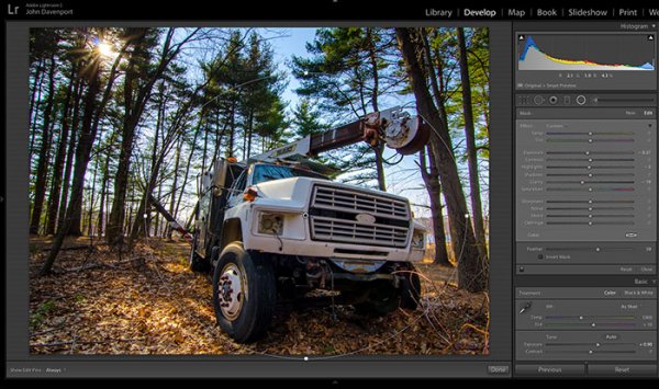
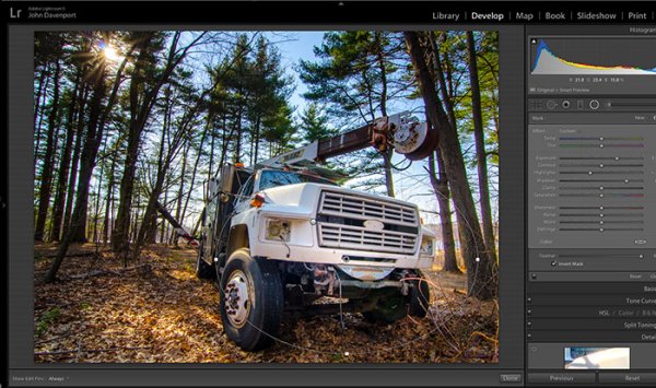
    The radial filter allows for a subtle vignette to be added to the image which helps to keep the viewer’s eye within the frame. It also has the added benefit of darkening the sky, without darkening the truck, allowing for deeper blues to come through. After I was happy with this first radial filter I dropped in a second one to increase the brightness and detail of the grill of the truck. To do this the radial filter was inverted and the exposure and clarity sliders were increased.
    direct-viewers-attention

    Removing distractions

    direct-viewers-attention-2

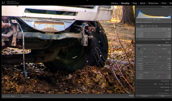
    Once you’ve gone through all the work of drawing attention to a particular area of a photograph you’ll want to go through with Lightroom’s clone/healing tool and remove anything that competes for that attention. Adobe has greatly improved this tool in Lightroom 5 allowing you to drag paths, making it possible to remove distracting branches with ease.

    The Final Edit

    With a few quick adjustments in the basic tab, a simple crop, and a few of Lightroom’s filters –  this utility truck really grabs the attention and is a vast improvement over the original straight out of camera shot. Go try this workflow for yourself and share your own before and after in the comments below!

    truck-edit2

    Watch this Edit Click for Click

    For those who prefer to sit back and watch – here’s  a quick video of the edit above.

    The post Directing your Viewer’s Eyes with Lightroom to Make a More Powerful Image by John Davenport appeared first on Digital Photography School.
    Digital Photography School

  • A Quick Video with 7 Tips to Create More Powerful Images

    In this short tutorial photographer Josh Cripps shares with you 7 tips to help you create more powerful images right now. You don’t have to buy any more gear, or take any classes. Put these tips into practice and get out there shooting.

    So are you getting close enough to your subjects? How about composition? Do you create depth in your images? Are you practiced in the art of using leading lines? All your shots from eye level – why not change up the perspective a bit? How about using the light to your advantage?

    That’s a quick summary of the tips in this video. Watch the whole thing to see some great image examples for each one. If you need ideas of what to shoot you can always check out the weekly photography challenge, this week it’s Blue. To see the current challenge you can always fine it in the right hand sidebar next to this article.

    The post A Quick Video with 7 Tips to Create More Powerful Images by Darlene Hildebrandt appeared first on Digital Photography School.

    Digital Photography School

  • How to Calibrate your Monitor with the Spyder 4 Express

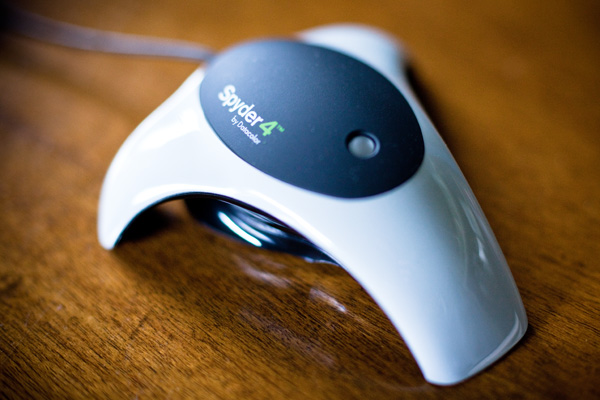
    Monitor calibration with Spyder 4 Express

    If you want to obtain accurate colours in your photos in Lightroom (or indeed any other software), no matter what you may read elsewhere, you need to calibrate your computer monitor. If you don’t, the colours in your photos won’t be accurate, and you will never produce a print (or any other form of output, such as a Blurb book) that matches the colours on your screen. If you undertake client work, or sell your photos through stock libraries, it is essential to calibrate your monitor so that you know the colours of your photo are as intended.

    The reason for this is simple. When monitors are manufactured, the colour is set incorrectly. Most monitors have a strong blue colour cast. The only exception seems to be Apple Mac computers. They still have a colour cast, but it’s not as strong.

    I have no idea why this is. Whenever I’ve searched for the answer all I find is vague references to blue computer screens looking better in the shops, or that the blue colour cast suits graphic designers. Neither of these ideas seems credible to me.

    Regardless, even if monitors were calibrated prior to shipping, you would still need to calibrate your monitor yourself at regular intervals because the colour of monitors drifts over time.

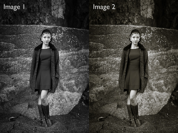
    Take a look at these two black and white images. One is completely neutral in tone, the other isn’t. Can you tell which is which?

    Monitor calibration with Spyder 4 Express

    If you answered that Image 1 is neutral, you are correct. But it’s very difficult to tell on an uncalibrated monitor. If your monitor is uncalibrated (making everything look bluer than what it is) you probably picked Image 2 as the neutrally coloured one.

    Using monitor calibration devices

    The only way to calibrate your monitor accurately is to buy (or borrow) a device that measures the colours emitted by your monitor. They are called colorimetric devices and connect to your computer via the USB port.

    If you research the topic online you will find articles that tell you how to calibrate your monitor without a colorimetric device. Pay no attention to them, their techniques don’t work. The only way to do it properly is with the correct device.

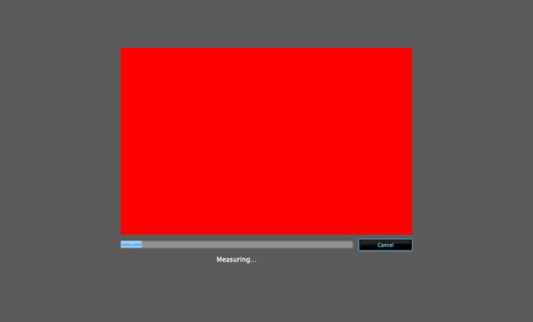
    Colorimetric devices are easy to use, and come with software that guides you through the calibration process. It shows you where to place your device on the screen, then displays a series of colour patches for the device to measure.

    It then compares the colour values recorded by the device, against the true colour values of the colour patches and creates a profile that compensates for the inaccuracies of the monitor. The profile is saved on your hard drive and used by your computer’s operating system to control the way colours are displayed on your monitor.

    Computers and colour profiles

    Once you have calibrated your monitor you can relax, knowing that the colours you see on your screen are as accurate as your monitor can render them. At least, that’s the idea. In real life, it’s a little more complex.

    Mac owners will be fine. The Mac operating system (OS X) works very well with colour. Every program you use works with the monitor profile and displays accurate colour. It’s one of the reasons that many professional photographers use Apple computers.

    If you have a Windows PC however the story is different. The operating system knows the monitor profile is there, but not all programs use it. It’s possible to have the same photo open in two programs, and for the colours in one to appear different to the other. One program is using the monitor profile, and the other isn’t.

    All the professional level programs you use, such as Lightroom and Photoshop, utilize the monitor profile and display colours accurately. But not all software does. An example is ACDSee. It doesn’t use the monitor profile and won’t display colours accurately. If you’re unsure whether your software uses the monitor profile, a Google search should reveal the answer.

    Just to make things even more complex, some PCs won’t load the monitor profile you created in the first place. It seems to be a problem with Windows Vista and Windows 7. This excellent article describes the problem in more detail and gives you a work around.

    Another thing to watch out for is that the colours on your monitor drift over time. For that reason it’s a good idea to calibrate your monitor at monthly intervals, or before you carry out any critical work. The software that comes with your device can be set up to give you a reminder.

    How to choose a monitor calibration device

    Colorimetric devices are made by several manufacturers. The main players seem to be Datacolor (who make the Spyder models) and X-Rite (which makes Colormunki).

    For many photographers, the least expensive model in each manufacturer’s range is probably sufficient. That’s good news because it means that you don’t have to spend a lot of money in order to calibrate your monitor.

    But before you rush out and buy the cheapest device you can find, ask yourself these questions. Some photographers will require the features found in more expensive models.

    • Do you use a dual monitor set up? Some colorimetric devices only profile a single monitor.
    • Do you have a printer to profile as well? Some devices can calibrate printers as well as monitors, although they are a lot more expensive.
    • Do you want to adjust the gamma or white point of your monitor? Not all monitors let you do this, but if you have a monitor which allows it you will need a more advanced device to enable this feature.

    The Spyder 4 Express

    I use a Spyder 4 Express to calibrate my monitor. Here’s how the process works. If you have a different device, the process will be similar.

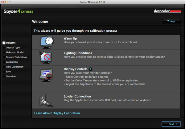
    1. Run the Spyder4Express software that comes with the device

    The first screen gives directions. The important points are that you should let your monitor warm up for half an hour before calibration and that there should be no intense light falling on the screen.

    It also asks you to reset the contrast setting and set white balance to 6500K. This isn’t possible on all computers, especially laptops, so don’t worry about these settings if you can’t adjust them. The device will still work.

    Monitor calibration with Spyder 4 Express

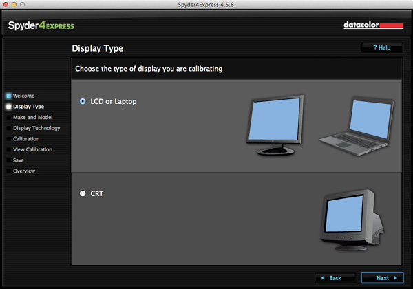
    2. Then it asks you which type of display you have

    Monitor calibration with Spyder 4 Express

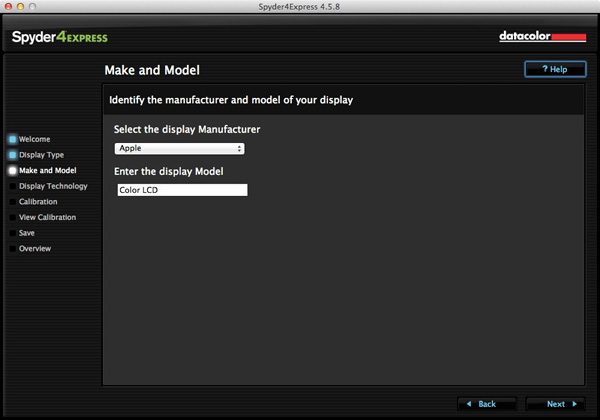
    3. Next enter the manufacturer and model of your display

    I selected Apple and the display model was filled in automatically. The Color LCD setting seems to be sufficient (confirmed by checking the monitor specs in System Information).

    Monitor calibration with Spyder 4 Express

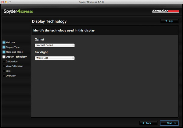
    4. Set the Gamut

    This next step is very important. Gamut is fairly easy. You’ll know if you have a wide gamut monitor because it will say so in the specs (that’s probably why you bought it). In fact, I tried setting wide gamut here to see what would happen and the software recognised that I didn’t have a wide gamut monitor and sent me back to change it.

    The backlight setting is crucial. The instructions recommend that if you’re not sure what type of backlighting you have that you should set it to Unknown. I tried that and even I could see with my naked eye that the colour was wrong (the screen had a magenta cast).

    If your monitor has the model number printed on it, simply Google the model number. You should find the spec sheet for the monitor which will tell you exactly what type of backlighting it has.

    If you have a laptop it’s harder to verify. I found these instructions for my Macbook Pro. I’ve been unable to find any for Windows laptops, so if you how to do this I’d be grateful if you could let us know in the comments. Once you have the model, you can Google it for the spec sheet. That’s how I confirmed my laptop has a White LED backlight.

    Monitor calibration with Spyder 4 Express

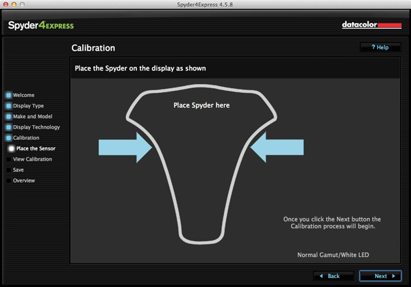
    5. Placement of the device

    The next screen shows where to place the Spyder 4 Express unit. It has a counterweight to hold it in position.

    Monitor calibration with Spyder 4 Express

    6. The software then displays a series of colour patches for the device to measure

    Monitor calibration with Spyder 4 Express

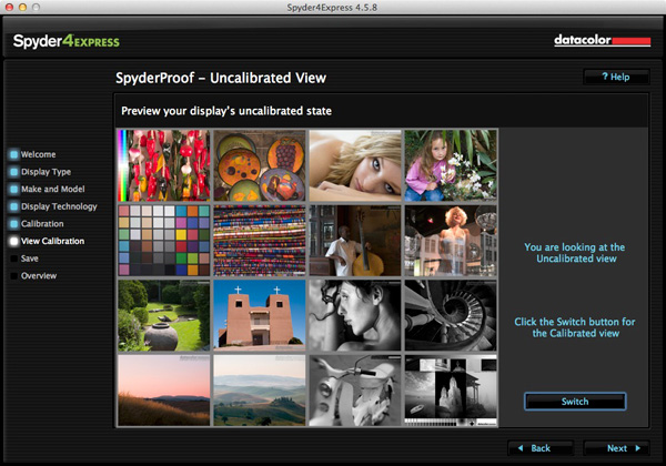
    7. A new profile is created

    When it’s finished, the program creates a new monitor profile that’s used by the computer from that point on. It also lets you switch between calibrated and uncalibrated versions to see the difference.

    Monitor calibration with Spyder 4 Express

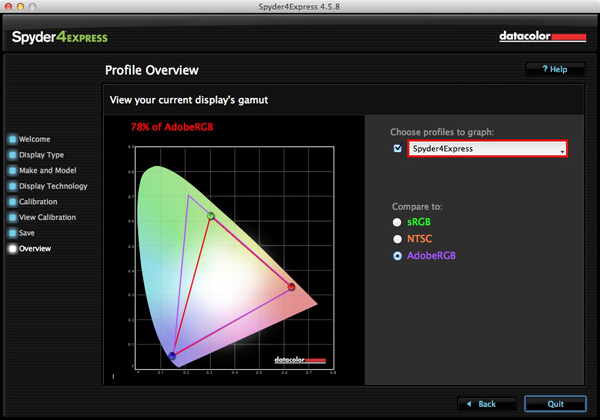
    8. Gamut comparison

    Finally, the program shows a graph comparing the colour gamut of the monitor compared to sRGB, NTSC and AdobeRGB colour spaces.

    Monitor calibration with Spyder 4 Express

    Conclusion

    Monitor calibration is an essential part of your workflow as a photographer. Indeed, it’s an essential part of all post-processing. There’s no way around it, but luckily the process doesn’t have to be difficult or overly expensive.

    I use the Spyder 4 Express, and it’s a great little unit. It’s easy to use and relatively inexpensive. The only potential sticking point seems to be working out what type of backlighting your LCD monitor has. It’s crucial to get that right or the calibration won’t be accurate. Also, if you need more advanced features, such as the ability to profile more than one monitor or set the colour temperature or white point, then you need a more advanced model of device.

    Have you used a different model to calibrate your monitor? How did the device perform and how did you get on? Let us know in the comments.


    Mastering Lightroom: Book Four – The Photos ebookMastering Lightroom: Book Four – The Photos

    My new ebook Mastering Lightroom: Book Four – The Photos takes you through ten beautiful examples of photography and shows you how I processed them step-by-step in Lightroom. It explores some of my favourite Develop Presets and plug-ins as well as the techniques I use in Lightroom itself. Click the link to learn more.

    The post How to Calibrate your Monitor with the Spyder 4 Express by Andrew S. Gibson appeared first on Digital Photography School.

    Digital Photography School

  • Weekly Photography Challenge – Blue

    Earlier I rounded up a set of blue images to inspire you. And as you may have guessed it’s that time again – the weekly challenge.

    I was feeling a little blue this week myself after hearing about the passing of Robin Williams. Sad that someone who brought so much joy to so many, had so little in his own life. But I don’t want you to be that kind of blue!

    Weekly photography challenge – blue

    This week I want you to get out and notice anything and everything around you that is blue. Then – photograph it and share it with us here. Nature provides lots of things that are blue for you, try there and also look for man made things too like bicycles, cars, homes, you name it. Here are a few more ideas for you:

    By Eric Bégin

    By Raj Stevenson

    By Syd Phillips

    By Éole Wind

    By Francisco Antunes

    By Will Montague

    By Yannis

    By amira_a

    Now it’s your turn!

    Share your Blue photos

    Simply upload your shot into the comment field (look for the little camera icon in the Disqus comments section as pictured below) and they’ll get embedded for us all to see or if you’d prefer upload them to your favourite photo sharing site and leave the link to them. Show me your leading lines using pathways and roads in this week’s challenge.

    The post Weekly Photography Challenge – Blue by Darlene Hildebrandt appeared first on Digital Photography School.

    Digital Photography School

  • A Set of Cool Blue Images to Enjoy

    This week it’s been hot where I live, almost unbearable so. Therefore I thought some blue images in nice cool tones would help chill things off a bit.

    So continuing on my series of colors we’ve already done Golden and Green . . .

    A set of cool blue images for you to enjoy!

    Photograph Bokeh by Joel Ericsson on 500px

    Bokeh by Joel Ericsson on 500px

    Photograph Blue by Boris van Berkel on 500px

    Blue by Boris van Berkel on 500px

    Photograph Blue by Suehana Suzie on 500px

    Blue by Suehana Suzie on 500px

    Photograph blue by olaus magnus on 500px

    blue by olaus magnus on 500px

    Photograph The Squareness by Joe@Plasmatico  on 500px

    The Squareness by Joe@Plasmatico on 500px

    Photograph Blue Quasar ? 5D/M51 by Josep Sumalla on 500px

    Blue Quasar ? 5D/M51 by Josep Sumalla on 500px

    Photograph Forest in blue by Valerie Anne Kelly on 500px

    Forest in blue by Valerie Anne Kelly on 500px

    Photograph Flurry. by  Chung on 500px

    Flurry. by Chung on 500px

    Photograph Midnight Blue by Margaret Morgan on 500px

    Midnight Blue by Margaret Morgan on 500px

    Photograph Flower of deep sea by Shihya Kowatari on 500px

    Flower of deep sea by Shihya Kowatari on 500px

    Photograph The night is coming by Cenzo Photography on 500px

    The night is coming by Cenzo Photography on 500px

    Photograph Flight.. by Atif Saeed on 500px

    Flight.. by Atif Saeed on 500px

    Photograph Rajan by Jody MacDonald on 500px

    Rajan by Jody MacDonald on 500px

    Photograph And I Am Off !!!! by Judylynn Malloch on 500px

    And I Am Off !!!! by Judylynn Malloch on 500px

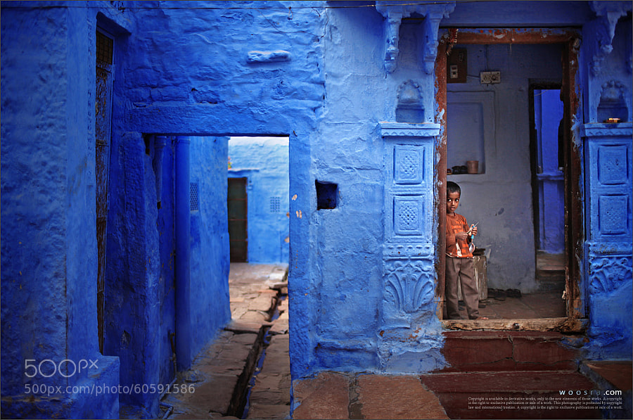
    Photograph Blue City by Woosra Kim on 500px

    Blue City by Woosra Kim on 500px

    Photograph NEO OSAKA by Yoshihiko Wada on 500px

    NEO OSAKA by Yoshihiko Wada on 500px

    Photograph IronMan MK II by Suradej Chuephanich on 500px

    IronMan MK II by Suradej Chuephanich on 500px

    Photograph Blue by Mike Busby on 500px

    Blue by Mike Busby on 500px

    Photograph Hpnotiq by James Brown on 500px

    Hpnotiq by James Brown on 500px

    Photograph To Each His Own by Juan Osorio on 500px

    To Each His Own by Juan Osorio on 500px

    Photograph Story Time by Adrian Murray on 500px

    Story Time by Adrian Murray on 500px

    Photograph smile by Eszter Virt on 500px

    smile by Eszter Virt on 500px

    Photograph Blue Eyes by Rasif Babayev on 500px

    Blue Eyes by Rasif Babayev on 500px

    Photograph Alone in the dark by AtomicZen : ) on 500px

    Alone in the dark by AtomicZen : ) on 500px

    Photograph Blue Syndrome by Lafugue Logos   on 500px

    Blue Syndrome by Lafugue Logos on 500px

    Photograph Hold hands by YUYU Photography on 500px

    Hold hands by YUYU Photography on 500px

    Photograph ?????????? ? ????????? by Natalia Lisovskaya on 500px

    ?????????? ? ????????? by Natalia Lisovskaya on 500px

    Photograph Summer Berry Waffles by MARJA SCHWARTZ on 500px

    Summer Berry Waffles by MARJA SCHWARTZ on 500px

    Photograph Peacock by strassguetlralf on 500px

    Peacock by strassguetlralf on 500px

    Photograph Follow the jellyfish... by Ilias  Varelas on 500px

    Follow the jellyfish… by Ilias Varelas on 500px

    Photograph Blue by Andres Restrepo on 500px

    Blue by Andres Restrepo on 500px

    Photograph A Friendly Berber Man by Brad Hammonds on 500px

    A Friendly Berber Man by Brad Hammonds on 500px

    Photograph Jodhpur by Mahesh Balasubramanian on 500px

    Jodhpur by Mahesh Balasubramanian on 500px

    Photograph JODHPUR-BLUE CITY by Harsh Chaudhary on 500px

    JODHPUR-BLUE CITY by Harsh Chaudhary on 500px

    Photograph Blue Cave by Roger Sharp on 500px

    Blue Cave by Roger Sharp on 500px

    Photograph Blue Impulse by K Yonekura on 500px

    Blue Impulse by K Yonekura on 500px

    Photograph Swimmer by Daniel Stefan on 500px

    Swimmer by Daniel Stefan on 500px

    The post A Set of Cool Blue Images to Enjoy by Darlene Hildebrandt appeared first on Digital Photography School.

    Digital Photography School

  • How to Make Instagram Filters in Photoshop: Sierra & Brannan

    I’m happy to continue our series of Instagram photo filter Photoshop tutorials. Before going to the tutorial, I’d like to share with you a few interesting facts about Instagram that you probably don’t know! Did you know that New York City is the most geotagged place on Instagram? Or that the most Instagram users are located in the United States, Continue Reading

    The post How to Make Instagram Filters in Photoshop: Sierra & Brannan appeared first on Photodoto.


    Photodoto

  • The Mysterious Disappearing Filters in Photoshop

    photoshop-missing-filters-1
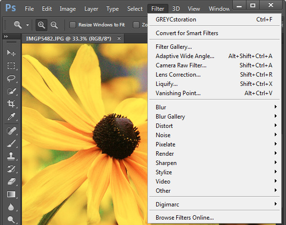
    If you use filters in Photoshop CS6, Creative Cloud (CC) or CC2014 you may notice that some of your old favorites are missing. Some (sadly) are gone forever, and others are just less easy to find. So, here’s what you need to know about the filters that are gone, how to make those that are hidden more accessible and why that might be important.

    Going…Going…Gone!

    First to Photoshop CC 2014. Gone from this version is the Oil Paint Filter. This was the sole remaining filter left when support for the Pixel Bender plug-in was removed from Photoshop CS6.

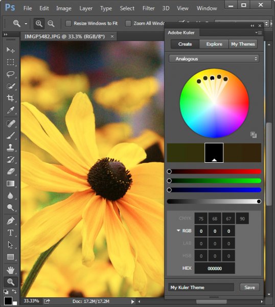
    Also gone from this version is the Kuler Extension which you could get to by choosing Window > Extension > Kuler, and Mini Bridge too. In addition, any older Flash based extension panels are also no longer supported. That said there is a new html based Kuler extension with a different feature set that you can download from Adobe here.

    photoshop-missing-filters-2

    Missing but not gone…

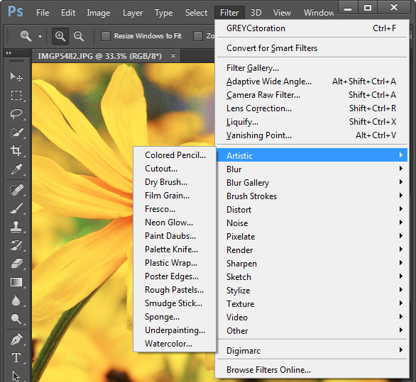
    In Photoshop CS6, CC and CC2014 some filters groups are missing from the Filter menu. Those missing are the Artistic, Brush Strokes, Distort, Sketch, and Texture groups. The filters themselves are still available from the Filter Gallery but the actual menu options for those filters are no longer visible by default.

    photoshop-missing-filters-3

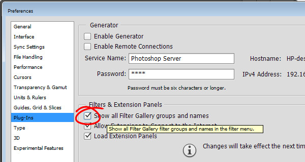
    Luckily you can restore those filters to the Filter menu. To do this, go to your Preferences dialog on Mac by choosing Photoshop > Preferences (on PC select Edit > Preferences). Click the Plug-Ins group of preferences and locate and select the checkbox for” Show all Filter Gallery groups and names” and click Ok.

    photoshop-missing-filters-4

    If the filter groups don’t appear on the Filter menu immediately, close and reopen Photoshop.

    photoshop-missing-filters-5

    You may be wondering if there is any real reason to return these filters to the Filter menu when they are all still accessible via the Filter Gallery. The answer is that there is a difference in how the filter is referred to in the Layers palette depending on whether you select it from the menu, or the Filter Gallery.

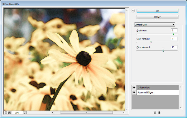
    In the image below I first selected the image layer and chose Filter > Convert for Smart Filters to make the layer a Smart Object. I then applied the Diffuse Glow filter to the photo by choosing Filter > Filter Gallery. I selected the Distort group of filters and applied the Diffuse Glow filter and clicked OK.

    photoshop-missing-filters-6

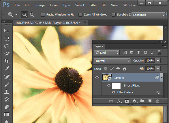
    The Layers palette entry for this filter simply reads Filter Gallery, there is nothing to say what filter was applied to the image. Worse still if I were to apply multiple filters this way the entries in the Layers palette will each read Filter Gallery so I have no visible indication of what filters have been applied or in what order.

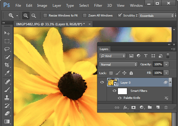
    Contrast this to the image below where I applied the Palette Knife filter by choosing Filter > Artistic > Palette Knife > OK and the Layers palette shows the filter name. So, even though the settings for the filter are applied using the Filter Gallery dialog, the very fact that the filter was initially selected from the Filter menu results in the filter’s name appearing below the Smart Object layer in place of the less helpful “Filter Gallery”.

    photoshop-missing-filters-7

    This is the case if you apply multiple filters from the Filter menu, and also if you select one filter from the menu and then change your mind and apply a different one when the Filter Gallery appears. The trigger seems to be that you start the process of applying a filter in the menus and not via the Filter Gallery.

    If you use filters a lot then it’s best to have them appear on the Filters menu and to use them from that menu rather than the Filter Gallery.

    An Oil Paint Filter option

    If you’re bemoaning the demise of the Oil Paint Filter in Photoshop CC 2014 there are some options available. One option is to keep an older version of Photoshop on your computer so you can use that version when you need to use that filter.

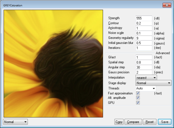
    If you are using Windows, there is a Windows only plug-in called GREYCstoration which you can find more details about here. This is an open source filter typically used for noise reduction that will double as an Oil Paint filter which installs inside Photoshop. Make sure you download the correct version for your version of Windows (there are x86 and x64 versions), unzip the file and copy the 8bf and bin files into your Plug-ins folder. Then you will find the filter in your Filters > Noise category. To date there is no Mac equivalent for this filter.

    photoshop-missing-filters-8

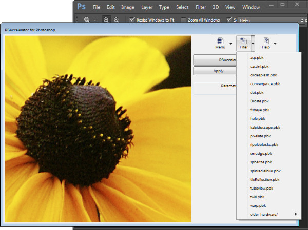
    Some sites have also suggested you try the Pixel Bender Accelerator for Photoshop that allows you to run Pixel Bender files in Photoshop CS6 and later. This will be of use to you if you want access to Pixel Bender filters that are available as .pbk files. Unfortunately the Oil Paint Filter was never distributed as a .pbk file so it appears that, inspite of suggestions to the contrary, this application won’t be of use for getting access to the Oil Paint filter.

    photoshop-missing-filters-9

    That said, this application is great for running Pixel Bender filters in later versions of Photoshop so, if that’s what you’re seeking to do it is worth a look.


    The post The Mysterious Disappearing Filters in Photoshop by Helen Bradley appeared first on Digital Photography School.

    Digital Photography School

  • How to Create Amazing Urban Landscape and Street Photography Images

    A stitched panorama in a city can make a great scene!

    A stitched panorama in a city can make a great scene!

    Many of us live in cities nowadays, in fact almost 80% of the world’s population lives in, or near, a large city. While it is fantastic to be out in nature, photographing the remote seascape scenes or the snow capped mountains, that is not possible for most photographers, everyday. That might mean that you don’t photograph for weeks at a time. As you probably know by now, to make big improvements in your photography you need to practice, practice, and practice some more.

    Living in a city has its own scenes that are great to photograph, this is why street photography is such a popular genre of photography. These urban landscapes can not only be interesting, but you can make some very powerful images in an urban or city setting. Here are some pointers on how to create amazing urban landscape and street photography images.

    1. Urban landscapes are the same as rural landscapes

    Ok, not visually maybe, but in the way you approach them. In traditional landscape photography you will use a leading line to draw the eye into the scene. You will make sure that there is foreground interest that holds the viewers eye. You will use composition guidelines to set up your shot. This is all true for urban landscapes too. Visually design your scene as you would when you photograph a landscape scene. Be sure that the scene has a good background, a strong mid ground and a compelling foreground. This is not a rule, but it will help when you set up your shot.

    2. The mundane becomes unusual

    We have all seen pretty much all the objects in a city. The fire hydrants, the mailboxes and the scenes all look familiar to us city dwellers. In urban landscapes it’s not only about the architecture or the street scenes, it is about making those well know objects look different or interesting. Think of the time of day that you photograph. Late afternoon sunlight, warm light can make a fire hydrant or mailbox look somehow magical. Graffiti can look gritty, textured, and interesting in the soft light. Look at how you can change the angle or lines in a normal scene. Come from a different angle and see how that change makes all the difference to making mundane objects seem different.

    Look for a way to make mundane scenes look different

    Look for a way to make mundane scenes look different

    3. Textures and close up

    Every city has literally thousands of different textures, including: walls of buildings, cobbled streets, paved walkways, wooden walkways, benches, grass, the list goes on. Each of these surfaces has texture which are great for urban landscape photography. To emphasize texture, you will want to be shooting in side light conditions. The side light will emphasize the granularity of the surface of the street, or the grain in the wooden bench. Textures can be a whole theme on their own. Think of the textures on the sidewalks, the brick walls, the concrete buildings, the glass surfaces (reflections are amazing too).

    Try this, go out into your city and try and shoot 24 photographs of different textures, at different times of the day. The range of different images will amaze you, and it will open up your eyes to what is possible when you focus on just one theme. Secondly, try and isolate some subjects in the scene. Get in closer to what you are shooting. By doing this, you will isolate part of the scene and make it look more intriguing.

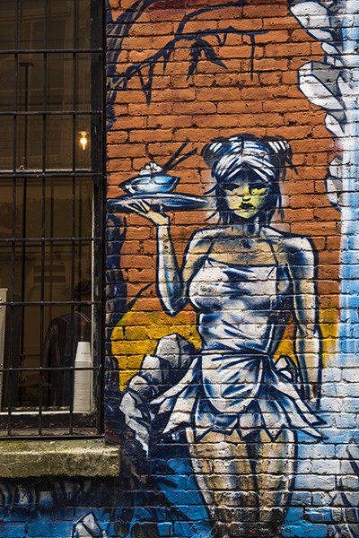
    This graffiti art looks amazing, but the textures and grittiness make the image more impactful

    This graffiti art looks amazing, but the textures and grittiness make the image more impactful

    4. Use colour

    We all photograph in colour nowadays, and then convert that image to black and white (if you don’t, you should!) but shooting for colour in your city can be a lot of fun. Decide on a colour you want to photograph and go out and look for all the different scenes you can find that contain your colour. To make it more challenging, try and isolate that colour to make 80% of your image the chosen colour. This will help you see beyond subjects and look at colour in a whole new way. You can also try and get the different colours in a scene into a cohesive arrangement, your primary colours (reds, yellows and blues) will be immediately powerful in a shot. A fire hydrant can become more interesting because of the redness of it. A blue wall becomes an abstract image, colour is a good theme to use in your urban images.

    Vibrant colours can make your image pop!

    Vibrant colours can make your image pop!

    5. Photographing people

    Cities are built for people, there are lots of them in any city.  It is always fun to see how people interact with the city. Do they use the park benches, do they take time to look around them in the city or do they simply march on to work. Look for opportunities to capture photos of people doing everyday stuff, but try and find a great backdrop to shoot against. A graffiti wall or a moving bus can make the perfect setting, good architecture too! Always be aware of people’s reaction to being photographed. I generally try and photograph people when they are not camera aware. If they spot me taking the shot, I will walk over to them, show them the image and explain why I shot it. Sometimes, people are not happy to be photographed, be respectful of this and be friendly. It’s amazing what a smile and a relaxed attitude can do.

    Use the city buildings as a backdrop to the people in the image

    Use the city buildings as a backdrop to the people in the image

    Your turn

    Photographing in your city can be fun. Of course, always be aware of your surroundings. Be careful not to step off the sidewalk into the street without looking at the traffic (trust me, this happens). Also, be aware of where you are wandering. You may have innocently wandered into the “rough” neighbourhood which might be a bad idea with a large SLR around your neck.

    Apart from being aware of your safety, photograph with abandon. Try and capture the essence of the city. Try and photograph the well known places in a new and fresh way. Above all, get out and photograph. As I said earlier, it may not always be possible to go out and shoot in some amazing natural setting, but you can get some really great images just outside your front door, in your home city.

    Here is a fun exercise, choose a time to go out and get some urban shots. Select a theme and shoot five images, choose another theme and shoot another five, and so on. Once you have done this a few times, upload your favourite image to the comments below and let’s see how creative the shots are. I look forward to seeing your city through your eyes!

    Look for refections, shapes and everyday life!

    Look for refections, shapes and everyday life!

    The post How to Create Amazing Urban Landscape and Street Photography Images by Barry J Brady appeared first on Digital Photography School.

    Digital Photography School

  • New Photographer’s Guide to Blue Hour

    Among the many tips and tricks new photographers get with regards to lighting, the time of day is an essential concept, which for getting some shots of landscapes and some dynamic shots of natural light and artificial light, is the time at dusk or dawn. This time is just before the appearance of the sun or just after it, when the light is soft enough to emphasize most of the dark of the scene, and yet not so dark that it necessitates the use of additional light source. This is a guide to Blue Hour, that natural time frame which is so poplar among photographers.

    Blue hour 03

    What is Blue Hour?

    Blue Hour can be defined as the period of the day when the colour of the sky ranges from blue to dark blue, followed by black sky or vice versa depending upon the time of day it is being considered (i.e. for sunrise or sunset). It is termed as BLUE HOUR based on the consideration that the blue hue in the sky lasts for about an hour. In reality it lasts between 30 to 40 minutes approximately. Its duration also depends upon the geographical location and the season.

    Rule of Thumb for Blue Hour times

    The rule of thumb for Blue Hour is when exactly it starts and ends:

    • Sunrise: during this part of the day the Blue Hour starts around 30 minutes prior to sunrise. The peak of it can be 10 minutes before the sunrise. During sunrise, the blue hour diminishes very fast towards the sun rising on the horizon.
    • Sunset: during the sunset the Blue Hour roughly starts 10 to 15 minutes after the sun has set. I personally prefer to capture Blue Hour during the sunset as it gives me added time to setup my equipment, or change my location before the actual Blue Hour starts.
    • There are websites available where one can find out the approximate blue hour duration at any location so that you can plan your trip accordingly.
    • If the sky is overcast then the duration of Blue Hour will shorten and in some instances the clouds can be too dense soas to wash out the complete Blue Hour.

    What to capture during Blue Hour

    Blue hour 04

    Blue Hour is best to capture cityscapes, landscapes and scenic beaches. The shots require long exposure or slow shutter speed thus making it difficult for taking pictures of people or moving bodies, as a slight movement can make the picture blurry but yet the light is optimum to bring out the vibrance of the landscapes.

    Why to capture Blue Hour pictures

    #1 Creativity in capturing motion

    Since, Blue Hour photography requires long exposures or fairly slow shutter speed, depending upon the scenario the long exposure can be creatively used to capture motion. The best part about Blue Hour is to capture light trails of vehicles while also capturing cityscapes, and if it is partially cloudy then the movements of the clouds can be used to create a drag effect. When capturing scenic beaches the movement of water appears to be dreamy. All of these effects add to the dynamics of the photograph.

    #2 Easy control of parameters in dim light

    I personally find capturing shots during Blue Hour fairly easy and interesting as compared to bright light conditions. With the availability of the right gear (e.g. tripod, remote trigger or shutter release) it’s easy to control various parameters to compose your shots. In comparison to this during a bright sunny day there are chances of getting overexposed images or burnt spots if there is no proper control of the light source with regards to the subject. However, every photography technique has its own pros and cons.

    Blue hour 05

    List of Equipment for Blue Hour

    The following are the essentials which can be considered as a must for Blue Hour photography:

    • DLSR – a must for taking any pictures. The better the DSLR, the better will be the noise performance for long exposures.
    • A rigid tripod – this as a must and the reason being long exposure/slow shutter speed during blue hour. So handheld shots maximize the chances of blurry images.
    • A cable or wireless remote shutter release – this is also one of the essential items which can help you in avoiding camera shake. An alternative to this is self-timer mode but at times you may need to use Bulb (exposures longer than 30 seconds) mode to capture the surroundings (for multiple layer blending) when shooting Blue Hour.
    • A handy flash light – to look around the surrounding areas when setting up your tripod in case the place is a bit dark.
    • A stop watch – this is now available in most of mobile phones, and comes very handy when you need to monitor the duration of shutter release in case your DSLR or remote doesn’t do that.
    • A wide angle zoom lens or lens suitable for composition – not a must but a wide angle zoom lens will help you in composing your frame properly as you can zoom in and out depending upon what you need to see in your picture.
    • Lens cleaning cloth and blower – this is one of the essentials to keep the lens clean in case of fingerprints or dirt. Although this isn’t specifically a Blue hour essential, it is a photography essential nevertheless.
    • Miscellaneous bits – these things can be handy and will make your photography comfortable. If you are setting up your camera around grass then a bug repellent will be useful and also if the weather is hot don’t forget to carry a small towel to wipe off the sweat rather than dripping onto your DSLR or lens.

    Blue hour 02

    How to capture Blue Hour

    Step one: Setting up your equipment

    The first and foremost is to setup your camera on a tripod, on firm ground, to avoid any camera shake. Place the tripod on the ground and give a firm press against it, to make sure it is set in position. Place your camera on the tripod and make sure it is properly locked on. Take a look from the viewfinder and compose your frame, and also make sure that the camera is properly aligned using a bubble level or electronic level (if available in your camera). Do make sure that you are not directly under a source of bright light, which can make lens flare.

    Connect the remote to the DSLR if it’s a wired one, or keep a wireless remote ready to be used. Looking into the viewfinder, try and use the autofocus to lock focus on any of the bright objects in your frame. Once the focus has been locked put the focusing switch on your lens to Manual Focus in order to avoid any re-focusing and lost focus.

    Try capturing picture in RAW format, rather than JPEG, as it gives us more flexibility and details when post-processing the image. Double check that your focus is covering the complete frame properly by taking a couple of test shots. I always try and make sure that I am there well before Blue Hour so that I can take my sweet time to setup my equipment and be ready to take pictures.

    Blue hour 01

    Step two: Taking multiple exposures

    Once your equipment has been setup, and the lens has been focused properly, set the aperture between f/8 and f/16 to make sure you have a good depth of field. My personal preference is that I keep a balance of ISO and shutter speed to control the noise in the picture. The preferred setting for ISO is between 100-200, and the rest I leave to the shutter speed which ranges from five seconds to over a minute, depending upon the foreground details or any light show I need to capture. I prefer shooting in full manual mode so that I can control all the parameters.

    If you have set a frame of the shot which contains trees and grass, try and capture couple of exposure in well lit condition so that you may use those during the post-processing. This will also give you an idea of what shutter speed you will need to capture the sky.

    Keep taking shots at different intervals during the Blue Hour in order to use the best exposure during the post-processing of the image. If your composition contains any light shows or any other architecture which has a lot of light, you can adjust the shutter speed to suit, and prevent it from being overexposed. At the same time you should keep reviewing your shots to make sure they are correctly exposed for post-processing.

    Post-processing of exposures

    This can be a separate article on “Multiple Layer Blending in Adobe Photoshop” but I will give a brief description about it here.

    I use Adobe Photoshop for multiple layer blending of my photographs of Blue Hour. If the picture is a RAW file format then you can change the basic parameters like Exposure, Clarity, Vibrance, Temperature, etc., when you open the file. Once you have done that, the actual image opens up in Adobe Photoshop. Select and open multiple images on the basis of exposure of sky, foreground, etc. Select one image that has the best Blue Hour exposure and create a blank “New Layer” to copy the other image which has good exposure of the foreground.

    Layer blending

    Arrange the different layers as per the priority of coverage in the example image the layer having a major section of the sky to be set as top layer followed by the foreground layer. Use the Erase tool to remove the underexposed areas from the top layer to reveal the correctly exposed layer for the foreground (you can also use a layer mask). Adjust the parameters like Selective Colour, Shadow/Highlights, Contrast, etc., of every layer to have an even colour effect. Merge these layers to form a single layer upon completion and you have got your final image ready.

    I personally don’t merge the layers which gives me the flexibility to alter any of the layers if required in future.

    Feel free to drop your suggestions and comments, if you have any, as I am always eager to learn more and more.

    The post New Photographer’s Guide to Blue Hour by Ausaaf Ahmad appeared first on Digital Photography School.

    Digital Photography School

  • The Essential Guide to Black and White Photography

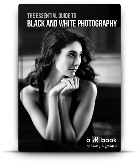
    There has been a real buzz of excitement around dPS headquarters this past week because today we’re launching a new eBook that we’re really proud of – The Essential Guide to Black and White Photography – an eBook that will walk you through everything you need to know to take beautiful black and white images!

    Blackandwhitephotographycover

    My first love with photography was with black and white photography. It was in a high school. The class that I remember sitting in a darkroom with two friends, watching images appear in front of me on paper, sitting in a chemical bath.

    At first they were faint grey outlines of the image, but as the chemicals did their work, tone, shade and contrast were added to the image until it had fully appeared.

    While our family photos were all shot in colour from the time I was born, as a teenager I would spend hours gazing into those first black and white images that I’d shot and developed. I’m not exactly sure what it was about them but there was a timeless, classic and magical quality to them that I still love today.

    It turns out that many of us here at dPS have similar memories and love for the black and white image, and so when we started to talk about putting together this new eBook on the topic we did so with real anticipation and energy.

    We looked around for a photographer to author this guide 12 months ago and came across the work of David Nightingale. David not only shoots beautiful images but he’s the creator of one of the most successful courses on the topic so we knew we’d found our dream author and set out to convince him to partner on the project.

    Thankfully he agreed and after many months of preparation today we’re excited to announce The Essential Guide to Black and White Photography is available for you to purchase with a very special Early Bird Offer.

    The eBook walks you through everything from learning to ‘see’ and take beautiful black and white images, to advice on gear right through to processing your images to perfection.

    NewImage

    Early Bird Special

    NewImageWhen you purchase The Essential Guide To Black And White Photography you’ll also receive a free copy of 10 Recipes for Amazing Black And White Photography.

    This bonus eBook contains all the ingredients you’ll need for shots such as an Ansel Adams Landscape right through to vintage images and classic black and white portraits.

    These recipes helps you take the amazing teaching in the essential guide, and put it into action in a variety of situations – it’s the perfect companion!

    Normally this would cost you $ 9.99 USD, with our new essential guide it’s FREE – but for a limited time only.

    Grab Your Copy Today

    These two eBooks are yours today to download for just $ 19.99 USD.

    They have straight forward explanations and tricks for all skill levels. Anyone wanting to take better black and white photos will get something out of this book.

    Pick up yours here today.

    The post The Essential Guide to Black and White Photography by Darren Rowse appeared first on Digital Photography School.

    Digital Photography School