Category: Photography

  • How Cropping in Post-Production Can Improve Composition

    Even though I strive to get the best compositional shot in-camera. I do see ‘cropping’ as essential to my post editing workflow. For such a simple post edit technique, it can really enhance and improve composition of the image. I have also found cropping an image, be it small or in a creative sense can transform an image dramatically.
    How Cropping in Post-Production

    I like to view cropping as reframing the scene. The initial framing of the scene comes when you look through the viewfinder, then next when you have uploaded your images onto your computer for editing.

    You get the chance and time to critically see if your image(s) needs cropping and what type is required. For example, there might be some distracting elements in the foreground that you missed when you looked through the viewfinder, or a horizon line isn’t quite as straight as it should be.

    In this article, I’m going to illustrate the following reasons why you might crop your images in post-production:

    • To straighten lines: keep the horizons even and the vertical lines vertical.
    • To move your subject or object: a little more to the left, right, up or down.
    • To trim away distracting elements, especially at the sides or the near foreground.
    • To zoom in to show impact, especially portrait or head-shots.
    • To use the rule of odds – instead of two subjects just use one.
    • For creative cropping – rotate image, use perspective crop.

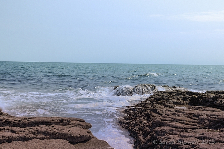
    Let’s take the first example, I took this shot handheld when I should have used a tripod. An uneven horizon line does not make for a good composition. The eye is immediately drawn there, for the wrong reason.
    crooked-horizon-line

    Seascape with a crooked horizon line.

    However, this is easily remedied in most photo editing programs. As Adobe Photoshop CS6 is my go-to photo editing software. I will be referencing it for the rest of this article.
    straighten-button

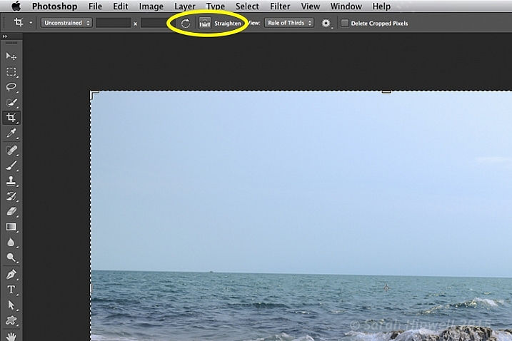
    Once you click on the Crop Tool in the Tools panel, there is a dedicated straighten button in the Options Bar.

    Click on the Crop Tool in the Tools panel. Go up to the the Options Bar where there is a dedicated Straighten button. Make sure this is selected, click and drag along the crooked horizon line. Release it, and Photoshop straightens the line and crops the image in one action! The same process can equally be applied to vertical lines.
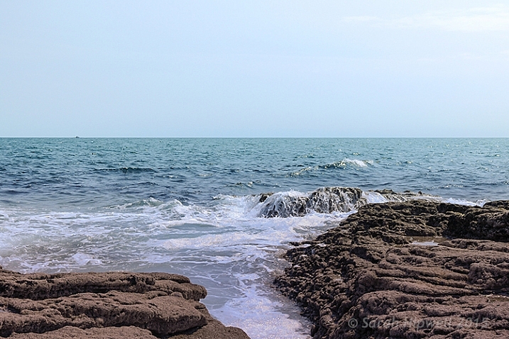
    straightened-horizon-line

    Horizon lines are easily fixed using the Crop Tool in Photoshop.

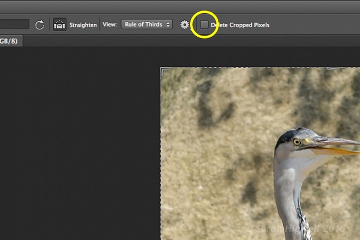
    The Crop Tool in Photoshop CS6 is impressive. It now works non-destructively. But you must make sure Delete Cropped Pixels isn’t ticked up in the Options Bar (leaving this box unticked keeps cropped portions which can be recovered later if needed).
    Delete-cropped-pixels

    The Crop Tool in Photoshop CS6 works non-destructively if the Delete Cropped Pixels box is unchecked.

    Inside most editing programs there is usually a choice of overlay guides, based on traditional compositional concepts like the Rule of Thirds or the Golden Ratio. You can read more about Composition in this article: Easy Tips to Help Beginners Understand Composition The crop overlays are great visual guides for good compositional techniques and makes it much easier to crop your image. I usually set it to Rule of Thirds.

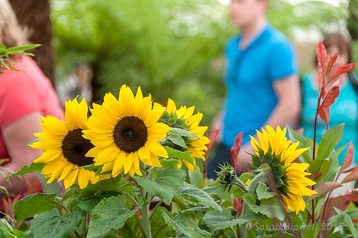
    So in the next image, I wanted the focus of this shot to be entirely on the sunflowers. The background, although blurred, is still too distracting with the color of the garments worn by the passersby.
    sunflowers

    Although the background is blurred, the colour of the garments worn by the passersby is too distracting.

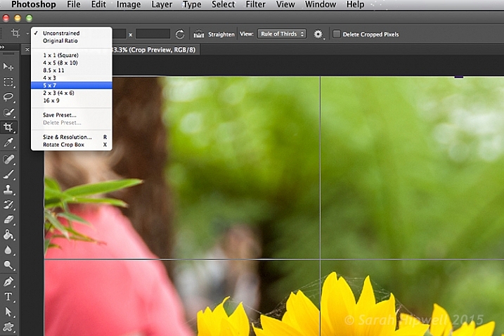
    I started with one of the aspect ratio presets. These can be found under this tab Unconstrained. I selected 5 x 7.
    Aspect-ratio-5x7

    There are various preset aspect ratios when you click on the Unconstrained tab. You can also save your own presets too.

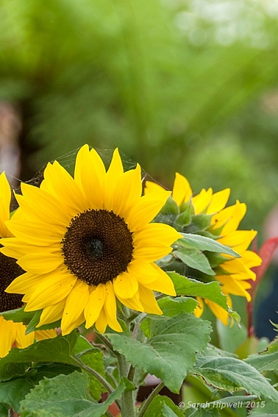
    I dragged the top right corner handle of the crop box down, and in towards the centre, to maintain this aspect ratio. By clicking on the image inside the crop box, I was able to move and reposition the image into place.
    sunflowers-cropped

    The sunflowers are now the main focus point in this image, and the green blurred background is complimentary, without being a distraction.

    I am strong believer in using my feet to get close to the subject, or if you have a nice telephoto lens, then happy days. Unfortunately for my next shot, I didn’t have the option of either of the above.

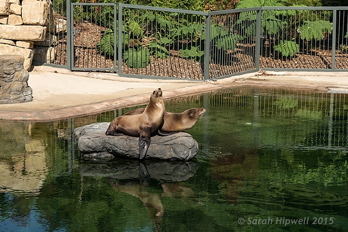
    I was at the zoo on a family outing, so I wasn’t taking dedicated shots for anyone. I was behind a barrier and a good 30 feet (approx.) away from the seals. I didn’t get time to think or compose for this shot. I just wanted to grab a shot of the seals.
    seals-at-the-zoo

    Seals taken at the zoo.

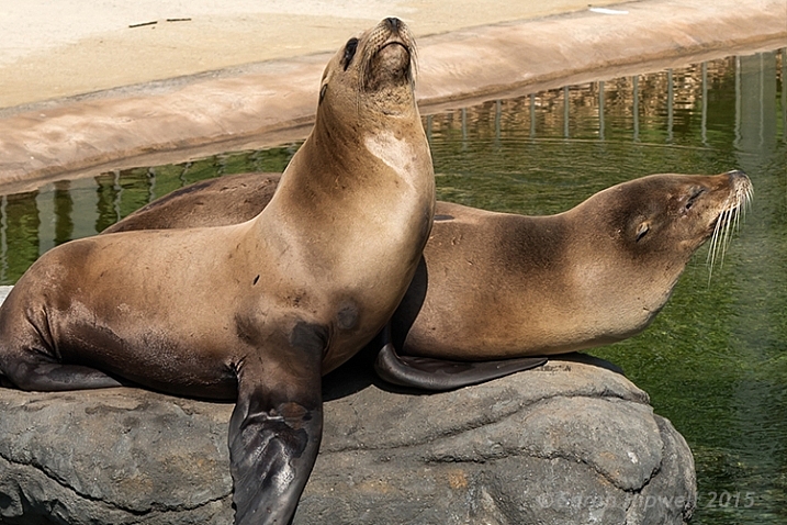
    The day was fantastic weather wise, and these seals were really enjoying the sunshine. I wanted to crop in tightly, just on the seals, but I had the megapixels to play with because I had a 24 megapixel camera with me, which can produce a 20×13” at 300 dpi print. The final crop for this image would give me 5.5×4” at 300 dpi print.
    seals-cropped

    I cropped in tight to get a close-up of the seals. I didn’t like the railings at the back, but I would have preferred to have kept the reflection of the seals in the water, but there is always a trade off!

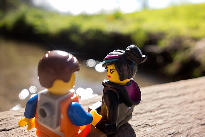
    In this next shot, cropping in tight on a subject can convey more impact, especially for portrait shots. No two people reveal the same expression. As a photographer, some subjects are easier to capture an expression over others.
    Emmet-and-Lucy

    Emmet and Lucy enjoying the nice weather and the chat!

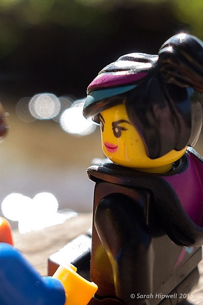
    I wanted to convey Lucy looking at Emmet in an adoring fashion, I-only-have-eyes-for-you type of expression.
    Lucy-cropped

    Lucy hanging on to every word that Emmet is saying! The look of I-only-have-eyes-for-you!

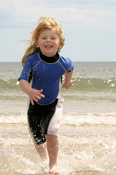
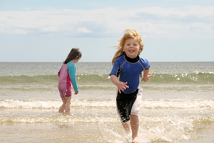
    Another way to convey impact is to focus on the action. Here, in this shot below, I cropped out my other daughter, so that the focus was on my youngest daughter running to shore.
    fun-at-the-beach

    Fun at the beach.

    fun-at-the-beach-cropped

    By cropping out my other daughter, the focus is on the action. It’s also using the Rule of Odds to focus on the single subject.

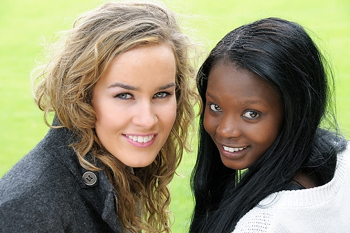
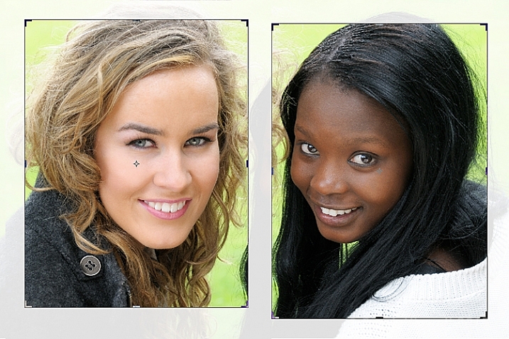
    Cropping an image is a great way to apply the Rule of Odds. A good example of this is in the following shot. The two subjects are side-by-side. By cropping in tight on each subject, I have created two distinct head-shots from one single image.
    two-portraits-together

    Two subjects shot sitting on a bench side-by-side.
    two-separate-portraits

    After the image is cropped, I now have two distinct portraits.

    Last but by not least, try and experiment with rotating your image to the left or right, and then cropping. This may be particularly useful with photos of tall buildings, where you want the focus to be on the height of the building.

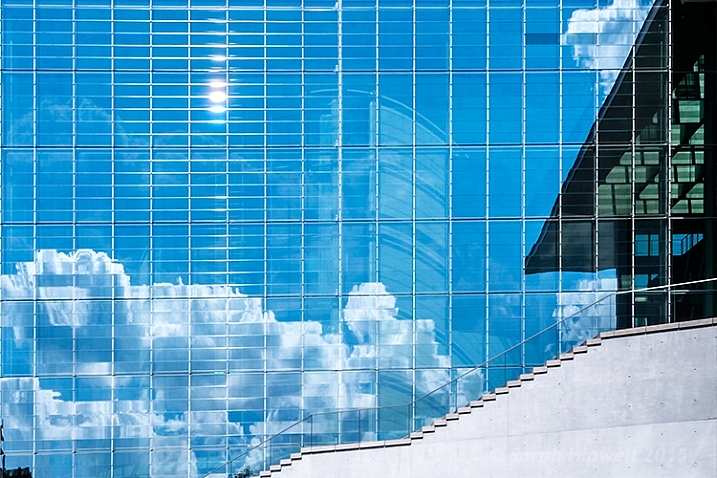
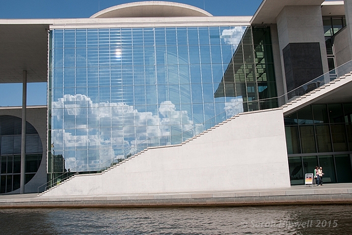
    I had taken the following photo in Berlin some years back from a boat on the river Spree. This modern building was quite impressive, but the reflection of the sky and clouds in the glass, caught my eye. It made for a nice abstract composition.
    Berlin

    A shot of a building while in a boat on the river Spree in Berlin. Compositionally, this by itself is not a good shot.

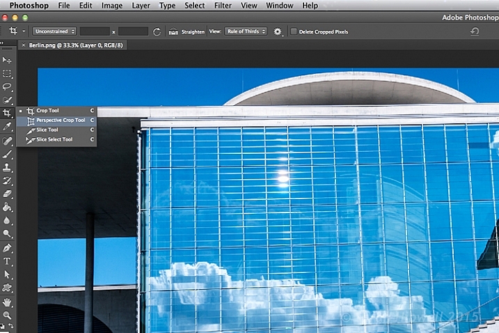
    The Crop Tool in Photoshop has another feature, the Perspective Crop Tool. When you click on the Crop Tool and hold, a fly-out menu appears with four options. The Perspective Crop Tool is directly under the Crop Tool.
    perspective-crop-tool

    With some editing to highlight the reflection in the glass of this building, I used the Perspective Crop Tool to create an abstract composition.

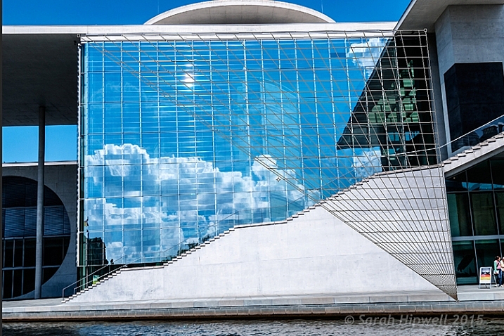
    Starting at one corner, click and drag across to the other corner, and repeat around the lines of the window frame. A grid appears around where you have clicked within the image. Click the commit button at the top in the Options Bar, or press the enter key. Make finer adjustments by clicking back to the regular Crop Tool.
    perspective-crop-grid

    The perspective Crop Tool in action.

    abstract-composition

    I created this abstract composition using the Perspective Crop Tool in Photoshop.

    Cropping is, after-all, getting an alternative perspective to enhance a better composition.

    To crop or not to crop, that is the question? Share your comments and images below please.

    This week on dPS we’re featuring a series of articles about composition. Many different elements and ways to compose images for more impact. Check out the ones we’ve done so far:

    • Using Framing for More Effective Compositions
    • 7 Tips to Improve Your Skyline Photos
    • 33 Images that Exemplify Compositional Elements
    • Weekly Photography Challenge – Composition Craziness
    • How to Take Control of Aperture and Create Stronger Photos

    googletag.cmd.push(function() {
    tablet_slots.push( googletag.defineSlot( “/1005424/_dPSv4_tab-all-article-bottom_(300×250)”, [300, 250], “pb-ad-78623” ).addService( googletag.pubads() ) ); } );

    googletag.cmd.push(function() {
    mobile_slots.push( googletag.defineSlot( “/1005424/_dPSv4_mob-all-article-bottom_(300×250)”, [300, 250], “pb-ad-78158” ).addService( googletag.pubads() ) ); } );

    The post How Cropping in Post-Production Can Improve Composition by Sarah Hipwell appeared first on Digital Photography School.
    Digital Photography School

  • Good Crop Bad Crop – How to Crop Portraits

    All images © Gina Milicia 2015

    “Learn the rules like a pro, so you can break them like an artist.” ? Pablo Picasso

    When it comes to knowing what is right for me there are a few things I know for sure: First, garlic and ice cream are never meant to be mixed together. Secondly, even if I colour my hair blonde I’m never going to look like madonna, and finally when my mechanic warns me that the timing chain in my car should be fixed as soon as possible, I need to listen up and act.

    If who have read my other articles or ebooks, you will know that I’ve also learned many lessons in my photography career from stupid mistakes, or lapses in judgement. It’s through learning from failure, and trial and error, that I’ve managed to discover what works best for me.

    When it comes to how I crop my portraits there are a few cropping styles I try to avoid because just like eating garlic ice cream I have learnt what works best for me.

    How I crop my portraits is just as important to defining my style as the lens I use, the way I light, and how I process my files. I believe the way an image is cropped can change the look from “meh” to “amazing”.

    Goodcrop 2B

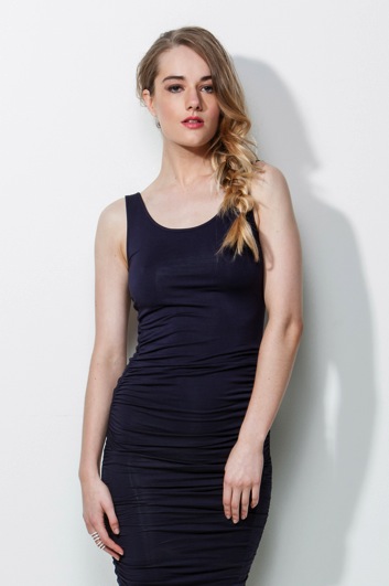
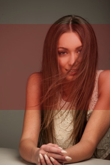
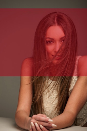
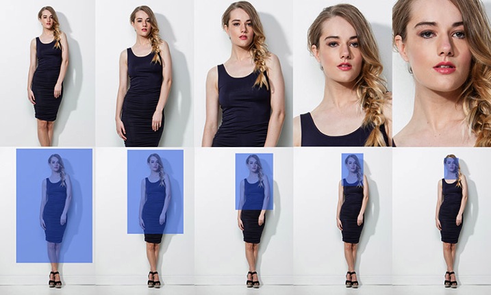
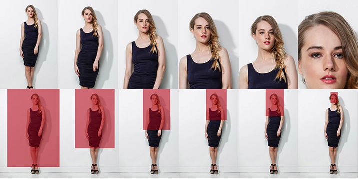
    I always crop a shot below the knee, mid-thigh, at the waist, across forearm, or through the top of head. If I’m going to crop through my model’s waist I will usually ask my model to bring their arms up so I don’t have to crop through their arms.

    BadCropW

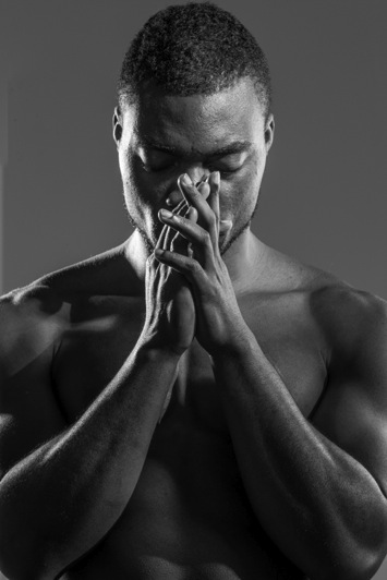
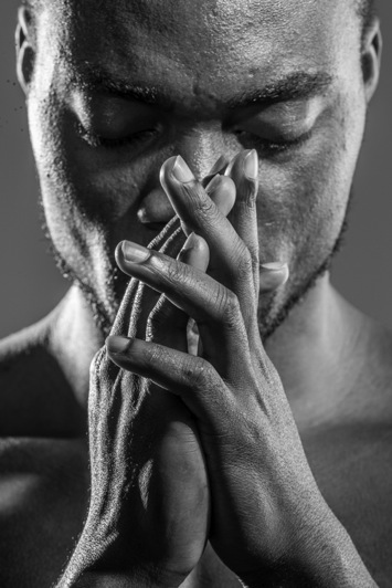
    I avoid cropping at any of the joints of the body. This includes fingers, toes, elbows, knees and wrists. I also think cropping through the model’s chin looks odd.

    It took me many years of trial and error, and studying the work of my favourite photographers, to learn that there are actually a few golden rules of cropping worth following. Ones that make a huge difference to the visual impact my portraits make, and how flattering these portraits can be for the subject.

    Like all rules there are always exceptions, and the art world would implode if these rules were not constantly tested and broken. Pablo Picasso, Vincent Van Gogh, and Jackson Pollack are examples of artists whose styles broke every rule in the, “how to paint book” and in their time they were mocked and ridiculed by other artists and critics alike, yet today their paintings are priceless. Having said that, they all studied conventional painting rules of their time, and then went on to break those rules, and create their own signature styles. I wonder if they ever considered changing their hair colour to look like Madonna…

    My shooting,lighting,posing, and post-production style has developed and evolved over the years, but the way I crop my images has remained the same.

    Here are my top five tips for how to crop portraits:

    #1 Crop In-Camera

    Tightcrop A

    Cropping in-camera basically means that you compose your image exactly how you want your final crop to look when you are taking the photo, rather than shooting loosely and cropping the shot in post-production. There are two reasons for this:

    1. Firstly, images cropped in-camera look totally different to images that are cropped in post-production. Filling the frame and cropping tight means that you will create great background blur (bokeh), which removes any background distractions and focuses more attention on your model, which is always a good thing.
    2. The other advantage of cropping in-camera is that your file size is not affected. A loosely photographed cropped image may only leave you with 10-15% of your file size, so a file that was originally 30MB as a full size image, is reduced to 3MB with a tight crop. Lower resolution images have less detail and won’t be as sharp as a full size image.

    #2 If it bends don’t crop it

    BadCrop 2Bad crop Crop3Good crop

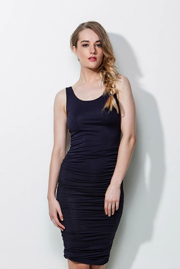
    I think cropping mid thigh looks visually more pleasing than doing so at the knee. Seeing just part of the knee where the dress ends also looks untidy.

    There are also certain ways to pose models that are more flattering to the body. I’m always looking for ways to pose my models that elongate, rather than shorten, their body parts. I try and emphasize their best features, and hide or diminish the features that are not as strong.

    As a general rule I crop in a way that will elongate and flatter the body. Cropping at the knees, waist, elbows, toes, fingers, ankles, or wrists can make your model look stumpy. Cropping off the arms or legs can make your model look square, or larger than they really are.

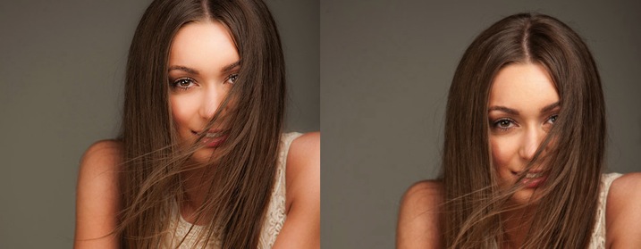
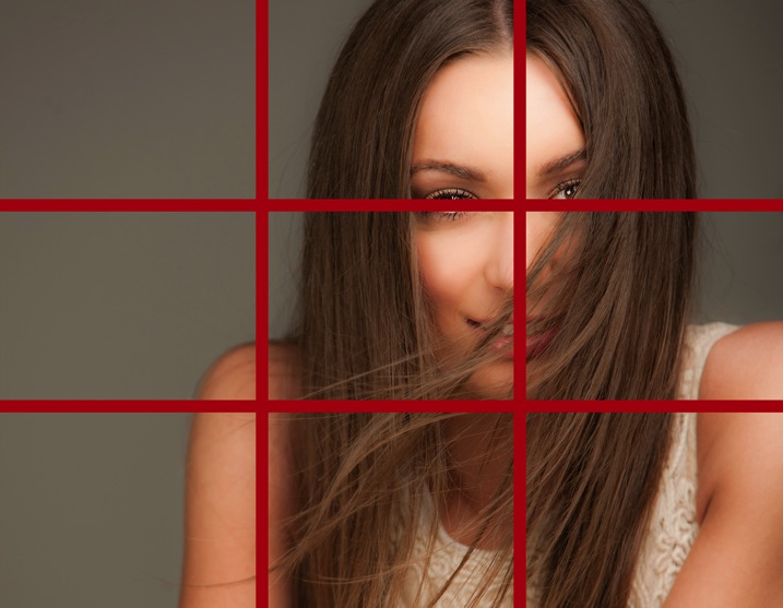
    #3 Avoid cropping into the chin and keep the eyes in the top third of the frame

    BadCrop 6Bd crop Crop6Good crop

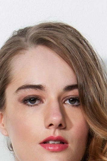
    Keeping the eyes in the top third of the frame is visually better than cropping into someone’s chin, which to my eye looks like I wasn’t paying attention when I took the shot, and visually this crop (above left) looks awkward.

    I find my portraits look much stronger visually when the eyes are positioned in the top third of the frame. Cropping into the chin is visually jarring in the same way that garlic ice cream was jarring to my tastebuds.

    Rulethirds

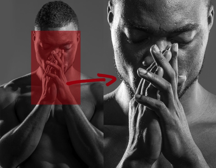
    This is the original framing of a shot I took for the cover of my dPS book, Portraits – Striking the Pose. I wasn’t sure how much of the shot we would be using, so I deliberately shot wider, and left space on the left of my frame to allow for text and other images.

    Rulethirds 1 Rulethirds 1B

    Rulethirds 2B

    Rulethirds 2

    The final shot for the cover was cropped very tightly because I felt including the hands looked a bit messy. I cropped this image with the eyes in the top third of the frame because this was visually the strongest option.

    #4 Give yourself options

    The explosion of social media has radically changed how I shoot my portraits. When a client booked me for a session a few years ago, I would shoot the majority of their portraits as vertical images. Now I make allowances for websites and social media platforms that run both vertical, square, and horizontal images.

    I will usually start with portraits framed as vertical images and then rotate my camera to shoot some horizontal frames.

    I generally position my model to fill the left or right hand third of the frame. This adds interest to the portrait, and makes it visually more dynamic. Having said that, there are times when I will frame my portrait in the centre of the shot because I personally love the way it looks.

    I also love cropping into people’s heads, but this is not everyone’s cup of tea, so I always shoot a few frames with space above the head just in case.

    You never know where the final image may end up in a few weeks or a few years, so I think it’s a good idea to plan ahead. It only takes a couple of minutes to shoot slightly wider, vertical, and horizontal at the end of each setup.

    #5 Crop like you mean it!

    Use these suggestions as a starting point, and find a style that works for you. Start with a full length portrait and first try cropping using traditional rules, then try breaking the rules and see which way you prefer the most.

    Each person, location, and pose you shoot will always be different, so don’t be afraid to mix it up a bit and create your own signature style. The one question I always ask myself when I’m cropping my images is, “Does this crop look deliberate or does it look like a mistake?”

    Tightcrop 2 Tightcrop 3

    Sometimes following cropping rules to the letter will still leave my portraits looking visually jarring. An example of this is if I photograph a model wearing 3/4 sleeves and crop at a point which is technically correct, leaving a tiny amount of arm showing just below the sleeve. This looks like a mistake and would look better if I cropped a little higher to remove the skin.

    The more you shoot, the more you will start to get a feeling for what looks right to you. If you’re still not sure, do two versions and compare them.

    You might like to deliberately create a series of portraits that are visually jarring because they will evoke an emotional reaction.

    How do you like to crop your portraits? Do you like to crop in-camera or in post-production? Do you think a tighter crop looks best ,or do you like to let your portraits have lots of space around them? Is there anything I’ve missed? I’d love to hear your thoughts and see your images. Please feel free to share in the comments section below.

    This week on dPS we’re featuring a series of articles about composition. Many different elements and ways to compose images for more impact. Check out the ones we’ve done so far:

    • Using Framing for More Effective Compositions
    • 7 Tips to Improve Your Skyline Photos
    • 33 Images that Exemplify Compositional Elements
    • Weekly Photography Challenge – Composition Craziness
    • How to Take Control of Aperture and Create Stronger Photos
    • How Cropping in Post-Production Can Improve Composition

    googletag.cmd.push(function() {
    tablet_slots.push( googletag.defineSlot( “/1005424/_dPSv4_tab-all-article-bottom_(300×250)”, [300, 250], “pb-ad-78623” ).addService( googletag.pubads() ) ); } );

    googletag.cmd.push(function() {
    mobile_slots.push( googletag.defineSlot( “/1005424/_dPSv4_mob-all-article-bottom_(300×250)”, [300, 250], “pb-ad-78158” ).addService( googletag.pubads() ) ); } );

    The post Good Crop Bad Crop – How to Crop Portraits by Gina Milicia appeared first on Digital Photography School.

    Digital Photography School

  • Review of the Nitz Custom Handmade Camera Strap

    Camera straps are one of those secondary things that most of us photographers don’t really put much thought into. However, consider this: the only thing keeping your camera away from the hard ground when it’s out of your hands, is your strap. It needs to satisfy some basic requirements, in order to serve us well. It needs to be strong, well-secured to our camera, and it needs to be comfortable.

    It also doesn’t hurt if the strap doesn’t break the bank; after all, we have many other things we’d like to spend our hard-earned money on, like lenses, other accessories, or even a new camera body.

    Nitz Custom Handmade Camera Strap is a product that not only meets all of those requirements – it exceeds them with extreme prejudice.

    IMG_2209

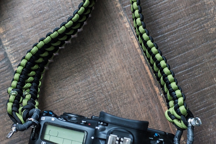
    Photographer Chris Nitz created the product initially out of his own need. He wasn’t happy with the mass-produced camera straps available on the market, and set out to create one on his own. After experimenting with different materials, he settled on Type III Commercial Grade 550 parachute cord, and began weaving a few prototypes together. The result was a strap that met all of his own requirements, and inevitably began to attract the attention of his fellow photographers.

    My main takeaway from the experience of ordering, and using a Nitz strap, was how custom tailored the entire process is. When you order one of these products, you know a few things immediately from visiting the website. You know that this strap is being made specifically for you, as a photographer. You know that you’re getting a product that is meant to last, and protect the equipment you value so much. Chris is also proud of the fact that all of the materials for his straps are sourced from right here in the United States.

    Finally, you understand immediately that Chris is well aware of the financial budgets many photographers have, and his commitment to our pocketbooks, as well as the environment, are clear.

    My experience began by visiting the Nitz Strap online store. Several options are available for every aspect of the product, and you begin by choosing the type of strap. At the moment, Chris is concentrating on neck straps for the heavier cameras, and wrist straps for the smaller, lighter models.

    IMG_2208

    After choosing a strap type, you then move on to the length and width of the product. Several different types of weaves are offered, each one differing in width. Want something thin, compact and discreet? Choose the “Thin Line”, a weave about 3/4″ wide. If you need something beefier, there are three more options available. Lengths available range between 12″ and 16″ for wrist straps, and from 36″ to an impressive 50″ for neck straps.

    As I wanted something wide that my future cameras could grow into, and a longer option than my Canon strap, I ordered the 50″ Double Cobra weave, which is Nitz’s widest strap at 1.25″. This would allow me a bit more length to let the camera hang from my shoulder (my most common setup), or wear my equipment cross-body to lessen the chance of it slipping off and falling to the ground.

    After selecting these basics, it’s time to move on to choosing the hardware you’ll use to connect the strap to your camera and keep it secure. The options here almost invoke a feeling of overkill; these straps are rated to hold up to 150 pounds depending on hardware, and any configuration you choose will be a huge step up from the connections we’re used to getting in standard camera kits.

    All straps include two very capable, metal split rings, to connect hardware to the strap points on your camera. But some ingenious additional options stand out here, including a simply perfect tripod screw that allows you to connect the strap directly into your tripod mount point for quick and easy removal. I chose the anchor shackle connector, a small, but immensely sturdy piece of metal rated up to 400 pounds on its own.

    IMG_2210

    At this point in the ordering process, it’s time to have some fun. Nitz Strap comes in a very impressive assortment of color and pattern options, many of which they keep in regular stock. Two colors are standard with your order, although you have the options of incorporating up to four colors into your creation, at the expense of possible additional wait time to get the product.

    Want a camouflage strap? Check. American flag? Christmas themed? Tie Dye? They’re all there. You’ll have fun going through the over 200+ color options offered.

    I wanted something that would satisfy my natural attraction to simple, dark, and matching palettes, and went with a very classy looking black and moss green weave that I figured would go with my all-black Canon body very well.

    Another point that Chris means to make is that you don’t have to break the bank to keep your equipment safe and secure. Pricing differs depending on options of course, but I was able to create the custom camera strap of my dreams in less than 10 minutes, and ended up spending less than $ 100 USD.

    My particular experience was a quick and completely painless one. I contacted Chris via e-mail about my order so he could talk me through some of the options I picked. I was amazed at how quickly he put the strap together and shipped it out (even though he had to order the moss green cord I requested as it was temporarily out of stock).

    IMG_2212

    Only five days went by between the time I clicked the order button, to the point I had the strap in my hand. The entire process really did make me feel I was having a custom strap made for me as an individual photographer, by another photographer.

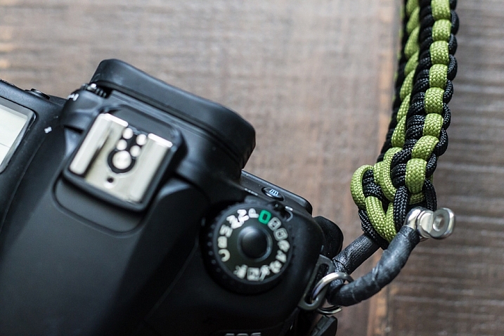
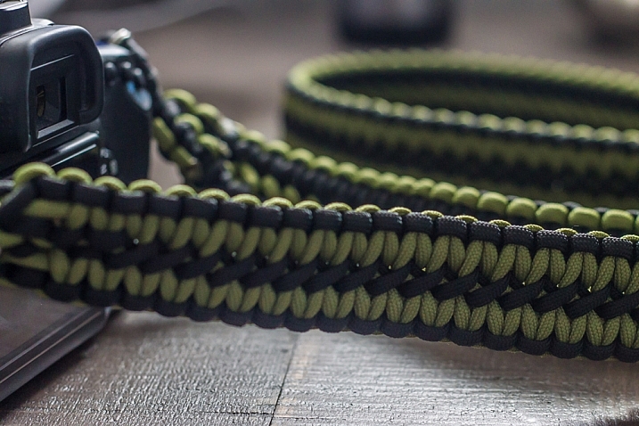
    And let’s be clear about this; these straps are beautiful. As cliché as it sounds, the craftsmanship on the strap I received was nothing short of impeccable. The hand weaving was perfectly done, with no loose ends. Even the way Chris tidies up the ends of the cords, blends in with the rest of the product.

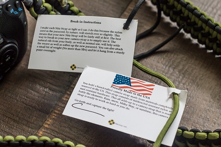
    The strap came in very simple packaging, rolled up in a coil, with a couple of tags adorning it. These tags are made from recycled paper, and attached to the strap with the remaining end pieces of the cord that was used to create it. There are no paper receipts here, everything is handled through e-mail. You’re never going to get a bad rap from me when little details like this are included to make a small, but meaningful contribution to our environment.

    IMG_2216

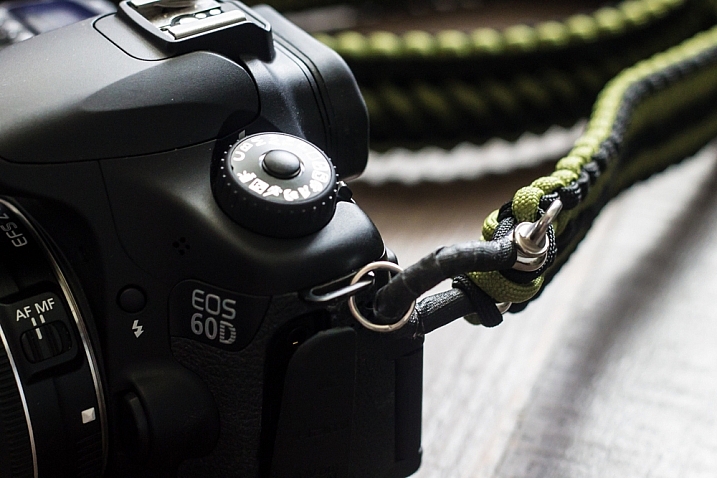
    After struggling a bit to get the strap onto my camera via the heavy-duty split rings (since I didn’t choose one of the simpler attachment options available, I don’t plan to switch this strap out to a different camera), it was immediately obvious that I had found a permanent solution to keeping my 60D safely around my neck.

    The strap was sturdy to the point of making me feel like it was almost too much for my camera. I would feel confident swinging it over my head by the strap as hard as I could; that’s how secure this thing feels. The strong anchor shackles are tightly wrapped in gaffer tape, and the whole package just looks professional, sturdy, and very, very slick.

    If I had to nitpick about one thing, it would be how stiff and unforgiving the strap is at first touch out of the package. But even this is by design. Chris weaves the parachute cord together as tightly as possible for strength, creating an impossibly tough piece of fabric. This type of cord is known for softening over time, which means after a bit of use out in the field, the strap becomes much more pliable, and it conforms to your neck or shoulder. I have found this is exactly the case, as in less than two weeks my strap is almost perfectly broken in to my liking.

    IMG_2220

    Overall I couldn’t be much happier with the product I received from Nitz Strap. Even as a photographer who gets excited about little accessories for my camera, I was beyond pleased with what I ordered. I already plan to order another one for my film camera body in the near future. This strap definitely has my endorsement, and I recommend you at least visit Chris’ site at www.nitzstrap.com to check out all of the options I’ve discussed; I’m sure you’ll be just impressed with what you see as I was!

    Disclaimer: Nitz Strap did provide this product to our writer to test out free of charge. However at dPS we only do completely unbiased reviews. But, as you can see the author plans on purchasing another one for his other cameras so that speaks to the product’s quality.

    googletag.cmd.push(function() {
    tablet_slots.push( googletag.defineSlot( “/1005424/_dPSv4_tab-all-article-bottom_(300×250)”, [300, 250], “pb-ad-78623” ).addService( googletag.pubads() ) ); } );

    googletag.cmd.push(function() {
    mobile_slots.push( googletag.defineSlot( “/1005424/_dPSv4_mob-all-article-bottom_(300×250)”, [300, 250], “pb-ad-78158” ).addService( googletag.pubads() ) ); } );

    The post Review of the Nitz Custom Handmade Camera Strap by Tim Gilbreath appeared first on Digital Photography School.


    Digital Photography School

  • How to Take Control of Aperture and Create Stronger Photos

    aperture and composition

    The focal length of the lens you use, combined with the aperture setting, determines how the camera sees whatever you point it at. This has profound implications for composition. Let’s look at them one by one.

    Selective focus and bokeh

    Selective focus occurs when you focus on your subject, and use a wide aperture to make the background go out of focus. Bokeh is the blurred parts of your photo. It originates from the Japanese word boke, and has come into use because we don’t have a word in English for it.

    aperture and composition

    This photo shows both selective focus and bokeh. I focused on the model’s eyes, and selected an aperture of f/1.4, to blur the background as much as possible.

    There are several factors that affect bokeh.

    1. Aperture

    The wider the aperture, the less depth-of-field there is, and the more bokeh you get. Photographers that like to use selective focus buy prime lenses, as they have often wider maximum aperture settings than zooms.

    But, you can still obtain nice bokeh with zooms, if you pay attention to the following points.

    2. Camera to subject distance

    The closer you are to the subject the less depth-of-field there is. This is a useful tip if you have a zoom lens with a limited maximum aperture (such as an 18-55mm f/3.5-5.6 kit lens). Just set the focal length to longest available setting, the aperture to its widest setting, and move in as close as you can. You’ll be surprised by what you can achieve.

    aperture and composition

    This photo was taken with an 18-55mm kit lens set to 55mm and f/5.6, the widest available aperture at that focal length. It’s not nearly as close to how little depth-of-field there would be if I had used an 50mm prime lens at f/1.4 – but it’s still enough to blur the background.

    3. Subject to background distance

    The more distance there is between subject and background, the more out of focus the background will get, at any given aperture setting.

    4. Quality of light

    Light affects bokeh. Soft light (like that on an overcast day) produces smooth, even bokeh. Sunlight or reflections, create a different type of bokeh with more texture.

    aperture and composition

    I took this photo on an overcast day. The bokeh is very smooth.

    aperture and composition

    I took this photo in the early evening. The artificial lights reflecting from the shiny objects in the background have created a different type of bokeh.

    5. The aperture blades of the lens

    The more blades the lens has, the rounder the shape of the aperture, and the smoother the quality of the bokeh. Less expensive lenses tend to have fewer aperture blades, and may not produce the same quality of bokeh as better ones.

    6. Other optical characteristics of the lens

    Some lenses, such as the Helios 58mm f/2 lens, used to take the photo below, have optical characteristics (or more likely, flaws) that produce a certain type of bokeh. Lensbaby is a company that makes lenses that produce a specific type of bokeh.

    Aperture and composition

    f/2.8 on a prime lens

    I’ve singled this aperture setting out because it hits a sweet spot when it comes to composition, especially for portraits.

    If you have a normal or short telephoto prime lens, and use the widest aperture setting (generally f/1.2, f/1.4 or f/1.8) then the depth-of-field is very narrow indeed. Sometimes that works really well, but other times you need a little more depth-of-field to create a stronger image. It’s like any technique – overuse it and it becomes a gimmick.

    The solution is to mix it up a little by using aperture settings like f/2, f/2.8, and f/4. You’ll still get a narrow depth-of-field and create some beautiful bokeh, but a little more of your subject will be in focus.

    Using f/2.8 (or thereabouts) shows subtlety, restraint, and maturity.

    aperture and composition

    I took this photo with an 85mm lens (full-frame) at f/2.8. The depth-of-field is still shallow enough to blur the background nicely.

    The middle apertures

    Now we get into the middling apertures, those from around f/4 or f/5.6, to f/8, depending on your lens.

    The effect of these apertures depends on the focal length of your lens and how close you are to your subject. For example, you could use a super telephoto lens (300mm plus) and shoot from farther away from your subject to create images with shallow depth-of-field at f/5.6, or get the entire scene in focus at the same aperture with a wide-angle lens (35mm and less) if you focus on the right spot and are much closer to your subject.

    These middle apertures represent the transition between photos where some of the image is out of focus, to those where everything is in focus.

    You can still use selective focus at these apertures (although perhaps not with wide-angles), although the effect is much gentler than with the widest aperture settings of your lens. Use these apertures when you want good depth-of-field but don’t mind if the background is out of focus a little.

    aperture and composition

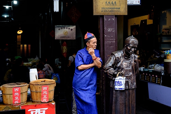
    I used an aperture of f/4.5 for this photo. The depth-of-field is sufficient to get the man, the statue, and the wooden baskets in focus. The background is unimportant and doesn’t need to be in focus.

    The smaller apertures

    These are the ones you use when you need everything within the frame to be sharp, like with landscape photography. This can be anything from f/8 on a wide-angle lens, to f/11 or f/16 on longer focal lengths. With telephotos and macro lenses you can stop down to f/16 and still not get everything in focus.

    The thing you need to be aware of here is diffraction. When the aperture gets too small, the light passing through it spreads out, and softens the image. Thanks to diffraction, images taken at f/22 are usually visibly softer overall, than those taken at f/8 or f/11. Noticeable diffraction may start at f/16 or f/22 on a full-frame camera, and around f/11 on an APS-C camera.

    aperture and composition

    An aperture of f/11 ensured everything in this photo, taken with a 14mm lens (APS-C), was in focus.

    Take control

    Every time you take a photo you should be thinking about what the optimum aperture is for the composition you want to make. Do you want to open the aperture and throw the background out of focus? Do you want to stop down and get as much as possible in focus? Or somewhere in between?

    What aperture settings do you like to use with your photos? Do you use a Lensbaby or other lens that gives a certain bokeh effect? Please let us know in the comments – I’d love to hear your thoughts and see your images.

    This week on dPS we’re featuring a series of articles about composition. Many different elements and ways to compose images for more impact. Check out the ones we’ve done so far:

    • Using Framing for More Effective Compositions
    • 7 Tips to Improve Your Skyline Photos
    • 33 Images that Exemplify Compositional Elements
    • Weekly Photography Challenge – Composition Craziness

    Mastering Composition ebookMastering Composition
    My new ebook Mastering Composition will help you learn to see and compose photos better. It takes you on a journey beyond the rule of thirds, exploring the principles of composition you need to understand in order to make beautiful imag
    googletag.cmd.push(function() {
    tablet_slots.push( googletag.defineSlot( “/1005424/_dPSv4_tab-all-article-bottom_(300×250)”, [300, 250], “pb-ad-78623” ).addService( googletag.pubads() ) ); } );

    googletag.cmd.push(function() {
    mobile_slots.push( googletag.defineSlot( “/1005424/_dPSv4_mob-all-article-bottom_(300×250)”, [300, 250], “pb-ad-78158” ).addService( googletag.pubads() ) ); } );

    The post How to Take Control of Aperture and Create Stronger Photos by Andrew S. Gibson appeared first on Digital Photography School.


    Digital Photography School

  • Weekly Photography Challenge – Composition Craziness

    This week on dPS we’re featuring a series of articles about composition. Many different elements and ways to compose images for more impact. Check out the ones we’ve done so far:

    • Using Framing for More Effective Compositions
    • 7 Tips to Improve Your Skyline Photos

    You can see how a few other photographers have used some compositional craziness to make dynamic images.

    Andi Campbell-Jones

    By Andi Campbell-Jones

    Weekly Photography Challenge – Composition

    This week your challenge is to pick an element of composition and make some stunning images. Here are a few ideas for you:

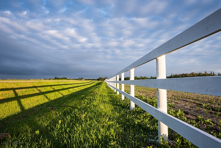
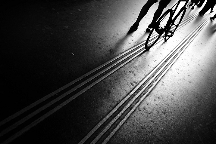
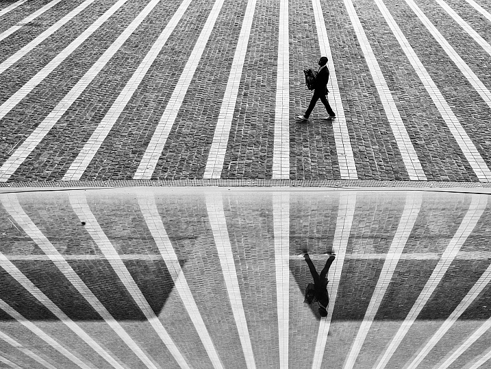
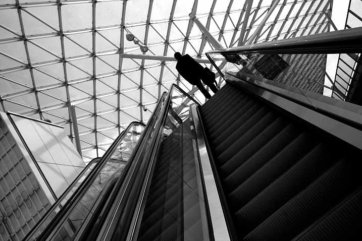
    • Lines
    • Form/shape
    • Texture
    • Contrast
    • Foreground/background
    • Angle of view
    • Rhythm
    • Framing
    • Light
    • Balance
    • Color
    • Direction of motion
    • Simplify
    • Perspective
    • Monochromatic
    Noe**

    By noe**

    DalioPhoto

    By dalioPhoto

    Stavros Markopoulos

    By Stavros Markopoulos

    Brett Kiger

    By Brett Kiger

    JFXie

    By JFXie

    Share your images below:

    Simply upload your shot into the comment field (look for the little camera icon in the Disqus comments section) and they’ll get embedded for us all to see or if you’d prefer upload them to your favourite photo sharing site and leave the link to them. Show me your best images in this week’s challenge. Sometimes it takes a while for an image to appear so be patient and try not to post the same image twice.

    googletag.cmd.push(function() {
    tablet_slots.push( googletag.defineSlot( “/1005424/_dPSv4_tab-all-article-bottom_(300×250)”, [300, 250], “pb-ad-78623” ).addService( googletag.pubads() ) ); } );

    googletag.cmd.push(function() {
    mobile_slots.push( googletag.defineSlot( “/1005424/_dPSv4_mob-all-article-bottom_(300×250)”, [300, 250], “pb-ad-78158” ).addService( googletag.pubads() ) ); } );

    The post Weekly Photography Challenge – Composition Craziness by Darlene Hildebrandt appeared first on Digital Photography School.


    Digital Photography School

  • 33 Images that Exemplify Compositional Elements

    This week on dPS we’re featuring a series of articles about composition. Many different elements and ways to compose images for more impact. Check out the ones we’ve done so far:

    • Using Framing for More Effective Compositions
    • 7 Tips to Improve Your Skyline Photos

    Here’s how some other photographers do it and work with various compositional elements.

    Lines

    Zoltán Vörös

    By Zoltán Vörös

    Raymond M.

    By Raymond M.

    Jeff Wallace

    By Jeff Wallace

    Thomas Leuthard

    By Thomas Leuthard

    Georgie Pauwels

    By Georgie Pauwels

    Gianni Dominici

    By Gianni Dominici

    Color

    Wester

    By wester

    Umberto Nicoletti

    By Umberto Nicoletti

    Louis Vest

    By Louis Vest

    Bill Selak

    By Bill Selak

    Shandie 8

    By shandie 8

    Sur Name

    By Sur Name

    Framing

    Fernando Ocaña Fernández

    By Fernando Ocaña Fernández

    Lawrence OP

    By Lawrence OP

    Georgie Pauwels

    By Georgie Pauwels

    Georgie Pauwels

    By Georgie Pauwels

    Michelle Robinson

    By Michelle Robinson

    Littlenelly (rare But There)

    By littlenelly (rare but there)

    Perspective

    Patrik Jones

    By Patrik Jones

    Topher76

    By topher76

    Vincent Moschetti

    By Vincent Moschetti

    Joris Louwes

    By Joris Louwes

    Mike138

    By mike138

    Perceptions I Sichtweisen

    By perceptions I sichtweisen

    Andreas Schalk

    By Andreas Schalk

    Aristocrats-hat

    By Aristocrats-hat

    Michael Coppola

    By Michael Coppola

    Chris Bird

    By Chris Bird

    Simplify

    Dave Toussaint

    By Dave Toussaint

    Dawn Ellner

    By Dawn Ellner

    Thomas Hawk

    By Thomas Hawk

    Frédéric Vissault

    By Frédéric Vissault

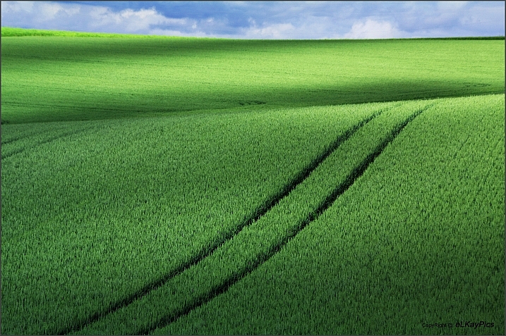
    ELKayPics (away)

    By eLKayPics (away)

    googletag.cmd.push(function() {
    tablet_slots.push( googletag.defineSlot( “/1005424/_dPSv4_tab-all-article-bottom_(300×250)”, [300, 250], “pb-ad-78623” ).addService( googletag.pubads() ) ); } );

    googletag.cmd.push(function() {
    mobile_slots.push( googletag.defineSlot( “/1005424/_dPSv4_mob-all-article-bottom_(300×250)”, [300, 250], “pb-ad-78158” ).addService( googletag.pubads() ) ); } );

    The post 33 Images that Exemplify Compositional Elements by Darlene Hildebrandt appeared first on Digital Photography School.


    Digital Photography School

  • Beginner’s Guide to Photographing Festivals

    Photographing-festivals-1

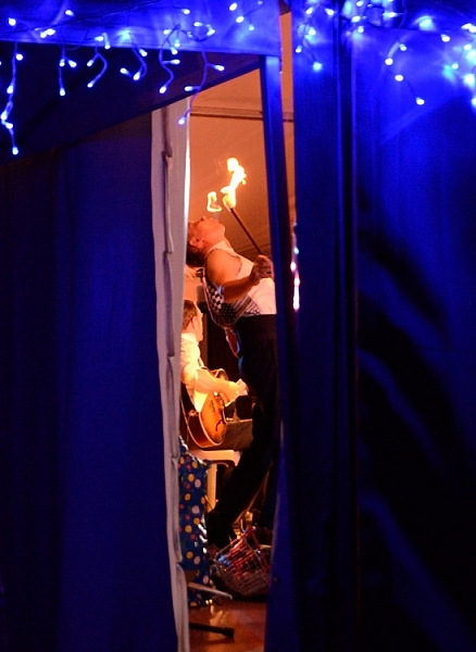
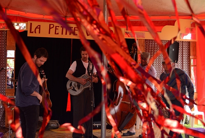
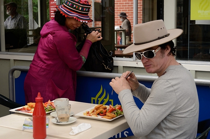
    Festivals are a great place to practice a wide variety of photographic disciplines for any photographer. With plenty of action in one central location, often over a couple of days or more, there’s a chance to try your hand at everything; portraiture, street photography, landscape, night photography, fast action, and more, as well as play with all kinds of lighting and subjects, and the chance to tell a photographic story.

    So much to learn about photography all in one place.

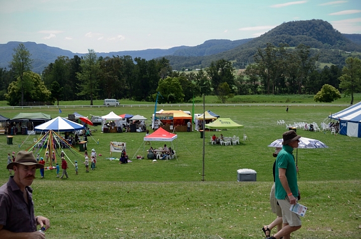
    Festivals are a great place to photograph everything from portraits to panoramas, and pretty much everything in-between.

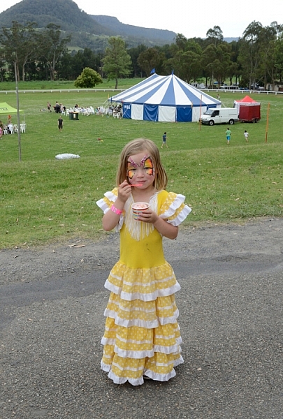
    There is a festival for just about everything from the massive Burning Man Festival, to small food, wine, music festivals, there’s some bizarre festivals like Tunarama in Australia, where the key event is tuna tossing. Unfortunately I didn’t make it to Tunarama, so for this article I have used images from a small country town folk festival. Regardless of the kind of festival you choose, here are some tips to get you started – a beginner’s guide to photographing festivals.

    There's so many different festivals for photographers to practice theirs skills at.

    Look up a local festival and get out there with your camera.

    Camera gear

    If you are a beginner reading this, chances are you have a DSLR with a standard kit lens, so you are good to go. I would highly recommend a zoom, but it’s not necessary, you can still get great images while learning a wide variety of photographic skills. For all these images I used either a standard kit 18-55mm lens, or a small point and shoot camera. If you have other lenses, take them, you’ll most likely have a chance to use them.

    A tripod will also come in handy if you are going to photograph at night. Many festivals have fireworks, or people twirling glow in the dark things, that need long exposures.

    Spare memory cards and batteries are pretty much essential, and a polarizing filter wouldn’t go astray for bright daylight.

    Photograph your festival with any gear you have, even your phone.

    You really don’t need fancy camera gear to get some interesting images at a festival.

    Camera settings

    If you are a beginner, and not used to rapidly adjusting manual settings on the fly, I would recommend starting with Auto or setting your camera to Program Mode, or pick an appropriate “Scene mode” for night and low light. But also take the opportunity to experiment with manual settings. Read up on low light, street photography, fireworks, etc., before you go. Try to avoid using your flash.

    The bottom line though, in order to have a great time photographing a festival, and getting a few images you are really happy with, you don’t need anything more than your mobile phone – everything else is bonus. If you are using your phone, and I recommend you do so as well as use your camera, try looking up some free extra apps to experiment with.

    Any gear will do for photographing a festival, even your mobile phone.

    This image was photographed using a small point and shoot with its auto filters.

    What to photograph

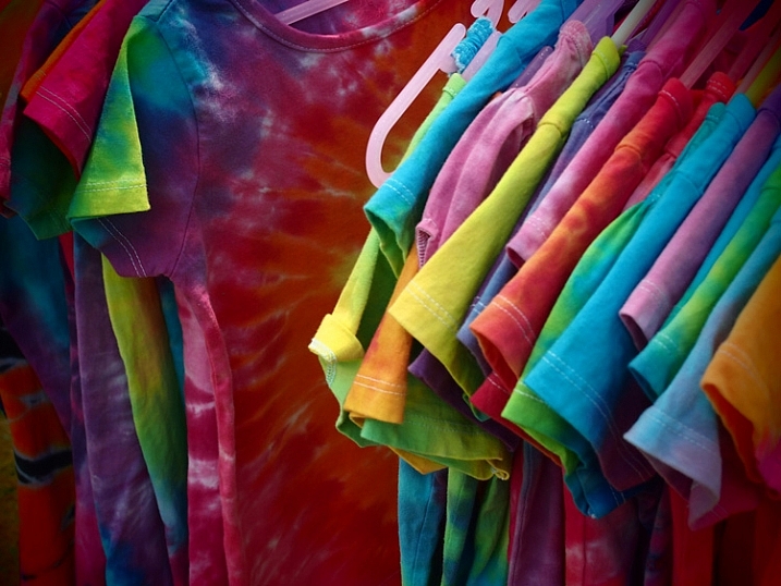
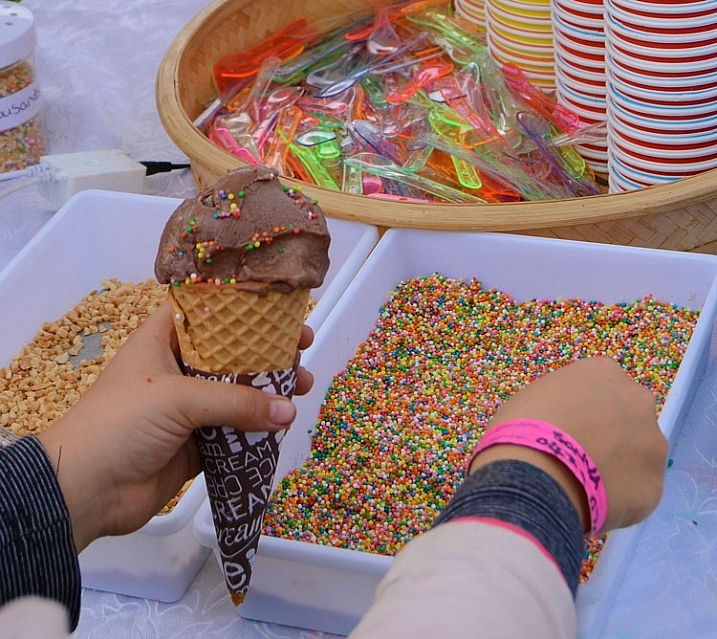
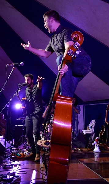
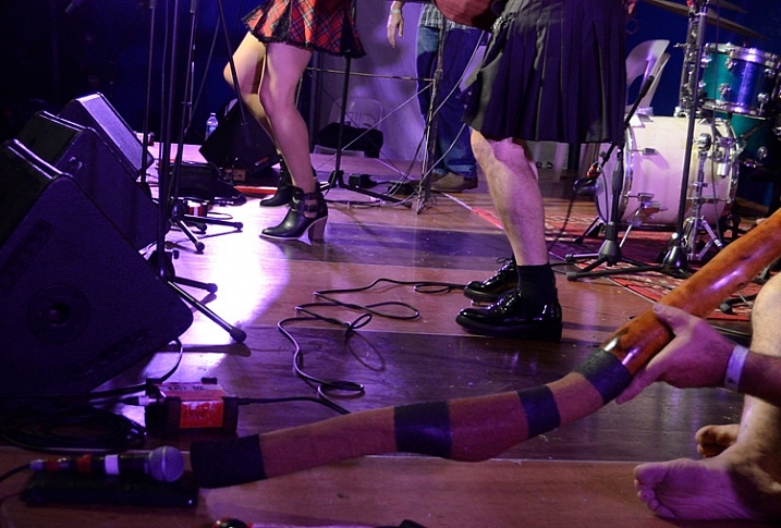
    Photography everything. Shoot non-stop from the setting up, to the live acts, parades, stall holders (vendors), the crowd, surrounding landscape, behind the scenes, people in audiences, details, packing up, and even what was left behind. Sometimes shooting from dawn until evening, in close, panoramic, and everything in-between.

    Photographing-festivals-12

    Photographing-festivals-7

    Photogrpahing-Festivals-19

    Try to tell a story

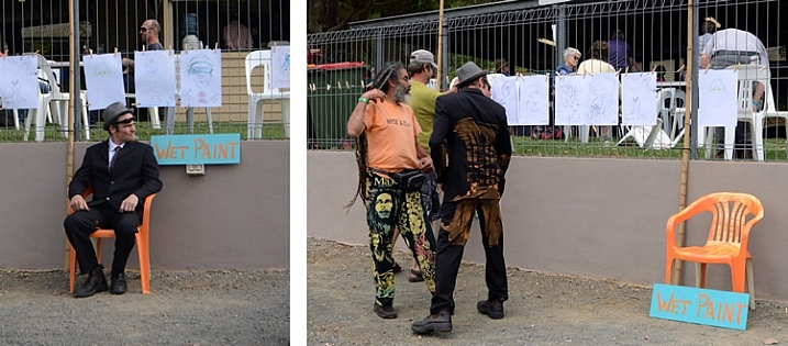
    You can capture a story in a whole series from a festival, or small series within a series, or within a single photograph.

    Photographing-festivals-9b

    Small festival stories can be fun to capture

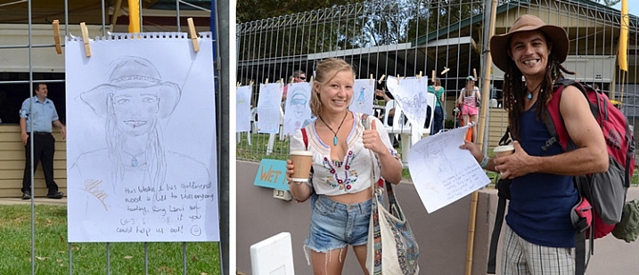
    These two pegged a drawing on the fence with a request for a lift to the next station. It worked!

    Festivals are great to try capturing a story in one image or over many.

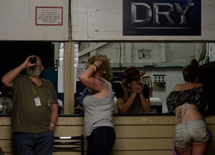
    Locals hanging out at the festival bar.

    Each festival I have been to, has a different feel. For example, a food and wine festival has a different crowd, and is more relaxed than a rock music festival.

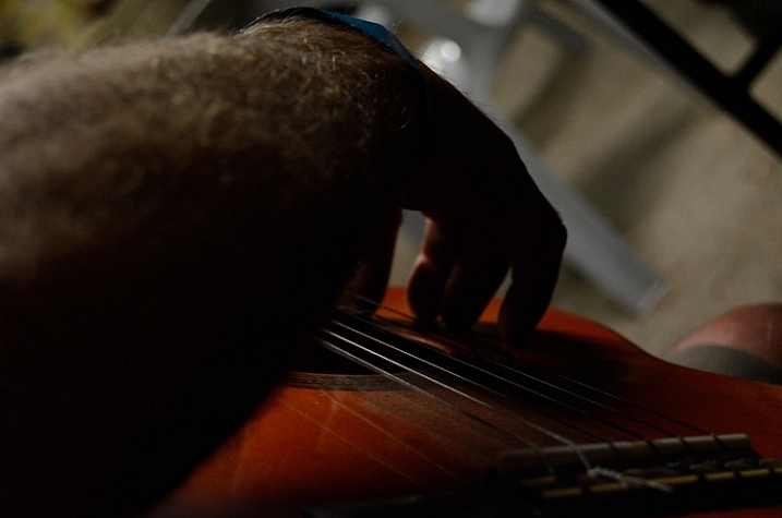
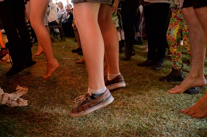
    Capturing small details and panoramas set the scene, give the viewer a sense of place. Then, capturing events, acts, and people give a sense of what is going on there. Capturing audience reactions and small details create a sense of really being there.

    Photographing-festivals-23

    Photographing-festivals-6

    Photographing-festivals-11

    Getting involved

    Festivals are often annual events. Depending on the event, there may be an opportunity to volunteer. While you may spend most of your time helping out, you could have access to back stage, or other areas behind the scenes. When you have a decent portfolio, you could volunteer as photographer to build up an excellent portfolio to apply as official paid photographer.

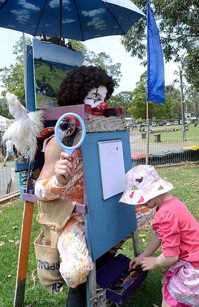
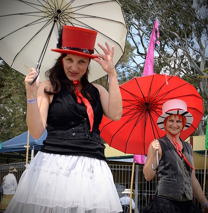
    The last festival I went to, I worked as an assistant to the artist in residence, dressed as a clown. This helped me to capture a lot of smiles, and some not so smiley expressions. Not everyone loves a clown.

    Get involved in the festival you are photographing.

    Photographing as a clown was a new experience!

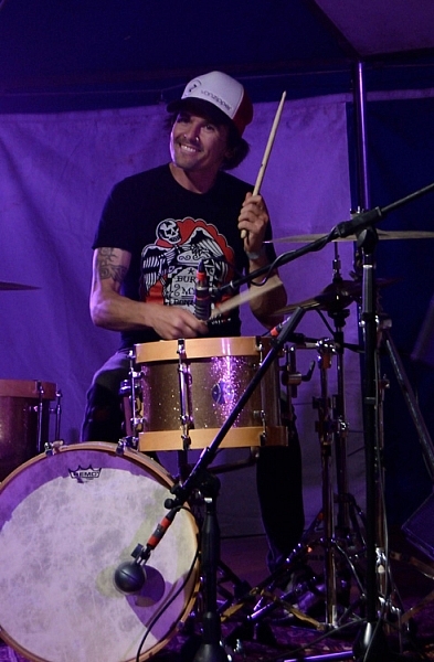
    This guy from the band 19-Twenty just noticed he was being photographed by a clown, and he didn’t miss a beat. I certainly wouldn’t have got that shot had I not been in my rather amusing costume.

    Don’t be afraid to approach people

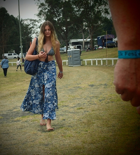
    People photography is also a great thing to practice at a festival. It can be pretty intimidating approaching strangers, as it is to be approached by a photographer. But most people don’t really mind, and are often flattered.

    Don't be afraid to approach strangers, most people are OK about it.

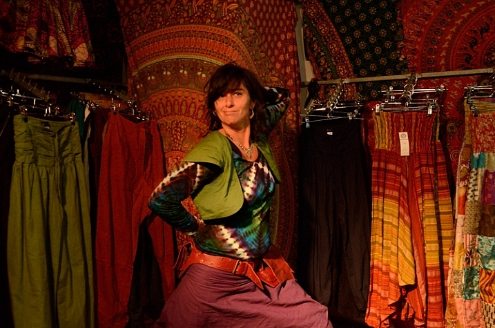
    Most people don’t mind having their photograph taken if you are polite about it. Some, like this lass, love it.

    So just ask, be honest with them, and let them know you are a beginner practicing at the festival. Perhaps even carry some cards or pieces of paper with your name, and a website, where they can see your images.

    If you’re too shy, sometimes a smile and a wave, pointing to your camera and giving them a hopeful questioning look will do the trick. Or you can try a street photography approach, capturing people more candidly, and naturally.

    Photographing-festivals-13

    Thank you Elvis, thank you very much.

    Keep doing the rounds

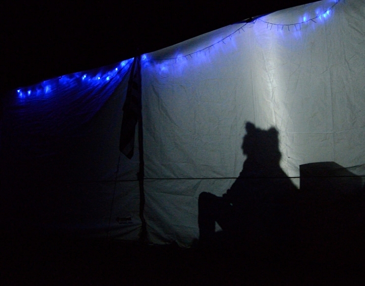
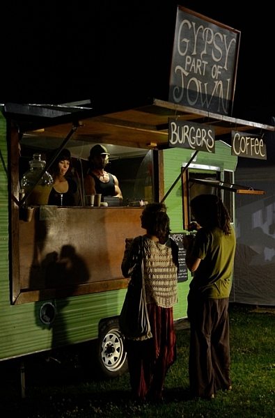
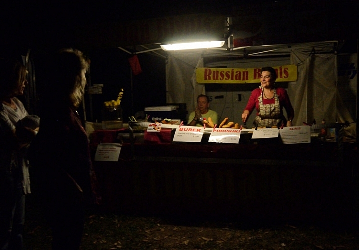
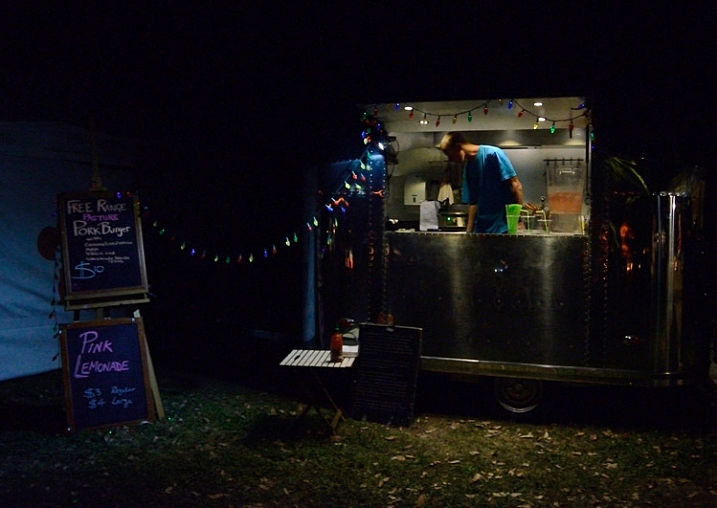
    Walking around the entire the festival over different times of day/night, can provide fresh images of the same spot as the light changes, and different people and characters pass by. A stall that doesn’t look like much during the day, could be lit up beautifully at night. Capturing stall holders when busy and quiet, can provide two entirely different moods.
    Photographing-festivals-16

    Photographing-festivals-24

    Photographing-festivals-21

    Don’t get in the way

    Try not to annoy the live acts, and audience, by photographing all the way through the entire act, or getting in anyone’s way. A good general rule for band photography is to only photograph for the first three songs.
    Morris dancer with evil eye.

    Keep your eye out for moments, rather than just firing away. Look for different angles and interesting color compositions.
    Photographing-festivals-18

    Photographing-festivals-17

    The best tip I can give you is to have fun. Enjoy the festival, as well as photographing it. So much photographic fodder in one place, often with good food and music as well.

    So get out there, find yourself a fun festival, and start photographing. Please share your festival photographs with us in the comments below. Have you any tips to add for our readers? Any great festivals to recommend?

    googletag.cmd.push(function() {
    tablet_slots.push( googletag.defineSlot( “/1005424/_dPSv4_tab-all-article-bottom_(300×250)”, [300, 250], “pb-ad-78623” ).addService( googletag.pubads() ) ); } );

    googletag.cmd.push(function() {
    mobile_slots.push( googletag.defineSlot( “/1005424/_dPSv4_mob-all-article-bottom_(300×250)”, [300, 250], “pb-ad-78158” ).addService( googletag.pubads() ) ); } );

    The post Beginner’s Guide to Photographing Festivals by Lea Hawkins appeared first on Digital Photography School.


    Digital Photography School

  • 4 Things You Should Know About Focal Length and Composition

    Lenses are the eye of your camera. The focal length of a lens (and your point of view) determine how much of the subject your camera sees.

    You may already be familiar with the basics, and understand the difference between, say, wide-angle and telephoto lenses, but let’s dive into the the topic a little deeper to see what’s really going on.

    focal length and composition

    There are four fundamental things to know and understand about the focal length and composition.

    1. Focal length is not as important as field-of-view

    There are two factors that determine the field-of-view of a lens:

    1. The focal length.
    2. The digital sensor or film size

    Field-of-view (sometimes called angle-of-view) is far more important than focal length, because it tells you how much of the scene the lens sees. However, as field-of-view changes according to sensor size, manufacturers tell us the focal length instead. Focal length is a fixed measurement that doesn’t change (it is literally the distance from the middle of the lens to the focal plane, which is the sensor).

    Here are some practical examples.

    Example #1 – 50mm prime lens

    A 50mm prime lens has a field-of-view of 47 degrees on a full-frame camera. This field-of-view approximates what we see with our own eyes. But what happens when you put the 50mm lens on an APS-C camera (crop factor of 1.6x)? The crop factor of the smaller sensor means that the lens now has a field-of-view of around 30 degrees, making it a short telephoto lens.

    This change in field-of-view means that you have to move further away from your subject in order to fit it in the frame, which also changes the perspective (giving the compressed effect that characterizes short telephoto lenses).

    If you want the equivalent of a 50mm lens on an APS-C camera you need to use a focal length of around 31mm, as it has the same field-of-view (47 degrees).

    A prime lens with that focal length doesn’t exist (you could choose between a 28mm or a 35mm depending on whether you wanted a slightly wider or a tighter field-of-view), but you can set that focal length if you have a zoom.

    focal length and composition

    50mm lens, full-frame camera. The lens has a field-of-view of 47 degrees.

    focal length and composition

    50mm lens, APS-C camera. The same lens has a field of view of 30 degrees with this camera.

    Example #2 – 21mm lens

    The same applies to wide-angle lenses. A 21mm prime lens has a field-of-view of around 92 degrees. That’s a nice wide field-of-view ideal for landscape photography, or creating images with dramatic perspective.

    But put it on an APS-C camera the field of view narrows to around 65 degrees. It’s still a wide-angle, but the effect is much more moderate. It now has nearly the same field-of-view as a 35mm lens does on a full-frame camera

    To get the same field-of-view as the 21mm lens (on a full frame) you would use a 14mm lens (on an APS-C camera).

    focal length and composition

    This photo was taken with a 14mm lens on an APS-C camera. It has the same field-of-view as a 21mm lens does on a full-frame camera.

    Example #3 – 16mm lenses

    It’s even possible to have two lenses with the same focal length, but different fields-of-view (on the same camera).

    A 16mm wide-angle lens has a field-of-view of 107 degrees – but a 16mm fisheye has a field-of-view of 180 degrees.

    They have the same focal length but each one is designed for a different purpose. The 16mm wide-angle is designed to keep straight lines straight. The fisheye doesn’t try to do that, and as a result has a much wider field-of-view.

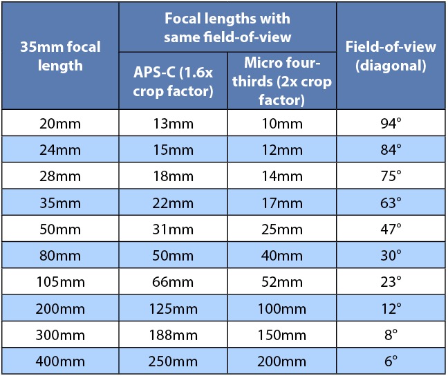
    This table shows the field-of-view of common focal lengths with full-frame, APS-C and micro four-thirds cameras.

    focal length and composition

    The next points explore the relationship between field-of-view and composition.

    2. Wide-angle lenses are lenses of inclusion

    You can think of any lens with a field-of-view wider than around 63 degrees as being a wide-angle. That’s 35mm or shorter on a full-frame camera, 20mm on APS-C, and around 18mm on micro four-thirds.

    Wide-angle lenses have two characteristics that affect composition:

    1. The wide field-of-view means that you have to move in close to your subject to fill the frame. But, at the same time wide-angle lenses also include quite a bit of the background. The shorter the focal length, the closer you need to get, and the more background is included.
    2. Wide-angle lenses also appear to have more depth-of-field at any given aperture setting than longer focal lengths (they actually don’t, it has to do with lens to subject distance which also changes with focal length).

    These two factors combine to make wide-angle lenses, ones of inclusion. You can always fit more into the frame with a wide-angle lens, no matter how close you get to your subject. The background is also more likely to appear more in focus, than it is with longer focal lengths. Getting in close, creates the dramatic perspective that some photographers love. It emphasizes line, and creates a sense of depth, that images taken with longer focal lengths can lack.

    The slightest change in your point of view makes a dramatic difference to the composition of the photo. The shorter the focal length, the more this applies. As wide-angle lenses include so much background it can be difficult to simplify the composition and remove all distractions. There’s no way around it, it’s just a characteristic you have to embrace.

    focal length and composition

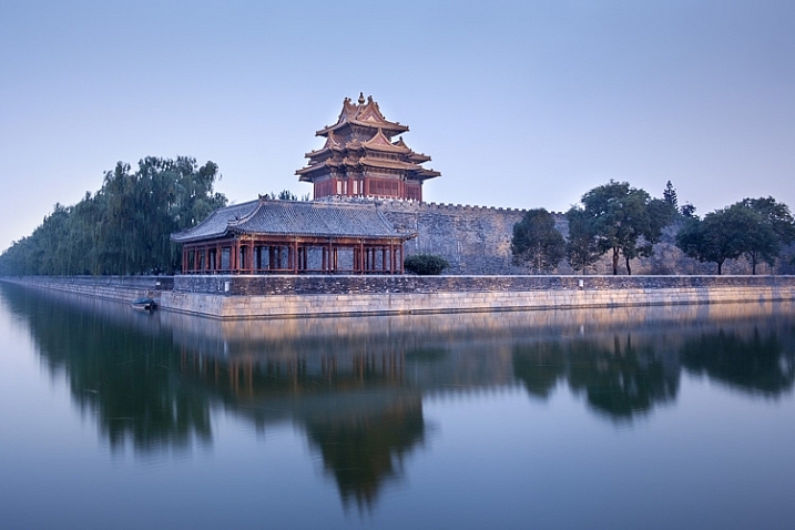
    This photo, taken with an 18mm lens (APS-C), includes the buildings, the city wall, the reflection in the water, the city trees disappearing into the distance, and keeps everything in sharp focus.

    3. Telephoto lenses are lenses of exclusion

    A telephoto lens is one that has a field-of-view of around 30 degrees or less. That’s around 85mm or longer on a full-frame camera, 50mm on an APS-C camera, and 40mm on micro four-thirds.

    Telephoto lenses are ones of exclusion. They have a narrow field-of-view. Fill the frame with your subject, and you won’t get much background in at all. It is also easy to throw the background out of focus by using a wide aperture, and making sure there is sufficient distance between your subject and the background.

    focal length and composition

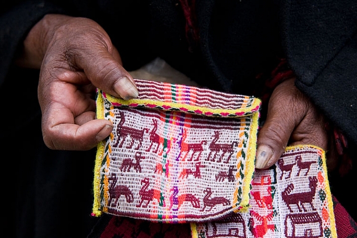
    This photo, taken with a 50-150mm lens set to 72 mm (APS-C), shows the woman’s hands and the textiles she is selling. There is not much in the background at all.

    4. Normal lenses occupy the middle ground

    Normal lenses, those with a field-of-view somewhere around 55 degrees, occupy the middle ground between wide-angle and telephoto. They don’t create images with the dramatic perspective that you can obtain with a wide-angle, nor do they exclude the background to the same extent as telephotos.

    If you have a normal prime lens you can open the aperture up to defocus the background, sometimes quite dramatically if you get close enough to the subject. But, you can also often stop down enough to get everything within the frame in focus.

    focal length and composition

    I took this photo with a 35mm lens, a normal lens on an APS-C camera. It lacks the dramatic perspective, and wide field-of-view of the photos taken with wide-angle lenses. But it includes more of the background and shows less compression than the photos taken with telephoto lenses.

    Your turn

    Can you think of anything else that photographers ought to know about focal length, field-of-view, and composition? If so, please let us know in the comments. I’d like to hear your thoughts.

    Note: this is the second in a series of articles on dPS this week talking about composition. See: Using Framing for More Effective Compositions and look for more over the next few days.


    Mastering Composition ebookMastering Composition
    My new ebook Mastering Composition will help you learn to see and compose photos better. It takes you on a journey beyond the rule of thirds, exploring the principles of composition you need to understand in order to make beautiful imag
    googletag.cmd.push(function() {
    tablet_slots.push( googletag.defineSlot( “/1005424/_dPSv4_tab-all-article-bottom_(300×250)”, [300, 250], “pb-ad-78623” ).addService( googletag.pubads() ) ); } );

    googletag.cmd.push(function() {
    mobile_slots.push( googletag.defineSlot( “/1005424/_dPSv4_mob-all-article-bottom_(300×250)”, [300, 250], “pb-ad-78158” ).addService( googletag.pubads() ) ); } );

    The post 4 Things You Should Know About Focal Length and Composition by Andrew S. Gibson appeared first on Digital Photography School.

    Digital Photography School

  • Using Framing for More Effective Compositions

    From my experience, it’s true – photographers tend to see the world in a different way. If not from the beginning, eventually, and maybe subconsciously, your eye is trained to notice details differently. Perhaps it’s the way light falls off of, or wraps around an object, or when pleasing geometrical compositions fall into place. In extreme cases, you may even start to catch glimpses of your camera’s viewfinder layout when you blink (you might want to seek help for this).

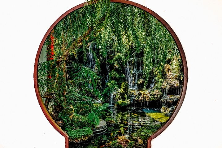
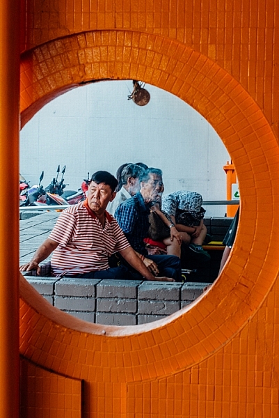
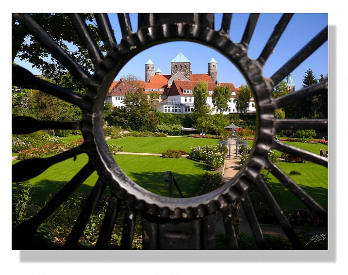
    Framing of a hidden Chinese garden.

    Some opportunities to use framing in photographs are less subtle than others. Of all the images I shot in this Chinese garden, this one stood out, as it not only shows the hidden nature of the garden, but makes a perfect frame.

    Often, an important step in the “Seeing like a Photographer” evolution is to begin recognizing, and implementing, framing elements into your images.
    Although in photo lingo we talk about framing often, it is one of the strongest tools you have at your disposal to create strong compositions. Let’s be clear that when we talk about framing your photo, we may be referring to the actual border of the image itself – but in this article we are discussing other objects used to intentionally create some sort of border around the subject of the image.

    However, clever framing is just one part of an equation that fits into an overarching photographic formula. In certain circumstances, the frame itself may be so ridiculously amazing and awe inspiring that it carries the image all by itself. In practice, you are likely to use framing in order to draw attention to, and strengthen, the subject of the photo.
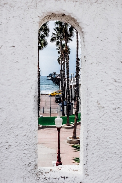
    Framing a photo of a pier

    Framing can help highlight your subject, directing the viewer’s gaze where you want it.
    Framing can be used to various degrees; while some framing elements may be subtle in one image, they can be quite obvious in others. This can be a product of your personal creativity or style, or simply a result of making do with what you have, as there aren’t always framing options for every photo you shoot.

    Using framing to boost your photo’s appeal is generally a good tactic, and is a great approach to creating original images of over-photographed scenes or landmarks.

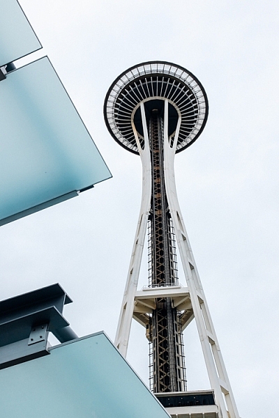
    Framed shot of the space needle

    A keen eye for framing can yield original images of well-photographed landmarks like the Space Needle in Seattle.

    As a photographer you will become familiar with the feeling of walking up to a familiar scene, turning on your camera and raising the viewfinder to your eye, only to not push the shutter button. You’ve realized that you’ve seen the picture you were about take a million times, and you want your own unique shot.

    For example, as I wander around a new city seeing the sights, I am always looking for environmental elements that I can use to add a sense of place, or implement as an element of a frame. Once you make a conscious effort to use framing techniques in your photography, you start to see all sorts architectural and natural elements that you can use.

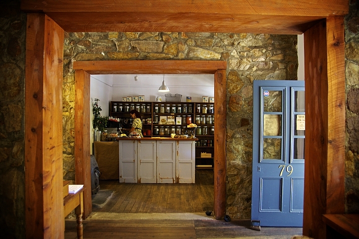
    Architectural element used for framing an image

    After developing an eye for framing your subject, many opportunities will reveal themselves.

    What can you use to frame your image? Some of the more common elements include foliage such as trees, branches, and leaves. Windows and mirrors in houses and cars are other popular framing options.

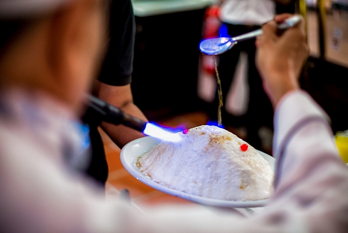
    Framing a food photo with the chef's body

    Framing elements come in many shapes and sizes – creative perspectives can pay off.

    I like to look for interesting architectural features, or even use people as framing borders. Sometimes you may not necessarily even have a subject in mind for an image but see a good framing opportunity, so you then look for a compelling subject or wait for a person to pass through the scene inside the frame.

    You can also use lighting as a powerful framing tool. As we are always working with various lighting in photography, what is included or excluded from the lighter areas of the image can help isolate the subject.

    Although it’s best practice to develop an eye for framing while out shooting, other options may often present themselves while editing your photos. Cropping can be very useful for honing in on, or aligning, the framed area of the photo just right. Other tools such as the Graduated Filter or Radial Filter in Lightroom, can be used to lighter or darken specific areas of your image, to boost the intensity of your framing.

    Have you made good use of framing techniques? Share your successes and images with everyone in the comments below.

    This is the first in a week of articles about composition. Look for another tomorrow and over the next few days! 

    googletag.cmd.push(function() {
    tablet_slots.push( googletag.defineSlot( “/1005424/_dPSv4_tab-all-article-bottom_(300×250)”, [300, 250], “pb-ad-78623” ).addService( googletag.pubads() ) ); } );

    googletag.cmd.push(function() {
    mobile_slots.push( googletag.defineSlot( “/1005424/_dPSv4_mob-all-article-bottom_(300×250)”, [300, 250], “pb-ad-78158” ).addService( googletag.pubads() ) ); } );

    The post Using Framing for More Effective Compositions by Jeremie Schatz appeared first on Digital Photography School.


    Digital Photography School

  • Comparing a 24mm Versus 50mm Lens for Photographing People

    photographing-people-2

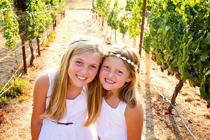
    Image taken with Canon 60D and Canon 24mm EF-S lens.

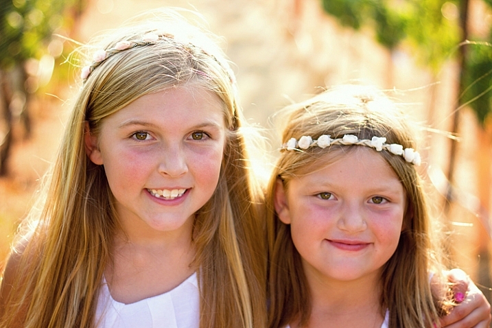
    A number of dPS readers have recently been asking about the Canon 24mm EF-S pancake lens, and how it compares to a 50mm lenses for photographing people. Both are great options, given the price point, but they do have slightly different strengths when it comes to people photography. In this article, I’ll show you several different images of the same model, location, and posing, photographed with both a 24mm and a 50mm lens. This will provide a good visual of the difference between the two lenses, as well as give you insight as to when you might want to reach for each one.

    photographing-people-50mm-1

    Image taken with Canon 60D and 50mm lens.

    For continuity, all images in this post were taken with a Canon 60D, and either the Canon 24mm f/2.8 or the Canon 50mm f/1.8 lenses. The 60D is an APS-C sensor (cropped sensor) camera, so first you need to multiply the focal length of each of your lenses by 1.6x in order to determine the functioning focal length of them on this camera (if you use Nikon it may be 1.5x, check your manual). So on a cropped sensor camera, the 24mm lens functions roughly as a 38mm lens, and the 50mm lens functions as an 80mm lens. In other words, the 50mm lens is great for head-and-shoulders portraits, while the 24mm lens is great for photographing people in the context of their surroundings. In the above example, you can see that the 50mm lens provided a tight shot of these two sisters, with a blurred background that keeps all the attention on their faces.

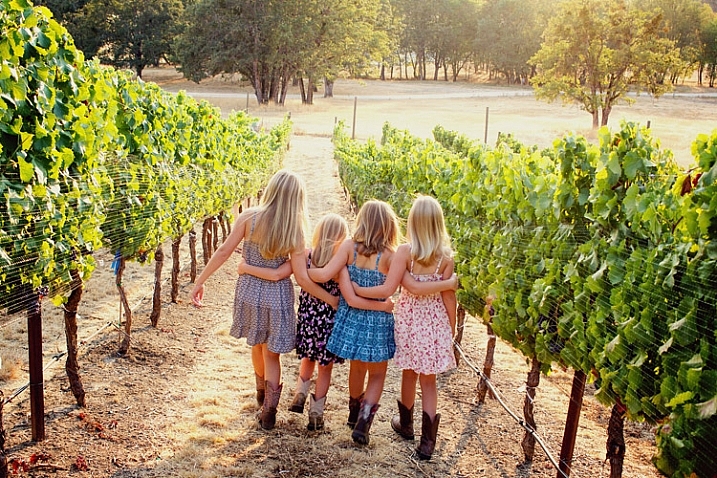
    However, the context for this session is also important, in that it took place at a family vineyard, and the clients wanted to be sure that the grapes were also visible in the background of some of the images. As you can see above, the grapes really weren’t visible in the portrait taken with the 50mm lens, nor would closing down the aperture really give the perspective of the vineyard that my clients were looking for. So, after taking a few portraits with the 50mm, I switched over to my 24mm lens in order to capture a few wider shots.

    photographing-people-24mm-1

    Image taken with Canon 60D and Canon 24mm EF-S lens.

    Same girls, same exact location, very similar pose. The only real difference here is that with the switch to the 24mm lens, you can see more of the girls and the the area around them. In some instances, you may want to minimize the area around your subject, in which case the 24mm lens would not be ideal. However, in this case it allowed for the images that highlighted both the girls and the vineyard, which was what the clients were after.

    Bonus tip: Photographing sibling sets with a 24mm lens also allows you to see the height differences between siblings more easily with the wider angle shot, which is something that a lot of parents really enjoy.

    photographing-people-50mm-3

    Image taken with Canon 60D and 50mm lens.

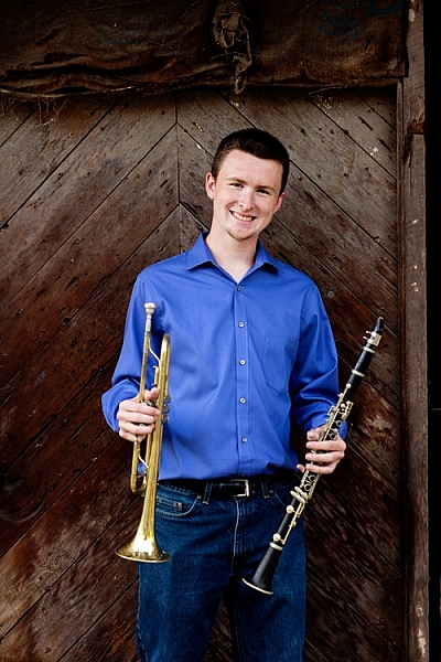
    Another thing to consider, besides the contents of the background in your images, is the coloring of the background. In the image above, the deep colored wood background brings a moodiness to the image that could be appropriate for a musician. However, the interesting thing is that the overall feeling of the image changes quite a bit when you look at it from the 24mm angle of view.

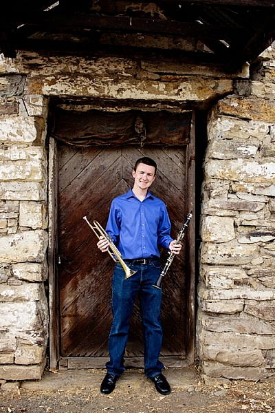
    photographing-people-24mm-3

    Image taken with Canon 60D and 24mm EF-S lens.

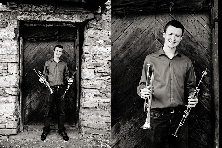
    The second image, though in the same location, feels a lot less moody and dramatic than the first. The lighter stonework around the door brings a sense of balance to the image that just wouldn’t be achieved as well with the 50mm lens in this location. In my experience, this balance is especially important when it comes to converting images to black and white.

    photographing-people-1

    As you can see in the left image, the lighter stonework, around the darker door, serves as a frame for the subject, and naturally draws your eye in towards him. In addition, the increased contrast and texture provide some of the key ingredients for black and white images, which makes the image more aesthetically pleasing than the image on the right.

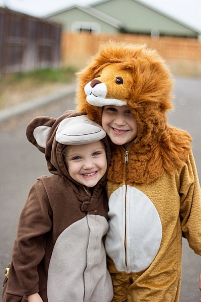
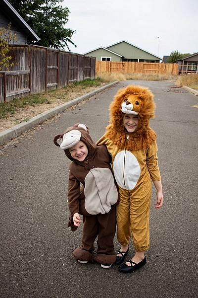
    Overall, while there may be instances in which the content or coloring of your background may cause you to reach for one of these two lenses over the other, I’m very much in favor of using both of them whenever possible. Here’s a quick example from my own life to explain why both are so great for their own reasons. I recently photographed my girls in their Halloween costumes. I started with the 50mm lens because it’s my favorite.

    photographing-people-50mm-4

    Image taken with Canon 60D and 50mm lens.

    I love this image of both girls (above) – the 50mm lens really lets you see their faces and expressions well, and the bokeh of the 50mm f/1.8 helped soften the literal construction site in the background of the image. However, the closer crop also means that only a small portion of their costumes were visible.

    So, I switched over to my 24mm lens to take a full-length photo (below) of my little monkey and my lion as well. Now, I can really see them from head to toe. I can see the little fake feet of the monkey costume that freaked my youngest daughter out so much that she begged her sister to switch costumes with her. I can see the height difference between the two of them. I can see the black flats that my oldest daughter is so proud of, and wears to any event that she deems remotely “fancy”. Those are all things that I want to look back on, and remember. I love both images for different reasons, and am so happy to have them both, thanks to my trusty 24mm and 50mm lenses.

    photographing-people-24mm-4

    Image taken with Canon 60D and 24mm EF-S lens

    I hope this has given you a good idea of how these two focal lengths compare when photographing people.

    Have you tried the Canon 24mm EF-S lens? How do you use it? Do you have a nifty-fifty and do you use it for people photography? Which is your favorite? Please share your comments and images below.

    googletag.cmd.push(function() {
    tablet_slots.push( googletag.defineSlot( “/1005424/_dPSv4_tab-all-article-bottom_(300×250)”, [300, 250], “pb-ad-78623” ).addService( googletag.pubads() ) ); } );

    googletag.cmd.push(function() {
    mobile_slots.push( googletag.defineSlot( “/1005424/_dPSv4_mob-all-article-bottom_(300×250)”, [300, 250], “pb-ad-78158” ).addService( googletag.pubads() ) ); } );

    The post Comparing a 24mm Versus 50mm Lens for Photographing People by Meredith Clark appeared first on Digital Photography School.


    Digital Photography School