Category: Photography

  • Tips for Using Flash to Enhance Outdoor Nature and Landscape Photography

    Late on a winter evening, I was photographing atop a ridge in Colorado’s Front Range. I had been working on some landscape shots, but with the light fading from the sky, the thought of beer and food was beginning to overwhelm my desire to stay out. The colors were shifting to the deep tones of blue hour, and the light was long gone from the hills. About to give up and head home, I spotted a lone juniper atop a rocky outcrop, perfectly silhouetted against the deep blue of the mountain sky. I sighed, tempted to ignore the scene, but instead put my camera back on the tripod, walked over and composed a shot. With a click, I snapped the shutter.
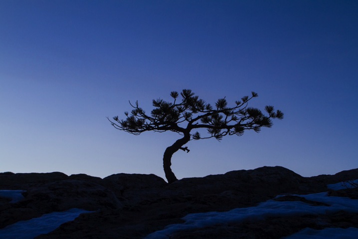
    CO KenCaryl evening 30Dec2011 6

    The image was decent, nice blues with a clean black foreground, but it needed some warmth, an element to contrast with the abundant cool tones. “If only I could get a beam of sunlight to reach back above the horizon…” I thought to myself.

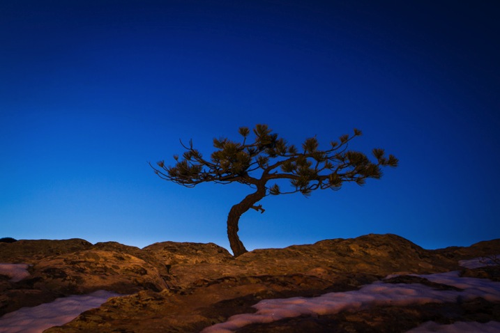
    Wait a second… I didn’t need the sun, I had a flash and a remote trigger in my bag. I pulled it out, all thoughts of beer and food forgotten, and placed the flash on a boulder a few feet to my left. I set it low, to 1/4 of full power, then took a shot.

    Better, I thought, looking at the image glowing on the back of my camera, but still not right. The light coming from the flash was too cool, lacking the warmth I wanted. Digging back in my bag, I emerged with a pack of gels and slapped a half cut of CTO (color temperature orange) over the flash, and clicked off another.
    CO KenCaryl evening 30Dec2011 7

    “Now we’re talking”, I muttered. A warm beam of light crossed the rocky foreground to light up the tree. Never mind that the actual sunlight disappeared 45 minutes before, I could re-create it with a little artificial light trickery. A few adjustments to the flash’s positioning and brightness, and I had my keeper shot. Finally, I could go home.

    Using Flash Outdoors

    For most photographers, flash is relegated to the studio, and if used outside it is usually restricted to portraiture. But there is so much more potential for artificial light. Landscape and wildlife photography can often benefit from a little flash, and with some creativity, it can bring out the best in your images. Here are a few tips to help you get using flash for your outdoor nature and landscape photography.

    To get started, you’ll need a few things in your bag:

    • At least one flash
    • Some kind of remote trigger (I use cheap and simple wireless triggers I found on Amazon for a few bucks)
    • A selection of multi-colored gels
    • A flash stand or assistant
    • For night photography, a strong headlamp or hand-held flashlight is a good addition to the kit
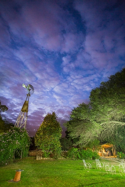
    A windmill stands in the garden of the Finca Santa Anita in Salta Province, Argentina.

    A windmill stands in the garden of the Finca Santa Anita in Salta Province, Argentina.

    General Guidelines

    As with almost all flash use, for best results, you’ve got to get the light off your camera. On-camera, straight flash, looks weird and unnatural. I like to say that photographic rules are meant to be broken, but this one seems universal: get the flash off your camera.

    Get the flash off your camera

    Direction of light, and how much to use it, is a matter of your personal vision, but here are my thoughts: Artificial light should either look so natural, you don’t notice it comes from a bulb, or so obvious, that it’s clear the scene was lit for artistic reasons. Anything in between usually doesn’t work.

    As with all successful photography, you need to think through your image, and the story you are trying to tell. Do you want a natural-looking scene or are you aiming for an artistic portrayal of your subject? Once you have an answer to that question you can move forward.
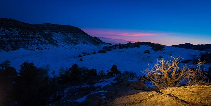
    Scrubby pines grow from the rocks of the Dakota Hogback in the foothills of Colorado outside Denver, late evening.

    Scrubby pines grow from the rocks of the Dakota Hogback in the foothills of Colorado outside Denver, late evening.

    Imitating Natural Light on the Landscape

    The near-dark hours before dawn and just after sunset, or full night, are the most suitable times to add a bit of light to a scene. A natural look is usually subtle and may rely heavily on the light that is already available to you. In my example of the juniper tree, I kept the flash setting low, and warmed the light with a gel to get a sun-like look. Finding the right balance between flash and ambient light is critical.

    The further you get from the flash, the dimmer, and harder the light becomes. A flash aimed toward the ground will be very bright close to the strobe, fading quickly to invisibility. When setting your scene, use the test button to look at the throw of light across your subject. Aim it carefully, and take advantage of the flash’s zoom to consolidate the beam just where it is needed.
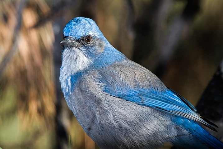
    A Western Scrub Jay perches in a tree in the foothills of the Rocky Mountains outside Denver, CO, USA.

    A Western Scrub Jay perches in a tree in the foothills of the Rocky Mountains outside Denver, CO, USA.

    Adjusting Exposure

    Once set, pop a shot or two, and check the results on your LCD. Almost always, you’ll find you need to adjust the flash brightness, placement, or the ambient light exposure.

    When using flash remember this: adjust ambient light with the shutter speed, and flash with the f-stop (aperture).

    For example, if you want to bring out more brightness in the sky, lengthen your shutter speed, if you want to increase the apparent brightness of your flash, open up the aperture. This is effective for small adjustments in camera, and keeps you from having to constantly readjust flash settings.

    Lighting Your Vision – Artistic Styles

    An artistic look is more straight forward, but light direction, intensity, and color are just as important. I often photograph the northern lights around my home in Fairbanks, Alaska. Often the moon, stars, or aurora itself, are sufficient to illuminate the foreground, but at times, it fades to black as you can see below.
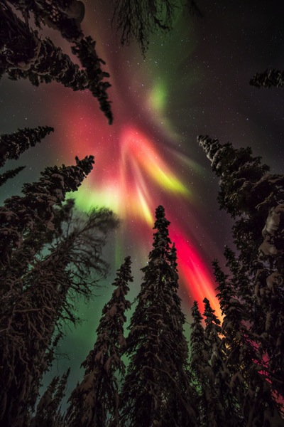
    AK FAI aurora 112073 17

    In such cases, a splash of light is just what I need. When photographing the aurora, or the night sky in general, I rarely carry an actual flash, but I’m always wearing a headlamp. During a typical 5-10 second exposure, if I need a little extra texture or warmth, I can pan the beam quickly over the foreground, “painting” it with light as I did in this image.
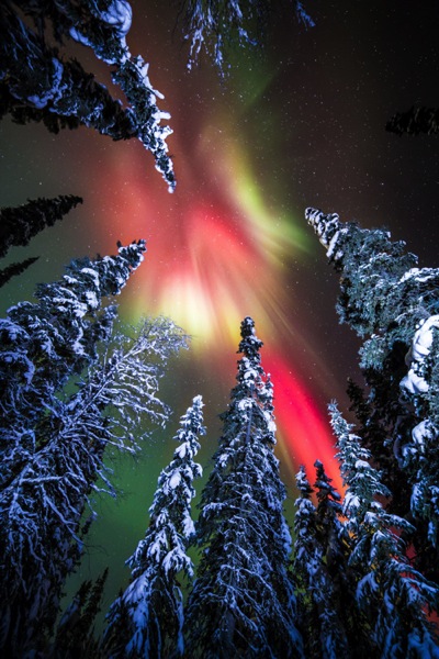
    AK FAI aurora 112073 18

    Light from a typical LED is very cool, but cover it with CTO gel, and nice warm tones result. Light painting is a popular technique, but one that requires some practice to make sure your subject is evenly lit, and not too bright. Mixing light painting and ambient can be very effective to even out brightness in an image, and compensate for highlights. In Argentina, a few years ago, I was shooting a historic farmhouse during the late evening. Bright porch lights on the house needed to be evened out, so I painted some key parts of the scene.
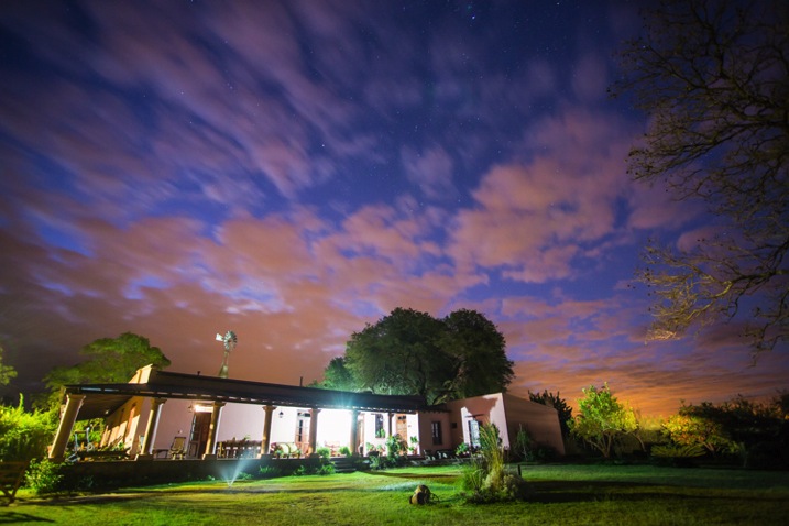
    Arg Salta SantAnita house night 104133 18

    A warning: painting light can mess with the color of a digital image. If you use your camera’s automatic settings, as I do, light painted images will often require some color correction in post-processing. Shoot in RAW to be sure you retain this flexibility.

    Wildlife

    Flash can also play an important role in wildlife photography. Birds in particular are often down low in dark forests, where natural sunlight is rarely found. The flat, boring light beneath the foliage can be replaced by the directional light of a flash.
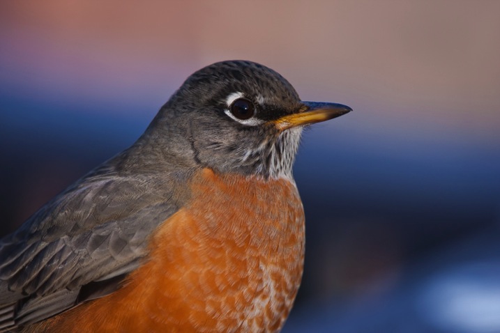
    CO Dec2009 AMRO 3

    When using flash with a long telephoto, you can often get away with on-camera, or bracket-mounted flash, as I did of the portrait of the American Robin above. Using camera-mounted flash is easy with TTL (Through The Lens) compatible strobes. In fact, this technique is so easy, that I’m not even going to go into it, because more interesting possibilities exist.

    Where I live in Alaska, the winters are long, and during the few hours of daylight, the sun is often hidden behind trees or clouds. The birds I love to photograph are usually stuck in flat, gray light. There are a few trees in my yard that the birds prefer. By setting up a flash (or two), gelled with CTO to emulate the absent sun, I’ve managed to create some well lit portraits of these guys.
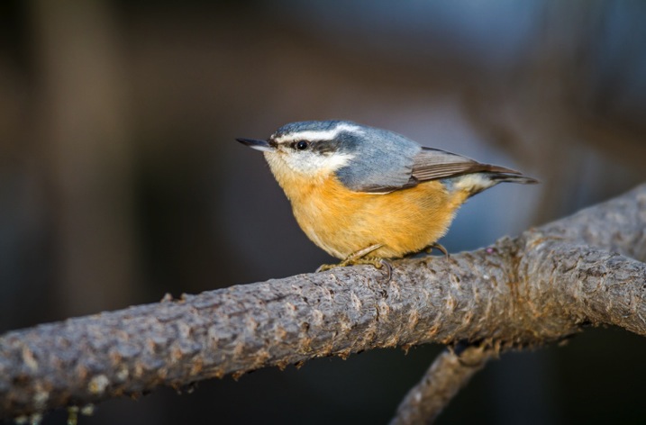
    RBNU 21Dec2011 2

    The method is similar to lighting a landscape. You’ve got to choose your flash placement to avoid shadows, and since there is rarely a chance to replicate a poorly exposed shot, it’s best to get your settings right and then leave them in place throughout the shoot. In this case, I was going for an almost studio-like look, so I took advantage of the white snow as a background, making the final image appear almost as a cut-out.
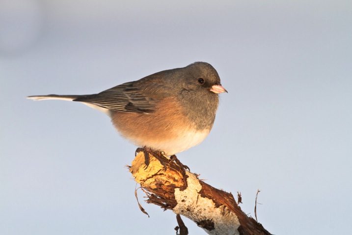
    ORJU 22Dec2011 2

    I like to put my flashes atop a tall stand to get them over my head like a low angle sun. Done right, the set up and exposure takes only a few moments, and the results can be great.

    Conclusion

    Artificial light in the outdoors offers a great opportunity to create unique images. Think through your shots, consider where extra light can be added, and what role it will play in the final image. Not every situation requires it, in fact, most don’t. But there are times when that extra pop of light can take a photo from mundane to extraordinary.

    Have you tried using flash with your nature or landscape photography? Please share your tips and images in the comments below.

    googletag.cmd.push(function() {
    tablet_slots.push( googletag.defineSlot( “/1005424/_dPSv4_tab-all-article-bottom_(300×250)”, [300, 250], “pb-ad-78623” ).addService( googletag.pubads() ) ); } );

    googletag.cmd.push(function() {
    mobile_slots.push( googletag.defineSlot( “/1005424/_dPSv4_mob-all-article-bottom_(300×250)”, [300, 250], “pb-ad-78158” ).addService( googletag.pubads() ) ); } );

    The post Tips for Using Flash to Enhance Outdoor Nature and Landscape Photography by David Shaw appeared first on Digital Photography School.


    Digital Photography School

  • Weekly Photography Challenge – Snow White

    Check out these images of snow I rounded up earlier today.

    Thomas Hawk

    By Thomas Hawk

    Weekly Photography Challenge – Snow White

    This week your challenge is to go photograph something snow white – so what that means is that if you do not live in a place where it snows you can still shoot based on the theme white. Try doing a white subject on a white background, something high-key.

    Howard Ignatius

    By Howard Ignatius

    Howard Ignatius

    By Howard Ignatius

    Sheree Zielke

    By Sheree Zielke

    Thomas Hawk

    By Thomas Hawk

    Rene De Paula Jr

    By rene de paula jr

    Will Montague

    By Will Montague

    Ben Raynal

    By Ben Raynal

    Share your images below:

    Simply upload your shot into the comment field (look for the little camera icon in the Disqus comments section) and they’ll get embedded for us all to see or if you’d prefer upload them to your favourite photo sharing site and leave the link to them. Show me your best images in this week’s challenge. Sometimes it takes a while for an image to appear so be patient and try not to post the same image twice.

    Francisco Gonzalez

    By Francisco Gonzalez

    Randi Hausken

    By Randi Hausken

    Jérémy Lelièvre

    By Jérémy Lelièvre

    googletag.cmd.push(function() {
    tablet_slots.push( googletag.defineSlot( “/1005424/_dPSv4_tab-all-article-bottom_(300×250)”, [300, 250], “pb-ad-78623” ).addService( googletag.pubads() ) ); } );

    googletag.cmd.push(function() {
    mobile_slots.push( googletag.defineSlot( “/1005424/_dPSv4_mob-all-article-bottom_(300×250)”, [300, 250], “pb-ad-78158” ).addService( googletag.pubads() ) ); } );

    The post Weekly Photography Challenge – Snow White by Darlene Hildebrandt appeared first on Digital Photography School.


    Digital Photography School

  • 28 Wintery White Snowy Images

    For those of us who live in the northern hemisphere, the ground is probably covered in snow for many of us by this time of the season. So what better reason is there to get out and photograph all that white fluffy stuff?

    Here is that wintery white stuff in some snowy day images:

    Adam Foster

    By Adam Foster

    Jenny Downing

    By jenny downing

    Tim Donnelly

    By Tim Donnelly

    Maf04

    By maf04

    Visit Finland

    By Visit Finland

    Shigemi.J

    By Shigemi.J

    Mika_Oulu

    By Mika_Oulu

    Adam Vradenburg

    By Adam Vradenburg

    Andrew Smith

    By Andrew Smith

    Gerry Balding

    By Gerry Balding

    Rodney Campbell

    By Rodney Campbell

    Maziar Hooshmand

    By maziar hooshmand

    Russ Seidel

    By Russ Seidel

    Julie Falk

    By Julie Falk

    Shawn Harquail

    By Shawn Harquail

    Pascal Bovet

    By Pascal Bovet

    Alexey Kljatov

    By Alexey Kljatov

    Kamyar Adl

    By Kamyar Adl

    Several Seconds

    By Several seconds

    Mike Norkum

    By Mike Norkum

    Rishi Bandopadhay

    By Rishi Bandopadhay

    Ishrona

    By Ishrona

    Roman Boed

    By Roman Boed

    Javier

    By Javier

    Flood G.

    By Flood G.

    Vida Dimovska

    By Vida Dimovska

    Brian Colson

    By brian colson

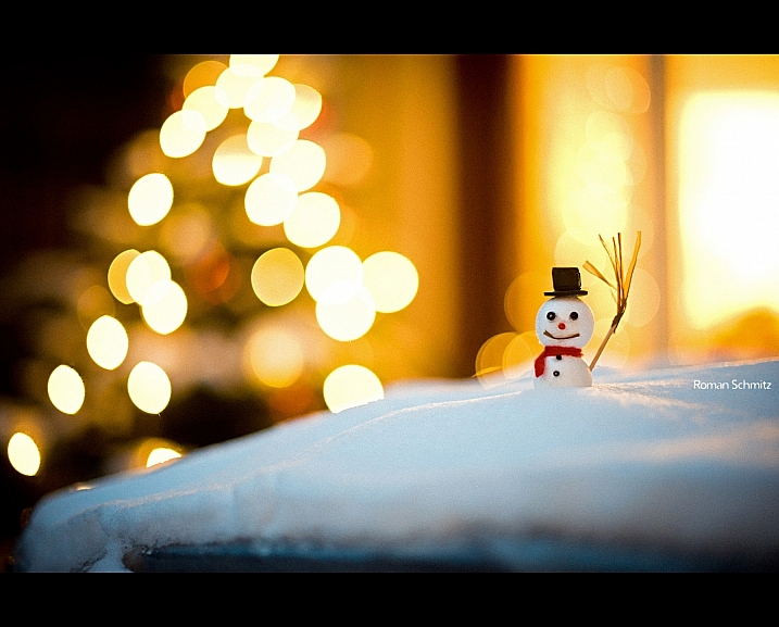
    Roman Schmitz

    By Roman Schmitz

    googletag.cmd.push(function() {
    tablet_slots.push( googletag.defineSlot( “/1005424/_dPSv4_tab-all-article-bottom_(300×250)”, [300, 250], “pb-ad-78623” ).addService( googletag.pubads() ) ); } );

    googletag.cmd.push(function() {
    mobile_slots.push( googletag.defineSlot( “/1005424/_dPSv4_mob-all-article-bottom_(300×250)”, [300, 250], “pb-ad-78158” ).addService( googletag.pubads() ) ); } );

    The post 28 Wintery White Snowy Images by Darlene Hildebrandt appeared first on Digital Photography School.


    Digital Photography School

  • Orbis is Going Away. Grab One (for Cheap) While You Can.

    For those of you late to the party, the Orbis Ring Flash Adpater is a passive, add-on light shaping device that turns your speedlight into a ring flash. There are others, but for a slew of reasons the Orbis has long been my favorite of the lot.

    And it is about to go away forever. This post is a quick heads-up to grab one while you can—and a pointer to a fantastic deal on the last units as they are closed out.

    The Orbis was developed in 2008 as a sophisticated answer to the DIY efforts of the Strobist community. After seeing what was possible with cereal boxes, aluminum foil and gaffer’s tape, reader James Madelin wanted to build something better. Meaning nicer looks, better durability, more efficiency, more color correct and with a better quality of light. So that’s exactly what he did.

    The Orbis is surprisingly complex on the inside in the way it bends light around the donut. It strikes the balance between lighting efficiency vs. evenness (both being very important) just about as well as possible.

    Interestingly, of all of the best ring flash adapters, the Orbis was the only one that was never knocked off by the shady Chinese photo gear copiers. It’s not that they never thought of it. Lord knows, they put out crap versions of all the others.

    My guess? They cut one open, took a look inside and said, “Eff this. Let’s knock off the Ray Flash instead.

    What it Will Do

    The Orbis Ring Flash Adapter is not a flash. It is a passive light mod that mounts onto your existing speedlight.

    Used alone, on-axis (classic ring light position) it creates that signature glam ring light look as seen above. And because it retains any TTL functions of the speedlight crammed into it, the Orbis is very popular with club/event photographers. Stick on a wideangle lens, work two stops over the ambient in TTL mode, and the results look cool as crap.

    And that’s fine for event shooters. But I prefer to use mine more in a way inspired by portrait shooters like Greg Heisler and Dan Winters.

    In this mode, the Orbis becomes a very sophisticated fill light. You can use it in combo with another off-camera speedlight acting as key light, and it fills in the gaps—to whatever level you choose based on how you power it.

    The photo above of poet Linda Joy Burke is a good example. The key light is coming from upper left. I am working well above the ambient with my flash exposure. So Linda’s shadow side would be very, very dark without the Orbis that is wrapped around my lens.

    The light from the orbis reaches into the shadow side without really adding any footprint, and creates legibility. How much? Your choice. Just dial the power of the ring-fill light up or down as much as you want.

    This is a common way for portrait photographers to create exactly the amount of legibility they want in the shadows. Which means you can get more creative and/or edgy with your key if you want. ‘Cause the ring is gonna save your ass in the shadows.

    Same here with this photo of blogger Sian Meades, done in London. I am in full shade here, and this light is completely being created with two speedlights.

    The key light is at hard left, raking across Sian’s face. The fill light, in an Orbis, stuck right on my lens, is creating the legibility in the shadows of the key.

    The ambient component here is minimal. Without the flashes the photo would be near black. The on-axis Orbis gives me complete control of my shadow density.

    (To learn more about lighting either of these two photos, click on either one.)

    Now or Never

    And the Orbis will soon be gone forever.

    They sold over the last seven years for $ 200, rarely if ever discounted. But the remaining units are being closed out for $ 129 (w/free shipping in US.) Or you can get it with the hands-free arm for $ 139 (+$ 7.40 shipping in US.)

    This is a great deal. Because not only will it work on nearly any speedlight (but not bigass Vivitar 285s, sorry) it is built to last you likely for the rest of your shooting life.

    Which is a good thing, because you’re not gonna be able to replace it.

    Amazon: Orbis Closeout: $ 129, free ship US

    Amazon: Orbis Ring Flash Adapter w/Arm: $ 139 + $ 7.40 ship US


    Strobist

  • Gear Review – Glow QuadraPro Portable Softbox

    There is no greater teacher in life than time and experience. If I could go back in time and teach myself some photography lessons, high on my list would be OCF – off-camera flash. Back when I was starting out in photography, I used to dread using my flash. In fact, I think for the first two years of my photography career, I did not even own one. If a client would enquire about a family photoshoot, I would promptly reply back saying I am strictly a natural light photographer and the best times to schedule the session would be a little after sunrise or around sunset. I think I might have even turned down some indoor photo sessions because I hated the look and feel of a flash.

    Fast forward a few years, as I ventured into the genre of wedding photography, I started to get over my fear of using a flash. As I educated myself on studio lights, flashes, and all the other lightning paraphernalia out there, I stopped hyperventilating as much at the thought of using artificial light for my photos. Although I am now fairly comfortable using an on-camera flash, I still consider myself a novice artificial light photographer. The next step to mastering artificial lights is to get comfortable with off-camera flash. To that end, I knew I needed, at the bare minimum, a light stand, a soft box, and my flash. So when I got the opportunity to review the GLOW QuadraPop Portable Softbox from Adorama I jumped at the chance.

    Screen Shot 2015-12-03 at 1.37.49 PM

    Let me preface this article by setting the record straight. I have never used an off-camera lighting system from the ground up. I have watched several online classes and tutorials on how a single light off-camera system works. In fact there are several wonderful articles on dPS that discuss off-camera flash like this one. But this is the first time I have handled such a setup ,and so, in essence, I am reviewing this product as a novice off-camera flash/softbox user.

    Contents and what’s in the box

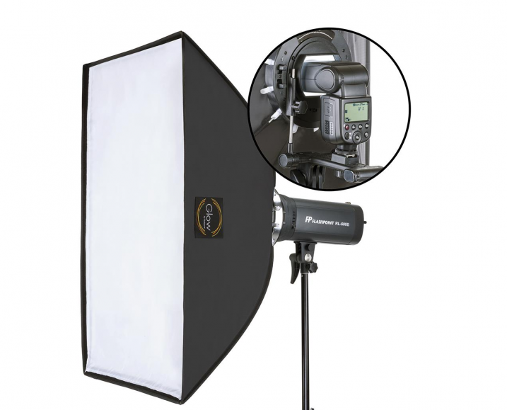
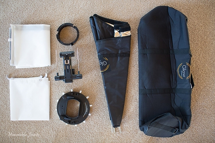
    The QuadraPro comes fully equipped to use with a speedlight, as well as a studio strobe. Included in the box were the actual soft box, angle adjustment shoe bracket that can be adjusted for height and depth, removable inner and outer diffusers, removable cold shoe, and a protective bag to carry the QuadraPro on location. The only thing you will need to have is a light stand. I have a generic, lightweight stand that I had purchased from a local camera shop last year, and the GLOW QuadraPro worked perfectly with it.

    Memorable Jaunts Glow QuadraPro Softbox Article Image Whats in the bag-1

    I have to admit that when I opened the box, I was a little nervous about how to set up the whole system. I am used to reading manuals and watching product videos prior to handling equipment, but for this softbox setup I decided to skip all the research and prep work, and start using the product right away. The setup did take me a few minutes to figure out, but once I read through the one page instruction sheet that comes with the GLOW QuadraPro, it was easy enough.

    The flash cold shoe bracket was easy to use, but attaching the actual softbox to the QuadraPro ring did take me a couple of tries. Once I was able to secure the rods into the rings, it was easy to snap them in to place by adjusting the rings in a circular manner. The inner and outer diffuser panels are quite literally a snap to attach. The outer diffuser panel has a velcro attachment mechanism, while the inner panel snaps with push buttons.

    Ease of use and comfort

    The Glow QuadraPop line is perfect for mobile studios, on-location work, and also travel. The entire system is quite lightweight, and easy to set up and dismantle. This is ideal for individual portraits and product shots, as well as for use on location. The one I used is the QuadraPop Rectangular softbox that comes in two sizes – 28×38″ and 24×34″. I used the GLOW QuadraPop with both the internal, and external, diffuser panels. Additionally the flash shoe bracket has an angle adjustment knob for easy tilting, thereby adjusting the angle of light – perfect for photographing things from above.

    Memorable Jaunts Glow QuadraPro Softbox Article Image Angle Adjustment on the Flash Hotshoe-3

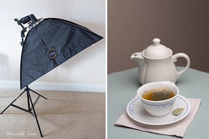
    My afternoon tea was photographed with the softbox above and to the right of the tea cup, as seen in the reflection on the surface of the tea in the cup, and the light on the tea pot.

    Basic setup and portability

    I created a quick video on how easy it is to set up the softbox:

    Memorable Jaunts Glow QuadraPro Softbox Article Image Softbox Setup-1

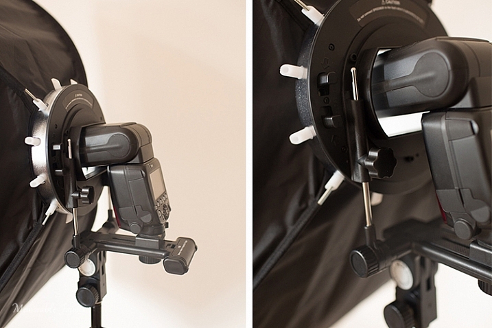
    The softbox is mounted on the circular ring using the white clasps. The softbox is mounted on the light stand via the cold-shoe mount that also holds the flash.

    Memorable Jaunts Glow QuadraPro Softbox Article Image Softbox Setup-4

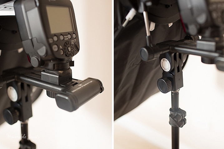
    The cold-shoe mount has an adjustable screw that slides the flash forward or backward on the base.

    Memorable Jaunts Glow QuadraPro Softbox Article Image Softbox Setup-6

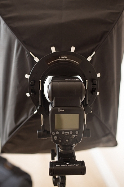
    Back view of the fully assembled GLOW QuadraPro Softbox with the flash attached.

    Memorable Jaunts Glow QuadraPro Softbox Article Image Softbox Setup-8

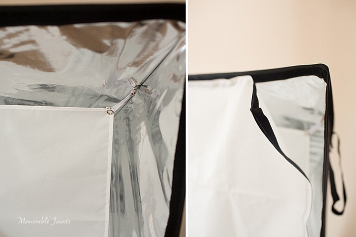
    Inside diffuser panel that snaps into place, while the outside diffuser panel has velcro that attaches to the inside of the softbox close to the edge.

    Indoor and outdoor use

    I planned on putting the GLOW QuadraPop to the test with both indoor and outdoor use. But, just as I was writing this article, Chicago got the first major snow storm of the season. So, with subzero temps, I decided to forgo the outdoor test and just use it indoors with my obliging models, a.k.a my kids!

    While indoors I moved the GLOW system from one room to the other, to see how easily I could manage carrying the system around. Before moving it, I removed the flash from the cold-shoe attachment, and also collapsed the softbox by squeezing the tabs on the sides of the ring. This did take some force, as the softbox rods were quite secure in their respective white sockets. I did not remove the diffuser panels as recommended, because I wanted the set up process to be easy at my next location (similar to what it would be like on a live on-location photoshoot). This made the set up, and take down process, much easier and faster.

    Please note – I was experimenting with various softbox positions and had the flash on ETTL. My focus here was not on posing, but on the look and feel of a diffused lighting setup using a single softbox, i.e. the GLOW QuadraPro.

    Memorable Jaunts Glow QuadraPro Softbox Article Image Indoor setup -4

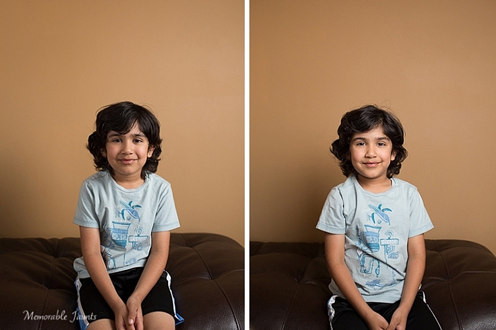
    The image on the left has the softbox to the right of the camera. There is a slight shadow on the left hand side, and a nice drop-off of light on the background. The image on the right has the softbox placed directly in front of the model for a more even tone, and even lighting on the face.

    Memorable Jaunts Glow QuadraPro Softbox Article Image Indoor setup -3

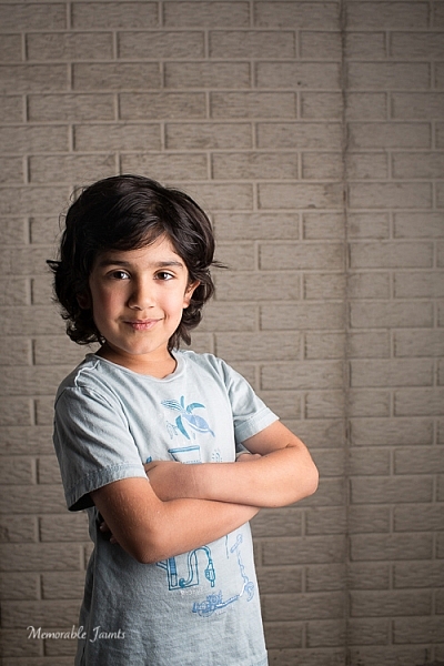
    For this image, I moved to the basement where it was much darker. I quite like the effect of the dramatic lighting on the left side of his face, with some shadows on the other side. His body is turned slightly towards the softbox, which is at approximately at a 45 degree angle from the subject’s position.

    Next up, my other willing model who had to be constantly bribed with treats and food!

    Memorable Jaunts Glow QuadraPro Softbox Article Image Indoor setup -5

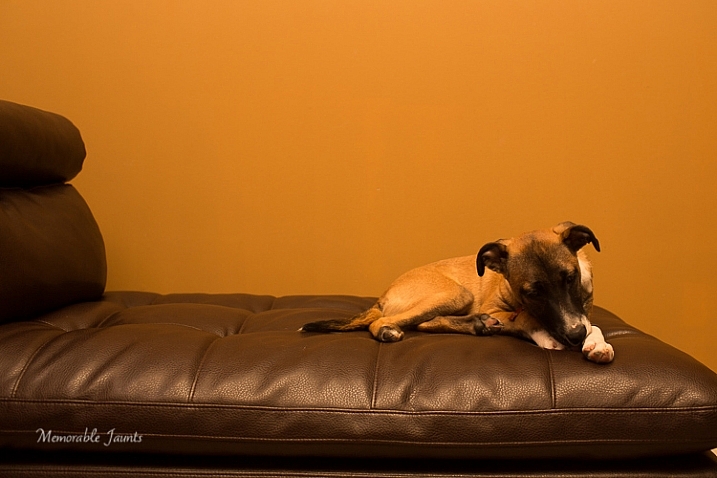
    This image was taking WITHOUT the softbox. The flash was just bounced straight up without any additional diffusion. The image is quite dark and the color of the wall is quite terrible in this image.

    Memorable Jaunts Glow QuadraPro Softbox Article Image Indoor setup -8

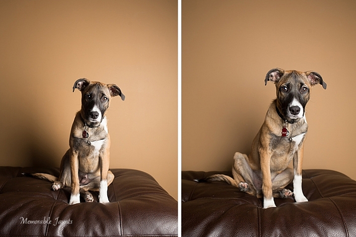
    The image on the left had the softbox placed at a 45 degree angle to the dog. The image on the right has the softbox pointed straight ahead, giving a more even lighting and beautiful catchlights in his eyes. Plus the color of the wall is more true to its actual color!

    Final Thoughts

    In conclusion, the GLOW QuadraPro softbox is a fairly easy to use, lightweight and portable, flash diffusion system. I quite liked the convenience of having the setup all ready to use as I was experimenting with a single off-camera flash. Initially the softbox was a bit difficult to put together, and that was purely because I have never used this type of lighting system from the ground up. But once I got used to the clamps, they were very easy to assemble and dismantle.

    googletag.cmd.push(function() {
    tablet_slots.push( googletag.defineSlot( “/1005424/_dPSv4_tab-all-article-bottom_(300×250)”, [300, 250], “pb-ad-78623” ).addService( googletag.pubads() ) ); } );

    googletag.cmd.push(function() {
    mobile_slots.push( googletag.defineSlot( “/1005424/_dPSv4_mob-all-article-bottom_(300×250)”, [300, 250], “pb-ad-78158” ).addService( googletag.pubads() ) ); } );

    The post Gear Review – Glow QuadraPro Portable Softbox by Karthika Gupta appeared first on Digital Photography School.


    Digital Photography School

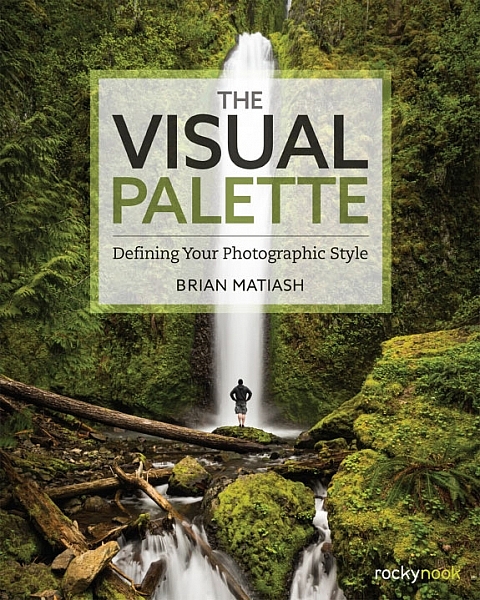
  • Book Review: The Visual Palette by Brian Matiash

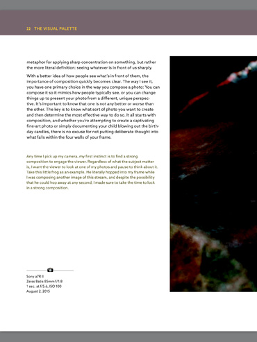
    The Visual Palette book review

    Brian Matiash is a photographer based in Portland, Oregon. The Visual Palette is his first book published by Rocky Nook.

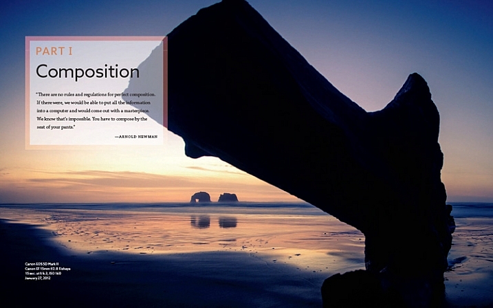
    As the title suggests this is not a technical book. It’s aimed at evolving photographers who grasp the basics, but need some guidance in developing the creative side of their photography. The book is divided into three sections – Composition, Post-Processing and Stylization, and Sharing Your Work and Your Brand. Each section builds on the lessons learned in the one before.

    The Visual Palette book review

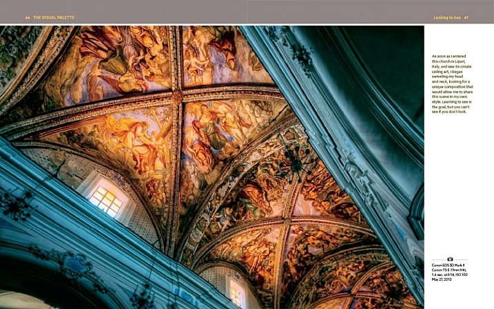
    Screenshot from The Visual Palette

    The book starts with composition. How you see, compose, and tell stories with photos is a major factor that sets your work apart from another. This section covers techniques like the rule-of-thirds, creating depth and using leading lines, as well as giving tips for photographing familiar subjects and learning to see.

    The book continues with post-processing and stylization. This is where you bring further individuality to your work by the style in which you chose to process. It suggests separating photo editing into two distinct skills – post-processing and stylization.

    • Post-processing is the preparation work – preparing a clean image that gives an accurate representation of the scene.
    • Stylization is the process of adding your own artistic interpretation to the image.

    I really like this idea, and think there is a lot to be gained by separating the concepts.

    The book covers the tools you can use to achieve both skills. Be forewarned – there is a lot of grungy HDR in this section, and the processing may look a bit over the top for those of you not into this style of photography.

    On the other hand, Brian does explain how he has moved from a grungy HDR style to a more natural one over the years – a journey that many photographers will probably identify with.

    The Visual Palette book review

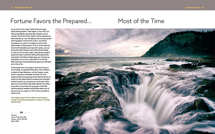
    Screenshot from The Visual Palette

    The final part of the book explores the process of sharing your work and building your personal brand. This will appeal to a wide spectrum of readers, from those who simply want to share their photos on Flickr or 500px, to professional photographers who need to build a brand to promote their work. If you haven’t put much thought much into how you share and promote your work, then you will find this section very useful.

    Personal stories

    As Brian explores the ideas in the book he relates his own experiences, giving you an insight to his thought processes, and his development as a photographer.

    It could be argued that dividing the book into three topics results in a lightweight treatment of each. In a way that’s true – if you want to learn more about composition, for example, you would be better off buying a book dedicated to the topic. However, the aim of this book is to give you a primer in each of the areas it covers. You can then follow up by buying a book that explores the topics that interest you most in more depth.

    For these reasons, The Visual Palette is more likely to appeal to beginners than advanced photographers.

    The Visual Palette book review

    Screenshot from The Visual Palette.

    Annoyances and niggles

    The review copy was provided in PDF form, and there were a couple of problems that stopped me fully enjoying the experience of reading it.

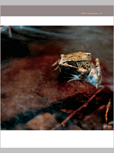
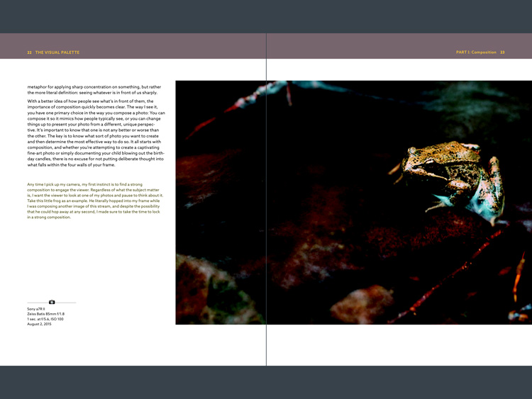
    The first is related to layout. In iBooks or Acrobat Reader (on an iPad) you can only view one page at a time (on a computer you can view page spreads in Reader). Given that the book is designed as a series of double page spreads, and that many photos cross the gutter, this prevented me from seeing the photos properly. You can’t look at, and appreciate the photo, when it is split into two by the formatting. It greatly lessened the enjoyment of the book, and to be honest, put me off buying another ebook from Rocky Nook.

    The Visual Palette book review

    Here’s an example of what I mean. This is a screenshot from iBooks, which presents the pages one at a time. Not good when you have lot of photos that cross the gutter.

    The solution would be to format the book especially for viewing on the iPad (and other tablets), so that each page in the PDF document contains a double page spread from the book. ILEX do this already with their ebooks (note: ILEX don’t publish PDF ebooks any more, restricting ebook sales to the Amazon Kindle store), and I’d like to see Rocky Nook follow suit.

    It is possible to see spreads in Goodreader, but that brings me to the next point.

    The second annoyance relates to color management. Adobe Acrobat Reader is the only PDF reader that accurately displays the colors and tones of the photos in the book on an iPad. However, Acrobat Reader only lets you view one page at a time, so we are back to the first problem.

    The Visual Palette book review

    This screenshot is from Adobe Acrobat Reader. Now we can see the photo with the correct brightness and contrast. But you can’t view two pages together, and the photo is still cut off.

    In Goodreader and iBooks the photos are too dark, have too much contrast, and the colors are inaccurate.

    This is a screenshot from Goodreader, which can display two pages together, as the designer intended them to be seen. Great – now you can see the entire photo. But that's not much use when the photo is too dark to see properly.

    This is a screenshot from Goodreader, which can display two pages together, as the designer intended them to be seen. Great – now you can see the entire photo. But that’s not much use when the photo is too dark to see properly.

    I hope someone from Rocky Nook reads this and takes some action to put it right. Anybody who buys the PDF version of this book and tries to view it in iBooks or Goodreader will be disappointed with the quality.

    Conclusion

    The Visual Palette is well written, well thought out, and full of useful ideas. While little of the content will be new to advanced photographers, most of it will be useful to people starting out.

    There are some good photos in the book (and unfortunately a few weak ones), although the heavy-handed treatment of some of them may put readers off who feel that there is a little more to stylization than using HDR techniques. However, if you ignore that, you’ll find a lot of good ideas in the written content.

    I’m giving this book three and a half stars for the content. I recommend the printed book over the PDF ebook which is virtually unreadable in its current format.

    Given my experience with the PDF version of this book I thought it would be interesting to ask your opinion about ebooks in general. Have you bought any? What did you think of the design? What format do you prefer, PDFs or epub/mobi? What feedback would you give publishers regarding design and content?

    And of course, if you have read The Visual Palette and would like to let us know what you think, or if you have any questions regarding the book, please let us know in the comments below.

    googletag.cmd.push(function() {
    tablet_slots.push( googletag.defineSlot( “/1005424/_dPSv4_tab-all-article-bottom_(300×250)”, [300, 250], “pb-ad-78623” ).addService( googletag.pubads() ) ); } );

    googletag.cmd.push(function() {
    mobile_slots.push( googletag.defineSlot( “/1005424/_dPSv4_mob-all-article-bottom_(300×250)”, [300, 250], “pb-ad-78158” ).addService( googletag.pubads() ) ); } );

    The post Book Review: The Visual Palette by Brian Matiash by Andrew S. Gibson appeared first on Digital Photography School.


    Digital Photography School

  • How to Reduce Editing Time by Automating Your Lightroom Workflow

    Don’t you hate when you realize that you spend more time in front of the computer than actually taking photographs? The realization is even more depressing when you are a travel and landscape photographer and, by definition, you are supposed to travel and discover the world’s beauty.

    Sunset Ride (San Francisco)

    The Crisis

    This is how I felt about 12 months ago during my second ever processing crisis as a photographer.

    The first crisis happened about 10 years ago when I became more serious about photography, and started taking more photos. This was a time when 100% of my editing was done in Photoshop, which quickly led me to feel like I was drowning in gigabytes of digital images. What I did not realize at the time was that a majority of photographers who had switched to the digital realm, shared my pain.

    This is when Adobe saved us all by releasing Lightroom, an application designed specifically for digital photographers. Lightroom not only offered non-destructive photo editing but a complete digital photography workflow with streamlined digital asset management as well.

    I immediately embraced Lightroom by starting with the beta version, which allowed me to cut my photo editing time in half. With every new version, Lightroom became more sophisticated and versatile, almost completely replacing Photoshop in my workflow. After Adobe released Lightroom 6, I recognized that I could complete 90% of my processing in Lightroom, and my need for Photoshop was minimal (10%).

    But, sophistication and versatility had its own price. Lightroom became much slower and its complexity skyrocketed.

    Another factor that contributed to my second processing crisis was my switch from a Canon DSLR, to a Sony mirrorless. The new Sony camera (A6000) had a bigger sensor and produced much bigger file sizes, which slowed my editing down even more.

    After a long trip to Hawaii, California, and the Southwest, I brought back more than 5,000 brand new photos. The process of Lightroom editing was slow and painful, making it obvious that I had to come up with the completely new workflow to reflect a higher volume of larger files.

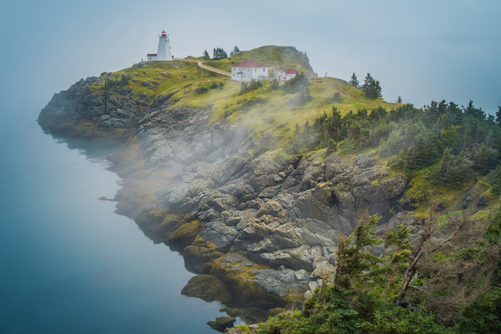
    Swallowtail Light (New Brunswick)

    The Solution

    I started by analyzing my Lightroom editing habits, and soon enough, I made a discovery that became the foundation for my new workflow. Perhaps less of a discovery and more like a simple realization, I noticed that 80% of my edits are identical for every single photo I process, with only 20% varying from photo to photo.

    The solution was obvious. By automating the 80%, I could radically reduce the time I spend in front of the computer. The use of preset functionality in Lightroom was an obvious choice.

    I dove into my Lightroom Portfolio Collection and selected the images that best reflected my personal style and artistic vision. I then created presets based on those selected photos.

    At that point, I faced a challenge. As you have probably noticed, LR presets usually do not work out of the box; their settings are too specific for a particular photo to work with every image. Depending on the lighting condition of the scene, contrast level, shadow depth, and color saturation, the same preset can produce a completely different result across different images.

    I managed to overcome this challenge by separating my presets into two categories, and using a two-level editing approach.

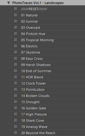
    • Level One: I use presets from a STYLE category, to define an artistic style or the “LOOK” in a photograph. For example: cool or warm, cross processed or natural, contrasted or soft.
    • Level Two: I use ADJUSTMENT presets to fine-tune a photo, compensating for the lighting of the scene, without changing the STYLE that I defined in the previous step.

    Okay, enough theory, let’s get to the practical demonstration – here’s my new Lightroom editing workflow in action:

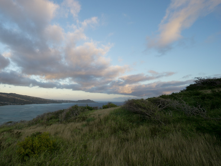
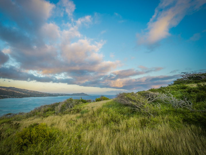
    Here is a photo I took in Hawaii at sunrise. This is a typical landscape photo featuring the open sky and water, mountains, and foreground vegetation. In order to preserve the details in the highlights, I set the exposure for the sky area, as I normally do for the majority of landscapes. It resulted in an underexposed capture.

    how_I_educed_my_photo_processing_time_in_half_03

    The goal here is to correct the exposure, recover the shadows, and bring back the rich colors of the tropical sunrise.

    STEP ONE

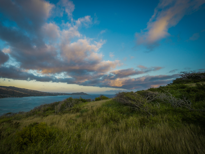
    I always start my landscape editing by trying to achieve a natural look first by applying the NATURAL preset from my STYLE collection.

    how_I_educed_my_photo_processing_time_in_half_04

    Even though I managed to boost the colors and define the sky, the result is far from exciting, as the photo is much too dark.

    how_I_educed_my_photo_processing_time_in_half_05

    STEP TWO

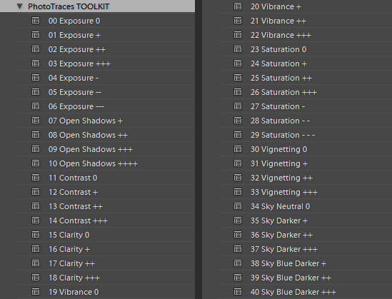
    This is when my ADJUSTMENT collection, which I call the TOOLKIT, comes into play.

    The TOOLKIT is a selection of 40 presets where each is responsible for changing only one specific parameter, without changing the style of the image. Together, they help to fine-tune different aspects of the photo.

    how_I_educed_my_photo_processing_time_in_half_06

    The TOOLKIT presets are stackable, which means that you can apply multiple presets to the image without the presets overwriting each other.

    • To make the image brighter, I apply preset 02. Exposure ++
    • To open up the shadows, I apply preset 10. Open Shadows +++
    • To increase the local contrast, I apply preset 17. Clarity ++

    how_I_educed_my_photo_processing_time_in_half_07

    This is all I had to do. As you can see, I managed to complete 80% of my entire editing in five clicks, without touching the right panel of Lightroom where all of the editing tools are housed.

    STEP THREE

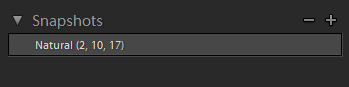
    The last step is to record the editing steps. I use the Snapshot functionality of Lightroom to save my editing steps as a new Snapshot. For the name, I use “Lightroom Editing Formula”.

    how_I_educed_my_photo_processing_time_in_half_08

    The Lightroom Editing Formula starts with the name of the preset and follows with the numbers inside the brackets, where each number represents a specific ADJUSTMENT preset from the TOOLKIT collection.

    If I edit a photo for my blog, I might stop here and export it as a JPEG; but, if I am working on a portfolio piece, I try to explore a variety of artistic styles. I follow a similar approach by going through the three steps of my workflow, but each time select a different STYLE preset.

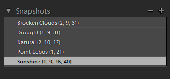
    Every time I achieve a result I like, I save it as another Snapshot.

    how_I_educed_my_photo_processing_time_in_half_09

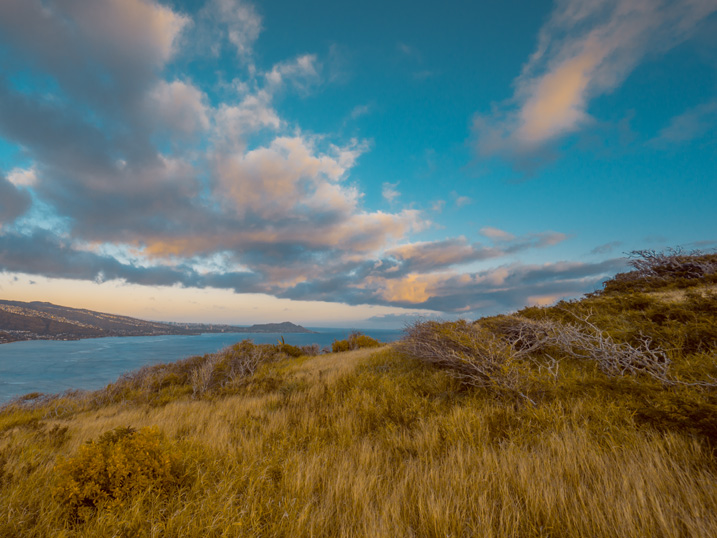
    By the time I am done, I might have anywhere from four to five different editing versions for the same image.

    how_I_educed_my_photo_processing_time_in_half_11

    how_I_educed_my_photo_processing_time_in_half_10

    how_I_educed_my_photo_processing_time_in_half_12

    how_I_educed_my_photo_processing_time_in_half_13

    Here is the most exciting part; I get to select the most interesting version for my portfolio and perhaps another one for Instagram.

    From here, I normally jump to Photoshop and perform the remaining 20% or so of the editing process. In Photoshop, I mostly clean up the image with the help of the Stamp Tool, and do noise reduction using Topaz DeNoise plugin.

    Conclusion

    The entire process of producing five different versions of the featured photo took me less than 10 minutes, and all without having to touch the main editing tools in Lightroom. I call it Lightroom Rapid Editing.

    By streamlining and automating my Lightroom workflow, I managed to reduce the total editing time by more than half.

    How can you use these tips to reduce your editing time? Do you have any other time savers you’d like to share? Please do so in the comments below.

    googletag.cmd.push(function() {
    tablet_slots.push( googletag.defineSlot( “/1005424/_dPSv4_tab-all-article-bottom_(300×250)”, [300, 250], “pb-ad-78623” ).addService( googletag.pubads() ) ); } );

    googletag.cmd.push(function() {
    mobile_slots.push( googletag.defineSlot( “/1005424/_dPSv4_mob-all-article-bottom_(300×250)”, [300, 250], “pb-ad-78158” ).addService( googletag.pubads() ) ); } );

    The post How to Reduce Editing Time by Automating Your Lightroom Workflow by Viktor Elizarov appeared first on Digital Photography School.


    Digital Photography School

  • My Favorite and ONLY Lens: The Canon EF 50mm f/1.2 L USM

    I operate my photography business on a shoe string budget. This started out of necessity, but continued because it became abundantly clear to me early on, that I would rather spend the money I earn from photography towards black t-shirts, home décor, five dollar lattes, and bills. Mainly bills, but no sense in pretending the other indulgences don’t factor into my take-home pay.

    lynseymattingly2

    I started my portrait business with a Canon Rebel, kit glass, and a prayer. As my business grew I invested in a 30D, and later a 5D. One particularly good tax refund, and a little generosity from my mother around my birthday, found me the proud new owner of a Canon 50mm L-series lens. I didn’t even know what the L stood for (to be honest, I still don’t), I just knew that all the photography blogs I read at the time called it the end-all, be-all lens. The It Lens. The Portrait Lens. I also had a seasoned pro tell me that I should spend as much money as possible on good glass, and it doesn’t get any better than this one.

    It’s also important to mention that I was at a place with both photography, and my confidence, that I would listen to just about anyone who even pretended they knew what they were talking about. Had she told me that my pictures would be better if I carried a frog in my pocket, I would have carried two, and a lizard in my shoe just in case.

    lynseymattingly7

    I am going to tell you all a secret. I am going to answer the question I always get asked when I pull out my big, fancy lens that is mounted to my camera body, which to be clear is the Canon 5D model from 4 models ago: does that snazzy lens make photos better? Brace yourselves because, yes. Yes, it does. So much so in fact that I don’t even own another lens.

    I had a fixed 24mm lens for a few years, but it did nothing more than take up space in my bag. Space that I prefer to give to gum and bug spray. So I sold it to increase my coffee and black yoga pants budget. Zoom lenses have never been my favorite, so that narrows down my choices considerably, and a 50mm just feels like the right length for me—I’m close to my subjects but not breathing in their face, even if my breath is minty fresh from my bulk gum purchases.

    lynseymattingly4

    Can you live without a lens that costs three times what my first car did? You bet. But I’ll tell you another thing—you can live without an entire bag of lenses just as easily. A back-up body and lens is nice—some may even say essential (particularly if you are a wedding photographer), and I suppose if you do certain types of photography, you may need a few different lenses. But I am here to tell you that I have operated a very successful portrait and wedding photography business with my one, albeit super fancy, lens and done just fine, thank you very much. I can count on one hand the times I’ve needed a different lens, and each time it was easy to either borrow or rent, and much more cost effective.

    lynseymattingly1

    I know my 50. I named my 50, if we are being honest (its name is Seth—it work well with Nancy my MacBook, and Monte my iMac). At this point it just feels like an extension of my arm, or eyeball. I know what I will see in the viewfinder by the time I get my camera to my face. Since my feet are the zoom, I know exactly where I need to stand to get the frame I want.

    Prime lenses are fast and sharp. If this means I have to walk around a bit more, then I can call it my exercise for the day (okay, fine: week) as well. The bulk of my business is photographing kids, so no matter what, I am going to be on the move. I’d just rather know that upfront, than mess with a zoom and continuously risk less than tack-sharp focus. This isn’t even counting the fact that by not spending a great deal on equipment I am able to be well caffeinated on expensive coffee during shoots, and sit at a very pretty desk while I edit.

    lynseymattingly3

    The other plus of counting on one great lens for everything? I invest my money back into my business in other places, beyond expensive equipment. Places that I feel reach farther than a bag full of stuff. I have a bold website and eye-catching business cards. My clients get their images in top-of-the-line professional packaging. I have a ShootSac and buy lollipops in bulk. I wear the most expensive contact lenses on the market, and you should see my hair tie-back selection.

    I can only afford these things because I’m not up to my expensive contact lens-wearing eyeballs in debt over fancy equipment. Additionally, my fees are not so outrageous that my client base is only a select few. My overhead being lower than average, allows me to continue photographing the families that supported my business when I was just starting. Families that otherwise may not be able to afford my services if I was dealing with extraordinary costs.

    lynseymattingly6

    My mom taught me to buy quality; to save my money and buy a good pair of jeans, instead of the cheapest pair that fit. Sadly this lesson didn’t stick and at this very moment I am dressed head to toe in Target. However, it’s true here; buy the nicest lens you can afford and make it work for you. It’s your paintbrush, your potters wheel, your knives (I’ve heard big-time chefs bring their own knives to everything); make it the best possible one and make it the only one you need.

    lynseymattingly5

    Have you invested in top quality lenses or “glass”? What is your go-to lens and why?

    googletag.cmd.push(function() {
    tablet_slots.push( googletag.defineSlot( “/1005424/_dPSv4_tab-all-article-bottom_(300×250)”, [300, 250], “pb-ad-78623” ).addService( googletag.pubads() ) ); } );

    googletag.cmd.push(function() {
    mobile_slots.push( googletag.defineSlot( “/1005424/_dPSv4_mob-all-article-bottom_(300×250)”, [300, 250], “pb-ad-78158” ).addService( googletag.pubads() ) ); } );

    The post My Favorite and ONLY Lens: The Canon EF 50mm f/1.2 L USM by Lynsey Mattingly appeared first on Digital Photography School.


    Digital Photography School

  • Macphun Aurora HDR Pro Software – First Impressions

    HDR, or High Dynamic Range, photography originally started as an attempt to correct the limited dynamic range for standard camera sensors, compared to what the human eye can see or perceive. This is not a new concept, but in case you’ve never heard of it, allow me to explain.

    Back in the day, camera sensors had an average dynamic range of about 5–7 stops, where our eyes can easily adapt and recognize ranges from 11 to 14 stops. Nowadays, sensors of modern cameras are much more capable in terms of dynamic range, but they still, depending on the situation, can’t capture the whole range.

    5 Images 1 Stop Apart - Basic Preset - Slight Contrast Adjustment

    5 Images 1 Stop Apart – Basic Preset – Slight Contrast Adjustment


    So HDR techniques utilize multiple images, with different exposures, of the same subject, that are then merged together to create an exposure range closer to what we can perceive with our eyes. Of course, this is not a new concept, and there is always a lot of controversy among photographers regarding the subject. Some people like it extreme or artsy, and others like it more natural. Both can be achieved through HDR methods. There are many different techniques and types of software for doing HDR. But, not all of them are easy to use and understand, with resulting images that are not natural, and over-processed.

    Recently Macphun, one of the world’s leading developers in consumer and professional photography software for the Mac, has teamed up with Trey Ratcliff, an artist and HDR pioneer who mastered the technique, gaining over nine million fans. According to their statement, “Aurora HDR contains every imaginable tool needed to produce high-quality next generation dramatic images.”

    I’ve been a fan of Trey’s wonderful images myself, so when I heard about the software, I wanted to give it a try. I just received a copy and have been playing around for a couple of days.

    5 Images 2 Stop Apart - Treys Angels Within Preset - Slight Contrast Adjustment

    5 Images 2 Stop Apart – Treys Angels Within Preset – Slight Contrast Adjustment

    Some of the key benefits of Macphun Aurora HDR Pro, as described by the developer, are:

    • Revolutionary HDR algorithms make possible the entire spectrum of HDR looks, from natural to highly stylized.
    • Total HDR editing experience with the most complete set of tools available.
    • Powerful one-click presets, including Signature Pro presets by Trey Ratcliff, yield fantastic results instantly.
    • Layers, masking and brushes provide the ultimate in selective editing.
    • Unique Radiance controls and custom texture blending for creative versatility.
    • Detail enhancement to increase drama in images.
    • Extensive color and toning controls for vibrant color combinations.
    • Approachable user interface makes for a comfortable, understandable experience.
    • Built-in sharing supports popular photo communities and social networks.
    • RAW, JPG, TIFF and other popular files support for the greatest flexibility.
    • Workflow tailored to any style, with support for using as a standalone app, or as a plugin to popular host applications.
    7 Images 1 Stop Apart - Indoor Bright Preset - Slight Contrast Adjustment

    7 Images 1 Stop Apart – Indoor Bright Preset – Slight Contrast Adjustment

    As mentioned above, the software can be used as a stand-alone application or as an plugin host operation within Adobe Photoshop, Adobe Lightroom or Apple Aperture. Because Lightroom is my base, I have chosen to use it from there.

    After the installation, it took me a while to figure out how to make it work with Lightroom. Most plugins automatically install the extensions but with Aurora, you actually need to open the program, open an image, and then go to the Aurora HDR Pro menu and select Install Plug-Ins. In my opinion, I think it would be better in future editions to have the option of installing the plug-ins upon the initial installation, rather than having to go through this process. But after that, it integrated with Lightroom flawlessly.

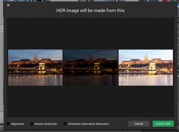
    When launched, the first window that shows up displays the images from which the HDR will be made, as well as options for Alignment, Ghosts and Chromatic Aberration Reduction. So far so good. Pick alignment if the images were shot hand-held, pick Ghosts Reduction if there are moving subjects, and so on.

    MacPhun-Aurora-HDR-First-Impressions (2 of 4)

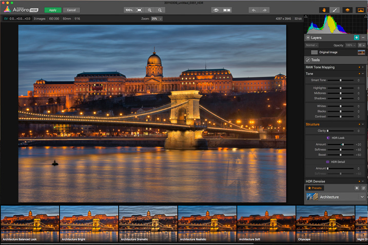
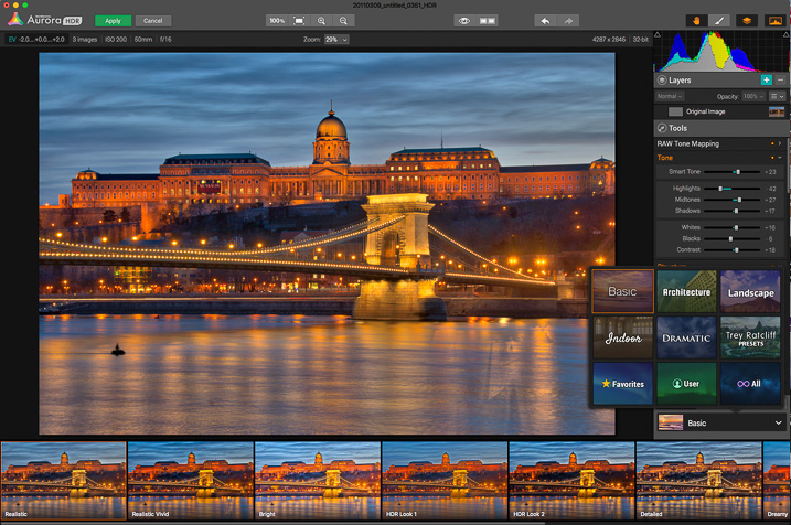
    Once you click Create HDR, the images are combined and the main interface will open up. The interface is well-rounded and easy to navigate. It features a large image view with three main sections: a navigation and tool bar at the top, layer and adjusting tools on the right side, and presets selections at the bottom.

    MacPhun-Aurora-HDR-First-Impressions (3 of 4)

    On the top bar you’ll find: the zooming tools, quick preview and compare options (to check against your original and edited images), a move tool (to move around when zoomed in), and a brush and eraser to use in layers (when creating masks) and the layers tool.

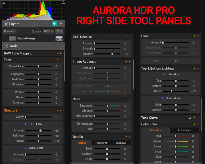
    The main section of right panel contains the following tools:

    • Histogram: Displays the complete tonal range of your image from dark to light. Similar to in Lightroom, clicking the upper right and left corners will display the black and white clipping points.
    • Layers: I really liked this one; layers are a great way to stay organized and add different effects on your image by isolating them using masks. You can add as many layers as you want, and they can be also applied using different blend modes: normal, soft light, hard light, overlay, multiply, screen luminosity and color. They pretty much work as they do in Adobe Photoshop.
    • Tone Mapping: This panel controls how Aurora HDR compresses the files, and the weight it places on each exposure in the bracketed set.
    • Tone: This panel controls the highlights, mid-tones and shadows; it also helps with contrast, as well as pushing the black and white points.
    • Structure: This panel has several functions, but think of it as clarity on steroids. It works by finding edges, and avoids adding contrast to edges but rather, it affects areas. It contains several sliders to play with, including, of course, “Clarity” as well as sub-panels called “HDR Look” and “HDR Detail.” From here you can increase and decrease the texture of the image.
    • HDR De-noise: A tool to eliminate noise and artifacts produced by the merging of the photos.
    • Image Radiance: You can clearly notice Trey’s hand in this one; it gives a “dreamy” feeling to the photos.Right Panel Tools (1 of 1)
    • Color: Includes controls for adjusting color, vibrance, color contrast, temperature and tint in the image.
    • Details: Increased clarity, detail, and sharpness to bring out the details in an image. As there is no sharpening function, this works as a sharpening tool.
    • Glow: Another creative tool. With this one you can create softening effects to the lighter tones.
    • Top & Bottom Lighting: I really liked this addition too; they work similar to a graduated neutral density filter. This control splits the image in two segments and darkens or lightens the image.
    • Tone Curve: The curves tool. As in Adobe Photoshop or Lightroom, if you are familiar with working with curves, the panel is there. You can apply it overall, or it also works with independent channels: red, green and blue.
    • Color Filter: The color filters are available to adjust saturation and luminance to specific colors. It works similar to the HSL panel in Adobe Lightroom, but the Aurora Software lacks the hue option and is limited to six basic colors. Still, it is good to have it there to adjust. I’m not pretending to compare it with Lightroom as this is a different software; just mentioning options that you could be familiar with.
    • Color Toning: With this one you can change the tone of either the highlights or the shadows, and individually increase or decrease saturation of the same. A really nice creative tool for split toning. I also really like the preset options on top of the panel.
    • Vignette: The traditional vignette tool. It works as expected, but there is something very clever as well: the Inner Light function allows you to add more light to the center, or any part of the image.

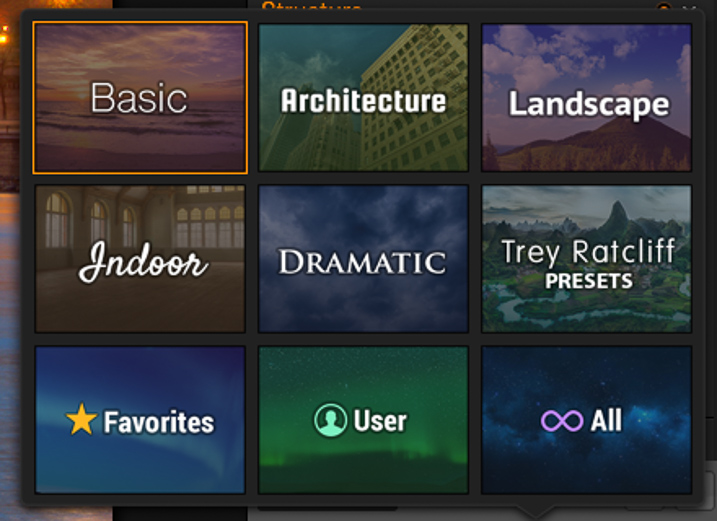
    Lastly, there are the presets, created by Macphun and Trey himself. They provide a good starting point to try out different looks in a single click. Of course, you can also create your own presets and save them for future use.

    MacPhun-Aurora-HDR-First-Impressions (4 of 4)

    MacPhun-Aurora-HDR-First-Impressions (5 of 4)

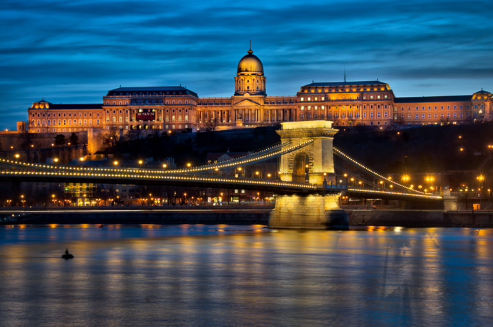
    I created the image below by using three images, shot two stops apart. I started with the Basic Realistic preset as a base, and played with the sliders until I got what I wanted. Then, I added a layer to add more light to the palace in the foreground, and masked out the rest.

    One of the things that I’ve noticed while working, is that the application is fast compared to other software I’ve used in the past, and that is a godsend. Everything loads fast, and the application seems to be very responsive. I’ll definitely continue to use it in the future and test more functions.

    MacPhun-Aurora-HDR-First-Impressions (6 of 6)

    Whether you are an HDR fan or have never experimented with the technique, you should give Macphun Aurora HDR Pro a try. This is a well-rounded application that can serve the needs of pros and amateurs alike.

    Unfortunately, the software is only available for Mac, but I think overall it is a great alternative. They are currently three options. The Aurora HDR currently retails for $ 49.99; with this option there is no RAW support, and it can just run as a standalone application. The tested version is the Aurora HDR Pro that retails for $ 99, and there is also a package that includes the application plus training for $ 129.

    googletag.cmd.push(function() {
    tablet_slots.push( googletag.defineSlot( “/1005424/_dPSv4_tab-all-article-bottom_(300×250)”, [300, 250], “pb-ad-78623” ).addService( googletag.pubads() ) ); } );

    googletag.cmd.push(function() {
    mobile_slots.push( googletag.defineSlot( “/1005424/_dPSv4_mob-all-article-bottom_(300×250)”, [300, 250], “pb-ad-78158” ).addService( googletag.pubads() ) ); } );

    The post Macphun Aurora HDR Pro Software – First Impressions by Daniel Korzeniewski appeared first on Digital Photography School.


    Digital Photography School

  • 6 Benefits of Using Cameras With Larger Sensors

    With ever increasing megapixel counts in smartphone cameras, do you need a dedicated camera at all? Or perhaps could you just get a really tiny compact camera?

    At this point in time at least, the answer is probably no. Or at least not if you really want consistently good image quality. The reason is, that these devices don’t have large enough digital sensors.

    The digital image sensor is the part of the camera that actually captures the image, from the light that is reflected onto it by the lens. The sensors are of a good size in any DSLR or mirrorless camera you are likely to buy, but in an iPhone or compact camera they are tiny.

    It may be obvious to you that a larger digital sensor might result in higher resolution in your pictures. But, there are other benefits of a larger sensor that you might not be aware of, which go well beyond resolution. Therefore, in this article, I want to explain why a digital sensor is so important to your photography. The fact is it may be the most important factor to consider when purchasing a new camera.

    1. Larger sensors generally provide higher resolution

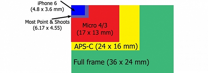
    Sensor size comparison chart

    Sensors in DSLRs and mirrorless cameras are generally either Micro Four Thirds, APS-C, or Full Frame. Any of these will usually work fine, and as you can see they are all of good size. The sensors for smartphones and compact cameras, on the other hand, are extremely small in comparison.

    Let’s start with the obvious thing – resolution. Having a digital sensor with a larger surface area provides the opportunity to include more pixels. Assuming the pixels are the same size, having a digital sensor that is 40% larger, reads that there can be 40% more pixels. That means higher resolution for your images, which in turn means more detail and the ability to make them larger.

    A larger sensor can also lead to larger pixels, which has significant benefits for your pictures. If you see a Full Frame camera with the same number of megapixels as an APS-C camera, that doesn’t mean they will have the same image quality. Rather, that means the pixels will have been spread out over a larger surface area in the Full Frame model, and as you will see in the remainder of this article, having larger pixels spread out over a wider surface area has a whole host of benefits for your photography.

    2. Larger sensors result in improved low-light performance

    The number one predictor of whether a camera will have good low-light performance is the size of the digital image sensor. The camera testing that has been done shows a direct correlation between larger image sensors, and improved low-light performance.

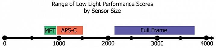
    A company called DxO Mark tests all digital cameras and assigns them a low-light performance score, which it calls its “sports” score (presumably because using high ISO is important to sports shooters, who often face poor light and need to use fast shutter speeds). This score is actually an ISO value. Specifically, the score is the highest ISO at which the camera will create a picture, without noise becoming too large of an issue (there is actually a technical formula they use involving decibels and signal to noise ratio, but that is my layperson’s definition of their score). The higher the score, the higher the useable ISO for that camera. For example, if a camera scores 900, that means the highest usable ISO for that camera is ISO 900. A camera with a score of 1250 would mean that its low-light performance was better, and performed well up to ISO 1250. And so on.

    When comparing the scores for the current models of DSLRs and mirrorless cameras being sold right now, and then separating the results by sensor size, the result is rather striking:

    Low light performance by sensor sizeTo explain this chart a little further, the range on the bottom is DxO Mark’s “sports scores,” which as mentioned above are really ISO values. Each camera was assigned a score, and I sorted them by sensor type. The range of values for Micro Four Thirds cameras is between ISO 757 and 896 (with the average at 825). The range for cameras with APS-C sensors is ISO 915 – 1438 (with an average of 1161). The range for full frame cameras is ISO 2293 – 3702 (with an average of 2811).

    Notice that even the lowest rated APS-C camera performs better than the highest rated Micro Four Thirds camera. Similarly, even the lowest rated full frame camera performs better than the highest rated APS-C camera. When it comes to low-light performance, sensor size appears to make all the difference.

    3. Dynamic range will likely be increased with larger image sensors

    A larger digital image sensor also appears to lead to an increase in dynamic range for your camera. This is the range of tones that your camera can capture between pure white and pure black. The wider the range, the better.

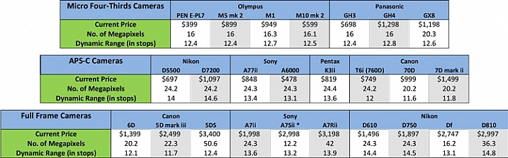
    There is no simple measurement for dynamic range, so comparing cameras is difficult. Finding the low-end of the spectrum (black) has a lot to do with the low-light performance of the camera, because digital noise increases when capturing very dark tones. At some point, the noise overwhelms the picture, so the bottom end of the dynamic range scale is not really “pure black” but rather “usable black.” What that means for us is that low-light performance determines part of the dynamic range of the camera, and as we saw in the previous section, low-light performance is largely a function of sensor size. Therefore, it would appear that a larger sensor would mean a higher dynamic range.

    The digital image sensor testing done by DxO Mark bears this out. They call this their “landscape” score, and their results show a correlation between sensor size and an increase in dynamic range. The average for Micro Four Thirds cameras I looked at was 12.5 stops of dynamic range. That increased a bit to 13.0 for cameras with APS-C sensors, and then to 13.4 for full frame cameras. Therefore, a camera with a larger digital image sensor is very likely to have a larger dynamic range.

    Comparison of dynamic range in digital cameras

    All these scores are pretty comparable, and my point is not so much to compare these sensors (which will all get the job done), but rather simply to show that sensor size matters. Based on this, we can see that a camera with a much smaller image sensor (like a phone or compact camera) would not perform as well when it comes to these measures of image quality.

    4. A larger sensor lets you create more background blur

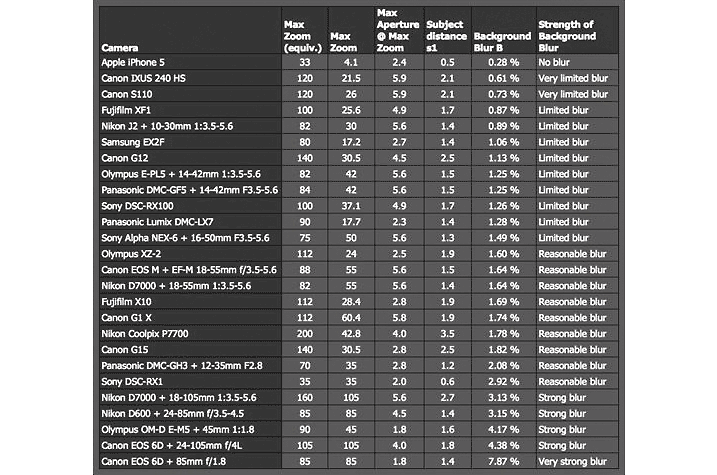
    If you want an appreciable degree of background blur in your images, you will need to use a larger digital image sensor. It is not just a function of aperture size (although that is obviously a very big part of it). In fact, it is virtually impossible to achieve a strong amount of background blur with a camera that has a tiny image sensor.

    The relationship between digital image sensor size and background blur has actually been tested by the folks at DP Review. Here is a link to their testing and results. Be warned that they use a lot of math and technical terms. Here is a chart with some of their results:

    DP-Review-Background-Blur-Chart


    The results are that cameras with very small digital image sensors like smartphones and compact cameras are worthless if you aim to include background blur in your pictures. They go on to show that the larger the digital image sensor, the more blur you can include in your pictures. Therefore, sensor size is an important consideration if you want to achieve any amount of background blur in your photos.

    5. A larger sensor can mean less diffraction

    One other impact that the size of the digital image sensor has on your photos – and one of which you might not be aware – is on the amount of diffraction in your photos.

    This may come as a surprise to you, if you are somewhat familiar with diffraction, because it is largely a function of using a very small aperture. Here’s how diffraction affects your pictures: When you use a small aperture, light reaching the edges of the image sensor can only get there after passing through the small aperture and then spreading out. That spreading of light causes the light rays to hit adjacent photo sites. Essentially, this spreading causes the light to sometimes hit the wrong photo site and leads to blur.

    What does that have to do with the digital image sensor? Remember that diffraction is caused by a scattering of light across photo sites. Therefore, if you cram a lot of megapixels on a digital image sensor, the photo sites will be very small, and the scattering of light will cross over onto other photo sites more easily. That will mean an increase in diffraction. But in a camera where megapixels are more spread out, the same amount of scattering, will have less of an impact on your pictures.

    As a result, larger image sensors where pixels are more spread out, tend to result in less image diffraction.

    6. Larger sensors reduce the crop factor

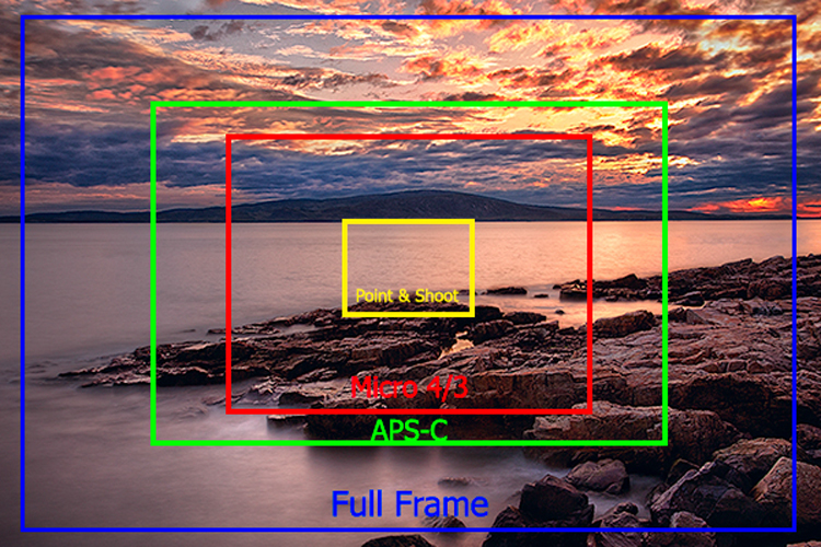
    Finally, let’s not forget about the crop factor that results from using a smaller digital image sensor. This chart shows the impact of crop factors. Notice in particular the yellow square in the center that shows the range of view for compact cameras:

    Impact of crop factors

    Of course, camera manufacturers have adapted to this by introducing extremely wide angle lenses which are designed for cameras with smaller sensors. Still it is generally much easier to obtain wide angle pictures using a larger image sensor.

    Conclusion

    It is not my intent to trash any particular camera, or system. The fact is that any camera is better than no camera, so use what you have. What I want to show here is that there are significant benefits to lugging around your DSLR, or mirrorless camera. That is true whether it is a Micro Four Thirds, APS-C, or a Full Frame camera. The benefits go well beyond resolution, and affect your overall image quality.

    Larger sensors help you take better pictures in low-light, capture a greater dynamic range of tones, result in reduced diffraction, and let you achieve more background blur. So keep lugging around those cameras rather than trying to get it done with a phone or a compact model.

    Do you have any additional data or questions you’d like to add? Please share in the comments below.

    googletag.cmd.push(function() {
    tablet_slots.push( googletag.defineSlot( “/1005424/_dPSv4_tab-all-article-bottom_(300×250)”, [300, 250], “pb-ad-78623” ).addService( googletag.pubads() ) ); } );

    googletag.cmd.push(function() {
    mobile_slots.push( googletag.defineSlot( “/1005424/_dPSv4_mob-all-article-bottom_(300×250)”, [300, 250], “pb-ad-78158” ).addService( googletag.pubads() ) ); } );

    The post 6 Benefits of Using Cameras With Larger Sensors by Jim Hamel appeared first on Digital Photography School.


    Digital Photography School