Category: Photography

  • The 5 Best Google Nik Color Efex Pro 4 Filters and How They Can Amplify Your Images

    The Google Nik collection has been considered one of the top photographic effect plugin suites for a few years now, and it just got better in a big way – as of March 24th, 2016, it’s available free of charge.

    This move has been applauded by many, yet accompanied by caution with by some, since a few analysts see this as the beginning of the end for the software suite. This is all speculation of course, and regardless of what the future holds for the Nik collection, it is a highly useful set of tools that can benefit any photographer, of any skill level.

    Nik color efex pro

    Color Efex Pro

    The highlight of this set has always been the all-around workhorse, Color Efex Pro. The current version, Color Efex Pro 4, is a complete package in itself, featuring a variety of effects of the highest quality. Although you can sort the list of effects by photo type (landscape, portrait, etc.), there is a lot to explore.

    Let’s go through five of the most useful and effective tools available in this package, and see how they can boost the appearance and effectiveness of your images.

    Foreword

    As with all of the tools within this suite, the filters described below include a Control Points feature within the panel of individual filter controls. This feature is invaluable, and allows you to add positive or negative points anywhere in the image, adding or reducing the effect of the filter in targeted areas. Each point can be individually controlled to modify range of effect and opacity. Combining these points with the filters gives you almost unlimited control of how the filters will effect your final photograph. I encourage you to play around with the control points, and you’ll quickly see how they can help you turn your image into the picture you initially envisioned.

    1 – Bi-Color Filters

    This filter is meant to simulate standard bi-color filters that would normally be affixed to your camera lens. Two preselected colors are blended together along a plane and mixed with your original image, creating a very customizable look that can completely change the tone of the photograph.

    Although another bi-color filter is available that allows you to choose the two colors to be blended, the original filter has already selected many color combinations divided into five shade groups, such as browns, cool/warm, violet/pinks, and so on.
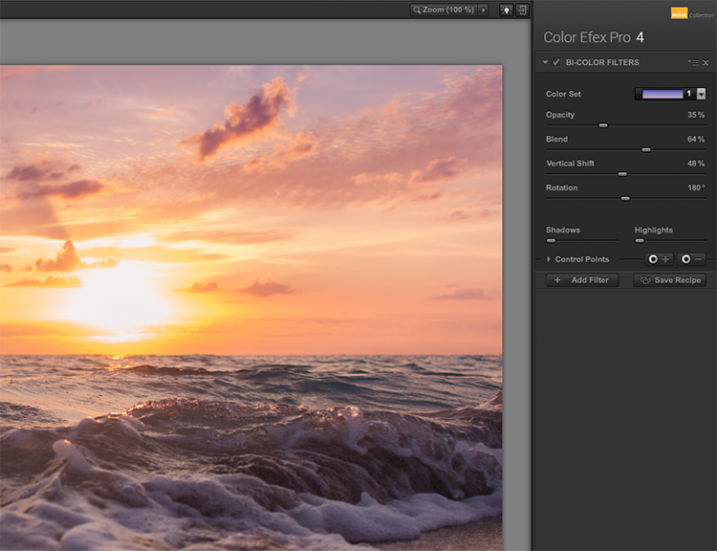
    Nik color efex pro

    Once you have selected a color set, you can further modify the appearance of the filter by adjusting several sliders, including Opacity which allows you to increase or decrease the intensity of the overall effect, and Blend slider, which softens or sharpens the line between the two colors. The entire effect can be rotated around the image using the Rotation slider.
    article_cep4_screen6

    Once you have mastered the controls for adjusting the bi-color filter effect, you can then move on to the User Defined Bi-Color Filter, which has similar controls, and allows you pick any two colors to blend with your image.

    2 – Contrast Color Range

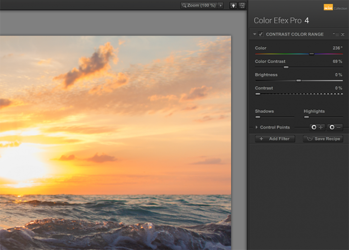
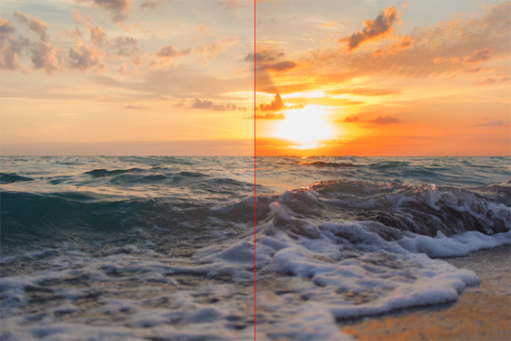
    The Contrast Color Range filter allows you to selectively modify contrast within certain colors of a photo. Selecting a color will cause that color range to become lighter or less saturated, and colors opposite of it to become darker or more saturated. For example, selecting a blue or purple color range in an image featuring a sunset (with a lot of orange within the photo) will intensify the red and orange colors, making the sunset much more dramatic.
    Nik color efex pro

    The two main tools to understand here are the Color, and Color Contrast sliders. The Color slider will select the color range, while the Color Contrast slider will adjust the intensity of the effect by increasing or decreasing the contrast between the color selected and its reciprocal.
    Nik color efex pro

    Below these are controls for Brightness and Contrast, which behave similarly to their counterparts in Photoshop or Lightroom.

    3 – Detail Extractor

    While most users might argue in favor of using the excellent Pro Contrast filter (discussed below) over the Detail Extractor, I’d argue that it depends on what look you’re going for. For a smoother, less enhanced result, Pro Contrast would definitely be the way to go, but to add insane levels of drama to your image, the Detail Extractor is just what the doctor ordered.
    Nik color efex pro

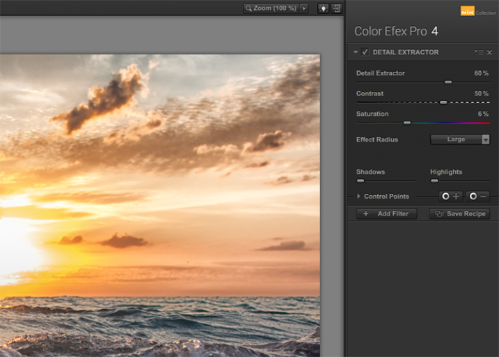
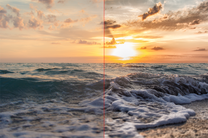
    This tool adds that drama by disrupting the balance of shadow and light within the photo, to pull much more detail, giving you a dark and gritty stylized result that can really grab the viewer’s eye.
    Nik color efex pro

    The main control used to create the effect here, is the Detail Extractor slider. Moving it to the right increases the amount of details highlighted. In addition to Contrast and Saturation adjustments, there is also an Effect Radius adjustment available, which allows you to target whether fine or large elements within the image are modified.

    4 – Pro Contrast

    Without a doubt, the Pro Contrast module in Color Efex 4 is my favorite filter by far. Admittedly, half of my interactions with the Nik Filters involve me making all of my adjustments in Lightroom, and using Color Efex 4’s phenomenal Pro Contrast to add the bit of drama and flair I’m looking for, without going over the top and getting an overcooked result.

    The tool analyzes the image to determine how the contrast adjustment will affect the loss in detail inevitable in this type of correction, and minimizes it. The filter can turn a flat, lifeless, image into a colorful and vibrant photo with almost perfect levels of contrast.
    Nik color efex pro

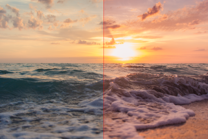
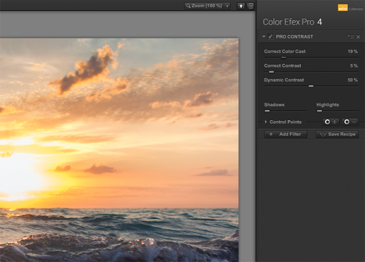
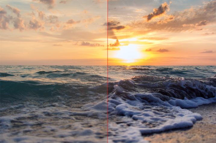
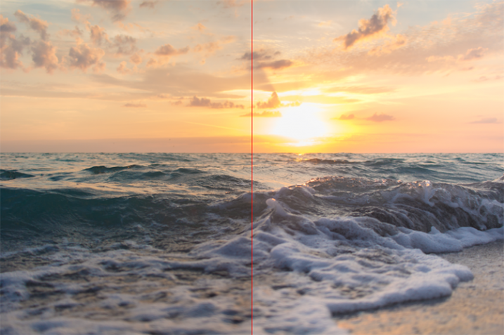
    Pro Contrast features three sliders, each one of them important to the final result. Correct Color Cast analyzes the photo, and produces an algorithm to remove any inherent color cast it finds. Moving the slider to the right will reduce this cast and smooth out the tonal scheme of the image. In the ocean sunset image shown here, applying Correct Color Cast removes the orange hue cast upon the waves in the foreground, and returns them to their proper blue.
    Nik color efex pro

    Correct Contrast applies a general contrast adjustment based on the tonality of the image, as analyzed by the software. Finally, Dynamic Contrast introduces the real magic; areas of the photo that are flat are boosted in contrast, while areas already featuring high contrast are not. This allows for a rich, beautiful enhancement, without muddy tonal structures and details that might normally be lost.

    5 – Reflector Efex

    We all understand the need for a reflector when creating portraits; whether it be a natural-light or studio situation, certain areas of our subject (usually a person’s face) are befallen with shadows due to the interaction of the subject with the light being used. Reflectors allow us to bounce light onto our subject, and target it to fill in these areas of shadow, producing an even layer of light.
    Nik color efex pro

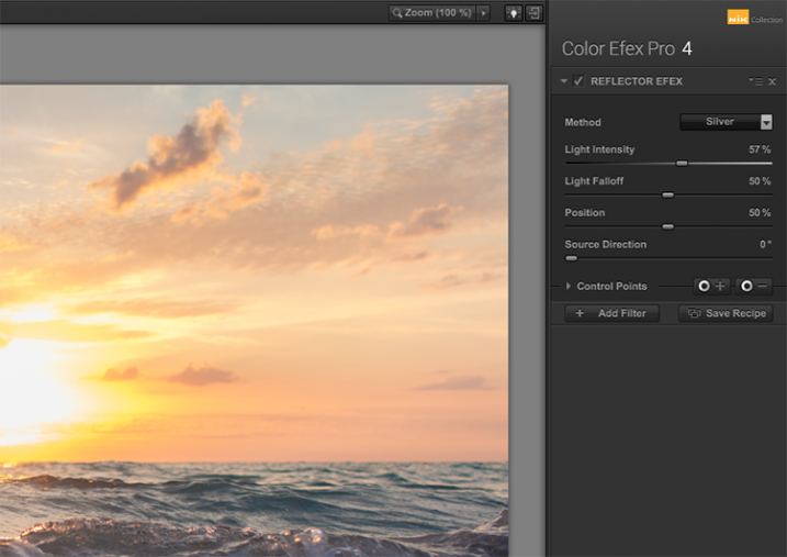
    The Reflector Efex filter takes that concept and turns it up to 11, by simulating a silver or gold reflector’s use within your image, and allowing you to modify it in a number of ways to illuminate the photo exactly as you envision it.

    First, you select a Method, which is effectively picking which color of reflector to use; gold, soft gold, or silver. You’ll then use the Intensity slider to select how much light will be bounced onto the image. This is equivalent to adjusting power output of a studio light, or the harshness of sunlight in an outdoor situation.
    Nik color efex pro

    The Light Falloff and Position sliders allow you to adjust how softly or sharply the effect of the bounced light trails off, as well as the position of this falloff. Finally, the Source Direction adjustment lets you change the position of the reflector; if you need light directed to your subject’s left side, you would position the Source Direction between 270° and 360°, which is the bottom, to bottom right corner of the frame.

    Conclusion

    We don’t know what the future holds for the Nik collection, as a price reduction to zero doesn’t bode well for continued enhancements or updates of any kind. But, for users of the software this may not matter, as it is already an integral part of many photographer’s toolkits, amateurs and professionals alike. The entire collection is of incredible value. But, Color Efect Pro 4 in particular, features these, and many more tools that can be incorporated into your everyday photographic workflow from Lightroom or Photoshop, and give your images a competitive edge!

    What about you? Do you already use Google’s Nik Collection? If not, will you try it now after it has been changed to a free product? Are there other filters within the collection you find just as useful for your own workflow? Sound off below please, ladies and gents!

    googletag.cmd.push(function() {
    tablet_slots.push( googletag.defineSlot( “/1005424/_dPSv4_tab-all-article-bottom_(300×250)”, [300, 250], “pb-ad-78623” ).addService( googletag.pubads() ) ); } );

    googletag.cmd.push(function() {
    mobile_slots.push( googletag.defineSlot( “/1005424/_dPSv4_mob-all-article-bottom_(300×250)”, [300, 250], “pb-ad-78158” ).addService( googletag.pubads() ) ); } );

    The post The 5 Best Google Nik Color Efex Pro 4 Filters and How They Can Amplify Your Images by Tim Gilbreath appeared first on Digital Photography School.


    Digital Photography School

  • Weekly Photography Challenge – Signs

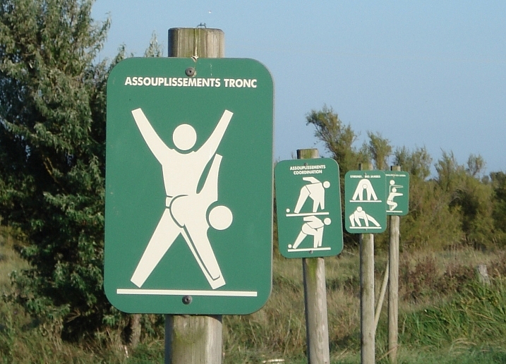
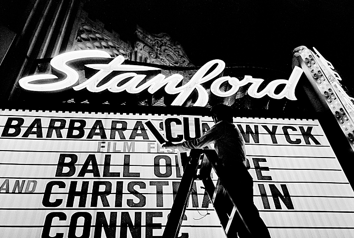
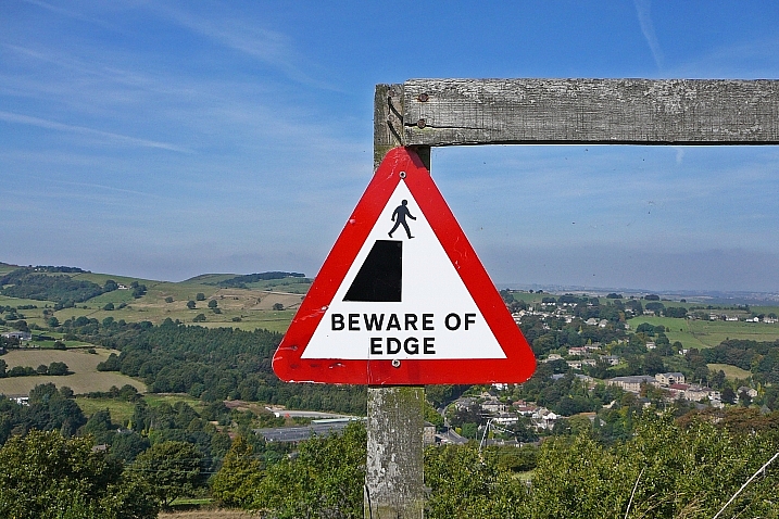
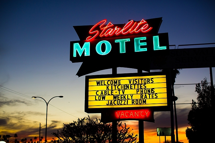
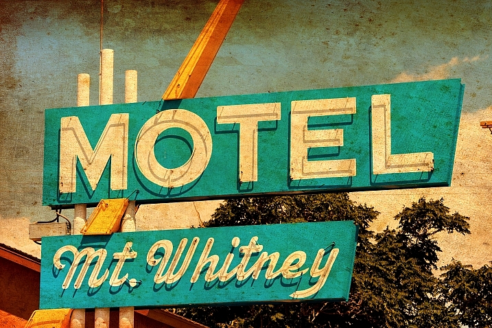
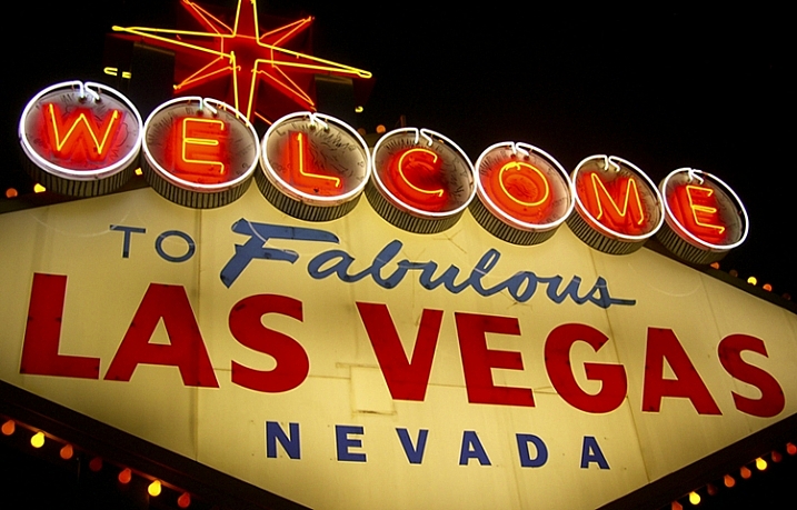
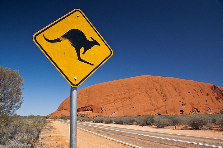
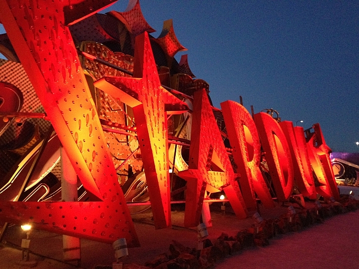
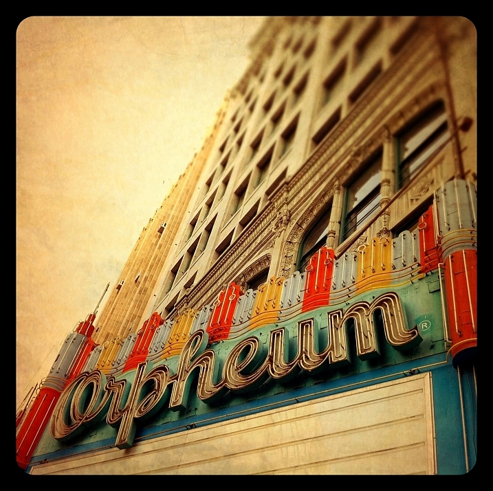
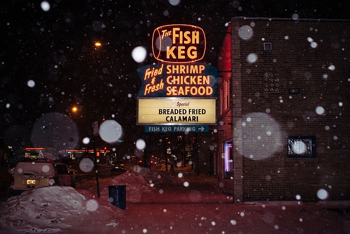
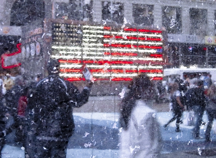
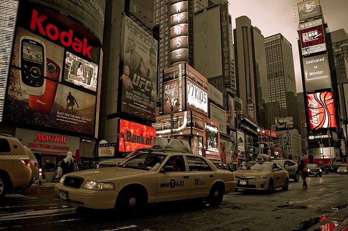
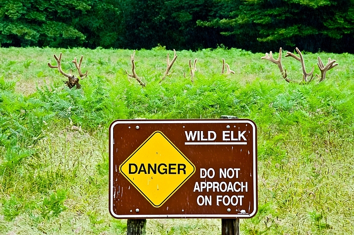
    You only have to walk down the street to be bombarded with signs, advertising, street markers, building and business names and more. See some here: Sign of the Times – 27 Significant Images of Signage

    Natasha Wheatland

    By Natasha Wheatland

    Natasha Wheatland

    By Natasha Wheatland

    Weekly Photography Challenge – Signs

    So it’s time to take a walk and see what signs you can find. Maybe do some street photography!

    Remember all the principals of good photography still apply: good lighting, good composition, a center of interest, sharpness, etc.

    Elisa Greco

    By elisa greco

    Meena Kadri

    By Meena Kadri

    ACME

    By ACME

    Share your images below:

    Simply upload your shot into the comment field (look for the little camera icon in the Disqus comments section) and they’ll get embedded for us all to see or if you’d prefer upload them to your favourite photo sharing site and leave the link to them. Show me your best images in this week’s challenge. Sometimes it takes a while for an image to appear so be patient and try not to post the same image twice.

    googletag.cmd.push(function() {
    tablet_slots.push( googletag.defineSlot( “/1005424/_dPSv4_tab-all-article-bottom_(300×250)”, [300, 250], “pb-ad-78623” ).addService( googletag.pubads() ) ); } );

    googletag.cmd.push(function() {
    mobile_slots.push( googletag.defineSlot( “/1005424/_dPSv4_mob-all-article-bottom_(300×250)”, [300, 250], “pb-ad-78158” ).addService( googletag.pubads() ) ); } );

    The post Weekly Photography Challenge – Signs by Darlene Hildebrandt appeared first on Digital Photography School.


    Digital Photography School

  • Sign of the Times – 27 Significant Images of Signage

    Images of signs can help date a photograph and give viewers clues about the location, culture, even the period of history. Street photography often incorporates signage.

    What other ways can we use signs? Literal or more subtle? Let’s see how these photographers use signs:

    Andrea Koerner

    By Andrea Koerner

    Scott Smith

    By Scott Smith

    Vicki  DeLoach

    By Vicki DeLoach

    Bob Jagendorf

    By Bob Jagendorf

    These * Are * My * Photons

    By These * Are * My * Photons

    Darlene Hildebrandt

    By Darlene Hildebrandt

    Howard Ignatius

    By Howard Ignatius

    Sancho McCann

    By Sancho McCann

    Carol Von Canon

    By Carol Von Canon

    Pete Zarria

    By Pete Zarria

    Hernan Seoane

    By Hernan Seoane

    Mark Nye

    By Mark Nye

    Tim Green

    By Tim Green

    Thomas Hawk

    By Thomas Hawk

    Thomas Hawk

    By Thomas Hawk

    Brent Disney

    By Brent Disney

    Bluedeviation

    By bluedeviation

    Yiannis Chatzitheodorou

    By Yiannis Chatzitheodorou

    Steve Parkinson

    By Steve Parkinson

    Wendy Berry

    By Wendy Berry

    TJ Gehling

    By TJ Gehling

    Gilda

    By Gilda

    Jeremy Brooks

    By Jeremy Brooks

    Davidag

    By Davidag

    Jeremy Brooks

    By Jeremy Brooks

    Chuddlesworth

    By chuddlesworth

    A McLin

    By A McLin

    googletag.cmd.push(function() {
    tablet_slots.push( googletag.defineSlot( “/1005424/_dPSv4_tab-all-article-bottom_(300×250)”, [300, 250], “pb-ad-78623” ).addService( googletag.pubads() ) ); } );

    googletag.cmd.push(function() {
    mobile_slots.push( googletag.defineSlot( “/1005424/_dPSv4_mob-all-article-bottom_(300×250)”, [300, 250], “pb-ad-78158” ).addService( googletag.pubads() ) ); } );

    The post Sign of the Times – 27 Significant Images of Signage by Darlene Hildebrandt appeared first on Digital Photography School.


    Digital Photography School

  • The Good, The Bad, and the Ugly of Watermarks and When and How to Use Them Effectively

    When going out and photographing you put your heart and soul in to capturing that special moment, and later, you may pay great care and attention to finishing the image off in post-processing. You are so proud of the results you simply cannot wait to share it online, or add to your portfolio on your website!

    One of the most popular practices amongst many photographers is the humble watermark; an opaque logo or text layered on top of an image. But is watermarking really necessary to protect your images – and is it really beneficial, or does it just get in the way?

    Image 3

    For the benefit, if are unfamiliar with what a watermark is, it is placing a logo or text  (or a combination of the two) with a reduced opacity over the main image. So why watermark in the first place?

    Don’t know how to make a watermark? Check out: How to Watermarking Images With Photoshop and Lightroom.

    What do watermarks do?

    Watermarks prevent, or reduce the chance, of your images being stolen or used without your permission.

    You’ve worked very hard – from capturing the image to editing it, and the last thing you want is for somebody to use your image without your permission; especially if it’s for the their financial gain. You would also like to have control over who uses your image. Many people believe that by adding a watermark to their images it will stop people, or at the very least deter them, from using their images without permission.

    However, there is no real proof that a watermark does indeed reduce this from happening at all. It’s now all too easy to crop a watermark out of an image, or for the more savvy, clone it out altogether. Some thieves may not even bother with any of that; they may just simply take the image, with or without a watermark, and use it. The truth that is once your images are online, you cannot stop your images from being used without your permission – watermark or no watermark.

     A watermark on your work looks professional

    This is a yes, and no answer. A good watermark can, in a very loose sense, look professional. However, the vast majority of watermarks – at least the ones I’ve seen – bring the level of professionalism right down. They are either simply too big, too distracting, have too much going on, or are poorly designed. They can even be a mix of all those things. A bad watermark can quickly degrade even the best image.

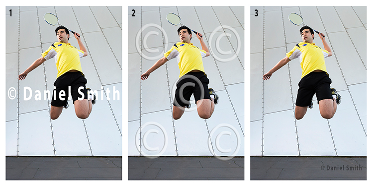
    If you’ve decided that you still wish to watermark your work, here’s a quick example of bad, and good watermarks.

    Watermarks

    Example 1 (above left)

    The watermark in the first example here has no reduced opacity, and is also straight across the middle of the image. By having it in that position, it is obstructing the view of the subject. In addition, it is also far too large. This would count as a bad example of a watermark.

    Example 2 (above middle)

    In this example, the opacity of the watermark has been reduced, which helps the image behind show through more than the first example. However, the watermark covers the entire image. The design is also quite generic which is okay for a stock website, where the images might be sold. But for a personal watermark, it looks too plain.

    Example 3 (above right)

    This is how a watermark should look; it’s small and discrete. It won’t stop people from stealing the image as it could easily be cloned out. However, if you wanted to try and prevent theft, this watermark could be placed closer to the main subject.

    Generally, a watermark should:

    • Be small and monochromatic – or have very little color. Large, colored watermarks, detract from the image as they can compete with the subject too much.
    • Be placed in a descreet area of the image that does not interfere with the view of the image, but will make it more difficult to remove or clone out.
    • Have limited text
    • If the watermark is small, then having text will be all but near impossible to read

    When and where to watermark

    Watermarks can have their place on images. Although, they should not be on every image that you post online. Social media platforms, such as Facebook and Pinterest for example, could benefit with a subtle watermark on your images. In this case, if other users do share your photo, you can at least get a little exposure, provided they do not crop the watermark out.

    Another instance where a watermark could be of benefit, is when you are showing images to someone as proofs or previews; perhaps after a wedding, or a model photoshoot for example. In those cases, the watermark could say SAMPLE or PROOF; something to make it known that those images are not the final product. In this scenario, the watermark is not intended to stop the unauthorized use of the images – rather it is there to make it known that, if these images are used, they are not the final product.

    On the other hand, if you have a website that you use to show off your work, or even to potential clients as a portfolio, watermarking your images will not be of great benefit, as they generally do not look that professional.

    Image 1

    Conclusion

    I am of the opinion that watermarks are used all too often nowadays, by photographers who want to get their name out there and prevent the theft or unauthorized use of their work, which is perfectly understandable. However, I believe that in most cases, a watermark does not add any significant purpose to your work. A watermark does not stop anyone from stealing your image, nor can it guarantee that your name will gain greater exposure if your images are shared. Rather, watermarks only degrade the quality of your work as they are most often not designed correctly, and are an obstruction to your image.

    The only way that you can guarantee that your work will not be stolen, or used without your permission at all, is to never post or upload your images anywhere on the internet.

    I enjoy sharing my work on the internet. But likewise, I like to share work that people can enjoy without the degrading distraction that a watermark provides. What are your thoughts? Do you use watermarks? Please share your thoughts and opinions in the comments below.

    Image 2

    googletag.cmd.push(function() {
    tablet_slots.push( googletag.defineSlot( “/1005424/_dPSv4_tab-all-article-bottom_(300×250)”, [300, 250], “pb-ad-78623” ).addService( googletag.pubads() ) ); } );

    googletag.cmd.push(function() {
    mobile_slots.push( googletag.defineSlot( “/1005424/_dPSv4_mob-all-article-bottom_(300×250)”, [300, 250], “pb-ad-78158” ).addService( googletag.pubads() ) ); } );

    The post The Good, The Bad, and the Ugly of Watermarks and When and How to Use Them Effectively by Daniel Smith appeared first on Digital Photography School.

    Digital Photography School

  • 8 Quick Tips to Improve Your Photos of Architectural Details

    When you’re photographing architecture, it’s easy to get lost in the grandeur of some buildings. That’s not a bad thing. That’s how they were designed, to be a spectacle. Cathedrals, palaces, opera houses, and state buildings are all examples of architecture that’s meant to impress.

    That’s the bigger picture. In terms of photography, however, it can be better to pull away from the grand, and look for opportunities in the details. All buildings and structures are sums of smaller parts, and it’s these parts that can often lead to visually interesting photos. Photographing these details comes with its own set of considerations. This article will point out a few things to look out for while you are out and about looking for the smaller picture, and 8 tip on how to improve your photos of architectural details.

    #1 – Low contrast lighting

    If the weather is poor and the sky is a drab, colorless grey, it may seem like a less than worthwhile opportunity for photography. That may be the case for some subjects, however, overcast days provide incredibly soft light that is quite suited for architectural details. This softness allows you to capture subjects with a lot of fine detail, that would normally be lost in the contrast.

    8-tips-architectural-details-2448

    Overcast days will help to bring out details that would have been lost in contrast.

    Likewise, keep an eye out for photo opportunities in areas of shade. You may need a tripod to take advantage here, but the extra effort is worth it.

    8-tips-architectural-details-1927

    Photographing subjects in the shade provides soft, even lighting.

    #2 – Side lighting

    For bold images, look for scenes with strong light coming from the side. This type of lighting will increase contrast, especially in texture, and it will help to emphasize the shape of your subject.

    8-tips-architectural-details-9763

    Side lighting helps to emphasise texture and shape.

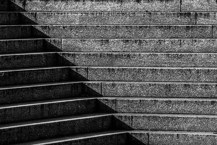
    #3 – Patterns in light and shadow

    Pay close attention to how light falls on various subjects. When you’re photographing details, shadows and highlights can, themselves, become an important compositional element.

    8-tips-architectural-details-9709

    Shadows and highlight can become graphic elements in their own right.

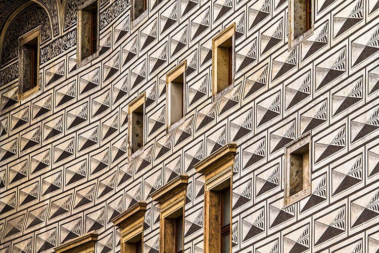
    #4 – Patterns

    8-tips-architectural-details-1864

    Repeating patterns can make for bold imagery.

    To me, the best part of photographing architectural details is the wealth of compositional possibilities. Man-made structures are full of patterns and shapes that can be exploited for photos. Take advantage of them by filling the frame for an abstract feel.

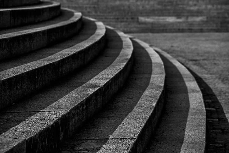
    8-tips-architectural-details-9717

    The curve in these stairs made for natural leading lines.

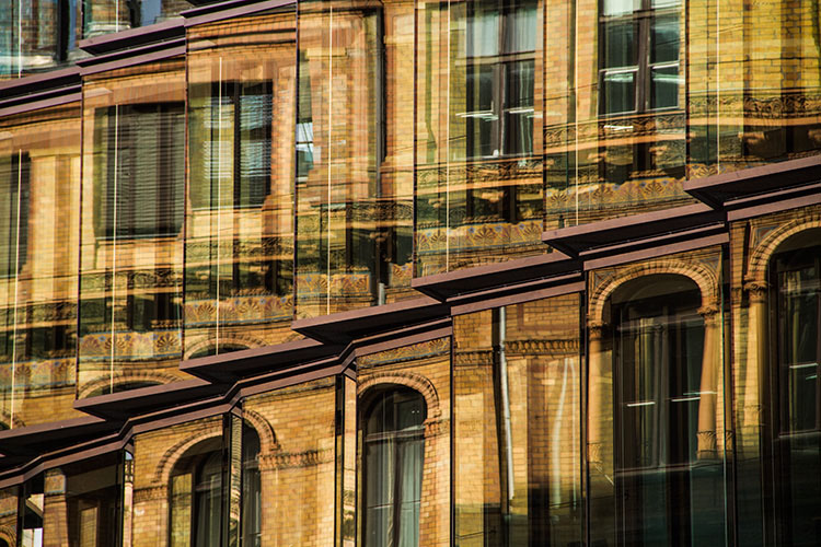
    #5 – Reflections

    For all of the wonderful architecture in the world, there’s at least as many drab and ugly buildings that appear to have little to offer photographers. They often do have something worth captuing, but it takes work to figure it out. One way to add interest to these subjects is to look for reflections. Reflections can add visual interest and color, to an otherwise lifeless and boring subject.

    8-tips-architectural-details-9752

    Reflections can add a boost to an otherwise lifeless scene.

    #6 – Fixtures

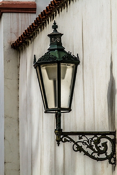
    It’s not always about the buildings, and only the buildings. Fixtures can often be overlooked, yet they can prove to be as compelling a subject as the architecture. When you’re considering a location, do look out for interesting fixtures like signs, light fittings, and security cameras.

    8-tips-architectural-details-1903

    Keep an eye out for interesting fixtures that other may overlook.

    #7 – Statuary and monuments

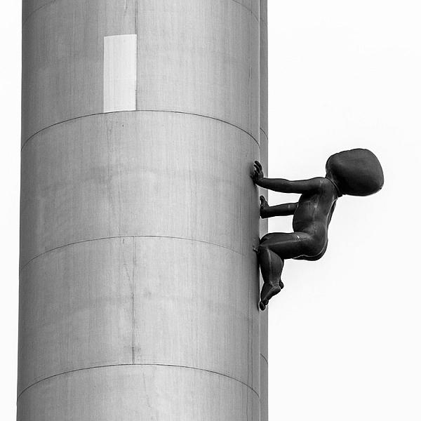
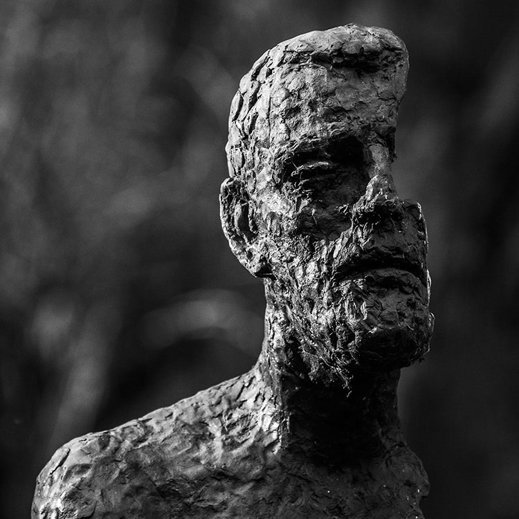
    When you think of architecture, statues are probably the last thing on your mind. However, they are a key element to a lot of buildings and monuments. For example, the Charles Bridge in Prague has 30 large, and very detailed, statues that beg to be photographed.

    8-tips-architectural-details-2250

    Statues are a common architectural features. Don’t neglect them with your camera.

    8-tips-architectural-details-2470

    #8 – Black and white

    This last tip is for when you’re back at home. If your images are full of texture or strong patterns, consider a black and conversion. Stripping the color element out of those images will help to emphasize your compositional elements, and can lead to much stronger photos.

    8-tips-architectural-details-2595

    Black and white processing can help to emphasise texture in a scene.

    Experiment

    These tips are hardly exhaustive, and only scratch the surface of the possibilities available to you when photographing architectural details. If there’s something man-made, there’s a photograph to be had somewhere. Just keep going until you find it.

    Do you have a tip of your own? Please share it below!

    googletag.cmd.push(function() {
    tablet_slots.push( googletag.defineSlot( “/1005424/_dPSv4_tab-all-article-bottom_(300×250)”, [300, 250], “pb-ad-78623” ).addService( googletag.pubads() ) ); } );

    googletag.cmd.push(function() {
    mobile_slots.push( googletag.defineSlot( “/1005424/_dPSv4_mob-all-article-bottom_(300×250)”, [300, 250], “pb-ad-78158” ).addService( googletag.pubads() ) ); } );

    The post 8 Quick Tips to Improve Your Photos of Architectural Details by John McIntire appeared first on Digital Photography School.

    Digital Photography School

  • Which Filters Should You Use for Landscape Photography

    Which filter should you use – if any – for Landscape Photography? It’s a question we hear all the time and one we’ve written about in our archives (we’ll link to some of our posts below) but today we came across this short video from Joshua Cripps where he tackles the question and shows some shots of images taken with the filters – to show what impact they have.

    Find more from Joshua at his site here.

    Further Reading on How to Use Filters in Your Landscape Photography

    • How to do Dreamy Landscape Photography with a Neutral Density Filter
    • Beginner’s Guide to Buying Filters
    • Polarizing and Neutral Density Filters: Essentials for Landscape Photography
    • Using Graduated Neutral Density filters for Landscape Photography
    • How to Use a 10 Stop Neutral Density Filter to add Drama to the Sky

    Check out our Brand New Landscape Lightroom Presets

    NewImage

    googletag.cmd.push(function() {
    tablet_slots.push( googletag.defineSlot( “/1005424/_dPSv4_tab-all-article-bottom_(300×250)”, [300, 250], “pb-ad-78623” ).addService( googletag.pubads() ) ); } );

    googletag.cmd.push(function() {
    mobile_slots.push( googletag.defineSlot( “/1005424/_dPSv4_mob-all-article-bottom_(300×250)”, [300, 250], “pb-ad-78158” ).addService( googletag.pubads() ) ); } );

    The post Which Filters Should You Use for Landscape Photography by Darren Rowse appeared first on Digital Photography School.

    Digital Photography School

  • How Making Horrible Photos Will Lead to More Keepers

    I make a lot of really, really, horrible photos. It’s an odd thing to say isn’t it? But I do. Thousands of them every year, and that is totally okay with me.

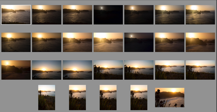
    I know that most (even all) of those really terrible, poorly composed, exposed, or focused shots, are just practice. They are practice for the next image, and the next, and the next, each building until I find that one keeper in a long string of wasted pixels, and more keepers overall at the end of the day.

    As I scrolled through my Lightroom catalog looking for images to accompany this piece, I found in my unedited photos many near-lookalikes. As I edit, I scroll through them one at time. Some get deleted right away because they are soft (out of focus), or the exposure is too far off the mark. Others get deleted because the composition was clearly wrong, unbalanced, or awkward. I often wonder, “What was I thinking?”

    Chiloesketch

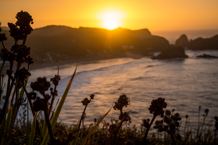
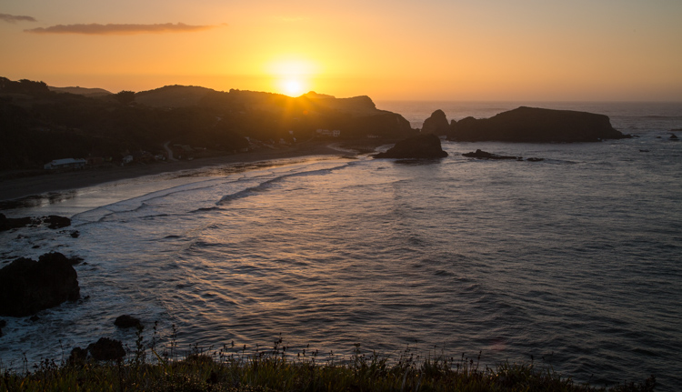
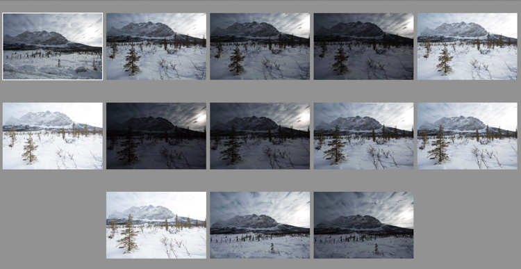
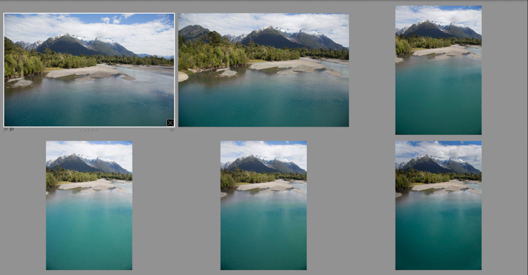
    Sometimes, it takes a lot of shots to find the one you are looking for. I was shooting the sunset on Chiloe Island, Chile, and eventually I found two that made the final cut (below).

    Chile-Chiloe-Pinihuil-103085-57

    Chile-Chiloe-Pinihuil-103085-61

    Most of the time the answer to that question, is that I wasn’t thinking at all. I had found a subject that intrigued me, and I started making photos, and thought had not yet worked its way into the equation. Scroll a few images further into the series, and things start to come together. The distracting elements, one at a time, disappear from the image. The exposure and focus are corrected, and by the time the last shot in the series appears, it’s technically decent, and maybe even a good photograph.

    aerial sketch

    AK-KatmaiCoast-AW-1075-660

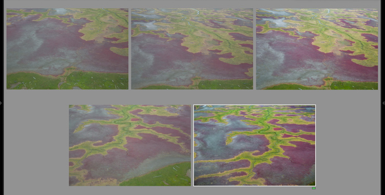
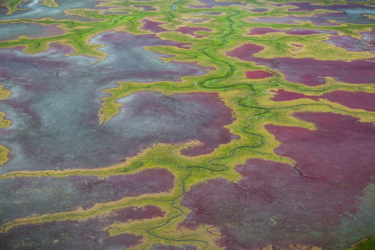
    Shooting out of the window of a small airplane flying low over the coastal mudflats of Cook Inlet, Alaska made exploring a single view difficult. But as I shot the first few images, I got a sense for what I was looking for, and when it appeared a few moments later in my viewfinder, I was ready for it.

    Those first shots are sketches, and they happen when my mind is still at play, too immature to recognize the scene for what it should be. Eventually, as I settle into the moment, the scene evolves and matures, as I begin to recognize what should and should not belong in the image.

    The Freedom of Digital

    With digital cameras, there is no harm in playing with a scene this way. Pixels are free, and we can shoot and shoot until our fingers are sore, or we get the right photo. When I’m shooting film however, (which believe it or not, I still do occasionally), there is no such luxury. Every time I release the shutter it’s a few bucks in film, processing, and scanning fees. If I shot with my film camera the way I do with digital, I’d be broke inside of a month.

    brookswintersketch

    AK-Wiseman-Sukukpak-104025-23

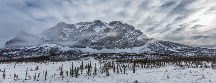
    This contrasty Brooks Range scene, made finding both the proper exposure and composition a challenge. Many images later, I settled on this one. I still think I could have done better.

    Instead, when shooting film, I’m forced to make those sketch images in my head, and in my viewfinder. I adjust tripod heights, I inch forward and backward, I focus and refocus, and I watch my light meter like a hawk. Then, once I’m sure I’ve got what I need, I click the shutter, and cross my fingers that I’ve got it right.

    antlersketch

    AK-ANWR-Kongakut-108094-1065

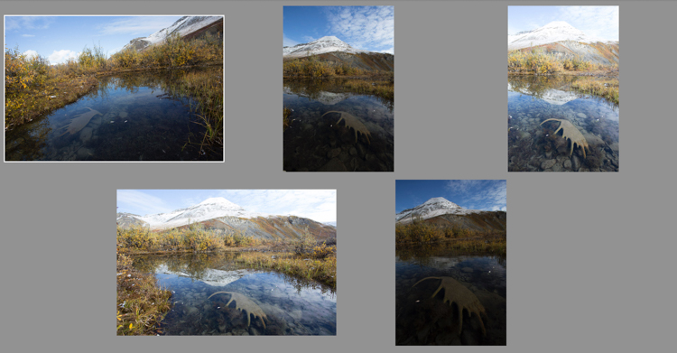
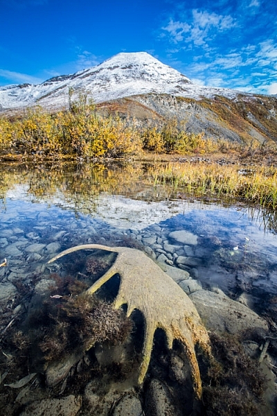
    Above are just a small number of the preliminary images this final shot required. At one point I even hiked off from the scene, thinking that I’d captured it. When I realized 10 minutes later that it could still be improved, I ran back, found the spot again, and made the image I should have made the first time around. My clients were less than pleased. (Arctic National Wildlife Refuge, Alaska).

    Whether you make the sketch images as a digital file, or as a mental one, the result is the same. Those preliminary frames, are just that, preparatory. Embrace them, but most importantly don’t stop at the first, or second, or even third shot. Keep exploring your subject, and you may find something you weren’t expecting.

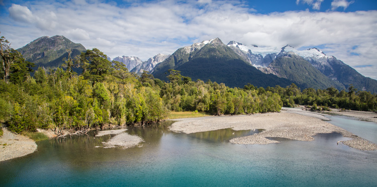
    Patagoniasketch

    Chile-Patagonia-landscape-103125-7

    I often find myself playing with both vertical and horizontal compositions as I sketch my way to a final composition. In this case, a horizontal one. (Chilean Patagonia).

    Exploring

    A few years ago, I was approaching the end of a ten day wilderness canoe trip in Gates of the Arctic National Park in the Brooks Range of northern Alaska. I was guiding, and so I was mostly concerned about keeping my clients safe, warm, well fed, and helping them make their own photos. My photography took a back seat. But after dinner, as my clients were heading off to their own tents on the tundra, I would often wander off with my camera and tripod. On that evening, as the trip was coming to its end, I ambled up the gravel bar away from camp. It was mid-August, and for the first time in months, the sun, for an hour or two each night, was actually dropping below the mountains that surrounded us.

    The river flowed past in a gentle riffle, washing over the stones with a shushing sound, that hushed my thoughts as quickly as librarian with a finger to her lips. As the sun made its long low dive toward the mountains, the light grew sweeter, illuminating the tundra and mountains in light so beautiful I could hardly bear to look at it.

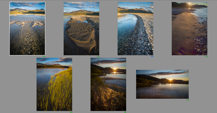
    noataksketches

    Though several of the images I made as the evening progressed are good, they more importantly allowed me to get comfortable with, and involved in the changing scenery.

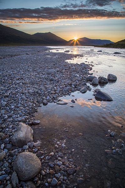
    Slowly, and it took a long time, I started making images. For a while, I let my myself play with the landscape, making photos here and there, pointing this way and that. I made images of a tributary river flowing over the rocks, the winding cut gravel banks, bear tracks, and sedges growing along quiet shores. Some of those images are decent, even good, but they were still leading me somewhere. Eventually I found myself by the main stem of the river when the sun was about to disappear behind the silhouetted mountains. There, after an hour or more of play, I found the image that I had ventured away from camp to make.

    AK-GAAR-Alatna-Noatak-1083-890

    Be There-There

    I got it right, because I was there-there. I wasn’t just existing with a camera in my hand, worried about f-stops and ISOs. I was present, because all those previous images over the past hours allowed me to put aside the technical worries, and permitted me to focus on the scene at hand – the way it felt, the way the breeze moved the surface of a quiet backwater, the sound of the water hushing over stone, and the way the river’s edge wandered away toward the setting sun.

    All those sketch images not only gave me permission to focus on the scene the way it needed to be, they gave me access to the moment when I needed it.

    As you can see, perfecting exposure and focus is just one part of what it means to work through your practice photos. These preliminary images allow your mind to get away from all that other stuff, and concentrate on what matters. Like me, you’ll end up with lot of really horrible photos, but occasionally, they will lead up to something meaningful. 

    googletag.cmd.push(function() {
    tablet_slots.push( googletag.defineSlot( “/1005424/_dPSv4_tab-all-article-bottom_(300×250)”, [300, 250], “pb-ad-78623” ).addService( googletag.pubads() ) ); } );

    googletag.cmd.push(function() {
    mobile_slots.push( googletag.defineSlot( “/1005424/_dPSv4_mob-all-article-bottom_(300×250)”, [300, 250], “pb-ad-78158” ).addService( googletag.pubads() ) ); } );

    The post How Making Horrible Photos Will Lead to More Keepers by David Shaw appeared first on Digital Photography School.

    Digital Photography School

  • How to Create Catch Lights in Your Natural Light Portraits

    What is a catch light, and why you should have it in your portraits?

    A very popular technique in portraiture – a catch light is a spark of light in your subject’s eyes. This spark will help you to draw your viewer’s attention to your subject’s eyes, making them full of life and, well, sparkling.

    04
    For this portrait, I made recently in Cienfuegos, Cuba, I used the light from the setting sun to create a catch light, even without having the subject looking up.

    How to create a catch light in portraits?

    To create a catch light, all you need is a source of bright light to reflect in your subject’s eyes. This source can be artificial, like a flash, or natural, like sunlight. In this article, I will focus on creating catch light in portraits using natural light.

    Creating a catch light – indoor

    To create a catch light in an indoor location, all you need to do is to make sure there is a visible source of light, which will be reflected in your subject’s eyes.

    Position your subject near an open window or door, during daylight, and make sure there is a direct line between the source of light and the subject, without blocking objects like furniture. Your subject does not have to look directly into the source, as it might be too dazzling or uncomfortable. The important thing is that the light source must be visible as a reflection in the subject’s eyes.

    01

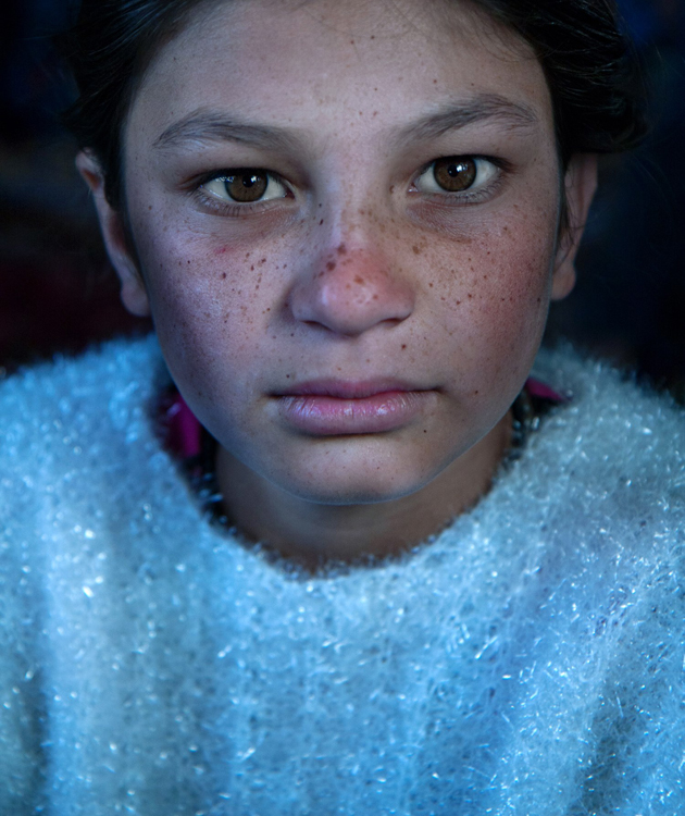
    I met the lovely Nagina at her home in a small village of Roma people, outside Bukhara, Uzbekistan. Although she was only 10; she was very busy caring for her small brothers, along with few other neighbors’ children. She asked me to take her photo, and I was drawn to her gaze right away, choosing to go for a close-up portrait. The house was completely dark, except a large window, which was position at a 45-degree angle to her face, which created that catch light in her eyes.

    Good to know: The closer your subject is to the light source (open window or door) the larger and more dominant the spark of catch light will seem.

    Taking it to the next level: Think carefully about the location of your subject to the light source, as that will not only affect the size and visibility of the catchlight in the subject’s eyes, it will also control the entire Illumination of the subject’s face. To read more about how the direction of light will affect your portrait, check out: Understanding Natural Light Part 3: Direction of Light.

    Creating a catch light – outdoors

    For achieving the best results in an outdoor shooting, all you need to do is aim your subject to look at the largest light source – the sky. DO NOT instruct the subject to gaze at the sun, even for a brief moment, as it can lead to pain and damage to his or her eyes.

    If you do not want to stage your subject, or if there is a language barrier, a great technique of aiming your subject’s gaze up, is by simply positioning yourself a bit above your subject. While they gaze it your lens, the sky (behind you) will reflect in their eyes. This is why I photograph many of my outdoor portraits at an angle, which is a bit higher than my subject.

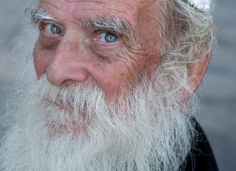
    Mordecai is Jewish Orthodox, from the old city of Jerusalem. I was very surprised that he agreed to be photographed, even with joy. To give a spark to those amazing eyes I told him to look into my lens, while I positioned myself slightly higher than him, and the lovely skies of holy Jerusalem were reflected in his eyes.

    02

    Good to know: On a sunny day, I recommend positioning your subject in the shade, as gazing at sunny skies might be uncomfortable.

    Taking it to the next level: If you want it or not, it is almost sure that apart from that spark of light, your own image (the photographer) will also be visible in the subject’s eyes. You can turn this fact into a creative portrait (of your subject) and a self-portrait (of yourself) in the same frame. Just do not forget to move the camera a bit, to let your face be visible. You can also use this technique for less narcissistic reasons, as with really tight close-up, as almost anything in front of your subject’s face will be reflected in his eyes. It is a wonderful technique for making a landscape shot, or an image of an iconic place, with a twist.

    Creating a catch light – while using a reflector

    Using reflectors in portrait photography is a wonderful technique (a more in-depth explanation about using reflectors in portrait photography, in this article: Reflectors: Your Secret Weapon for Amazing Portrait Photography), that can help you to create catch lights in almost any situation, indoor or outdoor, sunny or cloudy.

    Not only do reflectors allow you to create that spark of catch light almost anywhere; but they will allow you much more control, over the intensity, color, and direction of that spark.

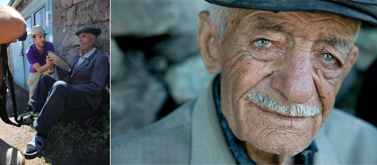
    A pocket size silver reflector was the best tool for the job for this portrait, photographed in a very hot afternoon in Armenia.

    03

    Good to know: Reflectors come in many sizes and colors. For the best results, use a small pocket-sized silver reflector. Why? Because you do not need anything larger or heavier. Those small reflectors are the perfect weapon of choice, for creating a catch light in close-up portraits. Position the reflector just under the chin of your subject. You can hold the reflector with your left hand, or ask the subject to hold it.

    Taking it to the next level: Although using a silver reflector will give you the most notable catch light, you can add warmth to the portrait by using a golden one, which will result in a golden catch light.

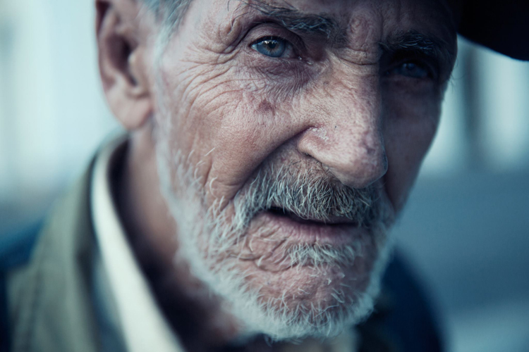
    A mix of shade, slightly higher camera angle, and gaze upward toward the sky, helped create the catch light in these portraits photographed in India and Israel.

    05

    See how the eyes are alive in their portraits? The catch lights help add the sparkle you see there, and without them the portraits wouldn’t feel as alive, vibrant.

    Now it’s your turn, show me your portraits with great catchlights. Please share in the comments below.

    googletag.cmd.push(function() {
    tablet_slots.push( googletag.defineSlot( “/1005424/_dPSv4_tab-all-article-bottom_(300×250)”, [300, 250], “pb-ad-78623” ).addService( googletag.pubads() ) ); } );

    googletag.cmd.push(function() {
    mobile_slots.push( googletag.defineSlot( “/1005424/_dPSv4_mob-all-article-bottom_(300×250)”, [300, 250], “pb-ad-78158” ).addService( googletag.pubads() ) ); } );

    The post How to Create Catch Lights in Your Natural Light Portraits by Oded Wagenstein appeared first on Digital Photography School.

    Digital Photography School

  • Using a Wide-angle Lens with Wildlife for a New Perspective

    With more and more budget telephoto lenses hitting the market, wildlife photography is becoming increasingly accessible. Consequently, you don’t have to look very far to see beautiful wildlife portraits, shot with a clean bokeh using a long lens. Close-ups like this definitely have their place, but this traditional form of wildlife photography is perhaps harder to achieve stand-out photos within nowadays.

    But who said you had to use a telephoto lens for captivating wildlife photos? In nature photography, wide-angle lenses are traditionally associated with landscape photography. But by using a wide-angle lens with wildlife, you can incorporate the environment, and habitat of a species, into your photo. This is will add an entirely new perspective to your images, and it’s a really enjoyable technique to play with.

    How Do You Do

    Equipment you’ll need

    While you can do wide-angle shots of wildlife using a camera trap system, I’m going to be looking at firing the shutter manually. So here are some pieces of equipment you’ll want to get hold of.

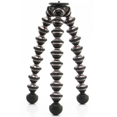
    Joby Gorillapod

    These three bendy tripods are extremely versatile, and allow you to position your camera in all sorts of places, whether that be wrapped around a tree, or precariously positioned on a rocky beach. This will help you to position your camera low to the ground, in the ideal position. Tripods rarely let you go to ground level, as they often have a neck or centre column. Plus, they’re very large when spread out to the ground. But make sure you buy the more heavy-duty of Joby’s offerings, as the cheaper versions will not cope with the weight of a DSLR.

    Joby

    Wireless release

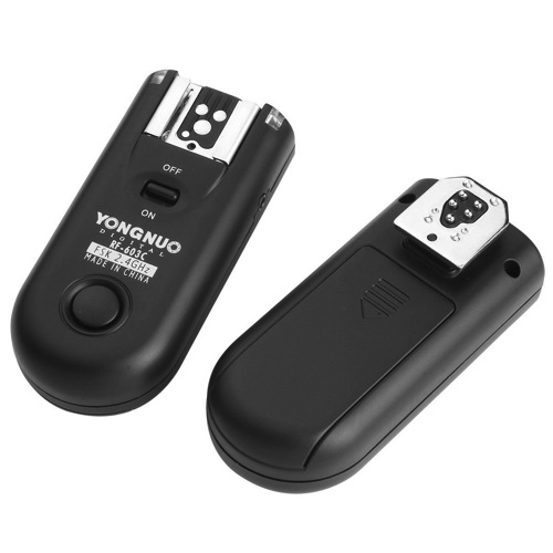
    You’ll definitely need some form of wireless trigger for your camera. You can’t press the shutter directly, as no animal will come near your camera if you’re sitting right behind it. Instead, get hold of some wireless releases from YongNuo. They are about $ 40 and work perfectly well. They are a radio based system, which do not require line of sight, and have they a range of up to 100 meters (supposedly).

    Yongnuo

    Setting up for the shot

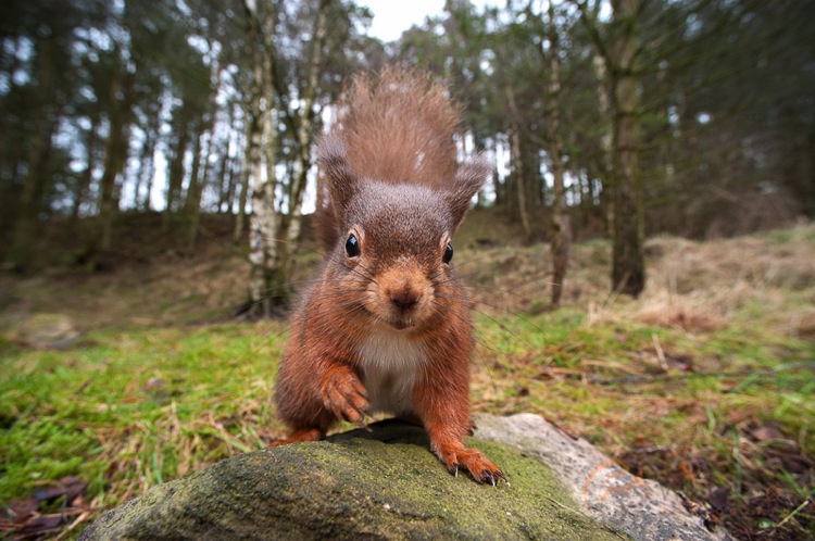
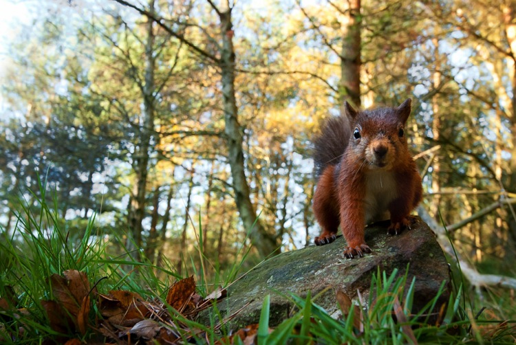
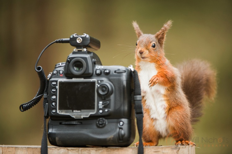
    You need to think about what you’re trying to convey in your photo. The best part about a wide-angle lens is the ability to include the habitat of your subject, so think about what are its key features. For me, red squirrels are a great subject for wide-angle photography. They live in British woodlands, so the obvious backdrop is a collection of trees.

    Remotesquirrel2

    Position the camera as low to the ground as possible; you want to make sure you are at or below eye-level of the animal. This really shifts the perspective of the shot. Remember that because you’re shooting wide (perhaps even as wide as 14mm), you’ll need to ensure your subject comes close enough to the lens, or it will appear too small.

    To do this, you can use some form of bait. I will stress right away that live baiting is seen as extremely unethical in wildlife photography, and I strongly suggest you do not take this approach in any form of wildlife photography. If your subject is a carnivore, then you can collect road kill or other already dead animals to use as bait. But for me, squirrels are omnivores and they are very happy with a few hazelnuts to bring them close to the camera.

    Remote High

    Put your camera into aperture priority mode. Make sure you have your exposure compensation set to expose the scene properly, and any changes in light should be adjusted for by the camera automatically. Set your focus manually, predicting where the animal will turn up, and make sure to switch the camera’s autofocus off (otherwise it will attempt to refocus when you fire the shutter).

    Now you can sit back and wait. Make sure you’re in range, but stay hidden. You can use a pop-up photography blind for this, and just be patient. Once an animal begins to approach, fire a test shot while it is still at a distance. This will help the animal get used to the sound of the shutter. For some animals a test shot won’t be appropriate, such as with birds that may fly away. If you’re lucky, your subject will realize that the camera means no harm, and happily sit and pose for your shot.

    Things to be aware of

    You should never put your photograph before the welfare of an animal. Period. There are no exceptions here, and to do otherwise is strongly condemned in the wildlife photography field. It therefore goes without saying that you should not perform this type of photography at the breeding site of an animal. If you shove a camera outside a bird’s nest, it will likely abandon it, and any chick in the nest will die. Disturbance like this never ends well.

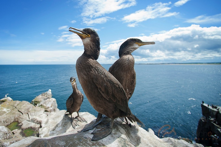
    Wide-angle photography handheld

    There are some situations where you can hand-hold your camera and take wide-angle shots of wildlife. This is often the case for seabirds which nest on islands and cliff tops. These usually reside in wildlife reserves, and it is the case in the UK that you can walk around these reserves. Consequently, the animals are used to people and are completely unafraid. It’s therefore possible to get close enough. As long as your subject doesn’t show any signs of stress, then you are probably okay to approach.

    Juvenile Shags

    In conclusion

    Wide-angle photography is great fun with wildlife. It feels just like Christmas, not knowing what you’re going to get until you go back and check the camera. Sometimes you’ll be bitterly disappointed at an out-of-focus image that had potential, but eventually you’ll come away with something you can be proud of.

    googletag.cmd.push(function() {
    tablet_slots.push( googletag.defineSlot( “/1005424/_dPSv4_tab-all-article-bottom_(300×250)”, [300, 250], “pb-ad-78623” ).addService( googletag.pubads() ) ); } );

    googletag.cmd.push(function() {
    mobile_slots.push( googletag.defineSlot( “/1005424/_dPSv4_mob-all-article-bottom_(300×250)”, [300, 250], “pb-ad-78158” ).addService( googletag.pubads() ) ); } );

    The post Using a Wide-angle Lens with Wildlife for a New Perspective by Will Nicholls appeared first on Digital Photography School.


    Digital Photography School

  • 5 Tips for Going from Pixels to Print Quality

    Whatever level of photographer, you are sure to have gathered a stockpile of pixels.

    It’s just the way it is nowadays. Whether you are the kind of person that clogs up their hard drive, gradually slowing your Mac or PC down until you are forced to do something about it. Or perhaps you are already super organized having kept negatives, CDs, DVDs, hard drives, a raid system or even the cloud?

    Indeed whatever storage method you choose you need to catalogue the files by name, event, and year, so you may retrieve without having a complete breakdown while searching for your favorite file. After all photography should be fun, not pain.

    Many photographers use Lightroom, which is a great program, not only for editing but also for organizing your ever-increasing pile of pixels. But then what? What do you do with them then? I think you would agree we all spend too much time in front of screens? So why would you keep your masterpieces locked away in digital format?

    To create that killer slideshow you will amaze your friends with is a lot of fun, especially if you have a large TV or digital projector. However, be careful of the content of your slideshow. Nothing worse than visiting a friend, only to be subjected to look through every snap taken on their holiday. Slideshows really should not be much more than ten minutes long or people generally loose interest. Keep them simple also, not too many whizzy effects, that just makes your viewer feel queasy!

    PIC 10 simonjohn co uk

    So you have this catalogue full of great images, what next? I would say enjoy them. Have your favorites printed and framed. Photography is personal, just like any other art form. By printing your special images, and hanging them in your home, you are not only enjoying the fruits of your labour, but also creating personalized wall art. This shows friends your talents, without the need for a longwinded slideshow.

    You may find as time goes by, the framed photographs mean more or less to you. This is quite natural as we grow, and our taste and habits change also. Not to worry, you can always replace them with fresh images. It’s not like the old days when the portrait your parents had remained in the given spot forevermore. In fact, it is refreshing to change your images from time to time. Just like wallpaper or any other interior design things, move on. Only when you can look back at a photograph you made perhaps 10, 20, or 30 years ago, and still love it, will you know it’s a keeper!

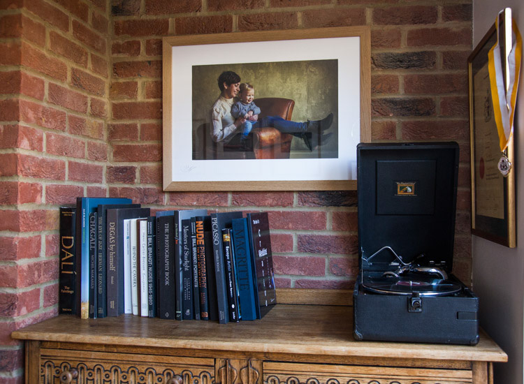
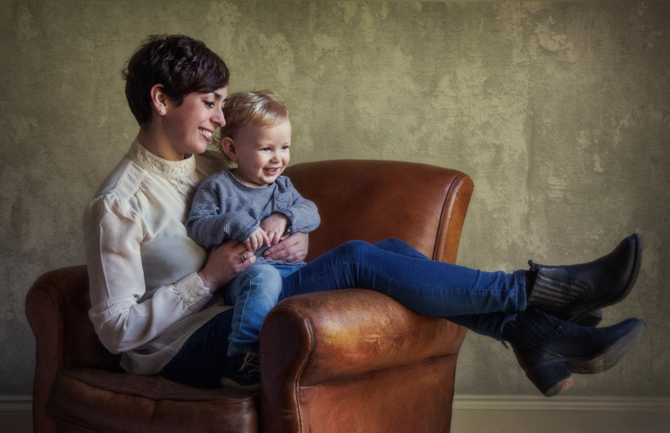
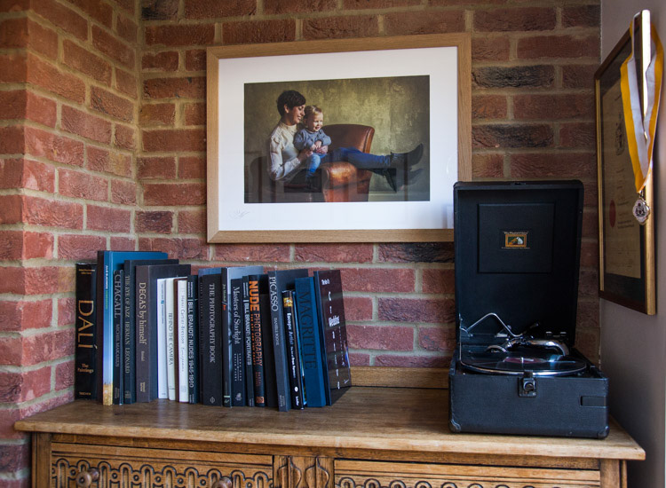
    My background is a portrait and wedding specialist. Lets take a look at an image from my portfolio. I will describe the process from capture through editing, and finally the framed piece for the wall (above).

    #1 – Get it right in-camera

    Pic 1 simonjohn co uk

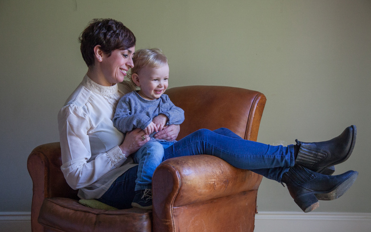
    As you can see the old chair, and soft natural light, was perfect for the basis of this portrait. I positioned the mother in the first third of the image, placing her legs over the arm of the chair for a more relaxed contemporary look. My directions to her were simply to get close, and look at your beautiful boy. All I had to do then was to get the toddler to look in the right direction, with the expression to fit. A squeaky toy often saves the day!

    The mother is in profile, while the toddler is in three quarter face, adding interest and different angles to the image. The lighting was a large window (not with hard sunlight) off to the right. I also placed a reflector just below the mum’s boots, to bring light back into the eyes and softly wrap around into the shadows. The exposure was 1/250th (freezing the toddler) with an aperture of f/5.6, using a 70mm focal length, as my back was pressed against the far wall of the room.

    So to summarize; I feel the expressions are captured well. The lighting is fitting, being soft and directional. The image has style, and is well balanced compositionally. But it just needs something more. The capture stage is so important to get right. Photoshop should not be regarded as a fixer. The great Ansel Adams talked about “printing virtuosity” and just because we now craft our images on a screen, as opposed to in the darkroom, quality and finishing are still paramount.
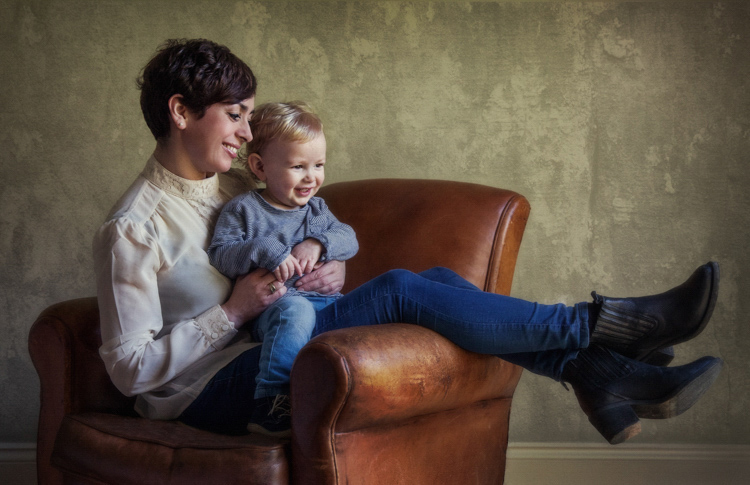
    So take a look at the edited image below.

    Pic 2 simonjohn co uk

    #2 Basic adjustments in Photoshop or Lightroom

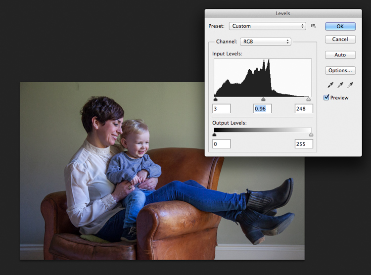
    Firstly, you will need to level the image in Photoshop, bringing the sliders in to just clip the histogram at both ends. This ensures depth in the blacks and good clean whites. The mid-tone is really your X factor, but just be aware that you have detail throughout all tones if that is the look you are after. Be careful if you make it too light, the image could appear milky. While if you make the mid-tones too dark the image could appear muddy.

    Screen Shot 2016-04-27 at 21.12.41-untitled

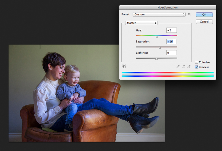
    Secondly, I have adjusted the Saturation and the hue of the image to achieve the color pallet I require. Often you can go between the levels and saturation, and make small tweaks as the image takes shape.

    Screen Shot 2016-04-27 at 21.13.20-untitled

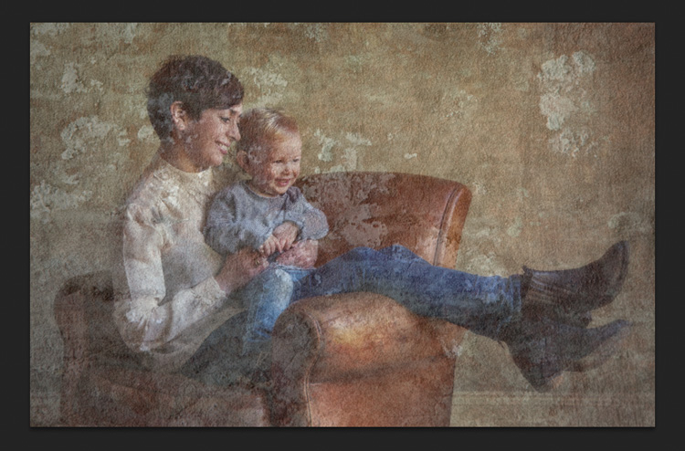
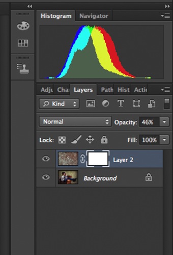
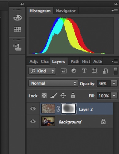
    #3 – Add a texture overlay (optional)

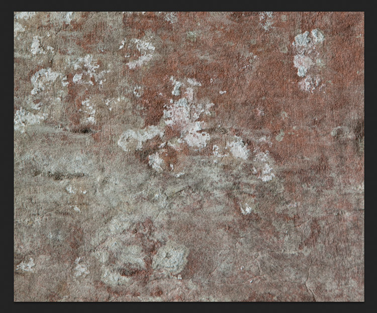
    Next you could do as I have here, added a texture overlay. I felt it complimented the chair in its shabby chic style. I photographed a piece of wall, then blended the two images using opacity in the layers pallet. I added a layer mask, then rubbed through with a soft brush to create the subtle look you see here. I then added a soft Gaussian blur from the PS filters, blending the two layers together.

    PIC 5 simonjohn co uk

    PIC 6 simonjohn co uk

    Pic 2-simonjohn.co.uk-untitled

    PIC 8 simonjohn co uk PIC 9 simonjohn co uk

    #4 – Local tone control

    Finally to complete my image I needed to Dodge and Burn. As you can see this really is a subtle finishing skill, and should not be left to a Photoshop filter. In a future article I will explain exactly how to dodge and burn your images like a professional, directing the eye of your viewer to the important parts of the image. But for now, let’s see the final piece as it was hung on my gallery wall.

    PIC 10 simonjohn co uk

    #5 – Print it

    I have printed the image on Fuji fine art 300mgs rough texture paper, which I love. The paper is not only excellent for color rendition but has a wonderful tooth to it, adding texture and depth. I have framed the portrait in a simple natural oak and white acid free mount. I have chosen clear glass. Although there is much talk about non-reflective glass, this simply flattens and dulls the image; I would not recommend it. The finished portrait compliments its surroundings, and fits well into the décor and given space.

    As I said at the start of the article, it’s important to display your favorite images rather than hide them away on a computer. I am happy to share with you, that I have done just that here. This is my girlfriend Yvonne and my son Miles.

    Some photographers prefer to print their own images. This can be a very good way of speeding up workflow and achieving exactly the right colors you require. In recent years printers have became smaller, and inks and paper more archival. I will perhaps invest this year simply for ease of use, and meeting clients deadlines. Perhaps one issue, according to friends who print their own, is you tend to have a fair amount of wastage profiling papers and inks. If you are not particularly a high volume, large output photographer, ink wells can get clogged up causing spattering of pigment. However I think both these problems are now almost eradicated as technology improves year after year.

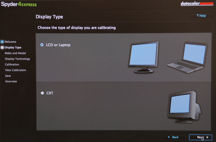
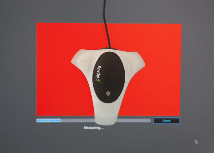
    If you choose, as many professional photographers do, to use a pro lab you have to close the color loop from the start. I use a Spyder 4, as seen in the screenshots below, and my lab use the Epson 9900 and 4900 for printing the Giclee fine art papers I require.


    2

    4
    It is attached via USB to your monitor, and simple to follow with onscreen instructions. Basically it brings the colors back in line within the colors space you use. Until recently most labs suggested sRGB, as the colors seen on your screen were pretty much what could be printed. The other often used space is Adobe 98, but not all printing machines can produce such subtleties in color. Progress moves on and there are machines that can print Adobe 98, but my advice for now would be stick with sRGB (ask your lab if you want to know which they use).

    Because you are working in a given color space the lab can set its own monitors accordingly, and with a skilled technician the loop should be closed. Sometimes you may find a print is slightly too dark or light. This may be due to the ambient light in yours or your printer’s room being marginally different. A good working relationship is what is needed when using a lab. When asked to reprint an image they should work with you, and offer tips and help if needed; its in everyone’s interest. I rarely have a print that is off, but if I do my lab simply reprints without charge.

    So how should you prepare your files? Follow this checklist below for ease of use:

    • Always shoot in raw. Much more detail recorded through highlight to shadow.
    • Save the raw file but create a working tiff.
    • Once you are happy with the finished tiff export as a jpg if sending to a lab.
    • Export or print always at 300dpi for best quality.
    • Check your prints against your monitor and if adjustments are needed, make sure you talk to your lab first.
    • Never compromise composition for print size, i.e. if your image looks better 10×5.5 rather than 10×8, make it that way and drop it on the nearest paper size available. Simply have a mat made to fit your masterpiece.

    Do not hang your finished prints in direct sunlight. Like anything that has natural fibers and dyes they will fade. Hung correctly, ink jet prints are now considered very stable, and a alternative to traditional lab chemistry for environmental reasons, but also better quality colors and increased tonal range.

    Please share photos of prints you make and hang up on your walls in the comments below. Ask any questions you may have about the process as well and I will try and help you out.

    googletag.cmd.push(function() {
    tablet_slots.push( googletag.defineSlot( “/1005424/_dPSv4_tab-all-article-bottom_(300×250)”, [300, 250], “pb-ad-78623” ).addService( googletag.pubads() ) ); } );

    googletag.cmd.push(function() {
    mobile_slots.push( googletag.defineSlot( “/1005424/_dPSv4_mob-all-article-bottom_(300×250)”, [300, 250], “pb-ad-78158” ).addService( googletag.pubads() ) ); } );

    The post 5 Tips for Going from Pixels to Print Quality by Simon John appeared first on Digital Photography School.

    Digital Photography School