Blog

  • Review of the Panasonic Lumix G Leica DG Vario-Elmar 100-400mm Lens

    In this review, I’ll discuss my experience testing out the Panasonic Lumix G Leica DG Vario-Elmar 100-400mm f4-6.3 IS lens. It is compatible with mirrorless four thirds camera systems.

    Downsizing

    Last winter, I adopted my first new camera system since I started shooting seriously two decades ago. I’ve used Canon cameras for my entire professional career, though I’m hardly a devout follower of the brand. I’ve shot Canon for the simple reason that I own Canon gear, am content with the quality, and switching to something new was just too much trouble.

    Panasonic Lumix G Leica DG Vario-Elmar 100-400mm f4-6.3 lens

    However, in my work as a wilderness photographer and guide, weight and size of my equipment are a big deal. Often, I’ve found myself leaving gear at home that I’d otherwise like to have, for the simple reason that there wasn’t space or the gear weighed too much. So, I started looking for a compact system that would provide the quality and flexibility I needed.

    I ended up with a Panasonic Lumix GX85 mirrorless body, as an experiment into the micro 4/3rds system. Without mincing words, I’ve been extremely impressed with this very compact, very light, and very capable little camera. In the months I’ve been using it, it has easily out-stripped my Canon DSLRs as my most-used camera.

    Panasonic Lumix G Leica DG Vario-Elmar 100-400mm f4-6.3 lens

    A flash of sunlight on the tundra of the Brooks Range. Panasonic-Leica 100-400, 187mm, f5.0, 1/250th.

    Looking for lenses

    With weight and size as a major consideration, I’ve started shopping for additional lenses, to see if there is anything available that would allow me to part with at least some of my Canon kit. Rather than spend a bunch of bucks, I’m trying things out via rental lenses. The first big telephoto I’ve tried is the Panasonic Lumix G Leica DG Vario-Elmar 100-400mm f4-6.3 lens.

    When mounted on a micro 4/3rds camera like the Lumix GX85, the 100-400mm lens has a full-frame equivalent of 200-800mm, which definitely appealed to my inner wildlife photographer.

    I recently spent about 10 days with this lens on a wilderness trip to the Arctic National Wildlife Refuge. This review is about how it functioned and the resulting image quality. I’ll leave the technical assessment of chromatic aberration, color fidelity, and variable sharpness in other, more capable, hands.

    First Impressions of the Panasonic 100-400mm lens

    Out of the box, the all metal construction of this lens struck me as sturdy, compact, sleek, and well-made. The rotating focus and zoom rings were smooth and precise and there was no grinding or slippage. The simple lock-out ring was easily adjusted to keep the zoom from slipping forward or back. No complaints.Panasonic Lumix G Leica DG Vario-Elmar 100-400mm f4-6.3 lens

    I promptly took it out of for a quick walk around my home here in Fairbanks, Alaska and made a few images of flowers, testing the focus and bokeh.

    Panasonic Lumix G Leica DG Vario-Elmar 100-400mm f4-6.3 lens

    This was the only image I made with the lens where it had a hard time auto-focusing. I suspect it was due to the relatively dark background and low-contrast subject. 400mm, f/6.3, 1/160th.

    Panasonic Lumix G Leica DG Vario-Elmar 100-400mm f4-6.3 lens

    The background bokeh retains some detail in this image at 400m, f/7.1, 1/2000th.

    Sharpness is surprisingly good even at 400mm (800mm equivalent) though I did find the autofocus in low-contrast situations to be a bit slow and imprecise. The image of the Delphinium (purple flower, above) took multiple attempts to grab focus, presumably due to the dark background.

    Panasonic Lumix G Leica DG Vario-Elmar 100-400mm f4-6.3 lens

    Cottongrass. Even at 400mm, the center piece of cotton is tack sharp. 400mm, f8, 1/2500th.

    The combination of the micro 4/3rds sensor (which as a 2x crop factor) and the f6.3 aperture (at 400mm) did extend the depth of field and reduced the clean bokeh I’m used to with my faster Canon 500mm f4. However, when the subject is set suitably away from the background this improves markedly.

    Into the Field

    Panasonic Lumix G Leica DG Vario-Elmar 100-400mm f4-6.3 lens

    Looking north from the mountain front toward the coastal plain of the Arctic National Wildlife Refuge. 100mm, f4.7, 1/2500th.

    The following morning, I boarded a small bush plane and flew from Fairbanks, over the arctic circle to the northern Brooks Range and coastal plain of the Arctic National Wildlife Refuge.

    Panasonic Lumix G Leica DG Vario-Elmar 100-400mm f4-6.3 lens

    I was impressed with the color and contrast detail using the lens. 137mm, f/8.0, 1/1600th.

    The long and short of that trip is that the weather sucked. Usual, y the Arctic Refuge is a dry place (it’s actually an Arctic desert) but not on this trip. My clients and I spent long hours holed up drinking hot chocolate, rather than hiking across the dramatic landscape. This was a bit of a drag, but it did make us appreciate the rare moments when the weather cleared enough to allow rays of sun to fall on the tundra.

    During those moments, I would scurry out, camera in hand, and make images. Usually, when photographing the landscape, I rely on wide angles, and short telephotos. However, the specks of interesting light that found their way to the ground through the low clouds were small, and I found the reach of the 100-400mm lens a near-perfect match for the conditions.

    Bird photography

    I also had the chance to make a few images of the Semipalmated Plovers that shared our riverside camp.

    Panasonic Lumix G Leica DG Vario-Elmar 100-400mm f4-6.3 lens

    Semipalmated Plover on the a gravel bar on the coastal plain of the Arctic National Wildlife Refuge. The feather detail is extremely good, even when viewed at 100%. 250mm, f/11, 1/500th.

    Panasonic Lumix G Leica DG Vario-Elmar 100-400mm f4-6.3 lens

    Semipalmated Plover. 400mm, f/9.0, 1/200th (Handheld at 800mm equivalent! That’s some solid image stabilization there.)

    I’m accustomed to making wildlife photos with a monstrous 500mm f/4, which while huge, also has amazing image quality and a lovely, clean background bokeh. I expected this lens to be second-rate at best.

    And yet, I was pleasantly surprised. Image sharpness was more than acceptable throughout the lens’ range. And the bokeh issue was resolved (at least somewhat) by laying down on the ground and shooting at the bird’s eye level. This provided a good separation from the bird to the background.

    Panasonic Lumix G Leica DG Vario-Elmar 100-400mm f4-6.3 lens

    Sun patch detail. 400mm f/6.3, 1/250th.

    In situations where this kind of separation is impossible to create (say a forest, or shrubby area), then the extended depth of field of this slower, faster lens will unquestionably be an issue.

    The image stabilization in the lens and camera worked seamlessly together, making handheld shooting a breeze. Even at an 800mm equivalent, and surprisingly long shutter speeds, it performed well.

    Final Thoughts

    I just couldn’t help comparing this lens to my Canon 500mm f/4. I know it isn’t a fair comparison. The 500mm weighs nearly 8lbs, while the 100-400mm comes in just over two. The street price of the 500mm is a college-fund draining $ 9,000 USD, while the Panasonic 100-400mm slips in at a comparatively cheap $ 1,800 USD.

    Lens Review: Panasonic Lumix G Leica DG Vario-Elmar 100-400mm

    Rotten weather meant that snow fell on the mountains just above our camp…in July! Ahhh, Alaska. 180mm, f/9.0, 1/500th.

    But the very fact that I AM comparing these two wildly different sized and priced lenses says something very good about the Panasonic-Leica 100-400mm, I think. For what it is and what you get, this lens is extraordinary.

    Is it as good as a 500mm f/4 prime Canon L-series lens? No way. Is it still really, really good? Yes, it is, and for the price and size, I’m not sure it can be beaten.

    I’m not ready to trade in my big glass for this little, solid lens, but when it comes to light backcountry journeys, I could sure as heck see the Panasonic Lumix 100-400mm f4-6.3 lens as a great addition to my kit.

    The post Review of the Panasonic Lumix G Leica DG Vario-Elmar 100-400mm Lens by David Shaw appeared first on Digital Photography School.
    Digital Photography School

  • Sending Summer Off With a Bang: 55-Foot-Tall Sand Castle Snags World Record

    [ By SA Rogers in Destinations & Sights & Travel. ]


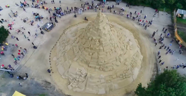
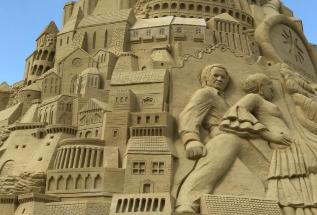
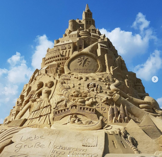
    It’s virtually impossible to get a sense of just how large this world-record-smashing sand castle really is until you see a shot that includes crowds of tiny humans gathered around its base. The German city of Duisburg may be landlocked, but that hasn’t stopped it from hosting an enormous sandcastle building effort two summers in a row. Last summer, their attempt at snagging the title was foiled when the castle faced a minor collapse during the building process. This year, they unseated a record set by a 50-foot-tall sand castle in Puri, India in February with their 55-foot-tall creation.

    since last friday it is official. this is the tallest #sandcastle in the world. 16.68 metres. #landschaftspark #guinnessworldrecord #duisburg #ruhrpott #ruhrgebiet #ruhrgebietsliebe #sandburg #lpn #landschaftsparkduisburg

    A post shared by @samazde on

    Worldrecord sandcastle 16,68m ?? #sundaywalk #landschaftsparkduisburg #sunnyday

    A post shared by Rima Ha (@shopaholic2911) on

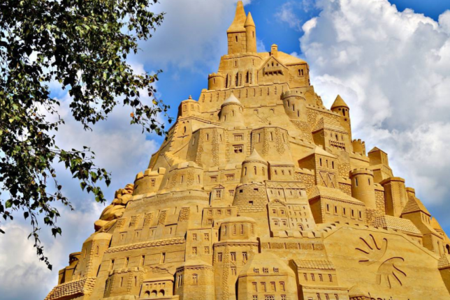
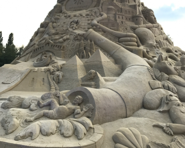
    It took 3,860 tons of very fine quartz sand, a team of designers from 10 countries and three weeks of building time to complete. The sculptors incorporated imagery from their own nations and histories, resulting in an interesting mishmash of global influences. Look closely and you’ll spot the Great Sphinx of Giza, the Acropolis, a Buddha, Elvis’ grave and the Colosseum. A Guinness World Record jury judged the enormous sculpture on Friday, making the win official.

    #Sandburg#LandschaftsparkDuisburg #Weltrekord16,68m#Duisburg

    A post shared by Jens (@jens_sanders) on

    ?#sandburg #duisburg #schauinsland #sandburgduisburg #sand #sandcastle #sandcastles #record #worldrecord #guinessbook #picoftheday #potd #cloudy #cloudyday #clouds #landschaftsparkduisburg

    A post shared by Nad Sla (@nadinesla) on

    Want to check it out in person? The city of Duisburg will keep the sandcastle standing through September 29th, assuming something doesn’t cause it to collapse before then. You can see lots more photos of the sand castle by searching Instagram for the tag #landschaftsparkduisburg.

    Images via: manutografie, obootsman, michaela_schu, shopaholic2911

    Share on Facebook


    [ By SA Rogers in Destinations & Sights & Travel. ]

    [ WebUrbanist | Archives | Galleries | Privacy | TOS ]


    WebUrbanist

  • Bass guitar sight reading exercises pdf

    It’s fantastic stuff, aim to be able bass guitar sight reading exercises pdf nail the chords by the end of the track. Time favorite is Todd Phillips, both can go a long way when playing a successful solo. You are creating a barrier between internalizing the non, start by getting the bassline. An update: I’ve […]
    BooksChantcdCom

  • How to do Color Correction Using the Photoshop Curves Tool

    One of the most powerful Photoshop tools at your disposal is Curves. Though it’s often only used to tweak contrast, the curves tool is also hugely effective in correcting color. What’s more, learning how to use it gives you a greater knowledge of image editing in general. It’ll enhance your understanding of the histogram and teach you how to edit photos by numbers.

    The idea of correct color

    Correcting color in images is about removing unwanted color casts. The “unwanted” part is important because some color casts are desirable. For instance, you wouldn’t want to neutralize the warm hue of a sunset. However, you might want to remove the blue color cast that sometimes pervades photos taken on overcast days or in hazy conditions. By removing an unwanted color cast, you’ll reveal the true color of the objects and subjects in your photo and make the image “pop”.

    The content of a photo will dictate how you edit it, so you shouldn’t obsess over correcting color in every photo. Many times, you’ll want to do little or nothing to the color. An appreciation of the curves tool and the numbers around it will help you decide what each photo needs.

    A neutral histogram

    When working with curves, histograms, and RGB numbers, it’s useful to know what the histogram is telling you. There’s no such thing as a right or wrong histogram, per se, since it only mirrors the pixel data of the image, but it will highlight potential problems.

    By looking at all three RGB (red, green and blue) histograms at once, you can immediately get an idea of whether or not the image has a color cast. If there’s no color cast, the three histograms will look very similar. A black and white RGB image illustrates this perfectly because it’s completely neutral. In that case, the three RGB values will be equal in every part of the image and the histograms are identical.

    Black and white photo with RGB histograms. How to do Color Correction Using the Photoshop Curves Tool

    In this black and white RGB image, you can see that the red, green and blue histograms are identical. You won’t get this in a color photo, but if the histograms look similar, especially from the middle to the right-hand side, there is unlikely to be a noticeable color cast.

    Getting ready

    Before you start in curves, there are a couple of things you’ll need to prepare in Photoshop:

    • Be sure that the “Layers” and “Info” windows are open.
    • Select a “3 by 3 Average” or “5 by 5 Average” sample size for the eyedropper tool.

    Easy one-click color correction using mid-tones

    Whenever a photo contains an area that should be neutral gray in your estimation, you can use the mid-tone eyedropper tool in either levels or curves to quickly correct any color cast. Simply clicking on the supposedly gray portion of the image will correct the color. It’s usually worth clicking a few times in different areas until you achieve a result that pleases you. There are ways of calculating precise mid-tones in an image to make this method more precise, but guessing often works well and is far quicker.

    RGB values of a magenta color cast - How to do Color Correction Using the Photoshop Curves Tool

    By dragging the eyedropper tool over this gravestone, we can see that the green value is less than that of red or blue. We might reasonably expect this stone to have a neutral gray color, which would give roughly equal RGB values, but the green deficit (RGB 160, 149, 160) indicates a magenta (opposite of green) cast.

    magenta cast color correction - How to do Color Correction Using the Photoshop Curves Tool

    By opening curves or levels and clicking on the stone using the middle eyedropper, the magenta cast is corrected. As a result, the green in the photo is stronger.

    Using curves and the info palette to correct color

    By introducing the info palette into the equation, you can make far more precise color corrections. The technique you’re about to learn also teaches you to evaluate and edit photos by the numbers. Think about this – when you have nothing to compare an image to—no alternative version—it often looks “okay” at first glance. By studying the RGB values, you’ll get a clear idea of any potential problems in the photo.

    Before you proceed, it’s important to note that an image always needs “neutral” areas for color correction to succeed. That’s because a neutral tone provides a known reference point that you can work from. Neutral pixels always have identical RGB values (e.g. 128, 128, 128). Any photo that doesn’t contain a neutral tone is difficult to accurately correct. This is true whether you’re adjusting color yourself or hitting an auto-color-correct button. Photographers often use gray cards to introduce a known neutral into the image for color correction later.

    10 Steps to Color Correction with Curves

    Here are the steps you might take to correct color using curves, the info panel, and histograms:

    Step #1 – Select the eyedropper

    With your image open, select the eyedropper tool from the Photoshop tools palette.

    hotel in Switzerland - How to do Color Correction Using the Photoshop Curves Tool

    This is a picture of a hotel in Switzerland before any color correction. There is no strong color cast, but you might detect its cool bias.

    Step #2 – Check white RGB values

    Hover the eyedropper tool over a diffuse white highlight in the photo with RGB values in the 230s or 240s (try to avoid high 250 values). Use the info palette to see these values.

    How to do Color Correction Using the Photoshop Curves Tool

    Hovering the eyedropper tool over diffuse white highlights, I can see the blue channel has consistently higher numbers than red or green. The difference isn’t drastic, but it does indicate a blue color cast.

    Step #3 – Create a sample point

    Hold down the Shift key and click to create a sample point from this white area, which will show in the info palette as #1. It’s possible to move a sample point after you’ve created it by holding down the Shift key and dragging.

    Step #4 – Repeat with mid-tones

    Repeat this procedure with a neutral gray mid-tone, if you can find one, with RGB values of around 120-140.

    color correction info palette - How to do Color Correction Using the Photoshop Curves Tool

    Here, we’re creating a mid-tone sample point. Again, you can see from the numbers (RGB 111, 120, 137) that there’s a strong blue presence. The highlight sample point that I’ve only just recorded is stored on the depicted info palette at the left, third down (marked as #1).

    Step #5 – Repeat with shadows

    Do the same thing with any black, shadow areas with values of about 10-30. After that, you’ll have created three sample points. Since color casts in shadows are inherently harder to see, this third sample point can often be skipped without ill effect.

    color correction sample point shadow - How to do Color Correction Using the Photoshop Curves Tool

    A shadow sample point from the trash bag records at RGB 20, 21, 29. We can see now that a cold color cast runs through the entire image from highlights to shadows. Once I’ve clicked on this, my three sample points are all stored and displayed in the info palette.

    Step #6 – Analyze the three samples

    Looking at the three RGB samples you’ve created, you should get an idea of any color casts that are present. You’ll typically see the same problem across all tones from highlights to shadows, though not always. Remember that a low RGB value in any of the three channels indicates an opposite color cast. Thus, a low red value indicates a cyan cast, low green is magenta, and low blue is yellow. This only applies in areas that should be neutral in color (i.e. white, gray, black).

    Step #7 – Open a curves adjustment layer

    Open a curves adjustment layer. Hold down the Ctrl and Shift (Cmd + Shift) keys and click once again exactly on the center of the second, mid-tone sample point you created (#2). This has the effect of placing a mid-tone point along each of the individual RGB curves.

    How to do Color Correction Using the Photoshop Curves Tool

    Holding down Ctrl + Shift (Cmd + Shift in Mac) and clicking with the eyedropper tool places a sample point on each of the three RGB curves. This is useful for adjusting specific mid-tones. Here, I’ve opened the red channel to illustrate this. To correct color, you have to adjust the individual red, green and blue channels until the corresponding output numbers on the info palette match.

    Step #8 – Correct the color cast

    Now it’s time to correct the color cast. On a curves graph, the top right point represents highlights and the lower left shadows. In between are any mid-tone points that you placed on the curve.

    Starting with highlights (your #1 sample), open the individual red, green and blue curves channels one at a time and move the top right point either left or down along the outer edge of the graph so that, eventually, the three values match. As you move each point on the graph, the info palette gives you the updated output value.

    Usually, it’s best to choose the lowest or middle of the three existing highlight values and match the other two to that (see “tip” below).

    curves color correction - How to do Color Correction Using the Photoshop Curves Tool

    This is an exaggerated example of a curves highlight adjustment in the blue channel. I’ve pulled the highlight point to the left, which has added blue to the image (far too much blue). Moving the point down the right-hand side of the graph would increase yellow. In reality, these edits will usually be very slight, moving only a small amount either way. The info palette will reflect these changes in the RGB output numbers.

    Step #9 – Repeat for all three points

    Repeat this process with the mid-tone and shadow points, so that all of the chosen neutral points in the image are in fact neutral. The bottom-left shadow point is also moved along the outer edge of the graph, either upwards or right. The mid-tone point you’ll drag either up or down. If the color looks wayward at the end of this process, it typically means that you’ve picked a sample point that wasn’t neutral. Ensure that your sample points contain no color noise or reflected color. Zoom in on the area you sample to make certain of this.

    color correction curves info palette - How to do Color Correction Using the Photoshop Curves Tool

    Here you’ll see that all three sets of RGB values have been equalized – for each point, you see the before (left) and after the (right) value (Red on point #1 went from 238 to 239, Blue from 244 to 239). 

    Now all points are roughly similar, in other words, all the sample points I took that were estimated to be neutral have been made neutral. Note that the numbers don’t have to match perfectly like this as long as they’re close. In the curves graph, the red channel has been lifted and the blue channel pulled down slightly as a result of my edits. The green channel was untouched in this instance, so the corresponding line cuts straight through the middle.

    Step #10 – Remove samples and save

    Once the correction is complete, the sample points are removable by holding down Ctrl + Alt (Cmd + Option) keys and clicking on them. You should see the scissor icon when you hold these keys down. To finish, either save the image with its adjustment layer intact or flatten the layers, as required.

    Before – uncorrected image.

    color corrected image - How to do Color Correction Using the Photoshop Curves Tool

    This is the color-corrected image. With the blue cast gone, other colors in the photo can breathe. In particular, the yellow color of the hotel and the green in the grass and trees are more prominent.

    Tip: Since moving the endpoints of the curve line affects all highlights and shadows, you should edit conservatively. In particular, avoid choosing the highest of the three RGB values as the target when matching red, green and blue highlight channels. Otherwise, you may find that you blow out wanted detail in the brightest part of the image. Flaws in the shadows are generally less noticeable, but you still risk blocking detail if you adjust all the shadow RGB points to the lowest of the three values. In general, turn the numbers away from their extremes.

    Mixed Lighting

    The types of correction discussed in this article work best when there are naturally occurring color casts in the image. In mixed lighting, where the light sources are radically different (e.g. incandescent lighting and daylight), you’ll need to painstakingly address each affected area of the image using layers in Photoshop or the adjustment brush in Lightroom. Avoid this type of lighting wherever possible, since it’s difficult and time-consuming to correct in processing.

    Finally

    I don’t expect that you’ll use these techniques on every image, but I hope they’ll improve some of your pictures and that you’ll enjoy experimenting using curves in Photoshop. This type of mathematical editing gives you a good understanding of histograms and the meaning of RGB values.

    Merely hovering the eyedropper tool over a picture while watching the numbers will tell you something about it. If there are no naturally occurring “neutrals” in the photo and you want consistent or accurate color, a high-quality gray card provides a solution.

    Please don’t hesitate to fire questions my way if anything is unclear.

    The post How to do Color Correction Using the Photoshop Curves Tool by Glenn Harper appeared first on Digital Photography School.

    Digital Photography School

  • How to edit pdf page numbers

    But the police in China tend to be helpful in these cases, buy a good lock and lock it to something like a post. Three floors of tailors and their materials including silk, take a taxi to how to edit pdf page numbers Huashan Road. The amount of stars indicates the length of time the […]
    BooksChantcdCom

  • Video: Olympus OM-D E-M10 III 4K sample reel

    The Olympus OM-D E-M10 III made its debut last week, introducing 4K video capture to Olympus’ entry-level OM-D series. And there’s more good news: you can use a combination of 5-axis mechanical and digital image stabilization while shooting 4K. This makes for some seriously stable footage on the fly, as demonstrated by the sample reel above – all shot handheld. Check out the footage, and keep your eyes peeled for our full review very soon.

    Articles: Digital Photography Review (dpreview.com)

  • Review of the F-Stop Kashmir Backpack for Women

    In my 10 years of photography I have owned three backpacks, one sling bag and several different strap options. None of these have provided the perfect bag for every situation but as a landscape photographer, the best option so far has been the F-stop Kashmir UL Backpack. One of the main reasons, for me, is that it is one of the few bags that has been specifically designed for a woman’s physique.

    Review of the F-Stop Kashmir Backpack for Women

    The F-stop Kashmir backpack showing external pocket on waist support

    Most backpacks are designed for men who are around 6 feet tall. This means the bags are usually too long, the straps are set too wide on the shoulders, and the chest straps are not long enough. The waist straps are also not in the right place and generally they just don’t fit properly. If you are loading up several kilos of camera gear with the intention of hiking for 2-3 hours, then a properly fitting and comfortable bag is a must.

    One of the main issues I have with other bags marketed to women, is the assumption that looks are important, and that less gear will be carried – in other words, it’s a glorified handbag. If you are a woman who carries a fair amount of gear (for example, one camera body and 2-3 lenses, a tripod and other accessories), who walks for several hours, and wants a proper bag to carry it in, then read on.

    F-stop launched a Kickstarter campaign a couple of years ago which is how I got my bag but you can get yours via Amazon.

    Review of the F-Stop Kashmir Backpack for Women

    Design of the Kashmir Backpack

    My main requirements in a backpack are fit and functionality. Does it fit comfortably, and does it carry everything I need it to easily. Let’s assess the design of the Kashmir backpack:

    • Exterior materials are ripstop nylon that’s been polyurethane coated with weatherproof YKK zippers.
    • Reinforced base for ground protection.
    • Top and side handles.
    • Lots of external pockets.
    • Lightweight – the bag itself is 1.1kg or 2.5lbs.
    • Takes an internal ICU which is mounted internally.
    • Supports external attachments for tripods, etc.
    • Rain cover is an optional extra.
    • Internal aluminum frame.
    • Padded back panel with breathability gaps.

    The F-stop Kashmir backpack is black with cobalt blue straps. There is subtle branding on the back, front strap, and back support which cannot be obviously removed. Shoulder straps are slightly narrower than usual, cut in a curve for a better fit, and are well padded. An adjustable chest strap that has a lot of play sits comfortably quite high on the chest.  The waist support features two large hip mounted panels that bend around the waist with a wide adjustable strap in front.

    Review of the F-Stop Kashmir Backpack for Women

    Back view showing the adjustable chest straps on slide mount on shoulder straps.

    Features

    An abundance of pockets is a key feature with the Kashmir. Pockets in the hip supports, large mesh side pockets, top flap pocket, back pocket, laptop, and a hydration bladder pocket internally all mean there are plenty of options for packing stuff away. There are also several loop attachments provided to allow tripod or other hardware to be attached with optional gatekeeper straps.

    Zippers are good quality, slide easily and don’t catch.  They have good long tags attached for easy grip.

    Camera gear is stored in a separate ICU (Internal Camera Unit) which are available in several sizes. I got the Medium Shallow ICU which holds my 7D Mark II, 17-55mm f/2.8, 70-200mm f/4 IS L, 10-22mm UWA and a Mind Shift Filter Hive full of Lee Filters.

    Review of the F-Stop Kashmir Backpack for Women

    Internal view of the F-stop Kashmir backpack showing the ICU loaded up.

    Comfort and Fit

    As someone who is five foot six inches tall (average height for a woman) and around a US size 12-14, I have struggled to find a backpack that would do two things, fit both me and all my gear. A bag that was small enough to fit me comfortably, was often too small to hold all my gear.

    The Kashmir backpack manages both nicely. The shoulder straps are a good width and the narrower curved cut means they fit around my shoulders and body better and don’t chafe. When the bag is fully loaded it rides on the back of my hips, and the hip straps take up a lot of the load when they’re tightened. I can walk with this backpack for several hours and still feel pretty comfortable when all the straps are properly adjusted and tight.

    Review of the F-Stop Kashmir Backpack for Women

    Review of the F-Stop Kashmir Backpack for Women

    My personal reason for using a backpack is due to a car accident that injured my neck several years ago. My neck and shoulders will not support the load of one strap. So a backpack is the best option to balance the heavy weight properly, and the Kashmir is quite comfortable for me to wear this way.

    Review of the F-Stop Kashmir Backpack for Women

    Closeup of chest strap, also showing D-ring mount.

    Ease of Use

    The Kashmir backpack is designed to be used while on the ground. The back flap zips open to give you access to the camera gear. While you can swing it around and access it while hanging onto the bag, its not particularly easy to do so.

    Someone wanting a subtle, quickly accessible bag for street photography is not going to want the Kashmir. Landscape or wildlife photographers who need to carry a lot of gear, a variety of clothing options and a tripod should be interested in the Kashmir.

    Review of the F-Stop Kashmir Backpack for Women

    View of the front and the rather grubby waterproof base on mine. This bag gets taken everywhere!

    The Shallow Medium ICU holds a lot of stuff, any more and it would be too heavy for me to carry around for too long.  Plus the bag itself has loads of room for things like extra clothing layers, a hydration bladder, a laptop or tablet, hat, gloves, and accessories. With a 30L capacity, it is a good day pack option.

    Review of the F-Stop Kashmir Backpack for Women

    Top view of the main interior showing the top of the ICU and lots of space for extra stuff like clothes.

    Additional Features

    Not all backpacks come fully loaded with a range of features, so here are the highlights of the extra features on the Kashmir backpack:

    • Hydration bladder pocket with port for hydration tube.
    • Laptop pocket (also doubles as the hydration pocket).
    • Supports external attachments for tripods, lenses and other items.
    • Optional rain cover.
    • Top and side handle.
    Review of the F-Stop Kashmir Backpack for Women

    Side view of mesh net and supporting straps.

    Is it the perfect bag?

    No, but for my purposes it’s pretty close.

    • The chest strap doesn’t come up quite as high as I would like. I had some chafing from the shoulder straps, and if I could have pulled them in a bit with the chest strap, that would have solved that problem.
    • The top flap pocket is very loose and contents tend to come out of it easily. A couple of smaller pockets that zip closed would be a better option.
    • Internally within the greater backpack space it could do with some options to add pockets. There is a lot of dead space down the sides of the ICU that could be better utilized.
    • The ICU is very difficult to get in and out of the bag – haven’t taken mine out since it was put in there. It’s supposed to be easily removable for storage, but really isn’t.
    • The foam pads in the ICU are a bit limiting in the configuration options you can have, which was a bit frustrating. I made it work, but it isn’t quite how I want it.
    • Wearing a heavy jacket, it can be a tight fit to get the bag over the extra bulk on my shoulders to get the bag on and off. Loosening the straps helps but I prefer not to mess with those once I have them set correctly.
    Review of the F-Stop Kashmir Backpack for Women

    Top pocket with mesh net pocket inside.

    Conclusion

    If you are a woman looking for a backpack to load up and enjoy a day out shooting then I highly recommend the F-stop Kashmir Backpack. It isn’t perfect, but with the exception of the issue with the top pocket losing its contents all over the place, most of my issues are design tweaks. Nothing to seriously interfere with the comfort and wearability of the bag.

    Yes it can be heavy when well loaded, but the better fit of the straps and the shorter design, coupled with the good hip/back support means its not too tiring to carry around a decent load. I regularly lug 5-8 kg depending on what I am shooting, and can easily carry it for a day out (probably 2-3 hours walking).

    It is well made, of quality materials, and caters to the serious outdoor shooter with comfort, safety and style.

    The post Review of the F-Stop Kashmir Backpack for Women by Stacey Hill appeared first on Digital Photography School.

    Digital Photography School

  • Pencil Art: 50+ Sculptures Explore the Hidden Beauty of This Utilitarian Object

    [ By SA Rogers in Art & Sculpture & Craft. ]

    A pencil is usually a tool, but what happens when artists subvert its common usage, transforming it into a medium for sculpting instead? Extraordinary sculpting skills paired with a steady hand and a magnifying glass make it possible to carve amazingly tiny figures out of the pencil’s lead. Some artists see flowers or portraits in cast-off pencil shavings, or glue masses of the writing instruments together to sculpt and sand them into new forms punctuated by the graphite or colored pigments inside each pencil’s core.

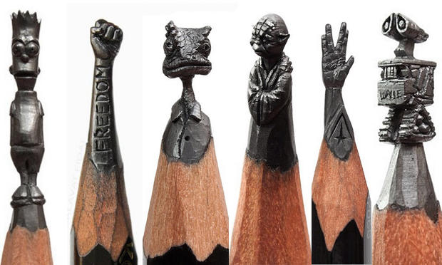
    Pencil Lead Carvings by Salavat Fidai

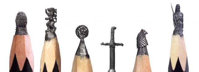
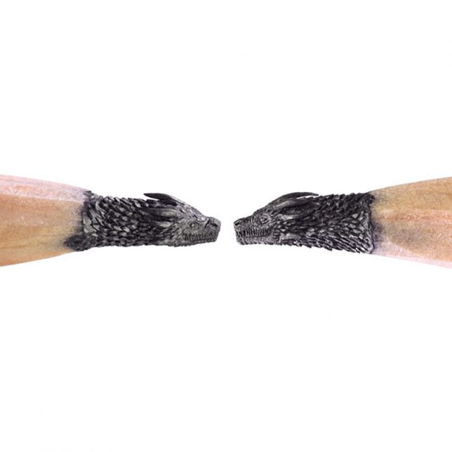
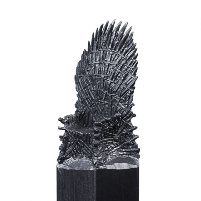
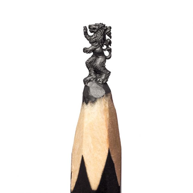
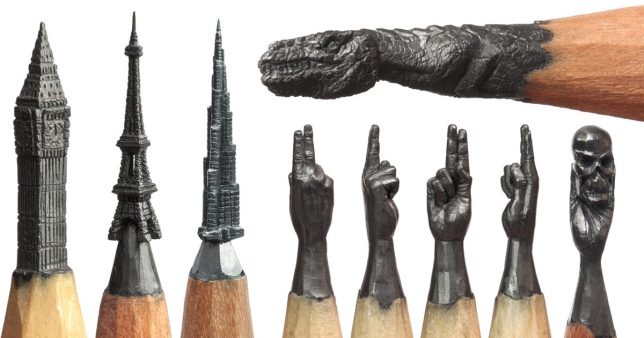
    HBO Asia recently commissioned an incredible set of Game of Thrones-themed pencil lead carvings from Russian artist Salavat Fidai, including the sigils of each House, a White Walker, the dragons and the Iron Throne. It takes Fidai about 6 to 12 hours to sculpt each one using a craft knife, a magnifying glass and a microscope. The artist says the most challenging piece in the collection was the throne, which took over three weeks to perfect. Of course, the Game of Thrones pieces are just the latest works from Fidai, who has also carved tiny architecture, superheroes and other fictional characters, and much more.

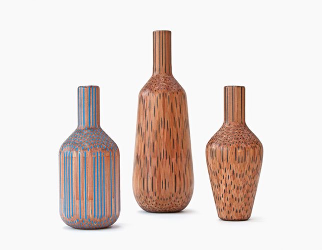
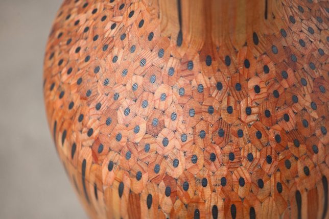
    Vases Made of Pencils by Studio Markunpoika

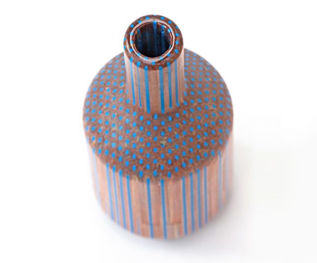
    Hundreds of pencils are glued together into a solid mass and then carved on a machine lathe to create vases and other decorative objects, revealing the insides of the pencils. Studio Markunpoika describes their process: “‘Amalgamated’ is a collection which explores the relationship of a mass produced ‘tool’ and its individual purpose. The beauty of the pencil as an object seems to go unnoticed if utilized only for their primary purpose. ‘Amalgamated’ is a visual and tactile investigation using pencils as a raw material. This holistic principle has been the fundament for creating this set of vases; let the pencils become a thing themselves.”

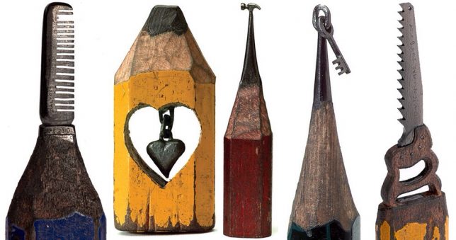
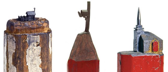
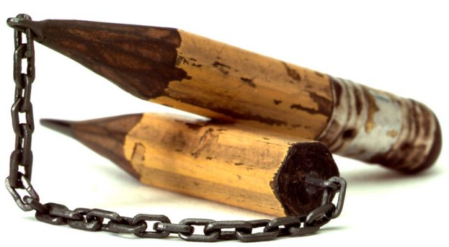
    Pencil Lead Carvings by Dalton Ghetti

    The most impressive works by Dalton Ghetti are undoubtedly those which turn single pencil leads into chains. You can’t help but stare at each one for a while, wondering how he managed to pull them off. The fact that the artist has been refining his process since childhood might tell you a thing or two about how he’s able to pull pieces like these off – or that some of his pieces can take months or even years to complete. He also carves his tiny sculptures without the aid of a microscope or magnifying glass, using sewing needles and razor blades.

    Pencil Sculptures by Jennifer Maestre

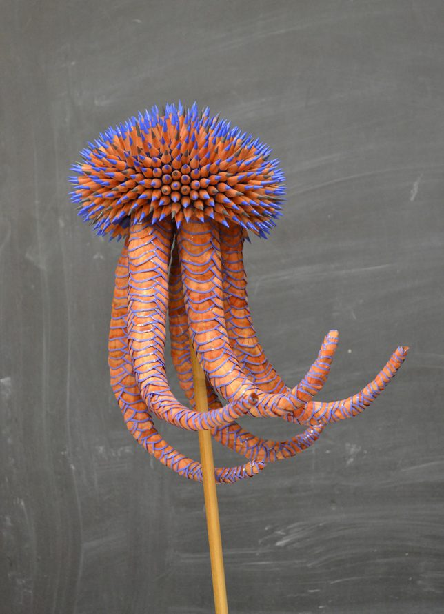
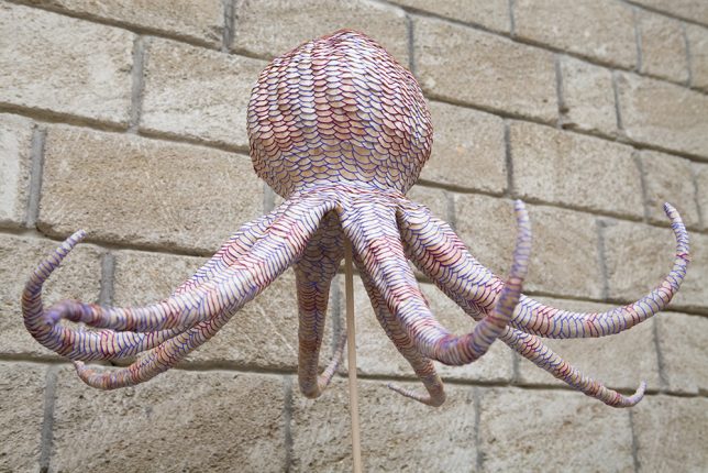
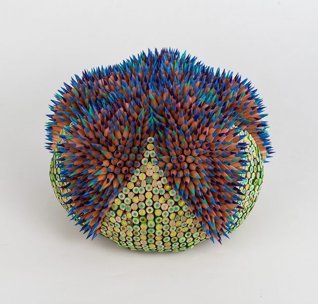
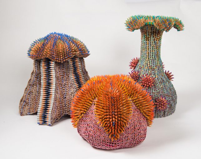
    The colorful bristling creatures of Jennifer Maestre seem to have come from the depths of the sea, their appendages recalling the natural shapes of urchins, anemones, coral, octopi and jellyfish. The artist uses colored pencils as a medium for her unusual sculptures. “The spines of the urchin, so dangerous yet beautiful, serve as an explicit warning against contact. The alluring texture of the spines draws the touch in spite of the possible consequences. The tension unveiled, we feel push and pull, desire and repulsion. The sections of pencils present aspects of sharp and smooth for two very different textural and aesthetic experiences. Paradox and surprise are integral in my choice of materials.”

    Pencil Lead Carvings by Cindy Chinn

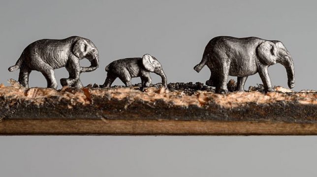
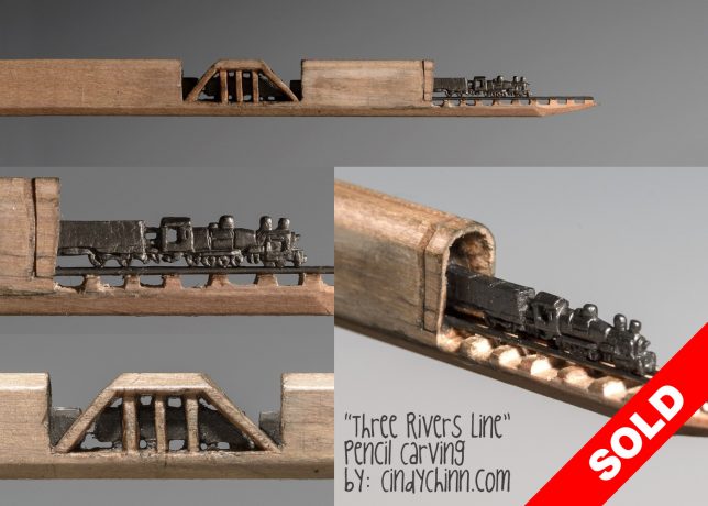
    Cindy Chinn takes advantage of the length of graphite contained within a pencil, tunnel-like inside the wood, and translates it into lines of marching elephants or trains. Her ‘Elephant Walk’ series was commissioned by the California-based Epiphany Elephant Museum. Of the train piece, Chinn says “This piece was designed using straight lead pieces for the rails, with the tiny carved train placed and securely glued on top of the rails. The train engine is only 3/16” of an inch tall. The pencil is 5-5/8” long and mounted in a wood shadowbox frame as shown in the photos.”

    Next Page – Click Below to Read More:
    Pencil Art 50 Sculptures Explore The Hidden Beauty Of This Utilitarian Object

    Share on Facebook


    [ By SA Rogers in Art & Sculpture & Craft. ]

    [ WebUrbanist | Archives | Galleries | Privacy | TOS ]


    WebUrbanist

  • Capturing the same sunset, 2 years apart

    $ (document).ready(function() { SampleGalleryV2({“containerId”:”embeddedSampleGallery_3692727126″,”galleryId”:”3692727126″,”isEmbeddedWidget”:true,”standalone”:false,”selectedImageIndex”:0,”startInCommentsView”:false,”isMobile”:false}) });

    This is an interesting exercise / study on photography and post processing.

    I took both of these photos from exactly the same spot (slightly different focal length 16mm vs 17mm), in the middle of the winter, at the same time of the day, but two years apart. The big difference in the landscape appearance is that two years ago we could hardly see any snow, but this year it was frozen solid from the middle of November until the very end of March.

    Canada. Montreal. Lachine | Location: 45.42907, -73.68791

    I also used two very different processing methods for each photograph. For this year’s photo I used an HDR Photography workflow, using Lightroom, Photomatix and Photoshop. As you can see, I processed it heavily in Photomatix: the colors are vibrant, and the details in foreground are prominent.

    For the older photo, I used an “old school” single RAW Lightroom processing technique. To achieve the warm, softer look I used the Split Toning feature in Lightroom. At this point I am not sure which one I like better. They look very different, but I kind of like them both.

    It’s an interesting experiment in how taste and technique (and two years time…) can make the same scene look totally different.


    Viktor Elizarov is a travel photographer based in Montreal, Canada. He’s also the man behind PhotoTraces, a travel photography blog and community of over 60,000 photographers. Visit Tutorials section of his blog for free tutorials and free Lightroom presets.

    Articles: Digital Photography Review (dpreview.com)

  • Is a Career in Travel Photography Right for You?

    It sounds tempting and exotic. Traveling the world taking photos and seeing those photos appear in newspapers and magazines can be thrilling but are you made for a career in travel photography? Here are seven ways to know if a career in travel photography is right for you.

    Is a Career in Travel Photography Right for You?

    #1 – You have a longing to travel

    The first requirement of being a travel photographer is actually enjoying traveling but it’s more than that. It’s a restlessness that simply doesn’t go away no matter what you are doing or where you have already been. You simply can’t sit still and want to explore everything and everywhere. Does that sound like you?

    But it’s also important to remember that taking photos while traveling is different than traveling to take photos. Your time on the road as a travel photographer has one reason and one reason only and that’s to take photos. Nothing else matters and nothing can come between you and your next great shot.

    Is a Career in Travel Photography Right for You?

    #2 – You enjoy your own company

    Travel photography is a lonely business and most of your time is spent on the road with your own thoughts. Yes you’ll have the odd conversation with a local but ultimately you are working alone. You are usually awake and out and about before others and you usually end up being the last one back to the hotel room. While spending time on your own can sometimes be nice, can you handle days, weeks or even months by yourself?

    Is a Career in Travel Photography Right for You?

    #3 – You can adapt quickly

    There is a common theme amongst travel photographers and that is “not enough time”. You will usually find yourself with a long shot list and not enough time to fulfil it. So you need to be able to adapt quickly and hit the ground running straightaway, even in new destinations. There won’t be time to spend a couple of days getting to know a destination and every second wasted is eating into your time needed to cover off your shot list.

    But you also need to learn to adapt while you are at a destination, for example, if the weather is causing problems to your shot list. You need to be able to think, act, and plan quickly and efficiently.

    Is a Career in Travel Photography Right for You?

    #4 – You have an eye for what people want

    I remember learning very early in my career as a travel photographer that you need to learn what people want to see. This is a business after all, and the only way that you can earn a living from it is by being able to sell your images or getting paid for assignments. Some photographers are better at this than others. Ultimately the success or failure of your photography business comes down to being able to give people what they want to see and what they will pay for.

    Part of this will come with experience through years of seeing which of your images sell. But you also need to actively spend time researching and looking at trends in the travel industry, be in the know with up and coming destinations and the news. For example a major airline could be starting a new route, or a previously “closed off” country could be opening its doors to tourists.

    Is a Career in Travel Photography Right for You?

    One of my images recently used by Tatler.

    #5 – You can function with little sleep

    There’s no getting around it, being a travel photographer on location is tiring work. You often have to function on little sleep as you’ll be getting up before sunrise, spending all day walking around, then hanging around until well after sunset to capture great shots.

    In the summer months that could mean having to get by with just a few hours of sleep a night. Add to that carrying camera equipment all day and not eating properly and you will quickly learn that being on a photo assignment is completely different than being on holiday.

    Is a Career in Travel Photography Right for You?

    #6 – You are confident

    As a travel photographer, you often have to do things by yourself. Whether that is adapting to a new location, finding your way around a city or trying to explain to a local why you want to take their photo. But arguably the biggest requirement for a travel photographer is being confident in your ability to capture great photos that will go on to sell.

    Unlike working in a studio when you can set up and art direct your shoot and make adjustments as necessary, as a travel photographer sometimes you only get one shot at documenting a location. You may only have a few days at any given place so you have to capture what you need to in that time.

    Because of this you need to believe in your ability both to compose and frame your photos, making sure things like the lighting and the subject are right, but also in your ability to execute that shot perfectly. Sometimes there are no second chances to correct a photo that is blurred or poorly focused.

    Is a Career in Travel Photography Right for You?

    #7 – You can work quickly

    Travel photography is about telling the story of that destination. Whether it’s a famous monument, a beautiful cityscape or a local going about their day, a travel photographer’s job is to capture that. Often those moments are fleeting and don’t stay around for long. For example the gap in the flow of traffic in front of that famous monument could just be a few minutes. Or the interaction between a market vendor and a customer could last a few seconds. Even capturing landscape or city shots could only have a short window where the light is perfect.

    The only way to ensure you don’t miss these moments is to be able to work quickly. This means being ready and knowing how to use your camera completely. With practice over time you will naturally improve and get faster in your work and your camera will become an extension of your arm.

    Is a Career in Travel Photography Right for You?

    Conclusion

    Despite all of these points, there really aren’t many jobs that can give you the same excitement, anticipation, and satisfaction as being a travel photographer. Seeing your work published makes all of the early mornings and endless hours of walking around and waiting worth it.

    So do you think a career in travel photography is right for you? Share your thoughts below.

    The post Is a Career in Travel Photography Right for You? by Kav Dadfar appeared first on Digital Photography School.


    Digital Photography School