Blog

  • This free app finally lets you post to Instagram from your computer

    Photographer and programmer Felix Sun has designed an app called Windowed that finally allows you to post images to your Instagram account straight from your computer—no tablet, smartphone, or strange loophole workaround required.

    Instagram is a great way to build an audience and even earn yourself a commission or two, but the app’s mobile-only upload has been a thorn in every professional photographer’s side from the very beginning. Most of us don’t shoot our best photos on our phones, and many camera brands don’t have the best systems (read: some downright suck) in place for getting those photos off of your main camera and onto your smartphone.

    Enter Windowed, a simple app that allows you to upload images straight to Instagram from your Mac or PC. And best of all, the application is open source and “100% free.”

    The app is able to provide this functionality thanks to a semi-recent update to Instagram that allows you to post photos from a mobile browser. Under normal circumstances, you’re unable to access this functionality from your Mac or PC; Windowed pretends to be a mobile browser to get around this limitation.

    There have been workarounds posted online for ages that make it possible to post to Instagram from your desktop, but this is the first implementation we’ve seen that’s truly easy. In fact, it’s no different than posting to IG using Chrome or Safari on your smartphone.

    To learn more about Windowed, see the source code, or download it for yourself, head over to the app’s website by clicking here.

    Articles: Digital Photography Review (dpreview.com)

  • Not Your Dive Bar’s Pool Table: 13 Modern Game Furniture Designs

    [ By SA Rogers in Design & Fixtures & Interiors. ]

    Most game furniture looks like it belongs in a musty basement smelling of spilled beer and body odor, but high end tables for billiards, foosball, ping pong, shuffleboard and other popular indoor games are made to fit right into luxury environments, sometimes even complete with plated gold details. Some are even works of art in their own right, doubling as sculpture, while others bring games that haven’t changed much in decades a little more firmly into the current century.

    Ping Pong FM Interactive Table Tennis Jukebox

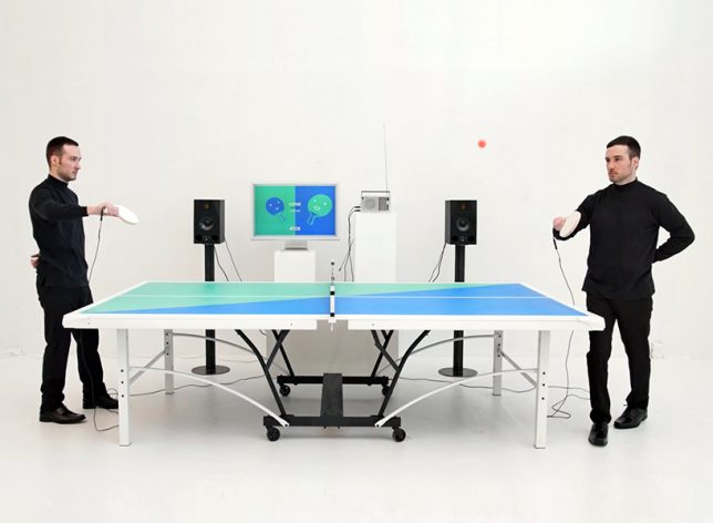
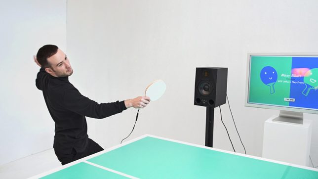
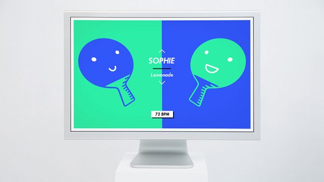
    This ‘fun musical take’ on table tennis by English designer Mark Wheeler lets you choose a song to set the tempo of your game, and the song only keeps playing as long as you manage to keep the ball in play. Drop it, and your game is over. “Usually music listening experiences are strictly about being as true to the original recording as possible. But why can’t listening to a record be as playful and interactive as a live performance?” says Wheeler.

    Luxury Game Tables by Adriano Design

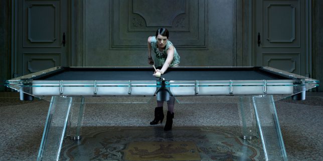
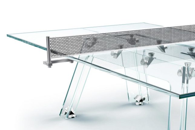
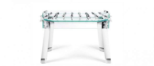
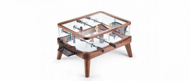
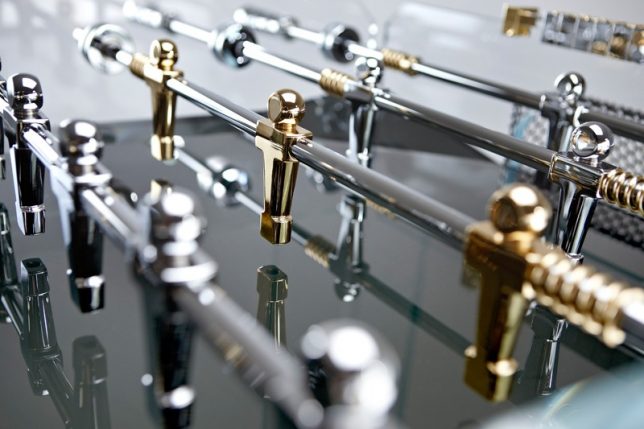
    A gold-plated crystalline foosball table is among the ‘luxury’ game options offered by Adriano Design, an Italian-based company operating as both ‘Calma e Gesso’ and ‘TECKELL.’ The Cristallino comes complete with 24-karat-gold plated players – because what else would the owner of a $ 10 million estate put in their game room? Other offerings include the ‘Filotto’ pool table and the Lungolinea ping pong table, all made in the company’s signature crystal-clear glass. They even produce child-sized ‘Angolo’ foosball table models for kids, which spare no stylish details.

    Isamu Noguchi Chess Table

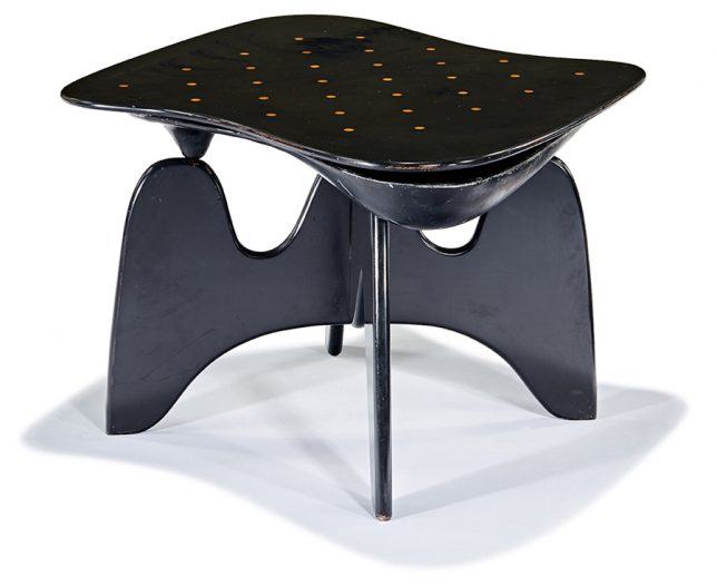
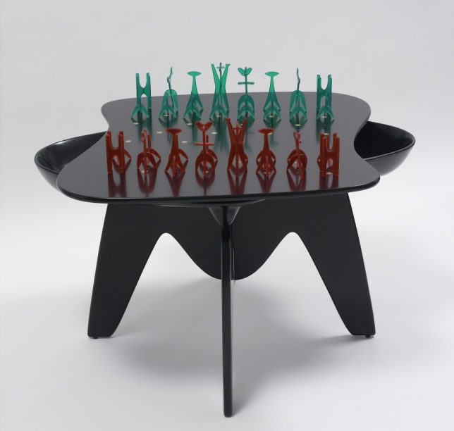
    Considered a seminal work of early organic modernism, Isamu Noguchi’s chess table is technically a functional sculpture, presented along with a set of game pieces Noguchi also designed. It debuted at ‘The Imagery of Chess’ in 1944, a show organized by Marcel Duchamp and Max Ernst. The table was put into production in 1947, but only a few dozen examples exist. One was auctioned in Los Angeles in 2016, selling for over $ 100,000.

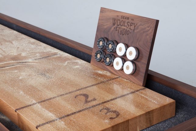
    Woolsey Shuffleboard Table by Sean Woolsey

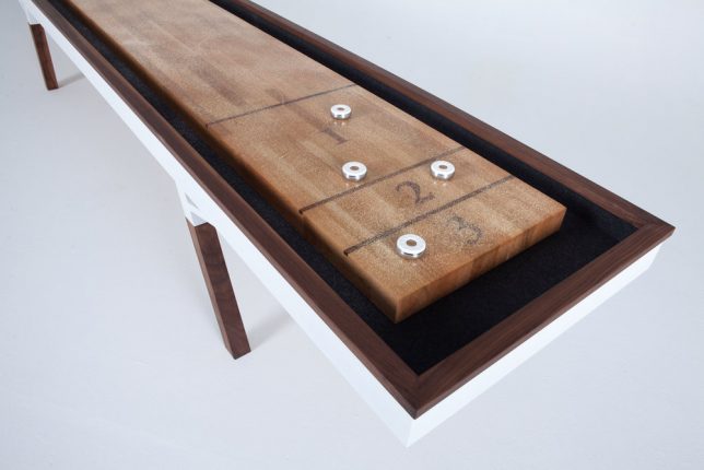
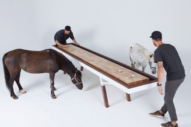
    Long, narrow and sleek, the Woolsey Shuffleboard Table by designer Sean Woolsey features a rift-sawn white oak top finished with epoxy resin and solid black walnut legs, which hide leg levelers. The table comes with 4 white and 4 black pucks, lots of shuffleboard salt and a magnetic wall mount for the pucks when not in use. Prices, unsurprisingly, start at $ 10K.

    Next Page – Click Below to Read More:
    Not Your Dive Bars Pool Table 13 Modern Game Furniture Designs

    Share on Facebook


    [ By SA Rogers in Design & Fixtures & Interiors. ]

    [ WebUrbanist | Archives | Galleries | Privacy | TOS ]


    WebUrbanist

  • Nikon releases official D850 lens recommendation list

    Nikon has published a list of lens recommendations for D850 owners, highlighting a total of eleven lenses that are suitable for use with its newly-launched, high-res, high-speed DSLR. The list covers prime, zoom, and speciality lenses, all of which are Nikon products (duh).

    Here they are for your perusing pleasure below, just in case you want to make sure your glass is up to snuff with your fancy new camera:

    Prime Lenses

    • 20mm f/1.8G – $ 796.95
    • 28mm f/1.4E – $ 1,996.95
    • 105mm f/1.4E – $ 2,196.95
    • 200mm f/2G – $ 5,696.95
    • 400mm f/2.8E – $ 11,196.95

    Zoom Lenses

    • 14-24mm f/2.8G – $ 1,896.95
    • 24-70mm f/2.8E – $ 2,396.95
    • 70-200mm f/2.8E – $ 2,796.95
    • 80-400mm f/4.5-5.6G – $ 2,296.95

    Specialty Lenses

    • 8-15mm f/3.5-4.5E – $ 1,246.95
    • 19mm f/4E PC – $ 3,396.95

    Articles: Digital Photography Review (dpreview.com)

  • How to Use Negative Space in People Photography

    When it comes to people photography, one of the most common pieces of advice is to “fill the frame” with your subject. In general, this is a good rule of thumb that can dramatically improve your photography right away. However, sometimes rules are meant to be broken, and learning how to use negative space in people photography can also be valuable in delivering a varied and useful gallery of images.

    People Photography Negative Space

    What is Negative Space?

    When you’re photographing people, the subject of your image is always the person (or people) in your frame. Similarly, the negative space of an image is anything other than the subject. It’s the foreground, the background, and the visual “breathing room” all around your subject.

    Although it can be counterintuitive, allowing a bit of space around your subject helps draw the viewer’s eye directly to the person you’re photographing. This, in turn, emphasizes their importance in the final image.

    How to Use Negative Space in People Photography

    How Do You Do Negative Space Well?

    So, how do you make sure that your negative space looks intentional and not accidental when you’re photographing people? Here are a few tips that will help get you started combining negative space images and people photography.

    Think in Thirds

    How to Use Negative Space in People Photography

    When creating a negative space image in people photography, aim for your subject to take up one-third of the image, and the negative space to take up roughly two-thirds of the image. Following guideline ensures that your subject is large enough to be seen while also creating a ratio that’s visually pleasing to the eye. You’ll also notice that using this ratio as a general framework for your images allows you to implement the rule of thirds in your negative space images, which further helps to ensure that your images are composed well and are aesthetically pleasing.

    Face the Space

    Rule of Thirds Photography - How to Use Negative Space in People Photography

    If you elect to follow the rule of thirds and compose your subject off center, spend some time experimenting with the direction your subject is facing. Is the image stronger when your subject is facing the negative space or facing away from the negative space? As a general rule, try to pose your subject so they’re looking towards the negative space. This is particularly important if the person you’re photographing is walking, running, or playing sports.

    By doing so, our brains are able to imagine the subject traveling through the negative space, which creates a more compelling and believable image. In addition, directing the person you’re photographing to look towards the negative space creates an image that looks more candid, which is a great way of adding diversity to some of your posed session images.

    Bring it to the Center

    How to Use Negative Space in People Photography

    Keep in mind that not all negative space images have to be offset! Try bringing your subject to the center of the frame while simultaneously allowing plenty of “headspace” around them in your image. This technique is similar to the idea of white space in graphic design, rests in musical composition, and high-end clothing stores that leave plenty of space between the clothing on the racks.

    By limiting the proportion of the image that causes our mind to “think”, we’re emphasizing the importance of the objects that do exist in the frame, thus increasing their perceived value in our brain.

    It’s Not All About Neutrals

    White Space in Photography - How to Use Negative Space in People Photography

    Negative space images don’t have to be all about neutral backgrounds and bokeh that obscures the background beyond recognition. Whether you’re at a favorite lake or their family’s historic farmhouse, negative space images can be a great way to subtly reference location without making it the star of the show!

    Look for backdrops that are relatively uniform in color and/or pattern, which will invoke the same visual feeling of breathing room and rest around your subject, while simultaneously visually cueing your location.

    Why Does Negative Space Matter?

    Now that you know how to create images of people that utilize negative space, it’s also helpful to understand why negative space images are important and why you should consider incorporating at least a few into every photo session.

    Emphasizing Scale

    Newborn Photography Scale - How to Use Negative Space in People Photography

    Using negative space when you’re photographing people can help to emphasize the size of the person you’re photographing. For example, if you’re photographing a newborn and fill the frame in every image you take, you may have missed the ability to convey just how small newborn babies are relative to their surroundings.

    By including varying degrees of negative space in your images, you will be better equipped to emphasize the scale of a newborn. Similarly, you could also consider using negative space images to convey how small a bride and groom are compared to the vast beach they were married on.

    Give Your Clients Options

    Headspace in Portraits - How to Use Negative Space in People Photography

    If any part of your business plan includes offering digital images to your clients, keep in mind that many of your clients will want to post the images you’ve taken on social media. Many of the popular social media platforms are not very conducive to typical “fill the frame” portraits, forcing your client to either cut off the top of their head or cut off their shoulders (leaving them looking rather like a floating head as above).

    Similarly, if a client requests a certain image printed on a canvas, images with negative space allow you to accommodate that request without worrying about part of the image getting cut off by the gallery wrap. By including negative space in a few images, you’ll be giving your clients more options and less frustration!

    Give Yourself Options

    Original shot with negative space on the left.

    Not only do images with negative space give your clients flexibility, they give you additional flexibility as the photographer as well!

    Want to submit your image for the cover of a local magazine? Many editors want images with plenty of negative space to accommodate headline text. Want to start offering a Christmas Card design to your clients? Negative space images help make that easier. Want to advertise mini sessions on Facebook? Try placing the text in the negative space of one of your favorite images.

    Using Negative Space in Photos - How to Use Negative Space in People Photography

    The negative space in this image allows room to add a text overlay.

    Making an effort to utilize negative space every time you photograph people will give you more ways to use your images.

    Wrapping it Up

    How to Use Negative Space in People Photography

    In a nutshell, using negative space when you’re photographing people can help bring attention to your subject. It can also showcase locations in an unobtrusive way. Negative space also helps emphasize movement and scale, add variety to your images, and offers more flexibility to both you and your client. It’s a great technique you can implement right away and it costs nothing!

    The post How to Use Negative Space in People Photography by Meredith Clark appeared first on Digital Photography School.


    Digital Photography School

  • Getting Your Priorities Straight – A Guide to Selecting Your Shot Priority

    A major goal when starting out in photography is to get off Auto mode and onto the semi-automatic Aperture and Shutter Priority modes. Is it daunting at first? It can be, but I promise that wrestling creative control away from your camera and into your hands is one of the first and greatest joys of digital photography.

    I teach people that a deeper reason exists for the name priority mode. The obvious one is you’re prioritizing control of shutter speed or aperture and surrendering control of the other. But also, you can teach yourself to base this decision on your shot priority.

    Getting Your Priorities Straight – A Guide to Selecting Your Shot Priority

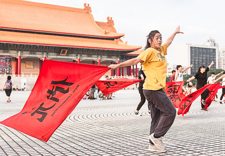
    Flag dancers in Liberty Square – Taipei, Taiwan. Shot priority: Freeze motion. Shutter speed: 1/500th.

    This article identifies four major shot priorities: to freeze motion, to imply motion, to create a shallow depth of field, and to create a deep depth of field. The goal is to get you to ask which of these is your priority for your next shot and then to select the appropriate mode and settings to achieve that.

    Shutter Priority Mode

    Shutter priority mode is marked with an “S” on Nikon and Sony cameras and “Tv” on Canon mode dials. Like your eyelid, the shutter opens and closes to expose the camera sensor to light. Through selecting this mode, you can choose how long it opens.

    With Shutter Priority mode, you’re prioritizing shutter speed as the crucial element for the image you want to take. Your camera will then select a corresponding aperture to create a correct exposure. It is the mode to use when your priority is either freezing motion or implying motion.

    Getting Your Priorities Straight – A Guide to Selecting Your Shot Priority

    Traditional dance performance at Haemi Fortress, South Korea. Priority: Freeze motion. Shutter speed: 1/1000.

    Priority #1 – To freeze motion

    Much of the time when shooting, you require sharp images in crisp focus. Shutter speed is the most critical factor affecting image sharpness; however, requiring image sharpness isn’t a fully-fledged shot priority. Here, we’re talking about freezing fast motion.

    Select this mode to freeze action in sports fast-moving water in landscapes, and other fast motion. For example, a runner could be frozen with a shutter speed of 1/500th of a second, whereas motorsports might require 1/2000th or faster.

    Getting Your Priorities Straight – A Guide to Selecting Your Shot Priority

    For this image of flag dancers in Taipei’s Liberty Square, I selected a shutter speed of 1/800th to freeze the motion. As well as freezing the dancer, the fast shutter speed also froze the flag and ensured the writing was crisp and legible.

    Getting Your Priorities Straight – A Guide to Selecting Your Shot Priority

    At the ghats by the River Ganges in Varanasi, India’s holiest city, I saw a procession of ladies heading downstairs and a cow heading up towards them. The animal looked ready to charge at them! I had just been shooting a game of cricket so my camera was already set to 1/1000th in Shutter Priority mode. I began shooting as the cow charged at the last two women before veering away. The cow and the women’s facial expressions were frozen, preserving a fleeting moment.

    Priority #2 – To imply motion

    Using Shutter Priority mode, implying motion is a beautiful effect that you can easily apply to your images. Everything from slight motion blurs to light trails to dreamy water effects are possible with a variety of moving subjects.

    Imagine that you’re shooting handheld street photography and you chance upon a pair of dancing street performers. You decide you want people viewing your images later to be able to get a sense of the action, so choose to imply motion as your shot priority. Because a shutter speed of 1/500th would freeze the performers, you could try 1/250th and work down from there until the desired motion blur is achieved.

    Getting Your Priorities Straight – A Guide to Selecting Your Shot Priority

    While working as a tour photographer in South Korea, I was tasked with capturing tourists prepare green tea leaves. To imply motion, I took a sample shot at 1/50th and then worked down until I achieved this blur. This image was 0.4 seconds – admittedly pushing the acceptable limits of handheld photography – but thanks to my lens’s image stabilization and steady hands, I ended up with this interesting shot.

    Now imagine you’re on the rooftop of a tall building at nighttime and you have a tripod. Because of the added stability a tripod allows, you can open up your shutter for significantly longer. Through selecting the right settings, you can achieve crisp backgrounds, blurred subjects, and light trails that build on top of each other.

    Getting Your Priorities Straight – A Guide to Selecting Your Shot Priority

    A nighttime cityscape of Seoul’s Han River and Namsan Tower featuring blurred white and red light trails. I used a shutter speed of 15 seconds to allow the light from numerous cars to reach my sensor, accumulating into long streaks of light in the final image. No golden rule exists for the number of seconds, so just enjoy experimenting.

    Aperture Priority Mode

    Aperture Priority mode is marked with an “A” on Nikon and Sony cameras and “Av” on Canon dials. Like an iris in a human eye, aperture represents the hole that opens to expose the camera sensor to light. Through selecting this mode, you can choose how wide or narrow to open the aperture. The lower the f-number, the wider the hole. Controlling aperture is mainly used to affect what is known as depth of field.

    You’ve seen portraits where the subject is in crisp focus but the background is beautifully blurry; this is called a shallow depth of field. Also, you’ve seen fantastic landscapes that are in sharp focus throughout the image from front to back; this is a deep depth of field.

    Through selecting Aperture Priority mode, you’re marking aperture as the crucial element for the image you want to take. Your camera will then select a corresponding shutter speed to create a correct exposure. It is the mode to use when your priorities are creating either a deep or shallow depth of field.

    Getting Your Priorities Straight – A Guide to Selecting Your Shot Priority

    Stall owner at the Mother’s Market in Imphal – Manipur, India. Priority: Shallow depth of field. Aperture selected: f/2.0.

    Priority #3 – To create a shallow depth of field

    As a travel photographer specializing in portraits, creating a shallow depth of field is often my priority. This allows me to have my photo subject (i.e., a person’s face, and more specifically their eyes) in crisp focus, while the background melts away in a dreamlike blur. To achieve this effect, you want to select a low aperture value.

    If you’re shooting with a kit lens, the lowest value available to you might be f/3.5. However, with a fixed focal length lens (prime), this will be lower, making this type of lens perfect for portrait photography. Let’s take a look at the two example images below.

    Getting Your Priorities Straight – A Guide to Selecting Your Shot Priority

    A Hindu lady showing her devotion during the Ganga Aarti ceremony – Varansi, India. When I’m out meeting people and taking portraits, I make sure my Sigma 35mm 1.4 Art lens is on my camera body. The aperture selected for this shot was f/1.4, ensuring a beautifully blurry background.

    Getting Your Priorities Straight – A Guide to Selecting Your Shot Priority

    A resident of Houtong Cat Village – Northern Taiwan. Aperture selected: f/2.8. This is a great example of shallow depth of field. The front of the cat’s paws are blurred and so is the back of its body. There is just a thin focal plane in sharp focus. The lower the aperture value selected, the thinner this slice of the focal plane becomes. For this shot, I spot focused on the cat’s left eye, ensuring that this was the sharpest spot of the image.

    Priority #4 – To create a deep depth of field

    By contrast, a deep depth of field enables front to back sharpness throughout an image, making it the shot priority to select for landscape photos. If the lowest aperture values provide the thinnest focal planes and the blurriest backgrounds, then surely the highest aperture values provide the best landscape settings, right? Wrong. Your lens may be capable of f/22 but please don’t select it.

    The highest aperture values can create image distortion. I recommend not going above f/16 for landscape photography with a tripod, and not going above f/11 handheld. A solid choice for handheld landscapes is actually f/8 because it provides a mid to deep depth of field while enabling a lower ISO and faster shutter speed for a sharper image.

    Getting Your Priorities Straight – A Guide to Selecting Your Shot Priority

    Beautiful Itsukushima Shrine at Miyajima, one of “The Three Views of Japan” – Hiroshima Prefecture. A higher aperture value creates a narrower hole through which light reaches your sensor. A deep depth of field is one of the main effects, which in landscape photos creates front to back sharpness. For this image, I selected an aperture of f/7.1 and spot focused on the pool of water in the foreground.

    Getting Your Priorities Straight – A Guide to Selecting Your Shot Priority

    On the road to “Zero Point”, the end of the road heading north in the Sikkimese Himalayas, and looking back toward Yumthang Valley – Sikkim, India. This is a simple handheld landscape shot, for which I selected f/8 because my shot priority was a deep depth of field.

    Conclusion

    Remember these four major shot priorities and put them into practice using the Aperture and Shutter priority modes. Don’t forget to share your work and comments below.

    The post Getting Your Priorities Straight – A Guide to Selecting Your Shot Priority by Ben McKechnie appeared first on Digital Photography School.


    Digital Photography School

  • Here’s why your beloved film SLR is never going digital

    There may be pent-up demand for a device that’s going to let you dust off your beloved Nikon F-something and shoot digital with it, but that doesn’t mean a crowdfunded project is going to make it possible. Or, at least, not in a way that’s worth the hassle.

    Large companies with dedicated engineering departments have worked on the task, yet no such product has yet been produced. That, along with a list of seemingly intractable technical hurdles, lead me to think that it’s not ever going to happen, no matter how desirable it might be.

    The wisdom of crowds

    The latest crowdfunded attempt to bring digital capability to old Nikon SLRs appears to involve the 1/2.3″-type sensor and lens from an inexpensive action camera and a Raspberry Pi project computer.

    “I’m Back” is the latest attempt to bring film cameras into the digital realm and it appears to do a reasonable job of addressing some of the challenges that sank Silicon Film and subsequent crowdfunded attempts to do the same:

    • Syncing the SLR shutter and digital exposure
    • A means of changing the digital settings
    • Keeping the cost reasonable

    However, it’s unclear or arguable how well it addresses other potential stumbling blocks:

    • Sensor/film plane alignment
    • Compatibility across the dwindling supply of film SLRs
    • Space for batteries and processing hardware

    And, with its use of a compact camera sized sensor fitted behind what looks remarkably like the lens from an inexpensive action cam pointed at a ground glass screen, there’s every chance it fails to clear a fairly significant hurdle:

    • Sufficient image quality to make the whole ordeal worthwhile

    A history of failed attempts

    Companies with significant backing and extensive engineering resources have failed to solve this problem, which doesn’t make it an obvious candidate for crowd-funded projects.

    Nikon itself clearly investigated the problem, since it got as far as patenting a system for adjusting the sensor, relative to the film plane. But it noticeably hasn’t ever released the fruits of this research.

    We wrote at the time about why we didn’t think it would lead to a product. We’ve also covered reports of why Silicon Film never delivered.

    Do it yourself

    If you’re really dedicated, can handle a craft knife with some precision and don’t mind sanding down the delicate components of several hundred dollars-worth of modern ILC, then you too can mount a Sony NEX upside down in the back of your SLR. So long as you remember to fire both shutters in sequence. (Despite my sarcasm at the impracticality, it’s an impressive piece of handiwork).

    But, realistically, if you really want to use your old SLR, I’d recommend going out and buying a roll of film. The recently resurrected Ektachrome, perhaps. Or, and I know this is going to sound radical, you could shoot with a camera that’s been designed from the ground up to shoot digital. A ‘D’-SLR if you will.

    Articles: Digital Photography Review (dpreview.com)

  • Huge Color-Coded ‘LEGO House’ Designed by BIG Now Open in Denmark

    [ By WebUrbanist in Architecture & Offices & Commercial. ]

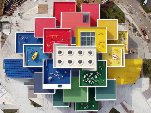
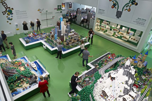
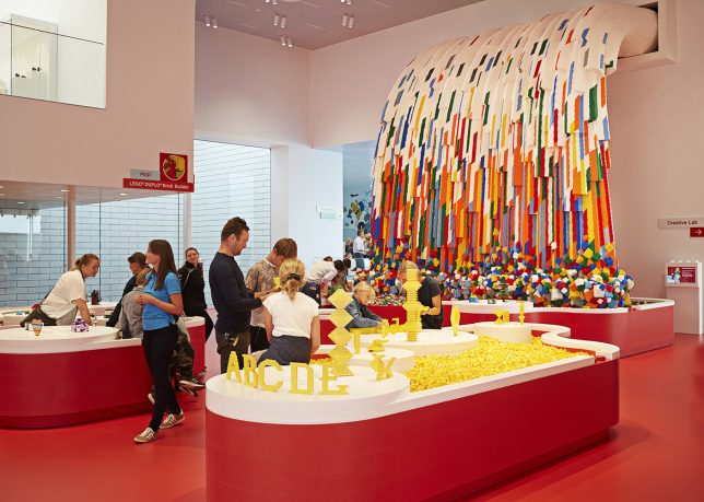
    Designed by architects from BIG, the new LEGO House is itself huge: a 130,000-square-foot ‘experience center’ welcoming people of all ages to play with and appreciate this ubiquitous toy.

    “It has been a dream for me for many years to create a place that will give our visitors the ultimate LEGO experience,” said former president and CEO of LEGO, Kjeld Kirk Kristiansen. A mesmerizing set of drone videos below show the building under construction and upon completion.

    “With LEGO House, we celebrate creativity and the strength of learning through play. When they play, children learn the basic skills that they need, such as creativity, collaboration and problem-solving abilities.”

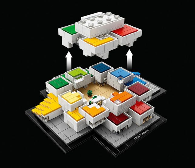
    Located on the company’s main campus in Billund, Denmark, the building looks like it was made of 21 supersized blocks. Inside, differently colored zones denote different functions — red areas are for creative skills, blue for cognitive skills, green for social skills and yellow for emotional skills.

    The venue includes paid attractions as well as experiences that are free and open to the public. Approximately 250,000 guests are expected annually, with around 2,500 visitors on peak days. Fans of their visit can take home something tangible from the experience as well:

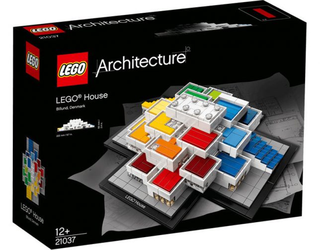
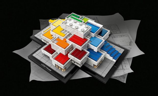
    The LEGO House opened its doors to the public in late September, coinciding with the release of a 744-piece kit of the building itself.

    Share on Facebook


    [ By WebUrbanist in Architecture & Offices & Commercial. ]

    [ WebUrbanist | Archives | Galleries | Privacy | TOS ]


    WebUrbanist

  • Yashica launches Y35 digiFilm camera that uses digital ‘film’ cartriges

    After a number of teasers over the past few weeks, Yashica has finally launched its ‘unprecedented camera’ on Kickstarter: meet the Y35 digiFilm camera. The description page does not offer an awful lot of technical detail, but it looks like the Y35 is relatively simple digital camera in a retro-style body that comes with a unique feature: interchangeable digital ‘film’ cartridges that Yashica calls digiFilm.

    The camera doesn’t actually save any images on the digiFilm (it has an SD-card slot for that) but instead ISO, color and digital filter settings are controlled by inserting a digiFilm cartridges. How’s that for a gimmick?

    To start with, Y35 users will be able to choose from an ISO1600 High Speed digiFilm for grainy images and shooting fast moving subjects, an ISO 400 Black & White digiFilm, an ISO 200 Ultra Fine digiFilm, and a ISO 200 “6 x 6” cartridge that makes the camera capture square images.

    Given most settings are adjusted by inserting a digiFilm cartridge, the camera body itself doesn’t offer a great deal of control. There’s only a “winder” to set the camera up for the next capture, and a shutter speed dial. The rest of the specifications are in line with quite basic digital cameras: images are captured on a 1/3.2-inch 14MP sensor and the lens comes with a 35mm equivalent focal length and F2.8 aperture.

    You can reserve an early bird Yashica Y35 digiFilm special for $ 124 on the Kickstarter page. This will get you the Yashica Y35 camera and the ISO 200 Ultra Fine digiFilm, plus a Yashica digiFilm post card. The package for $ 142 includes an additional digiFilm of your choice. Delivery is planned for April 2018, assuming the camera gets funded.

    Yashica Y35 Specifications:

    • 1/3.2-inch 14MP CMOS sensor
    • Built-in viewfinder
    • F2.8 aperture
    • 35mm equivalent focal length
    • 1m minimum focusing distance
    • 5 selectable steps shutter speeds 1s, 1/30s, 1/60s, 1/250s, 1/500s
    • SD card storage (wifi card compatible)
    • Micro USB connectivity for data transfers
    • Tripod mount
    • Power supply via 2 x AA batteries

    Articles: Digital Photography Review (dpreview.com)

  • How to Make Natural-Looking HDR Images with Aurora HDR 2018

    Aurora HDR 2018 is tremendously easy, fun software by Macphun, designed for processing HDR (High Dynamic Range) images. If you’ve been following popular contemporary photography for a while, you’ll know that dramatic HDR is no longer in style. It fell out of photography fashion as quickly as wine-lovers stopped drinking merlot. Knowing how to create natural-looking HDR images is a very practical tool to have in your wheelhouse though, so let’s take a look at how to do that with Aurora.

    How to Make Natural-Looking HDR Images with Aurora HDR 2018 - ice cave

    Realistic & Detailed Aurora HDR 2018 preset.

    When do you need HDR?

    If you’re shooting a location where there are very bright tones, along with very dark shadows, your camera probably won’t be capable of capturing exactly what your eye sees. If you bracket your images as you shoot, you can capture the entire dynamic range of the scene – every tone from very bright to very dark.

    What is bracketing?

    Bracketing means you shoot multiple images of the same thing, changing the exposure of each individual image. Most photographers choose to shoot between three and five images, though as few as two will work. Sometimes a situation requires seven or more. By bracketing your exposures this way, you generate the raw materials you need to use in Aurora HDR to create a final image that records all of the bright and dark tones your eyes saw.

    How to Make Natural-Looking HDR Images with Aurora HDR 2018

    My three bracketed images inside Lightroom.

    Setting your camera up to bracket

    First, attach your camera to your tripod, compose your scene and fine-tune your focus. Now, configure your bracketing. You can set the auto-bracketing feature (AEB) on your camera to shoot multiple images, approximately one to two stops of light apart, depending on the situation. The first image will be very light, or overexposed. The second image will be correctly exposed – or what your camera interprets as correct. The third image will be very dark or underexposed. Many photographers find three images to be effective, especially when they’re striving for a natural-looking HDR look but you can shoot as many as you think you’ll need.

    How to Make Natural-Looking HDR Images with Aurora HDR 2018 - back of camera AEB on

    Bracketing settings on a Canon camera.

    NOTE: If you don’t have a camera with an auto-bracketing feature, don’t worry, you can bracket manually too. Create multiple exposures for each scene using your exposure compensation dial to increase and then decrease your exposure (make sure to use Aperture Priority and only change the shutter speed as altering the aperture will result in images that do not blend properly). It takes a little more time and patience while you are shooting but it’s worth trying if your camera doesn’t have an auto-bracketing feature.

    How do you process the brackets?

    After your shoot, upload your images to your computer just like you normally would. Aurora HDR runs as stand-alone software but if you’re a Lightroom user, it can be installed as a plug-in too.

    Starting in Aurora HDR 2018

    Double click the Aurora icon to open the software. Click the Open Image button.

    Choose the folder where your images live and select them. Click Open.

    How to Make Natural-Looking HDR Images with Aurora HDR 2018 - select files

    The Aurora dialog box appears with your selected images. Click the Create HDR button.

    Note: Tick off the “Alignment” checkbox if you think there was any movement of the camera between shots. The program will scan the images and attempt to align them. You can also click the little gear icon for additional settings like removing ghosting (subjects that moved from image to image).

    How to Make Natural-Looking HDR Images with Aurora HDR 2018

    Starting in Lightroom

    Go to the folder containing the images you want to process in HDR. Click to select them. Right-click to bring up the menu. Select Export > Aurora HDR 2018 > Open Original Images. The Aurora dialog box appears with your selected images. Click the Create HDR button.

    How to Make Natural-Looking HDR Images with Aurora HDR 2018

    Note: If you made adjustments to your images in Lightroom, such as lens corrections, cropping, straightening, spot removal or noise reduction, instead of selecting Open Original Images, choose Use .TIFF with Lightroom Adjusters.

    Aurora HDR’s Realistic Presets

    Part of why I opened this article with the statement that Aurora HDR 2018 is both easy and fun is because of its presets. Along the lower part of the screen, just above the filmstrip, you’ll see a menu called Categories. Click on it to bring up the preset menu, then click on Realistic HDR.

    How to Make Natural-Looking HDR Images with Aurora HDR 2018

    My four favorite natural-looking Aurora presets live in this folder:

    • Realistic & Detailed
    • Realistic & Balanced
    • Realistic Bright
    • Realistic Neutral

    These presets make my images look and feel the way the ice cave looked and felt when I was there. To me, recreating an image faithful to that memory is what natural-looking realistic HDR is all about.

    How to Make Natural-Looking HDR Images with Aurora HDR 2018

    Choose your favorite

    The best way to choose your favorite Realistic HDR preset is to scroll all the way to the left on the filmstrip and then work your way right, clicking each one. As you select each preset, the larger image above the filmstrip will show you a more detailed preview of how each preset affects the look of your image. Once you find your favorite, it might look so perfect that all you might need to do is save it. Or, you might want to personalize the preset before you save. Here are a few tips on how to do that.

    Modifying the Opacity

    Let’s say that you love the Realistic & Detailed preset but it’s just a touch too much. The first – and easiest – way to modify its effect is to reduce the overall opacity of the preset. To do that, click on that preset in the filmstrip. Slowly shift the slider to the left, reducing the opacity, and lowering the effect (I often find that between 75-80 is the perfect amount). Save the image at this point if you are happy with it.

    How to Make Natural-Looking HDR Images with Aurora HDR 2018

    Another method of reducing opacity is layer-based. Look to the upper right corner of the Aurora HDR develop panel, just below the histogram. See where it says Layers? The Opacity adjustment slider for that layer is just below that. You can increase it or decrease it (each layer) there as well.

    Fine-tuning the preset

    If you’d like to use your chosen preset as a starting point, you can easily modify it. On the right-hand panel of the screen, in the editing panel, just below the Layers section, you’ll see a section called Filters. The first one is called HDR Basic which adds clarity, contrast, vibrance, and a bit of saturation. I’m calling this adjustment out specifically because it does so much to your image.

    Just for kicks, push the HDR Enhance slider all the way to the right, so that it’s at 100. Your image is now the opposite of what most people consider natural-looking HDR. Next, adjust the slider to zero to get a feel for what this slider does to your image.

    How to Make Natural-Looking HDR Images with Aurora HDR 2018

    Realistic & Detailed Aurora preset, with HDR Enhance set to 100. Compare this to the lead image of the same ice cave, with the HDR Enhance set at 50. This image is quite a bit more contrasty, with sharper edges throughout.

    Most of the Realistic presets are set below 50 for HDR Enhance. If you want to stay in a natural-looking range but your image needs a touch more pizazz, slowly move the HDR Enhance slider to the right until you reach the level that feels right to you.

    Additional fine-tuning options

    As you work your way through Aurora’s Filters, you’ll see additional options like Color, HDR Structure and Glow. The preset you’ve chosen dictates the setting of each Filter. But again, you can shift each slider individually to give your image more, or less, pop.

    How to Make Natural-Looking HDR Images with Aurora HDR 2018

    This HDR image was made from three exposures using the Realistic & Bright preset, set at an opacity of 80, with no other changes made.

    To learn the effects of each tool, I suggest moving the sliders all the way to the right, so that the effect is at 100 and then doing the opposite, so the effect is at zero. Nine times out of ten I think the Aurora HDR design gurus have chosen the right level, and I leave the preset at its original amount. If you do choose to make a change just remember that if your goal is natural-looking HDR, a little Structure or Saturation can make a big shift in the appearance of your image.

    Glow

    Glow is an interesting option, giving images an almost Orton-like effect. While it’s a popular style option for many photographers right now, it’s not what I usually call natural-looking. In all four of my favorites, Realistic HDR presets, the Glow setting is set to 0. For ice cave images, 0 is the perfect amount but for some subjects, like this barn, a touch of Glow softened the natural look of this HDR image and made it feel more inviting.

    How to Make Natural-Looking HDR Images with Aurora HDR 2018

    This HDR image was made from three exposures using the Realistic & Bright preset, set at an opacity of 100, with Glow set at 15. Both are very small changes but compare this image to the one above. This one has a little more of a bright, dreamy feel while still looking natural.

    While I probably sound like a broken record at this point, remember to move the slider just a touch to the right if you want your HDR image to have that natural, I-just-stumbled-on-this-gorgeous-vista-and-took-this-amazing-picture sort of look to it.

    Top and Bottom Adjustment

    The Top and Bottom Adjustment Filter is a “selective adjustment” meaning that, unlike global adjustments, it only affects parts of your image. If you have an image where the sky reads overexposed and is much brighter than the foreground, or conversely, where the foreground is dark and underexposed, adjust the image using this tool.

    How to Make Natural-Looking HDR Images with Aurora HDR 2018 - top and bottom adjustments

    This HDR image was made with the same three exposures using the Realistic & Balanced preset, at 80% opacity, plus a Top Adjustment of -5 Exposure, +5 Contrast and +15 Vibrance. I added a Bottom Adjustment of +10 Exposure and +5 Warmth. Of the three final HDR images, this one feels the most natural and faithful to the barn itself.

    For this final version of the barn, after applying the Realistic & Balanced preset, at 80% opacity, I ultimately decided that the sky was a bit too light and the barn was a little too dark. I added a Top Adjustment of -5 Exposure, +5 Contrast, and +15 Vibrance. I also added a Bottom Adjustment of +10 Exposure and +5 Warmth. These adjustments help to enhance the sky and even out the overall exposure of the image.

    Of the three, this version is my favorite. Which is yours?

    Saving your image

    Once you’ve completed all of your adjustments, it’s time to save your image. If you started in Aurora and want to create a JPEG or TIFF, select File > Export and then select the correct folder and rename the file as appropriate for your workflow.

    If you want to create a native Aurora .mpaur2 HDR file, select File > Save and then select the correct folder and rename the file. This format saves the history (and any layers) as well and allows you to continue to go back in and make changes to your image.

    How to Make Natural-Looking HDR Images with Aurora HDR 2018

    Saving your image to your Lightroom Catalog

    If you started in Lightroom, it’s a snap to save your image. After you finish processing your image in Aurora HDR, click the Apply button in the upper right corner of the interface. This saves and also catalogs your image in Lightroom. The new file name will end in AuroraHDR2018-edit.tiff.

    How to Make Natural-Looking HDR Images with Aurora HDR 2018

    Your Turn

    Hopefully, you’ve been following along and processed a few images in Aurora as you were reading this article. Now take a minute to upload your best natural-looking HDR version. Share with the dPS community about how you created it using Aurora as well as any other tips or tricks you’ve discovered.

    Disclaimer: Macphun is a dPS advertising partner.

    The post How to Make Natural-Looking HDR Images with Aurora HDR 2018 by Lara Joy Brynildssen appeared first on Digital Photography School.


    Digital Photography School

  • EyeEm now lets you collect multiple model releases at once over text message

    $ (document).ready(function() { SampleGalleryV2({“containerId”:”embeddedSampleGallery_9500155877″,”galleryId”:”9500155877″,”isEmbeddedWidget”:true,”standalone”:false,”selectedImageIndex”:0,”startInCommentsView”:false,”isMobile”:false}) });

    If you license images of people, you know how much of a pain it can be to gather the appropriate model releases. For every photo, you need a new release, even if you’re uploading 20 photos of the same person from the same photo shoot. Well, no longer. EyeEm just introduced a multi-release feature that lets you handle multiple releases at once; what’s more, you can do it all over text message.

    The feature is very straightforward, as EyeEm shows in this short demo video:

    It’s a 5-step process.

    • Step 1: Log on to EyeEm on the web, open the notifications pane, and go to To Dos.
    • Step 2: Click “Releases for multiple photos”
    • Step 3: Select all photos that show the same person
    • Step 4: Click next and fill out the model’s name
    • Step 5: Click next and share the link with your model through your favorite messaging app—SMS, WhatsApp, FB Messenger, and more are all available.

    That’s it. The model can select only the photos they want to release, and once they’ve signed you will receive a confirmation email.

    This might seem like a small feature, but if you’re a prolific stock photographer, generating multiple releases this easily removes a serious pain point. Plus, these releases can be used on other platforms as well, including Getty, Adobe, Alamy, and others.

    To learn more about the feature or give the EyeEm app a go for yourself, head over to the EyeEm Blog by clicking here.

    Articles: Digital Photography Review (dpreview.com)