Breakthrough Photography, a San Francisco-based startup, is seeking funding for what it claims is the ‘world’s sharpest and most color neutral circular polarizer,’ the X3 CPL. This polarizer is constructed with Schott B270 optical glass from Germany, MRC16 and nanotec coatings, a weather-sealed brass Traction Frame, and new American-made CrystalVision CPL film. Read more
Blog
-
Comparing a 24mm Versus 50mm Lens for Photographing People
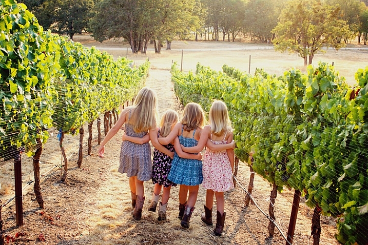
Image taken with Canon 60D and Canon 24mm EF-S lens.
A number of dPS readers have recently been asking about the Canon 24mm EF-S pancake lens, and how it compares to a 50mm lenses for photographing people. Both are great options, given the price point, but they do have slightly different strengths when it comes to people photography. In this article, I’ll show you several different images of the same model, location, and posing, photographed with both a 24mm and a 50mm lens. This will provide a good visual of the difference between the two lenses, as well as give you insight as to when you might want to reach for each one.

Image taken with Canon 60D and 50mm lens.
For continuity, all images in this post were taken with a Canon 60D, and either the Canon 24mm f/2.8 or the Canon 50mm f/1.8 lenses. The 60D is an APS-C sensor (cropped sensor) camera, so first you need to multiply the focal length of each of your lenses by 1.6x in order to determine the functioning focal length of them on this camera (if you use Nikon it may be 1.5x, check your manual). So on a cropped sensor camera, the 24mm lens functions roughly as a 38mm lens, and the 50mm lens functions as an 80mm lens. In other words, the 50mm lens is great for head-and-shoulders portraits, while the 24mm lens is great for photographing people in the context of their surroundings. In the above example, you can see that the 50mm lens provided a tight shot of these two sisters, with a blurred background that keeps all the attention on their faces.
However, the context for this session is also important, in that it took place at a family vineyard, and the clients wanted to be sure that the grapes were also visible in the background of some of the images. As you can see above, the grapes really weren’t visible in the portrait taken with the 50mm lens, nor would closing down the aperture really give the perspective of the vineyard that my clients were looking for. So, after taking a few portraits with the 50mm, I switched over to my 24mm lens in order to capture a few wider shots.
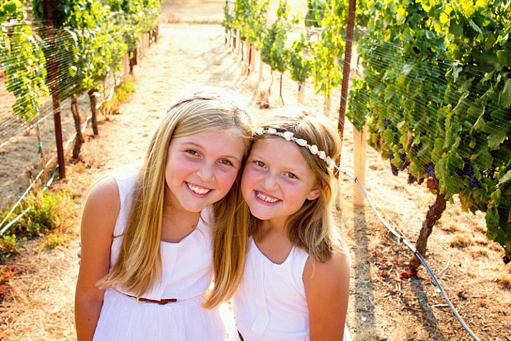
Image taken with Canon 60D and Canon 24mm EF-S lens.
Same girls, same exact location, very similar pose. The only real difference here is that with the switch to the 24mm lens, you can see more of the girls and the the area around them. In some instances, you may want to minimize the area around your subject, in which case the 24mm lens would not be ideal. However, in this case it allowed for the images that highlighted both the girls and the vineyard, which was what the clients were after.
Bonus tip: Photographing sibling sets with a 24mm lens also allows you to see the height differences between siblings more easily with the wider angle shot, which is something that a lot of parents really enjoy.
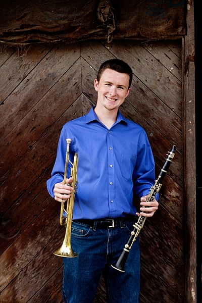
Image taken with Canon 60D and 50mm lens.
Another thing to consider, besides the contents of the background in your images, is the coloring of the background. In the image above, the deep colored wood background brings a moodiness to the image that could be appropriate for a musician. However, the interesting thing is that the overall feeling of the image changes quite a bit when you look at it from the 24mm angle of view.
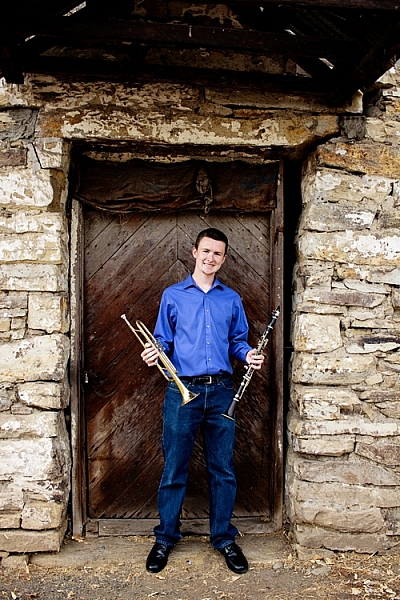
Image taken with Canon 60D and 24mm EF-S lens.
The second image, though in the same location, feels a lot less moody and dramatic than the first. The lighter stonework around the door brings a sense of balance to the image that just wouldn’t be achieved as well with the 50mm lens in this location. In my experience, this balance is especially important when it comes to converting images to black and white.
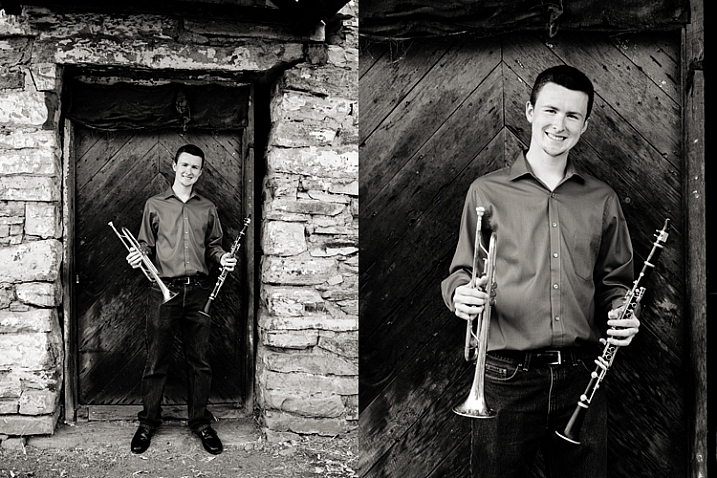
As you can see in the left image, the lighter stonework, around the darker door, serves as a frame for the subject, and naturally draws your eye in towards him. In addition, the increased contrast and texture provide some of the key ingredients for black and white images, which makes the image more aesthetically pleasing than the image on the right.
Overall, while there may be instances in which the content or coloring of your background may cause you to reach for one of these two lenses over the other, I’m very much in favor of using both of them whenever possible. Here’s a quick example from my own life to explain why both are so great for their own reasons. I recently photographed my girls in their Halloween costumes. I started with the 50mm lens because it’s my favorite.

Image taken with Canon 60D and 50mm lens.
I love this image of both girls (above) – the 50mm lens really lets you see their faces and expressions well, and the bokeh of the 50mm f/1.8 helped soften the literal construction site in the background of the image. However, the closer crop also means that only a small portion of their costumes were visible.
So, I switched over to my 24mm lens to take a full-length photo (below) of my little monkey and my lion as well. Now, I can really see them from head to toe. I can see the little fake feet of the monkey costume that freaked my youngest daughter out so much that she begged her sister to switch costumes with her. I can see the height difference between the two of them. I can see the black flats that my oldest daughter is so proud of, and wears to any event that she deems remotely “fancy”. Those are all things that I want to look back on, and remember. I love both images for different reasons, and am so happy to have them both, thanks to my trusty 24mm and 50mm lenses.
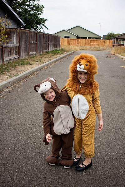
Image taken with Canon 60D and 24mm EF-S lens
I hope this has given you a good idea of how these two focal lengths compare when photographing people.
Have you tried the Canon 24mm EF-S lens? How do you use it? Do you have a nifty-fifty and do you use it for people photography? Which is your favorite? Please share your comments and images below.
googletag.cmd.push(function() {
tablet_slots.push( googletag.defineSlot( “/1005424/_dPSv4_tab-all-article-bottom_(300×250)”, [300, 250], “pb-ad-78623” ).addService( googletag.pubads() ) ); } );googletag.cmd.push(function() {
mobile_slots.push( googletag.defineSlot( “/1005424/_dPSv4_mob-all-article-bottom_(300×250)”, [300, 250], “pb-ad-78158” ).addService( googletag.pubads() ) ); } );The post Comparing a 24mm Versus 50mm Lens for Photographing People by Meredith Clark appeared first on Digital Photography School.
-
Muji Huts: 3 Minimalist Prefab Dwellings Starting at $25,000
[ By WebUrbanist in Architecture & Houses & Residential. ]
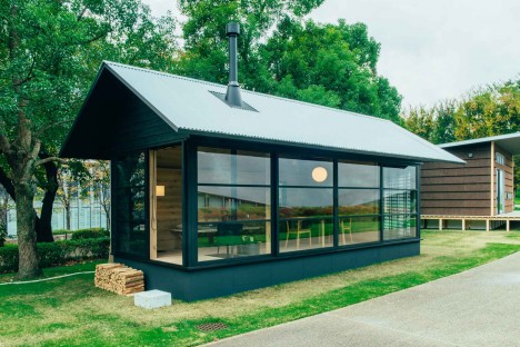
Three designers contributing to the Muji Hut project have pitched their tent-, cottage- and cabin-inspired ideas for tiny retreats at Tokyo Design Week, each structure borrowing lessons in simplicity from Japanese housing traditions. The spaces are intentionally essential, featuring just what one needs to relax and enjoy natural surroundings and family gatherings.
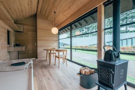
The Wooden Hut by Naoto Fukasawa is both open and cozy, with floor-to-ceiling windows, a soaking tub hidden behind a wall and a wood-burning stove to warm the interior. A wood-burning stove heats the interior, which is furnished with a cot, dining table and chairs, and kitchenette.
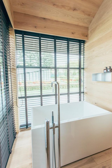
“When I hear the word hut, I’m attracted,” says designer Naoto Fukasawa. It’s not quite a villa but not as simple as a tent. With a small hut you can burrow into the wilderness whenever you want.”
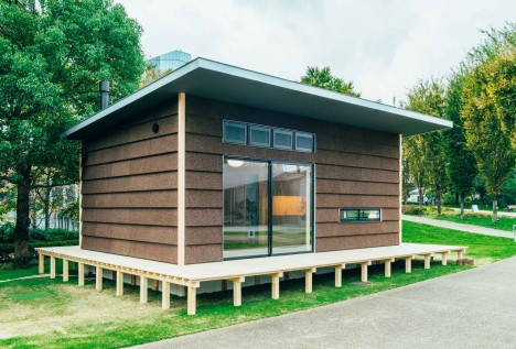
The Cork Hut by Jasper Morrison has space for cooking, eating, gathering and sleeping, featuring a trim aesthetic with simple lines brought to life by variegated cork surfaces.
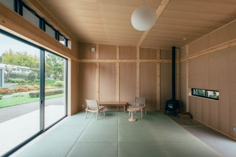
“Whenever I think about going to the country for the weekend, I start imagining a small house with everything needed for a short stay,” says Jasper Morrison.
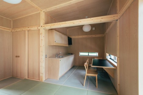
“The dream usually collapses when I think of the complexity of building a new house, but with this project I realized there was a chance to design such a house as a product rather than a one-off.”
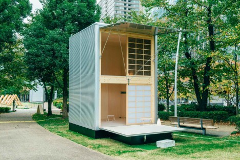
The Aluminum Hut by Konstantin Grcic has a small footprint to avoid the need for building permits. A ladder leads occupants up to sleeping lofts while flexible aluminum awnings protect it in transit.
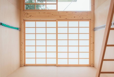
“The hut is just a space — it doesn’t have to be a fully functioning place for living,” says Grcic.
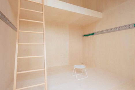
“There doesn’t have to be water or electricity. It is just a space for doing something.” The trio of huts will go on sale soon, starting at approximately $ 25,000 USD.
Want More? Click for Great Related Content on WebUrbanist:
Pocket Tent: Tiny Prefab Home Inflates Itself with Body Heat
A brilliant application of material science toward simple living, this portable self-inflating structure folds up into a manageable miniature package but …
Click Here to Read More »»
Temporary Retrofit: Micro-Dwellings for Unoccupied Buildings
Designed for empty warehouses or buildings under construction, these material-light shelters provide functionality for liminal interiors either past their …
Click Here to Read More »»
Speedy Prefab: How a 9-Story Apartment Was Built in 5 Days
We see conceptual modular designs of this kind all of the time, but rarely such exquisite real-world proof of how fast construction can be in the age of …
Click Here to Read More »»


[ By WebUrbanist in Architecture & Houses & Residential. ]
[ WebUrbanist | Archives | Galleries | Privacy | TOS ]
-
How to do Basic Processing on a Portrait in 5 Minutes Using Lightroom
There’s a Triangle of Service that you may have seen before which goes something like this: You have three options available (cheap, quick, quality) but can only choose two. I first saw this on a sign in an automotive shop years ago, but it applies in almost any professional setting where goods and services are produced for consumption, and is especially true in photography.
As a photographer you don’t have unlimited time, but you and your clients expect quality results, and doing so is not always cheap or easy. Fortunately Lightroom makes it simple to do a basic portrait processing job in only a few minutes, which you can then copy and paste to other similar photos, to make your work even faster.

Before I get too deep into this article I want to make clear that the following steps are a process that works for me, but your unique solution might be a bit different. The important lesson is to find a workflow that is easy to replicate and repeat, so you don’t spent all your time doing the same types of edits over and over.
As you work with any editing program – whether it’s Lightroom, Photoshop, Capture One, or even a free tool like Photos or Picasa – it’s a good idea to find an editing style that matches your photography style. I know the look I’m going for when I edit a portrait or headshot, which might be entirely different from what you prefer. Knowing how to achieve my particular style has taken me a while, but now I find that my editing is a lot quicker, because I start each photo with a particular set of steps:
- White Balance
- Tone
- Sharpening
- Vignette
These steps are quick, usually get me 90% of the way towards a finished image, and will often result in a finished portrait with no additional editing required. Let’s look at each step one by one:
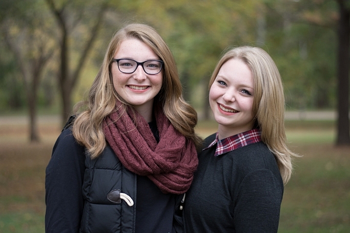
This original is decent but it needs some tweaks before it’s good enough to give to my client.
Step 1: White Balance
One advantage of shooting in the RAW format is that you can calibrate the White Balance of your images afterwards, whereas shooting in JPG leaves you much less leeway to edit not just White Balance, but most other aspects of the photo as well. Of course, one drawback of shooting in RAW is that calibrating the White Balance can take a lot of time, but much of this can be mitigated by using Lightroom’s eyedropper tool (targeted adjustment tool) instead of fiddling with the sliders on your own.
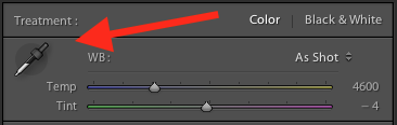
To quickly adjust the White Balance, click the eyedropper icon, then find a part of your image that is neutral in color – think slightly gray instead of pure white. The eyedropper tool might not get you the perfect overall color, but it will quickly get you close to your target, after which you can adjust the Temperature and Tint sliders to your liking.
Another tip to speed things up is to click directly on the Temperature and Tint numbers and use the up/down arrows to adjust their values, or hold down the [shift] key while doing so to make larger incremental changes.
Step 2: Tone
After you get your initial White Balance set, it’s time to make some initial adjustments using the rest of the Basic panel in the Develop module. To get my particular look, I almost always start off with the following values. You can change each one quickly by highlighting the numbers, entering new values, and pressing [Tab] to move to the next set of numbers instantly.
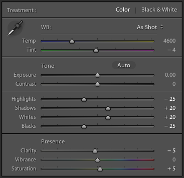
Exposure 0, Contrast 0. I don’t change these values until I make the following adjustments you see below. Because they are global, and affect the entire image, that is not usually what I want to do right away. If the image is still too light or dark after doing the rest of the basic adjustments, I’ll increase or decrease exposure accordingly, but rarely do I need to adjust contrast and you’ll see why in the steps below.
Highlights -25. This helps even out the bright portions of the portrait so any spots that are a little bright are brought down a bit.
Shadows +20. This is a way of brightening just the dark parts of the portrait to bring out a little more color and definition.
Whites +20, Blacks -25. I use these sliders instead of adjusting the contrast because it gives me more granular control over the look and feel of my portraits. I’m essentially making the whites and blacks more pure, which helps give the portrait a richer look overall. Some people skip this step and make adjustments to the Tone Curve, but it’s all a matter of personal preference, though I usually find the white/black adjustments to be quicker.
Clarity -5. Most people bump up the clarity slider which essentially affects edge contrast mostly in the midtones, but I like a slightly more subdued look so I usually start by lowering it a few notches.
Vibrance 0 (zero). This slider mostly affects colors outside the normal range of human skin, so it can be useful if you shoot outdoors and want to make the nature colors pop. I leave it at zero as a general rule, and then adjust later as necessary.
Saturation +5. I usually like a bit more color to start things off, so I start with a small value increase here, and then go up or down as necessary.
I always start with these adjustments, and then tweak as necessary. The whole process only takes a minute and almost always results in an image that is dramatically improved over the initial import.
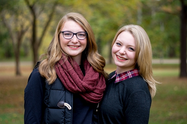
This image is already more vibrant than the initial picture even though most of the adjustments were very basic.
Step 3: Sharpen
After the color and tonal adjustments are finished, I almost always apply some degree of sharpening to the image. With portraits, it’s essential that the eyes be in focus and sharp, so the next thing after Basic adjustments, is to use the Detail panel to get the sharpening you want.
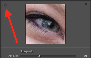
Click the targeting symbol in the top-left corner and then click on your subject’s eye to get a zoomed in view, then adjust your sharpening accordingly. I usually start with a value of 50 and then tweak additional parameters like Radius or Detail if I need to, but this basic adjustment is quick and usually gets me right near where I want.
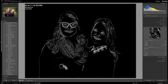
I also apply a mask to the sharpening so it doesn’t apply to areas like faces. This helps keep the eyes sharp without adding unwanted texture to people’s skin. If you hold down the ALT key while you click the Masking slider you will see something like this (below). The white areas are where sharpening will be applied, the black areas will not. Use this to decide how far you want to take the masking on your portrait.
Step 4: Vignette
This one is a bit controversial – some people like vignettes, and some think they are an abomination unto modern photography, but as I said in the beginning this is all about finding a style and workflow that works for you. I usually add a slight vignette to my portraits, but if that’s not your thing then you can skip this step altogether. It’s not part of everyone’s five-minute workflow but it fits neatly in with mine, which is why I’m including it here. I only use a little bit of highlight priority, dark vignette, and try to keep the effect subtle.
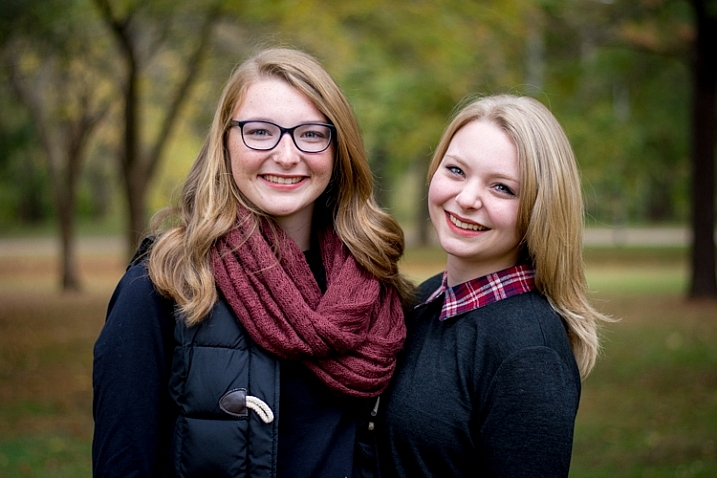
That’s it – finished
Doing these four steps won’t always lead you to a finished portrait, but as the title of this article implies, you can usually get to a very nicely-edited portrait in under five minutes with these simple steps. You might have additional adjustments like adjustment brushes, spot removal, or red-eye corrections to do afterwards, but this will get most of the essentials out of the way.
Before
After – subtle but you can see the differences
Save your settings as a Preset
One final way to speed things up even more is to create a preset based on your workflow, which you can then apply to all photos on import.
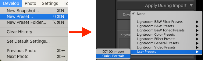
If you take this angle, be sure to err on the side of caution and be a bit more conservative with your edits when creating the preset. You probably won’t want want to apply the same dramatic alterations to every single photo, but if you do find yourself reusing the same workflow over and over it might be worth your time to do an import preset.
Alternatively, you can create a preset and apply it at will after import by right-clicking on any photo in the Develop module, and choosing your preset from the “Develop Presets” shortcut (or find it in the Develop Presets panel on the left side panel of Lightroom).
What quick portrait processing tips work for you? Are there any specific actions you have found that save you a great deal of time? Share your thoughts in the comments below, and any example images of what your finished portraits look like are always welcome.
googletag.cmd.push(function() {
tablet_slots.push( googletag.defineSlot( “/1005424/_dPSv4_tab-all-article-bottom_(300×250)”, [300, 250], “pb-ad-78623” ).addService( googletag.pubads() ) ); } );googletag.cmd.push(function() {
mobile_slots.push( googletag.defineSlot( “/1005424/_dPSv4_mob-all-article-bottom_(300×250)”, [300, 250], “pb-ad-78158” ).addService( googletag.pubads() ) ); } );The post How to do Basic Processing on a Portrait in 5 Minutes Using Lightroom by Simon Ringsmuth appeared first on Digital Photography School.
-
Into the woods: Samsung NX500 Field Test
It’s not often we get to eat what we photograph, but that’s what we did in our latest Field Test. We took the Samsung NX500 into the woods with pro photographer and mycology enthusiast Eirik Johnson to forage for some wild mushrooms. While providing a keen eye to make sure we didn’t try to eat anything poisonous, Eirik also helped us try out the NX500’s imaging and 4K video features. Read more
-
dPS Writer’s Favorite Lens: Rokinon 14mm f2.8
“What do you mean it’s a manual lens?”
That is usually the first response I receive when I tell people about one of the favorite lenses I keep in my bag: The Rokinon 14mm f/2.8. I understand their confusion. I never dreamed that I would succumb to the seeming devolution of using fully manual lenses.
Allow me to attempt to dispel the myth that manual focus/aperture lenses are difficult, and ungainly in the field. In mere months the Rokinon 14mm f/2.8 has quickly became a workhorse of my photo arsenal – let me tell you why. Grab a tissue, because it is a love story.
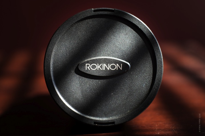
When I say that the Rokinon is a fully manual lens, what I mean is that there is no autofocus, and that the aperture must also be selected manually, using an aperture ring. This is a sticking point for most photographers, who have only used fully automated lenses. Personally, I have used fully manual legacy lenses for years, and have come to love the tangible control they require while I’m shooting. I really feel connected to the experience, more than I do when using an autofocusing lens.
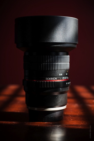
I will still admit, however, that a fully manual lens is not always ideal for every situation. So what type of photography suits the Rokinon best? The reason I purchased this lens in the first place was because I needed a fast, wide-angle lens, that can function as a main piece of glass for my astrophotography work. I find myself aiming my camera toward the sky more and more, so I really needed a quality lens that could serve as my go-to for most, if not all, of my nightscapes.
The wide-angle view, and relatively large aperture of f/2.8, makes the Rokinon ready-made for night photography, but of course, it is also a great tool for ultra-wide landscape shots. Some may find the 14mm focal length to be just a little too wide for a general purpose landscape lens, but it is most definitely capable of filling the role.
The most incredible quality about the Rokinon 14mm f/2.8 is just that, its quality. For the price, I can honestly say I have never encountered such a well-made lens, that produces tack sharp results throughout its aperture range. My initial test shots surpassed any expectations I could have hoped for from such a budget lens. Reading comments and testimonials from other users of the lens really left me with a healthy dose of, it’s too good to be true, doubt lingering in my mind.
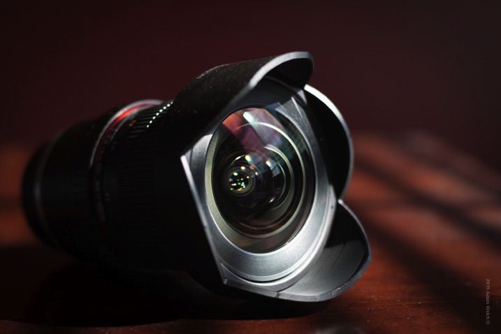
The quality of the build, and the subsequent image sharpness, are virtually on par with lenses which cost literally ten times as much as the Rokinon. I’m not suggesting that a lens with an average cost of $ 324 will be exactly the same as a lens costing $ 1,300 – but the gap between price and performance is, for lack of a better word, incredible. The aperture ring is comfortable to use, and produces a click at each f/stop, marking that is solidly satisfying.
Something that I really like about the Rokinon is the focusing ring. I has a very long travel when acquiring focus; meaning that adjusting occurs relatively slowly. This allows you to achieve tack sharp focus while shooting with the lens wide open at f/2.8, and makes honing in on stars very easy without over or under focusing.
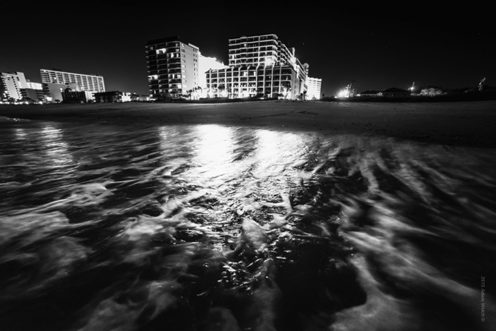
A common point of discussion concerning the Rokinon, in regard to its suitability for night photography, is the extreme low occurrence of “coma” when imaging the stars. Coma refers to an optical phenomena called “comatic aberration” (not to be confused with chromatic aberration). Coma is the distortion of small points of light when the light rays enter the lens at sharp angles, which makes small points of light, such as stars, appear to look like comets with small tails. Coma is amplified by imperfections in the lens geometry itself, or in the lens elements, and usually gets worse the further you move from the center of the lens. Yet strangely enough, the Rokinon excels in low coma aberrations, even to the point of OUTPERFORMING higher priced lenses of the same focal length and aperture ranges.
The Rokinon 14mm f/2.8 lens is one that I have grown to love in a relatively short time. The majority of my work revolves around landscapes, and shooting at wide-angles, often in low light. The Rokinon fills the requirements of my shooting needs, and then some.
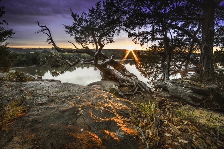
The full manual functionality of the lens could be odd if are not used to shooting that way, but for me I find it in no way slows me down, or hinders the quality of my images – in fact quite the opposite. The build quality, sharpness, low-light performance, and low coma are bundled together at a price that hovers in the $ 320 USD end of the pool.
In my opinion, if you are looking for a great landscape and astrophotography lens, or if you’re just wanting to get creative with wide angles, look no further than the Rokinon 14mm f/2.8.
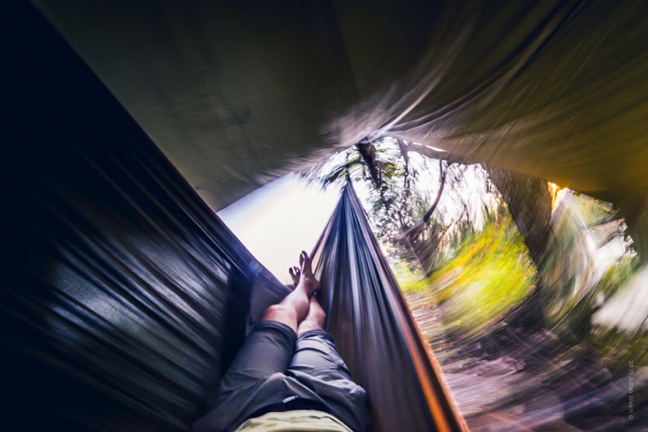
What you’ve all been waiting for…here are some images shot using the Rokinon 14mm f/2.8! All images shot with a Sony A7r and processed using Adobe Lightroom CC.
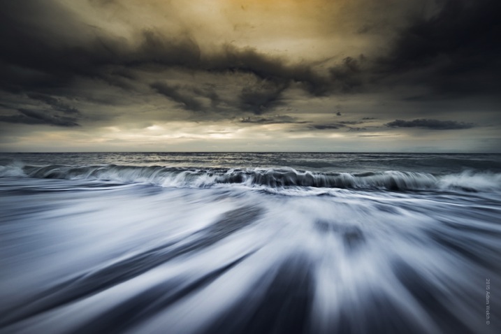

googletag.cmd.push(function() {
tablet_slots.push( googletag.defineSlot( “/1005424/_dPSv4_tab-all-article-bottom_(300×250)”, [300, 250], “pb-ad-78623” ).addService( googletag.pubads() ) ); } );googletag.cmd.push(function() {
mobile_slots.push( googletag.defineSlot( “/1005424/_dPSv4_mob-all-article-bottom_(300×250)”, [300, 250], “pb-ad-78158” ).addService( googletag.pubads() ) ); } );The post dPS Writer’s Favorite Lens: Rokinon 14mm f2.8 by Adam Welch appeared first on Digital Photography School.
-
Istanbul reloaded
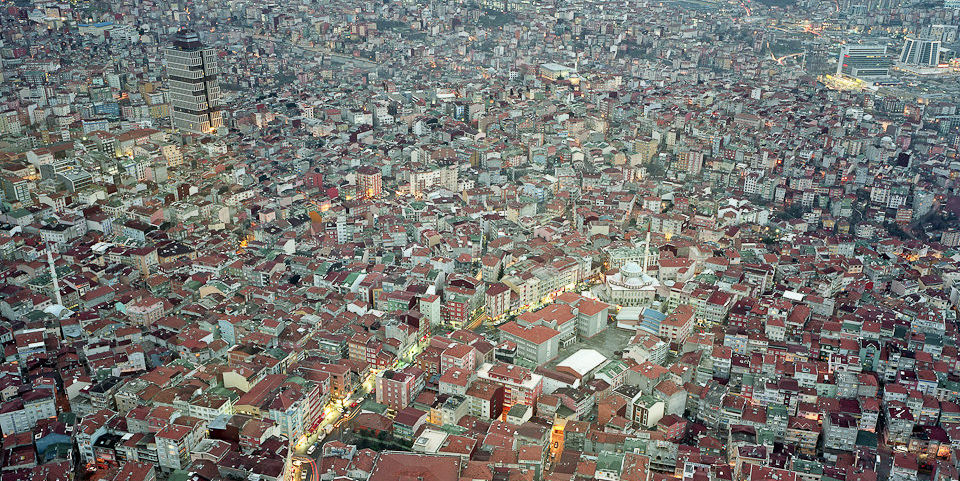
Jede Stadt hat ihre eigene Dynamik und verändert sich mit der Zeit ganz selbstverständlich. Die Faktoren, die die Veränderung beeinflussen, sind zahlreich und hängen auf komplexe Weise zusammen.
kwerfeldein – Fotografie Magazin | Fotocommunity -
Zig-Zagging Wooden Stairway Leads to Book-Shaped Building
[ By Steph in Architecture & Public & Institutional. ]
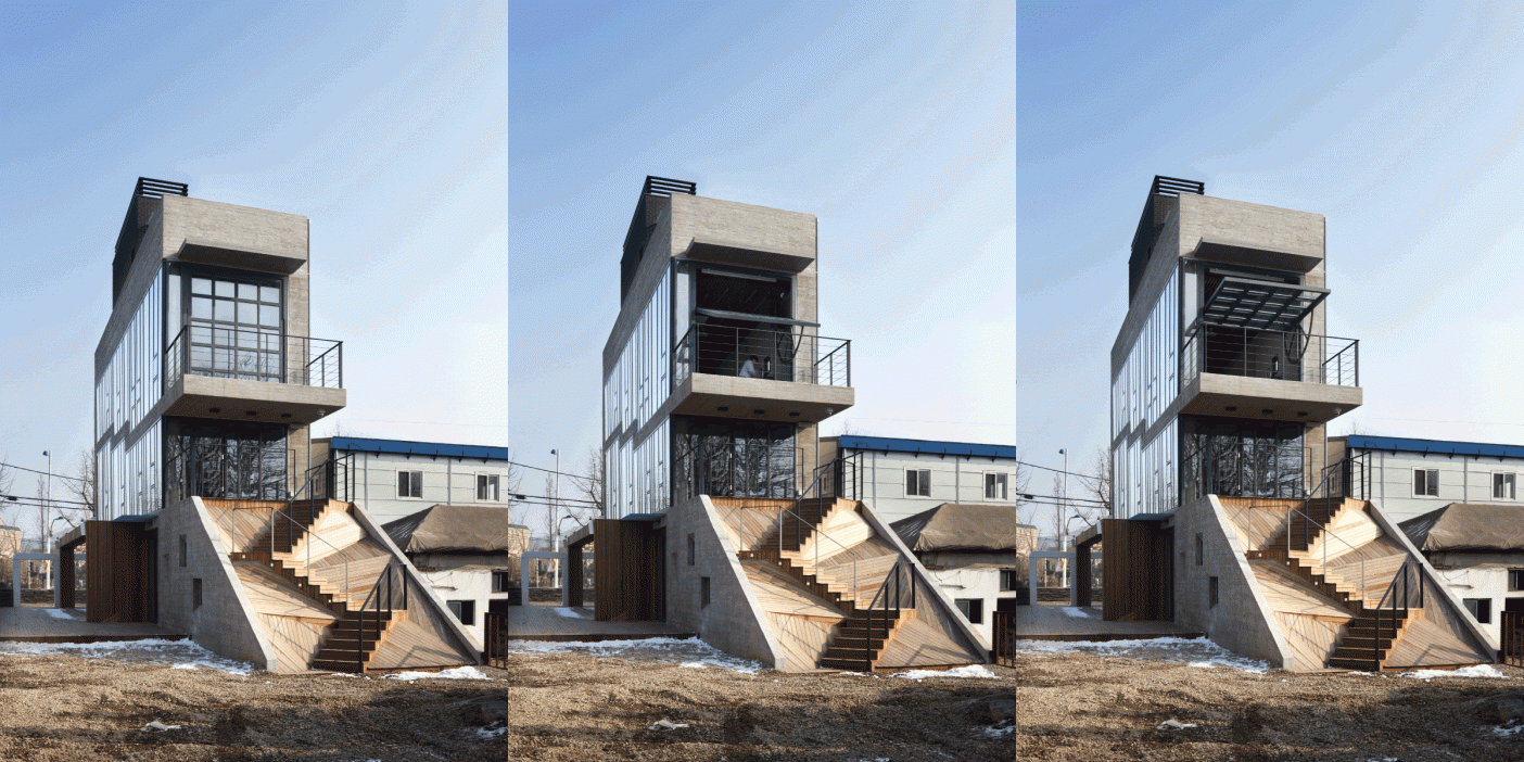
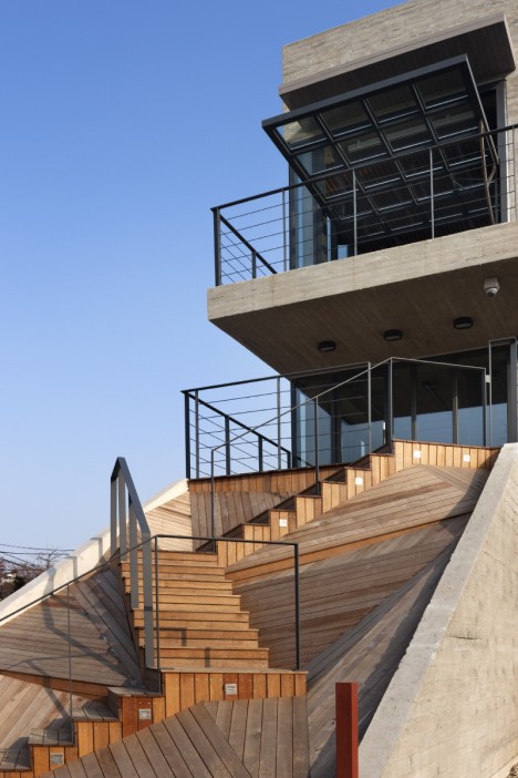
Shaped like a book, a cultural facility on the boundary between a residential neighborhood and industrial area in a suburb of Incheon, South Korea acts as a smooth visual segue-way. Placed on a narrow site, the concrete structure measures just four meters wide and features an eye-catching zig-zagging wooden staircase leading from the ground floor to the first level.
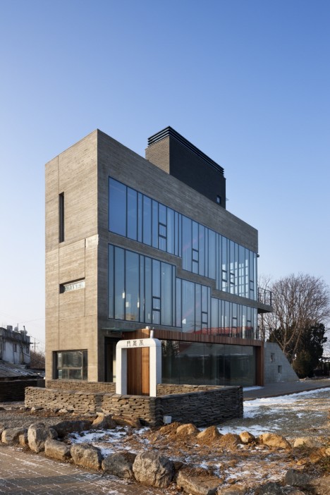
The building acts as a visual landmark for a town that lost its identity, a feeling the architects at Studio Gaon liken to an old man without fingerprints. The town of Gajwa-dong was once a fishing village positioned on the edge of the sea, but land reclamation projects re-routed the water. Views of the waves have now turned into bustling highways and unremarkable factory buildings.
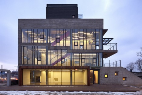
The owner of a 400-year-old house next door donated the oddly-shaped plot to the community after discovering that what he thought was his neighbor’s land was actually his own, with the request that the new structure act as a screen between his home and the industrial buildings next door.
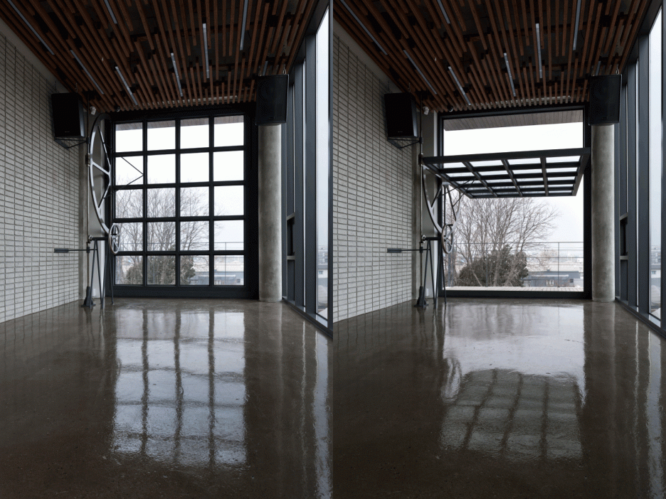
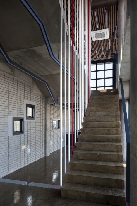
The resulting Sinjinmal building feels calm and solid with its cast-concrete walls bearing wood grain textures and expanses of glazing flooding the interiors with light. The zig-zag stairs outside reference those of a historic South Korean pavilion, while the interior stairs are painted bright red “suggesting past time, present, and future alterations.” A full-height, full-width glass door on the second floor seminar room pivots open to a terrace with the help of a manual winch.
Want More? Click for Great Related Content on WebUrbanist:
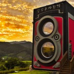
Camera-Shaped Cafe Offers Picture-Perfect Cups of Coffee
A giant two-story camera rises from the grass beside an ordinary suburban home in the hills of South Korea. The Dreamy Camera Cafe is housed in a re-creation …
Click Here to Read More »»
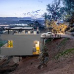
House in Reverse: Rooftop Driveway Leads to Hillside Home
Most people with single-family homes are used to pulling up into their driveways and then ascending flights of stairs to get to the living spaces. But in this …
Click Here to Read More »»
Philadelphia City Hall: Tallest Masonry Building in the World
Did you know that brick or stone-clad buildings you see today almost invariably hide a steel support structure that does the actual work?
Click Here to Read More »»
[ By Steph in Architecture & Public & Institutional. ]
[ WebUrbanist | Archives | Galleries | Privacy | TOS ]
-
2015 Roundup: Advanced Zoom Compacts
While most of the cameras in this category fall within the $ 500-$ 800 range (with a few exceptions), offerings vary quite a bit in terms of sensor size, control points, zoom range, video capabilities and built-in electronic viewfinders (or lack thereof). In general, we only included flagship compacts from each brand. All of the cameras here offer some sort of zoom range, in general, less than 8x. Get an overview of the category and find out our recommendations. Read more
-
Timber Transformations: 13 Space-Expanding Wood Interior Inserts
[ By Steph in Design & Fixtures & Interiors. ]

Customized to each particular interior, these wooden built-ins add lofted bedrooms, closet space, bookshelves, reading nooks, hidden laundry rooms and elevated workspaces in incredibly compact packages. Often performing like massively oversized furniture, custom timber creations can help make tiny apartments livable, taking full advantage of vertical space.
Bookcase Loft

A loft living room gets the addition of a library-style bookcase, closet, lofted wardrobe space, stairs and a small bedroom. Made of heartwood pine, the box insert measuring 16x17x10 takes full advantage of the ceiling height in the space.
Cabin in a Brooklyn Loft


A loft in Brooklyn gets a fun and functional new bedroom space reminiscent of a rustic cabin in the woods, creating a private room that also adds architectural interest to the space.
Garage to Studio Transformation


A garage in Moscow is now a studio space for an architecture student thanks to the addition of a bunch of built-in wooden elements, including a grid shelving system, work desk, sofa and suspended loft bed.
Sculptural Laser-Cut Shelving


Far more visually interesting than the average bookcase, this laser-cut built-in wall of shelves continues onto the ceiling in a single flowing form to become a sculptural focal point.
Multi-Level Artist Retreat


This artist-in-residence project at department store de Bijenkorf in Amsterdam fills the uniquely tall space of a historic tower with a beautiful series of stacked rooms decked out with cabinets, tables and bed platforms.
Next Page – Click Below to Read More:
Timber Transformations 13 Space Expanding Wood Interior Inserts
Want More? Click for Great Related Content on WebUrbanist:
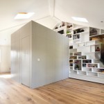
Ultra-Compact Stairs: 12 Next-Level Space-Saving Designs
Clever integration of storage, dangerous-looking alternating treads and unusual wall-mounted designs enable these 12 compact staircases to avoid the problem of …
Click Here to Read More »»

Tiny Apartment Tricks: 13 Ideas for Ultra-Compact Spaces
If you want to live in a tiny apartment without murdering your significant other or feeling like your home is a jail cell, you might want to employ a few of …
Click Here to Read More »»
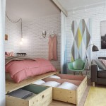
When Every Inch Counts: 14 More Clever Small Space Hacks
Making a tiny living space comfortable and practical means integrating multi-purpose furniture, custom built-ins and lots of other clever space-saving tricks. …
Click Here to Read More »»
[ By Steph in Design & Fixtures & Interiors. ]
[ WebUrbanist | Archives | Galleries | Privacy | TOS ]