Blog

  • Cruelty of Concrete: Harsh Architecture in Berlin & Beyond

    [ By Steph in Architecture & Public & Institutional. ]

    berlin brutalism fem 1

    There is an innate coldness and harshness to concrete that lends it a sinister air, as if unsavory practices are carried out within, even if the building is actually in use as a church or monastery. Spanning a range of architectural styles and movements from Bauhaus to Constructivism, most of these concrete wonders of Europe are in use as animal research facilities, former bunkers, libraries and hotels, while others remain abandoned.

    Mouse Bunker, Berlin: FEM Animal Testing Facility

    berlin brutalism fem 2

    berlin brutalism fem 3

    The imposing exterior of the FEM facility at Berlin’s Research Institute for Experimental Medicine is fittingly frightening for the activities that take place within: namely, testing on 88,000 laboratory animals. Known locally as the ‘Mouse Bunker,’ FEM was built in 1980 and its shape was ironically inspired by the sheep-stalls of Lower Saxony.

    Sainte Bernadette Church, Nevers
    cruel concrete st bernadette 1

    cruel concrete st bernadette 2

    cruel concrete st bernadette 3

    Designed by French architect Claude Parent and built in 1966, the Sainte Bernadette Church in the city of Nevers is about as un-churchlike as churches get. The solid concrete Brutalist structure eschews ornamentation for a utilitarian appearance that continues into the interior.

    Bibliotheque Louis Nucera, Nice, France

    crucl concrete bibliotheque

    cruel concrete bibliotheque 2

    This modern library in Nice is among the world’s most unusual, with a square block sitting atop a giant sculpted neck. Named for author Louis Nucera, the building is a joint project between architects Bayard and Chaps and sculptor Sacha Sosno.

    IBM France Research Center

    cruel concrete ibm france

    cruel concrete ibm france 2

    cruel concrete ibm france 3

    Marcel Breuer’s 1962 IBM Research Centre and Forum features a double Y-shaped plan situated on a sloping site overlooking the French Riviera. Precast concrete units on the facade disguise a system of in-situ concrete columns

    Ghostly World War II Boat Pen, Bordeaux, France
    cruel concrete sous marine 1

    cruel concrete sous marine 2

    cruel concrete sous marine 3

    cruel concrete base sous marine 4

    Sections of the abandoned Base Sous-Marine in Bordeaux are occasionally put to use as a dramatic backdrop for special events, but otherwise, this World War II wonder completed by the Germans in 1944 remains hauntingly empty. It once served as a home base for supply boats, torpedo transports, U-boats and the 12th Flotilla of long-range boats in the war and features a nearly indestructible 30-foot-thick roof. The whole thing occupies a total area of nearly 463,000 square feet and was made from 21,188,800 cubic feet of concrete.

    Forum Hotel, Krakow

    cruel concrete forum hotel

    cruel concrete forum hotel 2

    cruel concrete forum hotel 3

    Constructed between 1978 and 1989, Krakow’s Hotel Forum remains one of Poland’s most sci-fi-looking structures, but today, it’s deteriorating, its facades often covered in oversized billboards.

    St. Agnes Church, Berlin

    cruel concrete st. agnes church

    Once adorned with a neon blue cross that gently illuminated its harsh silhouette in the geographical center of Berlin, St. Agnes Church (built in 1967) was recently turned into an art gallery.

    Jesuit Cloister by Paul Schneider-Elsleben, Nymphenburg
    cruel concrete jesuit cloister

    Life must have felt harsh for the Jesuit monks who inhabited this Nymphenburg monastery by Paul Schneider-Esleben, completed in 1965.

    Water Towers in Germany by Bernd & Hilla Becher
    cruel concrete water towers 3

    cruel concrete water tower 2

    Water towers take on all sorts of weird shapes around the world, but Germany has its own special collection of Brutalist concrete versions by Bernd & Hilla Becher and Helmut Erdle.

    Tour Vigie et Reservoir, Gaston, France
    cruel concrete tour vigie

    Undeniably weird, this watchtower and reservoir designed by Gaston Jaubert and built in 1974 looks over the port of Fos-sur-Mer in France.

    Radio Kootwijk, Netherlands
    cruel concrete radio netherlands

    cruel concrete radio netherlands 2

    Pre-dating most Brutalist and modernist architecture by several decades, the Radio Kootwijk building began construction in 1918. Designed by Dutch architect Julius Maria Luthmann in Art Deco style, it’s an interesting juncture of a typically ornate architectural style and a rather impersonal material. The Germans blew up the transmitter during World War II and the building has been in disuse ever since.

    Pilgrimage Church by Gottfried Bohm, Neviges, Germany
    cruel concrete pilgrimage church 1

    cruel concrete pilgrimage church 2

    Designed by Pritzker Prize-winnign architect Gottfried Böhm and built in 1963, the Pilgrimage Church in Neviges, Germany resembles nothing more than an organic composition made from an unnatural medium, like a cluster of oversized crystals rising from the green hillside.

    Share on Facebook


    [ By Steph in Architecture & Public & Institutional. ]

    [ WebUrbanist | Archives | Galleries | Privacy | TOS ]


    WebUrbanist

  • Die Visualisierung von Erinnerungen

    Luisa Huebner

    Ein Beitrag von: Luisa Hübner

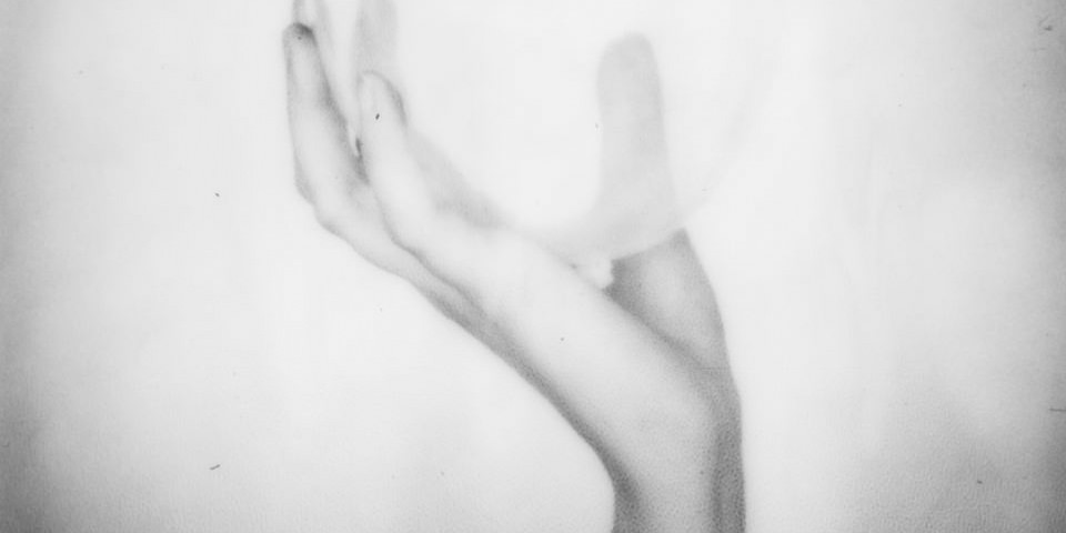
    Luisa Hübner lebt und arbeitet in Wien und erlernte ihr Handwerk an der Schule Friedl Kubelka für künstlerische Fotografie in selbiger Stadt. In ihren Arbeiten beschäftigt sie sich mit dem menschlichen Unterbewusstsein und versucht, es mit Hilfe ihrer Kamera dingfest zu machen.
    kwerfeldein – Fotografie Magazin | Fotocommunity

  • 16. November 2015

    Das Bild des Tages von: Andreas Krone

    22960214536_Andreas Krone

    Im Ausblick: Vollbartkunst, Fotobuchbesprechungen, Paare und Hasskommentare.
    kwerfeldein – Fotografie Magazin | Fotocommunity

  • Canon PowerShot G5 X and G9 X added to studio comparison, real-world G9 X gallery published

    Canon’s PowerShot G9 X and G5 X offer two distinctly different shooting experiences, but are based around the same 20.2MP 1″-type sensor. The G5 X provides an SLR-style grip and an EVF with a 24-100mm equiv. F1.8-2.8 lens, while the smaller G9 X offers a 28-84mm equiv. F2.0-4.9 lens. We’ve put them through our standard studio scene testing, and we’ve also assembled a gallery of real-world samples from the G9 X. Read more

    Articles: Digital Photography Review (dpreview.com)

  • Holiday Guide to Gifting For Photo-Lovers

    GG1

    It’s time to get festive! Check out our very best gifts for photo-lovin’ folks like yourself and your pals. Including four brand-spanking new items from the world’s cutest and most powerful projector to enamel pins we designed ourselves.

    Give your own photos as gifts and maybe even snag yourself an instant camera for those upcoming happy holiday parties.

    (…)
    Read the rest of Holiday Guide to Gifting For Photo-Lovers (0 words)


    © Erin for Photojojo, 2015. |
    Permalink |
    No comment |
    Add to
    del.icio.us

    Post tags:


    Photojojo

  • Sony A7RII Mirrorless Full Frame Camera Review

    Do you ever get the feeling you’re being played by the camera manufacturers? Sony appears to have no shame in regularly drip feeding its technology to consumers, eager for the next best thing in image quality.

    If you don’t mind your hot new camera becoming a dinosaur six months after you buy it, Sony is the camera brand for you. You see, Sony has been very crafty by releasing a wide range of new mirrorless cameras, in such a way that you’ll probably need more than one of them, if you want to avail yourself of their best features.

    The Sony A7RII Mirrorless Full Frame Body continues this money grabbing trend. The A7R was like the ultimate prototype, with a lot of usability problems, but it did produce gorgeous images. The next big hitter was the A7S with its amazing lowlight performance, and limited 4K video recording functionality (I say limited, because it cannot do internal 4K recording) .

    Enter the Sony A7RII – the next resolution monster from Sony.
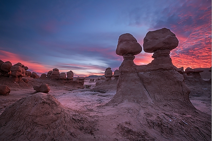
    Sony A7RII Review

    As you may know, I switched from Canon to the Sony A7R system as soon as it was launched, and overall I’m delighted with the results, even if the actual functionality of the camera can be painfully annoying at times.
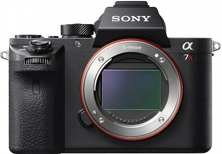
    Sony A7RII Review by Gavin Hardcastle

    Image courtesy of Sony

    For $ 4000 CDN ($ 3198 USD) the 42 Megapixel Sony A7RII packs a lot of firepower into a very small package, when you look at the specs. If your credit card is quivering in anticipation of buying this camera, there are a few things you might want to consider before throwing down your dollars.

    I’m going to approach the question of whether or not you should buy this camera based on the assumption that there are likely three types of buyer for this camera:

    1. Existing Sony A7R users considering the upgrade.
    2. DSLR users considering switching to the Dark Side.
    3. New camera buyers with no current investment in any system.
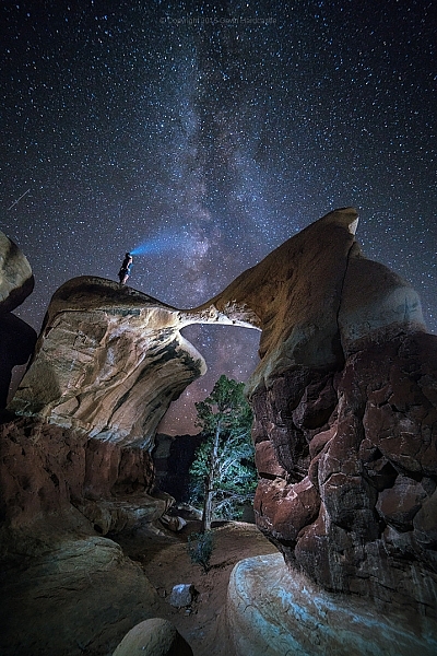
    Sony A7RII Review - Astrophotography, Gavin Hardcastle

    #1 – Existing Sony A7R users considering the upgrade

    If you already own the Sony A7R, here are four major reasons to shell out the big bucks for the upgrade:

    1. If you shoot a lot of handheld work and want the 5-axis image stabilization.
    2. You want to shoot 4K video (see below for my thoughts on that).
    3. You value the silent shutter for less vibration, and therefore sharper images.
    4. You value the new Eye Detect autofocus.

    If none of the features listed above have any great importance to your photography, you’re probably better off keeping your A7R, and spending your upgrade dollars on some of the stunning new Zeiss glass for E-Mount that’s available now, or coming out soon. The Batis and Loxia range of lenses are a force to be reckoned with. Also, realize, that based on Sony’s track record, there will probably be a Sony A7RIII on the shelves before you’ve filled your first memory card.

    But what about the extra megapixels?

    The difference between 36mp and 42mp is not that big a deal. In realistic terms, all it means is that you’ll be able to makes prints ever so slightly larger with the A7RII, and you’ll have a little bit more resolution to play with when cropping. To give you an idea of how big the difference is take a look at this comparison.
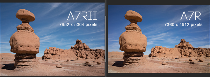
    Sony A7RII pixel dimensions vs A7R

    What about the Silent Shutter?

    I was very keen to discover how much of a sharpness improvement I could expect from the new silent shutter (and therefore vibration free) on the A7RII.

    Using the Zeiss Loxia f/2.8 35mm lens, I took the above shots on the A7RII and the A7R, with identical settings and focus point. The only difference was that the A7RII was set to silent shooting mode, and therefore didn’t suffer from the notorious shutter shock vibration of the A7R, which is something of a problem for fast exposures and when using telephoto lenses.

    The results were impressive. Zooming in to 100%, I can see a significantly sharper image produced by the A7RII, when shooting in bright daylight with fast shutter speeds.
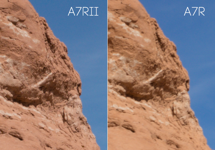
    Sony A7RII Sharpness test

    Both shots used the Zeiss Loxia 35mm at f/11 with focus manually set at the same point. No sharpening was added in post- production.

    After the above comparison, I thought I’d do the same thing in low-light, with a long exposure, to see if the increase in sharpness was consistent.

    With this post sunset shot of Bryce Canyon, the sharpness increase on the A7RII is much less significant. Zoomed in to 100% I can barely see a slightly sharper image produced by the A7RII, but the difference is not as significant in low-light situations with long exposures. Once you add a little sharpening in Adobe Camera RAW there is no visible sharpness difference between the A7R and A7RII image when shooting long exposures in low-light.
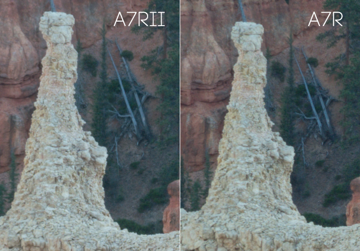
    Sony A7RII Review - Resolution Comparison

    100% magnification. Both shot with Sony FE 55mm lens at f/11. No sharpening was added in post-production.

    It has better noise performance right?

    When I heard that the A7RII had much better noise performance than the A7R, I was pretty excited to see how it would fare with astrophotography.

    In my tests I could see hardly any improvement over the A7R when pushing the ISO up to 3200 during long exposures for astrophotography. Don’t get me wrong, the A7R was already pretty impressive at astrophotography when paired with good f/2.8 lenses. But, if you’re considering upgrading mainly for the supposed better noise performance, you may be setting yourself up for disappointment.
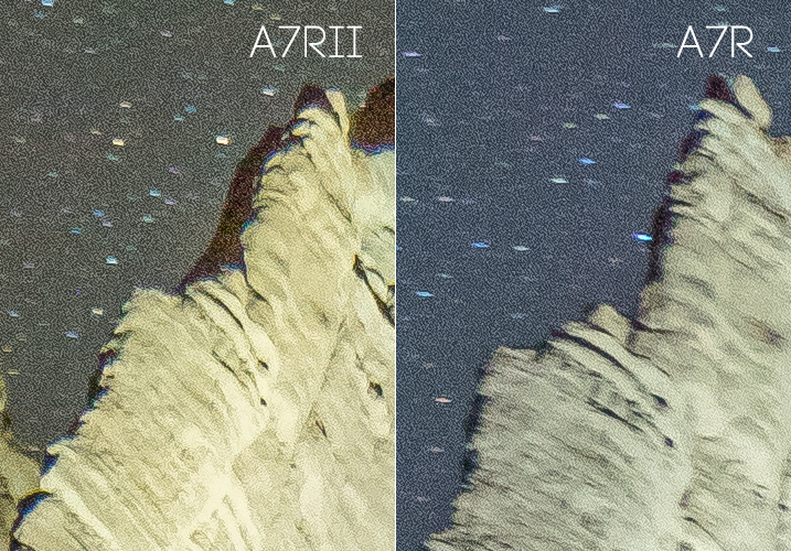
    The Sony A7RII for astrophotography

    What about the USB power option?

    If I wanted to carry around a brick all day I’d still be shooting with a DSLR.

    Granted this is a major improvement on the A7R which wouldn’t allow you to use the camera when connected to a USB power source, but I only ever use this feature when shooting a time-lapse sequence longer than the measly one hour provided by the feeble Sony batteries, which I pop like Tic Tacs.

    A better solution would be to provide longer lasting batteries. The A7RII has a bigger body than its previous version, so how about a bigger battery?

    What about dynamic range?

    In my tests I couldn’t see any improvement in dynamic range between the A7RII and the A7R in real use cases. By real use cases, I mean the limits by which you can recover shadow detail and highlight detail in your photos. It’s typical to deliberately underexpose your shots, so that you can recover the shadow detail when processing, and you won’t usually have to worry about blown out  highlights.

    Sony A7RII Review - Dynamic Range Test

    I deliberately underexposed these shots to avoid blown out highlights. I knew I could recover the shadow detail in post-production. Shown in the bottom half of the images, I increased the exposure by a ridiculous three stops in ACR, then reduced the Whites and Highlights sliders by three stops. I can see no noticeable difference in dynamic range between either camera, but the A7RII image is considerably sharper in this fast exposure as previously mentioned because of the silent shutter.

    I tried this many times with both the A7RII and the A7R, and my conclusion is that they both performed equally well. I’m sure there will be some scientific test that proves the A7RII has better dynamic range, but when it comes to what you’ll observe with your own eyes, I doubt you’ll see any noticeable difference between both cameras in most situations.

    If other users are observing better dynamic range in fast exposures, I wonder if what they’re seeing is actually the increase in sharpness on the A7RII, which simply records more detail than the A7R when shooting in silent shutter mode.
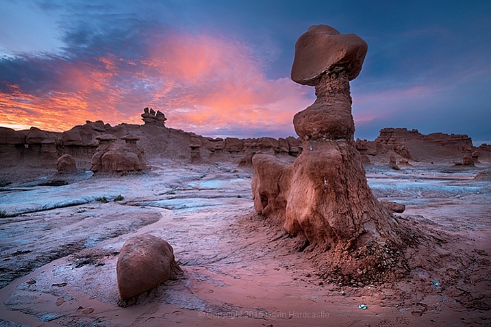
    Sony A7RII Review by Gavin Hardcastle with Example Images

    The 5-Axis Image Stabilization

    This is a very good feature. If you’re using adapted prime lenses with no vibration reduction, you’ll really see the benefit of this feature when shooting handheld in low-light, where otherwise trashed shots can end up being very usable.

    You’ll also be able to capture smoother handheld video with the image stabilization switched on, and with the additional Custom Function button on the camera body you can easily assign IS to that button, to save digging around in the menus to turn it on and off. This is a major improvement over the A7R.

    The menu system of Purgatory

    The one consistent gripe among all reviewers of the A7 series over the last couple of years has been the atrocious Sony menu system. They should have dealt with this issue long ago, but decided it wasn’t worth bothering on this upgrade.

    Sony doesn’t seem to use any sensible kind of logic as to where they place menu items. For example, you’d expect anything to do with Autofocus to be grouped in one menu – but no, it’s scattered all over the place as if deliberately trying to test your patience. Things like this are a real turn-off for professionals who don’t have the time to waste on menu digging.

    Get a grip Sony and sort this out! I’ll happily provide a much better layout for FREE if it means I no longer have to suffer the menu of misery.

    Much better autofocus

    Let’s be honest, the autofocus on the A7R is pretty lame, when compared to high-end DSLR cameras. If you’re seriously considering using the A7RII for portraiture the new Eye Detect autofocus function is a major attraction, and it works very well. If you primarily shoot landscapes this feature alone might not be worth the upgrade.
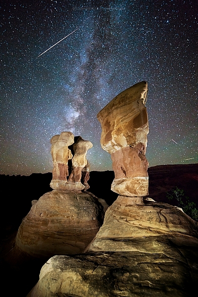
    Sony A7RII Image Examples for Astrophotography by Gavin Hardcastle

    It does 4K video right?

    Well – kind of. If you want full frame 4K video you’ll probably want to buy the A7SII instead, because the 4K full frame footage that I shot with the A7RII looks more like scaled up 1440p, and comes out looking pretty soft.

    You’ll get proper 4k image quality when shooting in the Super 35 mode, but you’re basically shooting in crop sensor mode, so you loose a major part of the frame to get that crisp 4K video quality. The other downside, is that the better looking Super 35 mode suffers from bad rolling shutter.

    Once again, this is another example of how Sony eeks out their technology across different camera models, ensuring that you have to buy more than one camera if you want all the coolest features. That being said, Sony is still offering better value than their competitors when it comes to how much bang you’re getting for your buck.

    Better color rendering?

    It’s been said that the A7RII produces better colors than the A7R, but I’ve yet to see any improvement from the test shots that I made. I’ve always been quite happy with colors produced by my A7R, but try as I might, I can’t see any difference (good or bad) in the colors produced by either camera. My examples above may show a slightly different color tone, but I’m putting that down to the time difference between shots while I got everything set up.
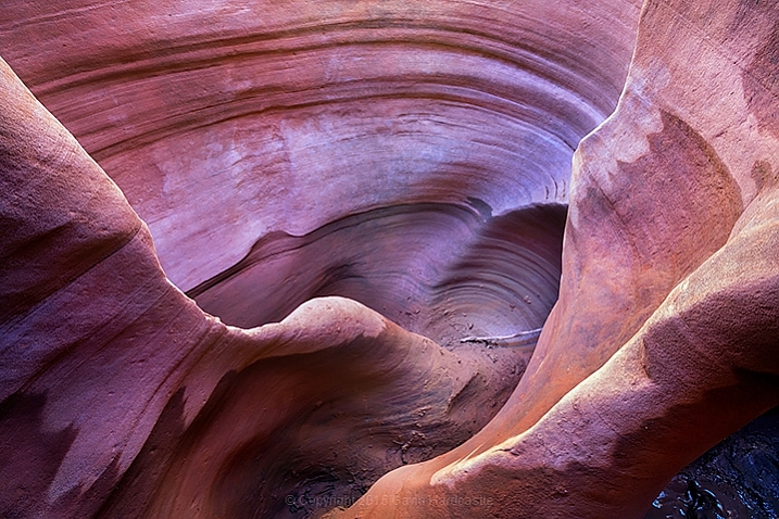
    Sony A7RII Review in Peek-a-Boo Canyon by Gavin Hardcastle

    Isn’t the EVF mind blowing?

    There’s been a lot of hype over the improved image quality on the EVF (Electronic View Finder) of the Sony A7RII, and while it’s definitely better than the A7R, it all amounts to nothing once you’ve punched in and magnified the image so that you can accurately set your focus manually.

    Sadly, the magnified image quality of the new EVF still looks like a bag of smashed crabs, and I didn’t find it to be any more usable than the A7R for that specific purpose. I tried viewing in both Normal, and High Quality modes, and my conclusion is that the new EVF doesn’t live up to all the hype. Sorry Sony Fanboys.

    Where you really notice the improved resolution of the EVF is during playback, and that can be very useful when you need to check the focus after shooting. This is something I do very often when working with poorly made Samyang lenses that have terrible build quality, but produce amazingly sharp images when focused correctly (especially for astrophotography). So, in that respect it’s great, but don’t for a second think that it’ll be any easier to set perfect focus using the EVF magnification.
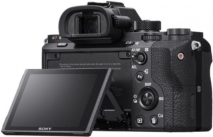
    Review of the Sony A7RII Digital Camera

    Image courtesy of Sony

    It’s bigger and heavier than the A7R

    The first thing I noticed as soon as I held the A7RII, was how much bigger and heavier it felt. While I liked the slightly larger size of the A7RII, I was none too happy about the added weight.

    One of the major attractions of mirrorless camera systems is their small size, and even with the added weight of carrying lots of spare batteries, it’s still a relief not to be lugging around a breeze-block (cinderblock) of a DSLR.

    If Sony could keep the same light weight to these cameras, but make them slightly larger and more ergonomically pleasing to the average hand size, I think they’ll win a lot of new business.

    #2 – DSLR users considering switching to the Dark Side

    If you’re considering jumping ship from another camera system, there are some things you need to consider before buying into the Sony brand. For most hobbyists these issues aren’t that big of a deal but for professionals these might be deal breakers.

    • No second memory card slots
    • Tedious and slow menu system induces violent tantrums
    • Slow response times when changing settings, writing to card, previewing and using apps
    • Battery life gives you a maximum of one hour of shooting
    • Small size is not comfortable for long periods shooting handheld unless you have tiny hands
    • Weather sealing is pathetic on the A7 series, don’t even test it

    Adapt your DSLR Glass
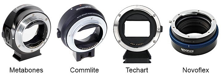
    Sony A7RII Lens Adapters

    On the plus side, there are now many choices of lens adapter available from different manufacturers, some of which can now handle aut focus. If you own a lot of expensive DSLR glass you’ll most likely be able to adapt it to the Sony E-Mount system. I’ve personally gone down this route but I’ve begun to gradually invest in native Zeiss glass for the Sony because the bulky size of the adapted DSLR lenses makes for a very uncomfortable experience and my camera bag needs to get smaller, not bigger.

    Is there really any competition?

    It’s pretty slim pickings in the DSLR camp if you need big megapixels. The Canon 5DSR offers more pixels but I’ve yet to see it produce better image quality than the A7RII, especially when it comes to low light shooting and ISO performance. The Nikon D810 is still the king of dynamic range in the DSLR world, but it falls behind the A7RII when it comes to accurate manual focusing using Live View, they don’t even have flip screens!

    None of the high end DSLR cameras currently records 4K video.

    If you’re outgrowing your current DSLR, or thinking of adding a second camera, that can produce superb images, the Sony A7RII is a logical choice if you can afford the asking price.

    3 – New camera buyers with no current investment in any system
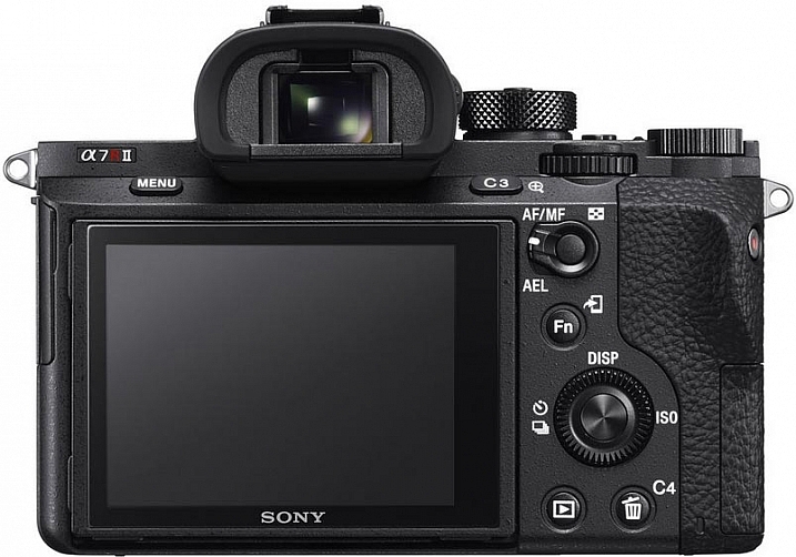
    Sony A7RII Camera Review by Gavin Hardcastle

    Image courtesy of Sony

    If you’re not already invested in any camera system and are thinking of splashing out in this camera, I can summarize the entire ethos of the Sony A7 series for you in one sentence.

    Image Quality Over Functionality. That’s what it’s all about. The Sony A7 series of cameras cannot compete with high end DSLR cameras in terms of functionality and reliability in high pressure shooting situations. But when it comes to sheer image quality, sharpness and low light performance, Sony crushes the competition with ruthless dominance.

    If you’re a landscape photographer there really is no competition in this price bracket. The Sony A7RII will produce spectacularly sharp and detailed images when paired with good quality lenses.

    What do you need from your camera?

    Your decision as to whether or not you should buy this camera depends entirely on your shooting style and requirements. Want to shoot weddings and sporting events where reliability is paramount? Buy a high end DSLR. Want to shoot stunning landscapes with the utmost clarity? It doesn’t get much better than the A7RII for the current asking price.

    But hold on – What about the A7R?

    If the $ 3200 USD price tag of the A7RII (body only) puts too much strain on your bank account, I would recommend that you seriously consider saving some money for Zeiss glass and look for a good used A7R. There should be quite a few Sony fanboys out there, selling off their now obsolete Sony A7Rs for peanuts. Snag one of those for a bargain price and you might still have money left over for a Zeiss Loxia 21mm f/2.8, and maybe even the Sony FE 55mm f/1.8 which are both excellent lenses.

    The attraction of top glass
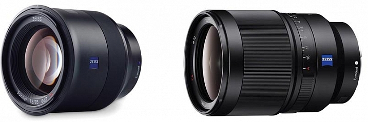
    The Zeiss Batis 85mm and Sony SEL35F14Z 35mm lenses

    Image courtesy of Zeiss

    When the Sony A7 range first came out there were hardly any native lenses to choose from. Now there are more and more high quality lenses from Sony and Zeiss that are so good, I can see some photographers buying into the A7 system simply to take advantage of lenses like the Zeiss Batis 85mm and Sony SEL35F14Z Distagon T FE 35mm f/1.4, which are quickly becoming legendary lenses.

    The Sony A7RII gets 4.5 stars
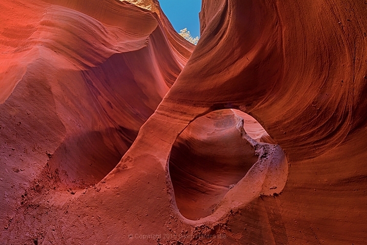
    Sony A7RII Test Shots and Review

    Why not 5 stars? In some ways Sony has listened to its users and fixed, or worked around, many of the issues voiced by A7R users. However the menu system is still atrocious, and the full frame 4K video is something of a let down.

    I would have placed more value on improved dynamic range over the extra few megapixels, and there has been zero improvement in battery life even though the A7RII is a larger camera than its predecessor.

    Maybe Sony will fix all of these issues in the A7RIII, and based on recent history, that camera should be in the shops before the next Star Wars sequel comes out.

    Special Note: All of the test shots created for the review were done before the latest firmware update which now allows the A7RII to shoot 14-bit uncompressed RAW files.

    googletag.cmd.push(function() {
    tablet_slots.push( googletag.defineSlot( “/1005424/_dPSv4_tab-all-article-bottom_(300×250)”, [300, 250], “pb-ad-78623” ).addService( googletag.pubads() ) ); } );

    googletag.cmd.push(function() {
    mobile_slots.push( googletag.defineSlot( “/1005424/_dPSv4_mob-all-article-bottom_(300×250)”, [300, 250], “pb-ad-78158” ).addService( googletag.pubads() ) ); } );

    The post Sony A7RII Mirrorless Full Frame Camera Review by Gavin Hardcastle appeared first on Digital Photography School.


    Digital Photography School

  • Starting 2015/16 Winter Paddling Season on South Platte River

    A middle of November. It’s time to start my winter paddling season. Of course, Horsetooth and other local lakes in Fort Collins are still open, so I can continue my summer style paddling. Nevertheless, I took the Sea Wind canoe, Pixel (aka water Corgi) and went for the first fall/winter paddling on the South Platte River.

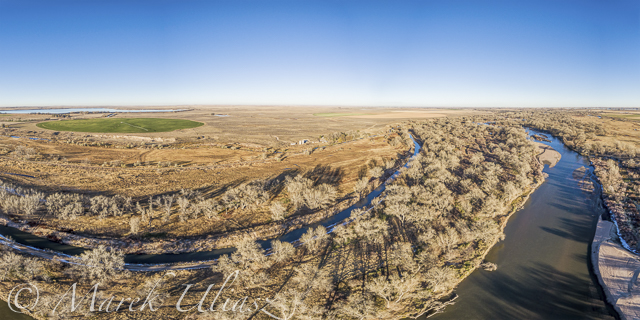
    We went to Masters and started to paddling upstream. However the dam just above Master bridge was closed and diverting water to Jackson Reservoir, so we paddled a couple miles downriver instead. Beautiful weather and a good flow of ~900cfs @ Weldona. Actually, I spent more time photographing than paddling.

    I am hoping to do more paddling on different sections of the South Platte River during the incoming winter season and, finally, update my river guide. Would you like to join me? The South Platte with a typical winter flow is just a wading river and suitable for safe paddling with any boat – kayak, canoe or SUP. Well, a paddleboard would require some experience and a short fin due to possible shallows. I don’t think that you need to dress for immersion, but I always take extra clothes for change.

    I am still sorting my blogs after migrating to a new server. If you encounter any problem or missing links please let me know.

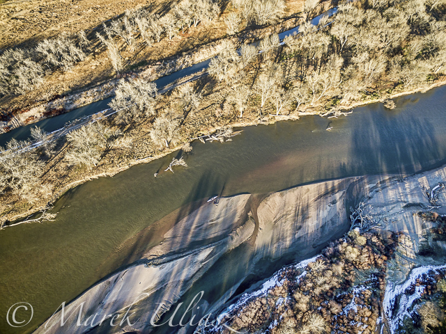
    aerial view of eastern Colorado landscape with South Platte River,  water channels, reservoirs and irrigated farmland

    South Platte River in eastern Colorado below Masters with Jackson Reservoir ditch, looking downstream

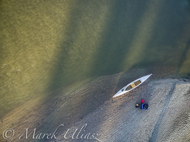
    aerial view of South Platte River in eastern Colorado with a canoe on sandbar, fall scenery

    Looking down from Phantom 3 drone. Can you see the Sea Wind canoe, me and Pixel?

    aerial view of expedition decked canoe on a sandbar, South Platte River in eastern Colorado

    Let’s look a little closer

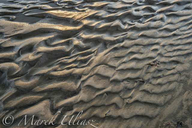
    river sandbar texture and pattern - South Platte RIver in eastern Colorado

    and, even closer

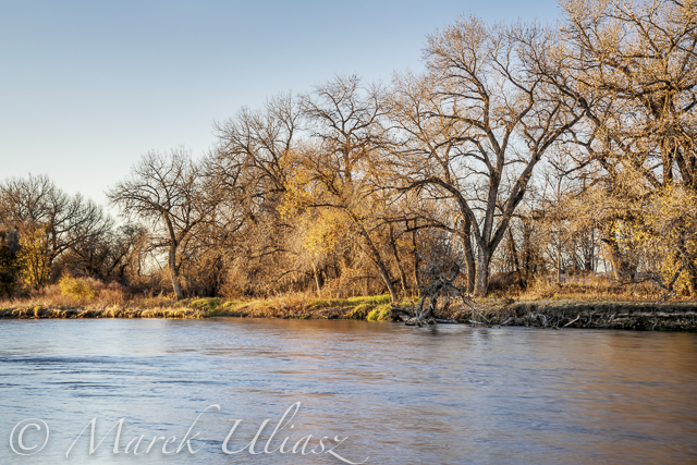
    South Platte River in eastern Colorado between Greeley and Fort Morgan, a typical fall or winter scenery

    A typical fall or winter scenery on the South Platte lit by the low setting sun


    paddling with a camera

  • How Cropping in Post-Production Can Improve Composition

    Even though I strive to get the best compositional shot in-camera. I do see ‘cropping’ as essential to my post editing workflow. For such a simple post edit technique, it can really enhance and improve composition of the image. I have also found cropping an image, be it small or in a creative sense can transform an image dramatically.

    How Cropping in Post-Production

    I like to view cropping as reframing the scene. The initial framing of the scene comes when you look through the viewfinder, then next when you have uploaded your images onto your computer for editing.

    You get the chance and time to critically see if your image(s) needs cropping and what type is required. For example, there might be some distracting elements in the foreground that you missed when you looked through the viewfinder, or a horizon line isn’t quite as straight as it should be.

    In this article, I’m going to illustrate the following reasons why you might crop your images in post-production:

    • To straighten lines: keep the horizons even and the vertical lines vertical.
    • To move your subject or object: a little more to the left, right, up or down.
    • To trim away distracting elements, especially at the sides or the near foreground.
    • To zoom in to show impact, especially portrait or head-shots.
    • To use the rule of odds – instead of two subjects just use one.
    • For creative cropping – rotate image, use perspective crop.

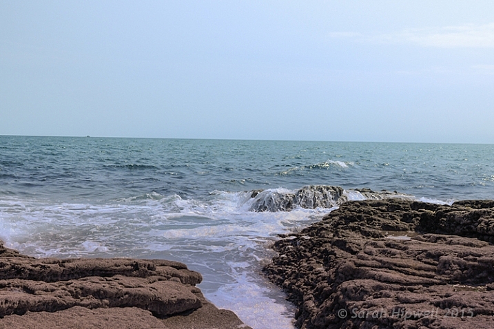
    Let’s take the first example, I took this shot handheld when I should have used a tripod. An uneven horizon line does not make for a good composition. The eye is immediately drawn there, for the wrong reason.

    crooked-horizon-line

    Seascape with a crooked horizon line.

    However, this is easily remedied in most photo editing programs. As Adobe Photoshop CS6 is my go-to photo editing software. I will be referencing it for the rest of this article.

    straighten-button

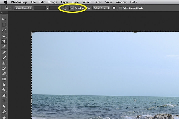
    Once you click on the Crop Tool in the Tools panel, there is a dedicated straighten button in the Options Bar.

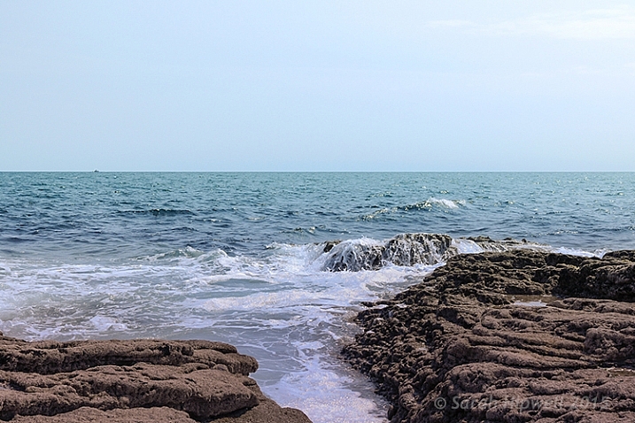
    Click on the Crop Tool in the Tools panel. Go up to the the Options Bar where there is a dedicated Straighten button. Make sure this is selected, click and drag along the crooked horizon line. Release it, and Photoshop straightens the line and crops the image in one action! The same process can equally be applied to vertical lines.

    straightened-horizon-line

    Horizon lines are easily fixed using the Crop Tool in Photoshop.

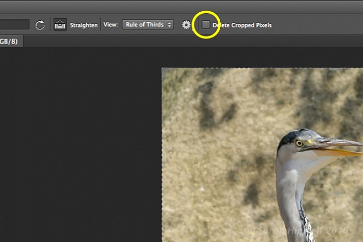
    The Crop Tool in Photoshop CS6 is impressive. It now works non-destructively. But you must make sure Delete Cropped Pixels isn’t ticked up in the Options Bar (leaving this box unticked keeps cropped portions which can be recovered later if needed).

    Delete-cropped-pixels

    The Crop Tool in Photoshop CS6 works non-destructively if the Delete Cropped Pixels box is unchecked.

    Inside most editing programs there is usually a choice of overlay guides, based on traditional compositional concepts like the Rule of Thirds or the Golden Ratio. You can read more about Composition in this article: Easy Tips to Help Beginners Understand Composition The crop overlays are great visual guides for good compositional techniques and makes it much easier to crop your image. I usually set it to Rule of Thirds.

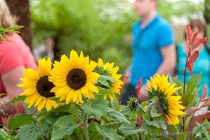
    So in the next image, I wanted the focus of this shot to be entirely on the sunflowers. The background, although blurred, is still too distracting with the color of the garments worn by the passersby.

    sunflowers

    Although the background is blurred, the colour of the garments worn by the passersby is too distracting.

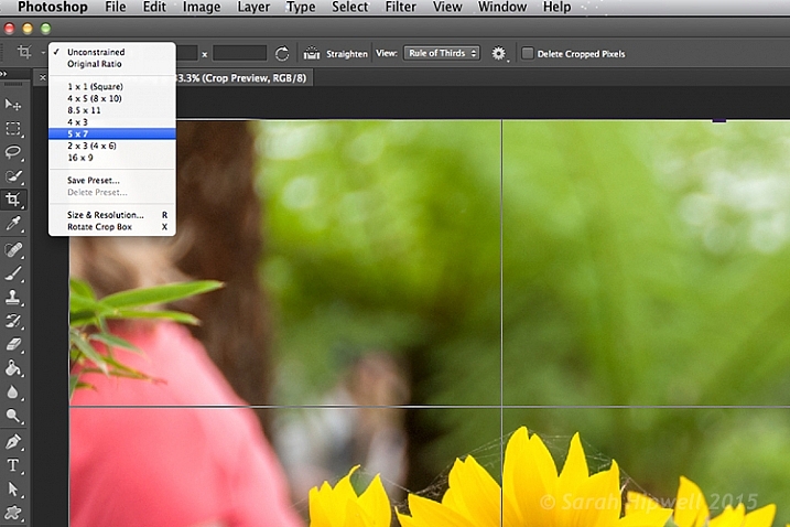
    I started with one of the aspect ratio presets. These can be found under this tab Unconstrained. I selected 5 x 7.

    Aspect-ratio-5x7

    There are various preset aspect ratios when you click on the Unconstrained tab. You can also save your own presets too.

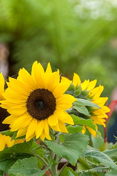
    I dragged the top right corner handle of the crop box down, and in towards the centre, to maintain this aspect ratio. By clicking on the image inside the crop box, I was able to move and reposition the image into place.

    sunflowers-cropped

    The sunflowers are now the main focus point in this image, and the green blurred background is complimentary, without being a distraction.

    I am strong believer in using my feet to get close to the subject, or if you have a nice telephoto lens, then happy days. Unfortunately for my next shot, I didn’t have the option of either of the above.

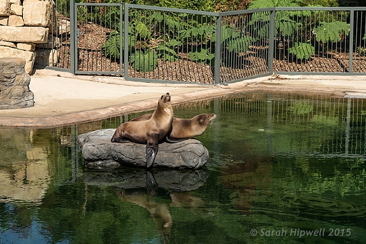
    I was at the zoo on a family outing, so I wasn’t taking dedicated shots for anyone. I was behind a barrier and a good 30 feet (approx.) away from the seals. I didn’t get time to think or compose for this shot. I just wanted to grab a shot of the seals.

    seals-at-the-zoo

    Seals taken at the zoo.

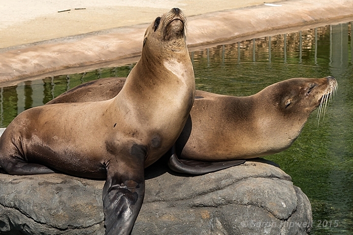
    The day was fantastic weather wise, and these seals were really enjoying the sunshine. I wanted to crop in tightly, just on the seals, but I had the megapixels to play with because I had a 24 megapixel camera with me, which can produce a 20×13” at 300 dpi print. The final crop for this image would give me 5.5×4” at 300 dpi print.

    seals-cropped

    I cropped in tight to get a close-up of the seals. I didn’t like the railings at the back, but I would have preferred to have kept the reflection of the seals in the water, but there is always a trade off!

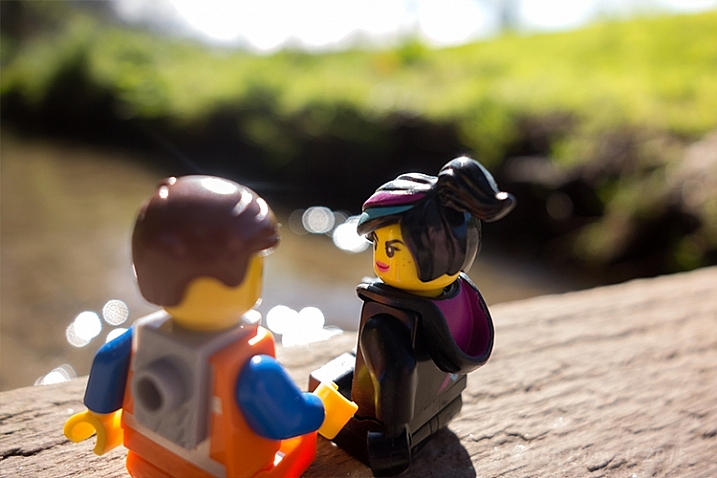
    In this next shot, cropping in tight on a subject can convey more impact, especially for portrait shots. No two people reveal the same expression. As a photographer, some subjects are easier to capture an expression over others.

    Emmet-and-Lucy

    Emmet and Lucy enjoying the nice weather and the chat!

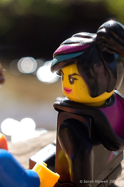
    I wanted to convey Lucy looking at Emmet in an adoring fashion, I-only-have-eyes-for-you type of expression.

    Lucy-cropped

    Lucy hanging on to every word that Emmet is saying! The look of I-only-have-eyes-for-you!

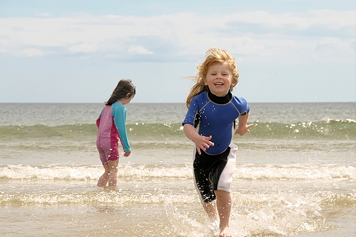
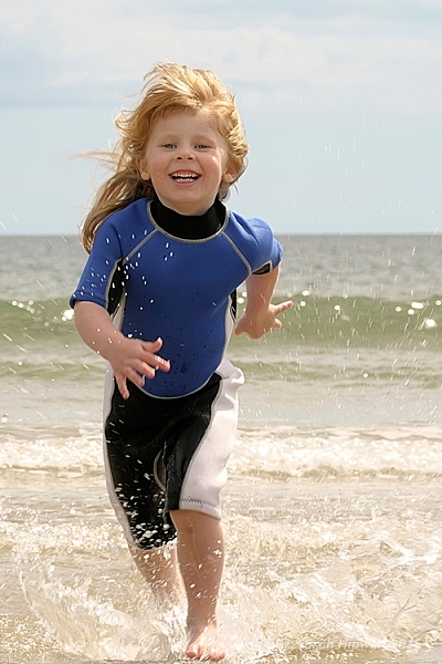
    Another way to convey impact is to focus on the action. Here, in this shot below, I cropped out my other daughter, so that the focus was on my youngest daughter running to shore.

    fun-at-the-beach

    Fun at the beach.

    fun-at-the-beach-cropped

    By cropping out my other daughter, the focus is on the action. It’s also using the Rule of Odds to focus on the single subject.

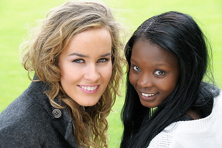
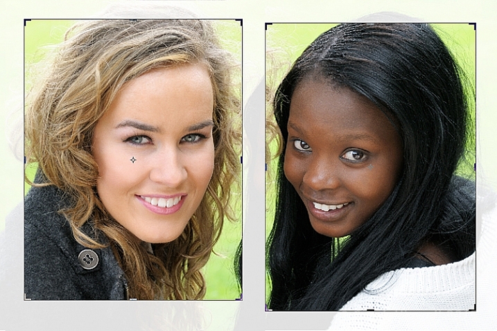
    Cropping an image is a great way to apply the Rule of Odds. A good example of this is in the following shot. The two subjects are side-by-side. By cropping in tight on each subject, I have created two distinct head-shots from one single image.

    two-portraits-together

    Two subjects shot sitting on a bench side-by-side.

    two-separate-portraits

    After the image is cropped, I now have two distinct portraits.

    Last but by not least, try and experiment with rotating your image to the left or right, and then cropping. This may be particularly useful with photos of tall buildings, where you want the focus to be on the height of the building.

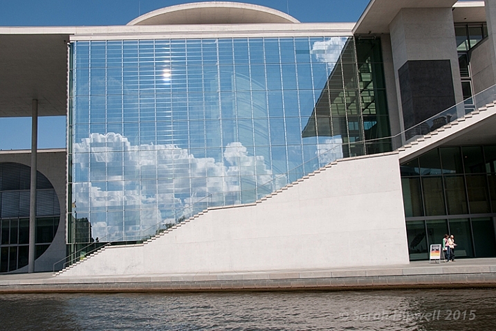
    I had taken the following photo in Berlin some years back from a boat on the river Spree. This modern building was quite impressive, but the reflection of the sky and clouds in the glass, caught my eye. It made for a nice abstract composition.

    Berlin

    A shot of a building while in a boat on the river Spree in Berlin. Compositionally, this by itself is not a good shot.

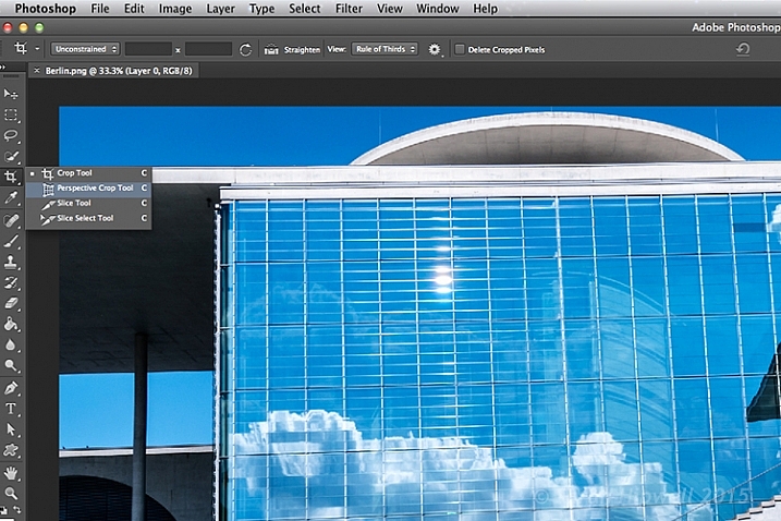
    The Crop Tool in Photoshop has another feature, the Perspective Crop Tool. When you click on the Crop Tool and hold, a fly-out menu appears with four options. The Perspective Crop Tool is directly under the Crop Tool.

    perspective-crop-tool

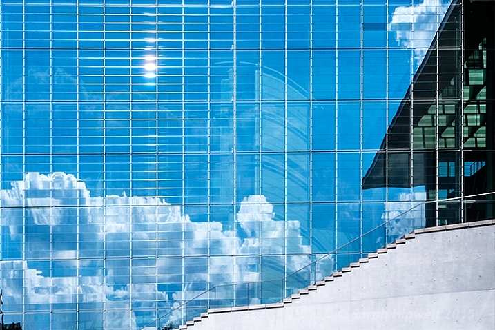
    With some editing to highlight the reflection in the glass of this building, I used the Perspective Crop Tool to create an abstract composition.

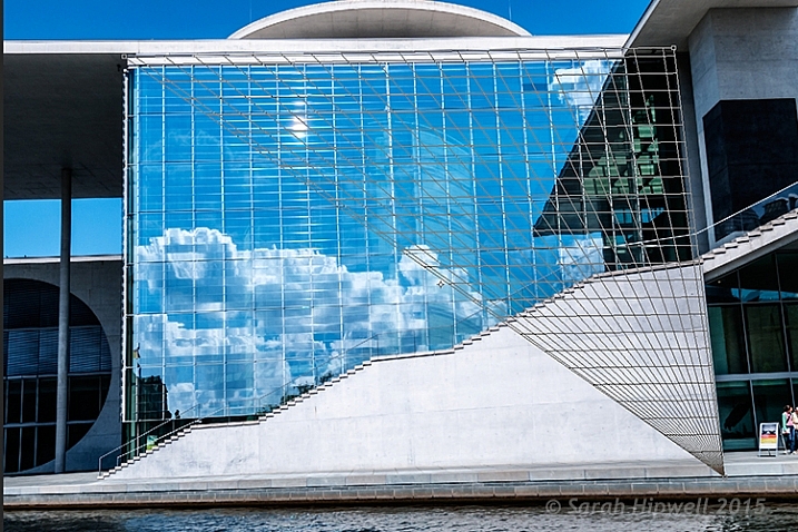
    Starting at one corner, click and drag across to the other corner, and repeat around the lines of the window frame. A grid appears around where you have clicked within the image. Click the commit button at the top in the Options Bar, or press the enter key. Make finer adjustments by clicking back to the regular Crop Tool.

    perspective-crop-grid

    The perspective Crop Tool in action.

    abstract-composition

    I created this abstract composition using the Perspective Crop Tool in Photoshop.

    Cropping is, after-all, getting an alternative perspective to enhance a better composition.

    To crop or not to crop, that is the question? Share your comments and images below please.

    This week on dPS we’re featuring a series of articles about composition. Many different elements and ways to compose images for more impact. Check out the ones we’ve done so far:

    • Using Framing for More Effective Compositions
    • 7 Tips to Improve Your Skyline Photos
    • 33 Images that Exemplify Compositional Elements
    • Weekly Photography Challenge – Composition Craziness
    • How to Take Control of Aperture and Create Stronger Photos

    googletag.cmd.push(function() {
    tablet_slots.push( googletag.defineSlot( “/1005424/_dPSv4_tab-all-article-bottom_(300×250)”, [300, 250], “pb-ad-78623” ).addService( googletag.pubads() ) ); } );

    googletag.cmd.push(function() {
    mobile_slots.push( googletag.defineSlot( “/1005424/_dPSv4_mob-all-article-bottom_(300×250)”, [300, 250], “pb-ad-78158” ).addService( googletag.pubads() ) ); } );

    The post How Cropping in Post-Production Can Improve Composition by Sarah Hipwell appeared first on Digital Photography School.


    Digital Photography School

  • Good Crop Bad Crop – How to Crop Portraits

    All images © Gina Milicia 2015

    “Learn the rules like a pro, so you can break them like an artist.” ? Pablo Picasso

    When it comes to knowing what is right for me there are a few things I know for sure: First, garlic and ice cream are never meant to be mixed together. Secondly, even if I colour my hair blonde I’m never going to look like madonna, and finally when my mechanic warns me that the timing chain in my car should be fixed as soon as possible, I need to listen up and act.

    If who have read my other articles or ebooks, you will know that I’ve also learned many lessons in my photography career from stupid mistakes, or lapses in judgement. It’s through learning from failure, and trial and error, that I’ve managed to discover what works best for me.

    When it comes to how I crop my portraits there are a few cropping styles I try to avoid because just like eating garlic ice cream I have learnt what works best for me.

    How I crop my portraits is just as important to defining my style as the lens I use, the way I light, and how I process my files. I believe the way an image is cropped can change the look from “meh” to “amazing”.

    Goodcrop 2B

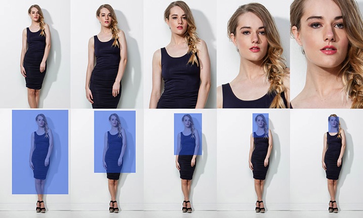
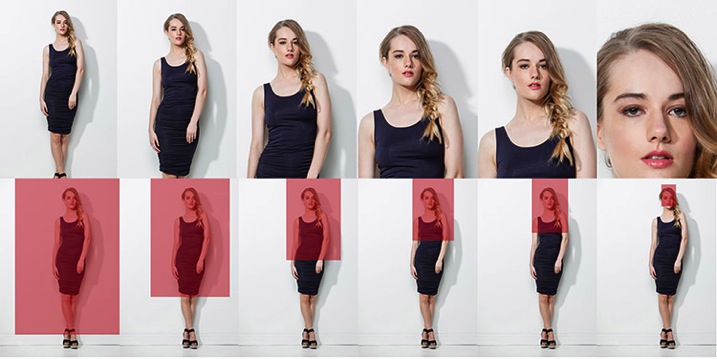
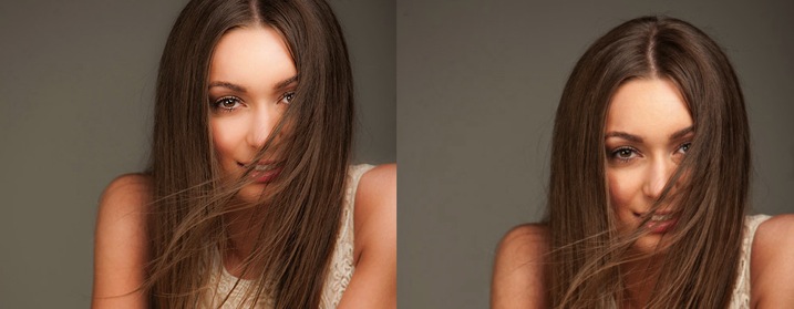
    I always crop a shot below the knee, mid-thigh, at the waist, across forearm, or through the top of head. If I’m going to crop through my model’s waist I will usually ask my model to bring their arms up so I don’t have to crop through their arms.

    BadCropW

    I avoid cropping at any of the joints of the body. This includes fingers, toes, elbows, knees and wrists. I also think cropping through the model’s chin looks odd.

    It took me many years of trial and error, and studying the work of my favourite photographers, to learn that there are actually a few golden rules of cropping worth following. Ones that make a huge difference to the visual impact my portraits make, and how flattering these portraits can be for the subject.

    Like all rules there are always exceptions, and the art world would implode if these rules were not constantly tested and broken. Pablo Picasso, Vincent Van Gogh, and Jackson Pollack are examples of artists whose styles broke every rule in the, “how to paint book” and in their time they were mocked and ridiculed by other artists and critics alike, yet today their paintings are priceless. Having said that, they all studied conventional painting rules of their time, and then went on to break those rules, and create their own signature styles. I wonder if they ever considered changing their hair colour to look like Madonna…

    My shooting,lighting,posing, and post-production style has developed and evolved over the years, but the way I crop my images has remained the same.

    Here are my top five tips for how to crop portraits:

    #1 Crop In-Camera

    Tightcrop A

    Cropping in-camera basically means that you compose your image exactly how you want your final crop to look when you are taking the photo, rather than shooting loosely and cropping the shot in post-production. There are two reasons for this:

    1. Firstly, images cropped in-camera look totally different to images that are cropped in post-production. Filling the frame and cropping tight means that you will create great background blur (bokeh), which removes any background distractions and focuses more attention on your model, which is always a good thing.
    2. The other advantage of cropping in-camera is that your file size is not affected. A loosely photographed cropped image may only leave you with 10-15% of your file size, so a file that was originally 30MB as a full size image, is reduced to 3MB with a tight crop. Lower resolution images have less detail and won’t be as sharp as a full size image.

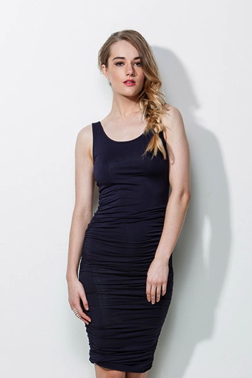
    #2 If it bends don’t crop it

    BadCrop 2Bad crop Crop3Good crop

    I think cropping mid thigh looks visually more pleasing than doing so at the knee. Seeing just part of the knee where the dress ends also looks untidy.

    There are also certain ways to pose models that are more flattering to the body. I’m always looking for ways to pose my models that elongate, rather than shorten, their body parts. I try and emphasize their best features, and hide or diminish the features that are not as strong.

    As a general rule I crop in a way that will elongate and flatter the body. Cropping at the knees, waist, elbows, toes, fingers, ankles, or wrists can make your model look stumpy. Cropping off the arms or legs can make your model look square, or larger than they really are.

    #3 Avoid cropping into the chin and keep the eyes in the top third of the frame

    BadCrop 6Bd crop Crop6Good crop

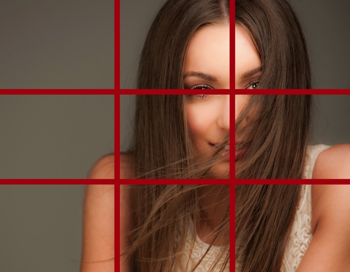
    Keeping the eyes in the top third of the frame is visually better than cropping into someone’s chin, which to my eye looks like I wasn’t paying attention when I took the shot, and visually this crop (above left) looks awkward.

    I find my portraits look much stronger visually when the eyes are positioned in the top third of the frame. Cropping into the chin is visually jarring in the same way that garlic ice cream was jarring to my tastebuds.

    Rulethirds

    This is the original framing of a shot I took for the cover of my dPS book, Portraits – Striking the Pose. I wasn’t sure how much of the shot we would be using, so I deliberately shot wider, and left space on the left of my frame to allow for text and other images.

    Rulethirds 1 Rulethirds 1B

    Rulethirds 2B

    Rulethirds 2

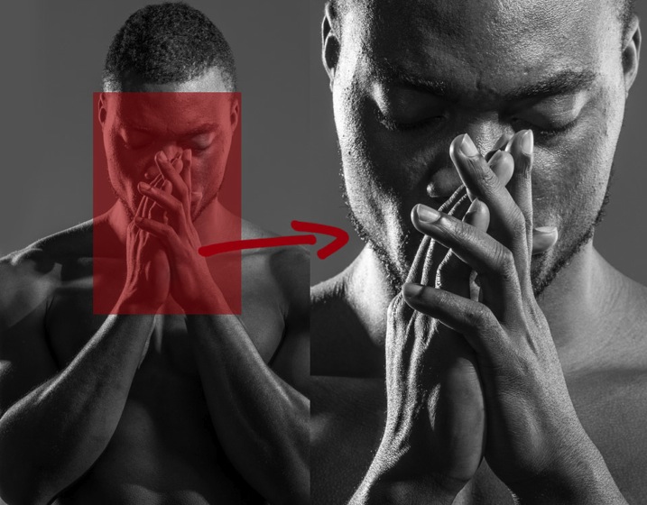
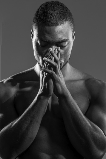
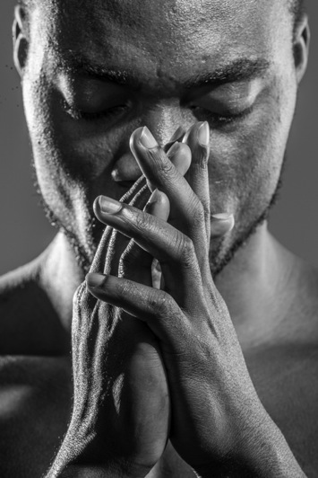
    The final shot for the cover was cropped very tightly because I felt including the hands looked a bit messy. I cropped this image with the eyes in the top third of the frame because this was visually the strongest option.

    #4 Give yourself options

    The explosion of social media has radically changed how I shoot my portraits. When a client booked me for a session a few years ago, I would shoot the majority of their portraits as vertical images. Now I make allowances for websites and social media platforms that run both vertical, square, and horizontal images.

    I will usually start with portraits framed as vertical images and then rotate my camera to shoot some horizontal frames.

    I generally position my model to fill the left or right hand third of the frame. This adds interest to the portrait, and makes it visually more dynamic. Having said that, there are times when I will frame my portrait in the centre of the shot because I personally love the way it looks.

    I also love cropping into people’s heads, but this is not everyone’s cup of tea, so I always shoot a few frames with space above the head just in case.

    You never know where the final image may end up in a few weeks or a few years, so I think it’s a good idea to plan ahead. It only takes a couple of minutes to shoot slightly wider, vertical, and horizontal at the end of each setup.

    #5 Crop like you mean it!

    Use these suggestions as a starting point, and find a style that works for you. Start with a full length portrait and first try cropping using traditional rules, then try breaking the rules and see which way you prefer the most.

    Each person, location, and pose you shoot will always be different, so don’t be afraid to mix it up a bit and create your own signature style. The one question I always ask myself when I’m cropping my images is, “Does this crop look deliberate or does it look like a mistake?”

    Tightcrop 2 Tightcrop 3

    Sometimes following cropping rules to the letter will still leave my portraits looking visually jarring. An example of this is if I photograph a model wearing 3/4 sleeves and crop at a point which is technically correct, leaving a tiny amount of arm showing just below the sleeve. This looks like a mistake and would look better if I cropped a little higher to remove the skin.

    The more you shoot, the more you will start to get a feeling for what looks right to you. If you’re still not sure, do two versions and compare them.

    You might like to deliberately create a series of portraits that are visually jarring because they will evoke an emotional reaction.

    How do you like to crop your portraits? Do you like to crop in-camera or in post-production? Do you think a tighter crop looks best ,or do you like to let your portraits have lots of space around them? Is there anything I’ve missed? I’d love to hear your thoughts and see your images. Please feel free to share in the comments section below.

    This week on dPS we’re featuring a series of articles about composition. Many different elements and ways to compose images for more impact. Check out the ones we’ve done so far:

    • Using Framing for More Effective Compositions
    • 7 Tips to Improve Your Skyline Photos
    • 33 Images that Exemplify Compositional Elements
    • Weekly Photography Challenge – Composition Craziness
    • How to Take Control of Aperture and Create Stronger Photos
    • How Cropping in Post-Production Can Improve Composition

    googletag.cmd.push(function() {
    tablet_slots.push( googletag.defineSlot( “/1005424/_dPSv4_tab-all-article-bottom_(300×250)”, [300, 250], “pb-ad-78623” ).addService( googletag.pubads() ) ); } );

    googletag.cmd.push(function() {
    mobile_slots.push( googletag.defineSlot( “/1005424/_dPSv4_mob-all-article-bottom_(300×250)”, [300, 250], “pb-ad-78158” ).addService( googletag.pubads() ) ); } );

    The post Good Crop Bad Crop – How to Crop Portraits by Gina Milicia appeared first on Digital Photography School.


    Digital Photography School

  • Color Me Patriotic: Ukraine’s Painted Lenin Statues

    [ By Steve in Art & Street Art & Graffiti. ]

    painted-lenin-statue-0

    As the Ukraine strives to break free from all things Russian, some unlikely allies – Soviet-era statues of Lenin – have been enlisted to wave the flag.

    painted-lenin-statue-1a

    painted-lenin-statue-1b

    painted-lenin-statue-1c

    Or “wear” the flag, as the case may be, and the easiest way to do that is by liberally (pun intended) applying blue and yellow – the colors of the Ukrainian flag – to bronze tarnished by decades of weathering. Lenin, as depicted above in Nikopol, wouldn’t be caught dead sporting such an ensemble back in the day. Not to worry, it wasn’t long before nationalistic protesters with plenty of rope put Dayglo Vlad out of his misery.

    Siberian Breakfast Club

    painted-lenin-statue-2a

    painted-lenin-statue-2b

    Not all Ukrainian-themed Lenin statues are in the Ukraine, mind you… take the above hastily colorized example from Novosibirsk, a city of 1.5 million in southwestern Siberia. According to a Radio Free Europe/Radio Liberty report carried by KyivPost, “Authorities in Novosibirsk say suspects accused of painting the colors of the Ukrainian flag on a monument to Lenin in the Russian city have been detained.” Hey, at least they didn’t tape his butt cheeks together.

    Hail Stylin’!

    painted-lenin-statue-3a

    painted-lenin-statue-3b

    Back in Kiev, however, anyone wanting to Ukrainianize a Lenin statue need not fear the police though a fear of heights would be a hindrance. The stylish statue above displays all the marks of an unhurried artist – ol’ Vlad looks dapper enough to work at IKEA!

    Party Chair Man

    painted-lenin-statue-7c

    painted-lenin-statue-7d

    painted-lenin-statue-7

    painted-lenin-statue-7e

    You don’t see many “Seated Lenin” statues like the one above, located in eastern Ukraine’s Donetsk region. There’s no rest for the wicked, however, and the Communist icon’s relaxed pose just made things easier for those wanting to make a political statement in blue and yellow spray paint.

    Next Page – Click Below to Read More:
    Color Me Patriotic Ukraines Painted Lenin Statues

    Share on Facebook


    [ By Steve in Art & Street Art & Graffiti. ]

    [ WebUrbanist | Archives | Galleries | Privacy | TOS ]


    WebUrbanist