Blog

  • METALmorphosis: Kinetic Sculpture by Controversial Czech Artist

    [ By SA Rogers in Art & Sculpture & Craft. ]

    david cerny 1

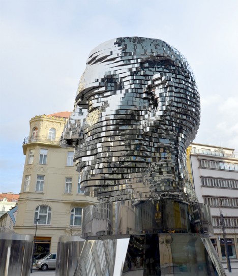
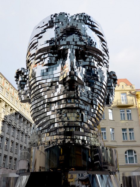
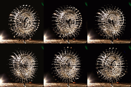
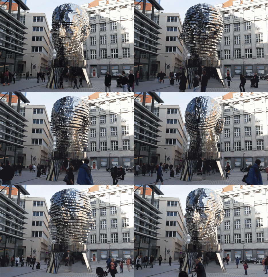
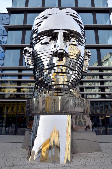
    A giant metallic head splits into segments and rotates in a ‘metamorphosis’ worthy of its subject, author Franz Kafka. All 42 of its layers spin independently, catching the sunlight on their reflective stainless steel edges, magnifying the strange transformation as the head briefly blurs into something more abstract and then comes together again. The 45-ton sculpture was installed in a Prague plaza in 2014, visualizing the inner workings of a psyche the sculptor may identify with, himself. It’s perhaps the tamest and least controversial piece Czech artist David Cerný has ever put out for public consumption.

    david cerny 2

    david cerny 5

    david cerny 3

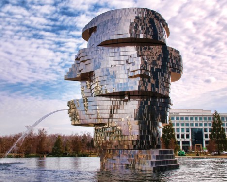
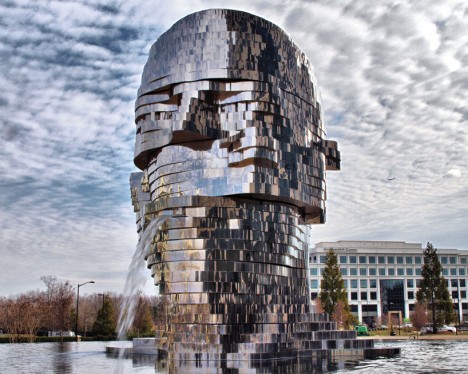
    Entitled ‘K’, the sculpture has a nearly-identical twin called METALMORPHOSIS in Technology Plaza in Charlotte, North Carolina, which even had its own live webcam feed for a while so anyone in the world could watch passersby interact with it at any given moment. The Charlotte version is not based on Kafka, and sits in the center of a fountain, occasionally spitting water. Its mirrored exterior almost makes it seem like an optical illusion in certain lights, like some kind of apparition made of the sky itself.

    metalmorphosis 2

    metalmorphosis

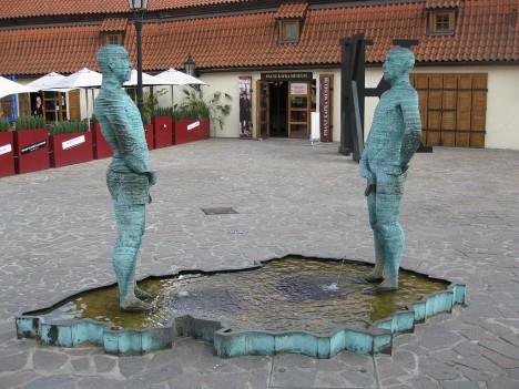
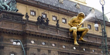
    Born in Prague, David ?erný first gained notoriety in 1991 when he took it upon himself to paint a Soviet tank serving as a war memorial in his home city bright pink. A number of his statues feature grown men peeing, and the literally masturbatory ‘Nation for Itself Forever’ had to be perched on the roof of the National Theater to keep it from being defaced.

    david cerny 7

    david cerny 12

    david cerny 8

    david cerny 10

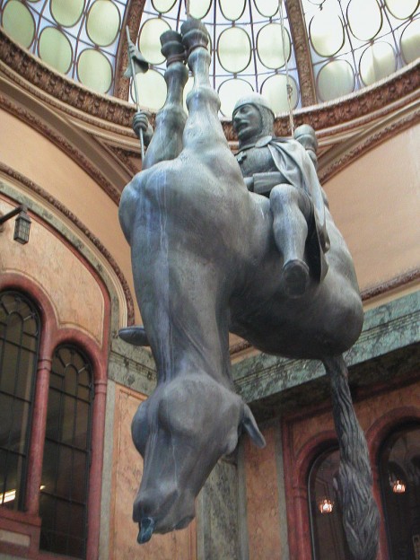
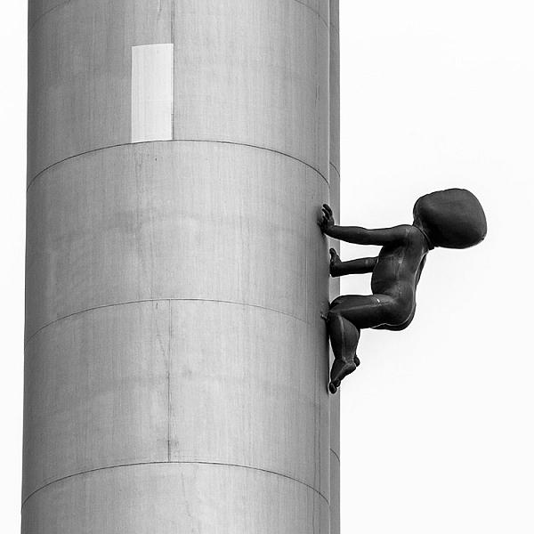
    Crawling babies with bizarrely punched-in faces scale the Czech Republic’s highest tower and wander blindly around parks, while the nation’s most revered saint, St. Wenceslas, is depicted riding a dead horse. A permanent exhibition at FUTURA gallery Prague features ladders leading up to two white posteriors; climb up and stick your head inside to view a video of two Czech politicians spoon-feeding each other to ‘We Are the Champions.” Czech out a tour of the irreverent sculptor’s works in Prague if you’re ever in the city to see them all.

    Share on Facebook


    [ By SA Rogers in Art & Sculpture & Craft. ]

    [ WebUrbanist | Archives | Galleries | Privacy | TOS ]


    WebUrbanist

  • Sign of the Times – 27 Significant Images of Signage

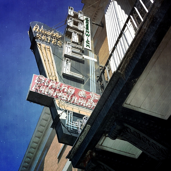
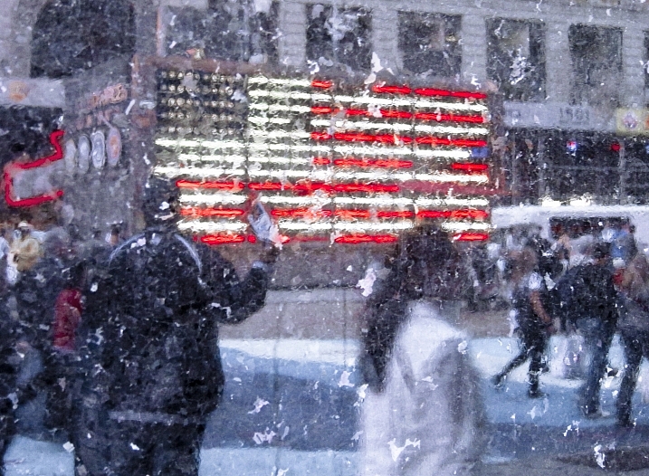
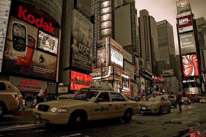
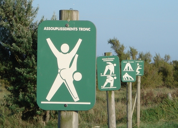
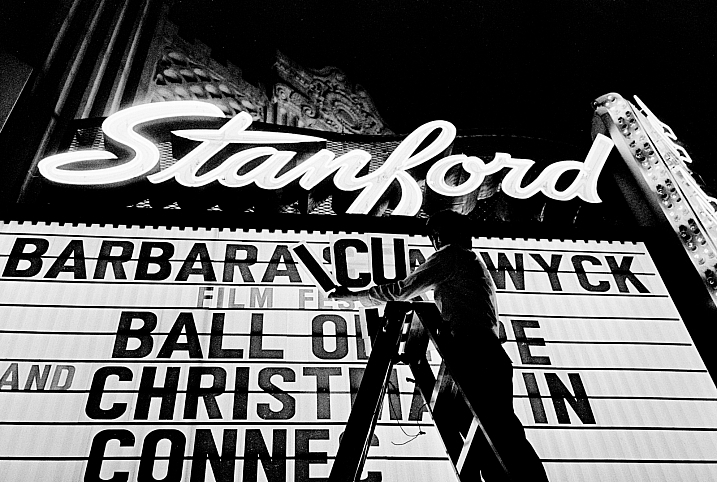
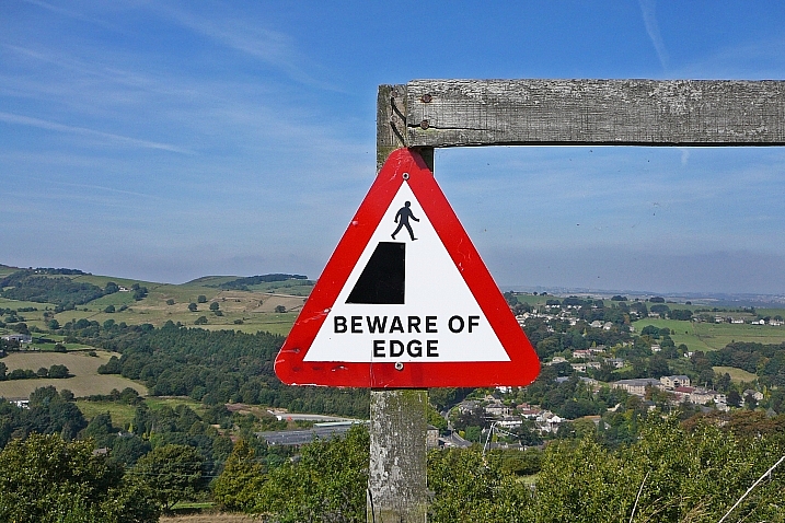
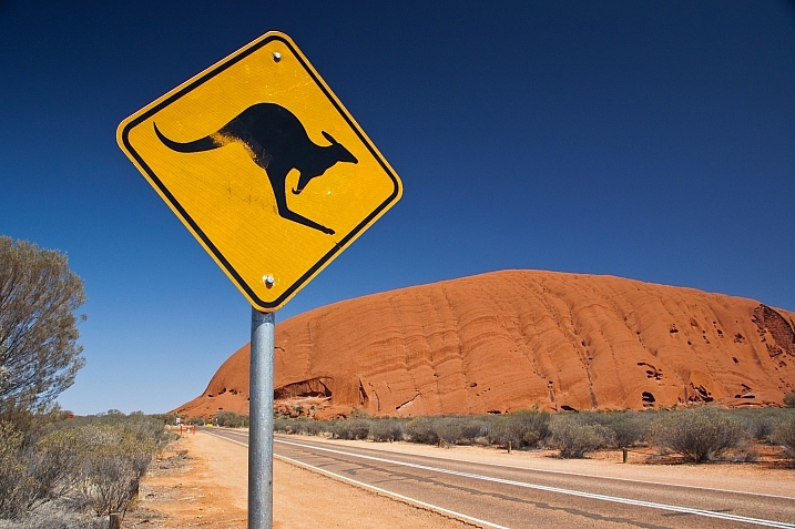
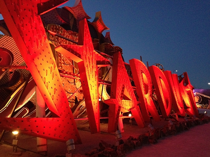
    Images of signs can help date a photograph and give viewers clues about the location, culture, even the period of history. Street photography often incorporates signage.

    What other ways can we use signs? Literal or more subtle? Let’s see how these photographers use signs:

    Andrea Koerner

    By Andrea Koerner

    Scott Smith

    By Scott Smith

    Vicki  DeLoach

    By Vicki DeLoach

    Bob Jagendorf

    By Bob Jagendorf

    These * Are * My * Photons

    By These * Are * My * Photons

    Darlene Hildebrandt

    By Darlene Hildebrandt

    Howard Ignatius

    By Howard Ignatius

    Sancho McCann

    By Sancho McCann

    Carol Von Canon

    By Carol Von Canon

    Pete Zarria

    By Pete Zarria

    Hernan Seoane

    By Hernan Seoane

    Mark Nye

    By Mark Nye

    Tim Green

    By Tim Green

    Thomas Hawk

    By Thomas Hawk

    Thomas Hawk

    By Thomas Hawk

    Brent Disney

    By Brent Disney

    Bluedeviation

    By bluedeviation

    Yiannis Chatzitheodorou

    By Yiannis Chatzitheodorou

    Steve Parkinson

    By Steve Parkinson

    Wendy Berry

    By Wendy Berry

    TJ Gehling

    By TJ Gehling

    Gilda

    By Gilda

    Jeremy Brooks

    By Jeremy Brooks

    Davidag

    By Davidag

    Jeremy Brooks

    By Jeremy Brooks

    Chuddlesworth

    By chuddlesworth

    A McLin

    By A McLin

    googletag.cmd.push(function() {
    tablet_slots.push( googletag.defineSlot( “/1005424/_dPSv4_tab-all-article-bottom_(300×250)”, [300, 250], “pb-ad-78623” ).addService( googletag.pubads() ) ); } );

    googletag.cmd.push(function() {
    mobile_slots.push( googletag.defineSlot( “/1005424/_dPSv4_mob-all-article-bottom_(300×250)”, [300, 250], “pb-ad-78158” ).addService( googletag.pubads() ) ); } );

    The post Sign of the Times – 27 Significant Images of Signage by Darlene Hildebrandt appeared first on Digital Photography School.


    Digital Photography School

  • 2016 Roundup: Interchangeable Lens Cameras around $500

    While they aren’t cameras that make headlines, one thing is for certain: entry-level interchangeable lens cameras sell by the truckload. The majority of them are stripped-down versions of their midrange siblings, with things like newer sensors, advanced autofocus systems, customizable controls and ‘premium’ build quality being left out. That doesn’t mean that these aren’t capable cameras – quite the contrary, actually.

    All of these cameras – both mirrored and mirrorless – produce good image quality, offer respectable performance and can record Full HD video. The majority have Wi-Fi. Many of them are targeted toward beginners, with ‘help’ systems that point out the best settings to use for various shooting situations.

    Those unfamiliar with DSLR and mirrorless cameras may be wondering what advantages and disadvantages each brings to the table. DSLRs are larger cameras, with a more ‘traditional’ shape and control layout, as well as an optical viewfinder. While they’re great for shooting stills, they’re not as well suited to video capture, and focusing using live view can be sluggish. Mirrorless cameras are typically smaller and are very capable video shooters, since live view focusing is much faster than most DSLRs. Two negatives about mirrorless cameras are that battery life isn’t nearly as good as a DSLR and – especially true in this class – they often lack a viewfinder.

    Let’s take a look at several entry-level ILCs, with US MSRPs in the $ 500 region, kit lens included. 

    • Canon EOS M10
    • Canon EOS Rebel T6
    • Fujifilm X-A2
    • Nikon 1 J5
    • Nikon D3300
    • Olympus PEN E-PL7
    • Sony Alpha a5100

    Articles: Digital Photography Review (dpreview.com)

  • Michael Reichmann, founder of Luminous-Landscape, dies aged 71

    We are very sad to report the death of Michael Reichmann, founder of Luminous-Landscape. 

    Luminous-Landscape and dpreview.com came of age at around the same time. While we focused on lab testing and measured performance, Michael’s perspective was always that of a passionate photographer. 

    Michael Reichmann, founder of Luminous-Landscape has passed away aged 71. Photo by Nick Devlin, used with permission.

    I was a keen reader of Luminous-Landscape before I discovered DPReview (shhhh, don’t tell Phil), back when it seemed like almost every month brought a new paradigm shift in the quality of digital cameras. I still remember poring over Michael’s now-famous (and still controversial) study of Canon’s EOS D30 against Fuji Provia, in which he concluded that grainless 3MP digital files were in most respects superior to film.

    “Life is short, death is long and
    I’m busy enough as it is”
     
    Michael Reichmann, on exhaustive side-by-side testing

    Michael was a towering figure in the North American photography press, and a natural writer. His humility and sense of humor shone through his work on Luminous-Landscape and made him wonderful company. He’d seen it all before, and didn’t take any of it – certainly not himself – particularly seriously. In failing health, Michael spent the last year of his life focused on the Luminous-Endowment, a charitable fund that he set up to benefit photographers across the globe.

    Just last week I enjoyed (re) reading his excoriating 2004 ‘non-review’ of the Contax N Digital, and I almost emailed him to see how he was doing. I wish I had. Michael will be missed by all of us at DPReview.

    Articles: Digital Photography Review (dpreview.com)

  • The Good, The Bad, and the Ugly of Watermarks and When and How to Use Them Effectively

    When going out and photographing you put your heart and soul in to capturing that special moment, and later, you may pay great care and attention to finishing the image off in post-processing. You are so proud of the results you simply cannot wait to share it online, or add to your portfolio on your website!

    One of the most popular practices amongst many photographers is the humble watermark; an opaque logo or text layered on top of an image. But is watermarking really necessary to protect your images – and is it really beneficial, or does it just get in the way?
    Image 3

    For the benefit, if are unfamiliar with what a watermark is, it is placing a logo or text  (or a combination of the two) with a reduced opacity over the main image. So why watermark in the first place?

    Don’t know how to make a watermark? Check out: How to Watermarking Images With Photoshop and Lightroom.

    What do watermarks do?

    Watermarks prevent, or reduce the chance, of your images being stolen or used without your permission.

    You’ve worked very hard – from capturing the image to editing it, and the last thing you want is for somebody to use your image without your permission; especially if it’s for the their financial gain. You would also like to have control over who uses your image. Many people believe that by adding a watermark to their images it will stop people, or at the very least deter them, from using their images without permission.

    However, there is no real proof that a watermark does indeed reduce this from happening at all. It’s now all too easy to crop a watermark out of an image, or for the more savvy, clone it out altogether. Some thieves may not even bother with any of that; they may just simply take the image, with or without a watermark, and use it. The truth that is once your images are online, you cannot stop your images from being used without your permission – watermark or no watermark.

     A watermark on your work looks professional

    This is a yes, and no answer. A good watermark can, in a very loose sense, look professional. However, the vast majority of watermarks – at least the ones I’ve seen – bring the level of professionalism right down. They are either simply too big, too distracting, have too much going on, or are poorly designed. They can even be a mix of all those things. A bad watermark can quickly degrade even the best image.

    If you’ve decided that you still wish to watermark your work, here’s a quick example of bad, and good watermarks.
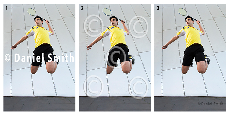
    Watermarks

    Example 1 (above left)

    The watermark in the first example here has no reduced opacity, and is also straight across the middle of the image. By having it in that position, it is obstructing the view of the subject. In addition, it is also far too large. This would count as a bad example of a watermark.

    Example 2 (above middle)

    In this example, the opacity of the watermark has been reduced, which helps the image behind show through more than the first example. However, the watermark covers the entire image. The design is also quite generic which is okay for a stock website, where the images might be sold. But for a personal watermark, it looks too plain.

    Example 3 (above right)

    This is how a watermark should look; it’s small and discrete. It won’t stop people from stealing the image as it could easily be cloned out. However, if you wanted to try and prevent theft, this watermark could be placed closer to the main subject.

    Generally, a watermark should:

    • Be small and monochromatic – or have very little color. Large, colored watermarks, detract from the image as they can compete with the subject too much.
    • Be placed in a descreet area of the image that does not interfere with the view of the image, but will make it more difficult to remove or clone out.
    • Have limited text
    • If the watermark is small, then having text will be all but near impossible to read

    When and where to watermark

    Watermarks can have their place on images. Although, they should not be on every image that you post online. Social media platforms, such as Facebook and Pinterest for example, could benefit with a subtle watermark on your images. In this case, if other users do share your photo, you can at least get a little exposure, provided they do not crop the watermark out.

    Another instance where a watermark could be of benefit, is when you are showing images to someone as proofs or previews; perhaps after a wedding, or a model photoshoot for example. In those cases, the watermark could say SAMPLE or PROOF; something to make it known that those images are not the final product. In this scenario, the watermark is not intended to stop the unauthorized use of the images – rather it is there to make it known that, if these images are used, they are not the final product.

    On the other hand, if you have a website that you use to show off your work, or even to potential clients as a portfolio, watermarking your images will not be of great benefit, as they generally do not look that professional.

    Image 1

    Conclusion

    I am of the opinion that watermarks are used all too often nowadays, by photographers who want to get their name out there and prevent the theft or unauthorized use of their work, which is perfectly understandable. However, I believe that in most cases, a watermark does not add any significant purpose to your work. A watermark does not stop anyone from stealing your image, nor can it guarantee that your name will gain greater exposure if your images are shared. Rather, watermarks only degrade the quality of your work as they are most often not designed correctly, and are an obstruction to your image.

    The only way that you can guarantee that your work will not be stolen, or used without your permission at all, is to never post or upload your images anywhere on the internet.

    I enjoy sharing my work on the internet. But likewise, I like to share work that people can enjoy without the degrading distraction that a watermark provides. What are your thoughts? Do you use watermarks? Please share your thoughts and opinions in the comments below.
    Image 2

    googletag.cmd.push(function() {
    tablet_slots.push( googletag.defineSlot( “/1005424/_dPSv4_tab-all-article-bottom_(300×250)”, [300, 250], “pb-ad-78623” ).addService( googletag.pubads() ) ); } );

    googletag.cmd.push(function() {
    mobile_slots.push( googletag.defineSlot( “/1005424/_dPSv4_mob-all-article-bottom_(300×250)”, [300, 250], “pb-ad-78158” ).addService( googletag.pubads() ) ); } );

    The post The Good, The Bad, and the Ugly of Watermarks and When and How to Use Them Effectively by Daniel Smith appeared first on Digital Photography School.


    Digital Photography School
  • Processor maker ARM acquires Apical

    Processor maker ARM has acquired the UK-based imaging technology company Apical for a cash consideration of $ 350 million. The Apical name might not be too well known among consumers, but the company’s technology can be found in a very large range of digital cameras and smartphones.  

    The company’s products include Assertive Display which makes screens adapt to changes in lighting, and Assertive Camera, a range of image signal processors (ISPs) and software modules that manage HDR capture, noise reduction and color management among other tasks. Apical is also one of the UK’s fastest growing technology companies and currently employs approximately 100 staff, most of them at its research and development center in Loughborough. 

    According to the press release, with the acquisition ARM is hoping to get into new markets where computer vision technology is in demand, including connected vehicles, robotics, smart cities, security systems, industrial/retail and the ‘Internet of Things’ devices. That said, Apical also complements ARM’s offerings in the smartphone and digital camera sectors. 

    “Computer vision is in the early stages of development and the world of devices powered by this exciting technology can only grow from here,” said Simon Segars, CEO, ARM. “Apical is at the forefront of embedded computer vision technology, building on its leadership in imaging products that already enable intelligent devices to deliver amazing new user experiences. The ARM partnership is solving the technical challenges of next generation products such as driverless cars and sophisticated security systems. These solutions rely on the creation of dedicated image computing solutions and Apical’s technologies will play a crucial role in their delivery.”

    Apical’s dynamic range compression algorithm, ‘Iridix’ was used by a range of camera makers, including Nikon, Olympus and Sony as they developed their in-camera dynamic range options Active D-Lighting, Shadow Adjustment Technology and Dynamic Range Optimizer.

    Articles: Digital Photography Review (dpreview.com)

  • Detroit Agate: Auto Factory Paints Accidentally Form ‘Fordite’

    [ By WebUrbanist in Art & Sculpture & Craft. ]

    shaped fordite

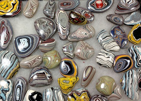
    Culled from paint deposits in old car factories, these may look like exotic gemstones, but their colors reflect years of layering and hundreds to thousands of assembly-line stops. They are frequently referred to as Detroit Agate, or simply: Fordite.

    fordite image

    Workers at the time, and urban explorers in later years, grew fascinated and started chipping off the results to save and ultimately shape into jewelry and other objects.

    fordite rings

    Historically, automotive bodies were painted by hand, and the spray-painted layer would drip onto surrounding surfaces and equipment (or simply be coated indirectly).

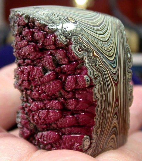
    natural detroit aggregate

    The pain would end up backed onto these surfaces, where it would solidify and grow thicker over time, up to inches over the years.

    fordite encursted form

    Like layers in a rock to a geologist, these faux-minerals tell stories of automotive history through their vibrant and varied colors, including changes in favorites over time. While you can still find this in raw form or polished pieces online, be warned: pre-1970s layers may contain lead.

    Share on Facebook


    [ By WebUrbanist in Art & Sculpture & Craft. ]

    [ WebUrbanist | Archives | Galleries | Privacy | TOS ]


    WebUrbanist

  • 8 Quick Tips to Improve Your Photos of Architectural Details

    When you’re photographing architecture, it’s easy to get lost in the grandeur of some buildings. That’s not a bad thing. That’s how they were designed, to be a spectacle. Cathedrals, palaces, opera houses, and state buildings are all examples of architecture that’s meant to impress.

    That’s the bigger picture. In terms of photography, however, it can be better to pull away from the grand, and look for opportunities in the details. All buildings and structures are sums of smaller parts, and it’s these parts that can often lead to visually interesting photos. Photographing these details comes with its own set of considerations. This article will point out a few things to look out for while you are out and about looking for the smaller picture, and 8 tip on how to improve your photos of architectural details.

    #1 – Low contrast lighting

    If the weather is poor and the sky is a drab, colorless grey, it may seem like a less than worthwhile opportunity for photography. That may be the case for some subjects, however, overcast days provide incredibly soft light that is quite suited for architectural details. This softness allows you to capture subjects with a lot of fine detail, that would normally be lost in the contrast.

    8-tips-architectural-details-2448

    Overcast days will help to bring out details that would have been lost in contrast.

    Likewise, keep an eye out for photo opportunities in areas of shade. You may need a tripod to take advantage here, but the extra effort is worth it.

    8-tips-architectural-details-1927

    Photographing subjects in the shade provides soft, even lighting.

    #2 – Side lighting

    For bold images, look for scenes with strong light coming from the side. This type of lighting will increase contrast, especially in texture, and it will help to emphasize the shape of your subject.

    8-tips-architectural-details-9763

    Side lighting helps to emphasise texture and shape.

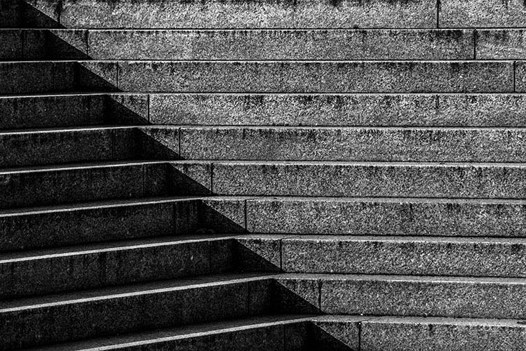
    #3 – Patterns in light and shadow

    Pay close attention to how light falls on various subjects. When you’re photographing details, shadows and highlights can, themselves, become an important compositional element.

    8-tips-architectural-details-9709

    Shadows and highlight can become graphic elements in their own right.

    #4 – Patterns

    8-tips-architectural-details-1864

    Repeating patterns can make for bold imagery.

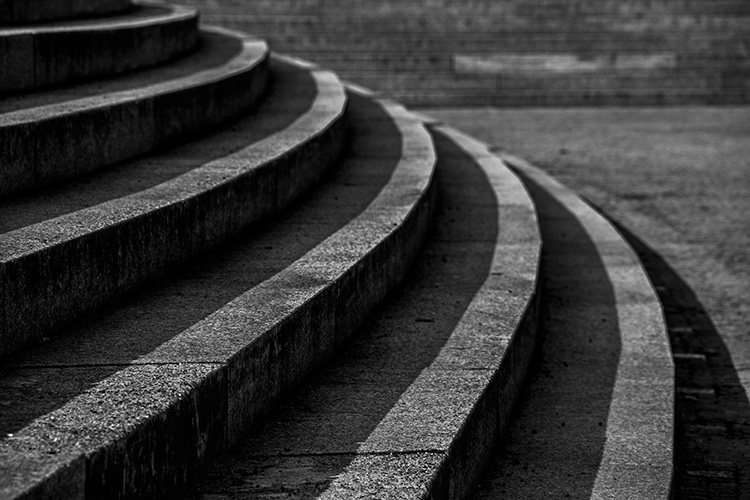
    To me, the best part of photographing architectural details is the wealth of compositional possibilities. Man-made structures are full of patterns and shapes that can be exploited for photos. Take advantage of them by filling the frame for an abstract feel.

    8-tips-architectural-details-9717

    The curve in these stairs made for natural leading lines.

    #5 – Reflections

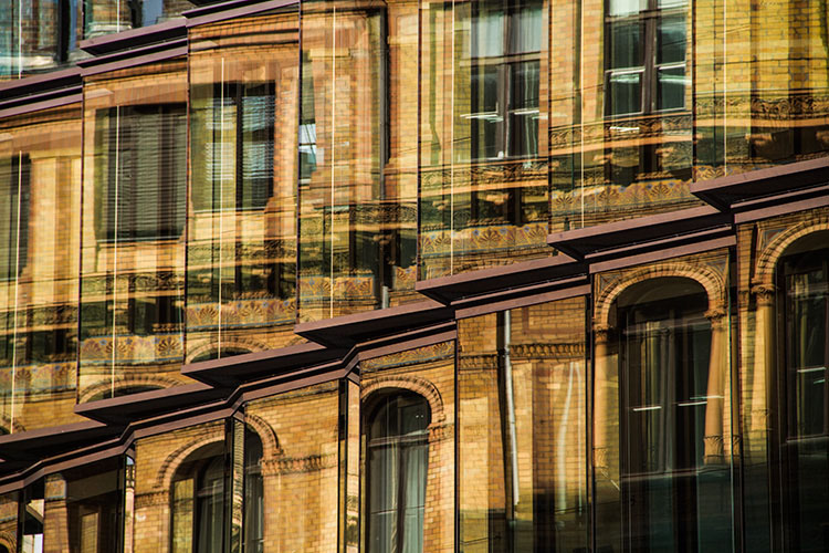
    For all of the wonderful architecture in the world, there’s at least as many drab and ugly buildings that appear to have little to offer photographers. They often do have something worth captuing, but it takes work to figure it out. One way to add interest to these subjects is to look for reflections. Reflections can add visual interest and color, to an otherwise lifeless and boring subject.

    8-tips-architectural-details-9752

    Reflections can add a boost to an otherwise lifeless scene.

    #6 – Fixtures

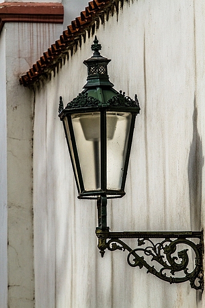
    It’s not always about the buildings, and only the buildings. Fixtures can often be overlooked, yet they can prove to be as compelling a subject as the architecture. When you’re considering a location, do look out for interesting fixtures like signs, light fittings, and security cameras.

    8-tips-architectural-details-1903

    Keep an eye out for interesting fixtures that other may overlook.

    #7 – Statuary and monuments

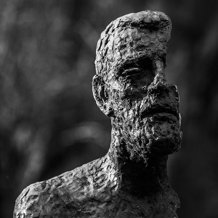
    When you think of architecture, statues are probably the last thing on your mind. However, they are a key element to a lot of buildings and monuments. For example, the Charles Bridge in Prague has 30 large, and very detailed, statues that beg to be photographed.

    8-tips-architectural-details-2250

    Statues are a common architectural features. Don’t neglect them with your camera.

    8-tips-architectural-details-2470

    #8 – Black and white

    This last tip is for when you’re back at home. If your images are full of texture or strong patterns, consider a black and conversion. Stripping the color element out of those images will help to emphasize your compositional elements, and can lead to much stronger photos.

    8-tips-architectural-details-2595

    Black and white processing can help to emphasise texture in a scene.

    Experiment

    These tips are hardly exhaustive, and only scratch the surface of the possibilities available to you when photographing architectural details. If there’s something man-made, there’s a photograph to be had somewhere. Just keep going until you find it.

    Do you have a tip of your own? Please share it below!

    googletag.cmd.push(function() {
    tablet_slots.push( googletag.defineSlot( “/1005424/_dPSv4_tab-all-article-bottom_(300×250)”, [300, 250], “pb-ad-78623” ).addService( googletag.pubads() ) ); } );

    googletag.cmd.push(function() {
    mobile_slots.push( googletag.defineSlot( “/1005424/_dPSv4_mob-all-article-bottom_(300×250)”, [300, 250], “pb-ad-78158” ).addService( googletag.pubads() ) ); } );

    The post 8 Quick Tips to Improve Your Photos of Architectural Details by John McIntire appeared first on Digital Photography School.


    Digital Photography School
  • Fast and steady: Tamron 85mm F1.8 Di VC USD real-world samples

    The Tamron 85mm F1.8 claims the title of the world’s first fast-aperture 85mm lens with stabilization. The focal length will certainly appeal to portrait photographers, and the combination of Tamron’s vibration compensation with an F1.8 aperture might just give it an edge in low light situations. We’ve been shooting with it over the past couple of weeks, both on full-frame and crop sensor bodies, to get an idea of its performance.
    Articles: Digital Photography Review (dpreview.com)

  • Which Filters Should You Use for Landscape Photography

    Which filter should you use – if any – for Landscape Photography? It’s a question we hear all the time and one we’ve written about in our archives (we’ll link to some of our posts below) but today we came across this short video from Joshua Cripps where he tackles the question and shows some shots of images taken with the filters – to show what impact they have.

    Find more from Joshua at his site here.

    Further Reading on How to Use Filters in Your Landscape Photography

    • How to do Dreamy Landscape Photography with a Neutral Density Filter
    • Beginner’s Guide to Buying Filters
    • Polarizing and Neutral Density Filters: Essentials for Landscape Photography
    • Using Graduated Neutral Density filters for Landscape Photography
    • How to Use a 10 Stop Neutral Density Filter to add Drama to the Sky

    Check out our Brand New Landscape Lightroom Presets

    NewImage

    googletag.cmd.push(function() {
    tablet_slots.push( googletag.defineSlot( “/1005424/_dPSv4_tab-all-article-bottom_(300×250)”, [300, 250], “pb-ad-78623” ).addService( googletag.pubads() ) ); } );

    googletag.cmd.push(function() {
    mobile_slots.push( googletag.defineSlot( “/1005424/_dPSv4_mob-all-article-bottom_(300×250)”, [300, 250], “pb-ad-78158” ).addService( googletag.pubads() ) ); } );

    The post Which Filters Should You Use for Landscape Photography by Darren Rowse appeared first on Digital Photography School.


    Digital Photography School