Blog

  • 3 Habits Every Outdoor Photographer Should Develop to Avoid Missing Shots

    Have you ever been out to photograph a gorgeous sunset, just to realize that you can’t, because your batteries are dead? Perhaps you’ve come home and imported your images, and noticed that all of them are unusable due to hundreds of dust spots?

    Don’t worry. Most of us have experienced the exact same things. Luckily, there are certain habits you can develop to avoid ever missing a shot again. None of them are time consuming, so there’s really no excuse not to implement them into your workflow.

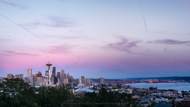
    Kerry-Park-Sunset

    Habit #1 – Charge your batteries

    It might sound obvious that you should charge your batteries but you would be surprised how often I meet people that are out in the field without any battery power. In fact, I’m guessing you’ve experienced this yourself (don’t worry, so have I, and most other photographers too).

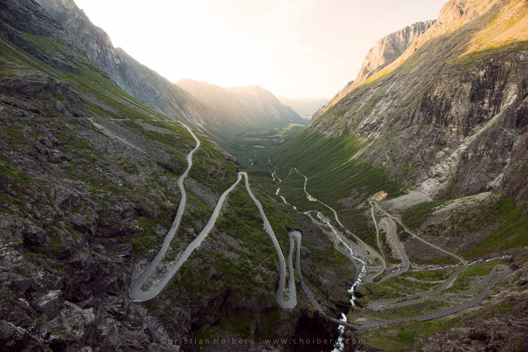
    About a year ago I decided to take a seven hour drive to Åndalsnes in Norway, known for its spectacular landscape, in particular the iconic Trollstigen road. I had been there a few times before, but the weather was never ideal, so I wanted to go back and capture at least one good image. When I arrived at the scenic road and walked out to the viewpoint I managed to take a handful of pictures before my battery died. Weird, I thought, but no problem, I still have two spare batteries. Turned out both of them where empty too. I guess you can imagine my frustration when I realized that this entire trip was ruined because I had forgotten to charge my batteries.

    trollstigen-sunset-glow

    I managed to capture one decent image before my batteries died

    I made it a habit after that incident to always charge my batteries after I come home from a trip, or evening out photographing. I set my batteries to charging even before I import my images, because I know if I don’t do it right away I may forget.

    Habit #2 – Clean your equipment

    Cleaning your camera gear is extremely important (especially for outdoor photographers) not only to lengthen the life of your equipment but also to improve image quality. I always get a bit upset when I view a beautiful image that is broken due to hundreds of small (or a few huge) dust spots. This is so unnecessarily, and easy to get rid of, so why let others believe you’re not as talented as you actually are.

    Honestly, you don’t need more than a cheap microfiber cloth to remove dust and dirt from your lens or filters. Even though that is enough in most cases (and something that should always be in your camera bag), I do recommend purchasing a liquid lens cleaner too, as this helps get rid of all smudges and especially salty spots.

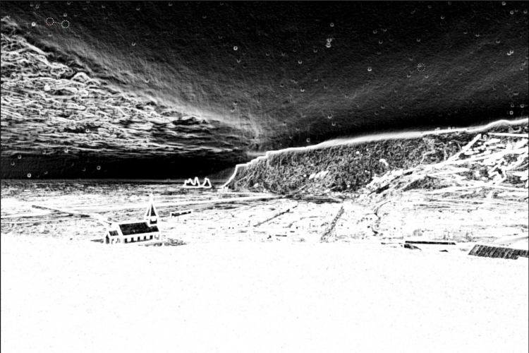
    After bad weather on Iceland my lens was filled with dus spots

    After bad weather on Iceland my lens was filled with dust spots, as you can see here in Lightroom.

    I’ve made it a habit to clean my equipment after each photo trip that lasts more than a day. If I’m out photographing seascapes or in windy/rainy conditions, I usually spend an extra minute afterwards getting rid of the worst. Making this a habit will help save you a lot of time in post-production using tools such as Lightroom’s Spot Removal.

    If you’re getting serious with your photography, and perhaps you have even began selling a print or two, it’s even more important to get rid of those nasty spots. Just imagine selling a large print, then seeing that those small spots suddenly look large and take away the attention of the image. Don’t make that mistake!

    Habit #3 – Don’t leave before it’s over

    My final habit is perhaps one of my most important advice for any outdoor photographer.

    Don’t leave before it’s over!

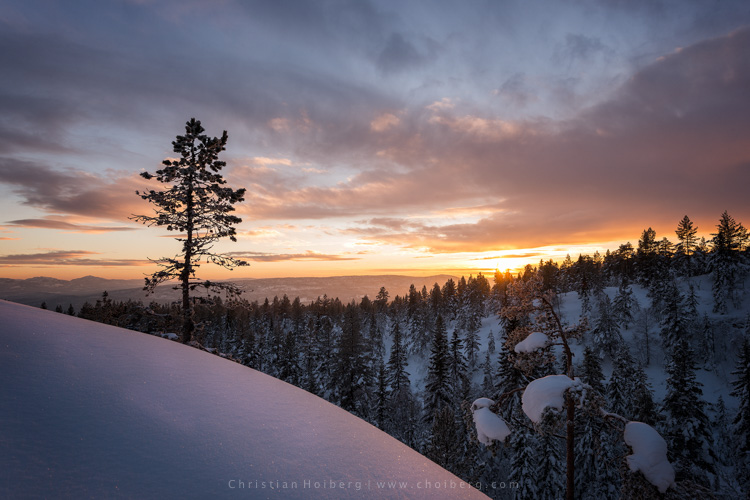
    An unexpected sunset this winter in Norway

    An unexpected sunset this winter in Norway

    This is a habit I had to learn the hard way. It happened many times when I was an amateur photographer that I decided a sunrise or sunset wouldn’t turn into anything good, because the weather looked a bit shabby. Instead of staying at the location longer, I preferred to go home and hope for better conditions next time. What happened as I was driving back home? The sky turned red for just a few minutes.

    Even though the conditions look a little dull it doesn’t mean that you won’t have a few minutes of good light. Alright, in most cases it doesn’t turn into something spectacular, but the times it does you will wish you had stayed for that 10-20 minutes extra.

    So, remember this the next time you’re considering leaving early: it’s not over before it’s over. Stay a little bit longer, and perhaps you will be treated with great light that results in a portfolio worthy image. It’s worth it!

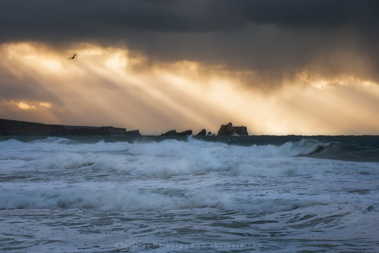
    Bird flying through a stormy sunset at Liencres, Cantabria.

    Bird flying through a stormy sunset at Liencres, Cantabria.

    Are you guilty of missing these 3 habits? Have you developed any other habits, either in the field or when you’re back home? Let us know by leaving a comment below!

    This week we are doing a series of articles to help you do nature photography. This is the first – watch for more coming soon! 

    googletag.cmd.push(function() {
    tablet_slots.push( googletag.defineSlot( “/1005424/_dPSv4_tab-all-article-bottom_(300×250)”, [300, 250], “pb-ad-78623” ).addService( googletag.pubads() ) ); } );

    googletag.cmd.push(function() {
    mobile_slots.push( googletag.defineSlot( “/1005424/_dPSv4_mob-all-article-bottom_(300×250)”, [300, 250], “pb-ad-78158” ).addService( googletag.pubads() ) ); } );

    The post 3 Habits Every Outdoor Photographer Should Develop to Avoid Missing Shots by Christian Hoiberg appeared first on Digital Photography School.


    Digital Photography School

  • All 7 Photography Deals Back – 24 Hours Only

    If you missed out on any of the amazing offers over the last 7 Days of our Summer Sale, today’s your final chance to grab a bargain.

    fb-all_deals_are_back_3_1024

    As in previous years we’ve received a few sad messages from readers who missed out on deals along the way, asking if there was any way to get them.

    As a result, today we’re opening all 7 deals back up again for one last chance.

    So if there’s a deal you regret missing or if you missed one of our emails – you’re in luck.

    Just to recap, here’s what’s available for the next 24 hours:

    1. The Complete Portraits Pack (71% Off)
    2. Lightroom Rapid Editing System for Travel Photography (72% Off)
    3. Landscape Photography Ebooks & Video (Save $ 400)
    4. The Essential Guide to Black And White Photography (Just $ 6)
    5. Photo Nuts Courses Bundle (70% Off)
    6. The Complete Photography Tutorial eBook (61% Off)
    7. The Ultimate Post Production Photography Bundle ($ 5000 worth for $ 79)
    8. See all 7 deals over at our Summer Sale page!

    googletag.cmd.push(function() {
    tablet_slots.push( googletag.defineSlot( “/1005424/_dPSv4_tab-all-article-bottom_(300×250)”, [300, 250], “pb-ad-78623” ).addService( googletag.pubads() ) ); } );

    googletag.cmd.push(function() {
    mobile_slots.push( googletag.defineSlot( “/1005424/_dPSv4_mob-all-article-bottom_(300×250)”, [300, 250], “pb-ad-78158” ).addService( googletag.pubads() ) ); } );

    The post All 7 Photography Deals Back – 24 Hours Only by Darren Rowse appeared first on Digital Photography School.


    Digital Photography School

  • Polaroid Swing is a new take on Apple’s Live Photos

    Apple didn’t invent the concept, but ever since the company launched its Live Photos feature it has been en vogue to add a touch of motion to still images – just enough to give you a better idea of the atmosphere at the time and place of capture.

    The latest new app to slightly vary this theme is Polaroid Swing. The app captures 60 frames in a quick burst and combines them into an animated image. When viewing you can trigger the 1-second animation by twisting your device or swiping across the screen. This works in both directions. Below are a couple of samples for you to try, just move the mouse across the images:

    As you would imagine, final results can be shared via Facebook, Twitter and other means. The effect is pretty neat but, as we’ve seen many times before, there is danger of the novelty factor wearing off pretty quickly. That said, the owners of the legendary Polaroid name seem to firmly believe in Polaroid Swing’s success. They have not only licensed the Polaroid name but also invested in the app. Polaroid Swing is available as a free download from the App Store now; an Android version is still in the works.

    Articles: Digital Photography Review (dpreview.com)

  • Peak Design launches Everyday backpack, tote and sling bags on Kickstarter

    Peak Design has launched four new bags in its Everyday product line: the Everyday Backpack in 20L and 30L sizes, the Everyday Tote, and the Everyday Sling. All four bags are offered in two different configurations, one Charcoal in color with black trim and red accents, the other Ash with black trim, blue accents, and leather accents. 

    Peak Design says its new bags, while ideal for photographers, ‘ain’t just camera bags,’ hence the Everyday moniker. The array of bags are made from weather-resistant materials and integrate protective design elements including both ultra-thick felt and high-density compression-molded EVA materials. The Everyday bags can be customized via the removable FlexFold dividers, are ‘loaded’ with storage spaces, and offer expanding internal structures with a system for attaching items to the bags’ exteriors.

    The new Everyday bags are currently being funded on Kickstarter where the campaign has reached nearly double its $ 500k funding goal with 58 days remaining. Peak Design estimates it will deliver bags to backers this coming December.

    Via: Kickstarter

    Articles: Digital Photography Review (dpreview.com)

  • Tips for Using Natural Framing to Improve Your Composition

    To help you compose more exciting and beautiful photographs, there are certain key composition techniques that you can use. Natural framing is one that is widely known, but needs careful and thoughtful application. Using framing can create extremely impressive and elegant images when done right. Here are some tips to help you.
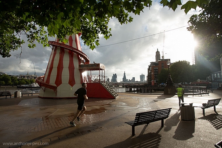
    natural-framing-tips--10

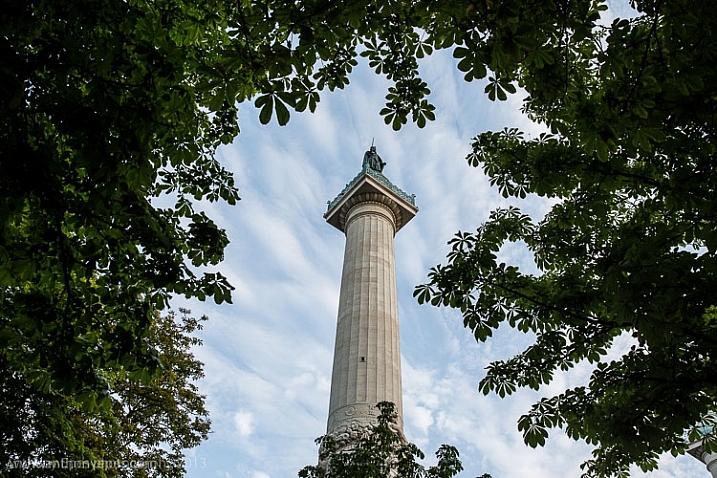
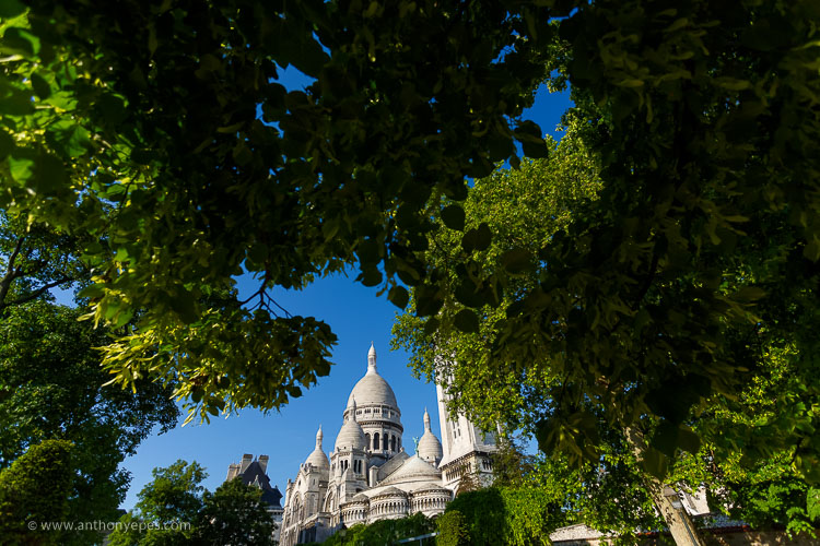
    Natural framing is when you use an element within your image to frame the subject. This draws the eye into the photo and highlights the actual subject.

    This internal frame can be constructed using a multitude of things you’ll find anywhere – branches, archways, tunnels, door frames etc., as well as things that aren’t solid like light, shadows, rain, fog, etc. – it doesn’t matter what you use.

    Framing is a technique to use sparingly – but when it’s totally right, it looks natural. So few people use it well that if you can master it, you can create some fantastic shots.
    natural-framing-tips--2
    Why you should use natural framing:

    • It easily draws your viewer’s eye into the photo and emphasizes the subject.
    • It isolates and separates your subject from what’s around it.
    • It brings a sense of order and structure to a photo – and the eye loves order.

    When to use natural framing

    • To obscure boring sky (my favourite).
    • To add depth to an image – especially when the item acting as the frame is not in focus.
    • To bring contrasting elements into the photo without detracting from the subject.
    • To create structure.
    • To create a feeling of a self-contained image, particularly if you are photographing something quite ordinary and simple, a frame will help give depth to the subject.
    natural-framing-tips--12

    Traditionally the frame should be distinctly separate from the subject, so that it’s not confusing to the eye. But I will also show you where I haven’t done that, and the photo still works. I will show you both how to use this technique as well as where else you can take it – how to let it inspire you to develop your images.

    Rules are made to followed, bent and broken

    Like anything that is considered a technique or rule, people can feel very passionately for or against their use.

    “Consulting the rules of composition before taking a photograph, is like consulting the laws of gravity before going for a walk.” Edward Weston

    But for me, it comes down to not using any of the rules so much, that your photos end up all looking the same. Don’t let rules keep you stuck in a box. They are a great springboard for your photography, or a way to help refresh your vision, so that you start composing in a different way.
    natural-framing-15

    When I was starting out, I worked hard to get really familiar with the key compositional techniques, but then after a while, once I’d embedded them, I started to develop my own way of using these techniques, my own style.

    I also encourage you to think of all these techniques and rules as opportunities to see and learn to organise the elements within your photos differently. In my workshops I’ve noticed that one of hardest things for people is to break the world down into elements, and then learn how to organise these elements to create striking compositions.

    Natural framing isn’t an add-on

    Natural framing is one of the harder rules to pull off well. I think many people use it to make a boring landscape or scene more interesting. But to me, if your subject is boring, no technique is going to liven it up. Framing should be used as an additional interesting element – not as an overlay to a mundane scene (just search: “natural framing” on Google images and you’ll see what I mean).
    natural-framing-tips--3

    I find natural framing is most interesting when used in the loosest possible interpretation. It has to be employed in a way that enhances the photo, and feels like it is a natural part of the composition.

    “There is no better time to crop a bad composition than just before you press the shutter release.” Bryan Peterson

    With those caveats – now it’s time to relax, have fun, and play with it!

    Creating your frame
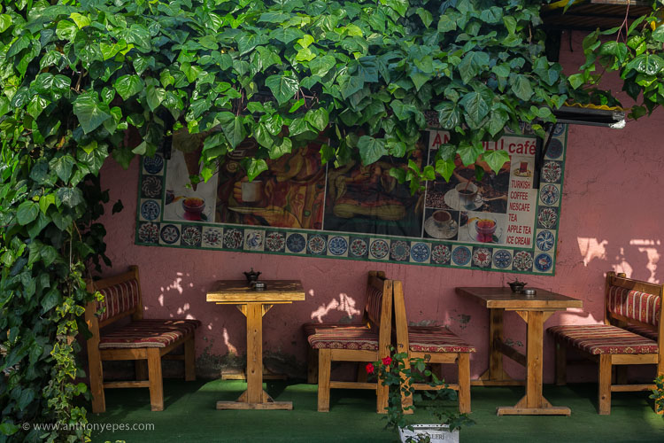
    natural-framing-20

    You don’t need to have a frame around all four sides of your photo for it to work – in fact I’d encourage you not to do that. I think more often than not, it looks more natural and pleasing to the eye for the frame to take up just two or three sides of the image. But like every recommendation – use your own personal judgement.

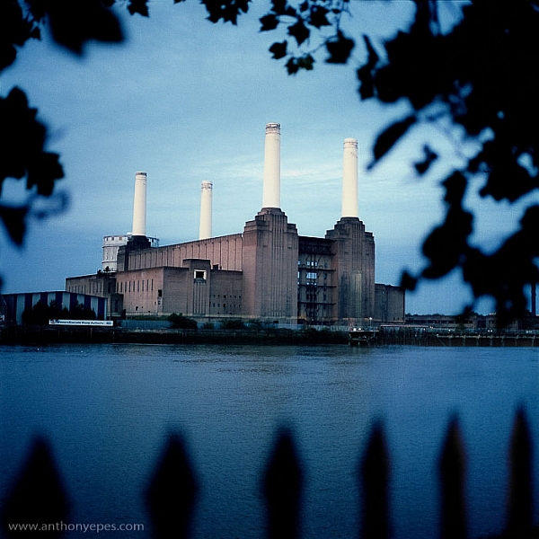
    The photo above of Battersea Power station is probably one of my most traditional interpretations of natural framing. I have framed the building with the branches and leaves at the top, and the outline of a fence at the bottom. Two important things to point out in this photo:

    • When the frame is out of focus it create a sense of depth to the image.
    • The frame can be made from different elements: I’ve used two different elements but their colour is the same, and they are both interesting shapes – so they have some common qualities.

    Obscuring boring sky
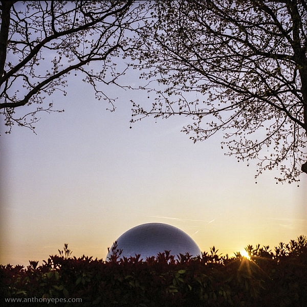
    natural-framing-tips--7

    In the photo above, I wanted to capture the shiny dome and the rising sun. But that wasn’t enough to make an interesting photo. There was some pretty endless sky, so I added a silhouette of the bare branches above. I seem to use a lot of tree branches in my natural framing compositions. In this case, I love how they create this beautiful, wild, chaotic pattern, above the very clean and shiny dome. Then I’ve added this little almost tuft of leaves below, which balances the photo out.

    I love using framing elements that have great texture – again they add depth. Just remember to keep it well organized and clear so people can see what you are trying to do. This photo is really about the simple contrasting shapes – and by using natural framing it creates a nicely ordered photo, constructed from the available elements.
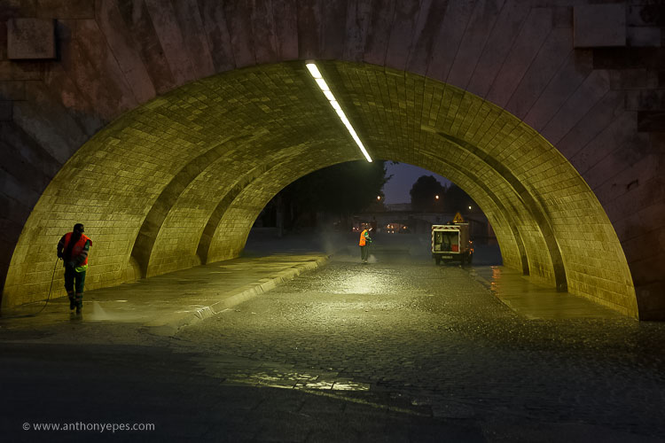
    natural-framing-17

    So once you’ve got a grasp of the concept you can start using the technique in other ways – have fun!

    You are in control of how the viewer sees the image

    Naturally framing is a very good way to remember that you are in control of how the viewer’s eye will go around the image. It doesn’t matter how big the photo is, the eye won’t see the complete image all at once. The eye will be drawn to one part and then move around the image depending on where the elements are placed. Your job as a photographer is to direct the eye.
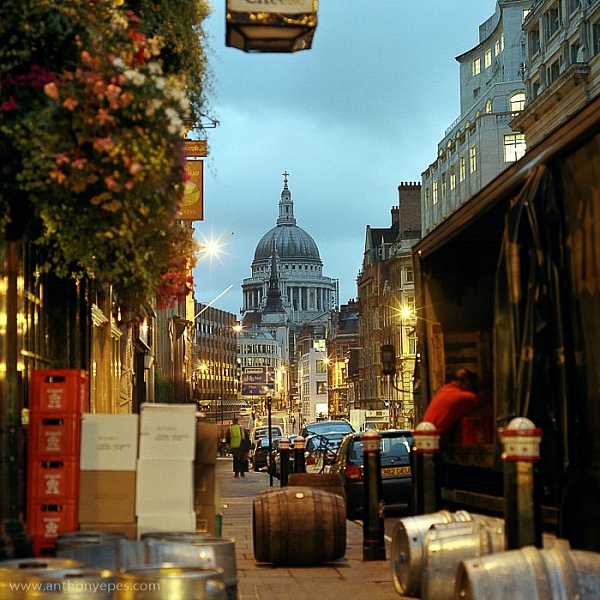
    natural-framing-tips--4

    Here the subject is St Paul’s Cathedral, bang in the centre of the image. But all around it there are buildings, streets, cars, etc. When you first see the image, all of that other detail bleeds into one, creating a natural frame for the cathedral. But then gradually you start to see the details, so the image becomes something quite different.

    This photo is a good example of how you can use framing to create order to a very busy scene, and give the viewer a way into the photo. It’s also a good example of how your eye moves around an image.

    The one-sided frame

    It is possible to do a one-sided frame, and it works! Below, even though the foliage is only running along the bottom, it creates a great grounding effect, and pushes the eye up toward the moon and the Statue of Liberty. Therefore, in my book, it adheres to the principal of drawing your eye towards the real subject of the photo. This isn’t even a strong line that’s creating the framing element – it’s simply the power of suggestion.
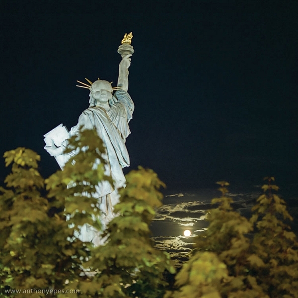
    natural-framing-tips--6
    In the photo below you’ll see some framing which is going across the corner of the photo. So it’s still drawing your eye to the subject – which is the rising sun and Tower Bridge – but it’s quite subtle. I would perhaps suggest that the bottom elements are creating a second framing element, grounding the photo, and framing the sun. What do you think?
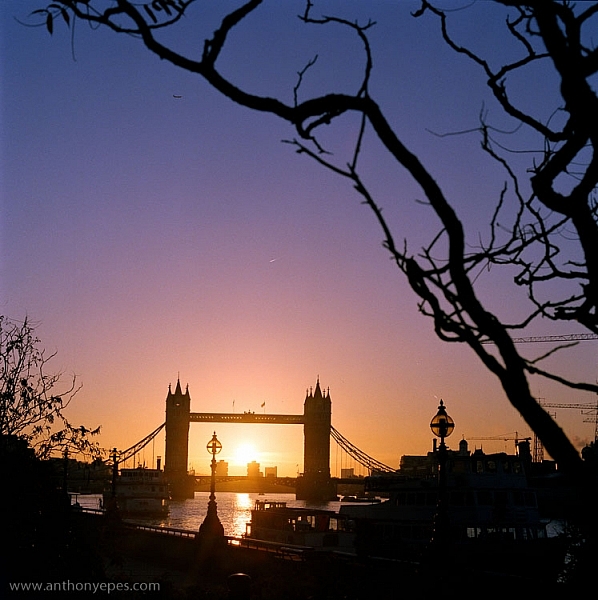
    natural-framing-tips--8

    When I am shooting photos with big sky – which is favourite subject of mine – what I often do is shoot when small objects appear in the sky, like above. If you look closely you can see a very small plane. Or sometimes a tiny bird appears, or some other random object. People often ask me why I don’t Photoshop it out because it can look like a piece of dust or a mistake, but I love these little surprising elements. It’s great if there can be tiny details that create layers of interest in your shots, so your viewers don’t see everything all at once. (Or as Henri Cartier-Bresson said, “The little, human detail can become a Leitmotiv.”)

    Here is another photo that is truly on the edge of being framing. But I think it shows how you can play with the idea (and there is nothing more fun than playing with all these different concepts and ideas, and making them your own).
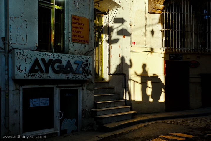
    Greeting Shadows

    I looked at this photo and thought – wow, I’ve framed the image of the shadows of the people with the surrounding dark shadow. It is doing what natural framing tells us to – which is use a frame to draw attention to the real subject of the photo, so I think it fits.

    Use multiple frames within one image

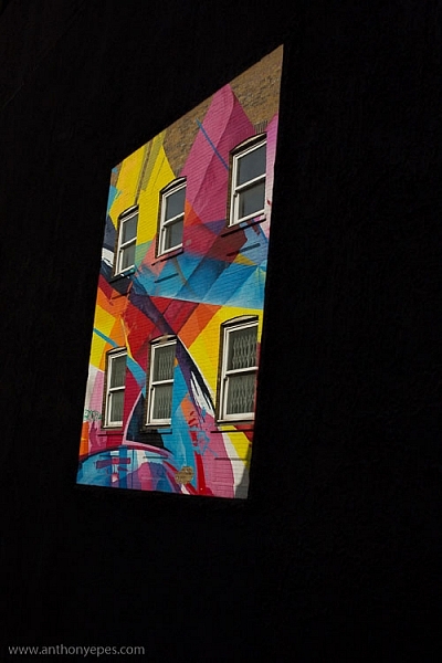
    I am a little bit obsessed with photographing things I find on the street. I love photographing very ordinary things – like chewing gum or lines on the road, disconnecting them from their wider context, and just playing with their shapes. This is also another way to help train you to practice breaking the world down into elements, so that you can then start to organize them in a more constructive way.

    You can go further still by making the frame within your image just a part of the image, and not the whole thing. It could even be just a suggestion of a frame, like I did here.
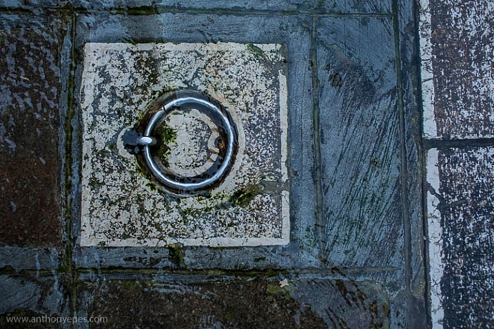
    natural-framing-tips--5

    I love using very simple backgrounds with strong colours for my portraits. This is because firstly, I want the background to not distract from subject, so a simple background is usually best. The camera can’t easily recreate the layers that we see with our awesome 3D eyes. So if, for example, you put a subject in front of a crowd, you will get a flat image without depth.

    Homeless World Cup Hasselblad Portraits

    Plus, I like to have the colour and texture of the background really fit with the subject – maybe with their clothes, their posture, their expression, etc. This photo is a good example of my philosophy on this point.

    Now back to framing! One key reason the photo above works is the added dimension of some framing. Yes, again not a totally traditional use of it, but you can see that the yellow arch shape and the blue strips either side are adding some great structure and form to the image. You’ve also got a sense of them confining the subject, which gives a nice balance to his strong, proud posture. That feeling of being confined is something you can do well with natural framing, and adds a curious feeling to the photo (since the posture of the subject is so proud and strong, you can’t imagine him being confined, right?).

    Everything within your frame has a message
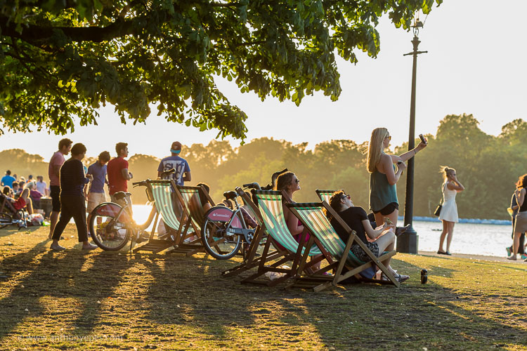
    natural-framing-19

    As the photographer, you need to make sure that everything you put in the frame is saying something that you want it to – that the elements are all working together to form the idea and feeling that you seek. If you don’t know what that’s supposed to be – just ask yourself:

    • What am I feeling here?
    • What is interesting to me in this scene?
    • Why is this important?

    It’s these feelings that you will be communicating through your images, if you’ve done it well and created a strong photograph.

    In the image below I framed the Shard, with buildings on the side and a fence along the bottom. There is a risk that it could all have blended in together, but that bright blue sky has created a natural space around the subject.
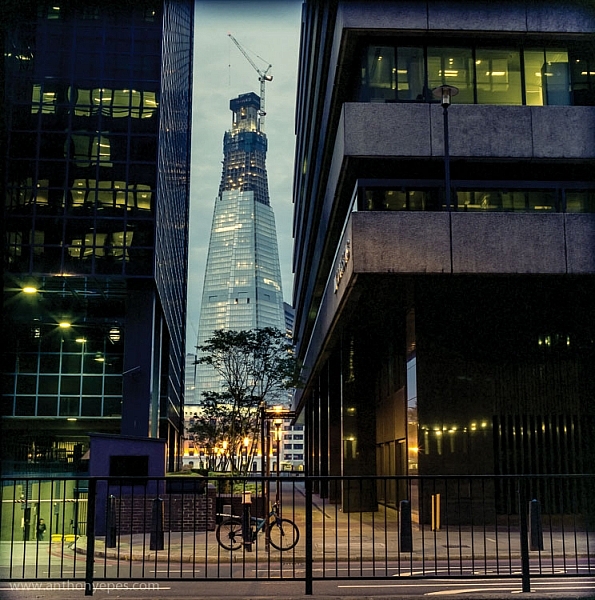
    natural-framing-tips--1

    If this is all feeling like a bit too much, don’t worry, as it all becomes instinctive after a while. As a final note, I like this thought from Henri Cartier-Bresson:

    “You just have to live and life will give you pictures.”

    It’s a great way to live.

    I’d love to know what you think of natural framing – do you use this technique? What do you think of the examples I’ve given here? Have you been inspired to try this out if you’ve never used it before? If you have any photos you’d like to post here I’d love to see them.

    googletag.cmd.push(function() {
    tablet_slots.push( googletag.defineSlot( “/1005424/_dPSv4_tab-all-article-bottom_(300×250)”, [300, 250], “pb-ad-78623” ).addService( googletag.pubads() ) ); } );

    googletag.cmd.push(function() {
    mobile_slots.push( googletag.defineSlot( “/1005424/_dPSv4_mob-all-article-bottom_(300×250)”, [300, 250], “pb-ad-78158” ).addService( googletag.pubads() ) ); } );

    The post Tips for Using Natural Framing to Improve Your Composition by Anthony Epes appeared first on Digital Photography School.


    Digital Photography School
  • Adobe boosts Lightroom Mobile with Raw editing for iOS

    Adobe’s Lightroom Mobile apps for Apple and Android mobile devices have both been given significant updates that allow users a much wider range of controls when editing and shooting. The company has quite different apps for the two operating systems, and while Android users have been able to edit Raw files for some time the facility is now offered to iOS users via version 2.4. Owners of Android devices can now install version 2.1 which offers what Adobe calls a ‘Pro’ shooting mode that allows much more detailed control over the way pictures are recorded.

    Adobe says the version 2.1 for Android has a completely new Lightroom Camera function that features a mode that gives the photographer access to shutter speed, ISO, white balance and focus so that they can all be adjusted manually. Aperture isn’t listed as few mobile cameras have significantly variable apertures. The company also says it has improved the app’s ability to export high resolution files.

    Apple iPhone and iPad users get Raw Technology Preview, which effectively allows photographers to import files from all the cameras supported by the main desktop version of Camera Raw. These Raw files can be edited using a wide range of tools to control contrast, exposure and white balance, and marked with star ratings and flags – all of which can be synched with Lightroom on the owner’s other devices. The company says it has edited 50MP images from the Canon EOS 5DS on an iPhone 6 to demonstrate how powerful the application is.

    iOS users can also now make radial and linear selections that allow local editing of particular areas of the image.

    Both the Android and iOS versions of Lightroom Mobile are free to download and use, but to enjoy the new features iOS users need to have a subscription to Creative Cloud.

    For more information see the Adobe blog. 

    Photograph by Elia Locardi of the valley in Meteora, Greece. Shot in raw on a Fuji XT-2 and edited on location with an iPad Pro with Lightroom for iOS.

    Manufacturer’s information:

    Two big updates for Lightroom for mobile are now available for download

    Lightroom for iOS 2.4
    In version 2.4, two major improvements have been added: a raw technology preview and the addition of local adjustment tools. In addition to these major improvements, we’ve also added the ability to use keyboard shortcuts with physical keyboards connected to iPads, the ability to add your copyright to all imported photos, functionality to turn on lens profiles (if your camera and lens combination are supported), as well as the usual bug fixes and improvements.

    Raw Technology Preview
    We’re sure it’s happened to you before: you’re out taking photos (in raw of course) and you capture a real stunner that you can’t wait to share with the world. Until now, you had to either transfer a JPEG version of the file over or you had to wait until you got back to your desktop or laptop. With the raw technology preview, you’ll be able to import raw photos immediately to either your iPhone or iPad, edit them, and then share them, anywhere you’ve got a connection. Our goal with Lightroom for mobile is to make it an indispensable part of your photography workflow, providing the tools that you’re familiar with and the quality you expect in a product that can be with you, no matter when inspiration strikes. With this technology preview, we want to push the boundaries of how photographers around the world work with their mobile devices.

    You get all of the benefits of raw, such as the ability to change the white balance, being able to recover blown out highlights, access to the full range of color information, as well as editing an uncompressed file, all using the exact same technology that powers Lightroom on your desktop. An added benefit is that the raw file that you’ve imported into Lightroom for iOS will be synced with Lightroom on your other devices, such as Lightroom for desktop or Lightroom on the web, along with any of the edits, star ratings, or flags that you added.

    Lightroom for mobile supports all of the same raw files that Lightroom for desktop as well as Adobe Camera Raw support, with the full list available here.

    To transfer photos to your mobile device, you need to use either the camera connection kit or the lightning to SD or USB kits from Apple to transfer your raw files over to your device, which will bring up the Import tab within the iOS Photos app. Importing the files will add them into your camera roll, where you can then access and load in any raw file directly into Lightroom mobile. It’s important to keep in mind that raw files are significantly larger (3-5 times larger) than JPEGs, meaning the raw files will take longer to import, upload, and take up more space on your device. Even as such, we found that the added control and quality that the raw files afforded were so useful that it outweighed the negatives.

    Just as when working with raw files that were synced from Lightroom for desktop or Lightroom on the web, you’ll be able to perform raw-specific enhancements, such as changing the white balance with greater control and recovering clipped highlights, but unlike when working with raw files synced from Lightroom for desktop, you’ll have access to the full resolution file AND you can do it anywhere in the world, even from your iPhone! 

    We’ve run Lightroom for mobile through its paces on a number of different files, including the 50MP Canon 5DS running on an iPhone 6, proving that you really can edit nearly any photo anywhere. After playing with the app for a few months, we’ve found that it’s a really great way to take a few of your favorite images from the day (or even that you just captured), review to make sure you captured what you saw, edit, and then share them, all right away, and with all of your edits carried through the rest of the Lightroom ecosystem.

    We had the pleasure of working with a number of photographers while creating the raw technology preview, take a look at how travel photographer Elia Locardi was able to put the technology to use while shooting on location in Greece.

    You can read more about the images that were created for this release through an article about Elia on Adobe Create as well as on Elia’s own blog.

    Linear and Radial Selections
    In addition to the raw technology preview, we’ve also added in the ability to perform local adjustments with linear and radial selections, the two most requested features after raw support.

    Lightroom for iOS Availability
    Lightroom mobile 2.4 is available immediately for iPhone and iPad from the iOS App Store for free. Both of these improvements are available only for members with a creative cloud subscription or or if you start a free Creative Cloud trial.

    Lightroom for Android 2.1

    While the iOS team was working hard on the raw technology preview, the Android team doubled-down on the unique end-to-end DNG capture experience first announced in Lightroom for Android 2.0 and created a brand new capture experience. Our goal is to create the best mobile photography experience available, and with the amazing quality possible on Android devices, especially thanks to DNG raw capture, we wanted to provide all of the controls and functionality needed.

    Now, the built-in camera has a new Pro mode that lets you control the shutter speed, ISO, white balance, and focus all manually, in a brand new interface.

    You can access the camera directly using the new Lightroom Camera widget. This new widget will launch the Lightroom camera directly, making it faster for you to get in and start taking pictures.

    In addition to the new built-in camera, we’ve also improved the app’s ability to export full-resolution files. If the files are available somewhere within the Lightroom ecosystem, Lightroom for Android will now download the full resolution version and enable you to export them.

    You can download Lightroom for Android 2.1 here now for free.

    Articles: Digital Photography Review (dpreview.com)

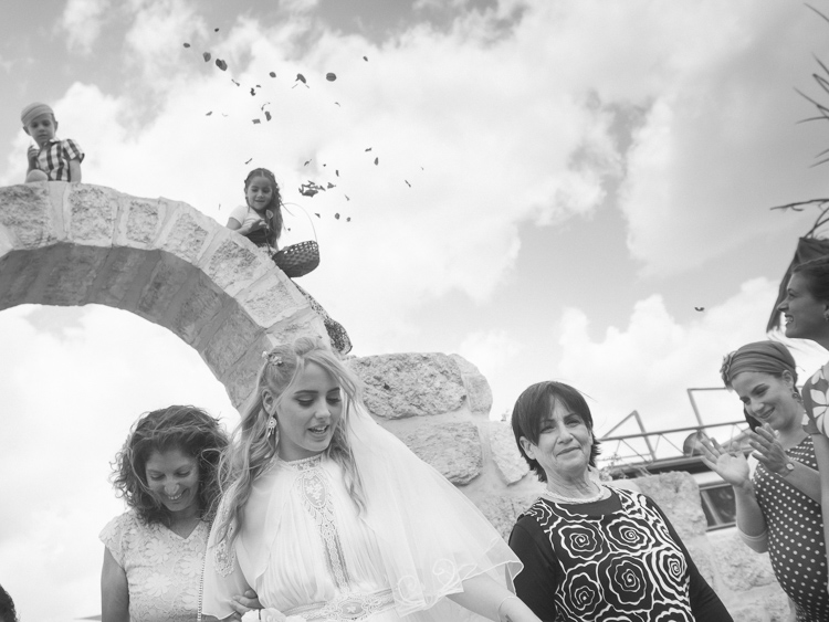
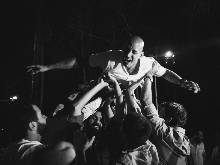
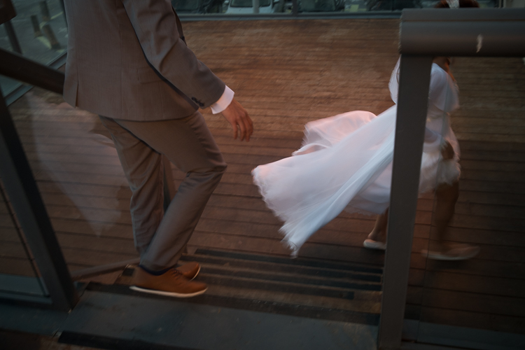
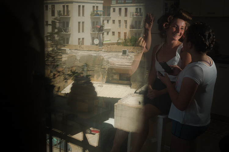
  • 4 Ways to Get Inspiration from the Streets to do Better Wedding Photography

    Be inspired by decisive moments on the streets to create better wedding photography.

    If you are reading this article you must have some interest in street photography, or maybe you are starting as a professional wedding photographer, but most likely you are interested in both fields. This will give you some ideas on how to draw inspiration from street photography that you can use in your wedding work.

    A street photographer can be anyone going out to wander the streets of a city with their camera, in order to make photographs that tell the human story of daily life as it occurs on the streets. A wedding photographer on the other hand, is one that is hired to capture memories, tell the love story, and the unfolding special day in a family’s life. The wedding photographer is a professional with enormous responsibility to find, and deliver the right frames, that will recreate trusted memories, decades after the big day is over.

    A clear personal artistic voice is what separates one photographer from another. That voice is who you are, but that voice of yours needs constant care and development, in order for it to be a dominant factor in your photographic style as a professional photographer. Competition, changing trends, and the release of new gear also have their own voices that can influence your photography. Maintaining a balance between your inner world and the outer influences is key to success as a street-wedding photographer.

    The following tips came from the world of street photography and are perfectly suited for the wedding photographer. If you master them on the street, you can go to a wedding with confidence, and sing your own song with your camera.

    1 – Planning versus reacting

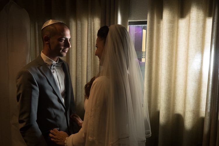
    Wedding photography tips
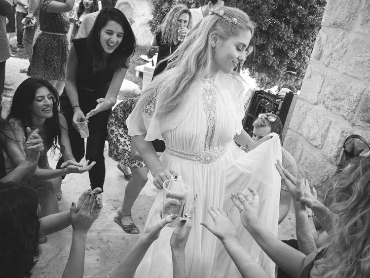
    What it takes to make great decisive moment photographs is, that first of all you need to see them before they occur. The longer before the better, it will give you the time to plan your composition, and work towards a frame that will be exciting and tell a story. In order to see things before the happen it takes looking around your subject, and constantly look at the surroundings of the bride, rather than focusing your attention only on her. This way you will be able to notice other elements and people that make your frame more interesting and communicative. Even as short as two or three seconds can be long enough for a street photographer to plan a good frame.

    If you look around and plan your next shot you have a greater chance of catching the decisive moment, rather the one that follows.

    2 – Create emotion

    wedding photography tips motion
    Freezing and blurring the movement of objects and people are two ways to communicate emotion in a photograph. It is a property that is unique to still photography, and is a big part of the photographic language. But often many photographers think that a wedding photograph has to be sharp and in focus, and the end result is often a precise documentation of reality, rather a poetic description of the moment. Give yourself the time it takes on the street to fully understand how the blurring and freezing of motion is being read and perceived by the viewers.

    Master motion techniques then bring them into the weddings you photograph.

    3 – Understand the way light can work for you

    wedding photography tips light
    Explore the way light falls on things, and the way it looks in your street photographs. When your are under the stress and responsibility of a wedding day the thinking side of your brain often takes over, and shuts down the creative side. You may see the wedding as a checklist of photographs to be taken, images of subjects, rather than decisive moments to tell a story.

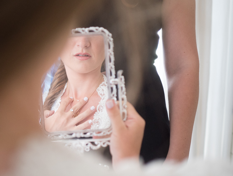
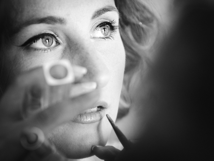
    One way to keep the creative brain in charge of things is to remind yourself constantly to work with the light, see light, change it if necessary, and let go of the subjects. If you are photographing the bride getting ready, she is the subject whether you think about it or not, now it’s time to think about light.

    4 – Responsibility and integrity

    wedding photography tips

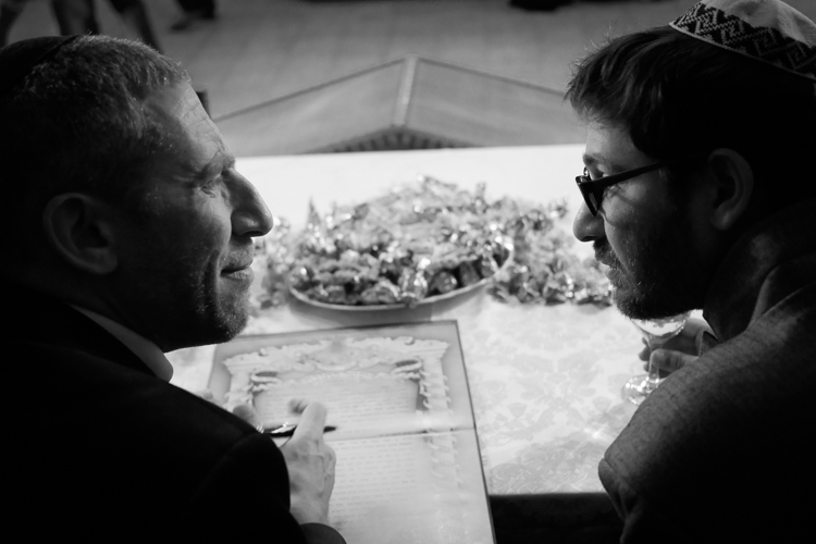
    Whether you work for yourself as a street photographer, or as a professional wedding shooter, you should be able to sleep well at night. You should never publish street photographs that might hurt someone’s feelings or cause them damage. However, that being said, you should also remember that the act of photographing people on the streets doesn’t harm them in any way, and have no fear to do your art.

    There is another side to the coin of responsibility, that is integrity. when you are hired to photograph a wedding be sure to have shown only photographs that were made by you, that are a good representation of your style and voice. Be sure to let your clients know that they are going to get artistic street-wedding photographs if that is what you want to give them!

    googletag.cmd.push(function() {
    tablet_slots.push( googletag.defineSlot( “/1005424/_dPSv4_tab-all-article-bottom_(300×250)”, [300, 250], “pb-ad-78623” ).addService( googletag.pubads() ) ); } );

    googletag.cmd.push(function() {
    mobile_slots.push( googletag.defineSlot( “/1005424/_dPSv4_mob-all-article-bottom_(300×250)”, [300, 250], “pb-ad-78158” ).addService( googletag.pubads() ) ); } );

    The post 4 Ways to Get Inspiration from the Streets to do Better Wedding Photography by Ouria Tadmor appeared first on Digital Photography School.


    Digital Photography School
  • How to Use the Text Tool in Photoshop

    As photographers, we often swear by the mantra that a picture speaks a thousand words. Yet there are some instances when we just wish we could add a word or two to help facilitate the understanding of the image, or carry the thought process forward even beyond viewing the image. The good news is that this is fairly easy to do using most editing software on the market today.

    In this article we’ll go over the basics of how to add text to an image using Photoshop.

    transparent-text

    The Type Tool

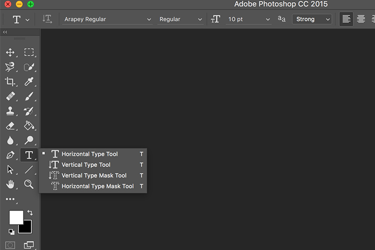
    Photoshop’s Type Tool is an easy to use yet powerful mechanism with which you can add text to an image. The Type Tool is found in the Tools panel, normally located along the left side of the screen. It’s the icon that is the capital letter T. You can also select the Type Tool by pressing the letter T on your keyboard. The default chosen is the Horizontal type tool, but you also have the option of selecting the Vertical type tool (where text entered is displayed in vertical orientation, going down instead of to the right – just click and hold your mouse on the Type tool on the panel to access the other options).

    Memorable Jaunts Article for DPS Text tool in Photoshop basics 02

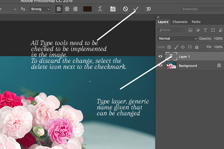
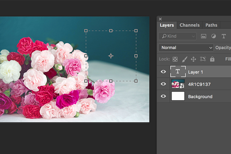
    When you choose the Type Tool, Photoshop automatically creates a new layer (called Type Layer) over the original background image. This is very helpful should you make a mistake and want to delete the layer to start over, or if you want to make edits after the fact. Initially the layer has a generic name “Layer 1” but once you start entering the text, the layer name changes to the text you have entered. However, this can be confusing, especially if you are entering in a lot of text in the type layer. I recommend changing the name of the Layer to something more appropriate and meaningful like Title Text or Quote Text, etc.

    Memorable Jaunts Article for DPS Text tool in Photoshop basics 04

    Choosing a Font

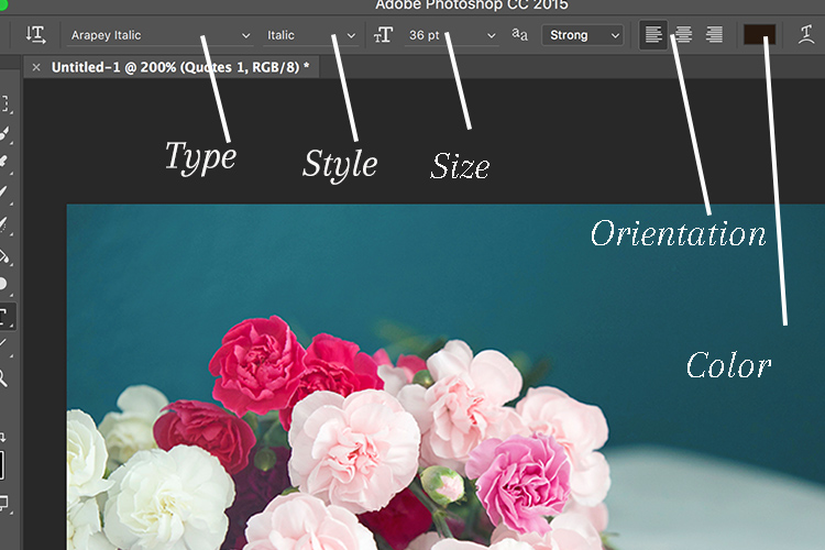
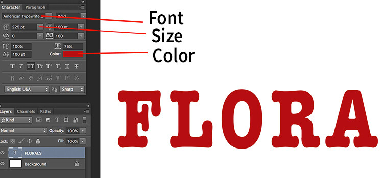
    As soon as you select the Type Tool, the Options Bar along the top of the screen updates to show the options related to it, including options for choosing a font, a font style and the size among others. Front left to right (as shown in the image below) you can choose font type, font style, font size, alignment, and color. The type indicates the font you want to use. Clicking on the dropdown arrow shows a list of all the possible fonts available for use. The exact fonts you’ll see in your list will depend on which fonts are currently installed on your computer. Next up is the style. In this example, I have used italic style for the image below. Following that is the size, alignment, and color. Selecting the color opens up the color picker tool where you can either choose the color from the pallet, or enter in the HEX value of the color you want for the text.

    Memorable Jaunts Article for DPS Text tool in Photoshop basics 03

    Adding Type to the Image

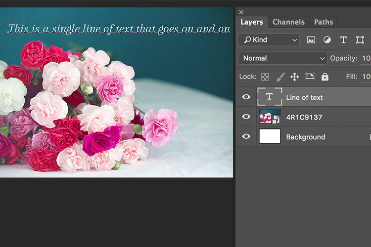
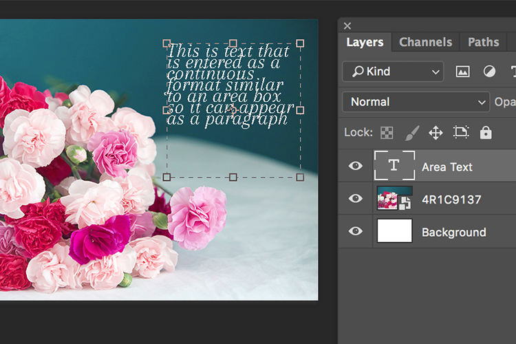
    The power of the type tool in Photoshop lies in the ability to add different types of text to a document. The first option is Point type (also known as character type), and the second is Area type (also known as paragraph type). The difference is that point type is mainly used for adding small amounts of text to a document (a few words, a title, etc.) while area type is used for adding larger amounts of text (think a quote or paragraph) inside a selected area. The Point type is the basic type tool. When the type tool is selected the default is a line of text that will keep extending as long as you keep writing text in the type box (that is Point type).

    Memorable Jaunts Article for DPS Text tool in Photoshop basics 07

    To add text using the Point type, simply click on your image with the Type Tool, in the spot where you want your text to begin. A blinking insertion marker will appear letting you know that Photoshop is ready for you to start typing.

    By holding down the Shift key, and dragging the ends of the type box (the blinking insertion marker), and an Area type will be created. This is the area where larger blocks of text, like paragraphs, can be entered. You can also simply click and drag to make a rectangle (similar to make a marquee selection) which will be the Area type.

    Memorable Jaunts Article for DPS Text tool in Photoshop basics 05

    Memorable Jaunts Article for DPS Text tool in Photoshop basics 06

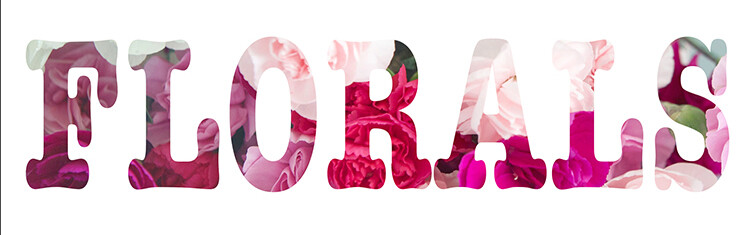
    As you can see, the Type tool is a simple yet powerful tool to add text to your images in a creative way. It can be used to enhance the messaging on an image, as well as for other uses like creating announcements, marketing materials, etc., based on your needs. Once you have the basics of the text tool mastered, you can take it up a notch to add effects like drop shadow and an image see-through the text effect as shown in the images below. It is not complicated but you need to follow the steps carefully.

    Special text effects

    Memorable-Jaunts-Text-Tool-Text-See-through-effect-for-DPS-article-01b

    Text tool effect with image see through

    Memorable-Jaunts-Text-Tool-Text-See-through-effect-for-DPS-article-02b

    Text tool with image see-through effect and a drop shadow for added impact.

    To add a drop-shadow to text, follow the steps listed below:

    1. Create a new text layer and select the font, size and color you want. To see the true effect of image through text, make sure you select an appropriate font and size (something bold and wide).
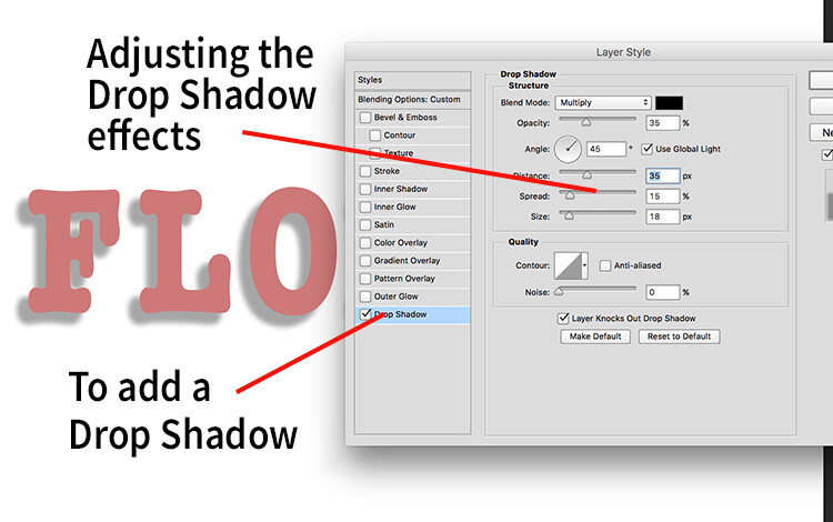
    2. Double clicking on the text layer will open up the layer style panel. To add a drop shadow effect, select the drop shadow option (last option) and adjust the size, position and color of the drop shadow.
    text-tool-01

    Create a new text layer on a new image and adjust the font, size and color of the text layer to taste. For text see-through effect, a bold large font is preferred.

    text-tool-02

    Using the layer style option, you can add a drop shadow effect and adjust the size, distance and orientation/angle of the drop shadow.

    Creating see-through text

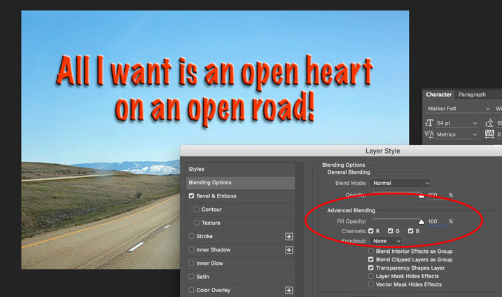
    To create an effect of transparent text (you can see through it) open up the Layer Style panel and click on Blending Options from the left-hand side. Look for Advanced Blending (circled below).

    text-unfaded

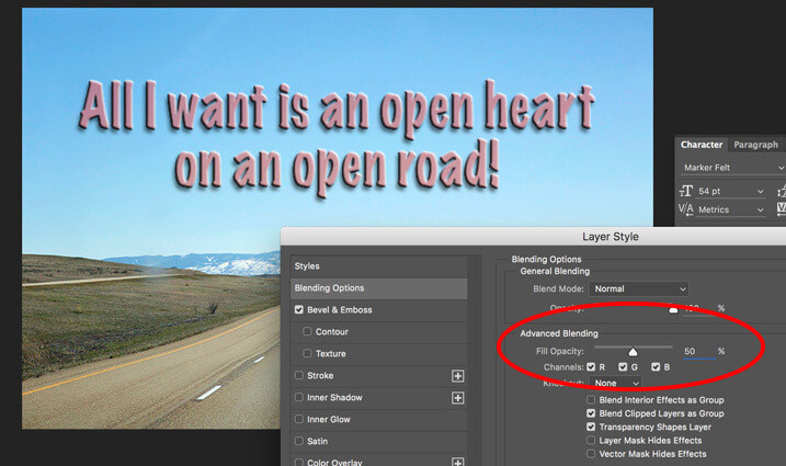
    Lower the Fill Opacity by moving the slider to the left. This is what 50% faded looks like:

    text-50-faded

    Text layer with the opacity lowered.

    Notice that is does not lower the opacity of any of the other layer styles you have applied such as the Drop Shadow. It only fades out the inside of the text. This is a handy trick for making watermarks of your name or logo over your images so it is subtle.

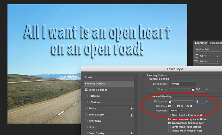
    Faded out to 0%

    Faded out to 0%

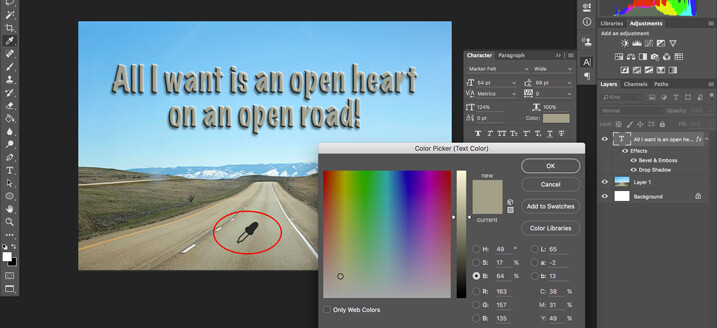
    Note: if you want to make a custom color for your text, one that complements well with the tones of your image – you can use the color picker to select a shade right from your image. Just click on the color in the top menu panel or the Character panel if you have it opened – that will bring up the Color Picker popup box. Just hover over your image and you will see a small eyedropper (I have enlarged it below so you can see it easier). Whatever color you click on will be selected and pulled right from your image.

    text-tool-custom-color

    Use the color picker to select a tone from your image to use for your text.

    Creating and image inside text

    To add an image see-through effect to the text you created, follow the steps listed below:

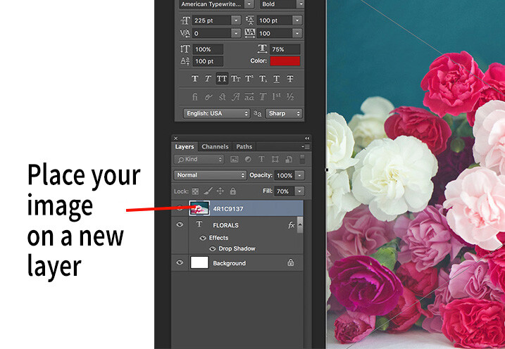
    1. Once you have the text you want, place an image (Select File, Place image). A new layer will be created and the image will be placed on top of the text layer. You will notice that the text layer you just created will be hidden behind the image.
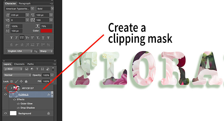
    2. To create the see through effect, you need to add a clipping mask to the image layer. This causes the image to be clipped to the text.
    3. To add a clipping mask, select Layer -> Create clipping mask from the menu options.
    4. You can move the image using the transform tool, to change the position of certain elements in the image to line up to the text if needed. For example I moved the image up to show more of the red and pink flowers through the text.
    text-tool-03

    Select the image you want to use for the text see-through effect and use the Place function to put it on the text layer. It is automatically selected in the transform mode. Adjust the size of the image to taste.

    Add a clipping mask to the image layer (Menu option - layer -> create clipping mask). The image will automatically appear behind the text and the effect will be seen through the text.

    Add a clipping mask to the image layer (Menu option – layer -> create clipping mask). The image will automatically appear behind the text and the effect will be seen through the text. When you see the little down arrow (circled) you know the clipping mask is applied between those two layers.

    Memorable-Jaunts-Text-Tool-Text-See-through-effect-for-DPS-article-02b

    Text with see-through image effect and pink drop shadow.

    Be sure to play around with various images to see what images work for you. What are some way you use the Type tool for your images? Feel free to share in the comments below.

    googletag.cmd.push(function() {
    tablet_slots.push( googletag.defineSlot( “/1005424/_dPSv4_tab-all-article-bottom_(300×250)”, [300, 250], “pb-ad-78623” ).addService( googletag.pubads() ) ); } );

    googletag.cmd.push(function() {
    mobile_slots.push( googletag.defineSlot( “/1005424/_dPSv4_mob-all-article-bottom_(300×250)”, [300, 250], “pb-ad-78158” ).addService( googletag.pubads() ) ); } );

    The post How to Use the Text Tool in Photoshop by Karthika Gupta appeared first on Digital Photography School.


    Digital Photography School
  • Crystal Universe: Digital Maze Invites You to Immerse Yourself in Light

    [ By SA Rogers in Art & Installation & Sound. ]

    Screen Shot 2016-07-13 at 5.05.53 PM

    A kaleidoscopic space filled with reflected and refracted light in all shades of the rainbow makes you feel like you’ve somehow immersed yourself inside a crystal at the DMMPLANETS exhibition in Odaiba, Tokyo. Dreamed up by the art collective teamLab, ‘Wander through the Crystal Universe’ is one of three major interactive installations in place through the end of August for the inaugural show. The work uses accumulated light points to create a sculptural body, “similar to the way distinct dots of color form an image in a pointillist painting.”

    crystal universe 2

    crystal universe 4


    As you walk through the three-dimensional light space, your movement affects the light particles, creating changes in the installation. Each person’s action or change affects the way everyone present experiences the space. The lights are constantly moving and shimmering, going dark to mimic the effect of floating in space and then shifting into new color palettes. Visitors can further interact with the exhibit using their smartphones, selecting certain elements and enhancing them.

    crystal universe 3

    Screen Shot 2016-07-13 at 5.05.53 PM

    crystal universe main

    “In Crystal Universe, the particles of light are digitally controlled, and change based on the viewer’s interactivity with the work. The result is an installation consisting of an accumulation of lights, forming a sculpture that expresses the universe.”

    floating

    floating 2

    Equally enchanting is ‘Drawing on the Water Surface Created by the Dance of Koi and People – Infinity.’ In this case, visitors are walking into a pool of water, influencing the movement of projected koi.

    floating 3

    “When the fish collide with people they turn into flowers and scatter. The trajectory of the koi is determined by the presence of people and these trajectories trace lines on the surface of the water. The work is rendered in real time by a computer program, it is neither a pre-recorded animation nor on loop. The interaction between the viewer and the installation causes continuous change in the artwork. Previous visual states can never be replicated, and will never reoccur.”

    Share on Facebook


    [ By SA Rogers in Art & Installation & Sound. ]

    [ WebUrbanist | Archives | Galleries | Privacy | TOS ]


    WebUrbanist

  • Urban Dystopia: 11 Short Sci-Fi Films Set in Future Cities

    [ By SA Rogers in Drawing & Digital. ]

    LIMA

    The science fiction of the past thirty years has evolved beyond the midcentury’s optimistic space-age visions into a darker, grittier place, where technology is out of control and resources are running out. Whether you think these imagined dystopian futures are overly dramatic or prescient of harder times to come, their depiction of our downfall can be absolutely riveting, and worth watching for the urban scenery alone. Short films offer an ideal medium for filmmakers of all skill levels to explore these concepts, including architecture that’s taken on a life of its own and high-tech surveillance societies.

    In fact, if you want to know what sci-fi films might be coming out in the next few years, keep an eye on the digital shorts that are proliferating across the internet, as many of them get snapped up by major studios to become full-length features.

    Spatial Bodies by AUJIK

    OSAKA 1

    OSAKA 2

    OSAKA 3

    OSAKA 4

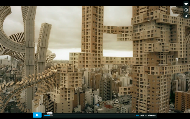
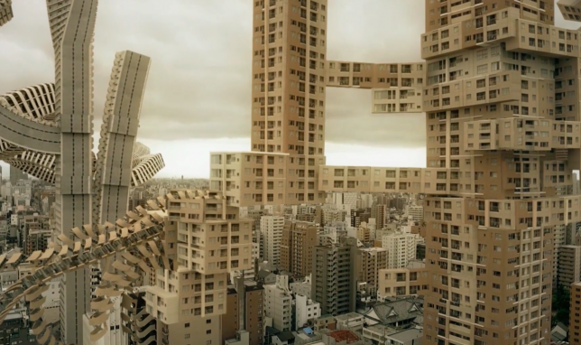
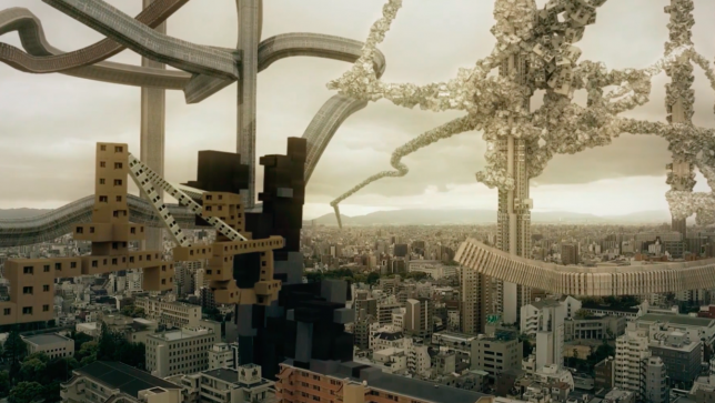
    Architecture in Osaka, Japan takes on a life of its own and begins to grow organically like vines and trees in the short ‘Spatial Bodies’ by AUJIK. “Spatial Bodies depicts the urban landscape and architectural bodies as an autonomous living and self replicating organism. Domesticated and cultivated only by its own nature. A vast concrete vegetation, oscillating between order and chaos,” say the creators, a collective referring to itself as a ‘mysterious nature/tech cult.’

    Megalomania by Factory Fifteen

    factory fifteen 1

    factory fifteen 2

    factory fifteen 3

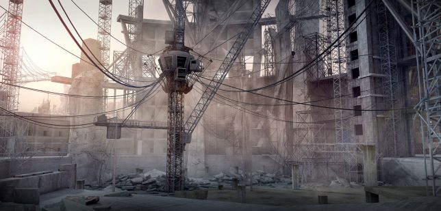
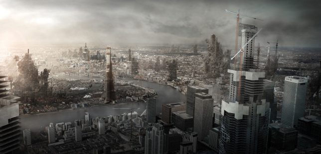
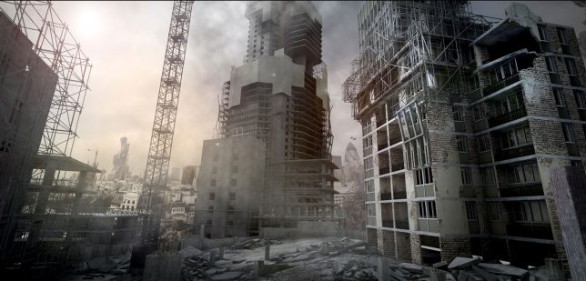
    From digital film studio Factory Fifteen, which has produced a number of striking shorts set in the future, Megalomania imagines a world in which cities are constantly in active construction mode. “The built environment is explored as a labyrinth of architecture that is either unfinished, incomplete or broken. Megalomania is a response to the state of infrastructure and capital, evolving the appearance of progress into the sublime.”

    TEARS OF STEEL by Ian Hubert/Blender Institute

    Tears of Steel

    Tears of Steel 2

    Tears of Steel 3

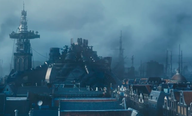
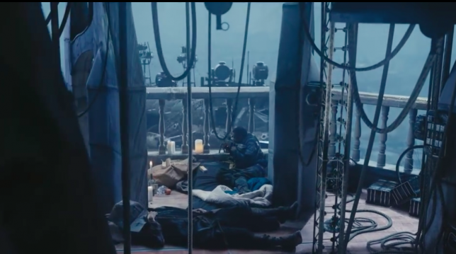
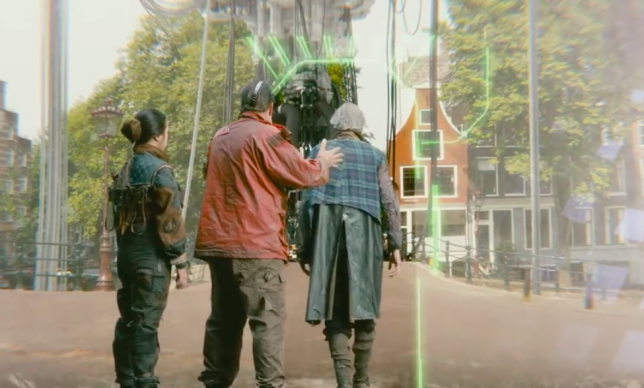
    This Creative Commons-licensed short made entirely with free and open source software was made in the Netherlands by the Blender Institute, which crowd-sources funding in online communities of 3D artists and animators. In ‘Tears of Steel,’ a group of warriors and scientists gathered at Amsterdam’s Oude Kerk attempt to stage a crucial event from the past in a desperate attempt to rescue the world from destructive robots.

    The Sand Storm by Jason Wishnow and Christopher Doyle

    Sand Storm 3

    Sand Storm

    Sand Storm 2

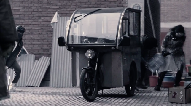
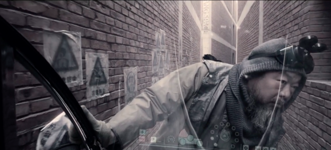
    Starring Chinese dissident and artist Ai Weiwei, ‘The Sand Storm’ by Hong Kong-based cinematographer Christopher Doyle and director Jason Wishnow examines a dystopian future that’s not so far away, where society is facing water shortages and technology is not as helpful as we might hope.

    Next Page – Click Below to Read More:
    Urban Dystopia 11 Short Sci Fi Films Set In Future Cities

    Share on Facebook


    [ By SA Rogers in Drawing & Digital. ]

    [ WebUrbanist | Archives | Galleries | Privacy | TOS ]


    WebUrbanist