Category: Photography

  • 9 Kickstarter Photography Projects Worth Funding

    “This year I will support a talented person.” Do you have a line like that in your New Year’s resolution? If not, it’s never too late to add it for this is the kind of goal that’s dead easy to accomplish yet it’ll make you feel as a part of something bigger. Added? Good! Now prepare to cross it out, Continue Reading

    The post 9 Kickstarter Photography Projects Worth Funding appeared first on Photodoto.


    Photodoto

  • Combining Rules of Composition to Improve Your Landscape Images

    One of the most elusive and frustrating elements of photography is finding the right composition. Many otherwise good images are often derailed by poor compositional choices. There are several primary rules of composition to be aware of, and by being aware of them, and then combining them, you can give your landscape photos a real boost in terms of interest.

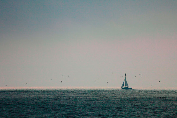
    In this image, I had a flat gray mist killing any interest in the sky. But when this lone sailboat began sailing right at the edge of the mist, I began to see possibilities. By placing the sailboat at the intersection of the rule of thirds, and placing the horizon line at the bottom third of the image, I allowed the negative space to take up a lot of room. That negative space gives the boat a place to go, and keeps the interest squarely on the sailboat.

    The first and most basic rule is the Rule of Thirds.  This rule states simply that elements of interest in your photos should be positioned one third of the way in from top, bottom, left or right of the image.  Elements of primary importance should be positioned at the intersection of those thirds.  The rule of thirds tends to be the first rule I look to when composing my images.  But I find my strongest images happen when I am able to combine the rule of thirds with other rules.  These rules include using leading lines, using negative space, and using framing.  Of course, there are always times to break these “rules”- they are actually more guidelines than rules. But that’s another article altogether.

    Use negative space to help your subject stand out. Too often photographers try to eliminate negative space, simply because there’s nothing of interest in that space. Negative space is simply an area of the image with nothing in it- a blank sky, a dark shadow area, a flat expanse of land.  However, that negative space can be used to contrast against your subject, ensuring the viewer’s eye goes right where you want it to.  Ideally, your subject should be heading or pointing IN to the negative space, to lead your eye into the composition.

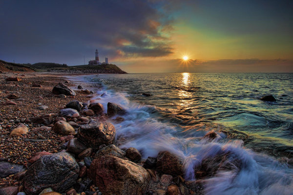
    The shoreline in this image leads the viewer's eye right to the lighthouse. The lighthouse is positioned right at the intersection of the rule of thirds, with the water on the right creating some nice negative space in contrast with the rocky shore. The horizon line is roughly at the top third of the image.

    Leading lines are another excellent tool to use to help draw attention to your subject. Ideally these lines are created by other elements in your composition and help lead the viewer’s eye right to your subject.  Leading lines help create depth when used to lead the eye into the frame, giving a more three dimensional feel to the image.

    A very effective way to draw attention to your subject is to use other elements to frame it within the image. Framing can be used to help keep interest where it belongs, and keep the eye from wandering aimlessly through the image.  Framing can add context to an image.  For instance, trees at the edges of an image, framing off a lake, or mountain peak, give a sense of where the photographer is when taking the image.  Eliminating those elements removes the context. This is not necessarily bad, but another variation to consider when photographing at a location. I’ve often found myself frustrated that a tree was in the way, or I couldn’t get the view I wanted because a building was in the way. Then I realize that I can use the trees, or use the building (by shooting through an open window), to add that context that gives an added layer of interest to a photo.

    By keeping these four simple compositional guidelines in mind when shooting, you can create a variety of images from the same subject, increasing your keeper ratio finding images you may not have found otherwise.

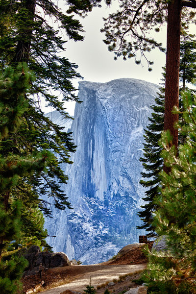
    In this image of Half Dome, foreground trees are used to set apart Half Dome and make it stand out, while providing a context. In addition, note that the trees are roughly at one third on each side of the image. This need not be exact, but it helps create a space within the image that the eye finds pleasing.

    Post originally from: Digital Photography Tips.

    Check out our more Photography Tips at Photography Tips for Beginners, Portrait Photography Tips and Wedding Photography Tips.

    Combining Rules of Composition to Improve Your Landscape Images


    Digital Photography School

  • The Winner of our 12 Days of Christmas Prize Is…

    In the lead up to Christmas this year we ran a 12 Days of Christmas here on dPS where we offered some great photographic deals on our eBooks and some products from other great online photography brands.

    As part of that we offered to give one dPS reader who picked up one of the deals a $ 1200 addition to their camera bag. Yes – we’re going to pitch in some money to help one of our readers buy a camera, lens or even a computer for processing photos.

    The winner has just been randomly drawn and is….

    Charles Cozart.

    Charles picked up our Natural Light eBook during the 12 days. We’ve contacted him via email to let him know about his prize. Congrats Charles and thanks to everyone else who participated in our 12 Days of Christmas this year!

    Post originally from: Digital Photography Tips.

    Check out our more Photography Tips at Photography Tips for Beginners, Portrait Photography Tips and Wedding Photography Tips.

    The Winner of our 12 Days of Christmas Prize Is…


    Digital Photography School

  • iPhoneography On Your Blog With SlideDeck

    SlideDeck is a really cool WordPress plugin for photographers where users can create sliders and add them to a website using shortcodes and widgets.

    What makes SlideDeck even more useful for photographers is the ability to aggregate content from social sources, like Instagram.

    slidedeck-01

    As you can in the screenshot, there are quite a few social sources.

    One of my favorites is the Instagram source so iPhoneographers can easily share their iPhonegraphy with website visitors in a beautiful slider.  You can see the feature in action at my Self Portrait Friday article.

    There is a free “lite” version of SlideDeck available so I recommend downloading and taking it out for spin.  If you like what you see, pick up a paid copy for additional lenses (slide styles) and options.

    Thanks for reading,

    Scott

    dslrBlog

  • How I Shot & Edited – The White Infinity Setup

    The Classic White Infinity Backdrop

    In my last post about studio photography (the killer clamshell) I covered a simple two light setup for achieving a gorgeous soft beauty look.  This time I thought it might be fun to cover something a bit more general purpose and for this there cannot be anything better than the ever classic white infinity setup.

    The All Can Do Lighting Setup

    There is a reason why pretty much every major fashion or lifestyle magazine makes good use of a white backdrop and that reason is simplicity.  Not only is this lighting arrangement incredibly easy to achieve but it also delivers sharp, detailed portraits with a beautifully clean and uniform background and most importantly no visible seams or edges.  Aesthetics aside its also great for beginners to try as if done correctly provides a large and consistent zone in which to place your subject, allowing you to concentrate less on the position of your lights and more on placing and posing your model.

    Families, pets, models, products the white infinity background is probably one of the most versatile setups going and to help you get started here is my approach to nailing this fantastic lighting arrangement:

    Disclaimer

    Ok, confession time.  The images and steps below are 100% genuine and therefore its going to be pretty obvious that I screwed up my exposure during this shoot.  Before you hit the big red ‘X’ at the top of your browser .. I can explain.  I basically had about 10 minutes to set everything up and 30 mins to take the shots before my studio rental was over.  Because I was in a rush I failed to spot that a large portion of the floor area was under exposed (by about a stop).  I promise I don’t do this all the time and if you don’t believe me check please feel free to check out the studio section of my portfolio site.  Hopefully by showing you my mistakes you will avoid them in the future.

    Equipment

    This lighting setup requires three lights and is best achieved using studio strobes as opposed to speed lights given the extra power needed to blow out the background.  As I have said before, hiring a studio is a cheap and very effective way to get access to this kind of equipment, making this shot all the easier to achieve.  If you do decide to do this at home however I would definitely recommend spending a little bit of money on a decent quality background paper, you can use a fabric backdrop but in my experience this will absorb much more light making the exposure more difficult than a non fabric setup.  Its also important that you have a background which is long enough to span both the back wall and floor of your shooting space.

    For this setup you will need:

    • Two lights for the background, preferably with some form of diffuser to spread and soften the light.
    • A main light with as large a diffuser as you can possibly get, an octobox is ideal however any softbox or umbrella will also work.
    • If possible a light meter is also a great tool for this setup and will help speed up the setup although it isn’t essential.

    The Lighting Setup

    The important thing to achieve is a background that is both evenly exposed and completely blown out (i.e. solid white).  The ideal result is to have a background that is twice as bright as your subject, the trick here being the ratio of light as opposed to absolute values.

    Typically I will set the exposure for my subject using an aperture of around f8.  Therefore if we want to achieve a background which is twice as bright we need to expose the background at an aperture which is one stop smaller than that used for the subject.

    Just in case this doesn’t make complete sense, changing the aperture by one stop will either halve or double the available light.  Therefore if when we meter the background we use an aperture which is one stop smaller than the subject, when we open this back up again to take the final shots the background will now be twice as bright as the subject.

    Here is how I go about getting this all set:

    1. Assuming a subject aperture of f8, set your camera to manual and dial in an aperture of f11 and a shutter speed of around 1/125 of a second with your lowest ISO.
    2. Aim the two background lights at the backdrop, positioning them to provide as even a spread of light as possible and either fire the stobes or take a test shot.  Take care to only expose the background, try to avoid any of the light spilling forward onto where the subject will be.
    3. If you have a light meter you can now use this to adjust the power of the background lights until you get an even exposure of f11 across the entire backing.  If you don’t have a light meter set the exposure by taking a test shot of the background, varying the power until the entire backdrop is solid white and evenly exposed.  If your camera has it you can use the highlight clipping warning combined with the histogram to double-check your results.   Remember to check the floor as well as the background, don’t make the same mistake as I did.
    4. Now its time to set the subject exposure, before doing so adjust your camera settings to f8 keeping everything else the same.
    5. Now turn off the background lights and place your subject in position.  Again if you have a light meter you can use this to confirm the right flash power to achieve an f8 exposure.  If you don’t have a light meter set your subject exposure by varying the flash power on your main light until you achieve an exposure that looks right.
    6. Now turn all your lights back on and you are all set.

    Two background lights and a main subject light.

    The Post Processing

    Obviously you can post process your final images however you like but just in case you are looking for a few pointers here is a brief overview of my workflow and more importantly how I overcame my exposure malfunction.

    Starting Point – Notice the horrible 'yellow' area of underexposed floor.

    Step 1: White Balance & Crop – Basic adjustments to get the colour right and to straighten up the slight slant on the composition.

     

    Step 2 – Minor exposure adjustment (slight exposure and fill light) to get the subject lighting right.

    Step 3 – Contrast corrections using via a minor curves adjustment (slight 'S') and added detail via Clarity.

    Step 4 – Now its time to fix the badly exposed floor. This was done using a gradient filter from the bottom up to increase the exposure on the area on the floor. Minor imperfections were cloned out using a spot healing brush.

    Step 5 – All done, final image completed. Much better than the start as I am sure you will agree. All in all this took less than 2 minutes and would have been much less if I had got the exposure correct from the start.

    Summary

    The white infinity backdrop is a fantastically versatile and satisfying lighting setup and one which I would definitely recommend to anyone wanting to try something different to a single light arrangement.   Hopefully the tips here will help you to have a go at this classic lighting look, unfortunately though finding the super model is down to you!

    Post originally from: Digital Photography Tips.

    Check out our more Photography Tips at Photography Tips for Beginners, Portrait Photography Tips and Wedding Photography Tips.

    How I Shot & Edited – The White Infinity Setup


    Digital Photography School
  • 7 Elements of Photography We Can Learn From The Hobbit

    THE-HOBBIT-AN-UNEXPECTED-JOURNEY-a-560x241.jpg

    1. Dramatic Lighting

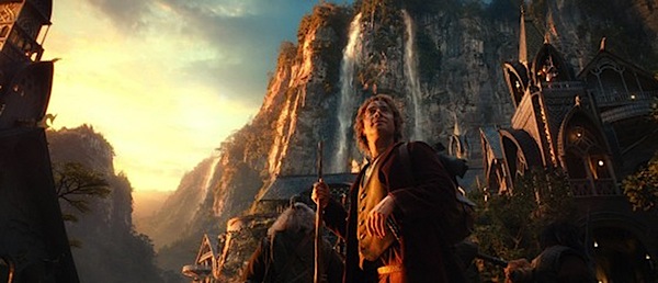
    You will notice that in the majority of good portraiture, dramatic lighting is often a key element. It’s not too often you’ll find ‘flat’ lighting in a great picture (not to say it can’t be done however). It will either result in the lighting that appears directly on the person or dramatic lighting between the subject and the foreground or background. For example, in the images of Bilbo and Thorin Oakenshield, there is dramatic, directional lighting on their faces. There are many ways that dramatic lighting can manifest itself or be achieved.

    2. Deep Blacks and Good Highlights

    You may also notice in images created by someone who knows how to process their images, they’ll have excellent tonal range. The images from The Hobbit capitalize on this. Proper images have some deep blacks and some highlights as well. This is also another way to avoid having your image appear ‘flat.’ It doesn’t necessarily have to be a great deal of each, just so long as you’re touching on both ends of the spectrum. Some photographers like to use filters or they have a style of slightly muting everything which minimizes tonal range. This is fine. There are times when the photographer can make a decision not to have a high contrast image. They still produce a great image, however this style is to be intentional and purposeful.

    11glamdring.jpg

    3. Interesting Foregrounds and Backgrounds

    Another element that can really enhance an image is including interesting foregrounds or backgrounds. These are two things that always need to be considered one way or the other. It’s very easy, especially if you’re new to photography, to forget about these and end up with distracting backgrounds or foregrounds. However, do not simply avoid them; they are useful tools to achieve a stronger image. Look at every example image from the movie. Don’t the backgrounds give interest, setting, and help tell a story? That’s what we’re wanting.

    4. Find Unique Angles

    Don’t be afraid to try new angles. It’s easy to get stuck in a rut of taking pictures from the same angle or height. Try spicing it up some; you may be shocked. Get high. Get low. Back away. Get close. This can add some variety to your shots and help you find a real keeper.

    5. Be Color Smart

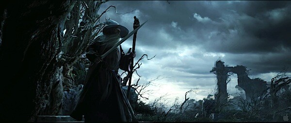
    Be very aware of how your colors and image temperatures are telling a story. Are your colors too bright and vibrant or too muted? How does this affect the mood? Is the image temperature cold and moody or warm and cheerful? These are things that can be fined-tuned to help narrate your image. If you’re wanting a dramatic image like Gandalf’s photo, then a warm temperature would not be desired. Chances are you could put more thought into these details to improve your images. So often we take the picture concerned only with composition, lighting direction, and subject when the color can be considered more thoroughly.

    The_Hobbit__An_Unexpected_Journey_70.jpg

    6. Mind the Sky

    If shooting outdoors, instead of allowing the sky to be a blown-out nuisance, view it as a resource, and use it to your advantage. Now, this may not always be possible due to equipment, desired effect, or setting. But there are ways that you can properly capture the clouds or the blue of the sky. You could either expose for the sky and light the subject with additional lighting, use HDR, or find a proper exposure with natural light that works for both your subject and the sky. But don’t always avoid the sky; learn to tame it. Notice the drama it adds to Gandalf and Bilbo’s images.

    7. Don’t Use Shallow Depth of Field Every Time

    Using a very large aperture and creating a shallow depth of field can be a great affect for portraiture and many other types of photography. This doesn’t mean, however, that it is the only effective use of DOF. Use a large DOF every so often, especially if your background could amplify the effect of the image. Make the image sharp throughout the entire image. Play around with both and learn in what situations it works best.

    David Wahlman is a wedding and portrait photographer from Redding, CA. He works all around California and is aiming to get into destination photography. You can see his best work at www.wahlmanphotography.com and follow his updates on his facebook page.

    Post originally from: Digital Photography Tips.

    Check out our more Photography Tips at Photography Tips for Beginners, Portrait Photography Tips and Wedding Photography Tips.

    7 Elements of Photography We Can Learn From The Hobbit


    Digital Photography School

  • Happy New Year from Photodoto!

    Year 2012 is coming to and end, and while you are sewing your Superman suit for the coming New Year party, I’d like to point out a couple of cool things that happened here on Photodoto during the last year. In July 2012 Photodoto recovered from a long sleep, and now we – George Bailey, Nancy Young and Tim Soulo Continue Reading

    The post Happy New Year from Photodoto! appeared first on Photodoto.


    Photodoto

  • My Visit With DigitalRev, or, What’s Kai Wong Really Like?

    Earlier this month as many of you know, I traveled to Hong Kong to be a guest on DigitalRev's Pro Tog, Cheap Camera series. (Full video and final pic edits below.)

    Which meant I also got to hang out with the DR team, including Lok, Alamby, Theo—and of course show frontman/international sex symbol/Man of Mystery Kai Wong.

    And you are probably wondering right now: what's Kai really like? Read more »
    Strobist

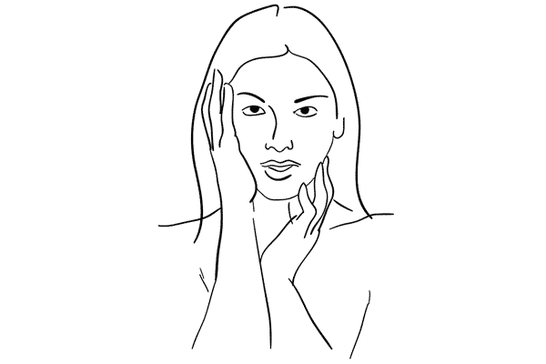
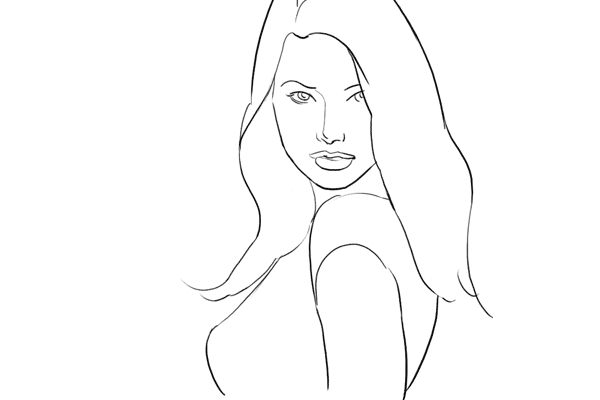
  • 8 Posing Guides to Inspire Your Portraiture

    Among the most read posts on dPS in 2012 was a series of posing guides written by Kaspars Grinvalds.

    We published the first in the series not intending to do much more than that – but the response from readers was so overwhelming that we kept going back to Kaspars for more.

    Here’s the full series – enjoy!

    Posing Guide: Sample Poses for Photographing Women Part 1

    _wp-content_uploads_2012_03_posing-photographing-female-models02.png

    Posing Guide: Sample Poses for Photographing Women Part 2

    _wp-content_uploads_2012_09_posing-guide-photographing-women-01.jpg

    Posing Guide: Sample Poses for Photographing Men

    _wp-content_uploads_2012_04_posing-men-subjects13.png

    Posing Guide: Sample Poses for Photographing Children

    _wp-content_uploads_2012_04_posing-guide-children-03.png

    Posing Guide: Sample Poses for Photographing Couples

    _wp-content_uploads_2012_05_couple01.gif

    Posing Guide: Sample Poses for Photographing Groups of People

    _wp-content_uploads_2012_05_posing-guide-groups-of-people04.png

    Posing Guide: Sample Poses for Photographing Weddings

    _wp-content_uploads_2012_06_posing-guide-weddings-04.jpg

    Posing Guide: Sample Poses to Get You Started with Glamour Photography

    _wp-content_uploads_2012_09_posing-guide-glamour-01.png

    Post originally from: Digital Photography Tips.

    Check out our more Photography Tips at Photography Tips for Beginners, Portrait Photography Tips and Wedding Photography Tips.

    8 Posing Guides to Inspire Your Portraiture


    Digital Photography School

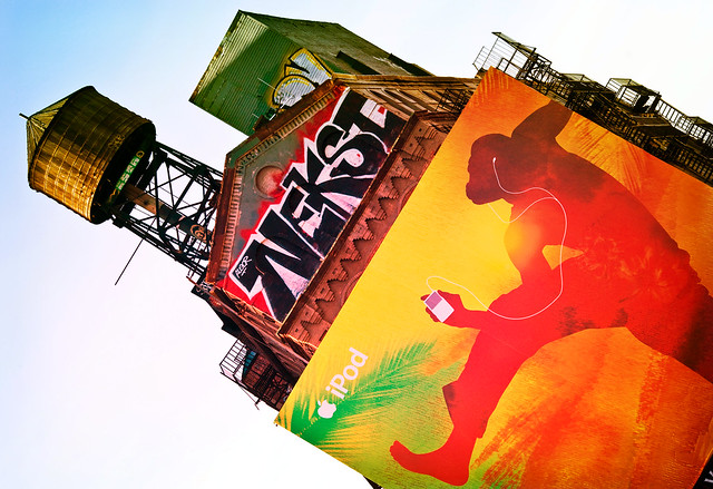
  • Nexst RIP

    Nekst RIP

    “In the graffiti world, there is a status pyramid. At the bottom you have the Toys, beginners to graffiti who have not yet earned respect nor established their art or name beyond a fundamental/amateur level. At the top, you have the Kings, who have established themselves as the best of the best through years of hard work, determination, talent and aligning themselves with other great graffiti writers.

    Nekst was an All-City King. Everywhere he went, he did it big and owned the city with his graffiti. He started here in Houston. His crew here is/was DTS (Def Threats). He went on to New York City, but also hit New Orleans, San Francisco, Detroit, Los Angeles, Miami and many other great cities along the way. He became part of the MSK crew (Mad Society Kings), which includes some of the best and most notorious graffiti artists in the world. He began writing his name as Next in 1996, then evolved to Nekst.

    Perhaps his best and most traditionally artistic work was done during a six-month detention in a Dallas-area prison, during which he drew dozens of touching and contemplative portraits of his fellow prison inmates with simple pencil and paper.

    We offer our condolences to his family and crew. May he forever rest in peace.”

    Houston Press


    Thomas Hawk Digital Connection