Category: Photography

  • How to Give Your Images the Hollywood Treatment Step by Step

    fig 1-1

    Do you have an image that you would like to give the Hollywood treatment to, and really help make it pop? In this article, I’ll be showing you a method that you can use to give your images the blockbuster treatment, and take them to the next level. The best part about it is that you don’t have to be a Photoshop genius to do it!

    The technique that we’ll be exploring is referred to as color-grading. The term color-grading is generally reserved for motion pictures where the editors would apply a creative color correction to films, but now it’s something that is appearing more and more in the vocabulary of still photographers. Color-grading is not to be confused with color correcting; it’s something quite different. Where color correcting is the process of ensuring that color casts are removed and colors are more accurate as a result, color grading is the process of altering and/or enhancing colors in specific areas in your image, such as shadows and highlights, to communicate a particular emotion or simply make the subject pop more, for example. If you have seen a movie then chances are extremely likely that you have seen color-grading at work.

    The most common, and easiest color-grading, is the use of  complimentary colors; for example teal/blue tones in the shadows and the opposite color, yellow/orange, in the highlights. These two groups of colors sit opposite each other on the color wheel and being complimentary colors, they work harmoniously together and help the subject stand out more. See these other examples of complimentary colors in action. There are other types of color-grading using different color theory methods, such as analogous and triad, however complimentary is the simplest to learn and it can provide great results.

    Before you begin, please ensure that the image you wish to work on has no color cast already, as this will affect the final result. Correcting your white balance is a great place to start. If you are unsure how to do that, 3 Ways to Change White Balance in Lightroom may help you.

    In this article, I’ll be using curves in Photoshop to add the color-grading, so if you are unfamiliar with curves, How to do a Quick and Easy Curves Adjustment in Photoshop. As with many other things in Photoshop, there is always more than one way to get the job done, but for a straight forward process that gives fantastic results, you cannot beat curves! (Curves would have to be one of my favourite adjustments in Photoshop, as you can control so many aspects to your image with this function alone.) I won’t be giving you exact numbers to dial in with each adjustment, as your tastes may vary to mine, and you will also be working on an image different to mine, so what will work for my image will not necessarily work for yours.

    Step 1: Add two adjustment layers
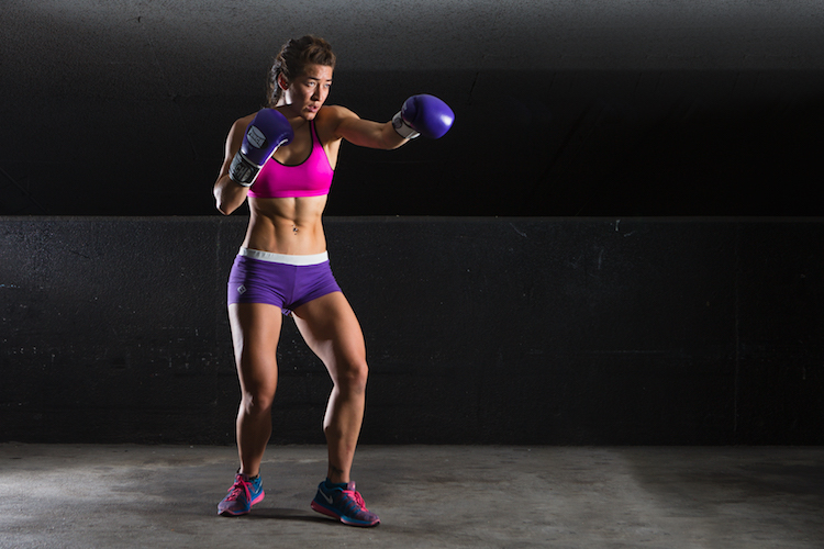
    Base Image

    I have the image that I would like to color-grade, and I want to add the teal/orange color combination, to give it that blockbuster look. I’ve ensured that there are no color casts already so I am good to go with this file. Get your image ready, and follow along.

    The first step now is to add two curve adjustment layers; name the first one Luminosity and the other Color (I always like to name each of my layers as part of my workflow as it quickly helps me remember what each layer is doing). Now change the blend mode of the Luminosity layer to Luminosity. To do this, simply click on Normal in the layers panel; this should bring up a drop-down menu. Now scroll all the way to the bottom and select Luminosity.

    Next, do a similar process with the Color layer selected; only instead of selecting Luminosity blend mode, you’ll be selecting Color. What these two steps are doing is very helpful when making adjustments to the curve in each layer. By changing one layer to a luminosity blend, you are effectively making only adjustments to the luminosity, or light levels of the image, and not adjusting color in any way. This is very help when increasing contrast, for example, as increasing contrast can alter the saturation of colors in the image.

    Conversely, altering the blend mode of the Color layer to Color ensures that only color adjustments in the curve layer will be applied, and it will have no affect on the luminosity values of the image at all.

    Step 2: Adjust the curve layers

    Now that you have the two curve layers made and named, it’s time to adjust them and let the magic happen. Firstly, we want to increase the contrast of the image. So with the Luminosity curve layer selected, add a simple S-Curve to the curve layer. This is referring to a curve that is in the shape of an S, and this style of curve increases contrast.
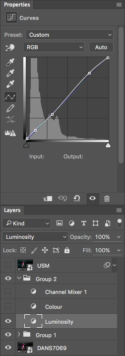
    Contrast Curve Layer

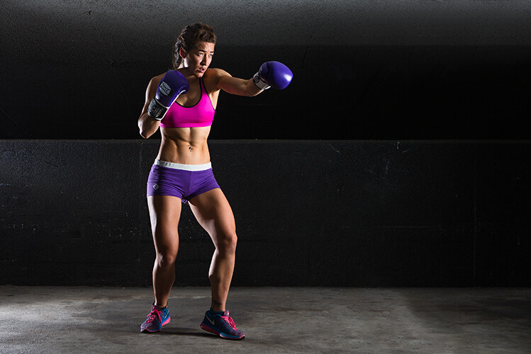
    As you can see, I have made a very slight adjustment with contrast here; the shadows have been darkened slightly and the highlights increase slightly. The image was already quite contrasty so I didn’t want to add too much more to it.
    Contrast Curve

    Here’s the effect of adjusting the contrast curve.

    Step 3: Add color-grading

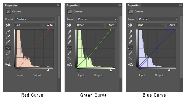
    With the overall contrast of the image looking pretty good, it’s now time to move on to add the color-grading. To add teal to the shadows and yellow to the highlights, select the Color curve adjustment layer and click on the RGB drop down menu. First up is red. we need to remove red from the shadows, but add some to the highlights. If you click on the bottom left of the curve and drag the shadow anchor point to the right, you will see a drop in red from the shadows and green begins to appear. To add red in the highlights, simply click the anchor point at the top right and slide it toward the left.

    Repeat this step for each of the green and blue colors in the drop-down menu.

    There is no set amount as to how much each should be moved. Start off with small amounts and increase as, and if required. To prevent the skin tones from being affected, I added an anchor point to the middle of the curve. To do this, I simply clicked on the curve in the centre of each color curve. This will lock that specific part of the curve and skin tones are around the mid-tone area.
    Curves

    Here is how each of the color curves looks with this image.

    If there are areas where you feel the color has been affected too much – perhaps you have too much red in the face, for example – clicking on the targeted adjust tool (TAT) will allow you to pinpoint the exact area on the curve that needs adjusting. Simply select the TAT and click in the image, on the area you want to target, and this will place an anchor point on the curve. You can now move that anchor up or down to suit. Using the keyboard keys to move up and down is most accurate.
    Colour Curve

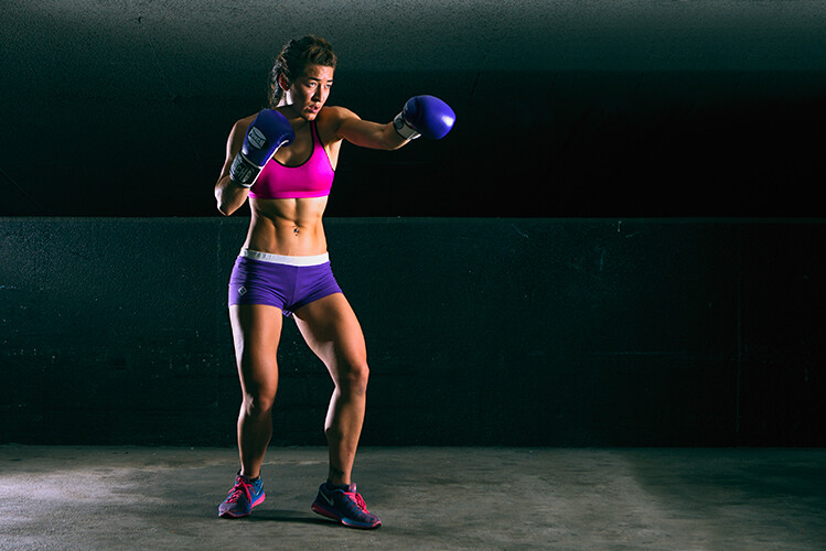
    Now I have adjusted the colors in the curve to how I would like them to look. Switch this adjustment layer on/off to see what impact the adjustments have for you. You may need to revisit each of the color curves and readjust slightly.

    Step 4: Add a Channel Mixer layer

    The final step in this is to add a Channel Mixer adjustment layer. For this image, I selected the Black and White with Red Filter, but feel free to experiment with different options for your image. You want to use one that creates a nice amount of contrast in your subject and background. You can also adjust the RGB sliders to suit, and finally, reduce the opacity of this layer (I usse 34%).

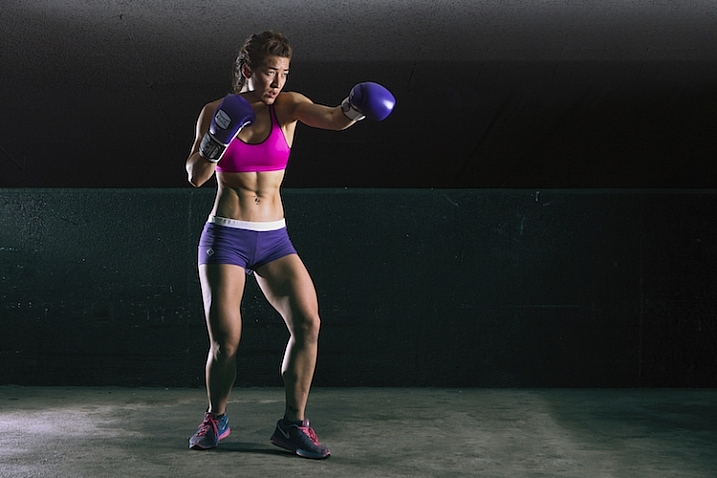
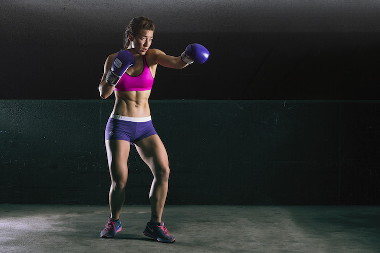
    Here is the final product.
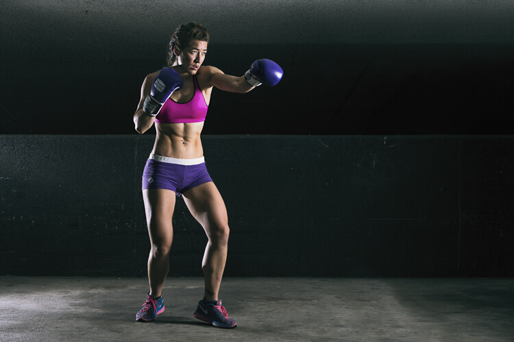
    fig 2

    There is quite a difference when compared with the original image below.

    Base Image

    Let’s look at them side by side:

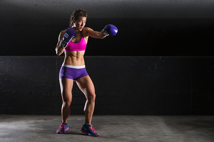
    Before

    Before

    After

    After

    Where to now?

    Now you have an introduction to color-grading using curves in Photoshop. With this example I showed you how to add a teal cast to the shadows, and a warmer orange tone to the highlights, but don’t feel that you are trapped with just this color combination. Experiment with moving the shadow and highlight anchor points in each color channel in a different direction; not just horizontally. Just remember that as a general rule, cooler colors such as greens and blues are more prevalent in shadow areas, and warmer colors such as reds and yellows should be in the brighter areas.

    Here is a run down on the effects of moving the shadow and highlight anchor points for each color channel:
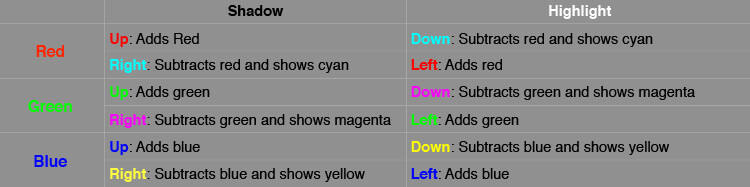
    Table

    If you ever forget what the opposite colors are, here is a handy color wheel.
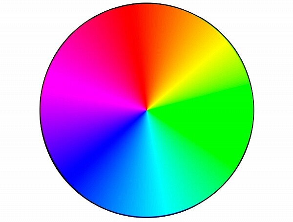
    Color Wheel

    googletag.cmd.push(function() {
    tablet_slots.push( googletag.defineSlot( “/1005424/_dPSv4_tab-all-article-bottom_(300×250)”, [300, 250], “pb-ad-78623” ).addService( googletag.pubads() ) ); } );

    googletag.cmd.push(function() {
    mobile_slots.push( googletag.defineSlot( “/1005424/_dPSv4_mob-all-article-bottom_(300×250)”, [300, 250], “pb-ad-78158” ).addService( googletag.pubads() ) ); } );

    The post How to Give Your Images the Hollywood Treatment Step by Step by Daniel Smith appeared first on Digital Photography School.
    Digital Photography School

  • How Thinking Film and Shooting Digital Can Improve Your Photography

    Film is not dead. But since the advent of digital photography, about 20 years ago, film has certainly taken a back seat. Since just over a decade ago, when digital cameras were widely available to the masses, film has almost been completely replaced. However, there’s a lot to be learned from the disciplines of analog days, before the ability to take photos so instantly, and at a phenomenal rate and remarkable quality, was made accessible to everyone with a digital camera.

    think film shoot digital creative project_0000

    Back in film days, we only had a limited amount of frames we could shoot on one roll. Often the camera sat for days and weeks until we had shot all the frames on the roll of film. We then carefully rewound the film and packaged it off to the film developers, then we wait…hours, days, weeks before we even saw the images we shot. Shooting film was no doubt a methodical exercise in process and patience.

    think film shoot digital creative project

    But, film has made a comeback in recent years. Many professional digital photographers have added film to their arsenal, others have made the complete switch back to film, and there are those who never made the switch to digital in the first place. Exciting days for analog in this predominantly digital age!

    One way to learn from the disciplines of shooting film is to think in film mode.

    think film shoot digital creative project

    Go out with your camera with the following restraints:

    1. Set yourself an imaginary film roll number. Limit the number of frames you can shoot to 12, 24, or 36.
    2. Keep your ISO to a set number like 100, 200, 400, or 800 – which are the common film speeds from those days.
    3. Use only one lens. I’m sure not many of us, unless we were professionals then, walked around with an array of lenses in hand. Often we just used one lens, carried no back up film, or batteries, or external flash!

    think film shoot digital creative project

    Now shoot like you have a film camera in your hand and adopt these mindsets:

    1.Don’t spray and pray!

    When you take a photo, bear in mind how many frames you have left, and think carefully before you press the shutter. You cannot spray and pray with film, therefore have to exercise restraint. Look at things carefully, with an intentional eye, and imagine what the scene might look like before you take the shot. This helps you compose the frame more meticulously, and look at the light and dark contrast of the scene with more discernment.

    think film shoot digital creative project

    2. Think of a story or theme, or limit yourself to one place.

    Boundaries are always helpful, they stretch you to think outside the box, more than when you have all the freedom in the world to photograph anything you please. It also helps make a cohesive story at the end, should you wish to collate your photos together on a blog or in an album.

    think film shoot digital creative project

    3. Don’t fear deep darkness or the raging midday sun.

    Film is so good at retaining details in highlight and shadow areas of a photograph, that the dynamic range of the image is miles better compared to the digital camera image. Film also has a very forgiving nature when it comes to underexposure and overexposure over a wide range of stops. So with your film brain on, don’t fear extreme brightness or deep darkness. However bear in mind the settings to use that could help you in such circumstances.

    When your subject is in bright daylight, and you don’t have a light meter handy, adopt the sunny f/16 rule. This means you use the following settings: aperture f/16 and your shutter speed set to the reciprocal of your ISO, or film speed. For example, if you have set your ISO to 100, this means your aperture will be f/16 and your shutter speed to the closest of 100 which is 1/125 (or any equivalent exposure value such as f/11 at 1/250, or f/8 at 1/500).

    think film shoot digital creative project

    4. Go where the light is

    Whether it be natural light or any other available light, whether under the brightness of the sun or just candelight in a room, find the light. Film is extremely sensitive to light and if you adjust your shutter speeds in low light accordingly, you will be surprised at how well film can capture ambient light. Remember when shooting in low light, steady yourself or your camera, lower your shutter speed and adjust your aperture (open it wide). Your ISO cannot be changed; with film you only have two sides of the exposure triangle to play with.

    think film shoot digital creative project

    5. Edit for a film look

    Nowadays there is a plethora of Lightroom presets, and Photoshop actions, that replicate the film look. If you are a dab hand at Photoshop, you can probably do it yourself from scratch. The main elements you are after to replicate the general film look are: pastel tones, creamy highlights, soft shadows, low and controlled contrast, reduced saturation, matte look (reduced black output), creamy skin tones, and some grain. Of course the actual overall look depends of the type of film used, but this list would encompass the general look and feel that film gives to an image.

    think film shoot digital creative project

    The photos I have used in this article were taken with a D700 and a 35mm f/1.4G, captured one day in London when I went out thinking film and shooting digital. I shot 22 frames out of 24 in three hours, nailed 19, botched two and fixed one in Photoshop.

    think film shoot digital creative project

    I hope you try this exercise and have fun with it. Share below in the comments how many frames you managed to shoot under great restraint, and then celebrate!

    think film shoot digital creative project

    amzn_assoc_placement = “adunit0”;
    amzn_assoc_enable_interest_ads = “true”;
    amzn_assoc_tracking_id = “dpsgeneral-20”;
    amzn_assoc_ad_mode = “auto”;
    amzn_assoc_ad_type = “smart”;
    amzn_assoc_marketplace = “amazon”;
    amzn_assoc_region = “US”;
    amzn_assoc_linkid = “6710d26f550e9793f41475ee806fee9e”;
    amzn_assoc_emphasize_categories = “13900861”;
    amzn_assoc_fallback_mode = {“type”:”search”,”value”:”digital cameras”};
    amzn_assoc_default_category = “Photo”;

    googletag.cmd.push(function() {
    tablet_slots.push( googletag.defineSlot( “/1005424/_dPSv4_tab-all-article-bottom_(300×250)”, [300, 250], “pb-ad-78623” ).addService( googletag.pubads() ) ); } );

    googletag.cmd.push(function() {
    mobile_slots.push( googletag.defineSlot( “/1005424/_dPSv4_mob-all-article-bottom_(300×250)”, [300, 250], “pb-ad-78158” ).addService( googletag.pubads() ) ); } );

    The post How Thinking Film and Shooting Digital Can Improve Your Photography by Lily Sawyer appeared first on Digital Photography School.

    Digital Photography School

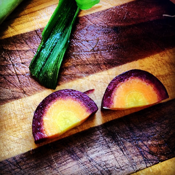
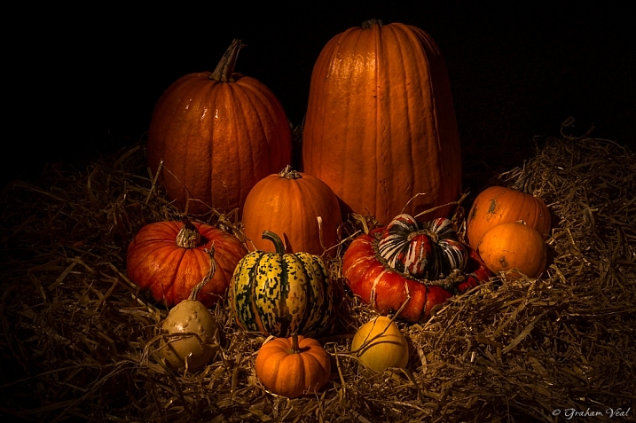
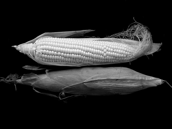
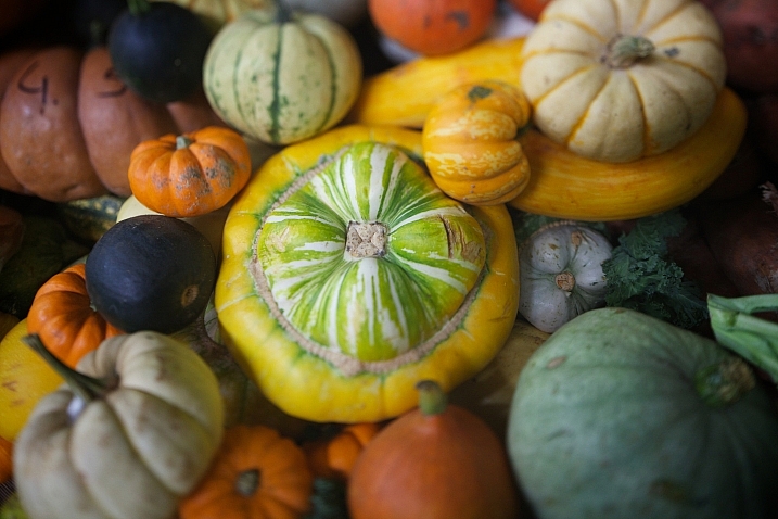
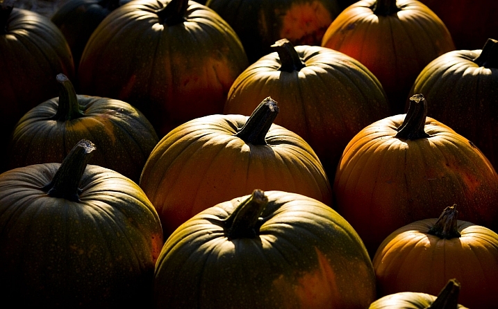
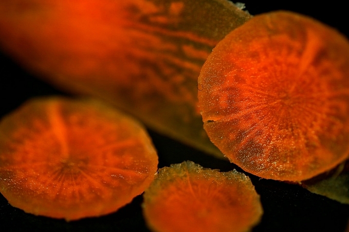
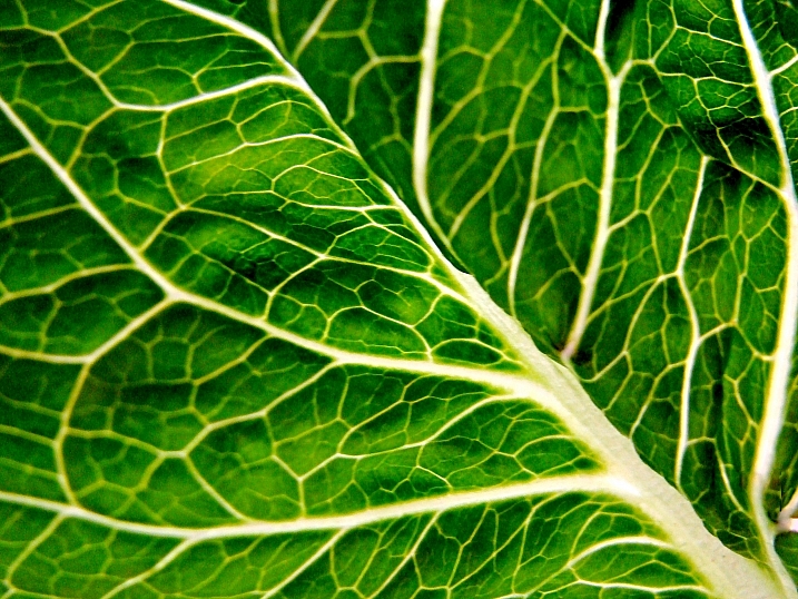
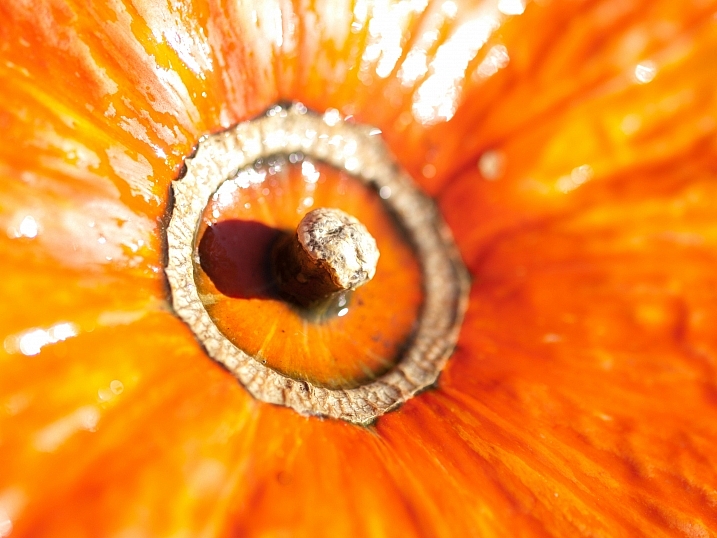
  • Photogenic Edibles – 25 Artistic Photos of Veggies

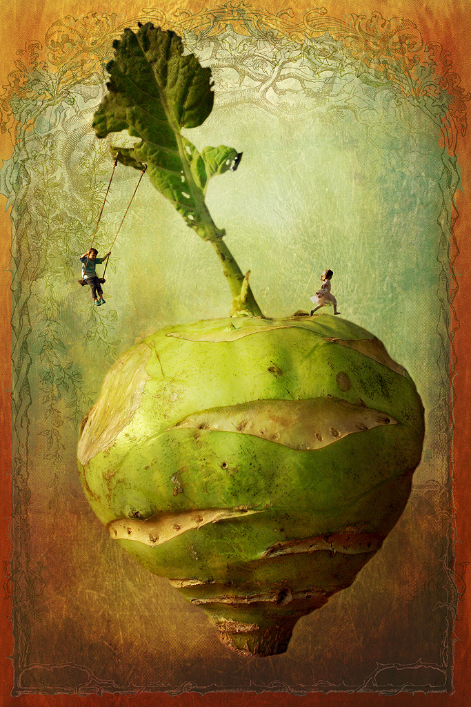
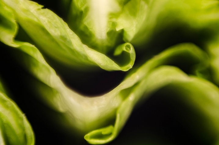
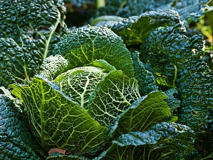
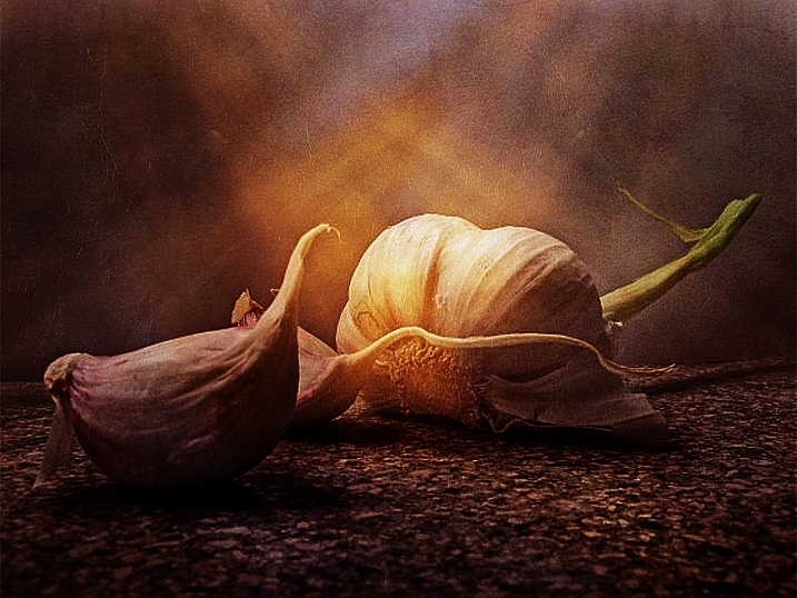
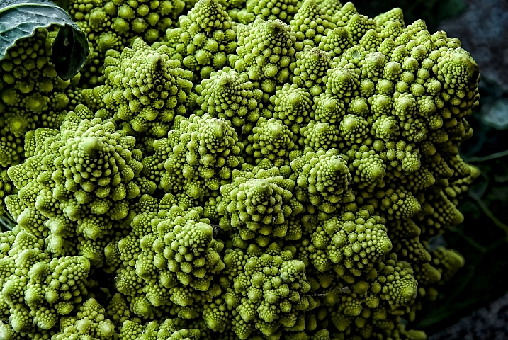
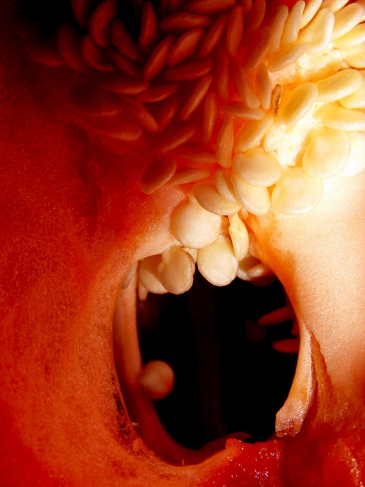
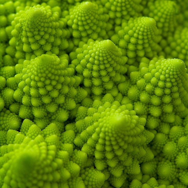
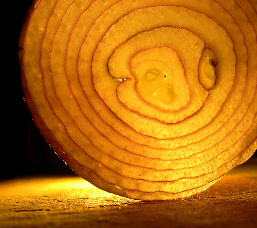
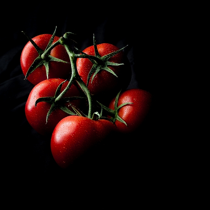
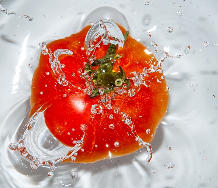
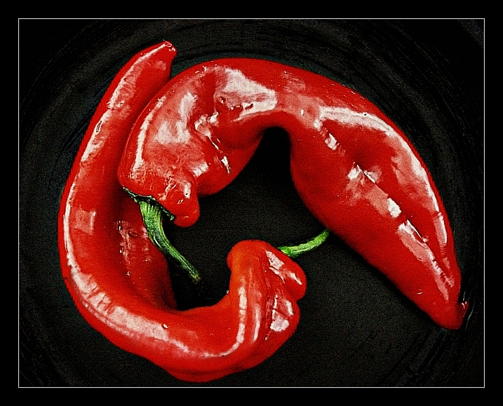
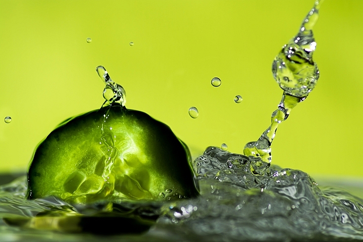
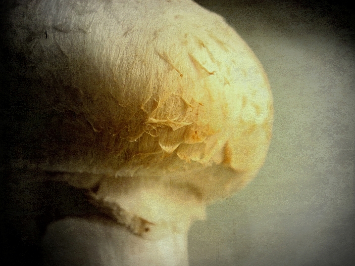
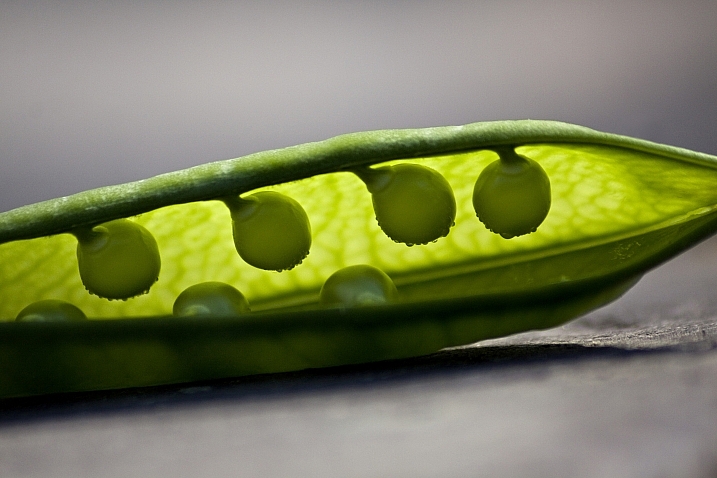
    Inspired by Edward Weston’s famous image of a pepper, comes this week’s image collection – veggies. Can a simple vegetable become art? You decide.

    Ryan Lane

    By Ryan Lane

    Grahamvphoto

    By grahamvphoto

    Matt Artz

    By Matt Artz

    Aurelien Guichard

    By Aurelien Guichard

    Thomas Hawk

    By Thomas Hawk

    E.c.johnson

    By e.c.johnson

    B .Y

    By B .Y

    William Warby

    By William Warby

    Andreas Engel

    By Andreas Engel

    Grant

    By Grant

    William Warby

    By William Warby

    Violscraper

    By violscraper

    Ian Richardson

    By Ian Richardson

    Marianela Díaz-cardozo

    By marianela díaz-cardozo

    Rum Bucolic Ape

    By Rum Bucolic Ape

    Sid

    By sid

    Dominique Pelletier

    By Dominique Pelletier

    Oveja

    By Oveja

    Yasser Abusen

    By Yasser Abusen

    Stanley Zimny (Thank You For 17 Million Views)

    By Stanley Zimny (Thank You for 17 Million views)

    Nebojsa Mladjenovic

    By nebojsa mladjenovic

    Valentin Kold Gundersen

    By Valentin Kold Gundersen

    Kurtis Garbutt

    By Kurtis Garbutt

    Sarah Horrigan

    By Sarah Horrigan

    Tjarko Busink

    By Tjarko Busink

    googletag.cmd.push(function() {
    tablet_slots.push( googletag.defineSlot( “/1005424/_dPSv4_tab-all-article-bottom_(300×250)”, [300, 250], “pb-ad-78623” ).addService( googletag.pubads() ) ); } );

    googletag.cmd.push(function() {
    mobile_slots.push( googletag.defineSlot( “/1005424/_dPSv4_mob-all-article-bottom_(300×250)”, [300, 250], “pb-ad-78158” ).addService( googletag.pubads() ) ); } );

    The post Photogenic Edibles – 25 Artistic Photos of Veggies by Darlene Hildebrandt appeared first on Digital Photography School.

    Digital Photography School

  • Weekly Photography Challenge – The Humble Vegetable

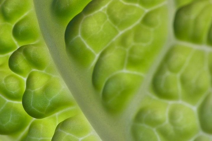
    Earlier we looked at some artsy images of everyday objects – vegetables.

    Williamo!

    By Williamo!

    Weekly Photography Challenge – the humble vegetable

    This week we want you to go find some produce and photograph it! Think outside the box:

    • Try black and white
    • Shoot macro
    • Go for an abstract
    • Backlight it
    • Light paint it
    Samandel.com

    By samandel.com

    Flavio~

    By Flavio~

    Lynn Friedman

    By Lynn Friedman

    Amelia Crook

    By Amelia Crook

    Woodleywonderworks

    By woodleywonderworks

    Tristan Bowersox

    By Tristan Bowersox

    Gillie Rhodes

    By Gillie Rhodes

    Tim Geers

    By Tim Geers

    Jar []

    By jar []

    Share your images below:

    Simply upload your shot into the comment field (look for the little camera icon in the Disqus comments section) and they’ll get embedded for us all to see or if you’d prefer upload them to your favourite photo sharing site and leave the link to them. Show me your best images in this week’s challenge. Sometimes it takes a while for an image to appear so be patient and try not to post the same image twice.

    David Reber

    By David Reber

    googletag.cmd.push(function() {
    tablet_slots.push( googletag.defineSlot( “/1005424/_dPSv4_tab-all-article-bottom_(300×250)”, [300, 250], “pb-ad-78623” ).addService( googletag.pubads() ) ); } );

    googletag.cmd.push(function() {
    mobile_slots.push( googletag.defineSlot( “/1005424/_dPSv4_mob-all-article-bottom_(300×250)”, [300, 250], “pb-ad-78158” ).addService( googletag.pubads() ) ); } );

    The post Weekly Photography Challenge – The Humble Vegetable by Darlene Hildebrandt appeared first on Digital Photography School.

    Digital Photography School

  • 20 Cutest Newborn Baby Photo Props for Spring Session

    The right photo props can upgrade your newborn baby shots from “just cute baby photos” to some truly moving images that even a Grumpy-cat-type of person would not resist. Every photo shoot is a whole new experience of capturing a baby’s and parents’ personalities. There are endless ways to make your photo session unique and beautiful using various photo props. Continue Reading

    The post 20 Cutest Newborn Baby Photo Props for Spring Session appeared first on Photodoto.


    Photodoto

  • 11 Stages That Every Photographer Goes Through

    Get 25% OFF James’ ebooks: Essentials of Street Photography & Street Photography Conversations eBook Bundle now for a limited time only at Snapndeals.

    How the $  *#$   do I use this thing!!?!

    How the $ *#$ do I use this thing!!?!

    While I hope you take this article as tongue and cheek, and realize that a decent amount of this is talking to my early self – the reality is that there is a pretty consistent learning curve that many photographers go through.

    While hopefully your learning curve will not be this extreme, I think that understanding it will help you to have as much fun as possible progressing through the photography learning process.

    Here is my belief about the typical progression, or the 11 stages a photographer goes through:

    1. Auto mode and how the $ @&# do I use this thing!?

    The camera sits like a brick for a couple months, except for when you switch it to auto mode to photograph your cat, or patio furniture in the snow. You take 12 self portraits with a hat on one day, staring at yourself in the bathroom. 12 years later, you still use this self portrait.

    The reality is that you have heard about 5000 photography terms that you think you need to know, and it’s overwhelming. You just don’t know where to start. While there are only five or six things that you really need to learn at this point to get started, nobody tells you that. We will cover these things in a bit.

    2. GEARRRRRR

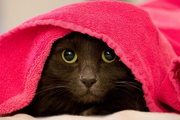
    The sharpest cat eye you've ever seen in a photograph.

    Do you SEE how sharp those nose hairs are??!

    When you think about your camera, your heart starts racing, your blood pressure rises, your hands get clammy, and you start sweating. Your camera system begins to morph into this awesomeness of sheer technology and power, that it was always destined to become.

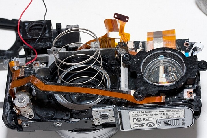
    Four lenses, five filters, a tripod that you tell everyone about that doesn’t actually work that well, a remote shutter release, a new camera strap, a flash unit, Lightroom, Photoshop, Silver Efex, a new monitor, a hard drive, a Wacom tablet, an ugly camera backpack where your gear can survive under water for 10 minutes, a light painting kit, 5,000 forum views, an HDR tutorial, and photo collages, oh my!

    Occasionally, you just take your camera out to stare at it for awhile before your wife catches you, then you get on the internet to read fondly about its dynamic range, yet you have only taken your camera out into the world a couple of times.

    Bonus points if you gave your wife a black eye due to your tripod hanging off your huge ugly backpack, on the way to catch a flight to an extended family vacation.

    3. OMG, everything looks so awesome!

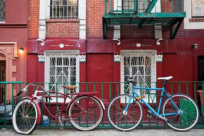
    Bikes!

    Bikes!

    Macro, landscape, street photography, portraits, travel, wildlife, architecture, live music, sports, fashion, medical imagery and dental photography – it’s all so awesome!

    Turn the saturation up to 20 baby! The world is my oyster. Colors, sunsets, old houses, doors, cobblestone, flowers, pots, bikes – definitely bikes!

    4. Shutter speed, aperture, ISO, exposure compensation, white balance, and focal lengths

    Shoot, I haven’t actually opened the camera manual yet. This is also known as the real step one. There are only six things that a photographer needs to learn at the very beginning (besides light, which we will cover later).

    1. Shutter speed
    2. Aperture
    3. ISO
    4. Exposure compensation
    5. White balance
    6. Focal length

    You now engulf yourself in every type of training possible, and read, read, read. Keep in mind that the best photographers never stop doing this. You realize that different established photographers tell you completely different ideas about what to do, and it’s confusing. That’s actually a good thing. There are many different ways to get to the same endpoint with a camera.

    5. I’m the best photographer ever

    shoulders

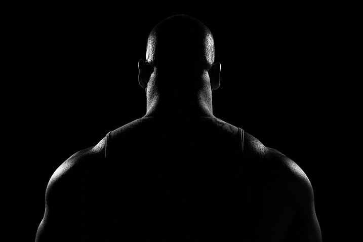
    “My knowledge of photography is unparalleled. Everyone else sucks. My neck muscles are huge because of the sheer weight of my awesomeness (and my camera bag with unnecessary equipment). I am ART. Everything is ART.”

    This is a trap that can happen to some photographers. Needless to say, a small contingent get stuck on this step for longer than they should, but everyone else usually passes on to the next step a year or two later, which is…

    6. OMG, everything sucks and I suck

    Anarchist Barney

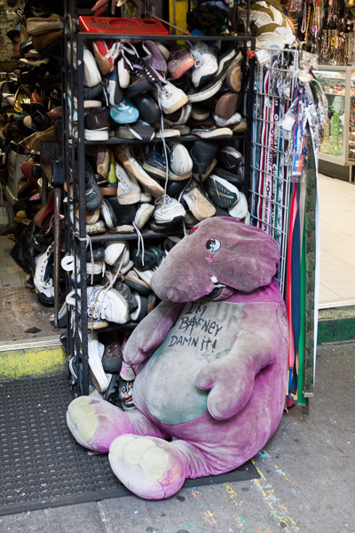
    “I hate it all. I’m the worst photographer in the world. I’ve tried everything and I can’t take a good image. I can’t look at another flower ever again. I hate sunsets. I hate bunnies. I hate children. I hate cookies. I am a sad, depressed photographer.”

    This is the point when you get past the basics, and realizes how difficult photography really can be. It goes way beyond settings. Creating interesting photography is difficult.

    7. Starting to see the light

    Light!

    Light!

    Eureka! Photography is just painting with light. Did you know, it’s all about the light? Warm light, cool light, colored light, harsh and shadowy light, indoor and artificial light.

    This step is so important, and learning about light sounds simple, but it actually takes most people a long time to start to see light well. It’s shocking how long it can take sometimes, because photographers tend to focus on so many other things, and particularly equipment at first. When learning to use your camera, light is the number one factor that goes into the equation. It should be the first thing that you learn before you even think about how to set up your cameras.

    8. Traveling light

    “Screw all that equipment. You know, photographers are too obsessed with equipment. One camera, one prime lens, a small (beautiful) bag, and a notebook that I’m never going to write in – that’s all I need. Life is beautiful. I can feel life and the wind in my hair.”

    An optional black and white period often takes place here, and the gear fetish morphs into a camera bag fetish, but in reality this is an important step. For most types of photography, you just did not need all that equipment. Simple can be a lot better, more often than not.

    9. Studying other photographers

    11-study

    “Wow, there were a lot of wonderful photographers throughout history, in all types of subject matter and all around the world. There are a lot of great photographers shooting now and doing it much better than I am!”

    You spend time in bookstores and on the internet researching. You start building your photo book collection. This is usually a big turning point for photographers in their education. This can be both inspiring and humbling.

    10. Focus, consistency, and subject matter

    By this point, you have photographed enough where you really have put in the hours, and are starting to improve significantly. While it’s so important to put in the hours to study photography and photographers, nothing beats time spent photographing.

    You become more intuitive with the camera, to the point where you start forgetting it’s there. Your subject matter, and the look of your photos, begin to become more consistent. You start to find specific content, and places that you like photographing the most.

    You start creating a portfolio with images that all fit together. It’s no longer as much about the individual photograph, but about collections and sequences of photographs. You start to realize that you can create a narrative this way, that goes beyond what the individual image can often achieve.

    11. Zen and a subtle feeling of inadequacy

    5th Avenue, New York

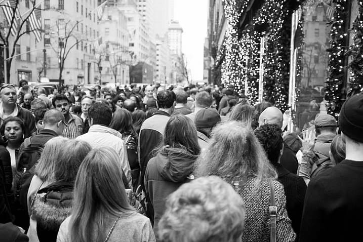
    While the other steps might take five to 10 years to progress through, this one can stick around for the rest of your photography life. There are so many incredible photographers out there doing powerful work, it can be intimidating. It feels like there is always someone out there who knows more about a subject than you. Each day you come across another fantastic body of work, from someone you have never heard of.

    But you have your own interests and unique point of view, and realizing this is what sets you apart. It’s not just about your knowledge of photography, but about the subject matter and perspective.

    This is where you can gain true satisfaction from photography, and for just being a small part of all of this. There is a worldwide community of people interested in the same things as you are, but all doing it in slightly different ways. It is powerful and inspiring.

    Bonus stage 12 – going to Cuba

    This is the final step of any photographer’s life progress. Cuba is so hot right now. I’m not going to lie, I really do want to go to Cuba very badly, although I heard it was so much better two years ago.

    Can you relate to these stages of your photography journey? What stage do you most identify with right now? Have you been through others? Please share in the comments below.

    Get 25% OFF James’ ebooks: Essentials of Street Photography & Street Photography Conversations eBook Bundle now for a limited time only at Snapndeals.

    googletag.cmd.push(function() {
    tablet_slots.push( googletag.defineSlot( “/1005424/_dPSv4_tab-all-article-bottom_(300×250)”, [300, 250], “pb-ad-78623” ).addService( googletag.pubads() ) ); } );

    googletag.cmd.push(function() {
    mobile_slots.push( googletag.defineSlot( “/1005424/_dPSv4_mob-all-article-bottom_(300×250)”, [300, 250], “pb-ad-78158” ).addService( googletag.pubads() ) ); } );

    The post 11 Stages That Every Photographer Goes Through by James Maher appeared first on Digital Photography School.

    Digital Photography School

  • Are You Obsessed with Shooting Wide Apertures – Here’s Why You Might Want to Hold Back

    There’s a scene in the original Jurassic Park movie, that almost perfectly describes one lesson I have learned when documenting the world around me with my camera. In this scene Dr. Ian Malcolm, a brilliant mathematician who is visiting the prehistoric park, expresses severe reservations about the idea of resurrecting long-extinct species during a conversation with John Hammond, the director of the park. Hammond is gleefully explaining the incredible genetic breakthroughs that his scientists have achieved. “Our scientists have done things which nobody’s ever done before.” Incredulous, Malcolm responds with equal fervor and says, “Your scientists were so preoccupied with whether or not they could, they didn’t stop to think if they should.” The same holds true for camera lenses. Just because you can shoot wide open at f/1.4 or f/1.8, doesn’t mean you should.

    ultra-wide-apertures-purple-flower

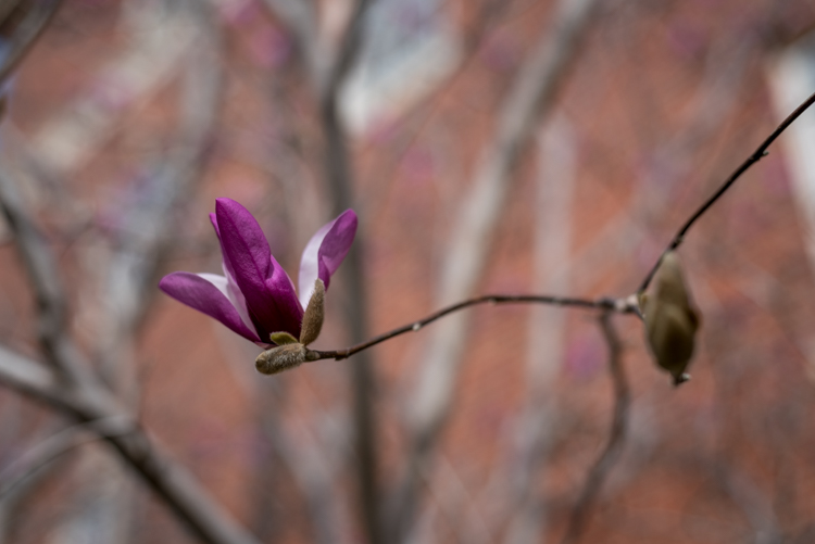
    When I first got into serious photography work, I was amazed at the power and light-gathering ability of my 50mm f/1.8 lens. It opened up a whole new world of photographic possibilities, that I continue to explore today, and was capable of producing incredible images, even on my humble little Nikon D200. Unfortunately, like the scientists in Jurassic Park, I did not spend years in the trenches learning my trade and honing my skills in order to learn how to truly utilize the power of such wide apertures, and went through a phase where I shot everything wide open because of things like low light photos, depth of field, and of course bokeh. Always with the bokeh. Now it’s important to note that I don’t regret any of those early lessons but I do want to offer youa few simple things I’ve learned over the years, and a couple reasons why you might want to reign things in a bit and not shoot wide open with that fancy prime or ultrafast zoom lens just yet.

    1. Depth of field can be way too shallow

    I shoot most of my photos with three prime lenses: a 35mm f/1.8, a 50mm f/1.8, and my favorite, an 85mm f/1.8, that I call my supermodel lens. (Seriously, you could just about point that lens at a moldy old scarecrow, and get a portrait worthy of Vogue magazine.) Each of these lenses has its own set of unique advantages and limitations, but as you can probably already tell, the one thing they all have in common is a super wide maximum aperture. Certainly there are plenty of lenses available with even bigger apertures, like the Nikon 58mm f/1.4 or Canon 85mm f/1.2, but when push comes to shove an f/1.8, or even f/2.8 lens, is no slouch either. Wielding one of these ultra-wide beasts can be a bit like riding a tyrannosaurus rex, in that the sheer amount of power at your disposal is kind of insane. But, one advantage of fast primes like this, an ultra-shallow depth of field, can also be somewhat of a curse if not used properly.

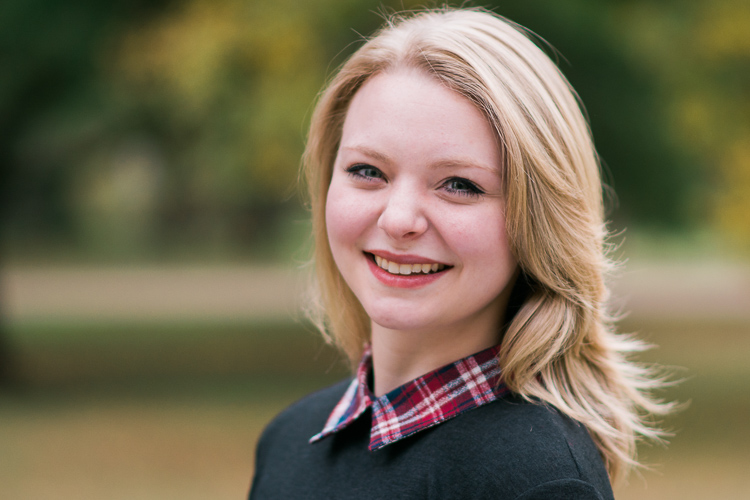
    I’m not going to lie, it’s a ton of fun to shoot things with your lens wide open but it took me a while to learn, that just like the scientists of Jurassic Park, maybe I should have held back a bit. This portrait of a college student is yet another time in which I had no good reason to shoot wide open, but did anyway, and the result was a photo that simply could not be used. Due to the wide f/1.8 aperture, and my proximity to the subject, it left me with a depth of field consisting of just a few centimeters. Her left eye (on the right side of the photo) is perfectly in focus while the other side of her face is blurry, and the result is a strange-looking picture that I had to discard. Thankfully, I quickly realized my mistake and got some other perfectly usable images by shooting at f/2.8 and f/4. But, this was one of those situations in which I thought it would be super cool to get the way awesome background blur of an f/1.8 aperture, but did not realize how I nearly destroyed the portrait in the process.

    85mm, f/1.8, 1/750 second, ISO 400

    85mm, f/1.8, 1/750 second, ISO 400

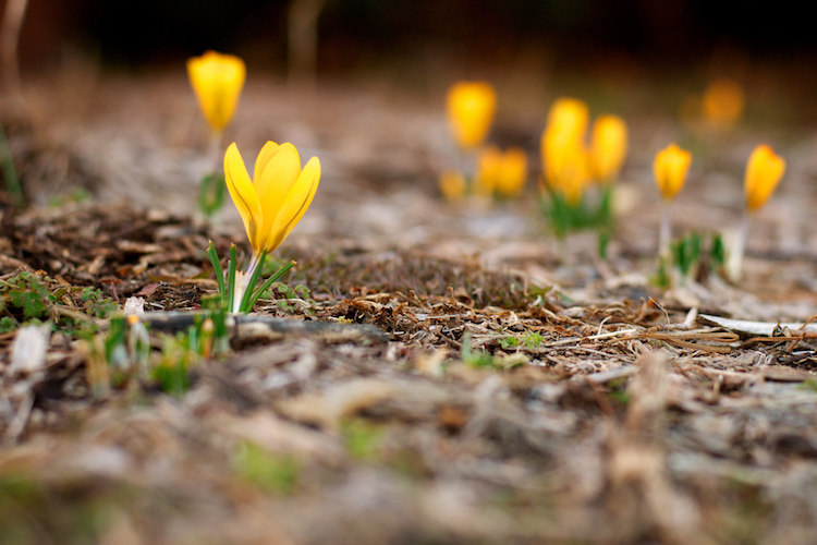
    Here’s another example from when I first got my 50mm lens, and thought it was so cool to go around shooting all my pictures at f/1.8 – because my warped sense of logic told me that no depth of field could ever be too thin. As a result this picture of some crocuses contains an ugly streak across the center where one flower and a lot of dead grass is in focus while the rest of the image is a blurry mess. Shooting at a smaller aperture would have given me a smooth transition between in-focus and out-of-focus areas and a much more pleasing image overall.

    50mm, f/1.8, 1/500 second, ISO 400

    50mm, f/1.8, 1/500 second, ISO 400

    2. Bokeh and background blur can get out of hand

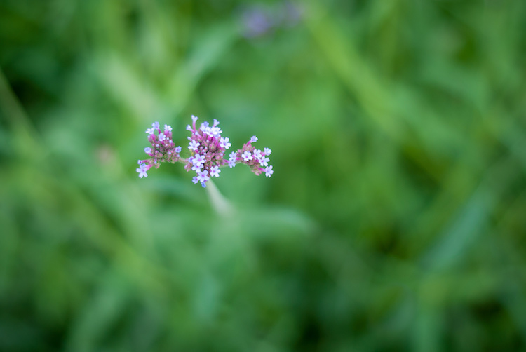
    This is a bit subjective, and open to interpretation on the part of both the photographer and the viewer, but over the years I have found that shooting at the widest possible aperture in order to get the most possible bokeh, or background blur, things can go from artistic and interesting, to messy and incomprehensible very quickly. Bokeh is nice and can certainly be used to add an artistic flair to an image, but when overused, it can overpower the subject and ruin the picture. The following photo of a purple flower sticking up from a bed of grass shows this phenomenon in action.

    ultra-wide-apertures-purple-flowers

    The flowers are so removed from the background it’s almost like they are hovering in midair, and the effect is somewhat disconcerting, and borders on upsetting. Blowing out the background so much has removed any sense of place and context for the subject, and what’s left is a green and purple mess, that is neither artistically interesting, nor aesthetically pleasing.

    3. Vignetting, chromatic aberration, and other optical oddities

    Before I say too much on this subject perhaps I need to add a bit of a preface. Less expensive lenses can behave strangely when you shoot with them wide open, but more expensive glass is usually much better at this sort of thing. With that disclaimer out of the way, it’s important to understand some of the optical abnormalities such as vignetting, chromatic aberration, and softness, that often show up when your lens is opened up as far as it will go.

    Vignetting is when the edges of your image look a bit darker than the rest of the picture, due to how light is manipulated inside your lens before it hits the image sensor inside your camera. It’s not too big of a problem on cameras with smaller sensors like APS-C or micro four thirds models, but it is certainly there, and even more so on full frame cameras.

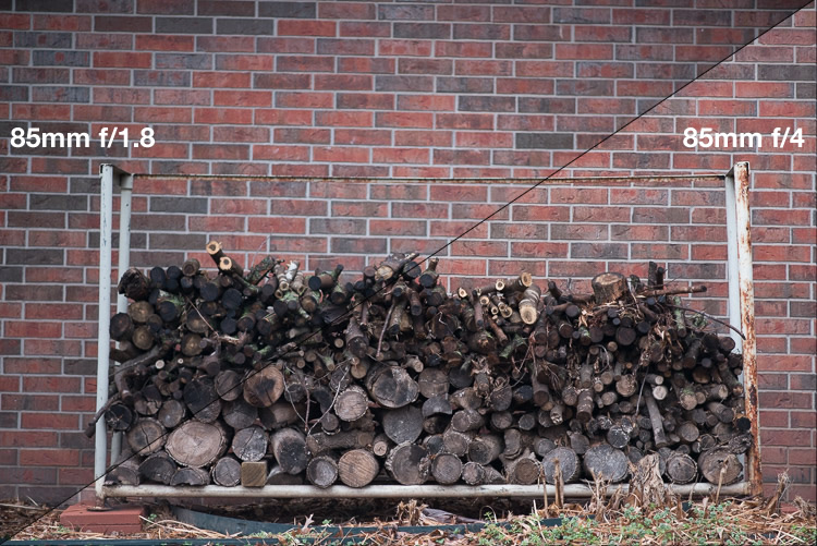
    Vignetting can be a major issue when shooting wide open. Notice how the centers of both images are equally exposed but the corners are much darker at f/1.8.

    Vignetting can be a major issue when shooting wide open. Notice how the centers of both images are equally exposed but the corners are much darker at f/1.8.

    If you shoot in RAW, you can use Lightroom, Photoshop, or other such applications to mitigate most of the effects of vignetting if you want. Of course another solution is to use a smaller aperture, which tends to eliminate most vignetting altogether. Vignetting is not always a dealbreaker, and many photographers, myself included, actually prefer the subtle effects of a well-used vignette. You may find that you fall into this camp, in which case go right ahead and shoot at f/1.8 or f/1.4 to your heart’s content.

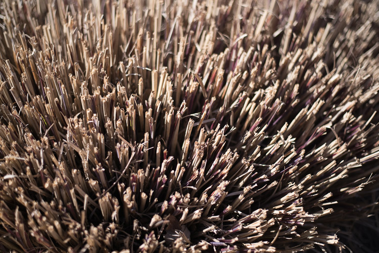
    The other optical abnormality that often rears its ugly head at wide apertures is chromatic aberration, which might be a much bigger problem if you are not ready for it. This usually manifests itself as purple or green outlines or fringes, around places in your pictures with harsh contrast between dark and light. For example the image below was shot at f/1.8, and upon first glance, looks perfectly usable.

    50mm, f/1.8, 1/3000 second, ISO 100

    50mm, f/1.8, 1/3000 second, ISO 100. It looks Okay on first inspection, but all is not well up close.

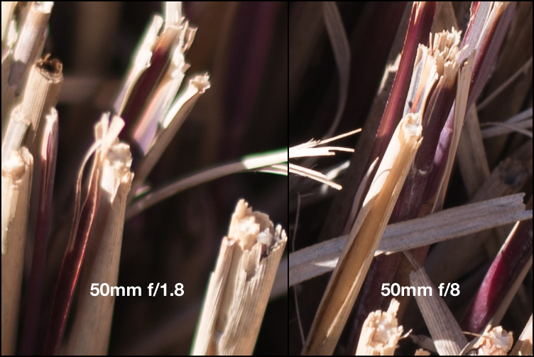
    Take a closer look and you will notice a big problem around the edges of most of the dry stalks of grass. Ugly green halos show up all over the place, and this is a direct result of shooting wide open, due to how the incoming light is transformed by the lens on its way to the camera. Here’s a 100% crop of the image next to the exact same picture shot at f/8.

    Green outlines abound on the left side while stopping down to f/8 eliminates them entirely.

    Green outlines abound on the left side while stopping down to f/8 eliminates them entirely.

    This optical imperfection can often be mitigated somewhat in Lightroom, by using its: Remove Chromatic Aberration option in the Develop panel. But even then the results are not ideal, and you will often be left with images that still show some green or purple artifacts, or lose a bit of color from other parts of your picture. Rather than mess around with fixing these issues in post-production, I like to just avoid it from the start and shoot at a slightly smaller aperture. It usually fixes the problem, and still leaves me with the same overall composition I would have had with a wider aperture.

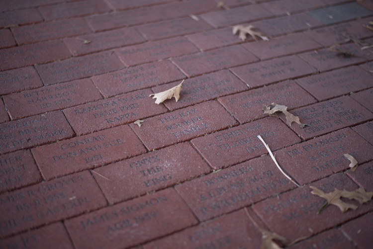
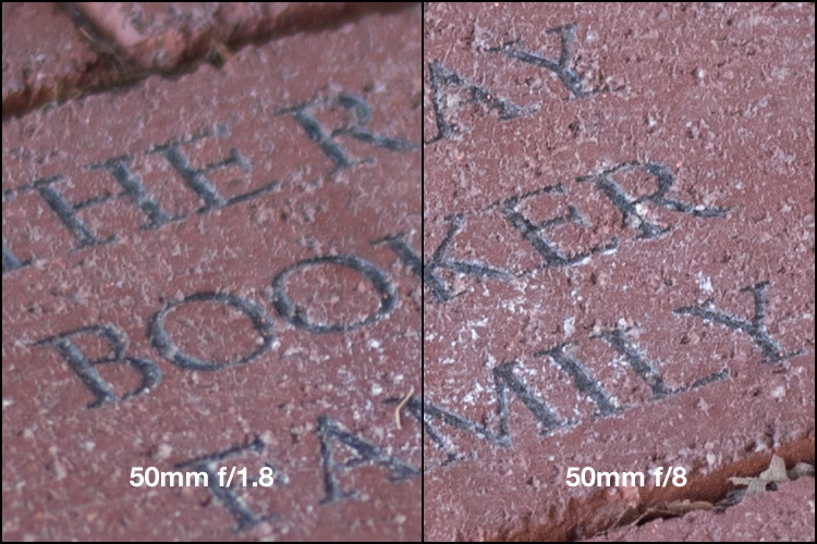
    The last weird characteristic of most lenses at their widest apertures might not be that big of a problem unless you are painstaking examining your pictures on a per-pixel basis, but it’s something you should know about nonetheless. Almost all lenses are a bit softer when used at their widest apertures, which can result in pictures that are not quite what you want. The picture below was shot at f/1.8 and looks decent upon first glance, but a closer inspection reveals a very different story.

    50mm, f/1.8, 1/125 second, ISO 100

    50mm, f/1.8, 1/125 second, ISO 100. Seems decent but once again a closer look reveals a much different story.

    Zooming in on the exact center of the image, the point at which I locked focus, shows two very different pictures when this is put next to the very same picture shot at f/8.

    Focus was locked precisely on the letter "K" and yet the image on the left, shot at the widest aperture on my lens, is much less sharp.

    Focus was locked precisely on the letter “K” and yet the image on the left, shot at the widest aperture on my lens, is much less sharp.

    Once again this sharpness problem can be corrected to some degree in post-production, but my ideal solution is to avoid shooting at f/1.8 unless I specifically need the light-gathering ability, background blur, or other effects that such a wide aperture offers. Photography is all about tradeoffs, and while closing down the aperture on my lens resulted in a picture that was sharper, it also gave me an image that had much wider depth of field, which made the overall composition less pleasing.

    4. Use wide apertures sparingly to maximize their impact

    The Roman philosopher Marcus Tullius Cicero once said, “Never go to excess, but let moderation be your guide.” This nugget of wisdom is applicable not only to life in general, but also speaks volumes about how to approach photography. I like to treat the widest aperture on my lenses like flooring the gas pedal on my car. It’s fun, but if I went around driving full speed everywhere I went, it would quickly lose its appeal. (Though in my 1998 Toyota sedan I would probably lose a race to a skateboarder, but you get the point.)

    Your lenses have wide apertures for a reason and they are meant to be used to get good images, particularly if you are aware of some of the quirks and idiosyncrasies of using them like this. If you like shooting wide open, and don’t mind some of the potential tradeoffs like a bit of vignetting and chromatic aberration, then go for it! However, my own personal rule of thumb is to only use f/1.8 when I really need it, otherwise the creamy backgrounds and bokeh balls start to lose a bit of their luster. When I’m doing a portrait session I keep f/1.8 in my back pocket for when I really need it, otherwise I shoot most pics at f/2.8, f/4, or smaller.

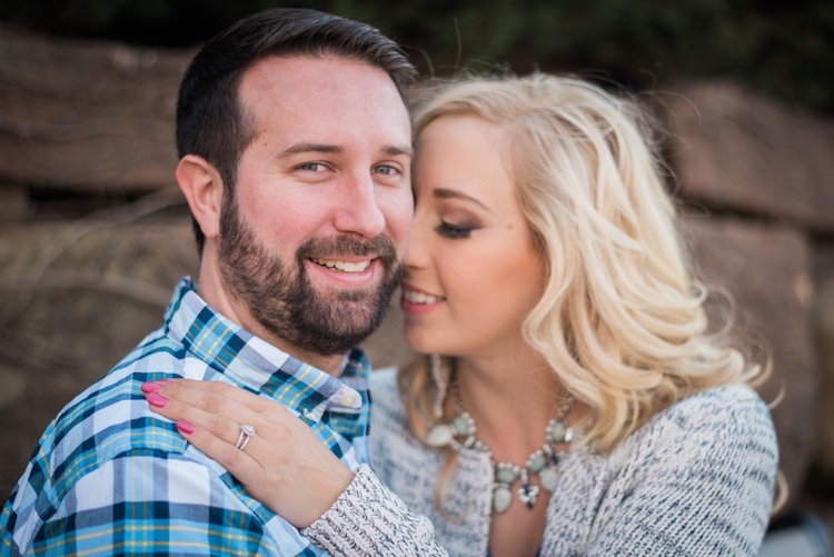
    I took most photos of this couple at smaller apertures, which made this one at f/1.8 really stand out.

    I took most photos of this couple at smaller apertures, which made this one at f/1.8 stand out among the rest.

    After hearing this list of reasons to hold back a bit when shooting wide open, I almost feel like I should write a similar article about the benefits of taking photos at the largest aperture possible. I don’t want to give the impression that you should never use your equipment to the fullest of its capabilities, just that there are a few things to know before you go around taking all your pictures at the widest possible aperture your lenses can use. You might end up with a few problems, just like the ill-fated scientists of Jurassic Park, but hopefully yours won’t be quite as lethal, and along the way you could very well manage to take some incredible photos too.

    I’d like to know what your thoughts are on all of this, and if you have any favorite shots taken at not-quite-wide apertures, please post them in the comments below!

    googletag.cmd.push(function() {
    tablet_slots.push( googletag.defineSlot( “/1005424/_dPSv4_tab-all-article-bottom_(300×250)”, [300, 250], “pb-ad-78623” ).addService( googletag.pubads() ) ); } );

    googletag.cmd.push(function() {
    mobile_slots.push( googletag.defineSlot( “/1005424/_dPSv4_mob-all-article-bottom_(300×250)”, [300, 250], “pb-ad-78158” ).addService( googletag.pubads() ) ); } );

    The post Are You Obsessed with Shooting Wide Apertures – Here’s Why You Might Want to Hold Back by Simon Ringsmuth appeared first on Digital Photography School.

    Digital Photography School

  • How the Square Format Can Enhance Your Street Photography

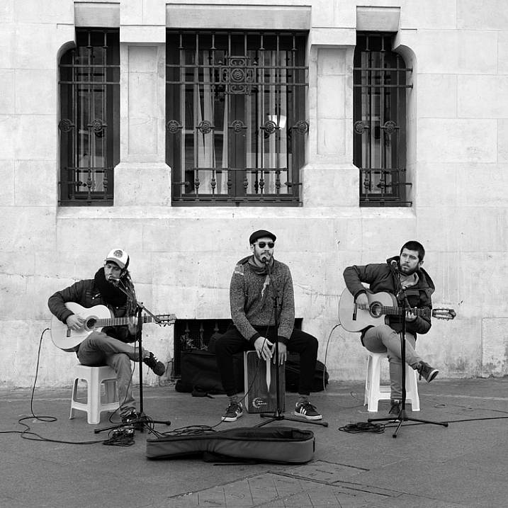
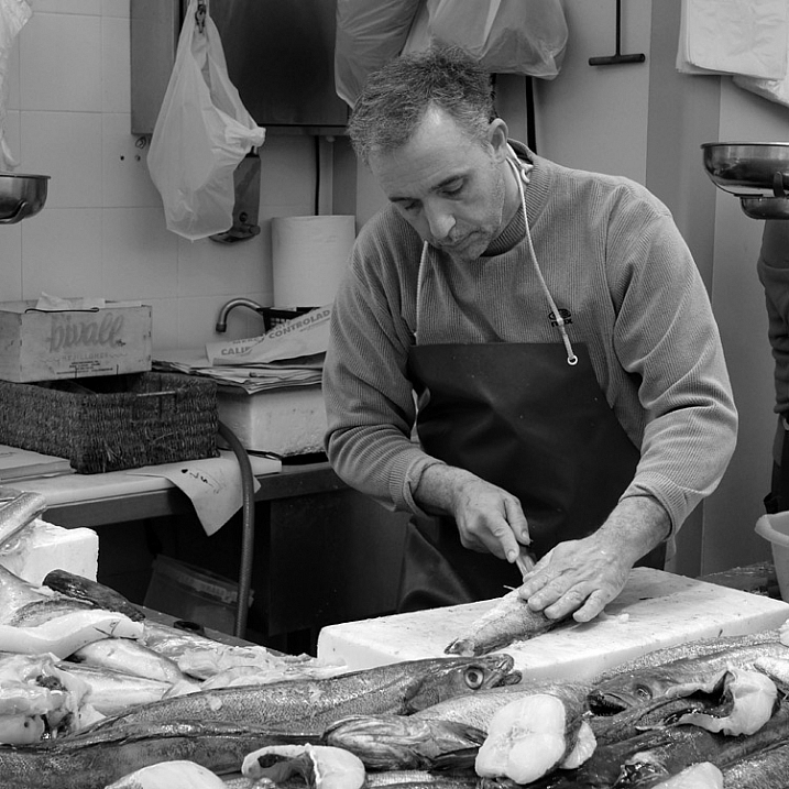
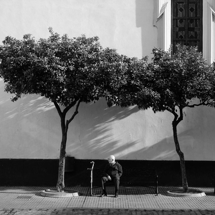
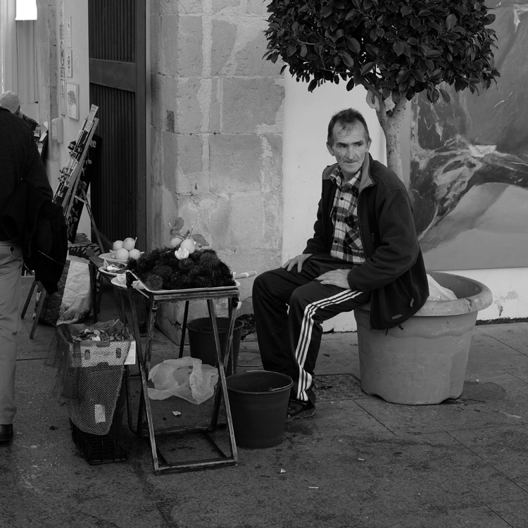
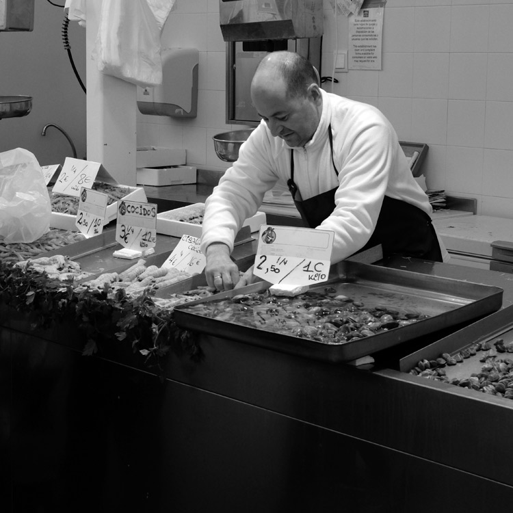
    Square format and street photography

    In my last article about choosing the best lens for street and travel photography, you may have noticed that all the photos used to illustrate it, were in the square format. That’s not a coincidence. I recently discovered that I really like this aspect ratio for street photography. It’s made a big improvement to my photos, and I thought it would be interesting to go a little deeper into the reasons why.

    It started when I read a book by street photographer Willem Wernsen. I noticed that virtually all his photos were square, and I had an aha moment. There was something about the aspect ratio that worked really well. I couldn’t wait to try it out.

    The square format and street photography

    So, what is so good about the square format? I think it comes down to two factors. The first is to do with a fundamental weakness of the 3:2 aspect ratio of the 35mm format, that full-frame and APS-C cameras use. The long rectangle is difficult to use well, especially when the camera is turned on its side in the portrait orientation.

    You can learn more about this in my article Aspect Ratio: What it is and Why it Matters

    That’s why some photographers historically prefer using medium, or large format cameras, for landscape and portrait photography. These are two subjects where it seems especially difficult to compose within the 35mm rectangle, in the portrait orientation. The shorter rectangles of these cameras (not to mention the 4:3 aspect ratio of Micro four-thirds cameras) just seems to work better.

    Square format and street photography

    Keeping street photography simple

    The other factor is that the square format greatly simplifies the decision making process. Street photography is often about reacting quickly to the scene in front of you. The fewer decisions you have to make, the quicker you can do so. With the square format, there is no need to consider whether the composition would be better if you turned the camera on its side.

    Another benefit of the square format is that is seems much easier to create an effective composition within the square frame, than it does within the rectangular one. A good tip is to look for strong shapes, and simplify the composition as much as you can.

    square-format-street-photography-02

    Camera settings

    If you would like to try out the square format, it is relatively easy to do so, as most modern digital cameras let you select the aspect ratio. If your camera has an optical viewfinder it will probably display guidelines to let you know how to frame the scene. Check your user manual.

    If your camera has an electronic viewfinder you will see a cropped, square image. This, combined with the smaller size and quiet operation, makes mirrorless cameras ideal for street photography.

    Square format and street photography

    If you would like to shoot in black and white, as I have done for the photos in this article, then you can do so by setting your camera to its monochrome mode. Mirrorless cameras display the scene in black and white in the viewfinder, a great aid to composition. Digital SLRs display the photos in black and white when you play them back on the LCD screen.

    If you shoot Raw, most cameras will let you uncrop the image in Lightroom if you want to (the exceptions are Nikon and Panasonic, which crop the image even for Raw files). The key is to convert the Raw files to DNG when you import them into Lightroom. If you keep them in their native format, Lightroom won’t let you uncrop them.

    Using Raw also lets you convert your black and white files to colour if you wish to.

    Square format and street photography

    Your turn

    Have you tried using the square format for street photography? How did you get on with it? Please let us know in the comments, and share some of your photos.

    Square format and street photography


    Mastering Composition ebookMastering Composition

    My new ebook Mastering Composition will help you learn to see and compose photos better. It takes you on a journey beyond the rule of thirds, exploring the principles of composition you need to understand in order to make beautiful images.

    googletag.cmd.push(function() {
    tablet_slots.push( googletag.defineSlot( “/1005424/_dPSv4_tab-all-article-bottom_(300×250)”, [300, 250], “pb-ad-78623” ).addService( googletag.pubads() ) ); } );

    googletag.cmd.push(function() {
    mobile_slots.push( googletag.defineSlot( “/1005424/_dPSv4_mob-all-article-bottom_(300×250)”, [300, 250], “pb-ad-78158” ).addService( googletag.pubads() ) ); } );

    The post How the Square Format Can Enhance Your Street Photography by Andrew S. Gibson appeared first on Digital Photography School.

    Digital Photography School

  • 5 Best Nik Color Efex Pro 4 Filters for Amazing Photos

    How do you know which filter in Nik Color Efex Pro 4 you should use for processing your photos? With a total of 55 filters in Color Efex Pro 4, there is a lot of filters to explore. However, here is a little help. I have gathered 5 of the best and most powerful Nik Color Efex Pro 4 filters Continue Reading

    The post 5 Best Nik Color Efex Pro 4 Filters for Amazing Photos appeared first on Photodoto.


    Photodoto

  • In Defense of Flickr

    In Defense of Flickr

    I’ve read two articles this week that appear critical of Flickr and thought I’d take a moment to address both, as well as share some of my own thoughts on Flickr. I have been a heavy Flickr photographer for over a decade and for most of this past decade have been active on the site on a daily basis. I’m also active on a number of other photo related and social networking sites as well.

    The first article out comes from PhotoShelter’s Allen Murabayashi via Petapixel and is titled, “Flickr’d Out: The Rise and Fall of a Photo Sharing Service.” The second article comes from Wired by David Pierce and is titled, “Time to Give up on Flickr Everybody.”

    The primary objection in both articles seems to relate to Flickr’s recent decision to limit their desktop uploader to paid Pro accounts only.

    Personally speaking I don’t use Flickr’s desktop uploader. I would rather carefully curate my library of images on Flickr than use Flickr as a dumb dumping ground or shoebox for every single photo I’ve ever taken in my life. However, I do understand Flickr’s decision to limit this tool to paid accounts. Storage is not free and replicated enterprise storage is even more costly than your standard 2TB Western Digital or Seagate Amazon special.

    My guess (just a guess) as to why Flickr made this change has to do with the value proposition. If some Flickr users were simply using Flickr as a place to backup their desktop photos without really sharing photos or engaging in the site, this might have very limited value to Yahoo. Yahoo is giving users something of value by providing them with a free terabyte of storage for photos, but if free users are just dumping private photos to the site as a backup source and not engaging socially, this significantly diminishes the value to Yahoo. In my mind it makes sense to expect these users to pay for storage. Yahoo could just go on providing everyone this free storage for the goodwill it generates, but this would make it harder for Flickr to remain profitable longer term.

    Even though I do not use the desktop uploader, I am a paid Flickr Pro user and have been for over 10 years and will continue to be for probably as long as Flickr continues to exist and honor the terms of my original agreement with them. Flickr remains the primary library for my archive of images for several important reasons.

    1. Flickr is giving me an unlimited amount of photo storage as a paid-Pro member. Yes, that is right, as a legacy Pro account Flickr has given me *unlimited* photo sharing. Flickr now limits accounts to 1 terabyte, but for 99.9% of folks that still is effectively unlimited.

    Even if you filed up a terabyte though you could always simply open up a second Flickr account if you wanted.

    In my case I am actually one of those rare .1% that uses over 1 terabyte. Having uploaded almost 115,000 full sized DSLR high res photos to the site over the past decade my storage use currently stands at 1.07 terabytes of unlimited. If you are lucky enough to have one of the old skool Flickr Pro accounts I’d encourage you to never let it lapse.

    2. Flickr allows full high res original JPG uploads. A lot of people point to Google Photos’ free desktop uploader as a reason not to pay for Flickr Pro. However, there is one very important difference between Flickr and Google Photos. Google Photos downsizes and resizes your photos to a high quality web version. While this may be fine for looking at your photos on the web, if you ever need a high res original you will have to pay Google for storage.

    Google would charge you $ 9.99/month for a terabyte of high res original storage which would equate to $ 119.88/year vs. Flickr Pro at $ 49.99/year. When announcing the change for their desktop uploader Flickr also offered users a 30% discount so you can get Flickr Pro right now for $ 34.99/year. $ 35 a year for a terabyte of full, perfect JPG originals is a pretty good deal in my opinion and less expensive than Google Photos.

    I also use Google Photos in addition to my paid Flickr account and think it is a great service as well, but if you are using it as your primary cloud based backup, you should beware that your photos will be downsized unless you pay. In my case, I sell a lot of my photos and most image buyers need a high res original. It’s nice that I can just send them a link to the high res original on Flickr and they can easily download the photo directly from Flickr.

    3. Flickr let’s me organize my albums by keywords. Albums are very important to me. I have over 2,000 albums at this point. I have albums for my photos that have been favorited 100 times or more. I have albums for photos that have green as the primary color. I have albums of bands and musical acts that I’ve photographed. I have albums for each city of the 100 largest American cities that I’m currently photographing.

    Flickr let’s me create albums and collections both, but the key difference between Flickr and Google Photos here is that using Flickr’s API, Jeremy Brooks has built SuprSetr which will automatically scan all of my photos and group photos into the correct albums based on the keywords that I enter for my images as part of my workflow in Adobe Lightroom. This automation makes managing albums so much easier.

    4. Flickr allows me to share all of my images both publicly and privately. In my case 99% of the images I post to Flickr are public. I like using Flickr as public place to share my archive with the rest of the world. Google Photos services is really designed for private photos only.

    On Google Photos you have to share photos or albums manually and public photo sharing is much more difficult. I’ve also found that sharing photos can take up to an hour for a link to work on Google Photos and the whole sharing process is very buggy. I like the feedback that I get on my photos from the broader public on Flickr. I sort of look at Flickr as my own personal art gallery and love that people can browse my photos and favorite, tag and comment.

    You can keep photos private on Flickr as well, but it has a much better public option for photos than Google Photos.

    5. Flickr is social. Even though Facebook and Instagram are probably considered more social than Flickr, I still find Flickr to be a very social place. I have many old friends and many new friends that I’ve met on Flickr and interact with on a daily basis.

    I think Flickr lost a bit of their social when they redesigned groups and shifted the emphasis away from forums and hope that at some point they bring groups back to what they can and should be, but even without strong groups I find the daily social interaction I get from other Flickr users to be a very fun part of using the service for me.

    Every day I comment on photos and others comment on mine. I’ve met many people from Flickr personally as I’ve travelled around the country and have found it to be a wonderful engaging and social place for friendships.

    6. Flickr Pro is ad-free. This is huge in my book. It seems like every 7th photo I view on Instagram these days is a “sponsored” post. I hate it when I accidently favorite a photo on Instagram only to quickly notice that I just favorited an advertisement for Citigroup or Toyota or Dom Perignon. Advertising on both Facebook and Instagram is getting worse and worse every day it seems. I also don’t like how the ads try to target me.

    With a paid Flickr Pro account not only do I never see ads when using the site, but other people who are not Pro don’t have to see ads on my photo pages either. I like that Flickr doesn’t market to my friends as part of our Pro deal.

    By the way another one of my favorite social networks, Ello, also is ad-free. Photos on Ello look better than probably anywhere else on the web right now.

    7. Flickr has a good system for dealing with nudity and other more adult content. Nudity can be tricky. Google, Facebook and Instagram just ban it outright. Personally I think that the human body can be a beautiful thing and certainly a work of art. It’s not something that offends me.

    Flickr allows each user to set the limits for what they want to see. If you only want to see safe for work stuff, you can set Flickr to that for you. If you want to also view NSFW fine art or personal photos you can allow restricted content. By default everyone at Flickr is set to safe only, but if you want to see more provocative photos you can change your settings.

    8. Flickr has a very well designed web version and also a really strong mobile app as well. Even though I sometimes complain that Flickr’s mobile app limits the number of my contacts’ photos that I can see, in general it is very well done. It is fast and beautiful and very functional. They really did a terrific job with the app. Similarly the web based redesigns that Flickr has done over the last several years have been very positive in my opinion (even if I do wish there was *MUCH* more infinite scrolling).

    Flickr and Google Photos are not the only two web based services to consider for your photos. SmugMug is another nice paid option, especially if you want an ecommerce engine to sell photos (although less social than Flickr). 500px is worth looking at.

    Even though I hate the advertising and the massive downsizing of photos I still have accounts on Instagram and Facebook — although I try to spend as little time there as possible.

    Ello as mentioned previously is probably the social network I’m most excited about right now (seriously, look how beautiful photos look on Ello).

    I also think for pure cloud backup every photographer should be using Amazon’s unlimited photo storage. While Amazon’s download and search functionality could really use work, Amazon will actually store your RAW original files for free if you have a Prime membership.

    Don’t get me wrong, I don’t think everything at Flickr is perfect. I’ve been yammering on for years that they should offer a credible stock photography offering to anyone who will listen. I doubt that they could get this done under a corporate parent like Yahoo, but Flickr probably has the largest highly organized database of high quality images in the world today. If they could turn that into a stock photography business by partnering with (and rewarding) their photographers, I honestly believe it could be bigger than Getty Images, the current king of the multi billion dollar stock photography business.

    I also think that Groups on Flickr could be so much more powerful if only organized right and really focused on the discussion threads more than as dumping pools for images.

    Explore and interestingness could also be overhauled in some very powerful ways.

    Even as Flickr remains less than perfect it still remains in my mind the best place to host your primary archive of photos on the web for photo sharing and for that reason I take issue with the two posts I read this week suggesting the decline of Flickr. For me Flickr is alive and well and I’m looking forward to spending the next decade on the site much like the last.

    You can find me on Flickr here. Stop by and say hi some time — let’s be friends. :)


    Thomas Hawk Digital Connection