Category: Photography

  • How to Build a Bench Prop for Great Portrait Photos

    The post How to Build a Bench Prop for Great Portrait Photos appeared first on Digital Photography School. It was authored by Simon Ringsmuth.

    When I got started with family and child photography, I thought I had all my bases covered. Between my cameras, lenses, locations, and shot lists, I figured I was all set to create some amazing portraits that families would treasure for generations. Then I ran head-first into a practical problem for which I didn’t really have a good solution; where do people sit? All the camera gear in the world won’t help on location with no place for parents, kids, or high school seniors to sit and pose for their pictures. I finally made my own solution, which has performed flawlessly, and it’s something you can make in an afternoon with a few tools you might already have in your garage.

    Before I built benches like this, I tried to use things I had around, such as bar stools, folding chairs, and even our living room coffee table. None of these really worked well or looked very professional. Once I realized I could construct my own bench props, my portraits improved almost immediately.

    This tutorial is going to cover a sturdy single-person bench 16 inches high, 16 inches deep, and 18 inches wide. This design is easy to customize if you want something wider, deeper or shorter, but it’s a great place to start if you’re looking for a simple one-person option.

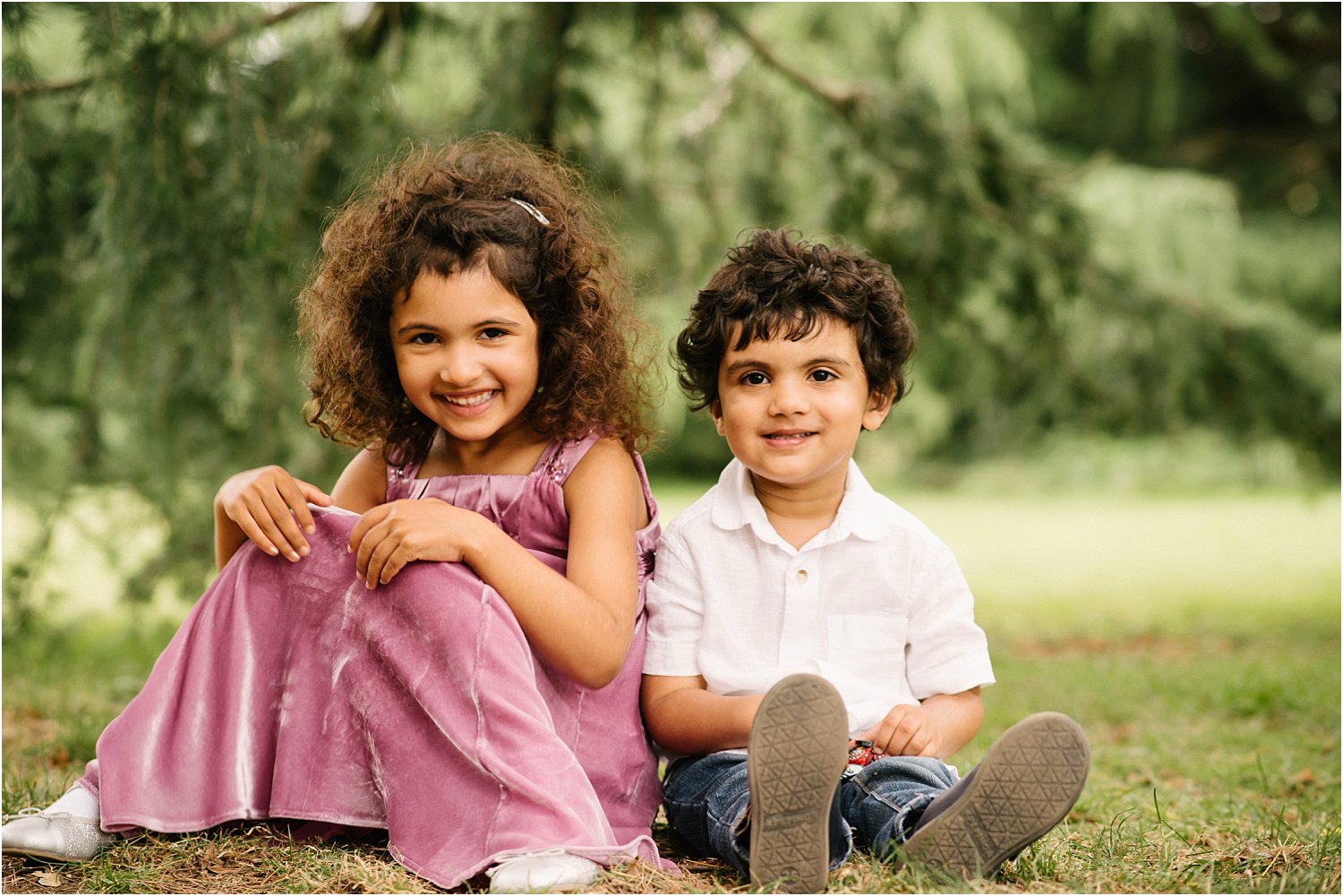
    This boy is on a wider version of the bench you’ll build in this tutorial.

    Materials needed

    The wood and hardware you need to construct a photo bench are pretty minimal:

    • Two 2×4’s, 8-feet long
    • 3/4-inch thick wood, 8-feet long and 11-inches wide. I like to use low-grade utility shelving but any similar wood will work just fine.
    • 1.5-inch Deck Screws
    • A saw to cut the wood

    The boards on the right, plus some screws, are all you need to build the bench on the left. It’s an easy afternoon project and your clients will appreciate having this highly practical prop. I spent about $ 40 on the four pieces of wood at a local lumber yard.

    The following tools will help you with the construction process, but your own situation might be different. These are what I used, but feel free to adapt as necessary. For instance, you could use a circular saw instead of a miter saw. This is a fun project to do with someone else, so if you don’t have any of these tools, you could ask a friend for help.

    • Miter saw
    • Table saw
    • Drill
    • Sandpaper or electric sander
    • Kreg Jig*
    • Kreg Jig screws 2.5-inches in length with coarse threads*
    • If you don’t use a Kreg Jig, you will need additional deck screws 2.5-inches in length.
    • Wood glue (optional)

    A table saw is really useful for ripping the utility shelving to a uniform width of 3 inches.

    *A Kreg Jig is a staple of a lot of DIY projects, but if you don’t have one already you probably don’t need to buy one just for this photo bench. Traditional wood screws will suffice just fine.

    A view of the bench from below. You could probably construct it out of thinner, lighter materials but it would be far less durable.

    Phase 1: Cut the wood

    For this photo bench you will need to cut the following pieces of wood in the lengths listed below.

    A miter saw makes this project a lot easier, but other cutting tools would suffice just fine too.

    • 2×4 boards, 7.5-inches long – 5 pieces
    • 2×4 boards, 15-inches long – 4 pieces
    • 2×4 boards, 15.5-inches long – 4 pieces
    • 3/4-inch thick boards, 3-inches wide and 16-inches long – 8 pieces
    • 3/4-inch thick boards, 3-inches wide and 18-inches long – 12 pieces

    It’s a lot easier to cut everything first and then assemble the bench all at once.

    Phase 2: Build the frame

    If you have a Kreg Jig, you can use it here to construct the frame of the bench. But if not, you can just use traditional screws. If you want to have an extra-secure hold, you could use wood glue at the joints as well, but it’s not necessary. I would recommend against using nails though, as they’re going to wiggle loose over time and you want this bench to be as sturdy as possible.

    A Kreg Jig is really useful but not necessary.

    If you’re going with this method you’ll need to use your Kreg Jig to drill two pocket holes in each end of the 15-inch, 2×4 boards.

    15-inch boards with two pocket holes in each end.

    When you’re done putting pocket holes in the 15-inch boards you’ll repeat the process with the 7-inch boards.

    7-inch boards with two pocket holes in each end.

    Once your pocket holes are ready you can start assembling the frame of the bench. Secure a 15.5-inch board to each end of one of the 15-inch boards to make a U-shape.

    This shape will form one side of the bench.

    Repeat the process with the other two 15.5-inch board and another 15-inch board. When you’re done you will have two identical U-shapes.

    Both sides of the bench, not yet attached to each other.

    If you don’t have a Kreg Jig, or don’t want to go to the trouble of using pocket holes, you can use regular screws to attach the 15.5-inch boards to the 15-inch board. As long as you end up with two U-shaped pieces as shown above, you’ll be just fine.

    After you get the U-shapes constructed, attach the other 15-inch board on the open end, but rotate it 90-degrees as shown below.

    Attach the second 15-inch board to the open side of each U-shape.

    Repeat this step with the other U-shape, which will give you two of these square pieces as you can see in the following image.

    These form the sides of the bench, and you’ll need to attach them by first securing all the 7-inch boards to one side.

    I find it easiest to attach all five of the 7-inch boards to one side, and then attach that entire assembly to the other side.

    Again, I like to use a Kreg Jig and pocket holes, but you can just as easily use regular deck screws to do this. Don’t worry too much about appearances either, as if you use deck screws you won’t really see them in the finished product. They will be covered up with the slats you will attach in Phase 3.

    The finished frame, upside down on my table saw which doubles as a small workbench.

    If you do end up using pocket holes, you might find yourself working in some really cramped conditions when you insert the screws. A right-angle attachment for your drill can be a huge lifesaver in this step! Once you’re all done, flip the contraption over, and you’re all set for attaching the slats to the sides.

    The brace in the middle gives the bench an extra measure of support. Kids can jump on this thing all day long and it won’t be harmed.

    It’s important to know that this bench is designed to be sturdy as well as aesthetically pleasing, as you can see in the photo above. You might be able to find something similar at a store but it probably won’t be built this solidly. Also, it won’t stand up to years of use and abuse.

    Note also the extra 7-inch board on top, which you can see in the above photo. This helps give even more structural support to the bench so it won’t buckle under the weight of people using it over the years.

    Phase 3: Attach the slats

    Once you have the basic frame built, you can get a little creative in how you want to finish everything off. I like to attach the boards about 1/2-inch apart, but you can space yours closer or farther. I wouldn’t go too far though, especially on the top where people will be sitting.

    Attaching the boards is pretty simple: just place them where you want them to go and attach with deck screws. Other types of screws would work too, but I like deck screws because they are self-tapping and hold very firmly. Nails might work for this step, but I prefer deck screws because of their firmer hold.

    I like to use four slats on each side as well as the top and space them about a 1/2-inch apart. But, this is also up to you. You might use fewer boards and make them wider. Or you may use several thin boards, or one giant board covering the entire surface. It’s up to you, and don’t be afraid to get a little creative. In this example, the 18-inch boards get attached to the front, top, and rear while the 16-inch boards go on the sides.

    Drilling pilot holes will extend the work time required for this step, but it helps ensure the wood doesn’t crack and split when you insert the screws. When finished, all the basic work is done.

    In the background, you can see a bench with some holes I cut out to make it easier to carry.

    I recommend sanding the entire bench to smooth out any rough edges. If you have a jig saw you can cut holes for carrying as you can see in the photo above.

    Phase 4: Finishing

    Now that you’ve constructed the basic bench, the sky is your only limit in terms of how you want the final product to look. I like to use tea-staining, which is inexpensive, non-toxic, and gives a lovely aged look to the wood. The results are inconsistent though, so you might prefer actual wood stain or even paint.

    This is your chance to customize the look of your bench, so have fun and get creative!

    Your clients will appreciate having a nice place to sit, stand, or otherwise pose when you are taking their pictures. And as a bonus, they’ll be doubly impressed when you tell them you made the bench all by yourself!

    We’d love to see some pictures of your bench once you build it. Please share with us in the comments below.


    The post How to Build a Bench Prop for Great Portrait Photos appeared first on Digital Photography School. It was authored by Simon Ringsmuth.


    Digital Photography School

  • Godox TT350 Flash Review – the Little Flash that Can

    The post Godox TT350 Flash Review – the Little Flash that Can appeared first on Digital Photography School. It was authored by Sean McCormack.

    Godox – the mighty Chinese brand that’s sweeping the lighting world, bringing fear to long-established premium brands. And their quality has reached the point where they can now be trusted.

    Godox tt350 with box

    One thing they’ve done well to push the brand forward is their system integration. Any of their X-series triggers will fire any light in the system. Not only that, their TTL speedlights can also act as masters for other lights in the system, from the mighty AD600Pro right through to the humble TT350.

    That’s what we’re looking at today – the TT350.

    This compact and pocketable unit is the smallest flash in the Godox range. It really is small – requiring noting more than two AA batteries.

    The Specs

    • A Guide Number of 36 (rather than the typical 52 of most larger flashes).
    • Recycle time of 2.2 seconds at full power
    • 210 full-power flashes available from two 2500maH AA batteries
    • TTL, Manual, Optical Slave, Optical Slave with Preflash, and Multiflash modes available
    • Coverage from 24–105mm in full-frame 35mm terms
    • High-speed sync up to 1/8000 sec
    • Built in 2.4G radio transmitter and receiver to act as either radio master or slave
    • Wide-angle diffuser and bounce card

    On-Camera

    The small size and weight of the TT350 make it the perfect on-camera flash for any camera system, particularly mirrorless systems. While I’m using them with a Fuji, they’re also available for Canon, Nikon, Sony, Olympus/Panasonic and even Pentax.

    As with any on-camera flash aimed directly at the subject, the light is hard and not particularly flattering.

    Godox tt350 direct flash
    While the flash does have a bounce card, I prefer using reverse bounce for on-camera situations to create a larger light source coming from behind me.

    Godox tt350 bounce flash
    On-camera, the TT350 can be used as a master for other off-camera flashes.

    Now let’s look at off-camera flash.

    Off-Camera

    The benefits of using a flash off-camera are many. You get better placement to control shadows, and by extension the shape of the features in the shot. You also can use a larger range of modifiers to soften or shape the light itself. To go off-camera, you need a flash, a trigger and a stand (with a modifier being an additional option). In this case, our flash is the TT350.

    Triggers

    The TT350 can be powered from:

    • the X-16 for manual power
    • the X1T or XPro trigger for TTL and Manual.

    It can also be triggered from:

    • another TT350 (and its lithium battery brother the V350)
    • the TT685 and V860II speedlights.

    The trigger sits on-camera and relays information from the camera to the remote flash.

    Stands

    Any stand will do, even the cheap Photo-R stands . I find Neewer to be great value for money, although in the studio I prefer using C-Stands even with speedlights.

    Master and Slave

    To use the radio features, hold down the Sync button and then twist the dial when the antennae icon flashes.

    The first option that appears is M, making your flash the Master.

    Godox tt350 Master

    A second twist brings you to S, which enables the Slave mode.

    To change between TTL, Manual and Multi modes, press the Mode button.

    Godox tt350 slave

    In Master mode, press the Slave button to alternate between the Master group (M) and the A, B or C groups.

    In Slave mode, pressing Slave chooses the group the flash is on (A, B or C).

    Godox tt350 slave group c

    The M group in Master dictates what the flash does on-camera. Press Mode to switch between flash off, TTL and Manual.

    Here’s a video that takes you through the entire process.

    ?

    Make sure all your flashes or triggers are on the same channel. To set the channel:

    1. Hold down the Slave button until the CH number flashes
    2. Use the dial to change channel
    3. Press Set to make the change.

    You’re now ready for off-camera flash.

    Using the TT350 with modifiers

    Moving the flash off-camera doesn’t automatically make it look better. But you do get to position the shadows better, as you can see in my article on lighting. I also have a list of cheap modifiers that won’t break the bank. The 120cm Octa is a good investment.

    One light

    Godox tt350 120cm Octa setup

    With the TT350 inside a 120cm Octa (with the diffuser on), you’re ready to get some big light from a small flash. With the Octa between you and the subject, you’ll get flattering light in the ‘Butterfly’ position.

    Godox tt350 120cm octa portrait

    You can improve this further by adding a reflector underneath, such as the Lastolite Halo Compact.

    Godox tt350 120cm octa portrait reflector

    High-Speed Sync

    To get really shallow depth of field with flash (especially outside), you need to use High-Speed Sync to overcome the limitation of the camera sync speed. To engage it, tap the Sync button once.

    Here’s a shot at 1/2000sec and f/1.4, ISO400 with HSS on. (You’ll find bumping the ISO helps save battery life, which is why I’m using ISO400 here).

    Godox tt350 120cm octa portrait HSS

    Two lights

    Another way to help battery life (and the recycle time) is to use two flashes in the modifier.

    Godox tt350 dual

    Set both flashes to the same channel and group. This allows them to automatically match power when you make a change.

    Godox tt350 120cm dual 120

    You can get double flash brackets and aim them into the center with them positioned either close together or further out.

    Godox tt350 120cm dual portrait

    Here’s a portrait with this dual-light Octa box setup on the left (facing across the shot) and a white reflector on the right.

    Godox tt350 120cm octa portrait dual setup

    This is what the setup looks like.

    Godox tt350 120cm cross light

    Removing one of the lights and putting it on a stand behind our subject gives a good cross-light setup.

    Should you get a TT350?

    Clearly, a flash you have with you is better than one you leave behind because of the weight. So for general flash applications the TT350 is great. But, it’s never going to overpower the sun, and and its compact size makes it the lowest-power flash in the range (excluding their mobile phone flash unit).

    However, you can buy two TT350s for the price of a V860II. And while they don’t have built-in batteries, combined they can provide more power for less weight.

    Me? I bought two so I can use them in the configurations I’ve shown here, and as a master-slave setup if I have an issue with a trigger.

    Overall, they’re great tools to have in the bag.

    Have you used this flash? What are your thoughts? Please share with us and the dPS community in the comments below.


    The post Godox TT350 Flash Review – the Little Flash that Can appeared first on Digital Photography School. It was authored by Sean McCormack.


    Digital Photography School

  • How to Add Functionality to Photoshop CC with Free Extensions

    The post How to Add Functionality to Photoshop CC with Free Extensions appeared first on Digital Photography School. It was authored by Glenn Harper.

    Using extensions in Photoshop is like putting scaffolding on Mount Everest. The program already has more features than you probably need. But you can add more functionality by using free extensions. Photoshop CC even invites you to “Find Extensions on Exchange…” on the Windows menu.

    Finding Photoshop extensions

    When browsing the Adobe Exchange site for extensions, take note of what products they’re compatible with. Otherwise, you’ll end up downloading stuff that won’t install. Naturally, free extensions are less likely to be up to date. Some of the paid add-ons are worth a look, with the caveat that you can’t always try them out first.

    Extension installers

    You can install Adobe extensions easily by using either Anastasiy’s Extension Manager or the ZXP Installer. (I use the latter.) Drag the .zxp file onto the app, and the extension will be waiting next time you open Photoshop. (Or at least it should be.) You can also use Adobe’s Creative Cloud desktop app to install and uninstall extensions.

    Installing Photoshop CC extensions

    If your extension doesn’t load automatically through the Creative Cloud app, try Anastasiy’s Extension Manager or the ZXP Installer.

    Three great free extensions

    Some great up-to-date extensions are available for free. They might be a segue from an unpaid product to a paid one or have some other sales angle, but they’re still handy additions to Photoshop.

    Here are three free extensions that work with Photoshop CC in 2019 (version 20.0.4 as I write).

    Adobe Paper Textures Pro (Russell Brown)

    This extension lets you easily add paper textures to photos. The downside is the supplied textures are web-size only, so you can’t add them to big files without losing definition. Of course, it’s designed to hook you into buying full-res textures from Fly Paper. But if you’re into this type of editing, it’s probably worth it, as they appear to be high quality.

    Photoshop texture overlay

    A textured digital photo using one of the supplied Fly Paper overlays in Adobe Paper Textures Pro.

    To make Adobe Paper Textures Pro fully functional without costing you anything, you can download free full-res texture images from other web sources and load those up instead. The textures automatically blend with your open image, so it’s quicker than creating layers manually. In the past, the extension has drawn a few negative reviews. But it has behaved well for me, and despite the odd glitch, it’s a lot of fun to use.

    Adobe Paper Textures Pro and a separately sourced texture overlay.

    Interactive Luminosity Masks (Sven Stork)

    Being able to select different areas of luminosity within an image can be useful when making local edits. You might want to adjust the contrast or tone in one area and not another. Or perhaps you want to avoid sharpening noisy, darker areas of the image or apply noise reduction to the shadows.

    The Interactive Luminosity Mask lets you select highlights, mid-tones or shadows, and also allows a customized choice with a zone mask and picker.

    Using a luminosity mask in Photoshop - free extension

    A luminosity mask exposing shadow areas only for adjustment. You can invert the selection if you want to protect an area rather than edit it.

    The extension also includes saturation masks. These were once useful for selectively increasing saturation, but the vibrance slider made that a little redundant. Even so, there’s still a lot of value in being able to use color to make selections. For instance, you may want to avoid sharpening large single-tone areas such as skies. This add-on lets you select areas of low, mid or high saturation, or manually pick a color using the zone mask. You can even launch channels and commonly used adjustment layers from within the extension.

    Facebook Grid Cover (Bojan Živkovic)

    Photography on Facebook - free extensions

    Facebook grids force you to curate your own photos if you want to create a good one. That’s always a useful exercise. This add-on set of actions works flawlessly.

    Facebook covers may seem like a frivolous way to spend your time. But creating a grid of photos that look good together isn’t always easy. Even with a simple three-image grid, you may find composing a good online triptych challenging. This extension doesn’t end up in your extensions menu. Instead, it’s an action (or series of actions) that loads initially onto your desktop.

    You can pick up to 13 images to go into your Facebook grid cover, and the actions let you switch any one of them as long as the layers remain intact. Whether you run a photographic Facebook page, or just want one for your own cover, this extension will create an eye-catching result.

    Further delights

    Here are some more free extensions for you to try:

    1. Thomas Zagler’s Free Stock Search is ideal for finding free stock images you can use for things such as digital composites. You could compile a folder of free texture photos and use them with the Adobe Paper Textures Pro extension I talked about earlier.
      Free stock search - free extension

      Free stock photos are useful for overlays in Photoshop. Add texture to your photos or drop in a better sky.

    2. Sven Stork’s Interactive Blender Panel lets you blend pictures together according to tone (highlights, mid-tones, or shadows) and leave the rest of the photo unblended. This is ideal for dropping in more appealing skies, among other things.

      Digitally adding skies in Photoshop

      This is another first-rate offering from Sven Stork. Adding better skies is one use for blending pictures by tone. You can use a layer mask to brush out any unwanted blending.

    3. Anil Tejwani’s Action Launcher provides useful ways to organize your actions, including alphabetically or by favorites. Note: The favorites feature expires after 30 days unless you upgrade to the pro version.

      Photoshop free extensions

      Action Launcher lets you easily filter and organize your actions.

    4. Davide Barranca’s PS Tools lets you lay out all the Photoshop tools you actually use in a pop-out panel and conceal the rest.

      Photoshop tools

      This extension lets you lay out all the tools you usually use and hide the rest. (Note: The panel doesn’t float. The illustration shows screenshots of editing pane and selected tools.)

    5. Denis Yanov’s RealLookLongShadow panel gives you lots of control over drop shadows and their length to make photos or cut-outs stand out.

      Photoshop drop shadows - free extensions

      This extension lets you create longer shadows than is usually possible within Photoshop.

    Your recommendations

    I hope you find some of these extensions useful or fun. Please feel free to add your own recommendations for free or paid extensions in the comments.


    The post How to Add Functionality to Photoshop CC with Free Extensions appeared first on Digital Photography School. It was authored by Glenn Harper.


    Digital Photography School

  • How to Pose Grooms and Groomsmen Effectively

    The post How to Pose Grooms and Groomsmen Effectively appeared first on Digital Photography School. It was authored by Jackie Lamas.

    Wedding days aren’t just about the bride, even though it might seem that way. As photographers we must also take photos of the groom by himself and with his groomsman buddies – whether they like it or not.

    Posing the groom alone

    When posing the groom alone you often see stiffness and shifting eyes because most men don’t feel  comfortable having their photo taken. So it’s worth starting a conversation that has nothing to do with the wedding to relax them and settle their nerves.

    Find a nice background where you can photograph the groom at three different crops: full-body, half-body, and close-up. These three crops will add variety to your portraits, and give you more options when choosing the best portrait to deliver to your clients.

    For example, window lighting can add dimension and depth while the groom is adjusting his tie or watch, or buttoning his shirt. Have the groom look out the window, or at his watch or tie. This keeps his hands busy, and because he’s not looking at the camera he won’t feel as vulnerable.

    When you’re outside you can have the groom lean on a wall, or simply stand in the middle of a walkway. To help him pose naturally, tell him to stand as if he was by himself and not getting his photo taken.

    Also, remind him to breathe. The stiffness is often caused by the groom holding his breath. It will also help him relax his shoulders and overall stance.

    Photographing the groom at three different crops is a great way to add variety to the final images.

    If the groom usually puts his hand in a pocket, have him put the one furthest from the camera into his pocket. This can help make the portrait feel more natural. Having the groom look at various points beyond the camera (to the side, behind you, or even at his shoes) can reduce the nerves and stiffness, and make him feel more comfortable.

    As you’re taking the groom’s portraits, feel free to joke around, talk about things they like, or simply compliment them. This can make them feel more comfortable and bring about natural smiling and laughing, as well as fill in the silence.

    Sitting is another great way to pose the groom. Have him sit on steps, a short wall or a chair. It will make the groom feel less stiff, and allow you to focus on various details of his outfit such as his shoes or socks if he chose something special.

    Portraits of the groom while with the bride

    But the groom doesn’t have to be completely alone in his portraits. A beautiful portrait of the groom with his bride can isolate him while placing him in the overall story of the wedding day.

    Pose the couple facing each other, and ask the bride to place her head on his chest or arm to bring her face out a little. Then have her close her eyes while you direct the groom to look at the camera.

    Another great portrait is having the groom at a 45-degree angle, with the bride behind him. Ask her to put her head on his back/shoulders, and have him look either directly at you or off into the distance.

    He doesn’t have to smile. He can even look a little more serious. But the big picture will still look romantic and show that the couple is sharing a special moment.

    You can move the groom and bride from there and create variations where the groom is:

    • in focus
    • in the forefront
    • looking directly at the camera
    • the main focal point in the photo.

    These will all make great portraits of the groom and help him pose with his bride.

    Groomsmen

    Groomsmen are really fun to photograph. Most of the time they’re buddies and will joke around a bit, which can make for great candid photos. But it can also mean they won’t take the photo shoot seriously.

    One way to get them to listen and cooperate is to let them know the faster they get through the photo shoot, the sooner they can start having fun. But don’t use this trick until you’ve captured some candids showing how they all interact, as it will be nice for the groom to have those as well.

    Keep at least three different groomsmen setups in mind before photographing the wedding. You can find inspiration online and save those inspirational photos on your phone to recreate or build on them. This can save you lots of time if you’re new to wedding photography.

    Try and keep the conversation light and easygoing. It will help the groomsmen relax, and you’ll get much more authentic expressions from them.

    Group huddles and hugs are great icebreakers, and can lighten the mood if you feel the photos are getting a little stiff or the groomsmen are losing steam. A slow walking photo is also nice to have and having them looking at each other and talking is a great way to get them all smiling.

    A staggered photo, either on a staircase or in a big area, can provide you with more varied poses for your final photos. If you have enough time, get a photo of each groomsman with the groom. Keep the photos moving by keeping the groom in the same place and having the groomsmen take turns standing beside him.

    Keep everyone’s height variations in mind when taking photos of the groom with his groomsmen. Taller groomsmen may need to stand further back. If there are big height differences between the groom and his groomsmen, place those who are about the same height next to the groom, or bring the groom closer to the camera. This can help isolate the groom and make him the focal point of the photo, which is exactly what you want.

    Keep everyone moving and try to get the photos done quickly. Groomsmen are usually ready for the next event pretty quickly and get sick of the camera much faster than the bride and bridesmaids.

    If the groomsmen have ideas for poses, go along with them. It may be an inside joke or something that brings them closer together as buddies. And they’re usually the photos they love to remember.

    Also, always ask if the groomsmen are wearing something special or have a gift from the couple – watches, socks, matching shoes, flasks, etc. These items have far more meaning when they’re photographed in the hands of those who received or are wearing them.

    For example, these groomsmen all received personalized flasks from the groom, so a toasting photo was fun to create for them, along with a close-up of one of the flasks.

    In conclusion

    Grooms and groomsmen are fun to photograph during a wedding. But it’s best to have a few poses in mind so you can work quickly, as they often don’t like having their photos taken and may tire quickly. Keeping the mood light and fun gives them a great experience, and they’ll look back at the photos with fond memories.

    dps-How-to-Pose-Grooms-and-Groomsmen-Effectively

    The post How to Pose Grooms and Groomsmen Effectively appeared first on Digital Photography School. It was authored by Jackie Lamas.


    Digital Photography School

  • Advising Clients What to Wear for a Photo Shoot

    The post Advising Clients What to Wear for a Photo Shoot appeared first on Digital Photography School. It was authored by Lily Sawyer.

    Outfits can make or break a photo shoot. No matter how beautiful your photos are, if the outfits aren’t right it can affect the look and feel of the photographs.

    I wouldn’t have said this before, but now I know from experience.

    1 - Advising Clients What to Wear for a Photo Shoot

    Before each photo shoot, I send my client an article and encourage them to read it. I then ask them to send me some of their outfit ideas so we can discuss their choices. The client plays the most important role in the photo shoot, and so while I offer advice on what to wear, I  also like to tailor their photo shoot to match their preferences and personalities.

    Here are some factors that help my client and I come to a decision on the right outfits for a successful photo shoot. Naturally, the outfits need to be right for the client. But they also need to be right for you as the photographer.

    2 - Advising Clients What to Wear for a Photo Shoot

    Type of photoshoot

    Chances are you already know this from the booking and/or your niche (if you have one). But in case you don’t, here are some photo shoots you may be asked to do:

    • Family (immediate family, perhaps with a couple of grandparents added)
    • Children (just the kids, sometimes with cousins included)
    • Siblings (brothers and sisters or multiples e.g. twins)
    • Three generations (e.g. grandmother, mother, daughter)
    • Engagement, love shoot or couple shoot
    • Newborn or babies
    • Valentine, anniversary
    • Activity-based (sports, event, themed)
    • Clan (bigger family shoots to include extended family, several families together)
    • Birthday, cake smash
    • Lifestyle (usually more informal)
    • Portrait (usually more formal)
    • Corporate

    3 - Advising Clients What to Wear for a Photo Shoot

    Type of client

    From my experience, clients generally fall into one of two types: styled or casual.

    Styled clients think about every detail of their shoot including:

    • the look and feel they want
    • the color scheme, location, and any props they want to use
    • makeup and accessories
    • the final outcome of their shoot in terms of products and what they do with them.

    Casual clients just want some memories captured, usually showcasing their usual attires and what they do as a family. They’re not too fussed about location or outfits, they just want lovely photos of their family or themselves and have the digital files stored safely so they can print them whenever they want.

    In both cases, I still try to get together with them to discuss their outfits and plan the photo shoot.

    Theme or no theme

    When it comes to themes, the possibilities are limitless. But I always advise my clients to narrow it down to a handful of choices and keep things simple within their chosen theme. For me, a theme just provides context. The focus is still the client looking good in their photographs, looking natural in the context, and loving the way they look in them.

    Keeping it simple is best.

    4 - Advising Clients What to Wear for a Photo Shoot

    Location of the shoot

    Rather than talk about differences between studio and outdoor locations (which are pretty obvious), I want to focus on what’s important when choosing outdoor locations to fit a client’s outfits and vice versa.

    If they’ve put a lot of work into choosing outfits (and perhaps props), a location that provides a simple but effective background will work best. So having outfits that suit the location is crucial.

    If you’re shooting in a busy location (e.g. city, market, funfair) where you can’t avoid being surrounded by people, I’d suggest plain, non-printed outfits. This will help you isolate your clients so they’re still the focus amidst the busy setting. When I shoot in these locations, I sometimes blur the background or drag the shutter to blur everything but the client.

    5 - Advising Clients What to Wear for a Photo Shoot

    If the location is a park where you can find a quiet spot and use trees, foliage or sky as the background, then they can wear florals and busy patterns. You can isolate them by blurring the background when shooting so you get creamy bokeh in a very shallow depth of field.

    You can also do silhouettes. This works well if they’re wearing outfits that are similar to each other (e.g. simple jackets or trench coats).

    Here are some other locations you could choose:

    • a brick wall (or any textured surface) large enough to be the background
    • large murals
    • alcoves
    • corners
    • an old building
    • a row of pillars that would work for background.

    While I try to minimize stark contrast within the outfits themselves, I try to maximize the contrast between the outfits and the location. In other words, plain outfits in busy locations and busy outfits in plain locations.

    6 - Advising Clients What to Wear for a Photo Shoot

    Time of the year

    This is pretty self-explanatory, except I want to add one word: options. I encourage my clients to have a change of outfits in case they want a different look. Some take up the offer, while others don’t. The weather in the UK can change quite dramatically. In autumn and spring, we can have all four seasons in one day.

    So during this time, I encourage my clients to dress in layers. If the sun comes out they can take a layer off. If it rains we can do some shots with an umbrella. If we’re suddenly plunged into winter, we can add a couple of layers for a cozy look in a cafe, complete with hot chocolate topped with marshmallows.

    But make sure you factor the weather, outfits and any activities (boating, cycling, etc.) into your shoot so you don’t run over time.

    Your style/niche

    You may have been told you should have a niche, and shoot only within that niche. That’s a nice ideal, but it isn’t true (or easy) for everyone. Sure, some people may not be your ideal client. But if they like your pictures, want you to photograph them and will pay you for it, would you turn them down?

    And while you may not showcase their photos on your blog because of the niche and brand you’re trying to build, if they don’t mind then why not do it? Yes, the photos in your portfolio, on your website and in your social media messages will help you attract those ideal clients. But here I’m talking about those who want you to photograph them regardless.

    7 - Advising Clients What to Wear for a Photo Shoot

    General outfit advice

    Bearing all of this in mind, here’s my general advice regarding outfits.

    Classic: Timeless style, chinos, khakis, beige and blues, nature-hues, pastels, shirts, and simple dresses.

    Florals and prints: Just florals, or an eclectic mix of prints and patterns. Pairing them with stripes can also work sometimes.

    Colors: Keep them complementary as opposed to completely matching (e.g. all white shirts and blue jeans). Avoid stark contrasts such as green and orange/red together, and yellows and purples juxtaposed. Complementary colors are more like warm tones (yellows, oranges, pinks, warm red and even warm greens) together and cool tones (blues, purples, greens) together. But an explosion of bright colors could also work, although I’d shoot it on a plain background or setting.

    Consistency: Avoid extreme differences (e.g. one person is wearing a casual knitted chunky sweater and the other is wearing a nice silky dress). It can be quite jarring. Black and white is another combination that’s too stark a contrast unless it’s done intentionally.

    Dark, light and bright: Darks for adults, and lights or brights for small children. Do it the other way and the adults will dominate the scene and draw the viewer’s attention, while the smaller people will disappear.

    dps-what-to-advise-clients-photoshoot-outfits

    We all have our own personal preferences and styles. These are mine, but if you have other ideas for your photo shoots that’s okay.

    If you have any other helpful advice, please share it with us in the comments.


    The post Advising Clients What to Wear for a Photo Shoot appeared first on Digital Photography School. It was authored by Lily Sawyer.


    Digital Photography School

  • 5 Tips for Stunning Macro Photography

    The post 5 Tips for Stunning Macro Photography appeared first on Digital Photography School. It was authored by Jaymes Dempsey.

    Do you want to capture gorgeous macro photography?

    Macro photography might feel like a struggle. But it doesn’t have to be. By using a few simple tricks you can capture amazing macro photos consistently.

    So if you’re interested in taking your macro images to the next level, follow these five tips.

    1. Simplify your macro composition’s subjects and colors

    All great macro photos have a carefully chosen composition. That is, the elements in the photos have been arranged in the most beautiful way possible.

    So if you want to capture amazing macro photography, you need to carefully choose your compositions, too.

    And the number one rule of composition?

    Simplify, simplify, simplify.

    Start by choosing a subject for your photo. Something that stands out – ideally the thing that initially drew you to the scene.

    And once you’ve found your subject, hit your viewer over the head with it. Remove any distractions from the scene. If there are stray twigs in the background, remove them. If there’s something unpleasant in the foreground, change your angle.

    The goal is to isolate your subject in every way possible. You want the viewer to know exactly what they’re supposed to look at.

    But as well as removing all the physical distractions, you should also remove all the distracting colors.

    A macro photo should have three colors or fewer – four if you’re really struggling. But no more than that.

    Because too many colors cause chaos.

    And in macro photography you absolutely need to avoid chaos.

    You need to simplify.

    2. Increase the subject-to-background distance for beautiful macro backgrounds

    Now you understand the importance of simplifying. But it’s not just the subject of the photo you need to simplify. You also need to simplify the background.

    The best macro photography backgrounds are clean, simple and uniform. They don’t take away from the subject. Instead, they complement the subject and help it stand out.

    But how do you create such a simple, clean background?

    One way is to increase the distance between the subject and the background, and use a very wide aperture (something in the f/2.8 to f/4 range).

    Why? Because the farther the subject is from the background, the greater the aperture needed to keep everything in focus. And so at very wide apertures the whole background becomes  wonderfully blurry.

    This background blur is called bokeh. And macro photographers love it because it helps the subject to stand out.

    Just remember that when it comes to macro photography backgrounds, blurrier is almost always better.

    So use a wide aperture, and increase the subject to background distance.

    You’ll get far better shots that way.

    3. Focus manually for the best macro photography detail

    Do you ever struggle to nail the focus while doing macro photography?

    It’s a common problem. Since you’re working at such high magnifications, the autofocus on your lens will undoubtedly struggle. And it’ll often miss your point of focus entirely.

    Fortunately, there’s a simple workaround for this problem: manual focus.

    Manual focus lets you change the point of focus using the ring on the lens. Twist the lens ring and the focus moves, allowing you to focus close, far away, then close again without using the lens’s autofocus.

    This is extremely useful for macro photography. Even at high magnifications, you’ll be able to consistently nail the focus.

    As long as you switch over to manual focus, of course.

    A couple of tips:

    • Turn the manual focus ring gently. You don’t want to go at it aggressively. Instead, move smoothly.
    • If you’re struggling to lock focus on your subject, try using autofocus to get you in the general area. Then fine tune the focus with manual.

    Manual focus may take a bit of practice to master. But it’ll be worth it in the end.

    4. Shoot into the sun for amazing background bokeh

    Now we’ve reached the fun part of this article: How to generate gorgeous background bokeh.

    As I mentioned earlier, bokeh refers to a beautiful blurry background.

    And here’s the thing: If you can create amazing bokeh in your macro photos you’re practically guaranteed a great shot, because it will make your shot stand out from the crowd.

    But how do you capture stunning bokeh?

    Here’s one simple trick you can use: shoot into the sun.

    First, wait until the sun is low in the sky (early morning or late afternoon).

    Next, find a subject and place that subject between you and the sun. Crouch down low so the sun is behind your subject.

    Now, move around until you find an area where the sun is broken up by something – tree branches, leaves, etc. You want the sun to shine through these tree branches, hit your subject, and then hit you.

    Why is this so important?

    Well, broken sunlight ultimately creates the best bokeh. Those smaller pinpricks of sunlight produce amazing backgrounds.

    Note: You don’t want the full sun in your frame. Otherwise the sky will be far too bright and your picture will lack serious detail. Instead, block the sunlight with your subject. If you like, let the sun peek out from behind. (In fact, this can result in some especially interesting effects.)

    Bottom line?

    If you can create amazing bokeh, your macro photography will be stunning. So create it whenever possible.

    5. Find shade-sun combinations for gorgeous colors

    Here’s a final macro photography tip for you (and one of my favorites).

    If you want to create wonderful, pastel-like colors in your macro photos, use shade-sun combinations.

    When the sun is low in the sky, go out looking for subjects. Shadows will be long, so you shouldn’t have any problem finding a nice subject in the shade.

    Get ready to photograph that subject. But before you actually take the shot, carefully position yourself so the background of the shot is sun-drenched.

    This works amazingly well, because the sunny background will be soft and golden. And golden light is amazing for bokeh.

    You’ll capture photos like this:

    And this:

    With a bit of patience, you should be able to find many great backgrounds by using this trick.

    So don’t forget to try it.

    Stunning macro photography: next steps

    Capturing amazing macro photos doesn’t have to be hard. You just have to know a few tricks.

    For instance, you have to simplify your compositions.

    You have to create beautiful backgrounds.

    And you have to focus manually.

    If you can do that, your macro photos will be amazing in no time at all.

    We’d love you to go out and try these techniques, and share your macro photos with us in the comments below.

    The post 5 Tips for Stunning Macro Photography appeared first on Digital Photography School. It was authored by Jaymes Dempsey.


    Digital Photography School

  • How to Turn Day to Night Using Photoshop for Urban Landscapes

    The post How to Turn Day to Night Using Photoshop for Urban Landscapes appeared first on Digital Photography School. It was authored by Ana Mireles.

    Have you ever wished you’d photographed something at night? You may not have had the time, knowledge, or gear to do it, but you still regret not getting that shot.

    In some cases you may be able to return at night and have another go. But if you can’t, you can quickly turn day to night with Photoshop.

    In this article I’ll show you how you to turn your daytime urban scene into a nighttime one using layers and masks. I’ll also give you a few tips on the details you should take care of for a more realistic effect.

    But first I want to explain the idea behind this technique so you can apply it to all kinds of photography.

    The blue night and the yellow light

    You may have noticed that different lights have different colors. Sunsets are redder and warmer than the sunlight at noon. The table lamp from your bedroom is more yellow than the fluorescent light of an office building. And so on.

    This is called the color temperature, and is measured in Kelvin degrees. (You can see it in full in this color temperature scale.) And you can take advantage of it to simulate night time by colorizing your image accordingly.

    Make it night

    First, you need to change the white daylight into a dark blue that corresponds to the night light by adding a blue layer. You can do this in various ways, although I find the easiest way it to select Layer -> New Adjustment Layer -> Color Lookup… from the menu and clicking OK.

    From the Properties panel, open the top drop-down menu and choose any option that gives you a blue tone such as Moonlight, Foggy night, or Night from Day.

    If you’re more experienced, and want to to have full control, you can work with a RAW file. At the top of the adjustment panel of the ACR window is a slider where you can adjust the color temperature. You can also enter the Kelvin degrees value you want directly according to the scale I mentioned before.

    Turn the lights up

    Next, create another layer that’s yellow or amber. If you’re using Adjustment Layers, remember to duplicate of the original first and then add the color one on top of it. If you’re sticking with the Color Lookup adjustment layer style choose Edgy Amber or Candlelight. Once you have it, merge the adjustment layer with the copy you created from the original.

    If you’re doing it from ACR, don’t just duplicate your layer. Use the Create a New Smart Object via Copy option instead, or the first layer will go yellow too. You can find this option by right-clicking the layer and choosing it from the menu. Then double-click on the thumbnail to open ACR again and drag the slider to the yellow side.

    You now need to add a mask to this yellow layer. You can do this by clicking on the Layer mask button on the bottom of the panel. Once you’ve created it, click Invert in the properties panel. We do it this way because the white mask will show all the content and the black one will block all of it. (To learn more about it, check out Getting Started with Layer Masks in Photoshop – a Beginners Tutorial.) For now you’ll want it all covered so you can paint only what you need to in the next step.

    The yellow corresponds to the tungsten light from light bulbs, which you can use to paint lamp posts, windows and any other source of light that might be available during night time. Identify these sources and, using the Brush tool, start painting in the Layer Mask with the brush set to white.

    For windows, I find it easier to paint the entire rectangle and then paint out the divisions with the black brush.

    This also works for any corrections or detailed work. If you paint something by accident, change the color of the brush to black and paint back over it to cover it again. This is why we’re using masks. The work is non-destructive, and you can easily go back and forth.

    The Giveaways

    It’s up to you how much work you want to put into the transformation. But keep in mind that the more details you do, the more realistic the effect looks.

    For example, the lamp will shed some light onto the wall where it’s hanging, so you’ll want to illuminate that part as well. With the same Brush tool you were using, diminish the opacity from the Options Bar and paint the wall where the light would be hitting. Keep diminishing the opacity as you get further away from the light source.

    Another big giveaway is reflective surfaces because light would reflect onto them. In this example, the water in the canals needs to have reflected light. But it may also be needed for cars or puddles, so keep an eye on your scene and paint those as well.

    There you have it: from day to night using nothing more than  layers and masks.

    I hope you enjoyed this technique. I recommend you go out and do some night photography so you can learn how light, tones and colors behave. The more you understand it, the better you will be able to replicate it in post-production.

    If you need some help getting started, check out The Ultimate Guide to Night Photography.

    And to get some inspiration for your next digitally created night scenes, here are two great articles:

    • Creating Moods with the Kelvin Scale
    • After Dark – 22 Night Photography Images.

    The post How to Turn Day to Night Using Photoshop for Urban Landscapes appeared first on Digital Photography School. It was authored by Ana Mireles.


    Digital Photography School

  • 3 Fun Backgrounds for Portraits and Photo Booths You Can Create at Home

    The post 3 Fun Backgrounds for Portraits and Photo Booths You Can Create at Home appeared first on Digital Photography School. It was authored by Erin Fitzgibbon.

    Bring out your Creativity

    With our phones becoming an essential tool in our lives, we’ve started integrating them into our daily routines. We use them to document events and milestones, and then share them on social media.

    One trend that seems set to continue is having photo booths at events and even gatherings. Guests are invited to shoot photos in front of a fun background to help document the memories of that special day.

    And photographers are always looking for great studio backdrops to help make portraits interesting.

    Keeping both scenarios in mind, I’ve put together three examples of easy-to-create backdrops that can be used in all sorts of situations. So whether you’re a serious portrait photographer who wants to create something unique for your business or a creative individual who wants to give your guests with something fun during an event, here are step-by-step instructions for creating some pretty cool backgrounds.

    1# String and a Theme

    For this creative effort all you need is a lot of string and some paper clips. I’ve used this technique with everything from displaying art to creating a fun backdrop  for portraits in support of Down Syndrome awareness.

    (The creases in the fabric can easily be removed in Photoshop. I just wanted to show exactly how it looked.)

    Created using some friends’ socks, two pieces of white fabric and some push pins.

    The steps are quite simple.

    1. Get some string. (I’m partial to either black string or brown hemp-based string.)
    2. Using strong tape or hooks, run the string back and forth across the area you’ll be shooting. This works best on a blank wall or a plain backdrop cloth. (If you don’t have a backdrop cloth, iron a bed sheet and hang it up using thumbtacks.)
    3. Attach whatever theme items you’ve chosen at random places along the string using paper clips.
    4. Take some test photos to make sure you like the look of your backdrop.


    I hung the socks from the string using bobby pins.

    Here’s a background we made for a school. The design was created for World Down Syndrome Day. Everyone was encouraged to raise awareness by wearing crazy socks. So we created this simple background and then took photos of the students in front of the socks. It was easy to set up, and a lot of fun to shoot.


    2# Paint Splatters and a Tri-Fold Display Board

    Remember those tri-fold display boards we all bought to make our science fair projects? Well, here’s a backdrop you can make using that school day staple. It’s also easy to transport – just fold it up and away you go. It’s also a great way to use up any paint you have sitting around in the basement. 

    I used some acrylic paint and a palette knife for this background. I decided to smear it this time, but you can also splatter the paint.

    1. Buy a tri-fold display board (black or white) from the dollar store.
    2. Choose some paint colors that go with your theme (or use whatever you have lying around in the basement). If the paint is too thick to splatter, adding water can help make it more pliable.
    3. Take the tri-fold board outside (or put down a lot of newspaper on the kitchen floor).
    4. Using a variety of brush sizes, randomly drip, splash or flick paint onto the tri-fold.
    5. Let it dry for several hours before moving the board.

    If you load the knife with a few colors and drag it across the palette you get lots of mixing and color variation.

    Here’s the full tri-fold display board. While the background isn’t very big, it’s quite portable. However, it does limit how much you see. But keep in mind you can always use a zoom lens and have your subject stand at a distance from the background. After all, a lot of DIY is about making do with what you have.

    A simply white tri-board can be really useful. And in a pinch it can also be used as a reflector.

    3# Brown Paper and Old Books

    For this one you’ll need a roll of craft paper, which you can either hang from a studio backdrop or improvise by taping it to the wall. But you’ll have to be gentle with this backdrop, and if your guests or clients aren’t careful they could easily rip the paper.

    Next, choose some books that have significance to your event. If it’s a baby shower, old children’s books might be a good choice for the background.

    (I realize that some people think dismantling a book for a backdrop is blasphemous. Personally, I think it’s a great way to give it another purpose instead of having it just sit on the shelf. If this really bothers you, use newspapers instead.)

    1. Gather up old books you won’t be reading again, or visit the library and ask for any damaged books they’ll be throwing away. Flea markets and garage sales are also great places to find books.
    2. Cut pages out of the books that you find visually appealing
    3. Glue the pages to the long strip of brown craft paper you hung up
    4. Apply as many pages as you see fit. (You may want to use only a few pages, while someone else may want to completely cover the brown paper.)
    5. Carefully adjust the roll of paper so guests can easily stand in front of your backdrop

    I used pages from an old Writer’s Market to create this background. The nice thing is I can roll it up and take it anywhere.

    I also like the look of this background with a black and white treatment.

    A classic black and white portrait in front is quite pleasing.

    Other Ideas

    Here’s are some more ideas for backgrounds.

    1. Run party streamers diagonally down the wall in a variety of colors.
    2. Hang homemade snowflakes from the ceiling.
    3. Hang Christmas lights behind a bed sheet for a glowing look.
    4. Collect fall leaves and glue them to brown paper.
    5. Use old rolls of wallpaper and drape them behind your subject. (No gluing required.)

    There are countless ways to create an inspiring look for portraits. Don’t be afraid to be creative and use items you have lying around the house. And please share your ideas and examples. We’d love to see what items you use to make something truly fun and creative. 

    The post 3 Fun Backgrounds for Portraits and Photo Booths You Can Create at Home appeared first on Digital Photography School. It was authored by Erin Fitzgibbon.


    Digital Photography School

  • How to Create and Use a Light Skin Smoothing Action in Photoshop

    The post How to Create and Use a Light Skin Smoothing Action in Photoshop appeared first on Digital Photography School. It was authored by Jackie Lamas.

    When you photograph portraits, you’ll spend time editing the photos so your clients look their very best. A lot of that time is often spent smoothing out the skin. But while some smoothing is okay, doing it too much can change the look of the person.

    Here’s how to create a simple and easy Photoshop action that will have you smoothing out skin faster without over-retouching it.

    Before and after using this light skin smoothing action.

    What is a Photoshop Action?

    A Photoshop action is where you record various steps in an editing process and save them so you can then reapply those steps simply by ‘playing’ the action.

    In this case, the action will have three steps. When you press ‘Play’ it will apply those three steps quickly and automatically so you can get to the fun part – the retouching.

    Create the action

    Step 1: Open a photo (any photo will do) so you can create the action.

    Step 2: Make sure the Actions panel is open. If it isn’t, go to the Window menu and make sure Actions is selected. If you can’t find the Actions panel on your workspace, deselect and re-select it in the menu.

    Step 3: Create an Action Set, which will create a master folder for your action to live in and help you organize your actions. (You can skip this step if you already have one.) Click on the three lines in the Actions panel and select New Set. You can also create it by clicking the folder icon at the bottom of the Actions panel. You can give it any name you like. (In this example I named it “My actions”.)

    Step 4: Now it’s time to record the action. Select New Action from the Actions panel menu, or click the New icon at the bottom. Choose a name for your action, select the set you want it stored in, and click Record.

    Note: Once you hit record, everything you do in Photoshop will be recorded – including the things you did accidentally. Fortunately, you can click the Record and Stop buttons at any time while you’re recording the steps.

    Step 5: Once you start recording your action, duplicate your layer in the layers panel or by hitting CMD/CTRL+J.

    Step 6: From the Photoshop menu select Filters ->Blur -> Gaussian Blur and choose a value between 10 and 25 pixels. (Don’t worry. Your photo won’t stay blurry.)

    Step 7: Create a mask layer, then hold down the Alt/Option key and click on the mask. This will add a black mask on your blur, and your photo will be back to normal. We’ll be using this mask to add the smoothing rather than erase the blur, which is a lot more work.

    Step 8: Select the Brush tool (or press B on the keyboard), and choose an opacity between 10% and 20%. Make sure your foreground color is set to white so you can paint back the smoothing.

    Step 9: Hit Stop to stop recording.

    Your action is now ready to use.

    To test your action, open a new photo and hit Play in the Actions panel.

    You’ll see the actions you recorded re-applied to the new photo.

    How to use your action

    Open a photo with the skin you want to smooth out. It’s best if you retouch any imperfections or blemishes beforehand. This action simply smoothes out the skin lightly to make it look natural and clean.

    Hit Play on your action, choose a brush size that’s best for your photo and start painting in the smoothing in small strokes. Make sure you paint in the mask layer or you’ll be painting white onto the skin.

    You should see the difference after a few strokes. You can also change the opacity if you need more or less smoothing.

    Tips

    If you accidentally record extra steps, simply stop the recording and then delete the steps that aren’t part of the action.

    You can also delete the action and start over. So don’t worry if you don’t get each step right the first time.

    In conclusion

    Retouching skin can often take time away from photographing clients. But by using actions, you can streamline your editing by automating steps you use regularly.

    This action also helps you retouch photos lightly and more naturally.

    Let us know if you find it helpful.

    The post How to Create and Use a Light Skin Smoothing Action in Photoshop appeared first on Digital Photography School. It was authored by Jackie Lamas.


    Digital Photography School

  • Weekly Photography Challenge – Macro

    The post Weekly Photography Challenge – Macro appeared first on Digital Photography School. It was authored by Caz Nowaczyk.

    This week’s photography challenge topic is MACRO!

    Image by Jaymes Dempsey.

    Go out and capture flowers, objects, insects etc. Just be sure they are really close up! They can be color, black and white, moody or bright. You get the picture! Have fun, and I look forward to seeing what you come up with!

    Image by Rick Ohnsman.

    Check out some of the articles below that give you tips on this week’s challenge.

    Tips for Shooting MACRO

    Macro Photography on a Budget: An introduction to Close-up Filters

    Getting Started with Abstract Macro Photography

    How to Give Your Macro Photography a Fine Art Touch in Post-Processing

    5 Surprising Macro Photography Ideas to Jumpstart Your Creativity

    Reverse Lens Macro – How to Make Macro Photos with “Backward Thinking”

    Creative Macro Photography – Using Fairy Lights

    How to Choose the Perfect Macro Lens

    Weekly Photography Challenge – MACRO

    Simply upload your shot into the comment field (look for the little camera icon in the Disqus comments section) and they’ll get embedded for us all to see or if you’d prefer, upload them to your favorite photo-sharing site and leave the link to them. Show me your best images in this week’s challenge.

    Share in the dPS Facebook Group

    You can also share your images in the dPS Facebook group as the challenge is posted there each week as well.

    If you tag your photos on Flickr, Instagram, Twitter or other sites – tag them as #DPSmacro to help others find them. Linking back to this page might also help others know what you’re doing so that they can share in the fun.

    The post Weekly Photography Challenge – Macro appeared first on Digital Photography School. It was authored by Caz Nowaczyk.


    Digital Photography School