Blog

  • The New Canon 6D Mark II – Hands-On Previews and Thoughts

    Recently Canon announced the release of their update to the 6D, its popular full frame camera body, with the Canon 6D Mark II. It’s getting some mixed reviews – let’s see what these reviewers thought:

    PhotoRec TV – too many deal breakers?

    Things many consider this camera to be lacking include:

    • No 4K video capability
    • No headphone jack (but there is one for a microphone)
    • Flash sync speed of only 1/180th of a second
    • Only one memory card slot

    Pros:

    • Finally a fully reticulating/tilting (touch) screen on a full frame camera
    • A full frame Canon body that includes WiFi and Bluetooth finally (and GPS)

    digiDIRECT – hands on first impressions

    Some points from this review:

    • Improved battery life
    • Body has improved weather sealing
    • New 26.2 megapixel sensor
    • Increased low light performance (native ISO up to 40,000)
    • 45 cross-type autofocus points (over 11 on the original 6D)
    • Dual pixel focus
    • A burst rate of 6.5 fps (compared to the 6D which does 4.5 fps)
    • This camera is aimed more towards still photographers, not those doing video because of some thing it lacks (no 4K video, no headphone jack)
    • It does, however, have a new time-lapse feature

    Thorough overview of the 6D Mark II by Tony Northrup

    In this video, Tony goes over most of the new features of the Canon 6D Mark II as compared to other camera bodies in the Canon line-up and other brands. See what he thinks are the pros and cons of this new Canon.

    Ready to buy the 6D Mark II?

    If you feel this is the camera for you – they are supposed to be available by the end of July, order yours on Amazon now.

    Have you tried it out, is it on your wish list? Share your thoughts on the Canon 6D Mark II below.

    The post The New Canon 6D Mark II – Hands-On Previews and Thoughts by Darlene Hildebrandt appeared first on Digital Photography School.


    Digital Photography School

  • How to Understand and Use Visual Weight in Composition

    Visual weight is the term given to compositional elements within an image and how much visual impact they have. Some things will feel heavier or more present within the image in comparison to other elements. As a photographer, it is your role to understand this and use it to your advantage when setting up your composition.

    How to Understand and Use Visual Weight in Composition

    How can visual weight affect an image?

    • Light colored elements = a light feel
    • Dark colored elements = a heavy feel
    • Eyes/faces = heavy
    • Text = heavy
    • Negative space = light
    • Focus = can be heavy or light depending on what you are focusing on
    • Image placement within the frame = can choose to make something heavier or lighter
    • Scale = can affect the weight of an element
    • Balance = can affect the weight of an element or the feel of the overall image
    • Color = a pop of unexpected color is heavier than its surroundings

    Examples and Discussion

    Light or even toned images and feel

    This macro shot of red clover is tonally quite similar over the entire image, with a shallow depth of field and a soft focus. The color tones are also soft so the overall feeling to this image visually is quite light – there isn’t really anywhere for the eye to settle and engage with the image.

    How to Understand and Use Visual Weight in Composition

    Compare it with another image that is tonally quite similar, color tones are muted with soft blurry cloud elements. However, in the image below there is a distinct contrast between the white and black points in this image. The black rocks have distinct visual weight and there is a definite point for the eye to rest on and travel around the image.

    How to Understand and Use Visual Weight in Composition

    Image with large dark areas

    In the case of dark moody shots with a lot of black background showing, you would think that the black would overpower the whole image. However, When the subject is well lit and positioned in a sculptural shape like the gerbera below, the subject carries the visual weight of the image and the black recedes into the background to support it.

    How to Understand and Use Visual Weight in Composition

    The landscape below is deliberately underexposed to add drama to the sky and show off the subtle light beams through the clouds. This meant the dark rocks are particularly underexposed and so they carry the visual weight of the image, almost slightly too heavy towards the bottom as a result.

    How to Understand and Use Visual Weight in Composition

    Color against a neutral background

    A bright pop of color in an otherwise neutral tone background carries all the visual weight in the following two images.

    How to Understand and Use Visual Weight in Composition

    How to Understand and Use Visual Weight in Composition

    Additionally, in the image of the New Zealand native wood pigeon below, the sharp eye holds the visual weight, with extra emphasis due to the bright red color of the eye and the beak. This is where your eye is drawn first.

    How to Understand and Use Visual Weight in Composition

    Balance and scale

    Balance and scale are also important factors. In the lighthouse image below, the bright white of the lighthouse holds the eye and the attention, but the horizon line of the sky against the sea gives the necessary scale to balance the overall compostion of the image.

    How to Understand and Use Visual Weight in Composition

    This floating swimming platform has the visual weight in this image, balancing the landscape on the left of the frame, which in turn provides the scale to understand the platform in the overall image context. Being closer to the camera also gives the platform more weight in this composition as well.

    Balance of light and dark

    In the horseshoe image below, it has been deliberately shot to enhance both the dark shadows, The white spiderwebs and add textural details, while the shadows add supporting visual weight to the shapes of the horseshoes.

    How to Understand and Use Visual Weight in Composition

    Below is a similar black and white image, with shadow detail supporting textural elements. But this image is more about the lighter areas, which take up most of the large central area within the image, so they carries more of the visual weight of the image.

    How to Understand and Use Visual Weight in Composition

    Color and balance

    Use of colour within an image can have significant impact. In the image of a sunset below, with the rich red clouds and the dark silhouetted tree line at the bottom, you might thing the dark trees carry the visual weight, but they instead balance out the large red cloud area nicely. The darkest or brightest element is not always the visually heaviest.

    How to Understand and Use Visual Weight in Composition

    Tonally the image below is very even, with the dark sea cliffs being balanced out by the bright sunrise of the sea haze. But the surprise in this image is that the visual weight is carried by the single seagull in flight across the ocean.

    Another sunrise, quite dark toned, but here the white froth of the waves taken as a long exposure to capture the movement has the visual weight within this image.

    How to Understand and Use Visual Weight in Composition

    Assessing visual weight within a composition

    The image of a leafy stream below has a nice balance of light and dark. The stream travels diagonally through the image, drawing the eye. While there is quite a heavy visual weight in the bottom left-hand corner, it still has enough light to have texture and detail and be part of the image. There are enough brighter areas above it and through the water as well so that the overall composition doesn’t feel overwhelmed by the darker areas. Our brains can accept that it is an image taken within a forest, so there will be light and dark areas.

    How to Understand and Use Visual Weight in Composition

    Visual weight working against the image

    Wild Kookaburra on a tree branch (below). In processing, this image has been deliberately overexposed as the original image was taken in shade and was quite dark. This has changed the tonal balance quite a lot, especially in the background. The branch closest to the camera has all the visual weight in this image, weighing it down and making it heavy on the right side. The bird’s dark eye and the feather detail on the wing do counteract the branch a bit, but not enough.

    How to Understand and Use Visual Weight in Composition

    Still life with a feather – an experiment shot while learning still life and food photography. An another example of how visual weight needs to be taken into account in your composition. Here the feather is too light in tone, too small in scale and too soft in structure to balance out the darkness of the basket of eggs in the background. Even though the feather is in sharp focus, the egg basket has all the visual weight in this image.

    How to Understand and Use Visual Weight in Composition

    Visual weight working for the image

    Negative space works really well here with the macro flower shot below. The flower only takes up a small part of the overall image, but because that one element is in sharp focus and the rest is very blurred and becomes part of the background, the flower has all the visual weight in this image. Notice how at the very bottom of the frame, the stem of flowers that is in partial focus also contributes to the weight of the image.

    How to Understand and Use Visual Weight in Composition

    Framing and placement of the gerbera flowers (below) relate directly to the visual weight of them within the image. The diagonal line bisects the image in half, but adds a dynamic angle that engages the eye. The selective focus at the front of the petals combined with the dark stem visually balance out the rest of the negative space in this image. The two other flowers are further away and out of focus so support the subject visually but due to their softness, do not overwhelm the image.

    How to Understand and Use Visual Weight in Composition

    Summary

    Visual weight is a more advanced composition concept, one that may be difficult to grasp initially. Understanding how it can impact your final image is important because thinking about it as part of the overall composition is necessary. Obviously with things like landscapes, macro, flowers, food photography and other staged or stationary situations you have more time to think and adjust your composition. With street, event, wedding, sport or other changeable situations, you may not get time to consider all your options.

    As can be seen from the examples above, both good and bad, visual weight can and does make a difference to the final image. Learning to see compositionally and frame your shot up with intent and forethought will improve your photography more than anything else, in my opinion.

    Because visual weight is affected by other elements of the composition – like tone, focus, light/dark, balance and scale – if you are thinking about those, then visual weight becomes part of the overall composition equation. It is still useful to think about it as a separate element, if you have time to do so, and of course, if you remember. Do you use visual weight as a compositional element for your images?

    The post How to Understand and Use Visual Weight in Composition by Stacey Hill appeared first on Digital Photography School.


    Digital Photography School

  • MIT’s newest photography tech can retouch an image before it’s captured

    MIT has developed a new machine learning technology that is able to retouch an image in real-time, presenting the photographer with the final product before they snap the photo. The system, which is being presented by both Google and MIT researchers at the digital graphics conference Siggraph in Los Angeles, was trained using thousands of both raw and retouched images that comprise a dataset created by MIT and Adobe, among others.

    The automatic image retouching system is lightweight enough to be used on an ordinary smartphone, and it can be equipped with multiple different styles. While real-time image retouching isn’t a new idea, the ability to perform it on a smartphone is. Talking about this, researcher Jon Barron explains:

    Using machine learning for computational photography is an exciting prospect but is limited by the severe computational and power constraints of mobile phones. This paper may provide us with a way to sidestep these issues and produce new, compelling, real-time photographic experiences without draining your battery or giving you a laggy viewfinder experience.

    In order for the image retouching to work in real-time on low power devices like smartphones, the researchers developed a system that modifies a low-resolution version of the final image, then translates those edits to the full-resolution photo.

    With this method arose a big problem, however. Namely, that the low-resolution image doesn’t contain enough data to adequately determine edits for the full-resolution version. Two different solutions were found to solve this problem, the first being that the system outputs ‘a set of simple formulae’ rather than the low-res image itself, and the second being a method for applying the formulae to the full-resolution photo. The team explains that technology in detail in the video below:

    Articles: Digital Photography Review (dpreview.com)

  • Nikon 8-15mm F3.5-4.5E ED fisheye lens impresses in underwater review

    Photo © Robin Dodd

    Our friends at Backscatter Underwater Video & Photo—the world’s leading supplier for underwater imaging equipment, the same folks behind this impressive underwater review of the Canon 1DX Mark II—recently took the new Nikon 8-15mm F3.5-4.5E ED fisheye zoom lens for a spin beneath the waves. As usual, they came back with some stunning photographs, along with a few thoughts about Nikon’s new fisheye zoom lens.

    Backscatter CEO Jim Decker and Producer Robin Dodd were able to ‘MacGyver’ a makeshift zoom gear from some stuff they had lying around the shop, slapped the lens onto a Nikon D810, and went diving. Immediately they were impressed.

    “The lens is a fisheye zoom lens that is a full frame diagonal fisheye lens at the 15mm side of the zoom, and a circular fisheye at the 8mm side,” explains Decker in their review. “It’s great to have the versatility of being able to shoot a circular fisheye, without having to dedicate your whole dive to it.” The photo up top was shot at 8mm, the one below at 15mm.

    Photo © Robin Dodd

    But it’s not just the versatility of having both a diagonal fisheye and a circular fisheye in one lens—a first for Nikon—that impressed Backscatter. The photos turned out great, too.

    “We were super impressed with the image quality of this lens along with the versatility,” writes Decker, “and will now recommend this lens as the primary lens for wide angle use with full frame Nikon cameras.”

    That’s some high praise. To read Backscatter’s full review and see several more underwater sample shots captured with the Nikon 8-15mm F3.5-4.5E ED fisheye, head over to their website by clicking here. And if you want to see some above-ground sample photos, you can see our sample gallery here.

    Articles: Digital Photography Review (dpreview.com)

  • Future Fonts: Tracing the Role of Typography in Science Fiction in Films

    [ By WebUrbanist in Design & Graphics & Branding. ]

    Whether intentionally retro, as in Stranger Things, or overtly futuristic, as in RoboCop, the role of typography in a movie goes well past the title, subtly but powerfully shaping the world viewers are invited to experience.

    Dave Addey, author and creator of Typeset in the Future, is as meticulous as he is obsessed, analyzing appearances of type in film line by line, providing insights, context and speculative answers to various uses (as well as typo corrections).

    It started with Eurostile Bold Extended, which has made appearances from Star Trek to Wall-E. Since then, he has written about typography in Alien, 2001: A Space Odyssey, Moon, and in anticipation of the sequel: Blade Runner.

    With fonts you get a lot of context for free,” says Addey. “You’ve established the time frame for your movie in seconds without a lot of special effects or backstory.” It also tells you something about the world, like: when a single megacorp runs everything and its typeface is consequently found everywhere.

    He watches films over and over again, taking notes then tracking down type, sometimes manually by searching through old books to find exact matches (in other cases: the typography is custom, making the process frustrating).

    And type is just part of the equation: he looks at iconography and other design elements too, piecing together a larger picture of the various strategies in play and how they relate to the core narrative.

    By zooming in on this one aspect of films, he often traces connections that are easy to miss, like: a newspaper being held by the lead character in Blade Runner later appearing as the liner for a drawer. For fans of sci-fi and design, his blog will take you deeper into films than you realized you could go — it is well worth checking out.

    More about the project: “This site is dedicated to typography and iconography as it appears in sci-fi and fantasy movies and TV shows. It’s inspired by the Typeset In The Future trope I added to TV Tropes. (If you know of more good sci-fi font examples, please do add them to that page.)”

    Share on Facebook


    [ By WebUrbanist in Design & Graphics & Branding. ]

    [ WebUrbanist | Archives | Galleries | Privacy | TOS ]


    WebUrbanist

  • Lighting 103: Learning From Your Couch

    Abstract: Don't just look to still photos for inspiration. Great inspiration also awaits you on your TV.

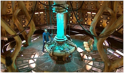
    We may think we are getting a good feel for color as photographers. But you know who kicks still photographers' butts every day? Cinematographers, that's who.

    Today, a look at some examples from 2010-era Dr. Who, which we have talked about on this blog before. These guys are near and dear to my heart, because they are unabashedly fearless when it comes to using color to manipulate light—and their viewers. Read more »
    Strobist

  • Nine new lens adapters announced for the Fujifilm GFX

    A host of new adapters have just been launched that allow owners of the Fujifilm GFX 50S to attach new and historic lenses from other brands to their mirrorless medium format camera.

    K&F Concept has introduced eight of the adapters, and is offering completely manual mounts for some surprising brands, including Olympus OM. The K&F adapters are brass on both sides and have matte black interiors to prevent flare.

    K&F Concept adapters:

    • KF-EFG: Canon EF – Fujifilm G
    • KF-CYG: Yashica/Contax – – Fujifilm G
    • KF-LRG: Leica R – Fujifilm G
    • KF-OMG: Olympus OM – Fujifilm G
    • KF-NFG: Nikon F – Fujifilm G
    • KF-SRG: Minolta MD-MC/SR – Fujifilm G
    • KF-PKG: Pentax K – Fujifilm G
    • KF-42G: M42 – Fujifilm G

    None of the K&F Concept adapters have any electronic communication with the body, and all cost around ¥10,000 (approx. $ 90)

    Contax 645 users will be more interested in this adapter from Fringer, which allows full electronic contact between the Fujifilm GFX and Contax 645 lenses.

    The extent of the communications provides autofocusing for 35mm f/3.5, 45mm f/2.8, 80mm f/2 and 140mm f/2.8 lenses, aperture control on all lenses through the camera body, and full EXIF information in the image file. Fringer admits ‘AF performance is not as good as native GF lenses!’ but some AF is usually better than no AF. The Fringer Contax 645 – GFX smart adapter costs $ 750.

    For more information see the K&F Concepts website (where there is no mention of the adapters) or the Shoten Kobo website (where there is).

    More information on the Fringer adapter can be found on the Fringer website.

    Sample shot taken with the Fringer adapter that allows AF with Contax 645 lenses on the Fujifilm GFX body

    Articles: Digital Photography Review (dpreview.com)

  • How to Make Your Photos Stand Out Using Color Contrast

    A great way to make your photograph look attractive is to make it pop! One of the best ways of making your photo pop is to use eye catching colors your image. Those colors will have even more impact when paired with a contrasting color, so in this article, we’ll look at how you can apply this idea. There is a simplicity to these kind of photos, and learning which colors pair well together will help a lot. Let’s take a look at contrast, and color contrast photography to see why this works.

    How to Make Your Photos Stand Out Using Color Contrast

    How to Make Your Photos Stand Out Using Color Contrast

    Red and blue, one of the strongest color contrasts, was used in this still life.

    Why does contrast work in photography?

    Opposites work well together in an artistic sense, concepts like old versus new are good photographic subject matter. One of the simplest forms of contrast is black and white, which is why photographs that were taken in this style look so effective. The best black and white photos often have strong contrast which makes them stand out.

    The aim of many photos is to isolate your subject, and by doing so, tell a story. The use of contrast is one way you can isolate a subject from the background, or bring out a strong repeating pattern in a texture photo. It’s also possible to have color contrast as well, but only certain color combinations work well together.

    How to Make Your Photos Stand Out Using Color Contrast

    The warm glow of street lights against the blue hour sky is a color contrast.

    What is color contrast photography?

    Getting color contrast is a bit more complex than it is with black and white photography. Color can be broadly split into two groups, cold colors, and warm colors. Color contrast happens when a cold color is paired with a warm color. You can also use complementary colors – that is when warm colors and cold colors (opposite on the color wheel) are in the same photo.

    An easy way to visualize this is by looking at a color wheel, which shows colors that are opposite each other. It’s not uncommon to see color contrast occurring naturally in nature with things like fruits and flowers often displaying this concept. The classic color contrasts are yellow/purple, red/green and orange/blue. Using the color wheel can you come up with some yourself and apply them to your images?

    How to Make Your Photos Stand Out Using Color Contrast

    Using this wheel you can see which colors are opposite each other. Image credit Todd Weed. Creative commons.

    How to take photos that have color contrast

    The world is full of color, but it’s often a mess of many different colors. So how do you go about taking photos that have color contrast, if there are so many other colors in the frame? The following are ideas you can use to do color contrast photography.

    How to Make Your Photos Stand Out Using Color Contrast

    Finding a good location

    Look for places with a solid color, walls often provide this. A red brick wall can contrast against green or blue colors. In some neighborhoods you might find a wall that has been painted blue or wood paneling that is a particular color. Artistic areas of town are often good hunting grounds. Once you have a strong color background you will need to find something or someone that has the contrasting color.

    How to Make Your Photos Stand Out Using Color Contrast

    The vendor knew to lay out their wares using color contrast to attract more customers.

    Create your own color contrast

    Color contrast photography is creative, so how about creating your own contrasts? This could mean asking a model to wear a particular color of clothes, or you can create still life photos that display color contrast. A quick trip to a local crafts store to buy colored paper will allow you to play with contrast.

    How to Make Your Photos Stand Out Using Color Contrast

    In this photo, the opposing colors of purple and green have been used.

    Finding color contrast in nature

    Flowers, especially orchids, have natural color contrast, meaning you don’t need to create it yourself! Another subject with strong colors are fruits, so head to the market and see if you can find contrasting colors with the food on display!

    How to Make Your Photos Stand Out Using Color Contrast

    The strong color contrast of red and blue gives this street scene more impact. Even the stalls are red and blue.

    Let’s see your examples of color contrast photography

    The world is much better in color, so let’s see examples of your photos! The chances are you already have some photos of this type in your archive. So which color combinations worked best for you? When you next challenge yourself to try something new with your photography how about using color contrast as a central theme? Go out and get some new photos, post them here, and share your experiences! This is a fun form of photography that anyone can try no matter what camera you’re using, so let’s see some color contrast photography!

    When you next challenge yourself to try something new with your photography how about using color contrast as a central theme? Go out and get some new photos, post them here, and share your experience in the comments section. This is a fun form of photography that anyone can try no matter what camera you’re using, so let’s see some color contrast photography!

    How to Make Your Photos Stand Out Using Color Contrast

    The yellow wall makes the women who are wearing blue stand out more.

    How to Make Your Photos Stand Out Using Color Contrast

    In this photo, the color contrast was created. I used a pixelstick to paint first in red, then in blue.

    The post How to Make Your Photos Stand Out Using Color Contrast by Simon Bond appeared first on Digital Photography School.


    Digital Photography School

  • Adobe launches new ‘3, 2, 1 … Photoshop!’ tutorial series on YouTube

    Adobe launched a new YouTube tutorial series for Photoshop beginners this week. It’s called ‘3, 2, 1 … Photoshop!’ and it covers some basic tips on how to use different features of the image editor—from the crop tool, to layer groups, to brushes and beyond.

    Advanced users probably won’t get much out of the new series (although, to be fair, you never know what basic tip you’ve been overlooking), but beginners will find it extremely useful. Over the years Photoshop has gotten more and more advanced and complicated. The tutorial series helps cut through the clutter and offer a few top tips from the makers themselves.

    You can watch the first video in the series, Three Tips for Photoshop’s Crop Tool, up top. To see the rest, keep on scrolling down.

    Five Tips for Working with Brushes

    Six Easy Ways to Select Colors in Photoshop

    10 Tips for Working with the Layers Panel

    Three Ways to Quickly Zoom in Photoshop CC

    Five Reasons to Use Smart Filters in Photoshop CC

    Eight Reasons to Use Layer Groups

    If you like these videos and you want to see more like them, check out the Adobe Photoshop YouTube channel and keep your eyes peeled for more ‘3, 2, 1 … Photoshop!’ tutorials in this playlist.

    Articles: Digital Photography Review (dpreview.com)

  • How to Make Creative Lightroom Develop Presets for Portraits

    It’s natural for portrait photographers to take lots of photos during a shoot. Therefore, it’s also helpful to have a system in Lightroom that allows you to save time processing your portraits. The easiest way to do this is with Develop Presets.

    Lightroom Develop Presets for portraits

    A Develop Preset is a record of the processing work you have done on a photo in the Develop Module of Lightroom. The idea is to save the settings you used in a preset that you can then easily apply to other photos. The end result is that you save time and finish developing your portraits more quickly.

    Let’s take a more detailed look at how it works.

    1. Select a portrait to process

    First, select a portrait and adjust it in Lightroom. Alternatively, use a portrait you have already developed.

    Lightroom Develop Presets for portraits

    2. Create a Develop Preset

    Make a new Develop Preset by going to the Presets panel (on the left-hand side) in the Develop module and clicking the plus icon on the right (or, go to Develop > New Preset).

    Lightroom Develop Presets for portraits

    When you do this, the New Develop Preset window appears. There are three sections you need to pay attention to, see below.

    Lightroom Develop Presets for portraits

    A. Preset Name and Folder. Give your preset a name and select the folder you want to save it in. The default folder is User Presets but you can pick another or create a new one by going to the New Folder option at the top of the menu. It’s a good idea to create a new folder for your Preset as it helps you keep your Presets panel organized.

    B. Auto Settings. Lightroom gives you the option to tick the Auto Tone box. I recommend you leave it unticked. Otherwise your preset may behave unpredictably when you apply it to other portraits.

    C. Settings. This is where you tell Lightroom which Develop Module settings you want to include in the Preset.

    Some settings may be unique to your photo. For example, you may have used a Graduated or Radial filter to make the background darker. These won’t work when applied to another portrait with a different background, so you should leave those out.

    It’s also a good idea not to include Exposure or White Balance settings. These need to be adjusted individually for each portrait. For the same reason, you should leave the Sharpening, Noise Reduction, Lens Corrections and Transform boxes unticked.

    You can tick all the other boxes, as shown in the above screenshot.

    3. Apply the Develop Preset to other portraits

    The next step is to apply the Develop Preset you just made to another portrait. Open the new portrait in the Develop module. Click on the Preset you just created, which you can see in the Presets panel.

    In this case, I created a new Develop Preset, especially for this article.

    Lightroom Develop Presets for portraits

    You can also apply your new Develop Portrait to more than one portrait at a time. This is useful if you have several portraits that you would like to develop in the same style. Here’s an easy way to do it.

    1. Go to the Library Module and select the portraits to which you want to apply the preset. It helps if you have already organized your portraits in a Collection.

    Lightroom Develop Presets for portraits

    2. Go to the Quick Develop panel. You can access all your Develop presets under Saved Preset. Select the preset you just created from the menu. Lightroom will apply it to all of your selected portraits.

    Lightroom Develop Presets for portraits

    3. Open the portraits one by one in the Develop module and tweak the settings or retouch them if needed.

    The creative power of Develop Presets for portraits

    Now we’ve explored the mechanics of creating Develop Presets for portraits, let’s look at some of the creative things you can do in the Develop Module. All of these can be included in presets. Eventually, you will build a personal library of your own presets for portraits.

    There are four techniques that are useful for portraits.

    1. Apply a vignette

    There are two ways to apply a vignette in Lightroom.

    The first option is to go to the Effects panel and use Post-Crop Vignetting. Move the Amount slider left to apply a vignette. Use the Midpoint slider to change the area covered.

    Lightroom Develop Presets for portraits

    Here’s a before and after example.

    Lightroom Develop Presets for portraits

    The only drawback of Post-Crop Vignetting is that the effect is centered. That leads us to the second way of creating a vignette which is using a Radial Filter. The advantage of Radial filters is that you can put them wherever you like.

    Here you can see two screenshots of a Radial Filter I applied to a portrait. The first (left) shows the position of the Radial Filter. The second (right) shows the area affected by the Radial Filter in red.

    Lightroom Develop Presets for portraits

    I moved the Exposure slider left to make the area outside the Radial Filter darker.

    Lightroom Develop Presets for portraits

    This is the comparison so you can see the difference.

    Lightroom Develop Presets for portraits

    2. Adjust colors in the HSL / Color / B&W panel

    Lightroom also gives you the option of adjusting the saturation and luminance (brightness) of individual colors. You do this in the HSL / Color / B&W panel.

    In my portrait, there is some blue paint on the wall behind the model. You can adjust only that color by going to the Saturation tab and moving the Aqua and Blue sliders left.

    Lightroom Develop Presets for portraits

    These photos show you the effect.

    Lightroom Develop Presets for portraits

    3. Split Tone

    Split toning isn’t just for black and white, it’s very effective for color portraits as well. The effect is similar to color grading used in TV shows and movies.

    One option for split toning is to apply blue to the shadows and orange to the highlights. Another is to apply teal to the shadows and yellow to the highlights. Here are some settings you can try.

    Lightroom Develop Presets for portraits

    Here are the results.

    Lightroom Develop Presets for portraits

    4. Adjust the Tone Curve

    You can use the Tone Curve panel to create a matte look. That is where the blacks are dark gray rather than black as if the photo has been printed on matte paper.

    Lift up the left-side of the RGB curve, as shown in the screenshot below. You can also do the same with the blue curve for a similar effect that also adds blue to the shadows.

    Lightroom Develop Presets for portraits

    These are the results.

    Lightroom Develop Presets for portraits

    Adjustment Brush presets

    You can also create your own Adjustment Brush presets to make retouching portraits easier. A good example is Lightroom’s own Soften Skin preset, which sets Clarity to -100 and Sharpness to +25.

    I like to make the model’s eyes more defined by creating an Adjustment Brush and setting Exposure to around +0.30 and Clarity to +70.

    Lightroom Develop Presets for portraits

    You can make an Adjustment Brush Preset from those settings by going to Save Current Settings as New Preset at the bottom of the Effect menu. Give the preset a name and Lightroom saves it in the Effect menu. You can also use this preset with the Gradient and Radial filters.

    Conclusion

    Develop Presets are powerful tools that help you leverage Lightroom’s advanced developing options. With the techniques in this article you can use presets to speed up the developing process and apply creative effects to your portraits.

    Do you have any questions about using Lightroom Develop Presets? Please let us know in the comments below.


    Are you a fan of the natural / vintage look in portraits? Then check out my Vintage Portrait Presets for Lightroom. There are over 30 presets to help you create beautiful portraits in Lightroom.

    The post How to Make Creative Lightroom Develop Presets for Portraits by Andrew S. Gibson appeared first on Digital Photography School.


    Digital Photography School