Blog

  • Macphun Aurora HDR 2017 pre-orders will start September 15

    Macphun has teased its customers with a brief preview of Aurora HDR 2017 ahead of its planned launch next month. The new version of the software features an updated user interface that, while similar to the original version, aims to better facilitate fast edits and help keep the user’s focus on the photo. Macphun has also added a new tone mapping algorithm for less noise and better results, a ‘smart polarizer tool’ for adjusting the sky in an image, batch processing, and more tools that haven’t yet been detailed.

    According to PhotoRumors, Macphun plans to start taking pre-orders for Aurora HDR 2017 on September 15, and will officially launch the software on September 29. The pre-order will include special pricing for existing Aurora HDR and Aurora HDR Pro customers at $ 69 and $ 49, respectively, while new customers will pay $ 89. Those who pre-order will also get -currently unspecified special bonuses.

    Via: PhotoRumors

    Articles: Digital Photography Review (dpreview.com)

  • How to Use Split Toning to Make Your Photos Stand Out

    Have you ever taken a picture and then been disappointed, because it didn’t capture the moment? Maybe it looked exactly like what you saw, but when you viewed the image afterwards it was lacking something.

    This is one of the greatest challenges photographers face, to express a feeling or vision in a two-dimensional medium. One of the most overlooked tools in the photographer’s processing kit is color.

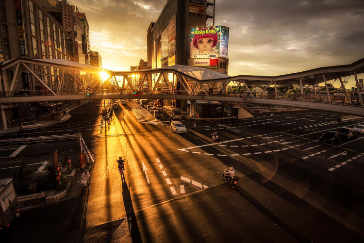
    Osaka Sunset

    Example of a warm split tone.

    I’m not talking about the color of the things in your photograph, like a red car or yellow dress. I mean the overall color cast, the tone of your image, is important too.

    Colors affect the way people feel, so much so that there is a whole body of science around it. Even some basic knowledge of color theory can help improve your photography.

    Beyond White Balance

    The first place to head when you want to change the tone is white balance. For instance, if it’s a gray cloudy day you might want to move the temperature slider towards the warmer side, making your image appear more yellow-orange, or sunny. Move it in the opposite direction, and your image will get cooler or more blue.

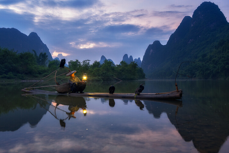
    Fisherman in Xingping China

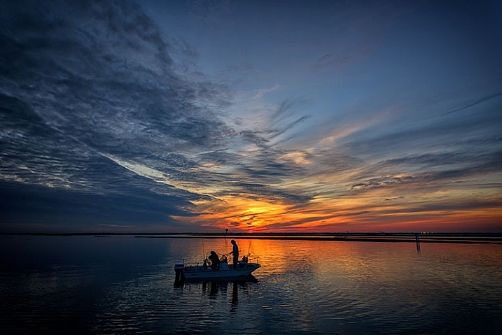
    Example of a cool split tone.

    Although changing the white balance of an image is helpful, it is still a global adjustment – it affects the entire image. In other words, editing the tone of your image with just the white balance is like a mechanic trying to fix an engine with a sledgehammer. It may not be the right tool for the job.

    To make more fine-tuned adjustments, and thus have greater control on the overall mood of your images, you may want to have a look at Split Toning.

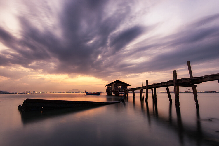
    Penang Sunrise at Fisherman Jetty

    Magenta and warm tones.

    A Bit of History of Toning

    Toning first started as a way to change the color of black and white photographs. For instance, in the past, chemicals were added to the development process to give prints a sepia tone. Later on, other chemicals toners were used to give images two different tones like red and blue.

    It may sound complicated, but in today’s digital darkroom, all split toning really means is that you add color to the shadows, highlights, or both. There are a number of ways you can split tone an image. One of the most common is to make the highlights yellow and shadows blue or vice versa. However, let’s take a look at how you can also adjust a single color, to create a particular mood in Adobe Lightroom (also possible in Photoshop and Bridge).

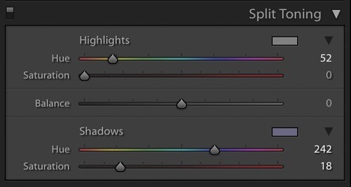
    Split Tone Window in Adobe Lightroom

    This is what the Split Toning slider looks like in Adobe Lightroom.

    Magenta Zen

    My favorite color cast to add to my images is magenta. Like a yin and yang varnish, this color (a purplish-red) represents harmony, balance, love, and personal growth. It has a calming effect that stimulates creativity and happiness.

    When split toning for magenta, I usually make my adjustments to either the shadows or highlights. I rarely make changes to both, as it tends to be overkill. More often than not, I adjust the shadows, as it’s usually the underexposed darker parts of the image I am trying to bring out. If the image is very bright then I edit for the highlights.

    Dubai Cityscape

    There is no rule as to how far you should move the sliders. However, I tend to move the hue slider somewhere between 230-250 and the saturation slider between 10-20. It all depends on the image and the intensity of the colors, shadows, and highlights. You can also use the eyedropper to choose the color.

    Another added bonus to adding some magenta is that it tends to take off the rough color edges. Browns, greens, and yellows are smoothed out, giving your photos a softer tone.

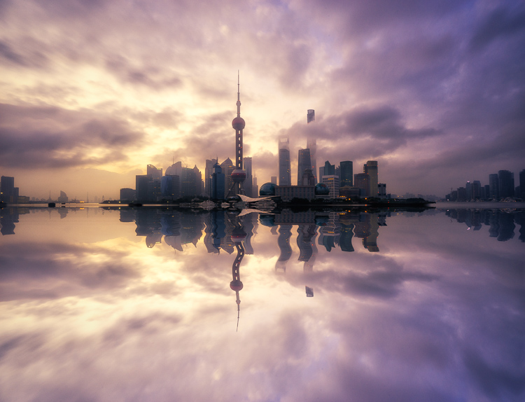
    Pudong Shanghai Cityscape

    Split Toning Keyboard Shortcuts for Lightroom

    There are a couple of shortcuts in the Lightroom Split Toning panel you’ll want to know about.

    First, it can be difficult to to choose the right color when the saturation strength is low. To briefly boost the hue up to %100 saturation, just press and hold Option on Mac (or Alt on Windows), then move the hue slider to either side. This will show the color at full strength so you can select it more easily.

    Second, to more easily view the colors split in the image, hold down Option/Alt and then drag the Balance slider in the Split Toning panel.

    Experiment

    Split Toning is much more than just magenta. Try adjusting the warmth or coolness in your photographs in the split toning panel, instead of using white balance for something different. You can also give your photos a cinematic feel, old film look, and more by split toning. Have fun, get creative, and find what works for you.

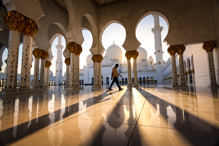
    Sunset at Sheikh Zayed Mosque in Abu Dhabi

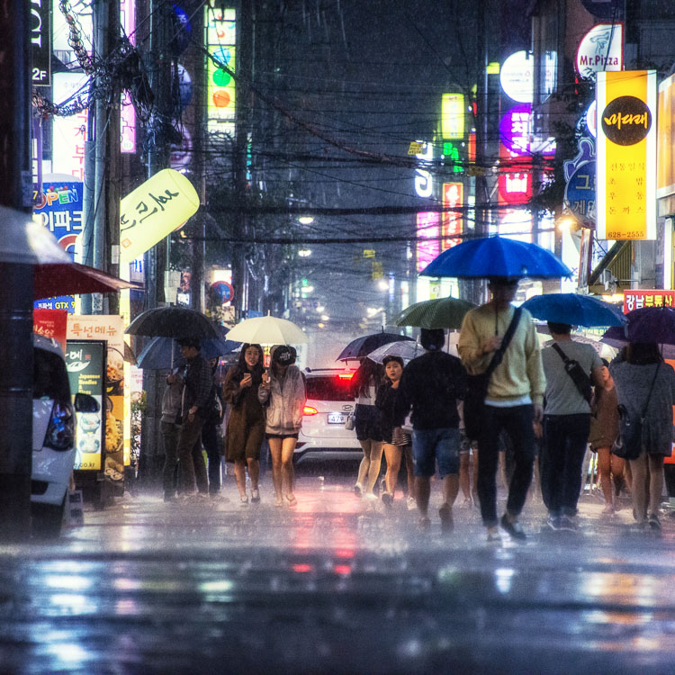
    Umbrellas in Busan Rain

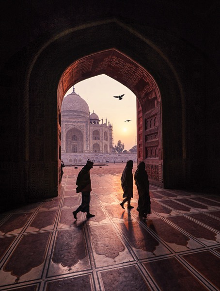
    Sunrise at Taj Majal

    googletag.cmd.push(function() {
    tablet_slots.push( googletag.defineSlot( “/1005424/_dPSv4_tab-all-article-bottom_(300×250)”, [300, 250], “pb-ad-78623” ).addService( googletag.pubads() ) ); } );

    googletag.cmd.push(function() {
    mobile_slots.push( googletag.defineSlot( “/1005424/_dPSv4_mob-all-article-bottom_(300×250)”, [300, 250], “pb-ad-78158” ).addService( googletag.pubads() ) ); } );

    The post How to Use Split Toning to Make Your Photos Stand Out by Pete DeMarco appeared first on Digital Photography School.


    Digital Photography School

  • Glitch Cities: Buildings Mysteriously Deleted from Chinese ‘Street View’

    [ By WebUrbanist in Art & Photography & Video. ]

    deleted buildings

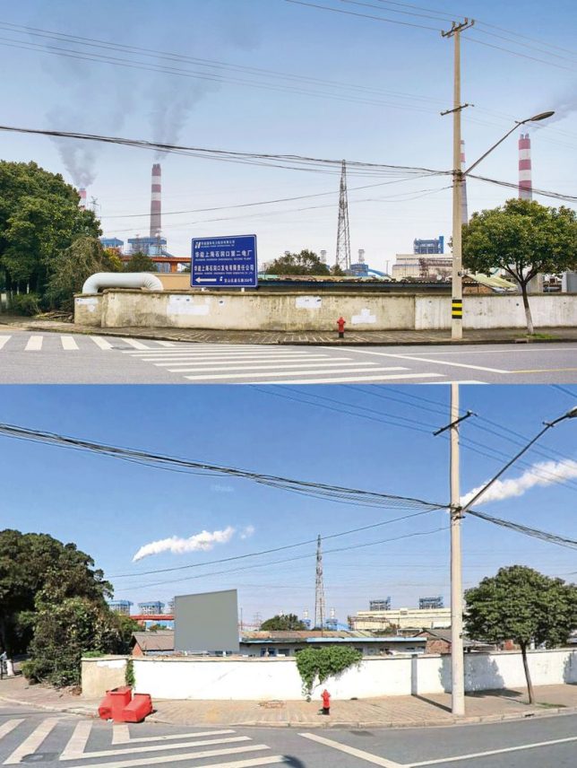
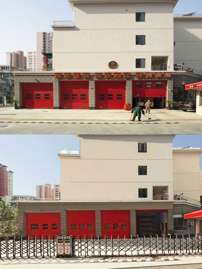
    All kinds of architecture is being inexplicably erased from the Baidu Total View image database (analogous to Google Street View) … and whoever is behind it is doing an oddly haphazard job of removing things.

    810 (4)

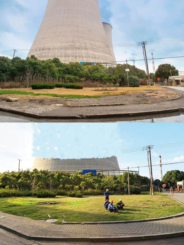
    Freelance photographer Jonathan Browning encountered this mystery a few years ago. He was searching for locations on Total View and discovered a half-erased bridge near some sooty factories and industrial complexes.

    810

    A resident of Shanghai, Browning dug deeper and found government buildings, prisons and other municipal infrastructure. These semi-deleted structures were all over, partially hidden in hundreds of Chinese cities viewed by hundreds of millions of monthly Total View users.

    810 (2)

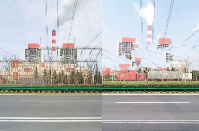
    In some cases, the partial deletions seem intentional – a building might remain with its sign and smoke stacks gone. In other instances, at least some attempt has been made to erase the entire structure. Often, aftereffects of cloning tools and other basic Photoshop-style manipulations are easy to spot in the picture. Since some of these structures are high, many of them have to be edited in dozens of surrounding views, too. Even normal-sized, street-facing buildings often show up in a few different shots.

    810 (1)

    Like Google Street view, the images found on Baidu are assembled from shots taken from cars (or persons) with mounted cameras. Also like their international counterpart, Total View removes some sensitive details, but the removals in this case don’t add up in terms of privacy or national security. If anything, they leave traces and thus highlight areas that people like Browning might find worth exploring.

    810 (3)

    Of course, Browning had to be careful when driving around and photographing places that someone (corporate or governmental) had decided shouldn’t be on publicly-accessible image maps. In the end, no one seems quite sure what these attempted deletions are all about, and the Chinese government, as usual, isn’t saying a thing (via BldgBlog and Wired).

    Share on Facebook


    [ By WebUrbanist in Art & Photography & Video. ]

    [ WebUrbanist | Archives | Galleries | Privacy | TOS ]


    WebUrbanist

  • Lightroom Mastery: The Power of the Adjustment Brush

    If there is one thing I wish I would have spent more time learning early on in my time with Lightroom, it’s the adjustment brush.

    Lightroom is an incredible editing tool, arguably the easiest one to use, and the quickest to learn. The one thing that took me a while to wrap my head around when starting out, was how to use the Adjustment Brush. In this article I’d like to share a quick excerpt from the new Lightroom Mastery course I created for Digital Photography School. I hope you find it helpful.

    Why the Adjustment Brush is Great

    Lightroom excels at making changes to the entire image (global adjustments) super simple and effective. It really becomes a joy to use Lightroom once you get the hang of it. Need to pull up the shadows in an overly-contrasty image?  No problem; just pull up the shadow slider.  Need to correct for overexposure?  Easy – just drop the exposure slider.

    But what do you do when you need to make a change to a very specific area (local adjustments), and you don’t want that to affect the rest of the image? This is exactly when you want to call upon the power of the Adjustment Brush.
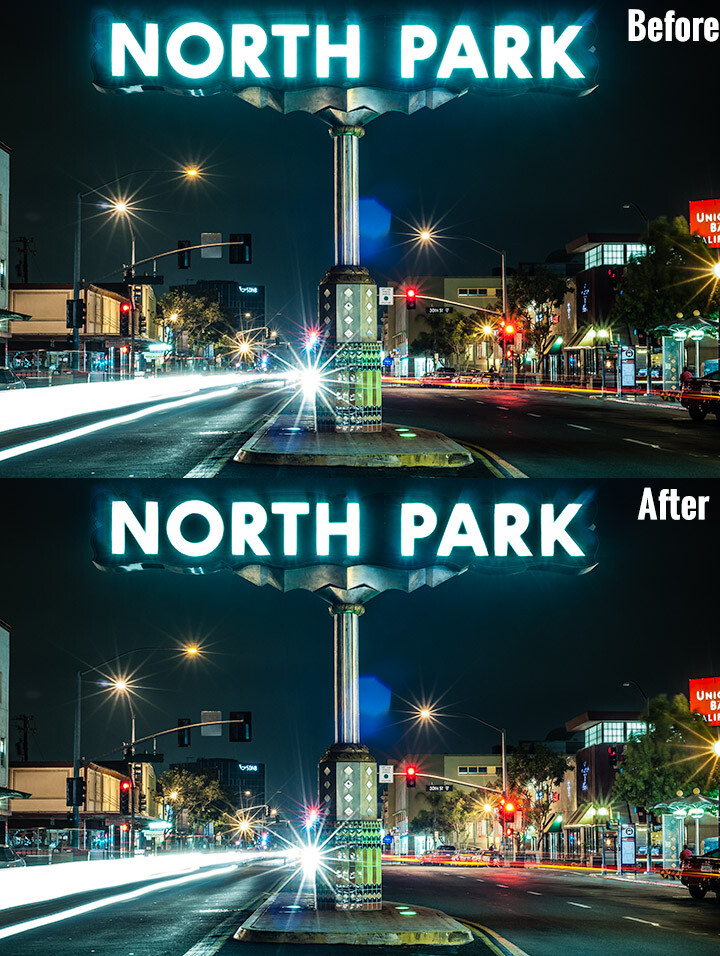
    Look at the difference an adjustment brush made in the sign, as well as brightening up the lower right corner.

    Look at the difference an adjustment brush made in the sign, as well as brightening up the lower right corner of this image.

    How the Adjustment Brush Works

    Instead of making a global change to the entire canvas, the Adjustment Brush enables you to get very specific and just paint over where you would like to make changes.

    This sounds simple, but is incredibly powerful – you now have the ability to affect big change in many different areas of your image, without resorting to bouncing the image over to Photoshop. Hey, I’m all about simplicity, and if I can get all my edits done in one program versus two, I’m all in!

    A Perfect Example – Corvettes and Chrome

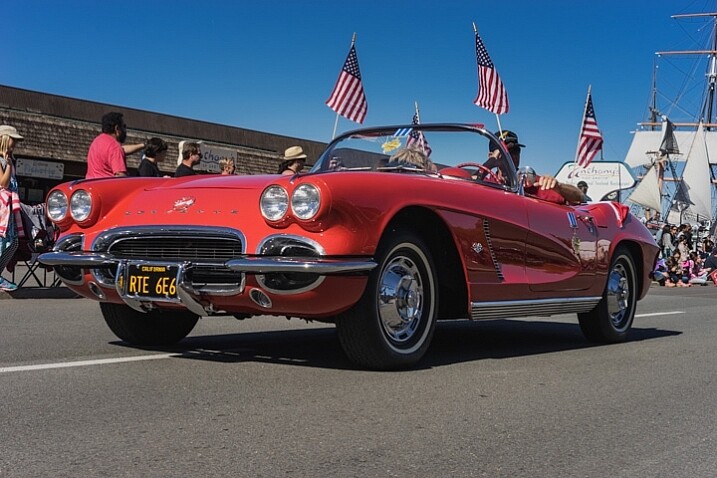
    A good friend had just come to visit me from China, we decided to walk around the neighborhood and managed to catch a parade. It may not look like it, but this was in November in San Diego, one of the benefits of fair weather every day. I caught this image of this beautiful car driving by:
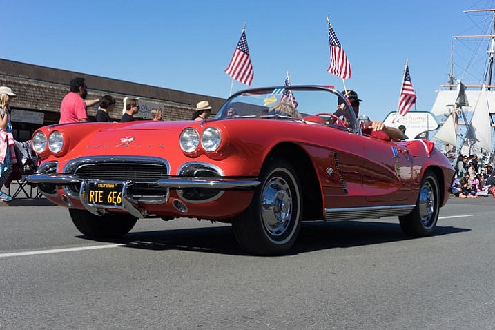
    Lightroom adjustment brush, lightroom mastery course, lightroom mastery, dps, corvette, chrome, parade

    I darkened the sky a bit and applied some more contrast to the ground and ended up with this:
    Lightroom adjustment brush, lightroom mastery course, lightroom mastery, dps, corvette, chrome, parade

    That looks good, but the photo really wasn’t capturing how bright the chrome wheels and bumper accents were. In short, I needed to do some local editing on just those pieces. Adjustment brush to the rescue!

    Time to Shine – Creating a Chrome Adjustment Brush

    Deciding where to start when creating your custom brush

    I knew the key to making this photo pop was getting that chrome to come back to life. I first clicked into my Adjustment Brush window (hit K on your keyboard or select the Brush tool from the top of the right hand panel in the Develop Module) and reset all the sliders back to zero. Since the wheels were not facing the sun, they were underexposed and caught in shadow.

    Creating the brush itself
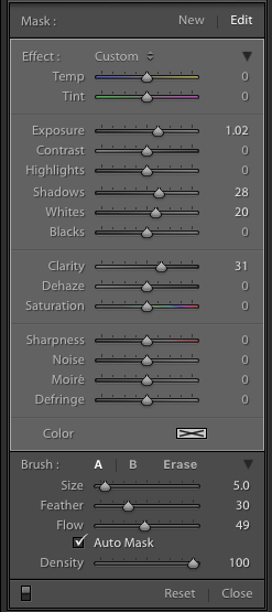
    Lightroom adjustment brush, lightroom mastery course, lightroom mastery, dps, corvette, chrome, paradeI decided to increase the exposure +1 stop, bump the shadows up to +28 to correct the darkness, and increase the whites to +20 to make the highlights in the chrome pop.

    For good measure I increased the clarity to +30 to make sure the edges in that chrome highlights were nice and snappy. Here is what the adjustment window looked like before I started painting (see right)

    This was an educated guess as to what I thought would work. If this worked well, I could leave it. If it didn’t, I could always move the sliders after painting, to change it as necessary.

    Painting with the Adjustment Brush – best practices

    There are a few guidelines I like to follow when painting with the Adjustment Brush. Here a few helpful tips to make this easy:

    • Use a brush size that is a bit smaller than the area you are trying to paint.  It helps if you don’t “color outside the lines”, although that is an easy fix if you do. A quick tip here: if you use a mouse with a scroll wheel you can change the size of your brush by scrolling up and down. It works the same with my Apple magic mouse.
    • Check the box for Auto Mask if you are painting something with fine edges you don’t want to go over. Auto Mask does a good job of keeping your brush inside the lines even if you go outside, which saves time.
    • I like to see the mask I’m painting versus the effects of the mask I’m painting. To have the mask show up in red either click Show selected mask overlay or simply click the O key on the keyboard to toggle the mask on and off.

    Let’s get painting!

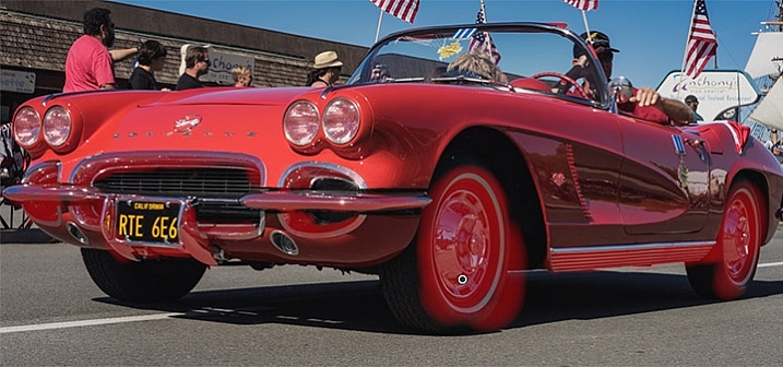
    I quickly painted over the wheels, front bumper, headlights, and any other chrome I could find. It’s a bit difficult to see, since the mask is nearly the same color as the car (you can change the mask color by clicking Shift+O repeated times until you find a better color) but here is what the mask looked like after my initial run:
    Lightroom adjustment brush, lightroom mastery course, lightroom mastery, dps, corvette, chrome, parade

    Using the eraser tool to clean up mistakes

    Wow, I’m apparently terrible at coloring inside the lines! In all reality, going outside the lines on this image didn’t make a noticeable difference, but we might as well do this right.

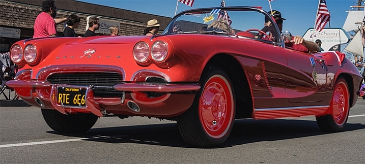
    To clean up areas where you’ve overpainted all you have to do is click Erase in your Adjustment Brush window. This will pull up a brush that will erase the mask area when you paint over it. This is important: make sure to click click the A or B brush after using the eraser so you don’t forget and start painting over areas with the eraser versus the brush by accident!

    After a quick clean-up I ended up with this, which is much better:
    Lightroom adjustment brush, lightroom mastery course, lightroom mastery, dps, corvette, chrome, parade

    Let’s turn off the mask and see how it looks

    Remember, to turn off the mask you can simply click the O key on your keyboard. Here you see my image after the adjustment brush has been applied:
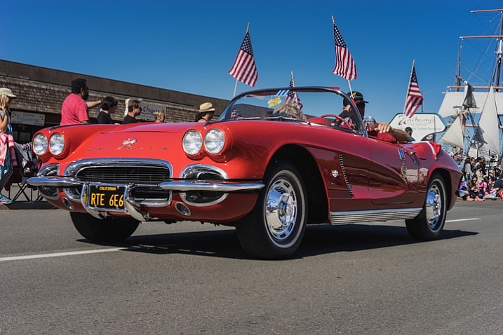
    Lightroom adjustment brush, lightroom mastery course, lightroom mastery, dps, corvette, chrome, parade

    Much better!  The chrome wheels and bumper are much brighter now, and look a lot better.  The only thing I don’t like now, is how dark the drivers-side door is.

    It’s a pretty easy fix to create a new brush to bring up the shadows, so I’ll do that.

    Starting a new mask in the same image

    It’s important to think of masks like layers. The wheels and bumpers are painted with one mask, that has one group of settings.

    If I want to make a new adjustment brush with different settings for the door, I need to create a new mask, as opposed to just moving the sliders around. If I move the sliders around without creating a new mask, that will make changes to the current active mask (my wheels and bumpers).

    To make a new mask just click New at the top of the mask menu. I only increased the exposure setting to +1 to add a full stop of light to the side, painted over the door and rear of the car, and got this:
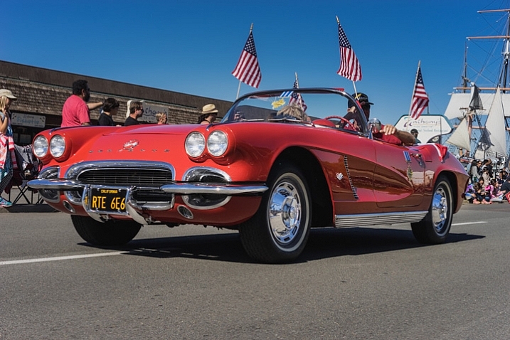
    Lightroom adjustment brush, lightroom mastery course, lightroom mastery, dps, corvette, chrome, parade

    Let’s compare that to the second edit before I used any adjustment brushes:

    Lightroom adjustment brush, lightroom mastery course, lightroom mastery, dps, corvette, chrome, parade

    Before Adjustment Brushes were applied.

    Much better!

    This is just one simple example, the sky’s the limit!

    There are endless possibilities with the adjustment brush. I could have changed the color of this entire car if I wanted to as well.

    You can lighten up dark areas of images and vice versa. You can apply sharpening or clarify to individual areas. You can do a whole host of beauty editing like whitening teeth, giving eyes more color,  and more.

    If you found this helpful, you will LOVE the new DPS Lightroom Mastery course!

    lightroom-mastery.jpg

    There are far too many excellent tips to learning how to master Lightroom to include in a blog post, so Digital Photography tasked me with creating the best and most comprehensive Lightroom video course on the web!

    In Lightroom Mastery I break down everything in Lightroom and teach you more in three hours, than most photographers learn in years. I cover every module, tool, tip, and trick from my 10 years using Lightroom.

    During the initial launch, dPS is doing a huge 50% discount on the course!  The price will regularly be $ 99, but during this special launch it’s only $ 49!

    Go grab the course before the sale is over

    You can click this link to learn more about what is included in the course, watch a preview video, and purchase the course!

    googletag.cmd.push(function() {
    tablet_slots.push( googletag.defineSlot( “/1005424/_dPSv4_tab-all-article-bottom_(300×250)”, [300, 250], “pb-ad-78623” ).addService( googletag.pubads() ) ); } );

    googletag.cmd.push(function() {
    mobile_slots.push( googletag.defineSlot( “/1005424/_dPSv4_mob-all-article-bottom_(300×250)”, [300, 250], “pb-ad-78158” ).addService( googletag.pubads() ) ); } );

    The post Lightroom Mastery: The Power of the Adjustment Brush by Mike Newton appeared first on Digital Photography School.


    Digital Photography School

  • Epson’s 4K home projectors to go on sale next month

    Printer and projector manufacturer Epson is set to begin sales of three 4K UHD digital projectors that feature HDR and 3D support, as well as extremely long lamp life. The EH-TW7300, EH-TW9300 and EH-TW9300W are designed for the home cinema market and come with a new high resolution 16-element lens. Each of the projectors uses Epson’s 3LCD-panel technology and boasts white and colored light output of 2,300 lumens in the case of the TW7300 and up to 2,500 lumens for the TW9300 and TW9300W. The TW-9300 and TW-9300W also offer a contrast ratio of 1,000,000:1 (the TW-7300 has a ratio of 160,000:1), while the TW-9300W is Wi-Fi enabled and can receive 4K, HDS and standard definition content wirelessly from host devices.

    Epson claims that the bulbs in these projectors have a lifespan that allows users to watch a movie every day for seven years (based on that movie being 1 hour and 45 minutes long) with the bulb in Eco mode, and the projectors can remember up to ten lens positions to make viewing different image formats easier.

    The projectors have been announced at different times in different regions but will go on sale in September at £2199, £2999/$ 2999 and £3299/$ 3299. In the USA the TW-9300 and TW-9300W will be called 5040UB and 5040Ube.

    For more information visit the Epson website.

    Press release:

    Enhancing the immersive, big-screen movie experience, Epson adds 4K enhancement, HDR and UHD Blu-ray support to three new home cinema projectors

    Usability is also improved with lens position memory and motorised optics

    Passionate film enthusiasts can get exceptional image quality at home with the latest state-of-the-art projectors from Epson. For the ultimate home cinema experience, the EH-TW7300, EH-TW9300, EH-TW9300W have been designed to offer 4K enhancement, UHD Blu-ray and high dynamic range support, motorised optics and lens position memory.

    These HDR compatible home cinema projectors combine the latest imaging technologies to bring movies to life with extra detail. They feature 4K enhancement to bring a new level of finesse to the texture and resolution of the projected image, whether they’re displaying native 4K content or digitally upscaling Full HD 1080p content. The projectors are also designed to support the most advanced content, including HDR and 4K UHD Blu-ray discs. This gives users the optimal visual experience with more depth, detail and natural yet intense colours. In fact, their expansive colour gamut displays the entire sRGB and DCI colour spaces.

    All three projectors deliver incredible definition, clarity and the deepest blacks due to an exceptionally high contrast ratio of up to 1,000,000:1 (EH-TW9300/ EH-TW9300W) and a new 16-piece glass lens. Colours are also rich and vivid thanks to Epson’s 3LCD panels that emit an equally high White and Colour Light Output of 2,300 lumens (EH-TW7300) or 2,500 lumens (EH-TW9300/ EH-TW9300W). In addition, frame interpolation and detail enhancement help to create sharp, smooth and flowing images.

    Keeping maintenance to a minimum, these projectors’ incredibly long lamp life means the user can watch a film every day on the big screen for the next seven years1. Installation is also simple and precise thanks to motorised optics, including a powered 2.1x optical zoom, powered focus and a new powered lens shift of ±96.3% vertical and ±47.1% horizontal. It’s quick and easy to switch between different aspect ratios, as the projectors are capable of storing up to ten different lens memory positions, enabling viewers to watch films as the director intended.

    With the EH-TW9300W 4K WirelessHD projector, it’s effortless to stream content to a projector from a smartphone, games console, Blu-ray player and more. The 4K WiHD transmitter makes it possible to view high-quality 4K content over WiHD, also providing flexibility when positioning the projector.

    Charlotte Hone, Product Manager, Epson UK, says: “We want customers to achieve the very best cinematic experience at home, so we’re really excited to be introducing the EH-TW7300, EH-TW9300 and EH-TW9300W. The latest technologies integrated in these models, such as 4K enhancement and UHD Blu-ray and HDR support, mark a significant improvement in image quality and will really enhance the user’s overall experience. But what’s great is that they’re also easy to use, with motorised optics and lens position memory making everything from installation to every day use simple and hassle-free.”
    The EH-TW7300, EH-TW9300, EH-TW9300W are available from September 2016, priced at £2,199, £2,999 and £3,299 respectively.

    Articles: Digital Photography Review (dpreview.com)

  • Lens Review: Sigma 20mm F1.4 DG HSM Art Lens

    In my opinion, one of the best developments to happen in photography recently is the stepped-up offerings of third party lens manufacturers. Early in my photography career, third party lenses were decent alternatives for a lower cost option, but my own experience was that the cost savings also came at a cost in performance. Those lenses weren’t as sharp, focused slower, and weren’t built to the same quality of similar lenses by Nikon and Canon (and other camera brands).

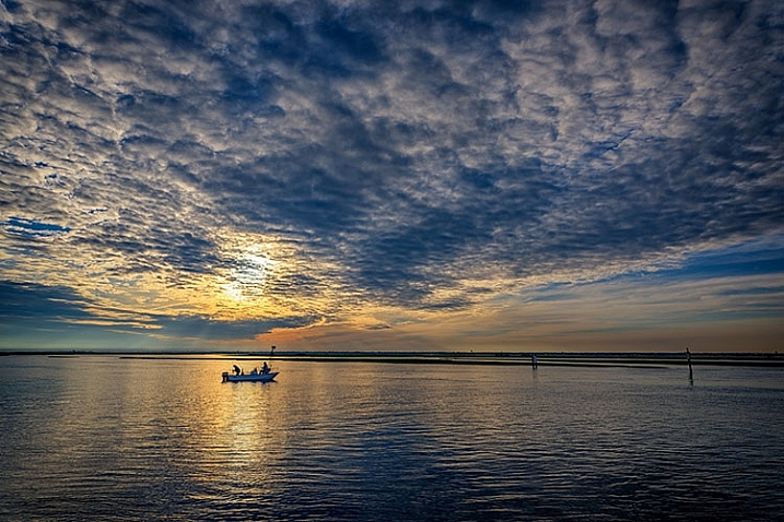
    Sample image from Sigma 20mm f/1.4 DG HSM Art

    The Sigma 20mm lens allows for capturing expansive views when photographing landscapes.

    Enter Sigma’s Art lineup of lenses. When the Sigma 35mm f/1.4 Art lens was introduced in 2012, it ushered in a new era of third party lenses, giving users lower cost options while maintaining high image quality and performance. As Sigma has continued to build out their Art lineup, adding a 50mm f/1.4, a mind-boggling 50-100mm f/1.8 zoom for APS-C cameras, and others – photographers are gaining new respect for Sigma as a lens maker. Recently, Sigma announced a new entry, the 20mm f/1.4 DG HSM Art lens, and I was thrilled to have an opportunity to try it out.

    First Impressions: Sigma 20mm f/1.4 Art Lens

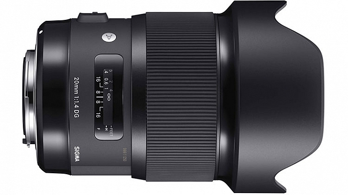
    Sigma 20mm f/1.4 DG HSM Art

    Image courtesy of Sigma

    When the lens first showed up on my doorstep, I immediately unpacked it to see what Sigma has done.  It is impressive. An ultra-wide angle lens with an ultra-fast maximum aperture, the 20mm f/1.4 Art lens is one with quite a few applications including; photojournalism, wedding photography, street photography, and landscapes, to name a few. If the image quality for this lens lives up to the reputation of previous Art lenses, it’s going to be an incredible lens to work with.

    A quick glance at the major manufacturers’ websites reveals that no other lens maker builds a 20mm lens with a maximum aperture as large as the Sigma 20mm f/1.4 Art lens. That fast aperture allows a lot of room for use of shallow depth of field, or for working in low light conditions. It also makes applications such as astrophotography a bit easier as well. The minimum aperture is only f/16, as opposed to f/22 on lenses such as the Canon Ef 24mm f/1.4. While that is not a huge issue, it does mean that when you’re trying to use slow shutter speeds on sunny days, a filter may be necessary.

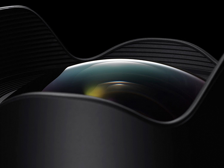
    Detail image of Sigma 20mm f/1.4 DG HSm Art

    The bulbous front element of the Sigma 20mm f/1.4 DG HSM Art lens. Photo courtesy of Sigma.

    Out of the box, the lens is fairly sizable (90.7mm x 129.8mm / 3.6  x 5.1 inches) and is a bit heavy (950 g / 33.5 oz.). It is considerably larger than my Nikon 24mm f/1.4 G or the Canon EF 24mm f/1.4L II. The outer barrel does have a bit of plastic feel to it, but the brass mount and considerable heft, assuage any fears of cheap build quality. Constructed of 15 elements in 11 groups, including F Low Dispersion, Special Low Dispersion, and aspherical elements, Sigma claimed class-leading image quality. I found minimal distortion and chromatic aberration in images I shot with this lens, and what I did find was easily corrected in Lightroom or Photoshop. The lens features a 9-blade rounded diaphragm aperture, excellent for soft rounded bokeh in out of focus areas of the image. Minimum focusing distance is 27.6 cm or 10.9 in.

    My one disappointment with the lens is the bulbous front element, which eliminates the ability to use either screw-in filters such as polarizers, or the smaller 100mm drop-in filters. While I have a set of 150mm filters, my adapter would not fit the lens, and other manufacturers had yet to build an adapter that works. I am told by several filter manufacturers that they are working on a suitable adapter for the 150mm filter kits on the market.

    The Sigma 20mm in the field

    Sample image from Sigma 20mm f/1.4 DG HSm Art

    Being a landscape photographer, the first thing I wanted to do was take this lens for a spin at one or two of my favorite local spots. While the lack of filters meant I had some difficult choices to make when photographing the sunset, I was anxious to use the wide angle lens to accentuate the foreground and the sky.

    The Sigma 20mm f/1.4 Art gave me no issues and focused smoothly on my subject. The 94.5° field of view on a full frame sensor provides a nice panoramic image, allowing you to emphasize the immediate foreground while creating context in showing the background. The necessity of filters will be more dictated by your camera sensor’s dynamic range, but I found on my Nikon D810, I was able to expose for the highlights and recover the shadows in post-production. Sharpness throughout the scene was excellent, with minimal distortion and loss of resolution at the corners. Color and contrast are excellent as well.

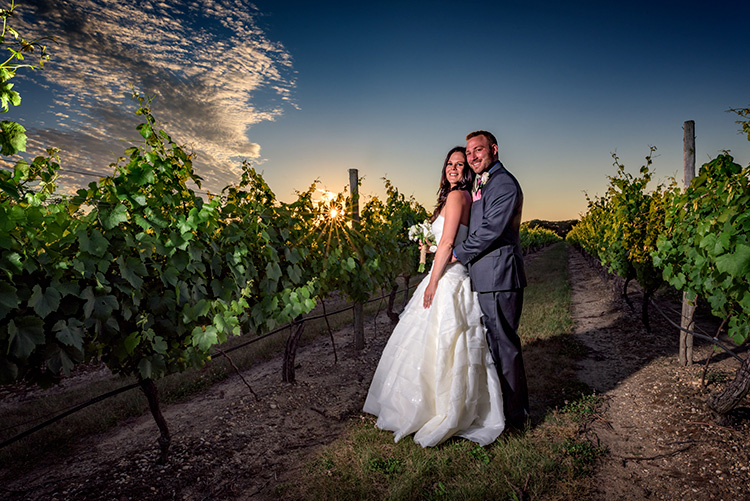
    20160624_Maureen-Chuck_0611b

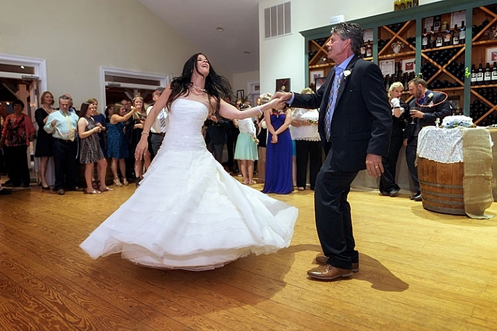
    My next test was to try the lens at a wedding. I will often employ a wide angle lens for capturing action on the dance floor, and occasionally for environmental portraits of the bride and groom like the image above. I found the Sigma 20mm f/1.4 Art lens excelled in both instances.

    On the dance floor, even in low light, I found the lens to focus quickly and accurately. The fast aperture allowed me to minimize my use of flash in the reception hall (below), and use the ambient lighting for a more natural, festive look. In addition, for the formal portraits I used the lens outdoors at sunset for some bridal portraits, and was impressed with the image quality in a high contrast situation. I used an external strobe to light the bride and groom (image above), with the sunset in the background, and stopped all the way down to f/16 for a starburst effect on the sun.

    Sample wedding image from Sigma 20mm f/1.4 DG HSM Art lens

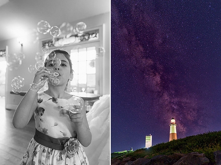
    My final test was to do some astrophotography with the lens. In the past, I’ve used both the Nikon 24mm f/1.4 and the Canon EF 24mm f/1.4L II lenses, and while both were satisfactory, each has a tendency to produce some comatic aberration, especially in the corners.

    While I did find some coma using the Sigma 20mm f/1.4 Art, I found it to be less noticeable than either the Nikon or the Canon. The fast f/1.4 aperture allowed me to capture the stars, while using an ISO of 800 and a 15 second exposure time. If nothing else, this lens is an astrophotographer’s dream, being wider than any other f/1.4 lens currently on the market, which allows for capturing expansive sections of the night sky.

    Sample images from Sigma 20mm f/1.4 Dg HSM Art lens.

    Summary

    In the 20mm f/1.4 Art lens, Sigma has managed to build an exceptional, wide aperture, wide angle lens that will suit a variety of photographers, from photojournalists, to landscape artists, street photographers and wedding photographers. Priced at $ 899, it’s less than half the price of the equivalent Nikon or Canon 24mm lenses, and provides a wider angle. Nikon’s 20mm f/1.8G is as close as the major manufacturers get to this lens, at a cost of $ 100 less than the Sigma. The Sigma 20mm f/1.4 DG HSM Art is available in Canon, Nikon, and Sigma mounts.

    I highly recommend this lens to anyone in the market for an ultra-wide, ultra-fast lens. My one caveat is that if you’re not already invested in a 150mm filter system, you will need to do so if you want to use filters with this beast.

    googletag.cmd.push(function() {
    tablet_slots.push( googletag.defineSlot( “/1005424/_dPSv4_tab-all-article-bottom_(300×250)”, [300, 250], “pb-ad-78623” ).addService( googletag.pubads() ) ); } );

    googletag.cmd.push(function() {
    mobile_slots.push( googletag.defineSlot( “/1005424/_dPSv4_mob-all-article-bottom_(300×250)”, [300, 250], “pb-ad-78158” ).addService( googletag.pubads() ) ); } );

    The post Lens Review: Sigma 20mm F1.4 DG HSM Art Lens by Rick Berk appeared first on Digital Photography School.


    Digital Photography School
  • Photoshop CC 2015.5.1 available

    Photoshop CC 2015.5 introduced tools like content-aware crop, seen here.

    Adobe released Photoshop CC 2015.5 in June, introducing features like content-aware crop and aiming to enhance the program’s performance. Now the company has released 2015.5.1, resolving a number of customer-reported bugs. Photoshop CC customers can download the update as of now by opening the program and navigating to Help > Updates.

    Customer reported issues resolved

    • Fixed customer submitted crashing issues
    • Subtool reverts to primary tool after using keyboard shortcut
    • Unable to Export individual layers that are nested in Artboard > Group
    • “Rasterize EPS Format” dialogue box doesn’t remember Mode setting
    • Embed color profile result reflects whatever it was set last time
    • Text accidentally commits when try to transform Paragraph text using bounding box transform handles
    • Cursor doesn’t correctly change to Commit cursor to differentiate from Rotate and Move cursor
    • Print color is off when using App Manage Color (Mac only)
    • Error: “Could not apply the workspace because the file was not found” when opening a file

    Several fixes and improvements for Select and Mask:

    • Select and Mask: Command not available on non-pixel layer masks
    • Select and Mask: Refine Edge Brush Tool creating artifacts along the brush stroke in mask
    • Select and Mask: Redraw corruption (RGB 16bit/32 bit) with Show Original in certain zoom levels (preview mode “black and white”)
    • Select and Mask: Using the Refine edge brush on one area of a pre-existing selection may cause certain hard edges in another area to change a few pixel values, especially when the image is in very high resolution
    • Select and Mask: Using brush tool with feather 8 or more and zoom level 50 or lower get redraw issue
    • Select and Mask: With a selection, the output defaults to selection, even if the previous output setting was a mask
    • Select and Mask: Inverting a selection outputs the original selection
    • Select and Mask: Crash when double-clicking adjustment mask
    • Select and Mask: Program error when image is multi-channel

    Articles: Digital Photography Review (dpreview.com)

  • 5 Ways Travel Can Inspire Your Wedding Photography

    If you’ve shot a wedding you’ve likely had that moment where some obscure family tradition threw you off balance, you struggled to attach the right lens in time, and missed that once-in-a-lifetime shot. You can shoot a thousand weddings, but without knowing what to look for, you just might miss the biggest moments of the couple’s wedding day. But, if Continue Reading

    The post 5 Ways Travel Can Inspire Your Wedding Photography appeared first on Photodoto.


    Photodoto

  • Floating in Space: Milky Way Reflections on Mirror-Like Salt Flats

    [ By SA Rogers in Art & Photography & Video. ]

    milky way 2

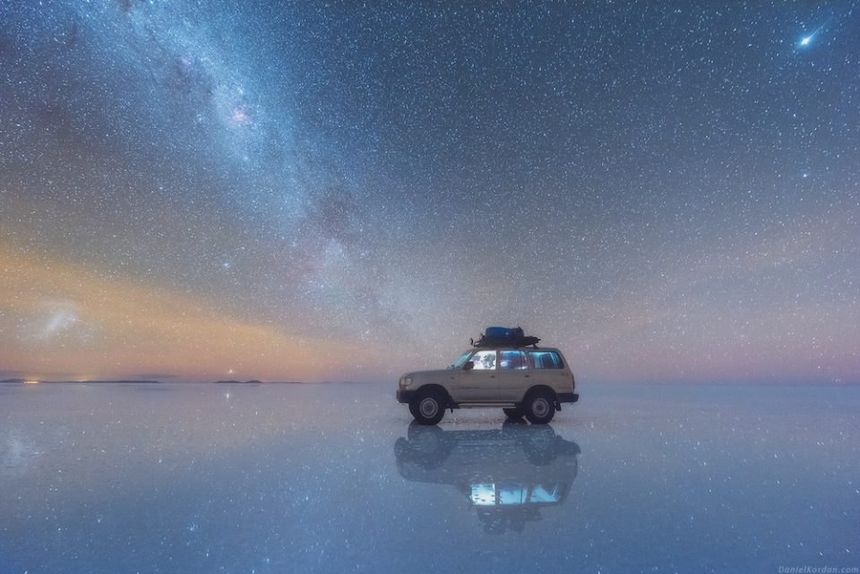
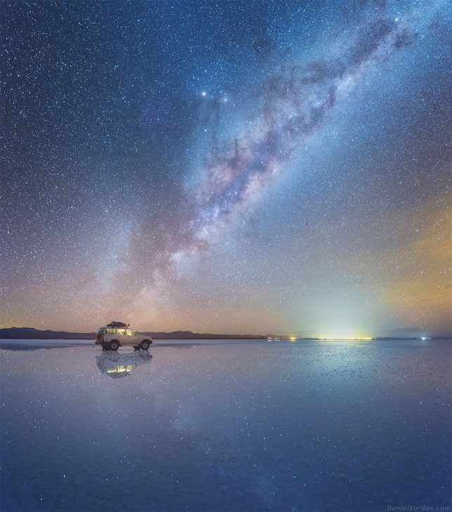
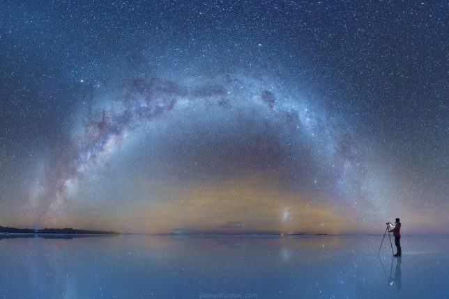
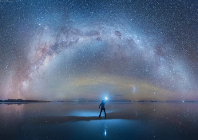
    Perhaps nowhere on Earth is there a more beautiful place to take in crystal-clear views of the starlit sky than the pristine Salar de Uyuni in southwest Bolivia, which boasts a mirror-like reflective surface in some spots. The largest salt flat in the world provides an incredible setting for photographer Daniel Kordan, who traveled there in search of the darkest possible sky. Avoiding light pollution can be tough even in rural areas, but not only is this mineral-coated landscape sufficiently far from urban areas, it’s also sort of alien-like in its own right.

    milky way 4

    milky way 1

    In an interview with My Modern Met, Kordan says the salt flats were so dark, he couldn’t see anything at all until his eyes adjusted. Then, suddenly, the stars were underneath him as well as above. “It seemed that we floated in open space. Our spaceship is parked in a distance, and stars are blinking with blue, red and yellow colors.”

    milky way 3

    A graduate of the Institute of Physics and Technology in Moscow, Kordan travels the world in search of the most photogenic landscapes, and judging by his portfolio as well as his increasingly popular Instagram, he’s had no trouble finding and capturing them. In addition the salt flats, the photographer has taken gorgeous photos of natural settings i Greece, New Zealand, Greenland, Tuscany, Scotland, Patagonia and many other locales. Check out his personal favorite collection of images he’s taken, replete with glaciers, ice caves, dramatic sand dunes and the aurora borealis.

    milky way 4

    milky way 5

    “I have been fascinated by the possibilities of photography since my early childhood,” says Kordon on his website. “I grew up at beautiful lake region under Moscow exploring wild nature, spending most of my free time in nature. I graduated the art painting school when I was a kid. Mix art, nature, constant activities and you’ll receive a summary – art of Landscape photography. Life started swirling me, pushing me into the rush. University, hard work on my quantum physics thesis, family and friends… but there is alway sa pleasure in the pathless woods: places I always returned and always admired. Nature is my inspiration, with all the beauty and variety of colors and compositions.”
    Share on Facebook


    [ By SA Rogers in Art & Photography & Video. ]

    [ WebUrbanist | Archives | Galleries | Privacy | TOS ]


    WebUrbanist

  • F-Stop abandons KitSentry Kickstarter, doesn’t offer backers refunds

    F-Stop Gear has announced that KitSentry, the bag it sought (and successfully raised) funding for on Kickstarter, will not be brought to market. The notice, which was posted as the final update for Kickstarter backers on Sunday, details various production issues and expenses that ultimately made KitSentry less than ‘economically viable.’ The company’s explanation is at odds with a report published in a recent investigative article by Resource Magazine, however, where an insider claims the Kickstarter campaign ‘was a sham from the beginning.’

    The Kickstarter campaign launched on February 23, 2015 and sought funds for KitSentry, a product F-Stop described as ‘the next generation smart bag.’ The campaign was reached its goal on March 3, 2015 and ultimately raised $ 27,039 by its end. The first sign of trouble arose with an August 2015 update in which F-Stop said it would be pushing back all of its deadlines by three or four months. By the time its April 2016 update was posted, backers were agitated and many were demanding refunds.

    In the final update posted yesterday, F-Stop cited ‘two big problems’ it couldn’t overcome: trouble getting around existing patents and higher than anticipated production costs. ‘While we may have been able to overcome one of the obstacles,’ the post explains, ‘the two combined have proven to be too much at this time. Even after the additional investment of time and money, it has become obvious that KitSentry is not economically viable.’

    It doesn’t appear backers will be refunded, with F-Stop instead offering ‘a goodwill credit toward any f-stop product, equal to the amount pledged on Kickstarter.’

    Earlier this month, however, Resource Magazine published an article detailing the troubled campaign and a conversation the piece’s author Jaron Schneider had with a contact he said he ‘greatly’ trusts. That source claimed, in part, that F-Stop’s CEO has been hemorrhaging company money with a lavish personal lifestyle, unsustainable projects, premature promises and mismanagement. 

    Among other things, the source stated:

    In regards to the KitSentry Kickstarter, it was a sham from the beginning. A former colleague of the CEO apparently ‘stole’ an idea the CEO had and was trying to execute KitSentry in some form or another. Once that former colleague started creating public info about that product, the CEO got spooked and forced his now-former marketing team to create a Kickstarter campaign to raise funding for a half-baked product. Once the funding was raised, he transferred all the funds to himself, leaving nothing to the actual development team to spend on creating KitSentry itself.

    Via: Kickstarter

    Articles: Digital Photography Review (dpreview.com)