Blog

  • 10 Photography Accessories You Can Buy at the Supermarket

    Let’s face it, we photographers are always looking for new stuff to add to our bag of tricks.

    As a studio photographer with almost 20 years experience, I have found myself repurposing a lot of stuff to use as photography tools in my photoshoots. I came to the conclusion that most of the stuff I have around the studio, or in my camera bag didn’t came from photography equipment stores, but rather from the supermarket, home improvement stores, or even one dollar stores.

    Here is a small list of items that you can find easily in a store near you, which might help out a lot in your future photo projects:

    1 – Cupcake nozzles

    01

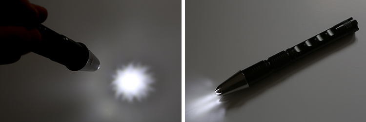
    These nozzles are used by bakers to decorate cakes, and you can find them in many shapes and sizes. If you take them out of context, they make great light modifiers when used in front of a flashlight, allowing you to shape and control your light, when you want to do some light painting for example.

    02

    2 – Shower caps

    03

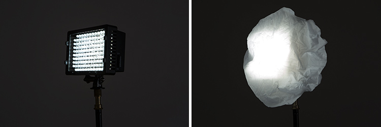
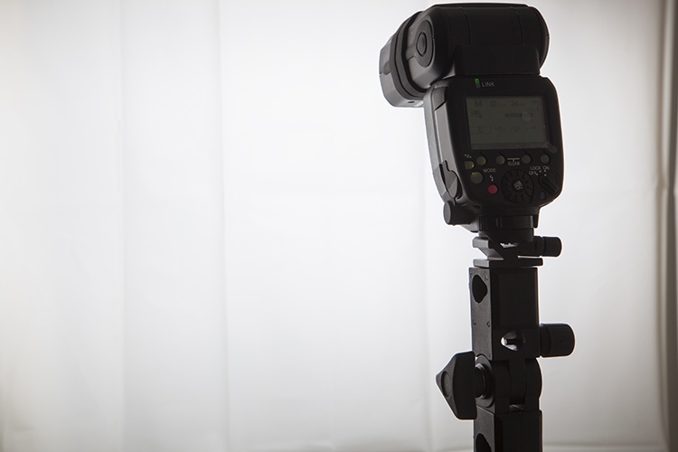
    This is something you can buy really cheap or even get for free in hotel rooms. I always have some laying around in my camera bag, and I use the white ones as light diffusers for flash or LED lights.

    04

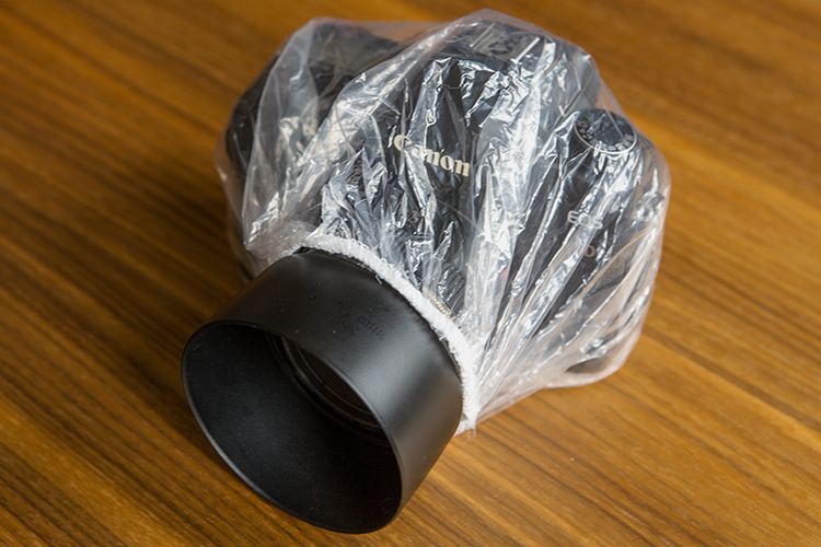
    I also use the transparent ones as a rain cover for the camera body. It’s not something for heavy rainfall, but it can save your equipment in an emergency situation, and you can still see the LCD and camera buttons with it.

    05

    3 – LED light strips

    06

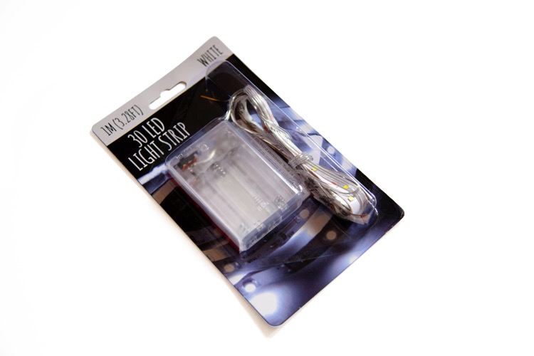
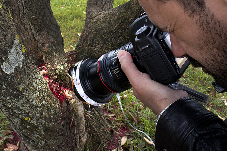
    These lights can be carried anywhere as they work with 3 AA batteries, and can be used in lots of different situations. I used them a lot as macro ring lights with the strip wrapped around my lens shade.

    07

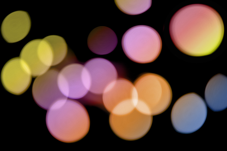
    These lights are also great to create light bokeh backgrounds, just put them over a black surface and turn your lens out of focus.

    08

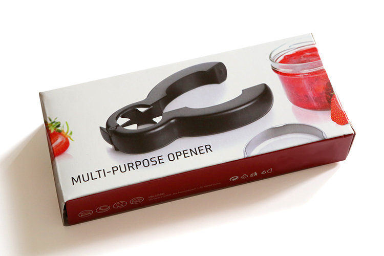
    4 – Multi-Purpose Opener

    This tool is made to be used around the kitchen, but I have been using it for years in my studio for a lot of different purposes.

    09

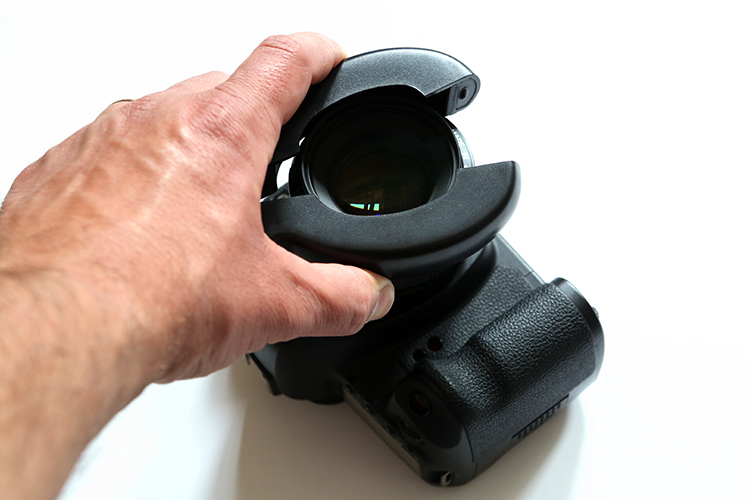
    The main use I have for it is for that really frustrating task of trying to unscrew a stuck filter on the front of your lens. Even though there are specific clip plastic tools for that job that you can buy in photography stores, I always find myself breaking them or scratching some really expensive filter.

    This multi-purpose opener has a rubberized inside and offers a much better grip, besides fitting every filter size you might have.

    10

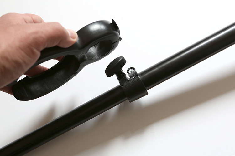
    It is also able to open any metal or screw cap bottle if you happen to get thirsty, and, last but not least, it is a great tool to open stuck thumb screws like the one you find on tripods or light stands for example.

    11

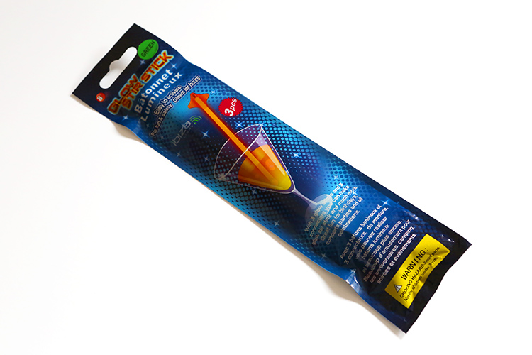
    5 – Glow Stir Sticks

    12

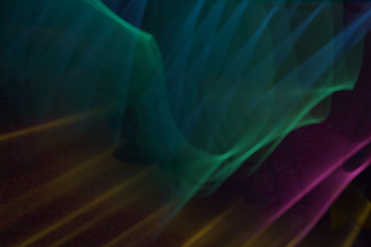
    These glow sticks, besides being a must at any cocktail party, are also really fun to use as a light source for light painting. They can be found in different colors and sizes and can glow for a few hours, allowing you to make fun images like this next one.

    13

    6 – Shower Curtains

    14

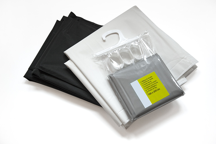
    Shower curtains are usually made out of plastic or waterproofed fabric. They are really cheap and can be used as great accessories for light control.

    I use white ones a lot as light diffusers, black ones as flags, and grey ones as backgrounds, but there is a lot that can be done with colorful ones for backgrounds or light color effects.

    15

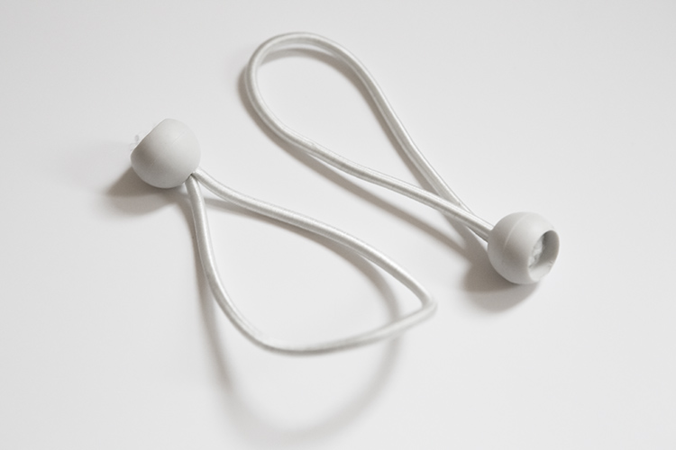
    7 – Ball Bungee Ties

    16

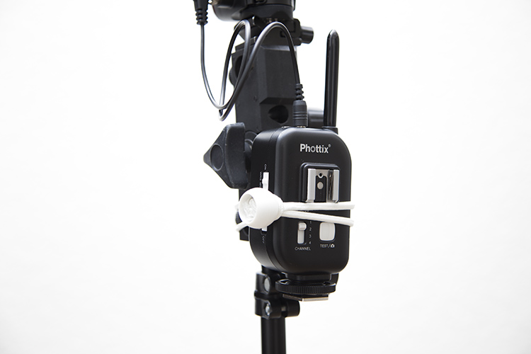
    It’s amazing what some elastic cord and a plastic ball can do together. This simple, but really effective tool, is used most of the time to tie cables, but there are a lot more uses for it. I use them a lot to hold my flash triggers to the light stand.

    17

    8 – Spring Clamps

    18

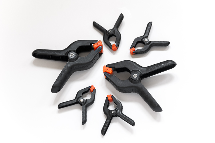
    I lost count of how many of these I bought through the years. Every time I see them on sale anywhere, I just buy a few more.

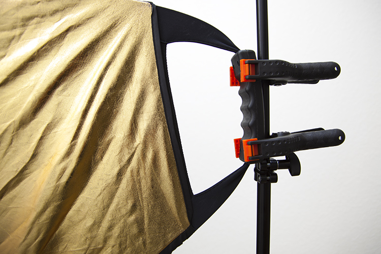
    These are a must have item in any photography studio, whether it is to make your model’s clothes fit a little better, to hold cables and power cords in place so I don’t trip on them, or simply to hold that reflector in that position that will provide the best reflection possible.

    19

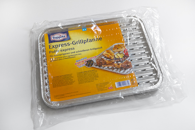
    9 – Express Grill Pan

    20

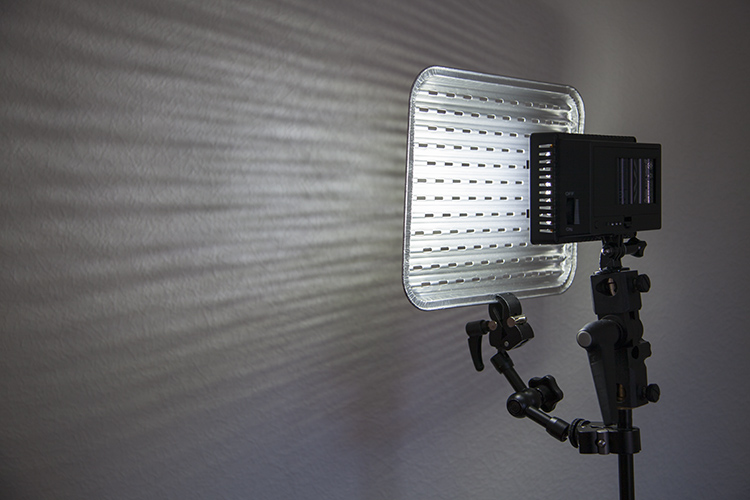
    These pans made out aluminum foil are great if you want to make a barbecue in a rush. But they’re also great to use as gobos that you can use in front of your light source to create special light effects.

    21

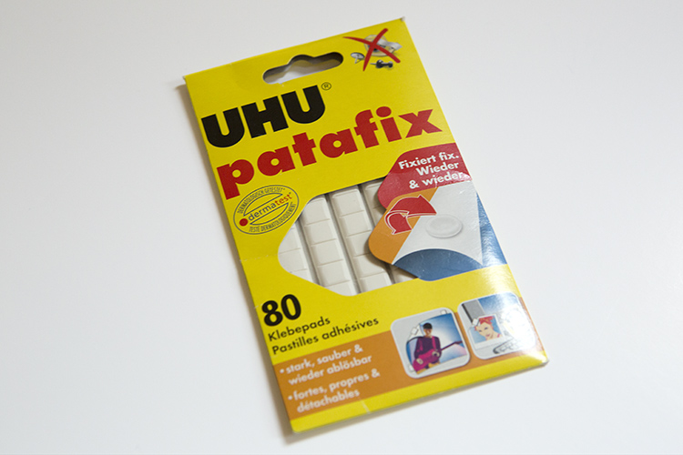
    10 – Reusable Putty-Like Adhesive

    22

    This type of adhesive is a lifesaver for product and macro photographers that need to keep small objects in a specific position.

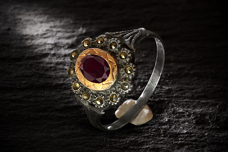
    It is moldable, reusable, and doesn’t leave any residue when you remove it. I use it a lot in jewelry photography to keep things in place, and just remove it (clone it out) in post-production afterwards.

    23

    So, keep these tips in mind next time you are dragging your shopping cart down the supermarket aisles. Maybe you can find some great accessories for your photography!

    googletag.cmd.push(function() {
    tablet_slots.push( googletag.defineSlot( “/1005424/_dPSv4_tab-all-article-bottom_(300×250)”, [300, 250], “pb-ad-78623” ).addService( googletag.pubads() ) ); } );

    googletag.cmd.push(function() {
    mobile_slots.push( googletag.defineSlot( “/1005424/_dPSv4_mob-all-article-bottom_(300×250)”, [300, 250], “pb-ad-78158” ).addService( googletag.pubads() ) ); } );

    The post 10 Photography Accessories You Can Buy at the Supermarket by Ivo Guimaraes appeared first on Digital Photography School.


    Digital Photography School

  • How to Use Adobe Camera Raw and Photoshop to Make Your Landscape Images Pop

    Photoshop is a wonderful tool if it is used correctly. Yes, there is a way to use it right. The basic idea is that if someone can see the adjustments you have made to your image, that’s not so good.

    Think of Photoshop as your own personal darkroom. During the film era, some photographers had black and white darkrooms in their homes. That way, they could control the complete process of making the image. Very few had colour darkrooms, as that was far more complicated and costly. Nowadays, we have a fully functional colour darkroom loaded onto our computers (even our iPads), it’s called Photoshop or Lightroom (which is not named that by mistake, it is the opposite of darkroom). If you have Photoshop or Lightroom, you have a very powerful tool with which to edit your images.
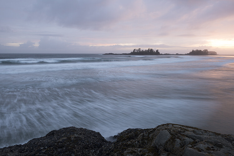
    Before
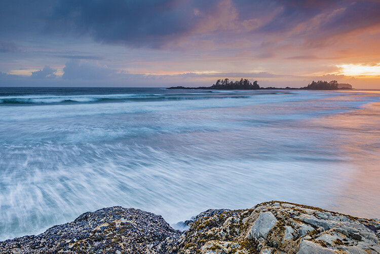
    Before

    After

    After

    Making your images POP!

    What does it mean to make your images pop? It can mean a number of things, but mostly it means to have more colour, contrast, and look more dramatic. As always, it implies that you have a good image to start with. Trying to make an average image pop, is not what this is about. Make sure you start off with a good image out of camera, then go through these steps in order.

    Shoot in RAW

    Shooting in RAW is a good start. I know, you may not want to shoot in RAW because the file sizes are so big, or you don’t really see the benefits, but RAW really does make a difference. Firstly, you are working with a full uncompressed file of data. A JPEG image has already had adjustments make in camera to compress it to that file size. Some information has already been discarded, which means you are working with less image information, which in turn means you have less flexibility in the editing process. Of course, RAW is only useful if you are going to spend time editing your images in Photoshop or Lightroom.

    Let’s assume that you are going to edit and you have shot in RAW, open your image up in Photoshop and you will see the Adobe Camera Raw (ACR) Editor open. The ACR editor is a really powerful tool. The latest updates have made the ACR editor in Photoshop almost a separate image editing tool, it’s that powerful. As it opens, you will see a selection of tools on the right hand side, mostly sliders such as: White Balance, Tint, Exposure, Contrast, Highlights, Shadows, Whites, Blacks, Clarity, Vibrance and Saturation.

    Camera Raw Editor in Photoshop CC

    The camera raw editor has some very powerful adjustment tools. The next few steps will be done mostly in the RAW editor, then the image will be opened in Photoshop, and edited further. Many of these edits are very similar in the Lightroom Develop module, so you can make these same adjustments there as well.
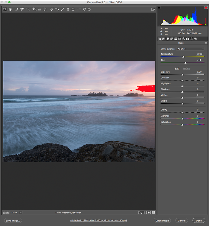
    The Camera Raw Editor in Adobe Photoshop CC
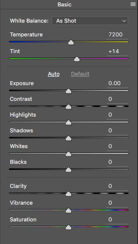
    Close up of the basic RAW editor sliders

    Making adjustments in the RAW editor

    • Temperature – Start off by taking a look at the colour in your scene. You can adjust the temperature to make the colour of the scene warmer (slide towards yellow) or cooler (slide towards blue). This can be used to correct a colour cast, or to add some drama to your image. In this scene, I chose to move toward the warmer side.
    • Exposure – Take a look at your exposure, the image might be a little dark, or maybe a little bright. Slide the exposure slider to adjust this.
    • Contrast – Adjust the contrast to make sure that the dark areas of the image are dark enough, but don’t lose details here.
    • Highlights – In this image, the red indicator in the highlights shows me where there is very little detail. To compensate for this, slide the highlights slider to the left. If your highlights are underexposed, slide this slider to the right, but be sure not to overexpose your highlights.
    • Shadows – The shadows slider can help you bring back details in the shadows or darken them a little. Be careful not to overdo this slider as your shadows may look noisy (or your image can take on an “HDR” look) if you push this too hard.
    • Whites – This slider adjusts any pixels in the image that are white or partially highlighted.
    • Blacks – This slider will adjust any pixels that are black.
    • Clarity – The clarity slider adjusts contrasts in the midtones. This can really add some structure to your image, but be careful not to overdo it.
    • Vibrance – This slider will adjust any pixels that are not saturated. This is a good place to start to add some subtle pop to your scene.
    • Saturation – This slider will adjust all pixels by saturating or desaturating them.
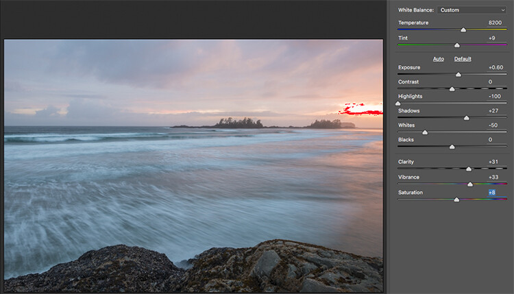
    Basic adjustments in Camera RAW

    HSL adjustments tab

    This tab has three different tools under it, namely: Hue, Saturation, and Luminance (HSL). These adjustments will make changes based on the colour channels in your image. For example, if you click on the saturation tab, you can make the reds in your image more or less saturated, the same is true for the oranges and all the way through the colour channels. You can also make certain colours brighter, by using the luminance tab. In this image, I wanted to saturate the reds, yellows, and oranges, as well as some of the blues.
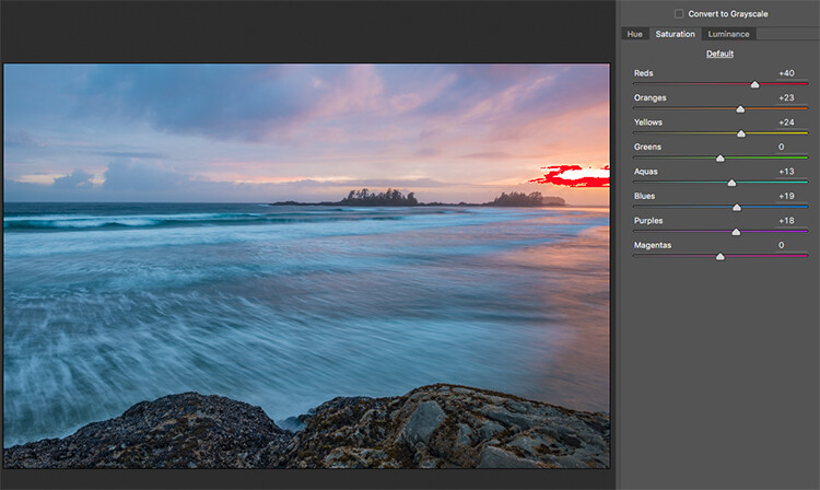
    HSL tab adjustments

    Graduated Filter in Camera Raw

    Much like using one on your camera in the field, you can add a graduated filter in Camera Raw. The beauty about doing this in Photoshop is that you can make some very fine tuned adjustments to your image, depending on how you position the Graduated Filter tool.

    Click on the Graduated Filter icon at the top of the screen, and the you will see a whole new dialogue box with very similar functions to the basic Camera Raw Module. The difference here is that you will click and drag the filter down on your image to select the sky. You can also click and drag up from the bottom to select the foreground. I will do both (theGraduated Filter applies to the image from the edge inward).

    Starting at the top, I click and drag the filter to just over midway through my image. That limits the effect to the top half. This filter is graduated, so the effect will be properly blended, and you won’t see a hard line where the filter ends (the more you drag it the wider the blend area, you can also adjust that after). I make some adjustments and you can see the difference they made to the sky. Once you are finished with one filter, click on New (at the top of the adjustment box) and repeat the process, but drag up from the bottom this time to make adjustments to the foreground. Once you have made the final adjustments, you can click open image at the bottom of the Camera Raw box to open your image into Photoshop.

    Graduated Filter icon highlighted

    One key adjustment that needs to mentioned here is the Dehaze tool. The Dehaze tool does exactly what it says, it removes haze and creates better contrast. Use it carefully, it is easy to go too far with it, and your image may suffer as a result. It is a really useful tool for landscapes and seascapes, as there is often some haze in the images, as there was in mine. Using it lightly has removed the haze and made the image better overall.

    You will notice it is part of the Graduated Filter tool, and there is also a Dehaze function in the effects tab of the Camera Raw Editor. It is up to you when you use it, but be aware that if you use it without a selection, it will apply the effect universally to your entire image. Using it here in the Graduated Filter tool means you can have better control over how it affects your image.
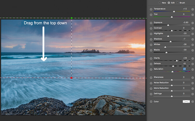
    Click and drag the Graduated Filter from the top down to select the sky. Then select with adjustments you want to apply.
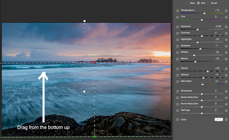
    Selecting the foreground by dragging from the bottom up.

    Open your image in Photoshop

    After you have made your adjustments in Camera Raw, the final touches can be applied in Adobe Photoshop. Once again, the sky and the foreground in this image are going to look different, and will need different adjustments.

    To make a softer selection of the sky, click on the quick mask tool at the bottom of the left hand side toolbar in Photoshop. You can then use a soft brush to paint in a selection of the sky as a mask. Once you are happy with the selection (see red mask) click on the quick mask tool again to activate that selection. There is one tricky thing to note about the quick mask tool, the mask means that you are selecting everything that is NOT red. So, when you click on the quick mask tool, you will see the marching ants around the bottom portion of the image and not the red area. This is good, because you can toggle between the two areas very easily and make adjustments to each selection.

    First of all, make the necessary adjustments to the foreground using Levels. In this image, I wanted to make the foreground a bit brighter, so I popped up the highlights a little. From there I selected the inverse (i.e. the sky). You can do this by holding down CMD>SHIFT>I together. This will toggle your selection from the foreground to the background.
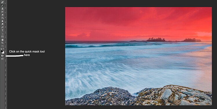
    Red indicates the area that will be masked
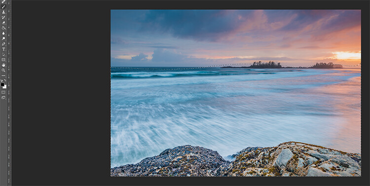
    Screen Shot 2016-07-05 at 3.28.52 PM

    The marching ants show where the current selection is in the foreground.
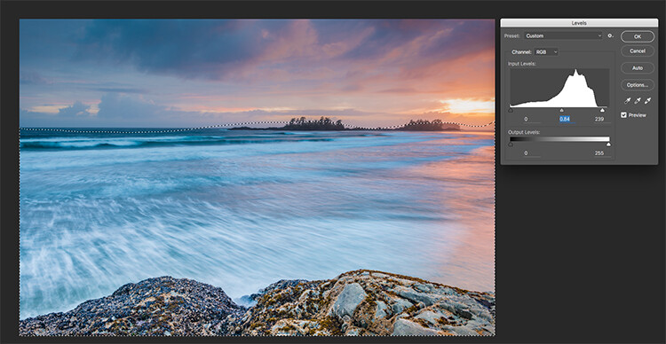
    Screen Shot 2016-07-05 at 3.29.56 PM

    Making levels adjustments to the foreground
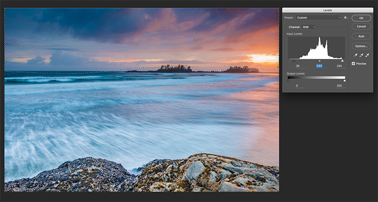
    Screen Shot 2016-07-05 at 3.30.24 PM

    CMD>SHIFT>I will toggle the selection, here the sky is being selected and levels is being used to adjust the sky

    Use Hue and Saturation to make final colour adjustments

    You can use the toggle function (CMD>SHIFT>I) to select the sky and foreground interchangeably. Once you have your selection, choose a tool to make adjustments, and the changes will only be made to the area that is selected. In this example I have used the Hue and Saturation function to make further enhancements to the image. I am again making adjustments by each channel. This gives me great control over what colour ranges need to be saturated, and perhaps desaturate others that are a little over done. Go through each channel and make the necessary adjustments.
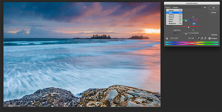
    Screen Shot 2016-07-05 at 3.30.53 PM

    Use Hue and Saturation to make final colour adjustments

    Once you are done, you can then sharpen your image as you see fit and save it to be printed. The steps outlined above will help you make any image look better. If done correctly, your images will have the pop and drama that you are looking for.

    Give it a try, once you know the process, these adjustments can be done really quickly.

    After

    Final image

    Please share your images and thoughts on the comments section below.

    googletag.cmd.push(function() {
    tablet_slots.push( googletag.defineSlot( “/1005424/_dPSv4_tab-all-article-bottom_(300×250)”, [300, 250], “pb-ad-78623” ).addService( googletag.pubads() ) ); } );

    googletag.cmd.push(function() {
    mobile_slots.push( googletag.defineSlot( “/1005424/_dPSv4_mob-all-article-bottom_(300×250)”, [300, 250], “pb-ad-78158” ).addService( googletag.pubads() ) ); } );

    The post How to Use Adobe Camera Raw and Photoshop to Make Your Landscape Images Pop by Barry J Brady appeared first on Digital Photography School.


    Digital Photography School
  • Fujifilm X-E2S real-world samples

    The Fujifilm X-E2S takes everything we loved about the X-E2 and its latest firmware updates and adds… well, not much. But that doesn’t mean it isn’t a capable and relevant camera in today’s market. With great build quality, plentiful external controls, retro styling and Fujifilm’s gorgeous film simulations, the X-E2S just begs you to slap on a prime lens and go out shooting. The substantial drop in MSRP compared to the original X-E2 doesn’t hurt, either. Take a look at what we came up with when we took the X-E2S for a spin.

    Articles: Digital Photography Review (dpreview.com)

  • Lighting 102: Distance

    Just like your focus, light has depth of field.

    For this layer of control, we are going to look at two different pictures. Everything will be the same except for one thing: The distance from our light to our subject will change. Nothing else. In particular, the subject-to-background distance will not change.

    Exhibit number one is a dark portrait of Dean, situated a few feet in front of a white wall, pictured above.

    White wall? Yes, white. But it doesn't look white, does it?Read more »
    Strobist

  • Lighting 102: Combining Distance and Two Lights

    By using a second light to ensure legibility in the shadows, we can place a "floor" on how low the tones will go on our subject. But we can also combine this with the fast falloff of a closely placed key light to get total control of a subject with an inherently tough dynamic range.Read more »
    Strobist

  • Huawei’s Honor Note 8 comes with 6.6″ Quad-HD screen

    If you’re keen on consuming video and images on your smartphone, Huawei’s latest model in its Honor sub-brand, the Honor Note 8, might be just the device for you. Its 6.6″ Super AMOLED display is one of the largest in the phablet segment and decidedly blurs the line between smartphone and tablet. With its Quad-HD resolution it offers a pixel density of 443 ppi.

    Unlike the standard Honor 8 model, the Note variant does not come with a dual-camera setup. Instead, the Honor combines a 13MP image sensor with a fast F2.0 aperture, optical image stabilization and a dual-LED flash. Video is recorded at 1080p Full HD resolution and an 8MP front camera is available for selfie-shooting and video calls.

    The Android 6 operating system is powered by Huawei’s in-house Kirin 955 chipset with octa-core CPU and 4GB of RAM. You can pick from 32, 64 or 128GB of storage options and expand capacity via a microSD card. The Note 8’s 4,500mAh battery should provide enough power to keep the large screen and other components running all day. The Honor Note 8 can be pre-ordered in China today for approximately $ 345 for the 32GB base model, $ 375 for the 64GB version and $ 420 for the 128GB top-end variant. There is no word on global availability yet but we would expect the Note 8 to become available in other regions soon.

    Articles: Digital Photography Review (dpreview.com)

  • Lighting 102: Apparent Light Size

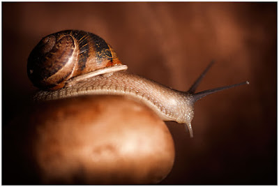
    This is Gary. Gary is a snail. And he's beautifully lit by my friend Sara Lando. While babysitting Gary for a friend, Sara decided to actually build a miniature set and then photograph the snail in the style of Irving Penn. Because this is what creative people do in their spare time.

    And pray tell, what beautifully soft light source is she using to subtly caress Gary and reveal his form?

    Oh look, it's a bare speedlight:Read more »
    Strobist

  • Lighting 102: Understanding Soft Light

    So what is it that actually makes a light soft? And why is it a function of both size and distance?

    In the portrait above, Dean is being bathed in soft umbrella light from camera right. But let's zoom in a little closer and place some waypoints on his forehead…Read more »
    Strobist

  • How to Use Two LED Lights to Achieve Moody Portraits

    Any kind of light is a must for photography. You just cannot photograph without light. There are various types of light that no doubt you are familiar with:

    • Natural light from the sun
    • Ambient light (could be natural or manmade)
    • Artificial light such as strobes, incandescent or tungsten, fluorescent, flash and LED lights
    • Infrared light

    achieving-moody-portrait-2-LEDs-tips

    This article will give you tips for using two LED lights to achieve moody portraits.

    Tip #1 – Modify your light

    The best light is always modified. Even sunlight is better with a diffuser. Direct sunlight produces hard shadows and harsh light. Clouds soften and diffuse sunlight (by making it spread over a larger area). On a bright cloudless day, shooting in open shade minimizes the harshness, but still takes advantage of the beautiful natural light. Shooting in shadows, located next to reflective surfaces, also leverages any bounced natural light. These techniques are simply modifiers of natural and available light.

    Modifiers are more obvious for artificial light. There is a plethora of choice when it comes to these: soft boxes, diffusers, reflectors, foam cores panels, umbrellas, flags to name a few.

    The same is true for LEDs when it comes to the need for modifiers. There are many types of LED lights, including ones that you can adjust their brightness as well as colour temperature. But, just like the above, regardless of brightness intensity of the continuous light, it is essential to modify LEDs to get soft, pleasing, beautiful light -overall a better quality of light.

    I’m going to show you a setup using modified LEDs to create moody portraits.

    achieving-moody-portrait-2-LEDs-tips

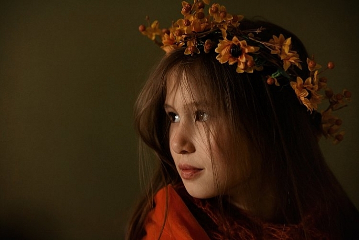
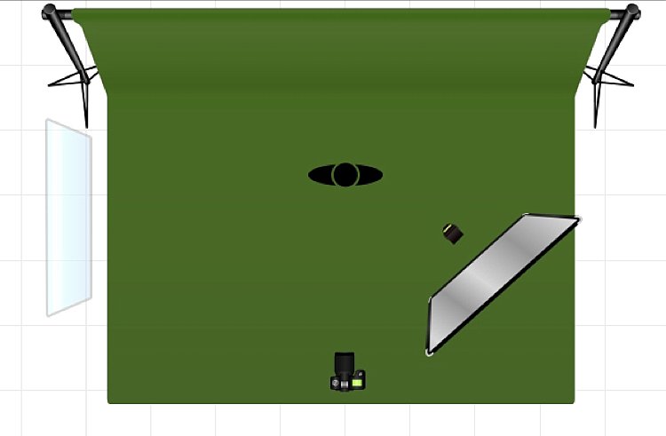
    Using a window to camera left and an LED, bounced into a diffusion panel, to the right.


    The main light I used here is the Magic Tube, the cheaper alternative to Westcott Ice Light. You can adjust the brightness of the light, and it comes with a tungsten gel if you need it. Apart from looking lightsaber Star Wars cool, the Magic Tube also comes with a charger that allows continuous charging while it is being used. So you can always have access to power by just plugging it in if the battery charge runs out.

    You can also use window light and just one LED for this setup. Substitute the main light with your window light, but make sure you are diffusing the light coming from a window with a sheer voile, or fabric to soften it.

    To diffuse the main light, I covered it with the Rogue Bender diffuser for the strip light. This is just a piece of rectangular translucent material which simply covers the light.

    Tip #2 – Position your lights for contrast

    Position the main light at 45 degrees to the subject, up high to emulate light coming from a tall window. Use a diffusion panel or a piece of sheer fabric. The less opaque the fabric, the more diffuse your light will be. To further modify the Magic Tube after I have attached the Rogue Bender diffuser, I also used the diffusion (translucent part) panel of a 5-in-1 reflector and had an assistant hold the panel in front of the main light. Having these two diffusers together reduces the strength of the light, but also greatly softens its quality.

    achieving-moody-portrait-2-LEDs-tips

    The second light is also an LED, this time a small video light positioned to camera right, at 45 degrees, but at the same height as the subject. However, instead of using a diffuser to modify this light, you can turn it around so the light faces away from the subject, and put a reflector in place to bounce the light on. The subject (filling in the shadows) gets illuminated by the soft bounced light from the reflector.

    achieving-moody-portrait-2-LEDs-tips

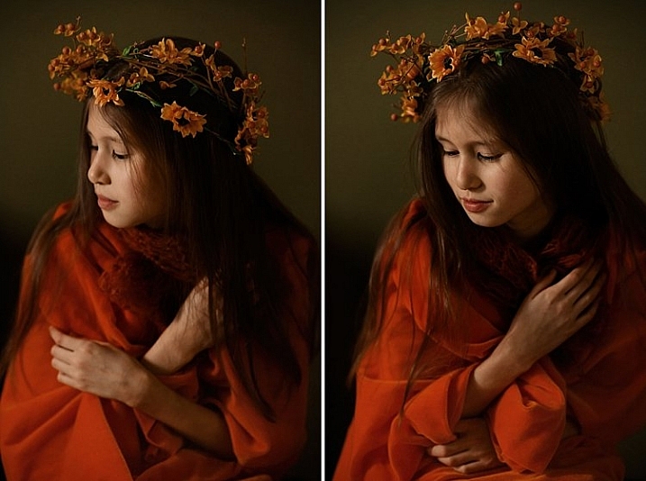
    For a moody look it is essential to have both light and shadow in the portrait. You need to watch where the main light falls, and the shadow it’s creating. You want the shadowed area to still have some detail, instead of being completely black. The bounced light from the reflector takes care of this.

    Tip #3 – Use a dark background

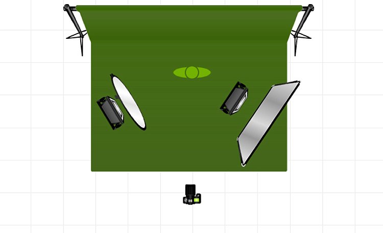
    I tried the exact same setup, although the lights were positioned the opposite way, with the main light on camera right. This setup had a lighter background, in this case lightly patterned, and the results were far from moody. I did not want to shoot at a smaller aperture as I wanted to blur the pattern of the wallpaper in the background. I also wanted to emulate sunlight shining through a window illuminating a dark room, and this setup just did not work to achieve that look.

    I’m sure if I had gridded the main LED to avoid spill into the light background, while increasing my shutter speed, the background would have gone darker, but I would have lost the soft and atmospheric look I was after. Compare this photo below to the one underneath it, and it’s pretty obvious the darker background is most definitely better at achieving the moody look.

    tutorial-using-2-led-lights-for-portraits-photography

    achieving-moody-portrait-2-LEDs-tips

    I hope this article gave you new ideas to try. Do share other tips you have to achieve moody portraits!

    googletag.cmd.push(function() {
    tablet_slots.push( googletag.defineSlot( “/1005424/_dPSv4_tab-all-article-bottom_(300×250)”, [300, 250], “pb-ad-78623” ).addService( googletag.pubads() ) ); } );

    googletag.cmd.push(function() {
    mobile_slots.push( googletag.defineSlot( “/1005424/_dPSv4_mob-all-article-bottom_(300×250)”, [300, 250], “pb-ad-78158” ).addService( googletag.pubads() ) ); } );

    The post How to Use Two LED Lights to Achieve Moody Portraits by Lily Sawyer appeared first on Digital Photography School.


    Digital Photography School
  • How to Use Framing to Create a Sense of Scale

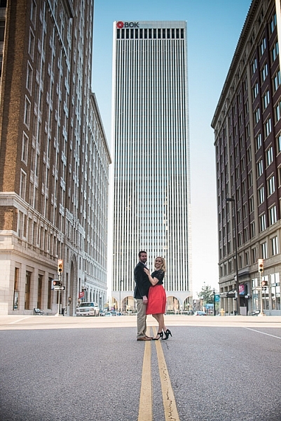
    One thing that can be difficult to get across when taking pictures is a true sense of how large something is in real life. A skyscraper that appears towering and imposing in person, can come across as unimpressive, or stripped of its majesty when photographed. Natural formations that inspire awe and self-reflection, often seem puny and insignificant when we go through our photos later at home or on our phones.create-sense-of-scale-bok-center
    This is something I have had happen many times in my own journey as a photographer, and while it can be tricky to create a sense of scale, there’s a way to use the concept of framing to capture the massive size of things in the world around you.

    What is framing?

    Framing has to do with the way the elements in a picture are positioned, in relation to one another. I struggled with the concept of framing for scale for a long time, before I really got the hang of it. But if you really want to show how big something is, it helps to put something else in the picture with it. This concept might seem a little counterintuitive, but adding elements to the foreground, background, or image sides, helps to not only give the viewer a sense of scale by showing how big the object is in relation to something else, but often it helps make the picture more compelling from a compositional perspective.

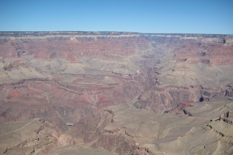
    As an example, here’s a picture I took when I visited the Grand Canyon a few years ago. I really wanted to capture the sheer size of this natural wonder, so naturally I pointed my camera out from a precipice and took a few pictures. Sadly, the resulting images look flat, muddy, and downright boring – almost the polar opposite of the Canyon itself.

    An incredibly boring picture of one of the most amazing natural formations I have ever seen.

    An incredibly boring picture of one of the most amazing natural formations I have ever seen.

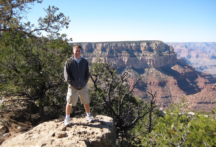
    The problem with this image is it does nothing to impart a sense of scale to the viewer. In order to truly appreciate how big the canyon is, we need other visual information in the frame, to which we may compare the background elements. Fortunately, one of my friends took a much better picture that includes a few foreground elements, which although they block out some of the Canyon, help to capture the grandeur of this natural wonder.

    create-sense-of-scale-grand-canyon-foreground

    A much better picture, even though part of the Grand Canyon is blocked out.

    The second picture works because it contains several layers: me, the trees, the plateau, and a glimpse of the rest of the Canyon. Of course this concept, like much in the world of photography, is quite subjective and some might think the top picture looks better because you can see more of the canyon itself. However, in my opinion the bottom image is more interesting because of the multiple compositional layers, while at the same time helping the viewer understand just how big the Grand Canyon really is.

    How to apply framing to show scale

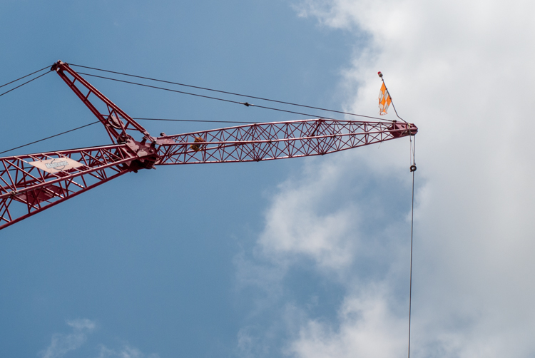
    You can see the same principle at work in the following pair of shots as well. The first one was zoomed in a little and focused just on the crane, which is fine, but it doesn’t really tell the story of how big the crane is, or how much it towers over the surrounding buildings.

    create-sense-of-scale-crane-unframed

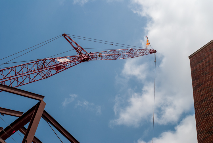
    To adequately capture the size of this piece of construction equipment I stood in the same place, but zoomed out a little bit, in order to frame the crane between two of the surrounding buildings. The result is a picture that adds a great deal of additional context, which helps the viewer to understand the size of the subject in the photo.

    create-sense-of-scale-crane-framed

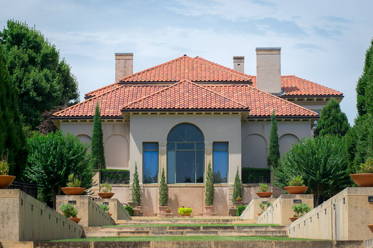
    Often these types of framing decisions are not all that complicated. It can be as simple as stepping a few meters in any direction, or zooming in and out with your camera. Another example is this set of two images taken at the Philbrook Museum in Tulsa, Oklahoma. It’s a grand building with a rich history, but unless the building is properly framed it can look like any other house.

    create-sense-of-scale-philbrook-unframed

    Looking at the above image you might get the idea that this dwelling is somewhat old, with a bit of a terrace in front. But, it doesn’t really capture a true sense of the scale, not only of the house, but its surrounding gardens.

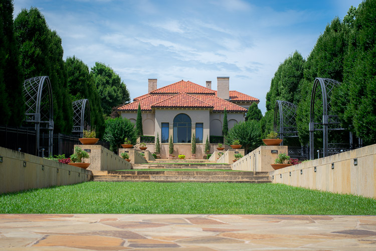
    create-sense-of-scale-philbrook-framed

    In the second image (above), the size of the mansion is smaller in the image, yet it seems much larger because it is framed on the sides by rows of trees, as well as the lower portion of the photo which shows many distinct levels of the terrace. It’s somewhat ironic that stepping back and re-framing a shot like this, so that the subject is smaller in the frame, can actually make it appear larger. But, you will find this phenomenon to be true across a wide range of photographic situations in which you want to convey the true size of something.

    Don’t overdo it

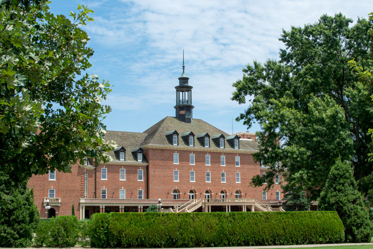
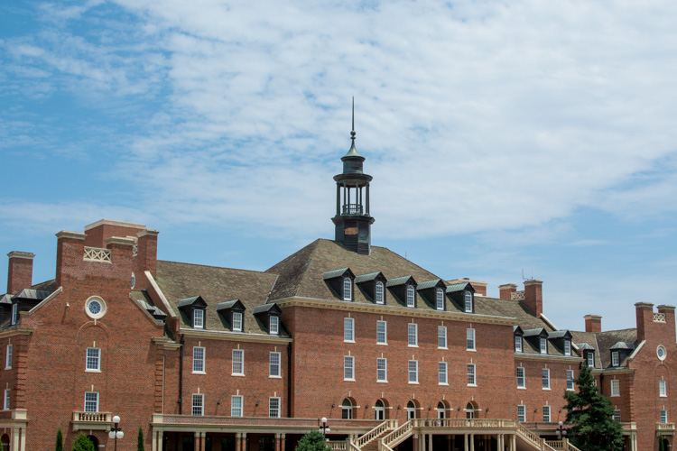
    Of course, just as important as knowing how to frame your subjects is knowing when to hold back a little bit. The picture below shows the student union of Oklahoma State University, one of the largest student unions in the country. Yet when it is framed between two trees on the sides and a hedge in the foreground, it almost gets dwarfed and seems somewhat diminutive in size.

    create-sense-of-scale-student-union-framed

    One reason the framing is not useful here is because it actually covers up part of the building, whereas in the previous example the technique was used enhance the large subjects. There are also several visual cues, such as windows and stairs, that on their own do a good job of imparting a sense of size to the viewer. To properly showcase how big this structure is, it’s enough to simply show it on its own.

    create-sense-of-scale-student-union-unframed

    The above examples are just a few illustrations of how you can use the idea of framing to capture a sense of scale, but I’m curious about your own personal approach. How do you use various photographic techniques to truly capture the size of your subject? Leave your thoughts and images in the comments below.

    googletag.cmd.push(function() {
    tablet_slots.push( googletag.defineSlot( “/1005424/_dPSv4_tab-all-article-bottom_(300×250)”, [300, 250], “pb-ad-78623” ).addService( googletag.pubads() ) ); } );

    googletag.cmd.push(function() {
    mobile_slots.push( googletag.defineSlot( “/1005424/_dPSv4_mob-all-article-bottom_(300×250)”, [300, 250], “pb-ad-78158” ).addService( googletag.pubads() ) ); } );

    The post How to Use Framing to Create a Sense of Scale by Simon Ringsmuth appeared first on Digital Photography School.


    Digital Photography School