Tag: typography

  • Future Fonts: Tracing the Role of Typography in Science Fiction in Films

    [ By WebUrbanist in Design & Graphics & Branding. ]

    Whether intentionally retro, as in Stranger Things, or overtly futuristic, as in RoboCop, the role of typography in a movie goes well past the title, subtly but powerfully shaping the world viewers are invited to experience.

    Dave Addey, author and creator of Typeset in the Future, is as meticulous as he is obsessed, analyzing appearances of type in film line by line, providing insights, context and speculative answers to various uses (as well as typo corrections).

    It started with Eurostile Bold Extended, which has made appearances from Star Trek to Wall-E. Since then, he has written about typography in Alien, 2001: A Space Odyssey, Moon, and in anticipation of the sequel: Blade Runner.

    With fonts you get a lot of context for free,” says Addey. “You’ve established the time frame for your movie in seconds without a lot of special effects or backstory.” It also tells you something about the world, like: when a single megacorp runs everything and its typeface is consequently found everywhere.

    He watches films over and over again, taking notes then tracking down type, sometimes manually by searching through old books to find exact matches (in other cases: the typography is custom, making the process frustrating).

    And type is just part of the equation: he looks at iconography and other design elements too, piecing together a larger picture of the various strategies in play and how they relate to the core narrative.

    By zooming in on this one aspect of films, he often traces connections that are easy to miss, like: a newspaper being held by the lead character in Blade Runner later appearing as the liner for a drawer. For fans of sci-fi and design, his blog will take you deeper into films than you realized you could go — it is well worth checking out.

    More about the project: “This site is dedicated to typography and iconography as it appears in sci-fi and fantasy movies and TV shows. It’s inspired by the Typeset In The Future trope I added to TV Tropes. (If you know of more good sci-fi font examples, please do add them to that page.)”

    Share on Facebook


    [ By WebUrbanist in Design & Graphics & Branding. ]

    [ WebUrbanist | Archives | Galleries | Privacy | TOS ]


    WebUrbanist

  • Art of Typography: 13 Text-Based Designs Spell It All Out

    [ By SA Rogers in Art & Sculpture & Craft. ]

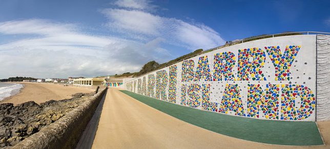
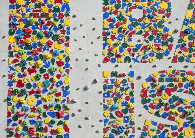
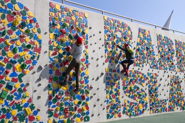
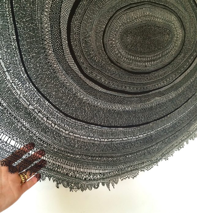
    The language of letters themselves is revealed when we look at their shapes as artistic forms and experiment with the materials we use to create them, whether using them as the basis of furniture design, climbing walls or intricately cut works of paper art. These typography-based experiments encourage us to look at the written word in a whole new way.

    Typographic Climbing Wall by Gordon Young

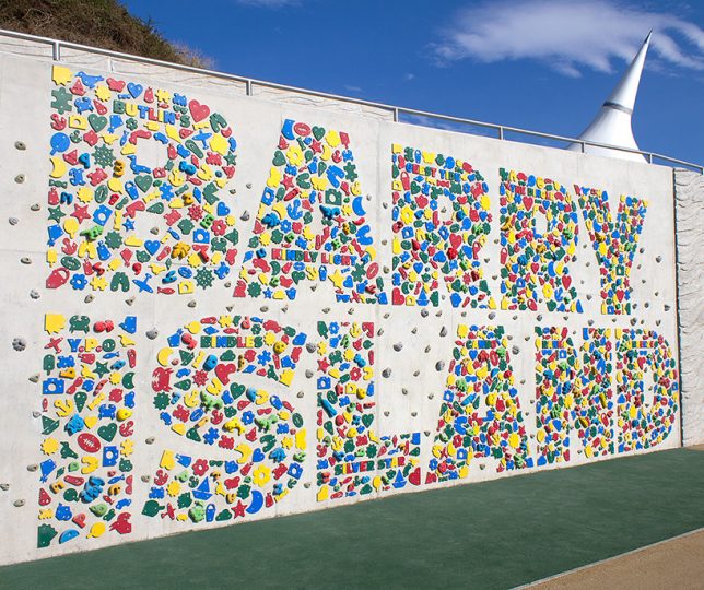
    4,000 recycled plastic climbing holds join up with 1,000 sea-themed novelty climbing holds to form a typographic wall spelling the name Barry Island in the UK. Gordon Young transformed a sea wall into an interactive landmark for a previously neglected corner of the shore.

    Typographic Paper Cuts by Annie Vought

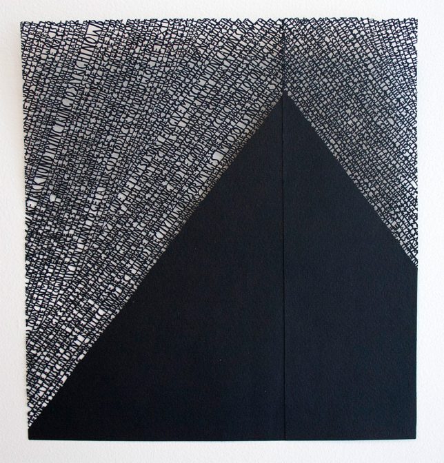
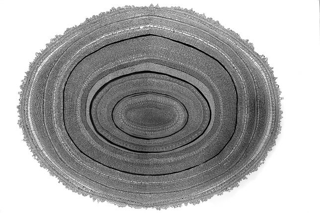
    Sometimes consisting of sentences and sometimes just a jumble of letters, these typographic works are painstakingly hand-cut from paper by artist Annie Vought. A piece called ‘Gosh I’ve Been Here Before’ measures 53” wide and consists of sentences strung together in circles like the rings of a tree.

    Playing with 3D-Printed Letter For by Thomas Wirtz

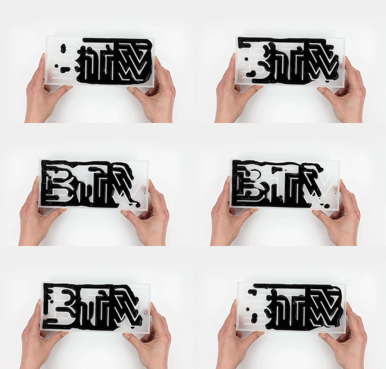
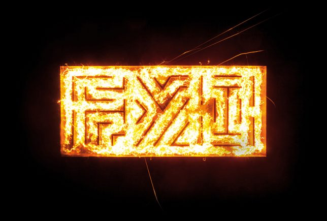
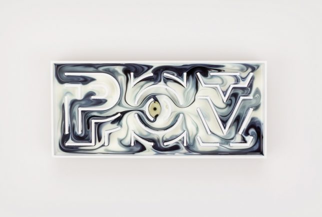
    Designer Thomas Wirtz created his own typeface, 3D-printed a series of acronyms like ‘BTW,’ ‘FYI’ and POV’ and used them as forms for experimentation with physical media like ink, dye, fire and colored gases.

    Letter-Shaped Desks by Benoit Challand

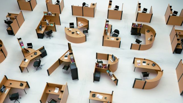
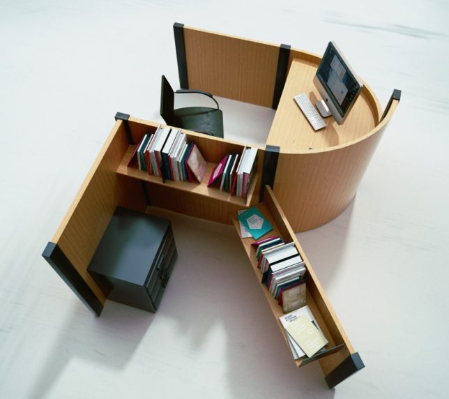
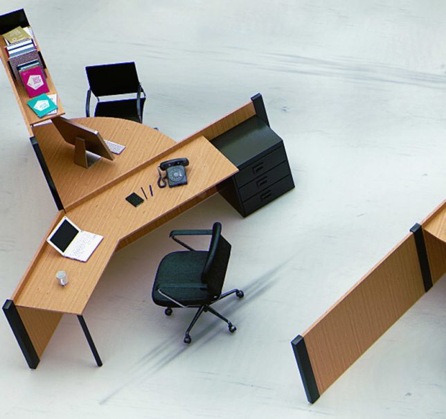
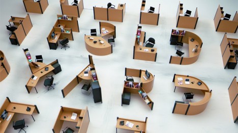
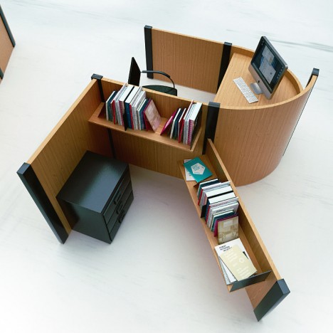
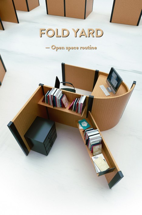
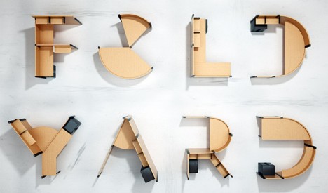
    Individual works stations are designed in the shapes of letters to spell out messages in an open-plan office environment, where you tend to either find zero privacy or a maze of cubicles. Designer Benoit Challand aims to celebrate the beauty of large-scale typography while bringing some fun into these spaces, demonstrating the concept with tiny models.

    Legible Graffiti by Mathieu Tremblin

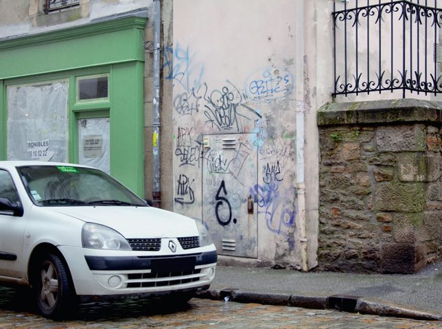
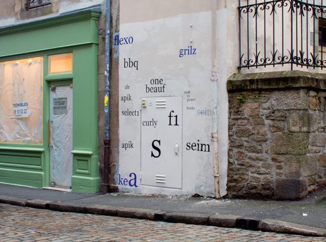
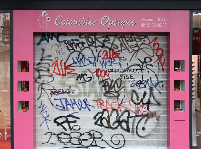
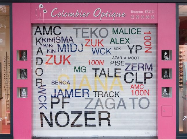
    Ugly spray-painted tags are a dime a dozen, and almost always illegible. Artist Mathieu Tremblin basically took any artistry out of the tags by converting them into basic typeface, showing us how nonsensical it all is when simply spelled out.

    Next Page – Click Below to Read More:
    Art Of Typography 13 Text Based Designs Spell It All Out

    Share on Facebook


    [ By SA Rogers in Art & Sculpture & Craft. ]

    [ WebUrbanist | Archives | Galleries | Privacy | TOS ]


    WebUrbanist

  • Textscape: 3D-Printed Typography Stretches Up Like City Blocks

    [ By Steph in Design & Graphics & Branding. ]

    type landscape 1

    Like braille for the seeing, this 3D-printed text raises off the page to add an extra dimension of physicality and meaning to its subject matter, the end result resembling a cityscape made of typography. The ‘Textscape’ project by Hongtao Zhou includes actual braille, as well as various languages and alphabets, calligraphies and number systems.

    type landscape 2

    The intent is to connect the text to its visuality in architecture, landscape, portraits and ‘abstract matters,’ profiling it in a way that can be consumed both literally and intuitively.

    type landscape 3

    Says the artist, “Printing technology was first created in ancient China to reproduce text using woodblocks, however today’s definition had been widely adopted in 3D printing, an additive process more often to create objects instead of duplicative text.”

    type landscape 4

    In this project, the text itself retains a legible meaning, while other letter-centric works often focus solely on the beauty of the typography. One example is Jaume Plensa’s monumental typographic sculptures. See 12 more works of typography art.

    Share on Facebook


    [ By Steph in Design & Graphics & Branding. ]

    [ WebUrbanist | Archives | Galleries | Privacy | TOS ]


    WebUrbanist

  • Temporary Legacy: Large-Scale Ice Typography Installations

    [ By Steph in Art & Sculpture & Craft. ]

    Ice Typography 1

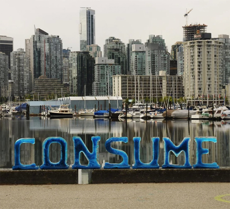
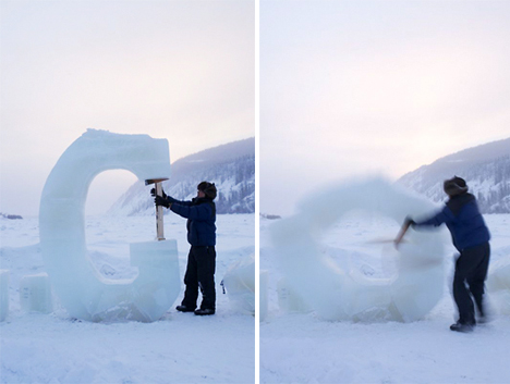
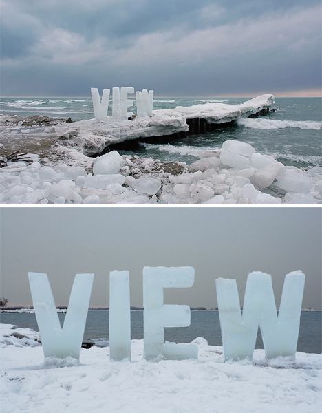
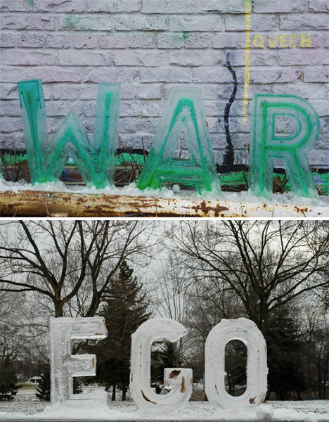
    Ephemeral messages ranging from eight inches to eight feet in height stand in public settings for just hours before they begin to disappear, melting into the snow or concrete beneath them. Artist Nicole Dextras makes social and environmental statements that are present just long enough to incite questions in passersby, making the meaning of the words themselves seem vulnerable and transient.

    Ice Typography 3

    Ice Typography 2

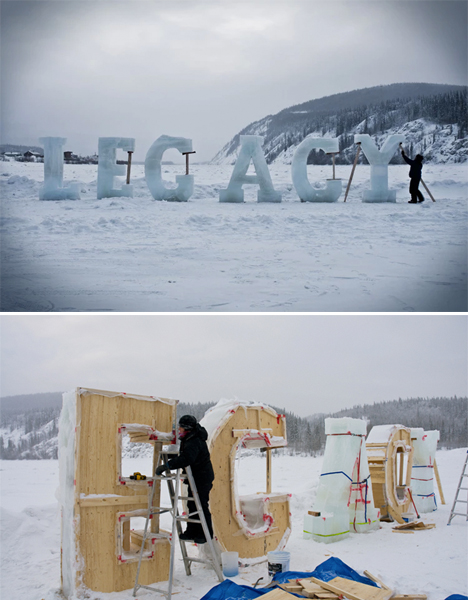
    The letters are made using wooden molds and sometimes, in the case of the larger installations, must be propped up as they start to melt – adding to the message of the word, as in the case of ‘LEGACY.’ Many of the pieces question human ownership of natural resources, and the way in which we take over and consume the world around us.

    Ice Typography 5

    “The use of text in the landscape relates to concrete and visual poetry but with the added twist of having the word’s meaning alter with the melting process,” says Dextras. “Sometimes the words relate directly to the landscape such as “silence” where the bucolic idealism of nature is transformed by the sound of the crashing waves behind it.”

    Ice Typography 4

    “Typography absorbs light, melts and eventually leave son trace; these words have more in common with dreams and oral stories than linear language. Words cast in ice interrupt our literal narratives, allowing a more integrated reading of the land we inhabit, as opposed to the past and current commodification of land as limitless resource. I therefore choose to create within an ephemeral vernacular to accentuate the collective physical and psychological experience of flux and change.”

    Share on Facebook


    [ By Steph in Art & Sculpture & Craft. ]

    [ WebUrbanist | Archives | Galleries | Privacy | TOS ]


    WebUrbanist

  • Cubicle Typography: Unique Desks as Office Furniture Font

    [ By WebUrbanist in Design & Graphics & Branding. ]

    furniture font design space

    One of the most dreary aspects of daily life in a cubical farm is the relentless sameness that pervades each office pod – perhaps it would help if each workspace were different, easy to assemble and simple to recycle.

    furniture letter r desk

    This Fold Yard typography of Benoit Challand has a touch of whimsy to be sure, but it also suggests a way to break out of the box by customizing each station at a given place of work.

    furniture typography font concept

    Who knows: these quickly-customized corrugated cardboard cubes (joined with modular plastic pieces) might be a good recipe for helping employees feel less like a hive of drones and more like individual workers with independent value and personal flexibility.

    furniture fold yard set

    furniture design title idea

    About the creator: “Ben is a creative image maker focused on digital art, 3D illustration and typography” – his work includes CGI retouching and digital drawings, with a background in motion design (animation). He has done typographic and other work for major brands as well as creating a number of neat independent projects.

    Share on Facebook


    [ By WebUrbanist in Design & Graphics & Branding. ]

    [ WebUrbanist | Archives | Galleries | Privacy | TOS ]

    WebUrbanist

  • Ironic Typography Posters That Show the True Photographer’s Life

    There is a chance you’ve seen a few posters with quotes about photographers on Facebook, Pinterest, Tumblr or other social-media platforms before. I’m talking about quotes like “Owning a camera does not make you a photographer” or others like “Life is like photography–we develop it from the negatives,” which all the photographers tend to share. Today, I’d like to bring Continue Reading

    The post Ironic Typography Posters That Show the True Photographer’s Life appeared first on Photodoto.


    Photodoto

  • DJ Zo and Dumbfoundead – Love Psycle Typography Film

    I’m sure all you guys have seen this film already. I forgot to post it on my own channel, so here it is! Many thanks to Dumbfoundead for reaching out and choosing me for this project. Thanks for all the love you guys have shown! It really means a lot. To be honest, I never expected it. It’s crazy! Thank you so much. I will definitely do my best to get good content up now that I know people are actually watching. Lol. To answer a couple of questions I’ve been getting from the first video: 1. Yes, there will be more films on my channel. 2. No, they all won’t be typography films. I am a photographer first and a graphic designer second. There will be photography-related (tutorials, reviews, short films, etc.) content on this channel as well. 3. I work alone, so I hope you guys don’t get too pissed that I don’t post weekly. But I’ll do my best to post more stuff for you guys. 4. The typography films were done in After Effects. 5. I got quite a few emails and messages asking about advice about After Effects. PLEASE don’t hesitate to email me and ask questions. I don’t check YouTube comments very often. So the best way to reach me about process questions is through email! You can send a YouTube message as well. I’m all for sharing creativity, hoping to get others to think creatively. Other than that, here are my websites if you guys want to get to know me a little better: Facebook Fanpage: facebook.com Art Website: kevincaoart.com Photography Website kevincaophotography.com Blog
    Video Rating: 4 / 5

  • lynda.com Tutorial | HTML5 First Look—Enhancing typography with CSS3

    Watch the entire course at www.lynda.com In HTML5 First Look, author James Williamson introduces the newest HTML specification, providing a high-level overview of HTML5 in its current state, how it differs from HTML 4, the current level of support in various browsers and mobile devices, and how the specification might evolve in the future.
    Video Rating: 0 / 5