Tag: Nice

  • Nice Slice: 30+ Sculptures & Illustrations Created with Cut Paper

    [ By SA Rogers in Art & Sculpture & Craft. ]

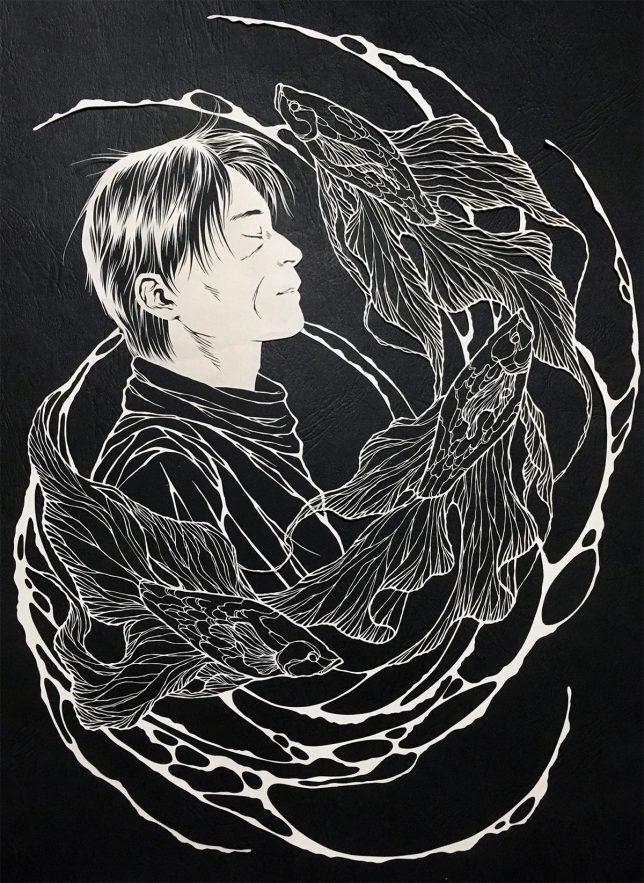
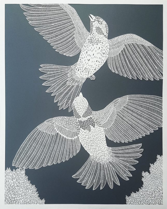
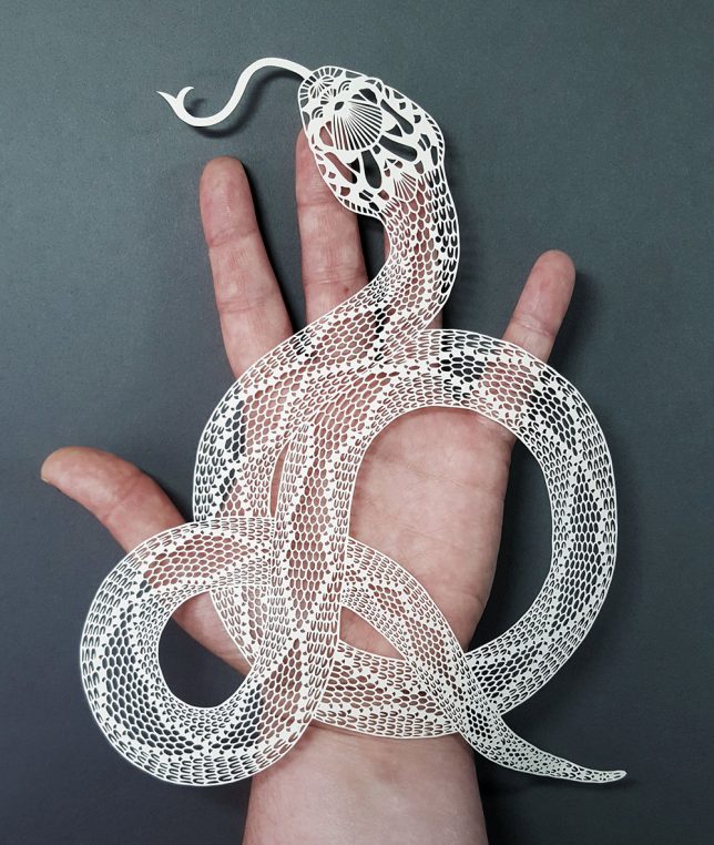
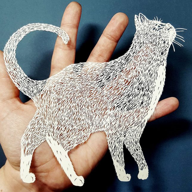
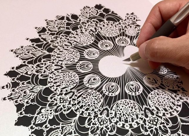
    Hand most people some paper and an X-acto knife and ask them to make art, and at best, they’ll produce some cartoonish shapes spattered with blood. But these twelve artists are producing some of the world’s most impressive papercut art, whether by laboring over astonishingly intricate tapestries for months at a time or making use of clever minimalism for a surprisingly big impact.

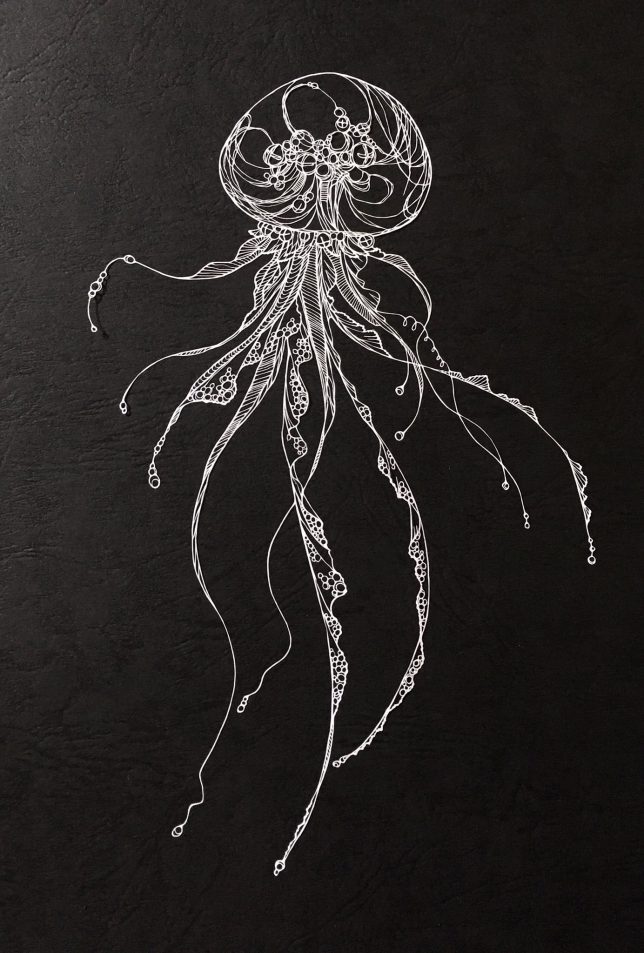
    Sea Creatures by Kiri Ken

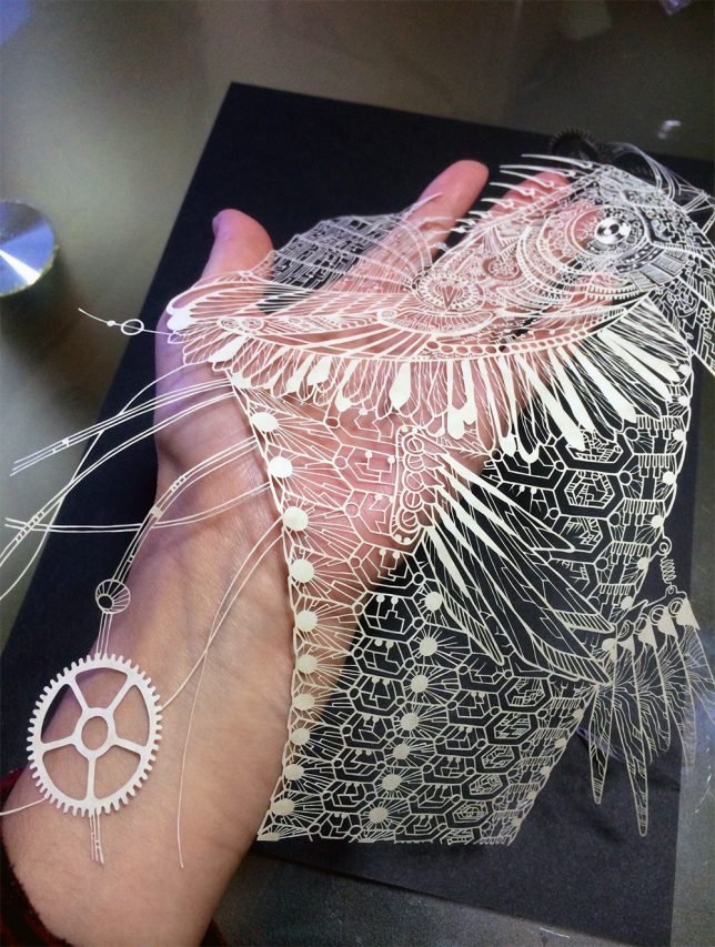
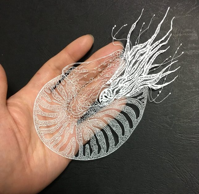
    Sea creatures and other natural subjects become the slightest wisps of paper in these extraordinarily delicate and detailed paper cuts by artist Kiri Ken, who shares her work on Twitter. The creatures often become something slightly unnatural in the textures and lines Kiri applies to their various parts, sprouting mechanical objects or patterns that look computerized.

    Nature Scenes by Pippa Dyrlaga

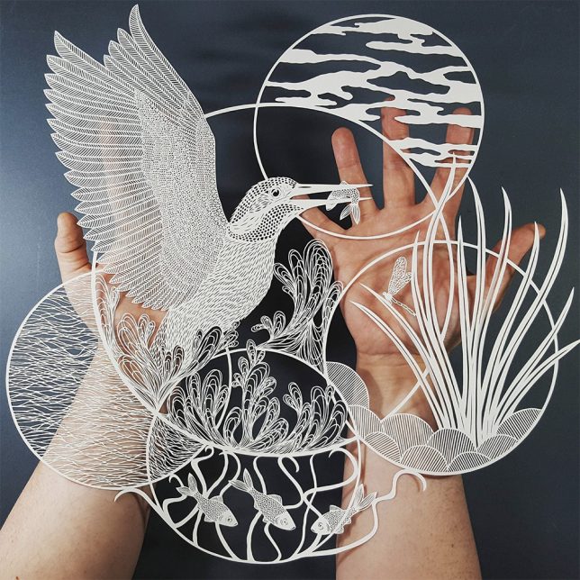
    Each teeny-tiny feather on a kingfisher’s wing, each scale on the body of a goldfish, is cut out with seemingly endless patience and unfailing accuracy in works by Yorkshire-based artist and printmaker Pippa Dyrlaga.

    Anatomy by Ali Harrison

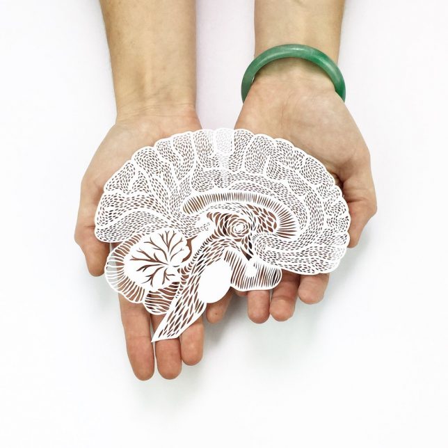
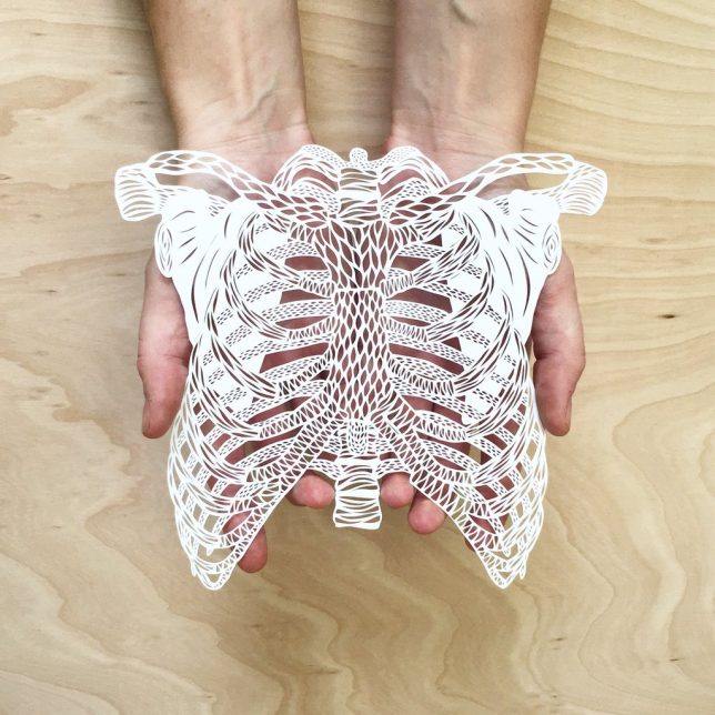
    Ali Harrison’s versions of human organs are quite a bit prettier than the real thing, each one given surprising depth and heft despite being cut out of ordinary sheets of paper. The artist designs each one and then laser-cuts them so they can be reproduced. She sells them in her Light and Paper shop.

    Endangered Species Cut-Outs by Patrick Cabral

    Wolves, elephants, pangolins, tigers, pandas and more are rendered starkly in black and white cut paper against a black surface, each layer of their lace-like faces and bodies cut by hand. Manila-based artist Patrick Cabral donated half the proceeds from the sales of each of these endangered species to WWF Philippines.

    Next Page – Click Below to Read More:
    Nice Slice 30 Sculptures Illustrations Created With Cut Paper

    Share on Facebook


    [ By SA Rogers in Art & Sculpture & Craft. ]

    [ WebUrbanist | Archives | Galleries | Privacy | TOS ]


    WebUrbanist

  • Dude Be Nice – Mastering the Art of Constructive Criticism

    Several years ago, one of the local high schools near me put on an anti-bullying campaign called “Dude, Be Nice!” During the time that the campaign was going on, I’d often see students, parents, and teachers wearing navy blue t-shirts with the slogan in huge white lettering across the front. I loved seeing those shirts around town because they served as a reminder to me that I almost always have a choice as to whether my words tear someone down or build them up.

    Since then, the phrase “Dude, Be Nice!” has become a kind of life motto for me (I even managed to get my hands on one of those t-shirts), and I think it is an especially relevant foundation for learning how to offer quality feedback in photography. Being nice is always the most important part in offering constructive criticism that is meaningful and will be heard.

    Here are a few other tips that will help you master the art of constructive criticism:

    Be Conscious of the Setting

    Dude Be Nice - Mastering the Art of Constructive Criticism

    Have you ever seen a photographer share an image on social media, saying how much they love this particular image, only to have some random person comment with criticism? Sometimes the comments may be constructive criticism, other times they’re just plain criticism like, ‘This photo sucks, and you’re a terrible photographer.” We don’t need to get into the dynamics of what might cause someone to leave the latter sort of comment because that’s just not worth any of our time.

    One thing that we should spend a bit of time thinking about is whether the person you’re responding to is actually asking for constructive criticism. There are a lot of great Facebook groups for new photographers to give and receive constructive criticism. That’s an appropriate place to offer thoughtful feedback about another person’s image. However, a photographer’s personal Facebook page may not be an appropriate place for that sort of feedback. You obviously have the freedom to say whatever you’d like, but I’d argue that offering criticism (even if it is constructive) when it hasn’t been asked for is very rarely helpful.

    Use a Compliment Sandwich

    Dude Be Nice - Mastering the Art of Constructive Criticism

    Most of us have heard about the concept of a compliment sandwich before. This idea isn’t new or groundbreaking, but I want to reiterate just how effective it can be in terms of providing constructive criticism that is actually heard by the recipient. For example, if we take my own image above, here’s an example of how to offer the same piece of criticism in several different ways:

    Straight Criticism: Your composition sucks. The baby should be either in the center or following the rule of thirds.

    Constructive Criticism: The photo would be stronger if you composed it differently. I would have put the baby in the center of the frame so that there was the same amount of greenery on either side.

    Compliment Sandwich:  The vibrant colors of the flowers are a really unique and fun contrast to the usual neutrals you see in newborn photos, I like it a lot! One thing that could make the image stronger would be to adjust your composition so that the baby is in the center of the frame. Or, you could adjust the other direction so that the baby is more off-center, following the rule of thirds, which would make your composition look more intentional instead of accidental. Overall though, good job on exposure, focus, and coloring!

    As you can see, the essential criticism is the same in all three examples. However, when you use a compliment sandwich, that same criticism is framed in a way that serves to build the recipient up which will make it more likely that they are able to hear and internalize your feedback.

    Ask a Question

    Dude Be Nice - Mastering the Art of Constructive Criticism

    Another really good method of offering constructive criticism is to phrase your criticism in a question. For example, you might ask something like, “Why did you choose to apply a matte treatment to this image?” Or, “Why did you decide to focus on the left petal of that flower rather than the center of the flower?”

    Framing something that may be a criticism in the form of a question helps to diffuse the psychological impulse that when we receive criticism, we’re being attacked. In addition, it requires the photographer to think about whether the element that you’re asking about was a conscious decision or an accident. This will help determine whether the criticism is coming from a stylistic difference (more on that in a minute!), or whether it was not an intentional decision, and an element that they may not have thought about before.

    Be Aware of Stylistic Differences

    Dude Be Nice - Mastering the Art of Constructive Criticism

    The novel, “The Road” by Cormac McCarthy received a Pulitzer Prize for fiction in 2007. It also breaks almost every conventional grammar rule known to man. Does the fact that it doesn’t follow the traditional rules mean that it’s less valuable? Nope. On the other hand, does the fact that it won a Pulitzer mean that it’s going to be everyone’s cup of tea? Again, nope.

    Whether you’re talking literature, art, music, or photography, there are lots of different styles or genres that will appeal to different people. The fact that I don’t personally prefer HDR photography doesn’t mean that there’s no value to HDR images.

    When giving constructive criticism, it’s important to consider whether or not your criticism is rooted in stylistic differences. For the most part, I’ve found that constructive criticism based primarily on stylistic differences is not a productive use of anyone’s time.

    Offer a Suggestion or Solution

    I’m a firm believer that learning how to offer constructive criticism is beneficial to both those giving and receiving the feedback. It forces the giver to think about an image in greater detail, and to really identify things that you like and dislike about an image (and why). When constructive criticism is done well, it allows the recipient the opportunity to hear from others about their photography, affirming the things they do well and identifying areas that may need improvement.

    Dude Be Nice - Mastering the Art of Constructive Criticism

    One of the ways that you can make your feedback even more beneficial to the person on the receiving end is to offer advice as to how to either correct or prevent the problem that you’re providing the feedback on, in the future. Whether you’re suggesting a remote shutter release in order to prevent camera shake in astrophotography or cropping an image in post-production to improve composition, giving someone else the tools to better their craft is one of the qualities that separates constructive criticism from quality constructive criticism that is likely to make an impact.

    It also makes YOU a better photographer, as it forces you to think in advance about how you’d handle different challenges and circumstances in advance, and create a game plan for how you’d handle them.

    Conclusion

    If you’re offering someone else constructive criticism, don’t forget that it is really hard to put yourself out there! Be kind, and encourage one another. Make sure that constructive criticism is actually wanted before you offer it. Utilize a compliment sandwich when possible. Frame your criticism in the form of a question, and be aware that some criticisms boil down to stylistic differences. Most importantly, if you want to offer quality constructive criticism, offer a suggestion or solution that will help to correct or prevent the issue you’re seeing.

    Then, chime in below–what was the most helpful piece of constructive criticism you’ve ever received? Why was it helpful? What was the least helpful? Why?

    The post Dude Be Nice – Mastering the Art of Constructive Criticism by Meredith Clark appeared first on Digital Photography School.


    Digital Photography School
  • Huawei P9 camera is nice, but it’s still a smartphone camera

    To dismiss the Huawei P9’s imager as ‘just another smartphone camera’ would be unfair. Its dual 12MP cameras aren’t your average dual cameras – Huawei claims that by using one monochrome and one RGB sensor, the camera is 100% more sensitive to light than your standard smartphone camera. It offers Raw capture, full manual exposure control and laser-assisted autofocus. Oh, and Leica had a hand in designing the module. All-in-all, there’s plenty going for it camera-wise. 

    We approached the P9 eager to give it a try, but with a healthy dose of skepticism. And keeping our expectations measured, we were pleased by the Huawei P9’s results. For one thing, shooting with is a nice experience. There are multiple grid overlay options, a level gauge (praise hands emoji!) and you can easily toggle between full manual and full auto shooting. It’s also possible to shoot exclusively with the monochrome camera, which opens up other creative possibilities.

    The P9 offers many of the comforts of an advanced point-and-shoot. So how’s the image quality? It’s pretty much as we expected. Good light JPEGs look just peachy on phone-sized screens, but at 100% they don’t look exactly ‘100 emoji’ 100. Grass turns mushy and halos start appearing around high contrast edges. Things obviously get quite noisy by the time you get to ISO 3200.

    $ (document).ready(function() { ImageComparisonWidget({“containerId”:”reviewImageComparisonWidget-42824869″,”widgetId”:365,”initialStateId”:null}) })

    But wait, there’s Raw! You can see some of the benefits in terms of detail retention in the studio scene widget$ (document).ready(function() { $ (“#imageComparisonLink2550”).click(function() { ImageComparisonWidgetLink(2550); }); }), but definitely check out the difference it makes in some of our real-world samples. It should be noted that Raw capture is only available in Pro mode, and can’t be used when shooting with the monochrome camera.

    TL;DR, I’d be pretty happy if the Huawei P9 camera was the camera I had with me all the time. But the dual camera system hasn’t solved the low light troubles inherent to small sensors.

    Articles: Digital Photography Review (dpreview.com)

  • 26 Nice Bright Colors and Some Greens of Summer to Liven up Your Day

    Paul Simon said it best in Kodachrome:

    Kodachrome – give us the nice bright colors. Give us the greens of summers, makes you think all the world’s a sunny day.

    For those of us old enough to remember and know what Kodachrome is – and the song – this is for you.

    T

    By T

    Okay, enough strolling down memory lane. Yes it’s summer in the northern hemisphere and we better enjoy it while it lasts. Let’s see some images of those great colors that summer gives us:

    Photograph Precious Love by Sue Hsu on 500px

    Precious Love by Sue Hsu on 500px

    Photograph Green Summer Rain by Max Ellis on 500px
    Green Summer Rain by Max Ellis on 500px

    Photograph Winds of Summer by Alex Greenshpun on 500px

    Winds of Summer by Alex Greenshpun on 500px

    Photograph *** by Laura Pashkevich on 500px
    *** by Laura Pashkevich on 500px

    Photograph First Hunt by Suzy Mead on 500px

    First Hunt by Suzy Mead on 500px

    Photograph Towards the Sun II by Alexey Sizov on 500px
    Towards the Sun II by Alexey Sizov on 500px

    Photograph Curious cows by Troels Klausen on 500px

    Curious cows by Troels Klausen on 500px

    Photograph Poppies by Bess Hamiti on 500px
    Poppies by Bess Hamiti on 500px

    Photograph Dandelion clock in morning by Bess Hamiti on 500px

    Dandelion clock in morning by Bess Hamiti on 500px

    Photograph Motherhood by Eleonora Di Primo on 500px
    Motherhood by Eleonora Di Primo on 500px

    Photograph endless summer by neriman ozder on 500px

    endless summer by neriman ozder on 500px

    Photograph Canada by Marco Bocelli on 500px
    Canada by Marco Bocelli on 500px

    Photograph sunflower by Reto Imhof on 500px

    sunflower by Reto Imhof on 500px

    Photograph Not afraid of heights by Edina Szalai on 500px
    Not afraid of heights by Edina Szalai on 500px

    Photograph Shades of Blue!!! by Jay Sabapathy on 500px

    Shades of Blue!!! by Jay Sabapathy on 500px

    Photograph Red flowers by Maja Top?agi? on 500px
    Red flowers by Maja Top?agi? on 500px

    Photograph Summer Colors by Leif Erik Smith on 500px

    Summer Colors by Leif Erik Smith on 500px

    Photograph Summer - time colors by Dmitry Doronin on 500px
    Summer – time colors by Dmitry Doronin on 500px

    Photograph Lonely Heart by Chad Briesemeister on 500px

    Lonely Heart by Chad Briesemeister on 500px

    Photograph Swans by Senna Ayd on 500px
    Swans by Senna Ayd on 500px

    Photograph Buff-tailed Coronet by Jess Findlay on 500px

    Buff-tailed Coronet by Jess Findlay on 500px

    Photograph Lunenburg Blue by Kursat Barin on 500px
    Lunenburg Blue by Kursat Barin on 500px

    Photograph Ferris Wheel by John Velocci on 500px

    Ferris Wheel by John Velocci on 500px

    Photograph Umbrellas by caie143 on 500px
    Umbrellas by caie143 on 500px

    Photograph Color Run by Vassili Broutski on 500px

    Color Run by Vassili Broutski on 500px

    Photograph Above the head... by Braulio Cosme on 500px
    Above the head… by Braulio Cosme on 500px

    googletag.cmd.push(function() {
    tablet_slots.push( googletag.defineSlot( “/1005424/_dPSv4_tab-all-article-bottom_(300×250)”, [300, 250], “pb-ad-78623” ).addService( googletag.pubads() ) ); } );

    googletag.cmd.push(function() {
    mobile_slots.push( googletag.defineSlot( “/1005424/_dPSv4_mob-all-article-bottom_(300×250)”, [300, 250], “pb-ad-78158” ).addService( googletag.pubads() ) ); } );

    The post 26 Nice Bright Colors and Some Greens of Summer to Liven up Your Day by Darlene Hildebrandt appeared first on Digital Photography School.


    Digital Photography School
  • Trade Secret Cards by Nice Industries – a Review

    What’s the Most Important Part of Photography?

    The Chase Jarvis Portraits set takes you behind the scenes on the lighting solutions for several national and international campaigns.

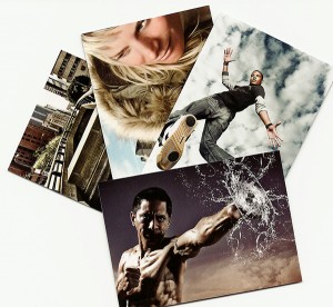
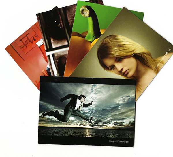
    Trade Secret flash cards by Nice Industries – lighting tips on the go! 

    If you talk to five different photographers, you’ll get five different answers to the question, “What’s the most important part of photography?” One might tell you proper exposure, while another might insist that it’s composition. Numbers three and four might debate the need to connect with the subject, but as the self-appointed fifth photographer in this roundtable, I’ll have to insist on lighting.

    Obviously, there is no right answer. The truth is, they all play a vital role in successful photography. We can debate the meaning of “successful” another time, but for me it really does come down to knowing how to see the light and make it work for you.

    Lighting is Key

    As both photographer and photography teacher, I’ve reviewed a lot of books on lighting over the last several years. Some have been amazing and truly elevated my photography, becoming well-worn friends on the shelf. Others have been epic disappointments. Regardless of success or failure, though, I applaud them all for the effort. They all tried to bring something new to the conversation.

    An unfortunate reality that all of these books share, however, is that you really can’t take them with you on a shoot. Think about it. The very last thing you need is to be standing there in front of a client, basically saying, “I’ll be with you in a minute. I just have to look something up.” Secondly, even if you’re experimenting on your own for future client work, dragging a lighting book along with you out on location is just plain cumbersome and inconvenient.

    That’s why I love these Trade Secret Cards from Nice Industries.

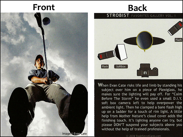
    trade-secret-cards-001These books we’ve been talking about are full of helpful lighting diagrams, set side-by-side with anecdotes and instruction from the photographers about how they set up the shots. But what if you could have all that great information in a more convenient, user-friendly package?

    Trade Secret Cards provide just such a package and are available in two sets:  Strobist or Chase Jarvis Portrait Sessions. Each contains 24 high-gloss “trading cards” with a photo on one side, along with the lighting diagram and a “How-They-Got-the-Shot” story on the other.

    The Strobist set runs the gamut from portraits to products to landscapes to light painting, and lots of cool stuff in between. Each of the 24 photographers’ lighting diagrams and tips were carefully selected to help take your lighting to the next level. The Chase Jarvis set gives you a front-row seat, as he walks you through a collection of portrait sessions he designed and shot for both his personal work, as well as several national ad campaigns, including the Hasselblad Masters Series.

    trade-secret-cards-004

    Each deck of 2.5″ x 3.5″ wallet-sized cards gives you instant access to quality tips and information aimed at a single goal– making you a better photographer. Printed on thick, semi-durable card stock, each image has been reproduced with a high-quality resolution and UV finish. With the photo on one side and all the info you need on the other, these easy-to-follow cards are also perfectly portable, making it easy to drop a card or two or ten in your bag and head out to tame the lighting beast.

    If you’re a photographer who really knows your lighting, these trading card-sized refresher courses are a great way to stay sharp. If you’re still learning, these images will inspire you to experiment and see why lighting really is the most important element of photography.

    Post originally from: Digital Photography Tips.

    Check out our more Photography Tips at Photography Tips for Beginners, Portrait Photography Tips and Wedding Photography Tips.

    Trade Secret Cards by Nice Industries – a Review

    The post Trade Secret Cards by Nice Industries – a Review by Jeff Guyer appeared first on Digital Photography School.


    Digital Photography School
  • Nice Visual Art photos

    Check out these visual art images:

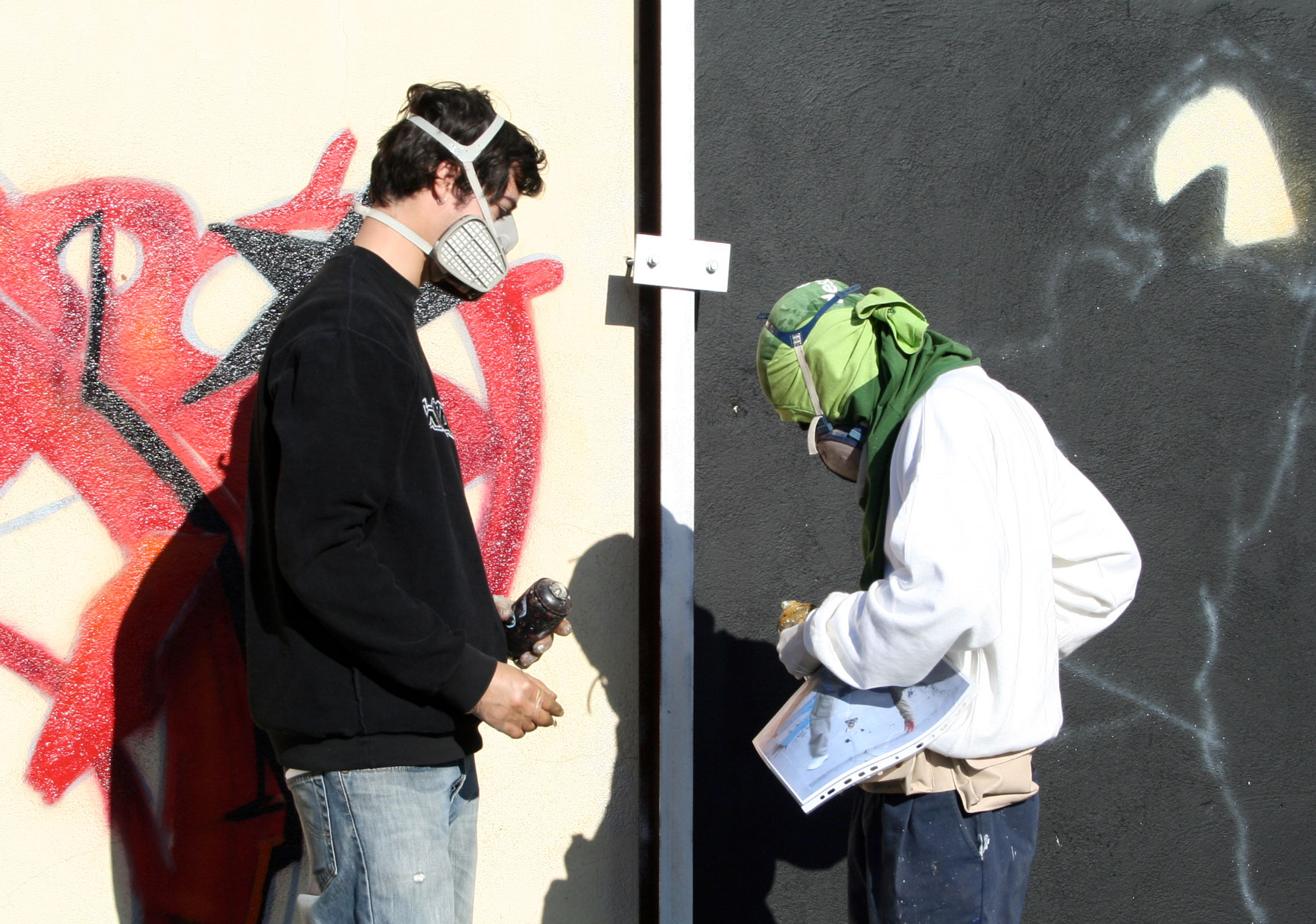
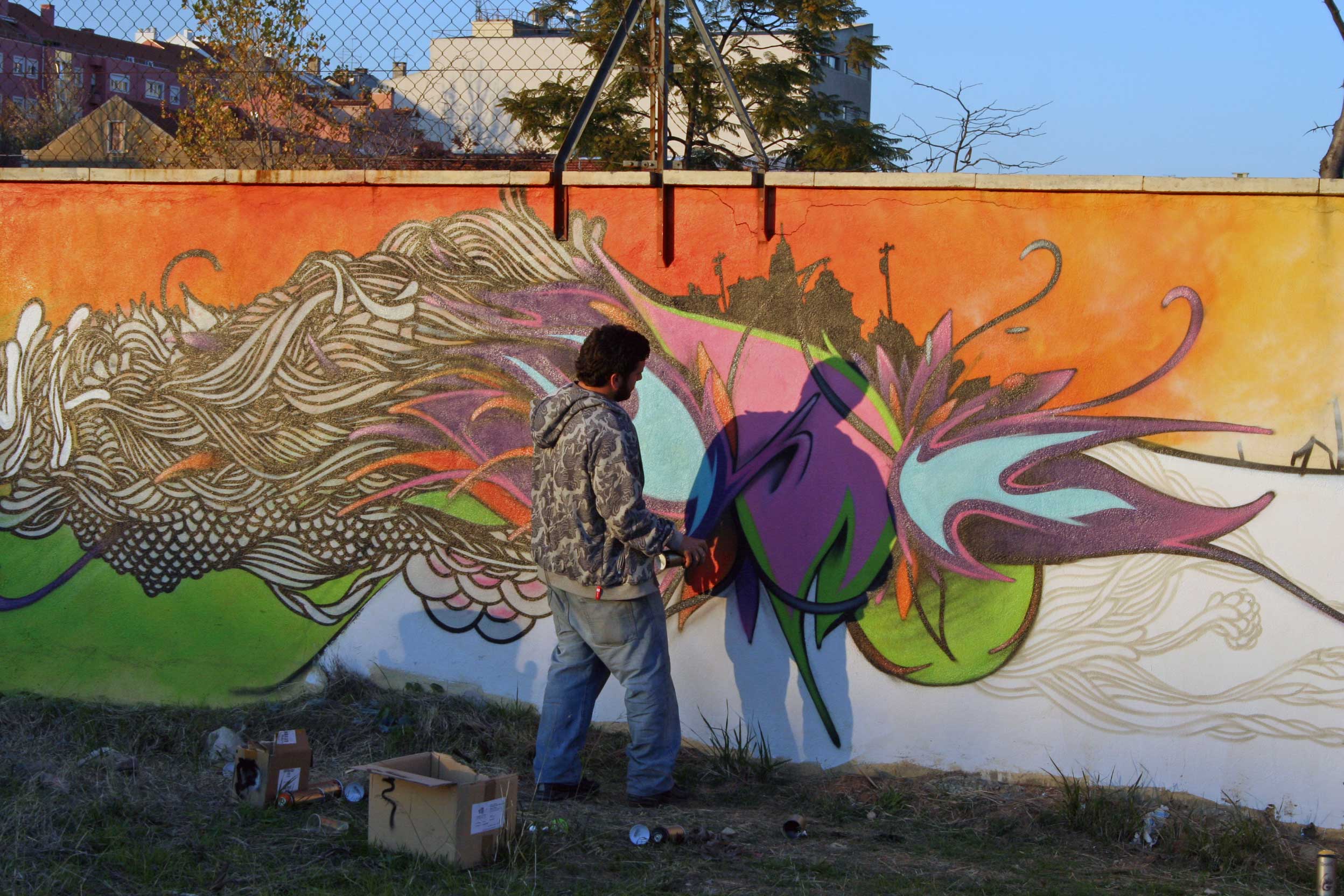
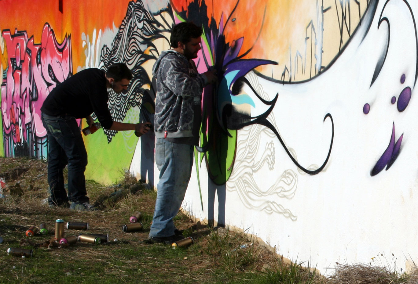
    VSP Visual Street Performance 2007 @ Fabrica Braco de Prata, Lisbon, Portugal
    visual art
    Image by Graffiti Land

  • Nice Visual Art photos

    Some cool visual art images:

    VSP Visual Street Performance 2007 @ Fabrica Braco de Prata, Lisbon, Portugal
    visual art
    Image by Graffiti Land

  • Nice Visual Art photos

    Check out these visual art images:

    Ruth Nickerson, American sculptor, 1905-1997
    visual art
    Image by Smithsonian Institution
    Description: Jennie Ruth Nickerson was a sculptor, WPA (Public Works of Art Program) artist, art educator and teacher. She preferred to work in stone and carved directly into her materials. Her signature works were larger-than-life religious figures, but also created the occasional political figure as well.

    Creator/Photographer: Peter A. Juley & Son

    Medium: Black and white photographic print

    Dimensions: 8 in x 10 in

    Culture: American

    Persistent URL: http://photography.si.edu/SearchImage.aspx?id=5836

    Repository: Smithsonian American Art Museum, Photograph Archives

    Collection: Peter A. Juley & Son Collection – The Peter A. Juley & Son Collection is comprised of 127,000 black-and-white photographic negatives documenting the works of more than 11,000 American artists. Throughout its long history, from 1896 to 1975, the Juley firm served as the largest and most respected fine arts photography firm in New York. The Juley Collection, acquired by the Smithsonian American Art Museum in 1975, constitutes a unique visual record of American art sometimes providing the only photographic documentation of altered, damaged, or lost works. Included in the collection are over 4,700 photographic portraits of artists.

    Accession number: J0014755

  • Nice Visual Art photos

    Check out these visual art images:

    VSP Visual Street Performance 2007 @ Fabrica Braco de Prata, Lisbon, Portugal
    visual art
    Image by Graffiti Land

    VSP Visual Street Performance 2007 @ Fabrica Braco de Prata, Lisbon, Portugal
    visual art
    Image by Graffiti Land

    VSP Visual Street Performance 2007 @ Fabrica Braco de Prata, Lisbon, Portugal
    visual art
    Image by Graffiti Land

  • Nice Visual Art photos

    Some cool visual art images:

    VSP Visual Street Performance 2007 @ Fabrica Braco de Prata, Lisbon, Portugal
    visual art
    Image by Graffiti Land

    VSP Visual Street Performance 2007 @ Fabrica Braco de Prata, Lisbon, Portugal
    visual art
    Image by Graffiti Land