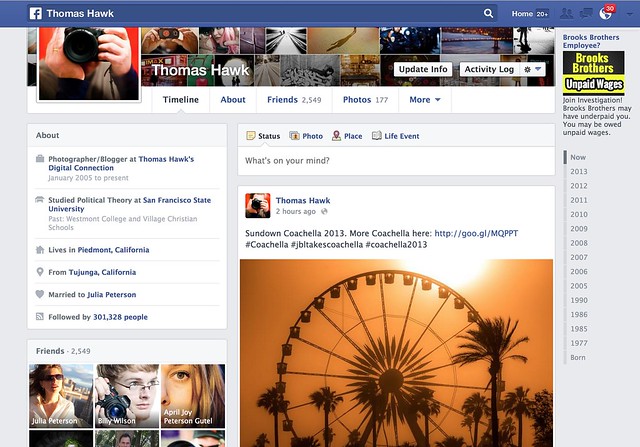
I had the new Facebook Timeline turned on for me yesterday. My wife got it about a week ago. Does anyone else have it? Do you like it? Anyone ever seen that movie Memento?
Photos feel larger — I like that — but I don’t really like the way that photos are cropped.
The old timeline forced everything into a square box by default so landscape/portrait crops were still problematic. You could reposition the photo after the fact (sometimes, when the reposition tool worked, which was probably less than 10% of the time for me) but your photo got stuck in a square crop. You could also “feature” the photo which would give it an extreme horizontal crop manually.
By the way, I seem to be able to use the reposition tool again now with the switch over to the new timeline.
Part of me liked the old Facebook timeline format. I love the square photo. It’s my favorite crop of all. When I uploaded a square to Facebook it would then show perfectly on my timeline page. If the other crops suffered, oh well.
The new timeline page goes back to a traditional landscape crop. So now when you upload your landscape oriented photos to Facebook they fit and look great. Unfortunately though, now both the portrait and the square crop are squashed into a landscape box.
Why on earth doesn’t Facebook just display BOTH landscape and square crops in their original crop? This is what they do on mobile btw, so it would seem more consistent. This would mean that square photos would be even bigger on the web version of Facebook, but everybody wants bigger photos anyways, so why make our square crop photos suffer in that landscape oriented box? This is what Flickr does by the way. On Flickr the square crop is king. I love that.
Of course portrait oriented photos get butchered even worse now with the new Facebook timeline — now they are squeezing a portrait photo into a landscape orientation instead of a square. Some of these just look awful.
It does feel like Facebook is trying to somehow more intelligently decide which portion of square and portrait photos get shown in the landscape box. Maybe their algorithm is looking for the eyes and focusing on that. I’m not sure, but it feels like the auto cropping is a little smarter and more intelligent.
Google+ takes a different approach. They retain the photographer’s original crop… but then you are stuck with those damn grey bars on the sides of your square and portrait photos on G+. For the life of Kevin, I’m not sure why G+ doesn’t just let the square photo have the entire envelope. It would look much better than those tiny little gray bars on the side and it’s just giving square photos an ensy weensy more real estate.
Which is what Facebook should do too, by the way. Square crops sort of fit into the landscape envelope, but why make the square suffer that way? Just liberate it. Make the square the king. I thought Facebook was doing this on the newsfeed a couple of weeks ago, but I think they switched back to cramming a square photo in a landscape box with both the new newsfeed and timeline now too.
Is there an answer to this perplexing problem about how best to display our images on the web? Why can’t we have just one big gigantic mosaic wall on both Facebook and Google+, that’s actually my favorite format of all I think.
Other changes on the new Facebook timeline, include moving your follower count over to a smaller less prominent place on the left. They also give the actual number now, instead of something that just said 300K before. You can add or remove certain modules out of the smaller left side column if you want.
Despite the photo crop issues, overall I like the new timeline a lot. I like it better than the old version. It feels more fluid and slick. I do like that overall photos do appear bigger. Landscape oriented photos especially look great there now.
The new comment system drives me a little batty though. I can never figure out who is talking to who and I feel like I’m trapped in some sort of web version of the movie Memento — but that’s a whole other topic entirely. I can never understand who said what in what order to who. I feel like I’m trapped in some sort of online version of that old movie Memento.
Unfortunately, as usual, with the new Facebook timeline we’re still stuck with the damn ads. I wish Facebook’s ads weren’t so especially vulgar. Why is Facebook trying to get me to join some lawsuit about unpaid wages at Brooks Brothers? I hate lawsuits — plus I’ve never worked at Brooks Brothers. Shouldn’t Facebook be smarter than that in terms of what ads it shows me? Why does Facebook think I worked at Brooks Brothers? Next thing you know some other ambulance chaser is going to start advertising at me just in case I’ve ever had Mesothelioma. Facebook should let us pay for a Pro account and exempt us from bad advertising.
By the way, anyone ever seen that movie Memento?
Thomas Hawk Digital Connection