[ By Steph in Design & Graphics & Branding. ]
Data is much easier for most of us to process when it’s presented in visual form, and these 15 infographics and visualizations give us a (literal) picture of New York City that would be hard to come by otherwise. Exploring things like income inequality, building age, how the city has evolved and what its most popular hot spots are, these maps and charts illuminate the city in new ways.
Inequality and New York’s Subway
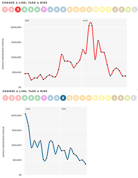
New York City’s inequality problem is even clearer when viewed by subway line, as this interactive infographic from The New Yorker illustrates. Using data on median household income from the U.S. Census Bureau, it allows you to see the areas where earnings range from abject poverty to sky-high wealth.
Building Age, NYC
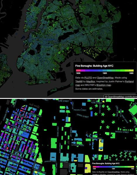
Where are the city’s oldest buildings? You could read a list of them, but seeing them laid out visually on a map makes them easier to spot. See the ages of one million New York buildings mapped in vivid colors, zooming in and exploring by neighborhood, at BDON.org.
10,000 NYC-Based Tweet Locations
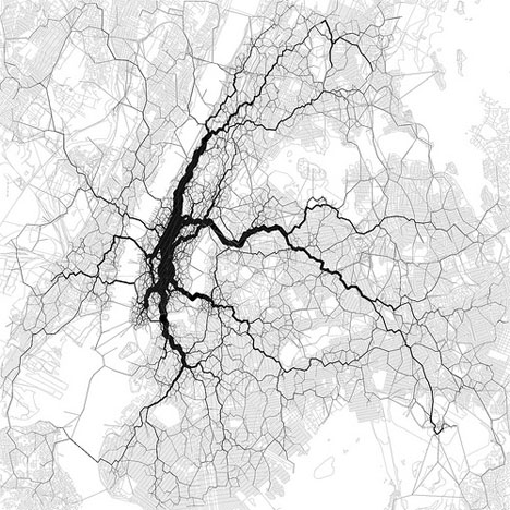
Ten thousand New York City-based tweets are laid out on top of a map in this interesting data visualization. The creator, Eric Fischer, asks “Is this the structure of New York City?” Perhaps it’s really just bored people in subways and cabs taking a moment to tell the world what they ate for lunch.
Growth of Manhattan Island, 1650-1980
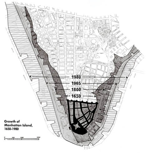
It’s easy to forget that much of Manhattan Island (and the rest of New York City) used to be a marsh. The borders of the island were much further inland way back in 1650 when the first settlement was founded. By 1980, they had extended by a good 1,000 feet.
Manhattan Past, Present and Future
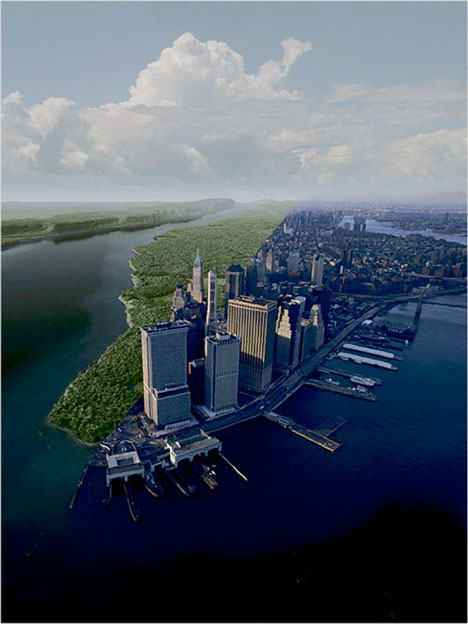
Here’s another visualization that shows the drastic changes in the island from the way it was when European settlers first arrived to how it looks today. The composite image shows the left side of the island as it was 400 years ago and the modern-day city on the right. How will it change in another 400 years?
Next Page – Click Below to Read More:
Virtual Reality 15 New York City Data Visualizations
Want More? Click for Great Related Content on WebUrbanist:
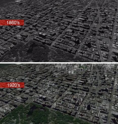
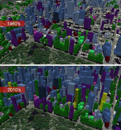
City Evolution: Watch Urban Growth in 3D Visualizations
Watch Manhattan multiply and San Francisco soar into the sky in a series of growth animation videos that show the expansion of cities over more than a century. … Click Here to Read More »»

Book of Cities: Rise & Fall of 10 Places Over 200 Years
We take it for granted that London and New York will grace the pages of books, but would you be surprised to learn that Madrid and Cairo were once as commonly … Click Here to Read More »»

Real Life Sim City: 3D Printers Turn Virtual to Reality
SimCity gets real in this fun 3D printing project that brings the virtual buildings to life. Who’s up for playing Godzilla? Click Here to Read More »»
![]()


[ By Steph in Design & Graphics & Branding. ]
[ WebUrbanist | Archives | Galleries | Privacy | TOS ]
![]()
     |


You must be logged in to post a comment.