RSS
 

Posts Tagged ‘Spaces’

Camera Color Spaces Explained – sRGB vs Adobe RGB vs RAW

22 Dec

The post Camera Color Spaces Explained – sRGB vs Adobe RGB vs RAW appeared first on Digital Photography School. It was authored by Herb Paynter.

camera-color-spaces-explained

Your camera is probably able to capture color images in a variety of different color containers called “spaces.” These camera color spaces collect colors in one of several size light buckets labeled sRGB, AdobeRGB, and RAW.

Each bucket gathers slightly increased varieties of light, similar to the way Crayola crayons are packaged and sold in increasingly inclusive collections of colors; small, large, and jumbo.

Camera color spaces offer photographers a variety of different size boxes.

Camera color spaces

camera-color-spaces

Scenes that include both brilliant colors and bright lighting are excellent candidates for capture with AdobeRGB color space.
F/3.5, 1/1000, ISO 400, Lumix G Vario 2.8, 35mm


A debate in the photo community usually arises over which camera color spaces to choose in the camera’s preferences. Some color spaces capture more of the hues and saturated colors than others. Pictures captured in one space may include more colors than another.

Each space is ideally suited for certain purposes, and the question of which camera color space to choose needs a bit of explanation. In addition to the capture question, choosing a color space for post-production editing will depend on the image’s ultimate usage.

Your camera’s color spaces involve not just color data, but additional parking space on the drive. Larger color spaces provide more bit-depth (explained below), which occupies more digital real estate on the memory card. So, the choice of which to use does have practical importance.

What camera color space to use

There is no singularly perfect color space choice, so let’s examine which is best for specific situations.

camera-color-spaces

Images that do not include highly-saturated color but contain significant detail in the shadow areas will benefit from RAW format capture and high-bit processing. F/10, 1/1600, ISO 800, Lumix G Vario 2.8, 200mm


Unless the sole purpose of a photo is to display as a high-resolution digital image, you might want to convert the file’s original color space for a less demanding result. However, keep in mind that every time a file mutates from a larger color space to a smaller color space (RAW to AdobeRGB, or AdobeRGB to sRGB), the image’s color intensity and integrity may diminish in the process. Some imaging applications are less demanding than others.

While copies of digital files remain identical in size and intensity to the original regardless of how many times they have been copied, when a digital file mutates to a lesser color space, it will always lose some critical color information. Your camera color spaces in general, and device color spaces, in particular, are all unique. Each serves a particular purpose.

Image: The extreme dynamic range and saturated skies benefitted from the RAW capture and editing in...

The extreme dynamic range and saturated skies benefitted from the RAW capture and editing in AdobeRGB. Detail buried in the shadows was possible because of the 14-bit capture. F/14, 1/300, ISO 3200, Lumix G Vario 2.8, 12mm


It’s a matter of depth

The difference between camera color spaces boils down to an issue called bit depth. Bit depth is a mathematical description of how many visible distinctions between shades of color can be recognized and reproduced by different devices (a techie term for scanners, cameras, computer monitors, and printing machines). Unfortunately, not all devices can reproduce all colors the same (which is the primary stumbling block amidst all color issues).

Every device reads and reproduces color using a different process. While this sounds like a fixable problem, there is a sad and unsolvable reality behind the problem. There are at least three different interpretations of color at play in every capture-display-print cycle.

Image: These colorful seat cushions and deep shadows were captured in RAW format, edited in AdobeRGB...

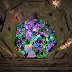
These colorful seat cushions and deep shadows were captured in RAW format, edited in AdobeRGB, and saved in sRGB for upload to our camera club’s server for display as part of a club field trip slideshow. F/7.1, 1/320, ISO 400, Lumix G Vario 2.8, 19mm


First, cameras capture color by recording intensities of light as electrical signals and interpreting those signals as colors. Each color is assigned a specific number.

Second, these numbers are then sent to the computer. Here, they get translated into another process that interprets those electrical signals into a process that turns on tiny lights (called pixels) on a backlit screen.

And third, those pixels are then sent to a printing machine that instructs those pixel values to spit tiny splatters of colored ink onto paper.

It’s a very complicated process that color scientists have tried for years to make simple. Unfortunately, it just ain’t that simple!

Anyway, during this hair-on-fire digital transition, different methods are employed that utilize the various color spaces in a way that transforms the colors from one device to another as accurately as possible. Sometimes the color translations don’t convey the colors as accurately as we would like, which is why sometimes the monitor colors don’t match the printer colors.

camera-color-spaces-explained

Science uses charts like this to plot the characteristics of camera color spaces. While these charts are referred to as “theoretical” because they are not visible to the human eye but represent what each color “bucket” can capture versus what the eye can see.


The ultimate referee

The only comprehensive color space that plots the full scope of what the human eye can see is what the science community calls L*a*b* (inverted horseshoe diagram) space.

The human eye is the ultimate arbitrator in the color wars, and all device capabilities (camera, display, and printer) are defined by how they match up to the eye’s master gamut. This is why this strange horseshoe shape is referred to as the Reference Space. All other devices, whether camera, display, or printer, can only recognize and utilize portions of this “reference space,” and they usually disagree with each other.

Color is a very diverse and dysfunctional family. Each device speaks a different dialect of a similar language. Each produces colors that cannot be faithfully reproduced on other devices. Color is a very messy topic.

color-spaces-explained

Crayola crayon boxes contain varying numbers of colors just as color spaces collect varying amounts of color. The lightest and darkest color crayons are the same value, but larger boxes contain more colors than smaller ones.


Some devices can express color more completely than others. Unfortunately, no device created by humans can reproduce all the colors that can be seen by humans. Also, the colors captured by one device that fall outside the gamut (Crayola box size) of other devices, get clipped, lost, or compressed during the handoff. Those colors never come back home.

This is the tragic truth about digital color reproduction. The trick to color reproduction is in retaining as much of the common color as possible during the process. Fortunately, this same human eye (and brain) are very forgiving about accepting the limitations of non-human devices.

Color reproduction is a true application of the law of diminishing returns and the visual science of physics. Photographers understand this law quite well.

Very rarely can a camera actually capture all the color and dynamics of an original scene. Moreover, nature’s color gamut extends even further than the colors that the human eye can identify. Any time a digital image gets transposed from one form into any another form, that transformation is a diminished-value exchange.

As an image is transferred from one device to another, those pixel values located outside the color gamut of the destination device always get lost in the translation. The object of color management is to mitigate color loss and maintain as much of the appearance of the original as possible, all the way through the reproduction process.

RGB spaces (sRGB, AdobeRGB, ProPhoto RGB)

It all begins with the camera’s color settings that are in place when you capture the scene. All cameras capture light through red, green, and blue filters (RGB color space). While there are a number of RGB color spaces to choose from, each sports a slightly different color gamut.

camera-color-spaces-explained

Each device in the photography chain interprets colors slightly differently, and each responds to the individual color spaces uniquely.


Each color space (sRGB, AdobeRGB, ProPhoto RGB, etc.) provides a unique collection of color attributes, and each space satisfies specific display and reproduction requirements.

Gamuts are descriptions of the range of colors that a device can recognize, record, display, or print.

Shooting a vibrant, saturated scene with the camera requires a larger color space. Using a camera color space with a smaller gamut could significantly diminish the raw, harsh emotion of the scene. This is why most photography experts encourage photographers to set their cameras to capture images in AdobeRGB.

sRGB

Almost all digital cameras are factory-set to capture colors using sRGB as the default color space for a plausible reason; most of the pictures we take never get printed! At best, we view them on computer monitors or social media. Quite honestly, most of the pictures we capture never make it past the initial glance at the camera’s LCD screen. Capturing those images in higher-bit color space is a total waste of disk space.

camera-color-spaces-explained

sRGB color space remains largely unchanged since it was defined in the 1950s to compress video images into a manageable size for broadcast. While the format has been updated slightly, the basic intent is the same.


sRGB was developed by HP, Microsoft (and others) back in the early days of television to address the color gamut needs of most televisions (early versions of computer monitors), and the standard was set long ago. The airwaves and Internet browsers live on an sRGB diet. As such, the sRGB color space standardizes the way images are still viewed on monitors and televisions.

Adobe RGB

If the ultimate destination for your picture is monitor or display-based presence (presentations, Internet, or television displays), this is probably the best choice to capture images. However, if you shoot for print on paper, both AdobeRGB 1998 and ProPhoto RGB RGB contain a wider gamut of colors and are thus more suited for preparing images for print.

camera-color-spaces-explained

The brilliant dynamics and saturated colors are always captured best in the deepest color bucket of all – RAW. The degree of adjustments provided by RAW capture and ProPhoto RGB editing is perfect for images like this. F/6.3, 1/800, ISO 400, Lumix G Vario 2.8, 26mm


RAW

Actually, the most ideal bucket for capturing images actually exceeds the gamuts of all three of these camera color spaces. I’m speaking of course of your camera’s ability to capture images in RAW format. This is a format that supersedes any defined color spaces.

RAW files capture color in the highest bit depth possible; up to 14-bits per color. RAW is not an acronym; it is more of a description. It is the recording of all the limited color depth and uncompressed dynamic range of the original scene. Start RAW and strip down from there.

Camera color spaces explained – Conclusion

Congratulations on sticking with this article through all the minutia.

By now, it probably seems like camera color space is more like outer space, but it doesn’t have to remain this technical. Simply remember to capture images in RAW format (perhaps in addition to capturing them as JPG) and then transform the colors down the chain of reproduction as the need dictates.

Edit images in the camera color spaces of ProPhoto RGB or AdobeRGB to retain as much color elbow room as necessary. Those images destined for print should be transposed to AdobeRGB, and reduce those images destined for the Internet or slideshows to sRGB. Simple, enough!

The post Camera Color Spaces Explained – sRGB vs Adobe RGB vs RAW appeared first on Digital Photography School. It was authored by Herb Paynter.


Digital Photography School

 
Comments Off on Camera Color Spaces Explained – sRGB vs Adobe RGB vs RAW

Posted in Photography


UC Berkeley researchers have created a drone that shrinks to squeeze through small spaces

09 Aug

Since drones entered mainstream consciousness, people have gotten creative with developing new ideas for how they can be used. Drones can deliver food and other small items. They can even bake cakes or play instruments when configured properly. Now, a team of researchers at UC Berkeley’s High Performance Robotics Laboratory (HiPeRLab) has created a ‘Passively Morphing Quadcopter’ that can temporarily shrink down to squeeze through small spaces.

While this isn’t the first drone that can compress its shape mid-flight, it is the only one that can shift its shape without using any additional hardware components. This feature helps preserve battery life, enabling the aircraft the fly even longer. Engines enable the arms to rotate freely and constant force springs provide the momentum to change shape. When no thrust is applied, the springs pull the arms into a folded configuration.

When the drone approaches an opening smaller than it can fit, it can plot a course that allows its arms to retract as it’s flying through a small small space. The rotors shut off and after the drone passes through, it loses a bit of altitude as it powers back up. While this set up can offer up a number of useful real-world applications, like inspecting hard-to-reach areas, there is still work to be done by the HiPeRLab team for it to work in any other scenario where there isn’t a wide open area on the other side of a small space for the drone to squeeze though. Nevertheless, when perfected, it could make for an innovative filmmaking tool.

Articles: Digital Photography Review (dpreview.com)

 
Comments Off on UC Berkeley researchers have created a drone that shrinks to squeeze through small spaces

Posted in Uncategorized


Occupy Urban Spaces: 10 Guerrilla Modifications to City Infrastructure

30 Nov

[ By SA Rogers in Architecture & Cities & Urbanism. ]

screen-shot-2016-11-29-at-7-17-51-pm

Nobody knows the needs of a city better than the residents who navigate it each day, so who better to edit, adapt and upgrade urban spaces to make them cooler and more useful? Urban ‘hacktivism’ takes underutilized architecture and infrastructure, from street signs to empty subway stations, and subverts it for a new purpose. Whether installed guerrilla-style or with the blessing of city officials, these projects make the city a more fun and comfortable place to hang out.

Arche de la Defense Occupation by Parasitic Guerrilla Architecture

arche-de-la-defense-occupation

arche-de-la-defense-occupation-2

arche-de-la-defense-occupation-3

What if citizens took the lack of affordable and accessible housing in cities into their own hands, and simply created their own residences wherever they saw fit? ‘Pocket of Active Resistance’ envisions how this would manifest in Paris, as guerrilla housing takes over monuments like the Arche de la Defense. Architect Stéphane Malka presents a modular housing system stuck right into the interior walls of la Defense, connected by scaffolding and catwalks.

Alleyway Squat Housing by WEAK!

screen-shot-2016-11-29-at-7-15-00-pm

screen-shot-2016-11-29-at-7-15-16-pm

screen-shot-2016-11-29-at-7-15-59-pm

The firm ‘WEAK!’ encourages the organic growth of illegal structures on all sorts of city surfaces, including rooftops, disused fields and abandoned skyscrapers, reflecting “the citizen’s right to express himself through architecture.” Among the projects they’ve brought to life throughout Taiwan is this elevated alleyway dwelling made primarily of scaffolding, which creates a new two-level residence while leaving room on the ground for pedestrians to pass through.

Parasite 2.0 Colony in Venice

screen-shot-2016-11-29-at-7-17-51-pm

screen-shot-2016-11-29-at-7-18-00-pm

Young Italian collective Parasite 2.0 took over a series of disused spaces throughout Italy as part of a 2013 urban occupation project, including the fort of the Sant’Andrea island in the Venetian lagoon. Stretching polyethylene through the frame of an abandoned building like a web, they created an amorphous series of rooms with built-in hammocks.

Cascade Project by Edge Design Institute

cascade-project-2

cascade-project-1

A staircase in Hong Kong that took up lots of space yet saw very little foot traffic temporarily became the setting for a vibrant geometric mesh sculpture with built-in seating and planters, creating a miniature park right in the middle of The Centrium. ‘The Cascade Project’ by Edge Design Institute features a living canopy of Bauhinia trees and other plants, giving the staircase an alternate and ultimately more useful purpose.

Art & Culture Center Beneath a Railway in Japan

railway-center-2

railway-center

While this project was completed with the blessing of the city of Yokohama, it’s a pretty cool example of how underutilized urban spaces can be taken over and transformed for the benefit of all residents. Situated on a once-obsolete and uneasily quiet street, right beneath a railway track, the new arts center includes a gallery, cafe and studio.

Next Page – Click Below to Read More:
Occupy Urban Spaces 10 Guerrilla Modifications To City Infrastructure

Share on Facebook


[ By SA Rogers in Architecture & Cities & Urbanism. ]

[ WebUrbanist | Archives | Galleries | Privacy | TOS ]


WebUrbanist

 
Comments Off on Occupy Urban Spaces: 10 Guerrilla Modifications to City Infrastructure

Posted in Creativity


The City is a Canvas: 31 Murals Transforming Urban Spaces

22 Nov

[ By SA Rogers in Art & Street Art & Graffiti. ]

colorful-street-art-main

Psychedelic portals beckon you to enter another dimension, sea monsters lurk at the bottom of the stairs and illustrated figures playfully interact with urban infrastructure in works of art that bring color, levity and natural imagery to urban environments.

Sea Monster Stair Steps by Skurk

interactive-street-art-sea-monster-1

interactive-street-art-sea-monster-mural-2

The creepy sea creature lurking at the base of these stairs is enough to make anyone nervous, even in broad daylight – but just wait until the sun goes down. Street artist Skurk used two existing lamps affixed to the building’s exterior as the eye and lure of an anglerfish to terrifying and delightful effect.

Site-Specific Wheatpastes by Levalet

street-art-levalet-1

interactive-street-art-levalet-2

interactive-street-art-levalet-3

interactive-street-art-levalet-4

Paris-based artist Levalet (Charles Leval) works with existing textures, colors and fixtures in urban environments to create playful site-specific works of art. Some are playful, some are a bit disturbing, but all of them pair sketched human and animal figures with fountain heads, drains, windows, utility boxes, staircases and other elements of the city.

Massive Murals in Italy by Millo

interactive-street-art-millo-2

interactive-street-art-millo-3

interactive-street-art-millo-4

An illustrative black-and-white style accented by carefully chosen splashes of bold color characterizes the ground-to-roof murals painted onto buildings by Italian street artist Millo.

Giant Bees by Matthew Willey

interactive-street-art-bees-1

interactive-street-art-bees-2

interactive-street-art-bees-4

50,000 bees now adorn surfaces around the world as part of the Good of the Hive Initiative, a project by artist Matt Willey aiming to raise awareness about the plight of the honey bee. Willey traveled all over the globe to paint a few dozen bees at a time in each location, with the goal number representing how many bees it takes to sustain a healthy hive.

Next Page – Click Below to Read More:
The City Is A Canvas 31 Murals Transforming Urban Spaces

Share on Facebook


[ By SA Rogers in Art & Street Art & Graffiti. ]

[ WebUrbanist | Archives | Galleries | Privacy | TOS ]


WebUrbanist

 
Comments Off on The City is a Canvas: 31 Murals Transforming Urban Spaces

Posted in Creativity


4 Tips to Help People Photographers Shoot Interior Spaces

18 Oct

As a people photographer, I am not a specialist in photographing still forms like architectural structures and interior spaces. However, because I photograph weddings, I often take photos of interiors and locations as part of the wedding photos I give my clients. This is essentially how I learned to develop an eye for detail, form and structure as part and parcel of my work.

4-tips-photographing-interiors-tutorial_0008

Let me share with you a few tips I have learned that will hopefully get you started in photographing interior spaces and architecture if you are a people photographer.

#1 Use natural light

One of the advantages of still photography is simply that – nothing moves. You can leverage this by playing with your settings, especially the shutter speed. With the camera rested on a tripod or a table, you can play around with very slow shutter speeds to maximize capturing ambient light even in very dark corners, limited light, or night interior photography. If there are lamps and lights that make up the overall ambiance of the room, include them and take advantage of slow shutter speeds and long exposures. You can also keep your ISO low this way and have the bonus of clean noiseless images.

It is important to remember that for interiors, you should aim for balanced lighting. Meaning there are no overly dark shadows or overly bright highlights. You want to see the detail in dark areas but not blow out the light areas altogether. Because we are talking about natural light, think about which times of the day which best feature the interior space. Early morning and late afternoon light are the softest. Overcast days produce soft light. Bright super sunny days produce harsher light especially midday and therefore you may want to take into consideration shadows produced in the interior from harsh outside light. In contrast to photographing people, I would normally use these shadows as an artistic element of the photo. Interior spaces however are different and this may not always be appropriate.

Early morning and late afternoon light are the softest. Overcast days produce soft light. Bright super sunny days produce harsher light, especially midday. Therefore you may want to take into consideration any shadows produced in the interior from harsh outside light. In contrast to photographing people, I would normally use these shadows as an artistic element of the photo. Interior spaces, however, are different and this may not always be appropriate.

4-tips-photographing-interiors-tutorial_0008

#2 Don’t forget your 50mm lens

Not only is the 50mm lens the closest lens that resembles the human eye (when using a full frame camera), it is also the perfect lens to separate some areas and details of the space without going in too close. In a way, it is an excellent “portrait” lens for spaces, whereas my 85mm is my choice of portrait lens for people.

When using wider lenses, I find I have to correct quite a lot of distortion on the edges of the frame. With the 50mm this is hardly an issue. The results are pleasing to the eye and it evokes a very natural look, making you feel like you are within the actual space yourself.

4-tips-photographing-interiors-tutorial_0008

#3 Get the white balance right

This is tricky and the nemesis of many photographers. Most non-photographers are oblivious to white balance. This is especially obvious in weddings where the bride’s dress looks blue and people’s faces register as magenta, yet hardly anyone notices.

When I sold my house a few years back, the real estate agents who boasted of great property photography sent a photographer to my house to take some professional pictures. She arrived with a camera on the tripod and a flash head pointed slightly upwards. The lens used was very wide – I guessed around 10mm or 14mm. It took many days before the photos were up online, when finally I saw them, they were all very blue. My home felt so cold and not homely. One of the reasons for that was the incorrect white balance.

Personally, I prefer a warm feel to all my photos so I tend to edit towards that side. But do be careful that the whites still look white and not yellow or cream. Remember that what often draws people to an image is a feeling or emotion. Your image becomes all the more powerful if it reminds the viewer of a sentiment, experience, or something that resonates with them. White balance is key in helping achieve this kind of engagement with your viewer.

4-tips-photographing-interiors-tutorial_0008

#4 Remember to go close, not just wide

Nowadays, when you browse through interior design catalogues or blogs, you will come across many interior details, arrangements and vignettes that do not show the entire space. Everyone is doing it from high street department stores to high end interior designers. There must be a good reason for it. In order to reinforce engagement and a connection to your audience, details are essential.

Imagine walking into a space, or that you are viewing a house for the first time. Before you walk though the door, you survey the outside look of the property and its surroundings. You do the same as you walk in, surveying the overall scene before your eyes. But when you are inside you get closer and see the details.

You may want to touch and feel the walls, flip some switches on if they work, or sit on the sofa with fluffy scatter cushions. You want to get close, touch and feel things. It is not only a visual connection then, it becomes physical. This is the sense you want to achieve with your images when the viewer is not physically in the space. That is why close up shots and details are important.

4-tips-photographing-interiors-tutorial_0008

Conclusion

With photography, aim to connect with your viewers not only by using visual senses but also with the power of emotion. If you can add a virtual physical touch to this engagement, all the better. When viewers look at your images and say, “I feel like I was actually there.” take that as one of the highest compliments.

I hope you enjoyed this little beginner’s journey into interior photography. Of course there are many more tips like straightening horizons and shooting through doors. If you have any other awesome tips, do share them here in the comments below.

googletag.cmd.push(function() {
tablet_slots.push( googletag.defineSlot( “/1005424/_dPSv4_tab-all-article-bottom_(300×250)”, [300, 250], “pb-ad-78623” ).addService( googletag.pubads() ) ); } );

googletag.cmd.push(function() {
mobile_slots.push( googletag.defineSlot( “/1005424/_dPSv4_mob-all-article-bottom_(300×250)”, [300, 250], “pb-ad-78158” ).addService( googletag.pubads() ) ); } );

The post 4 Tips to Help People Photographers Shoot Interior Spaces by Lily Sawyer appeared first on Digital Photography School.


Digital Photography School

 
Comments Off on 4 Tips to Help People Photographers Shoot Interior Spaces

Posted in Photography


World’s First Non-Rectangular Soccer Fields Activate Asymmetrical Spaces

29 Sep

[ By WebUrbanist in Architecture & Cities & Urbanism. ]

assymmetrical-soccer-field

Turning disused spaces in Bangkok into odd-shaped soccer (or: football) fields, this project provides much-needed places to play in dense cities where conventional lots are hard to find. It also serves as a potential model for creatively rethinking leftover urban land more broadly.

non-rectangular-football-field

Developed in partnership with the Khlong Toei community, The Unusual Football Field project takes advantaged of abnormally shaped sites scattered around the district. Once areas of opportunity were identified and sides outlined, permission was sought, trash was cleared, land was leveled and fields were fit into each location.

non-conventional-field-shape

Kids who might not otherwise have access to normal 105-by-68-meter fields can kick balls around these unusual courts, overcoming (or working with) the unique challenges of each variant. Sides can of course be switched mid-game as well to make sure things stay fair even on fields where one half could be seen as having an advantage.

shaped-soccer-playing-fields

Developed by AP Thailand, these creative fields represents an outside-the-box approach to working with urban density, rethinking possibilities and opportunities for irregular land configurations.

These soccer-playing zones may be unconventional but are nonetheless popular, catering as they do to Thailand’s most popular sport. On the flip side, they can also be re-purposed again with equal ease if demand shifts.

adaptied-fields-design

The hope, in part, is that other developers and community activists might see potential in this model, adapting it to other dense cities where large regular spaces are hard to come by. Indeed, other sports and athletic activities could adopt similar models as well – though given the tight confines a baseball-oriented version may be out of the question.

Share on Facebook


[ By WebUrbanist in Architecture & Cities & Urbanism. ]

[ WebUrbanist | Archives | Galleries | Privacy | TOS ]


WebUrbanist

 
Comments Off on World’s First Non-Rectangular Soccer Fields Activate Asymmetrical Spaces

Posted in Creativity


Wild & Scrappy: 3D Trash Sculptures of Animals Pop Up in Urban Spaces

29 Sep

[ By SA Rogers in Art & Street Art & Graffiti. ]

trash-sculptures-10

Literally popping out of city walls in three dimensions, wild animals emerge from a jumble of car parts, corrugated metal and random industrial objects masterfully layered and painted by Bordalo II. The Portuguese street artist has spent much of the last decade installing these giant murals in the streets of his hometown of Lisbon and other locales around the world, literally infusing new life into the stuff we’ve deemed junk and tossed away. Several new pieces have emerged in recent months, including a possum in Ft. Smith, Arkansas and a flying squirrel in Estonia.

trash-animals-10

trash-sculptures-7

trash-sculptures-6

Each of Bordalo’s sculptures grows in an almost organic fashion depending on what kind of trash the artist can find on the streets near his installation location. As you can probably imagine, he has no trouble accumulating more materials than he can handle just with a quick trip driving around a few city blocks. Certain materials, like tires, are preferred because they’re easy to cut and shape.

trash-sculptures-1

trash-sculptures-2

trash-sculptures-3

trash-sculptures-4

Like so many street artists, Bordalo started out making illegal street graffiti, and his style emerged over time as he began to integrate 3D objects into the paint. “Even if in the beginning it was all about exploring and discovering the way to do, the way to make it work, I’m still trying to innovate, create new problems and have fun with them – this is the process that creates different expressions, forms, textures, etc.,” he says in an interview with Street Art News.

trash-sculptures-5

trash-sculptures-8

trash-sculptures-9

Take a look through Bordalo’s Instagram for more projects, and see if you can identify all the individual elements that go into each piece.

Share on Facebook


[ By SA Rogers in Art & Street Art & Graffiti. ]

[ WebUrbanist | Archives | Galleries | Privacy | TOS ]


WebUrbanist

 
Comments Off on Wild & Scrappy: 3D Trash Sculptures of Animals Pop Up in Urban Spaces

Posted in Creativity


Book City: Retail Space for Reading Mimics the Look of Urban Spaces

01 Sep

[ By SA Rogers in Design & Fixtures & Interiors. ]

book city 1

The appearance of the city outside – complete with crosswalks and grids resembling aerial views of urban blocks – acts as a transition space between the entrance of a bookstore and the quiet, private spaces beyond. This space by XL-muse, located on the fourth floor of the Réel Mall in Shanghai, references the orderly aspects of urban aesthetics, carrying them from the sunny, exposed main room into the darkened alleys full of floor-to-ceiling shelves.

book city 2

book city 5

book city 6

Street lights gently illuminate the rows of books in these tranquil hallways, organized like pedestrian promenades complete with central park benches and displays. Mirrors are employed to visually double the height of the shelves, making them feel as if they continue up into the sky and stretch far deeper into the building than they really do. Paths direct you from one ‘house’ of books to the next as you explore the shop.

book city 4

book city 7

book city 3

In these atmospherically-lit areas bursting with dark-stained wood, shoppers feel like they’re navigating the city late at night, when the traffic has died down and the streets are eerily silent. The crosswalks continue into the small cafe, stepping right up onto the ceiling and then back out into the showroom, where white pegs inserted into the concrete walls can be pulled or pushed to create display niches.

Share on Facebook


[ By SA Rogers in Design & Fixtures & Interiors. ]

[ WebUrbanist | Archives | Galleries | Privacy | TOS ]


WebUrbanist

 
Comments Off on Book City: Retail Space for Reading Mimics the Look of Urban Spaces

Posted in Creativity


Living Street Art: Contorted Human Bodies in Urban Spaces

09 Jul

[ By SA Rogers in Art & Street Art & Graffiti. ]

Screen Shot 2016-07-08 at 9.48.16 AM

If you were to pass a bunch of colorfully-dressed human figures crammed into a crawlspace beneath a public staircase, you might think they’re mannequins at first, with their splayed limbs and claustrophobic positioning. The bodies are bent every which way, some hanging upside down, all of their faces obscured by hoodies, their positioning absurd. As you walk down the street, you spot more and more of them – folded beneath park benches, dangling from staircase railings, squeezed between utility boxes or piled on top of one another. But then a hand moves, or a muscle twitches, and you realize they’re alive.

bodies in urban spaces 3

The brilliance of choreographer Cie. Willi Dorner’s ‘Bodies in Urban Spaces’ lies as much in the chosen setting as it does in the extraordinary flexibility of his performers. Dressed in vivid track suits, the performers quickly assemble themselves into position, hold their poses for an uncomfortably long duration, and then disassemble themselves to run ahead to the next spot and repeat the process. The temporary urban interventions leave no trace when the performance is over, and aim to encourage residents to experience their cities in a different way.

Screen Shot 2016-07-08 at 9.48.30 AM

‘Bodies in Urban Spaces’ has been traveling the world since 2007, showing up all over the UK and Europe as well as Texas, New York, Istanbul, Russia and Japan. The performers lead an audience through each city, highlighting various architectural and urban features and how we interact with them as human bodies.

bodies in urban spaces 4

bodies in urban spaces 5

“‘Bodies in Urban Spaces’ is a temporary intervention in diversified urban architectonical environment,” says Dorner. “The intention of ‘Bodies in Urban Spaces’ is to point out the urban functional structure and to uncover the restricted movement possibilities and behavior as well as rules and limitations. By placing the bodies in selected spots the interventions provoke a thinking process and produce irritation. Passers by, residents and audience are motivated and prompted to reflect their urban surrounding and their own movement behavior and habits.”

Share on Facebook


[ By SA Rogers in Art & Street Art & Graffiti. ]

[ WebUrbanist | Archives | Galleries | Privacy | TOS ]


WebUrbanist

 
Comments Off on Living Street Art: Contorted Human Bodies in Urban Spaces

Posted in Creativity


Holy Art! 13 Spectacular Secular Installations in Sacred Spaces

23 May

[ By SA Rogers in Art & Installation & Sound. ]

church art mosque 5

Imbued with a sense of reverence, not to mention all those beautifully vaulted spaces, cathedrals and other sacred spaces can be stunning settings for art installations of all kinds, from ethereal light projections to complex arrangements of string. Abandoned churches get the revival of a lifetime when painted floor-to-cupola with vivid murals, while the ruins of long-lost cathedrals are resurrected in ghostly wire forms.

‘Our Colour Reflection’ by Liz West, UK

church art reflection 1

church art reflection 2

church art reflection 3

church ar reflection 4

church art reflection 5

Hundreds of mirrored discs in a spectrum of colors hover above the floor of England’s former St. John’s Church in Scunthorpe, reflecting rainbow light all over the interior. The installation by Liz West is gorgeous when taking it in as a whole, but step closer and you’ll see that each disc is like a miniature work of art in itself, containing its own tiny composition of architectural elements.

Ghost Church Made of Wire by Edoardo Tresoldi, Italy

church art ghost 1

church art ghost 2

church art ghost 3

church art ghost 4

A long-lost early Christian basilica is resurrected in ghostly form, its contours traced in wire for a translucent effect. Located in the historic park of Siponto in the Southern Italian region of Puglia, this installation by Edoardo Tresoldi lets modern-day visitors explore the church as it is thought to have appeared centuries ago.

Video Mapping by Marcos Zotes, Iceland

chuch art mapping 1

church art mapping 2

church art mapping 3

Artist and architect Marcos Zotes uses the facade of Hallgrímskirkja, Iceland’s largest church, as a canvas for projections of monumental proportions in a show called ‘Rafmognu? Náttúra.’ Moderating the color and movement through a midi controller, the artist created a dynamic visual experience that made the architecture seem to come alive.

11 Mirages to Freedom by Okuda San Miguel, Morocco

church art okuda 1

church art okuda 2

church art okuda 3

church art okuda 4

An abandoned and dilapidated church gets a striking makeover with the addition of a vivid mural covering nearly all of its exterior surfaces. Street artist Okuda San Miguel painted ’11 Mirages to Freedom’ on the outside of this church in Morrocco as an interactive display honoring its past as well as its structural beauty.

Next Page – Click Below to Read More:
Holy Art 13 Spectacular Secular Installations In Sacred Spaces

Share on Facebook


[ By SA Rogers in Art & Installation & Sound. ]

[ WebUrbanist | Archives | Galleries | Privacy | TOS ]


WebUrbanist

 
Comments Off on Holy Art! 13 Spectacular Secular Installations in Sacred Spaces

Posted in Creativity