RSS
 

Posts Tagged ‘Lightroom’s’

First impressions: ON1 360 is a cloud-based alternative to Lightroom’s ecosystem

12 Jul

Smartphones not only introduced the ability to capture photos anywhere, they also opened us to the idea of accessing our photo libraries on any device we’re carrying. Apple’s Photos and Adobe’s Lightroom ecosystems enable you to view and edit images that have been uploaded to their respective cloud services.

ON1 360 is a cloud-based service that links the ON1 Photo RAW desktop software with a new ON1 Photo Mobile app

Now, add ON1 to the any-device club. ON1 360 is a cloud-based service that links the ON1 Photo RAW desktop software with a new ON1 Photo Mobile app on iOS or Android devices. (I tested the macOS and iOS versions on a 2019 16-inch MacBook Pro, 2019 iPad Pro, and iPhone 11 Pro.)

System requirements:

  • iOS: iPhone or iPad with iOS 12.3 or higher
    • Recommended: iOS 13 or higher
  • Android: Phone or tablet with Android 7 (Nougat) or later with current maintenance releases (64-bit only)
    • Recommended: 64-bit Android 9 (Pie) or later

Sync Infrastructure

The cloud approach taken by Apple and Adobe is to automatically upload everything added to Photos and Lightroom. ON1 360 isn’t as aggressive, leaving it up to you to decide what gets synchronized between devices. (Lightroom Classic also takes this approach.)

In ON1 Photo RAW on the desktop, image sources can come from any folder, connected drive, or mountable network volume, and the software leaves the originals in place. To publish photos to ON1 360, you specify a folder as a Cataloged Folder, create an album, or add existing cataloged folders or albums.

Choose which cataloged folders or albums to sync with the ON1 360 service.

The images can be uploaded in their original formats or using ON1’s Editable Preview format, a compressed Raw format that is smaller in size but retains the same tonal information. In the ON1 Photo Mobile app, there’s no indication that you’re working with a format other than the original; the filename appears the same. A setting also lets you choose to upload only the Raw portion of Raw+JPEG pairs.

This photo was uploaded using ON1’s Editable Preview format, but it retains the same .RAF file name extension as if it was in its original Fujifilm raw format.

In the ON1 Photo Mobile app, images you import or capture using the app’s Camera feature are automatically uploaded (in their original formats) and made available to your other devices.

This structure is designed to differentiate all of the sources. Tapping the 360 icon in the mobile app displays the other devices sharing your account; in the desktop app, the other sources appear in a list under My Catalogs.

ON1 360 leaves it up to you to decide what gets synchronized between devices

What’s missing is the ability to view all shared images at once. If your goal is to keep the desktop app as the primary photo source, the approach transitions well. But if, say, you leave the computer at home and import lots of photos onto your tablet, soon you need to maintain a mental model of where images are stored; they’re all there, but you may still end up hunting and pecking to locate the ones you want to edit. Lightroom and Photos prioritize that everyone-in-the-pool approach, which can often feel crowded, which is why ON1’s more targeted approach will probably prove a refreshing change for some photographers. Having the option to switch between views would be a helpful addition in the future.

What’s missing is the ability to view all shared images at once

Syncing, for the most part, happens quickly among devices. Your internet speed is a huge factor when initially uploading images, but edits transfer as small instructions and are quite limited in terms of bandwidth. In my testing, thumbnails sometimes didn’t update correctly and images occasionally came up blank, so there are still some rough edges.

As for the infrastructure itself, ON1 is securely distributing the online storage among large providers (Microsoft Azure and Backblaze S2). Unlike Adobe’s CreativeCloud approach, ON1 is not using users’ images to feed its machine learning algorithms.

Editing and Metadata

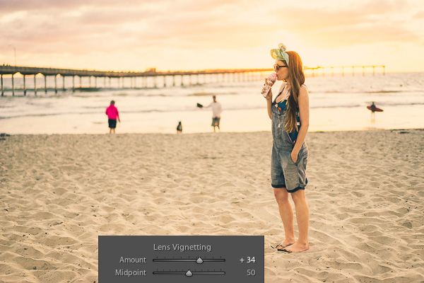
The editing features of the ON1 Photo Mobile app cover the basics of tone, color, and detail adjustments, plus a single-slider AI tool for one-stop improvement. A handful of effects are also included, such as adding a vignette and converting to black and white.

Editing a photo in ON1 Photo Mobile on an iPad Pro. Editing a photo in ON1 Photo Mobile on an iPhone 11 Pro.

Not everything in ON1 Photo RAW is represented, which isn’t a surprise for a first release. There’s no histogram, for instance. In one area, though, you have to be careful: If you apply any edit in the desktop app that isn’t supported on mobile, you’re locked out of all edits. For example, the Vignette effect in both versions let you set opacity, brightness, size, feather, and roundness attributes. In the desktop version, you can also click a shortcut such as ‘Subtle’ that applies preset values for those sliders.

If you apply an adjustment control in ON1 Photo RAW that isn’t supported on mobile… … you’re locked out of all edits (ON1 Photo Mobile on iPad Pro shown here).

However, when you try to edit that in mobile, a message says, “This photo has settings applied in ON1 Photo RAW that are not supported in the app yet.” The only option is to tap OK; you’re not able to edit supported adjustments, such as any of the tone tools.

Be careful: If you apply any edit in the desktop app that isn’t supported on mobile, you’re locked out of all edits

As for metadata, the only visible information is an image’s filename, star rating, and like/dislike flag. That also means there’s no way to filter images based on rating or even see, in the thumbnail view, which ones you’ve marked to work on later. It would be nice to sort the images, too, since by default the photos are listed based on file names.

ON1 Camera

The advantage of incorporating a camera into the mobile app is twofold: first, the images you capture are automatically added to ON1 360, bypassing the need to import them into ON1 Photo RAW; and second, it records photos in raw format by default, with the option to invoke manual control over shutter speed, ISO, focus, and white balance. (You can also choose to shoot in JPEG or, in the iOS version, HEIC formats.)

Adjusting manual focus in the camera feature of ON1 Photo Mobile.

Dragging up or down on the screen adjusts the exposure compensation, but if you leave your finger on the screen too long, the app assumes you want to use that spot as auto-focus and auto-exposure. Another annoyance is that if you’ve set manual settings such as shutter speed or ISO, tapping the screen to set focus reverts everything back to automatic.

Pricing

ON1 360 is a subscription add-on for existing owners of ON1 Photo RAW, or the two can be bundled as a subscription. For 200 GB of cloud storage, the service add-on costs $ 5.99 per month or $ 59.99 per year. The service/software bundle costs $ 7.99 per month or $ 89.99 per year.

A no-subscription perpetual license for just ON1 Photo RAW is also available for $ 99.9

The next tier up is 1 TB of storage, which costs $ 9.99 per month or $ 109.99 per year for the add-on plan, or $ 15.99 per month or $ 179.99 per year for the service/software bundle.

A no-subscription perpetual license for just ON1 Photo RAW is also available for $ 99.99. The ON1 Photo Mobile app for iOS or Android is free.

Conclusion

When you look back at the first mobile steps taken by Apple and Adobe’s photo offerings, they started basic and broadened their features over time; the mobile version of Lightroom is close to being in parity with the desktop version (though still not comparable with Lightroom Classic).

Sometimes a thumbnail doesn’t accurately reflect the edit (though the underlying image adjustments are intact). The ON1 360 sync status says everything is up to date, but a few thumbnails are lagging.
Before: Editing a photo on the iPad. After: Bizarre streaks appeared when activating the AI Auto adjustment.

ON1 360 is taking its own first steps. I did run into a few glitches, ranging from inconsistent thumbnails to images sometimes showing up blank and one instance of odd streaking when applying the Auto adjustment on mobile. However, the basic infrastructure is in place and extends the ecosystem beyond the desktop for photographers who use ON1 Photo RAW.

Articles: Digital Photography Review (dpreview.com)

 
Comments Off on First impressions: ON1 360 is a cloud-based alternative to Lightroom’s ecosystem

Posted in Uncategorized


How to Correct Skin Tones Using Lightroom’s Color Curves

27 Oct

Lightroom gives you a million and one ways to complete most photo edits. Having options is important. No two photos are alike, so no two edits are alike either. In this article, I’ll show you how to correct skin tones using Lightroom’s color curves.

There are times when the best way to edit color in general, and skin tones in particular, is to use Lightroom’s Color Curves. After reading this tutorial, you’ll be able to; measure RGB skin tone numbers to give you a general idea of which edits your photo needs, and correct the color issues using Lightroom’s Color Curves

skin-tones-Lightroom-curves-13.jpg

Finding the color numbers

The image below is a photo that came out of the camera with a pretty good white balance and skin tone. Do you see the numbers under the histogram? Those are Red, Green and Blue (RGB) numbers.

Skin tones Lightroom curves 01

You can display the RGB numbers for your photos too. In Lightroom’s Develop module, hover your cursor over the area you want to measure. Look under the histogram for the corresponding RGB measurements.

These measurements tell us that the pixels next to the arrow in the screen shot had the following measurements:

  • Red: 73.1%
  • Green: 67.1%
  • Blue: 60.5%

RGB numbers are usually measured on a scale of 0-255, unless you are working in Lightroom. In Lightroom, you generally see them on a percent scale. 0% is the darkest value for any color, it’s so dark that there is no visible detail in that area. 100% is the brightest, and is so bright that no detail is visible.

Analyzing the color numbers

When analyzing RGB numbers for skin tone, look for the following indicators:

  • Red should be higher than Green. Green should be higher than Blue. This pattern is universal to all skin tones, regardless of age or ethnicity.
  • Each color should have at least a 2% difference, usually more, between it and the next number. Do you know how to identify a pure gray? That is a pixel that measures exactly the same in its Red, Green and Blue numbers. So skin whose RGB numbers are very close to each other is going to look gray. Not very appealing, right?
  • If any colors measure 94% or above, you probably have overexposure to deal with.
  • If any colors measure 6% or below, you probably have underexposure to deal with.

The RGB numbers in the photo above are consistent with expectations. This means that the skin is within “proper range” of a well-exposed photo with good white balance.

What do to with bad numbers?

What happens, however, if your photo doesn’t look so good straight out of camera?

Skin tones Lightroom curves 02

In this photo, the measurement point was just next to the arrow on her forehead. The numbers read: Red 93.8%, Green 92.5%, and Blue: 93.6%.

Anytime you see a photo with skin tones that measure like this, your eyes are going to tell you that something is off before the numbers do. The benefit of using the numbers is that they give you the direction to which your edits for the image need to go.

The numbers in this photo cause concern because:

  • Anything higher than 94% or so in Lightroom is bright enough that your image, if you print it, might not render good detail in those areas. That means that these areas are too bright.
  • Blue is higher than Green. Red should always be the highest and Blue the lowest otherwise the skin tone will appear cold.
  • The RGB numbers are too close together – they are approaching gray. This skin in this photo is lifeless as a result.

Correcting the skin tones

To fix this image, you would start by tweaking exposure. Proper exposure is a huge component of proper skin color. In fact, it’s often impossible to assess skin tone issues correctly without correcting exposure first.

A little-known bit of Lightroom awesomeness is that it’s easy to correct exposure while keeping an eye on the RGB numbers. In the Develop module, double click in the numeric entry field for Exposure so that the number is highlighted. Next, hover your cursor over the area of skin you are measuring without clicking. Use the up or down arrows on your keyboard to change exposure until a more appropriate measurement for the Red value appears under the histogram.

Skin tones Lightroom curves 03

Adjust Highlights (or Shadows, Whites, or Blacks) in the same way. Activate the numeric input field for editing then hover the cursor over the arrow you want to measure. Use the arrow keys on your keyboard to increase or decrease the adjustment.

Exposure for this photo is better with the adjustments you see above, but color is still off. When the RGB numbers are as close together as you see here, it’s often better to use Color Curves than the White Balance sliders to fix the issue.

Using Color Curves instead of White Balance Sliders

Color Curves has two major advantages over the white balance (WB) sliders.

You might have noticed already that Lightroom measures three colors (red, green and blue) for each pixel. However, the White Balance sliders don’t allow for editing the most important component of skin color – red. But, you can edit Red tones using Lightroom’s Color Curves.

The other big benefit of using Color Curves is that you can adjust colors in limited parts of the tonal range. For instance, if you reduce yellow in an image using the Temperature slider in the White Balance section, you are reducing yellow globally (everywhere in the image equally). Using Color Curves, however, you could reduce yellow only in the shadows, without taking away the yellow that properly belongs in the mid tones and highlights of an image.

To find Color Curves in Lightroom, scroll down to the Tone Curve section. By default, it shows you the parametric curve, which looks like this:

Skin tones Lightroom curves 04

Click on the small button in the lower right corner of the Curves panel to access the Point Curve. (It’s circled in the screen shot above.)

Now you are looking at the Point Curve interface:

Skin tones Lightroom curves 05

Using the Channel drop down menu, select the color you’d like to adjust.

Skin tones Lightroom curves 06

Which color channel to edit?

At this point, you may be wondering about adjusting colors other than red, green, and blue. For instance, what if your photo has too much yellow or orange? Think about it like this.

Each of the three colors measured in Lightroom has an opposite:

  • Red is the opposite of cyan
  • Green is the opposite of magenta
  • Blue is the opposite of yellow

Reducing any one of those colors using Color Curves, increases that color’s opposite. In other words, reducing blue is the same as increasing yellow.

Looking at the Curves panel, do you see the histogram behind the straight line? When you click and drag the straight line to create a curve, this tells Lightroom to adjust the pixels corresponding to that part of the histogram.

Say, for instance, that you wanted to add blue to the mid tones of an image. You would select the Blue channel and click the line in the middle of the histogram, where the midtones live. Dragging the line up would add blue to the bright parts of your photo’s tonal range.

Dragging up increases the color the channel is named after – blue, in this case. If it increases blue, that means that it’s also decreasing blue’s opposite, yellow.

Skin tones Lightroom curves 07

Dragging down decreases the color the channel is named after.

skin-tones-lightroom-curves-08b

Using the Targeted Adjustment Tool for Curves

That’s the way it works in general. But you can get much more precise color control by using Lightroom’s Targeted Adjustment Tool. Click on the button at the top left corner of your Curves panel to activate it (circled below).

Skin tones Lightroom curves 08

Hover this tool over the spot you’re using to measure the skin tone in your photo, but don’t click! Use the up and down arrows on your keyboard while keeping an eye on the RGB numbers beneath your histogram until the both the appearance of the photo and the RGB numbers improve.

Moving the blue curve down, as in the screenshot below, provides better separation between the Green and Blue measurements. It also gives the photo the warmth it’s lacking.

Skin tones Lightroom curves 09

If the image still lacks vibrance, as this one does, move to the Red curve and increase the Red channel. Adding a touch of red is the best way to counteract gray skin.

Skin tones Lightroom curves 10

Next, decreasing green (to add magenta) makes the skin color, as well as the corresponding RGB numbers, look just about right.

Skin tones Lightroom curves 11

Tweaking things

However, the warmth of the plants behind them is overpowering the subjects. To downplay it, return to the Blue channel.

Using the Targeted Adjustment Tool, add Blue to the the shadows by hovering over a dark area of the photo and hitting the up arrow on your keyboard.

Skin tones Lightroom curves 12

Compare the original and edited photos here:

Before

Before

After

After

Editing your own images with Color Curves and RGB numbers

Keep the following tips in mind when editing your own images.

#1 – First, a big caveat to anyone who has heard that using RGB numbers to edit will solve all skin tone problems! There are as many proper RGB measurements as there are people in the world. As you study RGB numbers, let trends in the numbers and generalities guide your edits, but don’t try for an exact numeric match.

#2 – Measure skin tones in the middle range of brightness. Look for mid-tones rather than bright highlights or deep shadows. Also avoid measuring on cheeks, the end of the nose, or other areas that are usually redder than others.

#3 – In general, when I’m editing photos, I look for tones in these ranges:

  • Red is highest > Green is middle > Blue is lowest – always.
  • The Red channel is usually between 70% and 90%. Very light skin can be as high as 94%. Very dark skin can go as low as 40-50%.
  • The Blue channel is usually between 30% and 80%.
  • It’s not possible to generalize how many percentage points difference should be between Red and Green, or Green and Blue. However, skin that has warmer tones will have less Blue in proportion to Red and Green.

#4 – Small movements of your tone curve impact your image dramatically. Don’t go overboard!

Conclusion

Studying the patterns in the RGB numbers of your photos is a great way to develop your editing eye. Everyone has photos that aren’t quite right. Analyzing the relationship between the numbers and the appearance of the photo will help you get to the point where you can eyeball a photo’s needs without referring to the RGB numbers at all.

Any questions? We could talk about this topic all day. Comment below and tell me what you think.

googletag.cmd.push(function() {
tablet_slots.push( googletag.defineSlot( “/1005424/_dPSv4_tab-all-article-bottom_(300×250)”, [300, 250], “pb-ad-78623” ).addService( googletag.pubads() ) ); } );

googletag.cmd.push(function() {
mobile_slots.push( googletag.defineSlot( “/1005424/_dPSv4_mob-all-article-bottom_(300×250)”, [300, 250], “pb-ad-78158” ).addService( googletag.pubads() ) ); } );

The post How to Correct Skin Tones Using Lightroom’s Color Curves by Erin Peloquin appeared first on Digital Photography School.


Digital Photography School

 
Comments Off on How to Correct Skin Tones Using Lightroom’s Color Curves

Posted in Photography


Lightroom’s Secret Weapon: The Radial Filter and How to Use it

17 Oct

Back when Lightroom 5 was released, Adobe included an extremely useful tool called the Radial Filter. However, the name wasn’t particularly clear about what it could do, so many people still have yet to find how useful and powerful it can be. Further improvements were added in Lightroom 6, with the ability to further edit the effect of the tool with the Brush function.

LR Radial Filter panel vignette beginning 7

Workflow process

A generally accepted practice when editing images, is that you do your global adjustments first. These are the ones that affect the whole image at once. Some examples of adjustments that you might use are:

  • Exposure
  • White Balance
  • Contrast
  • White or Black Point
  • Sharpness
  • Clarity
  • Shadows and Highlights

Once the global adjustments are done, then the local adjustments can be made. These are changes made to only a small part of the image. They may be to add final polish to the image or to fix some blemishes. These changes should be subtle and layered on with a delicate touch. It should not be obvious that they have been made, but when you are finished and compare the before and after image, there should be some improvement visible.

How the Radial Filter fits in

This is where the Radial Filter can be used, adding in areas of highlight or clarity to the key subject, brightening or darkening areas, or adding a custom vignette. Lots of little touches to take your final image to the next level.

My example image is a shot of a couple tiger cubs taken at Melbourne Zoo in 2010. It was very dark and shaded in their enclosure so the original RAW images are very dark. This image has been edited in Lightroom 6 to apply all the required global adjustments. It is now ready to have some localized tweaks added with the Radial Filter.

LR Radial Filter BASE IMAGE 1

WHERE TO FIND THE RADIAL FILTER AND HOW TO USE IT

The Radial Filter lives in the right panel of the Develop Module. Under the histogram are six shapes that link to different tools. The round circle with a dot in the centre at the fifth position from the left is the Radial Filter.

LR radial filter panel where to find 2

When you click on the button for the Radial Filter (you can also use the keyboard shortcut Shift+M to open the Radial Filter), a panel opens up with all the editing choices available for this tool.

LR radial filter panel editing options 3

Adding and adjusting the filter

If you click on your image and drag the mouse out a bit, a roundish ellipse shape will form with a centre button and four control handles. Let go of the mouse when the shape is roughly the size you want it. The Radial Filter only offers a roundish ellipse shape but it has a lot of flexibility with changing the size and squashing it down to be a narrow oval shape instead of a circle.

LR radial filter panel new one 4

Clicking and dragging on the centre button allows you to move the filter to the part of the image you want to edit. Use the control handles to change the size and also the shape of the ellipse.

LR radial filter panel change tool shape 4a

Which area is affected

By default, Lightroom sets the editing area to OUTSIDE the ellipse. If you want to edit INSIDE the area, tick the Invert Mask box on the Panel.

LR radial filter panel move change size 5

The red colour shows up if you have Show Selected Mask Overlay ticked. It is handy to see where Lightroom will apply the effect and how much feathering you need to use.

NOTE: if you do not see a coloured overlay like the red one shown here, hit the O keyboard shortcut for “overlay”. Holding shift and tapping O will change the color of the overlay.

LR radial filter panel mask controls 6

Note: Always click Close or Done (or the keyboard shortcut Shift+M again) once you are finished editing a particular button so you can see the edited image clearly.

USING THE RADIAL FILTER TO EDIT AN IMAGE

In the example image the aim is to bring attention to the tiger cubs, adding some tweaks around the head and paws area (it’s not 100% sharp due to the low light and the movement while they were wrestling).

Add an off-centre edge vignette

First, we add a vignette to darken the distracting elements on the edge of the frame and bring the focus to the cubs.
Because they are not in the absolute centre of the image, the usual post-crop vignette tool will not work. This is where the Radial Filter is so useful, as you can add a vignette with the focus an off-centre subject rather than being limited to the middle of the frame.

The vignette needs to have Invert Mask NOT ticked, as the effect goes on the outside of the ellipse.

Add the Radial Filter and adjust the shape to be quite large – you can make the ellipse bigger than the actual image if necessary. Invert the mask and bring the exposure down just enough to darken the edges of the frame.

LR radial filter panel vignette beginning 7

Feather the filter

Lightroom has a default feather setting of 50 which is quite a lot, too much for this image, so adjust the feather down. Be careful not to go too far as a harsh edge will become visible.

LR radial filter panel changfeather 8

The right-hand edge of the image still has a bright spot of foliage. So add another long Radial Filter and bring the exposure down a little bit.

LR radial filter panel darken hedge 9

There are no set numbers of how much to edit with this tool, you will need to experiment and go with what feels right. The good news is these are all non-destructive edits (the image is not permanently changed) so you can remove them all and start again, or change the settings on one or all of them, as many times as necessary.

Tone control on select areas

There is a bright spot of foliage on the left-hand side, just sticking out from behind the tree trunk. Create a new Radial Filter just big enough to cover the right area and shape with the control handles.

Invert the mask and bring the exposure down a bit. This time, click and drag on the bottom control handle and drag to the right until the ellipse tilts back to the left a bit and aligns better with the line of the tree trunk.

LR radial filter panel darken foliage tilt 10

Add focus on the subject

Now it is time to add some brightness and focus to the tiger cubs. Add a new Radial Filter to cover the area on the bright side of the head and paws and bring up the exposure a tiny amount. That is where the sunlight is naturally falling, so that is the area that needs brightening. Be careful to add light effects only to the lighter parts of the image as it can look a bit odd if a darker area is unnaturally bright.

LR radial filter panel add brightness 11

Now is a good time to mention that you may have to make LOTS of little adjustments to cover areas with different shapes. It is fiddly and takes time, but you will get a better result if you take the time to edit that way.

Adding some clarity to the side of the face and paw in the sunlight is the next step. Create a new Radial Filter with size, shape and tilt to match the area and invert the mask. Add some clarity, and because this image is not quite sharp, just a little bit of sharpness. Be careful with these tools, as it is easy to go too far and get obvious effects.

LR radial filter panel clarity sharpness 12

The vignettes have darkened the overall area in the middle a bit much so let’s add some brightness. Add a Radial Filter to cover the area around the cubs and tweak the exposure up a small amount. Also, increase clarity and saturation a very small amount.

LR radial filter panel brightness circle 13

Before and after comparison

Let’s stop there and compare the BEFORE image with global adjustments only to the AFTER image with several specific applications of the Radial Filter.

LR radial filter panel finished with dots 14

First, we have the finished image with all the dots for the different individual Radial Filters added.

LR radial filter panel before comparison 15

Then we have the BEFORE image.

Finally the AFTER image with both global, and local edits applied with the Radial Filter.

LR radial filter panel after no pins comparison 16

CONCLUSION

As you can see, careful use of the Radial Filter can add many small subtle changes to an image, and bring the focus to the subject. It can also be used to further enhance the subject and give it extra punch and vibrancy.

The Radial Filter is a very capable tool that can take a bit of time to get used to. The limited shape has some challenges to learn how to work with it to get the best effect but it gives you a lot of power and control too.

Do you have any other tips for using the Radial Filter? Please share in the comments below.

googletag.cmd.push(function() {
tablet_slots.push( googletag.defineSlot( “/1005424/_dPSv4_tab-all-article-bottom_(300×250)”, [300, 250], “pb-ad-78623” ).addService( googletag.pubads() ) ); } );

googletag.cmd.push(function() {
mobile_slots.push( googletag.defineSlot( “/1005424/_dPSv4_mob-all-article-bottom_(300×250)”, [300, 250], “pb-ad-78158” ).addService( googletag.pubads() ) ); } );

The post Lightroom’s Secret Weapon: The Radial Filter and How to Use it by Stacey Hill appeared first on Digital Photography School.


Digital Photography School

 
Comments Off on Lightroom’s Secret Weapon: The Radial Filter and How to Use it

Posted in Photography


Using Lightroom’s Transform and Crop Tools to Improve Composition

30 Jul

Everybody loves to get it right in camera. But if you don’t, you have plenty of tools to help you make it right. Lightroom is one of the best available, and the easiest to use. In this article I’ll show you how you can use Lightroom’s Transform and Crop Tools to improve your composition.

The Transform Tab

First, let’s talk about the Transform tab, in the Develop module. Transform is relatively new to Lightroom. It’s an improved version, split-off of the Lens Correction tab. Essentially, Transform helps you straighten crooked or skewed images.

IMAGE 1

Here, in the first example above – a lovely seascape – there is a crooked horizon. Before opening the Transform tab, press the R key to activate the Crop Tool. Now press the O key (letter not number) to toggle the Grid overlay. With the Crop Tool still activated, click on the Transform tab in Lightroom and choose Level.

IMAGE 2

The Level option is perfect for images like this, when there are no strong vertical lines that need correction. It simply straightens the horizon so it no longer slopes crookedly. With the Grid overlay turned on, it’s easy to verify that the horizon is now straight. Here’s the image after the crop is applied.

IMAGE 3

In this next example (below) – an interior image of an old Italian mansion – the windows are falling over backwards.

IMAGE 4

Here the Vertical option in the Transform tab does a great job of straightening the perspective. The windows align perfectly with the horizontal and vertical lines of the Grid overlay.

IMAGE 5

But as you can see, straightening the image has created a few problems. The image was so crooked (perspective distortion) that now there is a lot of white space to crop out. The good news is that when fixing these issues, composition can be improved too.

Composing with the Crop Tool in Lightroom

The white space can be eliminated, and the composition strengthened, by creatively using the Crop Tool in Lightroom. The next step is to adjust the composition with the Crop Tool by moving it around the image.

IMAGE 6

In this image, to eliminate all of the white space and direct the viewer’s focus to the chandelier and windows, grab the Crop Tool at the top centre point, and draw down. This eliminates both the unnecessary ceiling, and the white spaces on either side of the image.

Now that the image is starting to look better, scroll through the Crop Tool overlays and review the newly cropped image to see which ones work. By reviewing your images with different Crop Tool overlays, you can strengthen your intuitive sense of strong composition.

To review each of the overlays, press the O (oh not zero)) key. You’ll toggle through the following:

  • Rule of Thirds (below left)
  • Diagonal (below right)
  • Golden Triangle
  • Golden Ratio (similar to the Rule of Thirds overlay)
  • Golden Spiral
  • Aspect Ratios
  • Grid
IMAGE 7 IMAGE 8

In the example images above, both the Rule of Thirds and the Diagonal overlays clearly show that the composition is strong.

Before

Before

IMAGE-9.jpg

Final image.


Here’s the final image (before correction is above left, after is on the right). Now let’s take a quick peek at one more image, and one more feature in Lightroom.

Flipping the Golden Spiral and Golden Triangle Overlays

You’ve probably toggled through the overlays and disregarded both the Golden Triangle and the Golden Spiral because they just never work. Unlike most of the overlays, neither the Golden Spiral nor the Golden Triangle is symmetrical. That means that you need to flip the overlays around a few times to find the orientation that aligns with your image. By pressing the Shift key and the O key at the same time, you can change the orientation of both the Golden Spiral and the Golden Triangle. Changing the orientation makes those overlays a lot more useful.

Here, in this image of a wild stallion (below), before flipping the Golden Triangle orientation, this overlay doesn’t work at all. Looking at it you might question whether or not the image had a strong enough composition to start with.

IMAGE 11

By pressing Shift plus the O key, and flipping the overlay orientation, the stallion fits neatly into his own triangle. His legs and nose are also no longer bisected by one of the diagonals. In addition, he’s positioned towards the back of the triangle. The top diagonal edge of the triangle that contains the stallion shows us that he is moving forward into the composition, towards the viewer, which is naturally pleasing to the eye. The other triangles neatly organize the foliage surrounding the stallion. Even the beam of sunlight highlighting the stallion falls within the main triangle, further confirming that this image is well composed.

IMAGE 12

With a little practice, some judicious use of the Transform tab and Crop Tool, you’ll master composition in no time. How do you use these tools to help you? Please share in the comments below.

googletag.cmd.push(function() {
tablet_slots.push( googletag.defineSlot( “/1005424/_dPSv4_tab-all-article-bottom_(300×250)”, [300, 250], “pb-ad-78623” ).addService( googletag.pubads() ) ); } );

googletag.cmd.push(function() {
mobile_slots.push( googletag.defineSlot( “/1005424/_dPSv4_mob-all-article-bottom_(300×250)”, [300, 250], “pb-ad-78158” ).addService( googletag.pubads() ) ); } );

The post Using Lightroom’s Transform and Crop Tools to Improve Composition by Lara Joy Brynildssen appeared first on Digital Photography School.


Digital Photography School

 
Comments Off on Using Lightroom’s Transform and Crop Tools to Improve Composition

Posted in Photography


How to Use Upright Guided Tools in Lightroom’s New Transform Section

27 Jul

In their latest release of Lightroom 6.6 (or CC 2015.6 if you are using the Creative Cloud subscription package), Adobe has added a new feature, allowing us photographers to straighten our images even easier than before.

Dps LR Transform 01

The image above is a typical example of a photo that can use some straightening. A tall building, shot from the ground, will always look tilted or skewed (unless you have the budget to buy a tilt-shift lens, designed to overcome these issues right in camera).

The latest update of Lightroom comes with a new Transform section

For these purposes, Adobe Lightroom had already offered an Upright feature within the Lens Corrections tab in its Develop module. In the newest version 6.6/CC 2015.6, this feature was extended, and is now in its own section called Transform.

Tansform panel LR

In this new Transform section, some of the known Upright features from the old Manual section can be found again. The image shown below is a good and easy sample to test the new features. I shot it slightly tilted against the wall, and there is also a slight barrel distortion visible, due to the mild wide angle lens used.

Dps LR Transform 03

Most interesting for us is the new Guided button, that allows us to show Lightroom which lines we want to have straightened. When you click on this button, Lightroom allows you to draw lines on the image, that show the software where and how you think your image is supposed to look straight.

dps-LR-Transform-04c

When you turn on the Show Loupe checkbox below the image (if you don’t see that on your screen hit T on your keyboard to toggle the toolbar), you can now move the mouse over the image, and Lightroom will close in on the details you are hovering over. This can help you find the perfect spots to click on, and make your lines.

The first click (click and hold it down) starts a new line that now moves along with your mouse. Move the line to a second spot in the image (and let go of the mouse) and Lightroom will have drawn the first line. You can click on both of the endpoints of this line if you want to correct it.

dps-LR-Transform-05c

As soon as you draw a second line, Lightroom starts correcting the image. The best way to use this tool is to draw one vertical, and one horizontal line at the start. You may notice the improvement already in this but if you look closely, not all of the tilt, nor the distortion, has been corrected yet.

You can then draw two more lines (it accepts up to four guide lines in total) to help Lightroom catch the last perspective issues and resolve them.

Dps LR Transform 06

Bonus tip: To make the lines more visible, I have temporarily reduced the Exposure value for the image, as you may notice in the last image (above). As the lines are thin and white, I found it easier to use when I darkened the photo to allow for good contrast with the tool.

Example image – correct a building tilt

Now, I will show you how I used the guides in the architectural image I showed on top of this article. Once again I have lowered the exposure to show the lines. As you can see, I have used two vertical and two horizontal lines, each of them way off the center of the image, to get the best results of this new feature.

Dps LR Transform 07

Finally, you might want to use the sliders to change the Aspect, Scale and the X and Y Offset to compensate for the changes in perspective that might turn the objects in your image into looking slightly wider or slimmer form, than would be seen in real life.

Additional tool tips for using Guided Upright

Adobe found the Guided Upright tool to be valuable enough to define a keyboard short cut for it. Shift-T will bring you to this tool directly from either the Develop module or even from the Library.

If you ever wish to reset the upright guides, or the whole Transform section, you can right-click into the image while using this tool. Lightroom will show two settings on top of the context menu offering you the option to reset the guides only, or all Transform settings.

Dps LR Transform 08

Do you shoot architecture? Has this been a feature you’ve found useful? How have you applied it to your images? Let us know in the comments below. If you have any questions post them there as well.

googletag.cmd.push(function() {
tablet_slots.push( googletag.defineSlot( “/1005424/_dPSv4_tab-all-article-bottom_(300×250)”, [300, 250], “pb-ad-78623” ).addService( googletag.pubads() ) ); } );

googletag.cmd.push(function() {
mobile_slots.push( googletag.defineSlot( “/1005424/_dPSv4_mob-all-article-bottom_(300×250)”, [300, 250], “pb-ad-78158” ).addService( googletag.pubads() ) ); } );

The post How to Use Upright Guided Tools in Lightroom’s New Transform Section by Michael Zwahlen appeared first on Digital Photography School.


Digital Photography School

 
Comments Off on How to Use Upright Guided Tools in Lightroom’s New Transform Section

Posted in Photography


The 6 Most Important Things You Need to Know about Lightroom’s Develop Module

15 May

Lightroom is powerful, but it’s also complex and has a steep learning curve. If you feel overwhelmed by all the options, there’s great value in taking a simple approach and learning to use the tools that are most useful first. Leave the more advanced features until you have more experience.

With that in mind, I’ve put together this list of the six most important things you need to know about Lightroom’s Develop module. Learn these and you will be well on the way to Lightroom mastery.

1. Backup your catalog regularly

This is the most crucial thing to set up, as everything you do to your photos in the Develop module (not to mention metadata changes like Collections, flags and keywords) is stored in the catalog. It would be a disaster to lose your catalog (and consequently all your hard work) to hard drive failure, so you need to make sure that Lightroom is backing it up regularly to an external hard drive.

To do so, go to:

  • For Windows users: Edit > Catalog Settings > Back up catalog
  • For Mac users: Lightroom > Catalog Settings > Back up catalog

I have mine set to: Every time Lightroom exits – some photographers find that Once a week, when exiting Lightroom is enough.

When you exit Lightroom, a dialog window appears that shows you where Lightroom is going to save the backup Catalog. Click Choose to change the location if you need to. Note: this is the only time you can select the destination where the backup will be saved.

Make sure the Test integrity before backing up and Optimize catalog after backing up boxes are both ticked. This slows down the back up process, but it’s worth it because it helps ensure that your catalog remains free from corruption, and is optimized for speed.

Lightroom Develop module

Please note: The Catalog doesn’t contain any of your photos. Backing up your Catalog doesn’t back up your photos, only the information that Lightroom contains about them. Photo backups need to be managed separately.

2. Profile is the most important setting in the Develop module

The Profile menu is tucked away in the Camera Calibration panel, at the bottom of the right-hand panels in the Develop module. The default profile setting is Adobe Standard (circled below). This profile was created specifically for your camera by Adobe. Pick that one for accurate colors.

You will also find the color profile settings specific to your camera (Landscape, Portrait, and so on). You can pick one of these if you prefer the look to Adobe Standard.

Lightroom Develop module

The profile affects both color and contrast, so from a practical point of view it’s important to select the right one, before you start adjusting contrast and white balance in the Basic panel. Get the profile right, and it makes all subsequent processing steps much easier. Get it wrong, and it makes them more difficult.

For example, if you apply a profile intended for landscape photos to a portrait, then you could end up with over-saturated colors and unnatural skin tones. Then you might try and fix that by playing with the Basic panel sliders or other color controls. This approach rarely works, it’s far better to select the most appropriate profile from the start.

These two photos show the difference between the Adobe Standard and Velvia profiles on a Fujifilm X-T1 camera. The Velvia profile saturates colors, the Adobe Standard profile looks more natural.

Lightroom Develop module

3. Use Lens Corrections to correct distortion and eliminate chromatic aberrations

No lens is perfect, and most have at least a little distortion and chromatic aberration. One of the benefits of digital photography is that you can eliminate these in the processing stage, so they are not the problem they once were. Go to the Basic tab in the Lens Correction panel, select Enable Profile Corrections and Remove Chromatic Aberration in order to do so.

Lightroom Develop module

This comparison shows the result on a photo taken with a zoom lens producing barrel distortion.

Lightroom Develop module

Lightroom Develop module

4. You can carry out 80% of your processing in the Basic panel

Once you have selected a Profile, and applied Lens Corrections, you can go to the Basic panel to start making any adjustments required to the photo’s brightness, contrast, and color.

The sliders in the Basic panel are extremely powerful. Take the time to get to know what each one does, and how the settings affect your images. Once you get the hang of these sliders it’s quite possible that you can do all of your global adjustments (those that affect the entire image) here, and not have to touch the Tone Curve or HSL / Color / B&W panels at all.

This photo is a good example. Virtually all the processing was done in the Basic panel, made possible by selecting the most appropriate profile first. The only additional thing I did was add a vignette using the Effects panel.

Lightroom Develop module

My article Steps for Getting Started in the Lightroom Develop Module goes into this in more detail.

5. Learn to use local adjustments wisely

It wasn’t so long ago that many professional photographers would send their negatives to master printers who used dodging, burning, and other fancy darkroom techniques, to create a far better print than the photographer ever could. These local adjustments – those applied to only part of the image, rather than all of it – are often vital for bringing the best out of your Raw files in Lightroom.

Lightroom has three tools for making local adjustments – the Adjustment Brush, Radial Filter and Graduated Filter. They allow you to selectively adjust brightness, contrast, and other tone and color settings. Each tool has its own idiosyncrasies, so take the time to get to know each one in turn.

This example shows the difference that local adjustments make. I used a combination of all three of Lightroom’s tools to turn the image on the left, into the one on the right.

Lightroom Develop module

6. Don’t overlook the Clarity slider

The Clarity slider is extremely useful as both a local, and global adjustment. It’s primary use is to enhance texture, and it does so by increasing edge contrast (the spots where dark and light areas meet). You do have to be careful not to overuse it, but judicious applications of texture enhancement can help bring the best out of any photo. Clarity is also an ideal tool for enhancing black and white images, which often rely on texture to add impact.

The following photos show the effect of adding Clarity. I used the Radial filter to apply Clarity to the Buddha heads to bring out the texture.

Lightroom Develop module

Lightroom Develop module

These six items are not a comprehensive list of what you can do in Lightroom’s Develop module, but they will certainly get you started, and simplify the process of learning to use it.

What do you think are the most important tools to master in the Develop module? Do you agree with my selection? Please let me know in the comments below. And if you want to learn more about Lightroom then please check out my Mastering Lightroom ebooks.

googletag.cmd.push(function() {
tablet_slots.push( googletag.defineSlot( “/1005424/_dPSv4_tab-all-article-bottom_(300×250)”, [300, 250], “pb-ad-78623” ).addService( googletag.pubads() ) ); } );

googletag.cmd.push(function() {
mobile_slots.push( googletag.defineSlot( “/1005424/_dPSv4_mob-all-article-bottom_(300×250)”, [300, 250], “pb-ad-78158” ).addService( googletag.pubads() ) ); } );

The post The 6 Most Important Things You Need to Know about Lightroom’s Develop Module by Andrew S. Gibson appeared first on Digital Photography School.


Digital Photography School

 
Comments Off on The 6 Most Important Things You Need to Know about Lightroom’s Develop Module

Posted in Photography


How to Understand and Use Lightroom’s Loupe Info Overlay

01 Dec

Lightroom Loupe Info Overlay intro image

The Lightroom Loupe Info Overlay feature provides valuable information about your photos. Used intelligently it can help you find your photos, and can even help you improve your photography skills. I’ll explain what it is, how to enable and disable it, how to configure it, and some reasons why the Loupe Info Overlay is such a valuable feature.

What is the Loupe Info Overlay?

Loupe Info Overlay is a small text overlay which appears in the top left corner of your images in the Develop module inside Lightroom, and when you are viewing images in Loupe view in the Library module. The Loupe Info Overlay confuses many first time Lightroom users when they turn it on, often accidentally, and then struggle to turn it off again.

What Lightroom Loupe info overlay looks like

Turning the Overlay Off and On

To view the Loupe Info Overlay you must be viewing an image in the Develop module, or in the Library module in Loupe (or single image) view. To display the Loupe Info Overlay, tap the I (i) key on your keyboard. Tap the i key repeatedly (but slowly so you can see what you are doing) to rotate through the three options for the Loupe Info Overlay.

They are: (1) Loupe Info Overlay off; (2) Loupe Info 1; and (3) Loupe Info 2. You will see that there are two different overlays which can be separately configured to show a range of information about your images.

The three states of the Lightroom Loupe Info Overlay

You can also display the Loupe Info Overlay using the Lightroom menus: choose View > Loupe Info and then select Info 1 or Info 2 to display one of the two overlay options. If Show Info Overlay is selected then selecting it again will hide the Loupe Info Overlay.

How to turn the Loupe Info Overlay on and off

Each Info Overlay is comprised of three lines of information, and you can select only one piece of information from a list of options for each line. The defaults for the Loupe Info Overlays are:

Loupe Info Overlay 1:

  • File Name and Copy Name
  • Capture Date/ Time
  • Crop Dimensions

Loupe Info Overlay 2:

  • File Name and Copy Name
  • Exposure and ISO
  • Lens Setting

Default settings for the Loupe Info Overlay

These items can be changed if you select View > View Options, and in the Library Module click the Loupe View tab. Select the Show Info Overlay checkbox and then choose the Info Overlay to show from the dropdown list – it’s a good idea to show the one you are going to change so you can see what it looks like and if the information you are seeing is what you want to see.

To change the information that appears in any of the three lines of the Info Overlay click the appropriate dropdown list – there are three for Loupe Info 1 and three for Loupe Info 2, all in the order they appear on your screen.

Some settings for the lines of information in the Loupe info overlay

From any of the lists you can select None to turn that line off so nothing displays there, or choose from any of the options on the list. These include a range of file name options, Common Attributes (whether the image is flagged, rated, has a label, or is a virtual copy), the crop dimensions and megapixels.

Also in the list are various items which are extracted from the image metadata such as Copyright, Title, Creator, and Common Photo Settings which include Shutter Speed, Aperture, ISO, the Lens, and the Focal Length. These are also available as individual options so, if you don’t want to see all that detail, you can choose to see Exposure Time, ISO, F-stop, Exposure Bias, Exposure Program, Metering Mode, or Camera + Lens Settings.

More settings for the Loupe info overlay

Of the options available, Common Photo Settings is a good one to use if you want to see a lot of information about each shot.

How the Loupe Info Overlay can make you a better photographer

If you plan to use the information from the Loupe Info Overlay to improve your photography, then consider setting the options for one of the Loupe Info Overlays to include Common Photo Settings, Exposure Program and, for example, Metering Mode. This will give you valuable insight into your camera settings at the time you took each shot.

Suggested settings for loupe info overlay that can help you troubleshoot problem shots

I use the Info Overlay to help photographers who are having issues with their photos. If you set the Loupe Info Overlay to show the camera settings you can determine why, for example, an image is out of focus, too light, or too dark. An out of focus shot may be caused by a shutter speed that is too slow, so that the subject or camera has moved while the shot is being captured. Being able to see the shutter speed will help you determine if it is the reason your photos aren’t sharp.

If you are shooting in manual mode and the shots are too dark (underexposed) it may be that you’re using too fast a shutter speed, too small an aperture, or a combination of both. An overly light (overexposed) image can be caused by too large an aperture, too slow a shutter speed, or both. Displaying aperture, shutter speed and ISO may help you troubleshoot your exposure issues.

Overexposed and underexposed images can also be caused by an incorrect exposure compensation setting. It’s not uncommon for a beginner photographer to set an exposure compensation value without realizing the impact of what they have done. If you set the Loupe Info Overlay to display Exposure Bias you can see if exposure compensation is the cause of incorrect exposure.

The Loupe Info Overlay is a useful tool which can display a wealth of information, some of which can help you troubleshoot problems you are having with your photos.

Now it’s over to you: do you use the Lightroom Info Overlay and, if so, what information do you set it to display and why?

googletag.cmd.push(function() {
tablet_slots.push( googletag.defineSlot( “/1005424/_dPSv4_tab-all-article-bottom_(300×250)”, [300, 250], “pb-ad-78623” ).addService( googletag.pubads() ) ); } );

googletag.cmd.push(function() {
mobile_slots.push( googletag.defineSlot( “/1005424/_dPSv4_mob-all-article-bottom_(300×250)”, [300, 250], “pb-ad-78158” ).addService( googletag.pubads() ) ); } );

The post How to Understand and Use Lightroom’s Loupe Info Overlay by Helen Bradley appeared first on Digital Photography School.


Digital Photography School

 
Comments Off on How to Understand and Use Lightroom’s Loupe Info Overlay

Posted in Photography


How to Use the Filter in Lightroom’s Library Module

26 Sep

Once you enable the filter in Lightroom’s library module, you are able to search your images in three ways – text, attributes and metadata. To activate the filter bar, the keyboard shortcut is backslash (\). The filter bar will be activated and displayed on top of the workspace (see the screenshot below), only if you press the backslash key in the Library module. If you press the same backslash key in Develop, you will be see the before version of the selected image, provided you have made some corrections to your image.

Lightroom FilterBar None 01

Filter by text

The first option, Text mode allows you to search your images by the images’ text fields, from title, caption, keywords, searchable metadata, searchable IPTC, searchable EXIF, to any searchable plugin field. The field box comes as a drop down menu, where you can pick the text your search should be based upon.

Lightroom FilterBar Text 02

In the next box you can pick either one of the following parameters – contains all, contains, contains words, or doesn’t contain. You can select starts with or ends with as well. In the last box you can enter your text, the text which you want your search should be based upon.

Searchable Contains all

Filter by image attributes

The next option to filter is based upon the Image attributes. This section is further divided into flag status, ratings, color ratings and kind of file. In flag status, you can either pick flagged, unflagged, or rejected ones as well as a combination of two of those choices by clicking the flag symbols. Once you filter your images, the selected ones will be highlighted in white (use Ctrl/Cmd+A to select all).

Lightroom FilterBar Attribute 03

Filter by rating

Lightroom FilterBar Rating 03a

The next option in this section is star rating; you can filter photographs based on the number ratings you have applied to them. You can click the third star if you want to filter the photographs which have three stars exactly. You can also select less than or greater than by clicking the greater than symbol (>), where you will be prompted to select one of the following:

Greater than

Filter by color label

The next option in this section is filter by color label; you might have applied color labels based on your own methods of flagging images. For example green for web upload, red for yet to process, or something like that. Imagine you want to view only the red ones which you wish to process now. You can do that by clicking the red color box alone or you can add yellow along with it by clicking that box as well. In this way you can combine all the color labels, or only the ones you want. If one color label is selected, that particular box will be brighter than the other, which means it is active.

Color filter

Filter by kind of file

The last option in this sub-section is to filter by kind; which in this instance means the kind of file. In Lightroom you can have three kinds of files; master image files, virtual copies, and video files. If you want only the virtual copies you can select that particular icon alone. Like the other filters here, you can also combine more than one choice.

Filter by metadata

The most powerful option to filter your photographs is by metadata – the options are endless.

Lightroom FilterBar Metadata 04

You have the option to filter your photographs by all of the metadata in your files, you can get an idea by looking at the screenshot above. You can combine multiple metadata together to work for you by adding more filter columns. Click the right side of the title for an option to add more columns with other criteria. Click the filter title itself to change it to something else. In the screenshot, I have clicked the title Label; and you can see the pull-down menu of options that appeared.

Lightroom FilterBar Metadata 05

Miscellaneous other filtering tips

The filtered photographs based on your criteria will be instantly displayed on the below workspace. You can also combine multiple filter sections from Text to Attributes to Metadata or all together, the options are almost endless.

You can create presets if you have a particular way of filtering your photographs, provided you have managed your library in that way. Have you noticed the lock symbol on the right end of the filter bar? The drop down menu next to the lock symbol has an option to save your search as a preset, so next time you just have to select that preset. Easy right?

Save filter

The lock symbol at the right end of the filter bar will lock the filter criteria (if you click it) and the same filter can be applied to all your collections or folders one by one as you select the folders and collections.

Lightroom-FilterBar-Metadata-05a

I hope this article helps you work smarter with Lightroom and saves you lots of time and resources.

Cheers and happy photographing.

The post How to Use the Filter in Lightroom’s Library Module by Navan Viswa appeared first on Digital Photography School.


Digital Photography School

 
Comments Off on How to Use the Filter in Lightroom’s Library Module

Posted in Photography


Four Under-Used Tools in Lightroom’s Lens Correction Module

30 Aug

hacking photography, mike newton, architecture,

Almost every lens changes the way your image looks by warping it in some way. Each lens can create barrel distortion, vignetting at big apertures, chromatic aberration, and more.

Some lenses have more distortion than others. Let’s look at four tools in Lightroom’s lens correction module that are a lifesaver

1. The easy button – lens profile corrections in one click

Before lens corrections:

lens corrections, lightroom

Brick wall at 16mm, f/2.8, ISO 1250. You can see the ‘bulge’ in the middle because the horizontal lines are not parallel. Also notice the dark corner vignetting from shooting wide open at f/2.8

After one-click lens correction:

hacking photography, brick wall, lens correction, barrel distortion

Same settings as above but with lens profile correction applied. Note the parallel horizontal lines and no more dark corners.

I shot this wall on a 16-35mm f/2.8 lens at f/2.8 to illustrate the ‘bulge’ in the middle and vignetted corners. These are distortions from the Canon 16-35mm f/2.8L II lens.lightroom 5 lens profile corrections,

Lightroom is already loaded with profile corrections for this specific lens! Just click “enable profile corrections” in the “Profile” section of the Lens Correction module and Lightroom will fix the distortion for the lens you used!

Finding your lens profiles on older versions of Lightroom

As Lightroom keeps rolling out newer versions, it rolls out profiles from newly released lenses. If you are using Lightroom 3 from 2010 but have a lens that hit the market in 2012, Lightroom won’t have it in there.

You can go download Adobe Lens Profile Creator to look up your lenses, grab their profiles, and manually add them to Lightroom.

I use the profile corrections on almost all of my images

Unless you have a very specific reason to manually deal with it, I suggest that you just use Lightroom’s built-in profile corrections most of the time.

While you can certainly change all these lens corrections manually, in most cases it makes more sense to let Lightroom do the hard work for you.

2. The vertical slider

Pizzeria Mozza San Diego, architecture photography, keystoning, hacking photography

The problem

I photographed this shot above for a commercial builder. Notice how the building in the back is falling over, and the one in front has vertical lines that aren’t parallel? Rather than repeat this excellent DPS article (Why are my Buildings Falling Over? A Short Guide to Perspective Distortion and Correction in Photography) that describes why this happens, I’ll show you how to correct it.

The solution

I pull the vertical slider to the left until the lines are parallel.

hacking photography, architecture photography, pizzeria mozza, lens correction, lightroom 5

Crop it

Notice anything weird? When you shift the vertical axis you lose some of the image. Architecture photographers use tilt-shift lenses to correct this in camera without losing any of the image.

Since I didn’t have one at the time, I corrected it in Lightroom by cropping the white part out.

tilt-shift, hacking photography,

3. The horizontal slider

Sometimes you might be in a hurry and shoot a photo that needs to be slightly shifted horizontally in post. I did this during a fashion shoot.

Hacking Photography, model, horizontal shift

The problem

I took the photograph without realizing I was slightly positioned to the side of the wall vs. straight on. If you look closely, you can see the line where the wall hits the ground, and that it slightly angles from bottom left to top right.

The solution

Using the horizontal slider and shifting it slightly to the right will tilt this photo so the right side appears to come closer to the viewer and the left side moves further away from the viewer. The result is that now the photo is perfectly square with the wall and the line along the bottom is level.

hacking photography, lens corrections

4. Vignette slider

The problem

When shooting at big apertures most lenses create some form of vignette, meaning dark corners in the photo. Sometimes these can be attractive, but sometimes you don’t want them.

I shot this photo at f/1.8. Do you see the dark corners? I want to remove those.

hacking photography

The solution

Simply pull the vignette slider in the Lens Correction manual module to the right to reduce a vignette.

vignette, hackingphotography.com

Vignettes are a matter of personal preference. I don’t think the first photo looks bad with the vignette, I just wanted it without it. You can use the vignette slider to create or enhance a vignette by pulling the slider to the left.

Pro tip: if you’ve cropped the image at all, you will want to use the post-crop vignetting tool in the “effects” dialog box. The vignette slider in the lens corrections module affects the original image size, regardless if you’ve cropped it.

If you want to see these tools in action, check out the video below:

I hope you found this helpful – happy editing!

The post Four Under-Used Tools in Lightroom’s Lens Correction Module by Mike Newton appeared first on Digital Photography School.


Digital Photography School

 
Comments Off on Four Under-Used Tools in Lightroom’s Lens Correction Module

Posted in Photography


6 of Lightroom’s Hidden Treasures

24 Feb

Lightroom is very popular for post-processing lately. In this article I will go over a few of Lightroom’s hidden treasures. See if you use these, or maybe you have some others you can share with us in the comments section.

1. Virtual Copy

In Lightroom’s develop module you can have any number of something called Virtual copies. The advantage is that each copy can use a different arrangement of settings to make the image look different; thus you can compare several options to see which gives the best results.

Virtual copies are not a copy of the original image, but a set of instructions copied from the original file, to which further instructions are added. It is not a duplicate image file; it is only the instructions written previously on the original, copied, and kept as a separate instructional file format, very tiny in size. You can backtrack and start over, or you can continue editing where you left in the current virtual copy you are editing.

To create a new virtual copy Click Ctrl + ‘ on PC (Command + ‘ on Mac) OR right click the image thumbnail and choose “Create Virtual Copy”

In essence it is different instructional files acting on one single original image, to produce different images as per the different processing strategies you apply (you then need to export each to create separate final files). Virtual copies are an intelligent way to try out different things without duplicating your originals, and consuming hard disk space.

Lightroom hidden treasures tips 01

This screen shot from filmstrip shows the Virtual Copies. The page flip symbol
(circled in red) on the bottom left corner of each image is the sign for Virtual Copy.

2. Soft Proofing

This has been one of the most sought after features in Lightroom for long time. Press “S” on your keyboard as you work in the Develop module and your working image’s background turns into paper white (you can change that as well). The photograph will appear as if it is on paper, and a notification shows “Proof Preview” on the top right of the image area.

To check if your image has any colour problems, take a look at the histogram. The clipping indicators are turned into two symbols; one on the right corner is a print colour warning, and the left one is a monitor colour warning. Too much of a particular colour in your image will give you a warning on the same histogram (click the paper and monitor symbol), that those colour regions are unable to make it into print medium. This means you have to reduce the colour intensity of that particular colour.

Lightroom hidden treasures tips 02

This screen shot shows the paper symbol on top right and the monitor symbol on top left of the soft proofing window (both are circled in red).

By clicking “Create Proof Copy” you will be able to create a Virtual Copy of the present settings and after the correction you can compare it to the changes after correcting the colours. You can apply colour profiles too based on the printer you are using. Press “S” again to exit Soft Proofing mode.

3. Smart Previews

Smart Preview, as the name suggests, is a smarter way of working when you have hard drive space constraints (say you are working on your laptop but your files are in the external harddrive). Smart Preview creates high res – low size file which can be used for working purposes. The moment you want to export the photographs, connect your external hard drive and export it from the original.

This tool will be highly useful for people who have already accumulated a lot of files, and utilized hard disk space. The moment you import, the option will be there. If you click the tick box to create Smart Previews, Lightroom will create and store them in a separate folder where your working instructions (your LR catalog) will be stored. The moment you connect your external drive, you will have an option to discard the smart preview files. Before discarding, the instructions will all be written on to the original files.

Lightroom hidden treasures tips 03

This screen shot shows the original file without Smart Preview

Lightroom hidden treasures tips 04

This shows the screen for the same file with Smart Preview (circled in red)

4. Lights Out

One of the least used tools in Lightroom; comes with a simple shortcut. Simply press “L” on your keyboard and the entire screen dims (80% dim), except the image area. Press “L” again and the screen will go to pitch black except your image portion. The smart thing about this is that when you first press the “L” you can continue working with the 80% dimly lit, panel sliders. You can also set what percentage you want for your Dim Level by going to your Preferences settings (see below).

Lightroom-hidden-treasures-tips-08

Set your Dim Level percentage in Preferences, here

When you press “F” for full screen you have to wait for resizing the image to full screen. But when you press “L” for lights off it is done in a snap.

5. Target Adjustment Tool (TAT)

This tool is available in the Develop module’s Tone Curve and Colours sections. This is one intelligent tool to adjust the tonal values directly on the image, when you do not know which sliders to adjust. You pick the tool from the panel and adjust the image directly by pressing and holding the mouse button, while you drag up or down as you may wish. The changes appear instantly as you drag.

It is available in the colour section as well, where you can adjust the colour values (Hue, Saturation & Luminance). Click the tool from the panel, place it over the image where you want to make adjustments, while pressing and holding the your mouse button. In B&W conversion you can also adjust the black, grey and white values by adjusting the tones darker or lighter, in a similar manner as you did for colour.

Lightroom hidden treasures tips 05

This shows where to find the Targeted Adjustment Tool in the Curves panel

Lightroom hidden treasures tips 06

When the tool appears with up and down arrow marks, as seen here, it means the tool is activated.

6. Visualize Spots

As you use your camera, with the passage of time, the sensor tends to accumulate dust over itself. The dust spots become visible on your image and reduce its quality and appeal. As there may be any number of reasons for not cleaning the camera sensor, every time you see a spot there is a tool in Lightroom to clean them, at the image level.

You are probably aware of the cloning and healing tool, which is on the top of the Develop module – second tool from the left, below the Histogram. You can use this tool for obvious reasons and also for correcting the sensor dust spots. Press “Q” (keyboard shortcut) to activate the tool and look at the bottom of the image (see below).

Lightroom hidden treasures tips 07

This screen shot shows the image after the tool is activated

Click the check box adjacent to Visualize Spots and the image turns into an inverted monochrome one which show the dust spots more clearly (if you do not see the toolbar or that option press “T” to show the Toolbar). You can adjust the intensity of the brightness to find the dust spots using the slider next to Visualize Spots, on the toolbar. This is an easy way to find the dust spots and correct them by cloning the nearest best place.

Do you have any other Lightroom tips or hidden treasures that you use? Please share in the comments below.

For more on Lightroom check these articles:

  • Why Lazy Photographers Should Use Lightroom Smart Collections
  • 3 Uses for the Radial Filter Tool in Lightroom 5
  • 4 Not-so-Secret Tricks to Speed up Your Lightroom Workflow

The post 6 of Lightroom’s Hidden Treasures by Navan Viswa appeared first on Digital Photography School.


Digital Photography School

 
Comments Off on 6 of Lightroom’s Hidden Treasures

Posted in Photography