


Tweet This Post Stumble This Post
Grunge. It’s a great look for gritty, edgy, photos, and you couldn’t have it simpler than doing it in Luminar 2018. In this article, you’ll see how to examine Presets and use elements from those Presets to create your own custom Grunge look. Presets are fantastic, but the best way to improve your processing is through your own creative process. So let’s get started.

Grunge look.
Open the photo you want to process. I have a winter woods scene here. It’s already moody, and you’ll find that using a photo that will benefit from a grunge look is a good place to start. No point starting with happy sunny day shots as it really doesn’t fit the style.

As Luminar has a huge number of Presets, you should begin there. If you don’t see the Presets at the bottom, click the Presets panel icon, it’s the third one in from the right on the top toolbar. From the Categories, choose Dramatic. Two of these look appealing for a grunge look; Dramatic Grungy and Dramatic Look.
Dramatic Grungy opens a custom Workspace with three filters: Dramatic, Clarity and Structure.

You’ll notice that Dramatic Look also uses three Filters. Dramatic is there, but the others are Raw Develop and Vignette.

The Dramatic Filter is common to both presets, and there are other filters that are in one and not the other, so perhaps a good start is to combine the five filters from both presets into your own custom workspace.
You can reset the image by going to Filters panel, clicking on “Custom Workspace” and choosing “Clear Workspace”. This gives you a fresh start to create your own grunge workspace.

Click Add Filters. You can find some of the filters immediately. Raw Develop, Structure and Vignette are in the Essentials section, Clarity is in Issue Fixers and Dramatic is in Creative. If you don’t see a filter immediately, just type a few letters in the Search box at the top of Filters Catalog to restrict the view to match.
You’ve probably noticed that there’s a Clarity slider in Raw Develop, so you could choose to leave out the Clarity filter. But you might want even more Clarity and this allows you to double up the effect, and mask it to only apply to certain parts of the image.
Finally, add one more filter to this set; Cross Processing. This will allow you to color tone the final look.
The Raw Develop filter is where you use Luminar’s processing to bring out the most from your Raw file. This Raw file (as per most) is a bit flat to start, so needs some tweaking. Reducing Highlights and increasing Shadows will open up the photo a bit more, while decreasing Blacks and increasing Whites will add to the contrast of your photo. At some point, you may want to decrease the saturation of the photo, but for now, use Raw Develop to get the most out of your photo.

The Photo is still a little cool toned so a bump in Temperature to 6000k will fix that and sit better with the tones in the photo.

You can leave Clarity at zero here and come back later if you want to add more.
What makes a photo grungy? Think of the things and feelings grunge evokes; dark, moody, edgy, and gritty. The Structure filter can definitely do the Edgy bit. Your Amount slider can go from really soft at -100, to really nasty at +100. 60 seems to look good for this photo.
Softness changes your internal contrast in the photo. A setting of 30 keeps the skin from getting too blown out. Of course, if you want more of the effect in the background you could erase the effect a little on the subject using the masking tools.
The final slider is Boost, which does indeed boost the effect. 60 looks great here. We’re already well on the way to making a grungy photo.

Vignette darkens or lightens the corners of the photo via the Amount slider. To draw attention to the center of your photo, you should darken the edges. Your first step should do is click Place Center, then click on your subject. That will target the area for the middle of the vignette to keep lighter.

To see your Vignette edge easier, set the Feather to 0, with Amount turned way down.

Using Size and Place Center, get the best position and radius for your vignette. Use Roundness to get the best shape; to the left, it’s more rectangular, to the right it’s rounder.
Don’t worry if it looks too obvious, this is just for getting the placement and size right as it’s easier to see this way.

Finally, set the Feather to soften the edge of the vignette, and set Amount to the final darkness you want.

Edge vignette applied.
Contrast darkens shadows and lightens highlights. Clarity tends to work away from these areas and work more in the mid tones. It’s a grit filter, so add your grit here. 100 is way too much, and 40 looks better here.

You’ve already gotten quite a bit of drama to the image, so only a hint of this contrast-based filter is needed. The Dramatic Filter is one to play with for this.
If you want to retain color, set Saturation up to full. Adding Contrast and Local Contrast will increase both the darker and lighter aspects of the photo, so Brightness is there to compensate for whichever is stronger. In this photo, you’ll find reducing it is necessary.


While this was originally a way of changing colors by processing film in the wrong chemicals, Cross Processing is now more associated with color toning a photo. Luminar uses city names to define their various toning options.
You should try each one with the Amount slider up high to find one you like. After looking at all the cities, I came back to Tokyo, which I’d found pleasing immediately. Then you can dial the effect back using the Amount slider until you find the look you want.

The image is now suitably dark and gritty, but probably a little too dark. A quick trip back to Raw Develop to bump the Exposure slider will fix this.

Now is the time to save what you’ve set up. If you like your work, you should consider creating either a Preset to repeat the exact look you have here or set up a Workspace to have all the filters open for you to begin working from scratch (or both).
To save your Preset, click Save Filters Preset at the very bottom right corner of the screen. A dialog appears allowing you to name and create your new preset. This will allow you to apply all the same filters and settings to any image with one click. Of course, you can always adjust any of them to suit the image or dial it back using the amount slider on the preset.

To save your new Workspace, go to the top of Filters, then click on Custom Workspace. From the drop-down menu and choose “Save as New Workspace”.

Name the Workspace and create it.

The new Workspace will now appear in the Workspaces list and will be selected (check mark next to it). Now it is available for you to use with any image. Clicking it will open those same five filters but not apply any of the settings.

Here is the before and after to show the full grunge effect.

Before.
Grunge look.
With the look solidified, you could potentially add a texture to add even more grit to your photo. So, check out how to do this in our article How to Apply Creativity to Your Images with Texture Overlays Using Luminar.
As you’ve seen, Luminar 2018 has great tools that you can use to achieve your processing goals quickly and repeatedly. Now, go out and grunge!
Disclaimer: Macphun, soon to be Skylum, is a dPS advertising partner.
The post How to Create a Grunge Look with Luminar 2018 by Sean McCormack appeared first on Digital Photography School.
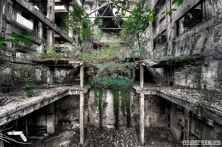
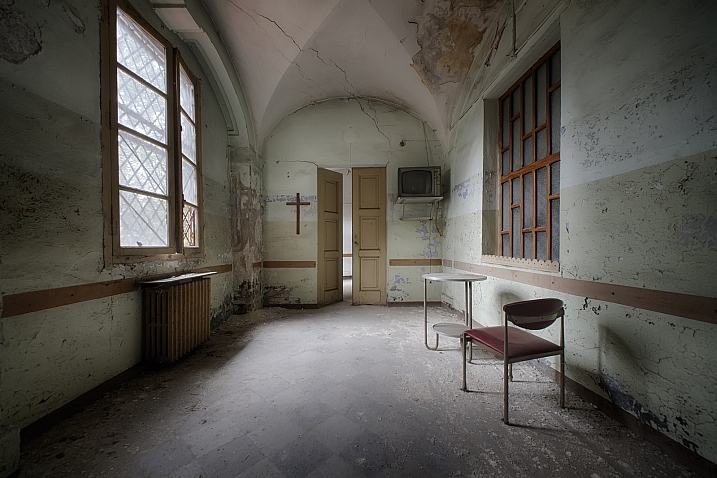
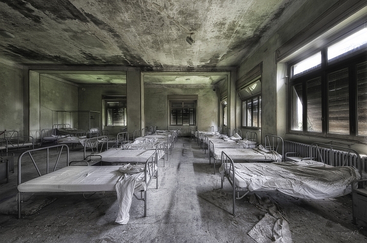
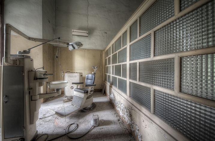
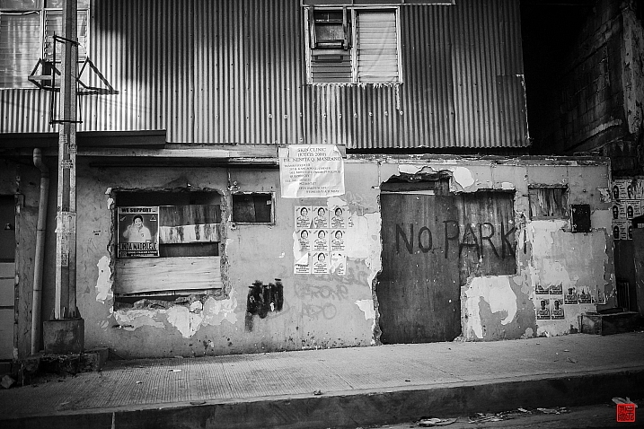
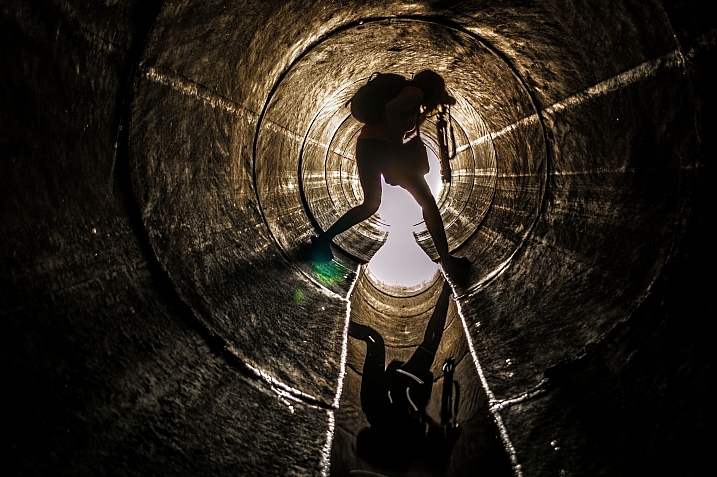
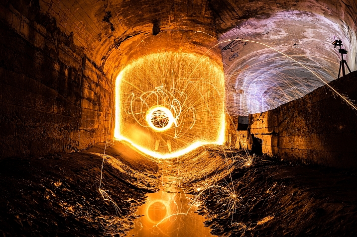
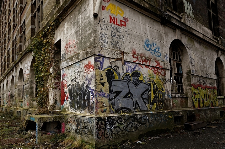
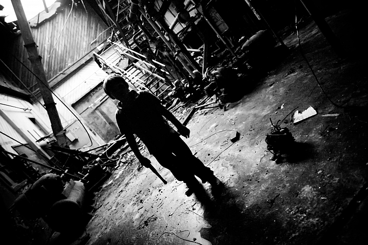
Many photographers are fascinated with old things, the more decayed and falling apart the better. Urban decay and grunge is a popular subject for photographers in cities. Some go out of their way to find abandoned buildings and little known spots.
Perhaps like these images:
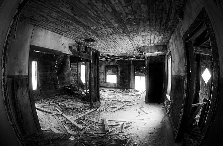
By Wayne Stadler
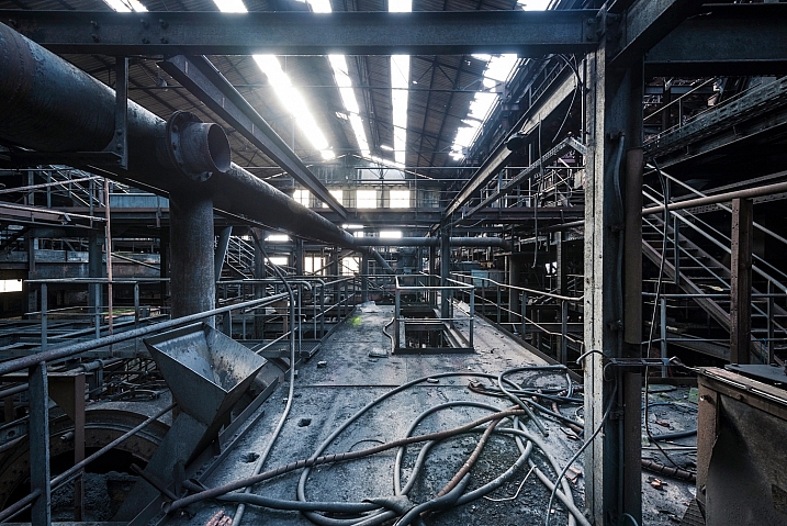
By Vincent Ferron
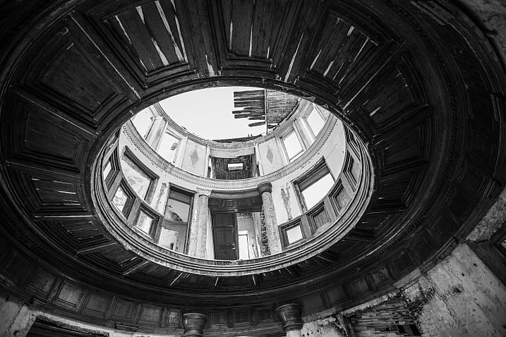
By RAFFI YOUREDJIAN
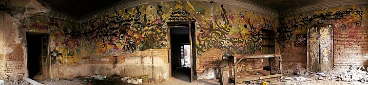
By ghalam_DAR
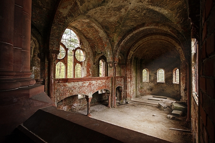
By Anna S.
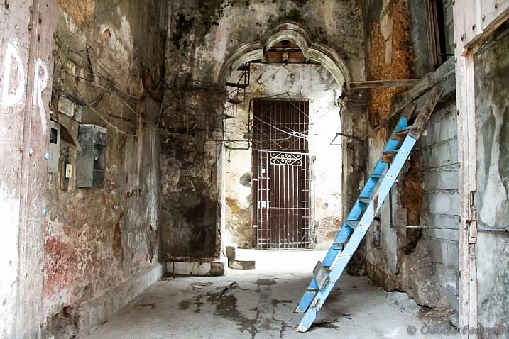
By Claudia M Eastman
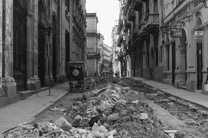
By Nano Anderson
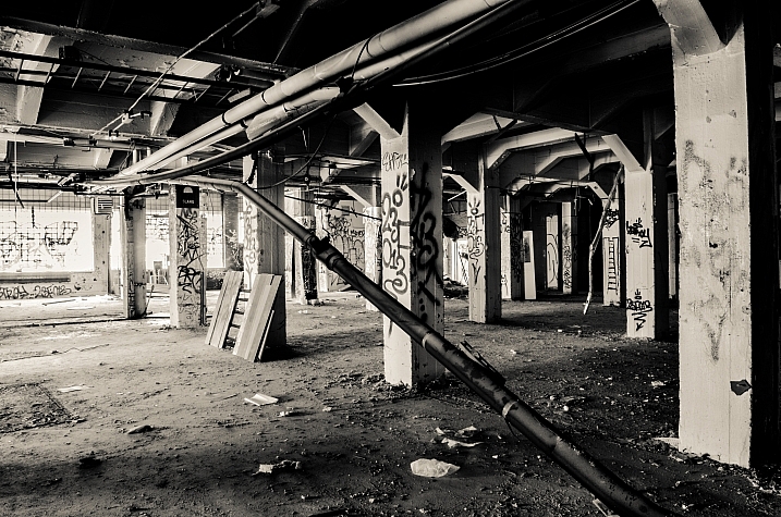
By Simon Samuelsson
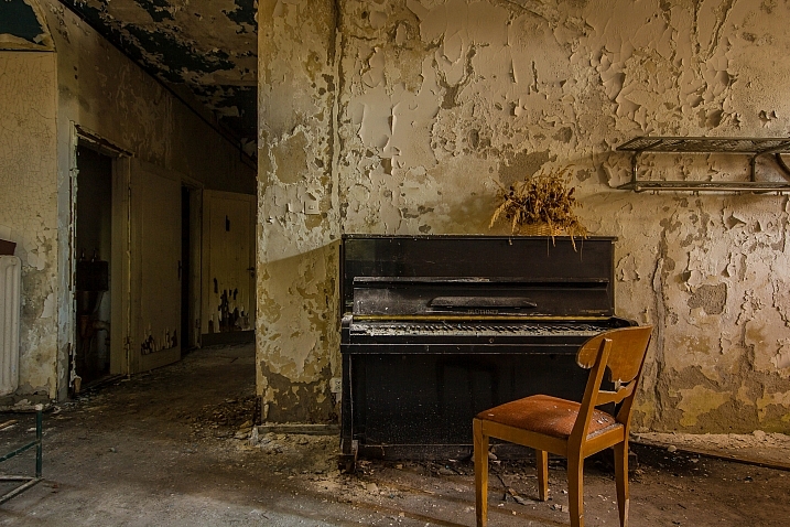
By olavXO
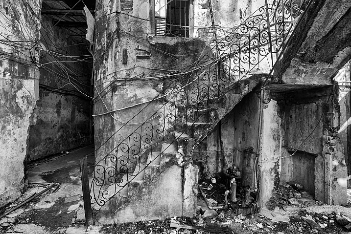
By Howard Ignatius

By Freaktography
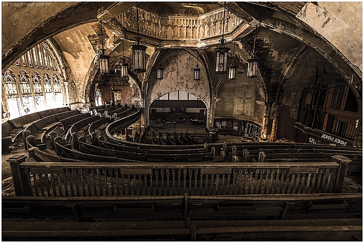
By Freaktography
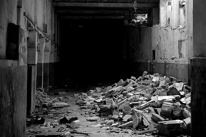
By Andre Valente
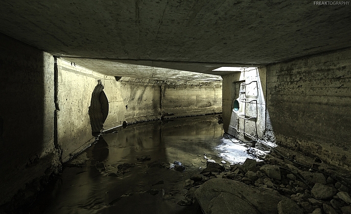
By Freaktography
By Pietromassimo Pasqui
By Maurizio
By Oreste Messina
By Maurizio
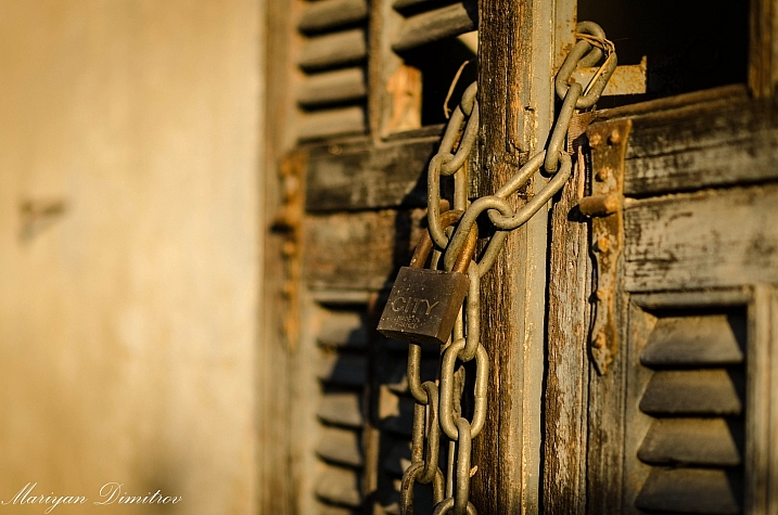
By Mariyan Dimitrov
By Daniel Go
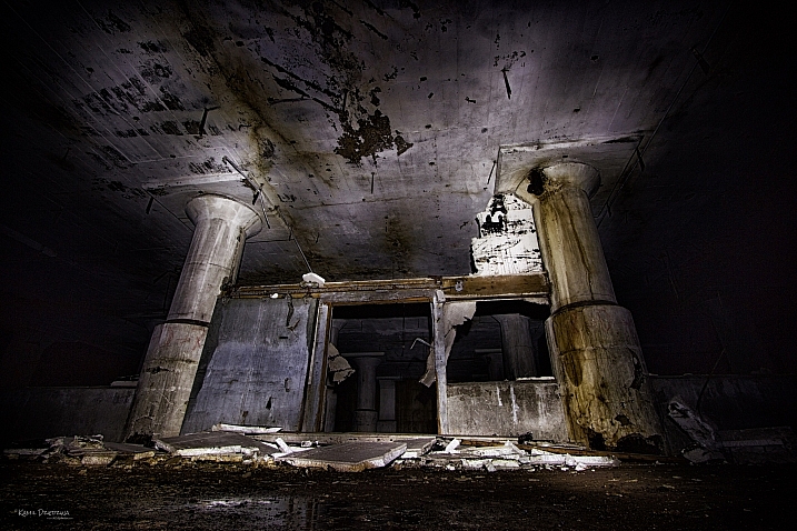
By Kamil Dziedzina
By darkday
By darkday
By Guillaume DELEBARRE (Guigui-Lille)
By Thomas Hawk
googletag.cmd.push(function() {
tablet_slots.push( googletag.defineSlot( “/1005424/_dPSv4_tab-all-article-bottom_(300×250)”, [300, 250], “pb-ad-78623” ).addService( googletag.pubads() ) ); } );
googletag.cmd.push(function() {
mobile_slots.push( googletag.defineSlot( “/1005424/_dPSv4_mob-all-article-bottom_(300×250)”, [300, 250], “pb-ad-78158” ).addService( googletag.pubads() ) ); } );
The post 25 Dilapidated Images of Urban Decay and Grunge by Darlene Hildebrandt appeared first on Digital Photography School.
Today’s deal is perfect for those of you wanting to awaken your creative genius and create some art with your images.
It is 70% off the Photoshop Artistry: Fine Art Grunge Composition course.

We offered this course on our sister site – SnapnDeals – earlier this year and it ended up being our most popular deal of the year, so we convinced it’s creator – Sebastian Michaels – to bring it back for dPS readers today.
The best thing you can do to learn what this course is about is to head over to the sales page where Sebastian has created a great video run down of what the course covers and why you might consider signing up.
You get a whole lot with this course including:

Normally this course retails for $ 297 and in January it is set to increase in price but for the next 24 hours it is yours for $ 89.
Best of all – there’s a 60 day satisfaction guarantee on this course. If you buy it and if you don’t find it meets your needs you’re able to simply ask for a refund and Sebastian will get you your money back.
Head over to check out full details of what is included here (there are also a heap of previous students testimonials).
googletag.cmd.push(function() {
tablet_slots.push( googletag.defineSlot( “/1005424/_dPSv4_tab-all-article-bottom_(300×250)”, [300, 250], “pb-ad-78623” ).addService( googletag.pubads() ) ); } );
googletag.cmd.push(function() {
mobile_slots.push( googletag.defineSlot( “/1005424/_dPSv4_mob-all-article-bottom_(300×250)”, [300, 250], “pb-ad-78158” ).addService( googletag.pubads() ) ); } );
The post Deal 8: 70% off Photoshop Artistry: Fine Art Grunge Composition Course by Darren Rowse appeared first on Digital Photography School.

All images copyright Gina Milicia – Model credits from left to right: Jess Kenneally, Nathan Kennedy, Firass Dirani.
Gina has a new dPS ebook just released – Portraits: After the Shot – check out out!
The style of side lighting (in the image below) is a great way to enhance muscle definition, and the post-production technique complements the lighting style. You can see that it appears as if Nathan has far better muscle definition in his after shot. I love using this post-production technique in character portraits for the entertainment industry, advertising and editorial shoots. It deliberately gives the skin a hard, detailed, gritty look, which is perfectly suited to character-style portraits.

Model credit: Nathan Kennedy for ML Denim. In this image I used fill flash from my Elinchrom Quadra lights with a Rotolux Deep Octabox camera left, which is lighting Nathan from a 45-degree angle.
If you want to see a full tutorial on my favourite lighting style for this type of effect, check out: How to Create this “Fight Club” Inspired Portrait using One Light.
It’s not the most flattering technique for skin post-production, so I’m selective about which projects I use it on and tend to avoid using it on female skin tones. There are very few women who will say, “Wow, I love how detailed and large my pores look.”
Don’t forget my overnight rule. After you’ve edited your image, try not to look at it for a minimum of 12 hours. When you look at it again with fresh eyes, you should trust your gut instinct on how it looks. If your first reaction is “Ewww”, then you may have gone too far!
Here’s my step-by-step recipe for adding a grunge effect to your portraits using Lightroom:
 |
 |
Note: Every lighting style is going to give you a slightly different result. I suggest you use my recipe as a rough guide only, tweaking your images until you get the results that best suit your image and personal style.

Find a neutral area of your image and use it to correct white balance. In this case I’ve selected a very light gray section of the white shirt the model is wearing.
Step 1. Import the file into Lightroom and in the Develop module, use the eyedropper tool (A.) and do a custom white balance (B.). This is achieved by finding a neutral area on your image (gray or white works best) then using your eyedropper tool (A) click on this (Neutral area) and Lightroom will automatically adjust your white balance.
The best and most accurate technique to achieve a good white balance is to ask your model to hold a gray card in front of their face for the first frame. This gives you an accurate neutral gray to select from for your white balance.
The third option to achieve white balance is to use Lightroom’s auto white balance. Test them all if you can and see which option best suits your shooting style.
I like working with a combination of gray card and finding neutral areas. I will use Lightroom’s auto function if I am shooting television stills or theatre productions where I need to color correct images that were shot under tungsten lights.

Step 2. As a starting point, increase shadows (+81) and decrease highlights (-60). The image starts to look a little wrong, but stay with me.

Step 3. Switch on clipping mask (A.) by clicking on little triangles above the histogram.
Move the blacks slider to the left until your image gets a good black tone. The areas in blue highlight loss of detail in the shadows, and areas highlighted in red indicate loss of detail in highlights.
Purists will probably start twitching at this point because I am crunching my black tones (B.) and blowing my highlights (C.). I believe this gives the image a more realistic feel because we don’t always see detail in shadow areas with our naked eye.
I personally like my images to look good overall, and if that means losing some detail in the shadows to gain good contrast across the whole image, I’ll do it. Just because Lightroom gives us the technology to see the entire gray scale doesn’t mean we have to.

Step 4. In the next step, I increase the mid-tone contrast or clarity) (A.). I also decrease saturation to counter the digital orange glow the skin tone tends to take on in Step 3. Then I increase vibrance to bring some tone back to the muted tones.

Step 5. The next step is to add a vignette from the Effects menu (A.). This is optional, but I feel it finishes the image off nicely and draws our eye to the hero of the shot, Jesse.

Step 6. Finally, I enhance the eyes slightly using my eye-enhancing technique for Lightroom.
If you’d like to try it, you can check it out here: 3 Simple Ways to Create Stunning Eyes in Your Portrait Photography.

Behind the scenes on my air shoot with actor Jess Kenneally and my MacGyver-inspired lighting boom.
How do you create a grungy, gritty look to your portraits? Should we keep detail in the blacks and highlights, or is it okay to crunch and blow out to create the right vibe? I’d love to hear what you think.
Gina has a new dPS ebook just released – Portraits: After the Shot – check out out!
The post How to Add a Grunge Effect to Your Portraits Using Lightroom by Gina Milicia appeared first on Digital Photography School.

Image by Sebastian Michaels
Sebastian Michaels has the course Photoshop Artistry: Fine Art Grunge Composition which is current on sale for 67% off at SnapnDeals.com for a limited time only. Grab it now before the deal is over.
One question. Do you sharpen just about all your images? If so … you should stop. As photographers we tend to want our images to be perfect: perfect exposure, perfect white balance, perfect sharpness. But aren’t you a little tired of being so perfect all the time? Let me clue you in. Art doesn’t always have to be so darn pretty. What if instead you let yourself RELAX a bit, lighten up, and have some fun? What if you let yourself get a little messy? Maybe not full-blown grunge. But how about “fine art grunge”?
Start here: a little more blur, a little more noise, an unexpected angle or crop, perhaps some striking effect of light combined with a subject you never would normally have thought to consider.

Photo credit: Catherine King (course student)
Sometimes we forget that at our core we are ARTISTS. Owning a Canon 5D Mark III rig and enough lighting gear to stage a Pink Floyd reunion tour doesn’t change that. Just because we spend so much time trying to capture the perfect shot doesn’t mean that we can’t switch it up now and then and treat our images (even our mistakes, even our botched shots) as nothing more than the starting point in more elaborate artistic compositions.
Here’s a mental trick to get you started. Think of some of your favorite shots. But instead of imagining your photos all printed pretty and perfect, imagine them layered-in and composited with other images and rendered as a painted canvas.
Think paint on canvas. Not that you need to simply run a paint filter on your photos. That’s not going to cut it here. Think instead of paint on a canvas in the sense of a wild-eyed painter with oil paint in his hair, brushes sticking out of his pockets and one clenched between his teeth – attacking a canvas in a frenzy of creativity and passion. When was the last time you approached your photography with that kind of intensity? When was the last time you let yourself step outside of your serious photographer role and actually felt like an ARTIST creating a great canvas?

Photo credit: Li Li Wee (course student)
That kind of artistry is in you. Let’s look at how you might begin tapping into it.
I mentioned a little of this earlier. You might already have some shots that you would otherwise delete out of hand just because they are blurred or the contrast is screwy. Give those a second look. Maybe there’s something artistic you could do with them. Maybe you could crop them in a creative way.
When you are shooting, try some angles you normally wouldn’t even attempt. For that matter, try shooting some subjects outside of your usual comfort zone. Take a walk down a dark alley (or a woodland trail) and see what you come out with.
Maybe enlist some models you normally wouldn’t have chosen, or stockpile some odd objects and lug them out to quirky locations. In other words: experiment more. Get out of your comfort zone and try something new. Take some chances for your art.
It’s surprising how much more interesting an image can become simply by slapping a Curves layer on it (or even simply duplicating the background layer) and assigning that layer a Blend Mode. Give it a try and see.


Your best bet is almost always with Multiply or Screen blend modes, or alternately with Overlay, Hard Light, or Soft Light. I recommend memorizing the keyboard short cuts for those so you can toggle through them quickly and pick the best. You might also want to lower the opacity of the layer (or you might want to duplicate that layer with Cmd/Ctrl+J, doubling up the effect, or giving that duplicate layer a different Blend Mode of its own).
You might also want to stick a Layer Mask on there and paint in precisely where you want that effect to show. Every image is different, and layer Blend Modes can create rich results.
I recommend also trying out some textures combined with Blend Modes and Layer Masks. A texture or overlay might be as simple as a photo of a grungy patch of concrete, or it might be a scanned watercolor wash. It could also be an intricately layered piece in and of itself, comprised of scanned swatches of paint, scratched up paper with coffee stains on it, colorized with a Hue/Saturation layer and given a dark vignette. When you decide to explore photo-artistry, you begin collecting a lot of these kinds of textures and overlays.

But whatever you use, you drop it in over the image and give it a Blend Mode; again, you might tweak the opacity or employ a Layer Mask. Already your image is likely looking more dramatic and artistic. It’s probably a bit “grungy” at this point, and that’s okay. Embrace it. You might already find yourself astonished; discovering something in the image you never quite knew was there until this moment.
You never know where an image is going to take you. All you can do is try a few things and see if one of them looks especially cool. One approach you may want to try is to slap another Curves layer on top of the image (or Brightness/Contrast if you’re working with Elements) and deliberately darken the entire image. Go back in with the Brush Tool to paint over the Layer Mask at a low opacity and, in essence, paint in the lighting where you want it. Be sure to use a soft-edged round brush at only about 20% opacity, layering your strokes while using black and white and toggling between the two by pressing the “x” key.
Here you are painting in where you want light. But you can do something very similar with any of the effects in the Filter Gallery. Here’s how:

Now that you have an interesting artistic image, it’s nice to give it some kind of artsy edge treatment. There are half a dozen ways to do this (you can even pick up OnOne Software specifically built for the task of creating edge effects), but we can leave the pure Photoshop methods for the next tutorial.
You might even want to stick a more artistic signature on the corner of the piece, because you’re likely excited at this point, since you are now looking at a work fit for canvas.

Photo credit: Irene Hofmann (course student)
You took some chances and it paid off. Next time maybe you’ll get even grungier, because by now you’re seeing that “grunge” is just another way of saying “artistic.” Above all else, whatever your tools, and whatever your approach, you are first and foremost, an artist.
For walk through of this process and a better idea of what the course is like, check out this video:
// < ![CDATA[ _evpInit('dHV0b3JpYWwxMjgweDY5MndlYi0xLm1wNA==[evp-f593aa84764ec0c7dba0fa770e9114bc]'); // ]]>
Sebastian Michaels has the course Photoshop Artistry: Fine Art Grunge Composition which is current on sale for 67% off at SnapnDeals.com for a limited time only. Grab it now before the deal is over.
The post 4 Steps to Photoshop Artistry Using Fine Art Grunge Techniques by Sebastian Michaels appeared first on Digital Photography School.
You must be logged in to post a comment.