Found over at RobertBenson.com. absolutely hilarious, and very true… hits close to home actually!

Tweet This Post Stumble This Post
Found over at RobertBenson.com. absolutely hilarious, and very true… hits close to home actually!
Tweet This Post Stumble This Post
The post Mastering Color Series – The Psychology and Evolution of the Color PINK and its use in Photography appeared first on Digital Photography School. It was authored by Megan Kennedy.
From the Renaissance to contemporary art, pink has endured as a color of emotional versatility. In this edition of the Mastering Color Series, let’s take a look into the color pink and its role within the history of visual arts.

The English word pink derives its name from flowers of the Dianthus genus. A combination of red and white, pink can be raucous and racy, or delicate and subtle. Buoyant light pinks describe playfulness, youth, kindness and affection. Darker shades of pink denote passion, love, energy, eroticism and confidence. However, too much pink can be a bad thing, influencing anxiety and claustrophobia.
Sweet foods like fairy floss, bubblegum, ice cream and lollies all embody tasty shades of pink. Associated with the smell of roses and the softness of flower petals, pink conjures ideas of tenderness and sensitivity. Evoking images of cherry blossoms, pink evokes impressions of spring, renewal and life. As a warm color, pink is drawn to the foreground of an image, cultivating intimacy and directing attention.
In the early 20th century, pink was designated the color for young boy’s clothing. The logic was that pink was a strong color and suited to boys. Blue was viewed as a lighter shade and was, therefore, more appropriate for girls. From the 1940s, however, pink came to be seen as a color for females. Products marketed at women and girls rapidly became pinker. As a result, pink has often been categorized as a color of femininity.
In China, pink is considered to be a shade of red, and comes with many of the same connotations. Indian culture sees pink as a color of youthful charm, celebration and nurture. Korean’s view pink as a sign of trust and security. In Germany, pink is considered bright and soft – a color of peace and harmlessness. In Thailand, pink is associated with Tuesday on the Thai solar calendar.

Although relatively rare in nature, pink may be the world’s oldest color. Compared to red, however, pink had tentative beginnings in art history. There is little evidence of a dedicated pink pigment being used in prehistoric artworks. Made by mixing whites derived from gypsum and reds made of ochres or realgar, the ancient Egyptians regarded pink as a secondary color, ranked alongside brown, grey and orange.
Despite it’s scant early use as a pigment, pink manifested in other mediums. Pink sandstone proved ideal for constructing magnificent edifices. Carved in the first century AD, AL-Khazneh is one of the most elaborate temples in the ancient Arab Nabatean Kingdom city of Petra. Furthermore, in China, the Tang Dynasty Leshan Giant Buddha, carved into a cliff face of pinkish sandstone, is the largest stone-carved Buddha in the world.

Pink can manifest in types of stone, appearing as an artistic medium for centuries
According to “Precious Colours” in Ancient Greek Polychromy and Painting, pink had a significant presence in the art of ancient Greece. Pink hues were found on fragments of the Mycenaean palace at Pylos and an examination of the Pitsa painted panels revealed pinks used in the painting of men’s skin. Pink is also seen in “small scale figures from the symposium scene on the tomb of Aghios Athanassios, where cinnabar is mixed with calcium carbonate whites and kaolinite to produce a subtle tone of pink”
Later, pink (from manganese) was used by the Romans to color glass for glassware, mosaics and decorative panels in walls and furniture.
During the medieval period, pink pigments are thought to have consisted of a mixture of lead white or calcite and madder and cochineal. Cinnabar, a sulfide mineral, was also crushed and mixed into shades of white.
During the renaissance, Italian writer and painter Cennino Cennini described a light pink he called cinabrese. It was made by blending sinopia (sourced from hematite) with lime white (composed of calcium hydroxide, and calcium carbonate). As suggested by Cennini, cinabrese was used for filling out fleshy tones.
However, in The Book of the Art of Cennino Cennini, Christina J. Herringham observes that “what pigment was used to produce the lovely pinks and crimsons of the early Italian painters is not really known with exactness”. Contenders include “madder…kermes…[the] bodies of the Coccus illicis gum lac…and Brazil-wood or verzino“. Vermilion and carmine may also have been mixed with whites to produce pinks.
In 1856, whilst trying to synthesize quinine, British man William Henry Perkin accidentally discovered mauvine, the first synthetic dye. The discovery prompted a surge in the industry and in 1858 German August Wilhelm von Hofmann produced a reddish-purple dye, made by combining aniline and carbon tetrachloride. Meanwhile, in the same year, Frenchman François-Emmanuel Verguin discovered the same substance independent of Hofmann and patented it. Named fuchsine by its original manufacturer Renard frères et Franc, production of Verguin’s dye commenced in 1859.
In the meantime, two British chemists, Chambers Nicolson and George Maule produced another aniline dye with a similar red-purple color. They began to manufacture the dye in 1860 under the name roseine, later changing the name to magenta in honor of the Battle of Magenta.

In 1935 quinacridone dyes were developed. A family of synthetic pigments, quinacridones are typically deep-red to violet in color. With exceptional vibrancy and lightfastness, quinacridones are often used for creating varying tones of magentas and pinks in artist’s paints.
Due to the invention of color-fast chemical dyes, pinks quickly grew in application and impact during the 20th century. During 1931, a radical shade of pink was created by Italian fashion designer Elsa Schiaparelli. The pink, dubbed shocking pink was made by adding a small amount of white to magenta. Schiaparelli’s designs, made in conjunction with surrealist artists like Jean Cocteau, displayed her new shade of pink prominently.

In February of 2016, Anish Kapoor secured an exclusive contract for the use of Vantablack in his art. In retaliation, artist Stuart Semple created a fluorescent pink pigment he dubbed PINK. Declaring it to be the world’s pinkest pink, Semple released PINK for sale, but with one caveat – any artist looking to purchase PINK are obliged to agree to a legal declaration which states: “you are not Anish Kapoor, you are in no way affiliated to Anish Kapoor, you are not purchasing this item on behalf of Anish Kapoor or an associate of Anish Kapoor. To the best of your knowledge, information, and belief this paint will not make its way into that hands of Anish Kapoor.”
Despite the ban, Kapoor did get his hands on PINK. He posted a picture of his middle finger dipped in the dry pigment to his Instagram account in December 2016. Nevertheless, Semple continues to sell PINK, anti-Kapoor declaration intact.

The website where Stuart Semple sells his PINK.
Pink truly came to life from the 14th century. During the early renaissance, infant incarnations of Jesus and angels were sometimes depicted dressed in pink, as in Cimabue’s the Virgin and Child Enthroned with Two Angels. Lorenzo da Sanseverino’s Virgin and Child, with Saints Anthony Abbott, Mark, Severino, and Sebastian depicts the child Jesus in a pink robe, matching the garb of one of the surrounding saints. Later, Raphael’s Madonna of the Pinks depicts the infant Jesus and the Virgin Mary with pink carnations, a slight anachronism – the flower is said to have first appeared at Jesus’crucifixion.
Baroque artists used pink hues to convey a broad range of subjects. The heavens and its holy occupants are grazed in soft pinks in Paolo de Matteis’s Triumph of the Immaculate. And Willem van Aelst and Rachel Ruysch used pink in arresting still life paintings. But it was during the rococo movement that pink saw a perceptible rise to fame in western art. Characterized by indulgent paintings featuring splendid pink costumes, rosy nudes and fine pink detailing, the color graduated from a secondary hue to a commanding presence in art.
Jose Ferraz de Almeida Junior’s Nha Chica and Batismo de Jesus are two examples of pink’s application in academic art. Realist painter Jean-Francois Millet’s Gleaners depicts three peasant women, one with distinctive pink sleeves, linking to the pinks hues in the overcast sky. And pre-raphaelite artists like Dante Gabriel Rossetti used intricate pinks to emphasize symbolic paraphernalia.

With an emphasis on the depiction of light, impressionists applied pink in a variety of contexts. Claude Monet used combinations of pink in his water lilies series. Manet painted the Plum with soft pinks verging on purple and Edgar Degas’ famous the Pink Dancers portrays figures dressed in flourishing pink ballet dresses. Paul Gauguin added depth to his paintings by filling them out with saturated fields of pink. And Vincent van Gogh painted post-impressionist pinks in his depictions of flowers, carefully detailing the blossoms of Almond Blossom.
Fauvism saw everyday settings painted in radical color. Les toits de Collioure by Henri Matisse charges a landscape with bright pink hues. In Charing Cross Bridge, Andre Derain contrasts a green and blue city skyline with a richly pink sky. As one of at least four renderings of the same landscape, Georges Braque crams a vista with active pinks in The Olive Tree Near l’Estaque. Unfortunately, the painting caught the eye of a thief, who stole it from the Musée d’Art Moderne de la Ville de Paris in May 2010.
Street, Dresden by expressionist Ernst Ludwig Kirchner is a haunting portrayal of modern public space underscored by glowering pink. Considered one of the earliest examples of cubism, The Young Ladies of Avignon by Pablo Picasso portrays five nude female prostitutes, their flesh padded out in varying degrees of pink. And abstract artists such as Robert Delaunay (Circular Forms) and Agnes Martin used color pink to convey meaning, doing away with the figurative altogether.
Loaded with meaning, pink is a common theme in contemporary art. Embracing ephemerality and visual abundance, Tanya Schultz works as Pip & Pop to create intricate installations and artworks from materials including sugar, glitter, found objects and craft effects. Sculpted not from icy rose-hued water but from solid glass, Roni Horn’s Two Pink Tons are deceptively evanescent in appearance. And Daniel Arsham’s Lunar Garden reflects his fascination with the familiar and the surreal, re-imagining a traditional zen garden in solid pink hues.
Known for her grotesquely intriguing representations of the human body, Mithu Sen aimed to stretch the limits of artistic language through her sculpture made of false teeth and pink dental polymer. Yue Minjun’s self-portraits depict him as bright pink-skinned characters in the throws of maniacal laughter. Anne Lindberg’s Drawn Pink culminated in an immersive gesture of movement and color and Karla Black’s weightless sculptures appear to keep themselves afloat in wispy pinks, blues and greens, exploring the nature of physical experience.
Lori B. Goodman investigates the tenuous nature of the color in her installation Pink writing, “it is said that pink is initially a calming color but that too much exposure creates anxiety.” And Anish Kapoor’s Gossamer, an elegantly carved piece of onyx, slumbers in quiet pink within gallery confines.

Even before the inception of color photography, pink has had a presence in the photographic landscape. Popular in the mid-to-late 19th century, hand-colored photographs depicting pastel pink cheeks and clothing added a level of realism to the photography of the time.
Pink is now abundant and accessible. As a result, many modern photographers turn their attention to pink. One striking example of pink’s application in photography is manifested in Richard Mosse’s Infra series captured in Aerochrome. Invented for reconnaissance during the Second World War, Aerochrome registers infrared light (normally invisible to the naked eye), transforming green shades into rich pinks in the process. As a result, Mosse’s documentary of war-torn Congo is dominated by pink hues, evoking an otherworldly beauty juxtaposed with war.
Photographers like Kate Ballis and Zoe Sim also use in-camera infrared conversions and filters to capture illusive pinks. Documenting the color preferences of children, JeongMee Yoon explores the socialization of gender and identity through her Pink & Blue Project. Smothering participants in luxurious pink materials, Loreal Prystaj’s series Pretty in Pink marries portraiture and materiality. Andria Darius Pancrazi photographs architecture in a format he describes as “softserve pinkcore mulhollandwave” and Martine Perret’s series Sel Rose captures abstract aerial shots of the pink waters of Western Australia.
Manit Sriwanichpoom inserts Pink Man into photographic scenes in various ways to channel his feelings towards Thai society. Singaporean Nguan documents his home city with restrained pinks and Xavier Portela documents the pink and purple hues of cities at night.

Infrared technology and effects render green organic matter in pinks and purples
Pink was a latecomer to the artist’s pallet. Nevertheless, as an extremely versatile color, pink has seen extensive use in art movements over time. Sometimes underestimated, pink can be lighthearted and subtle or raucous and bold. Associated with love, kindness, tenderness, affection, intensity, playfulness and sensitivity, pink denotes emotional abundance. Palpable in depth and weight, pink is a color of visual buoyancy, conveying meaning through sensual and emotive experience.
We’d love for you to share your images with the color pink in the comments below!
See the other colors in the Mastering Color Series here.

The post Mastering Color Series – The Psychology and Evolution of the Color PINK and its use in Photography appeared first on Digital Photography School. It was authored by Megan Kennedy.
The post Mastering Color Series – The Psychology and Evolution of the Color PURPLE and its use in Photography appeared first on Digital Photography School. It was authored by Megan Kennedy.
Purple has had a long history in visual arts. From prehistoric to modern artworks, purple has come to represent aspects of religion, royalty and status. In this article, we’ll look back on the history of the color purple, its evolution and its impact in the context of modern visual art.

In the traditional color wheel used by artists, violet and purple are placed between red and blue. Purple takes up the space closer to red, between crimson and violet. Violet is positioned closer to blue. Despite this, both violet and purple are often placed under the one heading of purple, sharing psychological associations.
As an intermediary between red and blue, purple tempers the extremes of both. Like blue, purple has a soothing effect, cultivating introspection and calm. Like red, purple also generates a visual vibration, stimulating creativity and passion. Lighter purples are considered light-hearted. Darker shades of purple are associated with wisdom and intellect.
Over history, the limited resources and arduous processes needed to obtain rich purples made it an expensive luxury. For this reason, the color purple came to be associated with status, royalty and wealth. Perhaps due to it’s uncommon and distinctive presence in nature, purple has also been attributed to exoticism, mystery, and magic.
In Christian tradition, purple is used during lent to signify mourning and majesty, anticipating the crucifixion of Jesus Christ. Hinduism associates purple with a oneness with God, peace, and wisdom. In China, purple represents spiritual awareness as well as physical and mental healing. Japanese cultures view purple as the color of privilege, wealth, and Japanese aristocracy. In Africa, purple is a symbol of status and wealth, whereas, in Brazil, purple can indicate mourning or death.

Used by Neolithic artists in the form of sticks, or ground and mixed with fat as a paint, hematite and manganese are the oldest pigments used for purple coloring in art. Dated between 16,000 and 25,000 BC, early artists used purple to draw and paint figures and the outlines of their hands on the walls of sites like Pech Merle cave in France. Manganese is still used today by some indigenous Australians as a traditional pigment for coloring the skin during rituals.
Despite it’s name, Han purple has been found to occur well before the Han dynasty in China. Created by melting silica with copper and barium at high temperatures, Han purple first appeared on glass beads found at burial sites. The pigment was later used in wall paintings, ceramics, and sculptures, including the terracotta warriors in the tomb of Emperor Qin Shihuangdi in Xi’an. The use of Han purple peaked in the Qin and Han dynasties (221 BC to 220 AD), declining during the Tang dynasty (618-907 AD).
Han purple can fade and decompose over time, particularly when in contact with acids or heat. However, the unique light-absorbing and emitting properties of the pigment generates powerful rays of light in the near-infrared range when exposed to an LED flashlight. This means that even faint traces of the pigment (invisible to the naked eye) can be viewed by conservators and scientists evaluating Han purple and its properties and history.

Ranging from a reddish to bluish purple, Tyrian purple became the most renowned shade of purple in history. Citizens of Sidon and Tyre, two cities on the coast of Ancient Phoenicia, (present-day Lebanon), were producing purple dye sourced from the mucous secretions of certain sea snails by the 15th century BC. The process for extracting the color from the snails was both unfortunate for the snail and protracted for the dye-maker as more than 10,000 snails were needed to dye a single cloak.
According to an article in The New York Times, the extricated snails were “…boiled for days in giant lead vats, producing a terrible odor. The snails, though, aren’t purple to begin with. The craftsmen were harvesting chemical precursors from the snails that, through heat and light, were transformed into the valuable dye”.
Tyrian purple was extremely pricey, and purple-dyed textiles became the color of emperors, generals, nobles, politicians, priests and magistrates throughout the Mediterranean.
Although it was used predominantly for dying textiles, Tyrian purple was also used for painting. Tyrian purple has been chemically detected in the Saffron Gatherers, a late bronze age fresco in the Aegean Island of Santorini.

During the middle ages, artists created purple pigments by mixing red and blue mediums together. For blues, artists sourced blue azurite or lapis-lazuli. For reds, red ochres, cinnabar, madder or minium were used. Artists also mixed woad or indigo dye for blues and cochineal dye for reds. Different mixtures resulted in different intensities and shades. However, many of these materials were prone to fading and many paintings with purple have dulled or changed in color. Jan Gossaert’s painting of a young princess is an example of this – the pattern on the garments of the sitter, now seen as blue, were originally purple in color.
In 1856, 18-year-old British chemistry student, William Henry Perkin, was working on a cure for malaria. During his experiments, he encountered an intriguing residue, the first synthetic aniline dye. Perkin realized the compound could be used to dye fabrics. He soon patented the dye and manufactured it under the name aniline purple and (confusingly) Tyrian purple. The color’s name was later changed to mauve in 1859, reflecting the French name for the purple mallow flower. Chemists called the dye compound mauveine.
Mauve quickly became fashionable. Queen Victoria wore a silk gown dyed with mauveine to the Royal Exhibition of 1862. Perkin developed an industrial process, built a factory, and produced the dye in large quantities. His efforts made purple accessible to anyone, not just the wealthy. However, due to dye’s propensity to fade, the success of mauve faded too, replaced by other synthetic dyes by 1873.

The first truly violet pigment was cobalt violet, developed in 1859 by Salvetat. Ranging from deep to pale shades of violet with either a pink or blue hue, the first cobalt violets were composed of cobalt arsenate. The highly toxic compound is now rarely used, replaced today by cobalt ammonium phosphate, cobalt lithium phosphate, and cobalt phosphate.
The only truly lightfast violet pigment with relatively strong color saturation, all alternative light-stable violet pigments are duller in hue. Although in use today, the high price, weak coloring power and toxicity of cobalt violet have limited the pigment’s application.
Also known as permanent violet, Nuremberg violet or mineral violet, manganese violet is believed to have first been discovered by E. Leykauf in 1868. More affordable and less toxic than its predecessor, manganese violet became an economical alternative to cobalt violet in the 1890s and remains in use today.

In 2017, the Pantone Color Institute announced a new shade of purple in honor of the singer Prince. The hue, dubbed Love Symbol #2, is a blue-based purple inspired by Prince’s adoption of the color throughout his career. Laurie Pressman, Vice President of the Pantone Color Institute said: “long associated with the purple family, Love Symbol #2 enables Prince’s unique purple shade to be consistently replicated [while maintaining] the same iconic status as the man himself”.
“Why this particular purple?” asks Pressman. “We are not sure of the exact reason, however, what we do know is that the language of this unique new purple, Love Symbol #2 conveys an aura of mystery, intrigue, and unconventionality, a color that stands apart from all others, something Prince, a performer of distinctive style, certainly did”.

The use of manganese and hematite to create purple pigments dates back at to at least 25,000 years BC. Evidence of purple in art has been found at sites such as the remote East Kalimantan province of Borneo and Neolithic sites in France. Much later, during the early stages of the church, variations of purple garments marked the hierarchies of Christian officials (mirroring the practices of pagan traditions). In medieval art, pages of the bible and gospel manuscripts were written in gold lettering on parchment dyed Tyrian purple. In Byzantine-style painting, figures of importance were depicted in purple robes.
Renaissance art saw portrayals of angels and the Virgin Mary garbed in purple. Because Jesus was said to have been clothed in purple by Roman soldiers during the events leading up to his crucifixion, purple also signified suffering, sacrifice, and majesty. The Assumption of the Virgin by Palma Vecchio features Mary dressed in a long purple gown. In Michelangelo’s Creation of Adam, God is dressed in a subtle lilac shift.
Purple featured in post-renaissance movements such as baroque and rococo art, academic art and realism. In 1789, French rococo artist, Antoine Callet, depicted Louis XVI in his royal costume, which included a luxuriant panel of purple material. Painted between 1880 and 1890, Wladyslaw Czachorski’s Lady in a Lilac Dress portrays a woman in an opulent lilac gown. The Shepherdess by academic artist William-Adolphe Bouguereau features a cool, purple backdrop, rhyming with the shepherdesses’ own garments. However, as seen in Jean Francois Millet’s The Angelus, realist artists broke away from the depiction of purple as a status symbol, instead using subtle variations of the hue to reflect the harshness of middle and lower class society.

Combining cobalt blue with madder, pre-raphaelite artists like John William Waterhouse painted women in rich purple garb. As seen in Monet’s Grainstack (Sunset), Waterloo Bridge, Blurred Sun and Water Lilies (1919), impressionist painters used purple to delineate both shadow and detail. Purple also played a significant role in post-impressionist art, as seen in A Sunday Afternoon on the Island of La Grande Jatte by Georges Seurat.
The symbolism movement saw purple used in increasingly varied applications. In paintings such as Death and Life by Gustav Klimt and The Cyclops by Odilon Redon, purple is used to highlight detail and depth. Fauvism then pushed purple to shocking brilliance. Henri Matisse’s Woman with a Hat sees purple mashed together with a range of colors, creating life and vibrancy. In Woman in a Purple Coat, Matisse exploits purple as a bold separation of subject and environment. Mirroring impressionism, Andre Derain painted shadowy purples, as seen in Charing Cross Bridge, London. And Jean Puy used fluid purples to illustrate Strolling Through Pine Woods.
As seen in Puberty by expressionist Edvard Munch, purple was distorted or exaggerated in ways that matched expressionism’s often hostile or alienated depiction of the modern world. Examples of purple in cubist art include Picasso’s Bowl of Fruit, Violin and Bottle and Claude, Son of Picasso. Abstraction, devoid of recognizable figurative imagery, used degrees of purple to evoke emotional responses in the viewer. Composition 8 (1923) by Vasily Kandinsky, Untitled (1957) by Franz Kline, Black Iris VI by Georgia O’Keeffe and Purple, White and Red 1953 by Mark Rothko are examples of purple’s application in abstract art.

As color technology evolved, purple became increasingly available to artists. In contemporary art, purple signifies both modernity and history, reflecting the social and cultural connotations of the color through time. Vaporwave, both a musical genre and artistic movement, incorporated the use of purple heavily in its internet-based aesthetic. Constructed of neon and tar, Dan Alva’s You Zig I Zag has roots in pop culture. Monira Al Qadiri’s sculpture of an iridescent blue and purple oil drill illustrates the industrial processes of the oil industry. And Lori Hersberger makes use of purple in his sculptures and installations, exploring light and the transformative properties of color.

Although it’s less available than other colors in the urban and natural landscape, purple is a favorite for many photographers. Because of its historically rare beauty, purple is often used to convey the surreal, the modern and the artificial. David LaChapelle utilizes purple to create striking contrasts signaling commodification and modernity. Marilyn Mugot documents the neon-purple landscapes of urban China at night, while Maggie West utilizes the otherworldly properties of purple in her bodies of work. Purple also has a strong presence in the experimental photography of Ellen Carey and in the aura photography of Christina Lonsdale.
Interestingly, colour outside our visible spectrum can be explored photographically. Consisting of longer wavelengths than those of visible light, near-infrared (as opposed to far-infrared, which is in the thermal-imaging territory) is generally invisible to the human eye. However, with infrared film, an infrared filter or a converted camera, photographers can capture near-infrared wavelengths, which, when emitted from different types of foliage, are often rendered as ethereal purple tones. Near-infrared photography can be mimicked in post-production, creating beautifully alien landscapes out of earthly forms.
Purple can also manifest as unwanted purple fringing. Most visible as a purple-colored fringe in the dark edges of a subject adjacent to illumination, purple fringing is usually caused by axial chromatic aberration. Because axial chromatic aberration occurs at its most severe at shorter wavelengths, fringing is rendered in violet. Methods for reducing purple fringing include shooting with a UV filter, avoiding overexposing highlights and not shooting with a wide-open lens in high contrast situations. Purple fringing can also be corrected in post-production.

From its origins in ancient art to its use in contemporary visual practice, purple reflects the visual complexities of life. As a combination of blue and red, purple absorbs attributes from each, inspiring clashes of calm and passion, stillness and visual movement. Due to its rarity in nature, purple has been associated with mystery and exoticism.
Historically difficult to obtain, purple has become a symbol of status, wealth and majesty. Purple’s role in religion has been linked to spirituality and mysticism. And purple’s momentum is believed to inspire both creativity and reflection. With such a diversity in meaning and visual scope, purple’s versatility connects with a wide range of audiences. Evoking emotions based in art and life, purple is a color of intricacy and depth.
We’d love to see your images that make use of the color purple. Feel free to share them in the comments below.

The post Mastering Color Series – The Psychology and Evolution of the Color PURPLE and its use in Photography appeared first on Digital Photography School. It was authored by Megan Kennedy.
The post Mastering Color Series – The Psychology and Evolution of the Color ORANGE and its Use in Photography appeared first on Digital Photography School. It was authored by Megan Kennedy.
Situated between yellow and red on the visible spectrum, orange has a long history in visual culture. Dubbed the “happiest color” by Frank Sinatra, we’ll take a look at the color orange and its significance from antiquity to contemporary art.

Named after the citrus fruit, the word orange is derived from the old French phrase orenge. The earliest use of the word orange in English dates back to the 1300s. However, orange’s use as the name of a color didn’t occur until the early 1500s. Before that, orange was simply called yellow-red.
The distinctive orange color of many fruits and vegetables comes from carotenes, a photosynthetic pigment. As a result, the orange pigmentation has fostered associations between orange and nourishment, refreshment and energy. Autumn leaves also get their orange color from carotenes, forging links between the color and Autumn, beauty, preparation, and change.
Orange cultivates optimism, enthusiasm, cheerfulness, and warm-heartedness. Orange’s boldness denotes confidence and creativity. Manifested in fire, orange can be associated with heat and destruction. Eye-catching and vibrant, orange is often used to direct attention. Furthermore, as the complementary color to azure, orange has the greatest contrast against sky blue tones. This means orange (or safety orange as it’s known) is often used in marine safety devices like life rafts, life jackets, and buoys.

In European and Western countries, orange is associated with harvest time, frivolity and extroversion. For Indian cultures, orange is considered to be lucky and sacred. In Japanese and Chinese cultures, orange denotes courage, happiness and good health. Buddhist monks’ of the Theravada tradition and Hindu swamis wear orange robes. Orange is the national color of the Netherlands, but in many Middle Eastern countries, orange can be associated with mourning.

The history of orange pigment begins with ocher. As a family of natural clay earth pigments, ocher ranges in color from yellow to red, sienna and umber. Orange ocher is composed predominantly of limonite. Thanks to the pigment’s excellent light fastness, some of the worlds best-preserved cave painting sites still feature orange ocher today. The pigment continues to see application within modern art, in both traditional and contemporary practice.

Made with ground cinnabar, the use of vermilion pigment dates back to 8000–7000 BC. Produced artificially from the 8th century, the orange-red pigment was used by painters up until the 1800s. However, the cost, poor light fastness, and toxicity of vermilion led to it being superseded by modern synthetic pigments like cadmium red.

An arsenic sulfide, realgar is an orange-red mineral that saw artistic use in ancient Egypt, China, India, and Central Asia. Prized for its richness in color, realgar most commonly occurs as a low-temperature hydrothermal vein mineral. Highly toxic, realgar was the only pure orange pigment available until modern chrome orange.
Orpiment, also a sulphide of arsenic, was found in the same locations as realgar. Producing a golden yellow-orange pigment, orpiment was just as toxic as realgar and was also used as a fly killer and to taint arrows with poison. An important item of trade in the Roman Empire, orpiment was ground down and used in paintings up until the 19th century.

In 1797, French scientist Louis Vauquelin discovered the mineral crocoite. This led to the invention of the synthetic pigment chrome orange. Ranging from a light to deep orange, chrome orange was the first pure orange pigment since realgar. And while it’s no longer in production, chrome orange can be viewed in Renoir’s Boating on the Siene.

As a by-product of zinc production, cadmium, was discovered by Friedrich Stromeyer in 1817. While heating zinc in his laboratory, Stromeyer observed a sample of zinc carbonate that formed a bright yellow oxide. Stromeyer realized the results of his experiment could prove useful to artists, but it wasn’t until the 1840s that cadmium pigments entered production industrially.
Quickly becoming popular among the Impressionists and post-Impressionists, the scarcity of cadmium meant that the availability of cadmium pigments was fairly limited up until the 1920s. Today, pigments like cadmium orange set the standard for coverage, tinting, and light-fastness.

From prehistoric periods to the present day, orange has had a continuing presence in visual arts. Figures sketched into rock by neolithic artists were often filled out in orange ocher. Orange was present in the elaborate art and hieroglyphics of the ancient Egyptians. In ancient Rome, the orange-red vermilion was used to paint frescoes, decorate statues and color the faces of victors in Roman triumphs. Vermilion was also used by North and South Americans to paint burial sites, ceramics, figurines and murals.
In medieval art, shades of orange were used in the coloring of illuminated manuscripts. During the renaissance, orange was featured in lustrous drapery. Creating dramatic contrasts between brightness and shadow, Baroque artists used orange to illuminate detail and light. For instance, in The Abduction of Ganymede, Rembrandt centered on the boy Ganymede’s orange tassel as a visual pendulum, indicating momentum and resistance. Depicting lush landscapes and well-to-do inhabitants, rococo art featured light, airy oranges. And the red-orange hair of Elizabeth Siddal, model and wife of the painter Dante Gabriel Rossetti, became a symbol of the pre-raphaelite movement.
In 1872, Claude Monet painted Impression, Sunrise. Featuring a luminous orange sun sprinkling light onto a hazy blue landscape, the painting lent its name to the impressionist movement. Post-impressionist Paul Gauguin used vivid oranges for backgrounds, clothing and skin color. And Vincent Van Gogh balanced rich blues and violets with bold oranges saying “there is no blue without yellow and without orange”.
Fauvists believed color should operate free from physical reality. Mountains at Collioure by André Derain expresses a landscape made up of patchwork oranges, an active contrast against the blues, greens and deep pinks that complete the image. Expressionist Edvard Munch used the visual activity of orange to suffuse his paintings with density and crowded movement. Later, abstract artists like Wassily Kandinsky and Robert Motherwell took advantage of orange’s internal buzz, generating movement and emotion within their canvasses.

As the possibilities of art have evolved, so has the application of color. As a color of great visual density, orange continues to have a significant role in contemporary art. Aboriginal and Torres Strait Islanders, painting in both traditional and contemporary styles, continue to use orange ocher in their artworks today.
Wilhelm Roseneder’s Orange Expansion uses orange to exaggerate a separation between art and setting. Roelof Louw’s Soul City (Pyramid of Oranges) invites viewers to take and eat one of the oranges that make up a pyramidic sculpture of citrus fruit. With each orange taken, the sculpture changes form and is eventually consumed in its entirety by the sculpture’s participants. Anish Kapoor’s Mirror (Pagan Gold to Orange to Pagan Gold) is a large concave dish that reflects the viewer within the orange haze of the artwork itself, re-expressing the self through materiality. And artist Alexander Knox chose orange as the prevailing color in his Moth Ascending the Capital, capturing the energy of a Bogong moth bursting into flight.
Orange’s associations conveys a rich photographic landscape. Photojournalist Ozier Muhammad’s photograph Marines Move through Sandstorm is an insight into the nature of war. The density of orange, though natural, significantly dampens visibility, creating a palpable tension. Depicting humans and objects as things to be studied, Martin Parr’s ultra-saturated oranges pair with his inquisitive photography. And Uta Barth’s …and of time series documents the quality of light and the passage of time, an orange hue feeling out the dimensions of a room with ephemeral softness.
On the bucket list of many a photographer, Antelope Canyon, located just outside of Page, Arizona, is a natural photographic wonder. The warm orange tones of the canyon are captured in countless images online. Nevertheless, photographers still flock to the spot to make their own photographs of the beautiful eroded Navajo Sandstone.
Occurring during the golden hour, orange-to-yellow light floods the atmosphere, creating ideal opportunities for landscape and portrait photography. Often manifested in steel wool photography, photographers can create effervescent trails of burning orange light with a few kitchen items. Orange filters are also a popular general-purpose tool for black and white photography. Balancing out the extremes of red filters and the subtlety of yellow filters, orange filters add a moderate degree of contrast to an image, darkening skies and emphasizing clouds. Furthermore, orange filters deliver a warm, smooth skin tone, reducing the appearance of freckles and blemishes.

Wassily Kandinsky once said, “orange is red brought nearer to humanity by yellow.” Energizing the viewer, orange conveys optimism, enthusiasm, and cheerfulness. Capturing attention, orange imparts vibrant emotion and illuminates detail. Found in food, orange also communicates nourishment and health. And reflected in nature, orange can be a signal of seasonal change, fire, and heat. A color of tenacity, endurance, and impact, orange reflects bold emotions, its historic presence and versatility inspiring and energizing audiences at the same time.
We’d love for you to share with us and the dPS community your photos that make use of the color orange in the comments below.
See other articles in the Mastering Color Series here.

The post Mastering Color Series – The Psychology and Evolution of the Color ORANGE and its Use in Photography appeared first on Digital Photography School. It was authored by Megan Kennedy.
The post Mastering Color Series – The Psychology and Evolution of the Color GREEN and its use in Photography appeared first on Digital Photography School. It was authored by Megan Kennedy.
Spanish dramatist, poet and writer Pedro Calderón de la Barca once said “green is the prime color of the world, and that from which its loveliness arises”. From the perspective of a well-loved frog however, it’s not so easy being green. On the visible spectrum, green occupies the space between blue and yellow. In color theory, it is a secondary color, made by mixing blue and yellow together. Here, we’ll have a look at the evolution of green and its impact in art from antiquity to the present day.

Green’s strongest psychological associations lie with the natural environment. The word green originates from the Middle English and Old English word grene, which has the same root as the words grass and grow. Many humans respond to nature, and thereby green itself, with a sense of calm and renewal. According to a recent study, exposure to green spaces in childhood can provide significant mental health benefits into adolescence and adulthood. Another study suggests that the “availability and quality of neighborhood green spaces are associated with greater well-being”.

Green’s association with nature has led to the adoption of green as an emblem for environmental movements. Fresh greenery in spring and the steady growth of plant-life has fostered associations with green and rebirth and determination. In contrast, the green text on early computer systems have cultivated associations between green, modernity and the digital landscape. The movie The Matrix has furthered this association.
When the United States government began issuing cash in 1861, bills were printed with a green-black ink. This has fostered associations between green and money. Due to it’s reflective nature, neon green is often used for safety equipment, clothing and signage. Because of it’s vibrational quality, neon green also features heavily in psychedelic art.

A belief held by the ancient Greeks that the overproduction of bile (which is typically a dark green to yellowish brown fluid) was a symptom of jealousy has drawn associations between green, envy and illness. Poeticized by William Drennan as the “Emerald Isle,” Ireland is associated with the color green because of it’s lush green landscapes. In China, green is associated with the east, spring and generative energy. For many Native American peoples, green symbolizes endurance. Green is the sacred color of Islam, representing Muhammad. However, in South America, green can be a symbol of death.
While prehistoric artists used a pallet made up of reds, yellows, blacks, browns and whites, greens and blues were noticeably absent from early art. Decorative ceramics made by ancient Mesopotamians depict some of the earliest examples of green in visual arts. However, the method used to produce these greens is unknown.
Mined in the west Sinai and eastern desert, ancient Egyptians adorned tombs and papyrus with finely ground blue-green malachite pigment. Referring to the afterlife as the Field of Malachite, the ancient Egyptians wore the crushed mineral around the eyes to ward away evil. Moderately lightfast but very sensitive to acids, and varying in tonal consistency, malachite’s use in art continued up until the 1800’s. The Egyptians also used green earth pigments or mixed yellow ochre with blue azurite to form green hues.

Sourced near Verona in Italy and on the Mediterranean island of Cyprus, the Romans used green earth extensively in decoration. According to the blog Eclectic Light Company, green earth pigments have also been found in paintings from North America and the Indian subcontinent. Although lacking in intensity, green earth has seen use right up to the present day. Perhaps its best known usage however, is in the under-painting of flesh tones during the middle ages.

The Romans also used verdigris as a source of green pigment. Verdigris occurs naturally when copper, brass or bronze is exposed to air or seawater over time. Deliberately cultivated by soaking copper plates in fermenting wine and collecting the resulting residue, verdigris was the most vibrant green available until the 19th century.
Invented in 1775 by chemist Carl Wilhelm Scheele, Scheele’s green was the first to contain arsenic in its composition. Although it faded rapidly, Scheele’s green was considered superior to previous paints due to its vibrancy. It was used in a range of applications from food dye to artist’s paints. Needless to say, Scheele’s green was highly toxic and carcinogenic. Both manufactures and consumers became ill or died from exposure to the deadly pigment.

In 1780 Swedish chemist Sven Rinman, developed a process that resulted in a cobalt-green compound of cobalt and zinc. Arthur Herbert Church, a British chemist, published Rinmann’s process in his book, the Chemistry of Paints and Painting where he stated that cobalt green was created by “precipitating with an alkaline carbonate a mixture of the nitrates of cobalt and of zinc, and then strongly heating (after washing) the precipitate formed”.
“When prepared properly,” Church continued, “cobalt green is a pigment of great beauty and power.” However, despite the opportunity to vary the ratio of zinc to cobalt oxides in production, the pigment was never a pure green, taking on a blueish hue instead. In addition, the high cost and poor tinting strength of cobalt green meant it saw limited use by artists.
Paris green is also known as emerald green. Becoming commercially available in 1814, Paris green was used as a pigment as well as a rodenticide and insecticide. Offering greater permanence and saturation over Scheele’s green, Paris green proved popular with artists such as Monet, and Van Gogh. Ranging from a pale blue-green to a deep green, Paris green was relativity cheap to manufacture. It was also used as a household paint and in decorative wallpaper. Highly toxic, it was discontinued over the second half of the twentieth century.

Electing to keep their methodology a secret, Viridian was first produced by chemists Pannetier and Binet in Paris around 1838. It took another 20 years before chemist Guignet patented a process to manufacture Viridian, making the pigment available to artists.
Viridian takes its name from the Latin word viridis, meaning green. A dark shade of spring green, Viridian sits between green and teal on the color wheel. Viridian’s brilliance, excellent permanence and lack of toxicity meant that it soon eclipsed all other green pigments. Readily adopted by Edvard Munch, Monet and Van Gogh, the rich blue-green hues of viridian remain in use today.

Green’s presence in art history is a testament to its evocative associations with nature and life. Cultivated by the flooding of the River Nile, ancient Egyptians recognized the greenery of flourishing crops as a symbol of rebirth. Osiris, the ancient Egyptian god of the underworld and rebirth was depicted with a green complexion and the hieroglyph for the color green was represented by the stalk of the papyrus.
During the middle ages and renaissance, clothing color signaled social rank and occupation. Green was worn by merchants, bankers and gentry. Both the Mona Lisa and the bride in the Arnolfini portrait by Jan van Eyck are depicted in green, an indication of their status.
Taking advantage of greens refined over the renaissance period, Baroque artists conveyed moments of movement and drama with rich green hues. Dreamy green landscapes populated by the well-to-do defined the rococo art movement, while the green hues in 19th century realism mirrored the bleak reality of middle and lower class society. In contrast, pre-raphaelite artists used green to depict resplendent clothing and foliage.
Capturing the interplay between light and movement, green took on a new life under the strokes of the impressionist’s brush. Expressionist artists, in their distortions and exaggerations, valued emotion over reality, using green to convey new artistic possibilities. Cubists used green as a tool to alleviate some of the heaviness of their compositions and later, abstract artists like Mark Rothko and Helen Frankenthaler expressed the immersive nature of green through verdant tones on active canvasses.
Contemporary examples of green used in art are as varied and unique as green itself. In 1970 Bruce Nauman erected two walls, placed them 12 inches apart and suspended green lights above the gap. Encouraged to walk through the claustrophobic space, members of the public were bathed in green fluorescence as they shuffled along.
In 1998 Olafur Eliasson used a sodium salt variation of fluorescein called uranine to color waterways in Germany, Norway, Iceland, Sweden, Japan and the USA a vibrant green. He called his endeavors the Green River Project.
In 2016 Norwegian artist Per Kristian Nygard transformed an Oslo gallery into an organic work of art. Distributing soil and grass seed over a wooden framework covered with plastic sheets, Per Kristian Nygard cultivated Not Red But Green, a contemplative piece investigating the exchange between architecture and nature.
Green’s associations continue to be depicted in both film and digital photographic formats. Australian duo Prue Stent and Honey Long combine photography with performance, installation and sculpture, investigating the relationship between the human body and nature. Stent and Long’s series Bush Babies melds the green of the natural environment with the nakedness of the human body.
An overreaching theme in Narelle Autio’s photography is the study of human interaction within green spaces. Namia Green’s portraits of black and brown subjects against lush greenery reflects the photographer’s rejection of the narrow representation of black peoples in art. Photographed by Steve McCurry, the famously green eyes of the Afghan Girl (Sharbat Gula) are both haunting and haunted, piercing a viewer’s gaze. Ren Hang (link NSFW), known for his sexually expressive imagery, often relied on green for contrast, context and life.
Landscape and architectural photographer Andreas Gursky often applies green as a visual pause within his work. Fashion photographer Miles Aldridge uses green as a surreal brush with the surreal. Signalling time, place and atmosphere, macro photographers like Tomas Shahan feature green as an inevitable backdrop for their minuscule natural subjects. And Pep Ventosa’s dynamic works see green as a prevailing presence in her series In the Round, Trees.
Green has applications on-camera too. In black and white photography, green filters are mainly used for photographing plants, separating green foliage from brightly colored flowers. In landscape photography, green filters lighten organic greens, giving an image a more natural appearance.

Despite its late arrival to the artist’s pallet, green’s versatility is reflected in its many connotations. Associated with renewal and rebirth, green has also been linked with the digital landscape, money, jealousy and sickness. From ancient art to contemporary visual culture, green has shaped our comprehension of the environment around us. Portraying immeasurable depth and abundance, green is the color of nature and life.
Share with us your photos that use green in the comments below.


The post Mastering Color Series – The Psychology and Evolution of the Color GREEN and its use in Photography appeared first on Digital Photography School. It was authored by Megan Kennedy.
The post Mastering Color Series – The Psychology and Evolution of the Color BLUE and its use in Photography appeared first on Digital Photography School. It was authored by Megan Kennedy.
As one of the three primary colors in traditional colour theory and the RGB colour model, blue’s greatest impact is in its capacity to convey strong emotion. Painter Vincent van Gogh once said “I never get tired of the blue sky”, his fascination proving integral to many of his most famous paintings. In this article, we’ll have a detailed look at the history of blue in visual arts and what it means for your photography.
Color has a profound effect on our psychology. Rayleigh scattering, an optical phenomenon that causes the sea and sky to appear blue, forges a psychological association between the color blue and the perceived qualities of blue in nature. For example, the ancient duality of the sea and the sky generates a visual relationship between blue and impressions of consistency and trust. Blue’s associations with water tie it to cleanliness and refreshment but also tears. Consequently, a person experiencing sadness is said to be feeling blue.
The cool light of winter and the blue tint of ice draws connections between blue and the cold. Clear blue skies have become synonymous with happiness, relaxation and tranquility. The blue tint of daylight helps regulate our circadian rhythms. Blue also lowers stress levels, stimulating calm. This has practical applications; hospitals are often painted in shades of blue to help ease patient anxiety. Additionally, many medications are dispensed in blue pill form.

Blue is believed to symbolize the male gender in the Western cultures – though this hasn’t always been the case. In China, blue manifests itself as a color of healing, relaxation and immortality. In countries like Turkey, Greece and Albania, blue is said to repel evil. Hindu tradition associates blue with Krishna, a deity that embodies love, virtue and divinity. Furthermore, in German, Swedish and Norwegian languages, a naive person is said to look upon the world with a blue eye.

Jodhpur – the blue city of India.
Egyptian blue is considered to be the first synthetic pigment. Produced by the ancient Egyptians from around 2,200 BC, Egyptian blue was made from a mixture of ground limestone, sand and a copper-containing mineral (like azurite or malachite). The mixture was heated up to 1650°F, producing an opaque blue glass. The glass was then crushed and combined with thickening agents for application.
Associated with the River Nile and the sky, ancient Egyptians used Egyptian blue to paint murals, statues and ceramics. Eventually, Egyptian blue spread to the Near East, the Eastern Mediterranean and the Roman Empire. Egyptian blue’s usage continued throughout the Late and Greco-Roman periods. However, the pigment died out in the 4th century AD, when the recipe for its manufacture was lost.

Lapis lazuli first appeared as a pigment in 6th to 7th century AD paintings in Afghanistani Zoroastrian and Buddhist temples. During the 14th and 15th centuries, Italian traders shipped the pigment to Europe. There, it was called ultramarine or ultramarinus (meaning beyond the sea in Latin).
For centuries, the cost of ultramarine pigment rivaled the price of gold. Subsequently, artists used ultramarine in only the most imperative aspects of a painting. This judicious application culminated in associations between the color blue and status.
Ultramarine remained almost prohibitively expensive until an artificial process was discovered in 1828 by Jean Baptiste Guimet. Commercial production of the synthetic ultramarine had commenced by 1830, and became known as French ultramarine.
In the 8th and 9th centuries, cobalt blue was used to color porcelain and jewelry in China. An alumina-based version of cobalt blue was later discovered by the French chemist, Louis Jacques Thénard in 1802. Commercial production of the pigment began in France in 1807.
Lightfast, stable and compatible with other pigments, Impressionists such as Pierre-Auguste Renoir and Claude Monet readily adopted cobalt blue as an alternative to pricey ultramarine. Post-Impressionists such as Vincent van Gogh and Paul Cezanne also made use of cobalt blue. According to the Musee d’Orsay, van Gogh used a combination of Prussian blue, cobalt and ultramarine to create the nighttime hues of Starry Night Over the Rhone. Van Gogh himself stated that “cobalt is a divine color and there is nothing so beautiful for creating atmosphere…”

Cerulean is a Latin word which translates as sky blue. Originally composed of cobalt magnesium stannate, cerulean was refined by a process developed in 1805 by Andreas Höpfner in Germany. Cerulean wasn’t sold as an artist’s pigment until 1860 by Rowney and Company. When it did become available, however, the color, ranging between azure and dark sky blue, proved popular among artists.
In 1999, Pantone released a statement declaring Cerulean Blue as the color for the millennium. Leatrice Eiseman, executive director of the Pantone Color Institute, stated that “…cerulean blue could bring on a certain peace because it reminds you of time spent outdoors, on a beach, near the water…in addition, it makes the unknown a little less frightening because the sky…is a constant…that’s the dependability factor of blue.”
Lisa Herbert, vice president, corporate communications worldwide, Pantone Inc., went on to say “our studies show that blue is the leading favorite color…regardless of culture, gender or geographic origin….[in the] U.S. [and] Europe and Asia as well. We’ve chosen cerulean blue as the official color for the millennium because of its mass appeal.”

Cerulean is the Latin word for sky blue
Prussian blue was apparently discovered by accident. Around 1706, pigment and dye producer Johann Jacob Diesbach was mixing crushed cochineal insects, iron sulfate and potash to create cochineal red lake. Unbeknownst to him, the potash he used was contaminated with animal blood. The resulting concoction turned out to be the first modern synthetic pigment, a rich, dark blue that was quickly recognized for its artistic applications.
Inexpensive, easily produced, non-toxic, and intensely colored, Prussian blue spread throughout the art world. Pieter van der Werff’s The Entombment of Christ is the oldest known example of Prussian blue in an artwork. Other early examples include Antoine Watteau’s Pilgrimage to Cythera and paintings produced in Berlin in 1710 by Antoine Pesne.
Japanese woodblock artist Katsushika Hokusai used Prussian blue (as well as indigo dye) to create the Great Wave off Kanagawa. In 1842, English scientist and astronomer Sir John Herschel’s experimentations with Prussian blue led to the invention of the cyanotype.
International Klein Blue (IKB) is a deep blue hue developed by French artist Yves Klein and Edouard Adam, a Parisian art paint supplier. Klein suspended his favorite ultramarine pigment in a matte, synthetic resin binder made of petroleum extracts. This allowed the rich blue hue to be applied without the loss of vibrancy. Single-colored canvases as well as elaborate performative undertakings were underpinned by Klein’s extensive use of the brilliant IKB.
Much like Prussian blue, YlnMn (pronounced Yin Min) blue was discovered by accident. In 2009 at Oregon State University, Professor Mas Subramanian and his then-graduate student Andrew E. Smith were investigating new materials for making electronics. The pair were experimenting with the properties of manganese oxide by heating it to approximately 2000 °F. What emerged from the furnace however, was a striking blue compound. Named after its chemical makeup of yttrium, indium, and manganese, YlnMn blue pigment was released for commercial use in June 2016. According to paint company Derivan YlnMn blue is “non-toxic with excellent archival attributes”.

Blue is an enduring presence throughout art history. Ancient Egyptians decorated murals and tombs with shades of blue. The walls of Roman villas in Pompeii had frescoes of blue skies. Greek artists used blue as a background colour behind the friezes on Greek temples and to colour the beards of statues.
Dark blue was widely used in the decoration of churches in the Byzantine Empire. Byzantine art depicted Christ and the Virgin Mary dressed in dark blue or purple. Elaborate dark blue and turquoise tiles were used to decorate mosques and palaces from Spain to Central Asia.
At the beginning of the Middle Ages in Europe, blue played a less significant role to that of other colors. However, in the 12th century, painters in Italy and greater Europe were instructed by the Roman Catholic Church to paint the robes of the Virgin Mary with ultramarine, the newest and most expensive pigment at the time. The Virgin Mother’s updated wardrobe resulted in blue being associated with holiness, humility and virtue.
During the Renaissance, artists began to paint the world as it was seen in real life, mixing blue hues with lead white paint to articulate shadows and highlights. In Titian’s Noli me Tangere and Bacchus and Ariadne, different shades of blue are layered to cultivate depth and tension. In another example, Raphael’s Madonna of the Meadow depicts Mary wearing a deep blue mantle set against a red dress, a striking contrast against a background populated with brown and light blue hues.
The Rococo art movement depicted mythology and light-hearted portrayals of upper-class domestic life with pastel blue skies and rich blue furnishings. Romanticism used blue predominantly to convey drama in the heavens, and Impressionists like Claude Monet used blue to investigate light and movement in both natural and artificial landscapes.
Emphasizing strong colour over the representational, Fauvist Henri Matisse’s figures in Dance circle naked under an open blue sky. Expressionist van Gogh’s seminal Starry Night, conveys the night sky in active blues and yellows. Cubist Pablo Picasso’s extensive use of Prussian blue defined his Blue Period while Surrealists adopted blue to simultaneously orientate and disorientate the viewer.
From the 20th century artists began to free themselves from the confines of the literal. As a result, artists looked to color as a tool to channel emotion. Exemplified in abstract expressionism, Jackson Pollock‘s Blue Poles, is made up of chaotic strands of blacks, greens, oranges, whites, yellows and grays tempered by nine vertical blue lines. Mark Rothko experimented extensively with blue, as did Barnett Newman, both artists using color as a device to transcend the confines of the canvas. And Helen Frankenthaler‘s stained blues emphasize both the flattening and dimensionality of space.
With the arrival of modern technologies and materials, contemporary examples of blue in art are rich and varied. Roger Hiorns’ crystalline Seizure, transformed space with color, light and chemistry. Katharina Fritsch’s Hahn/Cock plays with our sense of scale and relationship to animals. And Anish Kapoor’s Sky Mirror, Blue challenges our perceptions of an urban environment, re-imagining the landscape through the lens of a large, blue concave mirror.
Birthed from nature and art, blue’s associations play a critical role in conveying the nature of the photographic image. Luigi Ghirri explored the relationship between shape and space by incorporating large fields of blue sky into his imagery. Color pioneer Martin Parr makes use of rich blues to create a surreal juxtaposition between subject, object and nature. Bill Henson uses blue hues to cultivate experiential photographic dramas. David Burdeny photographs precision landscapes, using blue to illustrate the materiality of his abstract vistas. While Gregory Crewdson and Didier Massard both use blue to signal time, place and atmosphere throughout their imagery.
The color blue has other applications in photography too. Occurring just after sunset and just before sunrise, the blue hour is a period when the sun drops below the horizon and residual sunlight takes on a blue hue. Valued for its soft quality of light, blue hour is popular with portrait and landscape photographers. In addition, blue filters (applied on-camera or in post production) are used in black and white photography to increase the appearance of mist and haze.

Yves Klein once said “blue has no dimensions, it is beyond dimensions”. Over history, blue has communicated the ineffable, transcending colour and touching on our spirituality and sense of self. Associated with nature, calm, reverence, purity, trust and sorrow, blue embodies the visual weight of emotion and human experience.
Have you used blue in your photography? Feel free to share them with us in the comments below.
Mastering Color Series – The Psychology and Evolution of the Color RED and it’s use in Photography
Mastering Color Series – The Psychology and Evolution of the Color YELLOW and its use in Photography

The post Mastering Color Series – The Psychology and Evolution of the Color BLUE and its use in Photography appeared first on Digital Photography School. It was authored by Megan Kennedy.
The post Mastering Color Series – The Psychology and Evolution of the Color YELLOW and its use in Photography appeared first on Digital Photography School. It was authored by Megan Kennedy.
In her diary, Frida Kahlo once wrote, “Yellow: madness, sickness, fear (part of the sun and of joy).” As one of the oldest pigments used by humans, the spectrum of attributes associated with yellow makes it an enduring presence in art and design. In this article, we’ll look at the evolution and artistic impact of yellow from prehistoric to contemporary visual arts.

As one of yellow’s oldest embodiments, the sun and yellow are inextricably linked, the qualities of the sun (warmth, energy, and radiance) reflected in human perceptions of the color yellow. Throughout history, the sun came to be viewed by many cultures as a figure of heavenly might. As a result, yellow has also inherited connotations of power, knowledge, imperishability, and status.
Many associations attributed to yellow originate in nature. For example, sunlight shifting the darkness of night has forged a relationship between yellow and joy. Spring-blooming flowers like daffodils, dandelions, wattle, and forsythia draw connections between yellow, rebirth and renewal. The yellowing of Autumnal leaves cultivates associations of change, balance, and age. Vibrant hues of lemons, bananas, and corn characterize yellow as a color of nourishment.
And in some cases, dangerous plants, insects and animals, exhibit yellow as a sign of warning.
Yellow has strong historical and cultural significance in China, where it is the color of glory, royalty, happiness, and wisdom. However, in many Latin American cultures, yellow is associated with death, sorrow, and mourning. Similarly, yellow is seen as a color of mourning in some parts of the Middle East.
In Japanese culture, yellow signifies courage, refinement and wealth. In Africa, yellow is worn to signify high-ranking members of a community. Saffron, a bright orange-yellow is considered sacred in India, representing selflessness and courage.
Yellow’s high visibility sees extensive use in safety equipment and signage. Due to its reflective properties, however, yellow can also lead to visual fatigue. Yellow’s associations with energy can be related to impulsivity and egotism. A close relative of gold, yellow is associated with money, wealth and sometimes greed. To be called yellow-bellied is to be called a coward.

A natural clay earth pigment, yellow ocher’s availability and versatility saw wide-spread use from the prehistoric period. Gavin Evans, writer of The Story of Colour: an Exploration of the Hidden Messages of the Spectrum, states that “in the Bomvu Ridge area of Swaziland, archaeologists have found 40,000-year-old mines used to dig out red and yellow ochre, thought to be used for body paint.”
Ancient cave paintings made with yellow ochre pigments have been found at Pech Merle in France, Lascaux cave and at the cave of Altamira in Spain. The Aboriginals of Australia have painted with yellow ochres for over 40,000 years.
Today, artists continue to use yellow ochre in traditional forms and in modern paints.

Borrowing its name from the Latin word auripigmentum (aurum meaning gold and pigmentum meaning pigment), orpiment is found in volcanic fumaroles and hydro-thermal veins and hot springs. A richly colored orange-yellow arsenic sulfide, orpiment’s striking color captured the interest of both Chinese and Western alchemists looking for ways to create gold. Although highly toxic, orpiment saw use in Egypt, Persia, Asia, and Rome.
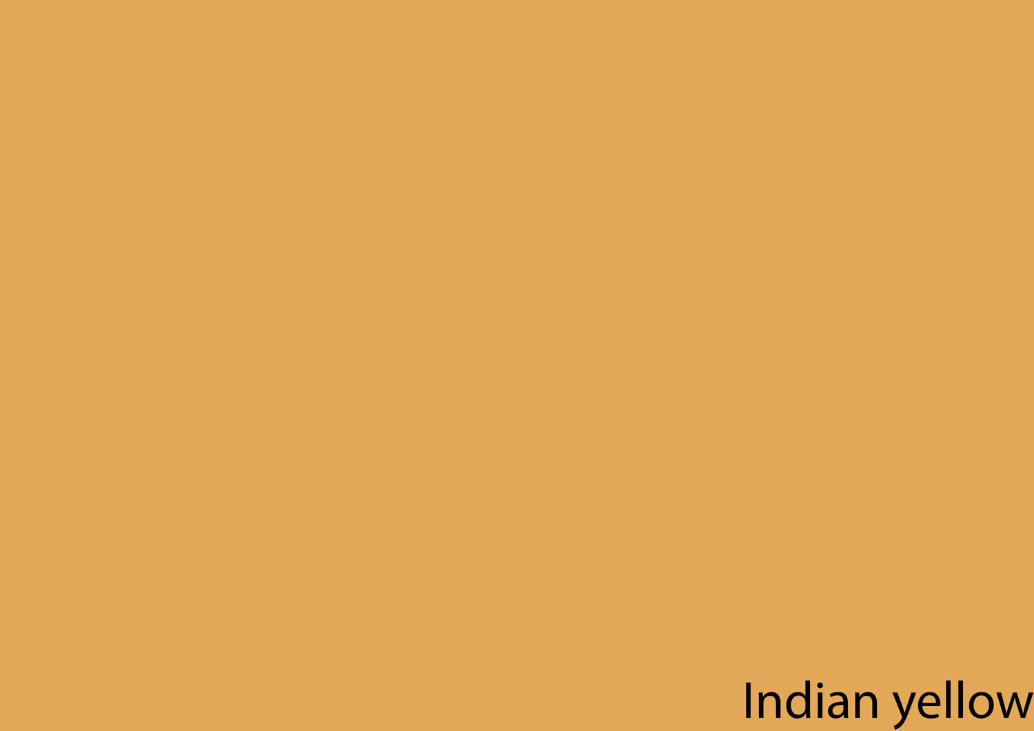
Indian yellow was widely used in Indian watercolor and tempera-like paints. Noted for its use in Rajput-Mughal paintings from the 16th to the 19th century, Indian yellow was also used throughout Europe from the 17th to the 19th century.
Indian yellow pigments were said to have been produced in rural India from the urine of cattle fed solely on water and mango leaves. Today, a synthetic Indian yellow hue is manufactured using a mixture of nickel aso, arylide yellow, and quinacridone burnt orange.
Lead-tin yellow takes on two different forms. According to ColourLex, “the first and more frequently used is called Lead-tin-yellow type I and is a mixed oxide of both elements tin and lead… Lead-tin-yellow type II possibly contains traces of silica and also pure tin oxide.” The earliest occurrence of lead-tin yellow dates back to the 1300s. It was most frequently used in the 15th, 16th and 17th centuries. Johannes Vermeer, Titian and Anthony van Dyck all made use of lead-tin yellow in their paintings.
When chromium was discovered in 1797 by French chemist Louis Vauquelin, lead chromate was synthesized and used as a pigment. In use by the second decade of the nineteenth century, chrome yellow’s toxicity and it’s inherent tendency to oxidize over time and darken on exposure to oxygen meant it was largely replaced by cadmium yellow.
Joseph Mallord William Turner made use of chrome yellow for highlights in his dramatic Romantic paintings. In aviation, the well-loved Piper J-3 Cub adopted chrome yellow as its standard color. Because of this, chrome yellow and similar equivalents are known as Cub yellow in aviation circles.

Much of the cadmium produced worldwide is used in rechargeable nickel-cadmium batteries. However, a portion of cadmium goes to the manufacture of cadmium pigments, a family of vibrant reds, yellows, and oranges. First discovered in 1817, good permanence and tinting properties mean cadmium yellow has remained in use since it began production in 1840. Claude Monet’s Wheatstacks (Sunset Snow Effect) and Still Life with Apples and Grapes are two examples of cadmium yellow’s application in art.
Arylide yellow (also known as Hansa yellow and Monoazo yellow) are a family of organic compounds used as industrial colorants for plastics, building paints, inks, oil paints, acrylics, and watercolors. Discovered in 1909 by Hermann Wagner in Germany, arylide yellow became commercially available around 1925 and has been used predominantly as a replacement for cadmium yellow since 1950. Alexander Calder and Jackson Pollock employed arylide yellow in their artworks.

Yellow’s propensity to capture attention makes it a commanding presence in visual art. Ancient Egyptians used yellow ocher to paint women’s skin tones and depict deities. Yellow ochre was also a staple on the palettes of Roman artists, who used it to lay down backgrounds and paint flesh-tones.
During the Medieval period, Judas Iscariot came to be depicted in yellow. The exact reasons for this are unclear. Nevertheless, Judas’ portrayal quickly garnered associations between yellow and jealousy, unease, tension, and betrayal. Despite its negative associations, however, artists continued to draw on yellow as a color of life and abundance. As one of the first artists to use commercially manufactured paints, Vincent van Gogh’s famous fascination with yellow culminated in numerous artworks including A Field Of Yellow Flowers, Dunes and his study of Sunflowers.
Painted during his Golden Period, Gustav Klimt’s, The Kiss is structured around luxuriant yellows and gold leaf. Pier Mondrian included yellow within his bold compositions of color and line. Artists like Mark Rothko and Willem de Kooning also used yellow to foster lightness and movement within their paintings and Andy Warhol used vibrant shades of yellow to add a blocky, surrealistic tone to his images of pop culture icons and everyday objects.
With the arrival of the 21st century came the rise of new artistic materials and technologies. Olafur Eliasson’s The Weather Project generates an atmosphere suffused with the breathtaking light of an artificial yellow sun. Yayoi Kusama’s infinity rooms, seemingly endless fields of yellow pumpkins dotted with black polka dots, play with the nature and psychology of seeing. And James Turrell harnesses the changeable quality of light through his Skyspaces, which hem the yellow light of the morning and evening each day.

The evocative nature of yellow and its associations with treachery, betrayal, joy, warning, and nature remain just as poignant within the frame of the photograph. Street photographer Saul Leiter incorporated swaths of yellow into his street scenes, adding a palpable rhythm to his work. Mark Cohens’ image of a blond boy brashly smoking into the camera lens is punctuated by the boy’s bright yellow skivvy. Gregory Crewdson often incorporates yellow light emanating from lamps or house windows, juxtaposing homeliness with palpable unrest. Frans Lanting’s depiction of a leopard stalking in grass explores yellow in the natural environment. Kyle Jeffers uses yellow to accent architectural landscapes and Annette Horn’s yellow images trace the energetic properties of yellow on the 2-dimensional photographic plane.
Yellow can also be applied as a creative tool in photography. Golden hour, the period of daylight that occurs just after sunrise and just before sunset, has a distinctively yellow hue. During this window, daylight is at its softest and warmest, creating opportunities for dynamic portraiture and landscape photography. Generally the most subtle of colored filters, yellow filters are used in black and white photography to darken skies slightly, and boost the contrast of green foliage. In portraiture, yellow filters also deliver warmer skin tones.

Yellow’s vibrancy has resonated with artists and viewers for thousands of years. As the most vivid color on the visible spectrum, yellow reflects the dynamics of life. Charged with associations of joy, rebirth, renewal, change and energy, yellow’s use in art has also communicated portrayals of jealousy, betrayal, and greed. Yellow’s vibrancy, versatility, and accessibility connects to audiences through associations drawn from both visual arts and the world around us.
Do you use the color yellow in your photography? Feel free to share your images and thoughts in the comments below.
Mastering Color Series – The Psychology and Evolution of the Color RED and its use in Photography
The post Mastering Color Series – The Psychology and Evolution of the Color YELLOW and its use in Photography appeared first on Digital Photography School. It was authored by Megan Kennedy.
The post Mastering Color Series – The Pschology and Evolution of the Color RED and it’s use in Photography appeared first on Digital Photography School. It was authored by Megan Kennedy.
Photography was invented in 1839 as a black and white medium. Finicky and cumbersome, most proponents of photography were more concerned with perfecting the photographic process without the added complexity of color. Some pioneers endured, creating new methods to convey the colored photographic image. But it was only in the 1930’s, when companies like Kodak and Agfa began introducing consumer-based color film that color photography started to become widely available and relatively affordable.

With color photography, photographers could create imagery with the emotional charge of colour
The invention and widespread use of color film had a significant impact on photography. Modern photographers could now depict a more realistic rendition of a scene, conveying the world in colors similar to that seen through the average human eye. But color photography had another purpose too. Photographers could now couple imagery with the emotional charge of color a lot more readily.
Over the course of history, humans have forged strong associations with colors. And while some associations are experiential, others speak to our evolution and the history of visual arts. In this series of articles, we’ll take a look at the history of different colors, how they have shaped our way of seeing and what it means for your photography.
Color has a significant impact on our perceptions, emotions and physicality. Our earliest ancestors drew associations between red and the color of our blood, cultivating a strong visual link between red and danger, violence, and life. Humans evolved to prioritize red as a color of immediacy, warning and opportunity. For example, the appearance of fire links red to warmth and light, but also to destruction.

Associated with warmth and fire, red appeals to our emotions and our physicality
Because it commands our attention, red brings text and subjects to the foreground of an image. Red is also the international standard for stop signs and traffic lights. In nature, red Autumn leaves and vibrant sunsets appeal to our sense of time and season. Perhaps tied to the color of red roses – a flower traditionally associated with romance – red symbolizes passion, love and sex. Red appeals to our taste buds too, with foods like strawberries, apples, cherries, tomatoes and peppers all colored by forms of carotenoids – vibrant red pigments that assist photosynthesis.
Red has different associations in different cultures and beliefs. In some parts of Africa, red is a color of mourning, representing death. Traditionally worn at funerals, weddings and New Year festivities, red symbolizes good luck, happiness and prosperity in China. In Thai tradition, red is the color for Sunday, associated with Surya, a solar god. In the Indian subcontinent, red signifies purity, fertility, wealth, beauty and the goddess Lakshmi. And in Japan, red is the traditional color of heroism.
Informed by the enduring presence of red in visual arts, these inherent associations (and more) sculpt the way a viewer reads an image.

Despite its numerous forms, red has held a constant place of significance throughout history. From Ocher to Cadmium Red, the evolution of red stems from our ancient reverence for the commanding hue.
Ocher is a naturally occurring pigment that ranges in color from yellow to deep orange or brown. When combined with hematite, ochre takes on a red tone. Dated around 36,000 years old, the red bison on the cave walls of Altamira in Spain are among some of the oldest examples of red being used in visual arts.

Red bison on the cave walls of Altamira in Spain. Image credit: By Museo de Altamira y D. Rodríguez, CC BY-SA 3.0, Link
Cinnabar, a natural mercuric sulfide, ranges in hue from deep brick to scarlet. Though highly toxic, Romans lorded over the brilliance of the red pigment, using it extensively in decoration. Cinnabar features prominently in the murals of upper-class villas in Pompeii. Starting with the Song dynasty, the Chinese employed cinnabar in elaborately carved lacquerware.
Ancient writers used the term vermilion to describe the pigment made from grinding up cinnabar. But vermilion also refers to a synthetic version of the color, invented in China. Renaissance paintings feature the latter regularly. Renowned renaissance artist Titian is known for his luxuriant vermilion accents.

Titian’s Assumption of the Virgin with vermilion accents. Credit: Titian [Public domain], via Wikimedia Commons
Romans made minium, also known as red lead, by heating white lead to extremely high temperatures. Contrasting well against gold and marble, the Romans used minium mainly for inscriptions. Medieval illustrators made use of the pigment in their illuminated manuscripts but it was particularly popular with the Mugal artists from India and Persia in the 17th and 18th centuries.
Vincent van Gogh was an ardent user of minium. However, it has since been discovered that minium whitens under light, and some of van Gogh’s works have had their red accents fade as a consequence.
During their conquest of Mexico in the early 16th century, Spanish conquistadors were taken aback by the vibrant fabrics and face paint of the Aztecs. Derived from cochineal bugs, the Spanish soon started shipping large quantities of ‘Spanish Red’ to Europe. Artists quickly adopted carmine to adorn their elaborate dramas. However, like minium, carmine also had a tendency to fade, especially in sunlight. Cosmetics and red food coloring continue to employ carmine today.
In 1817, a German chemist discovered a new element, cadmium, which became the basis for shades of yellow and orange paint. However, it took another 93 years before cadmium red became available commercially in 1910. Intense and lightfast, Henri Matisse was one of the first prominent users of the pigment. Other artists who adopted cadmium red include Edvard Munch, Francis Bacon and Clyfford Still.
Since the invention of cadmium red, technological advances have created a broad range of synthetic pigments and chemical processes for producing red pigment. Easier preparation and application, better archival qualities and a wide variety in shades have all become standard for red in paint, dyes and inks today.

The Red Room by Henri Matisse. Credit: JD Lasica via Flickr
Because of its continuous presence in art history, the concept of red has evolved over time, encompassing new significance and meaning. We can’t be entirely sure what significance red held for our ancient ancestors. However, we can assume that at the very least that the use of red elevated the drawing from the rock, making the image appear more dimensional.
Medieval artists associated red with Pentecost, the holy spirit and the blood of Christian martyrs. In renaissance painting, red exploited the gaze of the viewer, cloaking Christ, the Virgin Mary or other substantial figures.
Baroque art saw deep and luminous reds conveyed in spectacular drama. Later, pre-raphaelite artists used shades of red and orange to paint the flowing locks of women and to draw attention to the symbolism nested within their artworks.

Lady Lilith by pre-raphaelite Dante Gabriel Rossetti. Image credit: By Dante Gabriel Rossetti – Delaware Art Museum, Public Domain, Link
Impressionist and post-impressionist artists used reds to convey light or accent detail. Fauvists however, crammed abundantly vibrant reds into scenes and portraits with almost violent tenacity. Only a few years later, abstract art abandoned objective subject matter. Used to punctuate, irritate and philosophate, abstract artists energized the viewer or engulfed them altogether in fields of ravenous red.

Abstract expressionist Mark Rothko painted in deep reds. Credit: G. Starke via Flickr
With the advent of color photography, the creative possibilities for photographers flourished. The radical medium allowed photographers to depict color close to as it was in the field. Furthermore, inherent color associations carried over to color photography. Red’s enduring qualities allowed photographers to communicate visual cues based in evolution and in art.
As an early pioneer in color photography, Marie Cosindas‘ dispersal of reds throughout her still lifes and portraits resembles the technique of baroque still lifes. William Eggleston‘s famous photograph, The Red Ceiling, uses red as a stark undercurrent to a seemingly ordinary setting. In Saul Leiter’s dynamic renderings, red adds drama to the theater of the urban landscape. Images like Dust Storm and Red Boy and Holi Festival by Steve McCurry document the history and materiality of red in art and culture. McCurry’s most well-known photograph, Afghan Girl depicts a young girl whose piercing eyes are further accentuated by the striking red scarf framing her face.
Nan Goldin’s use of red conveys atmospheric tension, as if the air itself were dense with color. Richard Mosse’s series Infra depicts the Congo in infra-red, rendering the green landscape in shades of pink and red, re-framing the nature of photojournalism.
The use of red isn’t limited to color photography either. Red filters (applied on/in-camera or in post production) absorb blue and green light, enhancing contrast. Famous landscape photographer Ansel Adams used red filters to dramatic effect, darkening the blue skies featured in his abundant vistas.

Ansel Adams used red filters to enhance the contrast of the sky in his photographs. Photo credit: Wikimedia Commons
Faber Birren, an American author and consultant on color theory once said “red is the passionate and ardent hue of the spectrum, marking the saint and the sinner, patriotism and anarchy, love and hatred, compassion and war.” Red has been regularly utilized throughout history to denote concepts and experiences. Status, physicality, anger, warmth, love and danger are all aspects that have been characterized as having associations with red.
With the invention of color photography, red carried over to film and then digital media. And while it has different meanings in different cultures, red’s prominence throughout art history is a testament to its emotional and visual impact today.
The post Mastering Color Series – The Pschology and Evolution of the Color RED and it’s use in Photography appeared first on Digital Photography School. It was authored by Megan Kennedy.
The tale of the world’s reliance on satellites like a resource of information and amusement, at internet satelit least in which civilian utilization is anxious, begins within the 1970’s. A California scientist recognized that the satellites utilized to give television programming to terrestrial support providers can be tapped into with the appropriate antenna, which he manufactured, so launching a revolution during the delivery of entertainment. Right until 1984, any time a Congressional act gave suppliers the authority to encrypt their indicators, the data becoming beamed by any satellite was truthful sport for anyone in possession of your important gear.
Fast forward into the 1990’s. Satellite tv is now a subscription provider as well as the numerous accessible channels have helped it take pleasure in rapid adoption and constant development. The shrinking size of your components suggests that the antennas, which used to consider up an excellent portion of the user’s property, now fit on rooftops. With the similar time, the internet is quick turning out to be a industrial and leisure medium to be reckoned with. The availability of much information, from anywhere on this planet, has resulted in purchaser fascination in the new technological innovation not observed considering the fact that tv turned the entertainment conventional from the 1950’s.
Satellite services providers before long recognized that, on top of that to television and radio products and services, they may deliver Web accessibility as a result of their technologies in addition. In metropolitan areas where cable tv and telephone central offices were found, several customers adopted broadband once it grew to become offered, ditching the sluggish telephone modem access from the Internet’s 1st yrs. For the people in more far-flung locations, even so, broadband was not out there. Until, naturally, they received their broadband accessibility from a satellite, the place the attain of wires will not be an element in availability.
Inside the United states of america, the most rural regions tend to be farm place. Farmers have already been progressively using personal computers along with the World-wide-web for business enterprise applications. In line with the US Department of Agriculture, farms utilizing satellite Internet services doubled between 2005 and 2007, demonstrating the recognition of the services for anyone in rural spots.
In other international locations, specifically all those with tiny infrastructure, satellite Internet supplies the identical use of news and data from all around the earth since it does in designed nations. In some spots exactly where flooding, fireplace and other seasonal hazards are continual threats to inhabitants, the access the online market place supplies to real-time forecasting knowledge, these kinds of as radar and satellite imaging is usually a opportunity life-saver. Even these out at sea or within the deepest deserts from the environment can now accessibility the internet making use of moveable devices, which makes sure that their locale could be identified in an crisis or their discoveries could be shared, instantly, with all the entire world at large.
The internet is usually credited with switching the whole world and it definitely accurate, to any serious observer, that this is definitely the circumstance. However, the next World-wide-web revolution will probably be described by an ever-increasing availability of Internet companies which will only continue to carry the planet closer given that the Web alone has previously performed.
The post The Satellite Online Evolution appeared first on Photonovice.
 |
With a variable aperture, super-slow-motion and (in the case of the Plus model) a dual-camera setup, Samsung’s newly announced flagship smartphones Galaxy S9 and S9 Plus put a lot of emphasis on camera features and performance. But, of course, this is far from Samsung’s first foray into camera phone tech.
Samsung has long been at the forefront of mobile imaging, and to visualize this fact, the company has released am infographic that puts its camera phone innovations onto a timeline of the past 18 years.
The graphic starts with Samsung’s first camera phone—the SCH-V200—which was launched in 2000 and allowed you to shoot and store up to 20 0.11MP images (you still needed a computer to view them, though). From there, it move on to a number of flip-style feature phones and smartphone classics, such as the first Galaxy S or the Galaxy S4 Zoom.
As you would expect, the infographic ends with the new Galaxy S9 models, but it includes technical data and interesting tidbits about all the featured phones—well worth a closer look for anyone interested in tech history. Check it out for yourself below:
 |
Articles: Digital Photography Review (dpreview.com)
You must be logged in to post a comment.