The post Focus, Compose, and Expose with Intent in Photography appeared first on Digital Photography School. It was authored by Kevin Landwer-Johan.

Why do you take photographs? What’s your intention each time you press the shutter button? Do you visualize how you want your photo to look before you take it? When you photograph with intent, the pictures you make resonate more with the people who view them.
All of us have a unique worldview. No two people perceive what they see precisely the same way. Learning to express what you see through the lens of your camera requires paying attention to more than what you are looking at. You must also have intent as to how you want your photos to turn out.

Your camera does not take photos
Just as a musician’s instrument or a painter’s brush creates nothing on its own, your camera does not take photographs.
Instead, the interaction you have with your camera is what creates photos. The quality and creativity of your photographs depends on the level of synergy between photographer and camera. The connection between you and your chosen subject is also significant.
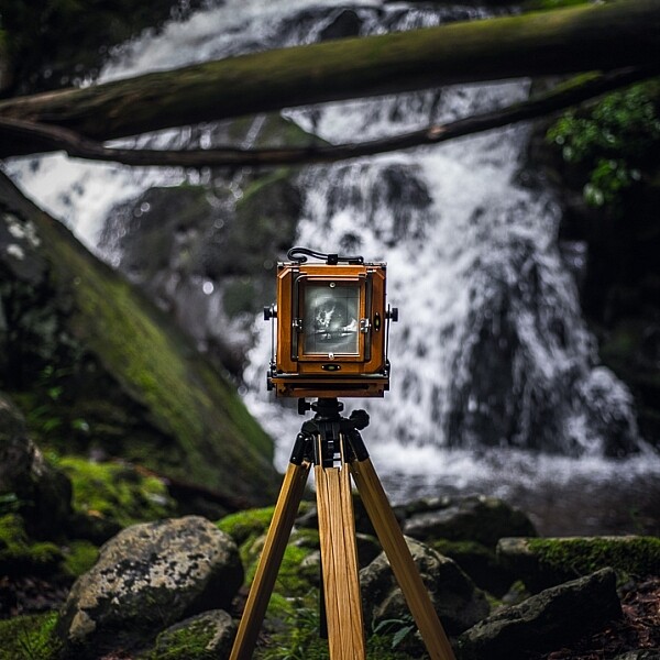
Modern digital cameras are all designed to be as simple as possible to use – especially consumer-level cameras. Scene modes, auto-exposure, autofocus, auto-everything allows unskilled photographers to take snapshots that turn out pretty well.
When I was a kid, our neighbors had a pianola. This was a piano that had a handy mechanism: we could push pedals with our feet and the pianola would play tunes. There were special rolls of paper with holes punched in them that could be loaded into the front of the pianola. As we pedaled, the paper roll would turn. The configuration of the holes determined what tune was played. We were playing music without being musicians.
This is similar to using a camera with its auto-functions turned on. It can be fun, and there will be a certain, but limited, satisfaction as pictures are created. Just as we loved “playing” the pianola, you can take photos with minimal creative input or skill.
To take truly wonderful photos, however, you must interact with your camera and your subject with intent. Relying on camera technology to make it easy to take photos will not make you a great photographer.

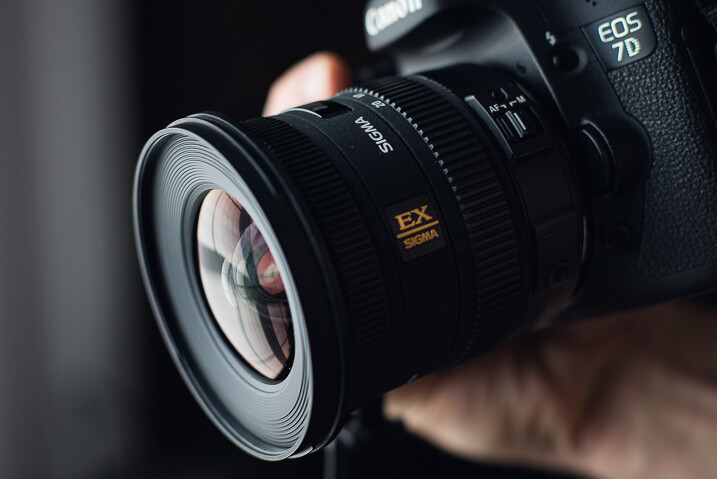
Know your camera well
Being familiar with your camera and its controls means you can concentrate more on the art of photography. You’ll no longer be distracted by the technical aspects of the camera.
Learn to control your exposure, focus, white balance, and all the other settings. As you do this, you will grow in confidence and begin to “see” what you are photographing in different ways.
Cameras used in auto-exposure mode tend to make very generically-exposed images. Your camera is programmed to do things in certain ways to produce photos with an even exposure. But the more you take charge of what your camera is doing, the more creative your photography becomes.

Understand the exposure meter. Use your spot meter to measure the light from different zones in your composition. Experiment with manual exposure settings. Don’t always adhere to what the meter tells you is “correct.” Control where you are focusing and the amount of the image that is sharp.
This may all seem a bit overwhelming if you’re new to photography, or if you’ve been using your camera for years without adjusting the controls. But remember: We could not add any creative expression to the tunes we played with the pianola. Unless you intentionally set your camera’s controls, your photos will lack creativity.

Visualize your photographs
Think about how you want your photos to look before you take them. Do you want to record a scene exactly as you see it? Or will your frame it in such a way as to exclude some ugly elements?
Make constant choices about what focal length lens you’ll use. How much of what you see will you include in the final shot? The same scene photographed with a 24mm lens will look very different than if you back up and photograph it with a 200mm lens.
How do you want your exposure to look? Will exposing for the highlights or shadows create a more interesting atmosphere? Are there things in the shadow areas you want to hide or reveal? When you have control over your exposure, you have the capability to express yourself in more creative ways.

Your choice of when you press the shutter release to take the photo can have an important creative influence on the outcome. This is sometimes a matter of a split second, or it can be a matter of waiting for the season to change. Picking the decisive moment when photographing a child playing versus photographing a landscape is very different. But timing is equally relevant to making good pictures.
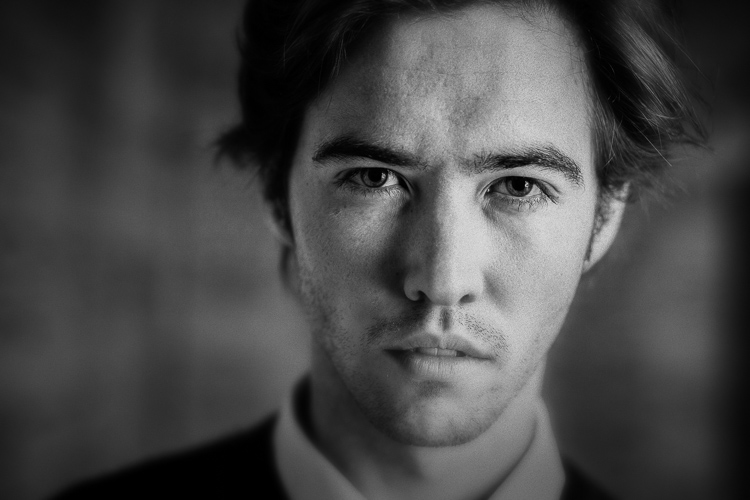
Are you seeing in color or in black and white? Will your subject look more interesting as a monotone image? Will this alter the feeling of the photo? If you are intentional about color as you’re taking photos, you’ll create more compelling images.

Connect with your subject
As you’re taking photos, think about why you want to photograph your chosen subject. What has drawn you to want to make a picture of this person, thing, or scene?
When you think about the why, you can start to see your subject in new ways. Being aware of what motivates you can have an influence on how you photograph something.
Does your subject mean something personal to you? How can you show this in the photos you take? There are many ways you can choose to control your camera, or where you take your photos from, that will influence the final shot. Being aware of how you compose and expose your subjects will help build a story into your images.
Your photos will move from being snapshots to works of art that have depth and convey meaning.

Focus, compose, and expose with intent: conclusion
The more you are aware of what you want your photographs to look like, the more interesting they will be to you and to others.
Photographing with intent takes practice. It may seem somewhat abstract when you first try.
But, like anything creative, the more you apply yourself and practice, the better you will become – and this will show in your photos.
The post Focus, Compose, and Expose with Intent in Photography appeared first on Digital Photography School. It was authored by Kevin Landwer-Johan.


 Mastering Composition
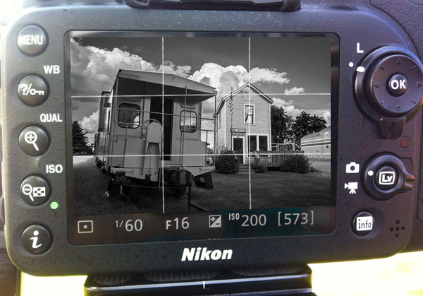


You must be logged in to post a comment.