Check out these visual art images:
Y SIN EMBARGO magazine #16 (free, fully bilingual)
Image by fernandoprats [@ theGlif+]
"du-champ-i-ssue"
jun.jul.ago.2008 | inviernosurveranonorte
ISBN: 978-1-4092-5339-6
ON PAPER
PDF
NAVIGATE it
Hi-Res PDF
Un número dedicado a explorar la visión y propuestas de Marcel Duchamp.
No su vida, no su obra; tan sólo algunos de sus conceptos.
Realizado con aportes de artistas, pensadores y diseñadores de todo el mundo
combinados con la explícita intención de producir a su vez un objeto duchampiano.
-el medio como instrumento intelectual que transpasa su especificidad y se burla de ella
-la obra independientemente de su carácter representativo e interpretativo
-”arte”, en términos de convenciones, lo más “amorfo” posible
-”obras” en las que la obra no es una finalidad en sí misma sino una excusa
-interpretaciones o, mejor dicho, lecturas que pueden convivir a pesar de ser aparentemente excluyentes
-objetos “anestesiados estéticamente”, anulados en su probable complacencia de la mirada, “rectificados”,”asistidos” para otorgarles una nueva -a menudo, insólita- significación. Como en la elección de los “ready-mades”: “basada en la indiferencia visual y en la ausencia total del buen o mal gusto”
-obras “definitivamente inacabadas”
-rrose sélavy, su alter(-)ego
-ajedrez, máquinas ópticas, matemáticas, geometría, “artefactos”
-la “pintura mental”, “pintura de precisión”, el rechazo de cualquier elemento en el que la mirada se pueda recrear con fruición
-texto, – bloques, – fotografías, + mixed-media, + pintura, + ilustración.
-toda la revista está en castellano e inglés.
(descárgala gratis y comienza felizmente el verano -o el invierno-)
# # #
This issue plays around the conceptual universe of Marcel Duchamp. Not his life, nor his works, just some of his concepts.
– the medium, as an intellectual tool which goes beyond its specificity mocking it.
– the work, regardless of its representative and interpretative character.
– “art”, in terms of conventions, as “amorphous” as possible.
– “construction”, in which the work is not it’s purpose, but an excuse.
– interpretations, or rather readings which can coexist despite being seemingly exclusive.
– objects “aesthetically anesthetized,” lapsed in their likely sight complacency; “rectified”, “assisted”, to give them a new –often unusual- significance. As with the choice of “ready-mades”: “based on visual indifference and a total absence of good or bad taste”
– works “definitively unfinished”.
– rrose sélavy, his alter (-) ego.
– chess, optic machines, mathematics, geometry, “artifacts”.
– “mental painting,” “precision painting”, the rejection of any element in which sight can be delighted.
– aesthetics: – text, – blocks, – photographs, + mixed-media, + painting, + illustration.
– the whole magazine, in spanish and english.
(download it. it’s free. and start enjoying summer -or winter-)
# # #
edit(ing), direct(ing) + complements
fernandoprats
art direct(ing) + design(ing)
estudi prats
insistAnçao, correct(ing) + additional stuff
r | v
listen(ing)
hernán dardes
musicaliz(ing)
albert jordà
translat(ing)
kiddo | emilia cavecedo
frontcover(ing) concept fot
une autre sensualité
backcover(ing) concept borrador
UU – dou _ ble _you et aa
open(ing) concept
nacho piédrola + salaboli & fp porta
-structure:
accesories, lisa kehoe { kiddo | emilia cavecedo, lisa liibbe lara, josean prado, oriol espinal, mark valentine sullivan, hernán dardes, alfredo de la rosa, jonathan minila } => meta
{ pepo m.-the secret society, r | v, leah leone } => hilarious
{ pancho lorenz, natalia osiatynska } fernandoprats => rage
=> meta kiddo | emilia cavecedo, nacho piédrola, salaboli, lisa kehoe { lisa liibbe lara, mark valentine sullivan + shari baker, oriol espinal, gabriel magri, naomi vona, mara carrión }
=> hilarious { d7, olivier gilet, jef safi, special spatial guests }
=> rage { brancollina, gabriel magri, natalia osiatynska, bill horne, UU, christy trotter } simon fröehlich
ysinembargo#16… sensualmente inacabada.
a b r e l a m u r a l l a
antwerp · barcelona · basauri · boulder · bruxelles · buenos aires · carlsbad · collioure · coyoacán · grenoble · holden beach · iowa city · lawrenceville · lansing · london · madrid · mendoza · mexicali b.c. · milano · san francisco · san rafael · sào paulo · tarragona · warsaw
# # #
YSE #16’s Original Music | YSElected videos
# # #
Official WEBsite | MySpace | Flickr Group
Greenpoint Studio 1

Image by Madilworth
Banners from the Art & Law Exhibition:
The project takes its name from the latitudinal circle that divides the globe into north and south, the same circle that was used to draw the U.S. Mason-Dixon Line.
This historically important demarcation remains critical to global trade today, as a home to global economic centers and as a mediator of labor markets and migration.
The composition is constructed from visual references to global trade and labor. An initial interest in the African American Burial Ground in lower Manhattan lead to research on the quilt patterns used for communication in the Underground Railroad, a system of iconic visual communication that was integrated into trade routes.
Its pattern, inspired by quilt design, is populated by a hybrid iconography drawn from states’ flags and emblems as well as the logos of companies with a relationship to the 36 ° 30’ parallel, cumulatively weaving together a history of global trade.
Machinery (Abstract #2) by Paul Kelpe
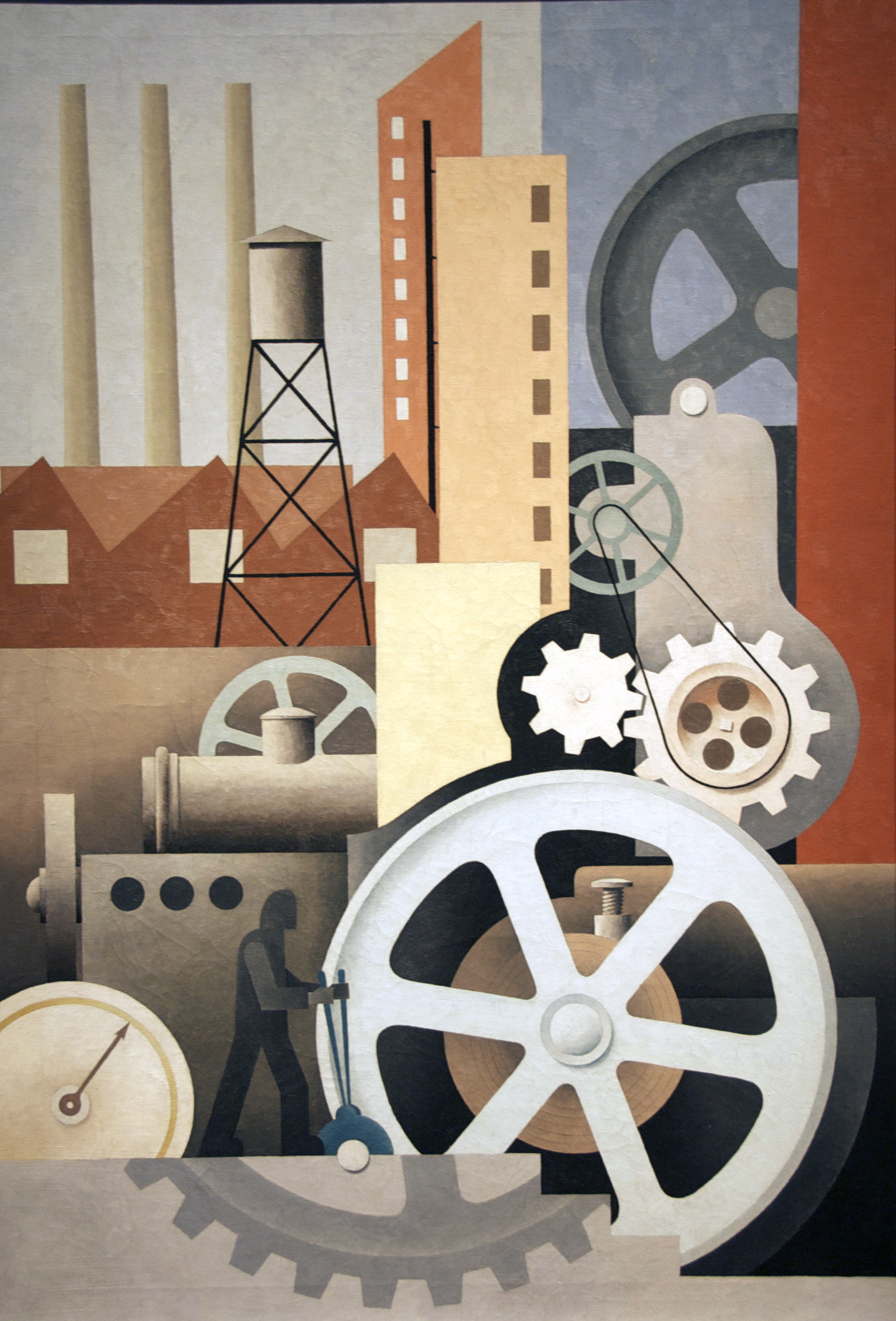
Image by ctankcycles
What kind of industry does the man holding the levers control in Paul Kelpe’s painting Machinery. There are no hints; the smokestacks emit no smoke and no product piles up on the factory floor. In fact, Kelpe’s mechanism manufactures nothing. He was actually an abstract painter whose concerns were aesthetic. In his paintings for the Public Works of Art Project, he knew that he needed to somehow address "the American Scene." "As they refused to accept ‘nonrepresentational’ art," he said, "I made a number of pictures with geometric machinery." But Kelpe, unlike the many PWAP artists who factually depicted industrial scenes, studied no real-life factories. He created his own independent visual world, reflecting the kind of technological progress of which Americans were proud. The artist thoughtfully balanced large and small shapes, warm and cool colors, to create a harmonious mechanistic vision. A pattern of diagonal brushstrokes on the painting’s surface catches the light to suggest action. The wheels seem to turn with the soft hum of a well-tuned machine.
1934: A New Deal for Artists exhibition label
The shadowed worker in this painting appears to be controlling the structure, suggesting man’s essential role in industry and his ability to create massive, powerful machines. During the Depression, many artists celebrated human achievements in this way, to emphasize the importance of the working class and to boost morale. In 1934, Paul Kelpe worked for the Public Works of Art Project. The program did not accept abstract art, so he incorporated realistic elements such as figures, wheels, and buildings into his compositions. These images were still not "representational enough," however, and he soon gave up trying to please his bosses (Manthorne, Paul Kelpe, Abstractions and Constructions, 1925-1940, 1990).