RSS
 

Archive for the ‘Creativity’ Category

Zaha Hadid Architects Make Flood Protection Look Elegant in Hamburg

28 Aug

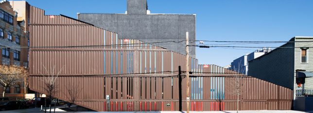
As urban planners grapple with the need for creative flood management systems in cities around the world, Zaha Hadid Architects provides an interesting example in Hamburg.

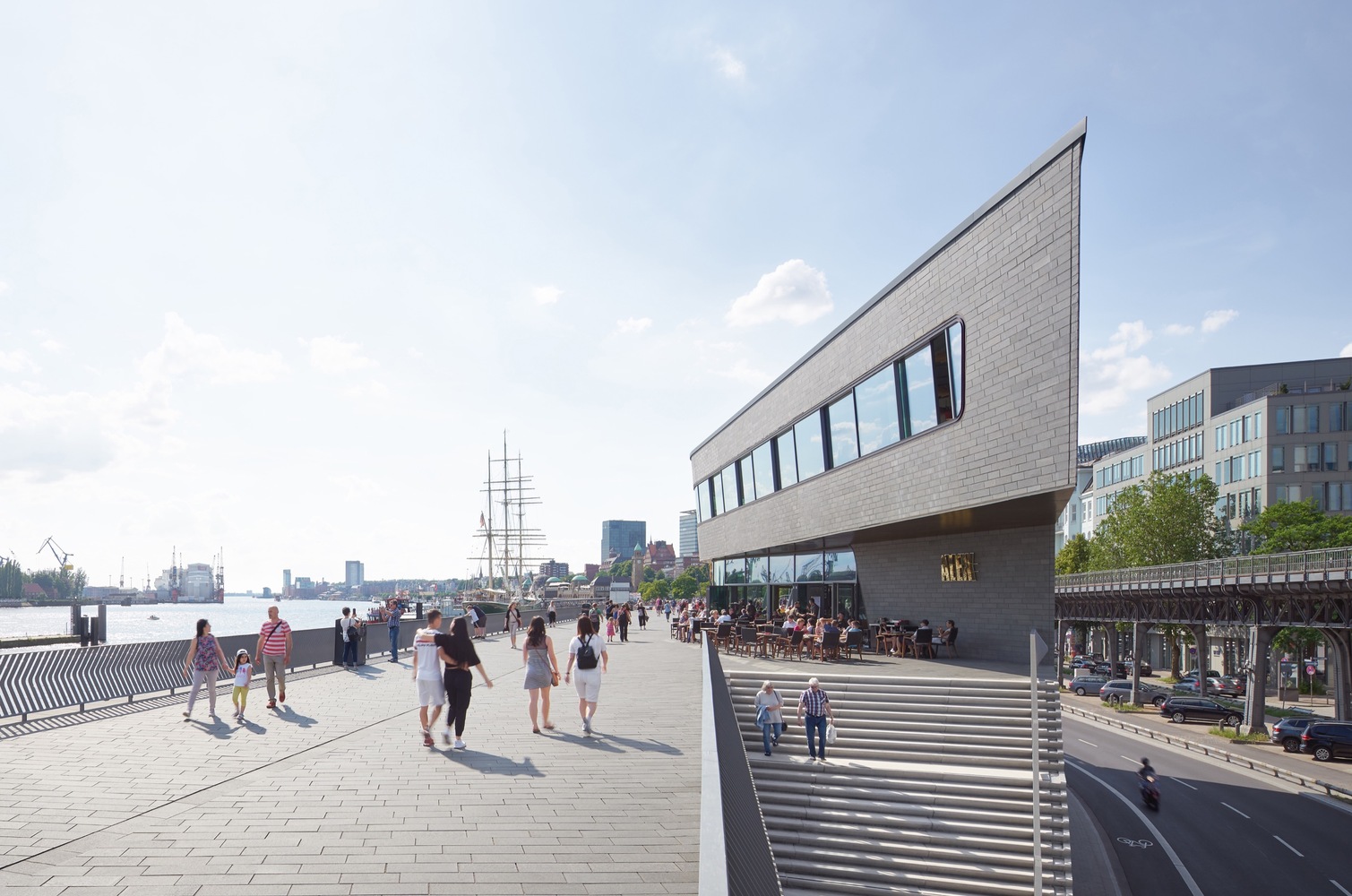
Located along the Elbe River, the new Niederhafen River Promenade offers two functions in one: a flood wall and a riverfront promenade. Set in a popular tourist area alongside one of the city’s most important public spaces, the new promenade offers views of the Elbe, links to adjacent neighborhoods and lots of room for pedestrians, food stalls, cafes and street performers, with shops and public utilities set into the structure at street level on the side that faces the city.

The barrier at Niederhafen was first built in the 1960s in the aftermath of severe storm surge floods that caused 315 fatalities and destroyed the homes of 60,000 residents, but according to modern calculations, it was no longer high enough to be effective. In addition to raising the total height of the barrier by .8 meters, the overburdened supporting elements of the structure needed to be replaced. The city announced a competition to design a redevelopment, awarding the project to Zaha Hadid Architects.

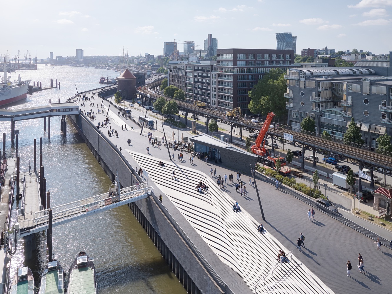
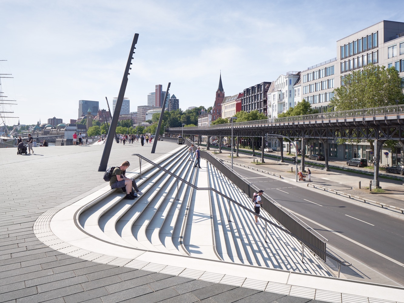
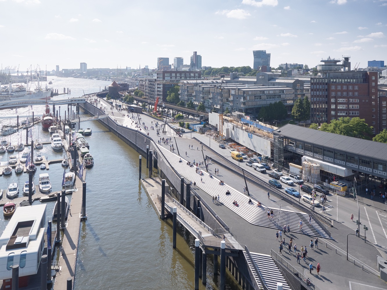
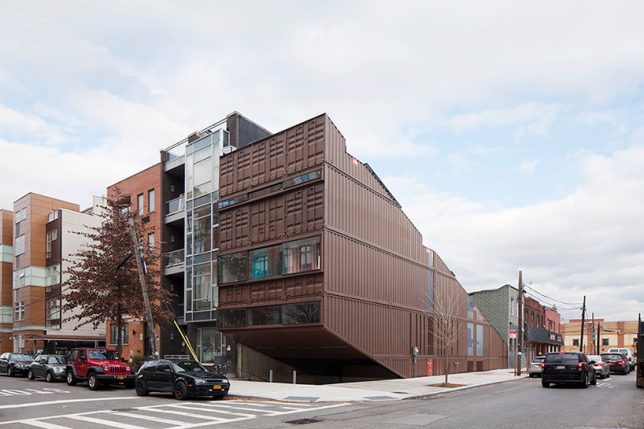
Standing 8.6 meters (28 feet) high on the eastern side and 8.9 meters (29 feet) high on the western side, the barrier is now tall enough to protect the city from maximum winter storm surges and extreme high tides. The architects carved sculptural staircases into the sides at various points, creating angular amphitheaters that encourage people to linger and enjoy the views and “generating an oscillating sequence in the river promenade as it repeatedly widens and narrows.”

“Dedicated cycle lanes at street level run the length of the flood protection barrier. Wide ramps at Baumwell and Langdungsbrücken connect the river promenade with street level and provide accessibility for all. A third central ramp enables service vehicles to access the promenade and Überseebrücke.”

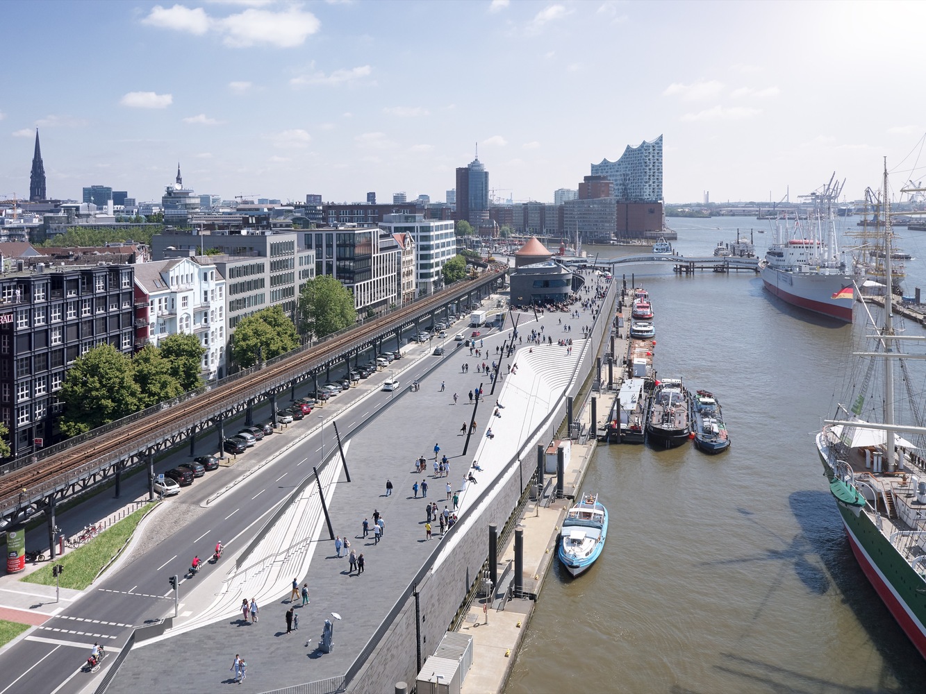
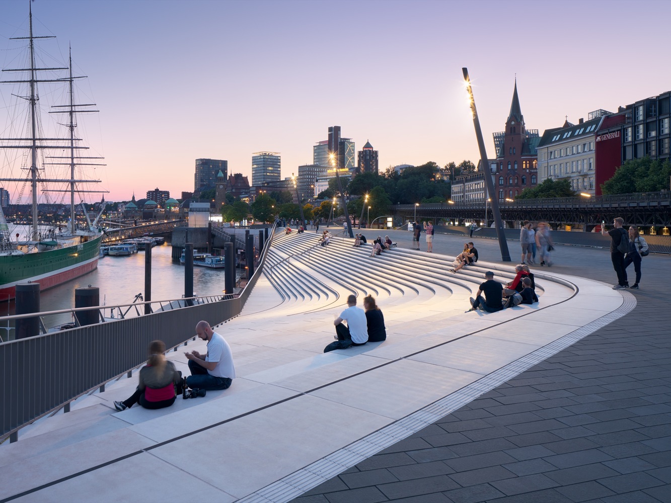
“The river promenade is divided into two sections with different spatial qualities. The zone to the west is at a larger scale, offering wide views downstream of all shipping activity on the river. To the east, the port’s marina creates amore intimate atmosphere with a long ramp alongside the amphitheater leading visitors down to the water’s edge.”

Of course, concrete flood walls aren’t right for every city, especially those where aquatic wildlife habitats have been destroyed and need to be restored. Some cities are working on plans to do just that, like Chicago’s “Wild Mile.” Read more about how “urban rewinding” can help make cities more flood resistant.

Photos by Piet Niemann via Zaha Hadid Architects


WebUrbanist

 
Comments Off on Zaha Hadid Architects Make Flood Protection Look Elegant in Hamburg

Posted in Creativity


Transforming Quadrant House: Rotating Terrace Follows the Sun

28 Aug

More than anything, the owners of a new transforming house in Poland wanted constant, direct access to sunlight. They commissioned the local firm KWK Promes to realize their unusual vision, and the result is definitely one of a kind.

“Quadrant House” sits on a grassy suburban plot surrounded by trees. The name comes from both the word referring to the quarters of a circle and a historical instrument used to determine the angle of the sun’s elevation in astronomy. Even without a moving element, the house stands out from its neighbors with its stacked white volumes, blind facades facing the street.

But of course, the star of the show is definitely that kinetic terrace. When it’s flat up against the side of the house, it almost doubles the living space. Moving silently and automatically, the volume swings out a full 90 degrees, allowing more or less sunlight to reach the indoor living room as desired. Sliding glass panels make it possible to open this entire section of the home to the outdoors.

“Clients wanted most simple, sunny and relaxing house, somehow reacting to the movement of the Sun. They also liked our Safe House, its changeability and mechanisms that create relations with the surroundings. The starting point was a regular shape unbuilt site, located in the suburbs among the average single-family housing. We placed a rectangular solid on it, corresponding to the wishes of investors in terms of the functional program.”

“Then we turned the part belonging to the ground floor to get as much privacy as possible from the side of the road. In the ‘cut’ space was located a living room, roofed floor and open to the garden – a similar solution can be found in Living Garden House, where the night zone is on the floor and the day zone becomes part of the garden – the boundaries between architecture and the landscape are blurred.”

Though they hoped for a flat roof, local code requires a gabled shape. The architects found a compromise by angling the gable toward the street-facing facade so that its back edge tapers down toward the yard, giving it a flat appearance from that angle, at least.

And if you’re wondering whether it might actually be dangerous to have a section of your home automatically changing positions according to the movement of the sun across the sky, don’t worry – the architects thought of that. Sensors make sure nothing is in the way of the movable volume, stopping the motion when obstacles are present.


WebUrbanist

 
Comments Off on Transforming Quadrant House: Rotating Terrace Follows the Sun

Posted in Creativity


Beach Please: Abandoned Surf Cincinnati Waterpark

28 Aug

[ By Steve in Abandoned Places & Architecture. ]

Wave goodbye to Surf Cincinnati, an abandoned water park and banquet hall complex that once entertained overheated Ohioans but now only breeds mosquitoes.

Cincy You’ve Been Gone

Plastic glass, jumbo shrimp, Surf Cincinnati? It may sound oxymoronic but the Surf Cincinnati water park conjured up a batch of bodacious beach blanket bingo in a place roughly equidistant from either ocean coast. A generation of wave-riding wannabe’s enjoyed the park’s many liquid-infused attractions until events conspired to shut the fun down at the end of the 2002 season.

Slip Slidin’ Away

Surf Cincinnati seemed to have it all when it opened in 1984. Situated on the border of Butler and Hamilton counties in far southwestern Ohio, the park complex boasted a huge wave pool, several kid’s pools, a winding “lazy river”, and an assortment of wild water slides built into the site’s rugged geological contours.

Six Feet Under

Water sports weren’t the be-all and end-all at Surf Cincinnati, however. Those who preferred their recreation on the drier side could partake in miniature golf or go-kart racing. When it came time to unwind, two spacious banquet halls (and later, a popular watering hole called “Caddies”) served up refreshments of the edible and drinkable persuasions. Sounds like a can’t-lose concept, right? Wrong…

Next Page – Click Below to Read More:
Beach Please Abandoned Surf Cincinnati Waterpark

Share on Facebook


[ By Steve in Abandoned Places & Architecture. ]

[ WebUrbanist | Archives | Galleries | Privacy | TOS ]


WebUrbanist

 
Comments Off on Beach Please: Abandoned Surf Cincinnati Waterpark

Posted in Creativity


Unboxing Buildings: Dull Modern Facades Removed to Reveal Historic Decor

24 Oct

[ By WebUrbanist in Architecture & Offices & Commercial. ]

Modernist architects rejected brick, stone and iron ornament in favor of clean metal and brutalist concrete, and in some extreme cases went so far as to cover up old facades with more contemporary cladding. But what was originally an act of erasure can also turn into an unintentional act of preservation, as in the case of this structure built in the 1920s but clad over in the 1960s.

This drab building in San Antonio, Texas was at best unremarkable and at worst a bit of an eyesore. White stripes and vertical strips of red worked with rows of glass to create something simple, Modern and a bit dull. It was also somewhat misleading: many of those apparent windows were covering up walls, not openings. All of this became clear as the surface started to be stripped away and old structure restored.

Echoing a similar trend in recent decades of stripping back paint to reveal wooden details in homes, developers and cities have started to realize the potential value in hidden landmark architecture. The Schoenfield Building in Cleveland, for instance (depicted above), was a beautiful structure built of brick but for a time covered in a less glamorous coat. Its underlying facade has since been uncovered.

In the case of the Odean theater, it is hard to imagine what ever possessed someone to cover the elaborate facade of the original (upper left) with its decorative details and beautiful windows with an array of vertical metal strips (upper right). Fortunately, though the name has changed, the architecture has since been restored (bottom).

The decision is not always so clear-cut, however. Architectural Observer followed the restoration of a structure in Hays, Kansas where “there was a push to ‘restore’ and ‘revitalize’ the immediate downtown area. The master plan called for the removal of this particular facade.”

“Much history was lost in the redevelopment process; should this facade be counted among the losses?  Or do you feel that the two early 20th-century facades (both needing restoration) which were revealed are the stronger asset?” It is a question that often faces preservationists, especially in places like Europe where long histories can result in many iterative additions and changes over time. In this case, the facade was removed but saved. To see more examples like these and discussion about historic preservation, check out this thread on reddit.

Share on Facebook


[ By WebUrbanist in Architecture & Offices & Commercial. ]

[ WebUrbanist | Archives | Galleries | Privacy | TOS ]


WebUrbanist

 
Comments Off on Unboxing Buildings: Dull Modern Facades Removed to Reveal Historic Decor

Posted in Creativity


Work Smarter: 12 Modern Desks Reinvent the Standard Office Surface

24 Oct

[ By SA Rogers in Design & Furniture & Decor. ]

The typical desk design has remained the same for centuries, but we need these surfaces to do more – like incorporate our gadgets, offer privacy in loud offices, fit into our homes, fold up to take on the go or offer proper space for our cat overlords. Maybe even all of these things at once.  These designs are more than just a flat slab on legs, adapting to 21st century standards in all sorts of different ways.

Turia Table by Maxime Mellot Incorporates Nature

“Can we admire nature and put it in a cage?” says Maxime Mellot of his own design, this curious desk inspired by a park in the city of Valencia, Spain. “Turia participates in the debate, and forces the user to divert his attention, from his own person to live animals, requiring care and benevolence. In a society focused on performance and permanent connection to the internet, pure moments of privacy become rare and precious. But how can furniture invite us to take a break, drink a tea or have a snack and help us to enjoy this specific disconnected moment? My project tends to merge the universe of nature and relaxation, by combining iconic items such as bird cage and fish tank in an interactive way.”

Koloro-Desk by Torafu Architects

The interior of the Koloro-desk by Torafu Architects is like a cheerful miniature house with its very own operable windows, so you can lean inside to read, work, sketch or nap and feel a sense of disconnection from the world just outside its little walls. The two flip-out windows on either side offer shelves for drinks and other objects, and there’s even a skylight.

Oxymoron Desk by Anna Lotova

Shove stationery, pens and other item between the two little cushions under the surface of Anna Lotova’s Oxymoron Desk. The name comes from the unlikely pairing of materials. The cushion sandwich even lets you slide a piece of plywood inside to create a side table.

“We have to change our behavior, plan and think of work with a different mindset: no matter where an office is situated, it has to have a space it can call its own, identifiable, alterable, on a human scale, with its own history and objects, an enjoyable environment,” says Lotova.

CATable by Hao Ruan

Do you have a persistent feline companion who gets a little jealous of your computer or books when you’re working? This clever table by Hao Ruan of LYCS Architecture doubles as cat furniture, with the underside full of comfy curving hollows and tunnels for your cat friend to hide in.

Next Page – Click Below to Read More:
Work Smarter 12 Modern Desks Reinvent The Standard Surface

Share on Facebook


[ By SA Rogers in Design & Furniture & Decor. ]

[ WebUrbanist | Archives | Galleries | Privacy | TOS ]


WebUrbanist

 
Comments Off on Work Smarter: 12 Modern Desks Reinvent the Standard Office Surface

Posted in Creativity


Steel Mesh Kraken Sunken Off British Virgin Islands to Create an Artificial Reef

23 Oct

[ By SA Rogers in Destinations & Sights & Travel. ]

Perched atop the Kodiak Queen, a former WW2-era Navy fuel barge, this 80-foot ‘Kraken’ now serves as the base of an artificial reef and marine research station on the ocean floor near the British Virgin Islands. The project, entitled BVI Art Reef, accomplishes a range of goals all at once: saving a decorated ship from destruction, transplanting coral to a new site in the hopes that it will flourish, creating an epic dive site and underwater art gallery, and providing a new habitat for marine life.

Photographer Owen Buggy documented the process, from the early stages of building the massive sea monster to sinking it in April 2017 to checking out the results a few months later. Sunken off the coast of the island Virgin Gorda with the help of tugboats and helicopters, the installation is already helping to rehabilitate heavily over-fished marine populations. Filmmaker Rob Sorrenti also got some great footage, presented as a documentary entitled ‘The Kodiak Queen,’ which is due for release in early 2018.

“This is the story of learning from past lessons and coming together to create something greater; rooted in joy and fueled by the power of play,” reads the BVI website. “This is the story of a group of friends from around the world who fell in love with the BVIs… and turned a weapon of war into a platform for unity – and a catalyst for new growth. This charitable kick-off in the British Virgin Islands combine art, ocean conservation, world history, marine science and economy… to solve a series of challenges in the BVIs by asking: how can we use play and collaboration to install permanent solutions that boost the local economy, secure the prosperity of these pristine islands for generations to come?”

“Our solution: a fantasy art eco-dive and ocean conservation site that puts the BVIs on the map as having one of the most unique and meaningful dive sites in the world… and one of the most forward-thinking approaches to creative problem solving that secures the education of its youth, and the health and prosperity of this island nation.”

Get updates on the project at the BVI Art Reef Facebook page.

Share on Facebook


[ By SA Rogers in Destinations & Sights & Travel. ]

[ WebUrbanist | Archives | Galleries | Privacy | TOS ]


WebUrbanist

 
Comments Off on Steel Mesh Kraken Sunken Off British Virgin Islands to Create an Artificial Reef

Posted in Creativity


Applied LEGO: Design Graduate Sends Miniature Figures of Himself as Resumes

23 Oct

[ By WebUrbanist in Art & Sculpture & Craft. ]

Design and architecture firms are used to getting creative resumes in the mail that unfold into portfolios or assemble into paper models, but this LEGO figurine may be the most creative variant yet.

A designer and artist, Andy Morris decided to make a miniature of himself as a way to stand out to potential employers and highlight his creativity.

His three-dimensional curriculum vitae packaged like a toy figure but also includes graphic elements that convey aspects of his own creative work.

The packaging gives more details on his design capabilities and offers links to his website and portfolio, accompanied by descriptions of his experience and personal design philosophies. Hurry: supplies are limited!

He hopes not only that the figure will help him find a job, but that it will match him with a workplace that mimics his own quirky creative ambitions.

Share on Facebook


[ By WebUrbanist in Art & Sculpture & Craft. ]

[ WebUrbanist | Archives | Galleries | Privacy | TOS ]


WebUrbanist

 
Comments Off on Applied LEGO: Design Graduate Sends Miniature Figures of Himself as Resumes

Posted in Creativity


Cutting Corners: LOT-EK’s 21-Box Sliced Shipping Container Home in NYC

20 Oct

[ By WebUrbanist in Architecture & Houses & Residential. ]

Rising up from its corner lot like a ship on a wave, this shipping container home in Williamsburg, Brooklyn, is a stunning private residence made from sliced, diced and strategically reassembled cargo boxes.

The cut containers were flipped and reassembled to avoid waste, reusing various angled sections generated through diagonal slicing (images by Danny Bright). Moving through the home, the logic of these cuts becomes increasingly clear.

Designed by LOT-EK, a firm famous for its industrial-style containertecture, the corrugated facade is spliced with vertical windows along the sides. Along the front and back, container ends open up for larger views and terraced roof access — there are outdoor spaces at each level, given privacy thanks to the angled cuts. Below, those same cuts provide a natural opening for the building’s sunken entry, garage and cellar.

Social living, dining and kitchen spaces are on the first floor. The inside is also shaped by the slice angles, forming spaces like a media room with bleacher seating and a projector. Upper levels include bedrooms, play areas and other private spaces.

Share on Facebook


[ By WebUrbanist in Architecture & Houses & Residential. ]

[ WebUrbanist | Archives | Galleries | Privacy | TOS ]


WebUrbanist

 
Comments Off on Cutting Corners: LOT-EK’s 21-Box Sliced Shipping Container Home in NYC

Posted in Creativity


This Copy of the Book ‘Fahrenheit 451’ Can Only Be Read When Heated

19 Oct

[ By SA Rogers in Design & Graphics & Branding. ]

Science, art and dystopian fiction come together in a fascinating new project that puts a highly appropriate heat-sensitive twist on Ray Bradbury’s classic novel, Fahrenheit 451. Charles Nypels Laboratory, which is part of Holland’s Jan van Eyck Academie, an institute for fine art and design, collaborated with graphic design collective Super Terrain to create a very special edition of the book. Check out the effect in their video below.

This week our colleagues from Super Terrain are working in the Lab as a last stop on their all-over-Europe printing adventures. They showed us this remarkable book they made "Fahrenheit 451". — @superterrain #printingadventures #heatsensitive #fire #experimental #artistsbook #allblack #screenprint

A post shared by Jo Frenken (@charlesnypelslab) on

Made in a lab, the pages are coated in thermochromic pigment, which disappears when a flame is held close to it (but not too close – you don’t want to actually reenact a major plot point of Fahrenheit 451, in which all books are contraband, and any that are found must be burned by ‘firemen.’) In the comments on the Instagram post, the designers note that the book will turn black again once it cools down, so you’d use a whole lot of lighter fluid (or matches) to read the whole thing.

This week our colleagues from Super Terrain are working in the Lab as a last stop on their all-over-Europe printing adventures,” says the Charles Nypel Lab on Instagram. “They showed us this remarkable book they made ‘Fahrenheit 451.’”

(h/t My Modern Met)

Share on Facebook


[ By SA Rogers in Design & Graphics & Branding. ]

[ WebUrbanist | Archives | Galleries | Privacy | TOS ]


WebUrbanist

 
Comments Off on This Copy of the Book ‘Fahrenheit 451’ Can Only Be Read When Heated

Posted in Creativity


Preserving Architectural Gems: 8 Beijing Hutong Plug-Ins Update Historic Shells

19 Oct

[ By SA Rogers in Architecture & Houses & Residential. ]

Passing through historic Beijing neighborhoods, seeing only the preserved street-facing facade, you’d never know that surprisingly modern structures contrast with aging surfaces within the courtyards just out of sight. Instead of just demolishing the ‘hutong’ courtyard houses found only in this Chinese city, architects are adapting them to modern life, slotting houses, hostels, museums, tea houses, cinemas and more under the existing roofs.

Tea House by Archstudio

In a truly stunning adaptation, Archstudio has completed a tea house and cafe within an existing hutong house, enclosing it from above with new roofs while leaving atriums open for bamboo and other greenery. The intervention connects the site’s five existing structures with a glazed corridor following the path of the original courtyard, forming three tea houses with their own unique views.

Twisting Courtyard by Archstudio

A river of glossy grey bricks streams through the courtyard of a Siheyuan house in the Paizihutong area of Beijing, upgrading the historic architecture with spaces that meet modern requirements of living. Archstudio‘s stunning pathway arches over the new volumes and even continues right into the dining room as part of the floor.

Mini Hostel Inside Hutong by ZAO / standardarchitecture

The firm ZAO / standard architecture inserted a small hostel inside a renovated Beijing hutong, exploring the potential of small-scale accommodations that slot right into the city’s existing architecture instead of displacing it. The glazed facades of volumes made of board-formed concrete project into the courtyard, facing each other (in some cases, with views of toilets, much to the horror of many Westerners looking at these images.) “The result is an architectural operation that brings back the courtyard as generator of the program, as it activates the building by creating a direct relationship with its urban context.”

Lai Yard House by Minggu Design

Tucked away behind weathered brick facades near the ancient city wall of Beijing, this courtyard home was crumbling. Minggu Design protects and preserves the original Chinese architecture while enhancing and adapting it for the 21st century, inserting volumes made of wood and glass to complement the surroundings without overpowering them. They used the new volumes to intentionally block and filter light to the original interior, creating a tranquil cave-like feel.

Next Page – Click Below to Read More:
Preserving Architectural Gems 8 Beijing Hutong Plug Ins Update Historic Shells

Share on Facebook


[ By SA Rogers in Architecture & Houses & Residential. ]

[ WebUrbanist | Archives | Galleries | Privacy | TOS ]


WebUrbanist

 
Comments Off on Preserving Architectural Gems: 8 Beijing Hutong Plug-Ins Update Historic Shells

Posted in Creativity